zapier.com
AI Breakdown
Design export
# Design brief: the Zapier About design language

Below is a complete design specification measured from a real, published web page. Use it as a design language for the user's product. It is not a page to reproduce.

## Reference images

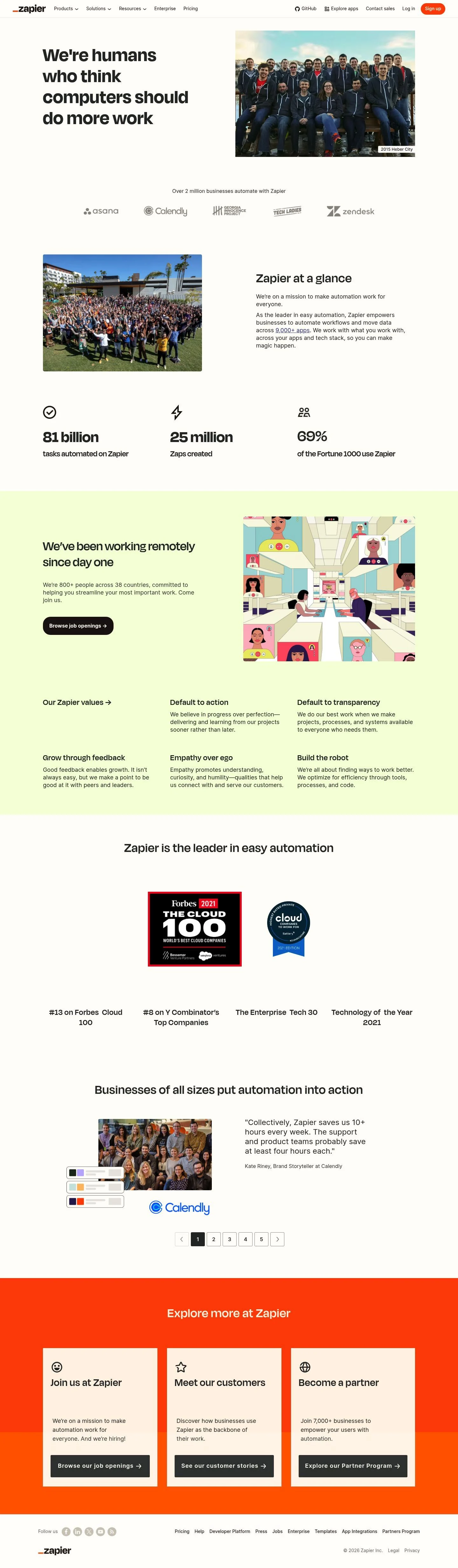
- Full page: https://cdn.designmunk.com/2026/09/10153134/zapier-com-about-featured.webp
- Above the fold: https://cdn.designmunk.com/2026/09/10153134/zapier-com-about-featured.webp
- On DesignMunk: https://designmunk.com/zapier-about-page/

Study these for hierarchy, rhythm, spacing and density. Where an image and the written spec disagree, the spec wins: the tokens were read from the page's own CSS, the images are one rendering of it.

## Before you start

Ask the user what they are building, who it is for, and what brand assets they already have — name, colours, typefaces. Wait for their answers before writing anything. Everything below is then applied to their product, not to the reference.

## Design specification

# Zapier: Big Ink Headlines Beside Team Photography

## Overview

A warm, people-first brand built for productivity and trust. The UI should feel straightforward and confident: large, weighty headings; generous spacing; minimal color outside of action accents. The audience ranges from operators to developers, so clarity beats flourish. When in doubt, prioritize legibility on a neutral surface with restrained use of Zapier Orange for actions only.

## Colors

- **primary (#201515):** Deep ink for headlines and core text.
- **secondary (#fca47a):** Soft accent for gentle highlights and illustrative UI.
- **tertiary (#ff4f00):** Zapier Orange for primary CTAs and emphasis chips.
- **neutral (#fffdf9):** Warm ivory for page backgrounds and cards.
- **border (#e5e7eb):** Light gray for dividers, card outlines, and input borders.
- **surface ({colors.neutral}):** Default surface; use as card and section background.
- **on-surface ({colors.primary}):** Text and icons placed on surface tones.

## Typography

- Degular Display (custom): Used for the largest brand headlines (headline-lg 62px/700/1.06, slight positive tracking). Not freely hosted; if unavailable, substitute Plus Jakarta Sans, Work Sans, or Manrope for similar contemporary warmth.
- Degular (custom): Section headlines and prominent body copy (headline-md 50px/600, headline-sm 40px/600, body-md 26px/600). Not freely hosted; prefer Plus Jakarta Sans, Work Sans, or Manrope as substitutes.
- Inter (Google): Small headlines and utility headings (headline-xs 32px/600) and UI microcopy when needed. Freely available via Google Fonts and safe to load.
Use heavy weights sparingly; pair large Degular headings with lighter paragraph text to avoid a wall of bold. Maintain token line-heights for crisp rhythm.

## Layout

Spacing runs on a five-step scale: 10, 26, 40, 60, 80px. Use xl (80px) for section padding on desktop, lg (60px) for inner gutters, and md (40px) for block gaps. A responsive 12-column grid supports two-column hero and content pairings; collapse to a single column with md (40px) vertical rhythm on mobile. Logo bars and metric grids use md (40px) gaps; lists (values) stack with sm (26px).

## Elevation & Depth

Shadows are disabled at every tier. Hierarchy is conveyed by: 1) weight and size contrast in type, 2) whitespace using lg/xl spacing, 3) 1px separators using border #e5e7eb, and 4) subtle surface vs. page contrast on #fffdf9. When a card needs separation, add a border instead of a shadow.

## Shapes

Corner radii form the language of intent: sm 3px for utility elements (secondary buttons, inputs), md 8px for cards and media, lg 18px for primary CTAs to feel more approachable. Links are square (0 radius) to remain typographic.

## Components

Buttons
- Primary Button: #ff4f00 background, #fffefb text, lg radius (18px), 44px height, 6px×12px padding. Use for the main page action (e.g., Sign up).
- Secondary Button: #fffdf9 background, #403f3e text, sm radius (3px), 44px height. Pair next to primary for lesser actions.
- Link Button: #3d4592 text, no background, 0 radius. For inline or lightweight CTAs.

Card
- Neutral #fffdf9 surface, #201515 text, md radius (8px), 16px padding; add a 1px #e5e7eb border when placed on the same surface.

### Top navigation (mega-menu)
- Sticky header with text links and a standout primary "Sign up" using the primary button spec. Dropdowns use link styles and border separators.

### Hero statement with side image
- Left column: headline-lg (62px, Degular Display) in #201515 on #fffdf9; right column: team image. Section padding xl (80px).

### Client logo bar
- Monochrome partner logos centered with md (40px) vertical spacing and border separators when needed.

### "Zapier at a glance" metrics
- Section headline uses headline-sm (40px). Three metric tiles with bold numerals and short labels; use md (40px) gaps and optional card borders.

### Values list
- Stack value headings (headline-xs 32px, Inter 600) with short body copy. Use sm (26px) gaps; no icons required.

### Awards strip
- Inline badges/logos in a horizontal list with md (40px) spacing and optional border top/bottom.

### Testimonials carousel
- Quote text in body style with bold author and company. Dots/arrows inherit link coloring; cards use md radius and border for separation.

### Explore more CTA trio
- Three cards linking to Jobs, Customer Stories, and Partner Program. Card spec with md radius, 16px padding, and link button or secondary button as the action.

## Do's and Don'ts

- Do reserve #ff4f00 for primary CTAs and rare emphasis; most UI should remain ink (#201515) on warm ivory (#fffdf9).
- Do use lg (18px) radius only on primary CTAs; keep cards at md (8px) and utility controls at sm (3px).
- Do separate sections with xl (80px) padding and #e5e7eb borders when elements share the same surface.
- Don't introduce shadows; use borders and whitespace for depth.
- Don't mix additional accent colors; secondary (#fca47a) is for light highlights, not buttons or body text.
- Don't replace Inter for the 32px small headings unless Degular substitutes are consistently applied elsewhere.

## Agent Prompt Guide

Quick reference
- Text: #201515
- Background: #fffdf9
- Border: #e5e7eb
- Accent/CTA: #ff4f00

1) Build a two-column hero
- Page background #fffdf9. Left: h1 using Degular Display (or Plus Jakarta Sans fallback) at 62px, weight 700, line-height 1.06, color #201515, letter-spacing 0.016em. Right: responsive image with md (8px) radius. Section padding: 80px top/bottom.

2) Create a client logo bar
- Container width 1200px max. Background #fffdf9. Centered logos in grayscale with 40px gap and 26px top/bottom padding. Add a 1px divider #e5e7eb above.

3) Metrics grid
- Section heading at 40px, Degular 600, color #201515. Three columns with 40px gaps. Each tile: card background #fffdf9, 8px radius, 16px padding, 1px border #e5e7eb. Numerals use Degular 50px/600.

4) Primary button
- Height 44px; padding 6px 12px; background #ff4f00; text #fffefb; border none; radius 18px; font Degular 600 (or Plus Jakarta Sans). Hover: darken by 6% or keep flat.

5) Values list
- Stack items with 26px gap. Heading uses Inter 32px/600, color #201515. Body copy in Degular 26px/600 with line-height 1.5, color #201515; max-width 60ch.

## Similar Brands

- Asana — Warm neutrals, approachable sans-serif headings, and restrained accent color; Asana uses more gradients, while Zapier stays flat.
- Slack — People-forward photography and bright accent color; Slack leans purple and uses more playful shapes.
- Airtable — Clean grid-based layouts with light borders and off-white grounds; Airtable adds saturated illustrations where Zapier remains photographic.
- Notion — Monochrome primary palette with bold typography; Notion is more minimal and serif-tinged, Zapier more human and colorful at the CTA level.

## Tokens

### CSS custom properties

```css
:root {
  /* Colors */
  --color-primary: #201515;
  --color-secondary: #fca47a;
  --color-tertiary: #ff4f00;
  --color-neutral: #fffdf9;
  --color-border: #e5e7eb;
  --color-surface: var(--color-neutral);
  --color-on-surface: var(--color-primary);

  /* Typography */
  --text-headline-lg-size: 62px;
  --text-headline-lg-weight: 700;
  --text-headline-lg-leading: 1.06;
  --text-headline-lg-tracking: 0.016em;
  --text-headline-md-size: 50px;
  --text-headline-md-weight: 600;
  --text-headline-md-leading: 1;
  --text-headline-md-tracking: 0.02em;
  --text-headline-sm-size: 40px;
  --text-headline-sm-weight: 600;
  --text-headline-sm-leading: 1;
  --text-headline-sm-tracking: 0.025em;
  --text-headline-xs-size: 32px;
  --text-headline-xs-weight: 600;
  --text-headline-xs-leading: 1.19;
  --text-body-md-size: 26px;
  --text-body-md-weight: 600;
  --text-body-md-leading: 1.5;
  --text-body-md-tracking: 0.038em;
  --font-degular-display: "Degular Display";
  --font-degular: "Degular";
  --font-inter: "Inter";

  /* Rounded */
  --radius-sm: 3px;
  --radius-md: 8px;
  --radius-lg: 18px;

  /* Spacing */
  --spacing-xs: 10px;
  --spacing-sm: 26px;
  --spacing-md: 40px;
  --spacing-lg: 60px;
  --spacing-xl: 80px;

  /* Components */
  --button-primary-background-color: var(--color-tertiary);
  --button-primary-text-color: #fffefb;
  --button-primary-rounded: var(--radius-lg);
  --button-primary-padding: 6px 12px;
  --button-primary-height: 44px;
  --button-secondary-background-color: var(--color-neutral);
  --button-secondary-text-color: #403f3e;
  --button-secondary-rounded: var(--radius-sm);
  --button-secondary-padding: 6px 12px;
  --button-secondary-height: 44px;
  --button-link-text-color: #3d4592;
  --button-link-rounded: 0px;
  --card-background-color: var(--color-neutral);
  --card-text-color: var(--color-primary);
  --card-rounded: var(--radius-md);
  --card-padding: 16px;
}
```

### Tailwind theme

```css
@theme {
  --color-primary: #201515;
  --color-secondary: #fca47a;
  --color-tertiary: #ff4f00;
  --color-neutral: #fffdf9;
  --color-border: #e5e7eb;
  --color-surface: #fffdf9;
  --color-on-surface: #201515;
  --font-headline-lg: "Degular Display";
  --font-headline-md: "Degular";
  --font-headline-sm: "Degular";
  --font-headline-xs: "Inter";
  --font-body-md: "Degular";
  --text-headline-lg: 62px;
  --text-headline-md: 50px;
  --text-headline-sm: 40px;
  --text-headline-xs: 32px;
  --text-body-md: 26px;
  --tracking-headline-lg: 0.016em;
  --tracking-headline-md: 0.02em;
  --tracking-headline-sm: 0.025em;
  --tracking-body-md: 0.038em;
  --font-weight-headline-lg: 700;
  --font-weight-headline-md: 600;
  --font-weight-headline-sm: 600;
  --font-weight-headline-xs: 600;
  --font-weight-body-md: 600;
  --radius-sm: 3px;
  --radius-md: 8px;
  --radius-lg: 18px;
  --spacing-xs: 10px;
  --spacing-sm: 26px;
  --spacing-md: 40px;
  --spacing-lg: 60px;
  --spacing-xl: 80px;
}
```

### Design tokens (DTCG)

```json
{
    "$schema": "https://www.designtokens.org/schemas/2025.10/format.json",
    "color": {
        "$type": "color",
        "primary": {
            "$value": {
                "colorSpace": "srgb",
                "components": [
                    0.125,
                    0.082,
                    0.082
                ],
                "hex": "#201515"
            }
        },
        "secondary": {
            "$value": {
                "colorSpace": "srgb",
                "components": [
                    0.988,
                    0.643,
                    0.478
                ],
                "hex": "#fca47a"
            }
        },
        "tertiary": {
            "$value": {
                "colorSpace": "srgb",
                "components": [
                    1,
                    0.31,
                    0
                ],
                "hex": "#ff4f00"
            }
        },
        "neutral": {
            "$value": {
                "colorSpace": "srgb",
                "components": [
                    1,
                    0.992,
                    0.976
                ],
                "hex": "#fffdf9"
            }
        },
        "border": {
            "$value": {
                "colorSpace": "srgb",
                "components": [
                    0.898,
                    0.906,
                    0.922
                ],
                "hex": "#e5e7eb"
            }
        },
        "surface": {
            "$value": {
                "colorSpace": "srgb",
                "components": [
                    1,
                    0.992,
                    0.976
                ],
                "hex": "#fffdf9"
            }
        },
        "on-surface": {
            "$value": {
                "colorSpace": "srgb",
                "components": [
                    0.125,
                    0.082,
                    0.082
                ],
                "hex": "#201515"
            }
        }
    },
    "spacing": {
        "$type": "dimension",
        "xs": {
            "$value": {
                "value": 10,
                "unit": "px"
            }
        },
        "sm": {
            "$value": {
                "value": 26,
                "unit": "px"
            }
        },
        "md": {
            "$value": {
                "value": 40,
                "unit": "px"
            }
        },
        "lg": {
            "$value": {
                "value": 60,
                "unit": "px"
            }
        },
        "xl": {
            "$value": {
                "value": 80,
                "unit": "px"
            }
        }
    },
    "rounded": {
        "$type": "dimension",
        "sm": {
            "$value": {
                "value": 3,
                "unit": "px"
            }
        },
        "md": {
            "$value": {
                "value": 8,
                "unit": "px"
            }
        },
        "lg": {
            "$value": {
                "value": 18,
                "unit": "px"
            }
        }
    },
    "typography": {
        "headline-lg": {
            "$type": "typography",
            "$value": {
                "fontFamily": "Degular Display",
                "fontSize": {
                    "value": 62,
                    "unit": "px"
                },
                "fontWeight": 700,
                "letterSpacing": {
                    "value": 0.016,
                    "unit": "em"
                }
            }
        },
        "headline-md": {
            "$type": "typography",
            "$value": {
                "fontFamily": "Degular",
                "fontSize": {
                    "value": 50,
                    "unit": "px"
                },
                "fontWeight": 600,
                "letterSpacing": {
                    "value": 0.02,
                    "unit": "em"
                }
            }
        },
        "headline-sm": {
            "$type": "typography",
            "$value": {
                "fontFamily": "Degular",
                "fontSize": {
                    "value": 40,
                    "unit": "px"
                },
                "fontWeight": 600,
                "letterSpacing": {
                    "value": 0.025,
                    "unit": "em"
                }
            }
        },
        "headline-xs": {
            "$type": "typography",
            "$value": {
                "fontFamily": "Inter",
                "fontSize": {
                    "value": 32,
                    "unit": "px"
                },
                "fontWeight": 600
            }
        },
        "body-md": {
            "$type": "typography",
            "$value": {
                "fontFamily": "Degular",
                "fontSize": {
                    "value": 26,
                    "unit": "px"
                },
                "fontWeight": 600,
                "letterSpacing": {
                    "value": 0.038,
                    "unit": "em"
                }
            }
        }
    }
}
```

## Rules

- **Fonts.** If the specification names a custom or self-hosted family, use one of the substitutes it names. Never reference a typeface you cannot actually load — it will fall back to a system font and undo the typography.
- **Colour.** Derive the palette from the user's brand. Use the token values as a guide to *relationships* — contrast, tint, how many accents carry the page — not as hex codes to paste.
- **Never reproduce** the wordmark, mascot, logo, brand name, illustrations, icon set, screenshots or any copy from the reference.
- **Never present the result as Zapier About**, or imply any connection to it.
- If something is unspecified, choose clarity and legibility over decoration.
---
version: alpha
name: Zapier
description: No-code automation across 9,000+ apps
colors:
  primary: "#201515"
  secondary: "#fca47a"
  tertiary: "#ff4f00"
  neutral: "#fffdf9"
  border: "#e5e7eb"
  surface: "{colors.neutral}"
  on-surface: "{colors.primary}"
typography:
  headline-lg:
    fontFamily: Degular Display
    fontSize: 62px
    fontWeight: 700
    lineHeight: 1.06
    letterSpacing: 0.016em
  headline-md:
    fontFamily: Degular
    fontSize: 50px
    fontWeight: 600
    lineHeight: 1
    letterSpacing: 0.02em
  headline-sm:
    fontFamily: Degular
    fontSize: 40px
    fontWeight: 600
    lineHeight: 1
    letterSpacing: 0.025em
  headline-xs:
    fontFamily: Inter
    fontSize: 32px
    fontWeight: 600
    lineHeight: 1.19
  body-md:
    fontFamily: Degular
    fontSize: 26px
    fontWeight: 600
    lineHeight: 1.5
    letterSpacing: 0.038em
rounded:
  sm: 3px
  md: 8px
  lg: 18px
spacing:
  xs: 10px
  sm: 26px
  md: 40px
  lg: 60px
  xl: 80px
components:
  button-primary:
    backgroundColor: "{colors.tertiary}"
    textColor: "#fffefb"
    rounded: "{rounded.lg}"
    padding: 6px 12px
    height: 44px
  button-secondary:
    backgroundColor: "{colors.neutral}"
    textColor: "#403f3e"
    rounded: "{rounded.sm}"
    padding: 6px 12px
    height: 44px
  button-link:
    textColor: "#3d4592"
    rounded: 0px
  card:
    backgroundColor: "{colors.neutral}"
    textColor: "{colors.primary}"
    rounded: "{rounded.md}"
    padding: 16px
---

# Zapier: Big Ink Headlines Beside Team Photography

## Overview

A warm, people-first brand built for productivity and trust. The UI should feel straightforward and confident: large, weighty headings; generous spacing; minimal color outside of action accents. The audience ranges from operators to developers, so clarity beats flourish. When in doubt, prioritize legibility on a neutral surface with restrained use of Zapier Orange for actions only.

## Colors

- **primary (#201515):** Deep ink for headlines and core text.
- **secondary (#fca47a):** Soft accent for gentle highlights and illustrative UI.
- **tertiary (#ff4f00):** Zapier Orange for primary CTAs and emphasis chips.
- **neutral (#fffdf9):** Warm ivory for page backgrounds and cards.
- **border (#e5e7eb):** Light gray for dividers, card outlines, and input borders.
- **surface ({colors.neutral}):** Default surface; use as card and section background.
- **on-surface ({colors.primary}):** Text and icons placed on surface tones.

## Typography

- Degular Display (custom): Used for the largest brand headlines (headline-lg 62px/700/1.06, slight positive tracking). Not freely hosted; if unavailable, substitute Plus Jakarta Sans, Work Sans, or Manrope for similar contemporary warmth.
- Degular (custom): Section headlines and prominent body copy (headline-md 50px/600, headline-sm 40px/600, body-md 26px/600). Not freely hosted; prefer Plus Jakarta Sans, Work Sans, or Manrope as substitutes.
- Inter (Google): Small headlines and utility headings (headline-xs 32px/600) and UI microcopy when needed. Freely available via Google Fonts and safe to load.
Use heavy weights sparingly; pair large Degular headings with lighter paragraph text to avoid a wall of bold. Maintain token line-heights for crisp rhythm.

## Layout

Spacing runs on a five-step scale: 10, 26, 40, 60, 80px. Use xl (80px) for section padding on desktop, lg (60px) for inner gutters, and md (40px) for block gaps. A responsive 12-column grid supports two-column hero and content pairings; collapse to a single column with md (40px) vertical rhythm on mobile. Logo bars and metric grids use md (40px) gaps; lists (values) stack with sm (26px).

## Elevation & Depth

Shadows are disabled at every tier. Hierarchy is conveyed by: 1) weight and size contrast in type, 2) whitespace using lg/xl spacing, 3) 1px separators using border #e5e7eb, and 4) subtle surface vs. page contrast on #fffdf9. When a card needs separation, add a border instead of a shadow.

## Shapes

Corner radii form the language of intent: sm 3px for utility elements (secondary buttons, inputs), md 8px for cards and media, lg 18px for primary CTAs to feel more approachable. Links are square (0 radius) to remain typographic.

## Components

Buttons
- Primary Button: #ff4f00 background, #fffefb text, lg radius (18px), 44px height, 6px×12px padding. Use for the main page action (e.g., Sign up).
- Secondary Button: #fffdf9 background, #403f3e text, sm radius (3px), 44px height. Pair next to primary for lesser actions.
- Link Button: #3d4592 text, no background, 0 radius. For inline or lightweight CTAs.

Card
- Neutral #fffdf9 surface, #201515 text, md radius (8px), 16px padding; add a 1px #e5e7eb border when placed on the same surface.

### Top navigation (mega-menu)
- Sticky header with text links and a standout primary "Sign up" using the primary button spec. Dropdowns use link styles and border separators.

### Hero statement with side image
- Left column: headline-lg (62px, Degular Display) in #201515 on #fffdf9; right column: team image. Section padding xl (80px).

### Client logo bar
- Monochrome partner logos centered with md (40px) vertical spacing and border separators when needed.

### "Zapier at a glance" metrics
- Section headline uses headline-sm (40px). Three metric tiles with bold numerals and short labels; use md (40px) gaps and optional card borders.

### Values list
- Stack value headings (headline-xs 32px, Inter 600) with short body copy. Use sm (26px) gaps; no icons required.

### Awards strip
- Inline badges/logos in a horizontal list with md (40px) spacing and optional border top/bottom.

### Testimonials carousel
- Quote text in body style with bold author and company. Dots/arrows inherit link coloring; cards use md radius and border for separation.

### Explore more CTA trio
- Three cards linking to Jobs, Customer Stories, and Partner Program. Card spec with md radius, 16px padding, and link button or secondary button as the action.

## Do's and Don'ts

- Do reserve #ff4f00 for primary CTAs and rare emphasis; most UI should remain ink (#201515) on warm ivory (#fffdf9).
- Do use lg (18px) radius only on primary CTAs; keep cards at md (8px) and utility controls at sm (3px).
- Do separate sections with xl (80px) padding and #e5e7eb borders when elements share the same surface.
- Don't introduce shadows; use borders and whitespace for depth.
- Don't mix additional accent colors; secondary (#fca47a) is for light highlights, not buttons or body text.
- Don't replace Inter for the 32px small headings unless Degular substitutes are consistently applied elsewhere.

## Agent Prompt Guide

Quick reference
- Text: #201515
- Background: #fffdf9
- Border: #e5e7eb
- Accent/CTA: #ff4f00

1) Build a two-column hero
- Page background #fffdf9. Left: h1 using Degular Display (or Plus Jakarta Sans fallback) at 62px, weight 700, line-height 1.06, color #201515, letter-spacing 0.016em. Right: responsive image with md (8px) radius. Section padding: 80px top/bottom.

2) Create a client logo bar
- Container width 1200px max. Background #fffdf9. Centered logos in grayscale with 40px gap and 26px top/bottom padding. Add a 1px divider #e5e7eb above.

3) Metrics grid
- Section heading at 40px, Degular 600, color #201515. Three columns with 40px gaps. Each tile: card background #fffdf9, 8px radius, 16px padding, 1px border #e5e7eb. Numerals use Degular 50px/600.

4) Primary button
- Height 44px; padding 6px 12px; background #ff4f00; text #fffefb; border none; radius 18px; font Degular 600 (or Plus Jakarta Sans). Hover: darken by 6% or keep flat.

5) Values list
- Stack items with 26px gap. Heading uses Inter 32px/600, color #201515. Body copy in Degular 26px/600 with line-height 1.5, color #201515; max-width 60ch.

## Similar Brands

- Asana — Warm neutrals, approachable sans-serif headings, and restrained accent color; Asana uses more gradients, while Zapier stays flat.
- Slack — People-forward photography and bright accent color; Slack leans purple and uses more playful shapes.
- Airtable — Clean grid-based layouts with light borders and off-white grounds; Airtable adds saturated illustrations where Zapier remains photographic.
- Notion — Monochrome primary palette with bold typography; Notion is more minimal and serif-tinged, Zapier more human and colorful at the CTA level.
:root {
  /* Colors */
  --color-primary: #201515;
  --color-secondary: #fca47a;
  --color-tertiary: #ff4f00;
  --color-neutral: #fffdf9;
  --color-border: #e5e7eb;
  --color-surface: var(--color-neutral);
  --color-on-surface: var(--color-primary);

  /* Typography */
  --text-headline-lg-size: 62px;
  --text-headline-lg-weight: 700;
  --text-headline-lg-leading: 1.06;
  --text-headline-lg-tracking: 0.016em;
  --text-headline-md-size: 50px;
  --text-headline-md-weight: 600;
  --text-headline-md-leading: 1;
  --text-headline-md-tracking: 0.02em;
  --text-headline-sm-size: 40px;
  --text-headline-sm-weight: 600;
  --text-headline-sm-leading: 1;
  --text-headline-sm-tracking: 0.025em;
  --text-headline-xs-size: 32px;
  --text-headline-xs-weight: 600;
  --text-headline-xs-leading: 1.19;
  --text-body-md-size: 26px;
  --text-body-md-weight: 600;
  --text-body-md-leading: 1.5;
  --text-body-md-tracking: 0.038em;
  --font-degular-display: "Degular Display";
  --font-degular: "Degular";
  --font-inter: "Inter";

  /* Rounded */
  --radius-sm: 3px;
  --radius-md: 8px;
  --radius-lg: 18px;

  /* Spacing */
  --spacing-xs: 10px;
  --spacing-sm: 26px;
  --spacing-md: 40px;
  --spacing-lg: 60px;
  --spacing-xl: 80px;

  /* Components */
  --button-primary-background-color: var(--color-tertiary);
  --button-primary-text-color: #fffefb;
  --button-primary-rounded: var(--radius-lg);
  --button-primary-padding: 6px 12px;
  --button-primary-height: 44px;
  --button-secondary-background-color: var(--color-neutral);
  --button-secondary-text-color: #403f3e;
  --button-secondary-rounded: var(--radius-sm);
  --button-secondary-padding: 6px 12px;
  --button-secondary-height: 44px;
  --button-link-text-color: #3d4592;
  --button-link-rounded: 0px;
  --card-background-color: var(--color-neutral);
  --card-text-color: var(--color-primary);
  --card-rounded: var(--radius-md);
  --card-padding: 16px;
}
{
  "$schema": "https://www.designtokens.org/schemas/2025.10/format.json",
  "$description": "No-code automation across 9,000+ apps",
  "color": {
    "$type": "color",
    "primary": {
      "$value": {
        "colorSpace": "srgb",
        "components": [
          0.125,
          0.082,
          0.082
        ],
        "hex": "#201515"
      }
    },
    "secondary": {
      "$value": {
        "colorSpace": "srgb",
        "components": [
          0.988,
          0.643,
          0.478
        ],
        "hex": "#fca47a"
      }
    },
    "tertiary": {
      "$value": {
        "colorSpace": "srgb",
        "components": [
          1,
          0.31,
          0
        ],
        "hex": "#ff4f00"
      }
    },
    "neutral": {
      "$value": {
        "colorSpace": "srgb",
        "components": [
          1,
          0.992,
          0.976
        ],
        "hex": "#fffdf9"
      }
    },
    "border": {
      "$value": {
        "colorSpace": "srgb",
        "components": [
          0.898,
          0.906,
          0.922
        ],
        "hex": "#e5e7eb"
      }
    },
    "surface": {
      "$value": {
        "colorSpace": "srgb",
        "components": [
          1,
          0.992,
          0.976
        ],
        "hex": "#fffdf9"
      }
    },
    "on-surface": {
      "$value": {
        "colorSpace": "srgb",
        "components": [
          0.125,
          0.082,
          0.082
        ],
        "hex": "#201515"
      }
    }
  },
  "spacing": {
    "$type": "dimension",
    "xs": {
      "$value": {
        "value": 10,
        "unit": "px"
      }
    },
    "sm": {
      "$value": {
        "value": 26,
        "unit": "px"
      }
    },
    "md": {
      "$value": {
        "value": 40,
        "unit": "px"
      }
    },
    "lg": {
      "$value": {
        "value": 60,
        "unit": "px"
      }
    },
    "xl": {
      "$value": {
        "value": 80,
        "unit": "px"
      }
    }
  },
  "rounded": {
    "$type": "dimension",
    "sm": {
      "$value": {
        "value": 3,
        "unit": "px"
      }
    },
    "md": {
      "$value": {
        "value": 8,
        "unit": "px"
      }
    },
    "lg": {
      "$value": {
        "value": 18,
        "unit": "px"
      }
    }
  },
  "typography": {
    "headline-lg": {
      "$type": "typography",
      "$value": {
        "fontFamily": "Degular Display",
        "fontSize": {
          "value": 62,
          "unit": "px"
        },
        "fontWeight": 700,
        "letterSpacing": {
          "value": 0.016,
          "unit": "em"
        }
      }
    },
    "headline-md": {
      "$type": "typography",
      "$value": {
        "fontFamily": "Degular",
        "fontSize": {
          "value": 50,
          "unit": "px"
        },
        "fontWeight": 600,
        "letterSpacing": {
          "value": 0.02,
          "unit": "em"
        }
      }
    },
    "headline-sm": {
      "$type": "typography",
      "$value": {
        "fontFamily": "Degular",
        "fontSize": {
          "value": 40,
          "unit": "px"
        },
        "fontWeight": 600,
        "letterSpacing": {
          "value": 0.025,
          "unit": "em"
        }
      }
    },
    "headline-xs": {
      "$type": "typography",
      "$value": {
        "fontFamily": "Inter",
        "fontSize": {
          "value": 32,
          "unit": "px"
        },
        "fontWeight": 600
      }
    },
    "body-md": {
      "$type": "typography",
      "$value": {
        "fontFamily": "Degular",
        "fontSize": {
          "value": 26,
          "unit": "px"
        },
        "fontWeight": 600,
        "letterSpacing": {
          "value": 0.038,
          "unit": "em"
        }
      }
    }
  }
}
@theme {
--color-primary: #201515;
--color-secondary: #fca47a;
--color-tertiary: #ff4f00;
--color-neutral: #fffdf9;
--color-border: #e5e7eb;
--color-surface: #fffdf9;
--color-on-surface: #201515;
--font-headline-lg: "Degular Display";
--font-headline-md: "Degular";
--font-headline-sm: "Degular";
--font-headline-xs: "Inter";
--font-body-md: "Degular";
--text-headline-lg: 62px;
--text-headline-md: 50px;
--text-headline-sm: 40px;
--text-headline-xs: 32px;
--text-body-md: 26px;
--tracking-headline-lg: 0.016em;
--tracking-headline-md: 0.02em;
--tracking-headline-sm: 0.025em;
--tracking-body-md: 0.038em;
--font-weight-headline-lg: 700;
--font-weight-headline-md: 600;
--font-weight-headline-sm: 600;
--font-weight-headline-xs: 600;
--font-weight-body-md: 600;
--radius-sm: 3px;
--radius-md: 8px;
--radius-lg: 18px;
--spacing-xs: 10px;
--spacing-sm: 26px;
--spacing-md: 40px;
--spacing-lg: 60px;
--spacing-xl: 80px;
} # Design brief: the Zapier About design language
Below is a complete design specification measured from a real, published web page. Use it as a design language for the user's product. It is not a page to reproduce.
## Reference images
- Full page: https://cdn.designmunk.com/2026/09/10153134/zapier-com-about-featured.webp
- Above the fold: https://cdn.designmunk.com/2026/09/10153134/zapier-com-about-featured.webp
- On DesignMunk: https://designmunk.com/zapier-about-page/
Study these for hierarchy, rhythm, spacing and density. Where an image and the written spec disagree, the spec wins: the tokens were read from the page's own CSS, the images are one rendering of it.
## Before you start
Ask the user what they are building, who it is for, and what brand assets they already have — name, colours, typefaces. Wait for their answers before writing anything. Everything below is then applied to their product, not to the reference.
## Design specification
# Zapier: Big Ink Headlines Beside Team Photography
## Overview
A warm, people-first brand built for productivity and trust. The UI should feel straightforward and confident: large, weighty headings; generous spacing; minimal color outside of action accents. The audience ranges from operators to developers, so clarity beats flourish. When in doubt, prioritize legibility on a neutral surface with restrained use of Zapier Orange for actions only.
## Colors
- **primary (#201515):** Deep ink for headlines and core text.
- **secondary (#fca47a):** Soft accent for gentle highlights and illustrative UI.
- **tertiary (#ff4f00):** Zapier Orange for primary CTAs and emphasis chips.
- **neutral (#fffdf9):** Warm ivory for page backgrounds and cards.
- **border (#e5e7eb):** Light gray for dividers, card outlines, and input borders.
- **surface ({colors.neutral}):** Default surface; use as card and section background.
- **on-surface ({colors.primary}):** Text and icons placed on surface tones.
## Typography
- Degular Display (custom): Used for the largest brand headlines (headline-lg 62px/700/1.06, slight positive tracking). Not freely hosted; if unavailable, substitute Plus Jakarta Sans, Work Sans, or Manrope for similar contemporary warmth.
- Degular (custom): Section headlines and prominent body copy (headline-md 50px/600, headline-sm 40px/600, body-md 26px/600). Not freely hosted; prefer Plus Jakarta Sans, Work Sans, or Manrope as substitutes.
- Inter (Google): Small headlines and utility headings (headline-xs 32px/600) and UI microcopy when needed. Freely available via Google Fonts and safe to load.
Use heavy weights sparingly; pair large Degular headings with lighter paragraph text to avoid a wall of bold. Maintain token line-heights for crisp rhythm.
## Layout
Spacing runs on a five-step scale: 10, 26, 40, 60, 80px. Use xl (80px) for section padding on desktop, lg (60px) for inner gutters, and md (40px) for block gaps. A responsive 12-column grid supports two-column hero and content pairings; collapse to a single column with md (40px) vertical rhythm on mobile. Logo bars and metric grids use md (40px) gaps; lists (values) stack with sm (26px).
## Elevation & Depth
Shadows are disabled at every tier. Hierarchy is conveyed by: 1) weight and size contrast in type, 2) whitespace using lg/xl spacing, 3) 1px separators using border #e5e7eb, and 4) subtle surface vs. page contrast on #fffdf9. When a card needs separation, add a border instead of a shadow.
## Shapes
Corner radii form the language of intent: sm 3px for utility elements (secondary buttons, inputs), md 8px for cards and media, lg 18px for primary CTAs to feel more approachable. Links are square (0 radius) to remain typographic.
## Components
Buttons
- Primary Button: #ff4f00 background, #fffefb text, lg radius (18px), 44px height, 6px×12px padding. Use for the main page action (e.g., Sign up).
- Secondary Button: #fffdf9 background, #403f3e text, sm radius (3px), 44px height. Pair next to primary for lesser actions.
- Link Button: #3d4592 text, no background, 0 radius. For inline or lightweight CTAs.
Card
- Neutral #fffdf9 surface, #201515 text, md radius (8px), 16px padding; add a 1px #e5e7eb border when placed on the same surface.
### Top navigation (mega-menu)
- Sticky header with text links and a standout primary "Sign up" using the primary button spec. Dropdowns use link styles and border separators.
### Hero statement with side image
- Left column: headline-lg (62px, Degular Display) in #201515 on #fffdf9; right column: team image. Section padding xl (80px).
### Client logo bar
- Monochrome partner logos centered with md (40px) vertical spacing and border separators when needed.
### "Zapier at a glance" metrics
- Section headline uses headline-sm (40px). Three metric tiles with bold numerals and short labels; use md (40px) gaps and optional card borders.
### Values list
- Stack value headings (headline-xs 32px, Inter 600) with short body copy. Use sm (26px) gaps; no icons required.
### Awards strip
- Inline badges/logos in a horizontal list with md (40px) spacing and optional border top/bottom.
### Testimonials carousel
- Quote text in body style with bold author and company. Dots/arrows inherit link coloring; cards use md radius and border for separation.
### Explore more CTA trio
- Three cards linking to Jobs, Customer Stories, and Partner Program. Card spec with md radius, 16px padding, and link button or secondary button as the action.
## Do's and Don'ts
- Do reserve #ff4f00 for primary CTAs and rare emphasis; most UI should remain ink (#201515) on warm ivory (#fffdf9).
- Do use lg (18px) radius only on primary CTAs; keep cards at md (8px) and utility controls at sm (3px).
- Do separate sections with xl (80px) padding and #e5e7eb borders when elements share the same surface.
- Don't introduce shadows; use borders and whitespace for depth.
- Don't mix additional accent colors; secondary (#fca47a) is for light highlights, not buttons or body text.
- Don't replace Inter for the 32px small headings unless Degular substitutes are consistently applied elsewhere.
## Agent Prompt Guide
Quick reference
- Text: #201515
- Background: #fffdf9
- Border: #e5e7eb
- Accent/CTA: #ff4f00
1) Build a two-column hero
- Page background #fffdf9. Left: h1 using Degular Display (or Plus Jakarta Sans fallback) at 62px, weight 700, line-height 1.06, color #201515, letter-spacing 0.016em. Right: responsive image with md (8px) radius. Section padding: 80px top/bottom.
2) Create a client logo bar
- Container width 1200px max. Background #fffdf9. Centered logos in grayscale with 40px gap and 26px top/bottom padding. Add a 1px divider #e5e7eb above.
3) Metrics grid
- Section heading at 40px, Degular 600, color #201515. Three columns with 40px gaps. Each tile: card background #fffdf9, 8px radius, 16px padding, 1px border #e5e7eb. Numerals use Degular 50px/600.
4) Primary button
- Height 44px; padding 6px 12px; background #ff4f00; text #fffefb; border none; radius 18px; font Degular 600 (or Plus Jakarta Sans). Hover: darken by 6% or keep flat.
5) Values list
- Stack items with 26px gap. Heading uses Inter 32px/600, color #201515. Body copy in Degular 26px/600 with line-height 1.5, color #201515; max-width 60ch.
## Tokens
### CSS custom properties
```css
:root {
/* Colors */
--color-primary: #201515;
--color-secondary: #fca47a;
--color-tertiary: #ff4f00;
--color-neutral: #fffdf9;
--color-border: #e5e7eb;
--color-surface: var(--color-neutral);
--color-on-surface: var(--color-primary);
/* Typography */
--text-headline-lg-size: 62px;
--text-headline-lg-weight: 700;
--text-headline-lg-leading: 1.06;
--text-headline-lg-tracking: 0.016em;
--text-headline-md-size: 50px;
--text-headline-md-weight: 600;
--text-headline-md-leading: 1;
--text-headline-md-tracking: 0.02em;
--text-headline-sm-size: 40px;
--text-headline-sm-weight: 600;
--text-headline-sm-leading: 1;
--text-headline-sm-tracking: 0.025em;
--text-headline-xs-size: 32px;
--text-headline-xs-weight: 600;
--text-headline-xs-leading: 1.19;
--text-body-md-size: 26px;
--text-body-md-weight: 600;
--text-body-md-leading: 1.5;
--text-body-md-tracking: 0.038em;
--font-degular-display: "Degular Display";
--font-degular: "Degular";
--font-inter: "Inter";
/* Rounded */
--radius-sm: 3px;
--radius-md: 8px;
--radius-lg: 18px;
/* Spacing */
--spacing-xs: 10px;
--spacing-sm: 26px;
--spacing-md: 40px;
--spacing-lg: 60px;
--spacing-xl: 80px;
/* Components */
--button-primary-background-color: var(--color-tertiary);
--button-primary-text-color: #fffefb;
--button-primary-rounded: var(--radius-lg);
--button-primary-padding: 6px 12px;
--button-primary-height: 44px;
--button-secondary-background-color: var(--color-neutral);
--button-secondary-text-color: #403f3e;
--button-secondary-rounded: var(--radius-sm);
--button-secondary-padding: 6px 12px;
--button-secondary-height: 44px;
--button-link-text-color: #3d4592;
--button-link-rounded: 0px;
--card-background-color: var(--color-neutral);
--card-text-color: var(--color-primary);
--card-rounded: var(--radius-md);
--card-padding: 16px;
}
```
## Rules
- **Fonts.** If the specification names a custom or self-hosted family, use one of the substitutes it names. Never reference a typeface you cannot actually load — it will fall back to a system font and undo the typography.
- **Colour.** Derive the palette from the user's brand. Use the token values as a guide to *relationships* — contrast, tint, how many accents carry the page — not as hex codes to paste.
- **Never reproduce** the wordmark, mascot, logo, brand name, illustrations, icon set, screenshots or any copy from the reference.
- **Never present the result as Zapier About**, or imply any connection to it.
- If something is unspecified, choose clarity and legibility over decoration.