







xpander.ai
AI Breakdown
Design export
# Design brief: the Xpander design language

Below is a complete design specification measured from a real, published web page. Use it as a design language for the user's product. It is not a page to reproduce.

## Reference images

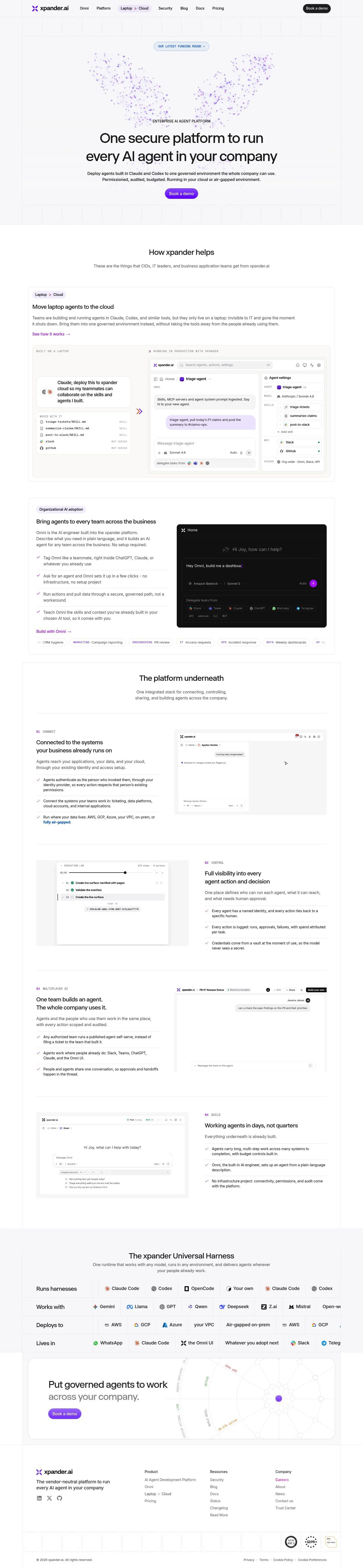
- Full page: https://cdn.designmunk.com/2026/09/30112341/xpander-ai-featured.webp
- Above the fold: https://cdn.designmunk.com/2026/09/30112341/xpander-ai-featured-1440x900.webp
- On DesignMunk: https://designmunk.com/xpander/

Study these for hierarchy, rhythm, spacing and density. Where an image and the written spec disagree, the spec wins: the tokens were read from the page's own CSS, the images are one rendering of it.

## Before you start

Ask the user what they are building, who it is for, and what brand assets they already have — name, colours, typefaces. Wait for their answers before writing anything. Everything below is then applied to their product, not to the reference.

## Design specification

# Xpander: Calm Monochrome Base with Electric Violet Pills

## Overview

Enterprise-calm and security-forward. The interface balances a neutral grayscale base with one vivid accent for momentum. Spacing is generous; sections alternate between airy hero/CTAs and denser, list-based content blocks. Tone is serious and precise, using concise copy and minimal decoration to communicate control and governance.

## Page Structure

- Global nav: left-aligned wordmark and compact links; right-aligned pill CTA. Minimal chrome.
- Announcement pill: centered, small-caps link inside a capsule badge.
- Hero: centered composition with decorative dot graphic, uppercase superhead, oversized display headline, one short paragraph, and a primary pill CTA.
- Intro section ("How it helps"): centered h2 with brief lead-in.
- Feature row — Laptop → Cloud: left column uses stacked chips, h3, body, and a text-link; right column shows a storyboard panel of skills/files and service icons.
- Omni section: reversed two-column layout with explanatory copy and a chat/composer mock framed by long rows of integration chips.
- Platform pillars (01–04): vertical sequence of numbered blocks; each has a h3, short bullets, and an adjacent screenshot/video frame.
- Universal Harness: grouped lists under four subheads arranged in a simple grid of rows/columns.
- Closing CTA: centered headline, short reinforcement line, and a single pill button.
- Footer: multi-column link lists for Product, Resources, Company; compact legal row beneath.

## Colors

- Primary (#222222): Core ink for headlines and most text.
- Secondary (#0c0c0c): Deeper ink for selected emphasis and dark UI elements.
- Tertiary (#753cff): Electric violet accent for CTAs, chips, and key highlights.
- Neutral (#ffffff): Page background and card surfaces.
- Border (#383238): Low-contrast hairlines and dividers.
- Brand-lilac-geode (#b492fc): Soft lilac highlight for gradients, glows, and secondary emphasis.
- Surface ({colors.neutral}): Standard surface matching the neutral background.
- On-surface ({colors.primary}): Default text color on surfaces.

## Typography

- Selecta Regular — display. Used for headline-lg/md/sm across the page (59px/32px/24px, weight 400 with negative tracking) to achieve a confident, low-contrast look. Source type: custom (self-hosted). If unavailable, substitute with Space Grotesk, Sora, or Outfit for a similar geometric/grotesk tone.
- Inter — body. Google font; loadable. Used for body-md at 16px/1.5 with slight negative tracking for compact paragraphs and UI labels.
- Headline-xs — sans-serif generic at 18px for small headings and overlines when the display face is unnecessary.
- Geist Mono — monospace (Google). Apply for CLI/shortcut hints (e.g., ⌘K), file names, and terse technical labels to distinguish commands from prose.

## Layout

A single centered spine with wide gutters. Vertical rhythm steps come from the spacing scale: xs 6px for micro-gaps, sm 14px for chip padding and inline separations, md 24px for intra-card spacing, lg 56px for section padding, and xl 96px for hero and major dividers. Content blocks swap between single-column stacks and two-column feature rows; lists often sit in simple rows instead of complex grids to preserve scan speed.

## Elevation & Depth

Shadows are largely absent (sm–xl: none). Hierarchy relies on whitespace, thin #383238 borders, and tonal contrast between text and the white surface. An inner glow ring is available for special states or callouts and reads as a subtle violet aura rather than a drop shadow.

## Shapes

Two radii define language: 12px corners for cards and structured containers; 48px for pills—buttons, chips, and badges. The latter signals interactivity and groupings. Links without containers remain square (0px).

## Components

Buttons and cards (tokened):
- Button-Primary: 40px height, 8px x 12px padding, 48px radius. Background #222222 with #0000ee text. Use for utility actions on light backgrounds; ensure contrast against #ffffff.
- Button-Secondary: 40px height, 48px radius with #222222 text and no fill—appropriate for quiet actions beside a filled CTA.
- Button-Link: Text-only action in #b43bff with 0px radius for inline links.
- Card: White (#ffffff) surface, black text, 12px radius, 16px/16px/12px padding; add a #383238 1px border when separation is needed.

Distinctive components on this page:
### Announcement Pill
- Small capsule link centered above the hero. 14px internal padding, 48px radius, violet text or outline to signal recency.
### Hero Block
- Centered stack: overline, 59px display headline, 16px body, and a filled pill CTA set in accent violet (#753cff). Spaced with xl (96px) top/bottom.
### Tag Chips
- Compact pills used as section labels (e.g., Laptop, Cloud). 14px internal padding, 48px radius, accent text; placed as a row before h3s.
### Storyboard Panel
- Right-side visual in the "Laptop → Cloud" feature: stacked mini-cards with file/skill labels and service icons; 12px card radius; md (24px) gaps.
### Omni Composer
- Chat-style panel with a prompt box, model selector, and long rows of integration chips. Body copy in Inter; technical tags may use Geist Mono.
### Numbered Pillar Block (01–04)
- Each pillar starts with a large numeral, a 32px headline, short bullets, and an adjacent media frame. lg (56px) vertical spacing separates pillars.
### Universal Harness Matrix
- Four subheads with bullet lists arranged in a simple two-column (or stacked) grid; 12px-radius containers and md (24px) internal spacing.
### Footer Columns
- Three link groups (Product, Resources, Company) in columns; small legal links row beneath with subdued separators.

## Do's and Don'ts

- Do reserve #753cff for primary CTAs, chips, and important highlights; keep most text in #222222 on #ffffff.
- Do keep buttons 40px tall with 48px radius; pair a quiet secondary beside a filled CTA.
- Do use lg (56px) and xl (96px) spacing to separate major sections; rely on borders (#383238) for subtle boundaries.
- Don't introduce drop shadows; use the provided inner glow only for special focus states.
- Don't exceed two columns in feature rows or cram long lists without chips—scanability suffers.
- Don't mix additional display faces; if Selecta Regular isn't available, switch all headings to a single substitute consistently.

## Agent Prompt Guide

Quick color reference — text: #222222; background: #ffffff; border: #383238; accent: #753cff; secondary accent: #b492fc.

1) Build a centered hero with pill CTA
- Container: max-width 1200px centered, padding-top/bottom 96px (#ffffff).
- Overline: Inter 16px/1.5, #222222 at 70% opacity.
- H1: Selecta Regular 59px/1.22, letter-spacing -0.03em, color #222222. If Selecta unavailable, use Space Grotesk 700.
- Body: Inter 16px/1.5, #222222.
- CTA: 40px height pill, 12px horizontal padding, 48px radius; background #753cff, text #ffffff.

2) Two-column feature "Laptop → Cloud"
- Section padding 56px. Grid: 2 columns, 24px gap.
- Left: row of chips (48px radius, 14px internal padding, text #753cff border #383238), h3 Selecta 32px, body Inter 16px, link #b43bff.
- Right: storyboard card stack, each card #ffffff with 12px radius, 1px border #383238, 24px internal padding and 24px gaps.

3) Numbered pillar block (01–04)
- Vertical list; each item has numeral (Inter 14px uppercase label), h3 Selecta 32px/1.38 #222222, 2–4 bullets Inter 16px.
- Media frame: 12px radius card with 1px #383238 border; place right or below on narrow screens; 56px gaps between items.

4) Universal Harness matrix
- Light section with 56px padding. Four subheads Selecta 24px; lists in two columns on desktop, stacked on mobile.
- Bullets: Inter 16px; use chips as needed for brands; maintain 24px row gaps and 12px card radius when grouping.

## Similar Brands

- Anthropic: grayscale base with restrained color; Xpander is more chip-forward and uses a stronger violet accent.
- Cohere: enterprise AI site using purple highlights; Xpander leans more on pill components and numbered pillars.
- Vercel: black-and-white minimalism and thin borders; Xpander adds a single color accent and more marketing structure.
- OpenAI: calm monochrome with sparse decoration; Xpander employs more interactive chips and structured lists.

## Tokens

### CSS custom properties

```css
:root {
  /* Colors */
  --color-primary: #222222;
  --color-secondary: #0c0c0c;
  --color-tertiary: #753cff;
  --color-neutral: #ffffff;
  --color-border: #383238;
  --color-brand-lilac-geode: #b492fc;
  --color-surface: var(--color-neutral);
  --color-on-surface: var(--color-primary);

  /* Typography */
  --text-headline-lg-size: 59px;
  --text-headline-lg-weight: 400;
  --text-headline-lg-leading: 1.22;
  --text-headline-lg-tracking: -0.03em;
  --text-headline-md-size: 32px;
  --text-headline-md-weight: 400;
  --text-headline-md-leading: 1.38;
  --text-headline-md-tracking: -0.02em;
  --text-headline-sm-size: 24px;
  --text-headline-sm-weight: 400;
  --text-headline-sm-leading: 1.33;
  --text-headline-sm-tracking: -0.02em;
  --text-headline-xs-size: 18px;
  --text-headline-xs-weight: 400;
  --text-headline-xs-leading: 1.22;
  --text-body-md-size: 16px;
  --text-body-md-weight: 400;
  --text-body-md-leading: 1.5;
  --text-body-md-tracking: -0.01em;
  --font-selecta-regular: "Selecta Regular";
  --font-sans-serif: "sans-serif";
  --font-inter: "Inter";

  /* Rounded */
  --radius-sm: 12px;
  --radius-md: 48px;

  /* Spacing */
  --spacing-xs: 6px;
  --spacing-sm: 14px;
  --spacing-md: 24px;
  --spacing-lg: 56px;
  --spacing-xl: 96px;

  /* Components */
  --button-primary-background-color: var(--color-primary);
  --button-primary-text-color: #0000ee;
  --button-primary-rounded: var(--radius-md);
  --button-primary-padding: 8px 12px;
  --button-primary-height: 40px;
  --button-secondary-text-color: var(--color-primary);
  --button-secondary-rounded: var(--radius-md);
  --button-secondary-padding: 8px 12px;
  --button-secondary-height: 40px;
  --button-link-text-color: #b43bff;
  --button-link-rounded: 0px;
  --card-background-color: var(--color-neutral);
  --card-text-color: #000000;
  --card-rounded: var(--radius-sm);
  --card-padding: 16px 16px 12px;
}
```

### Tailwind theme

```css
@theme {
  --color-primary: #222222;
  --color-secondary: #0c0c0c;
  --color-tertiary: #753cff;
  --color-neutral: #ffffff;
  --color-border: #383238;
  --color-brand-lilac-geode: #b492fc;
  --color-surface: #ffffff;
  --color-on-surface: #222222;
  --font-headline-lg: "Selecta Regular";
  --font-headline-md: "Selecta Regular";
  --font-headline-sm: "Selecta Regular";
  --font-headline-xs: "sans-serif";
  --font-body-md: "Inter";
  --text-headline-lg: 59px;
  --text-headline-md: 32px;
  --text-headline-sm: 24px;
  --text-headline-xs: 18px;
  --text-body-md: 16px;
  --tracking-headline-lg: -0.03em;
  --tracking-headline-md: -0.02em;
  --tracking-headline-sm: -0.02em;
  --tracking-body-md: -0.01em;
  --font-weight-headline-lg: 400;
  --font-weight-headline-md: 400;
  --font-weight-headline-sm: 400;
  --font-weight-headline-xs: 400;
  --font-weight-body-md: 400;
  --radius-sm: 12px;
  --radius-md: 48px;
  --spacing-xs: 6px;
  --spacing-sm: 14px;
  --spacing-md: 24px;
  --spacing-lg: 56px;
  --spacing-xl: 96px;
}
```

### Design tokens (DTCG)

```json
{
    "$schema": "https://www.designtokens.org/schemas/2025.10/format.json",
    "color": {
        "$type": "color",
        "primary": {
            "$value": {
                "colorSpace": "srgb",
                "components": [
                    0.133,
                    0.133,
                    0.133
                ],
                "hex": "#222222"
            }
        },
        "secondary": {
            "$value": {
                "colorSpace": "srgb",
                "components": [
                    0.047,
                    0.047,
                    0.047
                ],
                "hex": "#0c0c0c"
            }
        },
        "tertiary": {
            "$value": {
                "colorSpace": "srgb",
                "components": [
                    0.459,
                    0.235,
                    1
                ],
                "hex": "#753cff"
            }
        },
        "neutral": {
            "$value": {
                "colorSpace": "srgb",
                "components": [
                    1,
                    1,
                    1
                ],
                "hex": "#ffffff"
            }
        },
        "border": {
            "$value": {
                "colorSpace": "srgb",
                "components": [
                    0.22,
                    0.196,
                    0.22
                ],
                "hex": "#383238"
            }
        },
        "brand-lilac-geode": {
            "$value": {
                "colorSpace": "srgb",
                "components": [
                    0.706,
                    0.573,
                    0.988
                ],
                "hex": "#b492fc"
            }
        },
        "surface": {
            "$value": {
                "colorSpace": "srgb",
                "components": [
                    1,
                    1,
                    1
                ],
                "hex": "#ffffff"
            }
        },
        "on-surface": {
            "$value": {
                "colorSpace": "srgb",
                "components": [
                    0.133,
                    0.133,
                    0.133
                ],
                "hex": "#222222"
            }
        }
    },
    "spacing": {
        "$type": "dimension",
        "xs": {
            "$value": {
                "value": 6,
                "unit": "px"
            }
        },
        "sm": {
            "$value": {
                "value": 14,
                "unit": "px"
            }
        },
        "md": {
            "$value": {
                "value": 24,
                "unit": "px"
            }
        },
        "lg": {
            "$value": {
                "value": 56,
                "unit": "px"
            }
        },
        "xl": {
            "$value": {
                "value": 96,
                "unit": "px"
            }
        }
    },
    "rounded": {
        "$type": "dimension",
        "sm": {
            "$value": {
                "value": 12,
                "unit": "px"
            }
        },
        "md": {
            "$value": {
                "value": 48,
                "unit": "px"
            }
        }
    },
    "typography": {
        "headline-lg": {
            "$type": "typography",
            "$value": {
                "fontFamily": "Selecta Regular",
                "fontSize": {
                    "value": 59,
                    "unit": "px"
                },
                "fontWeight": 400,
                "letterSpacing": {
                    "value": -0.03,
                    "unit": "em"
                }
            }
        },
        "headline-md": {
            "$type": "typography",
            "$value": {
                "fontFamily": "Selecta Regular",
                "fontSize": {
                    "value": 32,
                    "unit": "px"
                },
                "fontWeight": 400,
                "letterSpacing": {
                    "value": -0.02,
                    "unit": "em"
                }
            }
        },
        "headline-sm": {
            "$type": "typography",
            "$value": {
                "fontFamily": "Selecta Regular",
                "fontSize": {
                    "value": 24,
                    "unit": "px"
                },
                "fontWeight": 400,
                "letterSpacing": {
                    "value": -0.02,
                    "unit": "em"
                }
            }
        },
        "headline-xs": {
            "$type": "typography",
            "$value": {
                "fontFamily": "sans-serif",
                "fontSize": {
                    "value": 18,
                    "unit": "px"
                },
                "fontWeight": 400
            }
        },
        "body-md": {
            "$type": "typography",
            "$value": {
                "fontFamily": "Inter",
                "fontSize": {
                    "value": 16,
                    "unit": "px"
                },
                "fontWeight": 400,
                "letterSpacing": {
                    "value": -0.01,
                    "unit": "em"
                }
            }
        }
    }
}
```

## Rules

- **Fonts.** If the specification names a custom or self-hosted family, use one of the substitutes it names. Never reference a typeface you cannot actually load — it will fall back to a system font and undo the typography.
- **Colour.** Derive the palette from the user's brand. Use the token values as a guide to *relationships* — contrast, tint, how many accents carry the page — not as hex codes to paste.
- **Never reproduce** the wordmark, mascot, logo, brand name, illustrations, icon set, screenshots or any copy from the reference.
- **Never present the result as Xpander**, or imply any connection to it.
- If something is unspecified, choose clarity and legibility over decoration.
---
version: alpha
name: Xpander
description: One secure platform to run every AI agent in your company
colors:
  primary: "#222222"
  secondary: "#0c0c0c"
  tertiary: "#753cff"
  neutral: "#ffffff"
  border: "#383238"
  brand-lilac-geode: "#b492fc"
  surface: "{colors.neutral}"
  on-surface: "{colors.primary}"
typography:
  headline-lg:
    fontFamily: Selecta Regular
    fontSize: 59px
    fontWeight: 400
    lineHeight: 1.22
    letterSpacing: -0.03em
  headline-md:
    fontFamily: Selecta Regular
    fontSize: 32px
    fontWeight: 400
    lineHeight: 1.38
    letterSpacing: -0.02em
  headline-sm:
    fontFamily: Selecta Regular
    fontSize: 24px
    fontWeight: 400
    lineHeight: 1.33
    letterSpacing: -0.02em
  headline-xs:
    fontFamily: sans-serif
    fontSize: 18px
    fontWeight: 400
    lineHeight: 1.22
  body-md:
    fontFamily: Inter
    fontSize: 16px
    fontWeight: 400
    lineHeight: 1.5
    letterSpacing: -0.01em
rounded:
  sm: 12px
  md: 48px
spacing:
  xs: 6px
  sm: 14px
  md: 24px
  lg: 56px
  xl: 96px
components:
  button-primary:
    backgroundColor: "{colors.primary}"
    textColor: "#0000ee"
    rounded: "{rounded.md}"
    padding: 8px 12px
    height: 40px
  button-secondary:
    textColor: "{colors.primary}"
    rounded: "{rounded.md}"
    padding: 8px 12px
    height: 40px
  button-link:
    textColor: "#b43bff"
    rounded: 0px
  card:
    backgroundColor: "{colors.neutral}"
    textColor: "#000000"
    rounded: "{rounded.sm}"
    padding: 16px 16px 12px
---

# Xpander: Calm Monochrome Base with Electric Violet Pills

## Overview

Enterprise-calm and security-forward. The interface balances a neutral grayscale base with one vivid accent for momentum. Spacing is generous; sections alternate between airy hero/CTAs and denser, list-based content blocks. Tone is serious and precise, using concise copy and minimal decoration to communicate control and governance.

## Page Structure

- Global nav: left-aligned wordmark and compact links; right-aligned pill CTA. Minimal chrome.
- Announcement pill: centered, small-caps link inside a capsule badge.
- Hero: centered composition with decorative dot graphic, uppercase superhead, oversized display headline, one short paragraph, and a primary pill CTA.
- Intro section ("How it helps"): centered h2 with brief lead-in.
- Feature row — Laptop → Cloud: left column uses stacked chips, h3, body, and a text-link; right column shows a storyboard panel of skills/files and service icons.
- Omni section: reversed two-column layout with explanatory copy and a chat/composer mock framed by long rows of integration chips.
- Platform pillars (01–04): vertical sequence of numbered blocks; each has a h3, short bullets, and an adjacent screenshot/video frame.
- Universal Harness: grouped lists under four subheads arranged in a simple grid of rows/columns.
- Closing CTA: centered headline, short reinforcement line, and a single pill button.
- Footer: multi-column link lists for Product, Resources, Company; compact legal row beneath.

## Colors

- Primary (#222222): Core ink for headlines and most text.
- Secondary (#0c0c0c): Deeper ink for selected emphasis and dark UI elements.
- Tertiary (#753cff): Electric violet accent for CTAs, chips, and key highlights.
- Neutral (#ffffff): Page background and card surfaces.
- Border (#383238): Low-contrast hairlines and dividers.
- Brand-lilac-geode (#b492fc): Soft lilac highlight for gradients, glows, and secondary emphasis.
- Surface ({colors.neutral}): Standard surface matching the neutral background.
- On-surface ({colors.primary}): Default text color on surfaces.

## Typography

- Selecta Regular — display. Used for headline-lg/md/sm across the page (59px/32px/24px, weight 400 with negative tracking) to achieve a confident, low-contrast look. Source type: custom (self-hosted). If unavailable, substitute with Space Grotesk, Sora, or Outfit for a similar geometric/grotesk tone.
- Inter — body. Google font; loadable. Used for body-md at 16px/1.5 with slight negative tracking for compact paragraphs and UI labels.
- Headline-xs — sans-serif generic at 18px for small headings and overlines when the display face is unnecessary.
- Geist Mono — monospace (Google). Apply for CLI/shortcut hints (e.g., ⌘K), file names, and terse technical labels to distinguish commands from prose.

## Layout

A single centered spine with wide gutters. Vertical rhythm steps come from the spacing scale: xs 6px for micro-gaps, sm 14px for chip padding and inline separations, md 24px for intra-card spacing, lg 56px for section padding, and xl 96px for hero and major dividers. Content blocks swap between single-column stacks and two-column feature rows; lists often sit in simple rows instead of complex grids to preserve scan speed.

## Elevation & Depth

Shadows are largely absent (sm–xl: none). Hierarchy relies on whitespace, thin #383238 borders, and tonal contrast between text and the white surface. An inner glow ring is available for special states or callouts and reads as a subtle violet aura rather than a drop shadow.

## Shapes

Two radii define language: 12px corners for cards and structured containers; 48px for pills—buttons, chips, and badges. The latter signals interactivity and groupings. Links without containers remain square (0px).

## Components

Buttons and cards (tokened):
- Button-Primary: 40px height, 8px x 12px padding, 48px radius. Background #222222 with #0000ee text. Use for utility actions on light backgrounds; ensure contrast against #ffffff.
- Button-Secondary: 40px height, 48px radius with #222222 text and no fill—appropriate for quiet actions beside a filled CTA.
- Button-Link: Text-only action in #b43bff with 0px radius for inline links.
- Card: White (#ffffff) surface, black text, 12px radius, 16px/16px/12px padding; add a #383238 1px border when separation is needed.

Distinctive components on this page:
### Announcement Pill
- Small capsule link centered above the hero. 14px internal padding, 48px radius, violet text or outline to signal recency.
### Hero Block
- Centered stack: overline, 59px display headline, 16px body, and a filled pill CTA set in accent violet (#753cff). Spaced with xl (96px) top/bottom.
### Tag Chips
- Compact pills used as section labels (e.g., Laptop, Cloud). 14px internal padding, 48px radius, accent text; placed as a row before h3s.
### Storyboard Panel
- Right-side visual in the "Laptop → Cloud" feature: stacked mini-cards with file/skill labels and service icons; 12px card radius; md (24px) gaps.
### Omni Composer
- Chat-style panel with a prompt box, model selector, and long rows of integration chips. Body copy in Inter; technical tags may use Geist Mono.
### Numbered Pillar Block (01–04)
- Each pillar starts with a large numeral, a 32px headline, short bullets, and an adjacent media frame. lg (56px) vertical spacing separates pillars.
### Universal Harness Matrix
- Four subheads with bullet lists arranged in a simple two-column (or stacked) grid; 12px-radius containers and md (24px) internal spacing.
### Footer Columns
- Three link groups (Product, Resources, Company) in columns; small legal links row beneath with subdued separators.

## Do's and Don'ts

- Do reserve #753cff for primary CTAs, chips, and important highlights; keep most text in #222222 on #ffffff.
- Do keep buttons 40px tall with 48px radius; pair a quiet secondary beside a filled CTA.
- Do use lg (56px) and xl (96px) spacing to separate major sections; rely on borders (#383238) for subtle boundaries.
- Don't introduce drop shadows; use the provided inner glow only for special focus states.
- Don't exceed two columns in feature rows or cram long lists without chips—scanability suffers.
- Don't mix additional display faces; if Selecta Regular isn't available, switch all headings to a single substitute consistently.

## Agent Prompt Guide

Quick color reference — text: #222222; background: #ffffff; border: #383238; accent: #753cff; secondary accent: #b492fc.

1) Build a centered hero with pill CTA
- Container: max-width 1200px centered, padding-top/bottom 96px (#ffffff).
- Overline: Inter 16px/1.5, #222222 at 70% opacity.
- H1: Selecta Regular 59px/1.22, letter-spacing -0.03em, color #222222. If Selecta unavailable, use Space Grotesk 700.
- Body: Inter 16px/1.5, #222222.
- CTA: 40px height pill, 12px horizontal padding, 48px radius; background #753cff, text #ffffff.

2) Two-column feature "Laptop → Cloud"
- Section padding 56px. Grid: 2 columns, 24px gap.
- Left: row of chips (48px radius, 14px internal padding, text #753cff border #383238), h3 Selecta 32px, body Inter 16px, link #b43bff.
- Right: storyboard card stack, each card #ffffff with 12px radius, 1px border #383238, 24px internal padding and 24px gaps.

3) Numbered pillar block (01–04)
- Vertical list; each item has numeral (Inter 14px uppercase label), h3 Selecta 32px/1.38 #222222, 2–4 bullets Inter 16px.
- Media frame: 12px radius card with 1px #383238 border; place right or below on narrow screens; 56px gaps between items.

4) Universal Harness matrix
- Light section with 56px padding. Four subheads Selecta 24px; lists in two columns on desktop, stacked on mobile.
- Bullets: Inter 16px; use chips as needed for brands; maintain 24px row gaps and 12px card radius when grouping.

## Similar Brands

- Anthropic: grayscale base with restrained color; Xpander is more chip-forward and uses a stronger violet accent.
- Cohere: enterprise AI site using purple highlights; Xpander leans more on pill components and numbered pillars.
- Vercel: black-and-white minimalism and thin borders; Xpander adds a single color accent and more marketing structure.
- OpenAI: calm monochrome with sparse decoration; Xpander employs more interactive chips and structured lists.
:root {
  /* Colors */
  --color-primary: #222222;
  --color-secondary: #0c0c0c;
  --color-tertiary: #753cff;
  --color-neutral: #ffffff;
  --color-border: #383238;
  --color-brand-lilac-geode: #b492fc;
  --color-surface: var(--color-neutral);
  --color-on-surface: var(--color-primary);

  /* Typography */
  --text-headline-lg-size: 59px;
  --text-headline-lg-weight: 400;
  --text-headline-lg-leading: 1.22;
  --text-headline-lg-tracking: -0.03em;
  --text-headline-md-size: 32px;
  --text-headline-md-weight: 400;
  --text-headline-md-leading: 1.38;
  --text-headline-md-tracking: -0.02em;
  --text-headline-sm-size: 24px;
  --text-headline-sm-weight: 400;
  --text-headline-sm-leading: 1.33;
  --text-headline-sm-tracking: -0.02em;
  --text-headline-xs-size: 18px;
  --text-headline-xs-weight: 400;
  --text-headline-xs-leading: 1.22;
  --text-body-md-size: 16px;
  --text-body-md-weight: 400;
  --text-body-md-leading: 1.5;
  --text-body-md-tracking: -0.01em;
  --font-selecta-regular: "Selecta Regular";
  --font-sans-serif: "sans-serif";
  --font-inter: "Inter";

  /* Rounded */
  --radius-sm: 12px;
  --radius-md: 48px;

  /* Spacing */
  --spacing-xs: 6px;
  --spacing-sm: 14px;
  --spacing-md: 24px;
  --spacing-lg: 56px;
  --spacing-xl: 96px;

  /* Components */
  --button-primary-background-color: var(--color-primary);
  --button-primary-text-color: #0000ee;
  --button-primary-rounded: var(--radius-md);
  --button-primary-padding: 8px 12px;
  --button-primary-height: 40px;
  --button-secondary-text-color: var(--color-primary);
  --button-secondary-rounded: var(--radius-md);
  --button-secondary-padding: 8px 12px;
  --button-secondary-height: 40px;
  --button-link-text-color: #b43bff;
  --button-link-rounded: 0px;
  --card-background-color: var(--color-neutral);
  --card-text-color: #000000;
  --card-rounded: var(--radius-sm);
  --card-padding: 16px 16px 12px;
}
{
  "$schema": "https://www.designtokens.org/schemas/2025.10/format.json",
  "$description": "One secure platform to run every AI agent in your company",
  "color": {
    "$type": "color",
    "primary": {
      "$value": {
        "colorSpace": "srgb",
        "components": [
          0.133,
          0.133,
          0.133
        ],
        "hex": "#222222"
      }
    },
    "secondary": {
      "$value": {
        "colorSpace": "srgb",
        "components": [
          0.047,
          0.047,
          0.047
        ],
        "hex": "#0c0c0c"
      }
    },
    "tertiary": {
      "$value": {
        "colorSpace": "srgb",
        "components": [
          0.459,
          0.235,
          1
        ],
        "hex": "#753cff"
      }
    },
    "neutral": {
      "$value": {
        "colorSpace": "srgb",
        "components": [
          1,
          1,
          1
        ],
        "hex": "#ffffff"
      }
    },
    "border": {
      "$value": {
        "colorSpace": "srgb",
        "components": [
          0.22,
          0.196,
          0.22
        ],
        "hex": "#383238"
      }
    },
    "brand-lilac-geode": {
      "$value": {
        "colorSpace": "srgb",
        "components": [
          0.706,
          0.573,
          0.988
        ],
        "hex": "#b492fc"
      }
    },
    "surface": {
      "$value": {
        "colorSpace": "srgb",
        "components": [
          1,
          1,
          1
        ],
        "hex": "#ffffff"
      }
    },
    "on-surface": {
      "$value": {
        "colorSpace": "srgb",
        "components": [
          0.133,
          0.133,
          0.133
        ],
        "hex": "#222222"
      }
    }
  },
  "spacing": {
    "$type": "dimension",
    "xs": {
      "$value": {
        "value": 6,
        "unit": "px"
      }
    },
    "sm": {
      "$value": {
        "value": 14,
        "unit": "px"
      }
    },
    "md": {
      "$value": {
        "value": 24,
        "unit": "px"
      }
    },
    "lg": {
      "$value": {
        "value": 56,
        "unit": "px"
      }
    },
    "xl": {
      "$value": {
        "value": 96,
        "unit": "px"
      }
    }
  },
  "rounded": {
    "$type": "dimension",
    "sm": {
      "$value": {
        "value": 12,
        "unit": "px"
      }
    },
    "md": {
      "$value": {
        "value": 48,
        "unit": "px"
      }
    }
  },
  "typography": {
    "headline-lg": {
      "$type": "typography",
      "$value": {
        "fontFamily": "Selecta Regular",
        "fontSize": {
          "value": 59,
          "unit": "px"
        },
        "fontWeight": 400,
        "letterSpacing": {
          "value": -0.03,
          "unit": "em"
        }
      }
    },
    "headline-md": {
      "$type": "typography",
      "$value": {
        "fontFamily": "Selecta Regular",
        "fontSize": {
          "value": 32,
          "unit": "px"
        },
        "fontWeight": 400,
        "letterSpacing": {
          "value": -0.02,
          "unit": "em"
        }
      }
    },
    "headline-sm": {
      "$type": "typography",
      "$value": {
        "fontFamily": "Selecta Regular",
        "fontSize": {
          "value": 24,
          "unit": "px"
        },
        "fontWeight": 400,
        "letterSpacing": {
          "value": -0.02,
          "unit": "em"
        }
      }
    },
    "headline-xs": {
      "$type": "typography",
      "$value": {
        "fontFamily": "sans-serif",
        "fontSize": {
          "value": 18,
          "unit": "px"
        },
        "fontWeight": 400
      }
    },
    "body-md": {
      "$type": "typography",
      "$value": {
        "fontFamily": "Inter",
        "fontSize": {
          "value": 16,
          "unit": "px"
        },
        "fontWeight": 400,
        "letterSpacing": {
          "value": -0.01,
          "unit": "em"
        }
      }
    }
  }
}
@theme {
--color-primary: #222222;
--color-secondary: #0c0c0c;
--color-tertiary: #753cff;
--color-neutral: #ffffff;
--color-border: #383238;
--color-brand-lilac-geode: #b492fc;
--color-surface: #ffffff;
--color-on-surface: #222222;
--font-headline-lg: "Selecta Regular";
--font-headline-md: "Selecta Regular";
--font-headline-sm: "Selecta Regular";
--font-headline-xs: "sans-serif";
--font-body-md: "Inter";
--text-headline-lg: 59px;
--text-headline-md: 32px;
--text-headline-sm: 24px;
--text-headline-xs: 18px;
--text-body-md: 16px;
--tracking-headline-lg: -0.03em;
--tracking-headline-md: -0.02em;
--tracking-headline-sm: -0.02em;
--tracking-body-md: -0.01em;
--font-weight-headline-lg: 400;
--font-weight-headline-md: 400;
--font-weight-headline-sm: 400;
--font-weight-headline-xs: 400;
--font-weight-body-md: 400;
--radius-sm: 12px;
--radius-md: 48px;
--spacing-xs: 6px;
--spacing-sm: 14px;
--spacing-md: 24px;
--spacing-lg: 56px;
--spacing-xl: 96px;
} # Design brief: the Xpander design language
Below is a complete design specification measured from a real, published web page. Use it as a design language for the user's product. It is not a page to reproduce.
## Reference images
- Full page: https://cdn.designmunk.com/2026/09/30112341/xpander-ai-featured.webp
- Above the fold: https://cdn.designmunk.com/2026/09/30112341/xpander-ai-featured-1440x900.webp
- On DesignMunk: https://designmunk.com/xpander/
Study these for hierarchy, rhythm, spacing and density. Where an image and the written spec disagree, the spec wins: the tokens were read from the page's own CSS, the images are one rendering of it.
## Before you start
Ask the user what they are building, who it is for, and what brand assets they already have — name, colours, typefaces. Wait for their answers before writing anything. Everything below is then applied to their product, not to the reference.
## Design specification
# Xpander: Calm Monochrome Base with Electric Violet Pills
## Overview
Enterprise-calm and security-forward. The interface balances a neutral grayscale base with one vivid accent for momentum. Spacing is generous; sections alternate between airy hero/CTAs and denser, list-based content blocks. Tone is serious and precise, using concise copy and minimal decoration to communicate control and governance.
## Page Structure
- Global nav: left-aligned wordmark and compact links; right-aligned pill CTA. Minimal chrome.
- Announcement pill: centered, small-caps link inside a capsule badge.
- Hero: centered composition with decorative dot graphic, uppercase superhead, oversized display headline, one short paragraph, and a primary pill CTA.
- Intro section ("How it helps"): centered h2 with brief lead-in.
- Feature row — Laptop → Cloud: left column uses stacked chips, h3, body, and a text-link; right column shows a storyboard panel of skills/files and service icons.
- Omni section: reversed two-column layout with explanatory copy and a chat/composer mock framed by long rows of integration chips.
- Platform pillars (01–04): vertical sequence of numbered blocks; each has a h3, short bullets, and an adjacent screenshot/video frame.
- Universal Harness: grouped lists under four subheads arranged in a simple grid of rows/columns.
- Closing CTA: centered headline, short reinforcement line, and a single pill button.
- Footer: multi-column link lists for Product, Resources, Company; compact legal row beneath.
## Colors
- Primary (#222222): Core ink for headlines and most text.
- Secondary (#0c0c0c): Deeper ink for selected emphasis and dark UI elements.
- Tertiary (#753cff): Electric violet accent for CTAs, chips, and key highlights.
- Neutral (#ffffff): Page background and card surfaces.
- Border (#383238): Low-contrast hairlines and dividers.
- Brand-lilac-geode (#b492fc): Soft lilac highlight for gradients, glows, and secondary emphasis.
- Surface ({colors.neutral}): Standard surface matching the neutral background.
- On-surface ({colors.primary}): Default text color on surfaces.
## Typography
- Selecta Regular — display. Used for headline-lg/md/sm across the page (59px/32px/24px, weight 400 with negative tracking) to achieve a confident, low-contrast look. Source type: custom (self-hosted). If unavailable, substitute with Space Grotesk, Sora, or Outfit for a similar geometric/grotesk tone.
- Inter — body. Google font; loadable. Used for body-md at 16px/1.5 with slight negative tracking for compact paragraphs and UI labels.
- Headline-xs — sans-serif generic at 18px for small headings and overlines when the display face is unnecessary.
- Geist Mono — monospace (Google). Apply for CLI/shortcut hints (e.g., ⌘K), file names, and terse technical labels to distinguish commands from prose.
## Layout
A single centered spine with wide gutters. Vertical rhythm steps come from the spacing scale: xs 6px for micro-gaps, sm 14px for chip padding and inline separations, md 24px for intra-card spacing, lg 56px for section padding, and xl 96px for hero and major dividers. Content blocks swap between single-column stacks and two-column feature rows; lists often sit in simple rows instead of complex grids to preserve scan speed.
## Elevation & Depth
Shadows are largely absent (sm–xl: none). Hierarchy relies on whitespace, thin #383238 borders, and tonal contrast between text and the white surface. An inner glow ring is available for special states or callouts and reads as a subtle violet aura rather than a drop shadow.
## Shapes
Two radii define language: 12px corners for cards and structured containers; 48px for pills—buttons, chips, and badges. The latter signals interactivity and groupings. Links without containers remain square (0px).
## Components
Buttons and cards (tokened):
- Button-Primary: 40px height, 8px x 12px padding, 48px radius. Background #222222 with #0000ee text. Use for utility actions on light backgrounds; ensure contrast against #ffffff.
- Button-Secondary: 40px height, 48px radius with #222222 text and no fill—appropriate for quiet actions beside a filled CTA.
- Button-Link: Text-only action in #b43bff with 0px radius for inline links.
- Card: White (#ffffff) surface, black text, 12px radius, 16px/16px/12px padding; add a #383238 1px border when separation is needed.
Distinctive components on this page:
### Announcement Pill
- Small capsule link centered above the hero. 14px internal padding, 48px radius, violet text or outline to signal recency.
### Hero Block
- Centered stack: overline, 59px display headline, 16px body, and a filled pill CTA set in accent violet (#753cff). Spaced with xl (96px) top/bottom.
### Tag Chips
- Compact pills used as section labels (e.g., Laptop, Cloud). 14px internal padding, 48px radius, accent text; placed as a row before h3s.
### Storyboard Panel
- Right-side visual in the "Laptop → Cloud" feature: stacked mini-cards with file/skill labels and service icons; 12px card radius; md (24px) gaps.
### Omni Composer
- Chat-style panel with a prompt box, model selector, and long rows of integration chips. Body copy in Inter; technical tags may use Geist Mono.
### Numbered Pillar Block (01–04)
- Each pillar starts with a large numeral, a 32px headline, short bullets, and an adjacent media frame. lg (56px) vertical spacing separates pillars.
### Universal Harness Matrix
- Four subheads with bullet lists arranged in a simple two-column (or stacked) grid; 12px-radius containers and md (24px) internal spacing.
### Footer Columns
- Three link groups (Product, Resources, Company) in columns; small legal links row beneath with subdued separators.
## Do's and Don'ts
- Do reserve #753cff for primary CTAs, chips, and important highlights; keep most text in #222222 on #ffffff.
- Do keep buttons 40px tall with 48px radius; pair a quiet secondary beside a filled CTA.
- Do use lg (56px) and xl (96px) spacing to separate major sections; rely on borders (#383238) for subtle boundaries.
- Don't introduce drop shadows; use the provided inner glow only for special focus states.
- Don't exceed two columns in feature rows or cram long lists without chips—scanability suffers.
- Don't mix additional display faces; if Selecta Regular isn't available, switch all headings to a single substitute consistently.
## Agent Prompt Guide
Quick color reference — text: #222222; background: #ffffff; border: #383238; accent: #753cff; secondary accent: #b492fc.
1) Build a centered hero with pill CTA
- Container: max-width 1200px centered, padding-top/bottom 96px (#ffffff).
- Overline: Inter 16px/1.5, #222222 at 70% opacity.
- H1: Selecta Regular 59px/1.22, letter-spacing -0.03em, color #222222. If Selecta unavailable, use Space Grotesk 700.
- Body: Inter 16px/1.5, #222222.
- CTA: 40px height pill, 12px horizontal padding, 48px radius; background #753cff, text #ffffff.
2) Two-column feature "Laptop → Cloud"
- Section padding 56px. Grid: 2 columns, 24px gap.
- Left: row of chips (48px radius, 14px internal padding, text #753cff border #383238), h3 Selecta 32px, body Inter 16px, link #b43bff.
- Right: storyboard card stack, each card #ffffff with 12px radius, 1px border #383238, 24px internal padding and 24px gaps.
3) Numbered pillar block (01–04)
- Vertical list; each item has numeral (Inter 14px uppercase label), h3 Selecta 32px/1.38 #222222, 2–4 bullets Inter 16px.
- Media frame: 12px radius card with 1px #383238 border; place right or below on narrow screens; 56px gaps between items.
4) Universal Harness matrix
- Light section with 56px padding. Four subheads Selecta 24px; lists in two columns on desktop, stacked on mobile.
- Bullets: Inter 16px; use chips as needed for brands; maintain 24px row gaps and 12px card radius when grouping.
## Tokens
### CSS custom properties
```css
:root {
/* Colors */
--color-primary: #222222;
--color-secondary: #0c0c0c;
--color-tertiary: #753cff;
--color-neutral: #ffffff;
--color-border: #383238;
--color-brand-lilac-geode: #b492fc;
--color-surface: var(--color-neutral);
--color-on-surface: var(--color-primary);
/* Typography */
--text-headline-lg-size: 59px;
--text-headline-lg-weight: 400;
--text-headline-lg-leading: 1.22;
--text-headline-lg-tracking: -0.03em;
--text-headline-md-size: 32px;
--text-headline-md-weight: 400;
--text-headline-md-leading: 1.38;
--text-headline-md-tracking: -0.02em;
--text-headline-sm-size: 24px;
--text-headline-sm-weight: 400;
--text-headline-sm-leading: 1.33;
--text-headline-sm-tracking: -0.02em;
--text-headline-xs-size: 18px;
--text-headline-xs-weight: 400;
--text-headline-xs-leading: 1.22;
--text-body-md-size: 16px;
--text-body-md-weight: 400;
--text-body-md-leading: 1.5;
--text-body-md-tracking: -0.01em;
--font-selecta-regular: "Selecta Regular";
--font-sans-serif: "sans-serif";
--font-inter: "Inter";
/* Rounded */
--radius-sm: 12px;
--radius-md: 48px;
/* Spacing */
--spacing-xs: 6px;
--spacing-sm: 14px;
--spacing-md: 24px;
--spacing-lg: 56px;
--spacing-xl: 96px;
/* Components */
--button-primary-background-color: var(--color-primary);
--button-primary-text-color: #0000ee;
--button-primary-rounded: var(--radius-md);
--button-primary-padding: 8px 12px;
--button-primary-height: 40px;
--button-secondary-text-color: var(--color-primary);
--button-secondary-rounded: var(--radius-md);
--button-secondary-padding: 8px 12px;
--button-secondary-height: 40px;
--button-link-text-color: #b43bff;
--button-link-rounded: 0px;
--card-background-color: var(--color-neutral);
--card-text-color: #000000;
--card-rounded: var(--radius-sm);
--card-padding: 16px 16px 12px;
}
```
## Rules
- **Fonts.** If the specification names a custom or self-hosted family, use one of the substitutes it names. Never reference a typeface you cannot actually load — it will fall back to a system font and undo the typography.
- **Colour.** Derive the palette from the user's brand. Use the token values as a guide to *relationships* — contrast, tint, how many accents carry the page — not as hex codes to paste.
- **Never reproduce** the wordmark, mascot, logo, brand name, illustrations, icon set, screenshots or any copy from the reference.
- **Never present the result as Xpander**, or imply any connection to it.
- If something is unspecified, choose clarity and legibility over decoration.



