
WorkOS About
workos.com
Your app, Enterprise Ready — ship SSO in minutes, not months
workos.com
AI Breakdown
Design export
# Design brief: the WorkOS About design language

Below is a complete design specification measured from a real, published web page. Use it as a design language for the user's product. It is not a page to reproduce.

## Reference images

- Full page: https://cdn.designmunk.com/2026/09/10142639/workos-com-about-featured.webp
- Above the fold: https://cdn.designmunk.com/2026/09/10142639/workos-com-about-featured.webp
- On DesignMunk: https://designmunk.com/workos-about-page/

Study these for hierarchy, rhythm, spacing and density. Where an image and the written spec disagree, the spec wins: the tokens were read from the page's own CSS, the images are one rendering of it.

## Before you start

Ask the user what they are building, who it is for, and what brand assets they already have — name, colours, typefaces. Wait for their answers before writing anything. Everything below is then applied to their product, not to the reference.

## Design specification

# WorkOS: Indigo Pills, Tight Sans, and a 3D Hero

## Overview

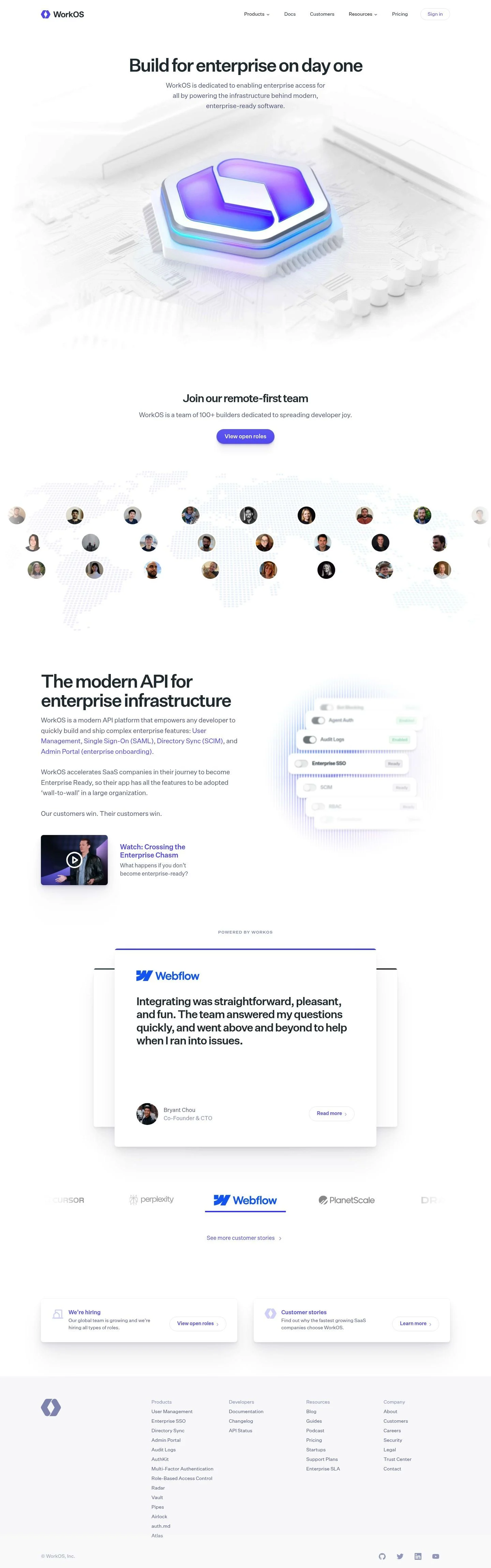
A developer-first brand aimed at SaaS teams integrating enterprise auth and user management. The interface should feel calm, reliable, and fast to scan. Density is medium: generous whitespace at the section level with compact cards for detail. Tone is serious and utility-driven rather than promotional; components telegraph status and credibility over decoration.

## Colors

- Primary (#29363d): Inked text for headlines, body, and default icons.
- Secondary (#6464f4): Core accent for links, emphasis, and interactive states.
- Tertiary (#23f0c3): Supporting accent for data highlights or subtle success states; used sparingly.
- Neutral (#ffffff): Base surface for the entire page and cards.
- Border (#e5e7eb): Hairline dividers, card outlines, and table rules on white.
- Brand-shy-moment (#acacf5): Soft lavender for subtle brand flourishes and low-contrast highlights.
- Surface ({colors.neutral} → #ffffff): Canonical surface color for pages and panels.
- On-surface ({colors.primary} → #29363d): Default text/icon color on white surfaces.

## Typography

All type uses Untitled Sans with a functional grotesk voice. It is self-hosted (custom) and not guaranteed for agents to load. Substitute with Inter (Google), Work Sans (Google), or IBM Plex Sans (Google) for similar x-height and tone.
- Headline-lg: 52px / 1.07, weight 500, letter-spacing -0.05em. Use for hero H1s.
- Headline-md: 40px / 1.2, weight 500, -0.04em for section headers.
- Headline-sm: 31px / 1.19, weight 500 for sub-sections.
- Headline-xs: 24px / 1.0, weight 500 for card titles and footers.
- Body-md: 19px / 1.6, weight 400, -0.01em for long-form copy and UI descriptions.

## Layout

Spacing tokens encourage roomy sections with compact internals. Use xl (56px) for section paddings, lg (32px) for intra-section gaps, and md (20px) for component gutters. sm (12px) manages tight clusters and label stacks; xs (2px) handles micro-alignment and badge offsets. Cards use a fixed 16px internal padding for a denser feel on white. A simple centered content column with responsive breakpoints works well; align text blocks to a consistent baseline and let the hero image bleed within the white surface.

## Elevation & Depth

Hierarchy is conveyed with subtle shadows and hairline borders on white. Use shadow-sm for cards on white to lift slightly; md and lg suit modals or spotlighted panels. xl is "none" for flat areas. When stacking many white surfaces, prefer Border (#e5e7eb) dividers over heavy shadows. Inner shadow is reserved for toggles or embossed UI where depth aids affordance.

## Shapes

Two radii define the language: sm (8px) for cards and panels, and full (9999px) for pill actions and badges. Reserve full for interactive elements to signal clickability. Keep imagery and large containers at 8px to maintain a consistent, enterprise tone.

## Components

Buttons and Cards (tokenized):
- Button-primary: Text color #6363f1, pill radius (9999px), 43px height, padding 9.5px 20px. Typically presented as a high-emphasis link/pill on white.
- Button-secondary: Same metrics as primary with text color #6363f1; use for peer CTAs.
- Button-link: Text color #6363f1, no radius, inline usage.
- Card: White background, text #29363d, 8px radius, 16px padding; pair with shadow-sm or a #e5e7eb border.

### Top Navigation Bar
Centered navigation with logo left, product/resources menus, and a pill "Sign in." Use body-md (19px) links in #29363d; primary actions use the Button-secondary spec.

### Hero with 3D Brandmark
H1 in headline-lg (52px/500/-0.05em) and a concise subcopy in body-md. Keep the canvas #ffffff with ample top/bottom xl (56px) spacing; no hard container around the image.

### Capability Status Grid
A multi-tile grid listing features (e.g., Enterprise SSO, SCIM) each showing "Ready" and "Enabled." Use Card spec with 8px corners, #e5e7eb dividers, and small badges using full radius.

### Video Callout
Inline media link "Watch: Crossing the Enterprise Chasm." Style as Button-link in #6363f1 with an optional play icon and md (20px) spacing above/below.

### Testimonial Cards Stack
Quote blocks with author name and role, each ending with a "Read more" link in #6363f1. Use Card with shadow-sm and lg (32px) vertical rhythm between entries.

### Dual CTA Row
Two compact panels: Careers and Customer Stories. Each uses headline-xs (24px) for titles, card padding 16px, and Button-primary for the action.

### Footer Site Map
Multi-column link lists. Section headings use headline-xs (24px), links in body-md (19px), top border #e5e7eb, and xl (56px) vertical padding.

### Cookie Consent Banner
Low-profile bar with body-md copy, two pills (Accept / Reject) using Button-primary metrics and contrasting #29363d text on #ffffff.

## Do's and Don'ts

- Do use headline-lg at 52px/500 with negative tracking for hero headings; avoid heavier weights.
- Do keep surfaces white (#ffffff) and separate regions with #e5e7eb borders or shadow-sm only.
- Do reserve full (9999px) radius for interactive pills and badges; keep containers at 8px.
- Don't introduce filled brand buttons on dark backgrounds; this system favors indigo text pills (#6363f1) on white.
- Don't mix multiple accent colors in a single section; Secondary (#6464f4) is the primary accent and Tertiary (#23f0c3) is rare.
- Don't exceed body-md (19px) for UI copy; larger sizes are for headings only.

## Agent Prompt Guide

Quick color reference — Text: #29363d; Background: #ffffff; Border: #e5e7eb; Accent: #6464f4 (buttons often use #6363f1 for text).

1) Build a hero band
- Container: centered, max-width comfortable for copy; background #ffffff; padding top/bottom 56px.
- H1: font-family "Untitled Sans", fallback "Inter", size 52px, weight 500, line-height 1.07, letter-spacing -0.05em; color #29363d.
- Subcopy: 19px/1.6, weight 400, letter-spacing -0.01em; color #29363d; margin-top 12px.
- Optional action: pill link with color #6363f1; height 43px; padding 9.5px 20px; border-radius 9999px.

2) Create a capability status grid (6 tiles)
- Grid gap 32px; tile uses: background #ffffff; border 1px solid #e5e7eb; radius 8px; padding 16px; shadow "rgba(0,0,0,0.04) 0 0 0 1px, rgba(0,0,0,0.17) 0 5px 10px -4px".
- Title: 24px, weight 500, color #29363d.
- Badges: 12px text, background transparent, border 1px #e5e7eb, radius 9999px, text color #29363d; spacing 12px.

3) Testimonial card
- Card: background #ffffff; radius 8px; padding 16px; border 1px solid #e5e7eb; shadow as above (sm optional).
- Quote: body 19px/1.6; color #29363d; author line in 19px/500.
- Link: "Read more" styled as Button-link, color #6363f1.

4) Footer section
- Wrapper border-top 1px solid #e5e7eb; padding 56px 0; background #ffffff.
- Column headers: 24px/500, color #29363d.
- Links: 19px/400, color #29363d; hover color #6464f4; spacing 12px between items.

## Similar Brands

- Auth0: Also identity for developers; more color and gradient usage, while WorkOS stays whiter and relies on indigo links and pills.
- Okta: Enterprise identity with dense navigation; Okta uses heavier blues and filled CTAs compared to WorkOS's link-forward style.
- Clerk: Developer-focused auth with minimal surfaces; Clerk leans bolder on gradients, WorkOS is more restrained.
- Stripe: Similar typographic rigor and white space discipline; Stripe employs more motion and gradient accents.
- Vercel: Developer tooling with monochrome surfaces; Vercel is darker and high-contrast, WorkOS is lighter and indigo-accented.

## Tokens

### CSS custom properties

```css
:root {
  /* Colors */
  --color-primary: #29363d;
  --color-secondary: #6464f4;
  --color-tertiary: #23f0c3;
  --color-neutral: #ffffff;
  --color-border: #e5e7eb;
  --color-brand-shy-moment: #acacf5;
  --color-surface: var(--color-neutral);
  --color-on-surface: var(--color-primary);

  /* Typography */
  --text-headline-lg-size: 52px;
  --text-headline-lg-weight: 500;
  --text-headline-lg-leading: 1.07;
  --text-headline-lg-tracking: -0.05em;
  --text-headline-md-size: 40px;
  --text-headline-md-weight: 500;
  --text-headline-md-leading: 1.2;
  --text-headline-md-tracking: -0.04em;
  --text-headline-sm-size: 31px;
  --text-headline-sm-weight: 500;
  --text-headline-sm-leading: 1.19;
  --text-headline-xs-size: 24px;
  --text-headline-xs-weight: 500;
  --text-headline-xs-leading: 1;
  --text-headline-xs-tracking: -0.008em;
  --text-body-md-size: 19px;
  --text-body-md-weight: 400;
  --text-body-md-leading: 1.6;
  --text-body-md-tracking: -0.01em;
  --font-untitled-sans: "Untitled Sans";

  /* Rounded */
  --radius-sm: 8px;
  --radius-full: 9999px;

  /* Spacing */
  --spacing-xs: 2px;
  --spacing-sm: 12px;
  --spacing-md: 20px;
  --spacing-lg: 32px;
  --spacing-xl: 56px;

  /* Components */
  --button-primary-text-color: #6363f1;
  --button-primary-rounded: var(--radius-full);
  --button-primary-padding: 9.5px 20px;
  --button-primary-height: 43px;
  --button-secondary-text-color: #6363f1;
  --button-secondary-rounded: var(--radius-full);
  --button-secondary-padding: 9.5px 20px;
  --button-secondary-height: 43px;
  --button-link-text-color: #6363f1;
  --button-link-rounded: 0px;
  --card-background-color: var(--color-neutral);
  --card-text-color: var(--color-primary);
  --card-rounded: var(--radius-sm);
  --card-padding: 16px;
}
```

### Tailwind theme

```css
@theme {
  --color-primary: #29363d;
  --color-secondary: #6464f4;
  --color-tertiary: #23f0c3;
  --color-neutral: #ffffff;
  --color-border: #e5e7eb;
  --color-brand-shy-moment: #acacf5;
  --color-surface: #ffffff;
  --color-on-surface: #29363d;
  --font-headline-lg: "Untitled Sans";
  --font-headline-md: "Untitled Sans";
  --font-headline-sm: "Untitled Sans";
  --font-headline-xs: "Untitled Sans";
  --font-body-md: "Untitled Sans";
  --text-headline-lg: 52px;
  --text-headline-md: 40px;
  --text-headline-sm: 31px;
  --text-headline-xs: 24px;
  --text-body-md: 19px;
  --tracking-headline-lg: -0.05em;
  --tracking-headline-md: -0.04em;
  --tracking-headline-xs: -0.008em;
  --tracking-body-md: -0.01em;
  --font-weight-headline-lg: 500;
  --font-weight-headline-md: 500;
  --font-weight-headline-sm: 500;
  --font-weight-headline-xs: 500;
  --font-weight-body-md: 400;
  --radius-sm: 8px;
  --radius-full: 9999px;
  --spacing-xs: 2px;
  --spacing-sm: 12px;
  --spacing-md: 20px;
  --spacing-lg: 32px;
  --spacing-xl: 56px;
}
```

### Design tokens (DTCG)

```json
{
    "$schema": "https://www.designtokens.org/schemas/2025.10/format.json",
    "color": {
        "$type": "color",
        "primary": {
            "$value": {
                "colorSpace": "srgb",
                "components": [
                    0.161,
                    0.212,
                    0.239
                ],
                "hex": "#29363d"
            }
        },
        "secondary": {
            "$value": {
                "colorSpace": "srgb",
                "components": [
                    0.392,
                    0.392,
                    0.957
                ],
                "hex": "#6464f4"
            }
        },
        "tertiary": {
            "$value": {
                "colorSpace": "srgb",
                "components": [
                    0.137,
                    0.941,
                    0.765
                ],
                "hex": "#23f0c3"
            }
        },
        "neutral": {
            "$value": {
                "colorSpace": "srgb",
                "components": [
                    1,
                    1,
                    1
                ],
                "hex": "#ffffff"
            }
        },
        "border": {
            "$value": {
                "colorSpace": "srgb",
                "components": [
                    0.898,
                    0.906,
                    0.922
                ],
                "hex": "#e5e7eb"
            }
        },
        "brand-shy-moment": {
            "$value": {
                "colorSpace": "srgb",
                "components": [
                    0.675,
                    0.675,
                    0.961
                ],
                "hex": "#acacf5"
            }
        },
        "surface": {
            "$value": {
                "colorSpace": "srgb",
                "components": [
                    1,
                    1,
                    1
                ],
                "hex": "#ffffff"
            }
        },
        "on-surface": {
            "$value": {
                "colorSpace": "srgb",
                "components": [
                    0.161,
                    0.212,
                    0.239
                ],
                "hex": "#29363d"
            }
        }
    },
    "spacing": {
        "$type": "dimension",
        "xs": {
            "$value": {
                "value": 2,
                "unit": "px"
            }
        },
        "sm": {
            "$value": {
                "value": 12,
                "unit": "px"
            }
        },
        "md": {
            "$value": {
                "value": 20,
                "unit": "px"
            }
        },
        "lg": {
            "$value": {
                "value": 32,
                "unit": "px"
            }
        },
        "xl": {
            "$value": {
                "value": 56,
                "unit": "px"
            }
        }
    },
    "rounded": {
        "$type": "dimension",
        "sm": {
            "$value": {
                "value": 8,
                "unit": "px"
            }
        },
        "full": {
            "$value": {
                "value": 9999,
                "unit": "px"
            }
        }
    },
    "typography": {
        "headline-lg": {
            "$type": "typography",
            "$value": {
                "fontFamily": "Untitled Sans",
                "fontSize": {
                    "value": 52,
                    "unit": "px"
                },
                "fontWeight": 500,
                "letterSpacing": {
                    "value": -0.05,
                    "unit": "em"
                }
            }
        },
        "headline-md": {
            "$type": "typography",
            "$value": {
                "fontFamily": "Untitled Sans",
                "fontSize": {
                    "value": 40,
                    "unit": "px"
                },
                "fontWeight": 500,
                "letterSpacing": {
                    "value": -0.04,
                    "unit": "em"
                }
            }
        },
        "headline-sm": {
            "$type": "typography",
            "$value": {
                "fontFamily": "Untitled Sans",
                "fontSize": {
                    "value": 31,
                    "unit": "px"
                },
                "fontWeight": 500
            }
        },
        "headline-xs": {
            "$type": "typography",
            "$value": {
                "fontFamily": "Untitled Sans",
                "fontSize": {
                    "value": 24,
                    "unit": "px"
                },
                "fontWeight": 500,
                "letterSpacing": {
                    "value": -0.008,
                    "unit": "em"
                }
            }
        },
        "body-md": {
            "$type": "typography",
            "$value": {
                "fontFamily": "Untitled Sans",
                "fontSize": {
                    "value": 19,
                    "unit": "px"
                },
                "fontWeight": 400,
                "letterSpacing": {
                    "value": -0.01,
                    "unit": "em"
                }
            }
        }
    }
}
```

## Rules

- **Fonts.** If the specification names a custom or self-hosted family, use one of the substitutes it names. Never reference a typeface you cannot actually load — it will fall back to a system font and undo the typography.
- **Colour.** Derive the palette from the user's brand. Use the token values as a guide to *relationships* — contrast, tint, how many accents carry the page — not as hex codes to paste.
- **Never reproduce** the wordmark, mascot, logo, brand name, illustrations, icon set, screenshots or any copy from the reference.
- **Never present the result as WorkOS About**, or imply any connection to it.
- If something is unspecified, choose clarity and legibility over decoration.
---
version: alpha
name: WorkOS
description: Your app, Enterprise Ready — ship SSO in minutes, not months
colors:
  primary: "#29363d"
  secondary: "#6464f4"
  tertiary: "#23f0c3"
  neutral: "#ffffff"
  border: "#e5e7eb"
  brand-shy-moment: "#acacf5"
  surface: "{colors.neutral}"
  on-surface: "{colors.primary}"
typography:
  headline-lg:
    fontFamily: Untitled Sans
    fontSize: 52px
    fontWeight: 500
    lineHeight: 1.07
    letterSpacing: -0.05em
  headline-md:
    fontFamily: Untitled Sans
    fontSize: 40px
    fontWeight: 500
    lineHeight: 1.2
    letterSpacing: -0.04em
  headline-sm:
    fontFamily: Untitled Sans
    fontSize: 31px
    fontWeight: 500
    lineHeight: 1.19
  headline-xs:
    fontFamily: Untitled Sans
    fontSize: 24px
    fontWeight: 500
    lineHeight: 1
    letterSpacing: -0.008em
  body-md:
    fontFamily: Untitled Sans
    fontSize: 19px
    fontWeight: 400
    lineHeight: 1.6
    letterSpacing: -0.01em
rounded:
  sm: 8px
  full: 9999px
spacing:
  xs: 2px
  sm: 12px
  md: 20px
  lg: 32px
  xl: 56px
components:
  button-primary:
    textColor: "#6363f1"
    rounded: "{rounded.full}"
    padding: 9.5px 20px
    height: 43px
  button-secondary:
    textColor: "#6363f1"
    rounded: "{rounded.full}"
    padding: 9.5px 20px
    height: 43px
  button-link:
    textColor: "#6363f1"
    rounded: 0px
  card:
    backgroundColor: "{colors.neutral}"
    textColor: "{colors.primary}"
    rounded: "{rounded.sm}"
    padding: 16px
---

# WorkOS: Indigo Pills, Tight Sans, and a 3D Hero

## Overview

A developer-first brand aimed at SaaS teams integrating enterprise auth and user management. The interface should feel calm, reliable, and fast to scan. Density is medium: generous whitespace at the section level with compact cards for detail. Tone is serious and utility-driven rather than promotional; components telegraph status and credibility over decoration.

## Colors

- Primary (#29363d): Inked text for headlines, body, and default icons.
- Secondary (#6464f4): Core accent for links, emphasis, and interactive states.
- Tertiary (#23f0c3): Supporting accent for data highlights or subtle success states; used sparingly.
- Neutral (#ffffff): Base surface for the entire page and cards.
- Border (#e5e7eb): Hairline dividers, card outlines, and table rules on white.
- Brand-shy-moment (#acacf5): Soft lavender for subtle brand flourishes and low-contrast highlights.
- Surface ({colors.neutral} → #ffffff): Canonical surface color for pages and panels.
- On-surface ({colors.primary} → #29363d): Default text/icon color on white surfaces.

## Typography

All type uses Untitled Sans with a functional grotesk voice. It is self-hosted (custom) and not guaranteed for agents to load. Substitute with Inter (Google), Work Sans (Google), or IBM Plex Sans (Google) for similar x-height and tone.
- Headline-lg: 52px / 1.07, weight 500, letter-spacing -0.05em. Use for hero H1s.
- Headline-md: 40px / 1.2, weight 500, -0.04em for section headers.
- Headline-sm: 31px / 1.19, weight 500 for sub-sections.
- Headline-xs: 24px / 1.0, weight 500 for card titles and footers.
- Body-md: 19px / 1.6, weight 400, -0.01em for long-form copy and UI descriptions.

## Layout

Spacing tokens encourage roomy sections with compact internals. Use xl (56px) for section paddings, lg (32px) for intra-section gaps, and md (20px) for component gutters. sm (12px) manages tight clusters and label stacks; xs (2px) handles micro-alignment and badge offsets. Cards use a fixed 16px internal padding for a denser feel on white. A simple centered content column with responsive breakpoints works well; align text blocks to a consistent baseline and let the hero image bleed within the white surface.

## Elevation & Depth

Hierarchy is conveyed with subtle shadows and hairline borders on white. Use shadow-sm for cards on white to lift slightly; md and lg suit modals or spotlighted panels. xl is "none" for flat areas. When stacking many white surfaces, prefer Border (#e5e7eb) dividers over heavy shadows. Inner shadow is reserved for toggles or embossed UI where depth aids affordance.

## Shapes

Two radii define the language: sm (8px) for cards and panels, and full (9999px) for pill actions and badges. Reserve full for interactive elements to signal clickability. Keep imagery and large containers at 8px to maintain a consistent, enterprise tone.

## Components

Buttons and Cards (tokenized):
- Button-primary: Text color #6363f1, pill radius (9999px), 43px height, padding 9.5px 20px. Typically presented as a high-emphasis link/pill on white.
- Button-secondary: Same metrics as primary with text color #6363f1; use for peer CTAs.
- Button-link: Text color #6363f1, no radius, inline usage.
- Card: White background, text #29363d, 8px radius, 16px padding; pair with shadow-sm or a #e5e7eb border.

### Top Navigation Bar
Centered navigation with logo left, product/resources menus, and a pill "Sign in." Use body-md (19px) links in #29363d; primary actions use the Button-secondary spec.

### Hero with 3D Brandmark
H1 in headline-lg (52px/500/-0.05em) and a concise subcopy in body-md. Keep the canvas #ffffff with ample top/bottom xl (56px) spacing; no hard container around the image.

### Capability Status Grid
A multi-tile grid listing features (e.g., Enterprise SSO, SCIM) each showing "Ready" and "Enabled." Use Card spec with 8px corners, #e5e7eb dividers, and small badges using full radius.

### Video Callout
Inline media link "Watch: Crossing the Enterprise Chasm." Style as Button-link in #6363f1 with an optional play icon and md (20px) spacing above/below.

### Testimonial Cards Stack
Quote blocks with author name and role, each ending with a "Read more" link in #6363f1. Use Card with shadow-sm and lg (32px) vertical rhythm between entries.

### Dual CTA Row
Two compact panels: Careers and Customer Stories. Each uses headline-xs (24px) for titles, card padding 16px, and Button-primary for the action.

### Footer Site Map
Multi-column link lists. Section headings use headline-xs (24px), links in body-md (19px), top border #e5e7eb, and xl (56px) vertical padding.

### Cookie Consent Banner
Low-profile bar with body-md copy, two pills (Accept / Reject) using Button-primary metrics and contrasting #29363d text on #ffffff.

## Do's and Don'ts

- Do use headline-lg at 52px/500 with negative tracking for hero headings; avoid heavier weights.
- Do keep surfaces white (#ffffff) and separate regions with #e5e7eb borders or shadow-sm only.
- Do reserve full (9999px) radius for interactive pills and badges; keep containers at 8px.
- Don't introduce filled brand buttons on dark backgrounds; this system favors indigo text pills (#6363f1) on white.
- Don't mix multiple accent colors in a single section; Secondary (#6464f4) is the primary accent and Tertiary (#23f0c3) is rare.
- Don't exceed body-md (19px) for UI copy; larger sizes are for headings only.

## Agent Prompt Guide

Quick color reference — Text: #29363d; Background: #ffffff; Border: #e5e7eb; Accent: #6464f4 (buttons often use #6363f1 for text).

1) Build a hero band
- Container: centered, max-width comfortable for copy; background #ffffff; padding top/bottom 56px.
- H1: font-family "Untitled Sans", fallback "Inter", size 52px, weight 500, line-height 1.07, letter-spacing -0.05em; color #29363d.
- Subcopy: 19px/1.6, weight 400, letter-spacing -0.01em; color #29363d; margin-top 12px.
- Optional action: pill link with color #6363f1; height 43px; padding 9.5px 20px; border-radius 9999px.

2) Create a capability status grid (6 tiles)
- Grid gap 32px; tile uses: background #ffffff; border 1px solid #e5e7eb; radius 8px; padding 16px; shadow "rgba(0,0,0,0.04) 0 0 0 1px, rgba(0,0,0,0.17) 0 5px 10px -4px".
- Title: 24px, weight 500, color #29363d.
- Badges: 12px text, background transparent, border 1px #e5e7eb, radius 9999px, text color #29363d; spacing 12px.

3) Testimonial card
- Card: background #ffffff; radius 8px; padding 16px; border 1px solid #e5e7eb; shadow as above (sm optional).
- Quote: body 19px/1.6; color #29363d; author line in 19px/500.
- Link: "Read more" styled as Button-link, color #6363f1.

4) Footer section
- Wrapper border-top 1px solid #e5e7eb; padding 56px 0; background #ffffff.
- Column headers: 24px/500, color #29363d.
- Links: 19px/400, color #29363d; hover color #6464f4; spacing 12px between items.

## Similar Brands

- Auth0: Also identity for developers; more color and gradient usage, while WorkOS stays whiter and relies on indigo links and pills.
- Okta: Enterprise identity with dense navigation; Okta uses heavier blues and filled CTAs compared to WorkOS's link-forward style.
- Clerk: Developer-focused auth with minimal surfaces; Clerk leans bolder on gradients, WorkOS is more restrained.
- Stripe: Similar typographic rigor and white space discipline; Stripe employs more motion and gradient accents.
- Vercel: Developer tooling with monochrome surfaces; Vercel is darker and high-contrast, WorkOS is lighter and indigo-accented.
:root {
  /* Colors */
  --color-primary: #29363d;
  --color-secondary: #6464f4;
  --color-tertiary: #23f0c3;
  --color-neutral: #ffffff;
  --color-border: #e5e7eb;
  --color-brand-shy-moment: #acacf5;
  --color-surface: var(--color-neutral);
  --color-on-surface: var(--color-primary);

  /* Typography */
  --text-headline-lg-size: 52px;
  --text-headline-lg-weight: 500;
  --text-headline-lg-leading: 1.07;
  --text-headline-lg-tracking: -0.05em;
  --text-headline-md-size: 40px;
  --text-headline-md-weight: 500;
  --text-headline-md-leading: 1.2;
  --text-headline-md-tracking: -0.04em;
  --text-headline-sm-size: 31px;
  --text-headline-sm-weight: 500;
  --text-headline-sm-leading: 1.19;
  --text-headline-xs-size: 24px;
  --text-headline-xs-weight: 500;
  --text-headline-xs-leading: 1;
  --text-headline-xs-tracking: -0.008em;
  --text-body-md-size: 19px;
  --text-body-md-weight: 400;
  --text-body-md-leading: 1.6;
  --text-body-md-tracking: -0.01em;
  --font-untitled-sans: "Untitled Sans";

  /* Rounded */
  --radius-sm: 8px;
  --radius-full: 9999px;

  /* Spacing */
  --spacing-xs: 2px;
  --spacing-sm: 12px;
  --spacing-md: 20px;
  --spacing-lg: 32px;
  --spacing-xl: 56px;

  /* Components */
  --button-primary-text-color: #6363f1;
  --button-primary-rounded: var(--radius-full);
  --button-primary-padding: 9.5px 20px;
  --button-primary-height: 43px;
  --button-secondary-text-color: #6363f1;
  --button-secondary-rounded: var(--radius-full);
  --button-secondary-padding: 9.5px 20px;
  --button-secondary-height: 43px;
  --button-link-text-color: #6363f1;
  --button-link-rounded: 0px;
  --card-background-color: var(--color-neutral);
  --card-text-color: var(--color-primary);
  --card-rounded: var(--radius-sm);
  --card-padding: 16px;
}
{
  "$schema": "https://www.designtokens.org/schemas/2025.10/format.json",
  "$description": "Your app, Enterprise Ready — ship SSO in minutes, not months",
  "color": {
    "$type": "color",
    "primary": {
      "$value": {
        "colorSpace": "srgb",
        "components": [
          0.161,
          0.212,
          0.239
        ],
        "hex": "#29363d"
      }
    },
    "secondary": {
      "$value": {
        "colorSpace": "srgb",
        "components": [
          0.392,
          0.392,
          0.957
        ],
        "hex": "#6464f4"
      }
    },
    "tertiary": {
      "$value": {
        "colorSpace": "srgb",
        "components": [
          0.137,
          0.941,
          0.765
        ],
        "hex": "#23f0c3"
      }
    },
    "neutral": {
      "$value": {
        "colorSpace": "srgb",
        "components": [
          1,
          1,
          1
        ],
        "hex": "#ffffff"
      }
    },
    "border": {
      "$value": {
        "colorSpace": "srgb",
        "components": [
          0.898,
          0.906,
          0.922
        ],
        "hex": "#e5e7eb"
      }
    },
    "brand-shy-moment": {
      "$value": {
        "colorSpace": "srgb",
        "components": [
          0.675,
          0.675,
          0.961
        ],
        "hex": "#acacf5"
      }
    },
    "surface": {
      "$value": {
        "colorSpace": "srgb",
        "components": [
          1,
          1,
          1
        ],
        "hex": "#ffffff"
      }
    },
    "on-surface": {
      "$value": {
        "colorSpace": "srgb",
        "components": [
          0.161,
          0.212,
          0.239
        ],
        "hex": "#29363d"
      }
    }
  },
  "spacing": {
    "$type": "dimension",
    "xs": {
      "$value": {
        "value": 2,
        "unit": "px"
      }
    },
    "sm": {
      "$value": {
        "value": 12,
        "unit": "px"
      }
    },
    "md": {
      "$value": {
        "value": 20,
        "unit": "px"
      }
    },
    "lg": {
      "$value": {
        "value": 32,
        "unit": "px"
      }
    },
    "xl": {
      "$value": {
        "value": 56,
        "unit": "px"
      }
    }
  },
  "rounded": {
    "$type": "dimension",
    "sm": {
      "$value": {
        "value": 8,
        "unit": "px"
      }
    },
    "full": {
      "$value": {
        "value": 9999,
        "unit": "px"
      }
    }
  },
  "typography": {
    "headline-lg": {
      "$type": "typography",
      "$value": {
        "fontFamily": "Untitled Sans",
        "fontSize": {
          "value": 52,
          "unit": "px"
        },
        "fontWeight": 500,
        "letterSpacing": {
          "value": -0.05,
          "unit": "em"
        }
      }
    },
    "headline-md": {
      "$type": "typography",
      "$value": {
        "fontFamily": "Untitled Sans",
        "fontSize": {
          "value": 40,
          "unit": "px"
        },
        "fontWeight": 500,
        "letterSpacing": {
          "value": -0.04,
          "unit": "em"
        }
      }
    },
    "headline-sm": {
      "$type": "typography",
      "$value": {
        "fontFamily": "Untitled Sans",
        "fontSize": {
          "value": 31,
          "unit": "px"
        },
        "fontWeight": 500
      }
    },
    "headline-xs": {
      "$type": "typography",
      "$value": {
        "fontFamily": "Untitled Sans",
        "fontSize": {
          "value": 24,
          "unit": "px"
        },
        "fontWeight": 500,
        "letterSpacing": {
          "value": -0.008,
          "unit": "em"
        }
      }
    },
    "body-md": {
      "$type": "typography",
      "$value": {
        "fontFamily": "Untitled Sans",
        "fontSize": {
          "value": 19,
          "unit": "px"
        },
        "fontWeight": 400,
        "letterSpacing": {
          "value": -0.01,
          "unit": "em"
        }
      }
    }
  }
}
@theme {
--color-primary: #29363d;
--color-secondary: #6464f4;
--color-tertiary: #23f0c3;
--color-neutral: #ffffff;
--color-border: #e5e7eb;
--color-brand-shy-moment: #acacf5;
--color-surface: #ffffff;
--color-on-surface: #29363d;
--font-headline-lg: "Untitled Sans";
--font-headline-md: "Untitled Sans";
--font-headline-sm: "Untitled Sans";
--font-headline-xs: "Untitled Sans";
--font-body-md: "Untitled Sans";
--text-headline-lg: 52px;
--text-headline-md: 40px;
--text-headline-sm: 31px;
--text-headline-xs: 24px;
--text-body-md: 19px;
--tracking-headline-lg: -0.05em;
--tracking-headline-md: -0.04em;
--tracking-headline-xs: -0.008em;
--tracking-body-md: -0.01em;
--font-weight-headline-lg: 500;
--font-weight-headline-md: 500;
--font-weight-headline-sm: 500;
--font-weight-headline-xs: 500;
--font-weight-body-md: 400;
--radius-sm: 8px;
--radius-full: 9999px;
--spacing-xs: 2px;
--spacing-sm: 12px;
--spacing-md: 20px;
--spacing-lg: 32px;
--spacing-xl: 56px;
} # Design brief: the WorkOS About design language
Below is a complete design specification measured from a real, published web page. Use it as a design language for the user's product. It is not a page to reproduce.
## Reference images
- Full page: https://cdn.designmunk.com/2026/09/10142639/workos-com-about-featured.webp
- Above the fold: https://cdn.designmunk.com/2026/09/10142639/workos-com-about-featured.webp
- On DesignMunk: https://designmunk.com/workos-about-page/
Study these for hierarchy, rhythm, spacing and density. Where an image and the written spec disagree, the spec wins: the tokens were read from the page's own CSS, the images are one rendering of it.
## Before you start
Ask the user what they are building, who it is for, and what brand assets they already have — name, colours, typefaces. Wait for their answers before writing anything. Everything below is then applied to their product, not to the reference.
## Design specification
# WorkOS: Indigo Pills, Tight Sans, and a 3D Hero
## Overview
A developer-first brand aimed at SaaS teams integrating enterprise auth and user management. The interface should feel calm, reliable, and fast to scan. Density is medium: generous whitespace at the section level with compact cards for detail. Tone is serious and utility-driven rather than promotional; components telegraph status and credibility over decoration.
## Colors
- Primary (#29363d): Inked text for headlines, body, and default icons.
- Secondary (#6464f4): Core accent for links, emphasis, and interactive states.
- Tertiary (#23f0c3): Supporting accent for data highlights or subtle success states; used sparingly.
- Neutral (#ffffff): Base surface for the entire page and cards.
- Border (#e5e7eb): Hairline dividers, card outlines, and table rules on white.
- Brand-shy-moment (#acacf5): Soft lavender for subtle brand flourishes and low-contrast highlights.
- Surface ({colors.neutral} → #ffffff): Canonical surface color for pages and panels.
- On-surface ({colors.primary} → #29363d): Default text/icon color on white surfaces.
## Typography
All type uses Untitled Sans with a functional grotesk voice. It is self-hosted (custom) and not guaranteed for agents to load. Substitute with Inter (Google), Work Sans (Google), or IBM Plex Sans (Google) for similar x-height and tone.
- Headline-lg: 52px / 1.07, weight 500, letter-spacing -0.05em. Use for hero H1s.
- Headline-md: 40px / 1.2, weight 500, -0.04em for section headers.
- Headline-sm: 31px / 1.19, weight 500 for sub-sections.
- Headline-xs: 24px / 1.0, weight 500 for card titles and footers.
- Body-md: 19px / 1.6, weight 400, -0.01em for long-form copy and UI descriptions.
## Layout
Spacing tokens encourage roomy sections with compact internals. Use xl (56px) for section paddings, lg (32px) for intra-section gaps, and md (20px) for component gutters. sm (12px) manages tight clusters and label stacks; xs (2px) handles micro-alignment and badge offsets. Cards use a fixed 16px internal padding for a denser feel on white. A simple centered content column with responsive breakpoints works well; align text blocks to a consistent baseline and let the hero image bleed within the white surface.
## Elevation & Depth
Hierarchy is conveyed with subtle shadows and hairline borders on white. Use shadow-sm for cards on white to lift slightly; md and lg suit modals or spotlighted panels. xl is "none" for flat areas. When stacking many white surfaces, prefer Border (#e5e7eb) dividers over heavy shadows. Inner shadow is reserved for toggles or embossed UI where depth aids affordance.
## Shapes
Two radii define the language: sm (8px) for cards and panels, and full (9999px) for pill actions and badges. Reserve full for interactive elements to signal clickability. Keep imagery and large containers at 8px to maintain a consistent, enterprise tone.
## Components
Buttons and Cards (tokenized):
- Button-primary: Text color #6363f1, pill radius (9999px), 43px height, padding 9.5px 20px. Typically presented as a high-emphasis link/pill on white.
- Button-secondary: Same metrics as primary with text color #6363f1; use for peer CTAs.
- Button-link: Text color #6363f1, no radius, inline usage.
- Card: White background, text #29363d, 8px radius, 16px padding; pair with shadow-sm or a #e5e7eb border.
### Top Navigation Bar
Centered navigation with logo left, product/resources menus, and a pill "Sign in." Use body-md (19px) links in #29363d; primary actions use the Button-secondary spec.
### Hero with 3D Brandmark
H1 in headline-lg (52px/500/-0.05em) and a concise subcopy in body-md. Keep the canvas #ffffff with ample top/bottom xl (56px) spacing; no hard container around the image.
### Capability Status Grid
A multi-tile grid listing features (e.g., Enterprise SSO, SCIM) each showing "Ready" and "Enabled." Use Card spec with 8px corners, #e5e7eb dividers, and small badges using full radius.
### Video Callout
Inline media link "Watch: Crossing the Enterprise Chasm." Style as Button-link in #6363f1 with an optional play icon and md (20px) spacing above/below.
### Testimonial Cards Stack
Quote blocks with author name and role, each ending with a "Read more" link in #6363f1. Use Card with shadow-sm and lg (32px) vertical rhythm between entries.
### Dual CTA Row
Two compact panels: Careers and Customer Stories. Each uses headline-xs (24px) for titles, card padding 16px, and Button-primary for the action.
### Footer Site Map
Multi-column link lists. Section headings use headline-xs (24px), links in body-md (19px), top border #e5e7eb, and xl (56px) vertical padding.
### Cookie Consent Banner
Low-profile bar with body-md copy, two pills (Accept / Reject) using Button-primary metrics and contrasting #29363d text on #ffffff.
## Do's and Don'ts
- Do use headline-lg at 52px/500 with negative tracking for hero headings; avoid heavier weights.
- Do keep surfaces white (#ffffff) and separate regions with #e5e7eb borders or shadow-sm only.
- Do reserve full (9999px) radius for interactive pills and badges; keep containers at 8px.
- Don't introduce filled brand buttons on dark backgrounds; this system favors indigo text pills (#6363f1) on white.
- Don't mix multiple accent colors in a single section; Secondary (#6464f4) is the primary accent and Tertiary (#23f0c3) is rare.
- Don't exceed body-md (19px) for UI copy; larger sizes are for headings only.
## Agent Prompt Guide
Quick color reference — Text: #29363d; Background: #ffffff; Border: #e5e7eb; Accent: #6464f4 (buttons often use #6363f1 for text).
1) Build a hero band
- Container: centered, max-width comfortable for copy; background #ffffff; padding top/bottom 56px.
- H1: font-family "Untitled Sans", fallback "Inter", size 52px, weight 500, line-height 1.07, letter-spacing -0.05em; color #29363d.
- Subcopy: 19px/1.6, weight 400, letter-spacing -0.01em; color #29363d; margin-top 12px.
- Optional action: pill link with color #6363f1; height 43px; padding 9.5px 20px; border-radius 9999px.
2) Create a capability status grid (6 tiles)
- Grid gap 32px; tile uses: background #ffffff; border 1px solid #e5e7eb; radius 8px; padding 16px; shadow "rgba(0,0,0,0.04) 0 0 0 1px, rgba(0,0,0,0.17) 0 5px 10px -4px".
- Title: 24px, weight 500, color #29363d.
- Badges: 12px text, background transparent, border 1px #e5e7eb, radius 9999px, text color #29363d; spacing 12px.
3) Testimonial card
- Card: background #ffffff; radius 8px; padding 16px; border 1px solid #e5e7eb; shadow as above (sm optional).
- Quote: body 19px/1.6; color #29363d; author line in 19px/500.
- Link: "Read more" styled as Button-link, color #6363f1.
4) Footer section
- Wrapper border-top 1px solid #e5e7eb; padding 56px 0; background #ffffff.
- Column headers: 24px/500, color #29363d.
- Links: 19px/400, color #29363d; hover color #6464f4; spacing 12px between items.
## Tokens
### CSS custom properties
```css
:root {
/* Colors */
--color-primary: #29363d;
--color-secondary: #6464f4;
--color-tertiary: #23f0c3;
--color-neutral: #ffffff;
--color-border: #e5e7eb;
--color-brand-shy-moment: #acacf5;
--color-surface: var(--color-neutral);
--color-on-surface: var(--color-primary);
/* Typography */
--text-headline-lg-size: 52px;
--text-headline-lg-weight: 500;
--text-headline-lg-leading: 1.07;
--text-headline-lg-tracking: -0.05em;
--text-headline-md-size: 40px;
--text-headline-md-weight: 500;
--text-headline-md-leading: 1.2;
--text-headline-md-tracking: -0.04em;
--text-headline-sm-size: 31px;
--text-headline-sm-weight: 500;
--text-headline-sm-leading: 1.19;
--text-headline-xs-size: 24px;
--text-headline-xs-weight: 500;
--text-headline-xs-leading: 1;
--text-headline-xs-tracking: -0.008em;
--text-body-md-size: 19px;
--text-body-md-weight: 400;
--text-body-md-leading: 1.6;
--text-body-md-tracking: -0.01em;
--font-untitled-sans: "Untitled Sans";
/* Rounded */
--radius-sm: 8px;
--radius-full: 9999px;
/* Spacing */
--spacing-xs: 2px;
--spacing-sm: 12px;
--spacing-md: 20px;
--spacing-lg: 32px;
--spacing-xl: 56px;
/* Components */
--button-primary-text-color: #6363f1;
--button-primary-rounded: var(--radius-full);
--button-primary-padding: 9.5px 20px;
--button-primary-height: 43px;
--button-secondary-text-color: #6363f1;
--button-secondary-rounded: var(--radius-full);
--button-secondary-padding: 9.5px 20px;
--button-secondary-height: 43px;
--button-link-text-color: #6363f1;
--button-link-rounded: 0px;
--card-background-color: var(--color-neutral);
--card-text-color: var(--color-primary);
--card-rounded: var(--radius-sm);
--card-padding: 16px;
}
```
## Rules
- **Fonts.** If the specification names a custom or self-hosted family, use one of the substitutes it names. Never reference a typeface you cannot actually load — it will fall back to a system font and undo the typography.
- **Colour.** Derive the palette from the user's brand. Use the token values as a guide to *relationships* — contrast, tint, how many accents carry the page — not as hex codes to paste.
- **Never reproduce** the wordmark, mascot, logo, brand name, illustrations, icon set, screenshots or any copy from the reference.
- **Never present the result as WorkOS About**, or imply any connection to it.
- If something is unspecified, choose clarity and legibility over decoration.