
Work With Island About
workwithisland.com
Réduire le bruit et apporter plus de sérénité en entreprise.
workwithisland.com
AI Breakdown
Design export
# Design brief: the Work With Island About design language

Below is a complete design specification measured from a real, published web page. Use it as a design language for the user's product. It is not a page to reproduce.

## Reference images

- Full page: https://cdn.designmunk.com/2026/09/10152937/workwithisland-com-en-about-us-featured.webp
- Above the fold: https://cdn.designmunk.com/2026/09/10152937/workwithisland-com-en-about-us-featured.webp
- On DesignMunk: https://designmunk.com/work-with-island-about-page/

Study these for hierarchy, rhythm, spacing and density. Where an image and the written spec disagree, the spec wins: the tokens were read from the page's own CSS, the images are one rendering of it.

## Before you start

Ask the user what they are building, who it is for, and what brand assets they already have — name, colours, typefaces. Wait for their answers before writing anything. Everything below is then applied to their product, not to the reference.

## Design specification

# Work With Island: Tilted Photo Triptych and Blue Tiles

## Overview

Industrial-grade product, consumer-simple interface. The tone is confident, factual, and calm—black on white with two blues for emphasis. Spacing is generous and copy is short; components are low-chrome with thin borders and minimal shadow. Use this to create a quiet reading experience that feels trustworthy and efficient rather than flashy or salesy.

## Colors

- **primary (#000000):** Core text, headlines, icons, and high-contrast elements.
- **secondary (#04a4d3):** Light accent for links, subtle highlights, and informational UI.
- **tertiary (#0970ad):** Saturated action and emphasis color for filled CTAs and spotlight tiles.
- **neutral (#ffffff):** Page background and card surfaces.
- **border (#e5e7eb):** Hairline dividers, input outlines, and card delineation.
- **surface ({colors.neutral}):** Alias of white for surfaces.
- **on-surface ({colors.primary}):** Default text color on white backgrounds.

## Typography

Headlines use Helvetica for clarity and authority: lg at 44px/700/1.1 with tight -0.03em tracking for hero statements; md at 28px/700/1.2 for section leads. Small headlines (sm 20px/600 and xs 18px/600) use system-ui for utilitarian labels and subheads. Body copy runs Helvetica 16px/400/1.4 with very light negative tracking for dense but readable paragraphs. Availability: Helvetica is custom/self-hosted and may not be obtainable by agents; use Roboto, Fira Sans, or Ubuntu as close, freely available substitutes. system-ui is built-in and should remain as the fallback stack for UI labels and controls.

## Layout

Spacing follows a compact-inside, generous-outside rhythm. Use sm 16px for control padding and card content; md 24px for gaps within modules; lg 48px for section spacing; and xl 84px for major scene changes (hero to body, or between large bands). Build sections on a simple fluid grid; stack content vertically with 24–48px gaps and keep side gutters roomy to maintain the quiet feel.

## Elevation & Depth

Depth is mostly flat. A single soft shadow is available (sm: rgba(0,0,0,0.08) 0 2px 12px) for floating elements such as dialogs or sticky nav. Everything else relies on thin #e5e7eb borders, white space, and tonal blocks of the tertiary blue to establish hierarchy.

## Shapes

Corners are square by default with two radii: sm 2px for buttons and chips; md 8px for cards, images, and tiles. Use md on media and featured panels to echo product friendliness without feeling bubbly; avoid larger radii that would read playful.

## Components

Buttons
- Primary: Text-first control with textColor #101010, 40px height, 4px 16px padding, 2px radius. Use on white surfaces where minimal emphasis is desired.
- Secondary: Filled action with #0970ad background and white text, 40px height, 4px 16px padding, 2px radius. Use for primary CTAs such as Get a quote.
- Link: Unadorned text action in #000000 with 0px radius; reserve for inline or low-emphasis actions.

Card
- White background (#ffffff), #000000 text, 8px radius, 16px padding, bordered with #e5e7eb when separation is needed.

### Top Bar Navigation
- Dense horizontal bar with logo left, product and docs links center-left, and actions right. Use a secondary filled button (#0970ad) for "Get a quote" and a neutral primary for "Schedule a demo". Button height 40px; gaps 16–24px.

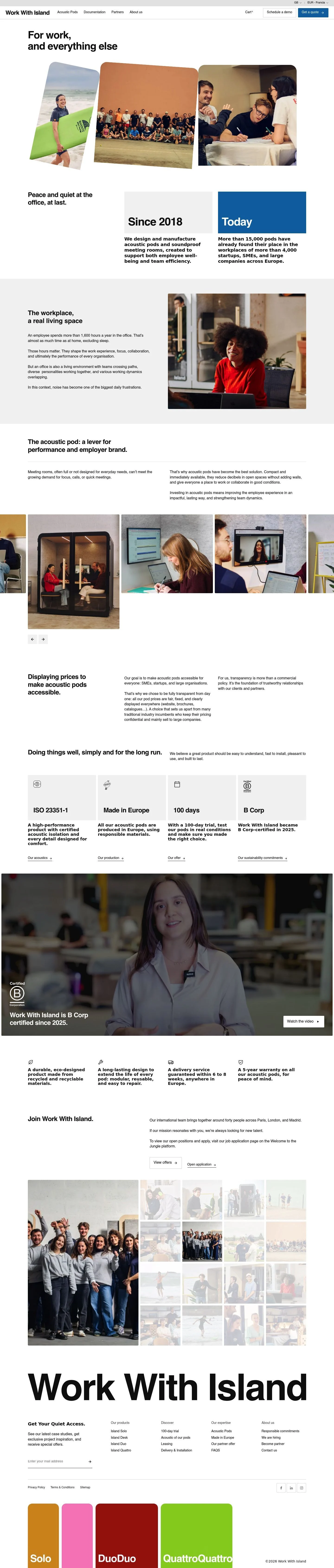
### Hero Photo Triptych
- H1 set in Helvetica 44px/700. Three images arranged side by side with md 8px corners and subtle rotation for energy. Keep 48–84px white margins around the block.

### Milestone Tiles
- Two tiles in a row: neutral card for "Since 2018" and a solid tertiary (#0970ad) card for "Today". Headlines use 28px/700; body in 16px/400. Padding 16px; outer gap 24–48px.

### Proof Pillars
- Four items (ISO standard, Made in Europe, 100 days, B Corp). Each is a card-less block on white with a short bold label (20px/600) and a 16px body line; separate columns using #e5e7eb dividers.

### Localization & Language Drawer
- Modal or panel with stacked country and language pickers. Use system-ui 18–20px labels and #e5e7eb inputs; md 24px gaps; shadow sm for elevation.

### Mini Cart & Basket
- Compact cart status in the header with a lightweight dropdown using the card spec. Keep emphasis on totals with 20px/600 subheads.

### Case Studies Rail
- List of recent case studies as linked cards. Use md 24px internal padding and md 8px corners; apply border #e5e7eb.

### Footer Directory
- Multi-column link directory with 16px rows, 24px column gaps, legal links at the base. Keep icons in #000000 and dividers in #e5e7eb.

## Do's and Don'ts

- Do set hero and section leads with Helvetica 44px and 28px respectively; keep body at 16px for consistency.
- Do reserve #0970ad for primary CTAs and spotlight tiles; use #04a4d3 sparingly for supportive accents or informational links.
- Do separate dense content with #e5e7eb borders rather than heavy shadows.
- Don't round corners beyond 8px; the system aims for crisp, industrial edges.
- Don't introduce new grays for panels; use white surfaces with borders, or the tertiary blue for emphasis.
- Don't stack multiple filled blues in a single viewport; one strong emphasis block per section is the norm.

## Agent Prompt Guide

Quick color reference
- Text: #000000
- Background: #ffffff
- Border: #e5e7eb
- Accent (primary action): #0970ad; Accent (info): #04a4d3

1) Build the hero
- Container on #ffffff with 84px top/bottom padding. H1: "For work, and everything else" in Helvetica (fallback Roboto), 44px, 700, line-height 1.1, letter-spacing -0.03em, color #000000. Below, place three images side-by-side, 8px border-radius, 24px gaps. No primary CTA; keep 48px space before next section.

2) Create milestone tiles
- Two cards in a row with 24px gap. Left card: background #ffffff, 8px radius, 16px padding, 1px border #e5e7eb; headline "Since 2018" in Helvetica 28px/700; body in 16px/400. Right card: background #0970ad, text #ffffff, same radius/padding; headline "Today" in 28px/700.

3) Proof pillars row
- Four columns on white. Each item: label in system-ui 20px/600 #000000, supporting text in Helvetica 16px/400. Separate columns with 1px dividers in #e5e7eb. Section outer padding 48px.

4) Header with actions
- Left logo, center links, right actions spaced 16px. "Schedule a demo": button height 40px, padding 4px 16px, text #101010, 2px radius, white background. "Get a quote": filled button #0970ad with #ffffff text, same sizing.

5) Footer directory
- Multi-column grid on #ffffff. Headings in Helvetica 28px/700, links in 16px/400 #000000. Use 24px column gaps, 16px row gaps, and a top border #e5e7eb.

## Similar Brands

- Framery: Also uses restrained typography and blue accents; Framery leans more on illustration, while Island prefers photography and white space.
- ROOM: Minimal black/white with blue CTAs; ROOM's grid is tighter and uses heavier product renders.
- Hush Office: Product-led pages with proof tiles; Hush employs more gradients and larger shadowed cards than Island's flat approach.
- Zenbooth: Direct, price-forward layouts; typography is less compact, with chunkier buttons than Island's lean 40px controls.

## Tokens

### CSS custom properties

```css
:root {
  /* Colors */
  --color-primary: #000000;
  --color-secondary: #04a4d3;
  --color-tertiary: #0970ad;
  --color-neutral: #ffffff;
  --color-border: #e5e7eb;
  --color-surface: var(--color-neutral);
  --color-on-surface: var(--color-primary);

  /* Typography */
  --text-headline-lg-size: 44px;
  --text-headline-lg-weight: 700;
  --text-headline-lg-leading: 1.1;
  --text-headline-lg-tracking: -0.03em;
  --text-headline-md-size: 28px;
  --text-headline-md-weight: 700;
  --text-headline-md-leading: 1.2;
  --text-headline-md-tracking: -0.029em;
  --text-headline-sm-size: 20px;
  --text-headline-sm-weight: 600;
  --text-headline-sm-leading: 1.2;
  --text-headline-xs-size: 18px;
  --text-headline-xs-weight: 600;
  --text-headline-xs-leading: 1.22;
  --text-body-md-size: 16px;
  --text-body-md-weight: 400;
  --text-body-md-leading: 1.4;
  --text-body-md-tracking: -0.003em;
  --font-helvetica: "Helvetica";
  --font-system-ui: "system-ui";

  /* Rounded */
  --radius-sm: 2px;
  --radius-md: 8px;

  /* Spacing */
  --spacing-xs: 6px;
  --spacing-sm: 16px;
  --spacing-md: 24px;
  --spacing-lg: 48px;
  --spacing-xl: 84px;

  /* Components */
  --button-primary-text-color: #101010;
  --button-primary-rounded: var(--radius-sm);
  --button-primary-padding: 4px 16px;
  --button-primary-height: 40px;
  --button-secondary-background-color: var(--color-tertiary);
  --button-secondary-text-color: var(--color-neutral);
  --button-secondary-rounded: var(--radius-sm);
  --button-secondary-padding: 4px 16px;
  --button-secondary-height: 40px;
  --button-link-text-color: var(--color-primary);
  --button-link-rounded: 0px;
  --card-background-color: var(--color-neutral);
  --card-text-color: var(--color-primary);
  --card-rounded: var(--radius-md);
  --card-padding: 16px;
}
```

### Tailwind theme

```css
@theme {
  --color-primary: #000000;
  --color-secondary: #04a4d3;
  --color-tertiary: #0970ad;
  --color-neutral: #ffffff;
  --color-border: #e5e7eb;
  --color-surface: #ffffff;
  --color-on-surface: #000000;
  --font-headline-lg: "Helvetica";
  --font-headline-md: "Helvetica";
  --font-headline-sm: "system-ui";
  --font-headline-xs: "system-ui";
  --font-body-md: "Helvetica";
  --text-headline-lg: 44px;
  --text-headline-md: 28px;
  --text-headline-sm: 20px;
  --text-headline-xs: 18px;
  --text-body-md: 16px;
  --tracking-headline-lg: -0.03em;
  --tracking-headline-md: -0.029em;
  --tracking-body-md: -0.003em;
  --font-weight-headline-lg: 700;
  --font-weight-headline-md: 700;
  --font-weight-headline-sm: 600;
  --font-weight-headline-xs: 600;
  --font-weight-body-md: 400;
  --radius-sm: 2px;
  --radius-md: 8px;
  --spacing-xs: 6px;
  --spacing-sm: 16px;
  --spacing-md: 24px;
  --spacing-lg: 48px;
  --spacing-xl: 84px;
}
```

### Design tokens (DTCG)

```json
{
    "$schema": "https://www.designtokens.org/schemas/2025.10/format.json",
    "color": {
        "$type": "color",
        "primary": {
            "$value": {
                "colorSpace": "srgb",
                "components": [
                    0,
                    0,
                    0
                ],
                "hex": "#000000"
            }
        },
        "secondary": {
            "$value": {
                "colorSpace": "srgb",
                "components": [
                    0.016,
                    0.643,
                    0.827
                ],
                "hex": "#04a4d3"
            }
        },
        "tertiary": {
            "$value": {
                "colorSpace": "srgb",
                "components": [
                    0.035,
                    0.439,
                    0.678
                ],
                "hex": "#0970ad"
            }
        },
        "neutral": {
            "$value": {
                "colorSpace": "srgb",
                "components": [
                    1,
                    1,
                    1
                ],
                "hex": "#ffffff"
            }
        },
        "border": {
            "$value": {
                "colorSpace": "srgb",
                "components": [
                    0.898,
                    0.906,
                    0.922
                ],
                "hex": "#e5e7eb"
            }
        },
        "surface": {
            "$value": {
                "colorSpace": "srgb",
                "components": [
                    1,
                    1,
                    1
                ],
                "hex": "#ffffff"
            }
        },
        "on-surface": {
            "$value": {
                "colorSpace": "srgb",
                "components": [
                    0,
                    0,
                    0
                ],
                "hex": "#000000"
            }
        }
    },
    "spacing": {
        "$type": "dimension",
        "xs": {
            "$value": {
                "value": 6,
                "unit": "px"
            }
        },
        "sm": {
            "$value": {
                "value": 16,
                "unit": "px"
            }
        },
        "md": {
            "$value": {
                "value": 24,
                "unit": "px"
            }
        },
        "lg": {
            "$value": {
                "value": 48,
                "unit": "px"
            }
        },
        "xl": {
            "$value": {
                "value": 84,
                "unit": "px"
            }
        }
    },
    "rounded": {
        "$type": "dimension",
        "sm": {
            "$value": {
                "value": 2,
                "unit": "px"
            }
        },
        "md": {
            "$value": {
                "value": 8,
                "unit": "px"
            }
        }
    },
    "typography": {
        "headline-lg": {
            "$type": "typography",
            "$value": {
                "fontFamily": "Helvetica",
                "fontSize": {
                    "value": 44,
                    "unit": "px"
                },
                "fontWeight": 700,
                "letterSpacing": {
                    "value": -0.03,
                    "unit": "em"
                }
            }
        },
        "headline-md": {
            "$type": "typography",
            "$value": {
                "fontFamily": "Helvetica",
                "fontSize": {
                    "value": 28,
                    "unit": "px"
                },
                "fontWeight": 700,
                "letterSpacing": {
                    "value": -0.029,
                    "unit": "em"
                }
            }
        },
        "headline-sm": {
            "$type": "typography",
            "$value": {
                "fontFamily": "system-ui",
                "fontSize": {
                    "value": 20,
                    "unit": "px"
                },
                "fontWeight": 600
            }
        },
        "headline-xs": {
            "$type": "typography",
            "$value": {
                "fontFamily": "system-ui",
                "fontSize": {
                    "value": 18,
                    "unit": "px"
                },
                "fontWeight": 600
            }
        },
        "body-md": {
            "$type": "typography",
            "$value": {
                "fontFamily": "Helvetica",
                "fontSize": {
                    "value": 16,
                    "unit": "px"
                },
                "fontWeight": 400,
                "letterSpacing": {
                    "value": -0.003,
                    "unit": "em"
                }
            }
        }
    }
}
```

## Rules

- **Fonts.** If the specification names a custom or self-hosted family, use one of the substitutes it names. Never reference a typeface you cannot actually load — it will fall back to a system font and undo the typography.
- **Colour.** Derive the palette from the user's brand. Use the token values as a guide to *relationships* — contrast, tint, how many accents carry the page — not as hex codes to paste.
- **Never reproduce** the wordmark, mascot, logo, brand name, illustrations, icon set, screenshots or any copy from the reference.
- **Never present the result as Work With Island About**, or imply any connection to it.
- If something is unspecified, choose clarity and legibility over decoration.
---
version: alpha
name: Work With Island
description: Réduire le bruit et apporter plus de sérénité en entreprise.
colors:
  primary: "#000000"
  secondary: "#04a4d3"
  tertiary: "#0970ad"
  neutral: "#ffffff"
  border: "#e5e7eb"
  surface: "{colors.neutral}"
  on-surface: "{colors.primary}"
typography:
  headline-lg:
    fontFamily: Helvetica
    fontSize: 44px
    fontWeight: 700
    lineHeight: 1.1
    letterSpacing: -0.03em
  headline-md:
    fontFamily: Helvetica
    fontSize: 28px
    fontWeight: 700
    lineHeight: 1.2
    letterSpacing: -0.029em
  headline-sm:
    fontFamily: system-ui
    fontSize: 20px
    fontWeight: 600
    lineHeight: 1.2
  headline-xs:
    fontFamily: system-ui
    fontSize: 18px
    fontWeight: 600
    lineHeight: 1.22
  body-md:
    fontFamily: Helvetica
    fontSize: 16px
    fontWeight: 400
    lineHeight: 1.4
    letterSpacing: -0.003em
rounded:
  sm: 2px
  md: 8px
spacing:
  xs: 6px
  sm: 16px
  md: 24px
  lg: 48px
  xl: 84px
components:
  button-primary:
    textColor: "#101010"
    rounded: "{rounded.sm}"
    padding: 4px 16px
    height: 40px
  button-secondary:
    backgroundColor: "{colors.tertiary}"
    textColor: "{colors.neutral}"
    rounded: "{rounded.sm}"
    padding: 4px 16px
    height: 40px
  button-link:
    textColor: "{colors.primary}"
    rounded: 0px
  card:
    backgroundColor: "{colors.neutral}"
    textColor: "{colors.primary}"
    rounded: "{rounded.md}"
    padding: 16px
---

# Work With Island: Tilted Photo Triptych and Blue Tiles

## Overview

Industrial-grade product, consumer-simple interface. The tone is confident, factual, and calm—black on white with two blues for emphasis. Spacing is generous and copy is short; components are low-chrome with thin borders and minimal shadow. Use this to create a quiet reading experience that feels trustworthy and efficient rather than flashy or salesy.

## Colors

- **primary (#000000):** Core text, headlines, icons, and high-contrast elements.
- **secondary (#04a4d3):** Light accent for links, subtle highlights, and informational UI.
- **tertiary (#0970ad):** Saturated action and emphasis color for filled CTAs and spotlight tiles.
- **neutral (#ffffff):** Page background and card surfaces.
- **border (#e5e7eb):** Hairline dividers, input outlines, and card delineation.
- **surface ({colors.neutral}):** Alias of white for surfaces.
- **on-surface ({colors.primary}):** Default text color on white backgrounds.

## Typography

Headlines use Helvetica for clarity and authority: lg at 44px/700/1.1 with tight -0.03em tracking for hero statements; md at 28px/700/1.2 for section leads. Small headlines (sm 20px/600 and xs 18px/600) use system-ui for utilitarian labels and subheads. Body copy runs Helvetica 16px/400/1.4 with very light negative tracking for dense but readable paragraphs. Availability: Helvetica is custom/self-hosted and may not be obtainable by agents; use Roboto, Fira Sans, or Ubuntu as close, freely available substitutes. system-ui is built-in and should remain as the fallback stack for UI labels and controls.

## Layout

Spacing follows a compact-inside, generous-outside rhythm. Use sm 16px for control padding and card content; md 24px for gaps within modules; lg 48px for section spacing; and xl 84px for major scene changes (hero to body, or between large bands). Build sections on a simple fluid grid; stack content vertically with 24–48px gaps and keep side gutters roomy to maintain the quiet feel.

## Elevation & Depth

Depth is mostly flat. A single soft shadow is available (sm: rgba(0,0,0,0.08) 0 2px 12px) for floating elements such as dialogs or sticky nav. Everything else relies on thin #e5e7eb borders, white space, and tonal blocks of the tertiary blue to establish hierarchy.

## Shapes

Corners are square by default with two radii: sm 2px for buttons and chips; md 8px for cards, images, and tiles. Use md on media and featured panels to echo product friendliness without feeling bubbly; avoid larger radii that would read playful.

## Components

Buttons
- Primary: Text-first control with textColor #101010, 40px height, 4px 16px padding, 2px radius. Use on white surfaces where minimal emphasis is desired.
- Secondary: Filled action with #0970ad background and white text, 40px height, 4px 16px padding, 2px radius. Use for primary CTAs such as Get a quote.
- Link: Unadorned text action in #000000 with 0px radius; reserve for inline or low-emphasis actions.

Card
- White background (#ffffff), #000000 text, 8px radius, 16px padding, bordered with #e5e7eb when separation is needed.

### Top Bar Navigation
- Dense horizontal bar with logo left, product and docs links center-left, and actions right. Use a secondary filled button (#0970ad) for "Get a quote" and a neutral primary for "Schedule a demo". Button height 40px; gaps 16–24px.

### Hero Photo Triptych
- H1 set in Helvetica 44px/700. Three images arranged side by side with md 8px corners and subtle rotation for energy. Keep 48–84px white margins around the block.

### Milestone Tiles
- Two tiles in a row: neutral card for "Since 2018" and a solid tertiary (#0970ad) card for "Today". Headlines use 28px/700; body in 16px/400. Padding 16px; outer gap 24–48px.

### Proof Pillars
- Four items (ISO standard, Made in Europe, 100 days, B Corp). Each is a card-less block on white with a short bold label (20px/600) and a 16px body line; separate columns using #e5e7eb dividers.

### Localization & Language Drawer
- Modal or panel with stacked country and language pickers. Use system-ui 18–20px labels and #e5e7eb inputs; md 24px gaps; shadow sm for elevation.

### Mini Cart & Basket
- Compact cart status in the header with a lightweight dropdown using the card spec. Keep emphasis on totals with 20px/600 subheads.

### Case Studies Rail
- List of recent case studies as linked cards. Use md 24px internal padding and md 8px corners; apply border #e5e7eb.

### Footer Directory
- Multi-column link directory with 16px rows, 24px column gaps, legal links at the base. Keep icons in #000000 and dividers in #e5e7eb.

## Do's and Don'ts

- Do set hero and section leads with Helvetica 44px and 28px respectively; keep body at 16px for consistency.
- Do reserve #0970ad for primary CTAs and spotlight tiles; use #04a4d3 sparingly for supportive accents or informational links.
- Do separate dense content with #e5e7eb borders rather than heavy shadows.
- Don't round corners beyond 8px; the system aims for crisp, industrial edges.
- Don't introduce new grays for panels; use white surfaces with borders, or the tertiary blue for emphasis.
- Don't stack multiple filled blues in a single viewport; one strong emphasis block per section is the norm.

## Agent Prompt Guide

Quick color reference
- Text: #000000
- Background: #ffffff
- Border: #e5e7eb
- Accent (primary action): #0970ad; Accent (info): #04a4d3

1) Build the hero
- Container on #ffffff with 84px top/bottom padding. H1: "For work, and everything else" in Helvetica (fallback Roboto), 44px, 700, line-height 1.1, letter-spacing -0.03em, color #000000. Below, place three images side-by-side, 8px border-radius, 24px gaps. No primary CTA; keep 48px space before next section.

2) Create milestone tiles
- Two cards in a row with 24px gap. Left card: background #ffffff, 8px radius, 16px padding, 1px border #e5e7eb; headline "Since 2018" in Helvetica 28px/700; body in 16px/400. Right card: background #0970ad, text #ffffff, same radius/padding; headline "Today" in 28px/700.

3) Proof pillars row
- Four columns on white. Each item: label in system-ui 20px/600 #000000, supporting text in Helvetica 16px/400. Separate columns with 1px dividers in #e5e7eb. Section outer padding 48px.

4) Header with actions
- Left logo, center links, right actions spaced 16px. "Schedule a demo": button height 40px, padding 4px 16px, text #101010, 2px radius, white background. "Get a quote": filled button #0970ad with #ffffff text, same sizing.

5) Footer directory
- Multi-column grid on #ffffff. Headings in Helvetica 28px/700, links in 16px/400 #000000. Use 24px column gaps, 16px row gaps, and a top border #e5e7eb.

## Similar Brands

- Framery: Also uses restrained typography and blue accents; Framery leans more on illustration, while Island prefers photography and white space.
- ROOM: Minimal black/white with blue CTAs; ROOM's grid is tighter and uses heavier product renders.
- Hush Office: Product-led pages with proof tiles; Hush employs more gradients and larger shadowed cards than Island's flat approach.
- Zenbooth: Direct, price-forward layouts; typography is less compact, with chunkier buttons than Island's lean 40px controls.
:root {
  /* Colors */
  --color-primary: #000000;
  --color-secondary: #04a4d3;
  --color-tertiary: #0970ad;
  --color-neutral: #ffffff;
  --color-border: #e5e7eb;
  --color-surface: var(--color-neutral);
  --color-on-surface: var(--color-primary);

  /* Typography */
  --text-headline-lg-size: 44px;
  --text-headline-lg-weight: 700;
  --text-headline-lg-leading: 1.1;
  --text-headline-lg-tracking: -0.03em;
  --text-headline-md-size: 28px;
  --text-headline-md-weight: 700;
  --text-headline-md-leading: 1.2;
  --text-headline-md-tracking: -0.029em;
  --text-headline-sm-size: 20px;
  --text-headline-sm-weight: 600;
  --text-headline-sm-leading: 1.2;
  --text-headline-xs-size: 18px;
  --text-headline-xs-weight: 600;
  --text-headline-xs-leading: 1.22;
  --text-body-md-size: 16px;
  --text-body-md-weight: 400;
  --text-body-md-leading: 1.4;
  --text-body-md-tracking: -0.003em;
  --font-helvetica: "Helvetica";
  --font-system-ui: "system-ui";

  /* Rounded */
  --radius-sm: 2px;
  --radius-md: 8px;

  /* Spacing */
  --spacing-xs: 6px;
  --spacing-sm: 16px;
  --spacing-md: 24px;
  --spacing-lg: 48px;
  --spacing-xl: 84px;

  /* Components */
  --button-primary-text-color: #101010;
  --button-primary-rounded: var(--radius-sm);
  --button-primary-padding: 4px 16px;
  --button-primary-height: 40px;
  --button-secondary-background-color: var(--color-tertiary);
  --button-secondary-text-color: var(--color-neutral);
  --button-secondary-rounded: var(--radius-sm);
  --button-secondary-padding: 4px 16px;
  --button-secondary-height: 40px;
  --button-link-text-color: var(--color-primary);
  --button-link-rounded: 0px;
  --card-background-color: var(--color-neutral);
  --card-text-color: var(--color-primary);
  --card-rounded: var(--radius-md);
  --card-padding: 16px;
}
{
  "$schema": "https://www.designtokens.org/schemas/2025.10/format.json",
  "$description": "Réduire le bruit et apporter plus de sérénité en entreprise.",
  "color": {
    "$type": "color",
    "primary": {
      "$value": {
        "colorSpace": "srgb",
        "components": [
          0,
          0,
          0
        ],
        "hex": "#000000"
      }
    },
    "secondary": {
      "$value": {
        "colorSpace": "srgb",
        "components": [
          0.016,
          0.643,
          0.827
        ],
        "hex": "#04a4d3"
      }
    },
    "tertiary": {
      "$value": {
        "colorSpace": "srgb",
        "components": [
          0.035,
          0.439,
          0.678
        ],
        "hex": "#0970ad"
      }
    },
    "neutral": {
      "$value": {
        "colorSpace": "srgb",
        "components": [
          1,
          1,
          1
        ],
        "hex": "#ffffff"
      }
    },
    "border": {
      "$value": {
        "colorSpace": "srgb",
        "components": [
          0.898,
          0.906,
          0.922
        ],
        "hex": "#e5e7eb"
      }
    },
    "surface": {
      "$value": {
        "colorSpace": "srgb",
        "components": [
          1,
          1,
          1
        ],
        "hex": "#ffffff"
      }
    },
    "on-surface": {
      "$value": {
        "colorSpace": "srgb",
        "components": [
          0,
          0,
          0
        ],
        "hex": "#000000"
      }
    }
  },
  "spacing": {
    "$type": "dimension",
    "xs": {
      "$value": {
        "value": 6,
        "unit": "px"
      }
    },
    "sm": {
      "$value": {
        "value": 16,
        "unit": "px"
      }
    },
    "md": {
      "$value": {
        "value": 24,
        "unit": "px"
      }
    },
    "lg": {
      "$value": {
        "value": 48,
        "unit": "px"
      }
    },
    "xl": {
      "$value": {
        "value": 84,
        "unit": "px"
      }
    }
  },
  "rounded": {
    "$type": "dimension",
    "sm": {
      "$value": {
        "value": 2,
        "unit": "px"
      }
    },
    "md": {
      "$value": {
        "value": 8,
        "unit": "px"
      }
    }
  },
  "typography": {
    "headline-lg": {
      "$type": "typography",
      "$value": {
        "fontFamily": "Helvetica",
        "fontSize": {
          "value": 44,
          "unit": "px"
        },
        "fontWeight": 700,
        "letterSpacing": {
          "value": -0.03,
          "unit": "em"
        }
      }
    },
    "headline-md": {
      "$type": "typography",
      "$value": {
        "fontFamily": "Helvetica",
        "fontSize": {
          "value": 28,
          "unit": "px"
        },
        "fontWeight": 700,
        "letterSpacing": {
          "value": -0.029,
          "unit": "em"
        }
      }
    },
    "headline-sm": {
      "$type": "typography",
      "$value": {
        "fontFamily": "system-ui",
        "fontSize": {
          "value": 20,
          "unit": "px"
        },
        "fontWeight": 600
      }
    },
    "headline-xs": {
      "$type": "typography",
      "$value": {
        "fontFamily": "system-ui",
        "fontSize": {
          "value": 18,
          "unit": "px"
        },
        "fontWeight": 600
      }
    },
    "body-md": {
      "$type": "typography",
      "$value": {
        "fontFamily": "Helvetica",
        "fontSize": {
          "value": 16,
          "unit": "px"
        },
        "fontWeight": 400,
        "letterSpacing": {
          "value": -0.003,
          "unit": "em"
        }
      }
    }
  }
}
@theme {
--color-primary: #000000;
--color-secondary: #04a4d3;
--color-tertiary: #0970ad;
--color-neutral: #ffffff;
--color-border: #e5e7eb;
--color-surface: #ffffff;
--color-on-surface: #000000;
--font-headline-lg: "Helvetica";
--font-headline-md: "Helvetica";
--font-headline-sm: "system-ui";
--font-headline-xs: "system-ui";
--font-body-md: "Helvetica";
--text-headline-lg: 44px;
--text-headline-md: 28px;
--text-headline-sm: 20px;
--text-headline-xs: 18px;
--text-body-md: 16px;
--tracking-headline-lg: -0.03em;
--tracking-headline-md: -0.029em;
--tracking-body-md: -0.003em;
--font-weight-headline-lg: 700;
--font-weight-headline-md: 700;
--font-weight-headline-sm: 600;
--font-weight-headline-xs: 600;
--font-weight-body-md: 400;
--radius-sm: 2px;
--radius-md: 8px;
--spacing-xs: 6px;
--spacing-sm: 16px;
--spacing-md: 24px;
--spacing-lg: 48px;
--spacing-xl: 84px;
} # Design brief: the Work With Island About design language
Below is a complete design specification measured from a real, published web page. Use it as a design language for the user's product. It is not a page to reproduce.
## Reference images
- Full page: https://cdn.designmunk.com/2026/09/10152937/workwithisland-com-en-about-us-featured.webp
- Above the fold: https://cdn.designmunk.com/2026/09/10152937/workwithisland-com-en-about-us-featured.webp
- On DesignMunk: https://designmunk.com/work-with-island-about-page/
Study these for hierarchy, rhythm, spacing and density. Where an image and the written spec disagree, the spec wins: the tokens were read from the page's own CSS, the images are one rendering of it.
## Before you start
Ask the user what they are building, who it is for, and what brand assets they already have — name, colours, typefaces. Wait for their answers before writing anything. Everything below is then applied to their product, not to the reference.
## Design specification
# Work With Island: Tilted Photo Triptych and Blue Tiles
## Overview
Industrial-grade product, consumer-simple interface. The tone is confident, factual, and calm—black on white with two blues for emphasis. Spacing is generous and copy is short; components are low-chrome with thin borders and minimal shadow. Use this to create a quiet reading experience that feels trustworthy and efficient rather than flashy or salesy.
## Colors
- **primary (#000000):** Core text, headlines, icons, and high-contrast elements.
- **secondary (#04a4d3):** Light accent for links, subtle highlights, and informational UI.
- **tertiary (#0970ad):** Saturated action and emphasis color for filled CTAs and spotlight tiles.
- **neutral (#ffffff):** Page background and card surfaces.
- **border (#e5e7eb):** Hairline dividers, input outlines, and card delineation.
- **surface ({colors.neutral}):** Alias of white for surfaces.
- **on-surface ({colors.primary}):** Default text color on white backgrounds.
## Typography
Headlines use Helvetica for clarity and authority: lg at 44px/700/1.1 with tight -0.03em tracking for hero statements; md at 28px/700/1.2 for section leads. Small headlines (sm 20px/600 and xs 18px/600) use system-ui for utilitarian labels and subheads. Body copy runs Helvetica 16px/400/1.4 with very light negative tracking for dense but readable paragraphs. Availability: Helvetica is custom/self-hosted and may not be obtainable by agents; use Roboto, Fira Sans, or Ubuntu as close, freely available substitutes. system-ui is built-in and should remain as the fallback stack for UI labels and controls.
## Layout
Spacing follows a compact-inside, generous-outside rhythm. Use sm 16px for control padding and card content; md 24px for gaps within modules; lg 48px for section spacing; and xl 84px for major scene changes (hero to body, or between large bands). Build sections on a simple fluid grid; stack content vertically with 24–48px gaps and keep side gutters roomy to maintain the quiet feel.
## Elevation & Depth
Depth is mostly flat. A single soft shadow is available (sm: rgba(0,0,0,0.08) 0 2px 12px) for floating elements such as dialogs or sticky nav. Everything else relies on thin #e5e7eb borders, white space, and tonal blocks of the tertiary blue to establish hierarchy.
## Shapes
Corners are square by default with two radii: sm 2px for buttons and chips; md 8px for cards, images, and tiles. Use md on media and featured panels to echo product friendliness without feeling bubbly; avoid larger radii that would read playful.
## Components
Buttons
- Primary: Text-first control with textColor #101010, 40px height, 4px 16px padding, 2px radius. Use on white surfaces where minimal emphasis is desired.
- Secondary: Filled action with #0970ad background and white text, 40px height, 4px 16px padding, 2px radius. Use for primary CTAs such as Get a quote.
- Link: Unadorned text action in #000000 with 0px radius; reserve for inline or low-emphasis actions.
Card
- White background (#ffffff), #000000 text, 8px radius, 16px padding, bordered with #e5e7eb when separation is needed.
### Top Bar Navigation
- Dense horizontal bar with logo left, product and docs links center-left, and actions right. Use a secondary filled button (#0970ad) for "Get a quote" and a neutral primary for "Schedule a demo". Button height 40px; gaps 16–24px.
### Hero Photo Triptych
- H1 set in Helvetica 44px/700. Three images arranged side by side with md 8px corners and subtle rotation for energy. Keep 48–84px white margins around the block.
### Milestone Tiles
- Two tiles in a row: neutral card for "Since 2018" and a solid tertiary (#0970ad) card for "Today". Headlines use 28px/700; body in 16px/400. Padding 16px; outer gap 24–48px.
### Proof Pillars
- Four items (ISO standard, Made in Europe, 100 days, B Corp). Each is a card-less block on white with a short bold label (20px/600) and a 16px body line; separate columns using #e5e7eb dividers.
### Localization & Language Drawer
- Modal or panel with stacked country and language pickers. Use system-ui 18–20px labels and #e5e7eb inputs; md 24px gaps; shadow sm for elevation.
### Mini Cart & Basket
- Compact cart status in the header with a lightweight dropdown using the card spec. Keep emphasis on totals with 20px/600 subheads.
### Case Studies Rail
- List of recent case studies as linked cards. Use md 24px internal padding and md 8px corners; apply border #e5e7eb.
### Footer Directory
- Multi-column link directory with 16px rows, 24px column gaps, legal links at the base. Keep icons in #000000 and dividers in #e5e7eb.
## Do's and Don'ts
- Do set hero and section leads with Helvetica 44px and 28px respectively; keep body at 16px for consistency.
- Do reserve #0970ad for primary CTAs and spotlight tiles; use #04a4d3 sparingly for supportive accents or informational links.
- Do separate dense content with #e5e7eb borders rather than heavy shadows.
- Don't round corners beyond 8px; the system aims for crisp, industrial edges.
- Don't introduce new grays for panels; use white surfaces with borders, or the tertiary blue for emphasis.
- Don't stack multiple filled blues in a single viewport; one strong emphasis block per section is the norm.
## Agent Prompt Guide
Quick color reference
- Text: #000000
- Background: #ffffff
- Border: #e5e7eb
- Accent (primary action): #0970ad; Accent (info): #04a4d3
1) Build the hero
- Container on #ffffff with 84px top/bottom padding. H1: "For work, and everything else" in Helvetica (fallback Roboto), 44px, 700, line-height 1.1, letter-spacing -0.03em, color #000000. Below, place three images side-by-side, 8px border-radius, 24px gaps. No primary CTA; keep 48px space before next section.
2) Create milestone tiles
- Two cards in a row with 24px gap. Left card: background #ffffff, 8px radius, 16px padding, 1px border #e5e7eb; headline "Since 2018" in Helvetica 28px/700; body in 16px/400. Right card: background #0970ad, text #ffffff, same radius/padding; headline "Today" in 28px/700.
3) Proof pillars row
- Four columns on white. Each item: label in system-ui 20px/600 #000000, supporting text in Helvetica 16px/400. Separate columns with 1px dividers in #e5e7eb. Section outer padding 48px.
4) Header with actions
- Left logo, center links, right actions spaced 16px. "Schedule a demo": button height 40px, padding 4px 16px, text #101010, 2px radius, white background. "Get a quote": filled button #0970ad with #ffffff text, same sizing.
5) Footer directory
- Multi-column grid on #ffffff. Headings in Helvetica 28px/700, links in 16px/400 #000000. Use 24px column gaps, 16px row gaps, and a top border #e5e7eb.
## Tokens
### CSS custom properties
```css
:root {
/* Colors */
--color-primary: #000000;
--color-secondary: #04a4d3;
--color-tertiary: #0970ad;
--color-neutral: #ffffff;
--color-border: #e5e7eb;
--color-surface: var(--color-neutral);
--color-on-surface: var(--color-primary);
/* Typography */
--text-headline-lg-size: 44px;
--text-headline-lg-weight: 700;
--text-headline-lg-leading: 1.1;
--text-headline-lg-tracking: -0.03em;
--text-headline-md-size: 28px;
--text-headline-md-weight: 700;
--text-headline-md-leading: 1.2;
--text-headline-md-tracking: -0.029em;
--text-headline-sm-size: 20px;
--text-headline-sm-weight: 600;
--text-headline-sm-leading: 1.2;
--text-headline-xs-size: 18px;
--text-headline-xs-weight: 600;
--text-headline-xs-leading: 1.22;
--text-body-md-size: 16px;
--text-body-md-weight: 400;
--text-body-md-leading: 1.4;
--text-body-md-tracking: -0.003em;
--font-helvetica: "Helvetica";
--font-system-ui: "system-ui";
/* Rounded */
--radius-sm: 2px;
--radius-md: 8px;
/* Spacing */
--spacing-xs: 6px;
--spacing-sm: 16px;
--spacing-md: 24px;
--spacing-lg: 48px;
--spacing-xl: 84px;
/* Components */
--button-primary-text-color: #101010;
--button-primary-rounded: var(--radius-sm);
--button-primary-padding: 4px 16px;
--button-primary-height: 40px;
--button-secondary-background-color: var(--color-tertiary);
--button-secondary-text-color: var(--color-neutral);
--button-secondary-rounded: var(--radius-sm);
--button-secondary-padding: 4px 16px;
--button-secondary-height: 40px;
--button-link-text-color: var(--color-primary);
--button-link-rounded: 0px;
--card-background-color: var(--color-neutral);
--card-text-color: var(--color-primary);
--card-rounded: var(--radius-md);
--card-padding: 16px;
}
```
## Rules
- **Fonts.** If the specification names a custom or self-hosted family, use one of the substitutes it names. Never reference a typeface you cannot actually load — it will fall back to a system font and undo the typography.
- **Colour.** Derive the palette from the user's brand. Use the token values as a guide to *relationships* — contrast, tint, how many accents carry the page — not as hex codes to paste.
- **Never reproduce** the wordmark, mascot, logo, brand name, illustrations, icon set, screenshots or any copy from the reference.
- **Never present the result as Work With Island About**, or imply any connection to it.
- If something is unspecified, choose clarity and legibility over decoration.