VisionAI About
visionai.co
Search Reimagined: Agentic AI that turns searches into profitable conversions.
visionai.co
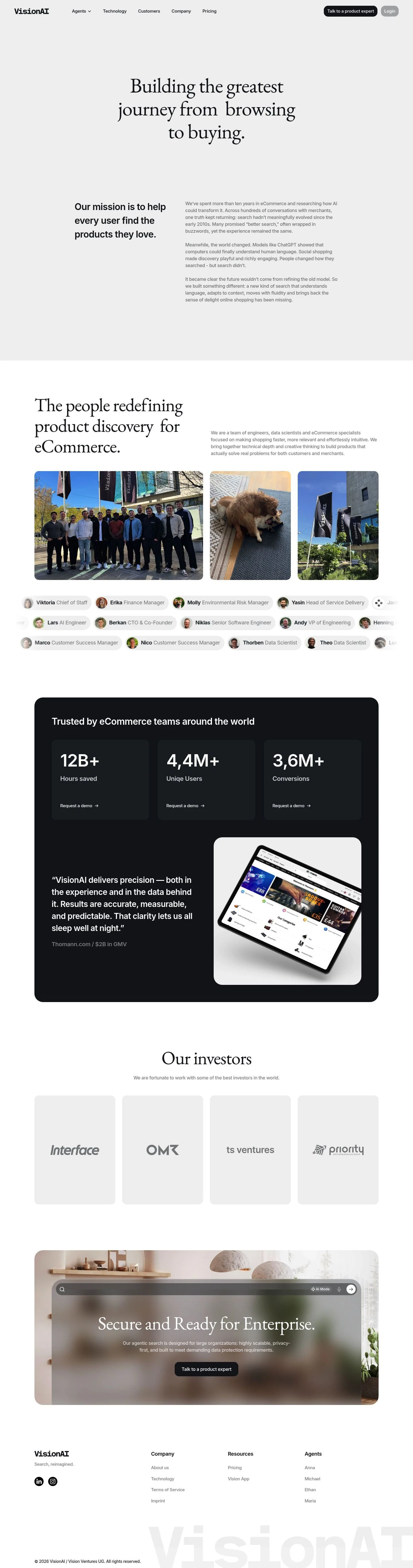
AI Breakdown
Design export
# Design brief: the VisionAI About design language

Below is a complete design specification measured from a real, published web page. Use it as a design language for the user's product. It is not a page to reproduce.

## Reference images

- Full page: https://cdn.designmunk.com/2026/09/10143114/visionai-co-about-us-featured.webp
- Above the fold: https://cdn.designmunk.com/2026/09/10143114/visionai-co-about-us-featured.webp
- On DesignMunk: https://designmunk.com/visionai-about-page/

Study these for hierarchy, rhythm, spacing and density. Where an image and the written spec disagree, the spec wins: the tokens were read from the page's own CSS, the images are one rendering of it.

## Before you start

Ask the user what they are building, who it is for, and what brand assets they already have — name, colours, typefaces. Wait for their answers before writing anything. Everything below is then applied to their product, not to the reference.

## Design specification

# VisionAI: Elegant Serif Headlines Over Calm Commerce UI

## Overview

VisionAI's interface is calm, retail-friendly, and conversion-minded. It targets ecommerce teams and founders who value clarity over spectacle. The mood is serious but welcoming: spacious sections, restrained color, and one primary action repeated at key moments. When tokens don't cover a case, prefer light backgrounds, dark text, and generous spacing to maintain the airy, editorial feel.

## Colors

- Primary (#15191e): Deep ink for headlines, core text, and primary icons.
- Secondary (#848c8c): Muted slate for secondary copy and helper labels.
- Tertiary (#000000): Pure black for logos or when maximum contrast is required sparingly.
- Neutral (#ffffff): Paper-white background for surfaces and page canvas.
- Border (#e5e7eb): Fog-light divider for section boundaries, tables, and cards.
- Brand-cool-elegance (#cecfd0): Porcelain tint for subtle panels and KPI bands.
- Surface (#ffffff): Alias to Neutral; use for cards and large panels to ensure consistency.
- On-surface (#15191e): Alias to Primary; text and icon color on light backgrounds.

## Typography

- Headlines (headline-lg 32px/1.19 700; headline-md 24px/1.21 700; headline-sm 20px/1.2 600; headline-xs 18px/1.22 600) use the generic sans-serif stack. This is agent-available by default; suitable concrete stacks include system-ui, Helvetica, Arial if a named family is needed.
- Body (body-md 16px/5 400 with -0.09em tracking) uses EB Garamond, which is freely available on Google Fonts and can be loaded directly. If EB Garamond is unavailable, use Merriweather or Crimson Text as stylistically compatible serif substitutes.
- Roles: headlines carry structure and scannability; body handles narrative and long-form text. Keep secondary notes in Secondary color to reduce visual weight.

## Layout

- Spacing scale: 12, 20, 40, 68, 100px. Treat 12px as the micro rhythm; 40–100px set section breathing room.
- Section layout favors wide margins and clear blocks. Use single-column on mobile; switch to two columns for text/image or mission sections at tablet/desktop with 40px gutters.
- Keep nav compact; place one primary CTA at the top and repeat it only at key proof points.

## Elevation & Depth

- No ambient shadows (sm–xl: none). Depth is expressed with borders (#e5e7eb), subtle surface shifts (Neutral vs Brand-cool-elegance), and whitespace.
- An inner inset highlight is available (rgba(255,255,255,0.3) 0 -1px 2px inset) for chips or inputs requiring a slight top edge catchlight.

## Shapes

- Radii: sm 4px (utility controls, secondary buttons), md 8px (cards, panels), lg 15px (primary buttons and key CTAs).
- Larger radii signal primary actions; smaller radii recede for utility and lists.

## Components

- Button — Primary: background #15191e, text #0000ee, 15px radius, 8px×12px padding, 40px height. Use for "Talk to a product expert" and "Request a demo".
- Button — Secondary: text #15191e, 4px radius, 8px×12px padding, 40px height. Place near primary when a safe alternative is needed.
- Button — Link: text #15191e, square corners. Use for inline actions in body text.
- Card: background #ffffff, text #15191e, 8px radius, 16px padding. Add Border color outline for separation when needed.

### Top Navigation
- Left-aligned wordmark; right-aligned links with secondary emphasis. One primary button (40px height, 15px radius) closes the set. Horizontal spacing uses sm (20px).

### Hero Header
- Centered copy block using Primary on Surface. Set the headline with headline-lg and xl (100px) top/bottom spacing. Keep one CTA below or in the nav, not both stacked.

### Mission Split
- Two-column text: left column uses headline-md for the lead sentence; right column uses body-md for the narrative. Column gap md (40px); section padding lg (68px).

### Team Roster Grid
- Grid of people cards or rows. Names in headline-xs; roles in Secondary; optional emoji badge at the end of the name line. Grid gap sm (20px), section padding lg (68px).

### KPI Stats Band
- Tinted background with Brand-cool-elegance (#cecfd0). Large numerals in headline-lg, labels in Secondary. Include a primary button inline for "Request a demo".

### Testimonial Block
- Quote inside a Card with md (8px) radius and optional Border outline. Attribution in Secondary; keep width constrained with md (40px) padding.

### Enterprise Reassurance
- Short headline + one paragraph on a neutral or tinted panel. Single primary button; avoid duplicating the same block multiple times in one view.

### Footer
- Multi-column list with small headlines (headline-xs) and body links in Primary. Use Border dividers sparingly to keep the base light.

## Do's and Don'ts

- Do rely on #15191e for all core text and headings over #ffffff surfaces.
- Do space major sections with lg (68px) to xl (100px) to preserve the airy, editorial feel.
- Do use #e5e7eb borders or #cecfd0 tints for separation; shadows are disabled.
- Don't introduce new accent colors; reserve #0000ee for primary button labels or explicit links.
- Don't mix radii within a component; primary CTAs use 15px, cards 8px, utility 4px.
- Don't stack multiple primary CTAs in the same viewport; keep one obvious choice.

## Agent Prompt Guide

Quick color reference — Text: #15191e. Background: #ffffff. Border: #e5e7eb. Accent tint: #cecfd0. Link/primary-label: #0000ee.

1) Build a centered hero
- Container: max-width 960px, margin auto, padding-top/bottom 100px, background #ffffff.
- Headline: font-family: sans-serif; font-size: 32px; line-height: 1.19; font-weight: 700; color: #15191e; text-align: center.
- Subtext: font-family: 'EB Garamond', serif; font-size: 16px; line-height: 5; letter-spacing: -0.09em; color: #848c8c; max-width: 720px; margin: 20px auto 40px.
- Primary button: height 40px; padding 8px 12px; border-radius: 15px; background #15191e; color: #0000ee.

2) Two-column mission section
- Section: padding 68px 0; background #ffffff; border-top: 1px solid #e5e7eb.
- Left: headline (24px/1.21, 700, sans-serif, #15191e); Right: paragraph (16px/5, EB Garamond, -0.09em, #15191e).
- Grid: two columns with 40px gutter; stack to single column below 768px.

3) KPI stats band
- Wrapper: background #cecfd0; padding 68px 0.
- Stat: number set in 32px/1.19 700 sans-serif #15191e; label in 16px EB Garamond #848c8c.
- CTA: primary button (40px height, 15px radius, #15191e background, #0000ee label) aligned to the right on desktop.

4) Testimonial card
- Card: background #ffffff; color #15191e; padding 16px; border-radius 8px; border 1px solid #e5e7eb.
- Quote: 16px EB Garamond; Attribution: 18px/1.22 600 sans-serif in #848c8c.

5) Footer columns
- Container: background #ffffff; border-top 1px solid #e5e7eb; padding 68px 0.
- Column titles: 18px/1.22 600 sans-serif #15191e; Links: 16px EB Garamond #15191e; column gap 40px; link hover uses underline only.

## Similar Brands

- Algolia: similarly minimal search-focused marketing; VisionAI reads warmer with serif touches where Algolia stays entirely sans-serif.
- Constructor: ecommerce search with proof-driven pages; VisionAI's layout is airier with lighter dividers.
- Coveo: enterprise search narrative with trust signals; VisionAI pares back color and keeps one dominant CTA.
- Shopify: retail-friendly restraint and plenty of white; VisionAI mirrors the calm but focuses entirely on search rather than platform breadth.

## Tokens

### CSS custom properties

```css
:root {
  /* Colors */
  --color-primary: #15191e;
  --color-secondary: #848c8c;
  --color-tertiary: #000000;
  --color-neutral: #ffffff;
  --color-border: #e5e7eb;
  --color-brand-cool-elegance: #cecfd0;
  --color-surface: var(--color-neutral);
  --color-on-surface: var(--color-primary);

  /* Typography */
  --text-headline-lg-size: 32px;
  --text-headline-lg-weight: 700;
  --text-headline-lg-leading: 1.19;
  --text-headline-md-size: 24px;
  --text-headline-md-weight: 700;
  --text-headline-md-leading: 1.21;
  --text-headline-sm-size: 20px;
  --text-headline-sm-weight: 600;
  --text-headline-sm-leading: 1.2;
  --text-headline-xs-size: 18px;
  --text-headline-xs-weight: 600;
  --text-headline-xs-leading: 1.22;
  --text-body-md-size: 16px;
  --text-body-md-weight: 400;
  --text-body-md-leading: 5;
  --text-body-md-tracking: -0.09em;
  --font-sans-serif: "sans-serif";
  --font-eb-garamond: "EB Garamond";

  /* Rounded */
  --radius-sm: 4px;
  --radius-md: 8px;
  --radius-lg: 15px;

  /* Spacing */
  --spacing-xs: 12px;
  --spacing-sm: 20px;
  --spacing-md: 40px;
  --spacing-lg: 68px;
  --spacing-xl: 100px;

  /* Components */
  --button-primary-background-color: var(--color-primary);
  --button-primary-text-color: #0000ee;
  --button-primary-rounded: var(--radius-lg);
  --button-primary-padding: 8px 12px;
  --button-primary-height: 40px;
  --button-secondary-text-color: var(--color-primary);
  --button-secondary-rounded: var(--radius-sm);
  --button-secondary-padding: 8px 12px;
  --button-secondary-height: 40px;
  --button-link-text-color: var(--color-primary);
  --button-link-rounded: 0px;
  --card-background-color: var(--color-neutral);
  --card-text-color: var(--color-primary);
  --card-rounded: var(--radius-md);
  --card-padding: 16px;
}
```

### Tailwind theme

```css
@theme {
  --color-primary: #15191e;
  --color-secondary: #848c8c;
  --color-tertiary: #000000;
  --color-neutral: #ffffff;
  --color-border: #e5e7eb;
  --color-brand-cool-elegance: #cecfd0;
  --color-surface: #ffffff;
  --color-on-surface: #15191e;
  --font-headline-lg: "sans-serif";
  --font-headline-md: "sans-serif";
  --font-headline-sm: "sans-serif";
  --font-headline-xs: "sans-serif";
  --font-body-md: "EB Garamond";
  --text-headline-lg: 32px;
  --text-headline-md: 24px;
  --text-headline-sm: 20px;
  --text-headline-xs: 18px;
  --text-body-md: 16px;
  --tracking-body-md: -0.09em;
  --font-weight-headline-lg: 700;
  --font-weight-headline-md: 700;
  --font-weight-headline-sm: 600;
  --font-weight-headline-xs: 600;
  --font-weight-body-md: 400;
  --radius-sm: 4px;
  --radius-md: 8px;
  --radius-lg: 15px;
  --spacing-xs: 12px;
  --spacing-sm: 20px;
  --spacing-md: 40px;
  --spacing-lg: 68px;
  --spacing-xl: 100px;
}
```

### Design tokens (DTCG)

```json
{
    "$schema": "https://www.designtokens.org/schemas/2025.10/format.json",
    "color": {
        "$type": "color",
        "primary": {
            "$value": {
                "colorSpace": "srgb",
                "components": [
                    0.082,
                    0.098,
                    0.118
                ],
                "hex": "#15191e"
            }
        },
        "secondary": {
            "$value": {
                "colorSpace": "srgb",
                "components": [
                    0.518,
                    0.549,
                    0.549
                ],
                "hex": "#848c8c"
            }
        },
        "tertiary": {
            "$value": {
                "colorSpace": "srgb",
                "components": [
                    0,
                    0,
                    0
                ],
                "hex": "#000000"
            }
        },
        "neutral": {
            "$value": {
                "colorSpace": "srgb",
                "components": [
                    1,
                    1,
                    1
                ],
                "hex": "#ffffff"
            }
        },
        "border": {
            "$value": {
                "colorSpace": "srgb",
                "components": [
                    0.898,
                    0.906,
                    0.922
                ],
                "hex": "#e5e7eb"
            }
        },
        "brand-cool-elegance": {
            "$value": {
                "colorSpace": "srgb",
                "components": [
                    0.808,
                    0.812,
                    0.816
                ],
                "hex": "#cecfd0"
            }
        },
        "surface": {
            "$value": {
                "colorSpace": "srgb",
                "components": [
                    1,
                    1,
                    1
                ],
                "hex": "#ffffff"
            }
        },
        "on-surface": {
            "$value": {
                "colorSpace": "srgb",
                "components": [
                    0.082,
                    0.098,
                    0.118
                ],
                "hex": "#15191e"
            }
        }
    },
    "spacing": {
        "$type": "dimension",
        "xs": {
            "$value": {
                "value": 12,
                "unit": "px"
            }
        },
        "sm": {
            "$value": {
                "value": 20,
                "unit": "px"
            }
        },
        "md": {
            "$value": {
                "value": 40,
                "unit": "px"
            }
        },
        "lg": {
            "$value": {
                "value": 68,
                "unit": "px"
            }
        },
        "xl": {
            "$value": {
                "value": 100,
                "unit": "px"
            }
        }
    },
    "rounded": {
        "$type": "dimension",
        "sm": {
            "$value": {
                "value": 4,
                "unit": "px"
            }
        },
        "md": {
            "$value": {
                "value": 8,
                "unit": "px"
            }
        },
        "lg": {
            "$value": {
                "value": 15,
                "unit": "px"
            }
        }
    },
    "typography": {
        "headline-lg": {
            "$type": "typography",
            "$value": {
                "fontFamily": "sans-serif",
                "fontSize": {
                    "value": 32,
                    "unit": "px"
                },
                "fontWeight": 700
            }
        },
        "headline-md": {
            "$type": "typography",
            "$value": {
                "fontFamily": "sans-serif",
                "fontSize": {
                    "value": 24,
                    "unit": "px"
                },
                "fontWeight": 700
            }
        },
        "headline-sm": {
            "$type": "typography",
            "$value": {
                "fontFamily": "sans-serif",
                "fontSize": {
                    "value": 20,
                    "unit": "px"
                },
                "fontWeight": 600
            }
        },
        "headline-xs": {
            "$type": "typography",
            "$value": {
                "fontFamily": "sans-serif",
                "fontSize": {
                    "value": 18,
                    "unit": "px"
                },
                "fontWeight": 600
            }
        },
        "body-md": {
            "$type": "typography",
            "$value": {
                "fontFamily": "EB Garamond",
                "fontSize": {
                    "value": 16,
                    "unit": "px"
                },
                "fontWeight": 400,
                "letterSpacing": {
                    "value": -0.09,
                    "unit": "em"
                }
            }
        }
    }
}
```

## Rules

- **Fonts.** If the specification names a custom or self-hosted family, use one of the substitutes it names. Never reference a typeface you cannot actually load — it will fall back to a system font and undo the typography.
- **Colour.** Derive the palette from the user's brand. Use the token values as a guide to *relationships* — contrast, tint, how many accents carry the page — not as hex codes to paste.
- **Never reproduce** the wordmark, mascot, logo, brand name, illustrations, icon set, screenshots or any copy from the reference.
- **Never present the result as VisionAI About**, or imply any connection to it.
- If something is unspecified, choose clarity and legibility over decoration.
---
version: alpha
name: VisionAI
description: "Search Reimagined: Agentic AI that turns searches into profitable conversions."
colors:
  primary: "#15191e"
  secondary: "#848c8c"
  tertiary: "#000000"
  neutral: "#ffffff"
  border: "#e5e7eb"
  brand-cool-elegance: "#cecfd0"
  surface: "{colors.neutral}"
  on-surface: "{colors.primary}"
typography:
  headline-lg:
    fontFamily: sans-serif
    fontSize: 32px
    fontWeight: 700
    lineHeight: 1.19
  headline-md:
    fontFamily: sans-serif
    fontSize: 24px
    fontWeight: 700
    lineHeight: 1.21
  headline-sm:
    fontFamily: sans-serif
    fontSize: 20px
    fontWeight: 600
    lineHeight: 1.2
  headline-xs:
    fontFamily: sans-serif
    fontSize: 18px
    fontWeight: 600
    lineHeight: 1.22
  body-md:
    fontFamily: EB Garamond
    fontSize: 16px
    fontWeight: 400
    lineHeight: 5
    letterSpacing: -0.09em
rounded:
  sm: 4px
  md: 8px
  lg: 15px
spacing:
  xs: 12px
  sm: 20px
  md: 40px
  lg: 68px
  xl: 100px
components:
  button-primary:
    backgroundColor: "{colors.primary}"
    textColor: "#0000ee"
    rounded: "{rounded.lg}"
    padding: 8px 12px
    height: 40px
  button-secondary:
    textColor: "{colors.primary}"
    rounded: "{rounded.sm}"
    padding: 8px 12px
    height: 40px
  button-link:
    textColor: "{colors.primary}"
    rounded: 0px
  card:
    backgroundColor: "{colors.neutral}"
    textColor: "{colors.primary}"
    rounded: "{rounded.md}"
    padding: 16px
---

# VisionAI: Elegant Serif Headlines Over Calm Commerce UI

## Overview

VisionAI's interface is calm, retail-friendly, and conversion-minded. It targets ecommerce teams and founders who value clarity over spectacle. The mood is serious but welcoming: spacious sections, restrained color, and one primary action repeated at key moments. When tokens don't cover a case, prefer light backgrounds, dark text, and generous spacing to maintain the airy, editorial feel.

## Colors

- Primary (#15191e): Deep ink for headlines, core text, and primary icons.
- Secondary (#848c8c): Muted slate for secondary copy and helper labels.
- Tertiary (#000000): Pure black for logos or when maximum contrast is required sparingly.
- Neutral (#ffffff): Paper-white background for surfaces and page canvas.
- Border (#e5e7eb): Fog-light divider for section boundaries, tables, and cards.
- Brand-cool-elegance (#cecfd0): Porcelain tint for subtle panels and KPI bands.
- Surface (#ffffff): Alias to Neutral; use for cards and large panels to ensure consistency.
- On-surface (#15191e): Alias to Primary; text and icon color on light backgrounds.

## Typography

- Headlines (headline-lg 32px/1.19 700; headline-md 24px/1.21 700; headline-sm 20px/1.2 600; headline-xs 18px/1.22 600) use the generic sans-serif stack. This is agent-available by default; suitable concrete stacks include system-ui, Helvetica, Arial if a named family is needed.
- Body (body-md 16px/5 400 with -0.09em tracking) uses EB Garamond, which is freely available on Google Fonts and can be loaded directly. If EB Garamond is unavailable, use Merriweather or Crimson Text as stylistically compatible serif substitutes.
- Roles: headlines carry structure and scannability; body handles narrative and long-form text. Keep secondary notes in Secondary color to reduce visual weight.

## Layout

- Spacing scale: 12, 20, 40, 68, 100px. Treat 12px as the micro rhythm; 40–100px set section breathing room.
- Section layout favors wide margins and clear blocks. Use single-column on mobile; switch to two columns for text/image or mission sections at tablet/desktop with 40px gutters.
- Keep nav compact; place one primary CTA at the top and repeat it only at key proof points.

## Elevation & Depth

- No ambient shadows (sm–xl: none). Depth is expressed with borders (#e5e7eb), subtle surface shifts (Neutral vs Brand-cool-elegance), and whitespace.
- An inner inset highlight is available (rgba(255,255,255,0.3) 0 -1px 2px inset) for chips or inputs requiring a slight top edge catchlight.

## Shapes

- Radii: sm 4px (utility controls, secondary buttons), md 8px (cards, panels), lg 15px (primary buttons and key CTAs).
- Larger radii signal primary actions; smaller radii recede for utility and lists.

## Components

- Button — Primary: background #15191e, text #0000ee, 15px radius, 8px×12px padding, 40px height. Use for "Talk to a product expert" and "Request a demo".
- Button — Secondary: text #15191e, 4px radius, 8px×12px padding, 40px height. Place near primary when a safe alternative is needed.
- Button — Link: text #15191e, square corners. Use for inline actions in body text.
- Card: background #ffffff, text #15191e, 8px radius, 16px padding. Add Border color outline for separation when needed.

### Top Navigation
- Left-aligned wordmark; right-aligned links with secondary emphasis. One primary button (40px height, 15px radius) closes the set. Horizontal spacing uses sm (20px).

### Hero Header
- Centered copy block using Primary on Surface. Set the headline with headline-lg and xl (100px) top/bottom spacing. Keep one CTA below or in the nav, not both stacked.

### Mission Split
- Two-column text: left column uses headline-md for the lead sentence; right column uses body-md for the narrative. Column gap md (40px); section padding lg (68px).

### Team Roster Grid
- Grid of people cards or rows. Names in headline-xs; roles in Secondary; optional emoji badge at the end of the name line. Grid gap sm (20px), section padding lg (68px).

### KPI Stats Band
- Tinted background with Brand-cool-elegance (#cecfd0). Large numerals in headline-lg, labels in Secondary. Include a primary button inline for "Request a demo".

### Testimonial Block
- Quote inside a Card with md (8px) radius and optional Border outline. Attribution in Secondary; keep width constrained with md (40px) padding.

### Enterprise Reassurance
- Short headline + one paragraph on a neutral or tinted panel. Single primary button; avoid duplicating the same block multiple times in one view.

### Footer
- Multi-column list with small headlines (headline-xs) and body links in Primary. Use Border dividers sparingly to keep the base light.

## Do's and Don'ts

- Do rely on #15191e for all core text and headings over #ffffff surfaces.
- Do space major sections with lg (68px) to xl (100px) to preserve the airy, editorial feel.
- Do use #e5e7eb borders or #cecfd0 tints for separation; shadows are disabled.
- Don't introduce new accent colors; reserve #0000ee for primary button labels or explicit links.
- Don't mix radii within a component; primary CTAs use 15px, cards 8px, utility 4px.
- Don't stack multiple primary CTAs in the same viewport; keep one obvious choice.

## Agent Prompt Guide

Quick color reference — Text: #15191e. Background: #ffffff. Border: #e5e7eb. Accent tint: #cecfd0. Link/primary-label: #0000ee.

1) Build a centered hero
- Container: max-width 960px, margin auto, padding-top/bottom 100px, background #ffffff.
- Headline: font-family: sans-serif; font-size: 32px; line-height: 1.19; font-weight: 700; color: #15191e; text-align: center.
- Subtext: font-family: 'EB Garamond', serif; font-size: 16px; line-height: 5; letter-spacing: -0.09em; color: #848c8c; max-width: 720px; margin: 20px auto 40px.
- Primary button: height 40px; padding 8px 12px; border-radius: 15px; background #15191e; color: #0000ee.

2) Two-column mission section
- Section: padding 68px 0; background #ffffff; border-top: 1px solid #e5e7eb.
- Left: headline (24px/1.21, 700, sans-serif, #15191e); Right: paragraph (16px/5, EB Garamond, -0.09em, #15191e).
- Grid: two columns with 40px gutter; stack to single column below 768px.

3) KPI stats band
- Wrapper: background #cecfd0; padding 68px 0.
- Stat: number set in 32px/1.19 700 sans-serif #15191e; label in 16px EB Garamond #848c8c.
- CTA: primary button (40px height, 15px radius, #15191e background, #0000ee label) aligned to the right on desktop.

4) Testimonial card
- Card: background #ffffff; color #15191e; padding 16px; border-radius 8px; border 1px solid #e5e7eb.
- Quote: 16px EB Garamond; Attribution: 18px/1.22 600 sans-serif in #848c8c.

5) Footer columns
- Container: background #ffffff; border-top 1px solid #e5e7eb; padding 68px 0.
- Column titles: 18px/1.22 600 sans-serif #15191e; Links: 16px EB Garamond #15191e; column gap 40px; link hover uses underline only.

## Similar Brands

- Algolia: similarly minimal search-focused marketing; VisionAI reads warmer with serif touches where Algolia stays entirely sans-serif.
- Constructor: ecommerce search with proof-driven pages; VisionAI's layout is airier with lighter dividers.
- Coveo: enterprise search narrative with trust signals; VisionAI pares back color and keeps one dominant CTA.
- Shopify: retail-friendly restraint and plenty of white; VisionAI mirrors the calm but focuses entirely on search rather than platform breadth.
:root {
  /* Colors */
  --color-primary: #15191e;
  --color-secondary: #848c8c;
  --color-tertiary: #000000;
  --color-neutral: #ffffff;
  --color-border: #e5e7eb;
  --color-brand-cool-elegance: #cecfd0;
  --color-surface: var(--color-neutral);
  --color-on-surface: var(--color-primary);

  /* Typography */
  --text-headline-lg-size: 32px;
  --text-headline-lg-weight: 700;
  --text-headline-lg-leading: 1.19;
  --text-headline-md-size: 24px;
  --text-headline-md-weight: 700;
  --text-headline-md-leading: 1.21;
  --text-headline-sm-size: 20px;
  --text-headline-sm-weight: 600;
  --text-headline-sm-leading: 1.2;
  --text-headline-xs-size: 18px;
  --text-headline-xs-weight: 600;
  --text-headline-xs-leading: 1.22;
  --text-body-md-size: 16px;
  --text-body-md-weight: 400;
  --text-body-md-leading: 5;
  --text-body-md-tracking: -0.09em;
  --font-sans-serif: "sans-serif";
  --font-eb-garamond: "EB Garamond";

  /* Rounded */
  --radius-sm: 4px;
  --radius-md: 8px;
  --radius-lg: 15px;

  /* Spacing */
  --spacing-xs: 12px;
  --spacing-sm: 20px;
  --spacing-md: 40px;
  --spacing-lg: 68px;
  --spacing-xl: 100px;

  /* Components */
  --button-primary-background-color: var(--color-primary);
  --button-primary-text-color: #0000ee;
  --button-primary-rounded: var(--radius-lg);
  --button-primary-padding: 8px 12px;
  --button-primary-height: 40px;
  --button-secondary-text-color: var(--color-primary);
  --button-secondary-rounded: var(--radius-sm);
  --button-secondary-padding: 8px 12px;
  --button-secondary-height: 40px;
  --button-link-text-color: var(--color-primary);
  --button-link-rounded: 0px;
  --card-background-color: var(--color-neutral);
  --card-text-color: var(--color-primary);
  --card-rounded: var(--radius-md);
  --card-padding: 16px;
}
{
  "$schema": "https://www.designtokens.org/schemas/2025.10/format.json",
  "$description": "Search Reimagined: Agentic AI that turns searches into profitable conversions.",
  "color": {
    "$type": "color",
    "primary": {
      "$value": {
        "colorSpace": "srgb",
        "components": [
          0.082,
          0.098,
          0.118
        ],
        "hex": "#15191e"
      }
    },
    "secondary": {
      "$value": {
        "colorSpace": "srgb",
        "components": [
          0.518,
          0.549,
          0.549
        ],
        "hex": "#848c8c"
      }
    },
    "tertiary": {
      "$value": {
        "colorSpace": "srgb",
        "components": [
          0,
          0,
          0
        ],
        "hex": "#000000"
      }
    },
    "neutral": {
      "$value": {
        "colorSpace": "srgb",
        "components": [
          1,
          1,
          1
        ],
        "hex": "#ffffff"
      }
    },
    "border": {
      "$value": {
        "colorSpace": "srgb",
        "components": [
          0.898,
          0.906,
          0.922
        ],
        "hex": "#e5e7eb"
      }
    },
    "brand-cool-elegance": {
      "$value": {
        "colorSpace": "srgb",
        "components": [
          0.808,
          0.812,
          0.816
        ],
        "hex": "#cecfd0"
      }
    },
    "surface": {
      "$value": {
        "colorSpace": "srgb",
        "components": [
          1,
          1,
          1
        ],
        "hex": "#ffffff"
      }
    },
    "on-surface": {
      "$value": {
        "colorSpace": "srgb",
        "components": [
          0.082,
          0.098,
          0.118
        ],
        "hex": "#15191e"
      }
    }
  },
  "spacing": {
    "$type": "dimension",
    "xs": {
      "$value": {
        "value": 12,
        "unit": "px"
      }
    },
    "sm": {
      "$value": {
        "value": 20,
        "unit": "px"
      }
    },
    "md": {
      "$value": {
        "value": 40,
        "unit": "px"
      }
    },
    "lg": {
      "$value": {
        "value": 68,
        "unit": "px"
      }
    },
    "xl": {
      "$value": {
        "value": 100,
        "unit": "px"
      }
    }
  },
  "rounded": {
    "$type": "dimension",
    "sm": {
      "$value": {
        "value": 4,
        "unit": "px"
      }
    },
    "md": {
      "$value": {
        "value": 8,
        "unit": "px"
      }
    },
    "lg": {
      "$value": {
        "value": 15,
        "unit": "px"
      }
    }
  },
  "typography": {
    "headline-lg": {
      "$type": "typography",
      "$value": {
        "fontFamily": "sans-serif",
        "fontSize": {
          "value": 32,
          "unit": "px"
        },
        "fontWeight": 700
      }
    },
    "headline-md": {
      "$type": "typography",
      "$value": {
        "fontFamily": "sans-serif",
        "fontSize": {
          "value": 24,
          "unit": "px"
        },
        "fontWeight": 700
      }
    },
    "headline-sm": {
      "$type": "typography",
      "$value": {
        "fontFamily": "sans-serif",
        "fontSize": {
          "value": 20,
          "unit": "px"
        },
        "fontWeight": 600
      }
    },
    "headline-xs": {
      "$type": "typography",
      "$value": {
        "fontFamily": "sans-serif",
        "fontSize": {
          "value": 18,
          "unit": "px"
        },
        "fontWeight": 600
      }
    },
    "body-md": {
      "$type": "typography",
      "$value": {
        "fontFamily": "EB Garamond",
        "fontSize": {
          "value": 16,
          "unit": "px"
        },
        "fontWeight": 400,
        "letterSpacing": {
          "value": -0.09,
          "unit": "em"
        }
      }
    }
  }
}
@theme {
--color-primary: #15191e;
--color-secondary: #848c8c;
--color-tertiary: #000000;
--color-neutral: #ffffff;
--color-border: #e5e7eb;
--color-brand-cool-elegance: #cecfd0;
--color-surface: #ffffff;
--color-on-surface: #15191e;
--font-headline-lg: "sans-serif";
--font-headline-md: "sans-serif";
--font-headline-sm: "sans-serif";
--font-headline-xs: "sans-serif";
--font-body-md: "EB Garamond";
--text-headline-lg: 32px;
--text-headline-md: 24px;
--text-headline-sm: 20px;
--text-headline-xs: 18px;
--text-body-md: 16px;
--tracking-body-md: -0.09em;
--font-weight-headline-lg: 700;
--font-weight-headline-md: 700;
--font-weight-headline-sm: 600;
--font-weight-headline-xs: 600;
--font-weight-body-md: 400;
--radius-sm: 4px;
--radius-md: 8px;
--radius-lg: 15px;
--spacing-xs: 12px;
--spacing-sm: 20px;
--spacing-md: 40px;
--spacing-lg: 68px;
--spacing-xl: 100px;
} # Design brief: the VisionAI About design language
Below is a complete design specification measured from a real, published web page. Use it as a design language for the user's product. It is not a page to reproduce.
## Reference images
- Full page: https://cdn.designmunk.com/2026/09/10143114/visionai-co-about-us-featured.webp
- Above the fold: https://cdn.designmunk.com/2026/09/10143114/visionai-co-about-us-featured.webp
- On DesignMunk: https://designmunk.com/visionai-about-page/
Study these for hierarchy, rhythm, spacing and density. Where an image and the written spec disagree, the spec wins: the tokens were read from the page's own CSS, the images are one rendering of it.
## Before you start
Ask the user what they are building, who it is for, and what brand assets they already have — name, colours, typefaces. Wait for their answers before writing anything. Everything below is then applied to their product, not to the reference.
## Design specification
# VisionAI: Elegant Serif Headlines Over Calm Commerce UI
## Overview
VisionAI's interface is calm, retail-friendly, and conversion-minded. It targets ecommerce teams and founders who value clarity over spectacle. The mood is serious but welcoming: spacious sections, restrained color, and one primary action repeated at key moments. When tokens don't cover a case, prefer light backgrounds, dark text, and generous spacing to maintain the airy, editorial feel.
## Colors
- Primary (#15191e): Deep ink for headlines, core text, and primary icons.
- Secondary (#848c8c): Muted slate for secondary copy and helper labels.
- Tertiary (#000000): Pure black for logos or when maximum contrast is required sparingly.
- Neutral (#ffffff): Paper-white background for surfaces and page canvas.
- Border (#e5e7eb): Fog-light divider for section boundaries, tables, and cards.
- Brand-cool-elegance (#cecfd0): Porcelain tint for subtle panels and KPI bands.
- Surface (#ffffff): Alias to Neutral; use for cards and large panels to ensure consistency.
- On-surface (#15191e): Alias to Primary; text and icon color on light backgrounds.
## Typography
- Headlines (headline-lg 32px/1.19 700; headline-md 24px/1.21 700; headline-sm 20px/1.2 600; headline-xs 18px/1.22 600) use the generic sans-serif stack. This is agent-available by default; suitable concrete stacks include system-ui, Helvetica, Arial if a named family is needed.
- Body (body-md 16px/5 400 with -0.09em tracking) uses EB Garamond, which is freely available on Google Fonts and can be loaded directly. If EB Garamond is unavailable, use Merriweather or Crimson Text as stylistically compatible serif substitutes.
- Roles: headlines carry structure and scannability; body handles narrative and long-form text. Keep secondary notes in Secondary color to reduce visual weight.
## Layout
- Spacing scale: 12, 20, 40, 68, 100px. Treat 12px as the micro rhythm; 40–100px set section breathing room.
- Section layout favors wide margins and clear blocks. Use single-column on mobile; switch to two columns for text/image or mission sections at tablet/desktop with 40px gutters.
- Keep nav compact; place one primary CTA at the top and repeat it only at key proof points.
## Elevation & Depth
- No ambient shadows (sm–xl: none). Depth is expressed with borders (#e5e7eb), subtle surface shifts (Neutral vs Brand-cool-elegance), and whitespace.
- An inner inset highlight is available (rgba(255,255,255,0.3) 0 -1px 2px inset) for chips or inputs requiring a slight top edge catchlight.
## Shapes
- Radii: sm 4px (utility controls, secondary buttons), md 8px (cards, panels), lg 15px (primary buttons and key CTAs).
- Larger radii signal primary actions; smaller radii recede for utility and lists.
## Components
- Button — Primary: background #15191e, text #0000ee, 15px radius, 8px×12px padding, 40px height. Use for "Talk to a product expert" and "Request a demo".
- Button — Secondary: text #15191e, 4px radius, 8px×12px padding, 40px height. Place near primary when a safe alternative is needed.
- Button — Link: text #15191e, square corners. Use for inline actions in body text.
- Card: background #ffffff, text #15191e, 8px radius, 16px padding. Add Border color outline for separation when needed.
### Top Navigation
- Left-aligned wordmark; right-aligned links with secondary emphasis. One primary button (40px height, 15px radius) closes the set. Horizontal spacing uses sm (20px).
### Hero Header
- Centered copy block using Primary on Surface. Set the headline with headline-lg and xl (100px) top/bottom spacing. Keep one CTA below or in the nav, not both stacked.
### Mission Split
- Two-column text: left column uses headline-md for the lead sentence; right column uses body-md for the narrative. Column gap md (40px); section padding lg (68px).
### Team Roster Grid
- Grid of people cards or rows. Names in headline-xs; roles in Secondary; optional emoji badge at the end of the name line. Grid gap sm (20px), section padding lg (68px).
### KPI Stats Band
- Tinted background with Brand-cool-elegance (#cecfd0). Large numerals in headline-lg, labels in Secondary. Include a primary button inline for "Request a demo".
### Testimonial Block
- Quote inside a Card with md (8px) radius and optional Border outline. Attribution in Secondary; keep width constrained with md (40px) padding.
### Enterprise Reassurance
- Short headline + one paragraph on a neutral or tinted panel. Single primary button; avoid duplicating the same block multiple times in one view.
### Footer
- Multi-column list with small headlines (headline-xs) and body links in Primary. Use Border dividers sparingly to keep the base light.
## Do's and Don'ts
- Do rely on #15191e for all core text and headings over #ffffff surfaces.
- Do space major sections with lg (68px) to xl (100px) to preserve the airy, editorial feel.
- Do use #e5e7eb borders or #cecfd0 tints for separation; shadows are disabled.
- Don't introduce new accent colors; reserve #0000ee for primary button labels or explicit links.
- Don't mix radii within a component; primary CTAs use 15px, cards 8px, utility 4px.
- Don't stack multiple primary CTAs in the same viewport; keep one obvious choice.
## Agent Prompt Guide
Quick color reference — Text: #15191e. Background: #ffffff. Border: #e5e7eb. Accent tint: #cecfd0. Link/primary-label: #0000ee.
1) Build a centered hero
- Container: max-width 960px, margin auto, padding-top/bottom 100px, background #ffffff.
- Headline: font-family: sans-serif; font-size: 32px; line-height: 1.19; font-weight: 700; color: #15191e; text-align: center.
- Subtext: font-family: 'EB Garamond', serif; font-size: 16px; line-height: 5; letter-spacing: -0.09em; color: #848c8c; max-width: 720px; margin: 20px auto 40px.
- Primary button: height 40px; padding 8px 12px; border-radius: 15px; background #15191e; color: #0000ee.
2) Two-column mission section
- Section: padding 68px 0; background #ffffff; border-top: 1px solid #e5e7eb.
- Left: headline (24px/1.21, 700, sans-serif, #15191e); Right: paragraph (16px/5, EB Garamond, -0.09em, #15191e).
- Grid: two columns with 40px gutter; stack to single column below 768px.
3) KPI stats band
- Wrapper: background #cecfd0; padding 68px 0.
- Stat: number set in 32px/1.19 700 sans-serif #15191e; label in 16px EB Garamond #848c8c.
- CTA: primary button (40px height, 15px radius, #15191e background, #0000ee label) aligned to the right on desktop.
4) Testimonial card
- Card: background #ffffff; color #15191e; padding 16px; border-radius 8px; border 1px solid #e5e7eb.
- Quote: 16px EB Garamond; Attribution: 18px/1.22 600 sans-serif in #848c8c.
5) Footer columns
- Container: background #ffffff; border-top 1px solid #e5e7eb; padding 68px 0.
- Column titles: 18px/1.22 600 sans-serif #15191e; Links: 16px EB Garamond #15191e; column gap 40px; link hover uses underline only.
## Tokens
### CSS custom properties
```css
:root {
/* Colors */
--color-primary: #15191e;
--color-secondary: #848c8c;
--color-tertiary: #000000;
--color-neutral: #ffffff;
--color-border: #e5e7eb;
--color-brand-cool-elegance: #cecfd0;
--color-surface: var(--color-neutral);
--color-on-surface: var(--color-primary);
/* Typography */
--text-headline-lg-size: 32px;
--text-headline-lg-weight: 700;
--text-headline-lg-leading: 1.19;
--text-headline-md-size: 24px;
--text-headline-md-weight: 700;
--text-headline-md-leading: 1.21;
--text-headline-sm-size: 20px;
--text-headline-sm-weight: 600;
--text-headline-sm-leading: 1.2;
--text-headline-xs-size: 18px;
--text-headline-xs-weight: 600;
--text-headline-xs-leading: 1.22;
--text-body-md-size: 16px;
--text-body-md-weight: 400;
--text-body-md-leading: 5;
--text-body-md-tracking: -0.09em;
--font-sans-serif: "sans-serif";
--font-eb-garamond: "EB Garamond";
/* Rounded */
--radius-sm: 4px;
--radius-md: 8px;
--radius-lg: 15px;
/* Spacing */
--spacing-xs: 12px;
--spacing-sm: 20px;
--spacing-md: 40px;
--spacing-lg: 68px;
--spacing-xl: 100px;
/* Components */
--button-primary-background-color: var(--color-primary);
--button-primary-text-color: #0000ee;
--button-primary-rounded: var(--radius-lg);
--button-primary-padding: 8px 12px;
--button-primary-height: 40px;
--button-secondary-text-color: var(--color-primary);
--button-secondary-rounded: var(--radius-sm);
--button-secondary-padding: 8px 12px;
--button-secondary-height: 40px;
--button-link-text-color: var(--color-primary);
--button-link-rounded: 0px;
--card-background-color: var(--color-neutral);
--card-text-color: var(--color-primary);
--card-rounded: var(--radius-md);
--card-padding: 16px;
}
```
## Rules
- **Fonts.** If the specification names a custom or self-hosted family, use one of the substitutes it names. Never reference a typeface you cannot actually load — it will fall back to a system font and undo the typography.
- **Colour.** Derive the palette from the user's brand. Use the token values as a guide to *relationships* — contrast, tint, how many accents carry the page — not as hex codes to paste.
- **Never reproduce** the wordmark, mascot, logo, brand name, illustrations, icon set, screenshots or any copy from the reference.
- **Never present the result as VisionAI About**, or imply any connection to it.
- If something is unspecified, choose clarity and legibility over decoration.