viewport.theresonance.studio
AI Breakdown
Design export
# Design brief: the Viewport design language

Below is a complete design specification measured from a real, published web page. Use it as a design language for the user's product. It is not a page to reproduce.

## Reference images

- Full page: https://cdn.designmunk.com/2026/10/07061805/viewport-theresonance-studio-featured.webp
- Above the fold: https://cdn.designmunk.com/2026/10/07061805/viewport-theresonance-studio-featured-1440x900.webp
- On DesignMunk: https://designmunk.com/viewport/

Study these for hierarchy, rhythm, spacing and density. Where an image and the written spec disagree, the spec wins: the tokens were read from the page's own CSS, the images are one rendering of it.

## Before you start

Ask the user what they are building, who it is for, and what brand assets they already have — name, colours, typefaces. Wait for their answers before writing anything. Everything below is then applied to their product, not to the reference.

## Design specification

# Viewport: Dark Mac-style Landing with Timeline Demo

## Overview

Viewport's brand is focused, tool-first, and Mac-native. The UI should feel precise and calm: dark surfaces, bright electric-blue accents, and typography that reads like product documentation, not splashy marketing. Density stays low; spacing is generous and predictable, with one primary action per section (download or buy). When tokens leave gaps, default to clarity and restraint over decoration.

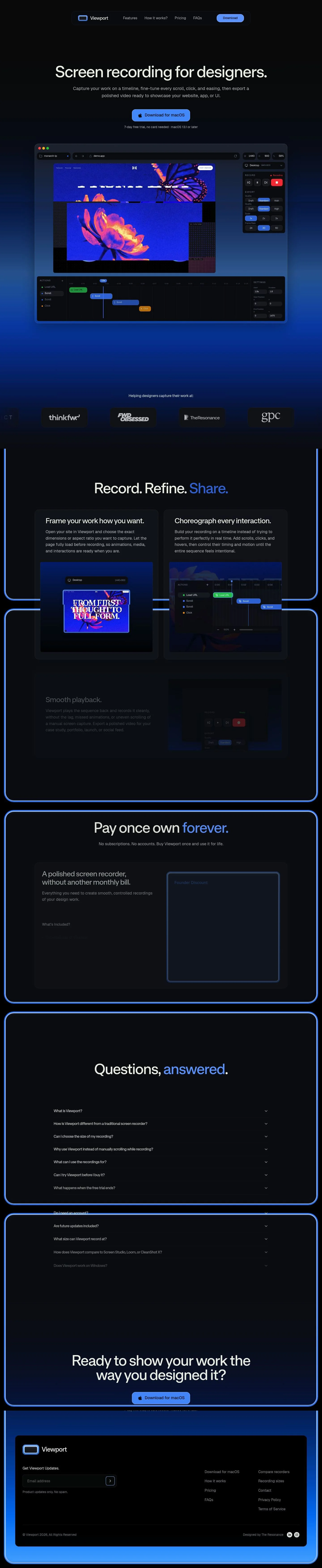
## Page Structure

- Header: compact dark bar with brand lockup at left, inline nav links, and a pill download button aligned right; minimal height, no shadow.
- Hero: centered headline and short subcopy; one prominent primary button and a single-line trial note beneath; wide negative space.
- Live Demo Window: oversized app/browser mockup card directly under the hero; rounded corners with dark chrome, timeline strip and controls visible.
- Section Intro: short band introducing the product's workflow followed by an H2 ("Record. Refine. Share.") as a transition into features.
- Feature Row — Frame: split layout; text column beside a masked media panel showing desktop/mobile framing.
- Feature Row — Choreograph: mirrored split; text column beside a timeline/action list; subtle UI microcards.
- Feature Row — Playback: split layout focusing on export and playback controls; consistent media mask with rounded corners.
- Pricing: single centered card with headline, checklist of inclusions, price with crossed "usual price," and a buy CTA; secondary link to trial.
- FAQs: vertical accordion list of questions; compact dividers and roomy expanded content.
- Closing CTA: centered headline, primary download button, and trial note.
- Footer: email subscribe strip followed by multi-column links (Navigation, Resources and legal) and attribution line.

## Colors

- Primary (#eef1ea): Core text and icons on dark surfaces; use for high-contrast body copy and headlines.
- Secondary (#244c80): Deep utility blue for subdued accents, links, or secondary UI states.
- Tertiary (#519dfc): Primary accent and CTA background; also for active timeline states and highlights.
- Neutral (#090d14): Page background and card surfaces across the site.
- brand-electronic (#546c84): Cool slate for borders, dividers, and quiet metadata text.
- brand-soothing-sapphire (#2d7ad8): Support accent for hovers, focus rings, or secondary buttons on dark.
- surface ({colors.neutral}): Alias for the base surface color; use for large panels and cards.
- on-surface ({colors.primary}): Alias for text/icons atop surface; ensures readable contrast.

## Typography

- Ritual (headlines lg/md/sm): Custom display sans used for all main headings. It is not freely available; substitute with Geist (Google) or Roboto (Google) for similar geometric warmth and clear apertures. Sizes: 70/51/37px at weight 500 with tight tracking for authority.
- System UI (-apple-system for headline-xs and body-md): Native platform sans for small headings and paragraph text at 27px (500) and 20px/1.6 (400). Freely available by default; when unavailable on web previews, substitute Geist or Roboto.
- Weight strategy: keep headlines at 500; body at 400. Avoid bolding links; rely on color and spacing for emphasis.

## Layout

- Spacing scale: xs 8, sm 16, md 24, lg 32, xl 100. Use xl between major sections, lg for block gutters, md for card padding, and sm/xs for control clusters.
- Flow: single centered column for hero and closing CTA; feature rows use two columns with ample outer margins.
- Container rhythm: keep copy lines short; let media cards span wider than text blocks while maintaining consistent 18px media masks.
- Alignment: headline and CTAs center in the hero; feature rows alternate left/right text alignment to maintain visual energy without adding components.

## Elevation & Depth

- Shadows are disabled (sm–xl: none). Hierarchy is created with tonal steps (neutral surface vs. surrounding gradient), the on-surface text color, and crisp 1px dividers using brand-electronic.
- A subtle inner top highlight (rgba(255,255,255,0.035) inset) may be used on bars or cards to hint at separation without visible drop shadows.

## Shapes

- Radii: sm 4px for chips and small controls; md 16px for primary/secondary buttons and input fields; lg 18px for large surfaces like demo windows and feature media.
- Shape language: rounded rectangles throughout; use the larger 18px mask to keep media and major cards feeling cohesive.

## Components

- Buttons
  - Primary: background #519DFC, text #090D14, 54px height, 18×24px padding, 16px radius. Use for the main action in a section.
  - Secondary: text #EEF1EA on transparent/dark, 54px height, 18×24px padding, 4px radius; pair with a subtle border in #546C84 when needed.
  - Link: text #EEF1EA, radius 0; reserve for inline or tertiary actions.
- Card: surface #090D14, text #EEF1EA, 18px radius, 32×24px padding; no drop shadow.

### App Window Demo
- Large card using the card token with lg (18px) radius. Top bar with small controls, full-bleed media inside. Caption and control pills use body-md (20px) and tertiary blue for active states.

### Timeline Actions Rail
- Horizontal strip listing actions and timestamps. Use body-md for labels, brand-electronic (#546C84) for ticks/dividers, and tertiary (#519DFC) to indicate the current or selected action. Controls and chips use sm (4px) radius.

### Feature Split Row
- Two columns: text (max ~60ch) and a masked media panel with 18px radius. Headline set in headline-md (51px), copy in body-md. Optional inline link styled as button-link.

### Pricing Panel
- Centered card using lg radius. Headline in headline-sm (37px), price in headline-md (51px). Checklist set in body-md with sm (16px) vertical gaps. Primary "Buy" button uses button-primary.

### FAQ Accordion
- Stack of items separated by 1px borders in #546C84. Question set in headline-xs (27px/500); answer in body-md. Expanded panel uses md (24px) inner padding and sm (4px) corner radius for nested blocks.

### Site Header Bar
- Compact horizontal bar with brand lockup, inline nav, and a right-aligned primary or secondary button. Bottom uses the inner inset highlight for separation.

## Do's and Don'ts

- Do keep the background at #090D14 and set all primary text in #EEF1EA for contrast.
- Do reserve #519DFC for primary CTAs, active states, and key highlights; avoid using it for long passages of text.
- Do space major sections with ~100px (xl) and keep card internals to 24–32px padding.
- Don't introduce drop shadows; use borders in #546C84 or the inset highlight for separation.
- Don't mix additional display fonts; if Ritual is unavailable, switch all headings to Geist or Roboto consistently.
- Don't stack multiple primary buttons in one view; pair a primary with a single text link instead.

## Agent Prompt Guide

Quick refs — Text: #EEF1EA, Background: #090D14, Border/Divider: #546C84, Accent/CTA: #519DFC.

1) Hero block
- Create a centered section on #090D14 with max-width content.
- H1: "Screen recording for designers." in Ritual, 70px, weight 500, line-height 1, letter-spacing -0.03em, color #EEF1EA.
- Paragraph: -apple-system, 20px/1.6, color #EEF1EA at 90% opacity.
- Primary button: 54px height, padding 18px 24px, radius 16px, background #519DFC, text #090D14.
- Add a one-line note below in -apple-system 20px.

2) App demo card
- Card container: background #090D14, text #EEF1EA, radius 18px, padding 32px 24px, no shadow; add a 1px top inner highlight (rgba(255,255,255,0.035) inset).
- Place a full-bleed media frame inside with 18px mask.

3) Feature split row
- Two equal columns with 32px gutter on #090D14.
- Left: H2 in Ritual 51px/1.25, weight 500, letter-spacing -0.038em; body in -apple-system 20px/1.6.
- Right: image/video masked to 18px radius. Use small chips with 4px radius and accent #519DFC for state.

4) Pricing panel
- Center a card (radius 18px, padding 32px 24px) on #090D14.
- Headline in Ritual 37px/1.19; price line in Ritual 51px.
- Checklist in -apple-system 20px with 16px vertical gaps; divider color #546C84.
- Primary "Buy" button per button-primary token; include a secondary text link.

5) FAQ accordion
- Stack items separated by 1px borders in #546C84.
- Question: -apple-system 27px/1.19 at 500; Answer: -apple-system 20px/1.6.
- Expand/collapse targets use 4px radius focus rings; highlight active question with text color #EEF1EA and small accent underline #519DFC.

## Similar Brands

- CleanShot X: Dark, Mac-native marketing with bright blue CTAs; CleanShot leans more playful with illustrations, while Viewport stays tool-like and minimal.
- Screen Studio: Similar emphasis on polished exports and timeline control; Viewport's typography is quieter and more documentation-like.
- Loom: Uses brighter surfaces and more marketing UI; Viewport is denser on product UI and keeps a darker base.
- Raycast: Shares a dark, disciplined aesthetic and strong blue accent; Raycast's site is more developer-oriented, while Viewport speaks to designers.

## Tokens

### CSS custom properties

```css
:root {
  /* Colors */
  --color-primary: #eef1ea;
  --color-secondary: #244c80;
  --color-tertiary: #519dfc;
  --color-neutral: #090d14;
  --color-brand-electronic: #546c84;
  --color-brand-soothing-sapphire: #2d7ad8;
  --color-surface: var(--color-neutral);
  --color-on-surface: var(--color-primary);

  /* Typography */
  --text-headline-lg-size: 70px;
  --text-headline-lg-weight: 500;
  --text-headline-lg-leading: 1;
  --text-headline-lg-tracking: -0.03em;
  --text-headline-md-size: 51px;
  --text-headline-md-weight: 500;
  --text-headline-md-leading: 1.25;
  --text-headline-md-tracking: -0.038em;
  --text-headline-sm-size: 37px;
  --text-headline-sm-weight: 500;
  --text-headline-sm-leading: 1.19;
  --text-headline-sm-tracking: -0.013em;
  --text-headline-xs-size: 27px;
  --text-headline-xs-weight: 500;
  --text-headline-xs-leading: 1.19;
  --text-body-md-size: 20px;
  --text-body-md-weight: 400;
  --text-body-md-leading: 1.6;
  --font-ritual: "ritual";
  --font-apple-system: "-apple-system";

  /* Rounded */
  --radius-sm: 4px;
  --radius-md: 16px;
  --radius-lg: 18px;

  /* Spacing */
  --spacing-xs: 8px;
  --spacing-sm: 16px;
  --spacing-md: 24px;
  --spacing-lg: 32px;
  --spacing-xl: 100px;

  /* Components */
  --button-primary-background-color: var(--color-tertiary);
  --button-primary-text-color: var(--color-neutral);
  --button-primary-rounded: var(--radius-md);
  --button-primary-padding: 18px 24px;
  --button-primary-height: 54px;
  --button-secondary-text-color: var(--color-primary);
  --button-secondary-rounded: var(--radius-sm);
  --button-secondary-padding: 18px 24px;
  --button-secondary-height: 54px;
  --button-link-text-color: var(--color-primary);
  --button-link-rounded: 0px;
  --card-background-color: var(--color-neutral);
  --card-text-color: var(--color-primary);
  --card-rounded: var(--radius-lg);
  --card-padding: 32px 24px;
}
```

### Tailwind theme

```css
@theme {
  --color-primary: #eef1ea;
  --color-secondary: #244c80;
  --color-tertiary: #519dfc;
  --color-neutral: #090d14;
  --color-brand-electronic: #546c84;
  --color-brand-soothing-sapphire: #2d7ad8;
  --color-surface: #090d14;
  --color-on-surface: #eef1ea;
  --font-headline-lg: "ritual";
  --font-headline-md: "ritual";
  --font-headline-sm: "ritual";
  --font-headline-xs: "-apple-system";
  --font-body-md: "-apple-system";
  --text-headline-lg: 70px;
  --text-headline-md: 51px;
  --text-headline-sm: 37px;
  --text-headline-xs: 27px;
  --text-body-md: 20px;
  --tracking-headline-lg: -0.03em;
  --tracking-headline-md: -0.038em;
  --tracking-headline-sm: -0.013em;
  --font-weight-headline-lg: 500;
  --font-weight-headline-md: 500;
  --font-weight-headline-sm: 500;
  --font-weight-headline-xs: 500;
  --font-weight-body-md: 400;
  --radius-sm: 4px;
  --radius-md: 16px;
  --radius-lg: 18px;
  --spacing-xs: 8px;
  --spacing-sm: 16px;
  --spacing-md: 24px;
  --spacing-lg: 32px;
  --spacing-xl: 100px;
}
```

### Design tokens (DTCG)

```json
{
    "$schema": "https://www.designtokens.org/schemas/2025.10/format.json",
    "color": {
        "$type": "color",
        "primary": {
            "$value": {
                "colorSpace": "srgb",
                "components": [
                    0.933,
                    0.945,
                    0.918
                ],
                "hex": "#eef1ea"
            }
        },
        "secondary": {
            "$value": {
                "colorSpace": "srgb",
                "components": [
                    0.141,
                    0.298,
                    0.502
                ],
                "hex": "#244c80"
            }
        },
        "tertiary": {
            "$value": {
                "colorSpace": "srgb",
                "components": [
                    0.318,
                    0.616,
                    0.988
                ],
                "hex": "#519dfc"
            }
        },
        "neutral": {
            "$value": {
                "colorSpace": "srgb",
                "components": [
                    0.035,
                    0.051,
                    0.078
                ],
                "hex": "#090d14"
            }
        },
        "brand-electronic": {
            "$value": {
                "colorSpace": "srgb",
                "components": [
                    0.329,
                    0.424,
                    0.518
                ],
                "hex": "#546c84"
            }
        },
        "brand-soothing-sapphire": {
            "$value": {
                "colorSpace": "srgb",
                "components": [
                    0.176,
                    0.478,
                    0.847
                ],
                "hex": "#2d7ad8"
            }
        },
        "surface": {
            "$value": {
                "colorSpace": "srgb",
                "components": [
                    0.035,
                    0.051,
                    0.078
                ],
                "hex": "#090d14"
            }
        },
        "on-surface": {
            "$value": {
                "colorSpace": "srgb",
                "components": [
                    0.933,
                    0.945,
                    0.918
                ],
                "hex": "#eef1ea"
            }
        }
    },
    "spacing": {
        "$type": "dimension",
        "xs": {
            "$value": {
                "value": 8,
                "unit": "px"
            }
        },
        "sm": {
            "$value": {
                "value": 16,
                "unit": "px"
            }
        },
        "md": {
            "$value": {
                "value": 24,
                "unit": "px"
            }
        },
        "lg": {
            "$value": {
                "value": 32,
                "unit": "px"
            }
        },
        "xl": {
            "$value": {
                "value": 100,
                "unit": "px"
            }
        }
    },
    "rounded": {
        "$type": "dimension",
        "sm": {
            "$value": {
                "value": 4,
                "unit": "px"
            }
        },
        "md": {
            "$value": {
                "value": 16,
                "unit": "px"
            }
        },
        "lg": {
            "$value": {
                "value": 18,
                "unit": "px"
            }
        }
    },
    "typography": {
        "headline-lg": {
            "$type": "typography",
            "$value": {
                "fontFamily": "ritual",
                "fontSize": {
                    "value": 70,
                    "unit": "px"
                },
                "fontWeight": 500,
                "letterSpacing": {
                    "value": -0.03,
                    "unit": "em"
                }
            }
        },
        "headline-md": {
            "$type": "typography",
            "$value": {
                "fontFamily": "ritual",
                "fontSize": {
                    "value": 51,
                    "unit": "px"
                },
                "fontWeight": 500,
                "letterSpacing": {
                    "value": -0.038,
                    "unit": "em"
                }
            }
        },
        "headline-sm": {
            "$type": "typography",
            "$value": {
                "fontFamily": "ritual",
                "fontSize": {
                    "value": 37,
                    "unit": "px"
                },
                "fontWeight": 500,
                "letterSpacing": {
                    "value": -0.013,
                    "unit": "em"
                }
            }
        },
        "headline-xs": {
            "$type": "typography",
            "$value": {
                "fontFamily": "-apple-system",
                "fontSize": {
                    "value": 27,
                    "unit": "px"
                },
                "fontWeight": 500
            }
        },
        "body-md": {
            "$type": "typography",
            "$value": {
                "fontFamily": "-apple-system",
                "fontSize": {
                    "value": 20,
                    "unit": "px"
                },
                "fontWeight": 400
            }
        }
    }
}
```

## Rules

- **Fonts.** If the specification names a custom or self-hosted family, use one of the substitutes it names. Never reference a typeface you cannot actually load — it will fall back to a system font and undo the typography.
- **Colour.** Derive the palette from the user's brand. Use the token values as a guide to *relationships* — contrast, tint, how many accents carry the page — not as hex codes to paste.
- **Never reproduce** the wordmark, mascot, logo, brand name, illustrations, icon set, screenshots or any copy from the reference.
- **Never present the result as Viewport**, or imply any connection to it.
- If something is unspecified, choose clarity and legibility over decoration.
---
version: alpha
name: Viewport
description: Record. Refine. Share.
colors:
  primary: "#eef1ea"
  secondary: "#244c80"
  tertiary: "#519dfc"
  neutral: "#090d14"
  brand-electronic: "#546c84"
  brand-soothing-sapphire: "#2d7ad8"
  surface: "{colors.neutral}"
  on-surface: "{colors.primary}"
typography:
  headline-lg:
    fontFamily: ritual
    fontSize: 70px
    fontWeight: 500
    lineHeight: 1
    letterSpacing: -0.03em
  headline-md:
    fontFamily: ritual
    fontSize: 51px
    fontWeight: 500
    lineHeight: 1.25
    letterSpacing: -0.038em
  headline-sm:
    fontFamily: ritual
    fontSize: 37px
    fontWeight: 500
    lineHeight: 1.19
    letterSpacing: -0.013em
  headline-xs:
    fontFamily: -apple-system
    fontSize: 27px
    fontWeight: 500
    lineHeight: 1.19
  body-md:
    fontFamily: -apple-system
    fontSize: 20px
    fontWeight: 400
    lineHeight: 1.6
rounded:
  sm: 4px
  md: 16px
  lg: 18px
spacing:
  xs: 8px
  sm: 16px
  md: 24px
  lg: 32px
  xl: 100px
components:
  button-primary:
    backgroundColor: "{colors.tertiary}"
    textColor: "{colors.neutral}"
    rounded: "{rounded.md}"
    padding: 18px 24px
    height: 54px
  button-secondary:
    textColor: "{colors.primary}"
    rounded: "{rounded.sm}"
    padding: 18px 24px
    height: 54px
  button-link:
    textColor: "{colors.primary}"
    rounded: 0px
  card:
    backgroundColor: "{colors.neutral}"
    textColor: "{colors.primary}"
    rounded: "{rounded.lg}"
    padding: 32px 24px
---

# Viewport: Dark Mac-style Landing with Timeline Demo

## Overview

Viewport's brand is focused, tool-first, and Mac-native. The UI should feel precise and calm: dark surfaces, bright electric-blue accents, and typography that reads like product documentation, not splashy marketing. Density stays low; spacing is generous and predictable, with one primary action per section (download or buy). When tokens leave gaps, default to clarity and restraint over decoration.

## Page Structure

- Header: compact dark bar with brand lockup at left, inline nav links, and a pill download button aligned right; minimal height, no shadow.
- Hero: centered headline and short subcopy; one prominent primary button and a single-line trial note beneath; wide negative space.
- Live Demo Window: oversized app/browser mockup card directly under the hero; rounded corners with dark chrome, timeline strip and controls visible.
- Section Intro: short band introducing the product's workflow followed by an H2 ("Record. Refine. Share.") as a transition into features.
- Feature Row — Frame: split layout; text column beside a masked media panel showing desktop/mobile framing.
- Feature Row — Choreograph: mirrored split; text column beside a timeline/action list; subtle UI microcards.
- Feature Row — Playback: split layout focusing on export and playback controls; consistent media mask with rounded corners.
- Pricing: single centered card with headline, checklist of inclusions, price with crossed "usual price," and a buy CTA; secondary link to trial.
- FAQs: vertical accordion list of questions; compact dividers and roomy expanded content.
- Closing CTA: centered headline, primary download button, and trial note.
- Footer: email subscribe strip followed by multi-column links (Navigation, Resources and legal) and attribution line.

## Colors

- Primary (#eef1ea): Core text and icons on dark surfaces; use for high-contrast body copy and headlines.
- Secondary (#244c80): Deep utility blue for subdued accents, links, or secondary UI states.
- Tertiary (#519dfc): Primary accent and CTA background; also for active timeline states and highlights.
- Neutral (#090d14): Page background and card surfaces across the site.
- brand-electronic (#546c84): Cool slate for borders, dividers, and quiet metadata text.
- brand-soothing-sapphire (#2d7ad8): Support accent for hovers, focus rings, or secondary buttons on dark.
- surface ({colors.neutral}): Alias for the base surface color; use for large panels and cards.
- on-surface ({colors.primary}): Alias for text/icons atop surface; ensures readable contrast.

## Typography

- Ritual (headlines lg/md/sm): Custom display sans used for all main headings. It is not freely available; substitute with Geist (Google) or Roboto (Google) for similar geometric warmth and clear apertures. Sizes: 70/51/37px at weight 500 with tight tracking for authority.
- System UI (-apple-system for headline-xs and body-md): Native platform sans for small headings and paragraph text at 27px (500) and 20px/1.6 (400). Freely available by default; when unavailable on web previews, substitute Geist or Roboto.
- Weight strategy: keep headlines at 500; body at 400. Avoid bolding links; rely on color and spacing for emphasis.

## Layout

- Spacing scale: xs 8, sm 16, md 24, lg 32, xl 100. Use xl between major sections, lg for block gutters, md for card padding, and sm/xs for control clusters.
- Flow: single centered column for hero and closing CTA; feature rows use two columns with ample outer margins.
- Container rhythm: keep copy lines short; let media cards span wider than text blocks while maintaining consistent 18px media masks.
- Alignment: headline and CTAs center in the hero; feature rows alternate left/right text alignment to maintain visual energy without adding components.

## Elevation & Depth

- Shadows are disabled (sm–xl: none). Hierarchy is created with tonal steps (neutral surface vs. surrounding gradient), the on-surface text color, and crisp 1px dividers using brand-electronic.
- A subtle inner top highlight (rgba(255,255,255,0.035) inset) may be used on bars or cards to hint at separation without visible drop shadows.

## Shapes

- Radii: sm 4px for chips and small controls; md 16px for primary/secondary buttons and input fields; lg 18px for large surfaces like demo windows and feature media.
- Shape language: rounded rectangles throughout; use the larger 18px mask to keep media and major cards feeling cohesive.

## Components

- Buttons
  - Primary: background #519DFC, text #090D14, 54px height, 18×24px padding, 16px radius. Use for the main action in a section.
  - Secondary: text #EEF1EA on transparent/dark, 54px height, 18×24px padding, 4px radius; pair with a subtle border in #546C84 when needed.
  - Link: text #EEF1EA, radius 0; reserve for inline or tertiary actions.
- Card: surface #090D14, text #EEF1EA, 18px radius, 32×24px padding; no drop shadow.

### App Window Demo
- Large card using the card token with lg (18px) radius. Top bar with small controls, full-bleed media inside. Caption and control pills use body-md (20px) and tertiary blue for active states.

### Timeline Actions Rail
- Horizontal strip listing actions and timestamps. Use body-md for labels, brand-electronic (#546C84) for ticks/dividers, and tertiary (#519DFC) to indicate the current or selected action. Controls and chips use sm (4px) radius.

### Feature Split Row
- Two columns: text (max ~60ch) and a masked media panel with 18px radius. Headline set in headline-md (51px), copy in body-md. Optional inline link styled as button-link.

### Pricing Panel
- Centered card using lg radius. Headline in headline-sm (37px), price in headline-md (51px). Checklist set in body-md with sm (16px) vertical gaps. Primary "Buy" button uses button-primary.

### FAQ Accordion
- Stack of items separated by 1px borders in #546C84. Question set in headline-xs (27px/500); answer in body-md. Expanded panel uses md (24px) inner padding and sm (4px) corner radius for nested blocks.

### Site Header Bar
- Compact horizontal bar with brand lockup, inline nav, and a right-aligned primary or secondary button. Bottom uses the inner inset highlight for separation.

## Do's and Don'ts

- Do keep the background at #090D14 and set all primary text in #EEF1EA for contrast.
- Do reserve #519DFC for primary CTAs, active states, and key highlights; avoid using it for long passages of text.
- Do space major sections with ~100px (xl) and keep card internals to 24–32px padding.
- Don't introduce drop shadows; use borders in #546C84 or the inset highlight for separation.
- Don't mix additional display fonts; if Ritual is unavailable, switch all headings to Geist or Roboto consistently.
- Don't stack multiple primary buttons in one view; pair a primary with a single text link instead.

## Agent Prompt Guide

Quick refs — Text: #EEF1EA, Background: #090D14, Border/Divider: #546C84, Accent/CTA: #519DFC.

1) Hero block
- Create a centered section on #090D14 with max-width content.
- H1: "Screen recording for designers." in Ritual, 70px, weight 500, line-height 1, letter-spacing -0.03em, color #EEF1EA.
- Paragraph: -apple-system, 20px/1.6, color #EEF1EA at 90% opacity.
- Primary button: 54px height, padding 18px 24px, radius 16px, background #519DFC, text #090D14.
- Add a one-line note below in -apple-system 20px.

2) App demo card
- Card container: background #090D14, text #EEF1EA, radius 18px, padding 32px 24px, no shadow; add a 1px top inner highlight (rgba(255,255,255,0.035) inset).
- Place a full-bleed media frame inside with 18px mask.

3) Feature split row
- Two equal columns with 32px gutter on #090D14.
- Left: H2 in Ritual 51px/1.25, weight 500, letter-spacing -0.038em; body in -apple-system 20px/1.6.
- Right: image/video masked to 18px radius. Use small chips with 4px radius and accent #519DFC for state.

4) Pricing panel
- Center a card (radius 18px, padding 32px 24px) on #090D14.
- Headline in Ritual 37px/1.19; price line in Ritual 51px.
- Checklist in -apple-system 20px with 16px vertical gaps; divider color #546C84.
- Primary "Buy" button per button-primary token; include a secondary text link.

5) FAQ accordion
- Stack items separated by 1px borders in #546C84.
- Question: -apple-system 27px/1.19 at 500; Answer: -apple-system 20px/1.6.
- Expand/collapse targets use 4px radius focus rings; highlight active question with text color #EEF1EA and small accent underline #519DFC.

## Similar Brands

- CleanShot X: Dark, Mac-native marketing with bright blue CTAs; CleanShot leans more playful with illustrations, while Viewport stays tool-like and minimal.
- Screen Studio: Similar emphasis on polished exports and timeline control; Viewport's typography is quieter and more documentation-like.
- Loom: Uses brighter surfaces and more marketing UI; Viewport is denser on product UI and keeps a darker base.
- Raycast: Shares a dark, disciplined aesthetic and strong blue accent; Raycast's site is more developer-oriented, while Viewport speaks to designers.
:root {
  /* Colors */
  --color-primary: #eef1ea;
  --color-secondary: #244c80;
  --color-tertiary: #519dfc;
  --color-neutral: #090d14;
  --color-brand-electronic: #546c84;
  --color-brand-soothing-sapphire: #2d7ad8;
  --color-surface: var(--color-neutral);
  --color-on-surface: var(--color-primary);

  /* Typography */
  --text-headline-lg-size: 70px;
  --text-headline-lg-weight: 500;
  --text-headline-lg-leading: 1;
  --text-headline-lg-tracking: -0.03em;
  --text-headline-md-size: 51px;
  --text-headline-md-weight: 500;
  --text-headline-md-leading: 1.25;
  --text-headline-md-tracking: -0.038em;
  --text-headline-sm-size: 37px;
  --text-headline-sm-weight: 500;
  --text-headline-sm-leading: 1.19;
  --text-headline-sm-tracking: -0.013em;
  --text-headline-xs-size: 27px;
  --text-headline-xs-weight: 500;
  --text-headline-xs-leading: 1.19;
  --text-body-md-size: 20px;
  --text-body-md-weight: 400;
  --text-body-md-leading: 1.6;
  --font-ritual: "ritual";
  --font-apple-system: "-apple-system";

  /* Rounded */
  --radius-sm: 4px;
  --radius-md: 16px;
  --radius-lg: 18px;

  /* Spacing */
  --spacing-xs: 8px;
  --spacing-sm: 16px;
  --spacing-md: 24px;
  --spacing-lg: 32px;
  --spacing-xl: 100px;

  /* Components */
  --button-primary-background-color: var(--color-tertiary);
  --button-primary-text-color: var(--color-neutral);
  --button-primary-rounded: var(--radius-md);
  --button-primary-padding: 18px 24px;
  --button-primary-height: 54px;
  --button-secondary-text-color: var(--color-primary);
  --button-secondary-rounded: var(--radius-sm);
  --button-secondary-padding: 18px 24px;
  --button-secondary-height: 54px;
  --button-link-text-color: var(--color-primary);
  --button-link-rounded: 0px;
  --card-background-color: var(--color-neutral);
  --card-text-color: var(--color-primary);
  --card-rounded: var(--radius-lg);
  --card-padding: 32px 24px;
}
{
  "$schema": "https://www.designtokens.org/schemas/2025.10/format.json",
  "$description": "Record. Refine. Share.",
  "color": {
    "$type": "color",
    "primary": {
      "$value": {
        "colorSpace": "srgb",
        "components": [
          0.933,
          0.945,
          0.918
        ],
        "hex": "#eef1ea"
      }
    },
    "secondary": {
      "$value": {
        "colorSpace": "srgb",
        "components": [
          0.141,
          0.298,
          0.502
        ],
        "hex": "#244c80"
      }
    },
    "tertiary": {
      "$value": {
        "colorSpace": "srgb",
        "components": [
          0.318,
          0.616,
          0.988
        ],
        "hex": "#519dfc"
      }
    },
    "neutral": {
      "$value": {
        "colorSpace": "srgb",
        "components": [
          0.035,
          0.051,
          0.078
        ],
        "hex": "#090d14"
      }
    },
    "brand-electronic": {
      "$value": {
        "colorSpace": "srgb",
        "components": [
          0.329,
          0.424,
          0.518
        ],
        "hex": "#546c84"
      }
    },
    "brand-soothing-sapphire": {
      "$value": {
        "colorSpace": "srgb",
        "components": [
          0.176,
          0.478,
          0.847
        ],
        "hex": "#2d7ad8"
      }
    },
    "surface": {
      "$value": {
        "colorSpace": "srgb",
        "components": [
          0.035,
          0.051,
          0.078
        ],
        "hex": "#090d14"
      }
    },
    "on-surface": {
      "$value": {
        "colorSpace": "srgb",
        "components": [
          0.933,
          0.945,
          0.918
        ],
        "hex": "#eef1ea"
      }
    }
  },
  "spacing": {
    "$type": "dimension",
    "xs": {
      "$value": {
        "value": 8,
        "unit": "px"
      }
    },
    "sm": {
      "$value": {
        "value": 16,
        "unit": "px"
      }
    },
    "md": {
      "$value": {
        "value": 24,
        "unit": "px"
      }
    },
    "lg": {
      "$value": {
        "value": 32,
        "unit": "px"
      }
    },
    "xl": {
      "$value": {
        "value": 100,
        "unit": "px"
      }
    }
  },
  "rounded": {
    "$type": "dimension",
    "sm": {
      "$value": {
        "value": 4,
        "unit": "px"
      }
    },
    "md": {
      "$value": {
        "value": 16,
        "unit": "px"
      }
    },
    "lg": {
      "$value": {
        "value": 18,
        "unit": "px"
      }
    }
  },
  "typography": {
    "headline-lg": {
      "$type": "typography",
      "$value": {
        "fontFamily": "ritual",
        "fontSize": {
          "value": 70,
          "unit": "px"
        },
        "fontWeight": 500,
        "letterSpacing": {
          "value": -0.03,
          "unit": "em"
        }
      }
    },
    "headline-md": {
      "$type": "typography",
      "$value": {
        "fontFamily": "ritual",
        "fontSize": {
          "value": 51,
          "unit": "px"
        },
        "fontWeight": 500,
        "letterSpacing": {
          "value": -0.038,
          "unit": "em"
        }
      }
    },
    "headline-sm": {
      "$type": "typography",
      "$value": {
        "fontFamily": "ritual",
        "fontSize": {
          "value": 37,
          "unit": "px"
        },
        "fontWeight": 500,
        "letterSpacing": {
          "value": -0.013,
          "unit": "em"
        }
      }
    },
    "headline-xs": {
      "$type": "typography",
      "$value": {
        "fontFamily": "-apple-system",
        "fontSize": {
          "value": 27,
          "unit": "px"
        },
        "fontWeight": 500
      }
    },
    "body-md": {
      "$type": "typography",
      "$value": {
        "fontFamily": "-apple-system",
        "fontSize": {
          "value": 20,
          "unit": "px"
        },
        "fontWeight": 400
      }
    }
  }
}
@theme {
--color-primary: #eef1ea;
--color-secondary: #244c80;
--color-tertiary: #519dfc;
--color-neutral: #090d14;
--color-brand-electronic: #546c84;
--color-brand-soothing-sapphire: #2d7ad8;
--color-surface: #090d14;
--color-on-surface: #eef1ea;
--font-headline-lg: "ritual";
--font-headline-md: "ritual";
--font-headline-sm: "ritual";
--font-headline-xs: "-apple-system";
--font-body-md: "-apple-system";
--text-headline-lg: 70px;
--text-headline-md: 51px;
--text-headline-sm: 37px;
--text-headline-xs: 27px;
--text-body-md: 20px;
--tracking-headline-lg: -0.03em;
--tracking-headline-md: -0.038em;
--tracking-headline-sm: -0.013em;
--font-weight-headline-lg: 500;
--font-weight-headline-md: 500;
--font-weight-headline-sm: 500;
--font-weight-headline-xs: 500;
--font-weight-body-md: 400;
--radius-sm: 4px;
--radius-md: 16px;
--radius-lg: 18px;
--spacing-xs: 8px;
--spacing-sm: 16px;
--spacing-md: 24px;
--spacing-lg: 32px;
--spacing-xl: 100px;
} # Design brief: the Viewport design language
Below is a complete design specification measured from a real, published web page. Use it as a design language for the user's product. It is not a page to reproduce.
## Reference images
- Full page: https://cdn.designmunk.com/2026/10/07061805/viewport-theresonance-studio-featured.webp
- Above the fold: https://cdn.designmunk.com/2026/10/07061805/viewport-theresonance-studio-featured-1440x900.webp
- On DesignMunk: https://designmunk.com/viewport/
Study these for hierarchy, rhythm, spacing and density. Where an image and the written spec disagree, the spec wins: the tokens were read from the page's own CSS, the images are one rendering of it.
## Before you start
Ask the user what they are building, who it is for, and what brand assets they already have — name, colours, typefaces. Wait for their answers before writing anything. Everything below is then applied to their product, not to the reference.
## Design specification
# Viewport: Dark Mac-style Landing with Timeline Demo
## Overview
Viewport's brand is focused, tool-first, and Mac-native. The UI should feel precise and calm: dark surfaces, bright electric-blue accents, and typography that reads like product documentation, not splashy marketing. Density stays low; spacing is generous and predictable, with one primary action per section (download or buy). When tokens leave gaps, default to clarity and restraint over decoration.
## Page Structure
- Header: compact dark bar with brand lockup at left, inline nav links, and a pill download button aligned right; minimal height, no shadow.
- Hero: centered headline and short subcopy; one prominent primary button and a single-line trial note beneath; wide negative space.
- Live Demo Window: oversized app/browser mockup card directly under the hero; rounded corners with dark chrome, timeline strip and controls visible.
- Section Intro: short band introducing the product's workflow followed by an H2 ("Record. Refine. Share.") as a transition into features.
- Feature Row — Frame: split layout; text column beside a masked media panel showing desktop/mobile framing.
- Feature Row — Choreograph: mirrored split; text column beside a timeline/action list; subtle UI microcards.
- Feature Row — Playback: split layout focusing on export and playback controls; consistent media mask with rounded corners.
- Pricing: single centered card with headline, checklist of inclusions, price with crossed "usual price," and a buy CTA; secondary link to trial.
- FAQs: vertical accordion list of questions; compact dividers and roomy expanded content.
- Closing CTA: centered headline, primary download button, and trial note.
- Footer: email subscribe strip followed by multi-column links (Navigation, Resources and legal) and attribution line.
## Colors
- Primary (#eef1ea): Core text and icons on dark surfaces; use for high-contrast body copy and headlines.
- Secondary (#244c80): Deep utility blue for subdued accents, links, or secondary UI states.
- Tertiary (#519dfc): Primary accent and CTA background; also for active timeline states and highlights.
- Neutral (#090d14): Page background and card surfaces across the site.
- brand-electronic (#546c84): Cool slate for borders, dividers, and quiet metadata text.
- brand-soothing-sapphire (#2d7ad8): Support accent for hovers, focus rings, or secondary buttons on dark.
- surface ({colors.neutral}): Alias for the base surface color; use for large panels and cards.
- on-surface ({colors.primary}): Alias for text/icons atop surface; ensures readable contrast.
## Typography
- Ritual (headlines lg/md/sm): Custom display sans used for all main headings. It is not freely available; substitute with Geist (Google) or Roboto (Google) for similar geometric warmth and clear apertures. Sizes: 70/51/37px at weight 500 with tight tracking for authority.
- System UI (-apple-system for headline-xs and body-md): Native platform sans for small headings and paragraph text at 27px (500) and 20px/1.6 (400). Freely available by default; when unavailable on web previews, substitute Geist or Roboto.
- Weight strategy: keep headlines at 500; body at 400. Avoid bolding links; rely on color and spacing for emphasis.
## Layout
- Spacing scale: xs 8, sm 16, md 24, lg 32, xl 100. Use xl between major sections, lg for block gutters, md for card padding, and sm/xs for control clusters.
- Flow: single centered column for hero and closing CTA; feature rows use two columns with ample outer margins.
- Container rhythm: keep copy lines short; let media cards span wider than text blocks while maintaining consistent 18px media masks.
- Alignment: headline and CTAs center in the hero; feature rows alternate left/right text alignment to maintain visual energy without adding components.
## Elevation & Depth
- Shadows are disabled (sm–xl: none). Hierarchy is created with tonal steps (neutral surface vs. surrounding gradient), the on-surface text color, and crisp 1px dividers using brand-electronic.
- A subtle inner top highlight (rgba(255,255,255,0.035) inset) may be used on bars or cards to hint at separation without visible drop shadows.
## Shapes
- Radii: sm 4px for chips and small controls; md 16px for primary/secondary buttons and input fields; lg 18px for large surfaces like demo windows and feature media.
- Shape language: rounded rectangles throughout; use the larger 18px mask to keep media and major cards feeling cohesive.
## Components
- Buttons
- Primary: background #519DFC, text #090D14, 54px height, 18×24px padding, 16px radius. Use for the main action in a section.
- Secondary: text #EEF1EA on transparent/dark, 54px height, 18×24px padding, 4px radius; pair with a subtle border in #546C84 when needed.
- Link: text #EEF1EA, radius 0; reserve for inline or tertiary actions.
- Card: surface #090D14, text #EEF1EA, 18px radius, 32×24px padding; no drop shadow.
### App Window Demo
- Large card using the card token with lg (18px) radius. Top bar with small controls, full-bleed media inside. Caption and control pills use body-md (20px) and tertiary blue for active states.
### Timeline Actions Rail
- Horizontal strip listing actions and timestamps. Use body-md for labels, brand-electronic (#546C84) for ticks/dividers, and tertiary (#519DFC) to indicate the current or selected action. Controls and chips use sm (4px) radius.
### Feature Split Row
- Two columns: text (max ~60ch) and a masked media panel with 18px radius. Headline set in headline-md (51px), copy in body-md. Optional inline link styled as button-link.
### Pricing Panel
- Centered card using lg radius. Headline in headline-sm (37px), price in headline-md (51px). Checklist set in body-md with sm (16px) vertical gaps. Primary "Buy" button uses button-primary.
### FAQ Accordion
- Stack of items separated by 1px borders in #546C84. Question set in headline-xs (27px/500); answer in body-md. Expanded panel uses md (24px) inner padding and sm (4px) corner radius for nested blocks.
### Site Header Bar
- Compact horizontal bar with brand lockup, inline nav, and a right-aligned primary or secondary button. Bottom uses the inner inset highlight for separation.
## Do's and Don'ts
- Do keep the background at #090D14 and set all primary text in #EEF1EA for contrast.
- Do reserve #519DFC for primary CTAs, active states, and key highlights; avoid using it for long passages of text.
- Do space major sections with ~100px (xl) and keep card internals to 24–32px padding.
- Don't introduce drop shadows; use borders in #546C84 or the inset highlight for separation.
- Don't mix additional display fonts; if Ritual is unavailable, switch all headings to Geist or Roboto consistently.
- Don't stack multiple primary buttons in one view; pair a primary with a single text link instead.
## Agent Prompt Guide
Quick refs — Text: #EEF1EA, Background: #090D14, Border/Divider: #546C84, Accent/CTA: #519DFC.
1) Hero block
- Create a centered section on #090D14 with max-width content.
- H1: "Screen recording for designers." in Ritual, 70px, weight 500, line-height 1, letter-spacing -0.03em, color #EEF1EA.
- Paragraph: -apple-system, 20px/1.6, color #EEF1EA at 90% opacity.
- Primary button: 54px height, padding 18px 24px, radius 16px, background #519DFC, text #090D14.
- Add a one-line note below in -apple-system 20px.
2) App demo card
- Card container: background #090D14, text #EEF1EA, radius 18px, padding 32px 24px, no shadow; add a 1px top inner highlight (rgba(255,255,255,0.035) inset).
- Place a full-bleed media frame inside with 18px mask.
3) Feature split row
- Two equal columns with 32px gutter on #090D14.
- Left: H2 in Ritual 51px/1.25, weight 500, letter-spacing -0.038em; body in -apple-system 20px/1.6.
- Right: image/video masked to 18px radius. Use small chips with 4px radius and accent #519DFC for state.
4) Pricing panel
- Center a card (radius 18px, padding 32px 24px) on #090D14.
- Headline in Ritual 37px/1.19; price line in Ritual 51px.
- Checklist in -apple-system 20px with 16px vertical gaps; divider color #546C84.
- Primary "Buy" button per button-primary token; include a secondary text link.
5) FAQ accordion
- Stack items separated by 1px borders in #546C84.
- Question: -apple-system 27px/1.19 at 500; Answer: -apple-system 20px/1.6.
- Expand/collapse targets use 4px radius focus rings; highlight active question with text color #EEF1EA and small accent underline #519DFC.
## Tokens
### CSS custom properties
```css
:root {
/* Colors */
--color-primary: #eef1ea;
--color-secondary: #244c80;
--color-tertiary: #519dfc;
--color-neutral: #090d14;
--color-brand-electronic: #546c84;
--color-brand-soothing-sapphire: #2d7ad8;
--color-surface: var(--color-neutral);
--color-on-surface: var(--color-primary);
/* Typography */
--text-headline-lg-size: 70px;
--text-headline-lg-weight: 500;
--text-headline-lg-leading: 1;
--text-headline-lg-tracking: -0.03em;
--text-headline-md-size: 51px;
--text-headline-md-weight: 500;
--text-headline-md-leading: 1.25;
--text-headline-md-tracking: -0.038em;
--text-headline-sm-size: 37px;
--text-headline-sm-weight: 500;
--text-headline-sm-leading: 1.19;
--text-headline-sm-tracking: -0.013em;
--text-headline-xs-size: 27px;
--text-headline-xs-weight: 500;
--text-headline-xs-leading: 1.19;
--text-body-md-size: 20px;
--text-body-md-weight: 400;
--text-body-md-leading: 1.6;
--font-ritual: "ritual";
--font-apple-system: "-apple-system";
/* Rounded */
--radius-sm: 4px;
--radius-md: 16px;
--radius-lg: 18px;
/* Spacing */
--spacing-xs: 8px;
--spacing-sm: 16px;
--spacing-md: 24px;
--spacing-lg: 32px;
--spacing-xl: 100px;
/* Components */
--button-primary-background-color: var(--color-tertiary);
--button-primary-text-color: var(--color-neutral);
--button-primary-rounded: var(--radius-md);
--button-primary-padding: 18px 24px;
--button-primary-height: 54px;
--button-secondary-text-color: var(--color-primary);
--button-secondary-rounded: var(--radius-sm);
--button-secondary-padding: 18px 24px;
--button-secondary-height: 54px;
--button-link-text-color: var(--color-primary);
--button-link-rounded: 0px;
--card-background-color: var(--color-neutral);
--card-text-color: var(--color-primary);
--card-rounded: var(--radius-lg);
--card-padding: 32px 24px;
}
```
## Rules
- **Fonts.** If the specification names a custom or self-hosted family, use one of the substitutes it names. Never reference a typeface you cannot actually load — it will fall back to a system font and undo the typography.
- **Colour.** Derive the palette from the user's brand. Use the token values as a guide to *relationships* — contrast, tint, how many accents carry the page — not as hex codes to paste.
- **Never reproduce** the wordmark, mascot, logo, brand name, illustrations, icon set, screenshots or any copy from the reference.
- **Never present the result as Viewport**, or imply any connection to it.
- If something is unspecified, choose clarity and legibility over decoration.