

Upstatement About
upstatement.com
Upstatement: all brands are digital, and systems tell stories.
upstatement.com
AI Breakdown
Design export
# Design brief: the Upstatement About design language

Below is a complete design specification measured from a real, published web page. Use it as a design language for the user's product. It is not a page to reproduce.

## Reference images

- Full page: https://cdn.designmunk.com/2026/09/10153340/upstatement-com-about-featured.webp
- Above the fold: https://cdn.designmunk.com/2026/09/10153340/upstatement-com-about-featured.webp
- On DesignMunk: https://designmunk.com/upstatement-about-page/

Study these for hierarchy, rhythm, spacing and density. Where an image and the written spec disagree, the spec wins: the tokens were read from the page's own CSS, the images are one rendering of it.

## Before you start

Ask the user what they are building, who it is for, and what brand assets they already have — name, colours, typefaces. Wait for their answers before writing anything. Everything below is then applied to their product, not to the reference.

## Design specification

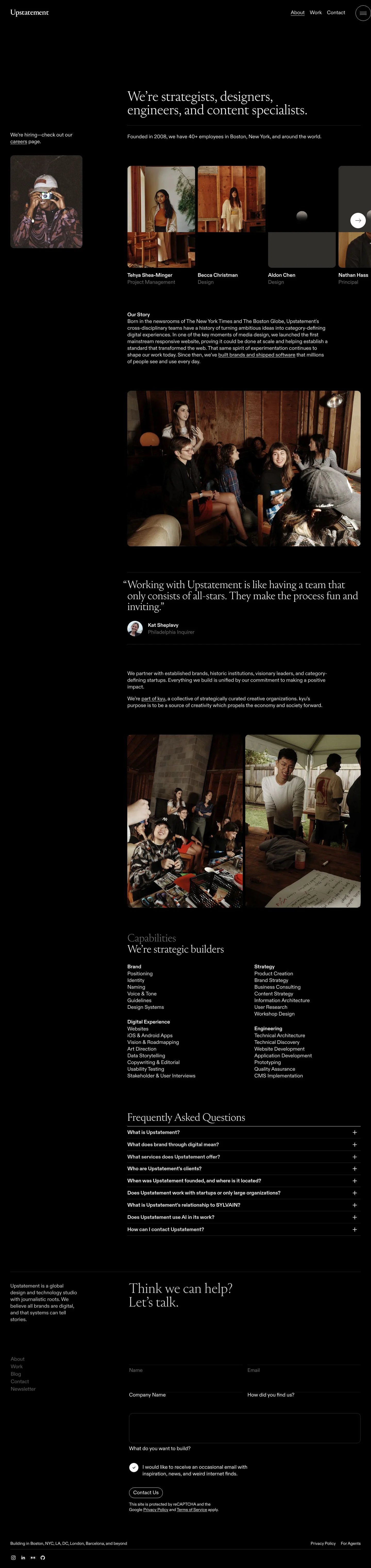
# Upstatement: Editorial Dark Mode with Pill Navigation and Cards

## Overview

Editorial, confident, and restrained. The site runs in dark mode with bright type on #000 backgrounds, relying on spacing and tonal shifts instead of color. Interactions favor rounded pills and soft 8px cards. Density is moderate: large section paddings with compact internal rhythm to keep long lists scannable.

## Colors

- **primary (#ffffff):** Primary text and key icons; use for headlines, names, and CTA text.
- **secondary (#7c7c7c):** Supporting copy such as roles, meta, and fine print.
- **neutral (#000000):** Core background and button fills; the base canvas for dark mode.
- **border (#374151):** Subtle dividers, outlines, and input borders on dark surfaces.
- **brand-desired-dawn (#d8d8d8):** Light accent for gentle highlights or muted UI states on dark backgrounds.
- **surface (#000000):** Alias of neutral; page surfaces and cards.
- **on-surface (#ffffff):** Alias of primary; default text color over surface.

## Typography

Diatype drives the entire system.
- Diatype (custom/self-hosted): A modern grotesk used for all headings and body. Not freely loadable by agents. Suggested substitutes with similar tone and metrics: Inter, Manrope, or IBM Plex Sans.
- Headings: headline-lg 32px/1.19 (700) for page intros; headline-md 24px/1.21 (700) for section leads; headline-sm 20px/1.4 (700) and headline-xs 18px/1.22 (600) for subheads, list titles, and accordion triggers.
- Body: body-md 16px/1.75 (600) for paragraphs, captions, and list items. Keep secondary text in the same size with the secondary color for hierarchy.

## Layout

Spacing follows a simple, scalable rhythm: xs 8px for micro gaps, sm 16px for inline padding and card gutters, md 30px for grid gutters and row gaps, lg 60px for section padding, and xl 120px for major section breaks. Use a flexible multi-column grid; on desktop, allocate md (30px) gutters between cards and lists, expanding to lg (60px) at section edges. Content width should breathe on the dark canvas—avoid crowding against the viewport.

## Elevation & Depth

Depth is minimal. Only a light sm shadow (0 0 5px, mid-gray) is available; md+ shadows are none. Hierarchy is conveyed by tonal contrast (#000 surfaces vs #fff type), fine borders in #374151, and whitespace. Reserve shadow-sm for interactive hover states or floating elements only.

## Shapes

Two radii define the language: sm 8px for cards, images, inputs, and media; full 9999px for pills, circular controls, and avatars. Pills signal interactivity and motion (e.g., next/prev, primary actions). Keep radii consistent—do not mix sharp corners with rounded content in the same group.

## Components

Buttons
- Primary & Secondary: #000 background with #fff text, fully rounded (9999px), 41px height, padding 9px 15px 10px. Use where a high-emphasis pill is needed on lighter blocks or within bordered controls.
- Link: Text-only in #fff, no radius. Use for inline CTAs.
- Card: #000 background, #fff text, 8px radius, 16px padding. Pair with #374151 borders when the card sits on another #000 surface.

Distinctive on this page

### Header navigation
- Left-aligned wordmark; right-aligned text links (About, Work, Contact) and a circular menu button. Text uses body-md 16px (600, #fff). Use border #374151 for the menu pill outline; spacing sm 16px between items.

### Hero introduction
- Intro paragraph set in headline-lg (32/1.19, 700, #fff) followed by supporting line in body-md (#7c7c7c). Apply a subtle divider below using border #374151 with md 30px spacing above and below.

### People grid
- Image cards with sm 8px radius and md 30px gaps. Name in #fff (body-md 16/1.75, 600); role in #7c7c7c. Use card padding 16px when captions sit on the image; otherwise place captions below with sm 16px spacing.

### Careers teaser card
- A left-rail card promoting jobs: card background #000, 8px radius, internal padding 16px; image corners match 8px. Copy in #fff with a link-style CTA.

### Capabilities matrix
- Four titled lists. Use headline-sm (20px, 700) for headings and body-md for items. Apply md 30px column gaps and sm 16px list spacing; dividers in #374151 are optional.

### FAQ accordion
- Triggers in headline-xs (18px, 600, #fff) with section borders #374151. Answers in body-md 16px, secondary color for long reads. Padding sm 16px inside each panel.

### Contact form
- Inputs over #000 with 8px radius, 1px border #374151, text #fff/labels #7c7c7c. Primary submit as a 41px pill (background #000, text #fff). Field spacing sm 16px; group spacing md 30px.

### Footer
- Multi-column links in body-md with secondary color. Top border #374151, section padding lg 60px; social links follow the same sizing.

## Do's and Don'ts

- Do keep text colors to primary (#ffffff) and secondary (#7c7c7c); introduce other hues only for imagery.
- Do use border (#374151) to separate #000-on-#000 elements and to outline pills.
- Do apply sm (8px) radii to media and cards; reserve full (9999px) for buttons and circular controls.
- Don't add heavy shadows—only the sm shadow is available; md+ are none.
- Don't place black-filled buttons directly on #000 without an outline or contrasting container.
- Don't downgrade body text below 16px; readability on dark surfaces depends on body-md sizing and generous line height.

## Agent Prompt Guide

Quick color reference
- Text: #ffffff
- Background: #000000
- Border: #374151
- Accent (muted highlight): #d8d8d8

1) Build a hero intro
- Background #000000; container padding-top 120px and padding-bottom 60px.
- Headline uses Diatype (or Inter/Manrope/IBM Plex Sans fallback), 32px, weight 700, line-height 1.19, color #ffffff.
- Supporting paragraph in 16px, weight 600, line-height 1.75, color #7c7c7c.
- Add a 1px divider in #374151 with 30px spacing above/below.

2) Create a People grid
- Three columns on desktop with 30px column gaps and 30px row gaps.
- Each card: background #000000, 8px radius, image corners 8px, internal padding 16px when captions overlay.
- Name: 16px/1.75, weight 600, color #ffffff. Role: 16px/1.75, weight 600, color #7c7c7c.

3) Capabilities matrix
- Four columns; section title in 20px, weight 700, line-height 1.4, color #ffffff.
- List items in 16px, weight 600, line-height 1.75, color #ffffff with 16px vertical spacing; 30px column gaps.
- Optional list separators: 1px #374151.

4) Contact form + CTA
- Inputs: 8px radius, 1px border #374151, background #000000, text #ffffff, label color #7c7c7c.
- Spacing: 16px between fields, 30px between groups.
- Submit button: height 41px, padding 9px 15px 10px, fully rounded (9999px), background #000000, text #ffffff.

## Similar Brands

- Instrument — Also favors dark, editorial canvases; Instrument leans more on motion while Upstatement relies on quiet spacing and type.
- Stink Studios — High-contrast black layouts and pill accents; Stink deploys bolder color pops than Upstatement's restrained palette.
- Ueno (archive) — Minimal, people-forward sections with soft cards; Upstatement is more text-led and less playful.
- Pentagram — Typographic rigor and sparse palettes; Pentagram uses more stark grids and often lighter themes, whereas Upstatement stays dark-first.

## Tokens

### CSS custom properties

```css
:root {
  /* Colors */
  --color-primary: #ffffff;
  --color-secondary: #7c7c7c;
  --color-neutral: #000000;
  --color-border: #374151;
  --color-brand-desired-dawn: #d8d8d8;
  --color-surface: var(--color-neutral);
  --color-on-surface: var(--color-primary);

  /* Typography */
  --text-headline-lg-size: 32px;
  --text-headline-lg-weight: 700;
  --text-headline-lg-leading: 1.19;
  --text-headline-md-size: 24px;
  --text-headline-md-weight: 700;
  --text-headline-md-leading: 1.21;
  --text-headline-sm-size: 20px;
  --text-headline-sm-weight: 700;
  --text-headline-sm-leading: 1.4;
  --text-headline-xs-size: 18px;
  --text-headline-xs-weight: 600;
  --text-headline-xs-leading: 1.22;
  --text-body-md-size: 16px;
  --text-body-md-weight: 600;
  --text-body-md-leading: 1.75;
  --font-diatype: "Diatype";

  /* Rounded */
  --radius-sm: 8px;
  --radius-full: 9999px;

  /* Spacing */
  --spacing-xs: 8px;
  --spacing-sm: 16px;
  --spacing-md: 30px;
  --spacing-lg: 60px;
  --spacing-xl: 120px;

  /* Components */
  --button-primary-background-color: var(--color-neutral);
  --button-primary-text-color: var(--color-primary);
  --button-primary-rounded: var(--radius-full);
  --button-primary-padding: 9px 15px 10px;
  --button-primary-height: 41px;
  --button-secondary-background-color: var(--color-neutral);
  --button-secondary-text-color: var(--color-primary);
  --button-secondary-rounded: var(--radius-full);
  --button-secondary-padding: 9px 15px 10px;
  --button-secondary-height: 41px;
  --button-link-text-color: var(--color-primary);
  --button-link-rounded: 0px;
  --card-background-color: var(--color-neutral);
  --card-text-color: var(--color-primary);
  --card-rounded: var(--radius-sm);
  --card-padding: 16px;
}
```

### Tailwind theme

```css
@theme {
  --color-primary: #ffffff;
  --color-secondary: #7c7c7c;
  --color-neutral: #000000;
  --color-border: #374151;
  --color-brand-desired-dawn: #d8d8d8;
  --color-surface: #000000;
  --color-on-surface: #ffffff;
  --font-headline-lg: "Diatype";
  --font-headline-md: "Diatype";
  --font-headline-sm: "Diatype";
  --font-headline-xs: "Diatype";
  --font-body-md: "Diatype";
  --text-headline-lg: 32px;
  --text-headline-md: 24px;
  --text-headline-sm: 20px;
  --text-headline-xs: 18px;
  --text-body-md: 16px;
  --font-weight-headline-lg: 700;
  --font-weight-headline-md: 700;
  --font-weight-headline-sm: 700;
  --font-weight-headline-xs: 600;
  --font-weight-body-md: 600;
  --radius-sm: 8px;
  --radius-full: 9999px;
  --spacing-xs: 8px;
  --spacing-sm: 16px;
  --spacing-md: 30px;
  --spacing-lg: 60px;
  --spacing-xl: 120px;
}
```

### Design tokens (DTCG)

```json
{
    "$schema": "https://www.designtokens.org/schemas/2025.10/format.json",
    "color": {
        "$type": "color",
        "primary": {
            "$value": {
                "colorSpace": "srgb",
                "components": [
                    1,
                    1,
                    1
                ],
                "hex": "#ffffff"
            }
        },
        "secondary": {
            "$value": {
                "colorSpace": "srgb",
                "components": [
                    0.486,
                    0.486,
                    0.486
                ],
                "hex": "#7c7c7c"
            }
        },
        "neutral": {
            "$value": {
                "colorSpace": "srgb",
                "components": [
                    0,
                    0,
                    0
                ],
                "hex": "#000000"
            }
        },
        "border": {
            "$value": {
                "colorSpace": "srgb",
                "components": [
                    0.216,
                    0.255,
                    0.318
                ],
                "hex": "#374151"
            }
        },
        "brand-desired-dawn": {
            "$value": {
                "colorSpace": "srgb",
                "components": [
                    0.847,
                    0.847,
                    0.847
                ],
                "hex": "#d8d8d8"
            }
        },
        "surface": {
            "$value": {
                "colorSpace": "srgb",
                "components": [
                    0,
                    0,
                    0
                ],
                "hex": "#000000"
            }
        },
        "on-surface": {
            "$value": {
                "colorSpace": "srgb",
                "components": [
                    1,
                    1,
                    1
                ],
                "hex": "#ffffff"
            }
        }
    },
    "spacing": {
        "$type": "dimension",
        "xs": {
            "$value": {
                "value": 8,
                "unit": "px"
            }
        },
        "sm": {
            "$value": {
                "value": 16,
                "unit": "px"
            }
        },
        "md": {
            "$value": {
                "value": 30,
                "unit": "px"
            }
        },
        "lg": {
            "$value": {
                "value": 60,
                "unit": "px"
            }
        },
        "xl": {
            "$value": {
                "value": 120,
                "unit": "px"
            }
        }
    },
    "rounded": {
        "$type": "dimension",
        "sm": {
            "$value": {
                "value": 8,
                "unit": "px"
            }
        },
        "full": {
            "$value": {
                "value": 9999,
                "unit": "px"
            }
        }
    },
    "typography": {
        "headline-lg": {
            "$type": "typography",
            "$value": {
                "fontFamily": "Diatype",
                "fontSize": {
                    "value": 32,
                    "unit": "px"
                },
                "fontWeight": 700
            }
        },
        "headline-md": {
            "$type": "typography",
            "$value": {
                "fontFamily": "Diatype",
                "fontSize": {
                    "value": 24,
                    "unit": "px"
                },
                "fontWeight": 700
            }
        },
        "headline-sm": {
            "$type": "typography",
            "$value": {
                "fontFamily": "Diatype",
                "fontSize": {
                    "value": 20,
                    "unit": "px"
                },
                "fontWeight": 700
            }
        },
        "headline-xs": {
            "$type": "typography",
            "$value": {
                "fontFamily": "Diatype",
                "fontSize": {
                    "value": 18,
                    "unit": "px"
                },
                "fontWeight": 600
            }
        },
        "body-md": {
            "$type": "typography",
            "$value": {
                "fontFamily": "Diatype",
                "fontSize": {
                    "value": 16,
                    "unit": "px"
                },
                "fontWeight": 600
            }
        }
    }
}
```

## Rules

- **Fonts.** If the specification names a custom or self-hosted family, use one of the substitutes it names. Never reference a typeface you cannot actually load — it will fall back to a system font and undo the typography.
- **Colour.** Derive the palette from the user's brand. Use the token values as a guide to *relationships* — contrast, tint, how many accents carry the page — not as hex codes to paste.
- **Never reproduce** the wordmark, mascot, logo, brand name, illustrations, icon set, screenshots or any copy from the reference.
- **Never present the result as Upstatement About**, or imply any connection to it.
- If something is unspecified, choose clarity and legibility over decoration.
---
version: alpha
name: Upstatement
description: "Upstatement: all brands are digital, and systems tell stories."
colors:
  primary: "#ffffff"
  secondary: "#7c7c7c"
  neutral: "#000000"
  border: "#374151"
  brand-desired-dawn: "#d8d8d8"
  surface: "{colors.neutral}"
  on-surface: "{colors.primary}"
typography:
  headline-lg:
    fontFamily: Diatype
    fontSize: 32px
    fontWeight: 700
    lineHeight: 1.19
  headline-md:
    fontFamily: Diatype
    fontSize: 24px
    fontWeight: 700
    lineHeight: 1.21
  headline-sm:
    fontFamily: Diatype
    fontSize: 20px
    fontWeight: 700
    lineHeight: 1.4
  headline-xs:
    fontFamily: Diatype
    fontSize: 18px
    fontWeight: 600
    lineHeight: 1.22
  body-md:
    fontFamily: Diatype
    fontSize: 16px
    fontWeight: 600
    lineHeight: 1.75
rounded:
  sm: 8px
  full: 9999px
spacing:
  xs: 8px
  sm: 16px
  md: 30px
  lg: 60px
  xl: 120px
components:
  button-primary:
    backgroundColor: "{colors.neutral}"
    textColor: "{colors.primary}"
    rounded: "{rounded.full}"
    padding: 9px 15px 10px
    height: 41px
  button-secondary:
    backgroundColor: "{colors.neutral}"
    textColor: "{colors.primary}"
    rounded: "{rounded.full}"
    padding: 9px 15px 10px
    height: 41px
  button-link:
    textColor: "{colors.primary}"
    rounded: 0px
  card:
    backgroundColor: "{colors.neutral}"
    textColor: "{colors.primary}"
    rounded: "{rounded.sm}"
    padding: 16px
---

# Upstatement: Editorial Dark Mode with Pill Navigation and Cards

## Overview

Editorial, confident, and restrained. The site runs in dark mode with bright type on #000 backgrounds, relying on spacing and tonal shifts instead of color. Interactions favor rounded pills and soft 8px cards. Density is moderate: large section paddings with compact internal rhythm to keep long lists scannable.

## Colors

- **primary (#ffffff):** Primary text and key icons; use for headlines, names, and CTA text.
- **secondary (#7c7c7c):** Supporting copy such as roles, meta, and fine print.
- **neutral (#000000):** Core background and button fills; the base canvas for dark mode.
- **border (#374151):** Subtle dividers, outlines, and input borders on dark surfaces.
- **brand-desired-dawn (#d8d8d8):** Light accent for gentle highlights or muted UI states on dark backgrounds.
- **surface (#000000):** Alias of neutral; page surfaces and cards.
- **on-surface (#ffffff):** Alias of primary; default text color over surface.

## Typography

Diatype drives the entire system.
- Diatype (custom/self-hosted): A modern grotesk used for all headings and body. Not freely loadable by agents. Suggested substitutes with similar tone and metrics: Inter, Manrope, or IBM Plex Sans.
- Headings: headline-lg 32px/1.19 (700) for page intros; headline-md 24px/1.21 (700) for section leads; headline-sm 20px/1.4 (700) and headline-xs 18px/1.22 (600) for subheads, list titles, and accordion triggers.
- Body: body-md 16px/1.75 (600) for paragraphs, captions, and list items. Keep secondary text in the same size with the secondary color for hierarchy.

## Layout

Spacing follows a simple, scalable rhythm: xs 8px for micro gaps, sm 16px for inline padding and card gutters, md 30px for grid gutters and row gaps, lg 60px for section padding, and xl 120px for major section breaks. Use a flexible multi-column grid; on desktop, allocate md (30px) gutters between cards and lists, expanding to lg (60px) at section edges. Content width should breathe on the dark canvas—avoid crowding against the viewport.

## Elevation & Depth

Depth is minimal. Only a light sm shadow (0 0 5px, mid-gray) is available; md+ shadows are none. Hierarchy is conveyed by tonal contrast (#000 surfaces vs #fff type), fine borders in #374151, and whitespace. Reserve shadow-sm for interactive hover states or floating elements only.

## Shapes

Two radii define the language: sm 8px for cards, images, inputs, and media; full 9999px for pills, circular controls, and avatars. Pills signal interactivity and motion (e.g., next/prev, primary actions). Keep radii consistent—do not mix sharp corners with rounded content in the same group.

## Components

Buttons
- Primary & Secondary: #000 background with #fff text, fully rounded (9999px), 41px height, padding 9px 15px 10px. Use where a high-emphasis pill is needed on lighter blocks or within bordered controls.
- Link: Text-only in #fff, no radius. Use for inline CTAs.
- Card: #000 background, #fff text, 8px radius, 16px padding. Pair with #374151 borders when the card sits on another #000 surface.

Distinctive on this page

### Header navigation
- Left-aligned wordmark; right-aligned text links (About, Work, Contact) and a circular menu button. Text uses body-md 16px (600, #fff). Use border #374151 for the menu pill outline; spacing sm 16px between items.

### Hero introduction
- Intro paragraph set in headline-lg (32/1.19, 700, #fff) followed by supporting line in body-md (#7c7c7c). Apply a subtle divider below using border #374151 with md 30px spacing above and below.

### People grid
- Image cards with sm 8px radius and md 30px gaps. Name in #fff (body-md 16/1.75, 600); role in #7c7c7c. Use card padding 16px when captions sit on the image; otherwise place captions below with sm 16px spacing.

### Careers teaser card
- A left-rail card promoting jobs: card background #000, 8px radius, internal padding 16px; image corners match 8px. Copy in #fff with a link-style CTA.

### Capabilities matrix
- Four titled lists. Use headline-sm (20px, 700) for headings and body-md for items. Apply md 30px column gaps and sm 16px list spacing; dividers in #374151 are optional.

### FAQ accordion
- Triggers in headline-xs (18px, 600, #fff) with section borders #374151. Answers in body-md 16px, secondary color for long reads. Padding sm 16px inside each panel.

### Contact form
- Inputs over #000 with 8px radius, 1px border #374151, text #fff/labels #7c7c7c. Primary submit as a 41px pill (background #000, text #fff). Field spacing sm 16px; group spacing md 30px.

### Footer
- Multi-column links in body-md with secondary color. Top border #374151, section padding lg 60px; social links follow the same sizing.

## Do's and Don'ts

- Do keep text colors to primary (#ffffff) and secondary (#7c7c7c); introduce other hues only for imagery.
- Do use border (#374151) to separate #000-on-#000 elements and to outline pills.
- Do apply sm (8px) radii to media and cards; reserve full (9999px) for buttons and circular controls.
- Don't add heavy shadows—only the sm shadow is available; md+ are none.
- Don't place black-filled buttons directly on #000 without an outline or contrasting container.
- Don't downgrade body text below 16px; readability on dark surfaces depends on body-md sizing and generous line height.

## Agent Prompt Guide

Quick color reference
- Text: #ffffff
- Background: #000000
- Border: #374151
- Accent (muted highlight): #d8d8d8

1) Build a hero intro
- Background #000000; container padding-top 120px and padding-bottom 60px.
- Headline uses Diatype (or Inter/Manrope/IBM Plex Sans fallback), 32px, weight 700, line-height 1.19, color #ffffff.
- Supporting paragraph in 16px, weight 600, line-height 1.75, color #7c7c7c.
- Add a 1px divider in #374151 with 30px spacing above/below.

2) Create a People grid
- Three columns on desktop with 30px column gaps and 30px row gaps.
- Each card: background #000000, 8px radius, image corners 8px, internal padding 16px when captions overlay.
- Name: 16px/1.75, weight 600, color #ffffff. Role: 16px/1.75, weight 600, color #7c7c7c.

3) Capabilities matrix
- Four columns; section title in 20px, weight 700, line-height 1.4, color #ffffff.
- List items in 16px, weight 600, line-height 1.75, color #ffffff with 16px vertical spacing; 30px column gaps.
- Optional list separators: 1px #374151.

4) Contact form + CTA
- Inputs: 8px radius, 1px border #374151, background #000000, text #ffffff, label color #7c7c7c.
- Spacing: 16px between fields, 30px between groups.
- Submit button: height 41px, padding 9px 15px 10px, fully rounded (9999px), background #000000, text #ffffff.

## Similar Brands

- Instrument — Also favors dark, editorial canvases; Instrument leans more on motion while Upstatement relies on quiet spacing and type.
- Stink Studios — High-contrast black layouts and pill accents; Stink deploys bolder color pops than Upstatement's restrained palette.
- Ueno (archive) — Minimal, people-forward sections with soft cards; Upstatement is more text-led and less playful.
- Pentagram — Typographic rigor and sparse palettes; Pentagram uses more stark grids and often lighter themes, whereas Upstatement stays dark-first.
:root {
  /* Colors */
  --color-primary: #ffffff;
  --color-secondary: #7c7c7c;
  --color-neutral: #000000;
  --color-border: #374151;
  --color-brand-desired-dawn: #d8d8d8;
  --color-surface: var(--color-neutral);
  --color-on-surface: var(--color-primary);

  /* Typography */
  --text-headline-lg-size: 32px;
  --text-headline-lg-weight: 700;
  --text-headline-lg-leading: 1.19;
  --text-headline-md-size: 24px;
  --text-headline-md-weight: 700;
  --text-headline-md-leading: 1.21;
  --text-headline-sm-size: 20px;
  --text-headline-sm-weight: 700;
  --text-headline-sm-leading: 1.4;
  --text-headline-xs-size: 18px;
  --text-headline-xs-weight: 600;
  --text-headline-xs-leading: 1.22;
  --text-body-md-size: 16px;
  --text-body-md-weight: 600;
  --text-body-md-leading: 1.75;
  --font-diatype: "Diatype";

  /* Rounded */
  --radius-sm: 8px;
  --radius-full: 9999px;

  /* Spacing */
  --spacing-xs: 8px;
  --spacing-sm: 16px;
  --spacing-md: 30px;
  --spacing-lg: 60px;
  --spacing-xl: 120px;

  /* Components */
  --button-primary-background-color: var(--color-neutral);
  --button-primary-text-color: var(--color-primary);
  --button-primary-rounded: var(--radius-full);
  --button-primary-padding: 9px 15px 10px;
  --button-primary-height: 41px;
  --button-secondary-background-color: var(--color-neutral);
  --button-secondary-text-color: var(--color-primary);
  --button-secondary-rounded: var(--radius-full);
  --button-secondary-padding: 9px 15px 10px;
  --button-secondary-height: 41px;
  --button-link-text-color: var(--color-primary);
  --button-link-rounded: 0px;
  --card-background-color: var(--color-neutral);
  --card-text-color: var(--color-primary);
  --card-rounded: var(--radius-sm);
  --card-padding: 16px;
}
{
  "$schema": "https://www.designtokens.org/schemas/2025.10/format.json",
  "$description": "Upstatement: all brands are digital, and systems tell stories.",
  "color": {
    "$type": "color",
    "primary": {
      "$value": {
        "colorSpace": "srgb",
        "components": [
          1,
          1,
          1
        ],
        "hex": "#ffffff"
      }
    },
    "secondary": {
      "$value": {
        "colorSpace": "srgb",
        "components": [
          0.486,
          0.486,
          0.486
        ],
        "hex": "#7c7c7c"
      }
    },
    "neutral": {
      "$value": {
        "colorSpace": "srgb",
        "components": [
          0,
          0,
          0
        ],
        "hex": "#000000"
      }
    },
    "border": {
      "$value": {
        "colorSpace": "srgb",
        "components": [
          0.216,
          0.255,
          0.318
        ],
        "hex": "#374151"
      }
    },
    "brand-desired-dawn": {
      "$value": {
        "colorSpace": "srgb",
        "components": [
          0.847,
          0.847,
          0.847
        ],
        "hex": "#d8d8d8"
      }
    },
    "surface": {
      "$value": {
        "colorSpace": "srgb",
        "components": [
          0,
          0,
          0
        ],
        "hex": "#000000"
      }
    },
    "on-surface": {
      "$value": {
        "colorSpace": "srgb",
        "components": [
          1,
          1,
          1
        ],
        "hex": "#ffffff"
      }
    }
  },
  "spacing": {
    "$type": "dimension",
    "xs": {
      "$value": {
        "value": 8,
        "unit": "px"
      }
    },
    "sm": {
      "$value": {
        "value": 16,
        "unit": "px"
      }
    },
    "md": {
      "$value": {
        "value": 30,
        "unit": "px"
      }
    },
    "lg": {
      "$value": {
        "value": 60,
        "unit": "px"
      }
    },
    "xl": {
      "$value": {
        "value": 120,
        "unit": "px"
      }
    }
  },
  "rounded": {
    "$type": "dimension",
    "sm": {
      "$value": {
        "value": 8,
        "unit": "px"
      }
    },
    "full": {
      "$value": {
        "value": 9999,
        "unit": "px"
      }
    }
  },
  "typography": {
    "headline-lg": {
      "$type": "typography",
      "$value": {
        "fontFamily": "Diatype",
        "fontSize": {
          "value": 32,
          "unit": "px"
        },
        "fontWeight": 700
      }
    },
    "headline-md": {
      "$type": "typography",
      "$value": {
        "fontFamily": "Diatype",
        "fontSize": {
          "value": 24,
          "unit": "px"
        },
        "fontWeight": 700
      }
    },
    "headline-sm": {
      "$type": "typography",
      "$value": {
        "fontFamily": "Diatype",
        "fontSize": {
          "value": 20,
          "unit": "px"
        },
        "fontWeight": 700
      }
    },
    "headline-xs": {
      "$type": "typography",
      "$value": {
        "fontFamily": "Diatype",
        "fontSize": {
          "value": 18,
          "unit": "px"
        },
        "fontWeight": 600
      }
    },
    "body-md": {
      "$type": "typography",
      "$value": {
        "fontFamily": "Diatype",
        "fontSize": {
          "value": 16,
          "unit": "px"
        },
        "fontWeight": 600
      }
    }
  }
}
@theme {
--color-primary: #ffffff;
--color-secondary: #7c7c7c;
--color-neutral: #000000;
--color-border: #374151;
--color-brand-desired-dawn: #d8d8d8;
--color-surface: #000000;
--color-on-surface: #ffffff;
--font-headline-lg: "Diatype";
--font-headline-md: "Diatype";
--font-headline-sm: "Diatype";
--font-headline-xs: "Diatype";
--font-body-md: "Diatype";
--text-headline-lg: 32px;
--text-headline-md: 24px;
--text-headline-sm: 20px;
--text-headline-xs: 18px;
--text-body-md: 16px;
--font-weight-headline-lg: 700;
--font-weight-headline-md: 700;
--font-weight-headline-sm: 700;
--font-weight-headline-xs: 600;
--font-weight-body-md: 600;
--radius-sm: 8px;
--radius-full: 9999px;
--spacing-xs: 8px;
--spacing-sm: 16px;
--spacing-md: 30px;
--spacing-lg: 60px;
--spacing-xl: 120px;
} # Design brief: the Upstatement About design language
Below is a complete design specification measured from a real, published web page. Use it as a design language for the user's product. It is not a page to reproduce.
## Reference images
- Full page: https://cdn.designmunk.com/2026/09/10153340/upstatement-com-about-featured.webp
- Above the fold: https://cdn.designmunk.com/2026/09/10153340/upstatement-com-about-featured.webp
- On DesignMunk: https://designmunk.com/upstatement-about-page/
Study these for hierarchy, rhythm, spacing and density. Where an image and the written spec disagree, the spec wins: the tokens were read from the page's own CSS, the images are one rendering of it.
## Before you start
Ask the user what they are building, who it is for, and what brand assets they already have — name, colours, typefaces. Wait for their answers before writing anything. Everything below is then applied to their product, not to the reference.
## Design specification
# Upstatement: Editorial Dark Mode with Pill Navigation and Cards
## Overview
Editorial, confident, and restrained. The site runs in dark mode with bright type on #000 backgrounds, relying on spacing and tonal shifts instead of color. Interactions favor rounded pills and soft 8px cards. Density is moderate: large section paddings with compact internal rhythm to keep long lists scannable.
## Colors
- **primary (#ffffff):** Primary text and key icons; use for headlines, names, and CTA text.
- **secondary (#7c7c7c):** Supporting copy such as roles, meta, and fine print.
- **neutral (#000000):** Core background and button fills; the base canvas for dark mode.
- **border (#374151):** Subtle dividers, outlines, and input borders on dark surfaces.
- **brand-desired-dawn (#d8d8d8):** Light accent for gentle highlights or muted UI states on dark backgrounds.
- **surface (#000000):** Alias of neutral; page surfaces and cards.
- **on-surface (#ffffff):** Alias of primary; default text color over surface.
## Typography
Diatype drives the entire system.
- Diatype (custom/self-hosted): A modern grotesk used for all headings and body. Not freely loadable by agents. Suggested substitutes with similar tone and metrics: Inter, Manrope, or IBM Plex Sans.
- Headings: headline-lg 32px/1.19 (700) for page intros; headline-md 24px/1.21 (700) for section leads; headline-sm 20px/1.4 (700) and headline-xs 18px/1.22 (600) for subheads, list titles, and accordion triggers.
- Body: body-md 16px/1.75 (600) for paragraphs, captions, and list items. Keep secondary text in the same size with the secondary color for hierarchy.
## Layout
Spacing follows a simple, scalable rhythm: xs 8px for micro gaps, sm 16px for inline padding and card gutters, md 30px for grid gutters and row gaps, lg 60px for section padding, and xl 120px for major section breaks. Use a flexible multi-column grid; on desktop, allocate md (30px) gutters between cards and lists, expanding to lg (60px) at section edges. Content width should breathe on the dark canvas—avoid crowding against the viewport.
## Elevation & Depth
Depth is minimal. Only a light sm shadow (0 0 5px, mid-gray) is available; md+ shadows are none. Hierarchy is conveyed by tonal contrast (#000 surfaces vs #fff type), fine borders in #374151, and whitespace. Reserve shadow-sm for interactive hover states or floating elements only.
## Shapes
Two radii define the language: sm 8px for cards, images, inputs, and media; full 9999px for pills, circular controls, and avatars. Pills signal interactivity and motion (e.g., next/prev, primary actions). Keep radii consistent—do not mix sharp corners with rounded content in the same group.
## Components
Buttons
- Primary & Secondary: #000 background with #fff text, fully rounded (9999px), 41px height, padding 9px 15px 10px. Use where a high-emphasis pill is needed on lighter blocks or within bordered controls.
- Link: Text-only in #fff, no radius. Use for inline CTAs.
- Card: #000 background, #fff text, 8px radius, 16px padding. Pair with #374151 borders when the card sits on another #000 surface.
Distinctive on this page
### Header navigation
- Left-aligned wordmark; right-aligned text links (About, Work, Contact) and a circular menu button. Text uses body-md 16px (600, #fff). Use border #374151 for the menu pill outline; spacing sm 16px between items.
### Hero introduction
- Intro paragraph set in headline-lg (32/1.19, 700, #fff) followed by supporting line in body-md (#7c7c7c). Apply a subtle divider below using border #374151 with md 30px spacing above and below.
### People grid
- Image cards with sm 8px radius and md 30px gaps. Name in #fff (body-md 16/1.75, 600); role in #7c7c7c. Use card padding 16px when captions sit on the image; otherwise place captions below with sm 16px spacing.
### Careers teaser card
- A left-rail card promoting jobs: card background #000, 8px radius, internal padding 16px; image corners match 8px. Copy in #fff with a link-style CTA.
### Capabilities matrix
- Four titled lists. Use headline-sm (20px, 700) for headings and body-md for items. Apply md 30px column gaps and sm 16px list spacing; dividers in #374151 are optional.
### FAQ accordion
- Triggers in headline-xs (18px, 600, #fff) with section borders #374151. Answers in body-md 16px, secondary color for long reads. Padding sm 16px inside each panel.
### Contact form
- Inputs over #000 with 8px radius, 1px border #374151, text #fff/labels #7c7c7c. Primary submit as a 41px pill (background #000, text #fff). Field spacing sm 16px; group spacing md 30px.
### Footer
- Multi-column links in body-md with secondary color. Top border #374151, section padding lg 60px; social links follow the same sizing.
## Do's and Don'ts
- Do keep text colors to primary (#ffffff) and secondary (#7c7c7c); introduce other hues only for imagery.
- Do use border (#374151) to separate #000-on-#000 elements and to outline pills.
- Do apply sm (8px) radii to media and cards; reserve full (9999px) for buttons and circular controls.
- Don't add heavy shadows—only the sm shadow is available; md+ are none.
- Don't place black-filled buttons directly on #000 without an outline or contrasting container.
- Don't downgrade body text below 16px; readability on dark surfaces depends on body-md sizing and generous line height.
## Agent Prompt Guide
Quick color reference
- Text: #ffffff
- Background: #000000
- Border: #374151
- Accent (muted highlight): #d8d8d8
1) Build a hero intro
- Background #000000; container padding-top 120px and padding-bottom 60px.
- Headline uses Diatype (or Inter/Manrope/IBM Plex Sans fallback), 32px, weight 700, line-height 1.19, color #ffffff.
- Supporting paragraph in 16px, weight 600, line-height 1.75, color #7c7c7c.
- Add a 1px divider in #374151 with 30px spacing above/below.
2) Create a People grid
- Three columns on desktop with 30px column gaps and 30px row gaps.
- Each card: background #000000, 8px radius, image corners 8px, internal padding 16px when captions overlay.
- Name: 16px/1.75, weight 600, color #ffffff. Role: 16px/1.75, weight 600, color #7c7c7c.
3) Capabilities matrix
- Four columns; section title in 20px, weight 700, line-height 1.4, color #ffffff.
- List items in 16px, weight 600, line-height 1.75, color #ffffff with 16px vertical spacing; 30px column gaps.
- Optional list separators: 1px #374151.
4) Contact form + CTA
- Inputs: 8px radius, 1px border #374151, background #000000, text #ffffff, label color #7c7c7c.
- Spacing: 16px between fields, 30px between groups.
- Submit button: height 41px, padding 9px 15px 10px, fully rounded (9999px), background #000000, text #ffffff.
## Tokens
### CSS custom properties
```css
:root {
/* Colors */
--color-primary: #ffffff;
--color-secondary: #7c7c7c;
--color-neutral: #000000;
--color-border: #374151;
--color-brand-desired-dawn: #d8d8d8;
--color-surface: var(--color-neutral);
--color-on-surface: var(--color-primary);
/* Typography */
--text-headline-lg-size: 32px;
--text-headline-lg-weight: 700;
--text-headline-lg-leading: 1.19;
--text-headline-md-size: 24px;
--text-headline-md-weight: 700;
--text-headline-md-leading: 1.21;
--text-headline-sm-size: 20px;
--text-headline-sm-weight: 700;
--text-headline-sm-leading: 1.4;
--text-headline-xs-size: 18px;
--text-headline-xs-weight: 600;
--text-headline-xs-leading: 1.22;
--text-body-md-size: 16px;
--text-body-md-weight: 600;
--text-body-md-leading: 1.75;
--font-diatype: "Diatype";
/* Rounded */
--radius-sm: 8px;
--radius-full: 9999px;
/* Spacing */
--spacing-xs: 8px;
--spacing-sm: 16px;
--spacing-md: 30px;
--spacing-lg: 60px;
--spacing-xl: 120px;
/* Components */
--button-primary-background-color: var(--color-neutral);
--button-primary-text-color: var(--color-primary);
--button-primary-rounded: var(--radius-full);
--button-primary-padding: 9px 15px 10px;
--button-primary-height: 41px;
--button-secondary-background-color: var(--color-neutral);
--button-secondary-text-color: var(--color-primary);
--button-secondary-rounded: var(--radius-full);
--button-secondary-padding: 9px 15px 10px;
--button-secondary-height: 41px;
--button-link-text-color: var(--color-primary);
--button-link-rounded: 0px;
--card-background-color: var(--color-neutral);
--card-text-color: var(--color-primary);
--card-rounded: var(--radius-sm);
--card-padding: 16px;
}
```
## Rules
- **Fonts.** If the specification names a custom or self-hosted family, use one of the substitutes it names. Never reference a typeface you cannot actually load — it will fall back to a system font and undo the typography.
- **Colour.** Derive the palette from the user's brand. Use the token values as a guide to *relationships* — contrast, tint, how many accents carry the page — not as hex codes to paste.
- **Never reproduce** the wordmark, mascot, logo, brand name, illustrations, icon set, screenshots or any copy from the reference.
- **Never present the result as Upstatement About**, or imply any connection to it.
- If something is unspecified, choose clarity and legibility over decoration.