Unrivaled Sports
unrivaledsportsco.com
Unrivaled selection for serious sports collectors and fans.
unrivaledsportsco.com
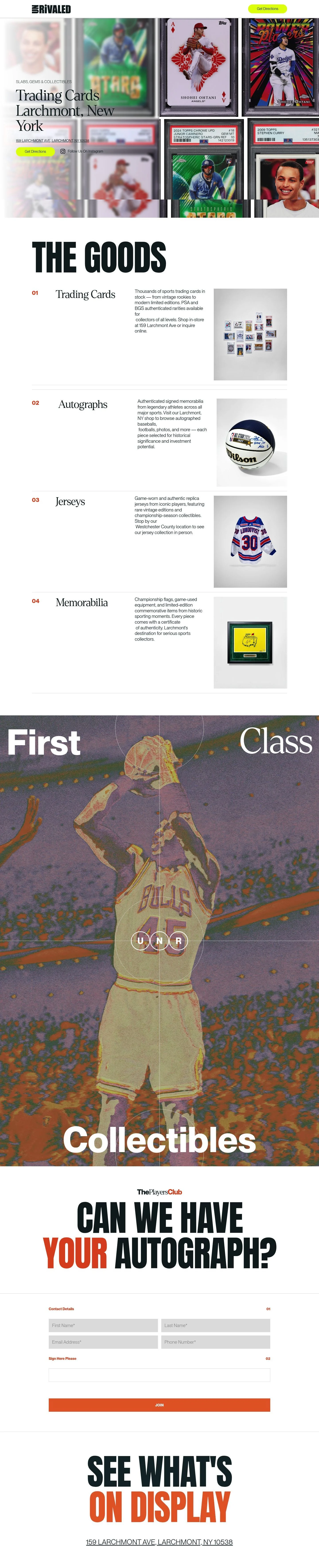
AI Breakdown
Design export
# Design brief: the Unrivaled Sports design language

Below is a complete design specification measured from a real, published web page. Use it as a design language for the user's product. It is not a page to reproduce.

## Reference images

- Full page: https://cdn.designmunk.com/2026/09/04180411/unrivaledsportsco-com-featured.webp
- Above the fold: https://cdn.designmunk.com/2026/09/04180411/unrivaledsportsco-com-featured.webp
- On DesignMunk: https://designmunk.com/unrivaled-sports/

Study these for hierarchy, rhythm, spacing and density. Where an image and the written spec disagree, the spec wins: the tokens were read from the page's own CSS, the images are one rendering of it.

## Before you start

Ask the user what they are building, who it is for, and what brand assets they already have — name, colours, typefaces. Wait for their answers before writing anything. Everything below is then applied to their product, not to the reference.

## Design specification

# Unrivaled Sports: Highlighter CTA Over Graded Card Grid

## Overview

Unrivaled Sports is a local, collector-first storefront site. The tone is confident and tactile — big headlines over a collage of graded cards — with a single job: get visitors to the Larchmont shop. The palette is mostly monochrome with a bright accent for calls to action. Layouts are spacious in sectioning but dense in imagery to echo packed display cases.

## Colors

- Primary (#122023): Deep ink for headlines, core text, and icons.
- Secondary (#8c8b8c): Supporting copy and subdued UI labels.
- Tertiary (#e1ff01): High-impact accent for CTAs, chips, and highlights only.
- Neutral (#ffffff): Page background and card surfaces.
- Border (#e5e7eb): Dividers, input strokes, and subtle section rules.
- Brand-compact-disc-grey (#cecdcd): Metallic-leaning neutral for decorative elements and low-contrast fills.
- Surface (#ffffff): Default surface on which content sits.
- On-surface (#122023): Text color when placed on surfaces.

## Typography

- Headline levels use Ppneuemontreal Book at 48px/36px, weight 700, for strong, editorial headlines; headline-xs at 21px weight 300 for small section leads. This family is custom/self-hosted and not directly obtainable. Substitutes: Inter (Google), Space Grotesk (Google), IBM Plex Sans (Google).
- Headline-sm uses Dentontest at 28px, weight 300, as a display accent for subheads or feature titles. This is also custom/unavailable. Substitutes: Barlow Condensed (Google), Oswald (Google), Antonio (Google) — all good for slender display headings.
- Body-md is Ppneuemontreal Book at 16px, weight 300, for paragraphs and meta. When substituting, match size/weight exactly and maintain a 1.4–1.6 reading line height.

## Layout

Spacing follows a large-step scale for clear sectioning: sm 16px for inner padding, md 40px for component gaps, lg 60px for section padding, xl 100px for hero bands. Use xs 2px for hairline offsets and icon nudges only. A simple 12-column grid with 16–24px gutters works; constrain main content to comfortable widths and let image grids bleed when desired. Vertical rhythm should stack in 40/60/100px increments to keep the collage + type composition balanced.

## Elevation & Depth

All measured shadows are none. Hierarchy is expressed through contrast, scale, borders (#e5e7eb), and generous negative space. Use the highlighter accent and bold headings to pull focus; rely on thin rules and tonal shifts rather than drop shadows for separation.

## Shapes

Two radii define affordance. sm 8px rounds for cards and inputs. full 9999px for pills and chips — the visual signature of CTAs like "Get Directions." Avoid mixing squared and rounded corners in the same element; keep shapes consistent by role.

## Components

Buttons
- Primary: Background #e1ff01, text #122023, pill radius 9999px, 40px tall, 10px 40px padding. Use for main actions only.
- Secondary: Text #122023, transparent background, pill radius 9999px, 40px tall. Place next to a primary or as a lighter alternative.
- Link: Text #122023, no radius, inline; reserve for navigational text links.
- Card: Background #ffffff, text #122023, 8px radius, 16px padding.

### Hero Card Collage
Full-bleed photo grid backdrop with a left-aligned headline (headline-lg 48px/700) and address link. Primary CTA uses the tertiary #e1ff01 pill. Top/bottom padding: xl 100px.

### Floating Directions Chip
A fixed or absolutely positioned chip at the top right. Height 40px, pill radius full, background #e1ff01, text #122023, internal padding 10px 40px.

### The Goods Section Header
Oversized section title followed by numbered categories. Top margin lg 60px, bottom md 40px. Copy styles: headline-md 36px/700 for the title, body-md 16px for intro text.

### Numbered Feature List (01–04)
Four items in a 2×2 grid on desktop; gap md 40px. Each item: small number label, subhead using headline-sm 28px/300, body-md 16px, and a short blurb.

### Instagram Follow Row
Inline icon + label styled as button-link. Keep text #122023 with no background; spacing sm 16px between icon and label.

### Autograph Contact Form
Two-step micro-flow with headings like "sign here please." Form wrapper is a card (8px radius, 16px padding). Inputs use border #e5e7eb; error message copies the body style in #122023.

### Address Bar
A text link to Google Maps placed under the hero headline and again near the footer. Style as button-link with clear hover state and adequate clickable padding (sm 16px inset).

### On-Display Gallery Strip
A horizontally scrolling or grid strip of card images. Use md 40px gaps and let imagery edge-to-edge; no shadows, optional 2px white gutters for seams.

## Do's and Don'ts

- Do reserve #e1ff01 for primary CTAs, chips, and critical highlights; it should not appear in body text blocks.
- Do align section paddings and gaps to 40/60/100px to maintain rhythm.
- Do keep components shadow-free; use #e5e7eb borders for separation.
- Don't mix square and pill shapes within a single control; pills indicate click-through actions.
- Don't substitute fonts without matching size/weight; if customs are unavailable, use Inter or Space Grotesk for all sans roles and Barlow Condensed for display accents.
- Don't introduce dark backgrounds; this system assumes a white surface with dark ink text.

## Agent Prompt Guide

Quick color reference
- Text: #122023
- Background: #ffffff
- Border: #e5e7eb
- Accent: #e1ff01

1) Build the hero header
- Background: full-bleed image.
- H1: Ppneuemontreal Book, 48px, weight 700, color #122023.
- Address link: body 16px, #122023.
- Primary CTA: 40px tall pill, 10px 40px padding, background #e1ff01, text #122023, border none, radius 9999px.
- Section padding: top/bottom 100px.

2) Create a 2×2 "The Goods" feature grid
- Wrapper: max-width 1200px, grid 2 columns, gap 40px.
- Item title: Dentontest 28px, weight 300, color #122023.
- Body: Ppneuemontreal Book 16px, weight 300, color #122023.
- Number label: Ppneuemontreal Book 21px, weight 300.
- If customs unavailable, use Inter (sans) and Barlow Condensed (display).

3) Autograph contact card
- Container: background #ffffff, radius 8px, padding 16px, border 1px solid #e5e7eb.
- Inputs: 44px height, 1px border #e5e7eb, radius 8px, text #122023.
- Submit button: pill 40px tall, background #e1ff01, text #122023.
- Error text: body 16px, #122023.

4) Floating "Get Directions" chip
- Position: fixed top 16px right 16px.
- Height 40px, padding 10px 40px, radius 9999px.
- Background #e1ff01, text #122023, no shadow, border none.

5) Address footer strip
- Layout: centered stack with 60px top padding and 40px bottom padding.
- Link style: button-link, color #122023, underline on hover, spacing sm 16px from adjacent elements.

## Similar Brands

- StockX: Greyscale base with a punchy accent; they lean into full e-commerce flows where Unrivaled keeps it store-first.
- GOAT: Minimal black/white and oversized type; GOAT is product-grid heavy while Unrivaled prioritizes directions and categories.
- PSA (psacard.com): Collector credibility and white surfaces; PSA uses patriotic reds/blues instead of neon accent.
- Fanatics: Sports retail with strong sans headlines; offers deep navigation and checkout where Unrivaled stays informational.

## Tokens

### CSS custom properties

```css
:root {
  /* Colors */
  --color-primary: #122023;
  --color-secondary: #8c8b8c;
  --color-tertiary: #e1ff01;
  --color-neutral: #ffffff;
  --color-border: #e5e7eb;
  --color-brand-compact-disc-grey: #cecdcd;
  --color-surface: var(--color-neutral);
  --color-on-surface: var(--color-primary);

  /* Typography */
  --text-headline-lg-size: 48px;
  --text-headline-lg-weight: 700;
  --text-headline-lg-leading: 1.21;
  --text-headline-md-size: 36px;
  --text-headline-md-weight: 700;
  --text-headline-md-leading: 1.19;
  --text-headline-sm-size: 28px;
  --text-headline-sm-weight: 300;
  --text-headline-sm-leading: 1.54;
  --text-headline-xs-size: 21px;
  --text-headline-xs-weight: 300;
  --text-headline-xs-leading: 1.19;
  --text-body-md-size: 16px;
  --text-body-md-weight: 300;
  --font-ppneuemontreal-book: "Ppneuemontreal Book";
  --font-dentontest: "Dentontest";

  /* Rounded */
  --radius-sm: 8px;
  --radius-full: 9999px;

  /* Spacing */
  --spacing-xs: 2px;
  --spacing-sm: 16px;
  --spacing-md: 40px;
  --spacing-lg: 60px;
  --spacing-xl: 100px;

  /* Components */
  --button-primary-background-color: var(--color-tertiary);
  --button-primary-text-color: var(--color-primary);
  --button-primary-rounded: var(--radius-full);
  --button-primary-padding: 10px 40px;
  --button-primary-height: 40px;
  --button-secondary-text-color: var(--color-primary);
  --button-secondary-rounded: var(--radius-full);
  --button-secondary-padding: 10px 40px;
  --button-secondary-height: 40px;
  --button-link-text-color: var(--color-primary);
  --button-link-rounded: 0px;
  --card-background-color: var(--color-neutral);
  --card-text-color: var(--color-primary);
  --card-rounded: var(--radius-sm);
  --card-padding: 16px;
}
```

### Tailwind theme

```css
@theme {
  --color-primary: #122023;
  --color-secondary: #8c8b8c;
  --color-tertiary: #e1ff01;
  --color-neutral: #ffffff;
  --color-border: #e5e7eb;
  --color-brand-compact-disc-grey: #cecdcd;
  --color-surface: #ffffff;
  --color-on-surface: #122023;
  --font-headline-lg: "Ppneuemontreal Book";
  --font-headline-md: "Ppneuemontreal Book";
  --font-headline-sm: "Dentontest";
  --font-headline-xs: "Ppneuemontreal Book";
  --font-body-md: "Ppneuemontreal Book";
  --text-headline-lg: 48px;
  --text-headline-md: 36px;
  --text-headline-sm: 28px;
  --text-headline-xs: 21px;
  --text-body-md: 16px;
  --font-weight-headline-lg: 700;
  --font-weight-headline-md: 700;
  --font-weight-headline-sm: 300;
  --font-weight-headline-xs: 300;
  --font-weight-body-md: 300;
  --radius-sm: 8px;
  --radius-full: 9999px;
  --spacing-xs: 2px;
  --spacing-sm: 16px;
  --spacing-md: 40px;
  --spacing-lg: 60px;
  --spacing-xl: 100px;
}
```

### Design tokens (DTCG)

```json
{
    "$schema": "https://www.designtokens.org/schemas/2025.10/format.json",
    "color": {
        "$type": "color",
        "primary": {
            "$value": {
                "colorSpace": "srgb",
                "components": [
                    0.071,
                    0.125,
                    0.137
                ],
                "hex": "#122023"
            }
        },
        "secondary": {
            "$value": {
                "colorSpace": "srgb",
                "components": [
                    0.549,
                    0.545,
                    0.549
                ],
                "hex": "#8c8b8c"
            }
        },
        "tertiary": {
            "$value": {
                "colorSpace": "srgb",
                "components": [
                    0.882,
                    1,
                    0.004
                ],
                "hex": "#e1ff01"
            }
        },
        "neutral": {
            "$value": {
                "colorSpace": "srgb",
                "components": [
                    1,
                    1,
                    1
                ],
                "hex": "#ffffff"
            }
        },
        "border": {
            "$value": {
                "colorSpace": "srgb",
                "components": [
                    0.898,
                    0.906,
                    0.922
                ],
                "hex": "#e5e7eb"
            }
        },
        "brand-compact-disc-grey": {
            "$value": {
                "colorSpace": "srgb",
                "components": [
                    0.808,
                    0.804,
                    0.804
                ],
                "hex": "#cecdcd"
            }
        },
        "surface": {
            "$value": {
                "colorSpace": "srgb",
                "components": [
                    1,
                    1,
                    1
                ],
                "hex": "#ffffff"
            }
        },
        "on-surface": {
            "$value": {
                "colorSpace": "srgb",
                "components": [
                    0.071,
                    0.125,
                    0.137
                ],
                "hex": "#122023"
            }
        }
    },
    "spacing": {
        "$type": "dimension",
        "xs": {
            "$value": {
                "value": 2,
                "unit": "px"
            }
        },
        "sm": {
            "$value": {
                "value": 16,
                "unit": "px"
            }
        },
        "md": {
            "$value": {
                "value": 40,
                "unit": "px"
            }
        },
        "lg": {
            "$value": {
                "value": 60,
                "unit": "px"
            }
        },
        "xl": {
            "$value": {
                "value": 100,
                "unit": "px"
            }
        }
    },
    "rounded": {
        "$type": "dimension",
        "sm": {
            "$value": {
                "value": 8,
                "unit": "px"
            }
        },
        "full": {
            "$value": {
                "value": 9999,
                "unit": "px"
            }
        }
    },
    "typography": {
        "headline-lg": {
            "$type": "typography",
            "$value": {
                "fontFamily": "Ppneuemontreal Book",
                "fontSize": {
                    "value": 48,
                    "unit": "px"
                },
                "fontWeight": 700
            }
        },
        "headline-md": {
            "$type": "typography",
            "$value": {
                "fontFamily": "Ppneuemontreal Book",
                "fontSize": {
                    "value": 36,
                    "unit": "px"
                },
                "fontWeight": 700
            }
        },
        "headline-sm": {
            "$type": "typography",
            "$value": {
                "fontFamily": "Dentontest",
                "fontSize": {
                    "value": 28,
                    "unit": "px"
                },
                "fontWeight": 300
            }
        },
        "headline-xs": {
            "$type": "typography",
            "$value": {
                "fontFamily": "Ppneuemontreal Book",
                "fontSize": {
                    "value": 21,
                    "unit": "px"
                },
                "fontWeight": 300
            }
        },
        "body-md": {
            "$type": "typography",
            "$value": {
                "fontFamily": "Ppneuemontreal Book",
                "fontSize": {
                    "value": 16,
                    "unit": "px"
                },
                "fontWeight": 300
            }
        }
    }
}
```

## Rules

- **Fonts.** If the specification names a custom or self-hosted family, use one of the substitutes it names. Never reference a typeface you cannot actually load — it will fall back to a system font and undo the typography.
- **Colour.** Derive the palette from the user's brand. Use the token values as a guide to *relationships* — contrast, tint, how many accents carry the page — not as hex codes to paste.
- **Never reproduce** the wordmark, mascot, logo, brand name, illustrations, icon set, screenshots or any copy from the reference.
- **Never present the result as Unrivaled Sports**, or imply any connection to it.
- If something is unspecified, choose clarity and legibility over decoration.
---
version: alpha
name: Unrivaled Sports
description: Unrivaled selection for serious sports collectors and fans.
colors:
  primary: "#122023"
  secondary: "#8c8b8c"
  tertiary: "#e1ff01"
  neutral: "#ffffff"
  border: "#e5e7eb"
  brand-compact-disc-grey: "#cecdcd"
  surface: "{colors.neutral}"
  on-surface: "{colors.primary}"
typography:
  headline-lg:
    fontFamily: Ppneuemontreal Book
    fontSize: 48px
    fontWeight: 700
    lineHeight: 1.21
  headline-md:
    fontFamily: Ppneuemontreal Book
    fontSize: 36px
    fontWeight: 700
    lineHeight: 1.19
  headline-sm:
    fontFamily: Dentontest
    fontSize: 28px
    fontWeight: 300
    lineHeight: 1.54
  headline-xs:
    fontFamily: Ppneuemontreal Book
    fontSize: 21px
    fontWeight: 300
    lineHeight: 1.19
  body-md:
    fontFamily: Ppneuemontreal Book
    fontSize: 16px
    fontWeight: 300
rounded:
  sm: 8px
  full: 9999px
spacing:
  xs: 2px
  sm: 16px
  md: 40px
  lg: 60px
  xl: 100px
components:
  button-primary:
    backgroundColor: "{colors.tertiary}"
    textColor: "{colors.primary}"
    rounded: "{rounded.full}"
    padding: 10px 40px
    height: 40px
  button-secondary:
    textColor: "{colors.primary}"
    rounded: "{rounded.full}"
    padding: 10px 40px
    height: 40px
  button-link:
    textColor: "{colors.primary}"
    rounded: 0px
  card:
    backgroundColor: "{colors.neutral}"
    textColor: "{colors.primary}"
    rounded: "{rounded.sm}"
    padding: 16px
---

# Unrivaled Sports: Highlighter CTA Over Graded Card Grid

## Overview

Unrivaled Sports is a local, collector-first storefront site. The tone is confident and tactile — big headlines over a collage of graded cards — with a single job: get visitors to the Larchmont shop. The palette is mostly monochrome with a bright accent for calls to action. Layouts are spacious in sectioning but dense in imagery to echo packed display cases.

## Colors

- Primary (#122023): Deep ink for headlines, core text, and icons.
- Secondary (#8c8b8c): Supporting copy and subdued UI labels.
- Tertiary (#e1ff01): High-impact accent for CTAs, chips, and highlights only.
- Neutral (#ffffff): Page background and card surfaces.
- Border (#e5e7eb): Dividers, input strokes, and subtle section rules.
- Brand-compact-disc-grey (#cecdcd): Metallic-leaning neutral for decorative elements and low-contrast fills.
- Surface (#ffffff): Default surface on which content sits.
- On-surface (#122023): Text color when placed on surfaces.

## Typography

- Headline levels use Ppneuemontreal Book at 48px/36px, weight 700, for strong, editorial headlines; headline-xs at 21px weight 300 for small section leads. This family is custom/self-hosted and not directly obtainable. Substitutes: Inter (Google), Space Grotesk (Google), IBM Plex Sans (Google).
- Headline-sm uses Dentontest at 28px, weight 300, as a display accent for subheads or feature titles. This is also custom/unavailable. Substitutes: Barlow Condensed (Google), Oswald (Google), Antonio (Google) — all good for slender display headings.
- Body-md is Ppneuemontreal Book at 16px, weight 300, for paragraphs and meta. When substituting, match size/weight exactly and maintain a 1.4–1.6 reading line height.

## Layout

Spacing follows a large-step scale for clear sectioning: sm 16px for inner padding, md 40px for component gaps, lg 60px for section padding, xl 100px for hero bands. Use xs 2px for hairline offsets and icon nudges only. A simple 12-column grid with 16–24px gutters works; constrain main content to comfortable widths and let image grids bleed when desired. Vertical rhythm should stack in 40/60/100px increments to keep the collage + type composition balanced.

## Elevation & Depth

All measured shadows are none. Hierarchy is expressed through contrast, scale, borders (#e5e7eb), and generous negative space. Use the highlighter accent and bold headings to pull focus; rely on thin rules and tonal shifts rather than drop shadows for separation.

## Shapes

Two radii define affordance. sm 8px rounds for cards and inputs. full 9999px for pills and chips — the visual signature of CTAs like "Get Directions." Avoid mixing squared and rounded corners in the same element; keep shapes consistent by role.

## Components

Buttons
- Primary: Background #e1ff01, text #122023, pill radius 9999px, 40px tall, 10px 40px padding. Use for main actions only.
- Secondary: Text #122023, transparent background, pill radius 9999px, 40px tall. Place next to a primary or as a lighter alternative.
- Link: Text #122023, no radius, inline; reserve for navigational text links.
- Card: Background #ffffff, text #122023, 8px radius, 16px padding.

### Hero Card Collage
Full-bleed photo grid backdrop with a left-aligned headline (headline-lg 48px/700) and address link. Primary CTA uses the tertiary #e1ff01 pill. Top/bottom padding: xl 100px.

### Floating Directions Chip
A fixed or absolutely positioned chip at the top right. Height 40px, pill radius full, background #e1ff01, text #122023, internal padding 10px 40px.

### The Goods Section Header
Oversized section title followed by numbered categories. Top margin lg 60px, bottom md 40px. Copy styles: headline-md 36px/700 for the title, body-md 16px for intro text.

### Numbered Feature List (01–04)
Four items in a 2×2 grid on desktop; gap md 40px. Each item: small number label, subhead using headline-sm 28px/300, body-md 16px, and a short blurb.

### Instagram Follow Row
Inline icon + label styled as button-link. Keep text #122023 with no background; spacing sm 16px between icon and label.

### Autograph Contact Form
Two-step micro-flow with headings like "sign here please." Form wrapper is a card (8px radius, 16px padding). Inputs use border #e5e7eb; error message copies the body style in #122023.

### Address Bar
A text link to Google Maps placed under the hero headline and again near the footer. Style as button-link with clear hover state and adequate clickable padding (sm 16px inset).

### On-Display Gallery Strip
A horizontally scrolling or grid strip of card images. Use md 40px gaps and let imagery edge-to-edge; no shadows, optional 2px white gutters for seams.

## Do's and Don'ts

- Do reserve #e1ff01 for primary CTAs, chips, and critical highlights; it should not appear in body text blocks.
- Do align section paddings and gaps to 40/60/100px to maintain rhythm.
- Do keep components shadow-free; use #e5e7eb borders for separation.
- Don't mix square and pill shapes within a single control; pills indicate click-through actions.
- Don't substitute fonts without matching size/weight; if customs are unavailable, use Inter or Space Grotesk for all sans roles and Barlow Condensed for display accents.
- Don't introduce dark backgrounds; this system assumes a white surface with dark ink text.

## Agent Prompt Guide

Quick color reference
- Text: #122023
- Background: #ffffff
- Border: #e5e7eb
- Accent: #e1ff01

1) Build the hero header
- Background: full-bleed image.
- H1: Ppneuemontreal Book, 48px, weight 700, color #122023.
- Address link: body 16px, #122023.
- Primary CTA: 40px tall pill, 10px 40px padding, background #e1ff01, text #122023, border none, radius 9999px.
- Section padding: top/bottom 100px.

2) Create a 2×2 "The Goods" feature grid
- Wrapper: max-width 1200px, grid 2 columns, gap 40px.
- Item title: Dentontest 28px, weight 300, color #122023.
- Body: Ppneuemontreal Book 16px, weight 300, color #122023.
- Number label: Ppneuemontreal Book 21px, weight 300.
- If customs unavailable, use Inter (sans) and Barlow Condensed (display).

3) Autograph contact card
- Container: background #ffffff, radius 8px, padding 16px, border 1px solid #e5e7eb.
- Inputs: 44px height, 1px border #e5e7eb, radius 8px, text #122023.
- Submit button: pill 40px tall, background #e1ff01, text #122023.
- Error text: body 16px, #122023.

4) Floating "Get Directions" chip
- Position: fixed top 16px right 16px.
- Height 40px, padding 10px 40px, radius 9999px.
- Background #e1ff01, text #122023, no shadow, border none.

5) Address footer strip
- Layout: centered stack with 60px top padding and 40px bottom padding.
- Link style: button-link, color #122023, underline on hover, spacing sm 16px from adjacent elements.

## Similar Brands

- StockX: Greyscale base with a punchy accent; they lean into full e-commerce flows where Unrivaled keeps it store-first.
- GOAT: Minimal black/white and oversized type; GOAT is product-grid heavy while Unrivaled prioritizes directions and categories.
- PSA (psacard.com): Collector credibility and white surfaces; PSA uses patriotic reds/blues instead of neon accent.
- Fanatics: Sports retail with strong sans headlines; offers deep navigation and checkout where Unrivaled stays informational.
:root {
  /* Colors */
  --color-primary: #122023;
  --color-secondary: #8c8b8c;
  --color-tertiary: #e1ff01;
  --color-neutral: #ffffff;
  --color-border: #e5e7eb;
  --color-brand-compact-disc-grey: #cecdcd;
  --color-surface: var(--color-neutral);
  --color-on-surface: var(--color-primary);

  /* Typography */
  --text-headline-lg-size: 48px;
  --text-headline-lg-weight: 700;
  --text-headline-lg-leading: 1.21;
  --text-headline-md-size: 36px;
  --text-headline-md-weight: 700;
  --text-headline-md-leading: 1.19;
  --text-headline-sm-size: 28px;
  --text-headline-sm-weight: 300;
  --text-headline-sm-leading: 1.54;
  --text-headline-xs-size: 21px;
  --text-headline-xs-weight: 300;
  --text-headline-xs-leading: 1.19;
  --text-body-md-size: 16px;
  --text-body-md-weight: 300;
  --font-ppneuemontreal-book: "Ppneuemontreal Book";
  --font-dentontest: "Dentontest";

  /* Rounded */
  --radius-sm: 8px;
  --radius-full: 9999px;

  /* Spacing */
  --spacing-xs: 2px;
  --spacing-sm: 16px;
  --spacing-md: 40px;
  --spacing-lg: 60px;
  --spacing-xl: 100px;

  /* Components */
  --button-primary-background-color: var(--color-tertiary);
  --button-primary-text-color: var(--color-primary);
  --button-primary-rounded: var(--radius-full);
  --button-primary-padding: 10px 40px;
  --button-primary-height: 40px;
  --button-secondary-text-color: var(--color-primary);
  --button-secondary-rounded: var(--radius-full);
  --button-secondary-padding: 10px 40px;
  --button-secondary-height: 40px;
  --button-link-text-color: var(--color-primary);
  --button-link-rounded: 0px;
  --card-background-color: var(--color-neutral);
  --card-text-color: var(--color-primary);
  --card-rounded: var(--radius-sm);
  --card-padding: 16px;
}
{
  "$schema": "https://www.designtokens.org/schemas/2025.10/format.json",
  "$description": "Unrivaled selection for serious sports collectors and fans.",
  "color": {
    "$type": "color",
    "primary": {
      "$value": {
        "colorSpace": "srgb",
        "components": [
          0.071,
          0.125,
          0.137
        ],
        "hex": "#122023"
      }
    },
    "secondary": {
      "$value": {
        "colorSpace": "srgb",
        "components": [
          0.549,
          0.545,
          0.549
        ],
        "hex": "#8c8b8c"
      }
    },
    "tertiary": {
      "$value": {
        "colorSpace": "srgb",
        "components": [
          0.882,
          1,
          0.004
        ],
        "hex": "#e1ff01"
      }
    },
    "neutral": {
      "$value": {
        "colorSpace": "srgb",
        "components": [
          1,
          1,
          1
        ],
        "hex": "#ffffff"
      }
    },
    "border": {
      "$value": {
        "colorSpace": "srgb",
        "components": [
          0.898,
          0.906,
          0.922
        ],
        "hex": "#e5e7eb"
      }
    },
    "brand-compact-disc-grey": {
      "$value": {
        "colorSpace": "srgb",
        "components": [
          0.808,
          0.804,
          0.804
        ],
        "hex": "#cecdcd"
      }
    },
    "surface": {
      "$value": {
        "colorSpace": "srgb",
        "components": [
          1,
          1,
          1
        ],
        "hex": "#ffffff"
      }
    },
    "on-surface": {
      "$value": {
        "colorSpace": "srgb",
        "components": [
          0.071,
          0.125,
          0.137
        ],
        "hex": "#122023"
      }
    }
  },
  "spacing": {
    "$type": "dimension",
    "xs": {
      "$value": {
        "value": 2,
        "unit": "px"
      }
    },
    "sm": {
      "$value": {
        "value": 16,
        "unit": "px"
      }
    },
    "md": {
      "$value": {
        "value": 40,
        "unit": "px"
      }
    },
    "lg": {
      "$value": {
        "value": 60,
        "unit": "px"
      }
    },
    "xl": {
      "$value": {
        "value": 100,
        "unit": "px"
      }
    }
  },
  "rounded": {
    "$type": "dimension",
    "sm": {
      "$value": {
        "value": 8,
        "unit": "px"
      }
    },
    "full": {
      "$value": {
        "value": 9999,
        "unit": "px"
      }
    }
  },
  "typography": {
    "headline-lg": {
      "$type": "typography",
      "$value": {
        "fontFamily": "Ppneuemontreal Book",
        "fontSize": {
          "value": 48,
          "unit": "px"
        },
        "fontWeight": 700
      }
    },
    "headline-md": {
      "$type": "typography",
      "$value": {
        "fontFamily": "Ppneuemontreal Book",
        "fontSize": {
          "value": 36,
          "unit": "px"
        },
        "fontWeight": 700
      }
    },
    "headline-sm": {
      "$type": "typography",
      "$value": {
        "fontFamily": "Dentontest",
        "fontSize": {
          "value": 28,
          "unit": "px"
        },
        "fontWeight": 300
      }
    },
    "headline-xs": {
      "$type": "typography",
      "$value": {
        "fontFamily": "Ppneuemontreal Book",
        "fontSize": {
          "value": 21,
          "unit": "px"
        },
        "fontWeight": 300
      }
    },
    "body-md": {
      "$type": "typography",
      "$value": {
        "fontFamily": "Ppneuemontreal Book",
        "fontSize": {
          "value": 16,
          "unit": "px"
        },
        "fontWeight": 300
      }
    }
  }
}
@theme {
--color-primary: #122023;
--color-secondary: #8c8b8c;
--color-tertiary: #e1ff01;
--color-neutral: #ffffff;
--color-border: #e5e7eb;
--color-brand-compact-disc-grey: #cecdcd;
--color-surface: #ffffff;
--color-on-surface: #122023;
--font-headline-lg: "Ppneuemontreal Book";
--font-headline-md: "Ppneuemontreal Book";
--font-headline-sm: "Dentontest";
--font-headline-xs: "Ppneuemontreal Book";
--font-body-md: "Ppneuemontreal Book";
--text-headline-lg: 48px;
--text-headline-md: 36px;
--text-headline-sm: 28px;
--text-headline-xs: 21px;
--text-body-md: 16px;
--font-weight-headline-lg: 700;
--font-weight-headline-md: 700;
--font-weight-headline-sm: 300;
--font-weight-headline-xs: 300;
--font-weight-body-md: 300;
--radius-sm: 8px;
--radius-full: 9999px;
--spacing-xs: 2px;
--spacing-sm: 16px;
--spacing-md: 40px;
--spacing-lg: 60px;
--spacing-xl: 100px;
} # Design brief: the Unrivaled Sports design language
Below is a complete design specification measured from a real, published web page. Use it as a design language for the user's product. It is not a page to reproduce.
## Reference images
- Full page: https://cdn.designmunk.com/2026/09/04180411/unrivaledsportsco-com-featured.webp
- Above the fold: https://cdn.designmunk.com/2026/09/04180411/unrivaledsportsco-com-featured.webp
- On DesignMunk: https://designmunk.com/unrivaled-sports/
Study these for hierarchy, rhythm, spacing and density. Where an image and the written spec disagree, the spec wins: the tokens were read from the page's own CSS, the images are one rendering of it.
## Before you start
Ask the user what they are building, who it is for, and what brand assets they already have — name, colours, typefaces. Wait for their answers before writing anything. Everything below is then applied to their product, not to the reference.
## Design specification
# Unrivaled Sports: Highlighter CTA Over Graded Card Grid
## Overview
Unrivaled Sports is a local, collector-first storefront site. The tone is confident and tactile — big headlines over a collage of graded cards — with a single job: get visitors to the Larchmont shop. The palette is mostly monochrome with a bright accent for calls to action. Layouts are spacious in sectioning but dense in imagery to echo packed display cases.
## Colors
- Primary (#122023): Deep ink for headlines, core text, and icons.
- Secondary (#8c8b8c): Supporting copy and subdued UI labels.
- Tertiary (#e1ff01): High-impact accent for CTAs, chips, and highlights only.
- Neutral (#ffffff): Page background and card surfaces.
- Border (#e5e7eb): Dividers, input strokes, and subtle section rules.
- Brand-compact-disc-grey (#cecdcd): Metallic-leaning neutral for decorative elements and low-contrast fills.
- Surface (#ffffff): Default surface on which content sits.
- On-surface (#122023): Text color when placed on surfaces.
## Typography
- Headline levels use Ppneuemontreal Book at 48px/36px, weight 700, for strong, editorial headlines; headline-xs at 21px weight 300 for small section leads. This family is custom/self-hosted and not directly obtainable. Substitutes: Inter (Google), Space Grotesk (Google), IBM Plex Sans (Google).
- Headline-sm uses Dentontest at 28px, weight 300, as a display accent for subheads or feature titles. This is also custom/unavailable. Substitutes: Barlow Condensed (Google), Oswald (Google), Antonio (Google) — all good for slender display headings.
- Body-md is Ppneuemontreal Book at 16px, weight 300, for paragraphs and meta. When substituting, match size/weight exactly and maintain a 1.4–1.6 reading line height.
## Layout
Spacing follows a large-step scale for clear sectioning: sm 16px for inner padding, md 40px for component gaps, lg 60px for section padding, xl 100px for hero bands. Use xs 2px for hairline offsets and icon nudges only. A simple 12-column grid with 16–24px gutters works; constrain main content to comfortable widths and let image grids bleed when desired. Vertical rhythm should stack in 40/60/100px increments to keep the collage + type composition balanced.
## Elevation & Depth
All measured shadows are none. Hierarchy is expressed through contrast, scale, borders (#e5e7eb), and generous negative space. Use the highlighter accent and bold headings to pull focus; rely on thin rules and tonal shifts rather than drop shadows for separation.
## Shapes
Two radii define affordance. sm 8px rounds for cards and inputs. full 9999px for pills and chips — the visual signature of CTAs like "Get Directions." Avoid mixing squared and rounded corners in the same element; keep shapes consistent by role.
## Components
Buttons
- Primary: Background #e1ff01, text #122023, pill radius 9999px, 40px tall, 10px 40px padding. Use for main actions only.
- Secondary: Text #122023, transparent background, pill radius 9999px, 40px tall. Place next to a primary or as a lighter alternative.
- Link: Text #122023, no radius, inline; reserve for navigational text links.
- Card: Background #ffffff, text #122023, 8px radius, 16px padding.
### Hero Card Collage
Full-bleed photo grid backdrop with a left-aligned headline (headline-lg 48px/700) and address link. Primary CTA uses the tertiary #e1ff01 pill. Top/bottom padding: xl 100px.
### Floating Directions Chip
A fixed or absolutely positioned chip at the top right. Height 40px, pill radius full, background #e1ff01, text #122023, internal padding 10px 40px.
### The Goods Section Header
Oversized section title followed by numbered categories. Top margin lg 60px, bottom md 40px. Copy styles: headline-md 36px/700 for the title, body-md 16px for intro text.
### Numbered Feature List (01–04)
Four items in a 2×2 grid on desktop; gap md 40px. Each item: small number label, subhead using headline-sm 28px/300, body-md 16px, and a short blurb.
### Instagram Follow Row
Inline icon + label styled as button-link. Keep text #122023 with no background; spacing sm 16px between icon and label.
### Autograph Contact Form
Two-step micro-flow with headings like "sign here please." Form wrapper is a card (8px radius, 16px padding). Inputs use border #e5e7eb; error message copies the body style in #122023.
### Address Bar
A text link to Google Maps placed under the hero headline and again near the footer. Style as button-link with clear hover state and adequate clickable padding (sm 16px inset).
### On-Display Gallery Strip
A horizontally scrolling or grid strip of card images. Use md 40px gaps and let imagery edge-to-edge; no shadows, optional 2px white gutters for seams.
## Do's and Don'ts
- Do reserve #e1ff01 for primary CTAs, chips, and critical highlights; it should not appear in body text blocks.
- Do align section paddings and gaps to 40/60/100px to maintain rhythm.
- Do keep components shadow-free; use #e5e7eb borders for separation.
- Don't mix square and pill shapes within a single control; pills indicate click-through actions.
- Don't substitute fonts without matching size/weight; if customs are unavailable, use Inter or Space Grotesk for all sans roles and Barlow Condensed for display accents.
- Don't introduce dark backgrounds; this system assumes a white surface with dark ink text.
## Agent Prompt Guide
Quick color reference
- Text: #122023
- Background: #ffffff
- Border: #e5e7eb
- Accent: #e1ff01
1) Build the hero header
- Background: full-bleed image.
- H1: Ppneuemontreal Book, 48px, weight 700, color #122023.
- Address link: body 16px, #122023.
- Primary CTA: 40px tall pill, 10px 40px padding, background #e1ff01, text #122023, border none, radius 9999px.
- Section padding: top/bottom 100px.
2) Create a 2×2 "The Goods" feature grid
- Wrapper: max-width 1200px, grid 2 columns, gap 40px.
- Item title: Dentontest 28px, weight 300, color #122023.
- Body: Ppneuemontreal Book 16px, weight 300, color #122023.
- Number label: Ppneuemontreal Book 21px, weight 300.
- If customs unavailable, use Inter (sans) and Barlow Condensed (display).
3) Autograph contact card
- Container: background #ffffff, radius 8px, padding 16px, border 1px solid #e5e7eb.
- Inputs: 44px height, 1px border #e5e7eb, radius 8px, text #122023.
- Submit button: pill 40px tall, background #e1ff01, text #122023.
- Error text: body 16px, #122023.
4) Floating "Get Directions" chip
- Position: fixed top 16px right 16px.
- Height 40px, padding 10px 40px, radius 9999px.
- Background #e1ff01, text #122023, no shadow, border none.
5) Address footer strip
- Layout: centered stack with 60px top padding and 40px bottom padding.
- Link style: button-link, color #122023, underline on hover, spacing sm 16px from adjacent elements.
## Tokens
### CSS custom properties
```css
:root {
/* Colors */
--color-primary: #122023;
--color-secondary: #8c8b8c;
--color-tertiary: #e1ff01;
--color-neutral: #ffffff;
--color-border: #e5e7eb;
--color-brand-compact-disc-grey: #cecdcd;
--color-surface: var(--color-neutral);
--color-on-surface: var(--color-primary);
/* Typography */
--text-headline-lg-size: 48px;
--text-headline-lg-weight: 700;
--text-headline-lg-leading: 1.21;
--text-headline-md-size: 36px;
--text-headline-md-weight: 700;
--text-headline-md-leading: 1.19;
--text-headline-sm-size: 28px;
--text-headline-sm-weight: 300;
--text-headline-sm-leading: 1.54;
--text-headline-xs-size: 21px;
--text-headline-xs-weight: 300;
--text-headline-xs-leading: 1.19;
--text-body-md-size: 16px;
--text-body-md-weight: 300;
--font-ppneuemontreal-book: "Ppneuemontreal Book";
--font-dentontest: "Dentontest";
/* Rounded */
--radius-sm: 8px;
--radius-full: 9999px;
/* Spacing */
--spacing-xs: 2px;
--spacing-sm: 16px;
--spacing-md: 40px;
--spacing-lg: 60px;
--spacing-xl: 100px;
/* Components */
--button-primary-background-color: var(--color-tertiary);
--button-primary-text-color: var(--color-primary);
--button-primary-rounded: var(--radius-full);
--button-primary-padding: 10px 40px;
--button-primary-height: 40px;
--button-secondary-text-color: var(--color-primary);
--button-secondary-rounded: var(--radius-full);
--button-secondary-padding: 10px 40px;
--button-secondary-height: 40px;
--button-link-text-color: var(--color-primary);
--button-link-rounded: 0px;
--card-background-color: var(--color-neutral);
--card-text-color: var(--color-primary);
--card-rounded: var(--radius-sm);
--card-padding: 16px;
}
```
## Rules
- **Fonts.** If the specification names a custom or self-hosted family, use one of the substitutes it names. Never reference a typeface you cannot actually load — it will fall back to a system font and undo the typography.
- **Colour.** Derive the palette from the user's brand. Use the token values as a guide to *relationships* — contrast, tint, how many accents carry the page — not as hex codes to paste.
- **Never reproduce** the wordmark, mascot, logo, brand name, illustrations, icon set, screenshots or any copy from the reference.
- **Never present the result as Unrivaled Sports**, or imply any connection to it.
- If something is unspecified, choose clarity and legibility over decoration.