







twingate.com
AI Breakdown
Design export
# Design brief: the Twingate Careers design language

Below is a complete design specification measured from a real, published web page. Use it as a design language for the user's product. It is not a page to reproduce.

## Reference images

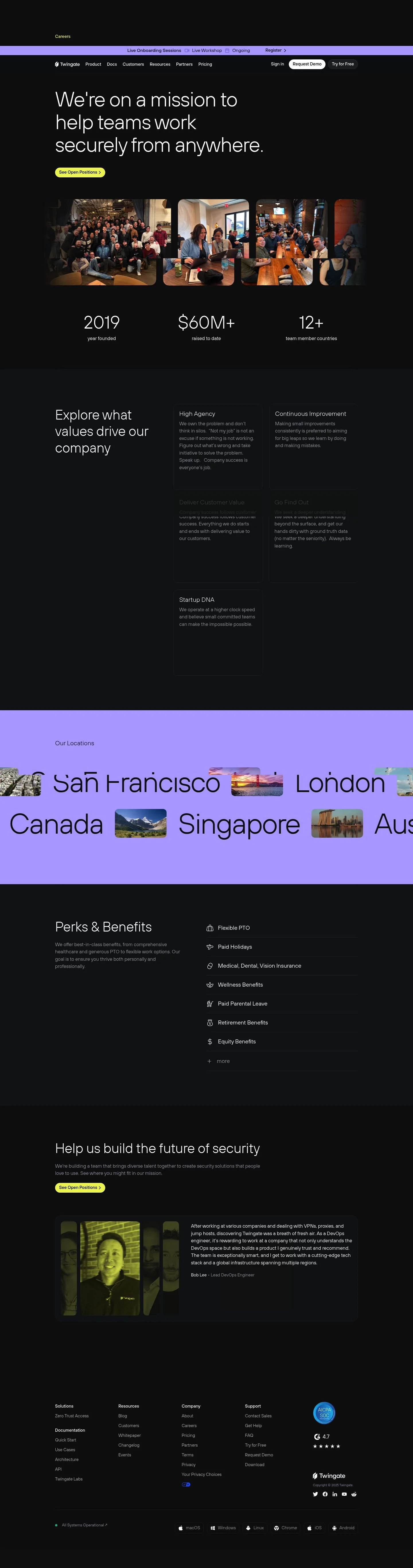
- Full page: https://cdn.designmunk.com/2026/09/12081227/twingate-com-careers-featured.webp
- Above the fold: https://cdn.designmunk.com/2026/09/12081227/twingate-com-careers-featured.webp
- On DesignMunk: https://designmunk.com/twingate-careers-page/

Study these for hierarchy, rhythm, spacing and density. Where an image and the written spec disagree, the spec wins: the tokens were read from the page's own CSS, the images are one rendering of it.

## Before you start

Ask the user what they are building, who it is for, and what brand assets they already have — name, colours, typefaces. Wait for their answers before writing anything. Everything below is then applied to their product, not to the reference.

## Design specification

# Twingate: Dark Careers Page Built on Pill CTAs

## Overview

Twingate's careers experience is built for a security-minded audience: credible, efficient, and approachable. Dark mode dominates with high-contrast text and restrained accents. Type is spacious at the top and compact in body copy, producing a serious but friendly tone. Layouts favor clear scans: headline, proof, action.

## Colors

- **primary (#ffffff):** Primary text and icon color on dark surfaces; used for CTAs with inverted treatment.
- **secondary (#838485):** Muted copy for supporting text, timestamps, and helper labels.
- **tertiary (#0000ee):** Link and interactive accent on dark backgrounds.
- **neutral (#0e0f11):** Core dark surface across hero, sections, and footer.
- **brand-lunar-rock (#c5c5c6):** Subtle borders, dividers, and low-contrast UI chrome on dark.
- **surface ({colors.neutral}):** Alias to the main dark background for consistency across components.
- **on-surface ({colors.primary}):** Alias for content color on dark surfaces; ensures accessibility baselines.

## Typography

- Headline family: TT Hoves Light (custom). Used for all headline levels. Not freely hosted; agents should substitute similar geometric grotesks such as Inter, Manrope, or Outfit. Maintain light weights and tight tracking.
- headline-lg: 72px, 400, 1.1, letter-spacing -0.028em. Hero statements and section intros.
- headline-md: 62px, 400, 1.2, letter-spacing -0.008em. Large stats and secondary section titles.
- headline-sm: 22px, 300, 1.3. Subheads, value headings, and card titles.
- headline-xs: 18px, 300, 1.22. Minor headings and overlines.
- Body family: sans-serif (system). body-md: 14px, 300, 1.71 for paragraphs, footers, and small UI text. When using TT Hoves substitutes, pair with Inter or system UI for body to keep contrast between display and copy.

## Layout

Spacing is a compact modular scale: 6, 14, 24, 50, 120px. Use xl (120px) for top/bottom padding in hero bands, lg (50px) for section gutters, md (24px) for intra-section grouping, sm (14px) for control padding and small gaps, and xs (6px) for tight stacks. Grids read as single-column hero followed by multi-column content blocks; keep generous outer margins to preserve dark-mode breathing room.

## Elevation & Depth

Hierarchy leans on contrast, scale, and whitespace. Subtle highlights come from measured shadows: use sm for hairline highlights on dark nav, md for soft separation of sticky bars, lg for dialogs or hover-elevated media. Where shadows are avoided, rely on brand-lunar-rock borders and tonal shifts of neutral.

## Shapes

Two radii define the language: sm at 6px for cards, images, and small surfaces; full (9999px) for pills used on buttons and chips. Full-radius CTAs signal primary actions; sm corners keep content modules cohesive without adding visual noise.

## Components

Buttons
- Primary button: 40px height, 0 14px padding, background #ffffff, text #0000ee, full radius. Use for high-intent actions.
- Secondary button: 40px height, 0 14px padding, no fill on dark, text #ffffff, full radius. Use alongside primary.
- Link button: Text-only, #ffffff on dark, radius 0; reserve for low-emphasis actions.

Card
- Light card: background #ffffff, text #000000, 6px radius, 20px 26px padding. Suitable for testimonials or highlighted callouts within dark sections.

### Utility Ribbon
Compact announcement bar at the top using body-md (14px) text and pill CTAs. Horizontal padding sm (14px); stack spacing xs (6px). Keep contrast high against the neutral surface.

### Careers Hero
Hero block with headline-lg (72px) and a single primary action. Vertical rhythm: xl (120px) top/bottom padding; space to next module lg (50px).

### Photo Gallery Strip
Row of image tiles under the hero. Treat each image as a card with sm (6px) radius; gap md (24px). Apply shadow lg on hover for depth.

### Stats Row
Three columns: use headline-md (62px) for figures and body-md (14px) for labels. Column gap md (24px); outer padding lg (50px).

### Values List
Stacked list of company values. Headline-sm (22px) for titles, body-md for descriptions. Item spacing md (24px); section padding lg (50px).

### Locations Grid
Simple grid of city headings using headline-sm (22px). Use md (24px) gaps and lg (50px) section padding for scanability.

### Perks & Benefits
Icon-and-text list. Headline-xs (18px) for perk titles, body-md for copy. Wrap in a light card when emphasis is needed.

### Testimonials
Cards using the light card spec. Use headline-xs (18px) for names/titles and body-md for quotes; stack spacing sm (14px).

## Do's and Don'ts

- Do use headline-lg (72px) sparingly—hero and first sectional intro only.
- Do pair primary (#ffffff) text with neutral (#0e0f11) surfaces; reserve tertiary (#0000ee) for links and focused accents.
- Do keep button heights at 40px and radii full for all CTAs to maintain consistency.
- Don't introduce additional accent colors without a clear semantic role; rely on tertiary for links and brand-lunar-rock for borders.
- Don't add heavy shadows on dark surfaces by default; prefer sm or none and use lg only for overlays/hover states.
- Don't mix square and pill buttons in the same view; pills signal action priority here.

## Agent Prompt Guide

Quick color reference
- Text: #ffffff
- Background: #0e0f11
- Border: #c5c5c6
- Accent/Link: #0000ee

1) Build a dark hero with pill CTAs
- Container: background #0e0f11; padding-top/bottom 120px; side padding 50px.
- H1: font-family "TT Hoves Light", Inter, Manrope, system-ui, sans-serif; size 72px; weight 400; line-height 1.1; letter-spacing -0.028em; color #ffffff; max-width 12ch.
- Supporting text: 14px/1.71, color #838485.
- Primary CTA: height 40px; padding 0 14px; border-radius 9999px; background #ffffff; text #0000ee.
- Secondary CTA: height 40px; padding 0 14px; border-radius 9999px; background transparent; text #ffffff.

2) Create a 3-column stats row
- Background #0e0f11; padding 50px 50px.
- Number: font 62px/1.2, weight 400, color #ffffff.
- Label: 14px/1.71, color #838485.
- Grid gap 24px; align items center.

3) Values list section
- Section padding 50px; item gap 24px.
- Value title: 22px/1.3, weight 300, color #ffffff.
- Description: 14px/1.71, color #838485.
- Optional "Learn more" link uses #0000ee.

4) Testimonial cards on dark
- Card: background #ffffff; text #000000; padding 20px 26px; border-radius 6px; shadow rgba(0,0,0,0.3) 0 32px 68px 0 on hover.
- Quote: 14px/1.71; Name/title: 18px/1.22.
- Grid gap 24px; section padding 50px.

## Similar Brands

- Cloudflare — Dark marketing with high-contrast type and pill CTAs; uses warmer accent colors and denser technical sections.
- Okta — Identity and security site with large headlines and restrained palettes; brighter blues and more enterprise proof modules.
- 1Password Business — Friendly dark surfaces with human imagery; more playful iconography compared to Twingate's reserved tone.
- HashiCorp — Monochrome-heavy developer brand; denser grids and fewer photographic elements while sharing a serious, technical voice.
- CrowdStrike — Security-focused with dark backgrounds and bold typography; heavier motion and dramatic imagery diverge from Twingate's calmer approach.

## Tokens

### CSS custom properties

```css
:root {
  /* Colors */
  --color-primary: #ffffff;
  --color-secondary: #838485;
  --color-tertiary: #0000ee;
  --color-neutral: #0e0f11;
  --color-brand-lunar-rock: #c5c5c6;
  --color-surface: var(--color-neutral);
  --color-on-surface: var(--color-primary);

  /* Typography */
  --text-headline-lg-size: 72px;
  --text-headline-lg-weight: 400;
  --text-headline-lg-leading: 1.1;
  --text-headline-lg-tracking: -0.028em;
  --text-headline-md-size: 62px;
  --text-headline-md-weight: 400;
  --text-headline-md-leading: 1.2;
  --text-headline-md-tracking: -0.008em;
  --text-headline-sm-size: 22px;
  --text-headline-sm-weight: 300;
  --text-headline-sm-leading: 1.3;
  --text-headline-xs-size: 18px;
  --text-headline-xs-weight: 300;
  --text-headline-xs-leading: 1.22;
  --text-body-md-size: 14px;
  --text-body-md-weight: 300;
  --text-body-md-leading: 1.71;
  --font-tt-hoves-light: "TT Hoves Light";
  --font-sans-serif: "sans-serif";

  /* Rounded */
  --radius-sm: 6px;
  --radius-full: 9999px;

  /* Spacing */
  --spacing-xs: 6px;
  --spacing-sm: 14px;
  --spacing-md: 24px;
  --spacing-lg: 50px;
  --spacing-xl: 120px;

  /* Components */
  --button-primary-background-color: var(--color-primary);
  --button-primary-text-color: var(--color-tertiary);
  --button-primary-rounded: var(--radius-full);
  --button-primary-padding: 0px 14px;
  --button-primary-height: 40px;
  --button-secondary-text-color: var(--color-primary);
  --button-secondary-rounded: var(--radius-full);
  --button-secondary-padding: 0px 14px;
  --button-secondary-height: 40px;
  --button-link-text-color: var(--color-primary);
  --button-link-rounded: 0px;
  --card-background-color: var(--color-primary);
  --card-text-color: #000000;
  --card-rounded: var(--radius-sm);
  --card-padding: 20px 26px;
}
```

### Tailwind theme

```css
@theme {
  --color-primary: #ffffff;
  --color-secondary: #838485;
  --color-tertiary: #0000ee;
  --color-neutral: #0e0f11;
  --color-brand-lunar-rock: #c5c5c6;
  --color-surface: #0e0f11;
  --color-on-surface: #ffffff;
  --font-headline-lg: "TT Hoves Light";
  --font-headline-md: "TT Hoves Light";
  --font-headline-sm: "TT Hoves Light";
  --font-headline-xs: "sans-serif";
  --font-body-md: "sans-serif";
  --text-headline-lg: 72px;
  --text-headline-md: 62px;
  --text-headline-sm: 22px;
  --text-headline-xs: 18px;
  --text-body-md: 14px;
  --tracking-headline-lg: -0.028em;
  --tracking-headline-md: -0.008em;
  --font-weight-headline-lg: 400;
  --font-weight-headline-md: 400;
  --font-weight-headline-sm: 300;
  --font-weight-headline-xs: 300;
  --font-weight-body-md: 300;
  --radius-sm: 6px;
  --radius-full: 9999px;
  --spacing-xs: 6px;
  --spacing-sm: 14px;
  --spacing-md: 24px;
  --spacing-lg: 50px;
  --spacing-xl: 120px;
}
```

### Design tokens (DTCG)

```json
{
    "$schema": "https://www.designtokens.org/schemas/2025.10/format.json",
    "color": {
        "$type": "color",
        "primary": {
            "$value": {
                "colorSpace": "srgb",
                "components": [
                    1,
                    1,
                    1
                ],
                "hex": "#ffffff"
            }
        },
        "secondary": {
            "$value": {
                "colorSpace": "srgb",
                "components": [
                    0.514,
                    0.518,
                    0.522
                ],
                "hex": "#838485"
            }
        },
        "tertiary": {
            "$value": {
                "colorSpace": "srgb",
                "components": [
                    0,
                    0,
                    0.933
                ],
                "hex": "#0000ee"
            }
        },
        "neutral": {
            "$value": {
                "colorSpace": "srgb",
                "components": [
                    0.055,
                    0.059,
                    0.067
                ],
                "hex": "#0e0f11"
            }
        },
        "brand-lunar-rock": {
            "$value": {
                "colorSpace": "srgb",
                "components": [
                    0.773,
                    0.773,
                    0.776
                ],
                "hex": "#c5c5c6"
            }
        },
        "surface": {
            "$value": {
                "colorSpace": "srgb",
                "components": [
                    0.055,
                    0.059,
                    0.067
                ],
                "hex": "#0e0f11"
            }
        },
        "on-surface": {
            "$value": {
                "colorSpace": "srgb",
                "components": [
                    1,
                    1,
                    1
                ],
                "hex": "#ffffff"
            }
        }
    },
    "spacing": {
        "$type": "dimension",
        "xs": {
            "$value": {
                "value": 6,
                "unit": "px"
            }
        },
        "sm": {
            "$value": {
                "value": 14,
                "unit": "px"
            }
        },
        "md": {
            "$value": {
                "value": 24,
                "unit": "px"
            }
        },
        "lg": {
            "$value": {
                "value": 50,
                "unit": "px"
            }
        },
        "xl": {
            "$value": {
                "value": 120,
                "unit": "px"
            }
        }
    },
    "rounded": {
        "$type": "dimension",
        "sm": {
            "$value": {
                "value": 6,
                "unit": "px"
            }
        },
        "full": {
            "$value": {
                "value": 9999,
                "unit": "px"
            }
        }
    },
    "typography": {
        "headline-lg": {
            "$type": "typography",
            "$value": {
                "fontFamily": "TT Hoves Light",
                "fontSize": {
                    "value": 72,
                    "unit": "px"
                },
                "fontWeight": 400,
                "letterSpacing": {
                    "value": -0.028,
                    "unit": "em"
                }
            }
        },
        "headline-md": {
            "$type": "typography",
            "$value": {
                "fontFamily": "TT Hoves Light",
                "fontSize": {
                    "value": 62,
                    "unit": "px"
                },
                "fontWeight": 400,
                "letterSpacing": {
                    "value": -0.008,
                    "unit": "em"
                }
            }
        },
        "headline-sm": {
            "$type": "typography",
            "$value": {
                "fontFamily": "TT Hoves Light",
                "fontSize": {
                    "value": 22,
                    "unit": "px"
                },
                "fontWeight": 300
            }
        },
        "headline-xs": {
            "$type": "typography",
            "$value": {
                "fontFamily": "sans-serif",
                "fontSize": {
                    "value": 18,
                    "unit": "px"
                },
                "fontWeight": 300
            }
        },
        "body-md": {
            "$type": "typography",
            "$value": {
                "fontFamily": "sans-serif",
                "fontSize": {
                    "value": 14,
                    "unit": "px"
                },
                "fontWeight": 300
            }
        }
    }
}
```

## Rules

- **Fonts.** If the specification names a custom or self-hosted family, use one of the substitutes it names. Never reference a typeface you cannot actually load — it will fall back to a system font and undo the typography.
- **Colour.** Derive the palette from the user's brand. Use the token values as a guide to *relationships* — contrast, tint, how many accents carry the page — not as hex codes to paste.
- **Never reproduce** the wordmark, mascot, logo, brand name, illustrations, icon set, screenshots or any copy from the reference.
- **Never present the result as Twingate Careers**, or imply any connection to it.
- If something is unspecified, choose clarity and legibility over decoration.
---
version: alpha
name: Twingate
description: Zero Trust with No Boundaries
colors:
  primary: "#ffffff"
  secondary: "#838485"
  tertiary: "#0000ee"
  neutral: "#0e0f11"
  brand-lunar-rock: "#c5c5c6"
  surface: "{colors.neutral}"
  on-surface: "{colors.primary}"
typography:
  headline-lg:
    fontFamily: TT Hoves Light
    fontSize: 72px
    fontWeight: 400
    lineHeight: 1.1
    letterSpacing: -0.028em
  headline-md:
    fontFamily: TT Hoves Light
    fontSize: 62px
    fontWeight: 400
    lineHeight: 1.2
    letterSpacing: -0.008em
  headline-sm:
    fontFamily: TT Hoves Light
    fontSize: 22px
    fontWeight: 300
    lineHeight: 1.3
  headline-xs:
    fontFamily: sans-serif
    fontSize: 18px
    fontWeight: 300
    lineHeight: 1.22
  body-md:
    fontFamily: sans-serif
    fontSize: 14px
    fontWeight: 300
    lineHeight: 1.71
rounded:
  sm: 6px
  full: 9999px
spacing:
  xs: 6px
  sm: 14px
  md: 24px
  lg: 50px
  xl: 120px
components:
  button-primary:
    backgroundColor: "{colors.primary}"
    textColor: "{colors.tertiary}"
    rounded: "{rounded.full}"
    padding: 0px 14px
    height: 40px
  button-secondary:
    textColor: "{colors.primary}"
    rounded: "{rounded.full}"
    padding: 0px 14px
    height: 40px
  button-link:
    textColor: "{colors.primary}"
    rounded: 0px
  card:
    backgroundColor: "{colors.primary}"
    textColor: "#000000"
    rounded: "{rounded.sm}"
    padding: 20px 26px
---

# Twingate: Dark Careers Page Built on Pill CTAs

## Overview

Twingate's careers experience is built for a security-minded audience: credible, efficient, and approachable. Dark mode dominates with high-contrast text and restrained accents. Type is spacious at the top and compact in body copy, producing a serious but friendly tone. Layouts favor clear scans: headline, proof, action.

## Colors

- **primary (#ffffff):** Primary text and icon color on dark surfaces; used for CTAs with inverted treatment.
- **secondary (#838485):** Muted copy for supporting text, timestamps, and helper labels.
- **tertiary (#0000ee):** Link and interactive accent on dark backgrounds.
- **neutral (#0e0f11):** Core dark surface across hero, sections, and footer.
- **brand-lunar-rock (#c5c5c6):** Subtle borders, dividers, and low-contrast UI chrome on dark.
- **surface ({colors.neutral}):** Alias to the main dark background for consistency across components.
- **on-surface ({colors.primary}):** Alias for content color on dark surfaces; ensures accessibility baselines.

## Typography

- Headline family: TT Hoves Light (custom). Used for all headline levels. Not freely hosted; agents should substitute similar geometric grotesks such as Inter, Manrope, or Outfit. Maintain light weights and tight tracking.
- headline-lg: 72px, 400, 1.1, letter-spacing -0.028em. Hero statements and section intros.
- headline-md: 62px, 400, 1.2, letter-spacing -0.008em. Large stats and secondary section titles.
- headline-sm: 22px, 300, 1.3. Subheads, value headings, and card titles.
- headline-xs: 18px, 300, 1.22. Minor headings and overlines.
- Body family: sans-serif (system). body-md: 14px, 300, 1.71 for paragraphs, footers, and small UI text. When using TT Hoves substitutes, pair with Inter or system UI for body to keep contrast between display and copy.

## Layout

Spacing is a compact modular scale: 6, 14, 24, 50, 120px. Use xl (120px) for top/bottom padding in hero bands, lg (50px) for section gutters, md (24px) for intra-section grouping, sm (14px) for control padding and small gaps, and xs (6px) for tight stacks. Grids read as single-column hero followed by multi-column content blocks; keep generous outer margins to preserve dark-mode breathing room.

## Elevation & Depth

Hierarchy leans on contrast, scale, and whitespace. Subtle highlights come from measured shadows: use sm for hairline highlights on dark nav, md for soft separation of sticky bars, lg for dialogs or hover-elevated media. Where shadows are avoided, rely on brand-lunar-rock borders and tonal shifts of neutral.

## Shapes

Two radii define the language: sm at 6px for cards, images, and small surfaces; full (9999px) for pills used on buttons and chips. Full-radius CTAs signal primary actions; sm corners keep content modules cohesive without adding visual noise.

## Components

Buttons
- Primary button: 40px height, 0 14px padding, background #ffffff, text #0000ee, full radius. Use for high-intent actions.
- Secondary button: 40px height, 0 14px padding, no fill on dark, text #ffffff, full radius. Use alongside primary.
- Link button: Text-only, #ffffff on dark, radius 0; reserve for low-emphasis actions.

Card
- Light card: background #ffffff, text #000000, 6px radius, 20px 26px padding. Suitable for testimonials or highlighted callouts within dark sections.

### Utility Ribbon
Compact announcement bar at the top using body-md (14px) text and pill CTAs. Horizontal padding sm (14px); stack spacing xs (6px). Keep contrast high against the neutral surface.

### Careers Hero
Hero block with headline-lg (72px) and a single primary action. Vertical rhythm: xl (120px) top/bottom padding; space to next module lg (50px).

### Photo Gallery Strip
Row of image tiles under the hero. Treat each image as a card with sm (6px) radius; gap md (24px). Apply shadow lg on hover for depth.

### Stats Row
Three columns: use headline-md (62px) for figures and body-md (14px) for labels. Column gap md (24px); outer padding lg (50px).

### Values List
Stacked list of company values. Headline-sm (22px) for titles, body-md for descriptions. Item spacing md (24px); section padding lg (50px).

### Locations Grid
Simple grid of city headings using headline-sm (22px). Use md (24px) gaps and lg (50px) section padding for scanability.

### Perks & Benefits
Icon-and-text list. Headline-xs (18px) for perk titles, body-md for copy. Wrap in a light card when emphasis is needed.

### Testimonials
Cards using the light card spec. Use headline-xs (18px) for names/titles and body-md for quotes; stack spacing sm (14px).

## Do's and Don'ts

- Do use headline-lg (72px) sparingly—hero and first sectional intro only.
- Do pair primary (#ffffff) text with neutral (#0e0f11) surfaces; reserve tertiary (#0000ee) for links and focused accents.
- Do keep button heights at 40px and radii full for all CTAs to maintain consistency.
- Don't introduce additional accent colors without a clear semantic role; rely on tertiary for links and brand-lunar-rock for borders.
- Don't add heavy shadows on dark surfaces by default; prefer sm or none and use lg only for overlays/hover states.
- Don't mix square and pill buttons in the same view; pills signal action priority here.

## Agent Prompt Guide

Quick color reference
- Text: #ffffff
- Background: #0e0f11
- Border: #c5c5c6
- Accent/Link: #0000ee

1) Build a dark hero with pill CTAs
- Container: background #0e0f11; padding-top/bottom 120px; side padding 50px.
- H1: font-family "TT Hoves Light", Inter, Manrope, system-ui, sans-serif; size 72px; weight 400; line-height 1.1; letter-spacing -0.028em; color #ffffff; max-width 12ch.
- Supporting text: 14px/1.71, color #838485.
- Primary CTA: height 40px; padding 0 14px; border-radius 9999px; background #ffffff; text #0000ee.
- Secondary CTA: height 40px; padding 0 14px; border-radius 9999px; background transparent; text #ffffff.

2) Create a 3-column stats row
- Background #0e0f11; padding 50px 50px.
- Number: font 62px/1.2, weight 400, color #ffffff.
- Label: 14px/1.71, color #838485.
- Grid gap 24px; align items center.

3) Values list section
- Section padding 50px; item gap 24px.
- Value title: 22px/1.3, weight 300, color #ffffff.
- Description: 14px/1.71, color #838485.
- Optional "Learn more" link uses #0000ee.

4) Testimonial cards on dark
- Card: background #ffffff; text #000000; padding 20px 26px; border-radius 6px; shadow rgba(0,0,0,0.3) 0 32px 68px 0 on hover.
- Quote: 14px/1.71; Name/title: 18px/1.22.
- Grid gap 24px; section padding 50px.

## Similar Brands

- Cloudflare — Dark marketing with high-contrast type and pill CTAs; uses warmer accent colors and denser technical sections.
- Okta — Identity and security site with large headlines and restrained palettes; brighter blues and more enterprise proof modules.
- 1Password Business — Friendly dark surfaces with human imagery; more playful iconography compared to Twingate's reserved tone.
- HashiCorp — Monochrome-heavy developer brand; denser grids and fewer photographic elements while sharing a serious, technical voice.
- CrowdStrike — Security-focused with dark backgrounds and bold typography; heavier motion and dramatic imagery diverge from Twingate's calmer approach.
:root {
  /* Colors */
  --color-primary: #ffffff;
  --color-secondary: #838485;
  --color-tertiary: #0000ee;
  --color-neutral: #0e0f11;
  --color-brand-lunar-rock: #c5c5c6;
  --color-surface: var(--color-neutral);
  --color-on-surface: var(--color-primary);

  /* Typography */
  --text-headline-lg-size: 72px;
  --text-headline-lg-weight: 400;
  --text-headline-lg-leading: 1.1;
  --text-headline-lg-tracking: -0.028em;
  --text-headline-md-size: 62px;
  --text-headline-md-weight: 400;
  --text-headline-md-leading: 1.2;
  --text-headline-md-tracking: -0.008em;
  --text-headline-sm-size: 22px;
  --text-headline-sm-weight: 300;
  --text-headline-sm-leading: 1.3;
  --text-headline-xs-size: 18px;
  --text-headline-xs-weight: 300;
  --text-headline-xs-leading: 1.22;
  --text-body-md-size: 14px;
  --text-body-md-weight: 300;
  --text-body-md-leading: 1.71;
  --font-tt-hoves-light: "TT Hoves Light";
  --font-sans-serif: "sans-serif";

  /* Rounded */
  --radius-sm: 6px;
  --radius-full: 9999px;

  /* Spacing */
  --spacing-xs: 6px;
  --spacing-sm: 14px;
  --spacing-md: 24px;
  --spacing-lg: 50px;
  --spacing-xl: 120px;

  /* Components */
  --button-primary-background-color: var(--color-primary);
  --button-primary-text-color: var(--color-tertiary);
  --button-primary-rounded: var(--radius-full);
  --button-primary-padding: 0px 14px;
  --button-primary-height: 40px;
  --button-secondary-text-color: var(--color-primary);
  --button-secondary-rounded: var(--radius-full);
  --button-secondary-padding: 0px 14px;
  --button-secondary-height: 40px;
  --button-link-text-color: var(--color-primary);
  --button-link-rounded: 0px;
  --card-background-color: var(--color-primary);
  --card-text-color: #000000;
  --card-rounded: var(--radius-sm);
  --card-padding: 20px 26px;
}
{
  "$schema": "https://www.designtokens.org/schemas/2025.10/format.json",
  "$description": "Zero Trust with No Boundaries",
  "color": {
    "$type": "color",
    "primary": {
      "$value": {
        "colorSpace": "srgb",
        "components": [
          1,
          1,
          1
        ],
        "hex": "#ffffff"
      }
    },
    "secondary": {
      "$value": {
        "colorSpace": "srgb",
        "components": [
          0.514,
          0.518,
          0.522
        ],
        "hex": "#838485"
      }
    },
    "tertiary": {
      "$value": {
        "colorSpace": "srgb",
        "components": [
          0,
          0,
          0.933
        ],
        "hex": "#0000ee"
      }
    },
    "neutral": {
      "$value": {
        "colorSpace": "srgb",
        "components": [
          0.055,
          0.059,
          0.067
        ],
        "hex": "#0e0f11"
      }
    },
    "brand-lunar-rock": {
      "$value": {
        "colorSpace": "srgb",
        "components": [
          0.773,
          0.773,
          0.776
        ],
        "hex": "#c5c5c6"
      }
    },
    "surface": {
      "$value": {
        "colorSpace": "srgb",
        "components": [
          0.055,
          0.059,
          0.067
        ],
        "hex": "#0e0f11"
      }
    },
    "on-surface": {
      "$value": {
        "colorSpace": "srgb",
        "components": [
          1,
          1,
          1
        ],
        "hex": "#ffffff"
      }
    }
  },
  "spacing": {
    "$type": "dimension",
    "xs": {
      "$value": {
        "value": 6,
        "unit": "px"
      }
    },
    "sm": {
      "$value": {
        "value": 14,
        "unit": "px"
      }
    },
    "md": {
      "$value": {
        "value": 24,
        "unit": "px"
      }
    },
    "lg": {
      "$value": {
        "value": 50,
        "unit": "px"
      }
    },
    "xl": {
      "$value": {
        "value": 120,
        "unit": "px"
      }
    }
  },
  "rounded": {
    "$type": "dimension",
    "sm": {
      "$value": {
        "value": 6,
        "unit": "px"
      }
    },
    "full": {
      "$value": {
        "value": 9999,
        "unit": "px"
      }
    }
  },
  "typography": {
    "headline-lg": {
      "$type": "typography",
      "$value": {
        "fontFamily": "TT Hoves Light",
        "fontSize": {
          "value": 72,
          "unit": "px"
        },
        "fontWeight": 400,
        "letterSpacing": {
          "value": -0.028,
          "unit": "em"
        }
      }
    },
    "headline-md": {
      "$type": "typography",
      "$value": {
        "fontFamily": "TT Hoves Light",
        "fontSize": {
          "value": 62,
          "unit": "px"
        },
        "fontWeight": 400,
        "letterSpacing": {
          "value": -0.008,
          "unit": "em"
        }
      }
    },
    "headline-sm": {
      "$type": "typography",
      "$value": {
        "fontFamily": "TT Hoves Light",
        "fontSize": {
          "value": 22,
          "unit": "px"
        },
        "fontWeight": 300
      }
    },
    "headline-xs": {
      "$type": "typography",
      "$value": {
        "fontFamily": "sans-serif",
        "fontSize": {
          "value": 18,
          "unit": "px"
        },
        "fontWeight": 300
      }
    },
    "body-md": {
      "$type": "typography",
      "$value": {
        "fontFamily": "sans-serif",
        "fontSize": {
          "value": 14,
          "unit": "px"
        },
        "fontWeight": 300
      }
    }
  }
}
@theme {
--color-primary: #ffffff;
--color-secondary: #838485;
--color-tertiary: #0000ee;
--color-neutral: #0e0f11;
--color-brand-lunar-rock: #c5c5c6;
--color-surface: #0e0f11;
--color-on-surface: #ffffff;
--font-headline-lg: "TT Hoves Light";
--font-headline-md: "TT Hoves Light";
--font-headline-sm: "TT Hoves Light";
--font-headline-xs: "sans-serif";
--font-body-md: "sans-serif";
--text-headline-lg: 72px;
--text-headline-md: 62px;
--text-headline-sm: 22px;
--text-headline-xs: 18px;
--text-body-md: 14px;
--tracking-headline-lg: -0.028em;
--tracking-headline-md: -0.008em;
--font-weight-headline-lg: 400;
--font-weight-headline-md: 400;
--font-weight-headline-sm: 300;
--font-weight-headline-xs: 300;
--font-weight-body-md: 300;
--radius-sm: 6px;
--radius-full: 9999px;
--spacing-xs: 6px;
--spacing-sm: 14px;
--spacing-md: 24px;
--spacing-lg: 50px;
--spacing-xl: 120px;
} # Design brief: the Twingate Careers design language
Below is a complete design specification measured from a real, published web page. Use it as a design language for the user's product. It is not a page to reproduce.
## Reference images
- Full page: https://cdn.designmunk.com/2026/09/12081227/twingate-com-careers-featured.webp
- Above the fold: https://cdn.designmunk.com/2026/09/12081227/twingate-com-careers-featured.webp
- On DesignMunk: https://designmunk.com/twingate-careers-page/
Study these for hierarchy, rhythm, spacing and density. Where an image and the written spec disagree, the spec wins: the tokens were read from the page's own CSS, the images are one rendering of it.
## Before you start
Ask the user what they are building, who it is for, and what brand assets they already have — name, colours, typefaces. Wait for their answers before writing anything. Everything below is then applied to their product, not to the reference.
## Design specification
# Twingate: Dark Careers Page Built on Pill CTAs
## Overview
Twingate's careers experience is built for a security-minded audience: credible, efficient, and approachable. Dark mode dominates with high-contrast text and restrained accents. Type is spacious at the top and compact in body copy, producing a serious but friendly tone. Layouts favor clear scans: headline, proof, action.
## Colors
- **primary (#ffffff):** Primary text and icon color on dark surfaces; used for CTAs with inverted treatment.
- **secondary (#838485):** Muted copy for supporting text, timestamps, and helper labels.
- **tertiary (#0000ee):** Link and interactive accent on dark backgrounds.
- **neutral (#0e0f11):** Core dark surface across hero, sections, and footer.
- **brand-lunar-rock (#c5c5c6):** Subtle borders, dividers, and low-contrast UI chrome on dark.
- **surface ({colors.neutral}):** Alias to the main dark background for consistency across components.
- **on-surface ({colors.primary}):** Alias for content color on dark surfaces; ensures accessibility baselines.
## Typography
- Headline family: TT Hoves Light (custom). Used for all headline levels. Not freely hosted; agents should substitute similar geometric grotesks such as Inter, Manrope, or Outfit. Maintain light weights and tight tracking.
- headline-lg: 72px, 400, 1.1, letter-spacing -0.028em. Hero statements and section intros.
- headline-md: 62px, 400, 1.2, letter-spacing -0.008em. Large stats and secondary section titles.
- headline-sm: 22px, 300, 1.3. Subheads, value headings, and card titles.
- headline-xs: 18px, 300, 1.22. Minor headings and overlines.
- Body family: sans-serif (system). body-md: 14px, 300, 1.71 for paragraphs, footers, and small UI text. When using TT Hoves substitutes, pair with Inter or system UI for body to keep contrast between display and copy.
## Layout
Spacing is a compact modular scale: 6, 14, 24, 50, 120px. Use xl (120px) for top/bottom padding in hero bands, lg (50px) for section gutters, md (24px) for intra-section grouping, sm (14px) for control padding and small gaps, and xs (6px) for tight stacks. Grids read as single-column hero followed by multi-column content blocks; keep generous outer margins to preserve dark-mode breathing room.
## Elevation & Depth
Hierarchy leans on contrast, scale, and whitespace. Subtle highlights come from measured shadows: use sm for hairline highlights on dark nav, md for soft separation of sticky bars, lg for dialogs or hover-elevated media. Where shadows are avoided, rely on brand-lunar-rock borders and tonal shifts of neutral.
## Shapes
Two radii define the language: sm at 6px for cards, images, and small surfaces; full (9999px) for pills used on buttons and chips. Full-radius CTAs signal primary actions; sm corners keep content modules cohesive without adding visual noise.
## Components
Buttons
- Primary button: 40px height, 0 14px padding, background #ffffff, text #0000ee, full radius. Use for high-intent actions.
- Secondary button: 40px height, 0 14px padding, no fill on dark, text #ffffff, full radius. Use alongside primary.
- Link button: Text-only, #ffffff on dark, radius 0; reserve for low-emphasis actions.
Card
- Light card: background #ffffff, text #000000, 6px radius, 20px 26px padding. Suitable for testimonials or highlighted callouts within dark sections.
### Utility Ribbon
Compact announcement bar at the top using body-md (14px) text and pill CTAs. Horizontal padding sm (14px); stack spacing xs (6px). Keep contrast high against the neutral surface.
### Careers Hero
Hero block with headline-lg (72px) and a single primary action. Vertical rhythm: xl (120px) top/bottom padding; space to next module lg (50px).
### Photo Gallery Strip
Row of image tiles under the hero. Treat each image as a card with sm (6px) radius; gap md (24px). Apply shadow lg on hover for depth.
### Stats Row
Three columns: use headline-md (62px) for figures and body-md (14px) for labels. Column gap md (24px); outer padding lg (50px).
### Values List
Stacked list of company values. Headline-sm (22px) for titles, body-md for descriptions. Item spacing md (24px); section padding lg (50px).
### Locations Grid
Simple grid of city headings using headline-sm (22px). Use md (24px) gaps and lg (50px) section padding for scanability.
### Perks & Benefits
Icon-and-text list. Headline-xs (18px) for perk titles, body-md for copy. Wrap in a light card when emphasis is needed.
### Testimonials
Cards using the light card spec. Use headline-xs (18px) for names/titles and body-md for quotes; stack spacing sm (14px).
## Do's and Don'ts
- Do use headline-lg (72px) sparingly—hero and first sectional intro only.
- Do pair primary (#ffffff) text with neutral (#0e0f11) surfaces; reserve tertiary (#0000ee) for links and focused accents.
- Do keep button heights at 40px and radii full for all CTAs to maintain consistency.
- Don't introduce additional accent colors without a clear semantic role; rely on tertiary for links and brand-lunar-rock for borders.
- Don't add heavy shadows on dark surfaces by default; prefer sm or none and use lg only for overlays/hover states.
- Don't mix square and pill buttons in the same view; pills signal action priority here.
## Agent Prompt Guide
Quick color reference
- Text: #ffffff
- Background: #0e0f11
- Border: #c5c5c6
- Accent/Link: #0000ee
1) Build a dark hero with pill CTAs
- Container: background #0e0f11; padding-top/bottom 120px; side padding 50px.
- H1: font-family "TT Hoves Light", Inter, Manrope, system-ui, sans-serif; size 72px; weight 400; line-height 1.1; letter-spacing -0.028em; color #ffffff; max-width 12ch.
- Supporting text: 14px/1.71, color #838485.
- Primary CTA: height 40px; padding 0 14px; border-radius 9999px; background #ffffff; text #0000ee.
- Secondary CTA: height 40px; padding 0 14px; border-radius 9999px; background transparent; text #ffffff.
2) Create a 3-column stats row
- Background #0e0f11; padding 50px 50px.
- Number: font 62px/1.2, weight 400, color #ffffff.
- Label: 14px/1.71, color #838485.
- Grid gap 24px; align items center.
3) Values list section
- Section padding 50px; item gap 24px.
- Value title: 22px/1.3, weight 300, color #ffffff.
- Description: 14px/1.71, color #838485.
- Optional "Learn more" link uses #0000ee.
4) Testimonial cards on dark
- Card: background #ffffff; text #000000; padding 20px 26px; border-radius 6px; shadow rgba(0,0,0,0.3) 0 32px 68px 0 on hover.
- Quote: 14px/1.71; Name/title: 18px/1.22.
- Grid gap 24px; section padding 50px.
## Tokens
### CSS custom properties
```css
:root {
/* Colors */
--color-primary: #ffffff;
--color-secondary: #838485;
--color-tertiary: #0000ee;
--color-neutral: #0e0f11;
--color-brand-lunar-rock: #c5c5c6;
--color-surface: var(--color-neutral);
--color-on-surface: var(--color-primary);
/* Typography */
--text-headline-lg-size: 72px;
--text-headline-lg-weight: 400;
--text-headline-lg-leading: 1.1;
--text-headline-lg-tracking: -0.028em;
--text-headline-md-size: 62px;
--text-headline-md-weight: 400;
--text-headline-md-leading: 1.2;
--text-headline-md-tracking: -0.008em;
--text-headline-sm-size: 22px;
--text-headline-sm-weight: 300;
--text-headline-sm-leading: 1.3;
--text-headline-xs-size: 18px;
--text-headline-xs-weight: 300;
--text-headline-xs-leading: 1.22;
--text-body-md-size: 14px;
--text-body-md-weight: 300;
--text-body-md-leading: 1.71;
--font-tt-hoves-light: "TT Hoves Light";
--font-sans-serif: "sans-serif";
/* Rounded */
--radius-sm: 6px;
--radius-full: 9999px;
/* Spacing */
--spacing-xs: 6px;
--spacing-sm: 14px;
--spacing-md: 24px;
--spacing-lg: 50px;
--spacing-xl: 120px;
/* Components */
--button-primary-background-color: var(--color-primary);
--button-primary-text-color: var(--color-tertiary);
--button-primary-rounded: var(--radius-full);
--button-primary-padding: 0px 14px;
--button-primary-height: 40px;
--button-secondary-text-color: var(--color-primary);
--button-secondary-rounded: var(--radius-full);
--button-secondary-padding: 0px 14px;
--button-secondary-height: 40px;
--button-link-text-color: var(--color-primary);
--button-link-rounded: 0px;
--card-background-color: var(--color-primary);
--card-text-color: #000000;
--card-rounded: var(--radius-sm);
--card-padding: 20px 26px;
}
```
## Rules
- **Fonts.** If the specification names a custom or self-hosted family, use one of the substitutes it names. Never reference a typeface you cannot actually load — it will fall back to a system font and undo the typography.
- **Colour.** Derive the palette from the user's brand. Use the token values as a guide to *relationships* — contrast, tint, how many accents carry the page — not as hex codes to paste.
- **Never reproduce** the wordmark, mascot, logo, brand name, illustrations, icon set, screenshots or any copy from the reference.
- **Never present the result as Twingate Careers**, or imply any connection to it.
- If something is unspecified, choose clarity and legibility over decoration.



