







twingate.com
AI Breakdown
Design export
# Design brief: the Twingate About design language

Below is a complete design specification measured from a real, published web page. Use it as a design language for the user's product. It is not a page to reproduce.

## Reference images

- Full page: https://cdn.designmunk.com/2026/09/10150521/twingate-com-about-featured.png
- Above the fold: https://cdn.designmunk.com/2026/09/10150521/twingate-com-about-featured.png
- On DesignMunk: https://designmunk.com/twingate-about-page/

Study these for hierarchy, rhythm, spacing and density. Where an image and the written spec disagree, the spec wins: the tokens were read from the page's own CSS, the images are one rendering of it.

## Before you start

Ask the user what they are building, who it is for, and what brand assets they already have — name, colours, typefaces. Wait for their answers before writing anything. Everything below is then applied to their product, not to the reference.

## Design specification

# Twingate: Near-Black Canvas with White Pill CTAs

## Overview

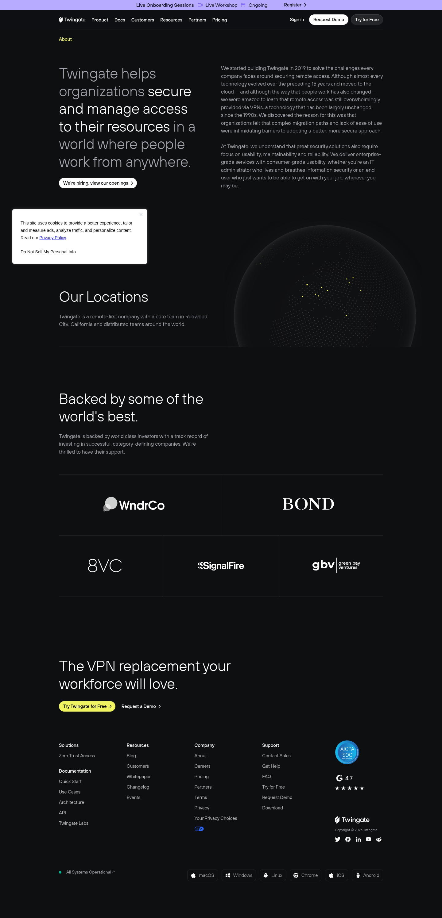
A dark, security-grade interface aimed at technical buyers and IT leaders. The tone is confident and restrained: crisp white type on a near-black surface, plenty of air, and minimal decoration. Layouts are spacious rather than dense, using generous vertical rhythm to keep long-form copy readable. CTAs use consistent white pills to stand out without adding color noise.

## Colors

- **primary (#ffffff):** Primary text and the fill for high-priority CTAs.
- **secondary (#838485):** Muted copy, metadata, and subdued UI labels.
- **tertiary (#0000ee):** Link and interactive text color; used for CTA text on white.
- **neutral (#0e0f11):** Page background and sectional surfaces across the dark theme.
- **border (#374151):** Low-contrast dividers, card outlines, and input borders.
- **brand-lunar-rock (#c5c5c6):** Supportive text on dark surfaces; lighter than secondary for emphasis without full white.
- **surface ({colors.neutral}):** Alias of the neutral background for components.
- **on-surface ({colors.primary}):** Default text on dark surfaces for maximum contrast.

## Typography

- TT Hoves Light — used for large and medium headlines (48px and 36px). Weight 400 with tight tracking keeps headlines sleek. Availability: custom/self-hosted; not freely loadable.
  Substitutes: Inter Light, Plus Jakarta Sans Light, or Manrope Light.
- TT Hoves Regular — used for smaller headlines (27px) where sturdier forms help legibility. Availability: custom/self-hosted.
  Substitutes: Inter Regular, Plus Jakarta Sans Regular, Manrope Regular.
- TT Hoves Medium — used for body (15px, line height 1.53) for clarity on dark backgrounds. Availability: custom/self-hosted.
  Substitutes: Inter Medium, Plus Jakarta Sans Medium, Manrope Medium.
- Headline-xs (20px) bridges section headings and card titles, keeping hierarchy clean on content-heavy sections.

## Layout

Spacing follows a spacious scale: 8, 16, 48, 100, 140px. Use 100–140px for section breaks, 48px for intra-section grouping and two-column gutters, and 16px for element padding inside components. Content typically runs in a two-column grid on wide screens: left for primary message, right for supporting copy or visuals. Keep line lengths moderate; pair wide section paddings with 15px body to avoid fatigue.

## Elevation & Depth

The system is almost flat. Shadows are either none or a faint white highlight (sm) and an inner inset highlight; depth is expressed through the slate #374151 borders, tonal contrast between #0E0F11 and text whites, and generous whitespace. Avoid heavy drop shadows; use borders and spacing to separate regions.

## Shapes

Two radius levels build the language: 8px corners for cards and provisional surfaces, and 9999px for fully rounded pills. Pills signal primary or navigational actions; 8px reads as utility or supportive UI. Keep radii consistent across breakpoints.

## Components

Buttons and cards are the workhorses.
- Button Primary: white fill (#FFFFFF), link-blue text (#0000EE), 40px height, horizontal padding 14px, fully rounded (9999px).
- Button Secondary: no fill on dark (text in #FFFFFF), same 40px height and pill radius; use for secondary actions near a primary.
- Button Link: text-only action in #FFFFFF with no radius; rely on layout and proximity.
- Card: #0E0F11 background, #FFFFFF text, 16px padding, 8px radius; add 1px #374151 border when separation is needed.

### Announcement Bar
Compact strip above the nav for events/onboarding notices. Use 8–16px vertical padding, #FFFFFF text on #0E0F11, links in #0000EE, and a dismiss or Register action aligned right.

### Global Navigation
Left-aligned logo; centered links; right-aligned CTAs. Primary "Request Demo" uses the white 40px pill; "Try for Free" uses the secondary pill. Keep item gaps near 16–48px.

### Hero Split Intro
Two-column layout: left headline at 48px/1.2; right body at 15px/1.53. Add a small careers CTA chip (primary button) below the copy with 16–48px spacing.

### Careers Chip CTA
A compact primary pill ("We're hiring...") at 40px height; place 16px below the headline block. Use chevron or arrow glyph inside the pill without changing height.

### Cookie Consent Toast
Card at viewport edge with 16px padding, 8px radius, optional 1px #374151 border. Body text at 15px; policy links in #0000EE. Place over the surface without heavy shadows.

### Locations + Globe
Section header at 27px or 20px; supporting paragraph at 15px. Right side hosts the globe graphic; left remains the text anchor. Section spacing: 100–140px.

### Investor Strip
Row of grayscale logos on the dark surface; ensure each logo sits inside a 16–48px padded area. Keep contrast safe but quiet; no extra shadows.

### Footer Columns
Multi-column list with 20px headings and 15px links. Top border #374151; internal column gaps ~48px; repeat CTAs ("Try for Free", "Request Demo") using standard buttons.

## Do's and Don'ts

- Do keep the page background at #0E0F11 and primary text at #FFFFFF for all core sections.
- Do use the 40px, fully-rounded pill for primary actions; pair with a secondary pill when two actions appear.
- Do separate blocks with 1px #374151 borders or 48px spacing instead of shadows.
- Don't recolor links; keep interactive text at #0000EE unless the component is a primary button.
- Don't compress section spacing below 100px on desktop; the scale depends on air.
- Don't mix additional corner radii—stick to 8px for cards and 9999px for pills.

## Agent Prompt Guide

Quick reference — Text: #FFFFFF; Background: #0E0F11; Border: #374151; Accent/Links: #0000EE.

1) Build a dark hero split
- Canvas #0E0F11 with 140px top/bottom padding.
- Left: H1 set to 48px/1.2, letter-spacing -0.01em, Inter Light (substitute for TT Hoves Light).
- Right: body at 15px/1.53, Inter Medium.
- Primary CTA: 40px height, 14px horizontal padding, fully rounded 9999px, background #FFFFFF, text #0000EE.
- Secondary text link nearby in #FFFFFF.

2) Add an announcement bar
- Full-width bar above nav on #0E0F11, 8–16px vertical padding.
- Text #FFFFFF; links #0000EE.
- Use Inter Medium 15px for legibility; include a right-aligned Register action.

3) Cookie consent toast (bottom-left)
- Card background #0E0F11 with 16px padding, 8px radius, 1px border #374151.
- Body text 15px/1.53 in Inter Medium; inline links #0000EE.
- Optional subtle shadow only if needed; prefer flat + border.

4) Footer mega menu
- Top divider 1px #374151; section padding 100px top/bottom.
- Column headings 20px/1.2 in Inter Regular; links 15px/1.53 in Inter Medium.
- Include CTAs using the standard 40px white pill with #0000EE text.

## Similar Brands

- Cloudflare — similarly restrained dark surfaces and crisp type; Cloudflare leans orange accents where Twingate keeps color minimal.
- Okta — identity-first enterprise site with clear CTAs; Okta uses lighter themes more often and a broader blue palette.
- Zscaler — security marketing with dark sections and precise spacing; heavier gradients than Twingate's flat approach.
- Tailscale — VPN alternative with minimal styling; lighter theme and playful illustrations versus Twingate's enterprise tone.
- 1Password Business — dark-friendly moments and disciplined spacing; more illustrative and brand-colored than Twingate's monochrome emphasis.

## Tokens

### CSS custom properties

```css
:root {
  /* Colors */
  --color-primary: #ffffff;
  --color-secondary: #838485;
  --color-tertiary: #0000ee;
  --color-neutral: #0e0f11;
  --color-border: #374151;
  --color-brand-lunar-rock: #c5c5c6;
  --color-surface: var(--color-neutral);
  --color-on-surface: var(--color-primary);

  /* Typography */
  --text-headline-lg-size: 48px;
  --text-headline-lg-weight: 400;
  --text-headline-lg-leading: 1.2;
  --text-headline-lg-tracking: -0.01em;
  --text-headline-md-size: 36px;
  --text-headline-md-weight: 400;
  --text-headline-md-leading: 1.6;
  --text-headline-md-tracking: -0.014em;
  --text-headline-sm-size: 27px;
  --text-headline-sm-weight: 400;
  --text-headline-sm-leading: 1.04;
  --text-headline-xs-size: 20px;
  --text-headline-xs-weight: 400;
  --text-headline-xs-leading: 1.2;
  --text-body-md-size: 15px;
  --text-body-md-weight: 400;
  --text-body-md-leading: 1.53;
  --font-tt-hoves-light: "TT Hoves Light";
  --font-tt-hoves-regular: "TT Hoves Regular";
  --font-sans-serif: "sans-serif";
  --font-tt-hoves-medium: "TT Hoves Medium";

  /* Rounded */
  --radius-sm: 8px;
  --radius-full: 9999px;

  /* Spacing */
  --spacing-xs: 8px;
  --spacing-sm: 16px;
  --spacing-md: 48px;
  --spacing-lg: 100px;
  --spacing-xl: 140px;

  /* Components */
  --button-primary-background-color: var(--color-primary);
  --button-primary-text-color: var(--color-tertiary);
  --button-primary-rounded: var(--radius-full);
  --button-primary-padding: 0px 14px;
  --button-primary-height: 40px;
  --button-secondary-text-color: var(--color-primary);
  --button-secondary-rounded: var(--radius-full);
  --button-secondary-padding: 0px 14px;
  --button-secondary-height: 40px;
  --button-link-text-color: var(--color-primary);
  --button-link-rounded: 0px;
  --card-background-color: var(--color-neutral);
  --card-text-color: var(--color-primary);
  --card-rounded: var(--radius-sm);
  --card-padding: 16px;
}
```

### Tailwind theme

```css
@theme {
  --color-primary: #ffffff;
  --color-secondary: #838485;
  --color-tertiary: #0000ee;
  --color-neutral: #0e0f11;
  --color-border: #374151;
  --color-brand-lunar-rock: #c5c5c6;
  --color-surface: #0e0f11;
  --color-on-surface: #ffffff;
  --font-headline-lg: "TT Hoves Light";
  --font-headline-md: "TT Hoves Light";
  --font-headline-sm: "TT Hoves Regular";
  --font-headline-xs: "sans-serif";
  --font-body-md: "TT Hoves Medium";
  --text-headline-lg: 48px;
  --text-headline-md: 36px;
  --text-headline-sm: 27px;
  --text-headline-xs: 20px;
  --text-body-md: 15px;
  --tracking-headline-lg: -0.01em;
  --tracking-headline-md: -0.014em;
  --font-weight-headline-lg: 400;
  --font-weight-headline-md: 400;
  --font-weight-headline-sm: 400;
  --font-weight-headline-xs: 400;
  --font-weight-body-md: 400;
  --radius-sm: 8px;
  --radius-full: 9999px;
  --spacing-xs: 8px;
  --spacing-sm: 16px;
  --spacing-md: 48px;
  --spacing-lg: 100px;
  --spacing-xl: 140px;
}
```

### Design tokens (DTCG)

```json
{
    "$schema": "https://www.designtokens.org/schemas/2025.10/format.json",
    "color": {
        "$type": "color",
        "primary": {
            "$value": {
                "colorSpace": "srgb",
                "components": [
                    1,
                    1,
                    1
                ],
                "hex": "#ffffff"
            }
        },
        "secondary": {
            "$value": {
                "colorSpace": "srgb",
                "components": [
                    0.514,
                    0.518,
                    0.522
                ],
                "hex": "#838485"
            }
        },
        "tertiary": {
            "$value": {
                "colorSpace": "srgb",
                "components": [
                    0,
                    0,
                    0.933
                ],
                "hex": "#0000ee"
            }
        },
        "neutral": {
            "$value": {
                "colorSpace": "srgb",
                "components": [
                    0.055,
                    0.059,
                    0.067
                ],
                "hex": "#0e0f11"
            }
        },
        "border": {
            "$value": {
                "colorSpace": "srgb",
                "components": [
                    0.216,
                    0.255,
                    0.318
                ],
                "hex": "#374151"
            }
        },
        "brand-lunar-rock": {
            "$value": {
                "colorSpace": "srgb",
                "components": [
                    0.773,
                    0.773,
                    0.776
                ],
                "hex": "#c5c5c6"
            }
        },
        "surface": {
            "$value": {
                "colorSpace": "srgb",
                "components": [
                    0.055,
                    0.059,
                    0.067
                ],
                "hex": "#0e0f11"
            }
        },
        "on-surface": {
            "$value": {
                "colorSpace": "srgb",
                "components": [
                    1,
                    1,
                    1
                ],
                "hex": "#ffffff"
            }
        }
    },
    "spacing": {
        "$type": "dimension",
        "xs": {
            "$value": {
                "value": 8,
                "unit": "px"
            }
        },
        "sm": {
            "$value": {
                "value": 16,
                "unit": "px"
            }
        },
        "md": {
            "$value": {
                "value": 48,
                "unit": "px"
            }
        },
        "lg": {
            "$value": {
                "value": 100,
                "unit": "px"
            }
        },
        "xl": {
            "$value": {
                "value": 140,
                "unit": "px"
            }
        }
    },
    "rounded": {
        "$type": "dimension",
        "sm": {
            "$value": {
                "value": 8,
                "unit": "px"
            }
        },
        "full": {
            "$value": {
                "value": 9999,
                "unit": "px"
            }
        }
    },
    "typography": {
        "headline-lg": {
            "$type": "typography",
            "$value": {
                "fontFamily": "TT Hoves Light",
                "fontSize": {
                    "value": 48,
                    "unit": "px"
                },
                "fontWeight": 400,
                "letterSpacing": {
                    "value": -0.01,
                    "unit": "em"
                }
            }
        },
        "headline-md": {
            "$type": "typography",
            "$value": {
                "fontFamily": "TT Hoves Light",
                "fontSize": {
                    "value": 36,
                    "unit": "px"
                },
                "fontWeight": 400,
                "letterSpacing": {
                    "value": -0.014,
                    "unit": "em"
                }
            }
        },
        "headline-sm": {
            "$type": "typography",
            "$value": {
                "fontFamily": "TT Hoves Regular",
                "fontSize": {
                    "value": 27,
                    "unit": "px"
                },
                "fontWeight": 400
            }
        },
        "headline-xs": {
            "$type": "typography",
            "$value": {
                "fontFamily": "sans-serif",
                "fontSize": {
                    "value": 20,
                    "unit": "px"
                },
                "fontWeight": 400
            }
        },
        "body-md": {
            "$type": "typography",
            "$value": {
                "fontFamily": "TT Hoves Medium",
                "fontSize": {
                    "value": 15,
                    "unit": "px"
                },
                "fontWeight": 400
            }
        }
    }
}
```

## Rules

- **Fonts.** If the specification names a custom or self-hosted family, use one of the substitutes it names. Never reference a typeface you cannot actually load — it will fall back to a system font and undo the typography.
- **Colour.** Derive the palette from the user's brand. Use the token values as a guide to *relationships* — contrast, tint, how many accents carry the page — not as hex codes to paste.
- **Never reproduce** the wordmark, mascot, logo, brand name, illustrations, icon set, screenshots or any copy from the reference.
- **Never present the result as Twingate About**, or imply any connection to it.
- If something is unspecified, choose clarity and legibility over decoration.
---
version: alpha
name: Twingate
description: Zero Trust with No Boundaries
colors:
  primary: "#ffffff"
  secondary: "#838485"
  tertiary: "#0000ee"
  neutral: "#0e0f11"
  border: "#374151"
  brand-lunar-rock: "#c5c5c6"
  surface: "{colors.neutral}"
  on-surface: "{colors.primary}"
typography:
  headline-lg:
    fontFamily: TT Hoves Light
    fontSize: 48px
    fontWeight: 400
    lineHeight: 1.2
    letterSpacing: -0.01em
  headline-md:
    fontFamily: TT Hoves Light
    fontSize: 36px
    fontWeight: 400
    lineHeight: 1.6
    letterSpacing: -0.014em
  headline-sm:
    fontFamily: TT Hoves Regular
    fontSize: 27px
    fontWeight: 400
    lineHeight: 1.04
  headline-xs:
    fontFamily: sans-serif
    fontSize: 20px
    fontWeight: 400
    lineHeight: 1.2
  body-md:
    fontFamily: TT Hoves Medium
    fontSize: 15px
    fontWeight: 400
    lineHeight: 1.53
rounded:
  sm: 8px
  full: 9999px
spacing:
  xs: 8px
  sm: 16px
  md: 48px
  lg: 100px
  xl: 140px
components:
  button-primary:
    backgroundColor: "{colors.primary}"
    textColor: "{colors.tertiary}"
    rounded: "{rounded.full}"
    padding: 0px 14px
    height: 40px
  button-secondary:
    textColor: "{colors.primary}"
    rounded: "{rounded.full}"
    padding: 0px 14px
    height: 40px
  button-link:
    textColor: "{colors.primary}"
    rounded: 0px
  card:
    backgroundColor: "{colors.neutral}"
    textColor: "{colors.primary}"
    rounded: "{rounded.sm}"
    padding: 16px
---

# Twingate: Near-Black Canvas with White Pill CTAs

## Overview

A dark, security-grade interface aimed at technical buyers and IT leaders. The tone is confident and restrained: crisp white type on a near-black surface, plenty of air, and minimal decoration. Layouts are spacious rather than dense, using generous vertical rhythm to keep long-form copy readable. CTAs use consistent white pills to stand out without adding color noise.

## Colors

- **primary (#ffffff):** Primary text and the fill for high-priority CTAs.
- **secondary (#838485):** Muted copy, metadata, and subdued UI labels.
- **tertiary (#0000ee):** Link and interactive text color; used for CTA text on white.
- **neutral (#0e0f11):** Page background and sectional surfaces across the dark theme.
- **border (#374151):** Low-contrast dividers, card outlines, and input borders.
- **brand-lunar-rock (#c5c5c6):** Supportive text on dark surfaces; lighter than secondary for emphasis without full white.
- **surface ({colors.neutral}):** Alias of the neutral background for components.
- **on-surface ({colors.primary}):** Default text on dark surfaces for maximum contrast.

## Typography

- TT Hoves Light — used for large and medium headlines (48px and 36px). Weight 400 with tight tracking keeps headlines sleek. Availability: custom/self-hosted; not freely loadable.
  Substitutes: Inter Light, Plus Jakarta Sans Light, or Manrope Light.
- TT Hoves Regular — used for smaller headlines (27px) where sturdier forms help legibility. Availability: custom/self-hosted.
  Substitutes: Inter Regular, Plus Jakarta Sans Regular, Manrope Regular.
- TT Hoves Medium — used for body (15px, line height 1.53) for clarity on dark backgrounds. Availability: custom/self-hosted.
  Substitutes: Inter Medium, Plus Jakarta Sans Medium, Manrope Medium.
- Headline-xs (20px) bridges section headings and card titles, keeping hierarchy clean on content-heavy sections.

## Layout

Spacing follows a spacious scale: 8, 16, 48, 100, 140px. Use 100–140px for section breaks, 48px for intra-section grouping and two-column gutters, and 16px for element padding inside components. Content typically runs in a two-column grid on wide screens: left for primary message, right for supporting copy or visuals. Keep line lengths moderate; pair wide section paddings with 15px body to avoid fatigue.

## Elevation & Depth

The system is almost flat. Shadows are either none or a faint white highlight (sm) and an inner inset highlight; depth is expressed through the slate #374151 borders, tonal contrast between #0E0F11 and text whites, and generous whitespace. Avoid heavy drop shadows; use borders and spacing to separate regions.

## Shapes

Two radius levels build the language: 8px corners for cards and provisional surfaces, and 9999px for fully rounded pills. Pills signal primary or navigational actions; 8px reads as utility or supportive UI. Keep radii consistent across breakpoints.

## Components

Buttons and cards are the workhorses.
- Button Primary: white fill (#FFFFFF), link-blue text (#0000EE), 40px height, horizontal padding 14px, fully rounded (9999px).
- Button Secondary: no fill on dark (text in #FFFFFF), same 40px height and pill radius; use for secondary actions near a primary.
- Button Link: text-only action in #FFFFFF with no radius; rely on layout and proximity.
- Card: #0E0F11 background, #FFFFFF text, 16px padding, 8px radius; add 1px #374151 border when separation is needed.

### Announcement Bar
Compact strip above the nav for events/onboarding notices. Use 8–16px vertical padding, #FFFFFF text on #0E0F11, links in #0000EE, and a dismiss or Register action aligned right.

### Global Navigation
Left-aligned logo; centered links; right-aligned CTAs. Primary "Request Demo" uses the white 40px pill; "Try for Free" uses the secondary pill. Keep item gaps near 16–48px.

### Hero Split Intro
Two-column layout: left headline at 48px/1.2; right body at 15px/1.53. Add a small careers CTA chip (primary button) below the copy with 16–48px spacing.

### Careers Chip CTA
A compact primary pill ("We're hiring...") at 40px height; place 16px below the headline block. Use chevron or arrow glyph inside the pill without changing height.

### Cookie Consent Toast
Card at viewport edge with 16px padding, 8px radius, optional 1px #374151 border. Body text at 15px; policy links in #0000EE. Place over the surface without heavy shadows.

### Locations + Globe
Section header at 27px or 20px; supporting paragraph at 15px. Right side hosts the globe graphic; left remains the text anchor. Section spacing: 100–140px.

### Investor Strip
Row of grayscale logos on the dark surface; ensure each logo sits inside a 16–48px padded area. Keep contrast safe but quiet; no extra shadows.

### Footer Columns
Multi-column list with 20px headings and 15px links. Top border #374151; internal column gaps ~48px; repeat CTAs ("Try for Free", "Request Demo") using standard buttons.

## Do's and Don'ts

- Do keep the page background at #0E0F11 and primary text at #FFFFFF for all core sections.
- Do use the 40px, fully-rounded pill for primary actions; pair with a secondary pill when two actions appear.
- Do separate blocks with 1px #374151 borders or 48px spacing instead of shadows.
- Don't recolor links; keep interactive text at #0000EE unless the component is a primary button.
- Don't compress section spacing below 100px on desktop; the scale depends on air.
- Don't mix additional corner radii—stick to 8px for cards and 9999px for pills.

## Agent Prompt Guide

Quick reference — Text: #FFFFFF; Background: #0E0F11; Border: #374151; Accent/Links: #0000EE.

1) Build a dark hero split
- Canvas #0E0F11 with 140px top/bottom padding.
- Left: H1 set to 48px/1.2, letter-spacing -0.01em, Inter Light (substitute for TT Hoves Light).
- Right: body at 15px/1.53, Inter Medium.
- Primary CTA: 40px height, 14px horizontal padding, fully rounded 9999px, background #FFFFFF, text #0000EE.
- Secondary text link nearby in #FFFFFF.

2) Add an announcement bar
- Full-width bar above nav on #0E0F11, 8–16px vertical padding.
- Text #FFFFFF; links #0000EE.
- Use Inter Medium 15px for legibility; include a right-aligned Register action.

3) Cookie consent toast (bottom-left)
- Card background #0E0F11 with 16px padding, 8px radius, 1px border #374151.
- Body text 15px/1.53 in Inter Medium; inline links #0000EE.
- Optional subtle shadow only if needed; prefer flat + border.

4) Footer mega menu
- Top divider 1px #374151; section padding 100px top/bottom.
- Column headings 20px/1.2 in Inter Regular; links 15px/1.53 in Inter Medium.
- Include CTAs using the standard 40px white pill with #0000EE text.

## Similar Brands

- Cloudflare — similarly restrained dark surfaces and crisp type; Cloudflare leans orange accents where Twingate keeps color minimal.
- Okta — identity-first enterprise site with clear CTAs; Okta uses lighter themes more often and a broader blue palette.
- Zscaler — security marketing with dark sections and precise spacing; heavier gradients than Twingate's flat approach.
- Tailscale — VPN alternative with minimal styling; lighter theme and playful illustrations versus Twingate's enterprise tone.
- 1Password Business — dark-friendly moments and disciplined spacing; more illustrative and brand-colored than Twingate's monochrome emphasis.
:root {
  /* Colors */
  --color-primary: #ffffff;
  --color-secondary: #838485;
  --color-tertiary: #0000ee;
  --color-neutral: #0e0f11;
  --color-border: #374151;
  --color-brand-lunar-rock: #c5c5c6;
  --color-surface: var(--color-neutral);
  --color-on-surface: var(--color-primary);

  /* Typography */
  --text-headline-lg-size: 48px;
  --text-headline-lg-weight: 400;
  --text-headline-lg-leading: 1.2;
  --text-headline-lg-tracking: -0.01em;
  --text-headline-md-size: 36px;
  --text-headline-md-weight: 400;
  --text-headline-md-leading: 1.6;
  --text-headline-md-tracking: -0.014em;
  --text-headline-sm-size: 27px;
  --text-headline-sm-weight: 400;
  --text-headline-sm-leading: 1.04;
  --text-headline-xs-size: 20px;
  --text-headline-xs-weight: 400;
  --text-headline-xs-leading: 1.2;
  --text-body-md-size: 15px;
  --text-body-md-weight: 400;
  --text-body-md-leading: 1.53;
  --font-tt-hoves-light: "TT Hoves Light";
  --font-tt-hoves-regular: "TT Hoves Regular";
  --font-sans-serif: "sans-serif";
  --font-tt-hoves-medium: "TT Hoves Medium";

  /* Rounded */
  --radius-sm: 8px;
  --radius-full: 9999px;

  /* Spacing */
  --spacing-xs: 8px;
  --spacing-sm: 16px;
  --spacing-md: 48px;
  --spacing-lg: 100px;
  --spacing-xl: 140px;

  /* Components */
  --button-primary-background-color: var(--color-primary);
  --button-primary-text-color: var(--color-tertiary);
  --button-primary-rounded: var(--radius-full);
  --button-primary-padding: 0px 14px;
  --button-primary-height: 40px;
  --button-secondary-text-color: var(--color-primary);
  --button-secondary-rounded: var(--radius-full);
  --button-secondary-padding: 0px 14px;
  --button-secondary-height: 40px;
  --button-link-text-color: var(--color-primary);
  --button-link-rounded: 0px;
  --card-background-color: var(--color-neutral);
  --card-text-color: var(--color-primary);
  --card-rounded: var(--radius-sm);
  --card-padding: 16px;
}
{
  "$schema": "https://www.designtokens.org/schemas/2025.10/format.json",
  "$description": "Zero Trust with No Boundaries",
  "color": {
    "$type": "color",
    "primary": {
      "$value": {
        "colorSpace": "srgb",
        "components": [
          1,
          1,
          1
        ],
        "hex": "#ffffff"
      }
    },
    "secondary": {
      "$value": {
        "colorSpace": "srgb",
        "components": [
          0.514,
          0.518,
          0.522
        ],
        "hex": "#838485"
      }
    },
    "tertiary": {
      "$value": {
        "colorSpace": "srgb",
        "components": [
          0,
          0,
          0.933
        ],
        "hex": "#0000ee"
      }
    },
    "neutral": {
      "$value": {
        "colorSpace": "srgb",
        "components": [
          0.055,
          0.059,
          0.067
        ],
        "hex": "#0e0f11"
      }
    },
    "border": {
      "$value": {
        "colorSpace": "srgb",
        "components": [
          0.216,
          0.255,
          0.318
        ],
        "hex": "#374151"
      }
    },
    "brand-lunar-rock": {
      "$value": {
        "colorSpace": "srgb",
        "components": [
          0.773,
          0.773,
          0.776
        ],
        "hex": "#c5c5c6"
      }
    },
    "surface": {
      "$value": {
        "colorSpace": "srgb",
        "components": [
          0.055,
          0.059,
          0.067
        ],
        "hex": "#0e0f11"
      }
    },
    "on-surface": {
      "$value": {
        "colorSpace": "srgb",
        "components": [
          1,
          1,
          1
        ],
        "hex": "#ffffff"
      }
    }
  },
  "spacing": {
    "$type": "dimension",
    "xs": {
      "$value": {
        "value": 8,
        "unit": "px"
      }
    },
    "sm": {
      "$value": {
        "value": 16,
        "unit": "px"
      }
    },
    "md": {
      "$value": {
        "value": 48,
        "unit": "px"
      }
    },
    "lg": {
      "$value": {
        "value": 100,
        "unit": "px"
      }
    },
    "xl": {
      "$value": {
        "value": 140,
        "unit": "px"
      }
    }
  },
  "rounded": {
    "$type": "dimension",
    "sm": {
      "$value": {
        "value": 8,
        "unit": "px"
      }
    },
    "full": {
      "$value": {
        "value": 9999,
        "unit": "px"
      }
    }
  },
  "typography": {
    "headline-lg": {
      "$type": "typography",
      "$value": {
        "fontFamily": "TT Hoves Light",
        "fontSize": {
          "value": 48,
          "unit": "px"
        },
        "fontWeight": 400,
        "letterSpacing": {
          "value": -0.01,
          "unit": "em"
        }
      }
    },
    "headline-md": {
      "$type": "typography",
      "$value": {
        "fontFamily": "TT Hoves Light",
        "fontSize": {
          "value": 36,
          "unit": "px"
        },
        "fontWeight": 400,
        "letterSpacing": {
          "value": -0.014,
          "unit": "em"
        }
      }
    },
    "headline-sm": {
      "$type": "typography",
      "$value": {
        "fontFamily": "TT Hoves Regular",
        "fontSize": {
          "value": 27,
          "unit": "px"
        },
        "fontWeight": 400
      }
    },
    "headline-xs": {
      "$type": "typography",
      "$value": {
        "fontFamily": "sans-serif",
        "fontSize": {
          "value": 20,
          "unit": "px"
        },
        "fontWeight": 400
      }
    },
    "body-md": {
      "$type": "typography",
      "$value": {
        "fontFamily": "TT Hoves Medium",
        "fontSize": {
          "value": 15,
          "unit": "px"
        },
        "fontWeight": 400
      }
    }
  }
}
@theme {
--color-primary: #ffffff;
--color-secondary: #838485;
--color-tertiary: #0000ee;
--color-neutral: #0e0f11;
--color-border: #374151;
--color-brand-lunar-rock: #c5c5c6;
--color-surface: #0e0f11;
--color-on-surface: #ffffff;
--font-headline-lg: "TT Hoves Light";
--font-headline-md: "TT Hoves Light";
--font-headline-sm: "TT Hoves Regular";
--font-headline-xs: "sans-serif";
--font-body-md: "TT Hoves Medium";
--text-headline-lg: 48px;
--text-headline-md: 36px;
--text-headline-sm: 27px;
--text-headline-xs: 20px;
--text-body-md: 15px;
--tracking-headline-lg: -0.01em;
--tracking-headline-md: -0.014em;
--font-weight-headline-lg: 400;
--font-weight-headline-md: 400;
--font-weight-headline-sm: 400;
--font-weight-headline-xs: 400;
--font-weight-body-md: 400;
--radius-sm: 8px;
--radius-full: 9999px;
--spacing-xs: 8px;
--spacing-sm: 16px;
--spacing-md: 48px;
--spacing-lg: 100px;
--spacing-xl: 140px;
} # Design brief: the Twingate About design language
Below is a complete design specification measured from a real, published web page. Use it as a design language for the user's product. It is not a page to reproduce.
## Reference images
- Full page: https://cdn.designmunk.com/2026/09/10150521/twingate-com-about-featured.png
- Above the fold: https://cdn.designmunk.com/2026/09/10150521/twingate-com-about-featured.png
- On DesignMunk: https://designmunk.com/twingate-about-page/
Study these for hierarchy, rhythm, spacing and density. Where an image and the written spec disagree, the spec wins: the tokens were read from the page's own CSS, the images are one rendering of it.
## Before you start
Ask the user what they are building, who it is for, and what brand assets they already have — name, colours, typefaces. Wait for their answers before writing anything. Everything below is then applied to their product, not to the reference.
## Design specification
# Twingate: Near-Black Canvas with White Pill CTAs
## Overview
A dark, security-grade interface aimed at technical buyers and IT leaders. The tone is confident and restrained: crisp white type on a near-black surface, plenty of air, and minimal decoration. Layouts are spacious rather than dense, using generous vertical rhythm to keep long-form copy readable. CTAs use consistent white pills to stand out without adding color noise.
## Colors
- **primary (#ffffff):** Primary text and the fill for high-priority CTAs.
- **secondary (#838485):** Muted copy, metadata, and subdued UI labels.
- **tertiary (#0000ee):** Link and interactive text color; used for CTA text on white.
- **neutral (#0e0f11):** Page background and sectional surfaces across the dark theme.
- **border (#374151):** Low-contrast dividers, card outlines, and input borders.
- **brand-lunar-rock (#c5c5c6):** Supportive text on dark surfaces; lighter than secondary for emphasis without full white.
- **surface ({colors.neutral}):** Alias of the neutral background for components.
- **on-surface ({colors.primary}):** Default text on dark surfaces for maximum contrast.
## Typography
- TT Hoves Light — used for large and medium headlines (48px and 36px). Weight 400 with tight tracking keeps headlines sleek. Availability: custom/self-hosted; not freely loadable.
Substitutes: Inter Light, Plus Jakarta Sans Light, or Manrope Light.
- TT Hoves Regular — used for smaller headlines (27px) where sturdier forms help legibility. Availability: custom/self-hosted.
Substitutes: Inter Regular, Plus Jakarta Sans Regular, Manrope Regular.
- TT Hoves Medium — used for body (15px, line height 1.53) for clarity on dark backgrounds. Availability: custom/self-hosted.
Substitutes: Inter Medium, Plus Jakarta Sans Medium, Manrope Medium.
- Headline-xs (20px) bridges section headings and card titles, keeping hierarchy clean on content-heavy sections.
## Layout
Spacing follows a spacious scale: 8, 16, 48, 100, 140px. Use 100–140px for section breaks, 48px for intra-section grouping and two-column gutters, and 16px for element padding inside components. Content typically runs in a two-column grid on wide screens: left for primary message, right for supporting copy or visuals. Keep line lengths moderate; pair wide section paddings with 15px body to avoid fatigue.
## Elevation & Depth
The system is almost flat. Shadows are either none or a faint white highlight (sm) and an inner inset highlight; depth is expressed through the slate #374151 borders, tonal contrast between #0E0F11 and text whites, and generous whitespace. Avoid heavy drop shadows; use borders and spacing to separate regions.
## Shapes
Two radius levels build the language: 8px corners for cards and provisional surfaces, and 9999px for fully rounded pills. Pills signal primary or navigational actions; 8px reads as utility or supportive UI. Keep radii consistent across breakpoints.
## Components
Buttons and cards are the workhorses.
- Button Primary: white fill (#FFFFFF), link-blue text (#0000EE), 40px height, horizontal padding 14px, fully rounded (9999px).
- Button Secondary: no fill on dark (text in #FFFFFF), same 40px height and pill radius; use for secondary actions near a primary.
- Button Link: text-only action in #FFFFFF with no radius; rely on layout and proximity.
- Card: #0E0F11 background, #FFFFFF text, 16px padding, 8px radius; add 1px #374151 border when separation is needed.
### Announcement Bar
Compact strip above the nav for events/onboarding notices. Use 8–16px vertical padding, #FFFFFF text on #0E0F11, links in #0000EE, and a dismiss or Register action aligned right.
### Global Navigation
Left-aligned logo; centered links; right-aligned CTAs. Primary "Request Demo" uses the white 40px pill; "Try for Free" uses the secondary pill. Keep item gaps near 16–48px.
### Hero Split Intro
Two-column layout: left headline at 48px/1.2; right body at 15px/1.53. Add a small careers CTA chip (primary button) below the copy with 16–48px spacing.
### Careers Chip CTA
A compact primary pill ("We're hiring...") at 40px height; place 16px below the headline block. Use chevron or arrow glyph inside the pill without changing height.
### Cookie Consent Toast
Card at viewport edge with 16px padding, 8px radius, optional 1px #374151 border. Body text at 15px; policy links in #0000EE. Place over the surface without heavy shadows.
### Locations + Globe
Section header at 27px or 20px; supporting paragraph at 15px. Right side hosts the globe graphic; left remains the text anchor. Section spacing: 100–140px.
### Investor Strip
Row of grayscale logos on the dark surface; ensure each logo sits inside a 16–48px padded area. Keep contrast safe but quiet; no extra shadows.
### Footer Columns
Multi-column list with 20px headings and 15px links. Top border #374151; internal column gaps ~48px; repeat CTAs ("Try for Free", "Request Demo") using standard buttons.
## Do's and Don'ts
- Do keep the page background at #0E0F11 and primary text at #FFFFFF for all core sections.
- Do use the 40px, fully-rounded pill for primary actions; pair with a secondary pill when two actions appear.
- Do separate blocks with 1px #374151 borders or 48px spacing instead of shadows.
- Don't recolor links; keep interactive text at #0000EE unless the component is a primary button.
- Don't compress section spacing below 100px on desktop; the scale depends on air.
- Don't mix additional corner radii—stick to 8px for cards and 9999px for pills.
## Agent Prompt Guide
Quick reference — Text: #FFFFFF; Background: #0E0F11; Border: #374151; Accent/Links: #0000EE.
1) Build a dark hero split
- Canvas #0E0F11 with 140px top/bottom padding.
- Left: H1 set to 48px/1.2, letter-spacing -0.01em, Inter Light (substitute for TT Hoves Light).
- Right: body at 15px/1.53, Inter Medium.
- Primary CTA: 40px height, 14px horizontal padding, fully rounded 9999px, background #FFFFFF, text #0000EE.
- Secondary text link nearby in #FFFFFF.
2) Add an announcement bar
- Full-width bar above nav on #0E0F11, 8–16px vertical padding.
- Text #FFFFFF; links #0000EE.
- Use Inter Medium 15px for legibility; include a right-aligned Register action.
3) Cookie consent toast (bottom-left)
- Card background #0E0F11 with 16px padding, 8px radius, 1px border #374151.
- Body text 15px/1.53 in Inter Medium; inline links #0000EE.
- Optional subtle shadow only if needed; prefer flat + border.
4) Footer mega menu
- Top divider 1px #374151; section padding 100px top/bottom.
- Column headings 20px/1.2 in Inter Regular; links 15px/1.53 in Inter Medium.
- Include CTAs using the standard 40px white pill with #0000EE text.
## Tokens
### CSS custom properties
```css
:root {
/* Colors */
--color-primary: #ffffff;
--color-secondary: #838485;
--color-tertiary: #0000ee;
--color-neutral: #0e0f11;
--color-border: #374151;
--color-brand-lunar-rock: #c5c5c6;
--color-surface: var(--color-neutral);
--color-on-surface: var(--color-primary);
/* Typography */
--text-headline-lg-size: 48px;
--text-headline-lg-weight: 400;
--text-headline-lg-leading: 1.2;
--text-headline-lg-tracking: -0.01em;
--text-headline-md-size: 36px;
--text-headline-md-weight: 400;
--text-headline-md-leading: 1.6;
--text-headline-md-tracking: -0.014em;
--text-headline-sm-size: 27px;
--text-headline-sm-weight: 400;
--text-headline-sm-leading: 1.04;
--text-headline-xs-size: 20px;
--text-headline-xs-weight: 400;
--text-headline-xs-leading: 1.2;
--text-body-md-size: 15px;
--text-body-md-weight: 400;
--text-body-md-leading: 1.53;
--font-tt-hoves-light: "TT Hoves Light";
--font-tt-hoves-regular: "TT Hoves Regular";
--font-sans-serif: "sans-serif";
--font-tt-hoves-medium: "TT Hoves Medium";
/* Rounded */
--radius-sm: 8px;
--radius-full: 9999px;
/* Spacing */
--spacing-xs: 8px;
--spacing-sm: 16px;
--spacing-md: 48px;
--spacing-lg: 100px;
--spacing-xl: 140px;
/* Components */
--button-primary-background-color: var(--color-primary);
--button-primary-text-color: var(--color-tertiary);
--button-primary-rounded: var(--radius-full);
--button-primary-padding: 0px 14px;
--button-primary-height: 40px;
--button-secondary-text-color: var(--color-primary);
--button-secondary-rounded: var(--radius-full);
--button-secondary-padding: 0px 14px;
--button-secondary-height: 40px;
--button-link-text-color: var(--color-primary);
--button-link-rounded: 0px;
--card-background-color: var(--color-neutral);
--card-text-color: var(--color-primary);
--card-rounded: var(--radius-sm);
--card-padding: 16px;
}
```
## Rules
- **Fonts.** If the specification names a custom or self-hosted family, use one of the substitutes it names. Never reference a typeface you cannot actually load — it will fall back to a system font and undo the typography.
- **Colour.** Derive the palette from the user's brand. Use the token values as a guide to *relationships* — contrast, tint, how many accents carry the page — not as hex codes to paste.
- **Never reproduce** the wordmark, mascot, logo, brand name, illustrations, icon set, screenshots or any copy from the reference.
- **Never present the result as Twingate About**, or imply any connection to it.
- If something is unspecified, choose clarity and legibility over decoration.



