Tracebit About
tracebit.com
The answer to Assume Breach: detect attacks in seconds.
tracebit.com
AI Breakdown
Design export
# Design brief: the Tracebit About design language

Below is a complete design specification measured from a real, published web page. Use it as a design language for the user's product. It is not a page to reproduce.

## Reference images

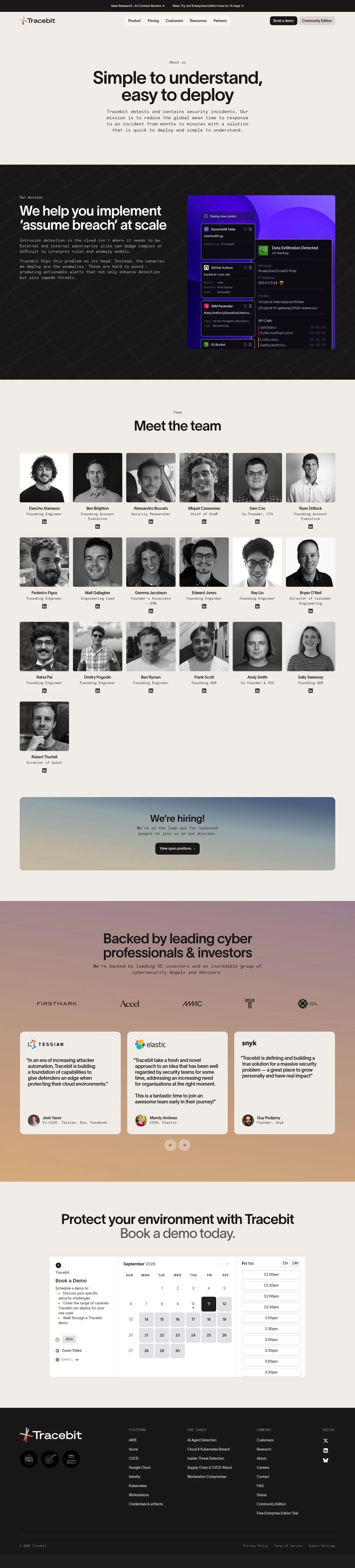
- Full page: https://cdn.designmunk.com/2026/09/10153521/tracebit-com-about-featured.webp
- Above the fold: https://cdn.designmunk.com/2026/09/10153521/tracebit-com-about-featured.webp
- On DesignMunk: https://designmunk.com/tracebit-about-page/

Study these for hierarchy, rhythm, spacing and density. Where an image and the written spec disagree, the spec wins: the tokens were read from the page's own CSS, the images are one rendering of it.

## Before you start

Ask the user what they are building, who it is for, and what brand assets they already have — name, colours, typefaces. Wait for their answers before writing anything. Everything below is then applied to their product, not to the reference.

## Design specification

# Tracebit: Monospace Body, Heavy Grotesk on Warm Off-White

## Overview

A security-first brand for technical buyers. The UI should feel confident, minimal, and readable on a warm neutral surface with high-contrast ink. Information density is moderate: large, tightly tracked headlines for scanning, monospace body for a log-like tone. Sections alternate light surface and near-black panels for rhythm; CTAs remain prominent and consistent.

## Colors

- Primary (#231f20): Ink for headlines, body, and key icons.
- Secondary (#fc9c04): Amber accent for highlights, notices, or sparing emphasis.
- Tertiary (#ea6f53): Coral accent for warnings or promotional moments.
- Neutral (#f3efec): Warm bone surface for pages and cards.
- Brand-armor-wash (#040404): Near-black canvas for dark sections and code-adjacent panels.
- Brand-savory-salmon (#d39c99): Muted supporting tint for illustrations or subtle fills.
- Surface ({colors.neutral}): Alias of Neutral; default page and card background.
- On-surface ({colors.primary}): Alias of Primary; default text and icon color on light surfaces.

## Typography

- Headlines (headline-lg/md/sm/xs) use TWK Lausanne Pan. This is a custom, self-hosted family and not directly obtainable by agents. Recommended substitutes: Inter, Plus Jakarta Sans, or IBM Plex Sans (all Google Fonts). Use the provided sizes and tracking: 72/48/32/21px with weights 600/600/500/500 and tight negative letter-spacing for impact.
- Body (body-md) uses Basis Grotesque Mono at 14px/1.4. This is also custom/self-hosted; use IBM Plex Mono, JetBrains Mono, or Space Mono as substitutes. Keep paragraphs short and rely on spacing to maintain readability.
- Pairing guidance: headlines carry tone and hierarchy; body-mono conveys precision and logs. Avoid mixing proportional and mono faces within the same paragraph.

## Layout

The spacing scale drives rhythm: xs 6px for micro offsets, sm 16px for element padding, md 32px for block gaps, lg 80px for section paddings, and xl 120px for hero/anchor sections. Use a responsive multi-column grid with generous gutters; constrain text columns to maintain measure, especially with 14px mono. Alternate light and dark bands to separate topics. Cards get md (32px) internal padding and stack with md (32px) gaps in lists or grids.

## Elevation & Depth

Depth is conveyed with tone and 1px hairlines rather than drop shadows. The measured "sm" shadow is a flat border (rgb(229, 226, 224) 0 0 0 1px) used for card delineation. Larger shadows are none; hierarchy comes from contrast shifts (#f3efec vs #040404), scale, and whitespace. Reserve borders for grouping; avoid layered shadows.

## Shapes

Three radii form the shape language: 4px (sm) for subtle inputs and secondary buttons; 10px (md) for primary buttons and interactive chips; 16px (lg) for cards and media frames. Link-style buttons remain square (0px) to read as text actions. Keep radii consistent within a module—do not mix 4/10/16 on the same component.

## Components

Buttons
- Primary: 40px tall with 10px radius (md), #231f20 background and white text; padding 4px 14px. Use for main CTAs (e.g., "Book a demo").
- Secondary: 40px tall with 4px radius (sm), text in #231f20. Pair with a light surface; add a 1px hairline if a boundary is needed.
- Link: Text-only, #8a3c90, 0px radius. Inline navigational or tertiary actions.

Card
- Background #f3efec, text #231f20, 16px radius (lg), 32px padding. Use the sm hairline border when grouping on light surfaces.

Distinctive components
### Announcement Bar
- Sits above the nav with two links. Use body-md (14px) on #231f20 text over a contrasting strip; spacing sm (16px) vertically.
### Top Navigation with Dual CTAs
- Logo + product/platform/use-cases menus. Right-aligned CTAs: Primary button (40px, md radius) and a secondary pill.
### About Hero
- Centered headline (headline-lg 72px, -0.03em), mono paragraph (body-md 14px). Surface #f3efec, on-surface #231f20, vertical padding xl (120px).
### Mission Panel (Dark Slice)
- Background #040404, text #f3efec. Left column copy (headline-md 48px), right column product image framed in a 16px-radius card.
### Team Grid
- Repeating cards for people: name (headline-xs 21px), role (body-md 14px). Card padding 32px, radius 16px, grid gap md (32px).
### Investor Quotes
- Blockquotes on light surface. Quote body in body-md, author line in headline-xs. Use md (32px) gaps between quotes.
### Closing CTA Strip
- Heading (headline-md 48px) with a single primary button (40px, md radius). Section padding lg (80px) on #f3efec.

## Do's and Don'ts

- Do keep headlines tight (use the provided negative letter-spacing) to achieve the bold, compressed feel.
- Do reserve Secondary (#fc9c04) and Tertiary (#ea6f53) for sparing emphasis; most UI should stay monochrome on #f3efec or #040404.
- Do use the sm hairline (rgb(229, 226, 224) 1px) instead of box shadows to separate cards.
- Don't mix multiple radii on a single component—choose 4, 10, or 16px by role.
- Don't enlarge body copy within a module without adjusting line length; 14px mono needs shorter measures.
- Don't place black primary buttons on #040404; switch to light-surface containers or outline patterns if needed.

## Agent Prompt Guide

Quick color reference
- Text: #231f20
- Background: #f3efec
- Border: rgb(229, 226, 224) (1px hairline)
- Accent: #fc9c04 or #ea6f53

1) Build a centered hero
- Container: background #f3efec; max-width 800px; padding-top/bottom: 120px; gap: 16px.
- H1: font-family 'TWK Lausanne Pan'; font-size 72px; font-weight 600; letter-spacing -0.03em; line-height 1.19; color #231f20; text-align center.
- Paragraph: font-family 'Basis Grotesque Mono'; font-size 14px; line-height 1.4; color #231f20; text-align center; max-width 640px; margin 0 auto.
- CTA: 40px height; padding 4px 14px; border-radius 10px; background #231f20; color #ffffff.

2) Dark mission section with split layout
- Section: background #040404; color #f3efec; padding: 80px 0.
- Left column: H2 using 'TWK Lausanne Pan' 48px/1.19, weight 600, letter-spacing -0.035em; paragraph in 'Basis Grotesque Mono' 14px/1.4.
- Right column: image inside a card with background #f3efec; border: rgb(229, 226, 224) 1px; border-radius 16px; padding 32px.

3) Team grid cards
- Grid: 3 columns desktop, gap 32px.
- Card: background #f3efec; color #231f20; padding 32px; border-radius 16px; border: rgb(229, 226, 224) 1px.
- Name: 'TWK Lausanne Pan' 21px/1.14 weight 500; Role: 'Basis Grotesque Mono' 14px/1.4.

4) Closing CTA strip
- Section: background #f3efec; padding: 80px 0; center content.
- Heading: 'TWK Lausanne Pan' 48px weight 600, letter-spacing -0.035em; Paragraph (optional): 'Basis Grotesque Mono' 14px.
- Button: 40px height; 10px radius; 4px 14px padding; background #231f20; text #ffffff.

## Similar Brands

- Vanta — similar neutral canvas with assertive black CTAs; Vanta leans teal for brand accents while Tracebit stays amber/coral.
- Snyk — developer-centric security with bold headlines; Snyk is more illustrative and colorful.
- Teleport — minimalist security site with dense technical navigation; uses cooler neutrals vs Tracebit's warmer bone.
- CrowdStrike — high-contrast security marketing; heavier motion and red accents compared to Tracebit's restrained palette.

## Tokens

### CSS custom properties

```css
:root {
  /* Colors */
  --color-primary: #231f20;
  --color-secondary: #fc9c04;
  --color-tertiary: #ea6f53;
  --color-neutral: #f3efec;
  --color-brand-armor-wash: #040404;
  --color-brand-savory-salmon: #d39c99;
  --color-surface: var(--color-neutral);
  --color-on-surface: var(--color-primary);

  /* Typography */
  --text-headline-lg-size: 72px;
  --text-headline-lg-weight: 600;
  --text-headline-lg-leading: 1.19;
  --text-headline-lg-tracking: -0.03em;
  --text-headline-md-size: 48px;
  --text-headline-md-weight: 600;
  --text-headline-md-leading: 1.19;
  --text-headline-md-tracking: -0.035em;
  --text-headline-sm-size: 32px;
  --text-headline-sm-weight: 500;
  --text-headline-sm-leading: 1.19;
  --text-headline-sm-tracking: -0.01em;
  --text-headline-xs-size: 21px;
  --text-headline-xs-weight: 500;
  --text-headline-xs-leading: 1.14;
  --text-headline-xs-tracking: -0.019em;
  --text-body-md-size: 14px;
  --text-body-md-weight: 400;
  --text-body-md-leading: 1.4;
  --font-twk-lausanne-pan: "TWK Lausanne Pan";
  --font-basis-grotesque-mono: "Basis Grotesque Mono";

  /* Rounded */
  --radius-sm: 4px;
  --radius-md: 10px;
  --radius-lg: 16px;

  /* Spacing */
  --spacing-xs: 6px;
  --spacing-sm: 16px;
  --spacing-md: 32px;
  --spacing-lg: 80px;
  --spacing-xl: 120px;

  /* Components */
  --button-primary-background-color: var(--color-primary);
  --button-primary-text-color: #ffffff;
  --button-primary-rounded: var(--radius-md);
  --button-primary-padding: 4px 14px;
  --button-primary-height: 40px;
  --button-secondary-text-color: var(--color-primary);
  --button-secondary-rounded: var(--radius-sm);
  --button-secondary-padding: 4px 14px;
  --button-secondary-height: 40px;
  --button-link-text-color: #8a3c90;
  --button-link-rounded: 0px;
  --card-background-color: var(--color-neutral);
  --card-text-color: var(--color-primary);
  --card-rounded: var(--radius-lg);
  --card-padding: 32px;
}
```

### Tailwind theme

```css
@theme {
  --color-primary: #231f20;
  --color-secondary: #fc9c04;
  --color-tertiary: #ea6f53;
  --color-neutral: #f3efec;
  --color-brand-armor-wash: #040404;
  --color-brand-savory-salmon: #d39c99;
  --color-surface: #f3efec;
  --color-on-surface: #231f20;
  --font-headline-lg: "TWK Lausanne Pan";
  --font-headline-md: "TWK Lausanne Pan";
  --font-headline-sm: "TWK Lausanne Pan";
  --font-headline-xs: "TWK Lausanne Pan";
  --font-body-md: "Basis Grotesque Mono";
  --text-headline-lg: 72px;
  --text-headline-md: 48px;
  --text-headline-sm: 32px;
  --text-headline-xs: 21px;
  --text-body-md: 14px;
  --tracking-headline-lg: -0.03em;
  --tracking-headline-md: -0.035em;
  --tracking-headline-sm: -0.01em;
  --tracking-headline-xs: -0.019em;
  --font-weight-headline-lg: 600;
  --font-weight-headline-md: 600;
  --font-weight-headline-sm: 500;
  --font-weight-headline-xs: 500;
  --font-weight-body-md: 400;
  --radius-sm: 4px;
  --radius-md: 10px;
  --radius-lg: 16px;
  --spacing-xs: 6px;
  --spacing-sm: 16px;
  --spacing-md: 32px;
  --spacing-lg: 80px;
  --spacing-xl: 120px;
}
```

### Design tokens (DTCG)

```json
{
    "$schema": "https://www.designtokens.org/schemas/2025.10/format.json",
    "color": {
        "$type": "color",
        "primary": {
            "$value": {
                "colorSpace": "srgb",
                "components": [
                    0.137,
                    0.122,
                    0.125
                ],
                "hex": "#231f20"
            }
        },
        "secondary": {
            "$value": {
                "colorSpace": "srgb",
                "components": [
                    0.988,
                    0.612,
                    0.016
                ],
                "hex": "#fc9c04"
            }
        },
        "tertiary": {
            "$value": {
                "colorSpace": "srgb",
                "components": [
                    0.918,
                    0.435,
                    0.325
                ],
                "hex": "#ea6f53"
            }
        },
        "neutral": {
            "$value": {
                "colorSpace": "srgb",
                "components": [
                    0.953,
                    0.937,
                    0.925
                ],
                "hex": "#f3efec"
            }
        },
        "brand-armor-wash": {
            "$value": {
                "colorSpace": "srgb",
                "components": [
                    0.016,
                    0.016,
                    0.016
                ],
                "hex": "#040404"
            }
        },
        "brand-savory-salmon": {
            "$value": {
                "colorSpace": "srgb",
                "components": [
                    0.827,
                    0.612,
                    0.6
                ],
                "hex": "#d39c99"
            }
        },
        "surface": {
            "$value": {
                "colorSpace": "srgb",
                "components": [
                    0.953,
                    0.937,
                    0.925
                ],
                "hex": "#f3efec"
            }
        },
        "on-surface": {
            "$value": {
                "colorSpace": "srgb",
                "components": [
                    0.137,
                    0.122,
                    0.125
                ],
                "hex": "#231f20"
            }
        }
    },
    "spacing": {
        "$type": "dimension",
        "xs": {
            "$value": {
                "value": 6,
                "unit": "px"
            }
        },
        "sm": {
            "$value": {
                "value": 16,
                "unit": "px"
            }
        },
        "md": {
            "$value": {
                "value": 32,
                "unit": "px"
            }
        },
        "lg": {
            "$value": {
                "value": 80,
                "unit": "px"
            }
        },
        "xl": {
            "$value": {
                "value": 120,
                "unit": "px"
            }
        }
    },
    "rounded": {
        "$type": "dimension",
        "sm": {
            "$value": {
                "value": 4,
                "unit": "px"
            }
        },
        "md": {
            "$value": {
                "value": 10,
                "unit": "px"
            }
        },
        "lg": {
            "$value": {
                "value": 16,
                "unit": "px"
            }
        }
    },
    "typography": {
        "headline-lg": {
            "$type": "typography",
            "$value": {
                "fontFamily": "TWK Lausanne Pan",
                "fontSize": {
                    "value": 72,
                    "unit": "px"
                },
                "fontWeight": 600,
                "letterSpacing": {
                    "value": -0.03,
                    "unit": "em"
                }
            }
        },
        "headline-md": {
            "$type": "typography",
            "$value": {
                "fontFamily": "TWK Lausanne Pan",
                "fontSize": {
                    "value": 48,
                    "unit": "px"
                },
                "fontWeight": 600,
                "letterSpacing": {
                    "value": -0.035,
                    "unit": "em"
                }
            }
        },
        "headline-sm": {
            "$type": "typography",
            "$value": {
                "fontFamily": "TWK Lausanne Pan",
                "fontSize": {
                    "value": 32,
                    "unit": "px"
                },
                "fontWeight": 500,
                "letterSpacing": {
                    "value": -0.01,
                    "unit": "em"
                }
            }
        },
        "headline-xs": {
            "$type": "typography",
            "$value": {
                "fontFamily": "TWK Lausanne Pan",
                "fontSize": {
                    "value": 21,
                    "unit": "px"
                },
                "fontWeight": 500,
                "letterSpacing": {
                    "value": -0.019,
                    "unit": "em"
                }
            }
        },
        "body-md": {
            "$type": "typography",
            "$value": {
                "fontFamily": "Basis Grotesque Mono",
                "fontSize": {
                    "value": 14,
                    "unit": "px"
                },
                "fontWeight": 400
            }
        }
    }
}
```

## Rules

- **Fonts.** If the specification names a custom or self-hosted family, use one of the substitutes it names. Never reference a typeface you cannot actually load — it will fall back to a system font and undo the typography.
- **Colour.** Derive the palette from the user's brand. Use the token values as a guide to *relationships* — contrast, tint, how many accents carry the page — not as hex codes to paste.
- **Never reproduce** the wordmark, mascot, logo, brand name, illustrations, icon set, screenshots or any copy from the reference.
- **Never present the result as Tracebit About**, or imply any connection to it.
- If something is unspecified, choose clarity and legibility over decoration.
---
version: alpha
name: Tracebit
description: "The answer to Assume Breach: detect attacks in seconds."
colors:
  primary: "#231f20"
  secondary: "#fc9c04"
  tertiary: "#ea6f53"
  neutral: "#f3efec"
  brand-armor-wash: "#040404"
  brand-savory-salmon: "#d39c99"
  surface: "{colors.neutral}"
  on-surface: "{colors.primary}"
typography:
  headline-lg:
    fontFamily: TWK Lausanne Pan
    fontSize: 72px
    fontWeight: 600
    lineHeight: 1.19
    letterSpacing: -0.03em
  headline-md:
    fontFamily: TWK Lausanne Pan
    fontSize: 48px
    fontWeight: 600
    lineHeight: 1.19
    letterSpacing: -0.035em
  headline-sm:
    fontFamily: TWK Lausanne Pan
    fontSize: 32px
    fontWeight: 500
    lineHeight: 1.19
    letterSpacing: -0.01em
  headline-xs:
    fontFamily: TWK Lausanne Pan
    fontSize: 21px
    fontWeight: 500
    lineHeight: 1.14
    letterSpacing: -0.019em
  body-md:
    fontFamily: Basis Grotesque Mono
    fontSize: 14px
    fontWeight: 400
    lineHeight: 1.4
rounded:
  sm: 4px
  md: 10px
  lg: 16px
spacing:
  xs: 6px
  sm: 16px
  md: 32px
  lg: 80px
  xl: 120px
components:
  button-primary:
    backgroundColor: "{colors.primary}"
    textColor: "#ffffff"
    rounded: "{rounded.md}"
    padding: 4px 14px
    height: 40px
  button-secondary:
    textColor: "{colors.primary}"
    rounded: "{rounded.sm}"
    padding: 4px 14px
    height: 40px
  button-link:
    textColor: "#8a3c90"
    rounded: 0px
  card:
    backgroundColor: "{colors.neutral}"
    textColor: "{colors.primary}"
    rounded: "{rounded.lg}"
    padding: 32px
---

# Tracebit: Monospace Body, Heavy Grotesk on Warm Off-White

## Overview

A security-first brand for technical buyers. The UI should feel confident, minimal, and readable on a warm neutral surface with high-contrast ink. Information density is moderate: large, tightly tracked headlines for scanning, monospace body for a log-like tone. Sections alternate light surface and near-black panels for rhythm; CTAs remain prominent and consistent.

## Colors

- Primary (#231f20): Ink for headlines, body, and key icons.
- Secondary (#fc9c04): Amber accent for highlights, notices, or sparing emphasis.
- Tertiary (#ea6f53): Coral accent for warnings or promotional moments.
- Neutral (#f3efec): Warm bone surface for pages and cards.
- Brand-armor-wash (#040404): Near-black canvas for dark sections and code-adjacent panels.
- Brand-savory-salmon (#d39c99): Muted supporting tint for illustrations or subtle fills.
- Surface ({colors.neutral}): Alias of Neutral; default page and card background.
- On-surface ({colors.primary}): Alias of Primary; default text and icon color on light surfaces.

## Typography

- Headlines (headline-lg/md/sm/xs) use TWK Lausanne Pan. This is a custom, self-hosted family and not directly obtainable by agents. Recommended substitutes: Inter, Plus Jakarta Sans, or IBM Plex Sans (all Google Fonts). Use the provided sizes and tracking: 72/48/32/21px with weights 600/600/500/500 and tight negative letter-spacing for impact.
- Body (body-md) uses Basis Grotesque Mono at 14px/1.4. This is also custom/self-hosted; use IBM Plex Mono, JetBrains Mono, or Space Mono as substitutes. Keep paragraphs short and rely on spacing to maintain readability.
- Pairing guidance: headlines carry tone and hierarchy; body-mono conveys precision and logs. Avoid mixing proportional and mono faces within the same paragraph.

## Layout

The spacing scale drives rhythm: xs 6px for micro offsets, sm 16px for element padding, md 32px for block gaps, lg 80px for section paddings, and xl 120px for hero/anchor sections. Use a responsive multi-column grid with generous gutters; constrain text columns to maintain measure, especially with 14px mono. Alternate light and dark bands to separate topics. Cards get md (32px) internal padding and stack with md (32px) gaps in lists or grids.

## Elevation & Depth

Depth is conveyed with tone and 1px hairlines rather than drop shadows. The measured "sm" shadow is a flat border (rgb(229, 226, 224) 0 0 0 1px) used for card delineation. Larger shadows are none; hierarchy comes from contrast shifts (#f3efec vs #040404), scale, and whitespace. Reserve borders for grouping; avoid layered shadows.

## Shapes

Three radii form the shape language: 4px (sm) for subtle inputs and secondary buttons; 10px (md) for primary buttons and interactive chips; 16px (lg) for cards and media frames. Link-style buttons remain square (0px) to read as text actions. Keep radii consistent within a module—do not mix 4/10/16 on the same component.

## Components

Buttons
- Primary: 40px tall with 10px radius (md), #231f20 background and white text; padding 4px 14px. Use for main CTAs (e.g., "Book a demo").
- Secondary: 40px tall with 4px radius (sm), text in #231f20. Pair with a light surface; add a 1px hairline if a boundary is needed.
- Link: Text-only, #8a3c90, 0px radius. Inline navigational or tertiary actions.

Card
- Background #f3efec, text #231f20, 16px radius (lg), 32px padding. Use the sm hairline border when grouping on light surfaces.

Distinctive components
### Announcement Bar
- Sits above the nav with two links. Use body-md (14px) on #231f20 text over a contrasting strip; spacing sm (16px) vertically.
### Top Navigation with Dual CTAs
- Logo + product/platform/use-cases menus. Right-aligned CTAs: Primary button (40px, md radius) and a secondary pill.
### About Hero
- Centered headline (headline-lg 72px, -0.03em), mono paragraph (body-md 14px). Surface #f3efec, on-surface #231f20, vertical padding xl (120px).
### Mission Panel (Dark Slice)
- Background #040404, text #f3efec. Left column copy (headline-md 48px), right column product image framed in a 16px-radius card.
### Team Grid
- Repeating cards for people: name (headline-xs 21px), role (body-md 14px). Card padding 32px, radius 16px, grid gap md (32px).
### Investor Quotes
- Blockquotes on light surface. Quote body in body-md, author line in headline-xs. Use md (32px) gaps between quotes.
### Closing CTA Strip
- Heading (headline-md 48px) with a single primary button (40px, md radius). Section padding lg (80px) on #f3efec.

## Do's and Don'ts

- Do keep headlines tight (use the provided negative letter-spacing) to achieve the bold, compressed feel.
- Do reserve Secondary (#fc9c04) and Tertiary (#ea6f53) for sparing emphasis; most UI should stay monochrome on #f3efec or #040404.
- Do use the sm hairline (rgb(229, 226, 224) 1px) instead of box shadows to separate cards.
- Don't mix multiple radii on a single component—choose 4, 10, or 16px by role.
- Don't enlarge body copy within a module without adjusting line length; 14px mono needs shorter measures.
- Don't place black primary buttons on #040404; switch to light-surface containers or outline patterns if needed.

## Agent Prompt Guide

Quick color reference
- Text: #231f20
- Background: #f3efec
- Border: rgb(229, 226, 224) (1px hairline)
- Accent: #fc9c04 or #ea6f53

1) Build a centered hero
- Container: background #f3efec; max-width 800px; padding-top/bottom: 120px; gap: 16px.
- H1: font-family 'TWK Lausanne Pan'; font-size 72px; font-weight 600; letter-spacing -0.03em; line-height 1.19; color #231f20; text-align center.
- Paragraph: font-family 'Basis Grotesque Mono'; font-size 14px; line-height 1.4; color #231f20; text-align center; max-width 640px; margin 0 auto.
- CTA: 40px height; padding 4px 14px; border-radius 10px; background #231f20; color #ffffff.

2) Dark mission section with split layout
- Section: background #040404; color #f3efec; padding: 80px 0.
- Left column: H2 using 'TWK Lausanne Pan' 48px/1.19, weight 600, letter-spacing -0.035em; paragraph in 'Basis Grotesque Mono' 14px/1.4.
- Right column: image inside a card with background #f3efec; border: rgb(229, 226, 224) 1px; border-radius 16px; padding 32px.

3) Team grid cards
- Grid: 3 columns desktop, gap 32px.
- Card: background #f3efec; color #231f20; padding 32px; border-radius 16px; border: rgb(229, 226, 224) 1px.
- Name: 'TWK Lausanne Pan' 21px/1.14 weight 500; Role: 'Basis Grotesque Mono' 14px/1.4.

4) Closing CTA strip
- Section: background #f3efec; padding: 80px 0; center content.
- Heading: 'TWK Lausanne Pan' 48px weight 600, letter-spacing -0.035em; Paragraph (optional): 'Basis Grotesque Mono' 14px.
- Button: 40px height; 10px radius; 4px 14px padding; background #231f20; text #ffffff.

## Similar Brands

- Vanta — similar neutral canvas with assertive black CTAs; Vanta leans teal for brand accents while Tracebit stays amber/coral.
- Snyk — developer-centric security with bold headlines; Snyk is more illustrative and colorful.
- Teleport — minimalist security site with dense technical navigation; uses cooler neutrals vs Tracebit's warmer bone.
- CrowdStrike — high-contrast security marketing; heavier motion and red accents compared to Tracebit's restrained palette.
:root {
  /* Colors */
  --color-primary: #231f20;
  --color-secondary: #fc9c04;
  --color-tertiary: #ea6f53;
  --color-neutral: #f3efec;
  --color-brand-armor-wash: #040404;
  --color-brand-savory-salmon: #d39c99;
  --color-surface: var(--color-neutral);
  --color-on-surface: var(--color-primary);

  /* Typography */
  --text-headline-lg-size: 72px;
  --text-headline-lg-weight: 600;
  --text-headline-lg-leading: 1.19;
  --text-headline-lg-tracking: -0.03em;
  --text-headline-md-size: 48px;
  --text-headline-md-weight: 600;
  --text-headline-md-leading: 1.19;
  --text-headline-md-tracking: -0.035em;
  --text-headline-sm-size: 32px;
  --text-headline-sm-weight: 500;
  --text-headline-sm-leading: 1.19;
  --text-headline-sm-tracking: -0.01em;
  --text-headline-xs-size: 21px;
  --text-headline-xs-weight: 500;
  --text-headline-xs-leading: 1.14;
  --text-headline-xs-tracking: -0.019em;
  --text-body-md-size: 14px;
  --text-body-md-weight: 400;
  --text-body-md-leading: 1.4;
  --font-twk-lausanne-pan: "TWK Lausanne Pan";
  --font-basis-grotesque-mono: "Basis Grotesque Mono";

  /* Rounded */
  --radius-sm: 4px;
  --radius-md: 10px;
  --radius-lg: 16px;

  /* Spacing */
  --spacing-xs: 6px;
  --spacing-sm: 16px;
  --spacing-md: 32px;
  --spacing-lg: 80px;
  --spacing-xl: 120px;

  /* Components */
  --button-primary-background-color: var(--color-primary);
  --button-primary-text-color: #ffffff;
  --button-primary-rounded: var(--radius-md);
  --button-primary-padding: 4px 14px;
  --button-primary-height: 40px;
  --button-secondary-text-color: var(--color-primary);
  --button-secondary-rounded: var(--radius-sm);
  --button-secondary-padding: 4px 14px;
  --button-secondary-height: 40px;
  --button-link-text-color: #8a3c90;
  --button-link-rounded: 0px;
  --card-background-color: var(--color-neutral);
  --card-text-color: var(--color-primary);
  --card-rounded: var(--radius-lg);
  --card-padding: 32px;
}
{
  "$schema": "https://www.designtokens.org/schemas/2025.10/format.json",
  "$description": "The answer to Assume Breach: detect attacks in seconds.",
  "color": {
    "$type": "color",
    "primary": {
      "$value": {
        "colorSpace": "srgb",
        "components": [
          0.137,
          0.122,
          0.125
        ],
        "hex": "#231f20"
      }
    },
    "secondary": {
      "$value": {
        "colorSpace": "srgb",
        "components": [
          0.988,
          0.612,
          0.016
        ],
        "hex": "#fc9c04"
      }
    },
    "tertiary": {
      "$value": {
        "colorSpace": "srgb",
        "components": [
          0.918,
          0.435,
          0.325
        ],
        "hex": "#ea6f53"
      }
    },
    "neutral": {
      "$value": {
        "colorSpace": "srgb",
        "components": [
          0.953,
          0.937,
          0.925
        ],
        "hex": "#f3efec"
      }
    },
    "brand-armor-wash": {
      "$value": {
        "colorSpace": "srgb",
        "components": [
          0.016,
          0.016,
          0.016
        ],
        "hex": "#040404"
      }
    },
    "brand-savory-salmon": {
      "$value": {
        "colorSpace": "srgb",
        "components": [
          0.827,
          0.612,
          0.6
        ],
        "hex": "#d39c99"
      }
    },
    "surface": {
      "$value": {
        "colorSpace": "srgb",
        "components": [
          0.953,
          0.937,
          0.925
        ],
        "hex": "#f3efec"
      }
    },
    "on-surface": {
      "$value": {
        "colorSpace": "srgb",
        "components": [
          0.137,
          0.122,
          0.125
        ],
        "hex": "#231f20"
      }
    }
  },
  "spacing": {
    "$type": "dimension",
    "xs": {
      "$value": {
        "value": 6,
        "unit": "px"
      }
    },
    "sm": {
      "$value": {
        "value": 16,
        "unit": "px"
      }
    },
    "md": {
      "$value": {
        "value": 32,
        "unit": "px"
      }
    },
    "lg": {
      "$value": {
        "value": 80,
        "unit": "px"
      }
    },
    "xl": {
      "$value": {
        "value": 120,
        "unit": "px"
      }
    }
  },
  "rounded": {
    "$type": "dimension",
    "sm": {
      "$value": {
        "value": 4,
        "unit": "px"
      }
    },
    "md": {
      "$value": {
        "value": 10,
        "unit": "px"
      }
    },
    "lg": {
      "$value": {
        "value": 16,
        "unit": "px"
      }
    }
  },
  "typography": {
    "headline-lg": {
      "$type": "typography",
      "$value": {
        "fontFamily": "TWK Lausanne Pan",
        "fontSize": {
          "value": 72,
          "unit": "px"
        },
        "fontWeight": 600,
        "letterSpacing": {
          "value": -0.03,
          "unit": "em"
        }
      }
    },
    "headline-md": {
      "$type": "typography",
      "$value": {
        "fontFamily": "TWK Lausanne Pan",
        "fontSize": {
          "value": 48,
          "unit": "px"
        },
        "fontWeight": 600,
        "letterSpacing": {
          "value": -0.035,
          "unit": "em"
        }
      }
    },
    "headline-sm": {
      "$type": "typography",
      "$value": {
        "fontFamily": "TWK Lausanne Pan",
        "fontSize": {
          "value": 32,
          "unit": "px"
        },
        "fontWeight": 500,
        "letterSpacing": {
          "value": -0.01,
          "unit": "em"
        }
      }
    },
    "headline-xs": {
      "$type": "typography",
      "$value": {
        "fontFamily": "TWK Lausanne Pan",
        "fontSize": {
          "value": 21,
          "unit": "px"
        },
        "fontWeight": 500,
        "letterSpacing": {
          "value": -0.019,
          "unit": "em"
        }
      }
    },
    "body-md": {
      "$type": "typography",
      "$value": {
        "fontFamily": "Basis Grotesque Mono",
        "fontSize": {
          "value": 14,
          "unit": "px"
        },
        "fontWeight": 400
      }
    }
  }
}
@theme {
--color-primary: #231f20;
--color-secondary: #fc9c04;
--color-tertiary: #ea6f53;
--color-neutral: #f3efec;
--color-brand-armor-wash: #040404;
--color-brand-savory-salmon: #d39c99;
--color-surface: #f3efec;
--color-on-surface: #231f20;
--font-headline-lg: "TWK Lausanne Pan";
--font-headline-md: "TWK Lausanne Pan";
--font-headline-sm: "TWK Lausanne Pan";
--font-headline-xs: "TWK Lausanne Pan";
--font-body-md: "Basis Grotesque Mono";
--text-headline-lg: 72px;
--text-headline-md: 48px;
--text-headline-sm: 32px;
--text-headline-xs: 21px;
--text-body-md: 14px;
--tracking-headline-lg: -0.03em;
--tracking-headline-md: -0.035em;
--tracking-headline-sm: -0.01em;
--tracking-headline-xs: -0.019em;
--font-weight-headline-lg: 600;
--font-weight-headline-md: 600;
--font-weight-headline-sm: 500;
--font-weight-headline-xs: 500;
--font-weight-body-md: 400;
--radius-sm: 4px;
--radius-md: 10px;
--radius-lg: 16px;
--spacing-xs: 6px;
--spacing-sm: 16px;
--spacing-md: 32px;
--spacing-lg: 80px;
--spacing-xl: 120px;
} # Design brief: the Tracebit About design language
Below is a complete design specification measured from a real, published web page. Use it as a design language for the user's product. It is not a page to reproduce.
## Reference images
- Full page: https://cdn.designmunk.com/2026/09/10153521/tracebit-com-about-featured.webp
- Above the fold: https://cdn.designmunk.com/2026/09/10153521/tracebit-com-about-featured.webp
- On DesignMunk: https://designmunk.com/tracebit-about-page/
Study these for hierarchy, rhythm, spacing and density. Where an image and the written spec disagree, the spec wins: the tokens were read from the page's own CSS, the images are one rendering of it.
## Before you start
Ask the user what they are building, who it is for, and what brand assets they already have — name, colours, typefaces. Wait for their answers before writing anything. Everything below is then applied to their product, not to the reference.
## Design specification
# Tracebit: Monospace Body, Heavy Grotesk on Warm Off-White
## Overview
A security-first brand for technical buyers. The UI should feel confident, minimal, and readable on a warm neutral surface with high-contrast ink. Information density is moderate: large, tightly tracked headlines for scanning, monospace body for a log-like tone. Sections alternate light surface and near-black panels for rhythm; CTAs remain prominent and consistent.
## Colors
- Primary (#231f20): Ink for headlines, body, and key icons.
- Secondary (#fc9c04): Amber accent for highlights, notices, or sparing emphasis.
- Tertiary (#ea6f53): Coral accent for warnings or promotional moments.
- Neutral (#f3efec): Warm bone surface for pages and cards.
- Brand-armor-wash (#040404): Near-black canvas for dark sections and code-adjacent panels.
- Brand-savory-salmon (#d39c99): Muted supporting tint for illustrations or subtle fills.
- Surface ({colors.neutral}): Alias of Neutral; default page and card background.
- On-surface ({colors.primary}): Alias of Primary; default text and icon color on light surfaces.
## Typography
- Headlines (headline-lg/md/sm/xs) use TWK Lausanne Pan. This is a custom, self-hosted family and not directly obtainable by agents. Recommended substitutes: Inter, Plus Jakarta Sans, or IBM Plex Sans (all Google Fonts). Use the provided sizes and tracking: 72/48/32/21px with weights 600/600/500/500 and tight negative letter-spacing for impact.
- Body (body-md) uses Basis Grotesque Mono at 14px/1.4. This is also custom/self-hosted; use IBM Plex Mono, JetBrains Mono, or Space Mono as substitutes. Keep paragraphs short and rely on spacing to maintain readability.
- Pairing guidance: headlines carry tone and hierarchy; body-mono conveys precision and logs. Avoid mixing proportional and mono faces within the same paragraph.
## Layout
The spacing scale drives rhythm: xs 6px for micro offsets, sm 16px for element padding, md 32px for block gaps, lg 80px for section paddings, and xl 120px for hero/anchor sections. Use a responsive multi-column grid with generous gutters; constrain text columns to maintain measure, especially with 14px mono. Alternate light and dark bands to separate topics. Cards get md (32px) internal padding and stack with md (32px) gaps in lists or grids.
## Elevation & Depth
Depth is conveyed with tone and 1px hairlines rather than drop shadows. The measured "sm" shadow is a flat border (rgb(229, 226, 224) 0 0 0 1px) used for card delineation. Larger shadows are none; hierarchy comes from contrast shifts (#f3efec vs #040404), scale, and whitespace. Reserve borders for grouping; avoid layered shadows.
## Shapes
Three radii form the shape language: 4px (sm) for subtle inputs and secondary buttons; 10px (md) for primary buttons and interactive chips; 16px (lg) for cards and media frames. Link-style buttons remain square (0px) to read as text actions. Keep radii consistent within a module—do not mix 4/10/16 on the same component.
## Components
Buttons
- Primary: 40px tall with 10px radius (md), #231f20 background and white text; padding 4px 14px. Use for main CTAs (e.g., "Book a demo").
- Secondary: 40px tall with 4px radius (sm), text in #231f20. Pair with a light surface; add a 1px hairline if a boundary is needed.
- Link: Text-only, #8a3c90, 0px radius. Inline navigational or tertiary actions.
Card
- Background #f3efec, text #231f20, 16px radius (lg), 32px padding. Use the sm hairline border when grouping on light surfaces.
Distinctive components
### Announcement Bar
- Sits above the nav with two links. Use body-md (14px) on #231f20 text over a contrasting strip; spacing sm (16px) vertically.
### Top Navigation with Dual CTAs
- Logo + product/platform/use-cases menus. Right-aligned CTAs: Primary button (40px, md radius) and a secondary pill.
### About Hero
- Centered headline (headline-lg 72px, -0.03em), mono paragraph (body-md 14px). Surface #f3efec, on-surface #231f20, vertical padding xl (120px).
### Mission Panel (Dark Slice)
- Background #040404, text #f3efec. Left column copy (headline-md 48px), right column product image framed in a 16px-radius card.
### Team Grid
- Repeating cards for people: name (headline-xs 21px), role (body-md 14px). Card padding 32px, radius 16px, grid gap md (32px).
### Investor Quotes
- Blockquotes on light surface. Quote body in body-md, author line in headline-xs. Use md (32px) gaps between quotes.
### Closing CTA Strip
- Heading (headline-md 48px) with a single primary button (40px, md radius). Section padding lg (80px) on #f3efec.
## Do's and Don'ts
- Do keep headlines tight (use the provided negative letter-spacing) to achieve the bold, compressed feel.
- Do reserve Secondary (#fc9c04) and Tertiary (#ea6f53) for sparing emphasis; most UI should stay monochrome on #f3efec or #040404.
- Do use the sm hairline (rgb(229, 226, 224) 1px) instead of box shadows to separate cards.
- Don't mix multiple radii on a single component—choose 4, 10, or 16px by role.
- Don't enlarge body copy within a module without adjusting line length; 14px mono needs shorter measures.
- Don't place black primary buttons on #040404; switch to light-surface containers or outline patterns if needed.
## Agent Prompt Guide
Quick color reference
- Text: #231f20
- Background: #f3efec
- Border: rgb(229, 226, 224) (1px hairline)
- Accent: #fc9c04 or #ea6f53
1) Build a centered hero
- Container: background #f3efec; max-width 800px; padding-top/bottom: 120px; gap: 16px.
- H1: font-family 'TWK Lausanne Pan'; font-size 72px; font-weight 600; letter-spacing -0.03em; line-height 1.19; color #231f20; text-align center.
- Paragraph: font-family 'Basis Grotesque Mono'; font-size 14px; line-height 1.4; color #231f20; text-align center; max-width 640px; margin 0 auto.
- CTA: 40px height; padding 4px 14px; border-radius 10px; background #231f20; color #ffffff.
2) Dark mission section with split layout
- Section: background #040404; color #f3efec; padding: 80px 0.
- Left column: H2 using 'TWK Lausanne Pan' 48px/1.19, weight 600, letter-spacing -0.035em; paragraph in 'Basis Grotesque Mono' 14px/1.4.
- Right column: image inside a card with background #f3efec; border: rgb(229, 226, 224) 1px; border-radius 16px; padding 32px.
3) Team grid cards
- Grid: 3 columns desktop, gap 32px.
- Card: background #f3efec; color #231f20; padding 32px; border-radius 16px; border: rgb(229, 226, 224) 1px.
- Name: 'TWK Lausanne Pan' 21px/1.14 weight 500; Role: 'Basis Grotesque Mono' 14px/1.4.
4) Closing CTA strip
- Section: background #f3efec; padding: 80px 0; center content.
- Heading: 'TWK Lausanne Pan' 48px weight 600, letter-spacing -0.035em; Paragraph (optional): 'Basis Grotesque Mono' 14px.
- Button: 40px height; 10px radius; 4px 14px padding; background #231f20; text #ffffff.
## Tokens
### CSS custom properties
```css
:root {
/* Colors */
--color-primary: #231f20;
--color-secondary: #fc9c04;
--color-tertiary: #ea6f53;
--color-neutral: #f3efec;
--color-brand-armor-wash: #040404;
--color-brand-savory-salmon: #d39c99;
--color-surface: var(--color-neutral);
--color-on-surface: var(--color-primary);
/* Typography */
--text-headline-lg-size: 72px;
--text-headline-lg-weight: 600;
--text-headline-lg-leading: 1.19;
--text-headline-lg-tracking: -0.03em;
--text-headline-md-size: 48px;
--text-headline-md-weight: 600;
--text-headline-md-leading: 1.19;
--text-headline-md-tracking: -0.035em;
--text-headline-sm-size: 32px;
--text-headline-sm-weight: 500;
--text-headline-sm-leading: 1.19;
--text-headline-sm-tracking: -0.01em;
--text-headline-xs-size: 21px;
--text-headline-xs-weight: 500;
--text-headline-xs-leading: 1.14;
--text-headline-xs-tracking: -0.019em;
--text-body-md-size: 14px;
--text-body-md-weight: 400;
--text-body-md-leading: 1.4;
--font-twk-lausanne-pan: "TWK Lausanne Pan";
--font-basis-grotesque-mono: "Basis Grotesque Mono";
/* Rounded */
--radius-sm: 4px;
--radius-md: 10px;
--radius-lg: 16px;
/* Spacing */
--spacing-xs: 6px;
--spacing-sm: 16px;
--spacing-md: 32px;
--spacing-lg: 80px;
--spacing-xl: 120px;
/* Components */
--button-primary-background-color: var(--color-primary);
--button-primary-text-color: #ffffff;
--button-primary-rounded: var(--radius-md);
--button-primary-padding: 4px 14px;
--button-primary-height: 40px;
--button-secondary-text-color: var(--color-primary);
--button-secondary-rounded: var(--radius-sm);
--button-secondary-padding: 4px 14px;
--button-secondary-height: 40px;
--button-link-text-color: #8a3c90;
--button-link-rounded: 0px;
--card-background-color: var(--color-neutral);
--card-text-color: var(--color-primary);
--card-rounded: var(--radius-lg);
--card-padding: 32px;
}
```
## Rules
- **Fonts.** If the specification names a custom or self-hosted family, use one of the substitutes it names. Never reference a typeface you cannot actually load — it will fall back to a system font and undo the typography.
- **Colour.** Derive the palette from the user's brand. Use the token values as a guide to *relationships* — contrast, tint, how many accents carry the page — not as hex codes to paste.
- **Never reproduce** the wordmark, mascot, logo, brand name, illustrations, icon set, screenshots or any copy from the reference.
- **Never present the result as Tracebit About**, or imply any connection to it.
- If something is unspecified, choose clarity and legibility over decoration.