tilt.com
AI Breakdown
Design export
# Design brief: the Tilt design language

Below is a complete design specification measured from a real, published web page. Use it as a design language for the user's product. It is not a page to reproduce.

## Reference images

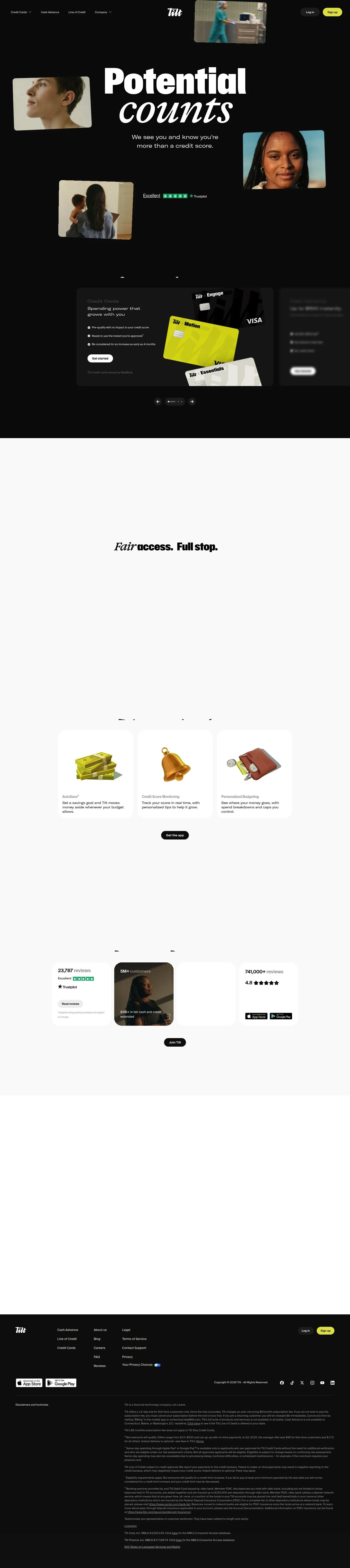
- Full page: https://cdn.designmunk.com/2026/09/30103408/tilt-com-featured.webp
- Above the fold: https://cdn.designmunk.com/2026/09/30103408/tilt-com-featured-1440x900.webp
- On DesignMunk: https://designmunk.com/tilt/

Study these for hierarchy, rhythm, spacing and density. Where an image and the written spec disagree, the spec wins: the tokens were read from the page's own CSS, the images are one rendering of it.

## Before you start

Ask the user what they are building, who it is for, and what brand assets they already have — name, colours, typefaces. Wait for their answers before writing anything. Everything below is then applied to their product, not to the reference.

## Design specification

# Tilt: Dark-Mode Credit Site With Poster-Scale Type

## Overview

Dark-mode, product-led marketing with high contrast and poster-scale typography. Audience is consumer finance shoppers comparing quick-access credit options. Tone is confident and direct; density varies by section — expressive and airy at the top, tighter and list-driven through the product and proof blocks.

## Page Structure

- Global navigation: left-aligned product menus, centered wordmark, right-side Log in and a bright pill Sign up; thin height, dark background.
- Hero: oversized display headline in two styles with one-line subcopy; scattered, slightly tilted portrait/video tiles around the type; no primary CTA in the hero.
- Typographic interlude: tall, stacked words that introduce the product area; acts as a visual divider with generous spacing.
- Product trio: a row of cards for Credit Cards, Cash Advance, and Line of Credit; each card lists 3–4 bullets, a small disclaimer line, and a primary pill CTA.
- Three-step value row: "Ready when you are / Finding a day one / Progress you can see" in three compact columns, each with a short paragraph and a text link CTA.
- Tools section: three feature tiles (AutoSave, Credit Score Monitoring, Personalized Budgeting) with one-sentence descriptions and a single app download CTA below.
- Social proof and metrics: reviews count with Trustpilot badge, large usage stats, a short testimonial snippet, and dual app-store badges.
- Join CTA: short callout preceding the footer to reinforce conversion.
- Footer: multi-column navigation (Products, Company, More) with legal, privacy, contact, social links, and store badges; extended disclosures and footnotes follow as a dense legal block.

## Colors

- Primary (#ffffff): Paper white for headlines and core text on dark.
- Secondary (#e1e114): Signal yellow used for high-attention accents like top-nav Sign up.
- Tertiary (#e4e24e): Lemon glow for primary CTAs in content areas.
- Neutral (#0b0b0b): Near-black surface for the entire page background and cards.
- Border (#374151): Slate divider for hairlines, card outlines, and subtle separators on dark.
- Brand-tool-green (#7c7414): Olive utility used sparingly for ratings or supportive UI notes.
- Surface ({colors.neutral}): The working canvas; dark background for all sections.
- On-surface ({colors.primary}): Default text and icon color over the dark surface.

## Typography

- Gravity (display, 900): Custom/self-hosted; not Google-served. Use for headline-lg (188px) and headline-md (119px) with tight tracking for a poster look. Substitutes: Anton, League Spartan, Archivo Black.
- Suisse Intl (secondary headlines, 600): Custom/self-hosted. Used for headline-sm (75px) and headline-xs (47px) to contrast the heavy display. Substitutes: Inter, IBM Plex Sans, Work Sans.
- GT America Extended Regular (body, 400): Custom/self-hosted. Used as body-md at 30px with wide proportions for legibility on dark. Substitutes: Inter, Archivo, Montserrat.
- GT America Expanded Regular (supporting wide display): Custom/self-hosted variant for occasional wide labels. Substitutes: Montserrat, League Spartan, Outfit.

## Layout

- Spacing scale uses 12/22/54/64/84px steps. Sections typically breathe on lg–xl (64–84px) top/bottom; card internals sit on sm–md (22–54px).
- A flexible 12-column grid is implied, but content often runs as centered stacks with rows of 2–3 tiles. Hero is single-column centered; product/tools use a row of cards with even gutters on md spacing.
- Copy line lengths are kept short; body at 30px favors 55–65 characters per line in single-column contexts.

## Elevation & Depth

- Shadows are minimal; only a small ambient shadow (sm) appears on floating media tiles. Most depth comes from contrast (white on near-black) and 1px borders in Slate Divider (#374151).
- Hierarchy relies on size, weight, and whitespace rather than heavy elevation.

## Shapes

- Cards use a modest 8px radius for a sturdy, utilitarian feel.
- Interactive controls (buttons, pills, badges) use full (9999px) rounding to read as tappable and friendly.
- Media tiles adopt the 8px radius and may be slightly rotated for motion and personality.

## Components

- Buttons
  - Primary: background #e4e24e, text #0f0f0f, pill radius 9999px, 44px height, 15px×20px padding.
  - Secondary: background #252525, text #ffffff, pill radius 9999px, 44px height.
  - Link: text #ffffff, no background, no radius.
- Card: background #0b0b0b, text #ffffff, 8px radius, 16px padding; add a 1px #374151 border when separation is needed.

### Centered Navbar with Pill CTA
- Thin dark bar with left product menus, centered logo, and right controls. Sign up uses secondary yellow (#e1e114) with full rounding; Log in is a text or secondary button.

### Floating Portrait Tiles
- Small 8px-radius image/video tiles arranged around the hero headline, each with a subtle sm shadow. Slight individual rotation (±2–4°) adds energy.

### Product Trio Card
- Three sibling cards in a row. Heading: Suisse Intl 47px/600. Bullets: GT America Extended 30px/1.5. CTA: primary button. Optional single-line issuer/legal note in smaller body.

### Three-Step Value Row
- Three equal columns: short h3 (Suisse Intl 47px/600), 1–2 sentences (GT America Extended 30px), and a link-style CTA.

### Tools Feature Tiles
- Row of three tiles (AutoSave, Credit Score Monitoring, Personalized Budgeting). Each tile: h4 (Suisse Intl 47px or 75px on large screens), one sentence body, and a single "Get the app" CTA below the row.

### Social Proof Cluster
- Left: Trustpilot badge with "Excellent" label. Right/adjacent: 2–3 large metrics and a short testimonial. App-store badges sit as a paired group below.

### Footer + Disclosures
- Multi-column site map followed by a dense legal block. Use border #374151 between groups; maintain xs–sm spacing for compactness.

## Do's and Don'ts

- Do keep backgrounds at #0b0b0b and text at #ffffff for consistent high contrast.
- Do reserve #e4e24e for primary CTAs in content blocks and #e1e114 for standout header actions.
- Do space major sections with 64–84px and keep card gutters on 54px for clarity.
- Don't introduce heavy shadows; use only the small ambient style on media.
- Don't square off buttons — all interactive pills should use full rounding (9999px).
- Don't mix new accent colors; borders and subtle dividers must use #374151.

## Agent Prompt Guide

Quick color reference
- Text: #ffffff
- Background: #0b0b0b
- Border: #374151
- Accent (primary CTA): #e4e24e; Header CTA accent: #e1e114

1) Build the hero
- Background #0b0b0b, center container at 1200px max-width.
- H1: "Potential counts" set in Gravity, 900, 188px, line-height 1.2, letter-spacing -0.005em; fallbacks: Anton, League Spartan, sans-serif; color #ffffff.
- Subcopy: GT America Extended, 400, 30px, line-height 1.5, color #ffffff; max 60ch.
- Place 4–6 image tiles (8px radius, sm shadow) around the headline with ±3° rotation.

2) Product trio row
- Three cards in a row, equal width, gap 54px.
- Card: background #0b0b0b, 1px border #374151, radius 8px, padding 16px.
- Heading: Suisse Intl 600 47px, color #ffffff.
- Bullets: GT America Extended 400 30px/1.5, color #ffffff.
- CTA: button primary — background #e4e24e, text #0f0f0f, radius 9999px, height 44px, padding 15px 20px.

3) Three-step value row
- Three columns, gap 54px, top/bottom padding 64px.
- Each column: h3 in Suisse Intl 600 47px; paragraph GT America Extended 30px/1.5; link CTA styled as button-link (#ffffff, no underline on default, underline on hover).

4) Tools feature tiles + app CTA
- Section heading: Suisse Intl 600 75px, color #ffffff.
- Three feature tiles as simple stacks; follow card spacing but omit borders to stay airy.
- Global CTA centered below: button primary (#e4e24e, 44px, 9999px).

5) Social proof cluster
- Left column: Trustpilot badge and review count.
- Right column: 2–3 large stats set in Gravity 900 119px and supportive copy in GT America Extended 30px; use #7c7414 sparingly for rating accents; keep a 1px #374151 divider between clusters.

## Similar Brands

- Cash App: Dark UI with bright accent color; Cash App skews greener and flatter, while Tilt uses lemon accents and heavier display type.
- Klarna: Bold, campaign-style headlines and lifestyle imagery; Klarna is lighter and pastel, Tilt is darker and higher contrast.
- Affirm: Product-led with strong typography and clear financing explanations; Affirm stays airier with more photographic product shots, Tilt is denser in its mid-page lists.
- Revolut: Dark surfaces with crisp white type and pill CTAs; Revolut leans more gradient and glass, Tilt keeps solids and minimal shadows.

## Tokens

### CSS custom properties

```css
:root {
  /* Colors */
  --color-primary: #ffffff;
  --color-secondary: #e1e114;
  --color-tertiary: #e4e24e;
  --color-neutral: #0b0b0b;
  --color-border: #374151;
  --color-brand-tool-green: #7c7414;
  --color-surface: var(--color-neutral);
  --color-on-surface: var(--color-primary);

  /* Typography */
  --text-headline-lg-size: 188px;
  --text-headline-lg-weight: 900;
  --text-headline-lg-leading: 1.2;
  --text-headline-lg-tracking: -0.005em;
  --text-headline-md-size: 119px;
  --text-headline-md-weight: 900;
  --text-headline-md-leading: 1.2;
  --text-headline-md-tracking: -0.004em;
  --text-headline-sm-size: 75px;
  --text-headline-sm-weight: 600;
  --text-headline-sm-leading: 1.2;
  --text-headline-xs-size: 47px;
  --text-headline-xs-weight: 600;
  --text-headline-xs-leading: 1.19;
  --text-body-md-size: 30px;
  --text-body-md-weight: 400;
  --text-body-md-leading: 1.5;
  --text-body-md-tracking: -0.017em;
  --font-gravity: "Gravity";
  --font-suisse-intl: "Suisse Intl";
  --font-gtamericaextendedregular: "GTAmericaExtendedRegular";

  /* Rounded */
  --radius-sm: 8px;
  --radius-full: 9999px;

  /* Spacing */
  --spacing-xs: 12px;
  --spacing-sm: 22px;
  --spacing-md: 54px;
  --spacing-lg: 64px;
  --spacing-xl: 84px;

  /* Components */
  --button-primary-background-color: var(--color-tertiary);
  --button-primary-text-color: #0f0f0f;
  --button-primary-rounded: var(--radius-full);
  --button-primary-padding: 15px 20px;
  --button-primary-height: 44px;
  --button-secondary-background-color: #252525;
  --button-secondary-text-color: var(--color-primary);
  --button-secondary-rounded: var(--radius-full);
  --button-secondary-padding: 15px 20px;
  --button-secondary-height: 44px;
  --button-link-text-color: var(--color-primary);
  --button-link-rounded: 0px;
  --card-background-color: var(--color-neutral);
  --card-text-color: var(--color-primary);
  --card-rounded: var(--radius-sm);
  --card-padding: 16px;
}
```

### Tailwind theme

```css
@theme {
  --color-primary: #ffffff;
  --color-secondary: #e1e114;
  --color-tertiary: #e4e24e;
  --color-neutral: #0b0b0b;
  --color-border: #374151;
  --color-brand-tool-green: #7c7414;
  --color-surface: #0b0b0b;
  --color-on-surface: #ffffff;
  --font-headline-lg: "Gravity";
  --font-headline-md: "Gravity";
  --font-headline-sm: "Suisse Intl";
  --font-headline-xs: "Suisse Intl";
  --font-body-md: "GTAmericaExtendedRegular";
  --text-headline-lg: 188px;
  --text-headline-md: 119px;
  --text-headline-sm: 75px;
  --text-headline-xs: 47px;
  --text-body-md: 30px;
  --tracking-headline-lg: -0.005em;
  --tracking-headline-md: -0.004em;
  --tracking-body-md: -0.017em;
  --font-weight-headline-lg: 900;
  --font-weight-headline-md: 900;
  --font-weight-headline-sm: 600;
  --font-weight-headline-xs: 600;
  --font-weight-body-md: 400;
  --radius-sm: 8px;
  --radius-full: 9999px;
  --spacing-xs: 12px;
  --spacing-sm: 22px;
  --spacing-md: 54px;
  --spacing-lg: 64px;
  --spacing-xl: 84px;
}
```

### Design tokens (DTCG)

```json
{
    "$schema": "https://www.designtokens.org/schemas/2025.10/format.json",
    "color": {
        "$type": "color",
        "primary": {
            "$value": {
                "colorSpace": "srgb",
                "components": [
                    1,
                    1,
                    1
                ],
                "hex": "#ffffff"
            }
        },
        "secondary": {
            "$value": {
                "colorSpace": "srgb",
                "components": [
                    0.882,
                    0.882,
                    0.078
                ],
                "hex": "#e1e114"
            }
        },
        "tertiary": {
            "$value": {
                "colorSpace": "srgb",
                "components": [
                    0.894,
                    0.886,
                    0.306
                ],
                "hex": "#e4e24e"
            }
        },
        "neutral": {
            "$value": {
                "colorSpace": "srgb",
                "components": [
                    0.043,
                    0.043,
                    0.043
                ],
                "hex": "#0b0b0b"
            }
        },
        "border": {
            "$value": {
                "colorSpace": "srgb",
                "components": [
                    0.216,
                    0.255,
                    0.318
                ],
                "hex": "#374151"
            }
        },
        "brand-tool-green": {
            "$value": {
                "colorSpace": "srgb",
                "components": [
                    0.486,
                    0.455,
                    0.078
                ],
                "hex": "#7c7414"
            }
        },
        "surface": {
            "$value": {
                "colorSpace": "srgb",
                "components": [
                    0.043,
                    0.043,
                    0.043
                ],
                "hex": "#0b0b0b"
            }
        },
        "on-surface": {
            "$value": {
                "colorSpace": "srgb",
                "components": [
                    1,
                    1,
                    1
                ],
                "hex": "#ffffff"
            }
        }
    },
    "spacing": {
        "$type": "dimension",
        "xs": {
            "$value": {
                "value": 12,
                "unit": "px"
            }
        },
        "sm": {
            "$value": {
                "value": 22,
                "unit": "px"
            }
        },
        "md": {
            "$value": {
                "value": 54,
                "unit": "px"
            }
        },
        "lg": {
            "$value": {
                "value": 64,
                "unit": "px"
            }
        },
        "xl": {
            "$value": {
                "value": 84,
                "unit": "px"
            }
        }
    },
    "rounded": {
        "$type": "dimension",
        "sm": {
            "$value": {
                "value": 8,
                "unit": "px"
            }
        },
        "full": {
            "$value": {
                "value": 9999,
                "unit": "px"
            }
        }
    },
    "typography": {
        "headline-lg": {
            "$type": "typography",
            "$value": {
                "fontFamily": "Gravity",
                "fontSize": {
                    "value": 188,
                    "unit": "px"
                },
                "fontWeight": 900,
                "letterSpacing": {
                    "value": -0.005,
                    "unit": "em"
                }
            }
        },
        "headline-md": {
            "$type": "typography",
            "$value": {
                "fontFamily": "Gravity",
                "fontSize": {
                    "value": 119,
                    "unit": "px"
                },
                "fontWeight": 900,
                "letterSpacing": {
                    "value": -0.004,
                    "unit": "em"
                }
            }
        },
        "headline-sm": {
            "$type": "typography",
            "$value": {
                "fontFamily": "Suisse Intl",
                "fontSize": {
                    "value": 75,
                    "unit": "px"
                },
                "fontWeight": 600
            }
        },
        "headline-xs": {
            "$type": "typography",
            "$value": {
                "fontFamily": "Suisse Intl",
                "fontSize": {
                    "value": 47,
                    "unit": "px"
                },
                "fontWeight": 600
            }
        },
        "body-md": {
            "$type": "typography",
            "$value": {
                "fontFamily": "GTAmericaExtendedRegular",
                "fontSize": {
                    "value": 30,
                    "unit": "px"
                },
                "fontWeight": 400,
                "letterSpacing": {
                    "value": -0.017,
                    "unit": "em"
                }
            }
        }
    }
}
```

## Rules

- **Fonts.** If the specification names a custom or self-hosted family, use one of the substitutes it names. Never reference a typeface you cannot actually load — it will fall back to a system font and undo the typography.
- **Colour.** Derive the palette from the user's brand. Use the token values as a guide to *relationships* — contrast, tint, how many accents carry the page — not as hex codes to paste.
- **Never reproduce** the wordmark, mascot, logo, brand name, illustrations, icon set, screenshots or any copy from the reference.
- **Never present the result as Tilt**, or imply any connection to it.
- If something is unspecified, choose clarity and legibility over decoration.
---
version: alpha
name: Tilt
description: Fair access. Full stop.
colors:
  primary: "#ffffff"
  secondary: "#e1e114"
  tertiary: "#e4e24e"
  neutral: "#0b0b0b"
  border: "#374151"
  brand-tool-green: "#7c7414"
  surface: "{colors.neutral}"
  on-surface: "{colors.primary}"
typography:
  headline-lg:
    fontFamily: Gravity
    fontSize: 188px
    fontWeight: 900
    lineHeight: 1.2
    letterSpacing: -0.005em
  headline-md:
    fontFamily: Gravity
    fontSize: 119px
    fontWeight: 900
    lineHeight: 1.2
    letterSpacing: -0.004em
  headline-sm:
    fontFamily: Suisse Intl
    fontSize: 75px
    fontWeight: 600
    lineHeight: 1.2
  headline-xs:
    fontFamily: Suisse Intl
    fontSize: 47px
    fontWeight: 600
    lineHeight: 1.19
  body-md:
    fontFamily: GTAmericaExtendedRegular
    fontSize: 30px
    fontWeight: 400
    lineHeight: 1.5
    letterSpacing: -0.017em
rounded:
  sm: 8px
  full: 9999px
spacing:
  xs: 12px
  sm: 22px
  md: 54px
  lg: 64px
  xl: 84px
components:
  button-primary:
    backgroundColor: "{colors.tertiary}"
    textColor: "#0f0f0f"
    rounded: "{rounded.full}"
    padding: 15px 20px
    height: 44px
  button-secondary:
    backgroundColor: "#252525"
    textColor: "{colors.primary}"
    rounded: "{rounded.full}"
    padding: 15px 20px
    height: 44px
  button-link:
    textColor: "{colors.primary}"
    rounded: 0px
  card:
    backgroundColor: "{colors.neutral}"
    textColor: "{colors.primary}"
    rounded: "{rounded.sm}"
    padding: 16px
---

# Tilt: Dark-Mode Credit Site With Poster-Scale Type

## Overview

Dark-mode, product-led marketing with high contrast and poster-scale typography. Audience is consumer finance shoppers comparing quick-access credit options. Tone is confident and direct; density varies by section — expressive and airy at the top, tighter and list-driven through the product and proof blocks.

## Page Structure

- Global navigation: left-aligned product menus, centered wordmark, right-side Log in and a bright pill Sign up; thin height, dark background.
- Hero: oversized display headline in two styles with one-line subcopy; scattered, slightly tilted portrait/video tiles around the type; no primary CTA in the hero.
- Typographic interlude: tall, stacked words that introduce the product area; acts as a visual divider with generous spacing.
- Product trio: a row of cards for Credit Cards, Cash Advance, and Line of Credit; each card lists 3–4 bullets, a small disclaimer line, and a primary pill CTA.
- Three-step value row: "Ready when you are / Finding a day one / Progress you can see" in three compact columns, each with a short paragraph and a text link CTA.
- Tools section: three feature tiles (AutoSave, Credit Score Monitoring, Personalized Budgeting) with one-sentence descriptions and a single app download CTA below.
- Social proof and metrics: reviews count with Trustpilot badge, large usage stats, a short testimonial snippet, and dual app-store badges.
- Join CTA: short callout preceding the footer to reinforce conversion.
- Footer: multi-column navigation (Products, Company, More) with legal, privacy, contact, social links, and store badges; extended disclosures and footnotes follow as a dense legal block.

## Colors

- Primary (#ffffff): Paper white for headlines and core text on dark.
- Secondary (#e1e114): Signal yellow used for high-attention accents like top-nav Sign up.
- Tertiary (#e4e24e): Lemon glow for primary CTAs in content areas.
- Neutral (#0b0b0b): Near-black surface for the entire page background and cards.
- Border (#374151): Slate divider for hairlines, card outlines, and subtle separators on dark.
- Brand-tool-green (#7c7414): Olive utility used sparingly for ratings or supportive UI notes.
- Surface ({colors.neutral}): The working canvas; dark background for all sections.
- On-surface ({colors.primary}): Default text and icon color over the dark surface.

## Typography

- Gravity (display, 900): Custom/self-hosted; not Google-served. Use for headline-lg (188px) and headline-md (119px) with tight tracking for a poster look. Substitutes: Anton, League Spartan, Archivo Black.
- Suisse Intl (secondary headlines, 600): Custom/self-hosted. Used for headline-sm (75px) and headline-xs (47px) to contrast the heavy display. Substitutes: Inter, IBM Plex Sans, Work Sans.
- GT America Extended Regular (body, 400): Custom/self-hosted. Used as body-md at 30px with wide proportions for legibility on dark. Substitutes: Inter, Archivo, Montserrat.
- GT America Expanded Regular (supporting wide display): Custom/self-hosted variant for occasional wide labels. Substitutes: Montserrat, League Spartan, Outfit.

## Layout

- Spacing scale uses 12/22/54/64/84px steps. Sections typically breathe on lg–xl (64–84px) top/bottom; card internals sit on sm–md (22–54px).
- A flexible 12-column grid is implied, but content often runs as centered stacks with rows of 2–3 tiles. Hero is single-column centered; product/tools use a row of cards with even gutters on md spacing.
- Copy line lengths are kept short; body at 30px favors 55–65 characters per line in single-column contexts.

## Elevation & Depth

- Shadows are minimal; only a small ambient shadow (sm) appears on floating media tiles. Most depth comes from contrast (white on near-black) and 1px borders in Slate Divider (#374151).
- Hierarchy relies on size, weight, and whitespace rather than heavy elevation.

## Shapes

- Cards use a modest 8px radius for a sturdy, utilitarian feel.
- Interactive controls (buttons, pills, badges) use full (9999px) rounding to read as tappable and friendly.
- Media tiles adopt the 8px radius and may be slightly rotated for motion and personality.

## Components

- Buttons
  - Primary: background #e4e24e, text #0f0f0f, pill radius 9999px, 44px height, 15px×20px padding.
  - Secondary: background #252525, text #ffffff, pill radius 9999px, 44px height.
  - Link: text #ffffff, no background, no radius.
- Card: background #0b0b0b, text #ffffff, 8px radius, 16px padding; add a 1px #374151 border when separation is needed.

### Centered Navbar with Pill CTA
- Thin dark bar with left product menus, centered logo, and right controls. Sign up uses secondary yellow (#e1e114) with full rounding; Log in is a text or secondary button.

### Floating Portrait Tiles
- Small 8px-radius image/video tiles arranged around the hero headline, each with a subtle sm shadow. Slight individual rotation (±2–4°) adds energy.

### Product Trio Card
- Three sibling cards in a row. Heading: Suisse Intl 47px/600. Bullets: GT America Extended 30px/1.5. CTA: primary button. Optional single-line issuer/legal note in smaller body.

### Three-Step Value Row
- Three equal columns: short h3 (Suisse Intl 47px/600), 1–2 sentences (GT America Extended 30px), and a link-style CTA.

### Tools Feature Tiles
- Row of three tiles (AutoSave, Credit Score Monitoring, Personalized Budgeting). Each tile: h4 (Suisse Intl 47px or 75px on large screens), one sentence body, and a single "Get the app" CTA below the row.

### Social Proof Cluster
- Left: Trustpilot badge with "Excellent" label. Right/adjacent: 2–3 large metrics and a short testimonial. App-store badges sit as a paired group below.

### Footer + Disclosures
- Multi-column site map followed by a dense legal block. Use border #374151 between groups; maintain xs–sm spacing for compactness.

## Do's and Don'ts

- Do keep backgrounds at #0b0b0b and text at #ffffff for consistent high contrast.
- Do reserve #e4e24e for primary CTAs in content blocks and #e1e114 for standout header actions.
- Do space major sections with 64–84px and keep card gutters on 54px for clarity.
- Don't introduce heavy shadows; use only the small ambient style on media.
- Don't square off buttons — all interactive pills should use full rounding (9999px).
- Don't mix new accent colors; borders and subtle dividers must use #374151.

## Agent Prompt Guide

Quick color reference
- Text: #ffffff
- Background: #0b0b0b
- Border: #374151
- Accent (primary CTA): #e4e24e; Header CTA accent: #e1e114

1) Build the hero
- Background #0b0b0b, center container at 1200px max-width.
- H1: "Potential counts" set in Gravity, 900, 188px, line-height 1.2, letter-spacing -0.005em; fallbacks: Anton, League Spartan, sans-serif; color #ffffff.
- Subcopy: GT America Extended, 400, 30px, line-height 1.5, color #ffffff; max 60ch.
- Place 4–6 image tiles (8px radius, sm shadow) around the headline with ±3° rotation.

2) Product trio row
- Three cards in a row, equal width, gap 54px.
- Card: background #0b0b0b, 1px border #374151, radius 8px, padding 16px.
- Heading: Suisse Intl 600 47px, color #ffffff.
- Bullets: GT America Extended 400 30px/1.5, color #ffffff.
- CTA: button primary — background #e4e24e, text #0f0f0f, radius 9999px, height 44px, padding 15px 20px.

3) Three-step value row
- Three columns, gap 54px, top/bottom padding 64px.
- Each column: h3 in Suisse Intl 600 47px; paragraph GT America Extended 30px/1.5; link CTA styled as button-link (#ffffff, no underline on default, underline on hover).

4) Tools feature tiles + app CTA
- Section heading: Suisse Intl 600 75px, color #ffffff.
- Three feature tiles as simple stacks; follow card spacing but omit borders to stay airy.
- Global CTA centered below: button primary (#e4e24e, 44px, 9999px).

5) Social proof cluster
- Left column: Trustpilot badge and review count.
- Right column: 2–3 large stats set in Gravity 900 119px and supportive copy in GT America Extended 30px; use #7c7414 sparingly for rating accents; keep a 1px #374151 divider between clusters.

## Similar Brands

- Cash App: Dark UI with bright accent color; Cash App skews greener and flatter, while Tilt uses lemon accents and heavier display type.
- Klarna: Bold, campaign-style headlines and lifestyle imagery; Klarna is lighter and pastel, Tilt is darker and higher contrast.
- Affirm: Product-led with strong typography and clear financing explanations; Affirm stays airier with more photographic product shots, Tilt is denser in its mid-page lists.
- Revolut: Dark surfaces with crisp white type and pill CTAs; Revolut leans more gradient and glass, Tilt keeps solids and minimal shadows.
:root {
  /* Colors */
  --color-primary: #ffffff;
  --color-secondary: #e1e114;
  --color-tertiary: #e4e24e;
  --color-neutral: #0b0b0b;
  --color-border: #374151;
  --color-brand-tool-green: #7c7414;
  --color-surface: var(--color-neutral);
  --color-on-surface: var(--color-primary);

  /* Typography */
  --text-headline-lg-size: 188px;
  --text-headline-lg-weight: 900;
  --text-headline-lg-leading: 1.2;
  --text-headline-lg-tracking: -0.005em;
  --text-headline-md-size: 119px;
  --text-headline-md-weight: 900;
  --text-headline-md-leading: 1.2;
  --text-headline-md-tracking: -0.004em;
  --text-headline-sm-size: 75px;
  --text-headline-sm-weight: 600;
  --text-headline-sm-leading: 1.2;
  --text-headline-xs-size: 47px;
  --text-headline-xs-weight: 600;
  --text-headline-xs-leading: 1.19;
  --text-body-md-size: 30px;
  --text-body-md-weight: 400;
  --text-body-md-leading: 1.5;
  --text-body-md-tracking: -0.017em;
  --font-gravity: "Gravity";
  --font-suisse-intl: "Suisse Intl";
  --font-gtamericaextendedregular: "GTAmericaExtendedRegular";

  /* Rounded */
  --radius-sm: 8px;
  --radius-full: 9999px;

  /* Spacing */
  --spacing-xs: 12px;
  --spacing-sm: 22px;
  --spacing-md: 54px;
  --spacing-lg: 64px;
  --spacing-xl: 84px;

  /* Components */
  --button-primary-background-color: var(--color-tertiary);
  --button-primary-text-color: #0f0f0f;
  --button-primary-rounded: var(--radius-full);
  --button-primary-padding: 15px 20px;
  --button-primary-height: 44px;
  --button-secondary-background-color: #252525;
  --button-secondary-text-color: var(--color-primary);
  --button-secondary-rounded: var(--radius-full);
  --button-secondary-padding: 15px 20px;
  --button-secondary-height: 44px;
  --button-link-text-color: var(--color-primary);
  --button-link-rounded: 0px;
  --card-background-color: var(--color-neutral);
  --card-text-color: var(--color-primary);
  --card-rounded: var(--radius-sm);
  --card-padding: 16px;
}
{
  "$schema": "https://www.designtokens.org/schemas/2025.10/format.json",
  "$description": "Fair access. Full stop.",
  "color": {
    "$type": "color",
    "primary": {
      "$value": {
        "colorSpace": "srgb",
        "components": [
          1,
          1,
          1
        ],
        "hex": "#ffffff"
      }
    },
    "secondary": {
      "$value": {
        "colorSpace": "srgb",
        "components": [
          0.882,
          0.882,
          0.078
        ],
        "hex": "#e1e114"
      }
    },
    "tertiary": {
      "$value": {
        "colorSpace": "srgb",
        "components": [
          0.894,
          0.886,
          0.306
        ],
        "hex": "#e4e24e"
      }
    },
    "neutral": {
      "$value": {
        "colorSpace": "srgb",
        "components": [
          0.043,
          0.043,
          0.043
        ],
        "hex": "#0b0b0b"
      }
    },
    "border": {
      "$value": {
        "colorSpace": "srgb",
        "components": [
          0.216,
          0.255,
          0.318
        ],
        "hex": "#374151"
      }
    },
    "brand-tool-green": {
      "$value": {
        "colorSpace": "srgb",
        "components": [
          0.486,
          0.455,
          0.078
        ],
        "hex": "#7c7414"
      }
    },
    "surface": {
      "$value": {
        "colorSpace": "srgb",
        "components": [
          0.043,
          0.043,
          0.043
        ],
        "hex": "#0b0b0b"
      }
    },
    "on-surface": {
      "$value": {
        "colorSpace": "srgb",
        "components": [
          1,
          1,
          1
        ],
        "hex": "#ffffff"
      }
    }
  },
  "spacing": {
    "$type": "dimension",
    "xs": {
      "$value": {
        "value": 12,
        "unit": "px"
      }
    },
    "sm": {
      "$value": {
        "value": 22,
        "unit": "px"
      }
    },
    "md": {
      "$value": {
        "value": 54,
        "unit": "px"
      }
    },
    "lg": {
      "$value": {
        "value": 64,
        "unit": "px"
      }
    },
    "xl": {
      "$value": {
        "value": 84,
        "unit": "px"
      }
    }
  },
  "rounded": {
    "$type": "dimension",
    "sm": {
      "$value": {
        "value": 8,
        "unit": "px"
      }
    },
    "full": {
      "$value": {
        "value": 9999,
        "unit": "px"
      }
    }
  },
  "typography": {
    "headline-lg": {
      "$type": "typography",
      "$value": {
        "fontFamily": "Gravity",
        "fontSize": {
          "value": 188,
          "unit": "px"
        },
        "fontWeight": 900,
        "letterSpacing": {
          "value": -0.005,
          "unit": "em"
        }
      }
    },
    "headline-md": {
      "$type": "typography",
      "$value": {
        "fontFamily": "Gravity",
        "fontSize": {
          "value": 119,
          "unit": "px"
        },
        "fontWeight": 900,
        "letterSpacing": {
          "value": -0.004,
          "unit": "em"
        }
      }
    },
    "headline-sm": {
      "$type": "typography",
      "$value": {
        "fontFamily": "Suisse Intl",
        "fontSize": {
          "value": 75,
          "unit": "px"
        },
        "fontWeight": 600
      }
    },
    "headline-xs": {
      "$type": "typography",
      "$value": {
        "fontFamily": "Suisse Intl",
        "fontSize": {
          "value": 47,
          "unit": "px"
        },
        "fontWeight": 600
      }
    },
    "body-md": {
      "$type": "typography",
      "$value": {
        "fontFamily": "GTAmericaExtendedRegular",
        "fontSize": {
          "value": 30,
          "unit": "px"
        },
        "fontWeight": 400,
        "letterSpacing": {
          "value": -0.017,
          "unit": "em"
        }
      }
    }
  }
}
@theme {
--color-primary: #ffffff;
--color-secondary: #e1e114;
--color-tertiary: #e4e24e;
--color-neutral: #0b0b0b;
--color-border: #374151;
--color-brand-tool-green: #7c7414;
--color-surface: #0b0b0b;
--color-on-surface: #ffffff;
--font-headline-lg: "Gravity";
--font-headline-md: "Gravity";
--font-headline-sm: "Suisse Intl";
--font-headline-xs: "Suisse Intl";
--font-body-md: "GTAmericaExtendedRegular";
--text-headline-lg: 188px;
--text-headline-md: 119px;
--text-headline-sm: 75px;
--text-headline-xs: 47px;
--text-body-md: 30px;
--tracking-headline-lg: -0.005em;
--tracking-headline-md: -0.004em;
--tracking-body-md: -0.017em;
--font-weight-headline-lg: 900;
--font-weight-headline-md: 900;
--font-weight-headline-sm: 600;
--font-weight-headline-xs: 600;
--font-weight-body-md: 400;
--radius-sm: 8px;
--radius-full: 9999px;
--spacing-xs: 12px;
--spacing-sm: 22px;
--spacing-md: 54px;
--spacing-lg: 64px;
--spacing-xl: 84px;
} # Design brief: the Tilt design language
Below is a complete design specification measured from a real, published web page. Use it as a design language for the user's product. It is not a page to reproduce.
## Reference images
- Full page: https://cdn.designmunk.com/2026/09/30103408/tilt-com-featured.webp
- Above the fold: https://cdn.designmunk.com/2026/09/30103408/tilt-com-featured-1440x900.webp
- On DesignMunk: https://designmunk.com/tilt/
Study these for hierarchy, rhythm, spacing and density. Where an image and the written spec disagree, the spec wins: the tokens were read from the page's own CSS, the images are one rendering of it.
## Before you start
Ask the user what they are building, who it is for, and what brand assets they already have — name, colours, typefaces. Wait for their answers before writing anything. Everything below is then applied to their product, not to the reference.
## Design specification
# Tilt: Dark-Mode Credit Site With Poster-Scale Type
## Overview
Dark-mode, product-led marketing with high contrast and poster-scale typography. Audience is consumer finance shoppers comparing quick-access credit options. Tone is confident and direct; density varies by section — expressive and airy at the top, tighter and list-driven through the product and proof blocks.
## Page Structure
- Global navigation: left-aligned product menus, centered wordmark, right-side Log in and a bright pill Sign up; thin height, dark background.
- Hero: oversized display headline in two styles with one-line subcopy; scattered, slightly tilted portrait/video tiles around the type; no primary CTA in the hero.
- Typographic interlude: tall, stacked words that introduce the product area; acts as a visual divider with generous spacing.
- Product trio: a row of cards for Credit Cards, Cash Advance, and Line of Credit; each card lists 3–4 bullets, a small disclaimer line, and a primary pill CTA.
- Three-step value row: "Ready when you are / Finding a day one / Progress you can see" in three compact columns, each with a short paragraph and a text link CTA.
- Tools section: three feature tiles (AutoSave, Credit Score Monitoring, Personalized Budgeting) with one-sentence descriptions and a single app download CTA below.
- Social proof and metrics: reviews count with Trustpilot badge, large usage stats, a short testimonial snippet, and dual app-store badges.
- Join CTA: short callout preceding the footer to reinforce conversion.
- Footer: multi-column navigation (Products, Company, More) with legal, privacy, contact, social links, and store badges; extended disclosures and footnotes follow as a dense legal block.
## Colors
- Primary (#ffffff): Paper white for headlines and core text on dark.
- Secondary (#e1e114): Signal yellow used for high-attention accents like top-nav Sign up.
- Tertiary (#e4e24e): Lemon glow for primary CTAs in content areas.
- Neutral (#0b0b0b): Near-black surface for the entire page background and cards.
- Border (#374151): Slate divider for hairlines, card outlines, and subtle separators on dark.
- Brand-tool-green (#7c7414): Olive utility used sparingly for ratings or supportive UI notes.
- Surface ({colors.neutral}): The working canvas; dark background for all sections.
- On-surface ({colors.primary}): Default text and icon color over the dark surface.
## Typography
- Gravity (display, 900): Custom/self-hosted; not Google-served. Use for headline-lg (188px) and headline-md (119px) with tight tracking for a poster look. Substitutes: Anton, League Spartan, Archivo Black.
- Suisse Intl (secondary headlines, 600): Custom/self-hosted. Used for headline-sm (75px) and headline-xs (47px) to contrast the heavy display. Substitutes: Inter, IBM Plex Sans, Work Sans.
- GT America Extended Regular (body, 400): Custom/self-hosted. Used as body-md at 30px with wide proportions for legibility on dark. Substitutes: Inter, Archivo, Montserrat.
- GT America Expanded Regular (supporting wide display): Custom/self-hosted variant for occasional wide labels. Substitutes: Montserrat, League Spartan, Outfit.
## Layout
- Spacing scale uses 12/22/54/64/84px steps. Sections typically breathe on lg–xl (64–84px) top/bottom; card internals sit on sm–md (22–54px).
- A flexible 12-column grid is implied, but content often runs as centered stacks with rows of 2–3 tiles. Hero is single-column centered; product/tools use a row of cards with even gutters on md spacing.
- Copy line lengths are kept short; body at 30px favors 55–65 characters per line in single-column contexts.
## Elevation & Depth
- Shadows are minimal; only a small ambient shadow (sm) appears on floating media tiles. Most depth comes from contrast (white on near-black) and 1px borders in Slate Divider (#374151).
- Hierarchy relies on size, weight, and whitespace rather than heavy elevation.
## Shapes
- Cards use a modest 8px radius for a sturdy, utilitarian feel.
- Interactive controls (buttons, pills, badges) use full (9999px) rounding to read as tappable and friendly.
- Media tiles adopt the 8px radius and may be slightly rotated for motion and personality.
## Components
- Buttons
- Primary: background #e4e24e, text #0f0f0f, pill radius 9999px, 44px height, 15px×20px padding.
- Secondary: background #252525, text #ffffff, pill radius 9999px, 44px height.
- Link: text #ffffff, no background, no radius.
- Card: background #0b0b0b, text #ffffff, 8px radius, 16px padding; add a 1px #374151 border when separation is needed.
### Centered Navbar with Pill CTA
- Thin dark bar with left product menus, centered logo, and right controls. Sign up uses secondary yellow (#e1e114) with full rounding; Log in is a text or secondary button.
### Floating Portrait Tiles
- Small 8px-radius image/video tiles arranged around the hero headline, each with a subtle sm shadow. Slight individual rotation (±2–4°) adds energy.
### Product Trio Card
- Three sibling cards in a row. Heading: Suisse Intl 47px/600. Bullets: GT America Extended 30px/1.5. CTA: primary button. Optional single-line issuer/legal note in smaller body.
### Three-Step Value Row
- Three equal columns: short h3 (Suisse Intl 47px/600), 1–2 sentences (GT America Extended 30px), and a link-style CTA.
### Tools Feature Tiles
- Row of three tiles (AutoSave, Credit Score Monitoring, Personalized Budgeting). Each tile: h4 (Suisse Intl 47px or 75px on large screens), one sentence body, and a single "Get the app" CTA below the row.
### Social Proof Cluster
- Left: Trustpilot badge with "Excellent" label. Right/adjacent: 2–3 large metrics and a short testimonial. App-store badges sit as a paired group below.
### Footer + Disclosures
- Multi-column site map followed by a dense legal block. Use border #374151 between groups; maintain xs–sm spacing for compactness.
## Do's and Don'ts
- Do keep backgrounds at #0b0b0b and text at #ffffff for consistent high contrast.
- Do reserve #e4e24e for primary CTAs in content blocks and #e1e114 for standout header actions.
- Do space major sections with 64–84px and keep card gutters on 54px for clarity.
- Don't introduce heavy shadows; use only the small ambient style on media.
- Don't square off buttons — all interactive pills should use full rounding (9999px).
- Don't mix new accent colors; borders and subtle dividers must use #374151.
## Agent Prompt Guide
Quick color reference
- Text: #ffffff
- Background: #0b0b0b
- Border: #374151
- Accent (primary CTA): #e4e24e; Header CTA accent: #e1e114
1) Build the hero
- Background #0b0b0b, center container at 1200px max-width.
- H1: "Potential counts" set in Gravity, 900, 188px, line-height 1.2, letter-spacing -0.005em; fallbacks: Anton, League Spartan, sans-serif; color #ffffff.
- Subcopy: GT America Extended, 400, 30px, line-height 1.5, color #ffffff; max 60ch.
- Place 4–6 image tiles (8px radius, sm shadow) around the headline with ±3° rotation.
2) Product trio row
- Three cards in a row, equal width, gap 54px.
- Card: background #0b0b0b, 1px border #374151, radius 8px, padding 16px.
- Heading: Suisse Intl 600 47px, color #ffffff.
- Bullets: GT America Extended 400 30px/1.5, color #ffffff.
- CTA: button primary — background #e4e24e, text #0f0f0f, radius 9999px, height 44px, padding 15px 20px.
3) Three-step value row
- Three columns, gap 54px, top/bottom padding 64px.
- Each column: h3 in Suisse Intl 600 47px; paragraph GT America Extended 30px/1.5; link CTA styled as button-link (#ffffff, no underline on default, underline on hover).
4) Tools feature tiles + app CTA
- Section heading: Suisse Intl 600 75px, color #ffffff.
- Three feature tiles as simple stacks; follow card spacing but omit borders to stay airy.
- Global CTA centered below: button primary (#e4e24e, 44px, 9999px).
5) Social proof cluster
- Left column: Trustpilot badge and review count.
- Right column: 2–3 large stats set in Gravity 900 119px and supportive copy in GT America Extended 30px; use #7c7414 sparingly for rating accents; keep a 1px #374151 divider between clusters.
## Tokens
### CSS custom properties
```css
:root {
/* Colors */
--color-primary: #ffffff;
--color-secondary: #e1e114;
--color-tertiary: #e4e24e;
--color-neutral: #0b0b0b;
--color-border: #374151;
--color-brand-tool-green: #7c7414;
--color-surface: var(--color-neutral);
--color-on-surface: var(--color-primary);
/* Typography */
--text-headline-lg-size: 188px;
--text-headline-lg-weight: 900;
--text-headline-lg-leading: 1.2;
--text-headline-lg-tracking: -0.005em;
--text-headline-md-size: 119px;
--text-headline-md-weight: 900;
--text-headline-md-leading: 1.2;
--text-headline-md-tracking: -0.004em;
--text-headline-sm-size: 75px;
--text-headline-sm-weight: 600;
--text-headline-sm-leading: 1.2;
--text-headline-xs-size: 47px;
--text-headline-xs-weight: 600;
--text-headline-xs-leading: 1.19;
--text-body-md-size: 30px;
--text-body-md-weight: 400;
--text-body-md-leading: 1.5;
--text-body-md-tracking: -0.017em;
--font-gravity: "Gravity";
--font-suisse-intl: "Suisse Intl";
--font-gtamericaextendedregular: "GTAmericaExtendedRegular";
/* Rounded */
--radius-sm: 8px;
--radius-full: 9999px;
/* Spacing */
--spacing-xs: 12px;
--spacing-sm: 22px;
--spacing-md: 54px;
--spacing-lg: 64px;
--spacing-xl: 84px;
/* Components */
--button-primary-background-color: var(--color-tertiary);
--button-primary-text-color: #0f0f0f;
--button-primary-rounded: var(--radius-full);
--button-primary-padding: 15px 20px;
--button-primary-height: 44px;
--button-secondary-background-color: #252525;
--button-secondary-text-color: var(--color-primary);
--button-secondary-rounded: var(--radius-full);
--button-secondary-padding: 15px 20px;
--button-secondary-height: 44px;
--button-link-text-color: var(--color-primary);
--button-link-rounded: 0px;
--card-background-color: var(--color-neutral);
--card-text-color: var(--color-primary);
--card-rounded: var(--radius-sm);
--card-padding: 16px;
}
```
## Rules
- **Fonts.** If the specification names a custom or self-hosted family, use one of the substitutes it names. Never reference a typeface you cannot actually load — it will fall back to a system font and undo the typography.
- **Colour.** Derive the palette from the user's brand. Use the token values as a guide to *relationships* — contrast, tint, how many accents carry the page — not as hex codes to paste.
- **Never reproduce** the wordmark, mascot, logo, brand name, illustrations, icon set, screenshots or any copy from the reference.
- **Never present the result as Tilt**, or imply any connection to it.
- If something is unspecified, choose clarity and legibility over decoration.