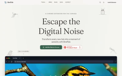





tidio.com

AI Breakdown
Design export
# Design brief: the Tidio design language

Below is a complete design specification measured from a real, published web page. Use it as a design language for the user's product. It is not a page to reproduce.

## Reference images

- Full page: https://cdn.designmunk.com/2026/09/14152838/tidio-1440x9366.webp
- Above the fold: https://cdn.designmunk.com/2026/09/14152838/tidio-1440x900.webp
- On DesignMunk: https://designmunk.com/tidio/

Study these for hierarchy, rhythm, spacing and density. Where an image and the written spec disagree, the spec wins: the tokens were read from the page's own CSS, the images are one rendering of it.

## Before you start

Ask the user what they are building, who it is for, and what brand assets they already have — name, colours, typefaces. Wait for their answers before writing anything. Everything below is then applied to their product, not to the reference.

## Design specification

# Tidio: Centered Hero with Lime CTA and Floating Chat Demo

## Overview

Direct, modern, and businesslike with friendly edges. The interface is bright and airy, using black on white for most text and surfaces with a single lime accent for actions and highlights. Spacing is generous and rhythmical; components sit on a quiet, low-contrast canvas so the CTA and demo elements carry the focus. Audience: teams evaluating AI-enabled customer support and live chat for ecommerce and SMB.

## Page Structure

- Utility Announcement Bar: slim full-width strip at the very top with a short message and a small action; minimal height and compact typography.
- Global Navigation: left-aligned logo, centered/left product menus with dropdowns, right-aligned actions; a green primary CTA and a lighter secondary button live in the header.
- Rating Row: centered line above the hero headline with green stars and a brief rating summary; compact and low-weight.
- Hero: single-column, centered composition — oversized headline, short supporting paragraph, then two inline CTAs (primary lime button and neutral secondary/outline).
- Demo Stage: wide, low-contrast panel immediately below the hero; rounded container with a floating chat message card layered on top using a subtle shadow.
- Footer and additional sections are off-screen in the provided capture and not described here.

## Colors

- Primary (#000000): Core ink for headlines, body text, and icons.
- Secondary (#909297): Subtext, meta labels, and low-emphasis UI copy.
- Tertiary (#64ed80): Accent for primary CTAs, rating stars, and positive status.
- Neutral (#ffffff): Page background and card surfaces.
- Border (#e5e7eb): Hairline dividers, input outlines, and secondary button strokes.
- Brand-black-grey (#242730): Dense text on colored chips or darker UI elements.
- Surface ({colors.neutral}): Default surface tone; synonymous with white backgrounds.
- On-surface ({colors.primary}): Text/icon color when placed on the surface tone.

## Typography

- Euclidcircularb (custom/self-hosted): Used for all headlines and body in tokens. As this family is not Google-hosted, agents should substitute with similar geometric/grotesk sans: Ubuntu (Google), Fira Sans (Google), or Roboto (Google) as a pragmatic fallback.
- Headline levels: headline-lg 72px/1.28, 500; headline-md 48px/1, 500; headline-sm 32px/1.19, 500; headline-xs 21px/1.19, 500. Tight negative letter-spacing on lg/md to keep big lines compact.
- Body: body-md 14px/1.5, 400 for paragraphs, list items, and helper text. Keep contrast high (primary on neutral) and avoid overly long lines in centered layouts.

## Layout

- Spacing scale: xs 12, sm 20, md 32, lg 58, xl 120. Use xl for section breaks (hero to next block), lg for in-section vertical rhythm, and md for element groups (headline to copy, copy to CTAs).
- Page grid favors a centered single column in the hero with ample side gutters. Full-bleed bars (announcement) and wide demo stages break the column to reset scale.
- Buttons maintain a fixed height of 48px; cards use 16px internal padding for consistent density.
- Keep alignment simple: center in the hero, left-align lists or multi-item rows elsewhere.

## Elevation & Depth

- Shadows are minimal; use the measured sm shadow (rgb(8, 15, 26) 0px 0px 32px -12px) to float key demo elements or dialogs.
- Most hierarchy is achieved with whitespace, typographic scale, and the border gray (#e5e7eb). Avoid stacking multiple shadows or heavy gradients.
- Use tonal contrast (black on white) for legibility; reserve the lime accent for actions, not backgrounds.

## Shapes

- Corners are unified at 8px (rounded.sm) for buttons, inputs, and cards. Link-style buttons are square (0px) to read as text actions.
- Maintain the 8px language even in larger surfaces like the demo panel to keep a cohesive silhouette across the page.

## Components

### Button: Primary
- Height 48px; padding 9px 12px; radius 8px. Background #64ED80, text #080F1A. Use for the main action in a section and in the global header.

### Button: Secondary
- Height 48px; padding 9px 12px; radius 8px. Text #080F1A on neutral background; pair with a 1px border in #E5E7EB to ensure visibility on white.

### Button: Link
- Text-only action with 0px radius; color #080F1A. Use inline or as a lightweight alternative to secondary.

### Card
- Background #FFFFFF, text #000000, radius 8px, padding 16px. Apply the sm shadow only when the card needs to "float."

### Announcement Bar
- Full-width strip pinned to the top. Compact body-md text (14px) and an optional small action at right. Keep contrast high; do not use the accent green as background.

### Global Navigation
- Horizontal row with logo left, menus center/left, actions right. Primary header button uses the same 48px spec as in the hero; adjacent secondary button uses the border gray.

### Rating Row
- Inline star icons colored #64ED80 followed by short copy in secondary (#909297). Centered above the headline with md (32px) spacing below.

### Hero CTA Group
- Two-button row centered under the paragraph: primary (#64ED80) then secondary (bordered). Maintain md (32px) spacing from body copy and sm (20px) gap between buttons.

### Demo Stage
- Wide container immediately below the hero, using a white or very light surface with 8px radius. Place a floating chat message card inside, elevated with the sm shadow to imply interactivity.

### Chat Message Bubble
- A card-sized element styled as a message: background #FFFFFF, text #000000, radius 8px, padding 16px, sm shadow. Use short lines and body-md typography to mimic UI scale.

### Cookie Banner
- Low-height bar that uses body-md (14px) and clear actions: a primary accept button and a secondary manage link. Keep border #E5E7EB to separate it from the page.

## Do's and Don'ts

- Do reserve #64ED80 for primary actions and positive signals; avoid using it for large backgrounds.
- Do keep body text at 14px/1.5 and headlines at the documented sizes; use weight 500 for headings to match tone.
- Do use the sm shadow sparingly to lift interactive demos or floating elements; rely on #E5E7EB borders for structure elsewhere.
- Don't round elements beyond 8px; consistency of corners is part of the brand.
- Don't pair multiple accent colors in the same section; one accent keeps the hierarchy clear.
- Don't set secondary buttons without a border on white backgrounds; they will disappear next to the primary CTA.

## Agent Prompt Guide

Quick reference — Text: #000000; Background: #FFFFFF; Border: #E5E7EB; Accent: #64ED80.

1) Build a centered hero with rating row and twin CTAs
- Font: Ubuntu (Google) as Euclid substitute; fallback Roboto.
- Heading: 72px, weight 500, line-height 1.28, color #000000, centered.
- Paragraph: 14px, line-height 1.5, color #909297, centered, max-width ~640px.
- Rating row above h1: star icons in #64ED80 + small copy in #909297; place md (32px) below it.
- CTA group: primary button 48px height, radius 8px, background #64ED80, text #080F1A; secondary button 48px height, radius 8px, 1px border #E5E7EB, text #080F1A; gap sm (20px).

2) Construct the global header with actions
- Left logo, middle nav links (14px, color #000000), right actions.
- Primary header button: 48px, radius 8px, #64ED80 with #080F1A text; secondary button: 48px, radius 8px, border #E5E7EB on #FFFFFF.
- Overall header padding: md (32px) top/bottom.

3) Create the demo stage with a floating chat bubble
- Section padding: xl (120px) top, lg (58px) bottom from the hero.
- Stage container: background #FFFFFF, radius 8px, internal padding md (32px).
- Chat bubble card: background #FFFFFF, text #000000, radius 8px, padding 16px, shadow rgb(8, 15, 26) 0 0 32px -12px; place it overlapping the top edge by ~md (32px).

4) Add a cookie consent bar
- Full-width bar at page bottom; background #FFFFFF with 1px top border #E5E7EB.
- Copy: 14px/1.5 in #000000; actions: primary accept (48px, radius 8px, #64ED80 on #080F1A text) and link-style manage (color #080F1A).

## Similar Brands

- Intercom: Similar single-accent marketing with large type; Intercom leans more on gradients and illustrations.
- Zendesk: Clean, type-forward support tooling site; tends to use softer pastels and larger body text.
- Drift: Conversational marketing with chat UI motifs; more saturated color usage and bolder motion.
- Crisp: Minimal chat-focused site with compact components; lighter typographic scale and fewer demo overlays.

## Tokens

### CSS custom properties

```css
:root {
  /* Colors */
  --color-primary: #000000;
  --color-secondary: #909297;
  --color-tertiary: #64ed80;
  --color-neutral: #ffffff;
  --color-border: #e5e7eb;
  --color-brand-black-grey: #242730;
  --color-surface: var(--color-neutral);
  --color-on-surface: var(--color-primary);

  /* Typography */
  --text-headline-lg-size: 72px;
  --text-headline-lg-weight: 500;
  --text-headline-lg-leading: 1.28;
  --text-headline-lg-tracking: -0.01em;
  --text-headline-md-size: 48px;
  --text-headline-md-weight: 500;
  --text-headline-md-leading: 1;
  --text-headline-md-tracking: -0.017em;
  --text-headline-sm-size: 32px;
  --text-headline-sm-weight: 500;
  --text-headline-sm-leading: 1.19;
  --text-headline-sm-tracking: -0.006em;
  --text-headline-xs-size: 21px;
  --text-headline-xs-weight: 500;
  --text-headline-xs-leading: 1.19;
  --text-body-md-size: 14px;
  --text-body-md-weight: 400;
  --text-body-md-leading: 1.5;
  --text-body-md-tracking: -0.007em;
  --font-euclidcircularb: "euclidcircularb";

  /* Rounded */
  --radius-sm: 8px;

  /* Spacing */
  --spacing-xs: 12px;
  --spacing-sm: 20px;
  --spacing-md: 32px;
  --spacing-lg: 58px;
  --spacing-xl: 120px;

  /* Components */
  --button-primary-background-color: var(--color-tertiary);
  --button-primary-text-color: #080f1a;
  --button-primary-rounded: var(--radius-sm);
  --button-primary-padding: 9px 12px;
  --button-primary-height: 48px;
  --button-secondary-text-color: #080f1a;
  --button-secondary-rounded: var(--radius-sm);
  --button-secondary-padding: 9px 12px;
  --button-secondary-height: 48px;
  --button-link-text-color: #080f1a;
  --button-link-rounded: 0px;
  --card-background-color: var(--color-neutral);
  --card-text-color: var(--color-primary);
  --card-rounded: var(--radius-sm);
  --card-padding: 16px;
}
```

### Tailwind theme

```css
@theme {
  --color-primary: #000000;
  --color-secondary: #909297;
  --color-tertiary: #64ed80;
  --color-neutral: #ffffff;
  --color-border: #e5e7eb;
  --color-brand-black-grey: #242730;
  --color-surface: #ffffff;
  --color-on-surface: #000000;
  --font-headline-lg: "euclidcircularb";
  --font-headline-md: "euclidcircularb";
  --font-headline-sm: "euclidcircularb";
  --font-headline-xs: "euclidcircularb";
  --font-body-md: "euclidcircularb";
  --text-headline-lg: 72px;
  --text-headline-md: 48px;
  --text-headline-sm: 32px;
  --text-headline-xs: 21px;
  --text-body-md: 14px;
  --tracking-headline-lg: -0.01em;
  --tracking-headline-md: -0.017em;
  --tracking-headline-sm: -0.006em;
  --tracking-body-md: -0.007em;
  --font-weight-headline-lg: 500;
  --font-weight-headline-md: 500;
  --font-weight-headline-sm: 500;
  --font-weight-headline-xs: 500;
  --font-weight-body-md: 400;
  --radius-sm: 8px;
  --spacing-xs: 12px;
  --spacing-sm: 20px;
  --spacing-md: 32px;
  --spacing-lg: 58px;
  --spacing-xl: 120px;
}
```

### Design tokens (DTCG)

```json
{
    "$schema": "https://www.designtokens.org/schemas/2025.10/format.json",
    "color": {
        "$type": "color",
        "primary": {
            "$value": {
                "colorSpace": "srgb",
                "components": [
                    0,
                    0,
                    0
                ],
                "hex": "#000000"
            }
        },
        "secondary": {
            "$value": {
                "colorSpace": "srgb",
                "components": [
                    0.565,
                    0.573,
                    0.592
                ],
                "hex": "#909297"
            }
        },
        "tertiary": {
            "$value": {
                "colorSpace": "srgb",
                "components": [
                    0.392,
                    0.929,
                    0.502
                ],
                "hex": "#64ed80"
            }
        },
        "neutral": {
            "$value": {
                "colorSpace": "srgb",
                "components": [
                    1,
                    1,
                    1
                ],
                "hex": "#ffffff"
            }
        },
        "border": {
            "$value": {
                "colorSpace": "srgb",
                "components": [
                    0.898,
                    0.906,
                    0.922
                ],
                "hex": "#e5e7eb"
            }
        },
        "brand-black-grey": {
            "$value": {
                "colorSpace": "srgb",
                "components": [
                    0.141,
                    0.153,
                    0.188
                ],
                "hex": "#242730"
            }
        },
        "surface": {
            "$value": {
                "colorSpace": "srgb",
                "components": [
                    1,
                    1,
                    1
                ],
                "hex": "#ffffff"
            }
        },
        "on-surface": {
            "$value": {
                "colorSpace": "srgb",
                "components": [
                    0,
                    0,
                    0
                ],
                "hex": "#000000"
            }
        }
    },
    "spacing": {
        "$type": "dimension",
        "xs": {
            "$value": {
                "value": 12,
                "unit": "px"
            }
        },
        "sm": {
            "$value": {
                "value": 20,
                "unit": "px"
            }
        },
        "md": {
            "$value": {
                "value": 32,
                "unit": "px"
            }
        },
        "lg": {
            "$value": {
                "value": 58,
                "unit": "px"
            }
        },
        "xl": {
            "$value": {
                "value": 120,
                "unit": "px"
            }
        }
    },
    "rounded": {
        "$type": "dimension",
        "sm": {
            "$value": {
                "value": 8,
                "unit": "px"
            }
        }
    },
    "typography": {
        "headline-lg": {
            "$type": "typography",
            "$value": {
                "fontFamily": "euclidcircularb",
                "fontSize": {
                    "value": 72,
                    "unit": "px"
                },
                "fontWeight": 500,
                "letterSpacing": {
                    "value": -0.01,
                    "unit": "em"
                }
            }
        },
        "headline-md": {
            "$type": "typography",
            "$value": {
                "fontFamily": "euclidcircularb",
                "fontSize": {
                    "value": 48,
                    "unit": "px"
                },
                "fontWeight": 500,
                "letterSpacing": {
                    "value": -0.017,
                    "unit": "em"
                }
            }
        },
        "headline-sm": {
            "$type": "typography",
            "$value": {
                "fontFamily": "euclidcircularb",
                "fontSize": {
                    "value": 32,
                    "unit": "px"
                },
                "fontWeight": 500,
                "letterSpacing": {
                    "value": -0.006,
                    "unit": "em"
                }
            }
        },
        "headline-xs": {
            "$type": "typography",
            "$value": {
                "fontFamily": "euclidcircularb",
                "fontSize": {
                    "value": 21,
                    "unit": "px"
                },
                "fontWeight": 500
            }
        },
        "body-md": {
            "$type": "typography",
            "$value": {
                "fontFamily": "euclidcircularb",
                "fontSize": {
                    "value": 14,
                    "unit": "px"
                },
                "fontWeight": 400,
                "letterSpacing": {
                    "value": -0.007,
                    "unit": "em"
                }
            }
        }
    }
}
```

## Rules

- **Fonts.** If the specification names a custom or self-hosted family, use one of the substitutes it names. Never reference a typeface you cannot actually load — it will fall back to a system font and undo the typography.
- **Colour.** Derive the palette from the user's brand. Use the token values as a guide to *relationships* — contrast, tint, how many accents carry the page — not as hex codes to paste.
- **Never reproduce** the wordmark, mascot, logo, brand name, illustrations, icon set, screenshots or any copy from the reference.
- **Never present the result as Tidio**, or imply any connection to it.
- If something is unspecified, choose clarity and legibility over decoration.
---
version: alpha
name: Tidio
description: Hire AI to handle customer service with TidioReply faster
colors:
  primary: "#000000"
  secondary: "#909297"
  tertiary: "#64ed80"
  neutral: "#ffffff"
  border: "#e5e7eb"
  brand-black-grey: "#242730"
  surface: "{colors.neutral}"
  on-surface: "{colors.primary}"
typography:
  headline-lg:
    fontFamily: euclidcircularb
    fontSize: 72px
    fontWeight: 500
    lineHeight: 1.28
    letterSpacing: -0.01em
  headline-md:
    fontFamily: euclidcircularb
    fontSize: 48px
    fontWeight: 500
    lineHeight: 1
    letterSpacing: -0.017em
  headline-sm:
    fontFamily: euclidcircularb
    fontSize: 32px
    fontWeight: 500
    lineHeight: 1.19
    letterSpacing: -0.006em
  headline-xs:
    fontFamily: euclidcircularb
    fontSize: 21px
    fontWeight: 500
    lineHeight: 1.19
  body-md:
    fontFamily: euclidcircularb
    fontSize: 14px
    fontWeight: 400
    lineHeight: 1.5
    letterSpacing: -0.007em
rounded:
  sm: 8px
spacing:
  xs: 12px
  sm: 20px
  md: 32px
  lg: 58px
  xl: 120px
components:
  button-primary:
    backgroundColor: "{colors.tertiary}"
    textColor: "#080f1a"
    rounded: "{rounded.sm}"
    padding: 9px 12px
    height: 48px
  button-secondary:
    textColor: "#080f1a"
    rounded: "{rounded.sm}"
    padding: 9px 12px
    height: 48px
  button-link:
    textColor: "#080f1a"
    rounded: 0px
  card:
    backgroundColor: "{colors.neutral}"
    textColor: "{colors.primary}"
    rounded: "{rounded.sm}"
    padding: 16px
---

# Tidio: Centered Hero with Lime CTA and Floating Chat Demo

## Overview

Direct, modern, and businesslike with friendly edges. The interface is bright and airy, using black on white for most text and surfaces with a single lime accent for actions and highlights. Spacing is generous and rhythmical; components sit on a quiet, low-contrast canvas so the CTA and demo elements carry the focus. Audience: teams evaluating AI-enabled customer support and live chat for ecommerce and SMB.

## Page Structure

- Utility Announcement Bar: slim full-width strip at the very top with a short message and a small action; minimal height and compact typography.
- Global Navigation: left-aligned logo, centered/left product menus with dropdowns, right-aligned actions; a green primary CTA and a lighter secondary button live in the header.
- Rating Row: centered line above the hero headline with green stars and a brief rating summary; compact and low-weight.
- Hero: single-column, centered composition — oversized headline, short supporting paragraph, then two inline CTAs (primary lime button and neutral secondary/outline).
- Demo Stage: wide, low-contrast panel immediately below the hero; rounded container with a floating chat message card layered on top using a subtle shadow.
- Footer and additional sections are off-screen in the provided capture and not described here.

## Colors

- Primary (#000000): Core ink for headlines, body text, and icons.
- Secondary (#909297): Subtext, meta labels, and low-emphasis UI copy.
- Tertiary (#64ed80): Accent for primary CTAs, rating stars, and positive status.
- Neutral (#ffffff): Page background and card surfaces.
- Border (#e5e7eb): Hairline dividers, input outlines, and secondary button strokes.
- Brand-black-grey (#242730): Dense text on colored chips or darker UI elements.
- Surface ({colors.neutral}): Default surface tone; synonymous with white backgrounds.
- On-surface ({colors.primary}): Text/icon color when placed on the surface tone.

## Typography

- Euclidcircularb (custom/self-hosted): Used for all headlines and body in tokens. As this family is not Google-hosted, agents should substitute with similar geometric/grotesk sans: Ubuntu (Google), Fira Sans (Google), or Roboto (Google) as a pragmatic fallback.
- Headline levels: headline-lg 72px/1.28, 500; headline-md 48px/1, 500; headline-sm 32px/1.19, 500; headline-xs 21px/1.19, 500. Tight negative letter-spacing on lg/md to keep big lines compact.
- Body: body-md 14px/1.5, 400 for paragraphs, list items, and helper text. Keep contrast high (primary on neutral) and avoid overly long lines in centered layouts.

## Layout

- Spacing scale: xs 12, sm 20, md 32, lg 58, xl 120. Use xl for section breaks (hero to next block), lg for in-section vertical rhythm, and md for element groups (headline to copy, copy to CTAs).
- Page grid favors a centered single column in the hero with ample side gutters. Full-bleed bars (announcement) and wide demo stages break the column to reset scale.
- Buttons maintain a fixed height of 48px; cards use 16px internal padding for consistent density.
- Keep alignment simple: center in the hero, left-align lists or multi-item rows elsewhere.

## Elevation & Depth

- Shadows are minimal; use the measured sm shadow (rgb(8, 15, 26) 0px 0px 32px -12px) to float key demo elements or dialogs.
- Most hierarchy is achieved with whitespace, typographic scale, and the border gray (#e5e7eb). Avoid stacking multiple shadows or heavy gradients.
- Use tonal contrast (black on white) for legibility; reserve the lime accent for actions, not backgrounds.

## Shapes

- Corners are unified at 8px (rounded.sm) for buttons, inputs, and cards. Link-style buttons are square (0px) to read as text actions.
- Maintain the 8px language even in larger surfaces like the demo panel to keep a cohesive silhouette across the page.

## Components

### Button: Primary
- Height 48px; padding 9px 12px; radius 8px. Background #64ED80, text #080F1A. Use for the main action in a section and in the global header.

### Button: Secondary
- Height 48px; padding 9px 12px; radius 8px. Text #080F1A on neutral background; pair with a 1px border in #E5E7EB to ensure visibility on white.

### Button: Link
- Text-only action with 0px radius; color #080F1A. Use inline or as a lightweight alternative to secondary.

### Card
- Background #FFFFFF, text #000000, radius 8px, padding 16px. Apply the sm shadow only when the card needs to "float."

### Announcement Bar
- Full-width strip pinned to the top. Compact body-md text (14px) and an optional small action at right. Keep contrast high; do not use the accent green as background.

### Global Navigation
- Horizontal row with logo left, menus center/left, actions right. Primary header button uses the same 48px spec as in the hero; adjacent secondary button uses the border gray.

### Rating Row
- Inline star icons colored #64ED80 followed by short copy in secondary (#909297). Centered above the headline with md (32px) spacing below.

### Hero CTA Group
- Two-button row centered under the paragraph: primary (#64ED80) then secondary (bordered). Maintain md (32px) spacing from body copy and sm (20px) gap between buttons.

### Demo Stage
- Wide container immediately below the hero, using a white or very light surface with 8px radius. Place a floating chat message card inside, elevated with the sm shadow to imply interactivity.

### Chat Message Bubble
- A card-sized element styled as a message: background #FFFFFF, text #000000, radius 8px, padding 16px, sm shadow. Use short lines and body-md typography to mimic UI scale.

### Cookie Banner
- Low-height bar that uses body-md (14px) and clear actions: a primary accept button and a secondary manage link. Keep border #E5E7EB to separate it from the page.

## Do's and Don'ts

- Do reserve #64ED80 for primary actions and positive signals; avoid using it for large backgrounds.
- Do keep body text at 14px/1.5 and headlines at the documented sizes; use weight 500 for headings to match tone.
- Do use the sm shadow sparingly to lift interactive demos or floating elements; rely on #E5E7EB borders for structure elsewhere.
- Don't round elements beyond 8px; consistency of corners is part of the brand.
- Don't pair multiple accent colors in the same section; one accent keeps the hierarchy clear.
- Don't set secondary buttons without a border on white backgrounds; they will disappear next to the primary CTA.

## Agent Prompt Guide

Quick reference — Text: #000000; Background: #FFFFFF; Border: #E5E7EB; Accent: #64ED80.

1) Build a centered hero with rating row and twin CTAs
- Font: Ubuntu (Google) as Euclid substitute; fallback Roboto.
- Heading: 72px, weight 500, line-height 1.28, color #000000, centered.
- Paragraph: 14px, line-height 1.5, color #909297, centered, max-width ~640px.
- Rating row above h1: star icons in #64ED80 + small copy in #909297; place md (32px) below it.
- CTA group: primary button 48px height, radius 8px, background #64ED80, text #080F1A; secondary button 48px height, radius 8px, 1px border #E5E7EB, text #080F1A; gap sm (20px).

2) Construct the global header with actions
- Left logo, middle nav links (14px, color #000000), right actions.
- Primary header button: 48px, radius 8px, #64ED80 with #080F1A text; secondary button: 48px, radius 8px, border #E5E7EB on #FFFFFF.
- Overall header padding: md (32px) top/bottom.

3) Create the demo stage with a floating chat bubble
- Section padding: xl (120px) top, lg (58px) bottom from the hero.
- Stage container: background #FFFFFF, radius 8px, internal padding md (32px).
- Chat bubble card: background #FFFFFF, text #000000, radius 8px, padding 16px, shadow rgb(8, 15, 26) 0 0 32px -12px; place it overlapping the top edge by ~md (32px).

4) Add a cookie consent bar
- Full-width bar at page bottom; background #FFFFFF with 1px top border #E5E7EB.
- Copy: 14px/1.5 in #000000; actions: primary accept (48px, radius 8px, #64ED80 on #080F1A text) and link-style manage (color #080F1A).

## Similar Brands

- Intercom: Similar single-accent marketing with large type; Intercom leans more on gradients and illustrations.
- Zendesk: Clean, type-forward support tooling site; tends to use softer pastels and larger body text.
- Drift: Conversational marketing with chat UI motifs; more saturated color usage and bolder motion.
- Crisp: Minimal chat-focused site with compact components; lighter typographic scale and fewer demo overlays.
:root {
  /* Colors */
  --color-primary: #000000;
  --color-secondary: #909297;
  --color-tertiary: #64ed80;
  --color-neutral: #ffffff;
  --color-border: #e5e7eb;
  --color-brand-black-grey: #242730;
  --color-surface: var(--color-neutral);
  --color-on-surface: var(--color-primary);

  /* Typography */
  --text-headline-lg-size: 72px;
  --text-headline-lg-weight: 500;
  --text-headline-lg-leading: 1.28;
  --text-headline-lg-tracking: -0.01em;
  --text-headline-md-size: 48px;
  --text-headline-md-weight: 500;
  --text-headline-md-leading: 1;
  --text-headline-md-tracking: -0.017em;
  --text-headline-sm-size: 32px;
  --text-headline-sm-weight: 500;
  --text-headline-sm-leading: 1.19;
  --text-headline-sm-tracking: -0.006em;
  --text-headline-xs-size: 21px;
  --text-headline-xs-weight: 500;
  --text-headline-xs-leading: 1.19;
  --text-body-md-size: 14px;
  --text-body-md-weight: 400;
  --text-body-md-leading: 1.5;
  --text-body-md-tracking: -0.007em;
  --font-euclidcircularb: "euclidcircularb";

  /* Rounded */
  --radius-sm: 8px;

  /* Spacing */
  --spacing-xs: 12px;
  --spacing-sm: 20px;
  --spacing-md: 32px;
  --spacing-lg: 58px;
  --spacing-xl: 120px;

  /* Components */
  --button-primary-background-color: var(--color-tertiary);
  --button-primary-text-color: #080f1a;
  --button-primary-rounded: var(--radius-sm);
  --button-primary-padding: 9px 12px;
  --button-primary-height: 48px;
  --button-secondary-text-color: #080f1a;
  --button-secondary-rounded: var(--radius-sm);
  --button-secondary-padding: 9px 12px;
  --button-secondary-height: 48px;
  --button-link-text-color: #080f1a;
  --button-link-rounded: 0px;
  --card-background-color: var(--color-neutral);
  --card-text-color: var(--color-primary);
  --card-rounded: var(--radius-sm);
  --card-padding: 16px;
}
{
  "$schema": "https://www.designtokens.org/schemas/2025.10/format.json",
  "$description": "Hire AI to handle customer service with TidioReply faster",
  "color": {
    "$type": "color",
    "primary": {
      "$value": {
        "colorSpace": "srgb",
        "components": [
          0,
          0,
          0
        ],
        "hex": "#000000"
      }
    },
    "secondary": {
      "$value": {
        "colorSpace": "srgb",
        "components": [
          0.565,
          0.573,
          0.592
        ],
        "hex": "#909297"
      }
    },
    "tertiary": {
      "$value": {
        "colorSpace": "srgb",
        "components": [
          0.392,
          0.929,
          0.502
        ],
        "hex": "#64ed80"
      }
    },
    "neutral": {
      "$value": {
        "colorSpace": "srgb",
        "components": [
          1,
          1,
          1
        ],
        "hex": "#ffffff"
      }
    },
    "border": {
      "$value": {
        "colorSpace": "srgb",
        "components": [
          0.898,
          0.906,
          0.922
        ],
        "hex": "#e5e7eb"
      }
    },
    "brand-black-grey": {
      "$value": {
        "colorSpace": "srgb",
        "components": [
          0.141,
          0.153,
          0.188
        ],
        "hex": "#242730"
      }
    },
    "surface": {
      "$value": {
        "colorSpace": "srgb",
        "components": [
          1,
          1,
          1
        ],
        "hex": "#ffffff"
      }
    },
    "on-surface": {
      "$value": {
        "colorSpace": "srgb",
        "components": [
          0,
          0,
          0
        ],
        "hex": "#000000"
      }
    }
  },
  "spacing": {
    "$type": "dimension",
    "xs": {
      "$value": {
        "value": 12,
        "unit": "px"
      }
    },
    "sm": {
      "$value": {
        "value": 20,
        "unit": "px"
      }
    },
    "md": {
      "$value": {
        "value": 32,
        "unit": "px"
      }
    },
    "lg": {
      "$value": {
        "value": 58,
        "unit": "px"
      }
    },
    "xl": {
      "$value": {
        "value": 120,
        "unit": "px"
      }
    }
  },
  "rounded": {
    "$type": "dimension",
    "sm": {
      "$value": {
        "value": 8,
        "unit": "px"
      }
    }
  },
  "typography": {
    "headline-lg": {
      "$type": "typography",
      "$value": {
        "fontFamily": "euclidcircularb",
        "fontSize": {
          "value": 72,
          "unit": "px"
        },
        "fontWeight": 500,
        "letterSpacing": {
          "value": -0.01,
          "unit": "em"
        }
      }
    },
    "headline-md": {
      "$type": "typography",
      "$value": {
        "fontFamily": "euclidcircularb",
        "fontSize": {
          "value": 48,
          "unit": "px"
        },
        "fontWeight": 500,
        "letterSpacing": {
          "value": -0.017,
          "unit": "em"
        }
      }
    },
    "headline-sm": {
      "$type": "typography",
      "$value": {
        "fontFamily": "euclidcircularb",
        "fontSize": {
          "value": 32,
          "unit": "px"
        },
        "fontWeight": 500,
        "letterSpacing": {
          "value": -0.006,
          "unit": "em"
        }
      }
    },
    "headline-xs": {
      "$type": "typography",
      "$value": {
        "fontFamily": "euclidcircularb",
        "fontSize": {
          "value": 21,
          "unit": "px"
        },
        "fontWeight": 500
      }
    },
    "body-md": {
      "$type": "typography",
      "$value": {
        "fontFamily": "euclidcircularb",
        "fontSize": {
          "value": 14,
          "unit": "px"
        },
        "fontWeight": 400,
        "letterSpacing": {
          "value": -0.007,
          "unit": "em"
        }
      }
    }
  }
}
@theme {
--color-primary: #000000;
--color-secondary: #909297;
--color-tertiary: #64ed80;
--color-neutral: #ffffff;
--color-border: #e5e7eb;
--color-brand-black-grey: #242730;
--color-surface: #ffffff;
--color-on-surface: #000000;
--font-headline-lg: "euclidcircularb";
--font-headline-md: "euclidcircularb";
--font-headline-sm: "euclidcircularb";
--font-headline-xs: "euclidcircularb";
--font-body-md: "euclidcircularb";
--text-headline-lg: 72px;
--text-headline-md: 48px;
--text-headline-sm: 32px;
--text-headline-xs: 21px;
--text-body-md: 14px;
--tracking-headline-lg: -0.01em;
--tracking-headline-md: -0.017em;
--tracking-headline-sm: -0.006em;
--tracking-body-md: -0.007em;
--font-weight-headline-lg: 500;
--font-weight-headline-md: 500;
--font-weight-headline-sm: 500;
--font-weight-headline-xs: 500;
--font-weight-body-md: 400;
--radius-sm: 8px;
--spacing-xs: 12px;
--spacing-sm: 20px;
--spacing-md: 32px;
--spacing-lg: 58px;
--spacing-xl: 120px;
} # Design brief: the Tidio design language
Below is a complete design specification measured from a real, published web page. Use it as a design language for the user's product. It is not a page to reproduce.
## Reference images
- Full page: https://cdn.designmunk.com/2026/09/14152838/tidio-1440x9366.webp
- Above the fold: https://cdn.designmunk.com/2026/09/14152838/tidio-1440x900.webp
- On DesignMunk: https://designmunk.com/tidio/
Study these for hierarchy, rhythm, spacing and density. Where an image and the written spec disagree, the spec wins: the tokens were read from the page's own CSS, the images are one rendering of it.
## Before you start
Ask the user what they are building, who it is for, and what brand assets they already have — name, colours, typefaces. Wait for their answers before writing anything. Everything below is then applied to their product, not to the reference.
## Design specification
# Tidio: Centered Hero with Lime CTA and Floating Chat Demo
## Overview
Direct, modern, and businesslike with friendly edges. The interface is bright and airy, using black on white for most text and surfaces with a single lime accent for actions and highlights. Spacing is generous and rhythmical; components sit on a quiet, low-contrast canvas so the CTA and demo elements carry the focus. Audience: teams evaluating AI-enabled customer support and live chat for ecommerce and SMB.
## Page Structure
- Utility Announcement Bar: slim full-width strip at the very top with a short message and a small action; minimal height and compact typography.
- Global Navigation: left-aligned logo, centered/left product menus with dropdowns, right-aligned actions; a green primary CTA and a lighter secondary button live in the header.
- Rating Row: centered line above the hero headline with green stars and a brief rating summary; compact and low-weight.
- Hero: single-column, centered composition — oversized headline, short supporting paragraph, then two inline CTAs (primary lime button and neutral secondary/outline).
- Demo Stage: wide, low-contrast panel immediately below the hero; rounded container with a floating chat message card layered on top using a subtle shadow.
- Footer and additional sections are off-screen in the provided capture and not described here.
## Colors
- Primary (#000000): Core ink for headlines, body text, and icons.
- Secondary (#909297): Subtext, meta labels, and low-emphasis UI copy.
- Tertiary (#64ed80): Accent for primary CTAs, rating stars, and positive status.
- Neutral (#ffffff): Page background and card surfaces.
- Border (#e5e7eb): Hairline dividers, input outlines, and secondary button strokes.
- Brand-black-grey (#242730): Dense text on colored chips or darker UI elements.
- Surface ({colors.neutral}): Default surface tone; synonymous with white backgrounds.
- On-surface ({colors.primary}): Text/icon color when placed on the surface tone.
## Typography
- Euclidcircularb (custom/self-hosted): Used for all headlines and body in tokens. As this family is not Google-hosted, agents should substitute with similar geometric/grotesk sans: Ubuntu (Google), Fira Sans (Google), or Roboto (Google) as a pragmatic fallback.
- Headline levels: headline-lg 72px/1.28, 500; headline-md 48px/1, 500; headline-sm 32px/1.19, 500; headline-xs 21px/1.19, 500. Tight negative letter-spacing on lg/md to keep big lines compact.
- Body: body-md 14px/1.5, 400 for paragraphs, list items, and helper text. Keep contrast high (primary on neutral) and avoid overly long lines in centered layouts.
## Layout
- Spacing scale: xs 12, sm 20, md 32, lg 58, xl 120. Use xl for section breaks (hero to next block), lg for in-section vertical rhythm, and md for element groups (headline to copy, copy to CTAs).
- Page grid favors a centered single column in the hero with ample side gutters. Full-bleed bars (announcement) and wide demo stages break the column to reset scale.
- Buttons maintain a fixed height of 48px; cards use 16px internal padding for consistent density.
- Keep alignment simple: center in the hero, left-align lists or multi-item rows elsewhere.
## Elevation & Depth
- Shadows are minimal; use the measured sm shadow (rgb(8, 15, 26) 0px 0px 32px -12px) to float key demo elements or dialogs.
- Most hierarchy is achieved with whitespace, typographic scale, and the border gray (#e5e7eb). Avoid stacking multiple shadows or heavy gradients.
- Use tonal contrast (black on white) for legibility; reserve the lime accent for actions, not backgrounds.
## Shapes
- Corners are unified at 8px (rounded.sm) for buttons, inputs, and cards. Link-style buttons are square (0px) to read as text actions.
- Maintain the 8px language even in larger surfaces like the demo panel to keep a cohesive silhouette across the page.
## Components
### Button: Primary
- Height 48px; padding 9px 12px; radius 8px. Background #64ED80, text #080F1A. Use for the main action in a section and in the global header.
### Button: Secondary
- Height 48px; padding 9px 12px; radius 8px. Text #080F1A on neutral background; pair with a 1px border in #E5E7EB to ensure visibility on white.
### Button: Link
- Text-only action with 0px radius; color #080F1A. Use inline or as a lightweight alternative to secondary.
### Card
- Background #FFFFFF, text #000000, radius 8px, padding 16px. Apply the sm shadow only when the card needs to "float."
### Announcement Bar
- Full-width strip pinned to the top. Compact body-md text (14px) and an optional small action at right. Keep contrast high; do not use the accent green as background.
### Global Navigation
- Horizontal row with logo left, menus center/left, actions right. Primary header button uses the same 48px spec as in the hero; adjacent secondary button uses the border gray.
### Rating Row
- Inline star icons colored #64ED80 followed by short copy in secondary (#909297). Centered above the headline with md (32px) spacing below.
### Hero CTA Group
- Two-button row centered under the paragraph: primary (#64ED80) then secondary (bordered). Maintain md (32px) spacing from body copy and sm (20px) gap between buttons.
### Demo Stage
- Wide container immediately below the hero, using a white or very light surface with 8px radius. Place a floating chat message card inside, elevated with the sm shadow to imply interactivity.
### Chat Message Bubble
- A card-sized element styled as a message: background #FFFFFF, text #000000, radius 8px, padding 16px, sm shadow. Use short lines and body-md typography to mimic UI scale.
### Cookie Banner
- Low-height bar that uses body-md (14px) and clear actions: a primary accept button and a secondary manage link. Keep border #E5E7EB to separate it from the page.
## Do's and Don'ts
- Do reserve #64ED80 for primary actions and positive signals; avoid using it for large backgrounds.
- Do keep body text at 14px/1.5 and headlines at the documented sizes; use weight 500 for headings to match tone.
- Do use the sm shadow sparingly to lift interactive demos or floating elements; rely on #E5E7EB borders for structure elsewhere.
- Don't round elements beyond 8px; consistency of corners is part of the brand.
- Don't pair multiple accent colors in the same section; one accent keeps the hierarchy clear.
- Don't set secondary buttons without a border on white backgrounds; they will disappear next to the primary CTA.
## Agent Prompt Guide
Quick reference — Text: #000000; Background: #FFFFFF; Border: #E5E7EB; Accent: #64ED80.
1) Build a centered hero with rating row and twin CTAs
- Font: Ubuntu (Google) as Euclid substitute; fallback Roboto.
- Heading: 72px, weight 500, line-height 1.28, color #000000, centered.
- Paragraph: 14px, line-height 1.5, color #909297, centered, max-width ~640px.
- Rating row above h1: star icons in #64ED80 + small copy in #909297; place md (32px) below it.
- CTA group: primary button 48px height, radius 8px, background #64ED80, text #080F1A; secondary button 48px height, radius 8px, 1px border #E5E7EB, text #080F1A; gap sm (20px).
2) Construct the global header with actions
- Left logo, middle nav links (14px, color #000000), right actions.
- Primary header button: 48px, radius 8px, #64ED80 with #080F1A text; secondary button: 48px, radius 8px, border #E5E7EB on #FFFFFF.
- Overall header padding: md (32px) top/bottom.
3) Create the demo stage with a floating chat bubble
- Section padding: xl (120px) top, lg (58px) bottom from the hero.
- Stage container: background #FFFFFF, radius 8px, internal padding md (32px).
- Chat bubble card: background #FFFFFF, text #000000, radius 8px, padding 16px, shadow rgb(8, 15, 26) 0 0 32px -12px; place it overlapping the top edge by ~md (32px).
4) Add a cookie consent bar
- Full-width bar at page bottom; background #FFFFFF with 1px top border #E5E7EB.
- Copy: 14px/1.5 in #000000; actions: primary accept (48px, radius 8px, #64ED80 on #080F1A text) and link-style manage (color #080F1A).
## Tokens
### CSS custom properties
```css
:root {
/* Colors */
--color-primary: #000000;
--color-secondary: #909297;
--color-tertiary: #64ed80;
--color-neutral: #ffffff;
--color-border: #e5e7eb;
--color-brand-black-grey: #242730;
--color-surface: var(--color-neutral);
--color-on-surface: var(--color-primary);
/* Typography */
--text-headline-lg-size: 72px;
--text-headline-lg-weight: 500;
--text-headline-lg-leading: 1.28;
--text-headline-lg-tracking: -0.01em;
--text-headline-md-size: 48px;
--text-headline-md-weight: 500;
--text-headline-md-leading: 1;
--text-headline-md-tracking: -0.017em;
--text-headline-sm-size: 32px;
--text-headline-sm-weight: 500;
--text-headline-sm-leading: 1.19;
--text-headline-sm-tracking: -0.006em;
--text-headline-xs-size: 21px;
--text-headline-xs-weight: 500;
--text-headline-xs-leading: 1.19;
--text-body-md-size: 14px;
--text-body-md-weight: 400;
--text-body-md-leading: 1.5;
--text-body-md-tracking: -0.007em;
--font-euclidcircularb: "euclidcircularb";
/* Rounded */
--radius-sm: 8px;
/* Spacing */
--spacing-xs: 12px;
--spacing-sm: 20px;
--spacing-md: 32px;
--spacing-lg: 58px;
--spacing-xl: 120px;
/* Components */
--button-primary-background-color: var(--color-tertiary);
--button-primary-text-color: #080f1a;
--button-primary-rounded: var(--radius-sm);
--button-primary-padding: 9px 12px;
--button-primary-height: 48px;
--button-secondary-text-color: #080f1a;
--button-secondary-rounded: var(--radius-sm);
--button-secondary-padding: 9px 12px;
--button-secondary-height: 48px;
--button-link-text-color: #080f1a;
--button-link-rounded: 0px;
--card-background-color: var(--color-neutral);
--card-text-color: var(--color-primary);
--card-rounded: var(--radius-sm);
--card-padding: 16px;
}
```
## Rules
- **Fonts.** If the specification names a custom or self-hosted family, use one of the substitutes it names. Never reference a typeface you cannot actually load — it will fall back to a system font and undo the typography.
- **Colour.** Derive the palette from the user's brand. Use the token values as a guide to *relationships* — contrast, tint, how many accents carry the page — not as hex codes to paste.
- **Never reproduce** the wordmark, mascot, logo, brand name, illustrations, icon set, screenshots or any copy from the reference.
- **Never present the result as Tidio**, or imply any connection to it.
- If something is unspecified, choose clarity and legibility over decoration.