
Summer Smash Tennis Careers
summersmashtennis.ca
Summer Smash Tennis: Learn, progress, and play tennis for life.
summersmashtennis.ca
AI Breakdown
Design export
# Design brief: the Summer Smash Tennis Careers design language

Below is a complete design specification measured from a real, published web page. Use it as a design language for the user's product. It is not a page to reproduce.

## Reference images

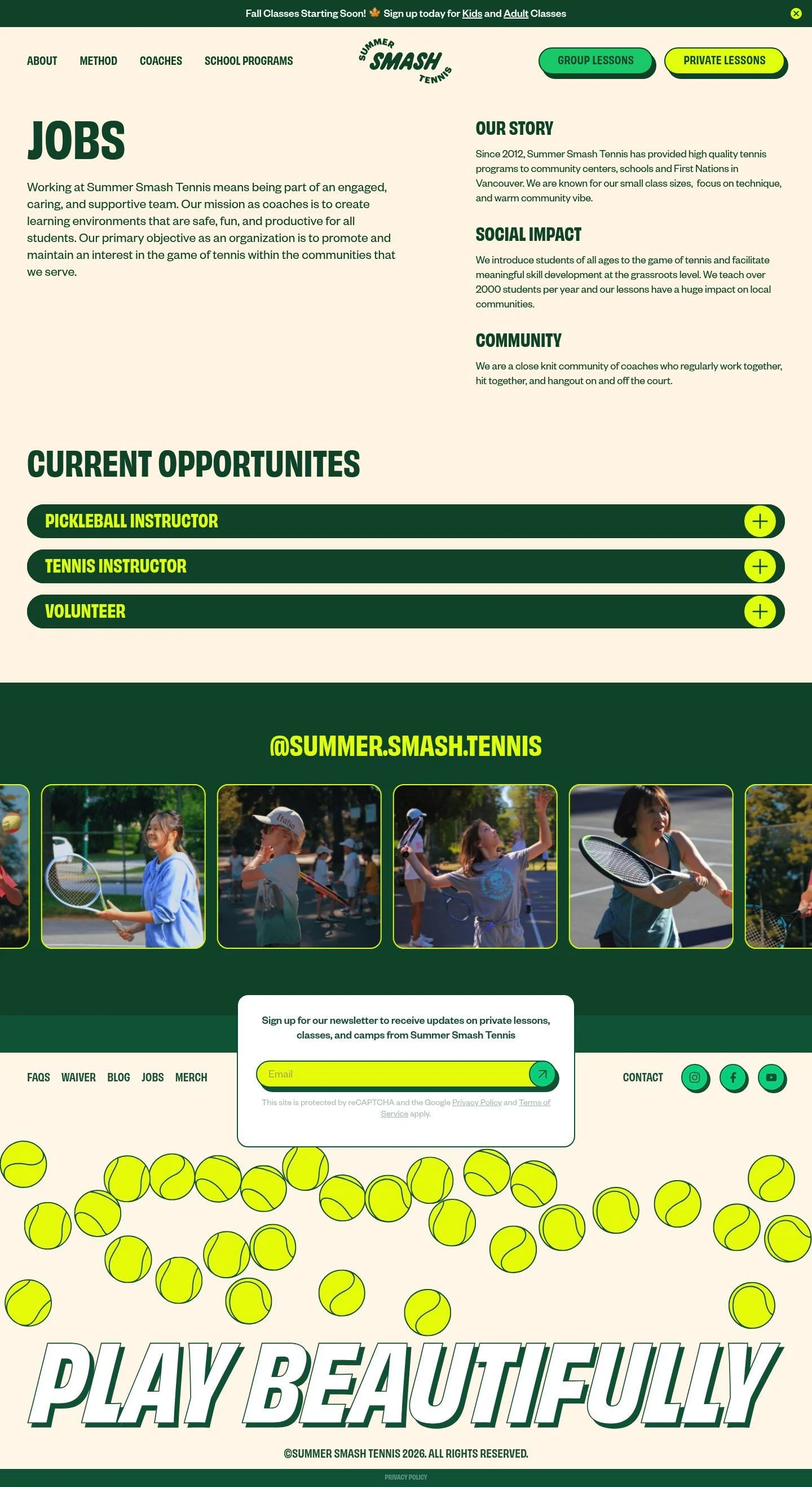
- Full page: https://cdn.designmunk.com/2026/09/12082034/summersmashtennis-ca-jobs-featured.webp
- Above the fold: https://cdn.designmunk.com/2026/09/12082034/summersmashtennis-ca-jobs-featured.webp
- On DesignMunk: https://designmunk.com/summer-smash-tennis-careers-page/

Study these for hierarchy, rhythm, spacing and density. Where an image and the written spec disagree, the spec wins: the tokens were read from the page's own CSS, the images are one rendering of it.

## Before you start

Ask the user what they are building, who it is for, and what brand assets they already have — name, colours, typefaces. Wait for their answers before writing anything. Everything below is then applied to their product, not to the reference.

## Design specification

# Summer Smash Tennis: Cream-and-Green Recruiting with Pill Accordions

## Overview

A friendly, community-first sports brand. The UI should feel warm, outdoorsy, and energetic: cream surfaces, deep forest text, and bright accents used sparingly. Density is moderate—generous 40–112px section spacing with compact headlines that punch above their size. When tokens don't cover a case, bias toward clarity, legibility, and approachable tone over decoration.

## Colors

- **primary (#0c5235):** Deep forest for headlines, body text, and high-contrast UI elements.
- **secondary (#a4d8ff):** Light sky accent for subtle informational highlights and backgrounds; use sparingly.
- **tertiary (#00ce7d):** Bright court mint for primary emphasis states and main CTAs.
- **neutral (#fff6e7):** Warm cream base for page backgrounds.
- **brand-white (#ffffff):** Clean white for cards, expanded details, and contrast panels.
- **brand-jungle-book-green (#346c54):** Cedar-toned green for borders, dividers, or hover states where a softer contrast than primary is preferred.
- **brand-tropical-bay (#9ebaaf):** Soft sage for gentle fills and supportive UI tones.
- **brand-windsurfer (#d7e2de):** Pale mist for subtle separators and backgrounds.
- **surface (#fff6e7):** Alias to neutral; the default page surface.
- **on-surface (#0c5235):** Alias to primary; text and icons on surface backgrounds.

## Typography

Two families define hierarchy. Display headings use Obviously Narrow at 700 (headline-lg 90px, headline-md 62px) and 600 (headline-xs 29px) for compact, athletic punch; this is a custom, self-hosted font and may not be directly obtainable. Recommended substitutes: Archivo Narrow, Oswald, or Bebas Neue for similarly condensed, sturdy forms. Supporting headings and all body copy use Founders Grotesk (headline-sm 42px/600; body-md 20px/400 with -0.01em letter-spacing). This is also custom/self-hosted. Recommended substitutes: Inter, Libre Franklin, or Work Sans. Roles: use headline-md for primary page titles, headline-sm for section headings, headline-xs for list section labels, and body-md for paragraphs and UI text.

## Layout

Spacing follows an 8px base with expressive jumps: xs 8, sm 16 for tight UI; md 40 and lg 56 for section rhythm; xl 112 for major vertical breaks. Desktop pages commonly split into a two-column content area (copy left, context right) with 40–56px gutters. Cards and expanded panels use 32–48px internal padding as specified. Keep lines 60–80ch where possible; allow headlines to sit dense above generous body spacing.

## Elevation & Depth

Hierarchy leans on tone and whitespace, with minimal shadow. Small elements may use a soft sm blur (0 0 5px gray) for separation. For playful, athletic emphasis on interactive blocks, the md shadow is a hard offset in primary (rgb(12, 82, 53) 4px 4px 0 0). Larger shadow tiers are none; when more separation is needed, prefer brand-white cards on cream or a border in #346c54.

## Shapes

Corners are simple and consistent. Cards use rounded-sm at 20px. Buttons and chip-like rows use rounded-full (9999px) for pronounced pill silhouettes. Use square edges only for text links and layout containers that should visually recede.

## Components

Buttons
- Primary button: background #00ce7d, text #0c5235, 48px height, 14px×32px padding, rounded-full. Use for the main action per view.
- Secondary button: background #e5fc09, text #0c5235, 48px height, 14px×32px padding, rounded-full. Reserve for alternative CTAs or to highlight utility actions.
- Link button: text #0c5235, no radius. Use for inline navigational actions.
Cards
- Background #ffffff, text #0c5235, rounded 20px, padding 32px top/sides and 48px bottom. Use for expanded job details and information blocks on cream surfaces.

Distinctive components on this page
### Announcement Bar
- Full-width strip at the very top. Background: #0c5235, text: #ffffff, compact body-md at 20px. Use xs–sm spacing and tight link styling.
### Primary Nav with Dual CTAs
- Left-aligned text links in body-md; right-aligned pair of pill buttons. Spacing sm–md between items; use primary and secondary buttons as supplied.
### Jobs Hero Header
- Page title set in headline-md (62px/700) on the cream surface using #0c5235. Keep top margin lg (56px) from the nav.
### Fact Columns
- Three short sections ("Our story," "Social impact," "Community") in headline-xs (29px/600) with body-md copy under each. Use md (40px) gaps and align to a grid that pairs with the hero.
### Opportunity Accordion Row
- Full-width pill row per role. Container can use #0c5235 with high-contrast text and a #e5fc09 circular plus button. Rounded-full ends; vertical padding sm–md.
### Job Detail Panel
- When expanded, render a card (#ffffff, 20px radius, 32–48px padding) directly beneath its row. Body-md paragraphs, headline-sm (42px/600) for subheads.
### Newsletter Signup
- Cream or white block with body-md copy and a primary or secondary button. Use lg (56px) vertical padding.
### Footer Links Grid
- Multicolumn list of links using body-md; use #0c5235 text on cream and sm spacing for readable scan lines.

## Do's and Don'ts

- Do set text on cream surfaces in #0c5235 for reliable contrast; reserve #ffffff panels for cards and expanded content.
- Do use rounded-full for list rows and CTAs; use 20px corners for cards to differentiate states.
- Do keep vertical rhythm to md (40px) and lg (56px) steps; use xl (112px) only for major section breaks.
- Don't apply large, blurry shadows; use the crisp md offset shadow or none.
- Don't overuse the bright #e5fc09—keep it for CTAs, icons, and key highlights so it retains impact.
- Don't substitute condensed and body fonts 1:1; if customs aren't available, swap to Archivo Narrow/Oswald for display and Inter/Libre Franklin for body to maintain tone.

## Agent Prompt Guide

Quick color reference
- Text: #0c5235
- Background: #fff6e7
- Border/Divider: #346c54 (subtle) or #d7e2de (very light)
- Accent: #00ce7d (primary action); CTA accent: #e5fc09 (secondary button)

1) Jobs hero header on cream
- Container: background #fff6e7; padding-top 56px; padding-bottom 40px.
- H1: font-family 'obviously-narrow', 'Archivo Narrow', 'Oswald', sans-serif; size 62px; weight 700; line-height 1.03; color #0c5235; margin-bottom 16px.
- Intro paragraph: font-family 'founders-grotesk', 'Inter', 'Libre Franklin', 'Work Sans', sans-serif; size 20px; line-height 1.5; letter-spacing -0.01em; color #0c5235; max-width 70ch.

2) Three fact columns
- Grid: 3 columns, gap 40px; container max-width 1100px; margin-top 40px.
- Each block heading: size 29px; weight 600; family 'obviously-narrow', 'Archivo Narrow', 'Oswald'; color #0c5235; margin-bottom 8px.
- Body: 20px/1.5 in 'founders-grotesk' or substitute; color #0c5235.

3) Opportunity accordion row
- Row container: background #0c5235; color #e5fc09 for title; border-radius 9999px; padding 16px 24px; display flex; align-items center; justify-content space-between.
- Plus button: 40px circle in #e5fc09 with icon in #0c5235; apply shadow rgb(12, 82, 53) 4px 4px 0 0.
- Expanded panel below: card background #ffffff; radius 20px; padding 32px 32px 48px; text #0c5235.

4) CTA button pair
- Primary: background #00ce7d; text #0c5235; height 48px; padding 14px 32px; border-radius 9999px.
- Secondary: background #e5fc09; text #0c5235; height 48px; padding 14px 32px; border-radius 9999px; place 16px to the right of the primary.

5) Newsletter signup block
- Card on cream: background #ffffff; radius 20px; padding 56px; header in 29px/600, body 20px/1.5; primary button in #00ce7d; optional border #d7e2de.

## Similar Brands

REI: Outdoorsy palette and sturdy type; REI leans darker with photography-heavy sections while this page keeps copy-led cards on warm cream.
Patagonia: Earthy tones and honest copy; Patagonia uses serif moments and more imagery, whereas this layout is mostly text and UI components.
USTA (United States Tennis Association): Sport-first structure and program listings; USTA is more corporate/blue, this is warmer and community-led with cream and forest.
On Running: Bold, condensed headings and crisp UI; On pushes grayscale minimalism while this system keeps a friendly cream background and bright accents.

## Tokens

### CSS custom properties

```css
:root {
  /* Colors */
  --color-primary: #0c5235;
  --color-secondary: #a4d8ff;
  --color-tertiary: #00ce7d;
  --color-neutral: #fff6e7;
  --color-brand-white: #ffffff;
  --color-brand-jungle-book-green: #346c54;
  --color-brand-tropical-bay: #9ebaaf;
  --color-brand-windsurfer: #d7e2de;
  --color-surface: var(--color-neutral);
  --color-on-surface: var(--color-primary);

  /* Typography */
  --text-headline-lg-size: 90px;
  --text-headline-lg-weight: 700;
  --text-headline-lg-leading: 1;
  --text-headline-md-size: 62px;
  --text-headline-md-weight: 700;
  --text-headline-md-leading: 1.03;
  --text-headline-sm-size: 42px;
  --text-headline-sm-weight: 600;
  --text-headline-sm-leading: 1.19;
  --text-headline-xs-size: 29px;
  --text-headline-xs-weight: 600;
  --text-headline-xs-leading: 1.1;
  --text-body-md-size: 20px;
  --text-body-md-weight: 400;
  --text-body-md-leading: 1.5;
  --text-body-md-tracking: -0.01em;
  --font-obviously-narrow: "obviously-narrow";
  --font-founders-grotesk: "founders-grotesk";

  /* Rounded */
  --radius-sm: 20px;
  --radius-full: 9999px;

  /* Spacing */
  --spacing-xs: 8px;
  --spacing-sm: 16px;
  --spacing-md: 40px;
  --spacing-lg: 56px;
  --spacing-xl: 112px;

  /* Components */
  --button-primary-background-color: var(--color-tertiary);
  --button-primary-text-color: var(--color-primary);
  --button-primary-rounded: var(--radius-full);
  --button-primary-padding: 14px 32px;
  --button-primary-height: 48px;
  --button-secondary-background-color: #e5fc09;
  --button-secondary-text-color: var(--color-primary);
  --button-secondary-rounded: var(--radius-full);
  --button-secondary-padding: 14px 32px;
  --button-secondary-height: 48px;
  --button-link-text-color: var(--color-primary);
  --button-link-rounded: 0px;
  --card-background-color: var(--color-brand-white);
  --card-text-color: var(--color-primary);
  --card-rounded: var(--radius-sm);
  --card-padding: 32px 32px 48px;
}
```

### Tailwind theme

```css
@theme {
  --color-primary: #0c5235;
  --color-secondary: #a4d8ff;
  --color-tertiary: #00ce7d;
  --color-neutral: #fff6e7;
  --color-brand-white: #ffffff;
  --color-brand-jungle-book-green: #346c54;
  --color-brand-tropical-bay: #9ebaaf;
  --color-brand-windsurfer: #d7e2de;
  --color-surface: #fff6e7;
  --color-on-surface: #0c5235;
  --font-headline-lg: "obviously-narrow";
  --font-headline-md: "obviously-narrow";
  --font-headline-sm: "founders-grotesk";
  --font-headline-xs: "obviously-narrow";
  --font-body-md: "founders-grotesk";
  --text-headline-lg: 90px;
  --text-headline-md: 62px;
  --text-headline-sm: 42px;
  --text-headline-xs: 29px;
  --text-body-md: 20px;
  --tracking-body-md: -0.01em;
  --font-weight-headline-lg: 700;
  --font-weight-headline-md: 700;
  --font-weight-headline-sm: 600;
  --font-weight-headline-xs: 600;
  --font-weight-body-md: 400;
  --radius-sm: 20px;
  --radius-full: 9999px;
  --spacing-xs: 8px;
  --spacing-sm: 16px;
  --spacing-md: 40px;
  --spacing-lg: 56px;
  --spacing-xl: 112px;
}
```

### Design tokens (DTCG)

```json
{
    "$schema": "https://www.designtokens.org/schemas/2025.10/format.json",
    "color": {
        "$type": "color",
        "primary": {
            "$value": {
                "colorSpace": "srgb",
                "components": [
                    0.047,
                    0.322,
                    0.208
                ],
                "hex": "#0c5235"
            }
        },
        "secondary": {
            "$value": {
                "colorSpace": "srgb",
                "components": [
                    0.643,
                    0.847,
                    1
                ],
                "hex": "#a4d8ff"
            }
        },
        "tertiary": {
            "$value": {
                "colorSpace": "srgb",
                "components": [
                    0,
                    0.808,
                    0.49
                ],
                "hex": "#00ce7d"
            }
        },
        "neutral": {
            "$value": {
                "colorSpace": "srgb",
                "components": [
                    1,
                    0.965,
                    0.906
                ],
                "hex": "#fff6e7"
            }
        },
        "brand-white": {
            "$value": {
                "colorSpace": "srgb",
                "components": [
                    1,
                    1,
                    1
                ],
                "hex": "#ffffff"
            }
        },
        "brand-jungle-book-green": {
            "$value": {
                "colorSpace": "srgb",
                "components": [
                    0.204,
                    0.424,
                    0.329
                ],
                "hex": "#346c54"
            }
        },
        "brand-tropical-bay": {
            "$value": {
                "colorSpace": "srgb",
                "components": [
                    0.62,
                    0.729,
                    0.686
                ],
                "hex": "#9ebaaf"
            }
        },
        "brand-windsurfer": {
            "$value": {
                "colorSpace": "srgb",
                "components": [
                    0.843,
                    0.886,
                    0.871
                ],
                "hex": "#d7e2de"
            }
        },
        "surface": {
            "$value": {
                "colorSpace": "srgb",
                "components": [
                    1,
                    0.965,
                    0.906
                ],
                "hex": "#fff6e7"
            }
        },
        "on-surface": {
            "$value": {
                "colorSpace": "srgb",
                "components": [
                    0.047,
                    0.322,
                    0.208
                ],
                "hex": "#0c5235"
            }
        }
    },
    "spacing": {
        "$type": "dimension",
        "xs": {
            "$value": {
                "value": 8,
                "unit": "px"
            }
        },
        "sm": {
            "$value": {
                "value": 16,
                "unit": "px"
            }
        },
        "md": {
            "$value": {
                "value": 40,
                "unit": "px"
            }
        },
        "lg": {
            "$value": {
                "value": 56,
                "unit": "px"
            }
        },
        "xl": {
            "$value": {
                "value": 112,
                "unit": "px"
            }
        }
    },
    "rounded": {
        "$type": "dimension",
        "sm": {
            "$value": {
                "value": 20,
                "unit": "px"
            }
        },
        "full": {
            "$value": {
                "value": 9999,
                "unit": "px"
            }
        }
    },
    "typography": {
        "headline-lg": {
            "$type": "typography",
            "$value": {
                "fontFamily": "obviously-narrow",
                "fontSize": {
                    "value": 90,
                    "unit": "px"
                },
                "fontWeight": 700
            }
        },
        "headline-md": {
            "$type": "typography",
            "$value": {
                "fontFamily": "obviously-narrow",
                "fontSize": {
                    "value": 62,
                    "unit": "px"
                },
                "fontWeight": 700
            }
        },
        "headline-sm": {
            "$type": "typography",
            "$value": {
                "fontFamily": "founders-grotesk",
                "fontSize": {
                    "value": 42,
                    "unit": "px"
                },
                "fontWeight": 600
            }
        },
        "headline-xs": {
            "$type": "typography",
            "$value": {
                "fontFamily": "obviously-narrow",
                "fontSize": {
                    "value": 29,
                    "unit": "px"
                },
                "fontWeight": 600
            }
        },
        "body-md": {
            "$type": "typography",
            "$value": {
                "fontFamily": "founders-grotesk",
                "fontSize": {
                    "value": 20,
                    "unit": "px"
                },
                "fontWeight": 400,
                "letterSpacing": {
                    "value": -0.01,
                    "unit": "em"
                }
            }
        }
    }
}
```

## Rules

- **Fonts.** If the specification names a custom or self-hosted family, use one of the substitutes it names. Never reference a typeface you cannot actually load — it will fall back to a system font and undo the typography.
- **Colour.** Derive the palette from the user's brand. Use the token values as a guide to *relationships* — contrast, tint, how many accents carry the page — not as hex codes to paste.
- **Never reproduce** the wordmark, mascot, logo, brand name, illustrations, icon set, screenshots or any copy from the reference.
- **Never present the result as Summer Smash Tennis Careers**, or imply any connection to it.
- If something is unspecified, choose clarity and legibility over decoration.
---
version: alpha
name: Summer Smash Tennis
description: "Summer Smash Tennis: Learn, progress, and play tennis for life."
colors:
  primary: "#0c5235"
  secondary: "#a4d8ff"
  tertiary: "#00ce7d"
  neutral: "#fff6e7"
  brand-white: "#ffffff"
  brand-jungle-book-green: "#346c54"
  brand-tropical-bay: "#9ebaaf"
  brand-windsurfer: "#d7e2de"
  surface: "{colors.neutral}"
  on-surface: "{colors.primary}"
typography:
  headline-lg:
    fontFamily: obviously-narrow
    fontSize: 90px
    fontWeight: 700
    lineHeight: 1
  headline-md:
    fontFamily: obviously-narrow
    fontSize: 62px
    fontWeight: 700
    lineHeight: 1.03
  headline-sm:
    fontFamily: founders-grotesk
    fontSize: 42px
    fontWeight: 600
    lineHeight: 1.19
  headline-xs:
    fontFamily: obviously-narrow
    fontSize: 29px
    fontWeight: 600
    lineHeight: 1.1
  body-md:
    fontFamily: founders-grotesk
    fontSize: 20px
    fontWeight: 400
    lineHeight: 1.5
    letterSpacing: -0.01em
rounded:
  sm: 20px
  full: 9999px
spacing:
  xs: 8px
  sm: 16px
  md: 40px
  lg: 56px
  xl: 112px
components:
  button-primary:
    backgroundColor: "{colors.tertiary}"
    textColor: "{colors.primary}"
    rounded: "{rounded.full}"
    padding: 14px 32px
    height: 48px
  button-secondary:
    backgroundColor: "#e5fc09"
    textColor: "{colors.primary}"
    rounded: "{rounded.full}"
    padding: 14px 32px
    height: 48px
  button-link:
    textColor: "{colors.primary}"
    rounded: 0px
  card:
    backgroundColor: "{colors.brand-white}"
    textColor: "{colors.primary}"
    rounded: "{rounded.sm}"
    padding: 32px 32px 48px
---

# Summer Smash Tennis: Cream-and-Green Recruiting with Pill Accordions

## Overview

A friendly, community-first sports brand. The UI should feel warm, outdoorsy, and energetic: cream surfaces, deep forest text, and bright accents used sparingly. Density is moderate—generous 40–112px section spacing with compact headlines that punch above their size. When tokens don't cover a case, bias toward clarity, legibility, and approachable tone over decoration.

## Colors

- **primary (#0c5235):** Deep forest for headlines, body text, and high-contrast UI elements.
- **secondary (#a4d8ff):** Light sky accent for subtle informational highlights and backgrounds; use sparingly.
- **tertiary (#00ce7d):** Bright court mint for primary emphasis states and main CTAs.
- **neutral (#fff6e7):** Warm cream base for page backgrounds.
- **brand-white (#ffffff):** Clean white for cards, expanded details, and contrast panels.
- **brand-jungle-book-green (#346c54):** Cedar-toned green for borders, dividers, or hover states where a softer contrast than primary is preferred.
- **brand-tropical-bay (#9ebaaf):** Soft sage for gentle fills and supportive UI tones.
- **brand-windsurfer (#d7e2de):** Pale mist for subtle separators and backgrounds.
- **surface (#fff6e7):** Alias to neutral; the default page surface.
- **on-surface (#0c5235):** Alias to primary; text and icons on surface backgrounds.

## Typography

Two families define hierarchy. Display headings use Obviously Narrow at 700 (headline-lg 90px, headline-md 62px) and 600 (headline-xs 29px) for compact, athletic punch; this is a custom, self-hosted font and may not be directly obtainable. Recommended substitutes: Archivo Narrow, Oswald, or Bebas Neue for similarly condensed, sturdy forms. Supporting headings and all body copy use Founders Grotesk (headline-sm 42px/600; body-md 20px/400 with -0.01em letter-spacing). This is also custom/self-hosted. Recommended substitutes: Inter, Libre Franklin, or Work Sans. Roles: use headline-md for primary page titles, headline-sm for section headings, headline-xs for list section labels, and body-md for paragraphs and UI text.

## Layout

Spacing follows an 8px base with expressive jumps: xs 8, sm 16 for tight UI; md 40 and lg 56 for section rhythm; xl 112 for major vertical breaks. Desktop pages commonly split into a two-column content area (copy left, context right) with 40–56px gutters. Cards and expanded panels use 32–48px internal padding as specified. Keep lines 60–80ch where possible; allow headlines to sit dense above generous body spacing.

## Elevation & Depth

Hierarchy leans on tone and whitespace, with minimal shadow. Small elements may use a soft sm blur (0 0 5px gray) for separation. For playful, athletic emphasis on interactive blocks, the md shadow is a hard offset in primary (rgb(12, 82, 53) 4px 4px 0 0). Larger shadow tiers are none; when more separation is needed, prefer brand-white cards on cream or a border in #346c54.

## Shapes

Corners are simple and consistent. Cards use rounded-sm at 20px. Buttons and chip-like rows use rounded-full (9999px) for pronounced pill silhouettes. Use square edges only for text links and layout containers that should visually recede.

## Components

Buttons
- Primary button: background #00ce7d, text #0c5235, 48px height, 14px×32px padding, rounded-full. Use for the main action per view.
- Secondary button: background #e5fc09, text #0c5235, 48px height, 14px×32px padding, rounded-full. Reserve for alternative CTAs or to highlight utility actions.
- Link button: text #0c5235, no radius. Use for inline navigational actions.
Cards
- Background #ffffff, text #0c5235, rounded 20px, padding 32px top/sides and 48px bottom. Use for expanded job details and information blocks on cream surfaces.

Distinctive components on this page
### Announcement Bar
- Full-width strip at the very top. Background: #0c5235, text: #ffffff, compact body-md at 20px. Use xs–sm spacing and tight link styling.
### Primary Nav with Dual CTAs
- Left-aligned text links in body-md; right-aligned pair of pill buttons. Spacing sm–md between items; use primary and secondary buttons as supplied.
### Jobs Hero Header
- Page title set in headline-md (62px/700) on the cream surface using #0c5235. Keep top margin lg (56px) from the nav.
### Fact Columns
- Three short sections ("Our story," "Social impact," "Community") in headline-xs (29px/600) with body-md copy under each. Use md (40px) gaps and align to a grid that pairs with the hero.
### Opportunity Accordion Row
- Full-width pill row per role. Container can use #0c5235 with high-contrast text and a #e5fc09 circular plus button. Rounded-full ends; vertical padding sm–md.
### Job Detail Panel
- When expanded, render a card (#ffffff, 20px radius, 32–48px padding) directly beneath its row. Body-md paragraphs, headline-sm (42px/600) for subheads.
### Newsletter Signup
- Cream or white block with body-md copy and a primary or secondary button. Use lg (56px) vertical padding.
### Footer Links Grid
- Multicolumn list of links using body-md; use #0c5235 text on cream and sm spacing for readable scan lines.

## Do's and Don'ts

- Do set text on cream surfaces in #0c5235 for reliable contrast; reserve #ffffff panels for cards and expanded content.
- Do use rounded-full for list rows and CTAs; use 20px corners for cards to differentiate states.
- Do keep vertical rhythm to md (40px) and lg (56px) steps; use xl (112px) only for major section breaks.
- Don't apply large, blurry shadows; use the crisp md offset shadow or none.
- Don't overuse the bright #e5fc09—keep it for CTAs, icons, and key highlights so it retains impact.
- Don't substitute condensed and body fonts 1:1; if customs aren't available, swap to Archivo Narrow/Oswald for display and Inter/Libre Franklin for body to maintain tone.

## Agent Prompt Guide

Quick color reference
- Text: #0c5235
- Background: #fff6e7
- Border/Divider: #346c54 (subtle) or #d7e2de (very light)
- Accent: #00ce7d (primary action); CTA accent: #e5fc09 (secondary button)

1) Jobs hero header on cream
- Container: background #fff6e7; padding-top 56px; padding-bottom 40px.
- H1: font-family 'obviously-narrow', 'Archivo Narrow', 'Oswald', sans-serif; size 62px; weight 700; line-height 1.03; color #0c5235; margin-bottom 16px.
- Intro paragraph: font-family 'founders-grotesk', 'Inter', 'Libre Franklin', 'Work Sans', sans-serif; size 20px; line-height 1.5; letter-spacing -0.01em; color #0c5235; max-width 70ch.

2) Three fact columns
- Grid: 3 columns, gap 40px; container max-width 1100px; margin-top 40px.
- Each block heading: size 29px; weight 600; family 'obviously-narrow', 'Archivo Narrow', 'Oswald'; color #0c5235; margin-bottom 8px.
- Body: 20px/1.5 in 'founders-grotesk' or substitute; color #0c5235.

3) Opportunity accordion row
- Row container: background #0c5235; color #e5fc09 for title; border-radius 9999px; padding 16px 24px; display flex; align-items center; justify-content space-between.
- Plus button: 40px circle in #e5fc09 with icon in #0c5235; apply shadow rgb(12, 82, 53) 4px 4px 0 0.
- Expanded panel below: card background #ffffff; radius 20px; padding 32px 32px 48px; text #0c5235.

4) CTA button pair
- Primary: background #00ce7d; text #0c5235; height 48px; padding 14px 32px; border-radius 9999px.
- Secondary: background #e5fc09; text #0c5235; height 48px; padding 14px 32px; border-radius 9999px; place 16px to the right of the primary.

5) Newsletter signup block
- Card on cream: background #ffffff; radius 20px; padding 56px; header in 29px/600, body 20px/1.5; primary button in #00ce7d; optional border #d7e2de.

## Similar Brands

REI: Outdoorsy palette and sturdy type; REI leans darker with photography-heavy sections while this page keeps copy-led cards on warm cream.
Patagonia: Earthy tones and honest copy; Patagonia uses serif moments and more imagery, whereas this layout is mostly text and UI components.
USTA (United States Tennis Association): Sport-first structure and program listings; USTA is more corporate/blue, this is warmer and community-led with cream and forest.
On Running: Bold, condensed headings and crisp UI; On pushes grayscale minimalism while this system keeps a friendly cream background and bright accents.
:root {
  /* Colors */
  --color-primary: #0c5235;
  --color-secondary: #a4d8ff;
  --color-tertiary: #00ce7d;
  --color-neutral: #fff6e7;
  --color-brand-white: #ffffff;
  --color-brand-jungle-book-green: #346c54;
  --color-brand-tropical-bay: #9ebaaf;
  --color-brand-windsurfer: #d7e2de;
  --color-surface: var(--color-neutral);
  --color-on-surface: var(--color-primary);

  /* Typography */
  --text-headline-lg-size: 90px;
  --text-headline-lg-weight: 700;
  --text-headline-lg-leading: 1;
  --text-headline-md-size: 62px;
  --text-headline-md-weight: 700;
  --text-headline-md-leading: 1.03;
  --text-headline-sm-size: 42px;
  --text-headline-sm-weight: 600;
  --text-headline-sm-leading: 1.19;
  --text-headline-xs-size: 29px;
  --text-headline-xs-weight: 600;
  --text-headline-xs-leading: 1.1;
  --text-body-md-size: 20px;
  --text-body-md-weight: 400;
  --text-body-md-leading: 1.5;
  --text-body-md-tracking: -0.01em;
  --font-obviously-narrow: "obviously-narrow";
  --font-founders-grotesk: "founders-grotesk";

  /* Rounded */
  --radius-sm: 20px;
  --radius-full: 9999px;

  /* Spacing */
  --spacing-xs: 8px;
  --spacing-sm: 16px;
  --spacing-md: 40px;
  --spacing-lg: 56px;
  --spacing-xl: 112px;

  /* Components */
  --button-primary-background-color: var(--color-tertiary);
  --button-primary-text-color: var(--color-primary);
  --button-primary-rounded: var(--radius-full);
  --button-primary-padding: 14px 32px;
  --button-primary-height: 48px;
  --button-secondary-background-color: #e5fc09;
  --button-secondary-text-color: var(--color-primary);
  --button-secondary-rounded: var(--radius-full);
  --button-secondary-padding: 14px 32px;
  --button-secondary-height: 48px;
  --button-link-text-color: var(--color-primary);
  --button-link-rounded: 0px;
  --card-background-color: var(--color-brand-white);
  --card-text-color: var(--color-primary);
  --card-rounded: var(--radius-sm);
  --card-padding: 32px 32px 48px;
}
{
  "$schema": "https://www.designtokens.org/schemas/2025.10/format.json",
  "$description": "Summer Smash Tennis: Learn, progress, and play tennis for life.",
  "color": {
    "$type": "color",
    "primary": {
      "$value": {
        "colorSpace": "srgb",
        "components": [
          0.047,
          0.322,
          0.208
        ],
        "hex": "#0c5235"
      }
    },
    "secondary": {
      "$value": {
        "colorSpace": "srgb",
        "components": [
          0.643,
          0.847,
          1
        ],
        "hex": "#a4d8ff"
      }
    },
    "tertiary": {
      "$value": {
        "colorSpace": "srgb",
        "components": [
          0,
          0.808,
          0.49
        ],
        "hex": "#00ce7d"
      }
    },
    "neutral": {
      "$value": {
        "colorSpace": "srgb",
        "components": [
          1,
          0.965,
          0.906
        ],
        "hex": "#fff6e7"
      }
    },
    "brand-white": {
      "$value": {
        "colorSpace": "srgb",
        "components": [
          1,
          1,
          1
        ],
        "hex": "#ffffff"
      }
    },
    "brand-jungle-book-green": {
      "$value": {
        "colorSpace": "srgb",
        "components": [
          0.204,
          0.424,
          0.329
        ],
        "hex": "#346c54"
      }
    },
    "brand-tropical-bay": {
      "$value": {
        "colorSpace": "srgb",
        "components": [
          0.62,
          0.729,
          0.686
        ],
        "hex": "#9ebaaf"
      }
    },
    "brand-windsurfer": {
      "$value": {
        "colorSpace": "srgb",
        "components": [
          0.843,
          0.886,
          0.871
        ],
        "hex": "#d7e2de"
      }
    },
    "surface": {
      "$value": {
        "colorSpace": "srgb",
        "components": [
          1,
          0.965,
          0.906
        ],
        "hex": "#fff6e7"
      }
    },
    "on-surface": {
      "$value": {
        "colorSpace": "srgb",
        "components": [
          0.047,
          0.322,
          0.208
        ],
        "hex": "#0c5235"
      }
    }
  },
  "spacing": {
    "$type": "dimension",
    "xs": {
      "$value": {
        "value": 8,
        "unit": "px"
      }
    },
    "sm": {
      "$value": {
        "value": 16,
        "unit": "px"
      }
    },
    "md": {
      "$value": {
        "value": 40,
        "unit": "px"
      }
    },
    "lg": {
      "$value": {
        "value": 56,
        "unit": "px"
      }
    },
    "xl": {
      "$value": {
        "value": 112,
        "unit": "px"
      }
    }
  },
  "rounded": {
    "$type": "dimension",
    "sm": {
      "$value": {
        "value": 20,
        "unit": "px"
      }
    },
    "full": {
      "$value": {
        "value": 9999,
        "unit": "px"
      }
    }
  },
  "typography": {
    "headline-lg": {
      "$type": "typography",
      "$value": {
        "fontFamily": "obviously-narrow",
        "fontSize": {
          "value": 90,
          "unit": "px"
        },
        "fontWeight": 700
      }
    },
    "headline-md": {
      "$type": "typography",
      "$value": {
        "fontFamily": "obviously-narrow",
        "fontSize": {
          "value": 62,
          "unit": "px"
        },
        "fontWeight": 700
      }
    },
    "headline-sm": {
      "$type": "typography",
      "$value": {
        "fontFamily": "founders-grotesk",
        "fontSize": {
          "value": 42,
          "unit": "px"
        },
        "fontWeight": 600
      }
    },
    "headline-xs": {
      "$type": "typography",
      "$value": {
        "fontFamily": "obviously-narrow",
        "fontSize": {
          "value": 29,
          "unit": "px"
        },
        "fontWeight": 600
      }
    },
    "body-md": {
      "$type": "typography",
      "$value": {
        "fontFamily": "founders-grotesk",
        "fontSize": {
          "value": 20,
          "unit": "px"
        },
        "fontWeight": 400,
        "letterSpacing": {
          "value": -0.01,
          "unit": "em"
        }
      }
    }
  }
}
@theme {
--color-primary: #0c5235;
--color-secondary: #a4d8ff;
--color-tertiary: #00ce7d;
--color-neutral: #fff6e7;
--color-brand-white: #ffffff;
--color-brand-jungle-book-green: #346c54;
--color-brand-tropical-bay: #9ebaaf;
--color-brand-windsurfer: #d7e2de;
--color-surface: #fff6e7;
--color-on-surface: #0c5235;
--font-headline-lg: "obviously-narrow";
--font-headline-md: "obviously-narrow";
--font-headline-sm: "founders-grotesk";
--font-headline-xs: "obviously-narrow";
--font-body-md: "founders-grotesk";
--text-headline-lg: 90px;
--text-headline-md: 62px;
--text-headline-sm: 42px;
--text-headline-xs: 29px;
--text-body-md: 20px;
--tracking-body-md: -0.01em;
--font-weight-headline-lg: 700;
--font-weight-headline-md: 700;
--font-weight-headline-sm: 600;
--font-weight-headline-xs: 600;
--font-weight-body-md: 400;
--radius-sm: 20px;
--radius-full: 9999px;
--spacing-xs: 8px;
--spacing-sm: 16px;
--spacing-md: 40px;
--spacing-lg: 56px;
--spacing-xl: 112px;
} # Design brief: the Summer Smash Tennis Careers design language
Below is a complete design specification measured from a real, published web page. Use it as a design language for the user's product. It is not a page to reproduce.
## Reference images
- Full page: https://cdn.designmunk.com/2026/09/12082034/summersmashtennis-ca-jobs-featured.webp
- Above the fold: https://cdn.designmunk.com/2026/09/12082034/summersmashtennis-ca-jobs-featured.webp
- On DesignMunk: https://designmunk.com/summer-smash-tennis-careers-page/
Study these for hierarchy, rhythm, spacing and density. Where an image and the written spec disagree, the spec wins: the tokens were read from the page's own CSS, the images are one rendering of it.
## Before you start
Ask the user what they are building, who it is for, and what brand assets they already have — name, colours, typefaces. Wait for their answers before writing anything. Everything below is then applied to their product, not to the reference.
## Design specification
# Summer Smash Tennis: Cream-and-Green Recruiting with Pill Accordions
## Overview
A friendly, community-first sports brand. The UI should feel warm, outdoorsy, and energetic: cream surfaces, deep forest text, and bright accents used sparingly. Density is moderate—generous 40–112px section spacing with compact headlines that punch above their size. When tokens don't cover a case, bias toward clarity, legibility, and approachable tone over decoration.
## Colors
- **primary (#0c5235):** Deep forest for headlines, body text, and high-contrast UI elements.
- **secondary (#a4d8ff):** Light sky accent for subtle informational highlights and backgrounds; use sparingly.
- **tertiary (#00ce7d):** Bright court mint for primary emphasis states and main CTAs.
- **neutral (#fff6e7):** Warm cream base for page backgrounds.
- **brand-white (#ffffff):** Clean white for cards, expanded details, and contrast panels.
- **brand-jungle-book-green (#346c54):** Cedar-toned green for borders, dividers, or hover states where a softer contrast than primary is preferred.
- **brand-tropical-bay (#9ebaaf):** Soft sage for gentle fills and supportive UI tones.
- **brand-windsurfer (#d7e2de):** Pale mist for subtle separators and backgrounds.
- **surface (#fff6e7):** Alias to neutral; the default page surface.
- **on-surface (#0c5235):** Alias to primary; text and icons on surface backgrounds.
## Typography
Two families define hierarchy. Display headings use Obviously Narrow at 700 (headline-lg 90px, headline-md 62px) and 600 (headline-xs 29px) for compact, athletic punch; this is a custom, self-hosted font and may not be directly obtainable. Recommended substitutes: Archivo Narrow, Oswald, or Bebas Neue for similarly condensed, sturdy forms. Supporting headings and all body copy use Founders Grotesk (headline-sm 42px/600; body-md 20px/400 with -0.01em letter-spacing). This is also custom/self-hosted. Recommended substitutes: Inter, Libre Franklin, or Work Sans. Roles: use headline-md for primary page titles, headline-sm for section headings, headline-xs for list section labels, and body-md for paragraphs and UI text.
## Layout
Spacing follows an 8px base with expressive jumps: xs 8, sm 16 for tight UI; md 40 and lg 56 for section rhythm; xl 112 for major vertical breaks. Desktop pages commonly split into a two-column content area (copy left, context right) with 40–56px gutters. Cards and expanded panels use 32–48px internal padding as specified. Keep lines 60–80ch where possible; allow headlines to sit dense above generous body spacing.
## Elevation & Depth
Hierarchy leans on tone and whitespace, with minimal shadow. Small elements may use a soft sm blur (0 0 5px gray) for separation. For playful, athletic emphasis on interactive blocks, the md shadow is a hard offset in primary (rgb(12, 82, 53) 4px 4px 0 0). Larger shadow tiers are none; when more separation is needed, prefer brand-white cards on cream or a border in #346c54.
## Shapes
Corners are simple and consistent. Cards use rounded-sm at 20px. Buttons and chip-like rows use rounded-full (9999px) for pronounced pill silhouettes. Use square edges only for text links and layout containers that should visually recede.
## Components
Buttons
- Primary button: background #00ce7d, text #0c5235, 48px height, 14px×32px padding, rounded-full. Use for the main action per view.
- Secondary button: background #e5fc09, text #0c5235, 48px height, 14px×32px padding, rounded-full. Reserve for alternative CTAs or to highlight utility actions.
- Link button: text #0c5235, no radius. Use for inline navigational actions.
Cards
- Background #ffffff, text #0c5235, rounded 20px, padding 32px top/sides and 48px bottom. Use for expanded job details and information blocks on cream surfaces.
Distinctive components on this page
### Announcement Bar
- Full-width strip at the very top. Background: #0c5235, text: #ffffff, compact body-md at 20px. Use xs–sm spacing and tight link styling.
### Primary Nav with Dual CTAs
- Left-aligned text links in body-md; right-aligned pair of pill buttons. Spacing sm–md between items; use primary and secondary buttons as supplied.
### Jobs Hero Header
- Page title set in headline-md (62px/700) on the cream surface using #0c5235. Keep top margin lg (56px) from the nav.
### Fact Columns
- Three short sections ("Our story," "Social impact," "Community") in headline-xs (29px/600) with body-md copy under each. Use md (40px) gaps and align to a grid that pairs with the hero.
### Opportunity Accordion Row
- Full-width pill row per role. Container can use #0c5235 with high-contrast text and a #e5fc09 circular plus button. Rounded-full ends; vertical padding sm–md.
### Job Detail Panel
- When expanded, render a card (#ffffff, 20px radius, 32–48px padding) directly beneath its row. Body-md paragraphs, headline-sm (42px/600) for subheads.
### Newsletter Signup
- Cream or white block with body-md copy and a primary or secondary button. Use lg (56px) vertical padding.
### Footer Links Grid
- Multicolumn list of links using body-md; use #0c5235 text on cream and sm spacing for readable scan lines.
## Do's and Don'ts
- Do set text on cream surfaces in #0c5235 for reliable contrast; reserve #ffffff panels for cards and expanded content.
- Do use rounded-full for list rows and CTAs; use 20px corners for cards to differentiate states.
- Do keep vertical rhythm to md (40px) and lg (56px) steps; use xl (112px) only for major section breaks.
- Don't apply large, blurry shadows; use the crisp md offset shadow or none.
- Don't overuse the bright #e5fc09—keep it for CTAs, icons, and key highlights so it retains impact.
- Don't substitute condensed and body fonts 1:1; if customs aren't available, swap to Archivo Narrow/Oswald for display and Inter/Libre Franklin for body to maintain tone.
## Agent Prompt Guide
Quick color reference
- Text: #0c5235
- Background: #fff6e7
- Border/Divider: #346c54 (subtle) or #d7e2de (very light)
- Accent: #00ce7d (primary action); CTA accent: #e5fc09 (secondary button)
1) Jobs hero header on cream
- Container: background #fff6e7; padding-top 56px; padding-bottom 40px.
- H1: font-family 'obviously-narrow', 'Archivo Narrow', 'Oswald', sans-serif; size 62px; weight 700; line-height 1.03; color #0c5235; margin-bottom 16px.
- Intro paragraph: font-family 'founders-grotesk', 'Inter', 'Libre Franklin', 'Work Sans', sans-serif; size 20px; line-height 1.5; letter-spacing -0.01em; color #0c5235; max-width 70ch.
2) Three fact columns
- Grid: 3 columns, gap 40px; container max-width 1100px; margin-top 40px.
- Each block heading: size 29px; weight 600; family 'obviously-narrow', 'Archivo Narrow', 'Oswald'; color #0c5235; margin-bottom 8px.
- Body: 20px/1.5 in 'founders-grotesk' or substitute; color #0c5235.
3) Opportunity accordion row
- Row container: background #0c5235; color #e5fc09 for title; border-radius 9999px; padding 16px 24px; display flex; align-items center; justify-content space-between.
- Plus button: 40px circle in #e5fc09 with icon in #0c5235; apply shadow rgb(12, 82, 53) 4px 4px 0 0.
- Expanded panel below: card background #ffffff; radius 20px; padding 32px 32px 48px; text #0c5235.
4) CTA button pair
- Primary: background #00ce7d; text #0c5235; height 48px; padding 14px 32px; border-radius 9999px.
- Secondary: background #e5fc09; text #0c5235; height 48px; padding 14px 32px; border-radius 9999px; place 16px to the right of the primary.
5) Newsletter signup block
- Card on cream: background #ffffff; radius 20px; padding 56px; header in 29px/600, body 20px/1.5; primary button in #00ce7d; optional border #d7e2de.
## Tokens
### CSS custom properties
```css
:root {
/* Colors */
--color-primary: #0c5235;
--color-secondary: #a4d8ff;
--color-tertiary: #00ce7d;
--color-neutral: #fff6e7;
--color-brand-white: #ffffff;
--color-brand-jungle-book-green: #346c54;
--color-brand-tropical-bay: #9ebaaf;
--color-brand-windsurfer: #d7e2de;
--color-surface: var(--color-neutral);
--color-on-surface: var(--color-primary);
/* Typography */
--text-headline-lg-size: 90px;
--text-headline-lg-weight: 700;
--text-headline-lg-leading: 1;
--text-headline-md-size: 62px;
--text-headline-md-weight: 700;
--text-headline-md-leading: 1.03;
--text-headline-sm-size: 42px;
--text-headline-sm-weight: 600;
--text-headline-sm-leading: 1.19;
--text-headline-xs-size: 29px;
--text-headline-xs-weight: 600;
--text-headline-xs-leading: 1.1;
--text-body-md-size: 20px;
--text-body-md-weight: 400;
--text-body-md-leading: 1.5;
--text-body-md-tracking: -0.01em;
--font-obviously-narrow: "obviously-narrow";
--font-founders-grotesk: "founders-grotesk";
/* Rounded */
--radius-sm: 20px;
--radius-full: 9999px;
/* Spacing */
--spacing-xs: 8px;
--spacing-sm: 16px;
--spacing-md: 40px;
--spacing-lg: 56px;
--spacing-xl: 112px;
/* Components */
--button-primary-background-color: var(--color-tertiary);
--button-primary-text-color: var(--color-primary);
--button-primary-rounded: var(--radius-full);
--button-primary-padding: 14px 32px;
--button-primary-height: 48px;
--button-secondary-background-color: #e5fc09;
--button-secondary-text-color: var(--color-primary);
--button-secondary-rounded: var(--radius-full);
--button-secondary-padding: 14px 32px;
--button-secondary-height: 48px;
--button-link-text-color: var(--color-primary);
--button-link-rounded: 0px;
--card-background-color: var(--color-brand-white);
--card-text-color: var(--color-primary);
--card-rounded: var(--radius-sm);
--card-padding: 32px 32px 48px;
}
```
## Rules
- **Fonts.** If the specification names a custom or self-hosted family, use one of the substitutes it names. Never reference a typeface you cannot actually load — it will fall back to a system font and undo the typography.
- **Colour.** Derive the palette from the user's brand. Use the token values as a guide to *relationships* — contrast, tint, how many accents carry the page — not as hex codes to paste.
- **Never reproduce** the wordmark, mascot, logo, brand name, illustrations, icon set, screenshots or any copy from the reference.
- **Never present the result as Summer Smash Tennis Careers**, or imply any connection to it.
- If something is unspecified, choose clarity and legibility over decoration.