careers.squareup.com
AI Breakdown
Design export
# Design brief: the Square Careers design language

Below is a complete design specification measured from a real, published web page. Use it as a design language for the user's product. It is not a page to reproduce.

## Reference images

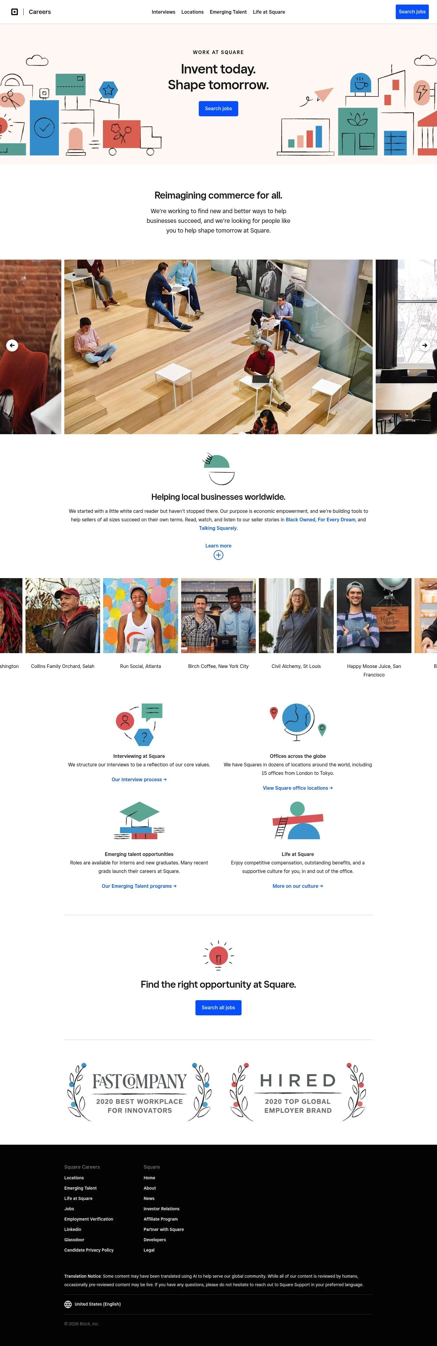
- Full page: https://cdn.designmunk.com/2026/09/12081758/careers-squareup-com-us-en-featured.webp
- Above the fold: https://cdn.designmunk.com/2026/09/12081758/careers-squareup-com-us-en-featured.webp
- On DesignMunk: https://designmunk.com/square-careers-page/

Study these for hierarchy, rhythm, spacing and density. Where an image and the written spec disagree, the spec wins: the tokens were read from the page's own CSS, the images are one rendering of it.

## Before you start

Ask the user what they are building, who it is for, and what brand assets they already have — name, colours, typefaces. Wait for their answers before writing anything. Everything below is then applied to their product, not to the reference.

## Design specification

# Square Careers: Playful Line Art, One Electric Blue CTA

## Overview

Square's careers UI is confident and minimal: spacious white surfaces, disciplined near-black type, and a single accent blue used only for primary actions. The tone is professional but approachable—serious typography paired with playful line illustrations and documentary photography. Density varies by section, but the vertical rhythm remains generous, prioritizing clarity and focus for job seekers.

## Colors

- primary (#1A1A1A): Body and headline ink for all text-heavy areas, ensuring strong contrast on white.
- secondary (#040404): Rarely used deeper charcoal for icons or special emphasis when extra weight is needed over primary.
- tertiary (#006AFF): Accent blue reserved for primary CTAs and key links that drive application flows.
- neutral (#FFFFFF): Base background across the site and card surfaces.
- border (#E5E7EB): Subtle hairline dividers, card outlines, and section separators.
- surface (#FFFFFF): Default surface color; equals neutral.
- on-surface (#1A1A1A): Default text color atop surface elements.

## Typography

- Square Sans Display VF — proprietary/self-hosted. Used for large and medium headlines (44/36/30px at weight 500) to deliver a modern, geometric voice with tight control.
  Substitutes: Manrope (Google), Space Grotesk (Google), Outfit (Google).
- Square Sans Text VF — proprietary/self-hosted. Used for small headlines (24px/500) and body copy (20px/400, 1.6 line height, -0.01em tracking) for readable application content.
  Substitutes: Inter (Google), Source Sans 3 (Google), Work Sans (Google).
- Sizing roles: headline-lg for hero statements, headline-md for section leads, headline-sm/xs for subheads; body-md for paragraphs, list items, and helper text. Keep the -0.01em tracking on body to match the system's tone.

## Layout

Spacing follows a compact-to-generous scale built on 6/10/18/30/60px steps. Use xl (60px) for section paddings, lg (30px) for intra-section grouping, and md (18px) for block spacing inside cards. Lists and nav items typically separate by sm (10px). Content reads best in a multi-column grid with wide gutters; cards align to consistent 8px radii and 16–18px internal spacing.

## Elevation & Depth

Depth is minimal. Only a soft ambient shadow is available (0 0 12px 2px, rgb(199,197,199)) for photos or modals; medium and larger shadows are none. Hierarchy is mainly conveyed using whitespace, weight/size in type, and subtle #E5E7EB borders or a 1px inner divider. Prefer tonal contrast over heavy elevation.

## Shapes

Two radii carry meaning: 24px (md) signals interactive, high-priority elements like primary and secondary buttons; 8px (sm) is for structural containers such as cards and media frames. Link buttons are square (0px) to stay text-like. Keep visual consistency by not mixing radii within a single component.

## Components

Button variants and card are canonical:
- Primary Button: 48px height, 10px padding, 24px radius, background #006AFF, text #FFFFFF. Use for core CTAs like "Search jobs".
- Secondary Button: 48px height, 10px padding, 24px radius, background #FFFFFF, text #1A1A1A; add a #E5E7EB border when placed on white.
- Link Button: Text-only, #006AFF, 0px radius for inline actions like "Learn more".
- Card: #FFFFFF background, #1A1A1A text, 8px radius, 16px padding; use for promos and product tiles.

Distinctive components on this page:

### Global Navigation Bar
- Left brand lockup and "Careers"; simple inline links spaced by sm (10px). Right-aligned tertiary CTA ("Search jobs") using the primary button spec.

### Hero Recruitment Banner
- Centered headline using headline-lg (44px/500) over body-md copy; single primary button. The illustration frame can sit on a light backdrop while text remains on #FFFFFF.

### Mission Statement Block
- Section lead in headline-md (36px/500) with one paragraph body-md; wide margins (xl 60px) above/below to reset attention.

### Culture Photo Mosaic
- Edge-to-edge photographic strip. Use 8px radii on images when inset and the small ambient shadow only if placed on similar-tone surfaces.

### Program Tiles Grid
- Three to four cards per row for "Interviews", "Locations", "Emerging Talent", "Life at Square". Each tile: card spec, headline-xs (24px/500), link-button for the CTA.

### Product Ecosystem Grid
- Cards for Appointments, Banking, Hardware, etc. Headline-xs for titles, body-md for blurbs, link-button CTAs. Maintain md (18px) gaps and sm (10px) inner spacing between title and copy.

### Region & Language Selector
- Collapsible list with dense links. Use body-md, border (#E5E7EB) to divide groups, and md (18px) vertical padding per group.

### Footer
- Multi-column link lists with a top border (#E5E7EB). Body-md text color #1A1A1A on #FFFFFF, md (18px) column gaps.

## Do's and Don'ts

- Do reserve #006AFF for primary CTAs and key links; it should not appear on decorative elements or secondary text.
- Do keep hero and section headings on #FFFFFF with #1A1A1A for reliable contrast and accessibility.
- Do maintain 48px button height and 24px radius for all primary/secondary buttons.
- Don't introduce additional shadows; prefer borders (#E5E7EB) or whitespace for separation.
- Don't mix radii within a component—use 24px for interactive pills and 8px for containers.
- Don't shrink body text below 20px or remove the slight negative tracking; readability is core to the system.

## Agent Prompt Guide

Quick reference — use these base colors:
- Text: #1A1A1A
- Background: #FFFFFF
- Border: #E5E7EB
- Accent: #006AFF

Prompts:
1) Build a centered hero with display and body copy
- Background #FFFFFF, max-width 840px, center.
- H1: 44px, weight 500, color #1A1A1A, font Manrope (as substitute for Square Sans Display VF).
- Paragraph: 20px, weight 400, line-height 1.6, letter-spacing -0.01em, color #1A1A1A, font Inter (as substitute for Square Sans Text VF).
- Primary button: 48px height, 24px radius, 10px horizontal padding, background #006AFF, text #FFFFFF.
- Vertical spacing: 60px above and below the block.

2) Create a 3-up promo card grid
- Container background #FFFFFF with 60px section padding.
- Each card: background #FFFFFF, text #1A1A1A, 8px radius, 16px padding, 1px border #E5E7EB.
- Card heading: 24px/500 Manrope; body: 20px Inter.
- Gaps: 18px between cards and internal elements; 30px between grid rows.

3) Add a navigation bar with CTA
- Bar height ~72px on #FFFFFF, 1px bottom border #E5E7EB.
- Inline links set in Inter 20px/400 with 10px gaps.
- Right-aligned primary button: 48px height, 24px radius, background #006AFF, text #FFFFFF.

4) Product ecosystem tiles
- Use the same card spec as in (2).
- Title: 24px/500 Manrope; description: 20px Inter.
- CTA: link style in #006AFF, no underline, 0px radius.

5) Footer with columns
- Section border-top: 1px #E5E7EB, background #FFFFFF.
- Column headings: 24px/500 Manrope; links: 20px/400 Inter.
- Spacing: 30px between columns, 18px between list items; text #1A1A1A.

## Similar Brands

- Stripe Careers — similarly spare black/white framework with a single blue accent; Stripe leans denser in type scales and adds more motion.
- Shopify Careers — minimalist with photo-led storytelling; Shopify uses green accents and softer rounded shapes than Square's 24px pill buttons.
- Wise Careers — blue-accent clarity and generous whitespace; Wise introduces more vivid secondary colors and bolder, angled shapes.
- PayPal Careers — blue-first CTA language and restrained chrome; PayPal's typography trends more conservative and slightly smaller across headings.

## Tokens

### CSS custom properties

```css
:root {
  /* Colors */
  --color-primary: #1a1a1a;
  --color-secondary: #040404;
  --color-tertiary: #006aff;
  --color-neutral: #ffffff;
  --color-border: #e5e7eb;
  --color-surface: var(--color-neutral);
  --color-on-surface: var(--color-primary);

  /* Typography */
  --text-headline-lg-size: 44px;
  --text-headline-lg-weight: 500;
  --text-headline-lg-leading: 1.18;
  --text-headline-md-size: 36px;
  --text-headline-md-weight: 500;
  --text-headline-md-leading: 1.22;
  --text-headline-sm-size: 30px;
  --text-headline-sm-weight: 500;
  --text-headline-sm-leading: 1.27;
  --text-headline-xs-size: 24px;
  --text-headline-xs-weight: 500;
  --text-headline-xs-leading: 1.21;
  --text-body-md-size: 20px;
  --text-body-md-weight: 400;
  --text-body-md-leading: 1.6;
  --text-body-md-tracking: -0.01em;
  --font-square-sans-display-vf: "Square Sans Display VF";
  --font-square-sans-text-vf: "Square Sans Text VF";

  /* Rounded */
  --radius-sm: 8px;
  --radius-md: 24px;

  /* Spacing */
  --spacing-xs: 6px;
  --spacing-sm: 10px;
  --spacing-md: 18px;
  --spacing-lg: 30px;
  --spacing-xl: 60px;

  /* Components */
  --button-primary-background-color: var(--color-tertiary);
  --button-primary-text-color: var(--color-neutral);
  --button-primary-rounded: var(--radius-md);
  --button-primary-padding: 10px;
  --button-primary-height: 48px;
  --button-secondary-background-color: var(--color-neutral);
  --button-secondary-text-color: var(--color-primary);
  --button-secondary-rounded: var(--radius-md);
  --button-secondary-padding: 10px;
  --button-secondary-height: 48px;
  --button-link-text-color: var(--color-tertiary);
  --button-link-rounded: 0px;
  --card-background-color: var(--color-neutral);
  --card-text-color: var(--color-primary);
  --card-rounded: var(--radius-sm);
  --card-padding: 16px;
}
```

### Tailwind theme

```css
@theme {
  --color-primary: #1a1a1a;
  --color-secondary: #040404;
  --color-tertiary: #006aff;
  --color-neutral: #ffffff;
  --color-border: #e5e7eb;
  --color-surface: #ffffff;
  --color-on-surface: #1a1a1a;
  --font-headline-lg: "Square Sans Display VF";
  --font-headline-md: "Square Sans Display VF";
  --font-headline-sm: "Square Sans Display VF";
  --font-headline-xs: "Square Sans Text VF";
  --font-body-md: "Square Sans Text VF";
  --text-headline-lg: 44px;
  --text-headline-md: 36px;
  --text-headline-sm: 30px;
  --text-headline-xs: 24px;
  --text-body-md: 20px;
  --tracking-body-md: -0.01em;
  --font-weight-headline-lg: 500;
  --font-weight-headline-md: 500;
  --font-weight-headline-sm: 500;
  --font-weight-headline-xs: 500;
  --font-weight-body-md: 400;
  --radius-sm: 8px;
  --radius-md: 24px;
  --spacing-xs: 6px;
  --spacing-sm: 10px;
  --spacing-md: 18px;
  --spacing-lg: 30px;
  --spacing-xl: 60px;
}
```

### Design tokens (DTCG)

```json
{
    "$schema": "https://www.designtokens.org/schemas/2025.10/format.json",
    "color": {
        "$type": "color",
        "primary": {
            "$value": {
                "colorSpace": "srgb",
                "components": [
                    0.102,
                    0.102,
                    0.102
                ],
                "hex": "#1a1a1a"
            }
        },
        "secondary": {
            "$value": {
                "colorSpace": "srgb",
                "components": [
                    0.016,
                    0.016,
                    0.016
                ],
                "hex": "#040404"
            }
        },
        "tertiary": {
            "$value": {
                "colorSpace": "srgb",
                "components": [
                    0,
                    0.416,
                    1
                ],
                "hex": "#006aff"
            }
        },
        "neutral": {
            "$value": {
                "colorSpace": "srgb",
                "components": [
                    1,
                    1,
                    1
                ],
                "hex": "#ffffff"
            }
        },
        "border": {
            "$value": {
                "colorSpace": "srgb",
                "components": [
                    0.898,
                    0.906,
                    0.922
                ],
                "hex": "#e5e7eb"
            }
        },
        "surface": {
            "$value": {
                "colorSpace": "srgb",
                "components": [
                    1,
                    1,
                    1
                ],
                "hex": "#ffffff"
            }
        },
        "on-surface": {
            "$value": {
                "colorSpace": "srgb",
                "components": [
                    0.102,
                    0.102,
                    0.102
                ],
                "hex": "#1a1a1a"
            }
        }
    },
    "spacing": {
        "$type": "dimension",
        "xs": {
            "$value": {
                "value": 6,
                "unit": "px"
            }
        },
        "sm": {
            "$value": {
                "value": 10,
                "unit": "px"
            }
        },
        "md": {
            "$value": {
                "value": 18,
                "unit": "px"
            }
        },
        "lg": {
            "$value": {
                "value": 30,
                "unit": "px"
            }
        },
        "xl": {
            "$value": {
                "value": 60,
                "unit": "px"
            }
        }
    },
    "rounded": {
        "$type": "dimension",
        "sm": {
            "$value": {
                "value": 8,
                "unit": "px"
            }
        },
        "md": {
            "$value": {
                "value": 24,
                "unit": "px"
            }
        }
    },
    "typography": {
        "headline-lg": {
            "$type": "typography",
            "$value": {
                "fontFamily": "Square Sans Display VF",
                "fontSize": {
                    "value": 44,
                    "unit": "px"
                },
                "fontWeight": 500
            }
        },
        "headline-md": {
            "$type": "typography",
            "$value": {
                "fontFamily": "Square Sans Display VF",
                "fontSize": {
                    "value": 36,
                    "unit": "px"
                },
                "fontWeight": 500
            }
        },
        "headline-sm": {
            "$type": "typography",
            "$value": {
                "fontFamily": "Square Sans Display VF",
                "fontSize": {
                    "value": 30,
                    "unit": "px"
                },
                "fontWeight": 500
            }
        },
        "headline-xs": {
            "$type": "typography",
            "$value": {
                "fontFamily": "Square Sans Text VF",
                "fontSize": {
                    "value": 24,
                    "unit": "px"
                },
                "fontWeight": 500
            }
        },
        "body-md": {
            "$type": "typography",
            "$value": {
                "fontFamily": "Square Sans Text VF",
                "fontSize": {
                    "value": 20,
                    "unit": "px"
                },
                "fontWeight": 400,
                "letterSpacing": {
                    "value": -0.01,
                    "unit": "em"
                }
            }
        }
    }
}
```

## Rules

- **Fonts.** If the specification names a custom or self-hosted family, use one of the substitutes it names. Never reference a typeface you cannot actually load — it will fall back to a system font and undo the typography.
- **Colour.** Derive the palette from the user's brand. Use the token values as a guide to *relationships* — contrast, tint, how many accents carry the page — not as hex codes to paste.
- **Never reproduce** the wordmark, mascot, logo, brand name, illustrations, icon set, screenshots or any copy from the reference.
- **Never present the result as Square Careers**, or imply any connection to it.
- If something is unspecified, choose clarity and legibility over decoration.
---
version: alpha
name: Square
description: Invent today. Shape tomorrow.
colors:
  primary: "#1a1a1a"
  secondary: "#040404"
  tertiary: "#006aff"
  neutral: "#ffffff"
  border: "#e5e7eb"
  surface: "{colors.neutral}"
  on-surface: "{colors.primary}"
typography:
  headline-lg:
    fontFamily: Square Sans Display VF
    fontSize: 44px
    fontWeight: 500
    lineHeight: 1.18
  headline-md:
    fontFamily: Square Sans Display VF
    fontSize: 36px
    fontWeight: 500
    lineHeight: 1.22
  headline-sm:
    fontFamily: Square Sans Display VF
    fontSize: 30px
    fontWeight: 500
    lineHeight: 1.27
  headline-xs:
    fontFamily: Square Sans Text VF
    fontSize: 24px
    fontWeight: 500
    lineHeight: 1.21
  body-md:
    fontFamily: Square Sans Text VF
    fontSize: 20px
    fontWeight: 400
    lineHeight: 1.6
    letterSpacing: -0.01em
rounded:
  sm: 8px
  md: 24px
spacing:
  xs: 6px
  sm: 10px
  md: 18px
  lg: 30px
  xl: 60px
components:
  button-primary:
    backgroundColor: "{colors.tertiary}"
    textColor: "{colors.neutral}"
    rounded: "{rounded.md}"
    padding: 10px
    height: 48px
  button-secondary:
    backgroundColor: "{colors.neutral}"
    textColor: "{colors.primary}"
    rounded: "{rounded.md}"
    padding: 10px
    height: 48px
  button-link:
    textColor: "{colors.tertiary}"
    rounded: 0px
  card:
    backgroundColor: "{colors.neutral}"
    textColor: "{colors.primary}"
    rounded: "{rounded.sm}"
    padding: 16px
---

# Square Careers: Playful Line Art, One Electric Blue CTA

## Overview

Square's careers UI is confident and minimal: spacious white surfaces, disciplined near-black type, and a single accent blue used only for primary actions. The tone is professional but approachable—serious typography paired with playful line illustrations and documentary photography. Density varies by section, but the vertical rhythm remains generous, prioritizing clarity and focus for job seekers.

## Colors

- primary (#1A1A1A): Body and headline ink for all text-heavy areas, ensuring strong contrast on white.
- secondary (#040404): Rarely used deeper charcoal for icons or special emphasis when extra weight is needed over primary.
- tertiary (#006AFF): Accent blue reserved for primary CTAs and key links that drive application flows.
- neutral (#FFFFFF): Base background across the site and card surfaces.
- border (#E5E7EB): Subtle hairline dividers, card outlines, and section separators.
- surface (#FFFFFF): Default surface color; equals neutral.
- on-surface (#1A1A1A): Default text color atop surface elements.

## Typography

- Square Sans Display VF — proprietary/self-hosted. Used for large and medium headlines (44/36/30px at weight 500) to deliver a modern, geometric voice with tight control.
  Substitutes: Manrope (Google), Space Grotesk (Google), Outfit (Google).
- Square Sans Text VF — proprietary/self-hosted. Used for small headlines (24px/500) and body copy (20px/400, 1.6 line height, -0.01em tracking) for readable application content.
  Substitutes: Inter (Google), Source Sans 3 (Google), Work Sans (Google).
- Sizing roles: headline-lg for hero statements, headline-md for section leads, headline-sm/xs for subheads; body-md for paragraphs, list items, and helper text. Keep the -0.01em tracking on body to match the system's tone.

## Layout

Spacing follows a compact-to-generous scale built on 6/10/18/30/60px steps. Use xl (60px) for section paddings, lg (30px) for intra-section grouping, and md (18px) for block spacing inside cards. Lists and nav items typically separate by sm (10px). Content reads best in a multi-column grid with wide gutters; cards align to consistent 8px radii and 16–18px internal spacing.

## Elevation & Depth

Depth is minimal. Only a soft ambient shadow is available (0 0 12px 2px, rgb(199,197,199)) for photos or modals; medium and larger shadows are none. Hierarchy is mainly conveyed using whitespace, weight/size in type, and subtle #E5E7EB borders or a 1px inner divider. Prefer tonal contrast over heavy elevation.

## Shapes

Two radii carry meaning: 24px (md) signals interactive, high-priority elements like primary and secondary buttons; 8px (sm) is for structural containers such as cards and media frames. Link buttons are square (0px) to stay text-like. Keep visual consistency by not mixing radii within a single component.

## Components

Button variants and card are canonical:
- Primary Button: 48px height, 10px padding, 24px radius, background #006AFF, text #FFFFFF. Use for core CTAs like "Search jobs".
- Secondary Button: 48px height, 10px padding, 24px radius, background #FFFFFF, text #1A1A1A; add a #E5E7EB border when placed on white.
- Link Button: Text-only, #006AFF, 0px radius for inline actions like "Learn more".
- Card: #FFFFFF background, #1A1A1A text, 8px radius, 16px padding; use for promos and product tiles.

Distinctive components on this page:

### Global Navigation Bar
- Left brand lockup and "Careers"; simple inline links spaced by sm (10px). Right-aligned tertiary CTA ("Search jobs") using the primary button spec.

### Hero Recruitment Banner
- Centered headline using headline-lg (44px/500) over body-md copy; single primary button. The illustration frame can sit on a light backdrop while text remains on #FFFFFF.

### Mission Statement Block
- Section lead in headline-md (36px/500) with one paragraph body-md; wide margins (xl 60px) above/below to reset attention.

### Culture Photo Mosaic
- Edge-to-edge photographic strip. Use 8px radii on images when inset and the small ambient shadow only if placed on similar-tone surfaces.

### Program Tiles Grid
- Three to four cards per row for "Interviews", "Locations", "Emerging Talent", "Life at Square". Each tile: card spec, headline-xs (24px/500), link-button for the CTA.

### Product Ecosystem Grid
- Cards for Appointments, Banking, Hardware, etc. Headline-xs for titles, body-md for blurbs, link-button CTAs. Maintain md (18px) gaps and sm (10px) inner spacing between title and copy.

### Region & Language Selector
- Collapsible list with dense links. Use body-md, border (#E5E7EB) to divide groups, and md (18px) vertical padding per group.

### Footer
- Multi-column link lists with a top border (#E5E7EB). Body-md text color #1A1A1A on #FFFFFF, md (18px) column gaps.

## Do's and Don'ts

- Do reserve #006AFF for primary CTAs and key links; it should not appear on decorative elements or secondary text.
- Do keep hero and section headings on #FFFFFF with #1A1A1A for reliable contrast and accessibility.
- Do maintain 48px button height and 24px radius for all primary/secondary buttons.
- Don't introduce additional shadows; prefer borders (#E5E7EB) or whitespace for separation.
- Don't mix radii within a component—use 24px for interactive pills and 8px for containers.
- Don't shrink body text below 20px or remove the slight negative tracking; readability is core to the system.

## Agent Prompt Guide

Quick reference — use these base colors:
- Text: #1A1A1A
- Background: #FFFFFF
- Border: #E5E7EB
- Accent: #006AFF

Prompts:
1) Build a centered hero with display and body copy
- Background #FFFFFF, max-width 840px, center.
- H1: 44px, weight 500, color #1A1A1A, font Manrope (as substitute for Square Sans Display VF).
- Paragraph: 20px, weight 400, line-height 1.6, letter-spacing -0.01em, color #1A1A1A, font Inter (as substitute for Square Sans Text VF).
- Primary button: 48px height, 24px radius, 10px horizontal padding, background #006AFF, text #FFFFFF.
- Vertical spacing: 60px above and below the block.

2) Create a 3-up promo card grid
- Container background #FFFFFF with 60px section padding.
- Each card: background #FFFFFF, text #1A1A1A, 8px radius, 16px padding, 1px border #E5E7EB.
- Card heading: 24px/500 Manrope; body: 20px Inter.
- Gaps: 18px between cards and internal elements; 30px between grid rows.

3) Add a navigation bar with CTA
- Bar height ~72px on #FFFFFF, 1px bottom border #E5E7EB.
- Inline links set in Inter 20px/400 with 10px gaps.
- Right-aligned primary button: 48px height, 24px radius, background #006AFF, text #FFFFFF.

4) Product ecosystem tiles
- Use the same card spec as in (2).
- Title: 24px/500 Manrope; description: 20px Inter.
- CTA: link style in #006AFF, no underline, 0px radius.

5) Footer with columns
- Section border-top: 1px #E5E7EB, background #FFFFFF.
- Column headings: 24px/500 Manrope; links: 20px/400 Inter.
- Spacing: 30px between columns, 18px between list items; text #1A1A1A.

## Similar Brands

- Stripe Careers — similarly spare black/white framework with a single blue accent; Stripe leans denser in type scales and adds more motion.
- Shopify Careers — minimalist with photo-led storytelling; Shopify uses green accents and softer rounded shapes than Square's 24px pill buttons.
- Wise Careers — blue-accent clarity and generous whitespace; Wise introduces more vivid secondary colors and bolder, angled shapes.
- PayPal Careers — blue-first CTA language and restrained chrome; PayPal's typography trends more conservative and slightly smaller across headings.
:root {
  /* Colors */
  --color-primary: #1a1a1a;
  --color-secondary: #040404;
  --color-tertiary: #006aff;
  --color-neutral: #ffffff;
  --color-border: #e5e7eb;
  --color-surface: var(--color-neutral);
  --color-on-surface: var(--color-primary);

  /* Typography */
  --text-headline-lg-size: 44px;
  --text-headline-lg-weight: 500;
  --text-headline-lg-leading: 1.18;
  --text-headline-md-size: 36px;
  --text-headline-md-weight: 500;
  --text-headline-md-leading: 1.22;
  --text-headline-sm-size: 30px;
  --text-headline-sm-weight: 500;
  --text-headline-sm-leading: 1.27;
  --text-headline-xs-size: 24px;
  --text-headline-xs-weight: 500;
  --text-headline-xs-leading: 1.21;
  --text-body-md-size: 20px;
  --text-body-md-weight: 400;
  --text-body-md-leading: 1.6;
  --text-body-md-tracking: -0.01em;
  --font-square-sans-display-vf: "Square Sans Display VF";
  --font-square-sans-text-vf: "Square Sans Text VF";

  /* Rounded */
  --radius-sm: 8px;
  --radius-md: 24px;

  /* Spacing */
  --spacing-xs: 6px;
  --spacing-sm: 10px;
  --spacing-md: 18px;
  --spacing-lg: 30px;
  --spacing-xl: 60px;

  /* Components */
  --button-primary-background-color: var(--color-tertiary);
  --button-primary-text-color: var(--color-neutral);
  --button-primary-rounded: var(--radius-md);
  --button-primary-padding: 10px;
  --button-primary-height: 48px;
  --button-secondary-background-color: var(--color-neutral);
  --button-secondary-text-color: var(--color-primary);
  --button-secondary-rounded: var(--radius-md);
  --button-secondary-padding: 10px;
  --button-secondary-height: 48px;
  --button-link-text-color: var(--color-tertiary);
  --button-link-rounded: 0px;
  --card-background-color: var(--color-neutral);
  --card-text-color: var(--color-primary);
  --card-rounded: var(--radius-sm);
  --card-padding: 16px;
}
{
  "$schema": "https://www.designtokens.org/schemas/2025.10/format.json",
  "$description": "Invent today. Shape tomorrow.",
  "color": {
    "$type": "color",
    "primary": {
      "$value": {
        "colorSpace": "srgb",
        "components": [
          0.102,
          0.102,
          0.102
        ],
        "hex": "#1a1a1a"
      }
    },
    "secondary": {
      "$value": {
        "colorSpace": "srgb",
        "components": [
          0.016,
          0.016,
          0.016
        ],
        "hex": "#040404"
      }
    },
    "tertiary": {
      "$value": {
        "colorSpace": "srgb",
        "components": [
          0,
          0.416,
          1
        ],
        "hex": "#006aff"
      }
    },
    "neutral": {
      "$value": {
        "colorSpace": "srgb",
        "components": [
          1,
          1,
          1
        ],
        "hex": "#ffffff"
      }
    },
    "border": {
      "$value": {
        "colorSpace": "srgb",
        "components": [
          0.898,
          0.906,
          0.922
        ],
        "hex": "#e5e7eb"
      }
    },
    "surface": {
      "$value": {
        "colorSpace": "srgb",
        "components": [
          1,
          1,
          1
        ],
        "hex": "#ffffff"
      }
    },
    "on-surface": {
      "$value": {
        "colorSpace": "srgb",
        "components": [
          0.102,
          0.102,
          0.102
        ],
        "hex": "#1a1a1a"
      }
    }
  },
  "spacing": {
    "$type": "dimension",
    "xs": {
      "$value": {
        "value": 6,
        "unit": "px"
      }
    },
    "sm": {
      "$value": {
        "value": 10,
        "unit": "px"
      }
    },
    "md": {
      "$value": {
        "value": 18,
        "unit": "px"
      }
    },
    "lg": {
      "$value": {
        "value": 30,
        "unit": "px"
      }
    },
    "xl": {
      "$value": {
        "value": 60,
        "unit": "px"
      }
    }
  },
  "rounded": {
    "$type": "dimension",
    "sm": {
      "$value": {
        "value": 8,
        "unit": "px"
      }
    },
    "md": {
      "$value": {
        "value": 24,
        "unit": "px"
      }
    }
  },
  "typography": {
    "headline-lg": {
      "$type": "typography",
      "$value": {
        "fontFamily": "Square Sans Display VF",
        "fontSize": {
          "value": 44,
          "unit": "px"
        },
        "fontWeight": 500
      }
    },
    "headline-md": {
      "$type": "typography",
      "$value": {
        "fontFamily": "Square Sans Display VF",
        "fontSize": {
          "value": 36,
          "unit": "px"
        },
        "fontWeight": 500
      }
    },
    "headline-sm": {
      "$type": "typography",
      "$value": {
        "fontFamily": "Square Sans Display VF",
        "fontSize": {
          "value": 30,
          "unit": "px"
        },
        "fontWeight": 500
      }
    },
    "headline-xs": {
      "$type": "typography",
      "$value": {
        "fontFamily": "Square Sans Text VF",
        "fontSize": {
          "value": 24,
          "unit": "px"
        },
        "fontWeight": 500
      }
    },
    "body-md": {
      "$type": "typography",
      "$value": {
        "fontFamily": "Square Sans Text VF",
        "fontSize": {
          "value": 20,
          "unit": "px"
        },
        "fontWeight": 400,
        "letterSpacing": {
          "value": -0.01,
          "unit": "em"
        }
      }
    }
  }
}
@theme {
--color-primary: #1a1a1a;
--color-secondary: #040404;
--color-tertiary: #006aff;
--color-neutral: #ffffff;
--color-border: #e5e7eb;
--color-surface: #ffffff;
--color-on-surface: #1a1a1a;
--font-headline-lg: "Square Sans Display VF";
--font-headline-md: "Square Sans Display VF";
--font-headline-sm: "Square Sans Display VF";
--font-headline-xs: "Square Sans Text VF";
--font-body-md: "Square Sans Text VF";
--text-headline-lg: 44px;
--text-headline-md: 36px;
--text-headline-sm: 30px;
--text-headline-xs: 24px;
--text-body-md: 20px;
--tracking-body-md: -0.01em;
--font-weight-headline-lg: 500;
--font-weight-headline-md: 500;
--font-weight-headline-sm: 500;
--font-weight-headline-xs: 500;
--font-weight-body-md: 400;
--radius-sm: 8px;
--radius-md: 24px;
--spacing-xs: 6px;
--spacing-sm: 10px;
--spacing-md: 18px;
--spacing-lg: 30px;
--spacing-xl: 60px;
} # Design brief: the Square Careers design language
Below is a complete design specification measured from a real, published web page. Use it as a design language for the user's product. It is not a page to reproduce.
## Reference images
- Full page: https://cdn.designmunk.com/2026/09/12081758/careers-squareup-com-us-en-featured.webp
- Above the fold: https://cdn.designmunk.com/2026/09/12081758/careers-squareup-com-us-en-featured.webp
- On DesignMunk: https://designmunk.com/square-careers-page/
Study these for hierarchy, rhythm, spacing and density. Where an image and the written spec disagree, the spec wins: the tokens were read from the page's own CSS, the images are one rendering of it.
## Before you start
Ask the user what they are building, who it is for, and what brand assets they already have — name, colours, typefaces. Wait for their answers before writing anything. Everything below is then applied to their product, not to the reference.
## Design specification
# Square Careers: Playful Line Art, One Electric Blue CTA
## Overview
Square's careers UI is confident and minimal: spacious white surfaces, disciplined near-black type, and a single accent blue used only for primary actions. The tone is professional but approachable—serious typography paired with playful line illustrations and documentary photography. Density varies by section, but the vertical rhythm remains generous, prioritizing clarity and focus for job seekers.
## Colors
- primary (#1A1A1A): Body and headline ink for all text-heavy areas, ensuring strong contrast on white.
- secondary (#040404): Rarely used deeper charcoal for icons or special emphasis when extra weight is needed over primary.
- tertiary (#006AFF): Accent blue reserved for primary CTAs and key links that drive application flows.
- neutral (#FFFFFF): Base background across the site and card surfaces.
- border (#E5E7EB): Subtle hairline dividers, card outlines, and section separators.
- surface (#FFFFFF): Default surface color; equals neutral.
- on-surface (#1A1A1A): Default text color atop surface elements.
## Typography
- Square Sans Display VF — proprietary/self-hosted. Used for large and medium headlines (44/36/30px at weight 500) to deliver a modern, geometric voice with tight control.
Substitutes: Manrope (Google), Space Grotesk (Google), Outfit (Google).
- Square Sans Text VF — proprietary/self-hosted. Used for small headlines (24px/500) and body copy (20px/400, 1.6 line height, -0.01em tracking) for readable application content.
Substitutes: Inter (Google), Source Sans 3 (Google), Work Sans (Google).
- Sizing roles: headline-lg for hero statements, headline-md for section leads, headline-sm/xs for subheads; body-md for paragraphs, list items, and helper text. Keep the -0.01em tracking on body to match the system's tone.
## Layout
Spacing follows a compact-to-generous scale built on 6/10/18/30/60px steps. Use xl (60px) for section paddings, lg (30px) for intra-section grouping, and md (18px) for block spacing inside cards. Lists and nav items typically separate by sm (10px). Content reads best in a multi-column grid with wide gutters; cards align to consistent 8px radii and 16–18px internal spacing.
## Elevation & Depth
Depth is minimal. Only a soft ambient shadow is available (0 0 12px 2px, rgb(199,197,199)) for photos or modals; medium and larger shadows are none. Hierarchy is mainly conveyed using whitespace, weight/size in type, and subtle #E5E7EB borders or a 1px inner divider. Prefer tonal contrast over heavy elevation.
## Shapes
Two radii carry meaning: 24px (md) signals interactive, high-priority elements like primary and secondary buttons; 8px (sm) is for structural containers such as cards and media frames. Link buttons are square (0px) to stay text-like. Keep visual consistency by not mixing radii within a single component.
## Components
Button variants and card are canonical:
- Primary Button: 48px height, 10px padding, 24px radius, background #006AFF, text #FFFFFF. Use for core CTAs like "Search jobs".
- Secondary Button: 48px height, 10px padding, 24px radius, background #FFFFFF, text #1A1A1A; add a #E5E7EB border when placed on white.
- Link Button: Text-only, #006AFF, 0px radius for inline actions like "Learn more".
- Card: #FFFFFF background, #1A1A1A text, 8px radius, 16px padding; use for promos and product tiles.
Distinctive components on this page:
### Global Navigation Bar
- Left brand lockup and "Careers"; simple inline links spaced by sm (10px). Right-aligned tertiary CTA ("Search jobs") using the primary button spec.
### Hero Recruitment Banner
- Centered headline using headline-lg (44px/500) over body-md copy; single primary button. The illustration frame can sit on a light backdrop while text remains on #FFFFFF.
### Mission Statement Block
- Section lead in headline-md (36px/500) with one paragraph body-md; wide margins (xl 60px) above/below to reset attention.
### Culture Photo Mosaic
- Edge-to-edge photographic strip. Use 8px radii on images when inset and the small ambient shadow only if placed on similar-tone surfaces.
### Program Tiles Grid
- Three to four cards per row for "Interviews", "Locations", "Emerging Talent", "Life at Square". Each tile: card spec, headline-xs (24px/500), link-button for the CTA.
### Product Ecosystem Grid
- Cards for Appointments, Banking, Hardware, etc. Headline-xs for titles, body-md for blurbs, link-button CTAs. Maintain md (18px) gaps and sm (10px) inner spacing between title and copy.
### Region & Language Selector
- Collapsible list with dense links. Use body-md, border (#E5E7EB) to divide groups, and md (18px) vertical padding per group.
### Footer
- Multi-column link lists with a top border (#E5E7EB). Body-md text color #1A1A1A on #FFFFFF, md (18px) column gaps.
## Do's and Don'ts
- Do reserve #006AFF for primary CTAs and key links; it should not appear on decorative elements or secondary text.
- Do keep hero and section headings on #FFFFFF with #1A1A1A for reliable contrast and accessibility.
- Do maintain 48px button height and 24px radius for all primary/secondary buttons.
- Don't introduce additional shadows; prefer borders (#E5E7EB) or whitespace for separation.
- Don't mix radii within a component—use 24px for interactive pills and 8px for containers.
- Don't shrink body text below 20px or remove the slight negative tracking; readability is core to the system.
## Agent Prompt Guide
Quick reference — use these base colors:
- Text: #1A1A1A
- Background: #FFFFFF
- Border: #E5E7EB
- Accent: #006AFF
Prompts:
1) Build a centered hero with display and body copy
- Background #FFFFFF, max-width 840px, center.
- H1: 44px, weight 500, color #1A1A1A, font Manrope (as substitute for Square Sans Display VF).
- Paragraph: 20px, weight 400, line-height 1.6, letter-spacing -0.01em, color #1A1A1A, font Inter (as substitute for Square Sans Text VF).
- Primary button: 48px height, 24px radius, 10px horizontal padding, background #006AFF, text #FFFFFF.
- Vertical spacing: 60px above and below the block.
2) Create a 3-up promo card grid
- Container background #FFFFFF with 60px section padding.
- Each card: background #FFFFFF, text #1A1A1A, 8px radius, 16px padding, 1px border #E5E7EB.
- Card heading: 24px/500 Manrope; body: 20px Inter.
- Gaps: 18px between cards and internal elements; 30px between grid rows.
3) Add a navigation bar with CTA
- Bar height ~72px on #FFFFFF, 1px bottom border #E5E7EB.
- Inline links set in Inter 20px/400 with 10px gaps.
- Right-aligned primary button: 48px height, 24px radius, background #006AFF, text #FFFFFF.
4) Product ecosystem tiles
- Use the same card spec as in (2).
- Title: 24px/500 Manrope; description: 20px Inter.
- CTA: link style in #006AFF, no underline, 0px radius.
5) Footer with columns
- Section border-top: 1px #E5E7EB, background #FFFFFF.
- Column headings: 24px/500 Manrope; links: 20px/400 Inter.
- Spacing: 30px between columns, 18px between list items; text #1A1A1A.
## Tokens
### CSS custom properties
```css
:root {
/* Colors */
--color-primary: #1a1a1a;
--color-secondary: #040404;
--color-tertiary: #006aff;
--color-neutral: #ffffff;
--color-border: #e5e7eb;
--color-surface: var(--color-neutral);
--color-on-surface: var(--color-primary);
/* Typography */
--text-headline-lg-size: 44px;
--text-headline-lg-weight: 500;
--text-headline-lg-leading: 1.18;
--text-headline-md-size: 36px;
--text-headline-md-weight: 500;
--text-headline-md-leading: 1.22;
--text-headline-sm-size: 30px;
--text-headline-sm-weight: 500;
--text-headline-sm-leading: 1.27;
--text-headline-xs-size: 24px;
--text-headline-xs-weight: 500;
--text-headline-xs-leading: 1.21;
--text-body-md-size: 20px;
--text-body-md-weight: 400;
--text-body-md-leading: 1.6;
--text-body-md-tracking: -0.01em;
--font-square-sans-display-vf: "Square Sans Display VF";
--font-square-sans-text-vf: "Square Sans Text VF";
/* Rounded */
--radius-sm: 8px;
--radius-md: 24px;
/* Spacing */
--spacing-xs: 6px;
--spacing-sm: 10px;
--spacing-md: 18px;
--spacing-lg: 30px;
--spacing-xl: 60px;
/* Components */
--button-primary-background-color: var(--color-tertiary);
--button-primary-text-color: var(--color-neutral);
--button-primary-rounded: var(--radius-md);
--button-primary-padding: 10px;
--button-primary-height: 48px;
--button-secondary-background-color: var(--color-neutral);
--button-secondary-text-color: var(--color-primary);
--button-secondary-rounded: var(--radius-md);
--button-secondary-padding: 10px;
--button-secondary-height: 48px;
--button-link-text-color: var(--color-tertiary);
--button-link-rounded: 0px;
--card-background-color: var(--color-neutral);
--card-text-color: var(--color-primary);
--card-rounded: var(--radius-sm);
--card-padding: 16px;
}
```
## Rules
- **Fonts.** If the specification names a custom or self-hosted family, use one of the substitutes it names. Never reference a typeface you cannot actually load — it will fall back to a system font and undo the typography.
- **Colour.** Derive the palette from the user's brand. Use the token values as a guide to *relationships* — contrast, tint, how many accents carry the page — not as hex codes to paste.
- **Never reproduce** the wordmark, mascot, logo, brand name, illustrations, icon set, screenshots or any copy from the reference.
- **Never present the result as Square Careers**, or imply any connection to it.
- If something is unspecified, choose clarity and legibility over decoration.