shiori.sh
AI Breakdown
Design export
# Design brief: the Shiori design language

Below is a complete design specification measured from a real, published web page. Use it as a design language for the user's product. It is not a page to reproduce.

## Reference images

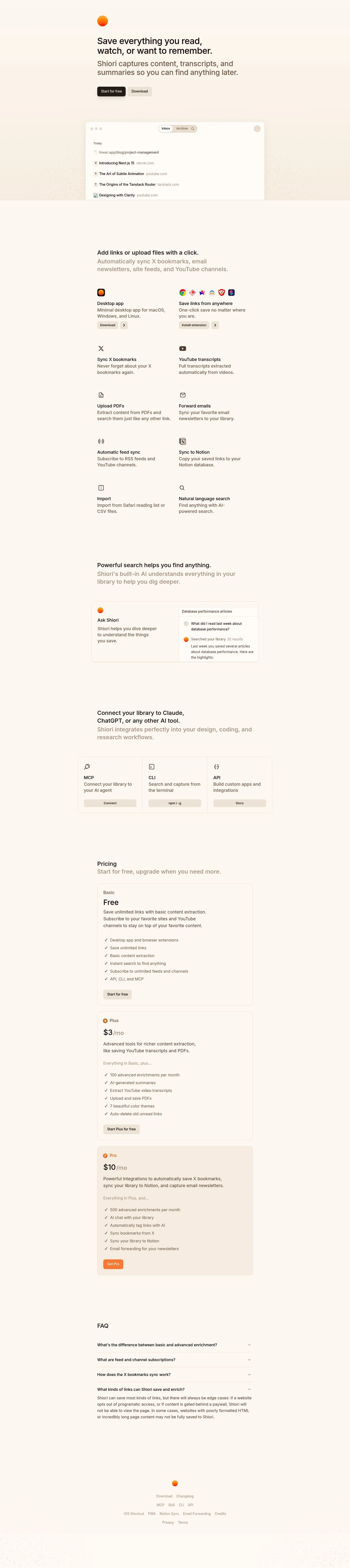
- Full page: https://cdn.designmunk.com/2026/09/07084517/shiori-sh-featured.webp
- Above the fold: https://cdn.designmunk.com/2026/09/07084517/shiori-sh-featured.webp
- On DesignMunk: https://designmunk.com/shiori/

Study these for hierarchy, rhythm, spacing and density. Where an image and the written spec disagree, the spec wins: the tokens were read from the page's own CSS, the images are one rendering of it.

## Before you start

Ask the user what they are building, who it is for, and what brand assets they already have — name, colours, typefaces. Wait for their answers before writing anything. Everything below is then applied to their product, not to the reference.

## Design specification

# Shiori: Black CTAs on a Soft, Card-Based Canvas

## Overview

Shiori's UI is calm, minimal, and utility-first. It pairs warm accents with a monochrome interface so content stays in focus. Spacing is generous and copy is airy, aiming for approachability over density. Inter-based headings guide quick scanning; components repeat to build familiarity across sections.

## Colors

- **primary (#000000):** Ink for headlines, body text, and primary iconography.
- **secondary (#fc9717):** Warm accent for brand marks, highlights, and small UI flares.
- **tertiary (#ff8c42):** Supporting orange for gradients or secondary accents sparingly.
- **neutral (#ffffff):** Paper-like background for surfaces and cards.
- **border (#e5e7eb):** Subtle dividers, card outlines, and input borders.
- **surface ({colors.neutral}):** Default surface for pages and containers.
- **on-surface ({colors.primary}):** Default text and icon color on white surfaces.

## Typography

- Inter Variable is the headline and body workhorse: 36px/500 (headline-lg), 29px/500 (headline-md), 24px/500 (headline-sm). Body runs 16px/500 with a very open 2.25 line height for easy reading.
- Headline-xs uses -apple-system at 20px/500 for compact subheads where web-safe performance is desired.
- Availability: Inter Variable is provided as a self-hosted custom file and may not always be accessible to an agent. Safe substitutes: Inter (Google) as the first choice; Roboto (Google) or Noto Sans (Google) as alternates with similar metrics and x-height.
- Use tight negative letterspacing where specified for large headings; keep body tracking normal and let the tall line height do the legibility work.

## Layout

- Spacing scale: xs 8, sm 16, md 24, lg 44, xl 64. Sections typically separate by lg–xl, while intra-section items use sm–md.
- Content width is comfortable and copy-led; keep hero and pricing headings to headline-lg and constrain paragraphs to medium line lengths to suit the airy 16px body.
- Use a simple column grid that collapses cleanly to one column on mobile; cards stack with sm–md gaps and maintain uniform internal padding (card padding 16).

## Elevation & Depth

- Depth is minimal. A single small shadow is measured for previews and important surfaces; larger elevations are none.
- Most hierarchy comes from whitespace, weight changes, and the light #e5e7eb border. Prefer border and spacing over heavy shadows.

## Shapes

- One radius language: 8px (rounded.sm). It appears on buttons, cards, inputs, and mock windows.
- Circles are reserved for small brand marks or status indicators; otherwise, maintain the 8px rectangle for consistency.

## Components

Buttons
- Primary Button: 40px height, 0 16px padding, 8px radius. On the page it appears as a solid black fill with white text; tokens list textColor #000000—treat the live rendering as source of truth.
- Secondary Button: Same sizing; neutral or outlined style with black text for low-emphasis actions.
- Link Button: Text-only, zero radius, in primary color for inline actions.

Card
- White surface, black text, 8px radius, 16px internal padding; add the small shadow only for featured previews.

Distinctive components
### Hero CTA Cluster
- 36px headline, 16px body, two actions side-by-side (Primary + Secondary). Vertical spacing: md between lines, lg to the preview card below.
### App Preview Window
- A large card with 8px radius and small shadow. Contains pill-style "Inbox/Archive" tabs and a list; use border #e5e7eb for internal separators.
### Feature List with Icons
- Two-level copy block: a 20–24px subhead and 16px body. Provider icons run in a compact row; use secondary (#fc9717) sparingly for highlights.
### Integrations Row (MCP, CLI, API)
- Three equal columns on desktop. Each tile uses headline-xs for the title, a short line of body, and a right-aligned link.
### Search Conversation Panel
- Demonstrates question/answer with a small results list. Use a card with 16px padding, 8px radius, border #e5e7eb, and sm gaps between list items.
### Pricing Plans (Basic, Plus, Pro)
- Three cards with stacked content: plan name (24–29px), price, feature list, and a full-width 40px CTA. Keep card gaps md and section spacing xl.
### FAQ Accordion
- Top and item dividers in #e5e7eb. Question set in 20px weight 500; answers in 16px body. Chevron rotates with no elevation changes.
### Footer Resource Bar
- Compact link list with sm padding and #e5e7eb separators; use body text at reduced opacity or secondary weight for hierarchy.

## Do's and Don'ts

- Do reserve secondary (#fc9717) and tertiary (#ff8c42) for small highlights, icons, and brand flourishes—not for body text or large backgrounds.
- Do keep section gaps at lg–xl and internal card padding at 16px to preserve the calm rhythm.
- Do use the #e5e7eb border for structure instead of heavier shadows; only the primary preview card should lift.
- Don't mix radii—keep 8px on all interactive and card surfaces.
- Don't tighten the 16px body line height globally; adjust only for dense lists where scanning needs it.
- Don't introduce new button sizes; stick to 40px height with 16px side padding for consistency.

## Agent Prompt Guide

Quick color reference
- Text: #000000
- Background: #ffffff
- Border: #e5e7eb
- Accent: #fc9717 (use #ff8c42 sparingly as secondary accent)

1) Build the hero
- Container background #ffffff. H1 set in Inter (Google) 36px, weight 500, letter-spacing -0.019em, line-height 1.11. Paragraph set in Inter 16px, weight 500, line-height 2.25. Primary button: 40px tall, 8px radius, 0 16px padding, background #000000, text #ffffff. Secondary button: outline with 1px border #e5e7eb, text #000000.

2) App preview card
- Card 800px max-width, background #ffffff, text #000000, 8px radius, 16px padding, border 1px solid #e5e7eb, small soft shadow only. Tabs styled as pills with border #e5e7eb and 8px radius; active text #000000.

3) Three-up integrations row
- Grid: 3 columns, gap 24px. Each tile: 8px radius, 16px padding, 1px border #e5e7eb. Title in Inter 20px/500, body in Inter 16px/2.25. Links use text color #000000 with hover underline; small accent icon in #fc9717.

4) Pricing section
- Section padding-top/bottom 64px. Three cards: 8px radius, 16px padding, 1px border #e5e7eb. Plan title Inter 24px/500, price Inter 29px/500, features as 16px list with 8px item gap. CTA button per plan: 40px height, 0 16px padding; primary plan uses background #000000 and text #ffffff.

## Similar Brands

- Readwise: Similarly calm monochrome UI with bright accent; Shiori is warmer and uses smaller, softer shadows.
- Raindrop.io: Card-based bookmarking with light dividers; Shiori leans more into AI search and chat-like panels.
- Notion: Minimal, black-on-white typography and subtle borders; Shiori applies the language to a consumer bookmarking flow.
- Mem: Knowledge tool with AI emphasis; Shiori's layout is simpler and more card-driven with clearer CTAs.

## Tokens

### CSS custom properties

```css
:root {
  /* Colors */
  --color-primary: #000000;
  --color-secondary: #fc9717;
  --color-tertiary: #ff8c42;
  --color-neutral: #ffffff;
  --color-border: #e5e7eb;
  --color-surface: var(--color-neutral);
  --color-on-surface: var(--color-primary);

  /* Typography */
  --text-headline-lg-size: 36px;
  --text-headline-lg-weight: 500;
  --text-headline-lg-leading: 1.11;
  --text-headline-lg-tracking: -0.019em;
  --text-headline-md-size: 29px;
  --text-headline-md-weight: 500;
  --text-headline-md-leading: 1.1;
  --text-headline-sm-size: 24px;
  --text-headline-sm-weight: 500;
  --text-headline-sm-leading: 1.33;
  --text-headline-xs-size: 20px;
  --text-headline-xs-weight: 500;
  --text-headline-xs-leading: 1.2;
  --text-body-md-size: 16px;
  --text-body-md-weight: 500;
  --text-body-md-leading: 2.25;
  --text-body-md-tracking: -0.025em;
  --font-inter-variable: "Inter Variable";
  --font-apple-system: "-apple-system";

  /* Rounded */
  --radius-sm: 8px;

  /* Spacing */
  --spacing-xs: 8px;
  --spacing-sm: 16px;
  --spacing-md: 24px;
  --spacing-lg: 44px;
  --spacing-xl: 64px;

  /* Components */
  --button-primary-text-color: var(--color-primary);
  --button-primary-rounded: var(--radius-sm);
  --button-primary-padding: 0px 16px;
  --button-primary-height: 40px;
  --button-secondary-text-color: var(--color-primary);
  --button-secondary-rounded: var(--radius-sm);
  --button-secondary-padding: 0px 16px;
  --button-secondary-height: 40px;
  --button-link-text-color: var(--color-primary);
  --button-link-rounded: 0px;
  --card-background-color: var(--color-neutral);
  --card-text-color: var(--color-primary);
  --card-rounded: var(--radius-sm);
  --card-padding: 16px;
}
```

### Tailwind theme

```css
@theme {
  --color-primary: #000000;
  --color-secondary: #fc9717;
  --color-tertiary: #ff8c42;
  --color-neutral: #ffffff;
  --color-border: #e5e7eb;
  --color-surface: #ffffff;
  --color-on-surface: #000000;
  --font-headline-lg: "Inter Variable";
  --font-headline-md: "Inter Variable";
  --font-headline-sm: "Inter Variable";
  --font-headline-xs: "-apple-system";
  --font-body-md: "Inter Variable";
  --text-headline-lg: 36px;
  --text-headline-md: 29px;
  --text-headline-sm: 24px;
  --text-headline-xs: 20px;
  --text-body-md: 16px;
  --tracking-headline-lg: -0.019em;
  --tracking-body-md: -0.025em;
  --font-weight-headline-lg: 500;
  --font-weight-headline-md: 500;
  --font-weight-headline-sm: 500;
  --font-weight-headline-xs: 500;
  --font-weight-body-md: 500;
  --radius-sm: 8px;
  --spacing-xs: 8px;
  --spacing-sm: 16px;
  --spacing-md: 24px;
  --spacing-lg: 44px;
  --spacing-xl: 64px;
}
```

### Design tokens (DTCG)

```json
{
    "$schema": "https://www.designtokens.org/schemas/2025.10/format.json",
    "color": {
        "$type": "color",
        "primary": {
            "$value": {
                "colorSpace": "srgb",
                "components": [
                    0,
                    0,
                    0
                ],
                "hex": "#000000"
            }
        },
        "secondary": {
            "$value": {
                "colorSpace": "srgb",
                "components": [
                    0.988,
                    0.592,
                    0.09
                ],
                "hex": "#fc9717"
            }
        },
        "tertiary": {
            "$value": {
                "colorSpace": "srgb",
                "components": [
                    1,
                    0.549,
                    0.259
                ],
                "hex": "#ff8c42"
            }
        },
        "neutral": {
            "$value": {
                "colorSpace": "srgb",
                "components": [
                    1,
                    1,
                    1
                ],
                "hex": "#ffffff"
            }
        },
        "border": {
            "$value": {
                "colorSpace": "srgb",
                "components": [
                    0.898,
                    0.906,
                    0.922
                ],
                "hex": "#e5e7eb"
            }
        },
        "surface": {
            "$value": {
                "colorSpace": "srgb",
                "components": [
                    1,
                    1,
                    1
                ],
                "hex": "#ffffff"
            }
        },
        "on-surface": {
            "$value": {
                "colorSpace": "srgb",
                "components": [
                    0,
                    0,
                    0
                ],
                "hex": "#000000"
            }
        }
    },
    "spacing": {
        "$type": "dimension",
        "xs": {
            "$value": {
                "value": 8,
                "unit": "px"
            }
        },
        "sm": {
            "$value": {
                "value": 16,
                "unit": "px"
            }
        },
        "md": {
            "$value": {
                "value": 24,
                "unit": "px"
            }
        },
        "lg": {
            "$value": {
                "value": 44,
                "unit": "px"
            }
        },
        "xl": {
            "$value": {
                "value": 64,
                "unit": "px"
            }
        }
    },
    "rounded": {
        "$type": "dimension",
        "sm": {
            "$value": {
                "value": 8,
                "unit": "px"
            }
        }
    },
    "typography": {
        "headline-lg": {
            "$type": "typography",
            "$value": {
                "fontFamily": "Inter Variable",
                "fontSize": {
                    "value": 36,
                    "unit": "px"
                },
                "fontWeight": 500,
                "letterSpacing": {
                    "value": -0.019,
                    "unit": "em"
                }
            }
        },
        "headline-md": {
            "$type": "typography",
            "$value": {
                "fontFamily": "Inter Variable",
                "fontSize": {
                    "value": 29,
                    "unit": "px"
                },
                "fontWeight": 500
            }
        },
        "headline-sm": {
            "$type": "typography",
            "$value": {
                "fontFamily": "Inter Variable",
                "fontSize": {
                    "value": 24,
                    "unit": "px"
                },
                "fontWeight": 500
            }
        },
        "headline-xs": {
            "$type": "typography",
            "$value": {
                "fontFamily": "-apple-system",
                "fontSize": {
                    "value": 20,
                    "unit": "px"
                },
                "fontWeight": 500
            }
        },
        "body-md": {
            "$type": "typography",
            "$value": {
                "fontFamily": "Inter Variable",
                "fontSize": {
                    "value": 16,
                    "unit": "px"
                },
                "fontWeight": 500,
                "letterSpacing": {
                    "value": -0.025,
                    "unit": "em"
                }
            }
        }
    }
}
```

## Rules

- **Fonts.** If the specification names a custom or self-hosted family, use one of the substitutes it names. Never reference a typeface you cannot actually load — it will fall back to a system font and undo the typography.
- **Colour.** Derive the palette from the user's brand. Use the token values as a guide to *relationships* — contrast, tint, how many accents carry the page — not as hex codes to paste.
- **Never reproduce** the wordmark, mascot, logo, brand name, illustrations, icon set, screenshots or any copy from the reference.
- **Never present the result as Shiori**, or imply any connection to it.
- If something is unspecified, choose clarity and legibility over decoration.
---
version: alpha
name: Shiori
description: Personal memory for you and your AI
colors:
  primary: "#000000"
  secondary: "#fc9717"
  tertiary: "#ff8c42"
  neutral: "#ffffff"
  border: "#e5e7eb"
  surface: "{colors.neutral}"
  on-surface: "{colors.primary}"
typography:
  headline-lg:
    fontFamily: Inter Variable
    fontSize: 36px
    fontWeight: 500
    lineHeight: 1.11
    letterSpacing: -0.019em
  headline-md:
    fontFamily: Inter Variable
    fontSize: 29px
    fontWeight: 500
    lineHeight: 1.1
  headline-sm:
    fontFamily: Inter Variable
    fontSize: 24px
    fontWeight: 500
    lineHeight: 1.33
  headline-xs:
    fontFamily: -apple-system
    fontSize: 20px
    fontWeight: 500
    lineHeight: 1.2
  body-md:
    fontFamily: Inter Variable
    fontSize: 16px
    fontWeight: 500
    lineHeight: 2.25
    letterSpacing: -0.025em
rounded:
  sm: 8px
spacing:
  xs: 8px
  sm: 16px
  md: 24px
  lg: 44px
  xl: 64px
components:
  button-primary:
    textColor: "{colors.primary}"
    rounded: "{rounded.sm}"
    padding: 0px 16px
    height: 40px
  button-secondary:
    textColor: "{colors.primary}"
    rounded: "{rounded.sm}"
    padding: 0px 16px
    height: 40px
  button-link:
    textColor: "{colors.primary}"
    rounded: 0px
  card:
    backgroundColor: "{colors.neutral}"
    textColor: "{colors.primary}"
    rounded: "{rounded.sm}"
    padding: 16px
---

# Shiori: Black CTAs on a Soft, Card-Based Canvas

## Overview

Shiori's UI is calm, minimal, and utility-first. It pairs warm accents with a monochrome interface so content stays in focus. Spacing is generous and copy is airy, aiming for approachability over density. Inter-based headings guide quick scanning; components repeat to build familiarity across sections.

## Colors

- **primary (#000000):** Ink for headlines, body text, and primary iconography.
- **secondary (#fc9717):** Warm accent for brand marks, highlights, and small UI flares.
- **tertiary (#ff8c42):** Supporting orange for gradients or secondary accents sparingly.
- **neutral (#ffffff):** Paper-like background for surfaces and cards.
- **border (#e5e7eb):** Subtle dividers, card outlines, and input borders.
- **surface ({colors.neutral}):** Default surface for pages and containers.
- **on-surface ({colors.primary}):** Default text and icon color on white surfaces.

## Typography

- Inter Variable is the headline and body workhorse: 36px/500 (headline-lg), 29px/500 (headline-md), 24px/500 (headline-sm). Body runs 16px/500 with a very open 2.25 line height for easy reading.
- Headline-xs uses -apple-system at 20px/500 for compact subheads where web-safe performance is desired.
- Availability: Inter Variable is provided as a self-hosted custom file and may not always be accessible to an agent. Safe substitutes: Inter (Google) as the first choice; Roboto (Google) or Noto Sans (Google) as alternates with similar metrics and x-height.
- Use tight negative letterspacing where specified for large headings; keep body tracking normal and let the tall line height do the legibility work.

## Layout

- Spacing scale: xs 8, sm 16, md 24, lg 44, xl 64. Sections typically separate by lg–xl, while intra-section items use sm–md.
- Content width is comfortable and copy-led; keep hero and pricing headings to headline-lg and constrain paragraphs to medium line lengths to suit the airy 16px body.
- Use a simple column grid that collapses cleanly to one column on mobile; cards stack with sm–md gaps and maintain uniform internal padding (card padding 16).

## Elevation & Depth

- Depth is minimal. A single small shadow is measured for previews and important surfaces; larger elevations are none.
- Most hierarchy comes from whitespace, weight changes, and the light #e5e7eb border. Prefer border and spacing over heavy shadows.

## Shapes

- One radius language: 8px (rounded.sm). It appears on buttons, cards, inputs, and mock windows.
- Circles are reserved for small brand marks or status indicators; otherwise, maintain the 8px rectangle for consistency.

## Components

Buttons
- Primary Button: 40px height, 0 16px padding, 8px radius. On the page it appears as a solid black fill with white text; tokens list textColor #000000—treat the live rendering as source of truth.
- Secondary Button: Same sizing; neutral or outlined style with black text for low-emphasis actions.
- Link Button: Text-only, zero radius, in primary color for inline actions.

Card
- White surface, black text, 8px radius, 16px internal padding; add the small shadow only for featured previews.

Distinctive components
### Hero CTA Cluster
- 36px headline, 16px body, two actions side-by-side (Primary + Secondary). Vertical spacing: md between lines, lg to the preview card below.
### App Preview Window
- A large card with 8px radius and small shadow. Contains pill-style "Inbox/Archive" tabs and a list; use border #e5e7eb for internal separators.
### Feature List with Icons
- Two-level copy block: a 20–24px subhead and 16px body. Provider icons run in a compact row; use secondary (#fc9717) sparingly for highlights.
### Integrations Row (MCP, CLI, API)
- Three equal columns on desktop. Each tile uses headline-xs for the title, a short line of body, and a right-aligned link.
### Search Conversation Panel
- Demonstrates question/answer with a small results list. Use a card with 16px padding, 8px radius, border #e5e7eb, and sm gaps between list items.
### Pricing Plans (Basic, Plus, Pro)
- Three cards with stacked content: plan name (24–29px), price, feature list, and a full-width 40px CTA. Keep card gaps md and section spacing xl.
### FAQ Accordion
- Top and item dividers in #e5e7eb. Question set in 20px weight 500; answers in 16px body. Chevron rotates with no elevation changes.
### Footer Resource Bar
- Compact link list with sm padding and #e5e7eb separators; use body text at reduced opacity or secondary weight for hierarchy.

## Do's and Don'ts

- Do reserve secondary (#fc9717) and tertiary (#ff8c42) for small highlights, icons, and brand flourishes—not for body text or large backgrounds.
- Do keep section gaps at lg–xl and internal card padding at 16px to preserve the calm rhythm.
- Do use the #e5e7eb border for structure instead of heavier shadows; only the primary preview card should lift.
- Don't mix radii—keep 8px on all interactive and card surfaces.
- Don't tighten the 16px body line height globally; adjust only for dense lists where scanning needs it.
- Don't introduce new button sizes; stick to 40px height with 16px side padding for consistency.

## Agent Prompt Guide

Quick color reference
- Text: #000000
- Background: #ffffff
- Border: #e5e7eb
- Accent: #fc9717 (use #ff8c42 sparingly as secondary accent)

1) Build the hero
- Container background #ffffff. H1 set in Inter (Google) 36px, weight 500, letter-spacing -0.019em, line-height 1.11. Paragraph set in Inter 16px, weight 500, line-height 2.25. Primary button: 40px tall, 8px radius, 0 16px padding, background #000000, text #ffffff. Secondary button: outline with 1px border #e5e7eb, text #000000.

2) App preview card
- Card 800px max-width, background #ffffff, text #000000, 8px radius, 16px padding, border 1px solid #e5e7eb, small soft shadow only. Tabs styled as pills with border #e5e7eb and 8px radius; active text #000000.

3) Three-up integrations row
- Grid: 3 columns, gap 24px. Each tile: 8px radius, 16px padding, 1px border #e5e7eb. Title in Inter 20px/500, body in Inter 16px/2.25. Links use text color #000000 with hover underline; small accent icon in #fc9717.

4) Pricing section
- Section padding-top/bottom 64px. Three cards: 8px radius, 16px padding, 1px border #e5e7eb. Plan title Inter 24px/500, price Inter 29px/500, features as 16px list with 8px item gap. CTA button per plan: 40px height, 0 16px padding; primary plan uses background #000000 and text #ffffff.

## Similar Brands

- Readwise: Similarly calm monochrome UI with bright accent; Shiori is warmer and uses smaller, softer shadows.
- Raindrop.io: Card-based bookmarking with light dividers; Shiori leans more into AI search and chat-like panels.
- Notion: Minimal, black-on-white typography and subtle borders; Shiori applies the language to a consumer bookmarking flow.
- Mem: Knowledge tool with AI emphasis; Shiori's layout is simpler and more card-driven with clearer CTAs.
:root {
  /* Colors */
  --color-primary: #000000;
  --color-secondary: #fc9717;
  --color-tertiary: #ff8c42;
  --color-neutral: #ffffff;
  --color-border: #e5e7eb;
  --color-surface: var(--color-neutral);
  --color-on-surface: var(--color-primary);

  /* Typography */
  --text-headline-lg-size: 36px;
  --text-headline-lg-weight: 500;
  --text-headline-lg-leading: 1.11;
  --text-headline-lg-tracking: -0.019em;
  --text-headline-md-size: 29px;
  --text-headline-md-weight: 500;
  --text-headline-md-leading: 1.1;
  --text-headline-sm-size: 24px;
  --text-headline-sm-weight: 500;
  --text-headline-sm-leading: 1.33;
  --text-headline-xs-size: 20px;
  --text-headline-xs-weight: 500;
  --text-headline-xs-leading: 1.2;
  --text-body-md-size: 16px;
  --text-body-md-weight: 500;
  --text-body-md-leading: 2.25;
  --text-body-md-tracking: -0.025em;
  --font-inter-variable: "Inter Variable";
  --font-apple-system: "-apple-system";

  /* Rounded */
  --radius-sm: 8px;

  /* Spacing */
  --spacing-xs: 8px;
  --spacing-sm: 16px;
  --spacing-md: 24px;
  --spacing-lg: 44px;
  --spacing-xl: 64px;

  /* Components */
  --button-primary-text-color: var(--color-primary);
  --button-primary-rounded: var(--radius-sm);
  --button-primary-padding: 0px 16px;
  --button-primary-height: 40px;
  --button-secondary-text-color: var(--color-primary);
  --button-secondary-rounded: var(--radius-sm);
  --button-secondary-padding: 0px 16px;
  --button-secondary-height: 40px;
  --button-link-text-color: var(--color-primary);
  --button-link-rounded: 0px;
  --card-background-color: var(--color-neutral);
  --card-text-color: var(--color-primary);
  --card-rounded: var(--radius-sm);
  --card-padding: 16px;
}
{
  "$schema": "https://www.designtokens.org/schemas/2025.10/format.json",
  "$description": "Personal memory for you and your AI",
  "color": {
    "$type": "color",
    "primary": {
      "$value": {
        "colorSpace": "srgb",
        "components": [
          0,
          0,
          0
        ],
        "hex": "#000000"
      }
    },
    "secondary": {
      "$value": {
        "colorSpace": "srgb",
        "components": [
          0.988,
          0.592,
          0.09
        ],
        "hex": "#fc9717"
      }
    },
    "tertiary": {
      "$value": {
        "colorSpace": "srgb",
        "components": [
          1,
          0.549,
          0.259
        ],
        "hex": "#ff8c42"
      }
    },
    "neutral": {
      "$value": {
        "colorSpace": "srgb",
        "components": [
          1,
          1,
          1
        ],
        "hex": "#ffffff"
      }
    },
    "border": {
      "$value": {
        "colorSpace": "srgb",
        "components": [
          0.898,
          0.906,
          0.922
        ],
        "hex": "#e5e7eb"
      }
    },
    "surface": {
      "$value": {
        "colorSpace": "srgb",
        "components": [
          1,
          1,
          1
        ],
        "hex": "#ffffff"
      }
    },
    "on-surface": {
      "$value": {
        "colorSpace": "srgb",
        "components": [
          0,
          0,
          0
        ],
        "hex": "#000000"
      }
    }
  },
  "spacing": {
    "$type": "dimension",
    "xs": {
      "$value": {
        "value": 8,
        "unit": "px"
      }
    },
    "sm": {
      "$value": {
        "value": 16,
        "unit": "px"
      }
    },
    "md": {
      "$value": {
        "value": 24,
        "unit": "px"
      }
    },
    "lg": {
      "$value": {
        "value": 44,
        "unit": "px"
      }
    },
    "xl": {
      "$value": {
        "value": 64,
        "unit": "px"
      }
    }
  },
  "rounded": {
    "$type": "dimension",
    "sm": {
      "$value": {
        "value": 8,
        "unit": "px"
      }
    }
  },
  "typography": {
    "headline-lg": {
      "$type": "typography",
      "$value": {
        "fontFamily": "Inter Variable",
        "fontSize": {
          "value": 36,
          "unit": "px"
        },
        "fontWeight": 500,
        "letterSpacing": {
          "value": -0.019,
          "unit": "em"
        }
      }
    },
    "headline-md": {
      "$type": "typography",
      "$value": {
        "fontFamily": "Inter Variable",
        "fontSize": {
          "value": 29,
          "unit": "px"
        },
        "fontWeight": 500
      }
    },
    "headline-sm": {
      "$type": "typography",
      "$value": {
        "fontFamily": "Inter Variable",
        "fontSize": {
          "value": 24,
          "unit": "px"
        },
        "fontWeight": 500
      }
    },
    "headline-xs": {
      "$type": "typography",
      "$value": {
        "fontFamily": "-apple-system",
        "fontSize": {
          "value": 20,
          "unit": "px"
        },
        "fontWeight": 500
      }
    },
    "body-md": {
      "$type": "typography",
      "$value": {
        "fontFamily": "Inter Variable",
        "fontSize": {
          "value": 16,
          "unit": "px"
        },
        "fontWeight": 500,
        "letterSpacing": {
          "value": -0.025,
          "unit": "em"
        }
      }
    }
  }
}
@theme {
--color-primary: #000000;
--color-secondary: #fc9717;
--color-tertiary: #ff8c42;
--color-neutral: #ffffff;
--color-border: #e5e7eb;
--color-surface: #ffffff;
--color-on-surface: #000000;
--font-headline-lg: "Inter Variable";
--font-headline-md: "Inter Variable";
--font-headline-sm: "Inter Variable";
--font-headline-xs: "-apple-system";
--font-body-md: "Inter Variable";
--text-headline-lg: 36px;
--text-headline-md: 29px;
--text-headline-sm: 24px;
--text-headline-xs: 20px;
--text-body-md: 16px;
--tracking-headline-lg: -0.019em;
--tracking-body-md: -0.025em;
--font-weight-headline-lg: 500;
--font-weight-headline-md: 500;
--font-weight-headline-sm: 500;
--font-weight-headline-xs: 500;
--font-weight-body-md: 500;
--radius-sm: 8px;
--spacing-xs: 8px;
--spacing-sm: 16px;
--spacing-md: 24px;
--spacing-lg: 44px;
--spacing-xl: 64px;
} # Design brief: the Shiori design language
Below is a complete design specification measured from a real, published web page. Use it as a design language for the user's product. It is not a page to reproduce.
## Reference images
- Full page: https://cdn.designmunk.com/2026/09/07084517/shiori-sh-featured.webp
- Above the fold: https://cdn.designmunk.com/2026/09/07084517/shiori-sh-featured.webp
- On DesignMunk: https://designmunk.com/shiori/
Study these for hierarchy, rhythm, spacing and density. Where an image and the written spec disagree, the spec wins: the tokens were read from the page's own CSS, the images are one rendering of it.
## Before you start
Ask the user what they are building, who it is for, and what brand assets they already have — name, colours, typefaces. Wait for their answers before writing anything. Everything below is then applied to their product, not to the reference.
## Design specification
# Shiori: Black CTAs on a Soft, Card-Based Canvas
## Overview
Shiori's UI is calm, minimal, and utility-first. It pairs warm accents with a monochrome interface so content stays in focus. Spacing is generous and copy is airy, aiming for approachability over density. Inter-based headings guide quick scanning; components repeat to build familiarity across sections.
## Colors
- **primary (#000000):** Ink for headlines, body text, and primary iconography.
- **secondary (#fc9717):** Warm accent for brand marks, highlights, and small UI flares.
- **tertiary (#ff8c42):** Supporting orange for gradients or secondary accents sparingly.
- **neutral (#ffffff):** Paper-like background for surfaces and cards.
- **border (#e5e7eb):** Subtle dividers, card outlines, and input borders.
- **surface ({colors.neutral}):** Default surface for pages and containers.
- **on-surface ({colors.primary}):** Default text and icon color on white surfaces.
## Typography
- Inter Variable is the headline and body workhorse: 36px/500 (headline-lg), 29px/500 (headline-md), 24px/500 (headline-sm). Body runs 16px/500 with a very open 2.25 line height for easy reading.
- Headline-xs uses -apple-system at 20px/500 for compact subheads where web-safe performance is desired.
- Availability: Inter Variable is provided as a self-hosted custom file and may not always be accessible to an agent. Safe substitutes: Inter (Google) as the first choice; Roboto (Google) or Noto Sans (Google) as alternates with similar metrics and x-height.
- Use tight negative letterspacing where specified for large headings; keep body tracking normal and let the tall line height do the legibility work.
## Layout
- Spacing scale: xs 8, sm 16, md 24, lg 44, xl 64. Sections typically separate by lg–xl, while intra-section items use sm–md.
- Content width is comfortable and copy-led; keep hero and pricing headings to headline-lg and constrain paragraphs to medium line lengths to suit the airy 16px body.
- Use a simple column grid that collapses cleanly to one column on mobile; cards stack with sm–md gaps and maintain uniform internal padding (card padding 16).
## Elevation & Depth
- Depth is minimal. A single small shadow is measured for previews and important surfaces; larger elevations are none.
- Most hierarchy comes from whitespace, weight changes, and the light #e5e7eb border. Prefer border and spacing over heavy shadows.
## Shapes
- One radius language: 8px (rounded.sm). It appears on buttons, cards, inputs, and mock windows.
- Circles are reserved for small brand marks or status indicators; otherwise, maintain the 8px rectangle for consistency.
## Components
Buttons
- Primary Button: 40px height, 0 16px padding, 8px radius. On the page it appears as a solid black fill with white text; tokens list textColor #000000—treat the live rendering as source of truth.
- Secondary Button: Same sizing; neutral or outlined style with black text for low-emphasis actions.
- Link Button: Text-only, zero radius, in primary color for inline actions.
Card
- White surface, black text, 8px radius, 16px internal padding; add the small shadow only for featured previews.
Distinctive components
### Hero CTA Cluster
- 36px headline, 16px body, two actions side-by-side (Primary + Secondary). Vertical spacing: md between lines, lg to the preview card below.
### App Preview Window
- A large card with 8px radius and small shadow. Contains pill-style "Inbox/Archive" tabs and a list; use border #e5e7eb for internal separators.
### Feature List with Icons
- Two-level copy block: a 20–24px subhead and 16px body. Provider icons run in a compact row; use secondary (#fc9717) sparingly for highlights.
### Integrations Row (MCP, CLI, API)
- Three equal columns on desktop. Each tile uses headline-xs for the title, a short line of body, and a right-aligned link.
### Search Conversation Panel
- Demonstrates question/answer with a small results list. Use a card with 16px padding, 8px radius, border #e5e7eb, and sm gaps between list items.
### Pricing Plans (Basic, Plus, Pro)
- Three cards with stacked content: plan name (24–29px), price, feature list, and a full-width 40px CTA. Keep card gaps md and section spacing xl.
### FAQ Accordion
- Top and item dividers in #e5e7eb. Question set in 20px weight 500; answers in 16px body. Chevron rotates with no elevation changes.
### Footer Resource Bar
- Compact link list with sm padding and #e5e7eb separators; use body text at reduced opacity or secondary weight for hierarchy.
## Do's and Don'ts
- Do reserve secondary (#fc9717) and tertiary (#ff8c42) for small highlights, icons, and brand flourishes—not for body text or large backgrounds.
- Do keep section gaps at lg–xl and internal card padding at 16px to preserve the calm rhythm.
- Do use the #e5e7eb border for structure instead of heavier shadows; only the primary preview card should lift.
- Don't mix radii—keep 8px on all interactive and card surfaces.
- Don't tighten the 16px body line height globally; adjust only for dense lists where scanning needs it.
- Don't introduce new button sizes; stick to 40px height with 16px side padding for consistency.
## Agent Prompt Guide
Quick color reference
- Text: #000000
- Background: #ffffff
- Border: #e5e7eb
- Accent: #fc9717 (use #ff8c42 sparingly as secondary accent)
1) Build the hero
- Container background #ffffff. H1 set in Inter (Google) 36px, weight 500, letter-spacing -0.019em, line-height 1.11. Paragraph set in Inter 16px, weight 500, line-height 2.25. Primary button: 40px tall, 8px radius, 0 16px padding, background #000000, text #ffffff. Secondary button: outline with 1px border #e5e7eb, text #000000.
2) App preview card
- Card 800px max-width, background #ffffff, text #000000, 8px radius, 16px padding, border 1px solid #e5e7eb, small soft shadow only. Tabs styled as pills with border #e5e7eb and 8px radius; active text #000000.
3) Three-up integrations row
- Grid: 3 columns, gap 24px. Each tile: 8px radius, 16px padding, 1px border #e5e7eb. Title in Inter 20px/500, body in Inter 16px/2.25. Links use text color #000000 with hover underline; small accent icon in #fc9717.
4) Pricing section
- Section padding-top/bottom 64px. Three cards: 8px radius, 16px padding, 1px border #e5e7eb. Plan title Inter 24px/500, price Inter 29px/500, features as 16px list with 8px item gap. CTA button per plan: 40px height, 0 16px padding; primary plan uses background #000000 and text #ffffff.
## Tokens
### CSS custom properties
```css
:root {
/* Colors */
--color-primary: #000000;
--color-secondary: #fc9717;
--color-tertiary: #ff8c42;
--color-neutral: #ffffff;
--color-border: #e5e7eb;
--color-surface: var(--color-neutral);
--color-on-surface: var(--color-primary);
/* Typography */
--text-headline-lg-size: 36px;
--text-headline-lg-weight: 500;
--text-headline-lg-leading: 1.11;
--text-headline-lg-tracking: -0.019em;
--text-headline-md-size: 29px;
--text-headline-md-weight: 500;
--text-headline-md-leading: 1.1;
--text-headline-sm-size: 24px;
--text-headline-sm-weight: 500;
--text-headline-sm-leading: 1.33;
--text-headline-xs-size: 20px;
--text-headline-xs-weight: 500;
--text-headline-xs-leading: 1.2;
--text-body-md-size: 16px;
--text-body-md-weight: 500;
--text-body-md-leading: 2.25;
--text-body-md-tracking: -0.025em;
--font-inter-variable: "Inter Variable";
--font-apple-system: "-apple-system";
/* Rounded */
--radius-sm: 8px;
/* Spacing */
--spacing-xs: 8px;
--spacing-sm: 16px;
--spacing-md: 24px;
--spacing-lg: 44px;
--spacing-xl: 64px;
/* Components */
--button-primary-text-color: var(--color-primary);
--button-primary-rounded: var(--radius-sm);
--button-primary-padding: 0px 16px;
--button-primary-height: 40px;
--button-secondary-text-color: var(--color-primary);
--button-secondary-rounded: var(--radius-sm);
--button-secondary-padding: 0px 16px;
--button-secondary-height: 40px;
--button-link-text-color: var(--color-primary);
--button-link-rounded: 0px;
--card-background-color: var(--color-neutral);
--card-text-color: var(--color-primary);
--card-rounded: var(--radius-sm);
--card-padding: 16px;
}
```
## Rules
- **Fonts.** If the specification names a custom or self-hosted family, use one of the substitutes it names. Never reference a typeface you cannot actually load — it will fall back to a system font and undo the typography.
- **Colour.** Derive the palette from the user's brand. Use the token values as a guide to *relationships* — contrast, tint, how many accents carry the page — not as hex codes to paste.
- **Never reproduce** the wordmark, mascot, logo, brand name, illustrations, icon set, screenshots or any copy from the reference.
- **Never present the result as Shiori**, or imply any connection to it.
- If something is unspecified, choose clarity and legibility over decoration.