Semrush About
semrush.com
Get Your Ticket Now: One day. Real strategies. Built for marketers who play to win.
semrush.com
AI Breakdown
Design export
# Design brief: the Semrush About design language

Below is a complete design specification measured from a real, published web page. Use it as a design language for the user's product. It is not a page to reproduce.

## Reference images

- Full page: https://cdn.designmunk.com/2026/09/10154505/semrush-com-company-stories-featured.png
- Above the fold: https://cdn.designmunk.com/2026/09/10154505/semrush-com-company-stories-featured.png
- On DesignMunk: https://designmunk.com/semrush-about-page/

Study these for hierarchy, rhythm, spacing and density. Where an image and the written spec disagree, the spec wins: the tokens were read from the page's own CSS, the images are one rendering of it.

## Before you start

Ask the user what they are building, who it is for, and what brand assets they already have — name, colours, typefaces. Wait for their answers before writing anything. Everything below is then applied to their product, not to the reference.

## Design specification

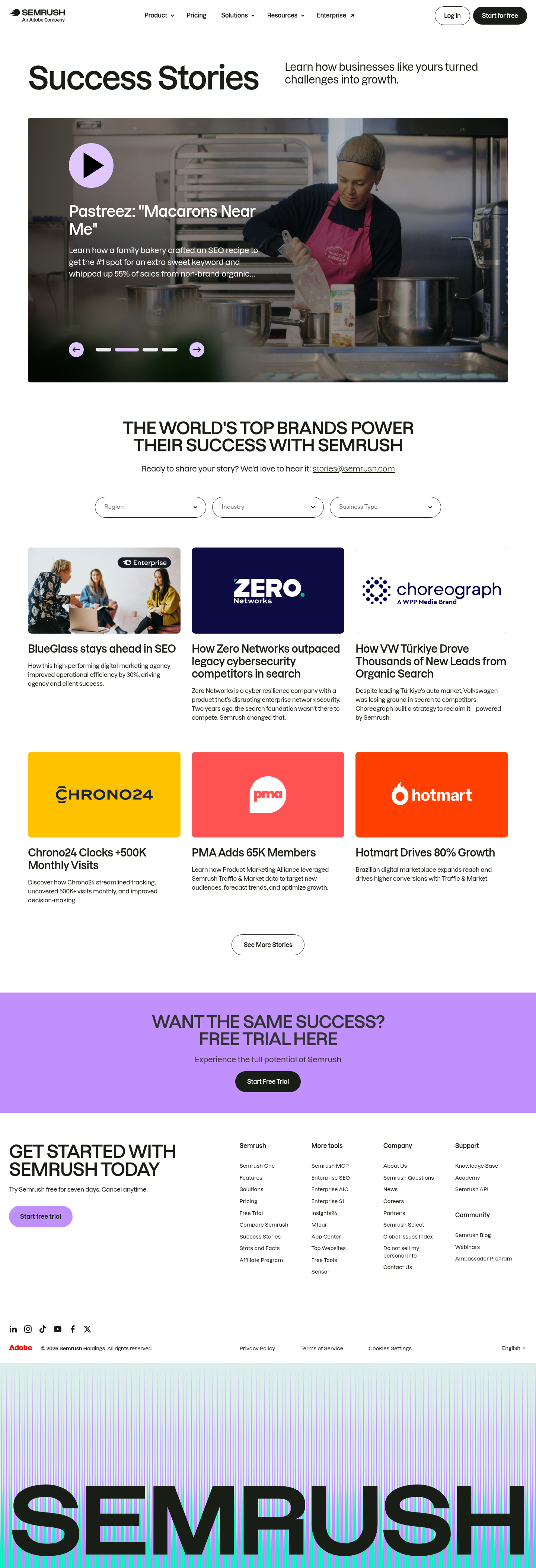
# Semrush: Lilac Controls Driving a Story-First Case Study Page

## Overview

Semrush presents an authoritative, data-forward brand with minimal chrome and high-contrast typography. The page is spacious rather than dense, with large headlines, generous section spacing, and a single violet accent to guide interactions. Audience is marketers and operators comparing outcomes; tone is confident and instructional. When no token applies, prefer white surfaces, ink text, and lilac/violet for interactive cues.

## Colors

- Primary (#181e15): Deep ink for headlines and core text.
- Secondary (#c499f5): Soft lilac for subtle interactive cues and secondary highlights.
- Tertiary (#c190ff): Vivid violet for primary actions, carousels, and media controls.
- Neutral (#ffffff): Paper-white surfaces and reversed text on dark imagery.
- Border (#e5e7eb): Light gray dividers and card outlines; replaces shadows.
- Brand-jubilee (#785f9b): Plum accent for brand-forward moments and emphasis text.
- Surface (#ffffff): Default page background; keep large regions clean.
- On-surface (#181e15): Default text color on white or light surfaces.

## Typography

- Inter (Google, free): Used for the largest headline tier (headline-lg 84px, 700, 1.2). It anchors page hierarchy and navigation labels where needed. Since it's loadable, use Inter wherever system access to Lazzer is unavailable.
- Lazzer (custom/self-hosted): Defines headline-md 64px/600/1.44/-0.053em, headline-sm 48px/600/1.21/-0.012em, headline-xs 37px/600/1.24/-0.05em, and body-md 28px/500/1.5/-0.02em. An agent cannot load this font directly.
- Substitutes for Lazzer: Prefer Manrope, Plus Jakarta Sans, or Outfit (all free Google families) for similar geometric sans proportions and clean counters. Keep the specified sizes, weights, and tracking to preserve rhythm.

## Layout

Spacing is a short, practical scale: 6, 16, 30, 60, 100. Use xs (6px) for icon and chip gaps; sm (16px) for card padding and inline control gutters; md (30px) for column gaps and standard block spacing; lg (60px) for section padding; xl (100px) for hero and major section tops/bottoms. A simple grid with generous outer gutters matches the story grid; align card tiles to equal column widths and keep vertical rhythm in 30px increments.

## Elevation & Depth

All measured shadows are none. Hierarchy comes from size, weight, and tonal contrast, with #e5e7eb borders separating tiles and filters. Use white blocks against imagery and slight image darkening for overlay text; avoid drop shadows. Emphasize interactivity through the violet accent rather than elevation.

## Shapes

Two radii set the language: sm 8px for structural components (cards, imagery masks) and full 9999px for interactive pills (buttons, filters, pagination dots). Reserve full pills for tap targets and controls to keep the silhouette consistent.

## Components

Buttons
- Primary: Background #c190ff, text #181e15, height 58px, padding 21px 30px, full radius. Use for key CTAs.
- Secondary: Text #181e15, no fill by default, height 58px, padding 21px 30px, full radius. Pair with links or lower-emphasis actions.
- Link: Text #181e15, radius 0; use inline with body copy.

Card
- Background #ffffff, text #181e15, 8px radius, 16px padding, border #e5e7eb when separation is needed. No shadow.

### Case Study Hero Carousel
- Full-width media slide with left-aligned text stack. Play control uses a circular button sized to the 58px control spec, filled #c190ff with icon in #181e15. Pagination dots and active state use #c190ff; inactive dots use #e5e7eb. Headline in Inter 84px or Lazzer 64px per layout.

### Filter Bar
- Three pill filters (Region, Industry, Business Type). Use full 9999px radius, 16px horizontal padding, 30px horizontal gaps, border #e5e7eb, text #181e15. Active filter uses #c190ff text/icon or a subtle fill.

### Story Tile
- 8px image mask, 16px content padding, optional border #e5e7eb. Title in Lazzer 48px/600 (substitute if unavailable), summary in 28px/500. Links and chevrons pick up #c190ff on hover.

### Brand Credibility Header
- All-caps or tight-tracked line at headline-xs (37px, -0.05em) centered, with ample 60–100px vertical spacing. No shadow or gradient.

### Mid-page CTA Panel
- Compact banner with headline-sm (48px/600) and a primary button. White background, #e5e7eb border top/bottom, button in #c190ff with full radius.

### Contact Strip
- Single line with mailto link. Body-md 28px/500, link styled as button-link (no radius) but may adopt #c190ff on hover for continuity.

## Do's and Don'ts

- Do reserve #c190ff for interactive controls, primary CTAs, and carousel states; keep general text in #181e15.
- Do use the spacing scale in multiples (30/60/100) to separate sections; avoid ad-hoc gaps.
- Do keep buttons at 58px height with full radius; mixing radii weakens recognition.
- Don't introduce shadows; use #e5e7eb borders or whitespace to separate cards.
- Don't stack more than two CTA styles in one viewport; pick primary (#c190ff fill) plus a text link.
- Don't reduce headline sizes without adjusting tracking; negative letter-spacing is intentional at each level.

## Agent Prompt Guide

Quick color reference — text: #181e15, background: #ffffff, border: #e5e7eb, accent: #c190ff (secondary lilac #c499f5, plum #785f9b).

1) Build a case-study hero
- Container: max 1200px, padding-top/bottom 100px (#ffffff).
- H1: Inter, 84px, 700, line-height 1.2, color #181e15.
- Media slide with dark overlay; caption over image uses color #ffffff.
- Play button: 58px circle, fill #c190ff, icon color #181e15.
- Pagination dots: 8px circles; active #c190ff, inactive #e5e7eb. Section gap below: 60px.

2) Create a filter bar
- Three pills: height 40–44px, horizontal padding 16–20px, gap 30px.
- Typeface for labels: Manrope (as Lazzer substitute), 16–18px, 600, color #181e15.
- Borders: 1px #e5e7eb; active pill: background #c499f5 or text accent #c190ff.
- Radii: 9999px.

3) Story grid of cards
- Grid: 3 columns, column-gap 30px, row-gap 30px, outer padding 60px.
- Card: background #ffffff, 1px border #e5e7eb, radius 8px, padding 16px.
- Title: Plus Jakarta Sans 48px, 600, line-height 1.21, letter-spacing -0.012em (Lazzer substitute), color #181e15.
- Summary: Plus Jakarta Sans 28px, 500, line-height 1.5, color #181e15.
- Link on hover: color #c190ff.

4) Mid-page CTA panel
- Container: padding 60px top/bottom, border-top/bottom 1px #e5e7eb.
- Headline: Outfit 37px, 600, letter-spacing -0.05em (Lazzer substitute), color #181e15.
- Primary button: height 58px, padding 21px 30px, radius 9999px, background #c190ff, text #181e15.

5) Footer CTA
- Background #ffffff, padding 60px.
- Headline: Inter 64px, 700, line-height 1.2, color #181e15.
- Button-secondary: text #181e15, height 58px, padding 21px 30px, radius 9999px; pair with a button-link (text #181e15).

## Similar Brands

- Ahrefs — Similar spare, content-led case studies with strong typographic hierarchy; Ahrefs leans blue where Semrush uses violet.
- Moz — Education-forward marketing site with large headlines and clean cards; Moz uses more illustration and softer radii.
- HubSpot — Story-driven marketing with pill buttons and border-based sections; warmer palette and heavier use of gradients.
- Shopify — Minimal surfaces, bold headlines, and grid-led storytelling; Shopify's green accent replaces Semrush's violet.
- Notion — Monochrome-first interface with selective accent usage; more ultra-minimal and type-centric than Semrush.

## Tokens

### CSS custom properties

```css
:root {
  /* Colors */
  --color-primary: #181e15;
  --color-secondary: #c499f5;
  --color-tertiary: #c190ff;
  --color-neutral: #ffffff;
  --color-border: #e5e7eb;
  --color-brand-jubilee: #785f9b;
  --color-surface: var(--color-neutral);
  --color-on-surface: var(--color-primary);

  /* Typography */
  --text-headline-lg-size: 84px;
  --text-headline-lg-weight: 700;
  --text-headline-lg-leading: 1.2;
  --text-headline-md-size: 64px;
  --text-headline-md-weight: 600;
  --text-headline-md-leading: 1.44;
  --text-headline-md-tracking: -0.053em;
  --text-headline-sm-size: 48px;
  --text-headline-sm-weight: 600;
  --text-headline-sm-leading: 1.21;
  --text-headline-sm-tracking: -0.012em;
  --text-headline-xs-size: 37px;
  --text-headline-xs-weight: 600;
  --text-headline-xs-leading: 1.24;
  --text-headline-xs-tracking: -0.05em;
  --text-body-md-size: 28px;
  --text-body-md-weight: 500;
  --text-body-md-leading: 1.5;
  --text-body-md-tracking: -0.02em;
  --font-inter: "Inter";
  --font-lazzer: "Lazzer";

  /* Rounded */
  --radius-sm: 8px;
  --radius-full: 9999px;

  /* Spacing */
  --spacing-xs: 6px;
  --spacing-sm: 16px;
  --spacing-md: 30px;
  --spacing-lg: 60px;
  --spacing-xl: 100px;

  /* Components */
  --button-primary-background-color: var(--color-tertiary);
  --button-primary-text-color: var(--color-primary);
  --button-primary-rounded: var(--radius-full);
  --button-primary-padding: 21px 30px;
  --button-primary-height: 58px;
  --button-secondary-text-color: var(--color-primary);
  --button-secondary-rounded: var(--radius-full);
  --button-secondary-padding: 21px 30px;
  --button-secondary-height: 58px;
  --button-link-text-color: var(--color-primary);
  --button-link-rounded: 0px;
  --card-background-color: var(--color-neutral);
  --card-text-color: var(--color-primary);
  --card-rounded: var(--radius-sm);
  --card-padding: 16px;
}
```

### Tailwind theme

```css
@theme {
  --color-primary: #181e15;
  --color-secondary: #c499f5;
  --color-tertiary: #c190ff;
  --color-neutral: #ffffff;
  --color-border: #e5e7eb;
  --color-brand-jubilee: #785f9b;
  --color-surface: #ffffff;
  --color-on-surface: #181e15;
  --font-headline-lg: "Inter";
  --font-headline-md: "Lazzer";
  --font-headline-sm: "Lazzer";
  --font-headline-xs: "Lazzer";
  --font-body-md: "Lazzer";
  --text-headline-lg: 84px;
  --text-headline-md: 64px;
  --text-headline-sm: 48px;
  --text-headline-xs: 37px;
  --text-body-md: 28px;
  --tracking-headline-md: -0.053em;
  --tracking-headline-sm: -0.012em;
  --tracking-headline-xs: -0.05em;
  --tracking-body-md: -0.02em;
  --font-weight-headline-lg: 700;
  --font-weight-headline-md: 600;
  --font-weight-headline-sm: 600;
  --font-weight-headline-xs: 600;
  --font-weight-body-md: 500;
  --radius-sm: 8px;
  --radius-full: 9999px;
  --spacing-xs: 6px;
  --spacing-sm: 16px;
  --spacing-md: 30px;
  --spacing-lg: 60px;
  --spacing-xl: 100px;
}
```

### Design tokens (DTCG)

```json
{
    "$schema": "https://www.designtokens.org/schemas/2025.10/format.json",
    "color": {
        "$type": "color",
        "primary": {
            "$value": {
                "colorSpace": "srgb",
                "components": [
                    0.094,
                    0.118,
                    0.082
                ],
                "hex": "#181e15"
            }
        },
        "secondary": {
            "$value": {
                "colorSpace": "srgb",
                "components": [
                    0.769,
                    0.6,
                    0.961
                ],
                "hex": "#c499f5"
            }
        },
        "tertiary": {
            "$value": {
                "colorSpace": "srgb",
                "components": [
                    0.757,
                    0.565,
                    1
                ],
                "hex": "#c190ff"
            }
        },
        "neutral": {
            "$value": {
                "colorSpace": "srgb",
                "components": [
                    1,
                    1,
                    1
                ],
                "hex": "#ffffff"
            }
        },
        "border": {
            "$value": {
                "colorSpace": "srgb",
                "components": [
                    0.898,
                    0.906,
                    0.922
                ],
                "hex": "#e5e7eb"
            }
        },
        "brand-jubilee": {
            "$value": {
                "colorSpace": "srgb",
                "components": [
                    0.471,
                    0.373,
                    0.608
                ],
                "hex": "#785f9b"
            }
        },
        "surface": {
            "$value": {
                "colorSpace": "srgb",
                "components": [
                    1,
                    1,
                    1
                ],
                "hex": "#ffffff"
            }
        },
        "on-surface": {
            "$value": {
                "colorSpace": "srgb",
                "components": [
                    0.094,
                    0.118,
                    0.082
                ],
                "hex": "#181e15"
            }
        }
    },
    "spacing": {
        "$type": "dimension",
        "xs": {
            "$value": {
                "value": 6,
                "unit": "px"
            }
        },
        "sm": {
            "$value": {
                "value": 16,
                "unit": "px"
            }
        },
        "md": {
            "$value": {
                "value": 30,
                "unit": "px"
            }
        },
        "lg": {
            "$value": {
                "value": 60,
                "unit": "px"
            }
        },
        "xl": {
            "$value": {
                "value": 100,
                "unit": "px"
            }
        }
    },
    "rounded": {
        "$type": "dimension",
        "sm": {
            "$value": {
                "value": 8,
                "unit": "px"
            }
        },
        "full": {
            "$value": {
                "value": 9999,
                "unit": "px"
            }
        }
    },
    "typography": {
        "headline-lg": {
            "$type": "typography",
            "$value": {
                "fontFamily": "Inter",
                "fontSize": {
                    "value": 84,
                    "unit": "px"
                },
                "fontWeight": 700
            }
        },
        "headline-md": {
            "$type": "typography",
            "$value": {
                "fontFamily": "Lazzer",
                "fontSize": {
                    "value": 64,
                    "unit": "px"
                },
                "fontWeight": 600,
                "letterSpacing": {
                    "value": -0.053,
                    "unit": "em"
                }
            }
        },
        "headline-sm": {
            "$type": "typography",
            "$value": {
                "fontFamily": "Lazzer",
                "fontSize": {
                    "value": 48,
                    "unit": "px"
                },
                "fontWeight": 600,
                "letterSpacing": {
                    "value": -0.012,
                    "unit": "em"
                }
            }
        },
        "headline-xs": {
            "$type": "typography",
            "$value": {
                "fontFamily": "Lazzer",
                "fontSize": {
                    "value": 37,
                    "unit": "px"
                },
                "fontWeight": 600,
                "letterSpacing": {
                    "value": -0.05,
                    "unit": "em"
                }
            }
        },
        "body-md": {
            "$type": "typography",
            "$value": {
                "fontFamily": "Lazzer",
                "fontSize": {
                    "value": 28,
                    "unit": "px"
                },
                "fontWeight": 500,
                "letterSpacing": {
                    "value": -0.02,
                    "unit": "em"
                }
            }
        }
    }
}
```

## Rules

- **Fonts.** If the specification names a custom or self-hosted family, use one of the substitutes it names. Never reference a typeface you cannot actually load — it will fall back to a system font and undo the typography.
- **Colour.** Derive the palette from the user's brand. Use the token values as a guide to *relationships* — contrast, tint, how many accents carry the page — not as hex codes to paste.
- **Never reproduce** the wordmark, mascot, logo, brand name, illustrations, icon set, screenshots or any copy from the reference.
- **Never present the result as Semrush About**, or imply any connection to it.
- If something is unspecified, choose clarity and legibility over decoration.
---
version: alpha
name: Semrush
description: "Get Your Ticket Now: One day. Real strategies. Built for marketers who play to win."
colors:
  primary: "#181e15"
  secondary: "#c499f5"
  tertiary: "#c190ff"
  neutral: "#ffffff"
  border: "#e5e7eb"
  brand-jubilee: "#785f9b"
  surface: "{colors.neutral}"
  on-surface: "{colors.primary}"
typography:
  headline-lg:
    fontFamily: Inter
    fontSize: 84px
    fontWeight: 700
    lineHeight: 1.2
  headline-md:
    fontFamily: Lazzer
    fontSize: 64px
    fontWeight: 600
    lineHeight: 1.44
    letterSpacing: -0.053em
  headline-sm:
    fontFamily: Lazzer
    fontSize: 48px
    fontWeight: 600
    lineHeight: 1.21
    letterSpacing: -0.012em
  headline-xs:
    fontFamily: Lazzer
    fontSize: 37px
    fontWeight: 600
    lineHeight: 1.24
    letterSpacing: -0.05em
  body-md:
    fontFamily: Lazzer
    fontSize: 28px
    fontWeight: 500
    lineHeight: 1.5
    letterSpacing: -0.02em
rounded:
  sm: 8px
  full: 9999px
spacing:
  xs: 6px
  sm: 16px
  md: 30px
  lg: 60px
  xl: 100px
components:
  button-primary:
    backgroundColor: "{colors.tertiary}"
    textColor: "{colors.primary}"
    rounded: "{rounded.full}"
    padding: 21px 30px
    height: 58px
  button-secondary:
    textColor: "{colors.primary}"
    rounded: "{rounded.full}"
    padding: 21px 30px
    height: 58px
  button-link:
    textColor: "{colors.primary}"
    rounded: 0px
  card:
    backgroundColor: "{colors.neutral}"
    textColor: "{colors.primary}"
    rounded: "{rounded.sm}"
    padding: 16px
---

# Semrush: Lilac Controls Driving a Story-First Case Study Page

## Overview

Semrush presents an authoritative, data-forward brand with minimal chrome and high-contrast typography. The page is spacious rather than dense, with large headlines, generous section spacing, and a single violet accent to guide interactions. Audience is marketers and operators comparing outcomes; tone is confident and instructional. When no token applies, prefer white surfaces, ink text, and lilac/violet for interactive cues.

## Colors

- Primary (#181e15): Deep ink for headlines and core text.
- Secondary (#c499f5): Soft lilac for subtle interactive cues and secondary highlights.
- Tertiary (#c190ff): Vivid violet for primary actions, carousels, and media controls.
- Neutral (#ffffff): Paper-white surfaces and reversed text on dark imagery.
- Border (#e5e7eb): Light gray dividers and card outlines; replaces shadows.
- Brand-jubilee (#785f9b): Plum accent for brand-forward moments and emphasis text.
- Surface (#ffffff): Default page background; keep large regions clean.
- On-surface (#181e15): Default text color on white or light surfaces.

## Typography

- Inter (Google, free): Used for the largest headline tier (headline-lg 84px, 700, 1.2). It anchors page hierarchy and navigation labels where needed. Since it's loadable, use Inter wherever system access to Lazzer is unavailable.
- Lazzer (custom/self-hosted): Defines headline-md 64px/600/1.44/-0.053em, headline-sm 48px/600/1.21/-0.012em, headline-xs 37px/600/1.24/-0.05em, and body-md 28px/500/1.5/-0.02em. An agent cannot load this font directly.
- Substitutes for Lazzer: Prefer Manrope, Plus Jakarta Sans, or Outfit (all free Google families) for similar geometric sans proportions and clean counters. Keep the specified sizes, weights, and tracking to preserve rhythm.

## Layout

Spacing is a short, practical scale: 6, 16, 30, 60, 100. Use xs (6px) for icon and chip gaps; sm (16px) for card padding and inline control gutters; md (30px) for column gaps and standard block spacing; lg (60px) for section padding; xl (100px) for hero and major section tops/bottoms. A simple grid with generous outer gutters matches the story grid; align card tiles to equal column widths and keep vertical rhythm in 30px increments.

## Elevation & Depth

All measured shadows are none. Hierarchy comes from size, weight, and tonal contrast, with #e5e7eb borders separating tiles and filters. Use white blocks against imagery and slight image darkening for overlay text; avoid drop shadows. Emphasize interactivity through the violet accent rather than elevation.

## Shapes

Two radii set the language: sm 8px for structural components (cards, imagery masks) and full 9999px for interactive pills (buttons, filters, pagination dots). Reserve full pills for tap targets and controls to keep the silhouette consistent.

## Components

Buttons
- Primary: Background #c190ff, text #181e15, height 58px, padding 21px 30px, full radius. Use for key CTAs.
- Secondary: Text #181e15, no fill by default, height 58px, padding 21px 30px, full radius. Pair with links or lower-emphasis actions.
- Link: Text #181e15, radius 0; use inline with body copy.

Card
- Background #ffffff, text #181e15, 8px radius, 16px padding, border #e5e7eb when separation is needed. No shadow.

### Case Study Hero Carousel
- Full-width media slide with left-aligned text stack. Play control uses a circular button sized to the 58px control spec, filled #c190ff with icon in #181e15. Pagination dots and active state use #c190ff; inactive dots use #e5e7eb. Headline in Inter 84px or Lazzer 64px per layout.

### Filter Bar
- Three pill filters (Region, Industry, Business Type). Use full 9999px radius, 16px horizontal padding, 30px horizontal gaps, border #e5e7eb, text #181e15. Active filter uses #c190ff text/icon or a subtle fill.

### Story Tile
- 8px image mask, 16px content padding, optional border #e5e7eb. Title in Lazzer 48px/600 (substitute if unavailable), summary in 28px/500. Links and chevrons pick up #c190ff on hover.

### Brand Credibility Header
- All-caps or tight-tracked line at headline-xs (37px, -0.05em) centered, with ample 60–100px vertical spacing. No shadow or gradient.

### Mid-page CTA Panel
- Compact banner with headline-sm (48px/600) and a primary button. White background, #e5e7eb border top/bottom, button in #c190ff with full radius.

### Contact Strip
- Single line with mailto link. Body-md 28px/500, link styled as button-link (no radius) but may adopt #c190ff on hover for continuity.

## Do's and Don'ts

- Do reserve #c190ff for interactive controls, primary CTAs, and carousel states; keep general text in #181e15.
- Do use the spacing scale in multiples (30/60/100) to separate sections; avoid ad-hoc gaps.
- Do keep buttons at 58px height with full radius; mixing radii weakens recognition.
- Don't introduce shadows; use #e5e7eb borders or whitespace to separate cards.
- Don't stack more than two CTA styles in one viewport; pick primary (#c190ff fill) plus a text link.
- Don't reduce headline sizes without adjusting tracking; negative letter-spacing is intentional at each level.

## Agent Prompt Guide

Quick color reference — text: #181e15, background: #ffffff, border: #e5e7eb, accent: #c190ff (secondary lilac #c499f5, plum #785f9b).

1) Build a case-study hero
- Container: max 1200px, padding-top/bottom 100px (#ffffff).
- H1: Inter, 84px, 700, line-height 1.2, color #181e15.
- Media slide with dark overlay; caption over image uses color #ffffff.
- Play button: 58px circle, fill #c190ff, icon color #181e15.
- Pagination dots: 8px circles; active #c190ff, inactive #e5e7eb. Section gap below: 60px.

2) Create a filter bar
- Three pills: height 40–44px, horizontal padding 16–20px, gap 30px.
- Typeface for labels: Manrope (as Lazzer substitute), 16–18px, 600, color #181e15.
- Borders: 1px #e5e7eb; active pill: background #c499f5 or text accent #c190ff.
- Radii: 9999px.

3) Story grid of cards
- Grid: 3 columns, column-gap 30px, row-gap 30px, outer padding 60px.
- Card: background #ffffff, 1px border #e5e7eb, radius 8px, padding 16px.
- Title: Plus Jakarta Sans 48px, 600, line-height 1.21, letter-spacing -0.012em (Lazzer substitute), color #181e15.
- Summary: Plus Jakarta Sans 28px, 500, line-height 1.5, color #181e15.
- Link on hover: color #c190ff.

4) Mid-page CTA panel
- Container: padding 60px top/bottom, border-top/bottom 1px #e5e7eb.
- Headline: Outfit 37px, 600, letter-spacing -0.05em (Lazzer substitute), color #181e15.
- Primary button: height 58px, padding 21px 30px, radius 9999px, background #c190ff, text #181e15.

5) Footer CTA
- Background #ffffff, padding 60px.
- Headline: Inter 64px, 700, line-height 1.2, color #181e15.
- Button-secondary: text #181e15, height 58px, padding 21px 30px, radius 9999px; pair with a button-link (text #181e15).

## Similar Brands

- Ahrefs — Similar spare, content-led case studies with strong typographic hierarchy; Ahrefs leans blue where Semrush uses violet.
- Moz — Education-forward marketing site with large headlines and clean cards; Moz uses more illustration and softer radii.
- HubSpot — Story-driven marketing with pill buttons and border-based sections; warmer palette and heavier use of gradients.
- Shopify — Minimal surfaces, bold headlines, and grid-led storytelling; Shopify's green accent replaces Semrush's violet.
- Notion — Monochrome-first interface with selective accent usage; more ultra-minimal and type-centric than Semrush.
:root {
  /* Colors */
  --color-primary: #181e15;
  --color-secondary: #c499f5;
  --color-tertiary: #c190ff;
  --color-neutral: #ffffff;
  --color-border: #e5e7eb;
  --color-brand-jubilee: #785f9b;
  --color-surface: var(--color-neutral);
  --color-on-surface: var(--color-primary);

  /* Typography */
  --text-headline-lg-size: 84px;
  --text-headline-lg-weight: 700;
  --text-headline-lg-leading: 1.2;
  --text-headline-md-size: 64px;
  --text-headline-md-weight: 600;
  --text-headline-md-leading: 1.44;
  --text-headline-md-tracking: -0.053em;
  --text-headline-sm-size: 48px;
  --text-headline-sm-weight: 600;
  --text-headline-sm-leading: 1.21;
  --text-headline-sm-tracking: -0.012em;
  --text-headline-xs-size: 37px;
  --text-headline-xs-weight: 600;
  --text-headline-xs-leading: 1.24;
  --text-headline-xs-tracking: -0.05em;
  --text-body-md-size: 28px;
  --text-body-md-weight: 500;
  --text-body-md-leading: 1.5;
  --text-body-md-tracking: -0.02em;
  --font-inter: "Inter";
  --font-lazzer: "Lazzer";

  /* Rounded */
  --radius-sm: 8px;
  --radius-full: 9999px;

  /* Spacing */
  --spacing-xs: 6px;
  --spacing-sm: 16px;
  --spacing-md: 30px;
  --spacing-lg: 60px;
  --spacing-xl: 100px;

  /* Components */
  --button-primary-background-color: var(--color-tertiary);
  --button-primary-text-color: var(--color-primary);
  --button-primary-rounded: var(--radius-full);
  --button-primary-padding: 21px 30px;
  --button-primary-height: 58px;
  --button-secondary-text-color: var(--color-primary);
  --button-secondary-rounded: var(--radius-full);
  --button-secondary-padding: 21px 30px;
  --button-secondary-height: 58px;
  --button-link-text-color: var(--color-primary);
  --button-link-rounded: 0px;
  --card-background-color: var(--color-neutral);
  --card-text-color: var(--color-primary);
  --card-rounded: var(--radius-sm);
  --card-padding: 16px;
}
{
  "$schema": "https://www.designtokens.org/schemas/2025.10/format.json",
  "$description": "Get Your Ticket Now: One day. Real strategies. Built for marketers who play to win.",
  "color": {
    "$type": "color",
    "primary": {
      "$value": {
        "colorSpace": "srgb",
        "components": [
          0.094,
          0.118,
          0.082
        ],
        "hex": "#181e15"
      }
    },
    "secondary": {
      "$value": {
        "colorSpace": "srgb",
        "components": [
          0.769,
          0.6,
          0.961
        ],
        "hex": "#c499f5"
      }
    },
    "tertiary": {
      "$value": {
        "colorSpace": "srgb",
        "components": [
          0.757,
          0.565,
          1
        ],
        "hex": "#c190ff"
      }
    },
    "neutral": {
      "$value": {
        "colorSpace": "srgb",
        "components": [
          1,
          1,
          1
        ],
        "hex": "#ffffff"
      }
    },
    "border": {
      "$value": {
        "colorSpace": "srgb",
        "components": [
          0.898,
          0.906,
          0.922
        ],
        "hex": "#e5e7eb"
      }
    },
    "brand-jubilee": {
      "$value": {
        "colorSpace": "srgb",
        "components": [
          0.471,
          0.373,
          0.608
        ],
        "hex": "#785f9b"
      }
    },
    "surface": {
      "$value": {
        "colorSpace": "srgb",
        "components": [
          1,
          1,
          1
        ],
        "hex": "#ffffff"
      }
    },
    "on-surface": {
      "$value": {
        "colorSpace": "srgb",
        "components": [
          0.094,
          0.118,
          0.082
        ],
        "hex": "#181e15"
      }
    }
  },
  "spacing": {
    "$type": "dimension",
    "xs": {
      "$value": {
        "value": 6,
        "unit": "px"
      }
    },
    "sm": {
      "$value": {
        "value": 16,
        "unit": "px"
      }
    },
    "md": {
      "$value": {
        "value": 30,
        "unit": "px"
      }
    },
    "lg": {
      "$value": {
        "value": 60,
        "unit": "px"
      }
    },
    "xl": {
      "$value": {
        "value": 100,
        "unit": "px"
      }
    }
  },
  "rounded": {
    "$type": "dimension",
    "sm": {
      "$value": {
        "value": 8,
        "unit": "px"
      }
    },
    "full": {
      "$value": {
        "value": 9999,
        "unit": "px"
      }
    }
  },
  "typography": {
    "headline-lg": {
      "$type": "typography",
      "$value": {
        "fontFamily": "Inter",
        "fontSize": {
          "value": 84,
          "unit": "px"
        },
        "fontWeight": 700
      }
    },
    "headline-md": {
      "$type": "typography",
      "$value": {
        "fontFamily": "Lazzer",
        "fontSize": {
          "value": 64,
          "unit": "px"
        },
        "fontWeight": 600,
        "letterSpacing": {
          "value": -0.053,
          "unit": "em"
        }
      }
    },
    "headline-sm": {
      "$type": "typography",
      "$value": {
        "fontFamily": "Lazzer",
        "fontSize": {
          "value": 48,
          "unit": "px"
        },
        "fontWeight": 600,
        "letterSpacing": {
          "value": -0.012,
          "unit": "em"
        }
      }
    },
    "headline-xs": {
      "$type": "typography",
      "$value": {
        "fontFamily": "Lazzer",
        "fontSize": {
          "value": 37,
          "unit": "px"
        },
        "fontWeight": 600,
        "letterSpacing": {
          "value": -0.05,
          "unit": "em"
        }
      }
    },
    "body-md": {
      "$type": "typography",
      "$value": {
        "fontFamily": "Lazzer",
        "fontSize": {
          "value": 28,
          "unit": "px"
        },
        "fontWeight": 500,
        "letterSpacing": {
          "value": -0.02,
          "unit": "em"
        }
      }
    }
  }
}
@theme {
--color-primary: #181e15;
--color-secondary: #c499f5;
--color-tertiary: #c190ff;
--color-neutral: #ffffff;
--color-border: #e5e7eb;
--color-brand-jubilee: #785f9b;
--color-surface: #ffffff;
--color-on-surface: #181e15;
--font-headline-lg: "Inter";
--font-headline-md: "Lazzer";
--font-headline-sm: "Lazzer";
--font-headline-xs: "Lazzer";
--font-body-md: "Lazzer";
--text-headline-lg: 84px;
--text-headline-md: 64px;
--text-headline-sm: 48px;
--text-headline-xs: 37px;
--text-body-md: 28px;
--tracking-headline-md: -0.053em;
--tracking-headline-sm: -0.012em;
--tracking-headline-xs: -0.05em;
--tracking-body-md: -0.02em;
--font-weight-headline-lg: 700;
--font-weight-headline-md: 600;
--font-weight-headline-sm: 600;
--font-weight-headline-xs: 600;
--font-weight-body-md: 500;
--radius-sm: 8px;
--radius-full: 9999px;
--spacing-xs: 6px;
--spacing-sm: 16px;
--spacing-md: 30px;
--spacing-lg: 60px;
--spacing-xl: 100px;
} # Design brief: the Semrush About design language
Below is a complete design specification measured from a real, published web page. Use it as a design language for the user's product. It is not a page to reproduce.
## Reference images
- Full page: https://cdn.designmunk.com/2026/09/10154505/semrush-com-company-stories-featured.png
- Above the fold: https://cdn.designmunk.com/2026/09/10154505/semrush-com-company-stories-featured.png
- On DesignMunk: https://designmunk.com/semrush-about-page/
Study these for hierarchy, rhythm, spacing and density. Where an image and the written spec disagree, the spec wins: the tokens were read from the page's own CSS, the images are one rendering of it.
## Before you start
Ask the user what they are building, who it is for, and what brand assets they already have — name, colours, typefaces. Wait for their answers before writing anything. Everything below is then applied to their product, not to the reference.
## Design specification
# Semrush: Lilac Controls Driving a Story-First Case Study Page
## Overview
Semrush presents an authoritative, data-forward brand with minimal chrome and high-contrast typography. The page is spacious rather than dense, with large headlines, generous section spacing, and a single violet accent to guide interactions. Audience is marketers and operators comparing outcomes; tone is confident and instructional. When no token applies, prefer white surfaces, ink text, and lilac/violet for interactive cues.
## Colors
- Primary (#181e15): Deep ink for headlines and core text.
- Secondary (#c499f5): Soft lilac for subtle interactive cues and secondary highlights.
- Tertiary (#c190ff): Vivid violet for primary actions, carousels, and media controls.
- Neutral (#ffffff): Paper-white surfaces and reversed text on dark imagery.
- Border (#e5e7eb): Light gray dividers and card outlines; replaces shadows.
- Brand-jubilee (#785f9b): Plum accent for brand-forward moments and emphasis text.
- Surface (#ffffff): Default page background; keep large regions clean.
- On-surface (#181e15): Default text color on white or light surfaces.
## Typography
- Inter (Google, free): Used for the largest headline tier (headline-lg 84px, 700, 1.2). It anchors page hierarchy and navigation labels where needed. Since it's loadable, use Inter wherever system access to Lazzer is unavailable.
- Lazzer (custom/self-hosted): Defines headline-md 64px/600/1.44/-0.053em, headline-sm 48px/600/1.21/-0.012em, headline-xs 37px/600/1.24/-0.05em, and body-md 28px/500/1.5/-0.02em. An agent cannot load this font directly.
- Substitutes for Lazzer: Prefer Manrope, Plus Jakarta Sans, or Outfit (all free Google families) for similar geometric sans proportions and clean counters. Keep the specified sizes, weights, and tracking to preserve rhythm.
## Layout
Spacing is a short, practical scale: 6, 16, 30, 60, 100. Use xs (6px) for icon and chip gaps; sm (16px) for card padding and inline control gutters; md (30px) for column gaps and standard block spacing; lg (60px) for section padding; xl (100px) for hero and major section tops/bottoms. A simple grid with generous outer gutters matches the story grid; align card tiles to equal column widths and keep vertical rhythm in 30px increments.
## Elevation & Depth
All measured shadows are none. Hierarchy comes from size, weight, and tonal contrast, with #e5e7eb borders separating tiles and filters. Use white blocks against imagery and slight image darkening for overlay text; avoid drop shadows. Emphasize interactivity through the violet accent rather than elevation.
## Shapes
Two radii set the language: sm 8px for structural components (cards, imagery masks) and full 9999px for interactive pills (buttons, filters, pagination dots). Reserve full pills for tap targets and controls to keep the silhouette consistent.
## Components
Buttons
- Primary: Background #c190ff, text #181e15, height 58px, padding 21px 30px, full radius. Use for key CTAs.
- Secondary: Text #181e15, no fill by default, height 58px, padding 21px 30px, full radius. Pair with links or lower-emphasis actions.
- Link: Text #181e15, radius 0; use inline with body copy.
Card
- Background #ffffff, text #181e15, 8px radius, 16px padding, border #e5e7eb when separation is needed. No shadow.
### Case Study Hero Carousel
- Full-width media slide with left-aligned text stack. Play control uses a circular button sized to the 58px control spec, filled #c190ff with icon in #181e15. Pagination dots and active state use #c190ff; inactive dots use #e5e7eb. Headline in Inter 84px or Lazzer 64px per layout.
### Filter Bar
- Three pill filters (Region, Industry, Business Type). Use full 9999px radius, 16px horizontal padding, 30px horizontal gaps, border #e5e7eb, text #181e15. Active filter uses #c190ff text/icon or a subtle fill.
### Story Tile
- 8px image mask, 16px content padding, optional border #e5e7eb. Title in Lazzer 48px/600 (substitute if unavailable), summary in 28px/500. Links and chevrons pick up #c190ff on hover.
### Brand Credibility Header
- All-caps or tight-tracked line at headline-xs (37px, -0.05em) centered, with ample 60–100px vertical spacing. No shadow or gradient.
### Mid-page CTA Panel
- Compact banner with headline-sm (48px/600) and a primary button. White background, #e5e7eb border top/bottom, button in #c190ff with full radius.
### Contact Strip
- Single line with mailto link. Body-md 28px/500, link styled as button-link (no radius) but may adopt #c190ff on hover for continuity.
## Do's and Don'ts
- Do reserve #c190ff for interactive controls, primary CTAs, and carousel states; keep general text in #181e15.
- Do use the spacing scale in multiples (30/60/100) to separate sections; avoid ad-hoc gaps.
- Do keep buttons at 58px height with full radius; mixing radii weakens recognition.
- Don't introduce shadows; use #e5e7eb borders or whitespace to separate cards.
- Don't stack more than two CTA styles in one viewport; pick primary (#c190ff fill) plus a text link.
- Don't reduce headline sizes without adjusting tracking; negative letter-spacing is intentional at each level.
## Agent Prompt Guide
Quick color reference — text: #181e15, background: #ffffff, border: #e5e7eb, accent: #c190ff (secondary lilac #c499f5, plum #785f9b).
1) Build a case-study hero
- Container: max 1200px, padding-top/bottom 100px (#ffffff).
- H1: Inter, 84px, 700, line-height 1.2, color #181e15.
- Media slide with dark overlay; caption over image uses color #ffffff.
- Play button: 58px circle, fill #c190ff, icon color #181e15.
- Pagination dots: 8px circles; active #c190ff, inactive #e5e7eb. Section gap below: 60px.
2) Create a filter bar
- Three pills: height 40–44px, horizontal padding 16–20px, gap 30px.
- Typeface for labels: Manrope (as Lazzer substitute), 16–18px, 600, color #181e15.
- Borders: 1px #e5e7eb; active pill: background #c499f5 or text accent #c190ff.
- Radii: 9999px.
3) Story grid of cards
- Grid: 3 columns, column-gap 30px, row-gap 30px, outer padding 60px.
- Card: background #ffffff, 1px border #e5e7eb, radius 8px, padding 16px.
- Title: Plus Jakarta Sans 48px, 600, line-height 1.21, letter-spacing -0.012em (Lazzer substitute), color #181e15.
- Summary: Plus Jakarta Sans 28px, 500, line-height 1.5, color #181e15.
- Link on hover: color #c190ff.
4) Mid-page CTA panel
- Container: padding 60px top/bottom, border-top/bottom 1px #e5e7eb.
- Headline: Outfit 37px, 600, letter-spacing -0.05em (Lazzer substitute), color #181e15.
- Primary button: height 58px, padding 21px 30px, radius 9999px, background #c190ff, text #181e15.
5) Footer CTA
- Background #ffffff, padding 60px.
- Headline: Inter 64px, 700, line-height 1.2, color #181e15.
- Button-secondary: text #181e15, height 58px, padding 21px 30px, radius 9999px; pair with a button-link (text #181e15).
## Tokens
### CSS custom properties
```css
:root {
/* Colors */
--color-primary: #181e15;
--color-secondary: #c499f5;
--color-tertiary: #c190ff;
--color-neutral: #ffffff;
--color-border: #e5e7eb;
--color-brand-jubilee: #785f9b;
--color-surface: var(--color-neutral);
--color-on-surface: var(--color-primary);
/* Typography */
--text-headline-lg-size: 84px;
--text-headline-lg-weight: 700;
--text-headline-lg-leading: 1.2;
--text-headline-md-size: 64px;
--text-headline-md-weight: 600;
--text-headline-md-leading: 1.44;
--text-headline-md-tracking: -0.053em;
--text-headline-sm-size: 48px;
--text-headline-sm-weight: 600;
--text-headline-sm-leading: 1.21;
--text-headline-sm-tracking: -0.012em;
--text-headline-xs-size: 37px;
--text-headline-xs-weight: 600;
--text-headline-xs-leading: 1.24;
--text-headline-xs-tracking: -0.05em;
--text-body-md-size: 28px;
--text-body-md-weight: 500;
--text-body-md-leading: 1.5;
--text-body-md-tracking: -0.02em;
--font-inter: "Inter";
--font-lazzer: "Lazzer";
/* Rounded */
--radius-sm: 8px;
--radius-full: 9999px;
/* Spacing */
--spacing-xs: 6px;
--spacing-sm: 16px;
--spacing-md: 30px;
--spacing-lg: 60px;
--spacing-xl: 100px;
/* Components */
--button-primary-background-color: var(--color-tertiary);
--button-primary-text-color: var(--color-primary);
--button-primary-rounded: var(--radius-full);
--button-primary-padding: 21px 30px;
--button-primary-height: 58px;
--button-secondary-text-color: var(--color-primary);
--button-secondary-rounded: var(--radius-full);
--button-secondary-padding: 21px 30px;
--button-secondary-height: 58px;
--button-link-text-color: var(--color-primary);
--button-link-rounded: 0px;
--card-background-color: var(--color-neutral);
--card-text-color: var(--color-primary);
--card-rounded: var(--radius-sm);
--card-padding: 16px;
}
```
## Rules
- **Fonts.** If the specification names a custom or self-hosted family, use one of the substitutes it names. Never reference a typeface you cannot actually load — it will fall back to a system font and undo the typography.
- **Colour.** Derive the palette from the user's brand. Use the token values as a guide to *relationships* — contrast, tint, how many accents carry the page — not as hex codes to paste.
- **Never reproduce** the wordmark, mascot, logo, brand name, illustrations, icon set, screenshots or any copy from the reference.
- **Never present the result as Semrush About**, or imply any connection to it.
- If something is unspecified, choose clarity and legibility over decoration.