Self-Made Web Designer
selfmadewebdesigner.com
Turn frustration into freelancing success—become a web designer fast.
selfmadewebdesigner.com
AI Breakdown
Design export
# Design brief: the Self-Made Web Designer design language

Below is a complete design specification measured from a real, published web page. Use it as a design language for the user's product. It is not a page to reproduce.

## Reference images

- Full page: https://cdn.designmunk.com/2026/09/02092347/selfmadewebdesigner-com-featured.webp
- Above the fold: https://cdn.designmunk.com/2026/09/02092347/selfmadewebdesigner-com-featured.webp
- On DesignMunk: https://designmunk.com/self-made-web-designer/

Study these for hierarchy, rhythm, spacing and density. Where an image and the written spec disagree, the spec wins: the tokens were read from the page's own CSS, the images are one rendering of it.

## Before you start

Ask the user what they are building, who it is for, and what brand assets they already have — name, colours, typefaces. Wait for their answers before writing anything. Everything below is then applied to their product, not to the reference.

## Design specification

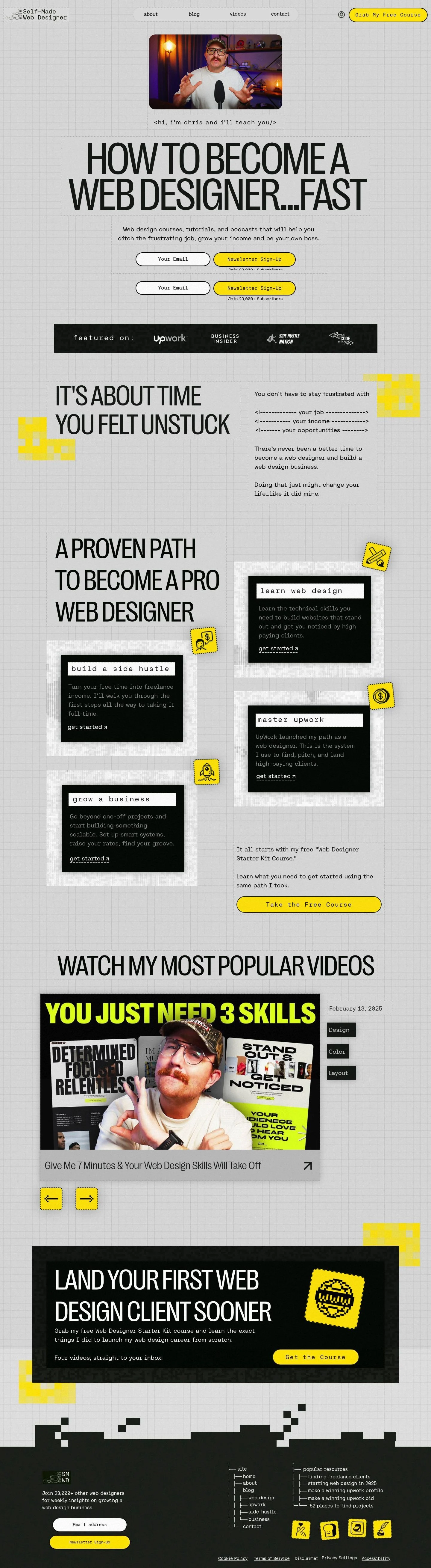
# Self-Made Web Designer: Yellow Pills on a Graph-Paper Grid

## Overview

Scrappy, practical, and fast. The interface should feel like a designer's notebook: light paper background, black ink, and a single signal color for actions. Copy is direct; layouts are instructional and modular. Density is medium — big display type with generous vertical rhythm (lg/xl) between sections and tight micro-gaps (xs/sm) inside components.

## Colors

- **primary (#000000):** Core ink for headlines, body text, outlines, and icons.
- **secondary (#241c24):** Deep accent for dark bands or subdued text; use sparingly.
- **tertiary (#ffe500):** Signal yellow for primary CTAs, badges, and attention flags.
- **neutral (#e0e0e0):** Paper-like surface for the page and cards.
- **surface (#e0e0e0):** Default container background; aligns with the site's paper backdrop.
- **on-surface (#000000):** Text and icon color on neutral surfaces.

## Typography

- Headline Display (headline-lg, 150px, 400, PP Right Grotesk Compact Regular): Ultra-condensed display for hero statements and section kickers. This is self-hosted/custom; agents should substitute Bebas Neue, Oswald, or Archivo Narrow for a similar condensed grotesk feel.
- Headline Secondary (headline-md, 91px, same family): Use for major section headers below the hero. Same substitution guidance as above.
- Mono Headline (headline-sm, 55px, Aeonik Mono Regular): Monospaced accent for code-styled lines, captions, and labeled callouts. Custom/self-hosted; substitute IBM Plex Mono, JetBrains Mono, or Space Mono.
- Serif Accent (headline-xs, 33px, Times New Roman): System serif for small titles and contrast notes; widely available.
- Body (body-md, 20px, Aeonik Fono Regular, 0.1em tracking): Primary paragraph and UI copy with generous letterspacing. Custom/self-hosted; substitute Inter, Plus Jakarta Sans, or Sora.

## Layout

Spacing follows a small–large cadence: xs/sm for micro-gaps in controls, md for card padding and between stacked elements, lg/xl for section breaks. Use a simple multi-column grid for content blocks (two to four columns depending on viewport). Keep ample outer margins; center key modules within neutral "cards" when grouping is needed. The page background reads as grid paper — align modules cleanly to maintain that workbook feel.

## Elevation & Depth

Depth is mostly ink and tone. Use the measured sm/md shadows sparingly on media (e.g., hero video) for lift; larger elevations are none. Hierarchy is clarified with: 1) black keylines, 2) neutral blocks against the paper background, and 3) big type scale changes. Prefer borders and whitespace over heavy blur.

## Shapes

Two radii define the language: 8px corners for cards, media, and images; 9999px pills for buttons, inputs, and badges. Roundness signals interactivity — if it's a pill, it's clickable or typable. Keep cards at 8px to remain structural, not playful.

## Components

Buttons
- Primary: background #ffe500, text #000501, 40px height, 5px 14px padding, full pill radius. Use for the main CTA in any view.
- Secondary: text #000000 on transparent or neutral background, 40px height, same padding, full pill radius. Consider a 1px #000000 keyline for definition.
- Link: text #000000, no radius, no fill; inline within copy or below cards.

Card
- Background #e0e0e0, text #000000, 16px padding, 8px radius. Add a subtle sm shadow or a 1px keyline when the card sits on the same neutral surface.

### Header with Pill CTA
- Left-aligned wordmark, inline links, and a right-aligned primary button ("Grab My Free Course"). Use body-md (20px) for links, full-radius #ffe500 button at 40px height.

### Hero Video + Code Caption
- Centered media with 8px radius and md shadow. Beneath it, a monospaced caption using headline-sm (55px) styled like a code tag.

### Hero Headline Block
- headline-lg at 150px, -0.04em tracking, black on neutral card. Keep generous top/bottom spacing (lg/xl) to let the headline breathe.

### Email Capture Bar
- Pill input at 40px height with a 1px #000000 outline beside a primary button. Use sm spacing between controls; include a small trust note ("Join 23,000+ Subscribers").

### Featured Logos Strip
- A full-width band with subdued logos and the label "featured on:". Use secondary (#241c24) or primary for the band; keep text in #000000 for contrast.

### Four-Step Path Grid
- Learn web design / Build a side hustle / Master Upwork / Grow a business. Four cards in a grid; each uses card tokens, a short paragraph in body-md, and a link-style "get started."

### Popular Videos List
- Stacked links with bold titles (headline-xs, 33px), date and small tags below. Keep tight xs/sm gaps between metadata lines.

### Client-Landing CTA Band
- Section header (headline-md or xs depending on space), supporting copy, and a primary CTA button. Maintain strong yellow emphasis and clear vertical rhythm.

## Do's and Don'ts

- Do reserve #ffe500 for the highest-priority CTAs; secondary actions should use outline or text-only treatments.
- Do pair condensed display type for headlines with mono accents for code-like notes; keep paragraphs in the body family at 20px.
- Do use 8px corners for structural cards and 9999px pills only for interactive controls.
- Don't place neutral cards directly on the same neutral without a shadow or 1px #000000 keyline; grouping will get lost.
- Don't introduce additional colors; the system relies on black, neutral paper, and one signal yellow.
- Don't overuse shadows; stop at md and prefer borders and spacing for hierarchy.

## Agent Prompt Guide

Quick color reference — Text: #000000, Background: #e0e0e0, Border: #000000, Accent/CTA: #ffe500.

1) Build a sticky header with nav and CTA
- Background: #e0e0e0. Links: 20px "Aeonik Fono Regular" (or Inter), color #000000. Right CTA: 40px height pill, padding 5px 14px, background #ffe500, text #000501, 1px #000000 border. Fonts: "PP Right Grotesk Compact Regular" (or Bebas Neue, Oswald) for any emphasis label.

2) Hero block with video, code caption, and big headline
- Place a 8px-radius media block with md shadow (rgba(0,0,0,0.5) 0 0 30px 0). Under it, mono caption in "Aeonik Mono Regular" (or IBM Plex Mono) at 20–24px styled like <code/>. Then set the headline at 150px, weight 400, letter-spacing -0.04em in "PP Right Grotesk Compact Regular" (or Bebas Neue). Background: #e0e0e0, text: #000000.

3) Email capture pill form
- Input: 40px height, full radius 9999px, 1px border #000000, background #e0e0e0, text #000000. Button: 40px height pill, #ffe500 fill, #000501 text. Gap between input and button: 10px (sm). Supporting note in 20px body with 0.1em tracking.

4) Four-card "Path" grid
- Each card: background #e0e0e0, 16px padding, 8px radius, optional sm shadow (rgba(0,0,0,0.2) 0 0 20px 0). Title in mono headline at 55px ("Aeonik Mono Regular" or IBM Plex Mono). Paragraph in 20px body. Link action as text-only (#000000).

5) Popular videos list
- Section title in 91px display ("PP Right Grotesk Compact Regular" or Oswald). Each item: clickable title at 33px "Times New Roman", metadata in 20px body. Use xs (6px) gaps between lines and md (26px) between items.

## Similar Brands

- Webflow University — Education-first layout with strong type hierarchy; WMU is more colorful and animated, whereas SMWD sticks to black, gray, and one yellow.
- SuperHi — Creative education with friendly modules; SuperHi leans on illustration and pastel color, this site on grid-paper texture and condensed type.
- Scrimba — Creator-led coding lessons; Scrimba uses darker themes and more video-driven thumbnails, SMWD opts for light surfaces and big headlines.
- DesignCourse — Personality-led design education; both rely on bold type and high-contrast CTAs, but this site's condensed display and mono accents are more pronounced.

## Tokens

### CSS custom properties

```css
:root {
  /* Colors */
  --color-primary: #000000;
  --color-secondary: #241c24;
  --color-tertiary: #ffe500;
  --color-neutral: #e0e0e0;
  --color-surface: var(--color-neutral);
  --color-on-surface: var(--color-primary);

  /* Typography */
  --text-headline-lg-size: 150px;
  --text-headline-lg-weight: 400;
  --text-headline-lg-leading: 1.2;
  --text-headline-lg-tracking: -0.04em;
  --text-headline-md-size: 91px;
  --text-headline-md-weight: 400;
  --text-headline-md-leading: 1.05;
  --text-headline-md-tracking: -0.032em;
  --text-headline-sm-size: 55px;
  --text-headline-sm-weight: 400;
  --text-headline-sm-leading: 1.2;
  --text-headline-sm-tracking: 0.044em;
  --text-headline-xs-size: 33px;
  --text-headline-xs-weight: 400;
  --text-headline-xs-leading: 1.21;
  --text-body-md-size: 20px;
  --text-body-md-weight: 400;
  --text-body-md-leading: 1.5;
  --text-body-md-tracking: 0.1em;
  --font-pp-right-grotesk-compact-regular: "PP Right Grotesk Compact Regular";
  --font-aeonik-mono-regular: "Aeonik Mono Regular";
  --font-times-new-roman: "Times New Roman";
  --font-aeonik-fono-regular: "Aeonik Fono Regular";

  /* Rounded */
  --radius-sm: 8px;
  --radius-full: 9999px;

  /* Spacing */
  --spacing-xs: 6px;
  --spacing-sm: 10px;
  --spacing-md: 26px;
  --spacing-lg: 54px;
  --spacing-xl: 58px;

  /* Components */
  --button-primary-background-color: var(--color-tertiary);
  --button-primary-text-color: #000501;
  --button-primary-rounded: var(--radius-full);
  --button-primary-padding: 5px 14px;
  --button-primary-height: 40px;
  --button-secondary-text-color: var(--color-primary);
  --button-secondary-rounded: var(--radius-full);
  --button-secondary-padding: 5px 14px;
  --button-secondary-height: 40px;
  --button-link-text-color: var(--color-primary);
  --button-link-rounded: 0px;
  --card-background-color: var(--color-neutral);
  --card-text-color: var(--color-primary);
  --card-rounded: var(--radius-sm);
  --card-padding: 16px;
}
```

### Tailwind theme

```css
@theme {
  --color-primary: #000000;
  --color-secondary: #241c24;
  --color-tertiary: #ffe500;
  --color-neutral: #e0e0e0;
  --color-surface: #e0e0e0;
  --color-on-surface: #000000;
  --font-headline-lg: "PP Right Grotesk Compact Regular";
  --font-headline-md: "PP Right Grotesk Compact Regular";
  --font-headline-sm: "Aeonik Mono Regular";
  --font-headline-xs: "Times New Roman";
  --font-body-md: "Aeonik Fono Regular";
  --text-headline-lg: 150px;
  --text-headline-md: 91px;
  --text-headline-sm: 55px;
  --text-headline-xs: 33px;
  --text-body-md: 20px;
  --tracking-headline-lg: -0.04em;
  --tracking-headline-md: -0.032em;
  --tracking-headline-sm: 0.044em;
  --tracking-body-md: 0.1em;
  --font-weight-headline-lg: 400;
  --font-weight-headline-md: 400;
  --font-weight-headline-sm: 400;
  --font-weight-headline-xs: 400;
  --font-weight-body-md: 400;
  --radius-sm: 8px;
  --radius-full: 9999px;
  --spacing-xs: 6px;
  --spacing-sm: 10px;
  --spacing-md: 26px;
  --spacing-lg: 54px;
  --spacing-xl: 58px;
}
```

### Design tokens (DTCG)

```json
{
    "$schema": "https://www.designtokens.org/schemas/2025.10/format.json",
    "color": {
        "$type": "color",
        "primary": {
            "$value": {
                "colorSpace": "srgb",
                "components": [
                    0,
                    0,
                    0
                ],
                "hex": "#000000"
            }
        },
        "secondary": {
            "$value": {
                "colorSpace": "srgb",
                "components": [
                    0.141,
                    0.11,
                    0.141
                ],
                "hex": "#241c24"
            }
        },
        "tertiary": {
            "$value": {
                "colorSpace": "srgb",
                "components": [
                    1,
                    0.898,
                    0
                ],
                "hex": "#ffe500"
            }
        },
        "neutral": {
            "$value": {
                "colorSpace": "srgb",
                "components": [
                    0.878,
                    0.878,
                    0.878
                ],
                "hex": "#e0e0e0"
            }
        },
        "surface": {
            "$value": {
                "colorSpace": "srgb",
                "components": [
                    0.878,
                    0.878,
                    0.878
                ],
                "hex": "#e0e0e0"
            }
        },
        "on-surface": {
            "$value": {
                "colorSpace": "srgb",
                "components": [
                    0,
                    0,
                    0
                ],
                "hex": "#000000"
            }
        }
    },
    "spacing": {
        "$type": "dimension",
        "xs": {
            "$value": {
                "value": 6,
                "unit": "px"
            }
        },
        "sm": {
            "$value": {
                "value": 10,
                "unit": "px"
            }
        },
        "md": {
            "$value": {
                "value": 26,
                "unit": "px"
            }
        },
        "lg": {
            "$value": {
                "value": 54,
                "unit": "px"
            }
        },
        "xl": {
            "$value": {
                "value": 58,
                "unit": "px"
            }
        }
    },
    "rounded": {
        "$type": "dimension",
        "sm": {
            "$value": {
                "value": 8,
                "unit": "px"
            }
        },
        "full": {
            "$value": {
                "value": 9999,
                "unit": "px"
            }
        }
    },
    "typography": {
        "headline-lg": {
            "$type": "typography",
            "$value": {
                "fontFamily": "PP Right Grotesk Compact Regular",
                "fontSize": {
                    "value": 150,
                    "unit": "px"
                },
                "fontWeight": 400,
                "letterSpacing": {
                    "value": -0.04,
                    "unit": "em"
                }
            }
        },
        "headline-md": {
            "$type": "typography",
            "$value": {
                "fontFamily": "PP Right Grotesk Compact Regular",
                "fontSize": {
                    "value": 91,
                    "unit": "px"
                },
                "fontWeight": 400,
                "letterSpacing": {
                    "value": -0.032,
                    "unit": "em"
                }
            }
        },
        "headline-sm": {
            "$type": "typography",
            "$value": {
                "fontFamily": "Aeonik Mono Regular",
                "fontSize": {
                    "value": 55,
                    "unit": "px"
                },
                "fontWeight": 400,
                "letterSpacing": {
                    "value": 0.044,
                    "unit": "em"
                }
            }
        },
        "headline-xs": {
            "$type": "typography",
            "$value": {
                "fontFamily": "Times New Roman",
                "fontSize": {
                    "value": 33,
                    "unit": "px"
                },
                "fontWeight": 400
            }
        },
        "body-md": {
            "$type": "typography",
            "$value": {
                "fontFamily": "Aeonik Fono Regular",
                "fontSize": {
                    "value": 20,
                    "unit": "px"
                },
                "fontWeight": 400,
                "letterSpacing": {
                    "value": 0.1,
                    "unit": "em"
                }
            }
        }
    }
}
```

## Rules

- **Fonts.** If the specification names a custom or self-hosted family, use one of the substitutes it names. Never reference a typeface you cannot actually load — it will fall back to a system font and undo the typography.
- **Colour.** Derive the palette from the user's brand. Use the token values as a guide to *relationships* — contrast, tint, how many accents carry the page — not as hex codes to paste.
- **Never reproduce** the wordmark, mascot, logo, brand name, illustrations, icon set, screenshots or any copy from the reference.
- **Never present the result as Self-Made Web Designer**, or imply any connection to it.
- If something is unspecified, choose clarity and legibility over decoration.
---
version: alpha
name: Self-Made Web Designer
description: Turn frustration into freelancing success—become a web designer fast.
colors:
  primary: "#000000"
  secondary: "#241c24"
  tertiary: "#ffe500"
  neutral: "#e0e0e0"
  surface: "{colors.neutral}"
  on-surface: "{colors.primary}"
typography:
  headline-lg:
    fontFamily: PP Right Grotesk Compact Regular
    fontSize: 150px
    fontWeight: 400
    lineHeight: 1.2
    letterSpacing: -0.04em
  headline-md:
    fontFamily: PP Right Grotesk Compact Regular
    fontSize: 91px
    fontWeight: 400
    lineHeight: 1.05
    letterSpacing: -0.032em
  headline-sm:
    fontFamily: Aeonik Mono Regular
    fontSize: 55px
    fontWeight: 400
    lineHeight: 1.2
    letterSpacing: 0.044em
  headline-xs:
    fontFamily: Times New Roman
    fontSize: 33px
    fontWeight: 400
    lineHeight: 1.21
  body-md:
    fontFamily: Aeonik Fono Regular
    fontSize: 20px
    fontWeight: 400
    lineHeight: 1.5
    letterSpacing: 0.1em
rounded:
  sm: 8px
  full: 9999px
spacing:
  xs: 6px
  sm: 10px
  md: 26px
  lg: 54px
  xl: 58px
components:
  button-primary:
    backgroundColor: "{colors.tertiary}"
    textColor: "#000501"
    rounded: "{rounded.full}"
    padding: 5px 14px
    height: 40px
  button-secondary:
    textColor: "{colors.primary}"
    rounded: "{rounded.full}"
    padding: 5px 14px
    height: 40px
  button-link:
    textColor: "{colors.primary}"
    rounded: 0px
  card:
    backgroundColor: "{colors.neutral}"
    textColor: "{colors.primary}"
    rounded: "{rounded.sm}"
    padding: 16px
---

# Self-Made Web Designer: Yellow Pills on a Graph-Paper Grid

## Overview

Scrappy, practical, and fast. The interface should feel like a designer's notebook: light paper background, black ink, and a single signal color for actions. Copy is direct; layouts are instructional and modular. Density is medium — big display type with generous vertical rhythm (lg/xl) between sections and tight micro-gaps (xs/sm) inside components.

## Colors

- **primary (#000000):** Core ink for headlines, body text, outlines, and icons.
- **secondary (#241c24):** Deep accent for dark bands or subdued text; use sparingly.
- **tertiary (#ffe500):** Signal yellow for primary CTAs, badges, and attention flags.
- **neutral (#e0e0e0):** Paper-like surface for the page and cards.
- **surface (#e0e0e0):** Default container background; aligns with the site's paper backdrop.
- **on-surface (#000000):** Text and icon color on neutral surfaces.

## Typography

- Headline Display (headline-lg, 150px, 400, PP Right Grotesk Compact Regular): Ultra-condensed display for hero statements and section kickers. This is self-hosted/custom; agents should substitute Bebas Neue, Oswald, or Archivo Narrow for a similar condensed grotesk feel.
- Headline Secondary (headline-md, 91px, same family): Use for major section headers below the hero. Same substitution guidance as above.
- Mono Headline (headline-sm, 55px, Aeonik Mono Regular): Monospaced accent for code-styled lines, captions, and labeled callouts. Custom/self-hosted; substitute IBM Plex Mono, JetBrains Mono, or Space Mono.
- Serif Accent (headline-xs, 33px, Times New Roman): System serif for small titles and contrast notes; widely available.
- Body (body-md, 20px, Aeonik Fono Regular, 0.1em tracking): Primary paragraph and UI copy with generous letterspacing. Custom/self-hosted; substitute Inter, Plus Jakarta Sans, or Sora.

## Layout

Spacing follows a small–large cadence: xs/sm for micro-gaps in controls, md for card padding and between stacked elements, lg/xl for section breaks. Use a simple multi-column grid for content blocks (two to four columns depending on viewport). Keep ample outer margins; center key modules within neutral "cards" when grouping is needed. The page background reads as grid paper — align modules cleanly to maintain that workbook feel.

## Elevation & Depth

Depth is mostly ink and tone. Use the measured sm/md shadows sparingly on media (e.g., hero video) for lift; larger elevations are none. Hierarchy is clarified with: 1) black keylines, 2) neutral blocks against the paper background, and 3) big type scale changes. Prefer borders and whitespace over heavy blur.

## Shapes

Two radii define the language: 8px corners for cards, media, and images; 9999px pills for buttons, inputs, and badges. Roundness signals interactivity — if it's a pill, it's clickable or typable. Keep cards at 8px to remain structural, not playful.

## Components

Buttons
- Primary: background #ffe500, text #000501, 40px height, 5px 14px padding, full pill radius. Use for the main CTA in any view.
- Secondary: text #000000 on transparent or neutral background, 40px height, same padding, full pill radius. Consider a 1px #000000 keyline for definition.
- Link: text #000000, no radius, no fill; inline within copy or below cards.

Card
- Background #e0e0e0, text #000000, 16px padding, 8px radius. Add a subtle sm shadow or a 1px keyline when the card sits on the same neutral surface.

### Header with Pill CTA
- Left-aligned wordmark, inline links, and a right-aligned primary button ("Grab My Free Course"). Use body-md (20px) for links, full-radius #ffe500 button at 40px height.

### Hero Video + Code Caption
- Centered media with 8px radius and md shadow. Beneath it, a monospaced caption using headline-sm (55px) styled like a code tag.

### Hero Headline Block
- headline-lg at 150px, -0.04em tracking, black on neutral card. Keep generous top/bottom spacing (lg/xl) to let the headline breathe.

### Email Capture Bar
- Pill input at 40px height with a 1px #000000 outline beside a primary button. Use sm spacing between controls; include a small trust note ("Join 23,000+ Subscribers").

### Featured Logos Strip
- A full-width band with subdued logos and the label "featured on:". Use secondary (#241c24) or primary for the band; keep text in #000000 for contrast.

### Four-Step Path Grid
- Learn web design / Build a side hustle / Master Upwork / Grow a business. Four cards in a grid; each uses card tokens, a short paragraph in body-md, and a link-style "get started."

### Popular Videos List
- Stacked links with bold titles (headline-xs, 33px), date and small tags below. Keep tight xs/sm gaps between metadata lines.

### Client-Landing CTA Band
- Section header (headline-md or xs depending on space), supporting copy, and a primary CTA button. Maintain strong yellow emphasis and clear vertical rhythm.

## Do's and Don'ts

- Do reserve #ffe500 for the highest-priority CTAs; secondary actions should use outline or text-only treatments.
- Do pair condensed display type for headlines with mono accents for code-like notes; keep paragraphs in the body family at 20px.
- Do use 8px corners for structural cards and 9999px pills only for interactive controls.
- Don't place neutral cards directly on the same neutral without a shadow or 1px #000000 keyline; grouping will get lost.
- Don't introduce additional colors; the system relies on black, neutral paper, and one signal yellow.
- Don't overuse shadows; stop at md and prefer borders and spacing for hierarchy.

## Agent Prompt Guide

Quick color reference — Text: #000000, Background: #e0e0e0, Border: #000000, Accent/CTA: #ffe500.

1) Build a sticky header with nav and CTA
- Background: #e0e0e0. Links: 20px "Aeonik Fono Regular" (or Inter), color #000000. Right CTA: 40px height pill, padding 5px 14px, background #ffe500, text #000501, 1px #000000 border. Fonts: "PP Right Grotesk Compact Regular" (or Bebas Neue, Oswald) for any emphasis label.

2) Hero block with video, code caption, and big headline
- Place a 8px-radius media block with md shadow (rgba(0,0,0,0.5) 0 0 30px 0). Under it, mono caption in "Aeonik Mono Regular" (or IBM Plex Mono) at 20–24px styled like <code/>. Then set the headline at 150px, weight 400, letter-spacing -0.04em in "PP Right Grotesk Compact Regular" (or Bebas Neue). Background: #e0e0e0, text: #000000.

3) Email capture pill form
- Input: 40px height, full radius 9999px, 1px border #000000, background #e0e0e0, text #000000. Button: 40px height pill, #ffe500 fill, #000501 text. Gap between input and button: 10px (sm). Supporting note in 20px body with 0.1em tracking.

4) Four-card "Path" grid
- Each card: background #e0e0e0, 16px padding, 8px radius, optional sm shadow (rgba(0,0,0,0.2) 0 0 20px 0). Title in mono headline at 55px ("Aeonik Mono Regular" or IBM Plex Mono). Paragraph in 20px body. Link action as text-only (#000000).

5) Popular videos list
- Section title in 91px display ("PP Right Grotesk Compact Regular" or Oswald). Each item: clickable title at 33px "Times New Roman", metadata in 20px body. Use xs (6px) gaps between lines and md (26px) between items.

## Similar Brands

- Webflow University — Education-first layout with strong type hierarchy; WMU is more colorful and animated, whereas SMWD sticks to black, gray, and one yellow.
- SuperHi — Creative education with friendly modules; SuperHi leans on illustration and pastel color, this site on grid-paper texture and condensed type.
- Scrimba — Creator-led coding lessons; Scrimba uses darker themes and more video-driven thumbnails, SMWD opts for light surfaces and big headlines.
- DesignCourse — Personality-led design education; both rely on bold type and high-contrast CTAs, but this site's condensed display and mono accents are more pronounced.
:root {
  /* Colors */
  --color-primary: #000000;
  --color-secondary: #241c24;
  --color-tertiary: #ffe500;
  --color-neutral: #e0e0e0;
  --color-surface: var(--color-neutral);
  --color-on-surface: var(--color-primary);

  /* Typography */
  --text-headline-lg-size: 150px;
  --text-headline-lg-weight: 400;
  --text-headline-lg-leading: 1.2;
  --text-headline-lg-tracking: -0.04em;
  --text-headline-md-size: 91px;
  --text-headline-md-weight: 400;
  --text-headline-md-leading: 1.05;
  --text-headline-md-tracking: -0.032em;
  --text-headline-sm-size: 55px;
  --text-headline-sm-weight: 400;
  --text-headline-sm-leading: 1.2;
  --text-headline-sm-tracking: 0.044em;
  --text-headline-xs-size: 33px;
  --text-headline-xs-weight: 400;
  --text-headline-xs-leading: 1.21;
  --text-body-md-size: 20px;
  --text-body-md-weight: 400;
  --text-body-md-leading: 1.5;
  --text-body-md-tracking: 0.1em;
  --font-pp-right-grotesk-compact-regular: "PP Right Grotesk Compact Regular";
  --font-aeonik-mono-regular: "Aeonik Mono Regular";
  --font-times-new-roman: "Times New Roman";
  --font-aeonik-fono-regular: "Aeonik Fono Regular";

  /* Rounded */
  --radius-sm: 8px;
  --radius-full: 9999px;

  /* Spacing */
  --spacing-xs: 6px;
  --spacing-sm: 10px;
  --spacing-md: 26px;
  --spacing-lg: 54px;
  --spacing-xl: 58px;

  /* Components */
  --button-primary-background-color: var(--color-tertiary);
  --button-primary-text-color: #000501;
  --button-primary-rounded: var(--radius-full);
  --button-primary-padding: 5px 14px;
  --button-primary-height: 40px;
  --button-secondary-text-color: var(--color-primary);
  --button-secondary-rounded: var(--radius-full);
  --button-secondary-padding: 5px 14px;
  --button-secondary-height: 40px;
  --button-link-text-color: var(--color-primary);
  --button-link-rounded: 0px;
  --card-background-color: var(--color-neutral);
  --card-text-color: var(--color-primary);
  --card-rounded: var(--radius-sm);
  --card-padding: 16px;
}
{
  "$schema": "https://www.designtokens.org/schemas/2025.10/format.json",
  "$description": "Turn frustration into freelancing success—become a web designer fast.",
  "color": {
    "$type": "color",
    "primary": {
      "$value": {
        "colorSpace": "srgb",
        "components": [
          0,
          0,
          0
        ],
        "hex": "#000000"
      }
    },
    "secondary": {
      "$value": {
        "colorSpace": "srgb",
        "components": [
          0.141,
          0.11,
          0.141
        ],
        "hex": "#241c24"
      }
    },
    "tertiary": {
      "$value": {
        "colorSpace": "srgb",
        "components": [
          1,
          0.898,
          0
        ],
        "hex": "#ffe500"
      }
    },
    "neutral": {
      "$value": {
        "colorSpace": "srgb",
        "components": [
          0.878,
          0.878,
          0.878
        ],
        "hex": "#e0e0e0"
      }
    },
    "surface": {
      "$value": {
        "colorSpace": "srgb",
        "components": [
          0.878,
          0.878,
          0.878
        ],
        "hex": "#e0e0e0"
      }
    },
    "on-surface": {
      "$value": {
        "colorSpace": "srgb",
        "components": [
          0,
          0,
          0
        ],
        "hex": "#000000"
      }
    }
  },
  "spacing": {
    "$type": "dimension",
    "xs": {
      "$value": {
        "value": 6,
        "unit": "px"
      }
    },
    "sm": {
      "$value": {
        "value": 10,
        "unit": "px"
      }
    },
    "md": {
      "$value": {
        "value": 26,
        "unit": "px"
      }
    },
    "lg": {
      "$value": {
        "value": 54,
        "unit": "px"
      }
    },
    "xl": {
      "$value": {
        "value": 58,
        "unit": "px"
      }
    }
  },
  "rounded": {
    "$type": "dimension",
    "sm": {
      "$value": {
        "value": 8,
        "unit": "px"
      }
    },
    "full": {
      "$value": {
        "value": 9999,
        "unit": "px"
      }
    }
  },
  "typography": {
    "headline-lg": {
      "$type": "typography",
      "$value": {
        "fontFamily": "PP Right Grotesk Compact Regular",
        "fontSize": {
          "value": 150,
          "unit": "px"
        },
        "fontWeight": 400,
        "letterSpacing": {
          "value": -0.04,
          "unit": "em"
        }
      }
    },
    "headline-md": {
      "$type": "typography",
      "$value": {
        "fontFamily": "PP Right Grotesk Compact Regular",
        "fontSize": {
          "value": 91,
          "unit": "px"
        },
        "fontWeight": 400,
        "letterSpacing": {
          "value": -0.032,
          "unit": "em"
        }
      }
    },
    "headline-sm": {
      "$type": "typography",
      "$value": {
        "fontFamily": "Aeonik Mono Regular",
        "fontSize": {
          "value": 55,
          "unit": "px"
        },
        "fontWeight": 400,
        "letterSpacing": {
          "value": 0.044,
          "unit": "em"
        }
      }
    },
    "headline-xs": {
      "$type": "typography",
      "$value": {
        "fontFamily": "Times New Roman",
        "fontSize": {
          "value": 33,
          "unit": "px"
        },
        "fontWeight": 400
      }
    },
    "body-md": {
      "$type": "typography",
      "$value": {
        "fontFamily": "Aeonik Fono Regular",
        "fontSize": {
          "value": 20,
          "unit": "px"
        },
        "fontWeight": 400,
        "letterSpacing": {
          "value": 0.1,
          "unit": "em"
        }
      }
    }
  }
}
@theme {
--color-primary: #000000;
--color-secondary: #241c24;
--color-tertiary: #ffe500;
--color-neutral: #e0e0e0;
--color-surface: #e0e0e0;
--color-on-surface: #000000;
--font-headline-lg: "PP Right Grotesk Compact Regular";
--font-headline-md: "PP Right Grotesk Compact Regular";
--font-headline-sm: "Aeonik Mono Regular";
--font-headline-xs: "Times New Roman";
--font-body-md: "Aeonik Fono Regular";
--text-headline-lg: 150px;
--text-headline-md: 91px;
--text-headline-sm: 55px;
--text-headline-xs: 33px;
--text-body-md: 20px;
--tracking-headline-lg: -0.04em;
--tracking-headline-md: -0.032em;
--tracking-headline-sm: 0.044em;
--tracking-body-md: 0.1em;
--font-weight-headline-lg: 400;
--font-weight-headline-md: 400;
--font-weight-headline-sm: 400;
--font-weight-headline-xs: 400;
--font-weight-body-md: 400;
--radius-sm: 8px;
--radius-full: 9999px;
--spacing-xs: 6px;
--spacing-sm: 10px;
--spacing-md: 26px;
--spacing-lg: 54px;
--spacing-xl: 58px;
} # Design brief: the Self-Made Web Designer design language
Below is a complete design specification measured from a real, published web page. Use it as a design language for the user's product. It is not a page to reproduce.
## Reference images
- Full page: https://cdn.designmunk.com/2026/09/02092347/selfmadewebdesigner-com-featured.webp
- Above the fold: https://cdn.designmunk.com/2026/09/02092347/selfmadewebdesigner-com-featured.webp
- On DesignMunk: https://designmunk.com/self-made-web-designer/
Study these for hierarchy, rhythm, spacing and density. Where an image and the written spec disagree, the spec wins: the tokens were read from the page's own CSS, the images are one rendering of it.
## Before you start
Ask the user what they are building, who it is for, and what brand assets they already have — name, colours, typefaces. Wait for their answers before writing anything. Everything below is then applied to their product, not to the reference.
## Design specification
# Self-Made Web Designer: Yellow Pills on a Graph-Paper Grid
## Overview
Scrappy, practical, and fast. The interface should feel like a designer's notebook: light paper background, black ink, and a single signal color for actions. Copy is direct; layouts are instructional and modular. Density is medium — big display type with generous vertical rhythm (lg/xl) between sections and tight micro-gaps (xs/sm) inside components.
## Colors
- **primary (#000000):** Core ink for headlines, body text, outlines, and icons.
- **secondary (#241c24):** Deep accent for dark bands or subdued text; use sparingly.
- **tertiary (#ffe500):** Signal yellow for primary CTAs, badges, and attention flags.
- **neutral (#e0e0e0):** Paper-like surface for the page and cards.
- **surface (#e0e0e0):** Default container background; aligns with the site's paper backdrop.
- **on-surface (#000000):** Text and icon color on neutral surfaces.
## Typography
- Headline Display (headline-lg, 150px, 400, PP Right Grotesk Compact Regular): Ultra-condensed display for hero statements and section kickers. This is self-hosted/custom; agents should substitute Bebas Neue, Oswald, or Archivo Narrow for a similar condensed grotesk feel.
- Headline Secondary (headline-md, 91px, same family): Use for major section headers below the hero. Same substitution guidance as above.
- Mono Headline (headline-sm, 55px, Aeonik Mono Regular): Monospaced accent for code-styled lines, captions, and labeled callouts. Custom/self-hosted; substitute IBM Plex Mono, JetBrains Mono, or Space Mono.
- Serif Accent (headline-xs, 33px, Times New Roman): System serif for small titles and contrast notes; widely available.
- Body (body-md, 20px, Aeonik Fono Regular, 0.1em tracking): Primary paragraph and UI copy with generous letterspacing. Custom/self-hosted; substitute Inter, Plus Jakarta Sans, or Sora.
## Layout
Spacing follows a small–large cadence: xs/sm for micro-gaps in controls, md for card padding and between stacked elements, lg/xl for section breaks. Use a simple multi-column grid for content blocks (two to four columns depending on viewport). Keep ample outer margins; center key modules within neutral "cards" when grouping is needed. The page background reads as grid paper — align modules cleanly to maintain that workbook feel.
## Elevation & Depth
Depth is mostly ink and tone. Use the measured sm/md shadows sparingly on media (e.g., hero video) for lift; larger elevations are none. Hierarchy is clarified with: 1) black keylines, 2) neutral blocks against the paper background, and 3) big type scale changes. Prefer borders and whitespace over heavy blur.
## Shapes
Two radii define the language: 8px corners for cards, media, and images; 9999px pills for buttons, inputs, and badges. Roundness signals interactivity — if it's a pill, it's clickable or typable. Keep cards at 8px to remain structural, not playful.
## Components
Buttons
- Primary: background #ffe500, text #000501, 40px height, 5px 14px padding, full pill radius. Use for the main CTA in any view.
- Secondary: text #000000 on transparent or neutral background, 40px height, same padding, full pill radius. Consider a 1px #000000 keyline for definition.
- Link: text #000000, no radius, no fill; inline within copy or below cards.
Card
- Background #e0e0e0, text #000000, 16px padding, 8px radius. Add a subtle sm shadow or a 1px keyline when the card sits on the same neutral surface.
### Header with Pill CTA
- Left-aligned wordmark, inline links, and a right-aligned primary button ("Grab My Free Course"). Use body-md (20px) for links, full-radius #ffe500 button at 40px height.
### Hero Video + Code Caption
- Centered media with 8px radius and md shadow. Beneath it, a monospaced caption using headline-sm (55px) styled like a code tag.
### Hero Headline Block
- headline-lg at 150px, -0.04em tracking, black on neutral card. Keep generous top/bottom spacing (lg/xl) to let the headline breathe.
### Email Capture Bar
- Pill input at 40px height with a 1px #000000 outline beside a primary button. Use sm spacing between controls; include a small trust note ("Join 23,000+ Subscribers").
### Featured Logos Strip
- A full-width band with subdued logos and the label "featured on:". Use secondary (#241c24) or primary for the band; keep text in #000000 for contrast.
### Four-Step Path Grid
- Learn web design / Build a side hustle / Master Upwork / Grow a business. Four cards in a grid; each uses card tokens, a short paragraph in body-md, and a link-style "get started."
### Popular Videos List
- Stacked links with bold titles (headline-xs, 33px), date and small tags below. Keep tight xs/sm gaps between metadata lines.
### Client-Landing CTA Band
- Section header (headline-md or xs depending on space), supporting copy, and a primary CTA button. Maintain strong yellow emphasis and clear vertical rhythm.
## Do's and Don'ts
- Do reserve #ffe500 for the highest-priority CTAs; secondary actions should use outline or text-only treatments.
- Do pair condensed display type for headlines with mono accents for code-like notes; keep paragraphs in the body family at 20px.
- Do use 8px corners for structural cards and 9999px pills only for interactive controls.
- Don't place neutral cards directly on the same neutral without a shadow or 1px #000000 keyline; grouping will get lost.
- Don't introduce additional colors; the system relies on black, neutral paper, and one signal yellow.
- Don't overuse shadows; stop at md and prefer borders and spacing for hierarchy.
## Agent Prompt Guide
Quick color reference — Text: #000000, Background: #e0e0e0, Border: #000000, Accent/CTA: #ffe500.
1) Build a sticky header with nav and CTA
- Background: #e0e0e0. Links: 20px "Aeonik Fono Regular" (or Inter), color #000000. Right CTA: 40px height pill, padding 5px 14px, background #ffe500, text #000501, 1px #000000 border. Fonts: "PP Right Grotesk Compact Regular" (or Bebas Neue, Oswald) for any emphasis label.
2) Hero block with video, code caption, and big headline
- Place a 8px-radius media block with md shadow (rgba(0,0,0,0.5) 0 0 30px 0). Under it, mono caption in "Aeonik Mono Regular" (or IBM Plex Mono) at 20–24px styled like <code/>. Then set the headline at 150px, weight 400, letter-spacing -0.04em in "PP Right Grotesk Compact Regular" (or Bebas Neue). Background: #e0e0e0, text: #000000.
3) Email capture pill form
- Input: 40px height, full radius 9999px, 1px border #000000, background #e0e0e0, text #000000. Button: 40px height pill, #ffe500 fill, #000501 text. Gap between input and button: 10px (sm). Supporting note in 20px body with 0.1em tracking.
4) Four-card "Path" grid
- Each card: background #e0e0e0, 16px padding, 8px radius, optional sm shadow (rgba(0,0,0,0.2) 0 0 20px 0). Title in mono headline at 55px ("Aeonik Mono Regular" or IBM Plex Mono). Paragraph in 20px body. Link action as text-only (#000000).
5) Popular videos list
- Section title in 91px display ("PP Right Grotesk Compact Regular" or Oswald). Each item: clickable title at 33px "Times New Roman", metadata in 20px body. Use xs (6px) gaps between lines and md (26px) between items.
## Tokens
### CSS custom properties
```css
:root {
/* Colors */
--color-primary: #000000;
--color-secondary: #241c24;
--color-tertiary: #ffe500;
--color-neutral: #e0e0e0;
--color-surface: var(--color-neutral);
--color-on-surface: var(--color-primary);
/* Typography */
--text-headline-lg-size: 150px;
--text-headline-lg-weight: 400;
--text-headline-lg-leading: 1.2;
--text-headline-lg-tracking: -0.04em;
--text-headline-md-size: 91px;
--text-headline-md-weight: 400;
--text-headline-md-leading: 1.05;
--text-headline-md-tracking: -0.032em;
--text-headline-sm-size: 55px;
--text-headline-sm-weight: 400;
--text-headline-sm-leading: 1.2;
--text-headline-sm-tracking: 0.044em;
--text-headline-xs-size: 33px;
--text-headline-xs-weight: 400;
--text-headline-xs-leading: 1.21;
--text-body-md-size: 20px;
--text-body-md-weight: 400;
--text-body-md-leading: 1.5;
--text-body-md-tracking: 0.1em;
--font-pp-right-grotesk-compact-regular: "PP Right Grotesk Compact Regular";
--font-aeonik-mono-regular: "Aeonik Mono Regular";
--font-times-new-roman: "Times New Roman";
--font-aeonik-fono-regular: "Aeonik Fono Regular";
/* Rounded */
--radius-sm: 8px;
--radius-full: 9999px;
/* Spacing */
--spacing-xs: 6px;
--spacing-sm: 10px;
--spacing-md: 26px;
--spacing-lg: 54px;
--spacing-xl: 58px;
/* Components */
--button-primary-background-color: var(--color-tertiary);
--button-primary-text-color: #000501;
--button-primary-rounded: var(--radius-full);
--button-primary-padding: 5px 14px;
--button-primary-height: 40px;
--button-secondary-text-color: var(--color-primary);
--button-secondary-rounded: var(--radius-full);
--button-secondary-padding: 5px 14px;
--button-secondary-height: 40px;
--button-link-text-color: var(--color-primary);
--button-link-rounded: 0px;
--card-background-color: var(--color-neutral);
--card-text-color: var(--color-primary);
--card-rounded: var(--radius-sm);
--card-padding: 16px;
}
```
## Rules
- **Fonts.** If the specification names a custom or self-hosted family, use one of the substitutes it names. Never reference a typeface you cannot actually load — it will fall back to a system font and undo the typography.
- **Colour.** Derive the palette from the user's brand. Use the token values as a guide to *relationships* — contrast, tint, how many accents carry the page — not as hex codes to paste.
- **Never reproduce** the wordmark, mascot, logo, brand name, illustrations, icon set, screenshots or any copy from the reference.
- **Never present the result as Self-Made Web Designer**, or imply any connection to it.
- If something is unspecified, choose clarity and legibility over decoration.