Sana Careers
sanalabs.com
Superintelligence for work—give teams tools to thrive in AI-first world
sanalabs.com
AI Breakdown
Design export
# Design brief: the Sana Careers design language

Below is a complete design specification measured from a real, published web page. Use it as a design language for the user's product. It is not a page to reproduce.

## Reference images

- Full page: https://cdn.designmunk.com/2026/09/12085103/sanalabs-com-careers-featured.webp
- Above the fold: https://cdn.designmunk.com/2026/09/12085103/sanalabs-com-careers-featured.webp
- On DesignMunk: https://designmunk.com/sana-careers-page/

Study these for hierarchy, rhythm, spacing and density. Where an image and the written spec disagree, the spec wins: the tokens were read from the page's own CSS, the images are one rendering of it.

## Before you start

Ask the user what they are building, who it is for, and what brand assets they already have — name, colours, typefaces. Wait for their answers before writing anything. Everything below is then applied to their product, not to the reference.

## Design specification

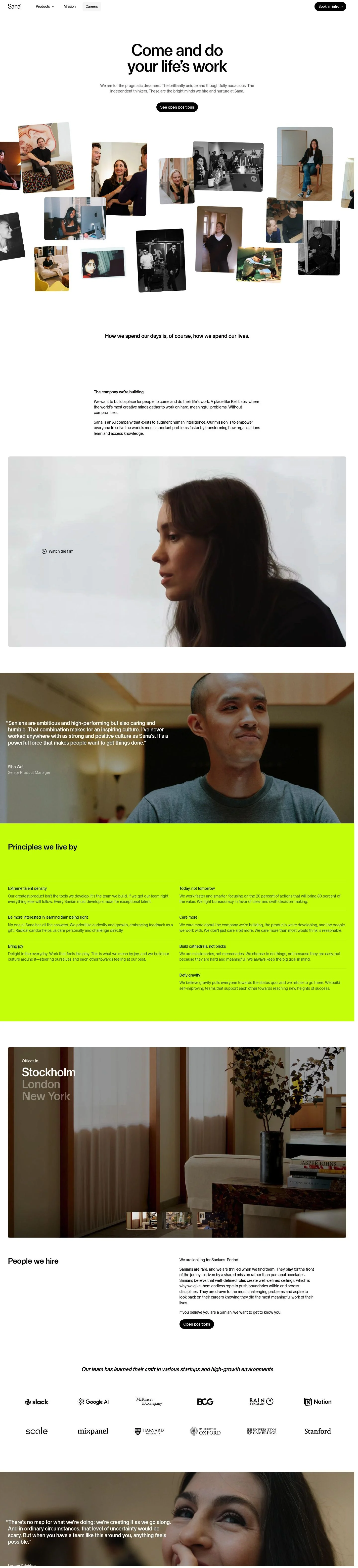
# Sana Careers: Monochrome Canvas with Floating Photo Collage

## Overview

Sana's site presents a calm, monochrome interface that centers people and content over chrome. The tone is ambitious, serious, and spacious—appropriate for enterprise AI and recruiting. White surfaces, black typography, and restrained accents allow product or culture imagery to lead. Use generous spacing to maintain clarity and momentum between sections.

## Colors

- **primary (#000000):** Core ink for headlines, body text, and icons.
- **secondary (#0055ff):** Action accent for links, hovers, and occasional highlights.
- **tertiary (#cdfe00):** High-energy highlight used very sparingly for emphasis moments.
- **neutral (#ffffff):** Default page background and card surfaces.
- **border (#e5e7eb):** Light dividers, section rules, and control outlines.
- **brand-namara-grey (#7c7c7c):** Secondary text, metadata, and muted captions.
- **brand-brushed-metal (#c8c8c8):** Subtle UI chrome, disabled states, and separators on light.
- **surface (#ffffff):** Primary surface color, matching neutral.
- **on-surface (#000000):** Default text and icon color on surfaces.

## Typography

All typography uses Sana Sans at 400 weight by default. Roles:
- Headline LG (72px/1.19, -0.01em): Primary hero statements and section intros.
- Headline MD (24px/1.21): Pull quotes, lead-ins, and sub-section headings.
- Headline SM (20px/1.2): Card titles and list headings.
- Headline XS (18px/1.22): Minor headings and dense UI labels.
- Body MD (16px/1.4, -0.01em): Paragraphs, nav items, buttons, and form copy.
Availability: Sana Sans is custom/self-hosted; agents should plan substitutes when the family isn't available. Recommended obtainable alternatives with similar modern, neutral geometry: Inter, Plus Jakarta Sans, or IBM Plex Sans.

## Layout

Spacing follows a generous scale: 8, 16, 40, 80, 120px. Use 80–120px vertical rhythm for section breaks, 40px for intra-section group spacing, and 16px for element gutters. Center content in wide single-column layouts; introduce multi-column lists (e.g., principles) with 40px gutters. Keep page margins and paddings aligned to the 8/16px base to maintain rhythm.

## Elevation & Depth

Depth is minimal. Use the sm shadow (subtle 1px ring plus 8/16 blur) to lift photos and cards from the white surface. Larger shadows are intentionally absent; hierarchy relies on type scale, whitespace, and light borders in #e5e7eb.

## Shapes

Two radii define the language: 8px for cards, images, and thumbnails; 36px for pill buttons and chips. The contrast between square-ish content blocks and soft pills signals clickability without color changes.

## Components

Buttons
- Primary: #000000 background, #ffffff text, 36px radius, 40px height, padding 4px 8px 0px 16px. Use for primary CTAs only.
- Secondary: Text-only, #000000 text, 36px radius, 40px height, same padding; suitable for secondary actions adjacent to a primary.
- Link: Text-only, #000000, 0px radius; inline links within copy.
Card
- #ffffff background, #000000 text, 8px radius, 16px padding. Add sm shadow when the card must float over imagery.

Distinctive components on this page
### Global Nav
- Left-aligned logo with simple links (Products, Mission, Careers). Primary CTA on the right can use the 40px pill style. Body MD for labels; spacing sm (16px) between items.
### Careers Hero
- Centered Headline LG at 72px with tight tracking. Supporting body at 16px. Single primary button at 40px tall, radius 36px. Section padding lg–xl (80–120px).
### Photo Collage Mosaic
- Grid-free arrangement of images with 8px corner radius and sm shadow. Use sm (16px) gaps between tiles and allow subtle rotations to avoid rigid alignment.
### Principles List
- Multi-item list in one or two columns. Item title at Headline SM (20px), body at 16px. Use md (40px) spacing between items and sections.
### Testimonial Block
- Quote set in Headline MD (24px) with attribution in Body MD (16px). Optionally wrap in a Card (8px radius, 16px padding) and add sm shadow if placed over imagery.
### Office Locations Strip
- Inline links (button-link style) for cities. Use sm (16px) horizontal spacing and Body MD type. Keep black text on white with hover accent in #0055ff if needed.
### Cookie Consent Banner
- Card with 8px radius and 16px padding at page bottom. Primary action uses the 40px, 36px-radius black pill; secondary is a text link.

## Do's and Don'ts

- Do keep text #000000 on #ffffff for all primary surfaces; rely on scale and spacing before adding color.
- Do reserve the 40px, 36px-radius black pill for the single most important CTA on a view.
- Do space sections with 80–120px and groups with 40px to preserve the airy rhythm.
- Do use the sm shadow on photos and floating cards; otherwise prefer light borders in #e5e7eb.
- Don't introduce new corner radii—use 8px for content, 36px for interactive pills.
- Don't overuse #0055ff or #cdfe00; accents should be rare against the monochrome base.

## Agent Prompt Guide

Quick reference
- Text: #000000
- Background: #ffffff
- Border: #e5e7eb
- Accent: #0055ff

1) Build a careers hero
- Background #ffffff. Center a 72px Sana Sans headline (line-height 1.19, letter-spacing -0.01em). Add a 16px paragraph beneath at 1.4 line-height. Primary CTA: 40px tall pill button, 36px radius, #000000 background, #ffffff text, padding 4px 8px 0px 16px. Vertical section padding 80–120px.

2) Create the principles section
- Two columns with 40px gutter. Each item: title in Sana Sans 20px/1.2, body in 16px/1.4. Use 40px spacing between items and 80px above/below the section. Optional dividers in #e5e7eb.

3) Design a testimonial block
- Card surface #ffffff, 8px radius, 16px padding, sm shadow. Quote text in Sana Sans 24px/1.21; attribution in 16px with #7c7c7c. Place within a section spaced by 80px.

4) Lay out a floating photo collage
- Place 10–15 images with 8px corner radius, sm shadow, and 16px gaps on a #ffffff surface. Keep captions in 16px #000000 if needed; avoid extra chrome so faces lead.

## Similar Brands

- Notion — similarly monochrome with restrained accent color; Notion leans denser in text and uses more compact spacing.
- Linear — crisp black-and-white base with minimal UI; Linear prefers darker themes and stronger motion.
- Workday — enterprise HR with clean, optimistic visuals; Workday uses more color and rounded UI elements throughout.
- Stripe — systematized typography and whitespace; Stripe deploys richer gradients and illustrations than Sana's pared-back presentation.

## Tokens

### CSS custom properties

```css
:root {
  /* Colors */
  --color-primary: #000000;
  --color-secondary: #0055ff;
  --color-tertiary: #cdfe00;
  --color-neutral: #ffffff;
  --color-border: #e5e7eb;
  --color-brand-namara-grey: #7c7c7c;
  --color-brand-brushed-metal: #c8c8c8;
  --color-surface: var(--color-neutral);
  --color-on-surface: var(--color-primary);

  /* Typography */
  --text-headline-lg-size: 72px;
  --text-headline-lg-weight: 400;
  --text-headline-lg-leading: 1.19;
  --text-headline-lg-tracking: -0.01em;
  --text-headline-md-size: 24px;
  --text-headline-md-weight: 400;
  --text-headline-md-leading: 1.21;
  --text-headline-sm-size: 20px;
  --text-headline-sm-weight: 400;
  --text-headline-sm-leading: 1.2;
  --text-headline-xs-size: 18px;
  --text-headline-xs-weight: 400;
  --text-headline-xs-leading: 1.22;
  --text-body-md-size: 16px;
  --text-body-md-weight: 400;
  --text-body-md-leading: 1.4;
  --text-body-md-tracking: -0.01em;
  --font-sana-sans: "Sana Sans";

  /* Rounded */
  --radius-sm: 8px;
  --radius-md: 36px;

  /* Spacing */
  --spacing-xs: 8px;
  --spacing-sm: 16px;
  --spacing-md: 40px;
  --spacing-lg: 80px;
  --spacing-xl: 120px;

  /* Components */
  --button-primary-background-color: var(--color-primary);
  --button-primary-text-color: var(--color-neutral);
  --button-primary-rounded: var(--radius-md);
  --button-primary-padding: 4px 8px 0px 16px;
  --button-primary-height: 40px;
  --button-secondary-text-color: var(--color-primary);
  --button-secondary-rounded: var(--radius-md);
  --button-secondary-padding: 4px 8px 0px 16px;
  --button-secondary-height: 40px;
  --button-link-text-color: var(--color-primary);
  --button-link-rounded: 0px;
  --card-background-color: var(--color-neutral);
  --card-text-color: var(--color-primary);
  --card-rounded: var(--radius-sm);
  --card-padding: 16px;
}
```

### Tailwind theme

```css
@theme {
  --color-primary: #000000;
  --color-secondary: #0055ff;
  --color-tertiary: #cdfe00;
  --color-neutral: #ffffff;
  --color-border: #e5e7eb;
  --color-brand-namara-grey: #7c7c7c;
  --color-brand-brushed-metal: #c8c8c8;
  --color-surface: #ffffff;
  --color-on-surface: #000000;
  --font-headline-lg: "Sana Sans";
  --font-headline-md: "Sana Sans";
  --font-headline-sm: "Sana Sans";
  --font-headline-xs: "Sana Sans";
  --font-body-md: "Sana Sans";
  --text-headline-lg: 72px;
  --text-headline-md: 24px;
  --text-headline-sm: 20px;
  --text-headline-xs: 18px;
  --text-body-md: 16px;
  --tracking-headline-lg: -0.01em;
  --tracking-body-md: -0.01em;
  --font-weight-headline-lg: 400;
  --font-weight-headline-md: 400;
  --font-weight-headline-sm: 400;
  --font-weight-headline-xs: 400;
  --font-weight-body-md: 400;
  --radius-sm: 8px;
  --radius-md: 36px;
  --spacing-xs: 8px;
  --spacing-sm: 16px;
  --spacing-md: 40px;
  --spacing-lg: 80px;
  --spacing-xl: 120px;
}
```

### Design tokens (DTCG)

```json
{
    "$schema": "https://www.designtokens.org/schemas/2025.10/format.json",
    "color": {
        "$type": "color",
        "primary": {
            "$value": {
                "colorSpace": "srgb",
                "components": [
                    0,
                    0,
                    0
                ],
                "hex": "#000000"
            }
        },
        "secondary": {
            "$value": {
                "colorSpace": "srgb",
                "components": [
                    0,
                    0.333,
                    1
                ],
                "hex": "#0055ff"
            }
        },
        "tertiary": {
            "$value": {
                "colorSpace": "srgb",
                "components": [
                    0.804,
                    0.996,
                    0
                ],
                "hex": "#cdfe00"
            }
        },
        "neutral": {
            "$value": {
                "colorSpace": "srgb",
                "components": [
                    1,
                    1,
                    1
                ],
                "hex": "#ffffff"
            }
        },
        "border": {
            "$value": {
                "colorSpace": "srgb",
                "components": [
                    0.898,
                    0.906,
                    0.922
                ],
                "hex": "#e5e7eb"
            }
        },
        "brand-namara-grey": {
            "$value": {
                "colorSpace": "srgb",
                "components": [
                    0.486,
                    0.486,
                    0.486
                ],
                "hex": "#7c7c7c"
            }
        },
        "brand-brushed-metal": {
            "$value": {
                "colorSpace": "srgb",
                "components": [
                    0.784,
                    0.784,
                    0.784
                ],
                "hex": "#c8c8c8"
            }
        },
        "surface": {
            "$value": {
                "colorSpace": "srgb",
                "components": [
                    1,
                    1,
                    1
                ],
                "hex": "#ffffff"
            }
        },
        "on-surface": {
            "$value": {
                "colorSpace": "srgb",
                "components": [
                    0,
                    0,
                    0
                ],
                "hex": "#000000"
            }
        }
    },
    "spacing": {
        "$type": "dimension",
        "xs": {
            "$value": {
                "value": 8,
                "unit": "px"
            }
        },
        "sm": {
            "$value": {
                "value": 16,
                "unit": "px"
            }
        },
        "md": {
            "$value": {
                "value": 40,
                "unit": "px"
            }
        },
        "lg": {
            "$value": {
                "value": 80,
                "unit": "px"
            }
        },
        "xl": {
            "$value": {
                "value": 120,
                "unit": "px"
            }
        }
    },
    "rounded": {
        "$type": "dimension",
        "sm": {
            "$value": {
                "value": 8,
                "unit": "px"
            }
        },
        "md": {
            "$value": {
                "value": 36,
                "unit": "px"
            }
        }
    },
    "typography": {
        "headline-lg": {
            "$type": "typography",
            "$value": {
                "fontFamily": "Sana Sans",
                "fontSize": {
                    "value": 72,
                    "unit": "px"
                },
                "fontWeight": 400,
                "letterSpacing": {
                    "value": -0.01,
                    "unit": "em"
                }
            }
        },
        "headline-md": {
            "$type": "typography",
            "$value": {
                "fontFamily": "Sana Sans",
                "fontSize": {
                    "value": 24,
                    "unit": "px"
                },
                "fontWeight": 400
            }
        },
        "headline-sm": {
            "$type": "typography",
            "$value": {
                "fontFamily": "Sana Sans",
                "fontSize": {
                    "value": 20,
                    "unit": "px"
                },
                "fontWeight": 400
            }
        },
        "headline-xs": {
            "$type": "typography",
            "$value": {
                "fontFamily": "Sana Sans",
                "fontSize": {
                    "value": 18,
                    "unit": "px"
                },
                "fontWeight": 400
            }
        },
        "body-md": {
            "$type": "typography",
            "$value": {
                "fontFamily": "Sana Sans",
                "fontSize": {
                    "value": 16,
                    "unit": "px"
                },
                "fontWeight": 400,
                "letterSpacing": {
                    "value": -0.01,
                    "unit": "em"
                }
            }
        }
    }
}
```

## Rules

- **Fonts.** If the specification names a custom or self-hosted family, use one of the substitutes it names. Never reference a typeface you cannot actually load — it will fall back to a system font and undo the typography.
- **Colour.** Derive the palette from the user's brand. Use the token values as a guide to *relationships* — contrast, tint, how many accents carry the page — not as hex codes to paste.
- **Never reproduce** the wordmark, mascot, logo, brand name, illustrations, icon set, screenshots or any copy from the reference.
- **Never present the result as Sana Careers**, or imply any connection to it.
- If something is unspecified, choose clarity and legibility over decoration.
---
version: alpha
name: Sana
description: Superintelligence for work—give teams tools to thrive in AI-first world
colors:
  primary: "#000000"
  secondary: "#0055ff"
  tertiary: "#cdfe00"
  neutral: "#ffffff"
  border: "#e5e7eb"
  brand-namara-grey: "#7c7c7c"
  brand-brushed-metal: "#c8c8c8"
  surface: "{colors.neutral}"
  on-surface: "{colors.primary}"
typography:
  headline-lg:
    fontFamily: Sana Sans
    fontSize: 72px
    fontWeight: 400
    lineHeight: 1.19
    letterSpacing: -0.01em
  headline-md:
    fontFamily: Sana Sans
    fontSize: 24px
    fontWeight: 400
    lineHeight: 1.21
  headline-sm:
    fontFamily: Sana Sans
    fontSize: 20px
    fontWeight: 400
    lineHeight: 1.2
  headline-xs:
    fontFamily: Sana Sans
    fontSize: 18px
    fontWeight: 400
    lineHeight: 1.22
  body-md:
    fontFamily: Sana Sans
    fontSize: 16px
    fontWeight: 400
    lineHeight: 1.4
    letterSpacing: -0.01em
rounded:
  sm: 8px
  md: 36px
spacing:
  xs: 8px
  sm: 16px
  md: 40px
  lg: 80px
  xl: 120px
components:
  button-primary:
    backgroundColor: "{colors.primary}"
    textColor: "{colors.neutral}"
    rounded: "{rounded.md}"
    padding: 4px 8px 0px 16px
    height: 40px
  button-secondary:
    textColor: "{colors.primary}"
    rounded: "{rounded.md}"
    padding: 4px 8px 0px 16px
    height: 40px
  button-link:
    textColor: "{colors.primary}"
    rounded: 0px
  card:
    backgroundColor: "{colors.neutral}"
    textColor: "{colors.primary}"
    rounded: "{rounded.sm}"
    padding: 16px
---

# Sana Careers: Monochrome Canvas with Floating Photo Collage

## Overview

Sana's site presents a calm, monochrome interface that centers people and content over chrome. The tone is ambitious, serious, and spacious—appropriate for enterprise AI and recruiting. White surfaces, black typography, and restrained accents allow product or culture imagery to lead. Use generous spacing to maintain clarity and momentum between sections.

## Colors

- **primary (#000000):** Core ink for headlines, body text, and icons.
- **secondary (#0055ff):** Action accent for links, hovers, and occasional highlights.
- **tertiary (#cdfe00):** High-energy highlight used very sparingly for emphasis moments.
- **neutral (#ffffff):** Default page background and card surfaces.
- **border (#e5e7eb):** Light dividers, section rules, and control outlines.
- **brand-namara-grey (#7c7c7c):** Secondary text, metadata, and muted captions.
- **brand-brushed-metal (#c8c8c8):** Subtle UI chrome, disabled states, and separators on light.
- **surface (#ffffff):** Primary surface color, matching neutral.
- **on-surface (#000000):** Default text and icon color on surfaces.

## Typography

All typography uses Sana Sans at 400 weight by default. Roles:
- Headline LG (72px/1.19, -0.01em): Primary hero statements and section intros.
- Headline MD (24px/1.21): Pull quotes, lead-ins, and sub-section headings.
- Headline SM (20px/1.2): Card titles and list headings.
- Headline XS (18px/1.22): Minor headings and dense UI labels.
- Body MD (16px/1.4, -0.01em): Paragraphs, nav items, buttons, and form copy.
Availability: Sana Sans is custom/self-hosted; agents should plan substitutes when the family isn't available. Recommended obtainable alternatives with similar modern, neutral geometry: Inter, Plus Jakarta Sans, or IBM Plex Sans.

## Layout

Spacing follows a generous scale: 8, 16, 40, 80, 120px. Use 80–120px vertical rhythm for section breaks, 40px for intra-section group spacing, and 16px for element gutters. Center content in wide single-column layouts; introduce multi-column lists (e.g., principles) with 40px gutters. Keep page margins and paddings aligned to the 8/16px base to maintain rhythm.

## Elevation & Depth

Depth is minimal. Use the sm shadow (subtle 1px ring plus 8/16 blur) to lift photos and cards from the white surface. Larger shadows are intentionally absent; hierarchy relies on type scale, whitespace, and light borders in #e5e7eb.

## Shapes

Two radii define the language: 8px for cards, images, and thumbnails; 36px for pill buttons and chips. The contrast between square-ish content blocks and soft pills signals clickability without color changes.

## Components

Buttons
- Primary: #000000 background, #ffffff text, 36px radius, 40px height, padding 4px 8px 0px 16px. Use for primary CTAs only.
- Secondary: Text-only, #000000 text, 36px radius, 40px height, same padding; suitable for secondary actions adjacent to a primary.
- Link: Text-only, #000000, 0px radius; inline links within copy.
Card
- #ffffff background, #000000 text, 8px radius, 16px padding. Add sm shadow when the card must float over imagery.

Distinctive components on this page
### Global Nav
- Left-aligned logo with simple links (Products, Mission, Careers). Primary CTA on the right can use the 40px pill style. Body MD for labels; spacing sm (16px) between items.
### Careers Hero
- Centered Headline LG at 72px with tight tracking. Supporting body at 16px. Single primary button at 40px tall, radius 36px. Section padding lg–xl (80–120px).
### Photo Collage Mosaic
- Grid-free arrangement of images with 8px corner radius and sm shadow. Use sm (16px) gaps between tiles and allow subtle rotations to avoid rigid alignment.
### Principles List
- Multi-item list in one or two columns. Item title at Headline SM (20px), body at 16px. Use md (40px) spacing between items and sections.
### Testimonial Block
- Quote set in Headline MD (24px) with attribution in Body MD (16px). Optionally wrap in a Card (8px radius, 16px padding) and add sm shadow if placed over imagery.
### Office Locations Strip
- Inline links (button-link style) for cities. Use sm (16px) horizontal spacing and Body MD type. Keep black text on white with hover accent in #0055ff if needed.
### Cookie Consent Banner
- Card with 8px radius and 16px padding at page bottom. Primary action uses the 40px, 36px-radius black pill; secondary is a text link.

## Do's and Don'ts

- Do keep text #000000 on #ffffff for all primary surfaces; rely on scale and spacing before adding color.
- Do reserve the 40px, 36px-radius black pill for the single most important CTA on a view.
- Do space sections with 80–120px and groups with 40px to preserve the airy rhythm.
- Do use the sm shadow on photos and floating cards; otherwise prefer light borders in #e5e7eb.
- Don't introduce new corner radii—use 8px for content, 36px for interactive pills.
- Don't overuse #0055ff or #cdfe00; accents should be rare against the monochrome base.

## Agent Prompt Guide

Quick reference
- Text: #000000
- Background: #ffffff
- Border: #e5e7eb
- Accent: #0055ff

1) Build a careers hero
- Background #ffffff. Center a 72px Sana Sans headline (line-height 1.19, letter-spacing -0.01em). Add a 16px paragraph beneath at 1.4 line-height. Primary CTA: 40px tall pill button, 36px radius, #000000 background, #ffffff text, padding 4px 8px 0px 16px. Vertical section padding 80–120px.

2) Create the principles section
- Two columns with 40px gutter. Each item: title in Sana Sans 20px/1.2, body in 16px/1.4. Use 40px spacing between items and 80px above/below the section. Optional dividers in #e5e7eb.

3) Design a testimonial block
- Card surface #ffffff, 8px radius, 16px padding, sm shadow. Quote text in Sana Sans 24px/1.21; attribution in 16px with #7c7c7c. Place within a section spaced by 80px.

4) Lay out a floating photo collage
- Place 10–15 images with 8px corner radius, sm shadow, and 16px gaps on a #ffffff surface. Keep captions in 16px #000000 if needed; avoid extra chrome so faces lead.

## Similar Brands

- Notion — similarly monochrome with restrained accent color; Notion leans denser in text and uses more compact spacing.
- Linear — crisp black-and-white base with minimal UI; Linear prefers darker themes and stronger motion.
- Workday — enterprise HR with clean, optimistic visuals; Workday uses more color and rounded UI elements throughout.
- Stripe — systematized typography and whitespace; Stripe deploys richer gradients and illustrations than Sana's pared-back presentation.
:root {
  /* Colors */
  --color-primary: #000000;
  --color-secondary: #0055ff;
  --color-tertiary: #cdfe00;
  --color-neutral: #ffffff;
  --color-border: #e5e7eb;
  --color-brand-namara-grey: #7c7c7c;
  --color-brand-brushed-metal: #c8c8c8;
  --color-surface: var(--color-neutral);
  --color-on-surface: var(--color-primary);

  /* Typography */
  --text-headline-lg-size: 72px;
  --text-headline-lg-weight: 400;
  --text-headline-lg-leading: 1.19;
  --text-headline-lg-tracking: -0.01em;
  --text-headline-md-size: 24px;
  --text-headline-md-weight: 400;
  --text-headline-md-leading: 1.21;
  --text-headline-sm-size: 20px;
  --text-headline-sm-weight: 400;
  --text-headline-sm-leading: 1.2;
  --text-headline-xs-size: 18px;
  --text-headline-xs-weight: 400;
  --text-headline-xs-leading: 1.22;
  --text-body-md-size: 16px;
  --text-body-md-weight: 400;
  --text-body-md-leading: 1.4;
  --text-body-md-tracking: -0.01em;
  --font-sana-sans: "Sana Sans";

  /* Rounded */
  --radius-sm: 8px;
  --radius-md: 36px;

  /* Spacing */
  --spacing-xs: 8px;
  --spacing-sm: 16px;
  --spacing-md: 40px;
  --spacing-lg: 80px;
  --spacing-xl: 120px;

  /* Components */
  --button-primary-background-color: var(--color-primary);
  --button-primary-text-color: var(--color-neutral);
  --button-primary-rounded: var(--radius-md);
  --button-primary-padding: 4px 8px 0px 16px;
  --button-primary-height: 40px;
  --button-secondary-text-color: var(--color-primary);
  --button-secondary-rounded: var(--radius-md);
  --button-secondary-padding: 4px 8px 0px 16px;
  --button-secondary-height: 40px;
  --button-link-text-color: var(--color-primary);
  --button-link-rounded: 0px;
  --card-background-color: var(--color-neutral);
  --card-text-color: var(--color-primary);
  --card-rounded: var(--radius-sm);
  --card-padding: 16px;
}
{
  "$schema": "https://www.designtokens.org/schemas/2025.10/format.json",
  "$description": "Superintelligence for work—give teams tools to thrive in AI-first world",
  "color": {
    "$type": "color",
    "primary": {
      "$value": {
        "colorSpace": "srgb",
        "components": [
          0,
          0,
          0
        ],
        "hex": "#000000"
      }
    },
    "secondary": {
      "$value": {
        "colorSpace": "srgb",
        "components": [
          0,
          0.333,
          1
        ],
        "hex": "#0055ff"
      }
    },
    "tertiary": {
      "$value": {
        "colorSpace": "srgb",
        "components": [
          0.804,
          0.996,
          0
        ],
        "hex": "#cdfe00"
      }
    },
    "neutral": {
      "$value": {
        "colorSpace": "srgb",
        "components": [
          1,
          1,
          1
        ],
        "hex": "#ffffff"
      }
    },
    "border": {
      "$value": {
        "colorSpace": "srgb",
        "components": [
          0.898,
          0.906,
          0.922
        ],
        "hex": "#e5e7eb"
      }
    },
    "brand-namara-grey": {
      "$value": {
        "colorSpace": "srgb",
        "components": [
          0.486,
          0.486,
          0.486
        ],
        "hex": "#7c7c7c"
      }
    },
    "brand-brushed-metal": {
      "$value": {
        "colorSpace": "srgb",
        "components": [
          0.784,
          0.784,
          0.784
        ],
        "hex": "#c8c8c8"
      }
    },
    "surface": {
      "$value": {
        "colorSpace": "srgb",
        "components": [
          1,
          1,
          1
        ],
        "hex": "#ffffff"
      }
    },
    "on-surface": {
      "$value": {
        "colorSpace": "srgb",
        "components": [
          0,
          0,
          0
        ],
        "hex": "#000000"
      }
    }
  },
  "spacing": {
    "$type": "dimension",
    "xs": {
      "$value": {
        "value": 8,
        "unit": "px"
      }
    },
    "sm": {
      "$value": {
        "value": 16,
        "unit": "px"
      }
    },
    "md": {
      "$value": {
        "value": 40,
        "unit": "px"
      }
    },
    "lg": {
      "$value": {
        "value": 80,
        "unit": "px"
      }
    },
    "xl": {
      "$value": {
        "value": 120,
        "unit": "px"
      }
    }
  },
  "rounded": {
    "$type": "dimension",
    "sm": {
      "$value": {
        "value": 8,
        "unit": "px"
      }
    },
    "md": {
      "$value": {
        "value": 36,
        "unit": "px"
      }
    }
  },
  "typography": {
    "headline-lg": {
      "$type": "typography",
      "$value": {
        "fontFamily": "Sana Sans",
        "fontSize": {
          "value": 72,
          "unit": "px"
        },
        "fontWeight": 400,
        "letterSpacing": {
          "value": -0.01,
          "unit": "em"
        }
      }
    },
    "headline-md": {
      "$type": "typography",
      "$value": {
        "fontFamily": "Sana Sans",
        "fontSize": {
          "value": 24,
          "unit": "px"
        },
        "fontWeight": 400
      }
    },
    "headline-sm": {
      "$type": "typography",
      "$value": {
        "fontFamily": "Sana Sans",
        "fontSize": {
          "value": 20,
          "unit": "px"
        },
        "fontWeight": 400
      }
    },
    "headline-xs": {
      "$type": "typography",
      "$value": {
        "fontFamily": "Sana Sans",
        "fontSize": {
          "value": 18,
          "unit": "px"
        },
        "fontWeight": 400
      }
    },
    "body-md": {
      "$type": "typography",
      "$value": {
        "fontFamily": "Sana Sans",
        "fontSize": {
          "value": 16,
          "unit": "px"
        },
        "fontWeight": 400,
        "letterSpacing": {
          "value": -0.01,
          "unit": "em"
        }
      }
    }
  }
}
@theme {
--color-primary: #000000;
--color-secondary: #0055ff;
--color-tertiary: #cdfe00;
--color-neutral: #ffffff;
--color-border: #e5e7eb;
--color-brand-namara-grey: #7c7c7c;
--color-brand-brushed-metal: #c8c8c8;
--color-surface: #ffffff;
--color-on-surface: #000000;
--font-headline-lg: "Sana Sans";
--font-headline-md: "Sana Sans";
--font-headline-sm: "Sana Sans";
--font-headline-xs: "Sana Sans";
--font-body-md: "Sana Sans";
--text-headline-lg: 72px;
--text-headline-md: 24px;
--text-headline-sm: 20px;
--text-headline-xs: 18px;
--text-body-md: 16px;
--tracking-headline-lg: -0.01em;
--tracking-body-md: -0.01em;
--font-weight-headline-lg: 400;
--font-weight-headline-md: 400;
--font-weight-headline-sm: 400;
--font-weight-headline-xs: 400;
--font-weight-body-md: 400;
--radius-sm: 8px;
--radius-md: 36px;
--spacing-xs: 8px;
--spacing-sm: 16px;
--spacing-md: 40px;
--spacing-lg: 80px;
--spacing-xl: 120px;
} # Design brief: the Sana Careers design language
Below is a complete design specification measured from a real, published web page. Use it as a design language for the user's product. It is not a page to reproduce.
## Reference images
- Full page: https://cdn.designmunk.com/2026/09/12085103/sanalabs-com-careers-featured.webp
- Above the fold: https://cdn.designmunk.com/2026/09/12085103/sanalabs-com-careers-featured.webp
- On DesignMunk: https://designmunk.com/sana-careers-page/
Study these for hierarchy, rhythm, spacing and density. Where an image and the written spec disagree, the spec wins: the tokens were read from the page's own CSS, the images are one rendering of it.
## Before you start
Ask the user what they are building, who it is for, and what brand assets they already have — name, colours, typefaces. Wait for their answers before writing anything. Everything below is then applied to their product, not to the reference.
## Design specification
# Sana Careers: Monochrome Canvas with Floating Photo Collage
## Overview
Sana's site presents a calm, monochrome interface that centers people and content over chrome. The tone is ambitious, serious, and spacious—appropriate for enterprise AI and recruiting. White surfaces, black typography, and restrained accents allow product or culture imagery to lead. Use generous spacing to maintain clarity and momentum between sections.
## Colors
- **primary (#000000):** Core ink for headlines, body text, and icons.
- **secondary (#0055ff):** Action accent for links, hovers, and occasional highlights.
- **tertiary (#cdfe00):** High-energy highlight used very sparingly for emphasis moments.
- **neutral (#ffffff):** Default page background and card surfaces.
- **border (#e5e7eb):** Light dividers, section rules, and control outlines.
- **brand-namara-grey (#7c7c7c):** Secondary text, metadata, and muted captions.
- **brand-brushed-metal (#c8c8c8):** Subtle UI chrome, disabled states, and separators on light.
- **surface (#ffffff):** Primary surface color, matching neutral.
- **on-surface (#000000):** Default text and icon color on surfaces.
## Typography
All typography uses Sana Sans at 400 weight by default. Roles:
- Headline LG (72px/1.19, -0.01em): Primary hero statements and section intros.
- Headline MD (24px/1.21): Pull quotes, lead-ins, and sub-section headings.
- Headline SM (20px/1.2): Card titles and list headings.
- Headline XS (18px/1.22): Minor headings and dense UI labels.
- Body MD (16px/1.4, -0.01em): Paragraphs, nav items, buttons, and form copy.
Availability: Sana Sans is custom/self-hosted; agents should plan substitutes when the family isn't available. Recommended obtainable alternatives with similar modern, neutral geometry: Inter, Plus Jakarta Sans, or IBM Plex Sans.
## Layout
Spacing follows a generous scale: 8, 16, 40, 80, 120px. Use 80–120px vertical rhythm for section breaks, 40px for intra-section group spacing, and 16px for element gutters. Center content in wide single-column layouts; introduce multi-column lists (e.g., principles) with 40px gutters. Keep page margins and paddings aligned to the 8/16px base to maintain rhythm.
## Elevation & Depth
Depth is minimal. Use the sm shadow (subtle 1px ring plus 8/16 blur) to lift photos and cards from the white surface. Larger shadows are intentionally absent; hierarchy relies on type scale, whitespace, and light borders in #e5e7eb.
## Shapes
Two radii define the language: 8px for cards, images, and thumbnails; 36px for pill buttons and chips. The contrast between square-ish content blocks and soft pills signals clickability without color changes.
## Components
Buttons
- Primary: #000000 background, #ffffff text, 36px radius, 40px height, padding 4px 8px 0px 16px. Use for primary CTAs only.
- Secondary: Text-only, #000000 text, 36px radius, 40px height, same padding; suitable for secondary actions adjacent to a primary.
- Link: Text-only, #000000, 0px radius; inline links within copy.
Card
- #ffffff background, #000000 text, 8px radius, 16px padding. Add sm shadow when the card must float over imagery.
Distinctive components on this page
### Global Nav
- Left-aligned logo with simple links (Products, Mission, Careers). Primary CTA on the right can use the 40px pill style. Body MD for labels; spacing sm (16px) between items.
### Careers Hero
- Centered Headline LG at 72px with tight tracking. Supporting body at 16px. Single primary button at 40px tall, radius 36px. Section padding lg–xl (80–120px).
### Photo Collage Mosaic
- Grid-free arrangement of images with 8px corner radius and sm shadow. Use sm (16px) gaps between tiles and allow subtle rotations to avoid rigid alignment.
### Principles List
- Multi-item list in one or two columns. Item title at Headline SM (20px), body at 16px. Use md (40px) spacing between items and sections.
### Testimonial Block
- Quote set in Headline MD (24px) with attribution in Body MD (16px). Optionally wrap in a Card (8px radius, 16px padding) and add sm shadow if placed over imagery.
### Office Locations Strip
- Inline links (button-link style) for cities. Use sm (16px) horizontal spacing and Body MD type. Keep black text on white with hover accent in #0055ff if needed.
### Cookie Consent Banner
- Card with 8px radius and 16px padding at page bottom. Primary action uses the 40px, 36px-radius black pill; secondary is a text link.
## Do's and Don'ts
- Do keep text #000000 on #ffffff for all primary surfaces; rely on scale and spacing before adding color.
- Do reserve the 40px, 36px-radius black pill for the single most important CTA on a view.
- Do space sections with 80–120px and groups with 40px to preserve the airy rhythm.
- Do use the sm shadow on photos and floating cards; otherwise prefer light borders in #e5e7eb.
- Don't introduce new corner radii—use 8px for content, 36px for interactive pills.
- Don't overuse #0055ff or #cdfe00; accents should be rare against the monochrome base.
## Agent Prompt Guide
Quick reference
- Text: #000000
- Background: #ffffff
- Border: #e5e7eb
- Accent: #0055ff
1) Build a careers hero
- Background #ffffff. Center a 72px Sana Sans headline (line-height 1.19, letter-spacing -0.01em). Add a 16px paragraph beneath at 1.4 line-height. Primary CTA: 40px tall pill button, 36px radius, #000000 background, #ffffff text, padding 4px 8px 0px 16px. Vertical section padding 80–120px.
2) Create the principles section
- Two columns with 40px gutter. Each item: title in Sana Sans 20px/1.2, body in 16px/1.4. Use 40px spacing between items and 80px above/below the section. Optional dividers in #e5e7eb.
3) Design a testimonial block
- Card surface #ffffff, 8px radius, 16px padding, sm shadow. Quote text in Sana Sans 24px/1.21; attribution in 16px with #7c7c7c. Place within a section spaced by 80px.
4) Lay out a floating photo collage
- Place 10–15 images with 8px corner radius, sm shadow, and 16px gaps on a #ffffff surface. Keep captions in 16px #000000 if needed; avoid extra chrome so faces lead.
## Tokens
### CSS custom properties
```css
:root {
/* Colors */
--color-primary: #000000;
--color-secondary: #0055ff;
--color-tertiary: #cdfe00;
--color-neutral: #ffffff;
--color-border: #e5e7eb;
--color-brand-namara-grey: #7c7c7c;
--color-brand-brushed-metal: #c8c8c8;
--color-surface: var(--color-neutral);
--color-on-surface: var(--color-primary);
/* Typography */
--text-headline-lg-size: 72px;
--text-headline-lg-weight: 400;
--text-headline-lg-leading: 1.19;
--text-headline-lg-tracking: -0.01em;
--text-headline-md-size: 24px;
--text-headline-md-weight: 400;
--text-headline-md-leading: 1.21;
--text-headline-sm-size: 20px;
--text-headline-sm-weight: 400;
--text-headline-sm-leading: 1.2;
--text-headline-xs-size: 18px;
--text-headline-xs-weight: 400;
--text-headline-xs-leading: 1.22;
--text-body-md-size: 16px;
--text-body-md-weight: 400;
--text-body-md-leading: 1.4;
--text-body-md-tracking: -0.01em;
--font-sana-sans: "Sana Sans";
/* Rounded */
--radius-sm: 8px;
--radius-md: 36px;
/* Spacing */
--spacing-xs: 8px;
--spacing-sm: 16px;
--spacing-md: 40px;
--spacing-lg: 80px;
--spacing-xl: 120px;
/* Components */
--button-primary-background-color: var(--color-primary);
--button-primary-text-color: var(--color-neutral);
--button-primary-rounded: var(--radius-md);
--button-primary-padding: 4px 8px 0px 16px;
--button-primary-height: 40px;
--button-secondary-text-color: var(--color-primary);
--button-secondary-rounded: var(--radius-md);
--button-secondary-padding: 4px 8px 0px 16px;
--button-secondary-height: 40px;
--button-link-text-color: var(--color-primary);
--button-link-rounded: 0px;
--card-background-color: var(--color-neutral);
--card-text-color: var(--color-primary);
--card-rounded: var(--radius-sm);
--card-padding: 16px;
}
```
## Rules
- **Fonts.** If the specification names a custom or self-hosted family, use one of the substitutes it names. Never reference a typeface you cannot actually load — it will fall back to a system font and undo the typography.
- **Colour.** Derive the palette from the user's brand. Use the token values as a guide to *relationships* — contrast, tint, how many accents carry the page — not as hex codes to paste.
- **Never reproduce** the wordmark, mascot, logo, brand name, illustrations, icon set, screenshots or any copy from the reference.
- **Never present the result as Sana Careers**, or imply any connection to it.
- If something is unspecified, choose clarity and legibility over decoration.