rodeo-labs.com
AI Breakdown
Design export
# Design brief: the Rodeo Adventure Labs design language

Below is a complete design specification measured from a real, published web page. Use it as a design language for the user's product. It is not a page to reproduce.

## Reference images

- Full page: https://cdn.designmunk.com/2026/09/04181444/rodeo-labs-com-featured.webp
- Above the fold: https://cdn.designmunk.com/2026/09/04181444/rodeo-labs-com-featured.webp
- On DesignMunk: https://designmunk.com/rodeo-adventure-labs/

Study these for hierarchy, rhythm, spacing and density. Where an image and the written spec disagree, the spec wins: the tokens were read from the page's own CSS, the images are one rendering of it.

## Before you start

Ask the user what they are building, who it is for, and what brand assets they already have — name, colours, typefaces. Wait for their answers before writing anything. Everything below is then applied to their product, not to the reference.

## Design specification

# Rodeo Adventure Labs: Big Type on Warm Canvas with Pill CTAs

## Overview

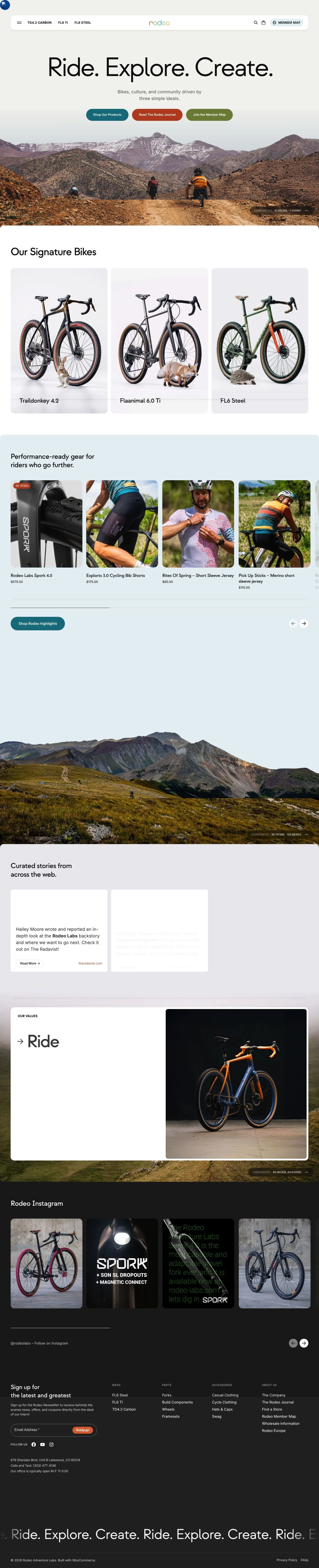
Adventure-forward retail with a social core. The UI is friendly, minimal, and outdoorsy: warm off-white surfaces, generous white space, and very large headlines. Photography does the emotive work; pill buttons and earthy accents carry calls to action without feeling techy. Density is medium—sections breathe, but products and links remain immediately accessible.

## Colors

- Primary (#111111): Core text and high-contrast UI elements, including headings and key icons.
- Secondary (#177c8c): Teal accent used for prominent CTAs and links, especially commerce-oriented actions.
- Tertiary (#7d8b45): Olive accent for CTAs related to community and navigation (e.g., Member Map).
- Neutral (#f3f3f0): Warm, slightly tinted background that softens photography and keeps type comfortable.
- brand-caribbean-blue (#14bcd4): Bright supporting accent for small highlights or badges; use sparingly.
- brand-nile (#acb77f): Muted olive variant for subtle UI stripes or secondary tags.
- brand-tangerine-bliss (#d55c2d): Vibrant orange accent reserved for promotional flags or energetic CTAs.
- brand-priceless-coral (#e8a48c): Soft coral for gentle highlights and secondary chips.
- surface (#f3f3f0): Default canvas for cards and sections, matching Neutral.
- on-surface (#111111): Text and icon color placed on the surface background.

## Typography

- Strawford (custom, display): Used for headline-lg (120px, 400, -0.06em), headline-md (77px, 400, -0.025em), and headline-sm (49px, 400, -0.017em). This face is self-hosted and not freely loadable by agents. Recommended substitutes: Manrope, Plus Jakarta Sans, or Sora for a clean, contemporary grotesk feel with similar apertures.
- Inter (Google): Used for headline-xs (31px, 400, 1.19) and body-md (20px, 400, 1.5). Freely available; use it for all long-form copy, UI labels, pricing, and metadata for maximum legibility.
- Pairing: Headlines in Strawford create brand tone; all supporting copy stays in Inter. Keep the negative letter-spacing from tokens for large headlines; do not add extra tracking to Inter body text.

## Layout

- Spacing scale: xs 6px, sm 16px, md 24px, lg 48px, xl 64px. Compose vertical rhythm by stacking md and lg between sections; use sm for card padding and compact clusters.
- Grid: A fluid, responsive grid with generous gutters suits the photography-led layout. Use md (24px) gaps inside content groups and lg (48px) between major sections.
- Sections typically open on surface (#f3f3f0) with centered headings and brief intros, followed by 2–4 column content at larger breakpoints and single-column on small screens.

## Elevation & Depth

The system is low-elevation. A subtle sm shadow is available for sticky navigation, hover states, or raised cards; larger shadow tiers are intentionally absent. Depth otherwise comes from tonal contrast (neutral surfaces vs on-surface text) and whitespace. When needed, rely on simple rules or separators rather than heavy effects.

## Shapes

Two radii define the language: sm 8px for cards and containers, and full 9999px for pills (buttons, chips, inputs). Pills communicate action and interactivity; 8px corners signal content groupings and media frames. Avoid mixing radii inside a single component.

## Components

- Button Primary: Background colors.tertiary (#7d8b45), text #ffffff, rounded full (9999px), 54px height, 20.024px × 31.5063px padding. Use for core brand/community actions.
- Button Secondary: Background #bd4c25, text #ffffff, rounded full, 54px height, same padding. Use for editorial or promo actions.
- Button Link: Text-only action in primary (#111111), no radius. Use inline or in compact lists.
- Card: Background #f3f3f0, text #111111, 8px radius, 16px padding. Optional sm shadow allowed.

### Header Bar with Product Tabs
A rounded container (8px) spanning the top with sm shadow. Contains tab-like links to TD4.2, FL6 Ti, and FL6 Steel, search, and a pill "Member Map" using Button Primary or colors.tertiary.

### Hero Banner
Centered headline using headline-lg (120px Strawford, -0.06em), brief Inter body copy, and a three-CTA row: teal Shop (colors.secondary #177c8c), brick Journal (button-secondary), olive Member Map (button-primary). Place on surface with lg (48px) spacing around the typographic stack, followed by a full-bleed image.

### Signature Bikes Row
Three feature links to TD4.2, FL6 Ti, and FL6 Steel. Each uses a Card (8px, 16px padding) with headline-sm (49px) labels and Inter body for short descriptors.

### Product Highlights Carousel
Horizontally scrollable cards for gear and parts. Card spec as above; price and badges in Inter body-md (20px). Use md (24px) gaps between items.

### Values Triptych
Three short columns—Ride, Explore, Create—with Inter body-md supporting copy. Keep md (24px) internal spacing and lg (48px) section margins.

### Curated Stories List
External articles presented as simple link cards on the surface. Use headline-xs (31px Inter) for titles and body-md for blurbs; reserve brand-tangerine-bliss (#d55c2d) for subtle "Read More" cues.

### Newsletter Signup
A compact surface block with Inter body, an email input, and a pill submit button using button-primary. Use md (24px) internal padding and lg (48px) section spacing.

## Do's and Don'ts

- Do keep headlines in Strawford at the specified sizes and negative letter-spacing; switch to Inter for all running text.
- Do use pill buttons at 54px height with full radius for primary actions; keep color assignments consistent (olive for community, brick for editorial, teal for shop).
- Do space major sections with lg (48px) or xl (64px) to preserve the relaxed, image-forward rhythm.
- Don't introduce heavier shadows or blurred glows; only the sm shadow is in the system.
- Don't mix square and rounded corners inside one module; use either 8px or full, not both.
- Don't add new accent colors; use the provided teal, olive, and orange family for contrast.

## Agent Prompt Guide

Quick color reference
- Text: #111111
- Background: #f3f3f0
- Border: #111111
- Accent: #177c8c, #7d8b45, #bd4c25, #d55c2d

1) Build the hero
- Container background #f3f3f0 with lg (48px) top/bottom padding.
- H1 set in Strawford headline-lg: 120px, weight 400, line-height 1, letter-spacing -0.06em, color #111111.
- Subhead in Inter body-md: 20px, line-height 1.5, color #111111.
- Three buttons:
  • Shop (colors.secondary #177c8c),
  • Read Journal (button-secondary #bd4c25),
  • Member Map (button-primary #7d8b45).
  All: text #ffffff, height 54px, padding 20.024px 31.5063px, rounded 9999px, md (24px) gap between.

2) Signature Bikes grid
- Section background #f3f3f0 with lg (48px) spacing.
- Title in Strawford headline-sm (49px, 400, letter-spacing -0.017em).
- Three Card items: background #f3f3f0, text #111111, radius 8px, padding 16px, md (24px) gaps.
- Item labels in Inter headline-xs (31px) and details in Inter body-md (20px).

3) Product highlights carousel
- Horizontal list of Card components (radius 8px, padding 16px) on #f3f3f0.
- Item title in Inter headline-xs (31px); price in Inter body-md (20px).
- Use md (24px) between items; CTA buttons inside cards use button-secondary (#bd4c25) or colors.secondary (#177c8c), 54px height, rounded 9999px.

4) Newsletter signup band
- Surface block with md (24px) internal padding and lg (48px) external spacing.
- Heading in Strawford headline-sm (49px); helper copy in Inter body-md.
- Submit as button-primary: background #7d8b45, text #ffffff, height 54px, rounded 9999px.

## Similar Brands

- Rapha: Photography-led retail with restrained UI; Rapha leans monochrome and serif accents, Rodeo uses warmer canvas and earthy accents.
- Canyon Bicycles: Large product imagery and minimal UI; Canyon is more industrial and grid-tight, Rodeo is roomier and more editorial.
- Specialized: Clear shopping pathways with strong CTAs; Specialized feels higher-contrast and black/white, Rodeo is softer and more community-forward.
- Patagonia: Outdoor storytelling balanced with commerce; Patagonia is more text-heavy and conservation-led, Rodeo is bike-specific with gear detail and ride culture.

## Tokens

### CSS custom properties

```css
:root {
  /* Colors */
  --color-primary: #111111;
  --color-secondary: #177c8c;
  --color-tertiary: #7d8b45;
  --color-neutral: #f3f3f0;
  --color-brand-caribbean-blue: #14bcd4;
  --color-brand-nile: #acb77f;
  --color-brand-tangerine-bliss: #d55c2d;
  --color-brand-priceless-coral: #e8a48c;
  --color-surface: var(--color-neutral);
  --color-on-surface: var(--color-primary);

  /* Typography */
  --text-headline-lg-size: 120px;
  --text-headline-lg-weight: 400;
  --text-headline-lg-leading: 1;
  --text-headline-lg-tracking: -0.06em;
  --text-headline-md-size: 77px;
  --text-headline-md-weight: 400;
  --text-headline-md-leading: 1.19;
  --text-headline-md-tracking: -0.025em;
  --text-headline-sm-size: 49px;
  --text-headline-sm-weight: 400;
  --text-headline-sm-leading: 1.2;
  --text-headline-sm-tracking: -0.017em;
  --text-headline-xs-size: 31px;
  --text-headline-xs-weight: 400;
  --text-headline-xs-leading: 1.19;
  --text-body-md-size: 20px;
  --text-body-md-weight: 400;
  --text-body-md-leading: 1.5;
  --font-strawford: "Strawford";
  --font-inter: "Inter";

  /* Rounded */
  --radius-sm: 8px;
  --radius-full: 9999px;

  /* Spacing */
  --spacing-xs: 6px;
  --spacing-sm: 16px;
  --spacing-md: 24px;
  --spacing-lg: 48px;
  --spacing-xl: 64px;

  /* Components */
  --button-primary-background-color: var(--color-tertiary);
  --button-primary-text-color: #ffffff;
  --button-primary-rounded: var(--radius-full);
  --button-primary-padding: 20.024px 31.5063px;
  --button-primary-height: 54px;
  --button-secondary-background-color: #bd4c25;
  --button-secondary-text-color: #ffffff;
  --button-secondary-rounded: var(--radius-full);
  --button-secondary-padding: 20.024px 31.5063px;
  --button-secondary-height: 54px;
  --button-link-text-color: var(--color-primary);
  --button-link-rounded: 0px;
  --card-background-color: var(--color-neutral);
  --card-text-color: var(--color-primary);
  --card-rounded: var(--radius-sm);
  --card-padding: 16px;
}
```

### Tailwind theme

```css
@theme {
  --color-primary: #111111;
  --color-secondary: #177c8c;
  --color-tertiary: #7d8b45;
  --color-neutral: #f3f3f0;
  --color-brand-caribbean-blue: #14bcd4;
  --color-brand-nile: #acb77f;
  --color-brand-tangerine-bliss: #d55c2d;
  --color-brand-priceless-coral: #e8a48c;
  --color-surface: #f3f3f0;
  --color-on-surface: #111111;
  --font-headline-lg: "Strawford";
  --font-headline-md: "Strawford";
  --font-headline-sm: "Strawford";
  --font-headline-xs: "Inter";
  --font-body-md: "Inter";
  --text-headline-lg: 120px;
  --text-headline-md: 77px;
  --text-headline-sm: 49px;
  --text-headline-xs: 31px;
  --text-body-md: 20px;
  --tracking-headline-lg: -0.06em;
  --tracking-headline-md: -0.025em;
  --tracking-headline-sm: -0.017em;
  --font-weight-headline-lg: 400;
  --font-weight-headline-md: 400;
  --font-weight-headline-sm: 400;
  --font-weight-headline-xs: 400;
  --font-weight-body-md: 400;
  --radius-sm: 8px;
  --radius-full: 9999px;
  --spacing-xs: 6px;
  --spacing-sm: 16px;
  --spacing-md: 24px;
  --spacing-lg: 48px;
  --spacing-xl: 64px;
}
```

### Design tokens (DTCG)

```json
{
    "$schema": "https://www.designtokens.org/schemas/2025.10/format.json",
    "color": {
        "$type": "color",
        "primary": {
            "$value": {
                "colorSpace": "srgb",
                "components": [
                    0.067,
                    0.067,
                    0.067
                ],
                "hex": "#111111"
            }
        },
        "secondary": {
            "$value": {
                "colorSpace": "srgb",
                "components": [
                    0.09,
                    0.486,
                    0.549
                ],
                "hex": "#177c8c"
            }
        },
        "tertiary": {
            "$value": {
                "colorSpace": "srgb",
                "components": [
                    0.49,
                    0.545,
                    0.271
                ],
                "hex": "#7d8b45"
            }
        },
        "neutral": {
            "$value": {
                "colorSpace": "srgb",
                "components": [
                    0.953,
                    0.953,
                    0.941
                ],
                "hex": "#f3f3f0"
            }
        },
        "brand-caribbean-blue": {
            "$value": {
                "colorSpace": "srgb",
                "components": [
                    0.078,
                    0.737,
                    0.831
                ],
                "hex": "#14bcd4"
            }
        },
        "brand-nile": {
            "$value": {
                "colorSpace": "srgb",
                "components": [
                    0.675,
                    0.718,
                    0.498
                ],
                "hex": "#acb77f"
            }
        },
        "brand-tangerine-bliss": {
            "$value": {
                "colorSpace": "srgb",
                "components": [
                    0.835,
                    0.361,
                    0.176
                ],
                "hex": "#d55c2d"
            }
        },
        "brand-priceless-coral": {
            "$value": {
                "colorSpace": "srgb",
                "components": [
                    0.91,
                    0.643,
                    0.549
                ],
                "hex": "#e8a48c"
            }
        },
        "surface": {
            "$value": {
                "colorSpace": "srgb",
                "components": [
                    0.953,
                    0.953,
                    0.941
                ],
                "hex": "#f3f3f0"
            }
        },
        "on-surface": {
            "$value": {
                "colorSpace": "srgb",
                "components": [
                    0.067,
                    0.067,
                    0.067
                ],
                "hex": "#111111"
            }
        }
    },
    "spacing": {
        "$type": "dimension",
        "xs": {
            "$value": {
                "value": 6,
                "unit": "px"
            }
        },
        "sm": {
            "$value": {
                "value": 16,
                "unit": "px"
            }
        },
        "md": {
            "$value": {
                "value": 24,
                "unit": "px"
            }
        },
        "lg": {
            "$value": {
                "value": 48,
                "unit": "px"
            }
        },
        "xl": {
            "$value": {
                "value": 64,
                "unit": "px"
            }
        }
    },
    "rounded": {
        "$type": "dimension",
        "sm": {
            "$value": {
                "value": 8,
                "unit": "px"
            }
        },
        "full": {
            "$value": {
                "value": 9999,
                "unit": "px"
            }
        }
    },
    "typography": {
        "headline-lg": {
            "$type": "typography",
            "$value": {
                "fontFamily": "Strawford",
                "fontSize": {
                    "value": 120,
                    "unit": "px"
                },
                "fontWeight": 400,
                "letterSpacing": {
                    "value": -0.06,
                    "unit": "em"
                }
            }
        },
        "headline-md": {
            "$type": "typography",
            "$value": {
                "fontFamily": "Strawford",
                "fontSize": {
                    "value": 77,
                    "unit": "px"
                },
                "fontWeight": 400,
                "letterSpacing": {
                    "value": -0.025,
                    "unit": "em"
                }
            }
        },
        "headline-sm": {
            "$type": "typography",
            "$value": {
                "fontFamily": "Strawford",
                "fontSize": {
                    "value": 49,
                    "unit": "px"
                },
                "fontWeight": 400,
                "letterSpacing": {
                    "value": -0.017,
                    "unit": "em"
                }
            }
        },
        "headline-xs": {
            "$type": "typography",
            "$value": {
                "fontFamily": "Inter",
                "fontSize": {
                    "value": 31,
                    "unit": "px"
                },
                "fontWeight": 400
            }
        },
        "body-md": {
            "$type": "typography",
            "$value": {
                "fontFamily": "Inter",
                "fontSize": {
                    "value": 20,
                    "unit": "px"
                },
                "fontWeight": 400
            }
        }
    }
}
```

## Rules

- **Fonts.** If the specification names a custom or self-hosted family, use one of the substitutes it names. Never reference a typeface you cannot actually load — it will fall back to a system font and undo the typography.
- **Colour.** Derive the palette from the user's brand. Use the token values as a guide to *relationships* — contrast, tint, how many accents carry the page — not as hex codes to paste.
- **Never reproduce** the wordmark, mascot, logo, brand name, illustrations, icon set, screenshots or any copy from the reference.
- **Never present the result as Rodeo Adventure Labs**, or imply any connection to it.
- If something is unspecified, choose clarity and legibility over decoration.
---
version: alpha
name: Rodeo Adventure Labs
description: Ride. Explore. Create.
colors:
  primary: "#111111"
  secondary: "#177c8c"
  tertiary: "#7d8b45"
  neutral: "#f3f3f0"
  brand-caribbean-blue: "#14bcd4"
  brand-nile: "#acb77f"
  brand-tangerine-bliss: "#d55c2d"
  brand-priceless-coral: "#e8a48c"
  surface: "{colors.neutral}"
  on-surface: "{colors.primary}"
typography:
  headline-lg:
    fontFamily: Strawford
    fontSize: 120px
    fontWeight: 400
    lineHeight: 1
    letterSpacing: -0.06em
  headline-md:
    fontFamily: Strawford
    fontSize: 77px
    fontWeight: 400
    lineHeight: 1.19
    letterSpacing: -0.025em
  headline-sm:
    fontFamily: Strawford
    fontSize: 49px
    fontWeight: 400
    lineHeight: 1.2
    letterSpacing: -0.017em
  headline-xs:
    fontFamily: Inter
    fontSize: 31px
    fontWeight: 400
    lineHeight: 1.19
  body-md:
    fontFamily: Inter
    fontSize: 20px
    fontWeight: 400
    lineHeight: 1.5
rounded:
  sm: 8px
  full: 9999px
spacing:
  xs: 6px
  sm: 16px
  md: 24px
  lg: 48px
  xl: 64px
components:
  button-primary:
    backgroundColor: "{colors.tertiary}"
    textColor: "#ffffff"
    rounded: "{rounded.full}"
    padding: 20.024px 31.5063px
    height: 54px
  button-secondary:
    backgroundColor: "#bd4c25"
    textColor: "#ffffff"
    rounded: "{rounded.full}"
    padding: 20.024px 31.5063px
    height: 54px
  button-link:
    textColor: "{colors.primary}"
    rounded: 0px
  card:
    backgroundColor: "{colors.neutral}"
    textColor: "{colors.primary}"
    rounded: "{rounded.sm}"
    padding: 16px
---

# Rodeo Adventure Labs: Big Type on Warm Canvas with Pill CTAs

## Overview

Adventure-forward retail with a social core. The UI is friendly, minimal, and outdoorsy: warm off-white surfaces, generous white space, and very large headlines. Photography does the emotive work; pill buttons and earthy accents carry calls to action without feeling techy. Density is medium—sections breathe, but products and links remain immediately accessible.

## Colors

- Primary (#111111): Core text and high-contrast UI elements, including headings and key icons.
- Secondary (#177c8c): Teal accent used for prominent CTAs and links, especially commerce-oriented actions.
- Tertiary (#7d8b45): Olive accent for CTAs related to community and navigation (e.g., Member Map).
- Neutral (#f3f3f0): Warm, slightly tinted background that softens photography and keeps type comfortable.
- brand-caribbean-blue (#14bcd4): Bright supporting accent for small highlights or badges; use sparingly.
- brand-nile (#acb77f): Muted olive variant for subtle UI stripes or secondary tags.
- brand-tangerine-bliss (#d55c2d): Vibrant orange accent reserved for promotional flags or energetic CTAs.
- brand-priceless-coral (#e8a48c): Soft coral for gentle highlights and secondary chips.
- surface (#f3f3f0): Default canvas for cards and sections, matching Neutral.
- on-surface (#111111): Text and icon color placed on the surface background.

## Typography

- Strawford (custom, display): Used for headline-lg (120px, 400, -0.06em), headline-md (77px, 400, -0.025em), and headline-sm (49px, 400, -0.017em). This face is self-hosted and not freely loadable by agents. Recommended substitutes: Manrope, Plus Jakarta Sans, or Sora for a clean, contemporary grotesk feel with similar apertures.
- Inter (Google): Used for headline-xs (31px, 400, 1.19) and body-md (20px, 400, 1.5). Freely available; use it for all long-form copy, UI labels, pricing, and metadata for maximum legibility.
- Pairing: Headlines in Strawford create brand tone; all supporting copy stays in Inter. Keep the negative letter-spacing from tokens for large headlines; do not add extra tracking to Inter body text.

## Layout

- Spacing scale: xs 6px, sm 16px, md 24px, lg 48px, xl 64px. Compose vertical rhythm by stacking md and lg between sections; use sm for card padding and compact clusters.
- Grid: A fluid, responsive grid with generous gutters suits the photography-led layout. Use md (24px) gaps inside content groups and lg (48px) between major sections.
- Sections typically open on surface (#f3f3f0) with centered headings and brief intros, followed by 2–4 column content at larger breakpoints and single-column on small screens.

## Elevation & Depth

The system is low-elevation. A subtle sm shadow is available for sticky navigation, hover states, or raised cards; larger shadow tiers are intentionally absent. Depth otherwise comes from tonal contrast (neutral surfaces vs on-surface text) and whitespace. When needed, rely on simple rules or separators rather than heavy effects.

## Shapes

Two radii define the language: sm 8px for cards and containers, and full 9999px for pills (buttons, chips, inputs). Pills communicate action and interactivity; 8px corners signal content groupings and media frames. Avoid mixing radii inside a single component.

## Components

- Button Primary: Background colors.tertiary (#7d8b45), text #ffffff, rounded full (9999px), 54px height, 20.024px × 31.5063px padding. Use for core brand/community actions.
- Button Secondary: Background #bd4c25, text #ffffff, rounded full, 54px height, same padding. Use for editorial or promo actions.
- Button Link: Text-only action in primary (#111111), no radius. Use inline or in compact lists.
- Card: Background #f3f3f0, text #111111, 8px radius, 16px padding. Optional sm shadow allowed.

### Header Bar with Product Tabs
A rounded container (8px) spanning the top with sm shadow. Contains tab-like links to TD4.2, FL6 Ti, and FL6 Steel, search, and a pill "Member Map" using Button Primary or colors.tertiary.

### Hero Banner
Centered headline using headline-lg (120px Strawford, -0.06em), brief Inter body copy, and a three-CTA row: teal Shop (colors.secondary #177c8c), brick Journal (button-secondary), olive Member Map (button-primary). Place on surface with lg (48px) spacing around the typographic stack, followed by a full-bleed image.

### Signature Bikes Row
Three feature links to TD4.2, FL6 Ti, and FL6 Steel. Each uses a Card (8px, 16px padding) with headline-sm (49px) labels and Inter body for short descriptors.

### Product Highlights Carousel
Horizontally scrollable cards for gear and parts. Card spec as above; price and badges in Inter body-md (20px). Use md (24px) gaps between items.

### Values Triptych
Three short columns—Ride, Explore, Create—with Inter body-md supporting copy. Keep md (24px) internal spacing and lg (48px) section margins.

### Curated Stories List
External articles presented as simple link cards on the surface. Use headline-xs (31px Inter) for titles and body-md for blurbs; reserve brand-tangerine-bliss (#d55c2d) for subtle "Read More" cues.

### Newsletter Signup
A compact surface block with Inter body, an email input, and a pill submit button using button-primary. Use md (24px) internal padding and lg (48px) section spacing.

## Do's and Don'ts

- Do keep headlines in Strawford at the specified sizes and negative letter-spacing; switch to Inter for all running text.
- Do use pill buttons at 54px height with full radius for primary actions; keep color assignments consistent (olive for community, brick for editorial, teal for shop).
- Do space major sections with lg (48px) or xl (64px) to preserve the relaxed, image-forward rhythm.
- Don't introduce heavier shadows or blurred glows; only the sm shadow is in the system.
- Don't mix square and rounded corners inside one module; use either 8px or full, not both.
- Don't add new accent colors; use the provided teal, olive, and orange family for contrast.

## Agent Prompt Guide

Quick color reference
- Text: #111111
- Background: #f3f3f0
- Border: #111111
- Accent: #177c8c, #7d8b45, #bd4c25, #d55c2d

1) Build the hero
- Container background #f3f3f0 with lg (48px) top/bottom padding.
- H1 set in Strawford headline-lg: 120px, weight 400, line-height 1, letter-spacing -0.06em, color #111111.
- Subhead in Inter body-md: 20px, line-height 1.5, color #111111.
- Three buttons:
  • Shop (colors.secondary #177c8c),
  • Read Journal (button-secondary #bd4c25),
  • Member Map (button-primary #7d8b45).
  All: text #ffffff, height 54px, padding 20.024px 31.5063px, rounded 9999px, md (24px) gap between.

2) Signature Bikes grid
- Section background #f3f3f0 with lg (48px) spacing.
- Title in Strawford headline-sm (49px, 400, letter-spacing -0.017em).
- Three Card items: background #f3f3f0, text #111111, radius 8px, padding 16px, md (24px) gaps.
- Item labels in Inter headline-xs (31px) and details in Inter body-md (20px).

3) Product highlights carousel
- Horizontal list of Card components (radius 8px, padding 16px) on #f3f3f0.
- Item title in Inter headline-xs (31px); price in Inter body-md (20px).
- Use md (24px) between items; CTA buttons inside cards use button-secondary (#bd4c25) or colors.secondary (#177c8c), 54px height, rounded 9999px.

4) Newsletter signup band
- Surface block with md (24px) internal padding and lg (48px) external spacing.
- Heading in Strawford headline-sm (49px); helper copy in Inter body-md.
- Submit as button-primary: background #7d8b45, text #ffffff, height 54px, rounded 9999px.

## Similar Brands

- Rapha: Photography-led retail with restrained UI; Rapha leans monochrome and serif accents, Rodeo uses warmer canvas and earthy accents.
- Canyon Bicycles: Large product imagery and minimal UI; Canyon is more industrial and grid-tight, Rodeo is roomier and more editorial.
- Specialized: Clear shopping pathways with strong CTAs; Specialized feels higher-contrast and black/white, Rodeo is softer and more community-forward.
- Patagonia: Outdoor storytelling balanced with commerce; Patagonia is more text-heavy and conservation-led, Rodeo is bike-specific with gear detail and ride culture.
:root {
  /* Colors */
  --color-primary: #111111;
  --color-secondary: #177c8c;
  --color-tertiary: #7d8b45;
  --color-neutral: #f3f3f0;
  --color-brand-caribbean-blue: #14bcd4;
  --color-brand-nile: #acb77f;
  --color-brand-tangerine-bliss: #d55c2d;
  --color-brand-priceless-coral: #e8a48c;
  --color-surface: var(--color-neutral);
  --color-on-surface: var(--color-primary);

  /* Typography */
  --text-headline-lg-size: 120px;
  --text-headline-lg-weight: 400;
  --text-headline-lg-leading: 1;
  --text-headline-lg-tracking: -0.06em;
  --text-headline-md-size: 77px;
  --text-headline-md-weight: 400;
  --text-headline-md-leading: 1.19;
  --text-headline-md-tracking: -0.025em;
  --text-headline-sm-size: 49px;
  --text-headline-sm-weight: 400;
  --text-headline-sm-leading: 1.2;
  --text-headline-sm-tracking: -0.017em;
  --text-headline-xs-size: 31px;
  --text-headline-xs-weight: 400;
  --text-headline-xs-leading: 1.19;
  --text-body-md-size: 20px;
  --text-body-md-weight: 400;
  --text-body-md-leading: 1.5;
  --font-strawford: "Strawford";
  --font-inter: "Inter";

  /* Rounded */
  --radius-sm: 8px;
  --radius-full: 9999px;

  /* Spacing */
  --spacing-xs: 6px;
  --spacing-sm: 16px;
  --spacing-md: 24px;
  --spacing-lg: 48px;
  --spacing-xl: 64px;

  /* Components */
  --button-primary-background-color: var(--color-tertiary);
  --button-primary-text-color: #ffffff;
  --button-primary-rounded: var(--radius-full);
  --button-primary-padding: 20.024px 31.5063px;
  --button-primary-height: 54px;
  --button-secondary-background-color: #bd4c25;
  --button-secondary-text-color: #ffffff;
  --button-secondary-rounded: var(--radius-full);
  --button-secondary-padding: 20.024px 31.5063px;
  --button-secondary-height: 54px;
  --button-link-text-color: var(--color-primary);
  --button-link-rounded: 0px;
  --card-background-color: var(--color-neutral);
  --card-text-color: var(--color-primary);
  --card-rounded: var(--radius-sm);
  --card-padding: 16px;
}
{
  "$schema": "https://www.designtokens.org/schemas/2025.10/format.json",
  "$description": "Ride. Explore. Create.",
  "color": {
    "$type": "color",
    "primary": {
      "$value": {
        "colorSpace": "srgb",
        "components": [
          0.067,
          0.067,
          0.067
        ],
        "hex": "#111111"
      }
    },
    "secondary": {
      "$value": {
        "colorSpace": "srgb",
        "components": [
          0.09,
          0.486,
          0.549
        ],
        "hex": "#177c8c"
      }
    },
    "tertiary": {
      "$value": {
        "colorSpace": "srgb",
        "components": [
          0.49,
          0.545,
          0.271
        ],
        "hex": "#7d8b45"
      }
    },
    "neutral": {
      "$value": {
        "colorSpace": "srgb",
        "components": [
          0.953,
          0.953,
          0.941
        ],
        "hex": "#f3f3f0"
      }
    },
    "brand-caribbean-blue": {
      "$value": {
        "colorSpace": "srgb",
        "components": [
          0.078,
          0.737,
          0.831
        ],
        "hex": "#14bcd4"
      }
    },
    "brand-nile": {
      "$value": {
        "colorSpace": "srgb",
        "components": [
          0.675,
          0.718,
          0.498
        ],
        "hex": "#acb77f"
      }
    },
    "brand-tangerine-bliss": {
      "$value": {
        "colorSpace": "srgb",
        "components": [
          0.835,
          0.361,
          0.176
        ],
        "hex": "#d55c2d"
      }
    },
    "brand-priceless-coral": {
      "$value": {
        "colorSpace": "srgb",
        "components": [
          0.91,
          0.643,
          0.549
        ],
        "hex": "#e8a48c"
      }
    },
    "surface": {
      "$value": {
        "colorSpace": "srgb",
        "components": [
          0.953,
          0.953,
          0.941
        ],
        "hex": "#f3f3f0"
      }
    },
    "on-surface": {
      "$value": {
        "colorSpace": "srgb",
        "components": [
          0.067,
          0.067,
          0.067
        ],
        "hex": "#111111"
      }
    }
  },
  "spacing": {
    "$type": "dimension",
    "xs": {
      "$value": {
        "value": 6,
        "unit": "px"
      }
    },
    "sm": {
      "$value": {
        "value": 16,
        "unit": "px"
      }
    },
    "md": {
      "$value": {
        "value": 24,
        "unit": "px"
      }
    },
    "lg": {
      "$value": {
        "value": 48,
        "unit": "px"
      }
    },
    "xl": {
      "$value": {
        "value": 64,
        "unit": "px"
      }
    }
  },
  "rounded": {
    "$type": "dimension",
    "sm": {
      "$value": {
        "value": 8,
        "unit": "px"
      }
    },
    "full": {
      "$value": {
        "value": 9999,
        "unit": "px"
      }
    }
  },
  "typography": {
    "headline-lg": {
      "$type": "typography",
      "$value": {
        "fontFamily": "Strawford",
        "fontSize": {
          "value": 120,
          "unit": "px"
        },
        "fontWeight": 400,
        "letterSpacing": {
          "value": -0.06,
          "unit": "em"
        }
      }
    },
    "headline-md": {
      "$type": "typography",
      "$value": {
        "fontFamily": "Strawford",
        "fontSize": {
          "value": 77,
          "unit": "px"
        },
        "fontWeight": 400,
        "letterSpacing": {
          "value": -0.025,
          "unit": "em"
        }
      }
    },
    "headline-sm": {
      "$type": "typography",
      "$value": {
        "fontFamily": "Strawford",
        "fontSize": {
          "value": 49,
          "unit": "px"
        },
        "fontWeight": 400,
        "letterSpacing": {
          "value": -0.017,
          "unit": "em"
        }
      }
    },
    "headline-xs": {
      "$type": "typography",
      "$value": {
        "fontFamily": "Inter",
        "fontSize": {
          "value": 31,
          "unit": "px"
        },
        "fontWeight": 400
      }
    },
    "body-md": {
      "$type": "typography",
      "$value": {
        "fontFamily": "Inter",
        "fontSize": {
          "value": 20,
          "unit": "px"
        },
        "fontWeight": 400
      }
    }
  }
}
@theme {
--color-primary: #111111;
--color-secondary: #177c8c;
--color-tertiary: #7d8b45;
--color-neutral: #f3f3f0;
--color-brand-caribbean-blue: #14bcd4;
--color-brand-nile: #acb77f;
--color-brand-tangerine-bliss: #d55c2d;
--color-brand-priceless-coral: #e8a48c;
--color-surface: #f3f3f0;
--color-on-surface: #111111;
--font-headline-lg: "Strawford";
--font-headline-md: "Strawford";
--font-headline-sm: "Strawford";
--font-headline-xs: "Inter";
--font-body-md: "Inter";
--text-headline-lg: 120px;
--text-headline-md: 77px;
--text-headline-sm: 49px;
--text-headline-xs: 31px;
--text-body-md: 20px;
--tracking-headline-lg: -0.06em;
--tracking-headline-md: -0.025em;
--tracking-headline-sm: -0.017em;
--font-weight-headline-lg: 400;
--font-weight-headline-md: 400;
--font-weight-headline-sm: 400;
--font-weight-headline-xs: 400;
--font-weight-body-md: 400;
--radius-sm: 8px;
--radius-full: 9999px;
--spacing-xs: 6px;
--spacing-sm: 16px;
--spacing-md: 24px;
--spacing-lg: 48px;
--spacing-xl: 64px;
} # Design brief: the Rodeo Adventure Labs design language
Below is a complete design specification measured from a real, published web page. Use it as a design language for the user's product. It is not a page to reproduce.
## Reference images
- Full page: https://cdn.designmunk.com/2026/09/04181444/rodeo-labs-com-featured.webp
- Above the fold: https://cdn.designmunk.com/2026/09/04181444/rodeo-labs-com-featured.webp
- On DesignMunk: https://designmunk.com/rodeo-adventure-labs/
Study these for hierarchy, rhythm, spacing and density. Where an image and the written spec disagree, the spec wins: the tokens were read from the page's own CSS, the images are one rendering of it.
## Before you start
Ask the user what they are building, who it is for, and what brand assets they already have — name, colours, typefaces. Wait for their answers before writing anything. Everything below is then applied to their product, not to the reference.
## Design specification
# Rodeo Adventure Labs: Big Type on Warm Canvas with Pill CTAs
## Overview
Adventure-forward retail with a social core. The UI is friendly, minimal, and outdoorsy: warm off-white surfaces, generous white space, and very large headlines. Photography does the emotive work; pill buttons and earthy accents carry calls to action without feeling techy. Density is medium—sections breathe, but products and links remain immediately accessible.
## Colors
- Primary (#111111): Core text and high-contrast UI elements, including headings and key icons.
- Secondary (#177c8c): Teal accent used for prominent CTAs and links, especially commerce-oriented actions.
- Tertiary (#7d8b45): Olive accent for CTAs related to community and navigation (e.g., Member Map).
- Neutral (#f3f3f0): Warm, slightly tinted background that softens photography and keeps type comfortable.
- brand-caribbean-blue (#14bcd4): Bright supporting accent for small highlights or badges; use sparingly.
- brand-nile (#acb77f): Muted olive variant for subtle UI stripes or secondary tags.
- brand-tangerine-bliss (#d55c2d): Vibrant orange accent reserved for promotional flags or energetic CTAs.
- brand-priceless-coral (#e8a48c): Soft coral for gentle highlights and secondary chips.
- surface (#f3f3f0): Default canvas for cards and sections, matching Neutral.
- on-surface (#111111): Text and icon color placed on the surface background.
## Typography
- Strawford (custom, display): Used for headline-lg (120px, 400, -0.06em), headline-md (77px, 400, -0.025em), and headline-sm (49px, 400, -0.017em). This face is self-hosted and not freely loadable by agents. Recommended substitutes: Manrope, Plus Jakarta Sans, or Sora for a clean, contemporary grotesk feel with similar apertures.
- Inter (Google): Used for headline-xs (31px, 400, 1.19) and body-md (20px, 400, 1.5). Freely available; use it for all long-form copy, UI labels, pricing, and metadata for maximum legibility.
- Pairing: Headlines in Strawford create brand tone; all supporting copy stays in Inter. Keep the negative letter-spacing from tokens for large headlines; do not add extra tracking to Inter body text.
## Layout
- Spacing scale: xs 6px, sm 16px, md 24px, lg 48px, xl 64px. Compose vertical rhythm by stacking md and lg between sections; use sm for card padding and compact clusters.
- Grid: A fluid, responsive grid with generous gutters suits the photography-led layout. Use md (24px) gaps inside content groups and lg (48px) between major sections.
- Sections typically open on surface (#f3f3f0) with centered headings and brief intros, followed by 2–4 column content at larger breakpoints and single-column on small screens.
## Elevation & Depth
The system is low-elevation. A subtle sm shadow is available for sticky navigation, hover states, or raised cards; larger shadow tiers are intentionally absent. Depth otherwise comes from tonal contrast (neutral surfaces vs on-surface text) and whitespace. When needed, rely on simple rules or separators rather than heavy effects.
## Shapes
Two radii define the language: sm 8px for cards and containers, and full 9999px for pills (buttons, chips, inputs). Pills communicate action and interactivity; 8px corners signal content groupings and media frames. Avoid mixing radii inside a single component.
## Components
- Button Primary: Background colors.tertiary (#7d8b45), text #ffffff, rounded full (9999px), 54px height, 20.024px × 31.5063px padding. Use for core brand/community actions.
- Button Secondary: Background #bd4c25, text #ffffff, rounded full, 54px height, same padding. Use for editorial or promo actions.
- Button Link: Text-only action in primary (#111111), no radius. Use inline or in compact lists.
- Card: Background #f3f3f0, text #111111, 8px radius, 16px padding. Optional sm shadow allowed.
### Header Bar with Product Tabs
A rounded container (8px) spanning the top with sm shadow. Contains tab-like links to TD4.2, FL6 Ti, and FL6 Steel, search, and a pill "Member Map" using Button Primary or colors.tertiary.
### Hero Banner
Centered headline using headline-lg (120px Strawford, -0.06em), brief Inter body copy, and a three-CTA row: teal Shop (colors.secondary #177c8c), brick Journal (button-secondary), olive Member Map (button-primary). Place on surface with lg (48px) spacing around the typographic stack, followed by a full-bleed image.
### Signature Bikes Row
Three feature links to TD4.2, FL6 Ti, and FL6 Steel. Each uses a Card (8px, 16px padding) with headline-sm (49px) labels and Inter body for short descriptors.
### Product Highlights Carousel
Horizontally scrollable cards for gear and parts. Card spec as above; price and badges in Inter body-md (20px). Use md (24px) gaps between items.
### Values Triptych
Three short columns—Ride, Explore, Create—with Inter body-md supporting copy. Keep md (24px) internal spacing and lg (48px) section margins.
### Curated Stories List
External articles presented as simple link cards on the surface. Use headline-xs (31px Inter) for titles and body-md for blurbs; reserve brand-tangerine-bliss (#d55c2d) for subtle "Read More" cues.
### Newsletter Signup
A compact surface block with Inter body, an email input, and a pill submit button using button-primary. Use md (24px) internal padding and lg (48px) section spacing.
## Do's and Don'ts
- Do keep headlines in Strawford at the specified sizes and negative letter-spacing; switch to Inter for all running text.
- Do use pill buttons at 54px height with full radius for primary actions; keep color assignments consistent (olive for community, brick for editorial, teal for shop).
- Do space major sections with lg (48px) or xl (64px) to preserve the relaxed, image-forward rhythm.
- Don't introduce heavier shadows or blurred glows; only the sm shadow is in the system.
- Don't mix square and rounded corners inside one module; use either 8px or full, not both.
- Don't add new accent colors; use the provided teal, olive, and orange family for contrast.
## Agent Prompt Guide
Quick color reference
- Text: #111111
- Background: #f3f3f0
- Border: #111111
- Accent: #177c8c, #7d8b45, #bd4c25, #d55c2d
1) Build the hero
- Container background #f3f3f0 with lg (48px) top/bottom padding.
- H1 set in Strawford headline-lg: 120px, weight 400, line-height 1, letter-spacing -0.06em, color #111111.
- Subhead in Inter body-md: 20px, line-height 1.5, color #111111.
- Three buttons:
• Shop (colors.secondary #177c8c),
• Read Journal (button-secondary #bd4c25),
• Member Map (button-primary #7d8b45).
All: text #ffffff, height 54px, padding 20.024px 31.5063px, rounded 9999px, md (24px) gap between.
2) Signature Bikes grid
- Section background #f3f3f0 with lg (48px) spacing.
- Title in Strawford headline-sm (49px, 400, letter-spacing -0.017em).
- Three Card items: background #f3f3f0, text #111111, radius 8px, padding 16px, md (24px) gaps.
- Item labels in Inter headline-xs (31px) and details in Inter body-md (20px).
3) Product highlights carousel
- Horizontal list of Card components (radius 8px, padding 16px) on #f3f3f0.
- Item title in Inter headline-xs (31px); price in Inter body-md (20px).
- Use md (24px) between items; CTA buttons inside cards use button-secondary (#bd4c25) or colors.secondary (#177c8c), 54px height, rounded 9999px.
4) Newsletter signup band
- Surface block with md (24px) internal padding and lg (48px) external spacing.
- Heading in Strawford headline-sm (49px); helper copy in Inter body-md.
- Submit as button-primary: background #7d8b45, text #ffffff, height 54px, rounded 9999px.
## Tokens
### CSS custom properties
```css
:root {
/* Colors */
--color-primary: #111111;
--color-secondary: #177c8c;
--color-tertiary: #7d8b45;
--color-neutral: #f3f3f0;
--color-brand-caribbean-blue: #14bcd4;
--color-brand-nile: #acb77f;
--color-brand-tangerine-bliss: #d55c2d;
--color-brand-priceless-coral: #e8a48c;
--color-surface: var(--color-neutral);
--color-on-surface: var(--color-primary);
/* Typography */
--text-headline-lg-size: 120px;
--text-headline-lg-weight: 400;
--text-headline-lg-leading: 1;
--text-headline-lg-tracking: -0.06em;
--text-headline-md-size: 77px;
--text-headline-md-weight: 400;
--text-headline-md-leading: 1.19;
--text-headline-md-tracking: -0.025em;
--text-headline-sm-size: 49px;
--text-headline-sm-weight: 400;
--text-headline-sm-leading: 1.2;
--text-headline-sm-tracking: -0.017em;
--text-headline-xs-size: 31px;
--text-headline-xs-weight: 400;
--text-headline-xs-leading: 1.19;
--text-body-md-size: 20px;
--text-body-md-weight: 400;
--text-body-md-leading: 1.5;
--font-strawford: "Strawford";
--font-inter: "Inter";
/* Rounded */
--radius-sm: 8px;
--radius-full: 9999px;
/* Spacing */
--spacing-xs: 6px;
--spacing-sm: 16px;
--spacing-md: 24px;
--spacing-lg: 48px;
--spacing-xl: 64px;
/* Components */
--button-primary-background-color: var(--color-tertiary);
--button-primary-text-color: #ffffff;
--button-primary-rounded: var(--radius-full);
--button-primary-padding: 20.024px 31.5063px;
--button-primary-height: 54px;
--button-secondary-background-color: #bd4c25;
--button-secondary-text-color: #ffffff;
--button-secondary-rounded: var(--radius-full);
--button-secondary-padding: 20.024px 31.5063px;
--button-secondary-height: 54px;
--button-link-text-color: var(--color-primary);
--button-link-rounded: 0px;
--card-background-color: var(--color-neutral);
--card-text-color: var(--color-primary);
--card-rounded: var(--radius-sm);
--card-padding: 16px;
}
```
## Rules
- **Fonts.** If the specification names a custom or self-hosted family, use one of the substitutes it names. Never reference a typeface you cannot actually load — it will fall back to a system font and undo the typography.
- **Colour.** Derive the palette from the user's brand. Use the token values as a guide to *relationships* — contrast, tint, how many accents carry the page — not as hex codes to paste.
- **Never reproduce** the wordmark, mascot, logo, brand name, illustrations, icon set, screenshots or any copy from the reference.
- **Never present the result as Rodeo Adventure Labs**, or imply any connection to it.
- If something is unspecified, choose clarity and legibility over decoration.