







replit.com
AI Breakdown
Design export
# Design brief: the Replit Careers design language

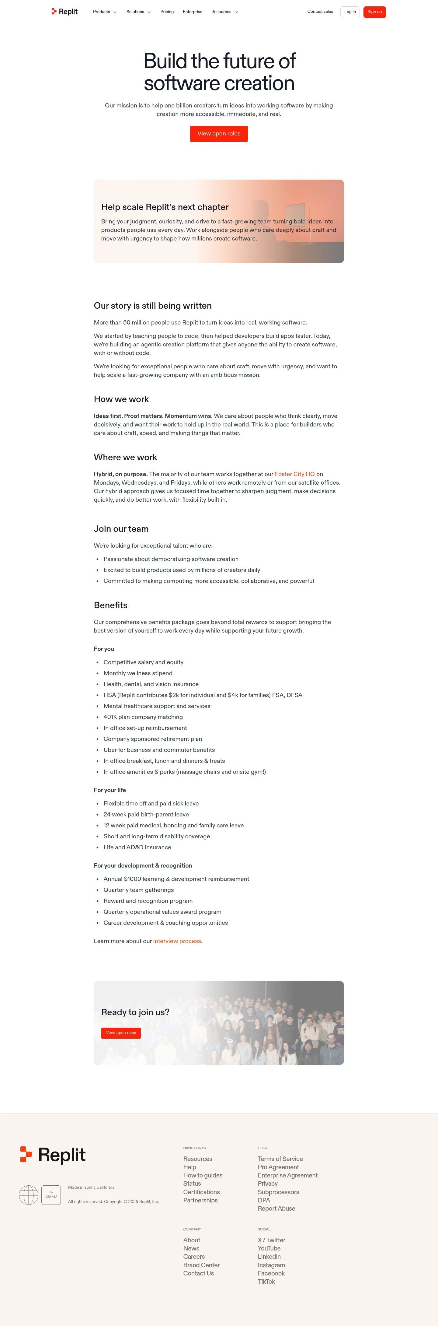
Below is a complete design specification measured from a real, published web page. Use it as a design language for the user's product. It is not a page to reproduce.

## Reference images

- Full page: https://cdn.designmunk.com/2026/09/12082243/replit-com-careers-featured.webp
- Above the fold: https://cdn.designmunk.com/2026/09/12082243/replit-com-careers-featured.webp
- On DesignMunk: https://designmunk.com/replit-careers-page/

Study these for hierarchy, rhythm, spacing and density. Where an image and the written spec disagree, the spec wins: the tokens were read from the page's own CSS, the images are one rendering of it.

## Before you start

Ask the user what they are building, who it is for, and what brand assets they already have — name, colours, typefaces. Wait for their answers before writing anything. Everything below is then applied to their product, not to the reference.

## Design specification

# Replit Careers: Grotesk Headlines and Signal-Orange CTAs

## Overview

Replit's careers page presents a confident, engineering-forward brand: spacious, minimal, and action-biased. The audience is technical and product-minded candidates who value clear hierarchy and fast decisions. The tone is serious but optimistic—large headlines, ample whitespace, and a single high-energy accent for actions. When a case is not covered by tokens, choose clarity and contrast over decoration.

## Colors

- **primary (#1b2333):** Core ink for headlines, body text, and high-readability copy.
- **secondary (#1a1b1b):** Near-black for navigation, metadata, and subdued UI text.
- **tertiary (#ff3c00):** Accent for primary actions, emphasis links, and highlights.
- **neutral (#ffffff):** Page background and default card surfaces.
- **border (#e5e7eb):** Subtle dividers, input borders, and section separators.
- **surface (#ffffff):** Alias of neutral for surfaces requiring explicit tokening.
- **on-surface (#1b2333):** Default text color when placed on neutral/surface backgrounds.

## Typography

ABCDiatype (ABC Diatype) is the sole family across headings and body.
- Availability: custom/self-hosted; not a Google font. Agents should not attempt to load it directly from third-party CDNs.
- Recommended substitutes (open and obtainable): Inter, IBM Plex Sans, Work Sans. Use system stacks as final fallback.
- Roles: headline-lg 72px/1 with -0.047em for hero statements; headline-md 52px/1.19 for primary section headings; headline-sm 38px/1.21 and headline-xs 28px/1.21 for subsections and feature blocks; body-md 20.1px/1.49 for all paragraphs and long-form content. All weights run at 400 for a calm, confident tone.

## Layout

Spacing is generous and uses a short, stepped scale: 12, 24, 38, 96, 194px. Use lg (96px) for vertical section padding and xl (194px) for heroes. md (38px) is the default stack gap between headings and paragraphs or between blocks within a section. sm (24px) handles compact groupings and column gaps; xs (12px) is for tight internal spacing. Content reads as a centered single column; multi-column lists (e.g., benefits) break at larger viewports using sm gaps and optional border dividers.

## Elevation & Depth

Depth is minimal. Only the sm shadow is available: rgba(0,0,0,0.12) 0 8px 24px 0 for occasional emphasis (e.g., promotional or recruitment cards). Most hierarchy relies on whitespace, the #e5e7eb border token, and typographic scale rather than heavier shadows.

## Shapes

The language is rectilinear with consistent 8px radii. Buttons and cards use rounded.sm (8px) to signal clickability and friendliness. Text links (button-link) are square (0px radius) to read as inline, non-container actions. Do not mix radii within a component.

## Components

Buttons
- Primary: 38px height; padding 8px 12px; background #ff3c00; text #ffffff; radius 8px. Use for main CTAs like "View open roles."
- Secondary: 38px height; padding 8px 12px; text #1b2333; radius 8px; no fill by default.
- Link: text-only action using #ff3c00; radius 0px.

Card
- Background #ffffff; text #1b2333; padding 16px; radius 8px; optional sm shadow for emphasis.

### Global navigation
- Text color #1a1b1b; compact vertical padding using xs–sm; primary action ("Sign up") uses the primary button spec. Use border #e5e7eb for separators on sticky or mobile states.

### Careers hero
- headline-lg 72px/1 at weight 400 with -0.047em; centered on #ffffff. Body-md 20.1px supporting line; primary button immediately below with md (38px) gap.

### Recruitment banner
- A featured card placed after the hero. Use card spec with sm shadow; may include a soft image/gradient overlay while maintaining text in #1b2333 for legibility.

### Company story block
- headline-sm or headline-md for the section title; paragraphs in body-md with md (38px) stack spacing. Keep lines wide and unbroken by unnecessary rules.

### How we work
- headline-sm for heading; opening sentence may include bold emphasis. Use sm (24px) gaps between the emphasized line and supporting paragraph.

### Benefits list
- Three categorized lists under bold subheads. Use headline-xs (28px) for subheads and body-md for bullets. Column gap sm (24px); optional vertical dividers using #e5e7eb.

### Ready to join CTA
- Compact closing section with a single primary button. Maintain lg (96px) vertical padding and center alignment.

### Footer links grid
- Multi-column link groups separated by #e5e7eb borders. Body-md for link text; sm (24px) gaps within groups and md (38px) between groups.

## Do's and Don'ts

- Do reserve #ff3c00 for primary actions and emphasis links; don't introduce additional accent colors.
- Do keep corners at 8px across buttons and cards; don't mix rounded values within a component.
- Do space sections with lg (96px) and heroes with xl (194px); don't collapse vertical rhythm below md (38px) between major blocks.
- Do use ABCDiatype at weight 400 for all headings; don't substitute bold weights to create hierarchy—use size and spacing.
- Do use #e5e7eb for dividers and light rules; don't use it for body text or interactive states.
- Don't add heavy shadows; the sm shadow is the maximum allowed depth.

## Agent Prompt Guide

Quick color reference — text: #1b2333, background: #ffffff, border: #e5e7eb, accent: #ff3c00.

1) Build a centered hero for a careers page: h1 in ABCDiatype (or Inter fallback) at 72px, line-height 1, letter-spacing -0.047em, color #1b2333 on #ffffff. Add a supporting paragraph in 20.1px/1.49. Place a primary button (38px height, 8px radius, padding 8px 12px, background #ff3c00, text #ffffff) below with 38px gap and 96px top/bottom section padding.

2) Create a global nav bar: links in ABCDiatype 20.1px, color #1a1b1b on #ffffff with 12–24px vertical padding. Right-align a "Sign up" button using the primary button spec. Add a bottom border #e5e7eb.

3) Add a recruitment card below the hero: container 100% width of content, background #ffffff, padding 16px, radius 8px, shadow rgba(0,0,0,0.12) 0 8px 24px 0. Title in 38px; paragraph in 20.1px. Allow an image/gradient overlay while keeping text color #1b2333.

4) Lay out a three-column benefits section: each column has a 28px subhead and 20.1px bullet list. Use a 24px column gap and optional vertical dividers in #e5e7eb. Section padding 96px top/bottom.

5) Close with a CTA block: centered paragraph in 20.1px and a primary button using #ff3c00. Maintain 96px vertical padding and 38px gap between text and button.

## Similar Brands

- Cloudflare — similar white canvas and orange accent; Replit's type runs lighter in weight and its ink tone is deeper (#1b2333 vs brighter blacks).
- Stripe — equally spacious with disciplined borders; Replit swaps Stripe's purples for a single signal-orange CTA.
- GitHub — developer-first clarity and restrained palette; Replit uses a brighter accent and larger hero type.
- Vercel — minimalist layout and centered rhythm; Replit is lighter on darks and relies on a single accent rather than gradients or motion.

## Tokens

### CSS custom properties

```css
:root {
  /* Colors */
  --color-primary: #1b2333;
  --color-secondary: #1a1b1b;
  --color-tertiary: #ff3c00;
  --color-neutral: #ffffff;
  --color-border: #e5e7eb;
  --color-surface: var(--color-neutral);
  --color-on-surface: var(--color-primary);

  /* Typography */
  --text-headline-lg-size: 72px;
  --text-headline-lg-weight: 400;
  --text-headline-lg-leading: 1;
  --text-headline-lg-tracking: -0.047em;
  --text-headline-md-size: 52px;
  --text-headline-md-weight: 400;
  --text-headline-md-leading: 1.19;
  --text-headline-sm-size: 38px;
  --text-headline-sm-weight: 400;
  --text-headline-sm-leading: 1.21;
  --text-headline-xs-size: 28px;
  --text-headline-xs-weight: 400;
  --text-headline-xs-leading: 1.21;
  --text-body-md-size: 20.1px;
  --text-body-md-weight: 400;
  --text-body-md-leading: 1.49;
  --text-body-md-tracking: 0.003em;
  --font-abcdiatype: "ABCDiatype";

  /* Rounded */
  --radius-sm: 8px;

  /* Spacing */
  --spacing-xs: 12px;
  --spacing-sm: 24px;
  --spacing-md: 38px;
  --spacing-lg: 96px;
  --spacing-xl: 194px;

  /* Components */
  --button-primary-background-color: var(--color-tertiary);
  --button-primary-text-color: var(--color-neutral);
  --button-primary-rounded: var(--radius-sm);
  --button-primary-padding: 8px 12px;
  --button-primary-height: 38px;
  --button-secondary-text-color: var(--color-primary);
  --button-secondary-rounded: var(--radius-sm);
  --button-secondary-padding: 8px 12px;
  --button-secondary-height: 38px;
  --button-link-text-color: var(--color-tertiary);
  --button-link-rounded: 0px;
  --card-background-color: var(--color-neutral);
  --card-text-color: var(--color-primary);
  --card-rounded: var(--radius-sm);
  --card-padding: 16px;
}
```

### Tailwind theme

```css
@theme {
  --color-primary: #1b2333;
  --color-secondary: #1a1b1b;
  --color-tertiary: #ff3c00;
  --color-neutral: #ffffff;
  --color-border: #e5e7eb;
  --color-surface: #ffffff;
  --color-on-surface: #1b2333;
  --font-headline-lg: "ABCDiatype";
  --font-headline-md: "ABCDiatype";
  --font-headline-sm: "ABCDiatype";
  --font-headline-xs: "ABCDiatype";
  --font-body-md: "ABCDiatype";
  --text-headline-lg: 72px;
  --text-headline-md: 52px;
  --text-headline-sm: 38px;
  --text-headline-xs: 28px;
  --text-body-md: 20.1px;
  --tracking-headline-lg: -0.047em;
  --tracking-body-md: 0.003em;
  --font-weight-headline-lg: 400;
  --font-weight-headline-md: 400;
  --font-weight-headline-sm: 400;
  --font-weight-headline-xs: 400;
  --font-weight-body-md: 400;
  --radius-sm: 8px;
  --spacing-xs: 12px;
  --spacing-sm: 24px;
  --spacing-md: 38px;
  --spacing-lg: 96px;
  --spacing-xl: 194px;
}
```

### Design tokens (DTCG)

```json
{
    "$schema": "https://www.designtokens.org/schemas/2025.10/format.json",
    "color": {
        "$type": "color",
        "primary": {
            "$value": {
                "colorSpace": "srgb",
                "components": [
                    0.106,
                    0.137,
                    0.2
                ],
                "hex": "#1b2333"
            }
        },
        "secondary": {
            "$value": {
                "colorSpace": "srgb",
                "components": [
                    0.102,
                    0.106,
                    0.106
                ],
                "hex": "#1a1b1b"
            }
        },
        "tertiary": {
            "$value": {
                "colorSpace": "srgb",
                "components": [
                    1,
                    0.235,
                    0
                ],
                "hex": "#ff3c00"
            }
        },
        "neutral": {
            "$value": {
                "colorSpace": "srgb",
                "components": [
                    1,
                    1,
                    1
                ],
                "hex": "#ffffff"
            }
        },
        "border": {
            "$value": {
                "colorSpace": "srgb",
                "components": [
                    0.898,
                    0.906,
                    0.922
                ],
                "hex": "#e5e7eb"
            }
        },
        "surface": {
            "$value": {
                "colorSpace": "srgb",
                "components": [
                    1,
                    1,
                    1
                ],
                "hex": "#ffffff"
            }
        },
        "on-surface": {
            "$value": {
                "colorSpace": "srgb",
                "components": [
                    0.106,
                    0.137,
                    0.2
                ],
                "hex": "#1b2333"
            }
        }
    },
    "spacing": {
        "$type": "dimension",
        "xs": {
            "$value": {
                "value": 12,
                "unit": "px"
            }
        },
        "sm": {
            "$value": {
                "value": 24,
                "unit": "px"
            }
        },
        "md": {
            "$value": {
                "value": 38,
                "unit": "px"
            }
        },
        "lg": {
            "$value": {
                "value": 96,
                "unit": "px"
            }
        },
        "xl": {
            "$value": {
                "value": 194,
                "unit": "px"
            }
        }
    },
    "rounded": {
        "$type": "dimension",
        "sm": {
            "$value": {
                "value": 8,
                "unit": "px"
            }
        }
    },
    "typography": {
        "headline-lg": {
            "$type": "typography",
            "$value": {
                "fontFamily": "ABCDiatype",
                "fontSize": {
                    "value": 72,
                    "unit": "px"
                },
                "fontWeight": 400,
                "letterSpacing": {
                    "value": -0.047,
                    "unit": "em"
                }
            }
        },
        "headline-md": {
            "$type": "typography",
            "$value": {
                "fontFamily": "ABCDiatype",
                "fontSize": {
                    "value": 52,
                    "unit": "px"
                },
                "fontWeight": 400
            }
        },
        "headline-sm": {
            "$type": "typography",
            "$value": {
                "fontFamily": "ABCDiatype",
                "fontSize": {
                    "value": 38,
                    "unit": "px"
                },
                "fontWeight": 400
            }
        },
        "headline-xs": {
            "$type": "typography",
            "$value": {
                "fontFamily": "ABCDiatype",
                "fontSize": {
                    "value": 28,
                    "unit": "px"
                },
                "fontWeight": 400
            }
        },
        "body-md": {
            "$type": "typography",
            "$value": {
                "fontFamily": "ABCDiatype",
                "fontSize": {
                    "value": 20.1,
                    "unit": "px"
                },
                "fontWeight": 400,
                "letterSpacing": {
                    "value": 0.003,
                    "unit": "em"
                }
            }
        }
    }
}
```

## Rules

- **Fonts.** If the specification names a custom or self-hosted family, use one of the substitutes it names. Never reference a typeface you cannot actually load — it will fall back to a system font and undo the typography.
- **Colour.** Derive the palette from the user's brand. Use the token values as a guide to *relationships* — contrast, tint, how many accents carry the page — not as hex codes to paste.
- **Never reproduce** the wordmark, mascot, logo, brand name, illustrations, icon set, screenshots or any copy from the reference.
- **Never present the result as Replit Careers**, or imply any connection to it.
- If something is unspecified, choose clarity and legibility over decoration.
---
version: alpha
name: Replit
description: Turn ideas into apps in minutes — no coding needed
colors:
  primary: "#1b2333"
  secondary: "#1a1b1b"
  tertiary: "#ff3c00"
  neutral: "#ffffff"
  border: "#e5e7eb"
  surface: "{colors.neutral}"
  on-surface: "{colors.primary}"
typography:
  headline-lg:
    fontFamily: ABCDiatype
    fontSize: 72px
    fontWeight: 400
    lineHeight: 1
    letterSpacing: -0.047em
  headline-md:
    fontFamily: ABCDiatype
    fontSize: 52px
    fontWeight: 400
    lineHeight: 1.19
  headline-sm:
    fontFamily: ABCDiatype
    fontSize: 38px
    fontWeight: 400
    lineHeight: 1.21
  headline-xs:
    fontFamily: ABCDiatype
    fontSize: 28px
    fontWeight: 400
    lineHeight: 1.21
  body-md:
    fontFamily: ABCDiatype
    fontSize: 20.1px
    fontWeight: 400
    lineHeight: 1.49
    letterSpacing: 0.003em
rounded:
  sm: 8px
spacing:
  xs: 12px
  sm: 24px
  md: 38px
  lg: 96px
  xl: 194px
components:
  button-primary:
    backgroundColor: "{colors.tertiary}"
    textColor: "{colors.neutral}"
    rounded: "{rounded.sm}"
    padding: 8px 12px
    height: 38px
  button-secondary:
    textColor: "{colors.primary}"
    rounded: "{rounded.sm}"
    padding: 8px 12px
    height: 38px
  button-link:
    textColor: "{colors.tertiary}"
    rounded: 0px
  card:
    backgroundColor: "{colors.neutral}"
    textColor: "{colors.primary}"
    rounded: "{rounded.sm}"
    padding: 16px
---

# Replit Careers: Grotesk Headlines and Signal-Orange CTAs

## Overview

Replit's careers page presents a confident, engineering-forward brand: spacious, minimal, and action-biased. The audience is technical and product-minded candidates who value clear hierarchy and fast decisions. The tone is serious but optimistic—large headlines, ample whitespace, and a single high-energy accent for actions. When a case is not covered by tokens, choose clarity and contrast over decoration.

## Colors

- **primary (#1b2333):** Core ink for headlines, body text, and high-readability copy.
- **secondary (#1a1b1b):** Near-black for navigation, metadata, and subdued UI text.
- **tertiary (#ff3c00):** Accent for primary actions, emphasis links, and highlights.
- **neutral (#ffffff):** Page background and default card surfaces.
- **border (#e5e7eb):** Subtle dividers, input borders, and section separators.
- **surface (#ffffff):** Alias of neutral for surfaces requiring explicit tokening.
- **on-surface (#1b2333):** Default text color when placed on neutral/surface backgrounds.

## Typography

ABCDiatype (ABC Diatype) is the sole family across headings and body.
- Availability: custom/self-hosted; not a Google font. Agents should not attempt to load it directly from third-party CDNs.
- Recommended substitutes (open and obtainable): Inter, IBM Plex Sans, Work Sans. Use system stacks as final fallback.
- Roles: headline-lg 72px/1 with -0.047em for hero statements; headline-md 52px/1.19 for primary section headings; headline-sm 38px/1.21 and headline-xs 28px/1.21 for subsections and feature blocks; body-md 20.1px/1.49 for all paragraphs and long-form content. All weights run at 400 for a calm, confident tone.

## Layout

Spacing is generous and uses a short, stepped scale: 12, 24, 38, 96, 194px. Use lg (96px) for vertical section padding and xl (194px) for heroes. md (38px) is the default stack gap between headings and paragraphs or between blocks within a section. sm (24px) handles compact groupings and column gaps; xs (12px) is for tight internal spacing. Content reads as a centered single column; multi-column lists (e.g., benefits) break at larger viewports using sm gaps and optional border dividers.

## Elevation & Depth

Depth is minimal. Only the sm shadow is available: rgba(0,0,0,0.12) 0 8px 24px 0 for occasional emphasis (e.g., promotional or recruitment cards). Most hierarchy relies on whitespace, the #e5e7eb border token, and typographic scale rather than heavier shadows.

## Shapes

The language is rectilinear with consistent 8px radii. Buttons and cards use rounded.sm (8px) to signal clickability and friendliness. Text links (button-link) are square (0px radius) to read as inline, non-container actions. Do not mix radii within a component.

## Components

Buttons
- Primary: 38px height; padding 8px 12px; background #ff3c00; text #ffffff; radius 8px. Use for main CTAs like "View open roles."
- Secondary: 38px height; padding 8px 12px; text #1b2333; radius 8px; no fill by default.
- Link: text-only action using #ff3c00; radius 0px.

Card
- Background #ffffff; text #1b2333; padding 16px; radius 8px; optional sm shadow for emphasis.

### Global navigation
- Text color #1a1b1b; compact vertical padding using xs–sm; primary action ("Sign up") uses the primary button spec. Use border #e5e7eb for separators on sticky or mobile states.

### Careers hero
- headline-lg 72px/1 at weight 400 with -0.047em; centered on #ffffff. Body-md 20.1px supporting line; primary button immediately below with md (38px) gap.

### Recruitment banner
- A featured card placed after the hero. Use card spec with sm shadow; may include a soft image/gradient overlay while maintaining text in #1b2333 for legibility.

### Company story block
- headline-sm or headline-md for the section title; paragraphs in body-md with md (38px) stack spacing. Keep lines wide and unbroken by unnecessary rules.

### How we work
- headline-sm for heading; opening sentence may include bold emphasis. Use sm (24px) gaps between the emphasized line and supporting paragraph.

### Benefits list
- Three categorized lists under bold subheads. Use headline-xs (28px) for subheads and body-md for bullets. Column gap sm (24px); optional vertical dividers using #e5e7eb.

### Ready to join CTA
- Compact closing section with a single primary button. Maintain lg (96px) vertical padding and center alignment.

### Footer links grid
- Multi-column link groups separated by #e5e7eb borders. Body-md for link text; sm (24px) gaps within groups and md (38px) between groups.

## Do's and Don'ts

- Do reserve #ff3c00 for primary actions and emphasis links; don't introduce additional accent colors.
- Do keep corners at 8px across buttons and cards; don't mix rounded values within a component.
- Do space sections with lg (96px) and heroes with xl (194px); don't collapse vertical rhythm below md (38px) between major blocks.
- Do use ABCDiatype at weight 400 for all headings; don't substitute bold weights to create hierarchy—use size and spacing.
- Do use #e5e7eb for dividers and light rules; don't use it for body text or interactive states.
- Don't add heavy shadows; the sm shadow is the maximum allowed depth.

## Agent Prompt Guide

Quick color reference — text: #1b2333, background: #ffffff, border: #e5e7eb, accent: #ff3c00.

1) Build a centered hero for a careers page: h1 in ABCDiatype (or Inter fallback) at 72px, line-height 1, letter-spacing -0.047em, color #1b2333 on #ffffff. Add a supporting paragraph in 20.1px/1.49. Place a primary button (38px height, 8px radius, padding 8px 12px, background #ff3c00, text #ffffff) below with 38px gap and 96px top/bottom section padding.

2) Create a global nav bar: links in ABCDiatype 20.1px, color #1a1b1b on #ffffff with 12–24px vertical padding. Right-align a "Sign up" button using the primary button spec. Add a bottom border #e5e7eb.

3) Add a recruitment card below the hero: container 100% width of content, background #ffffff, padding 16px, radius 8px, shadow rgba(0,0,0,0.12) 0 8px 24px 0. Title in 38px; paragraph in 20.1px. Allow an image/gradient overlay while keeping text color #1b2333.

4) Lay out a three-column benefits section: each column has a 28px subhead and 20.1px bullet list. Use a 24px column gap and optional vertical dividers in #e5e7eb. Section padding 96px top/bottom.

5) Close with a CTA block: centered paragraph in 20.1px and a primary button using #ff3c00. Maintain 96px vertical padding and 38px gap between text and button.

## Similar Brands

- Cloudflare — similar white canvas and orange accent; Replit's type runs lighter in weight and its ink tone is deeper (#1b2333 vs brighter blacks).
- Stripe — equally spacious with disciplined borders; Replit swaps Stripe's purples for a single signal-orange CTA.
- GitHub — developer-first clarity and restrained palette; Replit uses a brighter accent and larger hero type.
- Vercel — minimalist layout and centered rhythm; Replit is lighter on darks and relies on a single accent rather than gradients or motion.
:root {
  /* Colors */
  --color-primary: #1b2333;
  --color-secondary: #1a1b1b;
  --color-tertiary: #ff3c00;
  --color-neutral: #ffffff;
  --color-border: #e5e7eb;
  --color-surface: var(--color-neutral);
  --color-on-surface: var(--color-primary);

  /* Typography */
  --text-headline-lg-size: 72px;
  --text-headline-lg-weight: 400;
  --text-headline-lg-leading: 1;
  --text-headline-lg-tracking: -0.047em;
  --text-headline-md-size: 52px;
  --text-headline-md-weight: 400;
  --text-headline-md-leading: 1.19;
  --text-headline-sm-size: 38px;
  --text-headline-sm-weight: 400;
  --text-headline-sm-leading: 1.21;
  --text-headline-xs-size: 28px;
  --text-headline-xs-weight: 400;
  --text-headline-xs-leading: 1.21;
  --text-body-md-size: 20.1px;
  --text-body-md-weight: 400;
  --text-body-md-leading: 1.49;
  --text-body-md-tracking: 0.003em;
  --font-abcdiatype: "ABCDiatype";

  /* Rounded */
  --radius-sm: 8px;

  /* Spacing */
  --spacing-xs: 12px;
  --spacing-sm: 24px;
  --spacing-md: 38px;
  --spacing-lg: 96px;
  --spacing-xl: 194px;

  /* Components */
  --button-primary-background-color: var(--color-tertiary);
  --button-primary-text-color: var(--color-neutral);
  --button-primary-rounded: var(--radius-sm);
  --button-primary-padding: 8px 12px;
  --button-primary-height: 38px;
  --button-secondary-text-color: var(--color-primary);
  --button-secondary-rounded: var(--radius-sm);
  --button-secondary-padding: 8px 12px;
  --button-secondary-height: 38px;
  --button-link-text-color: var(--color-tertiary);
  --button-link-rounded: 0px;
  --card-background-color: var(--color-neutral);
  --card-text-color: var(--color-primary);
  --card-rounded: var(--radius-sm);
  --card-padding: 16px;
}
{
  "$schema": "https://www.designtokens.org/schemas/2025.10/format.json",
  "$description": "Turn ideas into apps in minutes — no coding needed",
  "color": {
    "$type": "color",
    "primary": {
      "$value": {
        "colorSpace": "srgb",
        "components": [
          0.106,
          0.137,
          0.2
        ],
        "hex": "#1b2333"
      }
    },
    "secondary": {
      "$value": {
        "colorSpace": "srgb",
        "components": [
          0.102,
          0.106,
          0.106
        ],
        "hex": "#1a1b1b"
      }
    },
    "tertiary": {
      "$value": {
        "colorSpace": "srgb",
        "components": [
          1,
          0.235,
          0
        ],
        "hex": "#ff3c00"
      }
    },
    "neutral": {
      "$value": {
        "colorSpace": "srgb",
        "components": [
          1,
          1,
          1
        ],
        "hex": "#ffffff"
      }
    },
    "border": {
      "$value": {
        "colorSpace": "srgb",
        "components": [
          0.898,
          0.906,
          0.922
        ],
        "hex": "#e5e7eb"
      }
    },
    "surface": {
      "$value": {
        "colorSpace": "srgb",
        "components": [
          1,
          1,
          1
        ],
        "hex": "#ffffff"
      }
    },
    "on-surface": {
      "$value": {
        "colorSpace": "srgb",
        "components": [
          0.106,
          0.137,
          0.2
        ],
        "hex": "#1b2333"
      }
    }
  },
  "spacing": {
    "$type": "dimension",
    "xs": {
      "$value": {
        "value": 12,
        "unit": "px"
      }
    },
    "sm": {
      "$value": {
        "value": 24,
        "unit": "px"
      }
    },
    "md": {
      "$value": {
        "value": 38,
        "unit": "px"
      }
    },
    "lg": {
      "$value": {
        "value": 96,
        "unit": "px"
      }
    },
    "xl": {
      "$value": {
        "value": 194,
        "unit": "px"
      }
    }
  },
  "rounded": {
    "$type": "dimension",
    "sm": {
      "$value": {
        "value": 8,
        "unit": "px"
      }
    }
  },
  "typography": {
    "headline-lg": {
      "$type": "typography",
      "$value": {
        "fontFamily": "ABCDiatype",
        "fontSize": {
          "value": 72,
          "unit": "px"
        },
        "fontWeight": 400,
        "letterSpacing": {
          "value": -0.047,
          "unit": "em"
        }
      }
    },
    "headline-md": {
      "$type": "typography",
      "$value": {
        "fontFamily": "ABCDiatype",
        "fontSize": {
          "value": 52,
          "unit": "px"
        },
        "fontWeight": 400
      }
    },
    "headline-sm": {
      "$type": "typography",
      "$value": {
        "fontFamily": "ABCDiatype",
        "fontSize": {
          "value": 38,
          "unit": "px"
        },
        "fontWeight": 400
      }
    },
    "headline-xs": {
      "$type": "typography",
      "$value": {
        "fontFamily": "ABCDiatype",
        "fontSize": {
          "value": 28,
          "unit": "px"
        },
        "fontWeight": 400
      }
    },
    "body-md": {
      "$type": "typography",
      "$value": {
        "fontFamily": "ABCDiatype",
        "fontSize": {
          "value": 20.1,
          "unit": "px"
        },
        "fontWeight": 400,
        "letterSpacing": {
          "value": 0.003,
          "unit": "em"
        }
      }
    }
  }
}
@theme {
--color-primary: #1b2333;
--color-secondary: #1a1b1b;
--color-tertiary: #ff3c00;
--color-neutral: #ffffff;
--color-border: #e5e7eb;
--color-surface: #ffffff;
--color-on-surface: #1b2333;
--font-headline-lg: "ABCDiatype";
--font-headline-md: "ABCDiatype";
--font-headline-sm: "ABCDiatype";
--font-headline-xs: "ABCDiatype";
--font-body-md: "ABCDiatype";
--text-headline-lg: 72px;
--text-headline-md: 52px;
--text-headline-sm: 38px;
--text-headline-xs: 28px;
--text-body-md: 20.1px;
--tracking-headline-lg: -0.047em;
--tracking-body-md: 0.003em;
--font-weight-headline-lg: 400;
--font-weight-headline-md: 400;
--font-weight-headline-sm: 400;
--font-weight-headline-xs: 400;
--font-weight-body-md: 400;
--radius-sm: 8px;
--spacing-xs: 12px;
--spacing-sm: 24px;
--spacing-md: 38px;
--spacing-lg: 96px;
--spacing-xl: 194px;
} # Design brief: the Replit Careers design language
Below is a complete design specification measured from a real, published web page. Use it as a design language for the user's product. It is not a page to reproduce.
## Reference images
- Full page: https://cdn.designmunk.com/2026/09/12082243/replit-com-careers-featured.webp
- Above the fold: https://cdn.designmunk.com/2026/09/12082243/replit-com-careers-featured.webp
- On DesignMunk: https://designmunk.com/replit-careers-page/
Study these for hierarchy, rhythm, spacing and density. Where an image and the written spec disagree, the spec wins: the tokens were read from the page's own CSS, the images are one rendering of it.
## Before you start
Ask the user what they are building, who it is for, and what brand assets they already have — name, colours, typefaces. Wait for their answers before writing anything. Everything below is then applied to their product, not to the reference.
## Design specification
# Replit Careers: Grotesk Headlines and Signal-Orange CTAs
## Overview
Replit's careers page presents a confident, engineering-forward brand: spacious, minimal, and action-biased. The audience is technical and product-minded candidates who value clear hierarchy and fast decisions. The tone is serious but optimistic—large headlines, ample whitespace, and a single high-energy accent for actions. When a case is not covered by tokens, choose clarity and contrast over decoration.
## Colors
- **primary (#1b2333):** Core ink for headlines, body text, and high-readability copy.
- **secondary (#1a1b1b):** Near-black for navigation, metadata, and subdued UI text.
- **tertiary (#ff3c00):** Accent for primary actions, emphasis links, and highlights.
- **neutral (#ffffff):** Page background and default card surfaces.
- **border (#e5e7eb):** Subtle dividers, input borders, and section separators.
- **surface (#ffffff):** Alias of neutral for surfaces requiring explicit tokening.
- **on-surface (#1b2333):** Default text color when placed on neutral/surface backgrounds.
## Typography
ABCDiatype (ABC Diatype) is the sole family across headings and body.
- Availability: custom/self-hosted; not a Google font. Agents should not attempt to load it directly from third-party CDNs.
- Recommended substitutes (open and obtainable): Inter, IBM Plex Sans, Work Sans. Use system stacks as final fallback.
- Roles: headline-lg 72px/1 with -0.047em for hero statements; headline-md 52px/1.19 for primary section headings; headline-sm 38px/1.21 and headline-xs 28px/1.21 for subsections and feature blocks; body-md 20.1px/1.49 for all paragraphs and long-form content. All weights run at 400 for a calm, confident tone.
## Layout
Spacing is generous and uses a short, stepped scale: 12, 24, 38, 96, 194px. Use lg (96px) for vertical section padding and xl (194px) for heroes. md (38px) is the default stack gap between headings and paragraphs or between blocks within a section. sm (24px) handles compact groupings and column gaps; xs (12px) is for tight internal spacing. Content reads as a centered single column; multi-column lists (e.g., benefits) break at larger viewports using sm gaps and optional border dividers.
## Elevation & Depth
Depth is minimal. Only the sm shadow is available: rgba(0,0,0,0.12) 0 8px 24px 0 for occasional emphasis (e.g., promotional or recruitment cards). Most hierarchy relies on whitespace, the #e5e7eb border token, and typographic scale rather than heavier shadows.
## Shapes
The language is rectilinear with consistent 8px radii. Buttons and cards use rounded.sm (8px) to signal clickability and friendliness. Text links (button-link) are square (0px radius) to read as inline, non-container actions. Do not mix radii within a component.
## Components
Buttons
- Primary: 38px height; padding 8px 12px; background #ff3c00; text #ffffff; radius 8px. Use for main CTAs like "View open roles."
- Secondary: 38px height; padding 8px 12px; text #1b2333; radius 8px; no fill by default.
- Link: text-only action using #ff3c00; radius 0px.
Card
- Background #ffffff; text #1b2333; padding 16px; radius 8px; optional sm shadow for emphasis.
### Global navigation
- Text color #1a1b1b; compact vertical padding using xs–sm; primary action ("Sign up") uses the primary button spec. Use border #e5e7eb for separators on sticky or mobile states.
### Careers hero
- headline-lg 72px/1 at weight 400 with -0.047em; centered on #ffffff. Body-md 20.1px supporting line; primary button immediately below with md (38px) gap.
### Recruitment banner
- A featured card placed after the hero. Use card spec with sm shadow; may include a soft image/gradient overlay while maintaining text in #1b2333 for legibility.
### Company story block
- headline-sm or headline-md for the section title; paragraphs in body-md with md (38px) stack spacing. Keep lines wide and unbroken by unnecessary rules.
### How we work
- headline-sm for heading; opening sentence may include bold emphasis. Use sm (24px) gaps between the emphasized line and supporting paragraph.
### Benefits list
- Three categorized lists under bold subheads. Use headline-xs (28px) for subheads and body-md for bullets. Column gap sm (24px); optional vertical dividers using #e5e7eb.
### Ready to join CTA
- Compact closing section with a single primary button. Maintain lg (96px) vertical padding and center alignment.
### Footer links grid
- Multi-column link groups separated by #e5e7eb borders. Body-md for link text; sm (24px) gaps within groups and md (38px) between groups.
## Do's and Don'ts
- Do reserve #ff3c00 for primary actions and emphasis links; don't introduce additional accent colors.
- Do keep corners at 8px across buttons and cards; don't mix rounded values within a component.
- Do space sections with lg (96px) and heroes with xl (194px); don't collapse vertical rhythm below md (38px) between major blocks.
- Do use ABCDiatype at weight 400 for all headings; don't substitute bold weights to create hierarchy—use size and spacing.
- Do use #e5e7eb for dividers and light rules; don't use it for body text or interactive states.
- Don't add heavy shadows; the sm shadow is the maximum allowed depth.
## Agent Prompt Guide
Quick color reference — text: #1b2333, background: #ffffff, border: #e5e7eb, accent: #ff3c00.
1) Build a centered hero for a careers page: h1 in ABCDiatype (or Inter fallback) at 72px, line-height 1, letter-spacing -0.047em, color #1b2333 on #ffffff. Add a supporting paragraph in 20.1px/1.49. Place a primary button (38px height, 8px radius, padding 8px 12px, background #ff3c00, text #ffffff) below with 38px gap and 96px top/bottom section padding.
2) Create a global nav bar: links in ABCDiatype 20.1px, color #1a1b1b on #ffffff with 12–24px vertical padding. Right-align a "Sign up" button using the primary button spec. Add a bottom border #e5e7eb.
3) Add a recruitment card below the hero: container 100% width of content, background #ffffff, padding 16px, radius 8px, shadow rgba(0,0,0,0.12) 0 8px 24px 0. Title in 38px; paragraph in 20.1px. Allow an image/gradient overlay while keeping text color #1b2333.
4) Lay out a three-column benefits section: each column has a 28px subhead and 20.1px bullet list. Use a 24px column gap and optional vertical dividers in #e5e7eb. Section padding 96px top/bottom.
5) Close with a CTA block: centered paragraph in 20.1px and a primary button using #ff3c00. Maintain 96px vertical padding and 38px gap between text and button.
## Tokens
### CSS custom properties
```css
:root {
/* Colors */
--color-primary: #1b2333;
--color-secondary: #1a1b1b;
--color-tertiary: #ff3c00;
--color-neutral: #ffffff;
--color-border: #e5e7eb;
--color-surface: var(--color-neutral);
--color-on-surface: var(--color-primary);
/* Typography */
--text-headline-lg-size: 72px;
--text-headline-lg-weight: 400;
--text-headline-lg-leading: 1;
--text-headline-lg-tracking: -0.047em;
--text-headline-md-size: 52px;
--text-headline-md-weight: 400;
--text-headline-md-leading: 1.19;
--text-headline-sm-size: 38px;
--text-headline-sm-weight: 400;
--text-headline-sm-leading: 1.21;
--text-headline-xs-size: 28px;
--text-headline-xs-weight: 400;
--text-headline-xs-leading: 1.21;
--text-body-md-size: 20.1px;
--text-body-md-weight: 400;
--text-body-md-leading: 1.49;
--text-body-md-tracking: 0.003em;
--font-abcdiatype: "ABCDiatype";
/* Rounded */
--radius-sm: 8px;
/* Spacing */
--spacing-xs: 12px;
--spacing-sm: 24px;
--spacing-md: 38px;
--spacing-lg: 96px;
--spacing-xl: 194px;
/* Components */
--button-primary-background-color: var(--color-tertiary);
--button-primary-text-color: var(--color-neutral);
--button-primary-rounded: var(--radius-sm);
--button-primary-padding: 8px 12px;
--button-primary-height: 38px;
--button-secondary-text-color: var(--color-primary);
--button-secondary-rounded: var(--radius-sm);
--button-secondary-padding: 8px 12px;
--button-secondary-height: 38px;
--button-link-text-color: var(--color-tertiary);
--button-link-rounded: 0px;
--card-background-color: var(--color-neutral);
--card-text-color: var(--color-primary);
--card-rounded: var(--radius-sm);
--card-padding: 16px;
}
```
## Rules
- **Fonts.** If the specification names a custom or self-hosted family, use one of the substitutes it names. Never reference a typeface you cannot actually load — it will fall back to a system font and undo the typography.
- **Colour.** Derive the palette from the user's brand. Use the token values as a guide to *relationships* — contrast, tint, how many accents carry the page — not as hex codes to paste.
- **Never reproduce** the wordmark, mascot, logo, brand name, illustrations, icon set, screenshots or any copy from the reference.
- **Never present the result as Replit Careers**, or imply any connection to it.
- If something is unspecified, choose clarity and legibility over decoration.



