







replit.com
AI Breakdown
Design export
# Design brief: the Replit About design language

Below is a complete design specification measured from a real, published web page. Use it as a design language for the user's product. It is not a page to reproduce.

## Reference images

- Full page: https://cdn.designmunk.com/2026/09/10154253/replit-com-about-featured.webp
- Above the fold: https://cdn.designmunk.com/2026/09/10154253/replit-com-about-featured.webp
- On DesignMunk: https://designmunk.com/replit-about-page/

Study these for hierarchy, rhythm, spacing and density. Where an image and the written spec disagree, the spec wins: the tokens were read from the page's own CSS, the images are one rendering of it.

## Before you start

Ask the user what they are building, who it is for, and what brand assets they already have — name, colours, typefaces. Wait for their answers before writing anything. Everything below is then applied to their product, not to the reference.

## Design specification

# Replit: Oversized Diatype Headline, One High-Contrast Orange CTA

## Overview

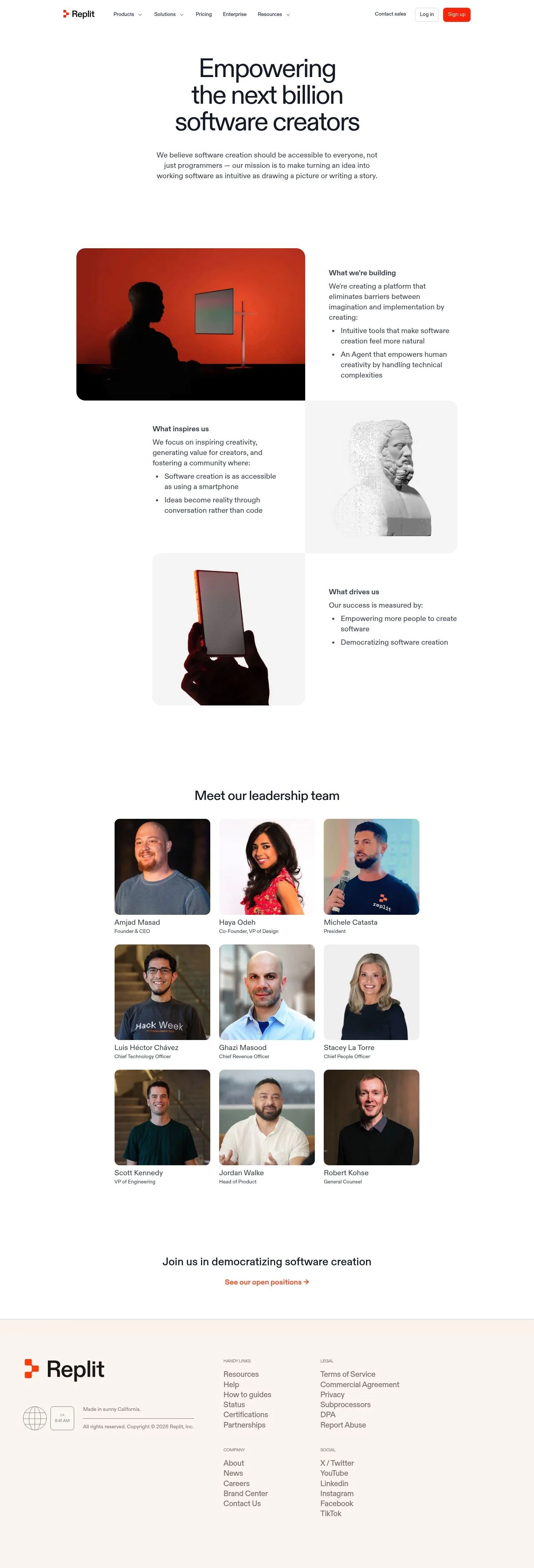
A minimal, text-first system aimed at founders and technical buyers. Tone is confident and instructional rather than playful. Layouts are spacious with long vertical rhythm, foregrounding copy over imagery. Interactions should feel quick and unintrusive; color carries emphasis sparingly.

## Colors

- Primary (#1b2333): Deep navy for headlines, body text, and icons on light surfaces.
- Secondary (#1a1b1b): Carbon black for rare emphasis, logotype accents, or dark UI states.
- Tertiary (#ff3c00): Replit Orange for primary CTAs, highlights, and active states.
- Neutral (#ffffff): Pure white base for pages and cards.
- Border (#e5e7eb): Cloud line dividers, card outlines, and subtle input strokes.
- Surface (#ffffff): Default surface color for containers and cards.
- On-surface (#1b2333): Text and icon color on white surfaces.

## Typography

All type is ABCDiatype. It is a custom, self-hosted family; agents should not assume they can load it directly. Suitable free substitutes with similar neo-grotesk geometry: Inter (Google), IBM Plex Sans (Google), and Public Sans (Google). Roles:
- headline-lg 72px/1.0, tight tracking for hero claims.
- headline-md 52px/1.19 for major section intros.
- headline-sm 38px/1.21 for sub-sections and feature leads.
- headline-xs 28px/1.5 with slight negative tracking for card and sidebar headings.
- body-md 20.1px/1.49 for paragraphs, lists, and long-form copy. Keep weights around 400; use color, not weight, for hierarchy.

## Layout

Spacing scale is asymmetric and generous: xs 12, sm 32, md 40, lg 76, xl 100. Use xl and lg for section top/bottom padding, md for intra-section group gaps, and sm for item spacing within groups. Grids favor a centered single column that breaks into two when pairing media with copy. Maintain wide margins and comfortable line lengths; let lists breathe with body leading rather than additional padding.

## Elevation & Depth

Shadows are largely absent; only sm shadow (rgba(0,0,0,0.12) 0 8px 24px) is available for overlays or focal cards. Everyday hierarchy relies on #e5e7eb borders, contrast between #ffffff and #1b2333, and whitespace. Avoid heavy depth effects; use the orange accent for interactive affordances.

## Shapes

A single language: 8px radius (rounded.sm). Apply it to cards and primary/secondary buttons. Links and text buttons stay square (0px) to preserve contrast between click-targets and inline actions.

## Components

Buttons
- Primary: 38px tall, #ff3c00 background, white text, 8px radius, 8px 12px padding. Use for the main action per view.
- Secondary: 38px tall, text-only with #1b2333 color and 8px corners; no fill by default. Use for lesser actions next to a primary.
- Link: Inline action with #ff3c00 text, 0px radius. Use inside paragraphs, lists, and footers.

Card
- White background, #1b2333 text, 8px radius, 16px padding, optional #e5e7eb border; reserve sm shadow for promotional callouts.

Distinctive page components
### Mission Hero
- Centered block: headline-lg (72px) and a single paragraph in body-md. Vertical spacing: lg above, md between heading and paragraph, md to next section.
### Split Media + Copy
- Left media panel, right text column with a heading (headline-xs or sm) and a bulleted body-md list. Card corners 8px if media sits in a framed box; use border #e5e7eb instead of a shadow.
### Principles List Trio
- Three stacked sections ("What we're building / inspires us / drives us"), each using headline-xs and body-md bullets. Use sm spacing between bullets and md between heading and list.
### Leadership Grid
- Responsive list of names and titles. Heading in headline-xs, items in body-md with a subtle divider (#e5e7eb) or sm gaps; no avatars required.
### Header Bar
- Left logo, center nav groups, right actions. "Sign up" uses the primary button; "Log in" is secondary/link style. Keep bar flat (no shadow).
### Careers CTA Banner
- Prominent card near the end with headline-xs, a brief sentence, and a primary button. White surface, optional #e5e7eb border, 8px radius, sm shadow only if isolation is needed.
### Multi-column Footer
- Link columns with small body text, #e5e7eb dividers, and inline social links; keep accents as link color only.

## Do's and Don'ts

- Do reserve #ff3c00 for primary CTAs and key links; one per view is ideal.
- Do keep body copy at 20.1px and headings on the provided sizes; avoid ad-hoc scales.
- Do use #e5e7eb borders instead of shadows to separate sections and items.
- Don't place long text over #ff3c00 backgrounds; contrast fails for body copy.
- Don't round link-style buttons; they must remain 0px to read as text actions.
- Don't stack multiple primary buttons in one viewport; use secondary for alternates.

## Agent Prompt Guide

Quick color reference — text: #1b2333, background: #ffffff, border: #e5e7eb, accent: #ff3c00.

1) Build the mission hero
- Container: background #ffffff, padding-top 100px, padding-bottom 76px.
- Headline: font-family "ABCDiatype", Inter, system-ui; size 72px; line-height 1; letter-spacing -0.047em; color #1b2333; center aligned.
- Paragraph: font-family as above; size 20.1px; line-height 1.49; color #1b2333; max-width 65ch; margin-top 40px.
- Primary button below: 38px height; padding 8px 12px; background #ff3c00; text #ffffff; border-radius 8px; margin-top 32px.

2) Create a split media + copy section
- Section padding: 76px top/bottom, background #ffffff, border-top 1px solid #e5e7eb.
- Left: 8px-radius image card on #ffffff with optional 1px #e5e7eb border.
- Right: Heading size 38px (headline-sm) color #1b2333; list in 20.1px body style with 32px gap; link color #ff3c00.

3) Lay out the principles trio
- Three stacked blocks; each gets 40px gap between heading (28px, line-height 1.5, letter-spacing -0.026em) and bullets (20.1px/1.49).
- Use #e5e7eb dividers or 76px vertical spacing between blocks; keep surfaces #ffffff.

4) Build the leadership grid and footer
- Leadership: section heading 28px; grid of text items in 20.1px with 32px row gaps and subtle 1px #e5e7eb separators.
- Footer: multi-column list with small 20.1px links; link color #ff3c00; top border 1px #e5e7eb; generous 76px padding and 8px radius only on any callout cards.

## Similar Brands

- Vercel — similarly sparse, monochrome UI with a single high-energy accent; Vercel skews darker and more technical.
- GitHub — developer-first language and restrained color; GitHub uses more illustrations and product screenshots.
- Cloudflare — strong orange accent and utility typography; Cloudflare runs denser layouts and heavier diagrams.
- Notion — calm black-on-white with minimal shadows; Notion's serif-leaning brand moments differ from Replit's neo-grotesk tone.

## Tokens

### CSS custom properties

```css
:root {
  /* Colors */
  --color-primary: #1b2333;
  --color-secondary: #1a1b1b;
  --color-tertiary: #ff3c00;
  --color-neutral: #ffffff;
  --color-border: #e5e7eb;
  --color-surface: var(--color-neutral);
  --color-on-surface: var(--color-primary);

  /* Typography */
  --text-headline-lg-size: 72px;
  --text-headline-lg-weight: 400;
  --text-headline-lg-leading: 1;
  --text-headline-lg-tracking: -0.047em;
  --text-headline-md-size: 52px;
  --text-headline-md-weight: 400;
  --text-headline-md-leading: 1.19;
  --text-headline-sm-size: 38px;
  --text-headline-sm-weight: 400;
  --text-headline-sm-leading: 1.21;
  --text-headline-xs-size: 28px;
  --text-headline-xs-weight: 400;
  --text-headline-xs-leading: 1.5;
  --text-headline-xs-tracking: -0.026em;
  --text-body-md-size: 20.1px;
  --text-body-md-weight: 400;
  --text-body-md-leading: 1.49;
  --text-body-md-tracking: 0.003em;
  --font-abcdiatype: "ABCDiatype";

  /* Rounded */
  --radius-sm: 8px;

  /* Spacing */
  --spacing-xs: 12px;
  --spacing-sm: 32px;
  --spacing-md: 40px;
  --spacing-lg: 76px;
  --spacing-xl: 100px;

  /* Components */
  --button-primary-background-color: var(--color-tertiary);
  --button-primary-text-color: var(--color-neutral);
  --button-primary-rounded: var(--radius-sm);
  --button-primary-padding: 8px 12px;
  --button-primary-height: 38px;
  --button-secondary-text-color: var(--color-primary);
  --button-secondary-rounded: var(--radius-sm);
  --button-secondary-padding: 8px 12px;
  --button-secondary-height: 38px;
  --button-link-text-color: var(--color-tertiary);
  --button-link-rounded: 0px;
  --card-background-color: var(--color-neutral);
  --card-text-color: var(--color-primary);
  --card-rounded: var(--radius-sm);
  --card-padding: 16px;
}
```

### Tailwind theme

```css
@theme {
  --color-primary: #1b2333;
  --color-secondary: #1a1b1b;
  --color-tertiary: #ff3c00;
  --color-neutral: #ffffff;
  --color-border: #e5e7eb;
  --color-surface: #ffffff;
  --color-on-surface: #1b2333;
  --font-headline-lg: "ABCDiatype";
  --font-headline-md: "ABCDiatype";
  --font-headline-sm: "ABCDiatype";
  --font-headline-xs: "ABCDiatype";
  --font-body-md: "ABCDiatype";
  --text-headline-lg: 72px;
  --text-headline-md: 52px;
  --text-headline-sm: 38px;
  --text-headline-xs: 28px;
  --text-body-md: 20.1px;
  --tracking-headline-lg: -0.047em;
  --tracking-headline-xs: -0.026em;
  --tracking-body-md: 0.003em;
  --font-weight-headline-lg: 400;
  --font-weight-headline-md: 400;
  --font-weight-headline-sm: 400;
  --font-weight-headline-xs: 400;
  --font-weight-body-md: 400;
  --radius-sm: 8px;
  --spacing-xs: 12px;
  --spacing-sm: 32px;
  --spacing-md: 40px;
  --spacing-lg: 76px;
  --spacing-xl: 100px;
}
```

### Design tokens (DTCG)

```json
{
    "$schema": "https://www.designtokens.org/schemas/2025.10/format.json",
    "color": {
        "$type": "color",
        "primary": {
            "$value": {
                "colorSpace": "srgb",
                "components": [
                    0.106,
                    0.137,
                    0.2
                ],
                "hex": "#1b2333"
            }
        },
        "secondary": {
            "$value": {
                "colorSpace": "srgb",
                "components": [
                    0.102,
                    0.106,
                    0.106
                ],
                "hex": "#1a1b1b"
            }
        },
        "tertiary": {
            "$value": {
                "colorSpace": "srgb",
                "components": [
                    1,
                    0.235,
                    0
                ],
                "hex": "#ff3c00"
            }
        },
        "neutral": {
            "$value": {
                "colorSpace": "srgb",
                "components": [
                    1,
                    1,
                    1
                ],
                "hex": "#ffffff"
            }
        },
        "border": {
            "$value": {
                "colorSpace": "srgb",
                "components": [
                    0.898,
                    0.906,
                    0.922
                ],
                "hex": "#e5e7eb"
            }
        },
        "surface": {
            "$value": {
                "colorSpace": "srgb",
                "components": [
                    1,
                    1,
                    1
                ],
                "hex": "#ffffff"
            }
        },
        "on-surface": {
            "$value": {
                "colorSpace": "srgb",
                "components": [
                    0.106,
                    0.137,
                    0.2
                ],
                "hex": "#1b2333"
            }
        }
    },
    "spacing": {
        "$type": "dimension",
        "xs": {
            "$value": {
                "value": 12,
                "unit": "px"
            }
        },
        "sm": {
            "$value": {
                "value": 32,
                "unit": "px"
            }
        },
        "md": {
            "$value": {
                "value": 40,
                "unit": "px"
            }
        },
        "lg": {
            "$value": {
                "value": 76,
                "unit": "px"
            }
        },
        "xl": {
            "$value": {
                "value": 100,
                "unit": "px"
            }
        }
    },
    "rounded": {
        "$type": "dimension",
        "sm": {
            "$value": {
                "value": 8,
                "unit": "px"
            }
        }
    },
    "typography": {
        "headline-lg": {
            "$type": "typography",
            "$value": {
                "fontFamily": "ABCDiatype",
                "fontSize": {
                    "value": 72,
                    "unit": "px"
                },
                "fontWeight": 400,
                "letterSpacing": {
                    "value": -0.047,
                    "unit": "em"
                }
            }
        },
        "headline-md": {
            "$type": "typography",
            "$value": {
                "fontFamily": "ABCDiatype",
                "fontSize": {
                    "value": 52,
                    "unit": "px"
                },
                "fontWeight": 400
            }
        },
        "headline-sm": {
            "$type": "typography",
            "$value": {
                "fontFamily": "ABCDiatype",
                "fontSize": {
                    "value": 38,
                    "unit": "px"
                },
                "fontWeight": 400
            }
        },
        "headline-xs": {
            "$type": "typography",
            "$value": {
                "fontFamily": "ABCDiatype",
                "fontSize": {
                    "value": 28,
                    "unit": "px"
                },
                "fontWeight": 400,
                "letterSpacing": {
                    "value": -0.026,
                    "unit": "em"
                }
            }
        },
        "body-md": {
            "$type": "typography",
            "$value": {
                "fontFamily": "ABCDiatype",
                "fontSize": {
                    "value": 20.1,
                    "unit": "px"
                },
                "fontWeight": 400,
                "letterSpacing": {
                    "value": 0.003,
                    "unit": "em"
                }
            }
        }
    }
}
```

## Rules

- **Fonts.** If the specification names a custom or self-hosted family, use one of the substitutes it names. Never reference a typeface you cannot actually load — it will fall back to a system font and undo the typography.
- **Colour.** Derive the palette from the user's brand. Use the token values as a guide to *relationships* — contrast, tint, how many accents carry the page — not as hex codes to paste.
- **Never reproduce** the wordmark, mascot, logo, brand name, illustrations, icon set, screenshots or any copy from the reference.
- **Never present the result as Replit About**, or imply any connection to it.
- If something is unspecified, choose clarity and legibility over decoration.
---
version: alpha
name: Replit
description: Turn ideas into apps in minutes — no coding needed
colors:
  primary: "#1b2333"
  secondary: "#1a1b1b"
  tertiary: "#ff3c00"
  neutral: "#ffffff"
  border: "#e5e7eb"
  surface: "{colors.neutral}"
  on-surface: "{colors.primary}"
typography:
  headline-lg:
    fontFamily: ABCDiatype
    fontSize: 72px
    fontWeight: 400
    lineHeight: 1
    letterSpacing: -0.047em
  headline-md:
    fontFamily: ABCDiatype
    fontSize: 52px
    fontWeight: 400
    lineHeight: 1.19
  headline-sm:
    fontFamily: ABCDiatype
    fontSize: 38px
    fontWeight: 400
    lineHeight: 1.21
  headline-xs:
    fontFamily: ABCDiatype
    fontSize: 28px
    fontWeight: 400
    lineHeight: 1.5
    letterSpacing: -0.026em
  body-md:
    fontFamily: ABCDiatype
    fontSize: 20.1px
    fontWeight: 400
    lineHeight: 1.49
    letterSpacing: 0.003em
rounded:
  sm: 8px
spacing:
  xs: 12px
  sm: 32px
  md: 40px
  lg: 76px
  xl: 100px
components:
  button-primary:
    backgroundColor: "{colors.tertiary}"
    textColor: "{colors.neutral}"
    rounded: "{rounded.sm}"
    padding: 8px 12px
    height: 38px
  button-secondary:
    textColor: "{colors.primary}"
    rounded: "{rounded.sm}"
    padding: 8px 12px
    height: 38px
  button-link:
    textColor: "{colors.tertiary}"
    rounded: 0px
  card:
    backgroundColor: "{colors.neutral}"
    textColor: "{colors.primary}"
    rounded: "{rounded.sm}"
    padding: 16px
---

# Replit: Oversized Diatype Headline, One High-Contrast Orange CTA

## Overview

A minimal, text-first system aimed at founders and technical buyers. Tone is confident and instructional rather than playful. Layouts are spacious with long vertical rhythm, foregrounding copy over imagery. Interactions should feel quick and unintrusive; color carries emphasis sparingly.

## Colors

- Primary (#1b2333): Deep navy for headlines, body text, and icons on light surfaces.
- Secondary (#1a1b1b): Carbon black for rare emphasis, logotype accents, or dark UI states.
- Tertiary (#ff3c00): Replit Orange for primary CTAs, highlights, and active states.
- Neutral (#ffffff): Pure white base for pages and cards.
- Border (#e5e7eb): Cloud line dividers, card outlines, and subtle input strokes.
- Surface (#ffffff): Default surface color for containers and cards.
- On-surface (#1b2333): Text and icon color on white surfaces.

## Typography

All type is ABCDiatype. It is a custom, self-hosted family; agents should not assume they can load it directly. Suitable free substitutes with similar neo-grotesk geometry: Inter (Google), IBM Plex Sans (Google), and Public Sans (Google). Roles:
- headline-lg 72px/1.0, tight tracking for hero claims.
- headline-md 52px/1.19 for major section intros.
- headline-sm 38px/1.21 for sub-sections and feature leads.
- headline-xs 28px/1.5 with slight negative tracking for card and sidebar headings.
- body-md 20.1px/1.49 for paragraphs, lists, and long-form copy. Keep weights around 400; use color, not weight, for hierarchy.

## Layout

Spacing scale is asymmetric and generous: xs 12, sm 32, md 40, lg 76, xl 100. Use xl and lg for section top/bottom padding, md for intra-section group gaps, and sm for item spacing within groups. Grids favor a centered single column that breaks into two when pairing media with copy. Maintain wide margins and comfortable line lengths; let lists breathe with body leading rather than additional padding.

## Elevation & Depth

Shadows are largely absent; only sm shadow (rgba(0,0,0,0.12) 0 8px 24px) is available for overlays or focal cards. Everyday hierarchy relies on #e5e7eb borders, contrast between #ffffff and #1b2333, and whitespace. Avoid heavy depth effects; use the orange accent for interactive affordances.

## Shapes

A single language: 8px radius (rounded.sm). Apply it to cards and primary/secondary buttons. Links and text buttons stay square (0px) to preserve contrast between click-targets and inline actions.

## Components

Buttons
- Primary: 38px tall, #ff3c00 background, white text, 8px radius, 8px 12px padding. Use for the main action per view.
- Secondary: 38px tall, text-only with #1b2333 color and 8px corners; no fill by default. Use for lesser actions next to a primary.
- Link: Inline action with #ff3c00 text, 0px radius. Use inside paragraphs, lists, and footers.

Card
- White background, #1b2333 text, 8px radius, 16px padding, optional #e5e7eb border; reserve sm shadow for promotional callouts.

Distinctive page components
### Mission Hero
- Centered block: headline-lg (72px) and a single paragraph in body-md. Vertical spacing: lg above, md between heading and paragraph, md to next section.
### Split Media + Copy
- Left media panel, right text column with a heading (headline-xs or sm) and a bulleted body-md list. Card corners 8px if media sits in a framed box; use border #e5e7eb instead of a shadow.
### Principles List Trio
- Three stacked sections ("What we're building / inspires us / drives us"), each using headline-xs and body-md bullets. Use sm spacing between bullets and md between heading and list.
### Leadership Grid
- Responsive list of names and titles. Heading in headline-xs, items in body-md with a subtle divider (#e5e7eb) or sm gaps; no avatars required.
### Header Bar
- Left logo, center nav groups, right actions. "Sign up" uses the primary button; "Log in" is secondary/link style. Keep bar flat (no shadow).
### Careers CTA Banner
- Prominent card near the end with headline-xs, a brief sentence, and a primary button. White surface, optional #e5e7eb border, 8px radius, sm shadow only if isolation is needed.
### Multi-column Footer
- Link columns with small body text, #e5e7eb dividers, and inline social links; keep accents as link color only.

## Do's and Don'ts

- Do reserve #ff3c00 for primary CTAs and key links; one per view is ideal.
- Do keep body copy at 20.1px and headings on the provided sizes; avoid ad-hoc scales.
- Do use #e5e7eb borders instead of shadows to separate sections and items.
- Don't place long text over #ff3c00 backgrounds; contrast fails for body copy.
- Don't round link-style buttons; they must remain 0px to read as text actions.
- Don't stack multiple primary buttons in one viewport; use secondary for alternates.

## Agent Prompt Guide

Quick color reference — text: #1b2333, background: #ffffff, border: #e5e7eb, accent: #ff3c00.

1) Build the mission hero
- Container: background #ffffff, padding-top 100px, padding-bottom 76px.
- Headline: font-family "ABCDiatype", Inter, system-ui; size 72px; line-height 1; letter-spacing -0.047em; color #1b2333; center aligned.
- Paragraph: font-family as above; size 20.1px; line-height 1.49; color #1b2333; max-width 65ch; margin-top 40px.
- Primary button below: 38px height; padding 8px 12px; background #ff3c00; text #ffffff; border-radius 8px; margin-top 32px.

2) Create a split media + copy section
- Section padding: 76px top/bottom, background #ffffff, border-top 1px solid #e5e7eb.
- Left: 8px-radius image card on #ffffff with optional 1px #e5e7eb border.
- Right: Heading size 38px (headline-sm) color #1b2333; list in 20.1px body style with 32px gap; link color #ff3c00.

3) Lay out the principles trio
- Three stacked blocks; each gets 40px gap between heading (28px, line-height 1.5, letter-spacing -0.026em) and bullets (20.1px/1.49).
- Use #e5e7eb dividers or 76px vertical spacing between blocks; keep surfaces #ffffff.

4) Build the leadership grid and footer
- Leadership: section heading 28px; grid of text items in 20.1px with 32px row gaps and subtle 1px #e5e7eb separators.
- Footer: multi-column list with small 20.1px links; link color #ff3c00; top border 1px #e5e7eb; generous 76px padding and 8px radius only on any callout cards.

## Similar Brands

- Vercel — similarly sparse, monochrome UI with a single high-energy accent; Vercel skews darker and more technical.
- GitHub — developer-first language and restrained color; GitHub uses more illustrations and product screenshots.
- Cloudflare — strong orange accent and utility typography; Cloudflare runs denser layouts and heavier diagrams.
- Notion — calm black-on-white with minimal shadows; Notion's serif-leaning brand moments differ from Replit's neo-grotesk tone.
:root {
  /* Colors */
  --color-primary: #1b2333;
  --color-secondary: #1a1b1b;
  --color-tertiary: #ff3c00;
  --color-neutral: #ffffff;
  --color-border: #e5e7eb;
  --color-surface: var(--color-neutral);
  --color-on-surface: var(--color-primary);

  /* Typography */
  --text-headline-lg-size: 72px;
  --text-headline-lg-weight: 400;
  --text-headline-lg-leading: 1;
  --text-headline-lg-tracking: -0.047em;
  --text-headline-md-size: 52px;
  --text-headline-md-weight: 400;
  --text-headline-md-leading: 1.19;
  --text-headline-sm-size: 38px;
  --text-headline-sm-weight: 400;
  --text-headline-sm-leading: 1.21;
  --text-headline-xs-size: 28px;
  --text-headline-xs-weight: 400;
  --text-headline-xs-leading: 1.5;
  --text-headline-xs-tracking: -0.026em;
  --text-body-md-size: 20.1px;
  --text-body-md-weight: 400;
  --text-body-md-leading: 1.49;
  --text-body-md-tracking: 0.003em;
  --font-abcdiatype: "ABCDiatype";

  /* Rounded */
  --radius-sm: 8px;

  /* Spacing */
  --spacing-xs: 12px;
  --spacing-sm: 32px;
  --spacing-md: 40px;
  --spacing-lg: 76px;
  --spacing-xl: 100px;

  /* Components */
  --button-primary-background-color: var(--color-tertiary);
  --button-primary-text-color: var(--color-neutral);
  --button-primary-rounded: var(--radius-sm);
  --button-primary-padding: 8px 12px;
  --button-primary-height: 38px;
  --button-secondary-text-color: var(--color-primary);
  --button-secondary-rounded: var(--radius-sm);
  --button-secondary-padding: 8px 12px;
  --button-secondary-height: 38px;
  --button-link-text-color: var(--color-tertiary);
  --button-link-rounded: 0px;
  --card-background-color: var(--color-neutral);
  --card-text-color: var(--color-primary);
  --card-rounded: var(--radius-sm);
  --card-padding: 16px;
}
{
  "$schema": "https://www.designtokens.org/schemas/2025.10/format.json",
  "$description": "Turn ideas into apps in minutes — no coding needed",
  "color": {
    "$type": "color",
    "primary": {
      "$value": {
        "colorSpace": "srgb",
        "components": [
          0.106,
          0.137,
          0.2
        ],
        "hex": "#1b2333"
      }
    },
    "secondary": {
      "$value": {
        "colorSpace": "srgb",
        "components": [
          0.102,
          0.106,
          0.106
        ],
        "hex": "#1a1b1b"
      }
    },
    "tertiary": {
      "$value": {
        "colorSpace": "srgb",
        "components": [
          1,
          0.235,
          0
        ],
        "hex": "#ff3c00"
      }
    },
    "neutral": {
      "$value": {
        "colorSpace": "srgb",
        "components": [
          1,
          1,
          1
        ],
        "hex": "#ffffff"
      }
    },
    "border": {
      "$value": {
        "colorSpace": "srgb",
        "components": [
          0.898,
          0.906,
          0.922
        ],
        "hex": "#e5e7eb"
      }
    },
    "surface": {
      "$value": {
        "colorSpace": "srgb",
        "components": [
          1,
          1,
          1
        ],
        "hex": "#ffffff"
      }
    },
    "on-surface": {
      "$value": {
        "colorSpace": "srgb",
        "components": [
          0.106,
          0.137,
          0.2
        ],
        "hex": "#1b2333"
      }
    }
  },
  "spacing": {
    "$type": "dimension",
    "xs": {
      "$value": {
        "value": 12,
        "unit": "px"
      }
    },
    "sm": {
      "$value": {
        "value": 32,
        "unit": "px"
      }
    },
    "md": {
      "$value": {
        "value": 40,
        "unit": "px"
      }
    },
    "lg": {
      "$value": {
        "value": 76,
        "unit": "px"
      }
    },
    "xl": {
      "$value": {
        "value": 100,
        "unit": "px"
      }
    }
  },
  "rounded": {
    "$type": "dimension",
    "sm": {
      "$value": {
        "value": 8,
        "unit": "px"
      }
    }
  },
  "typography": {
    "headline-lg": {
      "$type": "typography",
      "$value": {
        "fontFamily": "ABCDiatype",
        "fontSize": {
          "value": 72,
          "unit": "px"
        },
        "fontWeight": 400,
        "letterSpacing": {
          "value": -0.047,
          "unit": "em"
        }
      }
    },
    "headline-md": {
      "$type": "typography",
      "$value": {
        "fontFamily": "ABCDiatype",
        "fontSize": {
          "value": 52,
          "unit": "px"
        },
        "fontWeight": 400
      }
    },
    "headline-sm": {
      "$type": "typography",
      "$value": {
        "fontFamily": "ABCDiatype",
        "fontSize": {
          "value": 38,
          "unit": "px"
        },
        "fontWeight": 400
      }
    },
    "headline-xs": {
      "$type": "typography",
      "$value": {
        "fontFamily": "ABCDiatype",
        "fontSize": {
          "value": 28,
          "unit": "px"
        },
        "fontWeight": 400,
        "letterSpacing": {
          "value": -0.026,
          "unit": "em"
        }
      }
    },
    "body-md": {
      "$type": "typography",
      "$value": {
        "fontFamily": "ABCDiatype",
        "fontSize": {
          "value": 20.1,
          "unit": "px"
        },
        "fontWeight": 400,
        "letterSpacing": {
          "value": 0.003,
          "unit": "em"
        }
      }
    }
  }
}
@theme {
--color-primary: #1b2333;
--color-secondary: #1a1b1b;
--color-tertiary: #ff3c00;
--color-neutral: #ffffff;
--color-border: #e5e7eb;
--color-surface: #ffffff;
--color-on-surface: #1b2333;
--font-headline-lg: "ABCDiatype";
--font-headline-md: "ABCDiatype";
--font-headline-sm: "ABCDiatype";
--font-headline-xs: "ABCDiatype";
--font-body-md: "ABCDiatype";
--text-headline-lg: 72px;
--text-headline-md: 52px;
--text-headline-sm: 38px;
--text-headline-xs: 28px;
--text-body-md: 20.1px;
--tracking-headline-lg: -0.047em;
--tracking-headline-xs: -0.026em;
--tracking-body-md: 0.003em;
--font-weight-headline-lg: 400;
--font-weight-headline-md: 400;
--font-weight-headline-sm: 400;
--font-weight-headline-xs: 400;
--font-weight-body-md: 400;
--radius-sm: 8px;
--spacing-xs: 12px;
--spacing-sm: 32px;
--spacing-md: 40px;
--spacing-lg: 76px;
--spacing-xl: 100px;
} # Design brief: the Replit About design language
Below is a complete design specification measured from a real, published web page. Use it as a design language for the user's product. It is not a page to reproduce.
## Reference images
- Full page: https://cdn.designmunk.com/2026/09/10154253/replit-com-about-featured.webp
- Above the fold: https://cdn.designmunk.com/2026/09/10154253/replit-com-about-featured.webp
- On DesignMunk: https://designmunk.com/replit-about-page/
Study these for hierarchy, rhythm, spacing and density. Where an image and the written spec disagree, the spec wins: the tokens were read from the page's own CSS, the images are one rendering of it.
## Before you start
Ask the user what they are building, who it is for, and what brand assets they already have — name, colours, typefaces. Wait for their answers before writing anything. Everything below is then applied to their product, not to the reference.
## Design specification
# Replit: Oversized Diatype Headline, One High-Contrast Orange CTA
## Overview
A minimal, text-first system aimed at founders and technical buyers. Tone is confident and instructional rather than playful. Layouts are spacious with long vertical rhythm, foregrounding copy over imagery. Interactions should feel quick and unintrusive; color carries emphasis sparingly.
## Colors
- Primary (#1b2333): Deep navy for headlines, body text, and icons on light surfaces.
- Secondary (#1a1b1b): Carbon black for rare emphasis, logotype accents, or dark UI states.
- Tertiary (#ff3c00): Replit Orange for primary CTAs, highlights, and active states.
- Neutral (#ffffff): Pure white base for pages and cards.
- Border (#e5e7eb): Cloud line dividers, card outlines, and subtle input strokes.
- Surface (#ffffff): Default surface color for containers and cards.
- On-surface (#1b2333): Text and icon color on white surfaces.
## Typography
All type is ABCDiatype. It is a custom, self-hosted family; agents should not assume they can load it directly. Suitable free substitutes with similar neo-grotesk geometry: Inter (Google), IBM Plex Sans (Google), and Public Sans (Google). Roles:
- headline-lg 72px/1.0, tight tracking for hero claims.
- headline-md 52px/1.19 for major section intros.
- headline-sm 38px/1.21 for sub-sections and feature leads.
- headline-xs 28px/1.5 with slight negative tracking for card and sidebar headings.
- body-md 20.1px/1.49 for paragraphs, lists, and long-form copy. Keep weights around 400; use color, not weight, for hierarchy.
## Layout
Spacing scale is asymmetric and generous: xs 12, sm 32, md 40, lg 76, xl 100. Use xl and lg for section top/bottom padding, md for intra-section group gaps, and sm for item spacing within groups. Grids favor a centered single column that breaks into two when pairing media with copy. Maintain wide margins and comfortable line lengths; let lists breathe with body leading rather than additional padding.
## Elevation & Depth
Shadows are largely absent; only sm shadow (rgba(0,0,0,0.12) 0 8px 24px) is available for overlays or focal cards. Everyday hierarchy relies on #e5e7eb borders, contrast between #ffffff and #1b2333, and whitespace. Avoid heavy depth effects; use the orange accent for interactive affordances.
## Shapes
A single language: 8px radius (rounded.sm). Apply it to cards and primary/secondary buttons. Links and text buttons stay square (0px) to preserve contrast between click-targets and inline actions.
## Components
Buttons
- Primary: 38px tall, #ff3c00 background, white text, 8px radius, 8px 12px padding. Use for the main action per view.
- Secondary: 38px tall, text-only with #1b2333 color and 8px corners; no fill by default. Use for lesser actions next to a primary.
- Link: Inline action with #ff3c00 text, 0px radius. Use inside paragraphs, lists, and footers.
Card
- White background, #1b2333 text, 8px radius, 16px padding, optional #e5e7eb border; reserve sm shadow for promotional callouts.
Distinctive page components
### Mission Hero
- Centered block: headline-lg (72px) and a single paragraph in body-md. Vertical spacing: lg above, md between heading and paragraph, md to next section.
### Split Media + Copy
- Left media panel, right text column with a heading (headline-xs or sm) and a bulleted body-md list. Card corners 8px if media sits in a framed box; use border #e5e7eb instead of a shadow.
### Principles List Trio
- Three stacked sections ("What we're building / inspires us / drives us"), each using headline-xs and body-md bullets. Use sm spacing between bullets and md between heading and list.
### Leadership Grid
- Responsive list of names and titles. Heading in headline-xs, items in body-md with a subtle divider (#e5e7eb) or sm gaps; no avatars required.
### Header Bar
- Left logo, center nav groups, right actions. "Sign up" uses the primary button; "Log in" is secondary/link style. Keep bar flat (no shadow).
### Careers CTA Banner
- Prominent card near the end with headline-xs, a brief sentence, and a primary button. White surface, optional #e5e7eb border, 8px radius, sm shadow only if isolation is needed.
### Multi-column Footer
- Link columns with small body text, #e5e7eb dividers, and inline social links; keep accents as link color only.
## Do's and Don'ts
- Do reserve #ff3c00 for primary CTAs and key links; one per view is ideal.
- Do keep body copy at 20.1px and headings on the provided sizes; avoid ad-hoc scales.
- Do use #e5e7eb borders instead of shadows to separate sections and items.
- Don't place long text over #ff3c00 backgrounds; contrast fails for body copy.
- Don't round link-style buttons; they must remain 0px to read as text actions.
- Don't stack multiple primary buttons in one viewport; use secondary for alternates.
## Agent Prompt Guide
Quick color reference — text: #1b2333, background: #ffffff, border: #e5e7eb, accent: #ff3c00.
1) Build the mission hero
- Container: background #ffffff, padding-top 100px, padding-bottom 76px.
- Headline: font-family "ABCDiatype", Inter, system-ui; size 72px; line-height 1; letter-spacing -0.047em; color #1b2333; center aligned.
- Paragraph: font-family as above; size 20.1px; line-height 1.49; color #1b2333; max-width 65ch; margin-top 40px.
- Primary button below: 38px height; padding 8px 12px; background #ff3c00; text #ffffff; border-radius 8px; margin-top 32px.
2) Create a split media + copy section
- Section padding: 76px top/bottom, background #ffffff, border-top 1px solid #e5e7eb.
- Left: 8px-radius image card on #ffffff with optional 1px #e5e7eb border.
- Right: Heading size 38px (headline-sm) color #1b2333; list in 20.1px body style with 32px gap; link color #ff3c00.
3) Lay out the principles trio
- Three stacked blocks; each gets 40px gap between heading (28px, line-height 1.5, letter-spacing -0.026em) and bullets (20.1px/1.49).
- Use #e5e7eb dividers or 76px vertical spacing between blocks; keep surfaces #ffffff.
4) Build the leadership grid and footer
- Leadership: section heading 28px; grid of text items in 20.1px with 32px row gaps and subtle 1px #e5e7eb separators.
- Footer: multi-column list with small 20.1px links; link color #ff3c00; top border 1px #e5e7eb; generous 76px padding and 8px radius only on any callout cards.
## Tokens
### CSS custom properties
```css
:root {
/* Colors */
--color-primary: #1b2333;
--color-secondary: #1a1b1b;
--color-tertiary: #ff3c00;
--color-neutral: #ffffff;
--color-border: #e5e7eb;
--color-surface: var(--color-neutral);
--color-on-surface: var(--color-primary);
/* Typography */
--text-headline-lg-size: 72px;
--text-headline-lg-weight: 400;
--text-headline-lg-leading: 1;
--text-headline-lg-tracking: -0.047em;
--text-headline-md-size: 52px;
--text-headline-md-weight: 400;
--text-headline-md-leading: 1.19;
--text-headline-sm-size: 38px;
--text-headline-sm-weight: 400;
--text-headline-sm-leading: 1.21;
--text-headline-xs-size: 28px;
--text-headline-xs-weight: 400;
--text-headline-xs-leading: 1.5;
--text-headline-xs-tracking: -0.026em;
--text-body-md-size: 20.1px;
--text-body-md-weight: 400;
--text-body-md-leading: 1.49;
--text-body-md-tracking: 0.003em;
--font-abcdiatype: "ABCDiatype";
/* Rounded */
--radius-sm: 8px;
/* Spacing */
--spacing-xs: 12px;
--spacing-sm: 32px;
--spacing-md: 40px;
--spacing-lg: 76px;
--spacing-xl: 100px;
/* Components */
--button-primary-background-color: var(--color-tertiary);
--button-primary-text-color: var(--color-neutral);
--button-primary-rounded: var(--radius-sm);
--button-primary-padding: 8px 12px;
--button-primary-height: 38px;
--button-secondary-text-color: var(--color-primary);
--button-secondary-rounded: var(--radius-sm);
--button-secondary-padding: 8px 12px;
--button-secondary-height: 38px;
--button-link-text-color: var(--color-tertiary);
--button-link-rounded: 0px;
--card-background-color: var(--color-neutral);
--card-text-color: var(--color-primary);
--card-rounded: var(--radius-sm);
--card-padding: 16px;
}
```
## Rules
- **Fonts.** If the specification names a custom or self-hosted family, use one of the substitutes it names. Never reference a typeface you cannot actually load — it will fall back to a system font and undo the typography.
- **Colour.** Derive the palette from the user's brand. Use the token values as a guide to *relationships* — contrast, tint, how many accents carry the page — not as hex codes to paste.
- **Never reproduce** the wordmark, mascot, logo, brand name, illustrations, icon set, screenshots or any copy from the reference.
- **Never present the result as Replit About**, or imply any connection to it.
- If something is unspecified, choose clarity and legibility over decoration.



