quilt.com
AI Breakdown
Design export
# Design brief: the Quilt Careers design language

Below is a complete design specification measured from a real, published web page. Use it as a design language for the user's product. It is not a page to reproduce.

## Reference images

- Full page: https://cdn.designmunk.com/2026/09/12082524/quilt-com-careers-featured.webp
- Above the fold: https://cdn.designmunk.com/2026/09/12082524/quilt-com-careers-featured.webp
- On DesignMunk: https://designmunk.com/quilt-careers-page/

Study these for hierarchy, rhythm, spacing and density. Where an image and the written spec disagree, the spec wins: the tokens were read from the page's own CSS, the images are one rendering of it.

## Before you start

Ask the user what they are building, who it is for, and what brand assets they already have — name, colours, typefaces. Wait for their answers before writing anything. Everything below is then applied to their product, not to the reference.

## Design specification

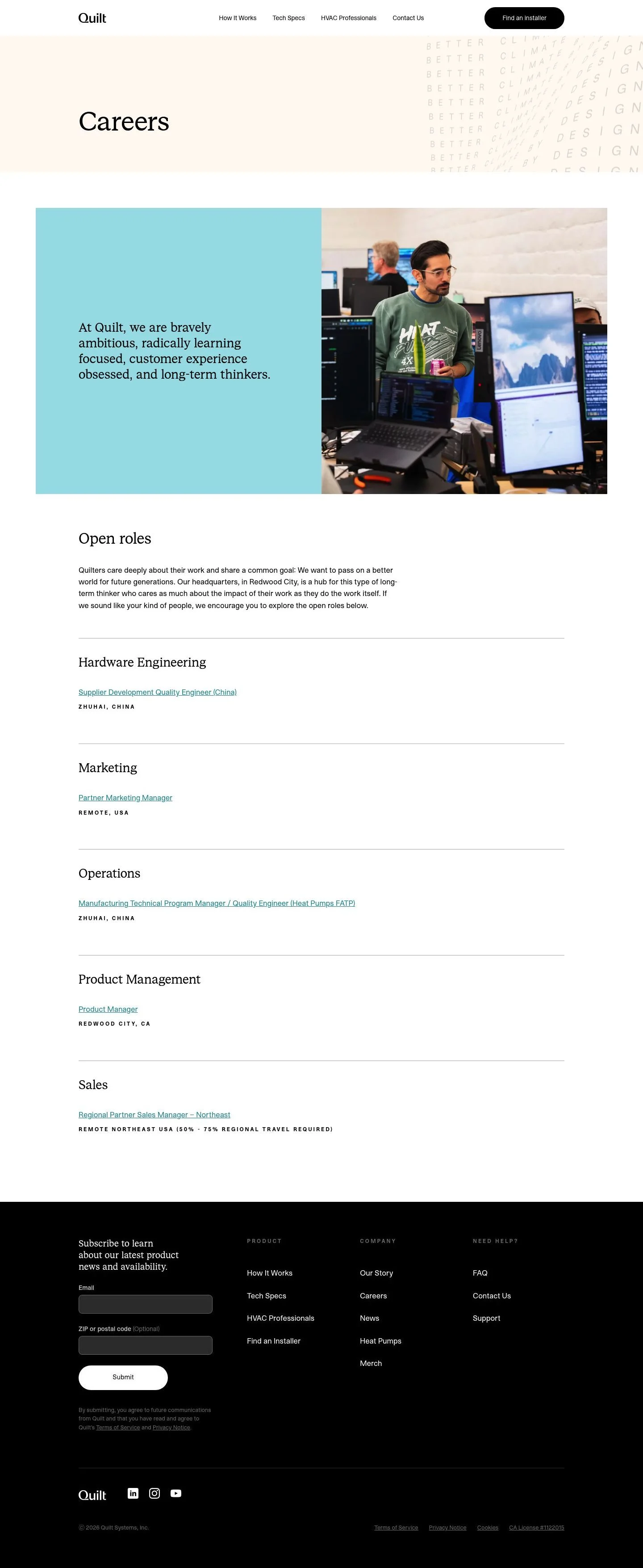
# Quilt: Calm Careers Page with Pill CTA in the Nav

## Overview

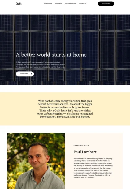
Quilt's UI balances precision hardware cues with friendly software clarity. It is calm, spacious, and confident rather than flashy. Headings use a characterful serif while body text stays purely utilitarian. The system favors large vertical spacing, minimal borders, and selective color accents so content—jobs and locations—remains the focus.

## Colors

- **primary (#000000):** Core text and dominant CTAs, including the pill button in the header.
- **secondary (#7c7c7c):** Secondary copy, legal text, and muted meta like locations.
- **tertiary (#2293a1):** Accent panels and promotional blocks; used sparingly for emphasis.
- **neutral (#ffffff):** Page surface and cards for a bright, clean base.
- **border (#e5e7eb):** Hairline separators for footer and form fields.
- **brand-tin-soldier (#bebebe):** Subtle textures and stamped patterns; also for quiet, non-interactive chrome.
- **surface ({colors.neutral}):** Default background; supports high-contrast black type.
- **on-surface ({colors.primary}):** Standard text color on neutral backgrounds.

## Typography

Two custom families drive hierarchy. Quilt Serif (custom; not freely hosted) handles all headline levels. Since agents cannot load it directly, use Source Serif 4, Spectral, or Georgia as substitutes with similar x-height and elegance. Quilt Sans (custom; not freely hosted) is the utility body and UI face; substitute Inter, Work Sans, or system-ui for reliable metrics and readability. Headline scale: 60px (headline-lg) for page titles, 34px (headline-md) for section leads, 28px (headline-sm) for subheads, and 17px (headline-xs) as a sans kicker. Body text is 15px (body-md) with generous 1.76 line-height for easy scanning of role lists.

## Layout

Spacing follows a roomy scale: 12, 24, 40, 48, and a dramatic 160px for hero bands and major breaks. Default pages stack sections with ample vertical whitespace and minimal horizontal rules. Content blocks often resolve into a two-column layout at medium screens (culture copy vs. photo), then collapse to a single column on mobile. Lists, like Open roles, rely on spacing rather than containers—24px gaps between items, larger (40–48px) between groups.

## Elevation & Depth

Depth is restrained. Light shadows (sm, md) are available for media or floating elements; large shadows are unused. Hierarchy instead comes from strong type, contrast (#000 on #fff), tonal accent panels in #2293a1, and quiet borders in #e5e7eb. Buttons lead visually through solid fills and pill shape rather than heavy effects.

## Shapes

Corners are concise and modern: 8px radius for cards and inputs, and 9999px for fully rounded pills. The pill shape signals primary actions (e.g., Find an installer). Content blocks and images should keep 8px to remain consistent across the page.

## Components

- Button Primary: 49px-tall pill with 14px × 40px padding, #000000 background and #ffffff label. Use for primary CTAs.
- Button Secondary: 49px pill with 14px × 40px padding, text-only #000000 on transparent background; pairs with a visible border if needed.
- Button Link: Text link with 0px radius; use for inline actions and job titles.
- Card: #ffffff background, #000000 text, 8px radius, 16px padding; apply md shadow only when the card must lift from the page.

### Site Header
Compact top bar with left-aligned wordmark and right-aligned primary pill CTA. Links use body-md; CTA uses Button Primary. Maintain surface #ffffff and no shadow.

### Careers Hero
Large hero band with headline-lg (60px) in Quilt Serif, color #000000, and xl spacing (160px) for top/bottom padding. Background uses surface with optional subtle pattern in #bebebe.

### Culture Split Block
Two-column layout: left panel uses #2293a1 with on-panel text in #000000; right column is an image with 8px corners. Internal padding sm–md (24–40px).

### Open Roles List
Section lead in headline-md (34px). Departments as headline-sm (28px) or headline-xs (17px) depending on density. Role links use Button Link styling at body-md (15px), with 24px gaps between items and 40–48px between departments. Locations appear in secondary (#7c7c7c).

### Job Link Row
Single-line link per role; no card. Hover state: underline or text-decoration with #000000; keep spacing consistent at 24px.

### Newsletter Subscribe Form
Inline form with two inputs using 8px corners, thin #e5e7eb borders, and a Submit in Button Primary. Body-md labels and legal copy in secondary (#7c7c7c).

### Footer Columns
Three to four link columns. Column titles in headline-xs, links in body-md. Use a top border #e5e7eb and lg spacing (48px) above and below.

## Do's and Don'ts

- Do keep page titles at 60px using the serif to anchor each section.
- Do reserve #2293a1 for accent panels or key callouts; overuse reduces contrast with #000 text.
- Do use pill buttons for primary actions and maintain the 49px height.
- Don't introduce heavy drop shadows; prefer borders (#e5e7eb) and whitespace for separation.
- Don't box the job list—use spacing (24px/40px) and clear link styling instead.
- Don't swap serif and sans roles; headings stay in the serif family, body and UI in the sans.

## Agent Prompt Guide

Quick reference — Text: #000000; Background: #ffffff; Border: #e5e7eb; Accent: #2293a1.

1) Build a Careers hero with a 160px top and bottom padding. Use H1 in "Quilt Serif, Source Serif 4, Georgia, serif" at 60px/1.08, weight 400, letter-spacing -0.02em, color #000000 on #ffffff. Keep the header nav minimal and include a right-aligned pill button 49px tall with 14px 40px padding, background #000000, text #ffffff, border-radius 9999px.

2) Create a two-column culture section. Left panel: background #2293a1 with copy in "Quilt Serif, Source Serif 4, Georgia, serif" at 28px/1.25, color #000000, internal padding 24–40px. Right column: image with 8px corner radius. Stack to one column on mobile.

3) Implement an Open roles list. Section heading: "Quilt Serif, Source Serif 4, Georgia, serif" at 34px/1.2, color #000000. Department subheads at 17–28px. Role links in "Inter, Work Sans, system-ui, sans-serif" at 15px/1.76, color #000000, underline on hover. Space items by 24px and departments by 40–48px.

4) Add a newsletter form. Two inputs with 8px radius, 1px border #e5e7eb, body text 15px in Inter. Submit button uses the primary pill: #000000 background, #ffffff text, 49px height, 14px 40px padding.

## Similar Brands

- Google Nest: similarly calm hardware–software brand; Nest leans brighter and uses more photography-based depth.
- Ecobee: smart thermostat brand with serif headlines and restrained color; Ecobee adds more green accenting and boxed cards.
- Octopus Energy: friendly energy company with roomy layouts; far louder color palette and playful illustrations.
- Mysa: HVAC control with clean sans-first UI; fewer serif moments and a more utilitarian component set.

## Tokens

### CSS custom properties

```css
:root {
  /* Colors */
  --color-primary: #000000;
  --color-secondary: #7c7c7c;
  --color-tertiary: #2293a1;
  --color-neutral: #ffffff;
  --color-border: #e5e7eb;
  --color-brand-tin-soldier: #bebebe;
  --color-surface: var(--color-neutral);
  --color-on-surface: var(--color-primary);

  /* Typography */
  --text-headline-lg-size: 60px;
  --text-headline-lg-weight: 400;
  --text-headline-lg-leading: 1.08;
  --text-headline-lg-tracking: -0.02em;
  --text-headline-md-size: 34px;
  --text-headline-md-weight: 400;
  --text-headline-md-leading: 1.2;
  --text-headline-md-tracking: -0.015em;
  --text-headline-sm-size: 28px;
  --text-headline-sm-weight: 400;
  --text-headline-sm-leading: 1.25;
  --text-headline-sm-tracking: -0.01em;
  --text-headline-xs-size: 17px;
  --text-headline-xs-weight: 400;
  --text-headline-xs-leading: 1.55;
  --text-body-md-size: 15px;
  --text-body-md-weight: 400;
  --text-body-md-leading: 1.76;
  --font-quilt-serif: "Quilt Serif";
  --font-quilt-sans: "Quilt Sans";

  /* Rounded */
  --radius-sm: 8px;
  --radius-full: 9999px;

  /* Spacing */
  --spacing-xs: 12px;
  --spacing-sm: 24px;
  --spacing-md: 40px;
  --spacing-lg: 48px;
  --spacing-xl: 160px;

  /* Components */
  --button-primary-background-color: var(--color-primary);
  --button-primary-text-color: var(--color-neutral);
  --button-primary-rounded: var(--radius-full);
  --button-primary-padding: 14px 40px;
  --button-primary-height: 49px;
  --button-secondary-text-color: var(--color-primary);
  --button-secondary-rounded: var(--radius-full);
  --button-secondary-padding: 14px 40px;
  --button-secondary-height: 49px;
  --button-link-text-color: var(--color-primary);
  --button-link-rounded: 0px;
  --card-background-color: var(--color-neutral);
  --card-text-color: var(--color-primary);
  --card-rounded: var(--radius-sm);
  --card-padding: 16px;
}
```

### Tailwind theme

```css
@theme {
  --color-primary: #000000;
  --color-secondary: #7c7c7c;
  --color-tertiary: #2293a1;
  --color-neutral: #ffffff;
  --color-border: #e5e7eb;
  --color-brand-tin-soldier: #bebebe;
  --color-surface: #ffffff;
  --color-on-surface: #000000;
  --font-headline-lg: "Quilt Serif";
  --font-headline-md: "Quilt Serif";
  --font-headline-sm: "Quilt Serif";
  --font-headline-xs: "Quilt Sans";
  --font-body-md: "Quilt Sans";
  --text-headline-lg: 60px;
  --text-headline-md: 34px;
  --text-headline-sm: 28px;
  --text-headline-xs: 17px;
  --text-body-md: 15px;
  --tracking-headline-lg: -0.02em;
  --tracking-headline-md: -0.015em;
  --tracking-headline-sm: -0.01em;
  --font-weight-headline-lg: 400;
  --font-weight-headline-md: 400;
  --font-weight-headline-sm: 400;
  --font-weight-headline-xs: 400;
  --font-weight-body-md: 400;
  --radius-sm: 8px;
  --radius-full: 9999px;
  --spacing-xs: 12px;
  --spacing-sm: 24px;
  --spacing-md: 40px;
  --spacing-lg: 48px;
  --spacing-xl: 160px;
}
```

### Design tokens (DTCG)

```json
{
    "$schema": "https://www.designtokens.org/schemas/2025.10/format.json",
    "color": {
        "$type": "color",
        "primary": {
            "$value": {
                "colorSpace": "srgb",
                "components": [
                    0,
                    0,
                    0
                ],
                "hex": "#000000"
            }
        },
        "secondary": {
            "$value": {
                "colorSpace": "srgb",
                "components": [
                    0.486,
                    0.486,
                    0.486
                ],
                "hex": "#7c7c7c"
            }
        },
        "tertiary": {
            "$value": {
                "colorSpace": "srgb",
                "components": [
                    0.133,
                    0.576,
                    0.631
                ],
                "hex": "#2293a1"
            }
        },
        "neutral": {
            "$value": {
                "colorSpace": "srgb",
                "components": [
                    1,
                    1,
                    1
                ],
                "hex": "#ffffff"
            }
        },
        "border": {
            "$value": {
                "colorSpace": "srgb",
                "components": [
                    0.898,
                    0.906,
                    0.922
                ],
                "hex": "#e5e7eb"
            }
        },
        "brand-tin-soldier": {
            "$value": {
                "colorSpace": "srgb",
                "components": [
                    0.745,
                    0.745,
                    0.745
                ],
                "hex": "#bebebe"
            }
        },
        "surface": {
            "$value": {
                "colorSpace": "srgb",
                "components": [
                    1,
                    1,
                    1
                ],
                "hex": "#ffffff"
            }
        },
        "on-surface": {
            "$value": {
                "colorSpace": "srgb",
                "components": [
                    0,
                    0,
                    0
                ],
                "hex": "#000000"
            }
        }
    },
    "spacing": {
        "$type": "dimension",
        "xs": {
            "$value": {
                "value": 12,
                "unit": "px"
            }
        },
        "sm": {
            "$value": {
                "value": 24,
                "unit": "px"
            }
        },
        "md": {
            "$value": {
                "value": 40,
                "unit": "px"
            }
        },
        "lg": {
            "$value": {
                "value": 48,
                "unit": "px"
            }
        },
        "xl": {
            "$value": {
                "value": 160,
                "unit": "px"
            }
        }
    },
    "rounded": {
        "$type": "dimension",
        "sm": {
            "$value": {
                "value": 8,
                "unit": "px"
            }
        },
        "full": {
            "$value": {
                "value": 9999,
                "unit": "px"
            }
        }
    },
    "typography": {
        "headline-lg": {
            "$type": "typography",
            "$value": {
                "fontFamily": "Quilt Serif",
                "fontSize": {
                    "value": 60,
                    "unit": "px"
                },
                "fontWeight": 400,
                "letterSpacing": {
                    "value": -0.02,
                    "unit": "em"
                }
            }
        },
        "headline-md": {
            "$type": "typography",
            "$value": {
                "fontFamily": "Quilt Serif",
                "fontSize": {
                    "value": 34,
                    "unit": "px"
                },
                "fontWeight": 400,
                "letterSpacing": {
                    "value": -0.015,
                    "unit": "em"
                }
            }
        },
        "headline-sm": {
            "$type": "typography",
            "$value": {
                "fontFamily": "Quilt Serif",
                "fontSize": {
                    "value": 28,
                    "unit": "px"
                },
                "fontWeight": 400,
                "letterSpacing": {
                    "value": -0.01,
                    "unit": "em"
                }
            }
        },
        "headline-xs": {
            "$type": "typography",
            "$value": {
                "fontFamily": "Quilt Sans",
                "fontSize": {
                    "value": 17,
                    "unit": "px"
                },
                "fontWeight": 400
            }
        },
        "body-md": {
            "$type": "typography",
            "$value": {
                "fontFamily": "Quilt Sans",
                "fontSize": {
                    "value": 15,
                    "unit": "px"
                },
                "fontWeight": 400
            }
        }
    }
}
```

## Rules

- **Fonts.** If the specification names a custom or self-hosted family, use one of the substitutes it names. Never reference a typeface you cannot actually load — it will fall back to a system font and undo the typography.
- **Colour.** Derive the palette from the user's brand. Use the token values as a guide to *relationships* — contrast, tint, how many accents carry the page — not as hex codes to paste.
- **Never reproduce** the wordmark, mascot, logo, brand name, illustrations, icon set, screenshots or any copy from the reference.
- **Never present the result as Quilt Careers**, or imply any connection to it.
- If something is unspecified, choose clarity and legibility over decoration.
---
version: alpha
name: Quilt
description: The smartest way to heat and cool your home
colors:
  primary: "#000000"
  secondary: "#7c7c7c"
  tertiary: "#2293a1"
  neutral: "#ffffff"
  border: "#e5e7eb"
  brand-tin-soldier: "#bebebe"
  surface: "{colors.neutral}"
  on-surface: "{colors.primary}"
typography:
  headline-lg:
    fontFamily: Quilt Serif
    fontSize: 60px
    fontWeight: 400
    lineHeight: 1.08
    letterSpacing: -0.02em
  headline-md:
    fontFamily: Quilt Serif
    fontSize: 34px
    fontWeight: 400
    lineHeight: 1.2
    letterSpacing: -0.015em
  headline-sm:
    fontFamily: Quilt Serif
    fontSize: 28px
    fontWeight: 400
    lineHeight: 1.25
    letterSpacing: -0.01em
  headline-xs:
    fontFamily: Quilt Sans
    fontSize: 17px
    fontWeight: 400
    lineHeight: 1.55
  body-md:
    fontFamily: Quilt Sans
    fontSize: 15px
    fontWeight: 400
    lineHeight: 1.76
rounded:
  sm: 8px
  full: 9999px
spacing:
  xs: 12px
  sm: 24px
  md: 40px
  lg: 48px
  xl: 160px
components:
  button-primary:
    backgroundColor: "{colors.primary}"
    textColor: "{colors.neutral}"
    rounded: "{rounded.full}"
    padding: 14px 40px
    height: 49px
  button-secondary:
    textColor: "{colors.primary}"
    rounded: "{rounded.full}"
    padding: 14px 40px
    height: 49px
  button-link:
    textColor: "{colors.primary}"
    rounded: 0px
  card:
    backgroundColor: "{colors.neutral}"
    textColor: "{colors.primary}"
    rounded: "{rounded.sm}"
    padding: 16px
---

# Quilt: Calm Careers Page with Pill CTA in the Nav

## Overview

Quilt's UI balances precision hardware cues with friendly software clarity. It is calm, spacious, and confident rather than flashy. Headings use a characterful serif while body text stays purely utilitarian. The system favors large vertical spacing, minimal borders, and selective color accents so content—jobs and locations—remains the focus.

## Colors

- **primary (#000000):** Core text and dominant CTAs, including the pill button in the header.
- **secondary (#7c7c7c):** Secondary copy, legal text, and muted meta like locations.
- **tertiary (#2293a1):** Accent panels and promotional blocks; used sparingly for emphasis.
- **neutral (#ffffff):** Page surface and cards for a bright, clean base.
- **border (#e5e7eb):** Hairline separators for footer and form fields.
- **brand-tin-soldier (#bebebe):** Subtle textures and stamped patterns; also for quiet, non-interactive chrome.
- **surface ({colors.neutral}):** Default background; supports high-contrast black type.
- **on-surface ({colors.primary}):** Standard text color on neutral backgrounds.

## Typography

Two custom families drive hierarchy. Quilt Serif (custom; not freely hosted) handles all headline levels. Since agents cannot load it directly, use Source Serif 4, Spectral, or Georgia as substitutes with similar x-height and elegance. Quilt Sans (custom; not freely hosted) is the utility body and UI face; substitute Inter, Work Sans, or system-ui for reliable metrics and readability. Headline scale: 60px (headline-lg) for page titles, 34px (headline-md) for section leads, 28px (headline-sm) for subheads, and 17px (headline-xs) as a sans kicker. Body text is 15px (body-md) with generous 1.76 line-height for easy scanning of role lists.

## Layout

Spacing follows a roomy scale: 12, 24, 40, 48, and a dramatic 160px for hero bands and major breaks. Default pages stack sections with ample vertical whitespace and minimal horizontal rules. Content blocks often resolve into a two-column layout at medium screens (culture copy vs. photo), then collapse to a single column on mobile. Lists, like Open roles, rely on spacing rather than containers—24px gaps between items, larger (40–48px) between groups.

## Elevation & Depth

Depth is restrained. Light shadows (sm, md) are available for media or floating elements; large shadows are unused. Hierarchy instead comes from strong type, contrast (#000 on #fff), tonal accent panels in #2293a1, and quiet borders in #e5e7eb. Buttons lead visually through solid fills and pill shape rather than heavy effects.

## Shapes

Corners are concise and modern: 8px radius for cards and inputs, and 9999px for fully rounded pills. The pill shape signals primary actions (e.g., Find an installer). Content blocks and images should keep 8px to remain consistent across the page.

## Components

- Button Primary: 49px-tall pill with 14px × 40px padding, #000000 background and #ffffff label. Use for primary CTAs.
- Button Secondary: 49px pill with 14px × 40px padding, text-only #000000 on transparent background; pairs with a visible border if needed.
- Button Link: Text link with 0px radius; use for inline actions and job titles.
- Card: #ffffff background, #000000 text, 8px radius, 16px padding; apply md shadow only when the card must lift from the page.

### Site Header
Compact top bar with left-aligned wordmark and right-aligned primary pill CTA. Links use body-md; CTA uses Button Primary. Maintain surface #ffffff and no shadow.

### Careers Hero
Large hero band with headline-lg (60px) in Quilt Serif, color #000000, and xl spacing (160px) for top/bottom padding. Background uses surface with optional subtle pattern in #bebebe.

### Culture Split Block
Two-column layout: left panel uses #2293a1 with on-panel text in #000000; right column is an image with 8px corners. Internal padding sm–md (24–40px).

### Open Roles List
Section lead in headline-md (34px). Departments as headline-sm (28px) or headline-xs (17px) depending on density. Role links use Button Link styling at body-md (15px), with 24px gaps between items and 40–48px between departments. Locations appear in secondary (#7c7c7c).

### Job Link Row
Single-line link per role; no card. Hover state: underline or text-decoration with #000000; keep spacing consistent at 24px.

### Newsletter Subscribe Form
Inline form with two inputs using 8px corners, thin #e5e7eb borders, and a Submit in Button Primary. Body-md labels and legal copy in secondary (#7c7c7c).

### Footer Columns
Three to four link columns. Column titles in headline-xs, links in body-md. Use a top border #e5e7eb and lg spacing (48px) above and below.

## Do's and Don'ts

- Do keep page titles at 60px using the serif to anchor each section.
- Do reserve #2293a1 for accent panels or key callouts; overuse reduces contrast with #000 text.
- Do use pill buttons for primary actions and maintain the 49px height.
- Don't introduce heavy drop shadows; prefer borders (#e5e7eb) and whitespace for separation.
- Don't box the job list—use spacing (24px/40px) and clear link styling instead.
- Don't swap serif and sans roles; headings stay in the serif family, body and UI in the sans.

## Agent Prompt Guide

Quick reference — Text: #000000; Background: #ffffff; Border: #e5e7eb; Accent: #2293a1.

1) Build a Careers hero with a 160px top and bottom padding. Use H1 in "Quilt Serif, Source Serif 4, Georgia, serif" at 60px/1.08, weight 400, letter-spacing -0.02em, color #000000 on #ffffff. Keep the header nav minimal and include a right-aligned pill button 49px tall with 14px 40px padding, background #000000, text #ffffff, border-radius 9999px.

2) Create a two-column culture section. Left panel: background #2293a1 with copy in "Quilt Serif, Source Serif 4, Georgia, serif" at 28px/1.25, color #000000, internal padding 24–40px. Right column: image with 8px corner radius. Stack to one column on mobile.

3) Implement an Open roles list. Section heading: "Quilt Serif, Source Serif 4, Georgia, serif" at 34px/1.2, color #000000. Department subheads at 17–28px. Role links in "Inter, Work Sans, system-ui, sans-serif" at 15px/1.76, color #000000, underline on hover. Space items by 24px and departments by 40–48px.

4) Add a newsletter form. Two inputs with 8px radius, 1px border #e5e7eb, body text 15px in Inter. Submit button uses the primary pill: #000000 background, #ffffff text, 49px height, 14px 40px padding.

## Similar Brands

- Google Nest: similarly calm hardware–software brand; Nest leans brighter and uses more photography-based depth.
- Ecobee: smart thermostat brand with serif headlines and restrained color; Ecobee adds more green accenting and boxed cards.
- Octopus Energy: friendly energy company with roomy layouts; far louder color palette and playful illustrations.
- Mysa: HVAC control with clean sans-first UI; fewer serif moments and a more utilitarian component set.
:root {
  /* Colors */
  --color-primary: #000000;
  --color-secondary: #7c7c7c;
  --color-tertiary: #2293a1;
  --color-neutral: #ffffff;
  --color-border: #e5e7eb;
  --color-brand-tin-soldier: #bebebe;
  --color-surface: var(--color-neutral);
  --color-on-surface: var(--color-primary);

  /* Typography */
  --text-headline-lg-size: 60px;
  --text-headline-lg-weight: 400;
  --text-headline-lg-leading: 1.08;
  --text-headline-lg-tracking: -0.02em;
  --text-headline-md-size: 34px;
  --text-headline-md-weight: 400;
  --text-headline-md-leading: 1.2;
  --text-headline-md-tracking: -0.015em;
  --text-headline-sm-size: 28px;
  --text-headline-sm-weight: 400;
  --text-headline-sm-leading: 1.25;
  --text-headline-sm-tracking: -0.01em;
  --text-headline-xs-size: 17px;
  --text-headline-xs-weight: 400;
  --text-headline-xs-leading: 1.55;
  --text-body-md-size: 15px;
  --text-body-md-weight: 400;
  --text-body-md-leading: 1.76;
  --font-quilt-serif: "Quilt Serif";
  --font-quilt-sans: "Quilt Sans";

  /* Rounded */
  --radius-sm: 8px;
  --radius-full: 9999px;

  /* Spacing */
  --spacing-xs: 12px;
  --spacing-sm: 24px;
  --spacing-md: 40px;
  --spacing-lg: 48px;
  --spacing-xl: 160px;

  /* Components */
  --button-primary-background-color: var(--color-primary);
  --button-primary-text-color: var(--color-neutral);
  --button-primary-rounded: var(--radius-full);
  --button-primary-padding: 14px 40px;
  --button-primary-height: 49px;
  --button-secondary-text-color: var(--color-primary);
  --button-secondary-rounded: var(--radius-full);
  --button-secondary-padding: 14px 40px;
  --button-secondary-height: 49px;
  --button-link-text-color: var(--color-primary);
  --button-link-rounded: 0px;
  --card-background-color: var(--color-neutral);
  --card-text-color: var(--color-primary);
  --card-rounded: var(--radius-sm);
  --card-padding: 16px;
}
{
  "$schema": "https://www.designtokens.org/schemas/2025.10/format.json",
  "$description": "The smartest way to heat and cool your home",
  "color": {
    "$type": "color",
    "primary": {
      "$value": {
        "colorSpace": "srgb",
        "components": [
          0,
          0,
          0
        ],
        "hex": "#000000"
      }
    },
    "secondary": {
      "$value": {
        "colorSpace": "srgb",
        "components": [
          0.486,
          0.486,
          0.486
        ],
        "hex": "#7c7c7c"
      }
    },
    "tertiary": {
      "$value": {
        "colorSpace": "srgb",
        "components": [
          0.133,
          0.576,
          0.631
        ],
        "hex": "#2293a1"
      }
    },
    "neutral": {
      "$value": {
        "colorSpace": "srgb",
        "components": [
          1,
          1,
          1
        ],
        "hex": "#ffffff"
      }
    },
    "border": {
      "$value": {
        "colorSpace": "srgb",
        "components": [
          0.898,
          0.906,
          0.922
        ],
        "hex": "#e5e7eb"
      }
    },
    "brand-tin-soldier": {
      "$value": {
        "colorSpace": "srgb",
        "components": [
          0.745,
          0.745,
          0.745
        ],
        "hex": "#bebebe"
      }
    },
    "surface": {
      "$value": {
        "colorSpace": "srgb",
        "components": [
          1,
          1,
          1
        ],
        "hex": "#ffffff"
      }
    },
    "on-surface": {
      "$value": {
        "colorSpace": "srgb",
        "components": [
          0,
          0,
          0
        ],
        "hex": "#000000"
      }
    }
  },
  "spacing": {
    "$type": "dimension",
    "xs": {
      "$value": {
        "value": 12,
        "unit": "px"
      }
    },
    "sm": {
      "$value": {
        "value": 24,
        "unit": "px"
      }
    },
    "md": {
      "$value": {
        "value": 40,
        "unit": "px"
      }
    },
    "lg": {
      "$value": {
        "value": 48,
        "unit": "px"
      }
    },
    "xl": {
      "$value": {
        "value": 160,
        "unit": "px"
      }
    }
  },
  "rounded": {
    "$type": "dimension",
    "sm": {
      "$value": {
        "value": 8,
        "unit": "px"
      }
    },
    "full": {
      "$value": {
        "value": 9999,
        "unit": "px"
      }
    }
  },
  "typography": {
    "headline-lg": {
      "$type": "typography",
      "$value": {
        "fontFamily": "Quilt Serif",
        "fontSize": {
          "value": 60,
          "unit": "px"
        },
        "fontWeight": 400,
        "letterSpacing": {
          "value": -0.02,
          "unit": "em"
        }
      }
    },
    "headline-md": {
      "$type": "typography",
      "$value": {
        "fontFamily": "Quilt Serif",
        "fontSize": {
          "value": 34,
          "unit": "px"
        },
        "fontWeight": 400,
        "letterSpacing": {
          "value": -0.015,
          "unit": "em"
        }
      }
    },
    "headline-sm": {
      "$type": "typography",
      "$value": {
        "fontFamily": "Quilt Serif",
        "fontSize": {
          "value": 28,
          "unit": "px"
        },
        "fontWeight": 400,
        "letterSpacing": {
          "value": -0.01,
          "unit": "em"
        }
      }
    },
    "headline-xs": {
      "$type": "typography",
      "$value": {
        "fontFamily": "Quilt Sans",
        "fontSize": {
          "value": 17,
          "unit": "px"
        },
        "fontWeight": 400
      }
    },
    "body-md": {
      "$type": "typography",
      "$value": {
        "fontFamily": "Quilt Sans",
        "fontSize": {
          "value": 15,
          "unit": "px"
        },
        "fontWeight": 400
      }
    }
  }
}
@theme {
--color-primary: #000000;
--color-secondary: #7c7c7c;
--color-tertiary: #2293a1;
--color-neutral: #ffffff;
--color-border: #e5e7eb;
--color-brand-tin-soldier: #bebebe;
--color-surface: #ffffff;
--color-on-surface: #000000;
--font-headline-lg: "Quilt Serif";
--font-headline-md: "Quilt Serif";
--font-headline-sm: "Quilt Serif";
--font-headline-xs: "Quilt Sans";
--font-body-md: "Quilt Sans";
--text-headline-lg: 60px;
--text-headline-md: 34px;
--text-headline-sm: 28px;
--text-headline-xs: 17px;
--text-body-md: 15px;
--tracking-headline-lg: -0.02em;
--tracking-headline-md: -0.015em;
--tracking-headline-sm: -0.01em;
--font-weight-headline-lg: 400;
--font-weight-headline-md: 400;
--font-weight-headline-sm: 400;
--font-weight-headline-xs: 400;
--font-weight-body-md: 400;
--radius-sm: 8px;
--radius-full: 9999px;
--spacing-xs: 12px;
--spacing-sm: 24px;
--spacing-md: 40px;
--spacing-lg: 48px;
--spacing-xl: 160px;
} # Design brief: the Quilt Careers design language
Below is a complete design specification measured from a real, published web page. Use it as a design language for the user's product. It is not a page to reproduce.
## Reference images
- Full page: https://cdn.designmunk.com/2026/09/12082524/quilt-com-careers-featured.webp
- Above the fold: https://cdn.designmunk.com/2026/09/12082524/quilt-com-careers-featured.webp
- On DesignMunk: https://designmunk.com/quilt-careers-page/
Study these for hierarchy, rhythm, spacing and density. Where an image and the written spec disagree, the spec wins: the tokens were read from the page's own CSS, the images are one rendering of it.
## Before you start
Ask the user what they are building, who it is for, and what brand assets they already have — name, colours, typefaces. Wait for their answers before writing anything. Everything below is then applied to their product, not to the reference.
## Design specification
# Quilt: Calm Careers Page with Pill CTA in the Nav
## Overview
Quilt's UI balances precision hardware cues with friendly software clarity. It is calm, spacious, and confident rather than flashy. Headings use a characterful serif while body text stays purely utilitarian. The system favors large vertical spacing, minimal borders, and selective color accents so content—jobs and locations—remains the focus.
## Colors
- **primary (#000000):** Core text and dominant CTAs, including the pill button in the header.
- **secondary (#7c7c7c):** Secondary copy, legal text, and muted meta like locations.
- **tertiary (#2293a1):** Accent panels and promotional blocks; used sparingly for emphasis.
- **neutral (#ffffff):** Page surface and cards for a bright, clean base.
- **border (#e5e7eb):** Hairline separators for footer and form fields.
- **brand-tin-soldier (#bebebe):** Subtle textures and stamped patterns; also for quiet, non-interactive chrome.
- **surface ({colors.neutral}):** Default background; supports high-contrast black type.
- **on-surface ({colors.primary}):** Standard text color on neutral backgrounds.
## Typography
Two custom families drive hierarchy. Quilt Serif (custom; not freely hosted) handles all headline levels. Since agents cannot load it directly, use Source Serif 4, Spectral, or Georgia as substitutes with similar x-height and elegance. Quilt Sans (custom; not freely hosted) is the utility body and UI face; substitute Inter, Work Sans, or system-ui for reliable metrics and readability. Headline scale: 60px (headline-lg) for page titles, 34px (headline-md) for section leads, 28px (headline-sm) for subheads, and 17px (headline-xs) as a sans kicker. Body text is 15px (body-md) with generous 1.76 line-height for easy scanning of role lists.
## Layout
Spacing follows a roomy scale: 12, 24, 40, 48, and a dramatic 160px for hero bands and major breaks. Default pages stack sections with ample vertical whitespace and minimal horizontal rules. Content blocks often resolve into a two-column layout at medium screens (culture copy vs. photo), then collapse to a single column on mobile. Lists, like Open roles, rely on spacing rather than containers—24px gaps between items, larger (40–48px) between groups.
## Elevation & Depth
Depth is restrained. Light shadows (sm, md) are available for media or floating elements; large shadows are unused. Hierarchy instead comes from strong type, contrast (#000 on #fff), tonal accent panels in #2293a1, and quiet borders in #e5e7eb. Buttons lead visually through solid fills and pill shape rather than heavy effects.
## Shapes
Corners are concise and modern: 8px radius for cards and inputs, and 9999px for fully rounded pills. The pill shape signals primary actions (e.g., Find an installer). Content blocks and images should keep 8px to remain consistent across the page.
## Components
- Button Primary: 49px-tall pill with 14px × 40px padding, #000000 background and #ffffff label. Use for primary CTAs.
- Button Secondary: 49px pill with 14px × 40px padding, text-only #000000 on transparent background; pairs with a visible border if needed.
- Button Link: Text link with 0px radius; use for inline actions and job titles.
- Card: #ffffff background, #000000 text, 8px radius, 16px padding; apply md shadow only when the card must lift from the page.
### Site Header
Compact top bar with left-aligned wordmark and right-aligned primary pill CTA. Links use body-md; CTA uses Button Primary. Maintain surface #ffffff and no shadow.
### Careers Hero
Large hero band with headline-lg (60px) in Quilt Serif, color #000000, and xl spacing (160px) for top/bottom padding. Background uses surface with optional subtle pattern in #bebebe.
### Culture Split Block
Two-column layout: left panel uses #2293a1 with on-panel text in #000000; right column is an image with 8px corners. Internal padding sm–md (24–40px).
### Open Roles List
Section lead in headline-md (34px). Departments as headline-sm (28px) or headline-xs (17px) depending on density. Role links use Button Link styling at body-md (15px), with 24px gaps between items and 40–48px between departments. Locations appear in secondary (#7c7c7c).
### Job Link Row
Single-line link per role; no card. Hover state: underline or text-decoration with #000000; keep spacing consistent at 24px.
### Newsletter Subscribe Form
Inline form with two inputs using 8px corners, thin #e5e7eb borders, and a Submit in Button Primary. Body-md labels and legal copy in secondary (#7c7c7c).
### Footer Columns
Three to four link columns. Column titles in headline-xs, links in body-md. Use a top border #e5e7eb and lg spacing (48px) above and below.
## Do's and Don'ts
- Do keep page titles at 60px using the serif to anchor each section.
- Do reserve #2293a1 for accent panels or key callouts; overuse reduces contrast with #000 text.
- Do use pill buttons for primary actions and maintain the 49px height.
- Don't introduce heavy drop shadows; prefer borders (#e5e7eb) and whitespace for separation.
- Don't box the job list—use spacing (24px/40px) and clear link styling instead.
- Don't swap serif and sans roles; headings stay in the serif family, body and UI in the sans.
## Agent Prompt Guide
Quick reference — Text: #000000; Background: #ffffff; Border: #e5e7eb; Accent: #2293a1.
1) Build a Careers hero with a 160px top and bottom padding. Use H1 in "Quilt Serif, Source Serif 4, Georgia, serif" at 60px/1.08, weight 400, letter-spacing -0.02em, color #000000 on #ffffff. Keep the header nav minimal and include a right-aligned pill button 49px tall with 14px 40px padding, background #000000, text #ffffff, border-radius 9999px.
2) Create a two-column culture section. Left panel: background #2293a1 with copy in "Quilt Serif, Source Serif 4, Georgia, serif" at 28px/1.25, color #000000, internal padding 24–40px. Right column: image with 8px corner radius. Stack to one column on mobile.
3) Implement an Open roles list. Section heading: "Quilt Serif, Source Serif 4, Georgia, serif" at 34px/1.2, color #000000. Department subheads at 17–28px. Role links in "Inter, Work Sans, system-ui, sans-serif" at 15px/1.76, color #000000, underline on hover. Space items by 24px and departments by 40–48px.
4) Add a newsletter form. Two inputs with 8px radius, 1px border #e5e7eb, body text 15px in Inter. Submit button uses the primary pill: #000000 background, #ffffff text, 49px height, 14px 40px padding.
## Tokens
### CSS custom properties
```css
:root {
/* Colors */
--color-primary: #000000;
--color-secondary: #7c7c7c;
--color-tertiary: #2293a1;
--color-neutral: #ffffff;
--color-border: #e5e7eb;
--color-brand-tin-soldier: #bebebe;
--color-surface: var(--color-neutral);
--color-on-surface: var(--color-primary);
/* Typography */
--text-headline-lg-size: 60px;
--text-headline-lg-weight: 400;
--text-headline-lg-leading: 1.08;
--text-headline-lg-tracking: -0.02em;
--text-headline-md-size: 34px;
--text-headline-md-weight: 400;
--text-headline-md-leading: 1.2;
--text-headline-md-tracking: -0.015em;
--text-headline-sm-size: 28px;
--text-headline-sm-weight: 400;
--text-headline-sm-leading: 1.25;
--text-headline-sm-tracking: -0.01em;
--text-headline-xs-size: 17px;
--text-headline-xs-weight: 400;
--text-headline-xs-leading: 1.55;
--text-body-md-size: 15px;
--text-body-md-weight: 400;
--text-body-md-leading: 1.76;
--font-quilt-serif: "Quilt Serif";
--font-quilt-sans: "Quilt Sans";
/* Rounded */
--radius-sm: 8px;
--radius-full: 9999px;
/* Spacing */
--spacing-xs: 12px;
--spacing-sm: 24px;
--spacing-md: 40px;
--spacing-lg: 48px;
--spacing-xl: 160px;
/* Components */
--button-primary-background-color: var(--color-primary);
--button-primary-text-color: var(--color-neutral);
--button-primary-rounded: var(--radius-full);
--button-primary-padding: 14px 40px;
--button-primary-height: 49px;
--button-secondary-text-color: var(--color-primary);
--button-secondary-rounded: var(--radius-full);
--button-secondary-padding: 14px 40px;
--button-secondary-height: 49px;
--button-link-text-color: var(--color-primary);
--button-link-rounded: 0px;
--card-background-color: var(--color-neutral);
--card-text-color: var(--color-primary);
--card-rounded: var(--radius-sm);
--card-padding: 16px;
}
```
## Rules
- **Fonts.** If the specification names a custom or self-hosted family, use one of the substitutes it names. Never reference a typeface you cannot actually load — it will fall back to a system font and undo the typography.
- **Colour.** Derive the palette from the user's brand. Use the token values as a guide to *relationships* — contrast, tint, how many accents carry the page — not as hex codes to paste.
- **Never reproduce** the wordmark, mascot, logo, brand name, illustrations, icon set, screenshots or any copy from the reference.
- **Never present the result as Quilt Careers**, or imply any connection to it.
- If something is unspecified, choose clarity and legibility over decoration.