quilt.com
AI Breakdown
Design export
# Design brief: the Quilt About design language

Below is a complete design specification measured from a real, published web page. Use it as a design language for the user's product. It is not a page to reproduce.

## Reference images

- Full page: https://cdn.designmunk.com/2026/09/10154112/quilt-com-our-story-featured.webp
- Above the fold: https://cdn.designmunk.com/2026/09/10154112/quilt-com-our-story-featured.webp
- On DesignMunk: https://designmunk.com/quilt-about-page/

Study these for hierarchy, rhythm, spacing and density. Where an image and the written spec disagree, the spec wins: the tokens were read from the page's own CSS, the images are one rendering of it.

## Before you start

Ask the user what they are building, who it is for, and what brand assets they already have — name, colours, typefaces. Wait for their answers before writing anything. Everything below is then applied to their product, not to the reference.

## Design specification

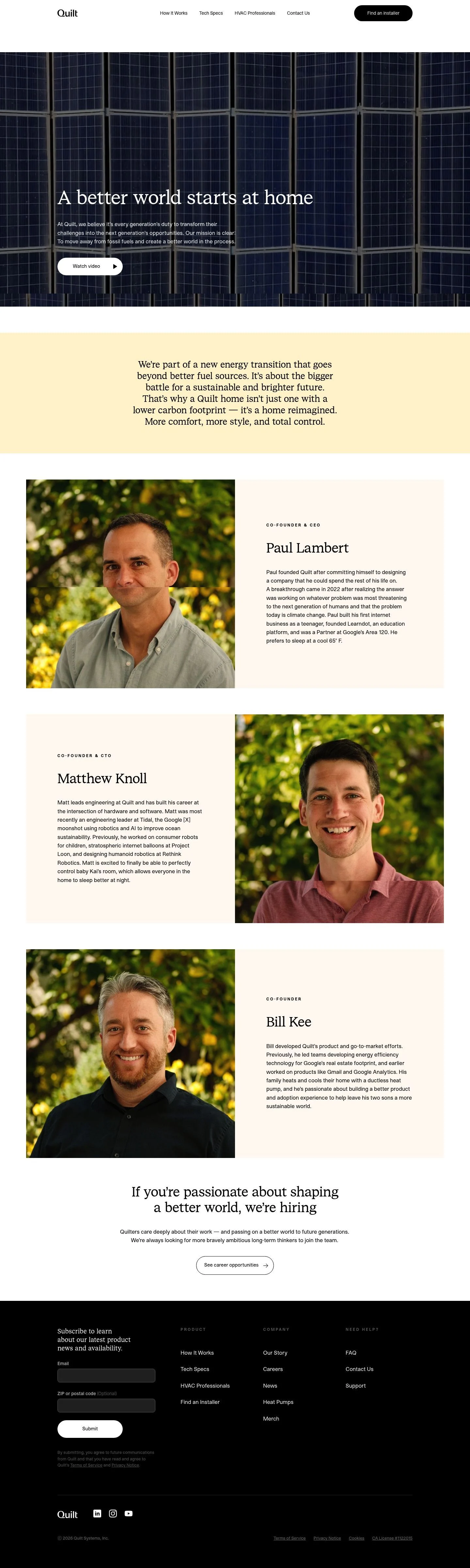
# Quilt: Serif Mission Statement Over Solar-Panel Hero

## Overview

Quilt's UI is calm, minimal, and conversion-minded: black text on white surfaces, sparse gray for scaffolding, and generous breathing room. Tone is assured and technical without feeling cold; long-form copy is welcomed with comfortable line heights. Audience ranges from homeowners researching heat pumps to HVAC pros, so hierarchy stays simple and legible. When tokens don't prescribe, prefer monochrome restraint and let typography carry the brand voice.

## Colors

- Primary (#000000): Ink for headlines, navigation, and all core text.
- Secondary (#7c7c7c): Muted gray for metadata, captions, and subdued links.
- Neutral (#ffffff): Primary surface and inverted text color on dark buttons.
- Border (#e5e7eb): Hairline dividers, input strokes, and footer rules.
- Brand-tin-soldier (#bebebe): Soft UI chrome or disabled states where secondary is too dark.
- Surface ({colors.neutral}): Default page and card backgrounds.
- On-surface ({colors.primary}): Standard text color on light surfaces.

## Typography

Two custom families define the voice. Quilt Sans (custom) handles UI, primary headlines, and body. Quilt Serif (custom) adds brand character in select display and subhead roles.
- Headline-lg — Quilt Sans, 42px/1.19, 700: section headers and hero titles when using sans.
- Headline-md — Quilt Sans, 34px/1.21, 400: secondary section intros.
- Headline-sm — Quilt Serif, 27px/1.52, 400, -0.031em: expressive pull lines and story leads.
- Headline-xs — Quilt Sans, 21px/1.07, 400: small section labels.
- Body-md — Quilt Sans, 17px/1.55, 400: standard paragraphs and long-form copy.
Availability: Both Quilt Sans and Quilt Serif are custom/self-hosted; agents should not rely on fetching them. Practical substitutes:
- For Quilt Sans: Inter, Source Sans 3, or Work Sans (all Google Fonts) match the modern, neutral sans feel.
- For Quilt Serif: Spectral, Merriweather, or Literata (Google Fonts) provide readable, editorial contrast for quotes and mission lines.

## Layout

Spacing follows an 8px base with asymmetric steps for vertical rhythm: xs 8, sm 16, md 36, lg 44, xl 80. Use sm (16px) for inline gaps and gutters, md (36px) for block spacing inside cards, lg (44px) to separate stacked sections within a view, and xl (80px) for page sections and hero paddings. Content width remains comfortable for reading; treat long text as a first-class citizen by honoring the 17px body size and ample leading.

## Elevation & Depth

Depth is restrained. Small, soft shadows are available: sm (rgba(0,0,0,0.2) 0 4px 8px) for floating UI like modals or sticky pills; md (rgb(199,197,199) 0 0 12px 2px) for larger overlays. Large and inner shadows are intentionally none; hierarchy relies on whitespace, tonal contrast (#000 on #fff), and fine borders (#e5e7eb).

## Shapes

Two radii express the shape language: sm 8px for cards, inputs, and containers; full 9999px for pill buttons and chips. Use 8px to signal content groupings; reserve the full pill for primary CTAs and compact actions to keep them visually distinctive.

## Components

Buttons and cards are the core components.
- Button — Primary: black background (#000000), white text (#ffffff), height 57px, padding 14px 40px, radius 9999px. Use for conversions like "Find an installer."
- Button — Secondary: text-only in #000000 with pill radius retained for consistency; pair with subtle affordances or icons.
- Button — Link: inline text action in #000000, no radius.
- Card: white background (#ffffff), black text (#000000), 8px radius, 16px padding; add a 1px #e5e7eb border when extra separation is needed.

### Top Navigation
- Left-aligned wordmark, center links, right-aligned primary CTA. Header sits on #ffffff with a 1px #e5e7eb bottom border. "Find an installer" uses the primary button spec (57px height, 9999px radius).

### Hero with Photographic Backdrop
- Full-bleed image with left-aligned copy block. Headline set in display type; supporting paragraph at body-md (17px). A white pill "Watch video" appears here; treat it as a context-specific control ensuring high contrast over dark imagery.

### Founder Bios Stack
- Each founder grouped as a text block: role label (headline-xs), name as display (headline-sm or headline-md), followed by body-md biography. Use md (36px) gaps between bios and lg (44px) above/below the section.

### Hiring Callout Band
- Section headline inviting applications, with a prominent link or secondary button to careers. Vertical padding xl (80px) for emphasis; keep copy width readable.

### Email Subscription Form
- Two inputs (Email, ZIP) styled as 8px radius fields with 16px internal padding and 1px #e5e7eb borders. Submit uses the primary pill (57px) in #000/#fff.

### Footer Columns
- Multi-column lists under simple headings. Top border #e5e7eb, body text #000000, link states stay monochrome. Use md (36px) column spacing and lg (44px) vertical padding.

### Cookie Preferences Modal
- Modal container uses card styling with md shadow for elevation. Toggle groups and checkboxes align to the 16px grid; actions row uses secondary and primary buttons.

## Do's and Don'ts

- Do keep primary actions in the pill style: #000 background, #fff text, 57px tall, 14px×40px padding.
- Do use #e5e7eb borders and generous md/lg/xl spacing to express hierarchy instead of heavy shadows.
- Do reserve brand-tin-soldier (#bebebe) for disabled or de-emphasized UI, not for body text.
- Don't introduce new accent colors; stay in the black/white/gray palette unless a page-specific background is explicitly required.
- Don't round containers to full pills; use sm (8px) corners for cards and inputs.
- Don't bury the primary CTA only in the header; repeat it contextually in long sections when appropriate.

## Agent Prompt Guide

Quick color reference — Text: #000000, Background: #ffffff, Border: #e5e7eb, Accent/CTA: #000000.

1) Build the header with primary CTA
- Background #ffffff, 1px bottom border #e5e7eb.
- Nav links: Inter (substitute for Quilt Sans), 17px/1.55, #000000, 16px gap.
- Primary button right: 57px height, padding 14px 40px, radius 9999px, background #000000, text #ffffff.

2) Hero section over photography
- Full-bleed image container with an overlayed text column.
- Headline: Spectral (sub for Quilt Serif), 42px/1.19, weight 700 (to echo display presence), color #ffffff when over dark image.
- Paragraph: Inter 17px/1.55, #ffffff at 90% opacity.
- Spacing: xl (80px) top/bottom, md (36px) between headline and paragraph.

3) Founder bio block
- Container: background #ffffff, text #000000, internal spacing md (36px).
- Name: Inter 34px/1.21, weight 400.
- Role label: Inter 21px/1.07, weight 400, color #7c7c7c.
- Body: Inter 17px/1.55, color #000000.

4) Newsletter form + submit
- Inputs: 1px border #e5e7eb, radius 8px, padding 16px; placeholder #7c7c7c.
- Submit button: 57px height, 14px 40px padding, radius 9999px, background #000000, text #ffffff.
- Layout: md (36px) gap between fields; lg (44px) above the section and to the footer.

5) Footer columns
- Top border #e5e7eb, background #ffffff.
- Headings: Inter 21px/1.07, #000000; links: Inter 17px/1.55, #000000.
- Column gap md (36px); section padding lg (44px) top/bottom.

## Similar Brands

Google Nest — similarly minimal, typographic clarity with monochrome UI; Nest leans more toward soft color accents and rounded imagery.
Tesla Energy — high-contrast black/white palette and photo-led hero; Tesla's typography is tighter and more condensed.
Tado — smart climate brand with clean sans and restrained color; uses more pastel accents than Quilt.
Sonos — stark monochrome, pill CTAs, and confident type; more emphasis on bold, condensed headlines than Quilt.

## Tokens

### CSS custom properties

```css
:root {
  /* Colors */
  --color-primary: #000000;
  --color-secondary: #7c7c7c;
  --color-neutral: #ffffff;
  --color-border: #e5e7eb;
  --color-brand-tin-soldier: #bebebe;
  --color-surface: var(--color-neutral);
  --color-on-surface: var(--color-primary);

  /* Typography */
  --text-headline-lg-size: 42px;
  --text-headline-lg-weight: 700;
  --text-headline-lg-leading: 1.19;
  --text-headline-md-size: 34px;
  --text-headline-md-weight: 400;
  --text-headline-md-leading: 1.21;
  --text-headline-sm-size: 27px;
  --text-headline-sm-weight: 400;
  --text-headline-sm-leading: 1.52;
  --text-headline-sm-tracking: -0.031em;
  --text-headline-xs-size: 21px;
  --text-headline-xs-weight: 400;
  --text-headline-xs-leading: 1.07;
  --text-body-md-size: 17px;
  --text-body-md-weight: 400;
  --text-body-md-leading: 1.55;
  --font-quilt-sans: "Quilt Sans";
  --font-quilt-serif: "Quilt Serif";

  /* Rounded */
  --radius-sm: 8px;
  --radius-full: 9999px;

  /* Spacing */
  --spacing-xs: 8px;
  --spacing-sm: 16px;
  --spacing-md: 36px;
  --spacing-lg: 44px;
  --spacing-xl: 80px;

  /* Components */
  --button-primary-background-color: var(--color-primary);
  --button-primary-text-color: var(--color-neutral);
  --button-primary-rounded: var(--radius-full);
  --button-primary-padding: 14px 40px;
  --button-primary-height: 57px;
  --button-secondary-text-color: var(--color-primary);
  --button-secondary-rounded: var(--radius-full);
  --button-secondary-padding: 14px 40px;
  --button-secondary-height: 57px;
  --button-link-text-color: var(--color-primary);
  --button-link-rounded: 0px;
  --card-background-color: var(--color-neutral);
  --card-text-color: var(--color-primary);
  --card-rounded: var(--radius-sm);
  --card-padding: 16px;
}
```

### Tailwind theme

```css
@theme {
  --color-primary: #000000;
  --color-secondary: #7c7c7c;
  --color-neutral: #ffffff;
  --color-border: #e5e7eb;
  --color-brand-tin-soldier: #bebebe;
  --color-surface: #ffffff;
  --color-on-surface: #000000;
  --font-headline-lg: "Quilt Sans";
  --font-headline-md: "Quilt Sans";
  --font-headline-sm: "Quilt Serif";
  --font-headline-xs: "Quilt Sans";
  --font-body-md: "Quilt Sans";
  --text-headline-lg: 42px;
  --text-headline-md: 34px;
  --text-headline-sm: 27px;
  --text-headline-xs: 21px;
  --text-body-md: 17px;
  --tracking-headline-sm: -0.031em;
  --font-weight-headline-lg: 700;
  --font-weight-headline-md: 400;
  --font-weight-headline-sm: 400;
  --font-weight-headline-xs: 400;
  --font-weight-body-md: 400;
  --radius-sm: 8px;
  --radius-full: 9999px;
  --spacing-xs: 8px;
  --spacing-sm: 16px;
  --spacing-md: 36px;
  --spacing-lg: 44px;
  --spacing-xl: 80px;
}
```

### Design tokens (DTCG)

```json
{
    "$schema": "https://www.designtokens.org/schemas/2025.10/format.json",
    "color": {
        "$type": "color",
        "primary": {
            "$value": {
                "colorSpace": "srgb",
                "components": [
                    0,
                    0,
                    0
                ],
                "hex": "#000000"
            }
        },
        "secondary": {
            "$value": {
                "colorSpace": "srgb",
                "components": [
                    0.486,
                    0.486,
                    0.486
                ],
                "hex": "#7c7c7c"
            }
        },
        "neutral": {
            "$value": {
                "colorSpace": "srgb",
                "components": [
                    1,
                    1,
                    1
                ],
                "hex": "#ffffff"
            }
        },
        "border": {
            "$value": {
                "colorSpace": "srgb",
                "components": [
                    0.898,
                    0.906,
                    0.922
                ],
                "hex": "#e5e7eb"
            }
        },
        "brand-tin-soldier": {
            "$value": {
                "colorSpace": "srgb",
                "components": [
                    0.745,
                    0.745,
                    0.745
                ],
                "hex": "#bebebe"
            }
        },
        "surface": {
            "$value": {
                "colorSpace": "srgb",
                "components": [
                    1,
                    1,
                    1
                ],
                "hex": "#ffffff"
            }
        },
        "on-surface": {
            "$value": {
                "colorSpace": "srgb",
                "components": [
                    0,
                    0,
                    0
                ],
                "hex": "#000000"
            }
        }
    },
    "spacing": {
        "$type": "dimension",
        "xs": {
            "$value": {
                "value": 8,
                "unit": "px"
            }
        },
        "sm": {
            "$value": {
                "value": 16,
                "unit": "px"
            }
        },
        "md": {
            "$value": {
                "value": 36,
                "unit": "px"
            }
        },
        "lg": {
            "$value": {
                "value": 44,
                "unit": "px"
            }
        },
        "xl": {
            "$value": {
                "value": 80,
                "unit": "px"
            }
        }
    },
    "rounded": {
        "$type": "dimension",
        "sm": {
            "$value": {
                "value": 8,
                "unit": "px"
            }
        },
        "full": {
            "$value": {
                "value": 9999,
                "unit": "px"
            }
        }
    },
    "typography": {
        "headline-lg": {
            "$type": "typography",
            "$value": {
                "fontFamily": "Quilt Sans",
                "fontSize": {
                    "value": 42,
                    "unit": "px"
                },
                "fontWeight": 700
            }
        },
        "headline-md": {
            "$type": "typography",
            "$value": {
                "fontFamily": "Quilt Sans",
                "fontSize": {
                    "value": 34,
                    "unit": "px"
                },
                "fontWeight": 400
            }
        },
        "headline-sm": {
            "$type": "typography",
            "$value": {
                "fontFamily": "Quilt Serif",
                "fontSize": {
                    "value": 27,
                    "unit": "px"
                },
                "fontWeight": 400,
                "letterSpacing": {
                    "value": -0.031,
                    "unit": "em"
                }
            }
        },
        "headline-xs": {
            "$type": "typography",
            "$value": {
                "fontFamily": "Quilt Sans",
                "fontSize": {
                    "value": 21,
                    "unit": "px"
                },
                "fontWeight": 400
            }
        },
        "body-md": {
            "$type": "typography",
            "$value": {
                "fontFamily": "Quilt Sans",
                "fontSize": {
                    "value": 17,
                    "unit": "px"
                },
                "fontWeight": 400
            }
        }
    }
}
```

## Rules

- **Fonts.** If the specification names a custom or self-hosted family, use one of the substitutes it names. Never reference a typeface you cannot actually load — it will fall back to a system font and undo the typography.
- **Colour.** Derive the palette from the user's brand. Use the token values as a guide to *relationships* — contrast, tint, how many accents carry the page — not as hex codes to paste.
- **Never reproduce** the wordmark, mascot, logo, brand name, illustrations, icon set, screenshots or any copy from the reference.
- **Never present the result as Quilt About**, or imply any connection to it.
- If something is unspecified, choose clarity and legibility over decoration.
---
version: alpha
name: Quilt
description: The smartest way to heat and cool your home
colors:
  primary: "#000000"
  secondary: "#7c7c7c"
  neutral: "#ffffff"
  border: "#e5e7eb"
  brand-tin-soldier: "#bebebe"
  surface: "{colors.neutral}"
  on-surface: "{colors.primary}"
typography:
  headline-lg:
    fontFamily: Quilt Sans
    fontSize: 42px
    fontWeight: 700
    lineHeight: 1.19
  headline-md:
    fontFamily: Quilt Sans
    fontSize: 34px
    fontWeight: 400
    lineHeight: 1.21
  headline-sm:
    fontFamily: Quilt Serif
    fontSize: 27px
    fontWeight: 400
    lineHeight: 1.52
    letterSpacing: -0.031em
  headline-xs:
    fontFamily: Quilt Sans
    fontSize: 21px
    fontWeight: 400
    lineHeight: 1.07
  body-md:
    fontFamily: Quilt Sans
    fontSize: 17px
    fontWeight: 400
    lineHeight: 1.55
rounded:
  sm: 8px
  full: 9999px
spacing:
  xs: 8px
  sm: 16px
  md: 36px
  lg: 44px
  xl: 80px
components:
  button-primary:
    backgroundColor: "{colors.primary}"
    textColor: "{colors.neutral}"
    rounded: "{rounded.full}"
    padding: 14px 40px
    height: 57px
  button-secondary:
    textColor: "{colors.primary}"
    rounded: "{rounded.full}"
    padding: 14px 40px
    height: 57px
  button-link:
    textColor: "{colors.primary}"
    rounded: 0px
  card:
    backgroundColor: "{colors.neutral}"
    textColor: "{colors.primary}"
    rounded: "{rounded.sm}"
    padding: 16px
---

# Quilt: Serif Mission Statement Over Solar-Panel Hero

## Overview

Quilt's UI is calm, minimal, and conversion-minded: black text on white surfaces, sparse gray for scaffolding, and generous breathing room. Tone is assured and technical without feeling cold; long-form copy is welcomed with comfortable line heights. Audience ranges from homeowners researching heat pumps to HVAC pros, so hierarchy stays simple and legible. When tokens don't prescribe, prefer monochrome restraint and let typography carry the brand voice.

## Colors

- Primary (#000000): Ink for headlines, navigation, and all core text.
- Secondary (#7c7c7c): Muted gray for metadata, captions, and subdued links.
- Neutral (#ffffff): Primary surface and inverted text color on dark buttons.
- Border (#e5e7eb): Hairline dividers, input strokes, and footer rules.
- Brand-tin-soldier (#bebebe): Soft UI chrome or disabled states where secondary is too dark.
- Surface ({colors.neutral}): Default page and card backgrounds.
- On-surface ({colors.primary}): Standard text color on light surfaces.

## Typography

Two custom families define the voice. Quilt Sans (custom) handles UI, primary headlines, and body. Quilt Serif (custom) adds brand character in select display and subhead roles.
- Headline-lg — Quilt Sans, 42px/1.19, 700: section headers and hero titles when using sans.
- Headline-md — Quilt Sans, 34px/1.21, 400: secondary section intros.
- Headline-sm — Quilt Serif, 27px/1.52, 400, -0.031em: expressive pull lines and story leads.
- Headline-xs — Quilt Sans, 21px/1.07, 400: small section labels.
- Body-md — Quilt Sans, 17px/1.55, 400: standard paragraphs and long-form copy.
Availability: Both Quilt Sans and Quilt Serif are custom/self-hosted; agents should not rely on fetching them. Practical substitutes:
- For Quilt Sans: Inter, Source Sans 3, or Work Sans (all Google Fonts) match the modern, neutral sans feel.
- For Quilt Serif: Spectral, Merriweather, or Literata (Google Fonts) provide readable, editorial contrast for quotes and mission lines.

## Layout

Spacing follows an 8px base with asymmetric steps for vertical rhythm: xs 8, sm 16, md 36, lg 44, xl 80. Use sm (16px) for inline gaps and gutters, md (36px) for block spacing inside cards, lg (44px) to separate stacked sections within a view, and xl (80px) for page sections and hero paddings. Content width remains comfortable for reading; treat long text as a first-class citizen by honoring the 17px body size and ample leading.

## Elevation & Depth

Depth is restrained. Small, soft shadows are available: sm (rgba(0,0,0,0.2) 0 4px 8px) for floating UI like modals or sticky pills; md (rgb(199,197,199) 0 0 12px 2px) for larger overlays. Large and inner shadows are intentionally none; hierarchy relies on whitespace, tonal contrast (#000 on #fff), and fine borders (#e5e7eb).

## Shapes

Two radii express the shape language: sm 8px for cards, inputs, and containers; full 9999px for pill buttons and chips. Use 8px to signal content groupings; reserve the full pill for primary CTAs and compact actions to keep them visually distinctive.

## Components

Buttons and cards are the core components.
- Button — Primary: black background (#000000), white text (#ffffff), height 57px, padding 14px 40px, radius 9999px. Use for conversions like "Find an installer."
- Button — Secondary: text-only in #000000 with pill radius retained for consistency; pair with subtle affordances or icons.
- Button — Link: inline text action in #000000, no radius.
- Card: white background (#ffffff), black text (#000000), 8px radius, 16px padding; add a 1px #e5e7eb border when extra separation is needed.

### Top Navigation
- Left-aligned wordmark, center links, right-aligned primary CTA. Header sits on #ffffff with a 1px #e5e7eb bottom border. "Find an installer" uses the primary button spec (57px height, 9999px radius).

### Hero with Photographic Backdrop
- Full-bleed image with left-aligned copy block. Headline set in display type; supporting paragraph at body-md (17px). A white pill "Watch video" appears here; treat it as a context-specific control ensuring high contrast over dark imagery.

### Founder Bios Stack
- Each founder grouped as a text block: role label (headline-xs), name as display (headline-sm or headline-md), followed by body-md biography. Use md (36px) gaps between bios and lg (44px) above/below the section.

### Hiring Callout Band
- Section headline inviting applications, with a prominent link or secondary button to careers. Vertical padding xl (80px) for emphasis; keep copy width readable.

### Email Subscription Form
- Two inputs (Email, ZIP) styled as 8px radius fields with 16px internal padding and 1px #e5e7eb borders. Submit uses the primary pill (57px) in #000/#fff.

### Footer Columns
- Multi-column lists under simple headings. Top border #e5e7eb, body text #000000, link states stay monochrome. Use md (36px) column spacing and lg (44px) vertical padding.

### Cookie Preferences Modal
- Modal container uses card styling with md shadow for elevation. Toggle groups and checkboxes align to the 16px grid; actions row uses secondary and primary buttons.

## Do's and Don'ts

- Do keep primary actions in the pill style: #000 background, #fff text, 57px tall, 14px×40px padding.
- Do use #e5e7eb borders and generous md/lg/xl spacing to express hierarchy instead of heavy shadows.
- Do reserve brand-tin-soldier (#bebebe) for disabled or de-emphasized UI, not for body text.
- Don't introduce new accent colors; stay in the black/white/gray palette unless a page-specific background is explicitly required.
- Don't round containers to full pills; use sm (8px) corners for cards and inputs.
- Don't bury the primary CTA only in the header; repeat it contextually in long sections when appropriate.

## Agent Prompt Guide

Quick color reference — Text: #000000, Background: #ffffff, Border: #e5e7eb, Accent/CTA: #000000.

1) Build the header with primary CTA
- Background #ffffff, 1px bottom border #e5e7eb.
- Nav links: Inter (substitute for Quilt Sans), 17px/1.55, #000000, 16px gap.
- Primary button right: 57px height, padding 14px 40px, radius 9999px, background #000000, text #ffffff.

2) Hero section over photography
- Full-bleed image container with an overlayed text column.
- Headline: Spectral (sub for Quilt Serif), 42px/1.19, weight 700 (to echo display presence), color #ffffff when over dark image.
- Paragraph: Inter 17px/1.55, #ffffff at 90% opacity.
- Spacing: xl (80px) top/bottom, md (36px) between headline and paragraph.

3) Founder bio block
- Container: background #ffffff, text #000000, internal spacing md (36px).
- Name: Inter 34px/1.21, weight 400.
- Role label: Inter 21px/1.07, weight 400, color #7c7c7c.
- Body: Inter 17px/1.55, color #000000.

4) Newsletter form + submit
- Inputs: 1px border #e5e7eb, radius 8px, padding 16px; placeholder #7c7c7c.
- Submit button: 57px height, 14px 40px padding, radius 9999px, background #000000, text #ffffff.
- Layout: md (36px) gap between fields; lg (44px) above the section and to the footer.

5) Footer columns
- Top border #e5e7eb, background #ffffff.
- Headings: Inter 21px/1.07, #000000; links: Inter 17px/1.55, #000000.
- Column gap md (36px); section padding lg (44px) top/bottom.

## Similar Brands

Google Nest — similarly minimal, typographic clarity with monochrome UI; Nest leans more toward soft color accents and rounded imagery.
Tesla Energy — high-contrast black/white palette and photo-led hero; Tesla's typography is tighter and more condensed.
Tado — smart climate brand with clean sans and restrained color; uses more pastel accents than Quilt.
Sonos — stark monochrome, pill CTAs, and confident type; more emphasis on bold, condensed headlines than Quilt.
:root {
  /* Colors */
  --color-primary: #000000;
  --color-secondary: #7c7c7c;
  --color-neutral: #ffffff;
  --color-border: #e5e7eb;
  --color-brand-tin-soldier: #bebebe;
  --color-surface: var(--color-neutral);
  --color-on-surface: var(--color-primary);

  /* Typography */
  --text-headline-lg-size: 42px;
  --text-headline-lg-weight: 700;
  --text-headline-lg-leading: 1.19;
  --text-headline-md-size: 34px;
  --text-headline-md-weight: 400;
  --text-headline-md-leading: 1.21;
  --text-headline-sm-size: 27px;
  --text-headline-sm-weight: 400;
  --text-headline-sm-leading: 1.52;
  --text-headline-sm-tracking: -0.031em;
  --text-headline-xs-size: 21px;
  --text-headline-xs-weight: 400;
  --text-headline-xs-leading: 1.07;
  --text-body-md-size: 17px;
  --text-body-md-weight: 400;
  --text-body-md-leading: 1.55;
  --font-quilt-sans: "Quilt Sans";
  --font-quilt-serif: "Quilt Serif";

  /* Rounded */
  --radius-sm: 8px;
  --radius-full: 9999px;

  /* Spacing */
  --spacing-xs: 8px;
  --spacing-sm: 16px;
  --spacing-md: 36px;
  --spacing-lg: 44px;
  --spacing-xl: 80px;

  /* Components */
  --button-primary-background-color: var(--color-primary);
  --button-primary-text-color: var(--color-neutral);
  --button-primary-rounded: var(--radius-full);
  --button-primary-padding: 14px 40px;
  --button-primary-height: 57px;
  --button-secondary-text-color: var(--color-primary);
  --button-secondary-rounded: var(--radius-full);
  --button-secondary-padding: 14px 40px;
  --button-secondary-height: 57px;
  --button-link-text-color: var(--color-primary);
  --button-link-rounded: 0px;
  --card-background-color: var(--color-neutral);
  --card-text-color: var(--color-primary);
  --card-rounded: var(--radius-sm);
  --card-padding: 16px;
}
{
  "$schema": "https://www.designtokens.org/schemas/2025.10/format.json",
  "$description": "The smartest way to heat and cool your home",
  "color": {
    "$type": "color",
    "primary": {
      "$value": {
        "colorSpace": "srgb",
        "components": [
          0,
          0,
          0
        ],
        "hex": "#000000"
      }
    },
    "secondary": {
      "$value": {
        "colorSpace": "srgb",
        "components": [
          0.486,
          0.486,
          0.486
        ],
        "hex": "#7c7c7c"
      }
    },
    "neutral": {
      "$value": {
        "colorSpace": "srgb",
        "components": [
          1,
          1,
          1
        ],
        "hex": "#ffffff"
      }
    },
    "border": {
      "$value": {
        "colorSpace": "srgb",
        "components": [
          0.898,
          0.906,
          0.922
        ],
        "hex": "#e5e7eb"
      }
    },
    "brand-tin-soldier": {
      "$value": {
        "colorSpace": "srgb",
        "components": [
          0.745,
          0.745,
          0.745
        ],
        "hex": "#bebebe"
      }
    },
    "surface": {
      "$value": {
        "colorSpace": "srgb",
        "components": [
          1,
          1,
          1
        ],
        "hex": "#ffffff"
      }
    },
    "on-surface": {
      "$value": {
        "colorSpace": "srgb",
        "components": [
          0,
          0,
          0
        ],
        "hex": "#000000"
      }
    }
  },
  "spacing": {
    "$type": "dimension",
    "xs": {
      "$value": {
        "value": 8,
        "unit": "px"
      }
    },
    "sm": {
      "$value": {
        "value": 16,
        "unit": "px"
      }
    },
    "md": {
      "$value": {
        "value": 36,
        "unit": "px"
      }
    },
    "lg": {
      "$value": {
        "value": 44,
        "unit": "px"
      }
    },
    "xl": {
      "$value": {
        "value": 80,
        "unit": "px"
      }
    }
  },
  "rounded": {
    "$type": "dimension",
    "sm": {
      "$value": {
        "value": 8,
        "unit": "px"
      }
    },
    "full": {
      "$value": {
        "value": 9999,
        "unit": "px"
      }
    }
  },
  "typography": {
    "headline-lg": {
      "$type": "typography",
      "$value": {
        "fontFamily": "Quilt Sans",
        "fontSize": {
          "value": 42,
          "unit": "px"
        },
        "fontWeight": 700
      }
    },
    "headline-md": {
      "$type": "typography",
      "$value": {
        "fontFamily": "Quilt Sans",
        "fontSize": {
          "value": 34,
          "unit": "px"
        },
        "fontWeight": 400
      }
    },
    "headline-sm": {
      "$type": "typography",
      "$value": {
        "fontFamily": "Quilt Serif",
        "fontSize": {
          "value": 27,
          "unit": "px"
        },
        "fontWeight": 400,
        "letterSpacing": {
          "value": -0.031,
          "unit": "em"
        }
      }
    },
    "headline-xs": {
      "$type": "typography",
      "$value": {
        "fontFamily": "Quilt Sans",
        "fontSize": {
          "value": 21,
          "unit": "px"
        },
        "fontWeight": 400
      }
    },
    "body-md": {
      "$type": "typography",
      "$value": {
        "fontFamily": "Quilt Sans",
        "fontSize": {
          "value": 17,
          "unit": "px"
        },
        "fontWeight": 400
      }
    }
  }
}
@theme {
--color-primary: #000000;
--color-secondary: #7c7c7c;
--color-neutral: #ffffff;
--color-border: #e5e7eb;
--color-brand-tin-soldier: #bebebe;
--color-surface: #ffffff;
--color-on-surface: #000000;
--font-headline-lg: "Quilt Sans";
--font-headline-md: "Quilt Sans";
--font-headline-sm: "Quilt Serif";
--font-headline-xs: "Quilt Sans";
--font-body-md: "Quilt Sans";
--text-headline-lg: 42px;
--text-headline-md: 34px;
--text-headline-sm: 27px;
--text-headline-xs: 21px;
--text-body-md: 17px;
--tracking-headline-sm: -0.031em;
--font-weight-headline-lg: 700;
--font-weight-headline-md: 400;
--font-weight-headline-sm: 400;
--font-weight-headline-xs: 400;
--font-weight-body-md: 400;
--radius-sm: 8px;
--radius-full: 9999px;
--spacing-xs: 8px;
--spacing-sm: 16px;
--spacing-md: 36px;
--spacing-lg: 44px;
--spacing-xl: 80px;
} # Design brief: the Quilt About design language
Below is a complete design specification measured from a real, published web page. Use it as a design language for the user's product. It is not a page to reproduce.
## Reference images
- Full page: https://cdn.designmunk.com/2026/09/10154112/quilt-com-our-story-featured.webp
- Above the fold: https://cdn.designmunk.com/2026/09/10154112/quilt-com-our-story-featured.webp
- On DesignMunk: https://designmunk.com/quilt-about-page/
Study these for hierarchy, rhythm, spacing and density. Where an image and the written spec disagree, the spec wins: the tokens were read from the page's own CSS, the images are one rendering of it.
## Before you start
Ask the user what they are building, who it is for, and what brand assets they already have — name, colours, typefaces. Wait for their answers before writing anything. Everything below is then applied to their product, not to the reference.
## Design specification
# Quilt: Serif Mission Statement Over Solar-Panel Hero
## Overview
Quilt's UI is calm, minimal, and conversion-minded: black text on white surfaces, sparse gray for scaffolding, and generous breathing room. Tone is assured and technical without feeling cold; long-form copy is welcomed with comfortable line heights. Audience ranges from homeowners researching heat pumps to HVAC pros, so hierarchy stays simple and legible. When tokens don't prescribe, prefer monochrome restraint and let typography carry the brand voice.
## Colors
- Primary (#000000): Ink for headlines, navigation, and all core text.
- Secondary (#7c7c7c): Muted gray for metadata, captions, and subdued links.
- Neutral (#ffffff): Primary surface and inverted text color on dark buttons.
- Border (#e5e7eb): Hairline dividers, input strokes, and footer rules.
- Brand-tin-soldier (#bebebe): Soft UI chrome or disabled states where secondary is too dark.
- Surface ({colors.neutral}): Default page and card backgrounds.
- On-surface ({colors.primary}): Standard text color on light surfaces.
## Typography
Two custom families define the voice. Quilt Sans (custom) handles UI, primary headlines, and body. Quilt Serif (custom) adds brand character in select display and subhead roles.
- Headline-lg — Quilt Sans, 42px/1.19, 700: section headers and hero titles when using sans.
- Headline-md — Quilt Sans, 34px/1.21, 400: secondary section intros.
- Headline-sm — Quilt Serif, 27px/1.52, 400, -0.031em: expressive pull lines and story leads.
- Headline-xs — Quilt Sans, 21px/1.07, 400: small section labels.
- Body-md — Quilt Sans, 17px/1.55, 400: standard paragraphs and long-form copy.
Availability: Both Quilt Sans and Quilt Serif are custom/self-hosted; agents should not rely on fetching them. Practical substitutes:
- For Quilt Sans: Inter, Source Sans 3, or Work Sans (all Google Fonts) match the modern, neutral sans feel.
- For Quilt Serif: Spectral, Merriweather, or Literata (Google Fonts) provide readable, editorial contrast for quotes and mission lines.
## Layout
Spacing follows an 8px base with asymmetric steps for vertical rhythm: xs 8, sm 16, md 36, lg 44, xl 80. Use sm (16px) for inline gaps and gutters, md (36px) for block spacing inside cards, lg (44px) to separate stacked sections within a view, and xl (80px) for page sections and hero paddings. Content width remains comfortable for reading; treat long text as a first-class citizen by honoring the 17px body size and ample leading.
## Elevation & Depth
Depth is restrained. Small, soft shadows are available: sm (rgba(0,0,0,0.2) 0 4px 8px) for floating UI like modals or sticky pills; md (rgb(199,197,199) 0 0 12px 2px) for larger overlays. Large and inner shadows are intentionally none; hierarchy relies on whitespace, tonal contrast (#000 on #fff), and fine borders (#e5e7eb).
## Shapes
Two radii express the shape language: sm 8px for cards, inputs, and containers; full 9999px for pill buttons and chips. Use 8px to signal content groupings; reserve the full pill for primary CTAs and compact actions to keep them visually distinctive.
## Components
Buttons and cards are the core components.
- Button — Primary: black background (#000000), white text (#ffffff), height 57px, padding 14px 40px, radius 9999px. Use for conversions like "Find an installer."
- Button — Secondary: text-only in #000000 with pill radius retained for consistency; pair with subtle affordances or icons.
- Button — Link: inline text action in #000000, no radius.
- Card: white background (#ffffff), black text (#000000), 8px radius, 16px padding; add a 1px #e5e7eb border when extra separation is needed.
### Top Navigation
- Left-aligned wordmark, center links, right-aligned primary CTA. Header sits on #ffffff with a 1px #e5e7eb bottom border. "Find an installer" uses the primary button spec (57px height, 9999px radius).
### Hero with Photographic Backdrop
- Full-bleed image with left-aligned copy block. Headline set in display type; supporting paragraph at body-md (17px). A white pill "Watch video" appears here; treat it as a context-specific control ensuring high contrast over dark imagery.
### Founder Bios Stack
- Each founder grouped as a text block: role label (headline-xs), name as display (headline-sm or headline-md), followed by body-md biography. Use md (36px) gaps between bios and lg (44px) above/below the section.
### Hiring Callout Band
- Section headline inviting applications, with a prominent link or secondary button to careers. Vertical padding xl (80px) for emphasis; keep copy width readable.
### Email Subscription Form
- Two inputs (Email, ZIP) styled as 8px radius fields with 16px internal padding and 1px #e5e7eb borders. Submit uses the primary pill (57px) in #000/#fff.
### Footer Columns
- Multi-column lists under simple headings. Top border #e5e7eb, body text #000000, link states stay monochrome. Use md (36px) column spacing and lg (44px) vertical padding.
### Cookie Preferences Modal
- Modal container uses card styling with md shadow for elevation. Toggle groups and checkboxes align to the 16px grid; actions row uses secondary and primary buttons.
## Do's and Don'ts
- Do keep primary actions in the pill style: #000 background, #fff text, 57px tall, 14px×40px padding.
- Do use #e5e7eb borders and generous md/lg/xl spacing to express hierarchy instead of heavy shadows.
- Do reserve brand-tin-soldier (#bebebe) for disabled or de-emphasized UI, not for body text.
- Don't introduce new accent colors; stay in the black/white/gray palette unless a page-specific background is explicitly required.
- Don't round containers to full pills; use sm (8px) corners for cards and inputs.
- Don't bury the primary CTA only in the header; repeat it contextually in long sections when appropriate.
## Agent Prompt Guide
Quick color reference — Text: #000000, Background: #ffffff, Border: #e5e7eb, Accent/CTA: #000000.
1) Build the header with primary CTA
- Background #ffffff, 1px bottom border #e5e7eb.
- Nav links: Inter (substitute for Quilt Sans), 17px/1.55, #000000, 16px gap.
- Primary button right: 57px height, padding 14px 40px, radius 9999px, background #000000, text #ffffff.
2) Hero section over photography
- Full-bleed image container with an overlayed text column.
- Headline: Spectral (sub for Quilt Serif), 42px/1.19, weight 700 (to echo display presence), color #ffffff when over dark image.
- Paragraph: Inter 17px/1.55, #ffffff at 90% opacity.
- Spacing: xl (80px) top/bottom, md (36px) between headline and paragraph.
3) Founder bio block
- Container: background #ffffff, text #000000, internal spacing md (36px).
- Name: Inter 34px/1.21, weight 400.
- Role label: Inter 21px/1.07, weight 400, color #7c7c7c.
- Body: Inter 17px/1.55, color #000000.
4) Newsletter form + submit
- Inputs: 1px border #e5e7eb, radius 8px, padding 16px; placeholder #7c7c7c.
- Submit button: 57px height, 14px 40px padding, radius 9999px, background #000000, text #ffffff.
- Layout: md (36px) gap between fields; lg (44px) above the section and to the footer.
5) Footer columns
- Top border #e5e7eb, background #ffffff.
- Headings: Inter 21px/1.07, #000000; links: Inter 17px/1.55, #000000.
- Column gap md (36px); section padding lg (44px) top/bottom.
## Tokens
### CSS custom properties
```css
:root {
/* Colors */
--color-primary: #000000;
--color-secondary: #7c7c7c;
--color-neutral: #ffffff;
--color-border: #e5e7eb;
--color-brand-tin-soldier: #bebebe;
--color-surface: var(--color-neutral);
--color-on-surface: var(--color-primary);
/* Typography */
--text-headline-lg-size: 42px;
--text-headline-lg-weight: 700;
--text-headline-lg-leading: 1.19;
--text-headline-md-size: 34px;
--text-headline-md-weight: 400;
--text-headline-md-leading: 1.21;
--text-headline-sm-size: 27px;
--text-headline-sm-weight: 400;
--text-headline-sm-leading: 1.52;
--text-headline-sm-tracking: -0.031em;
--text-headline-xs-size: 21px;
--text-headline-xs-weight: 400;
--text-headline-xs-leading: 1.07;
--text-body-md-size: 17px;
--text-body-md-weight: 400;
--text-body-md-leading: 1.55;
--font-quilt-sans: "Quilt Sans";
--font-quilt-serif: "Quilt Serif";
/* Rounded */
--radius-sm: 8px;
--radius-full: 9999px;
/* Spacing */
--spacing-xs: 8px;
--spacing-sm: 16px;
--spacing-md: 36px;
--spacing-lg: 44px;
--spacing-xl: 80px;
/* Components */
--button-primary-background-color: var(--color-primary);
--button-primary-text-color: var(--color-neutral);
--button-primary-rounded: var(--radius-full);
--button-primary-padding: 14px 40px;
--button-primary-height: 57px;
--button-secondary-text-color: var(--color-primary);
--button-secondary-rounded: var(--radius-full);
--button-secondary-padding: 14px 40px;
--button-secondary-height: 57px;
--button-link-text-color: var(--color-primary);
--button-link-rounded: 0px;
--card-background-color: var(--color-neutral);
--card-text-color: var(--color-primary);
--card-rounded: var(--radius-sm);
--card-padding: 16px;
}
```
## Rules
- **Fonts.** If the specification names a custom or self-hosted family, use one of the substitutes it names. Never reference a typeface you cannot actually load — it will fall back to a system font and undo the typography.
- **Colour.** Derive the palette from the user's brand. Use the token values as a guide to *relationships* — contrast, tint, how many accents carry the page — not as hex codes to paste.
- **Never reproduce** the wordmark, mascot, logo, brand name, illustrations, icon set, screenshots or any copy from the reference.
- **Never present the result as Quilt About**, or imply any connection to it.
- If something is unspecified, choose clarity and legibility over decoration.