privy.io
AI Breakdown
Design export
# Design brief: the Privy design language

Below is a complete design specification measured from a real, published web page. Use it as a design language for the user's product. It is not a page to reproduce.

## Reference images

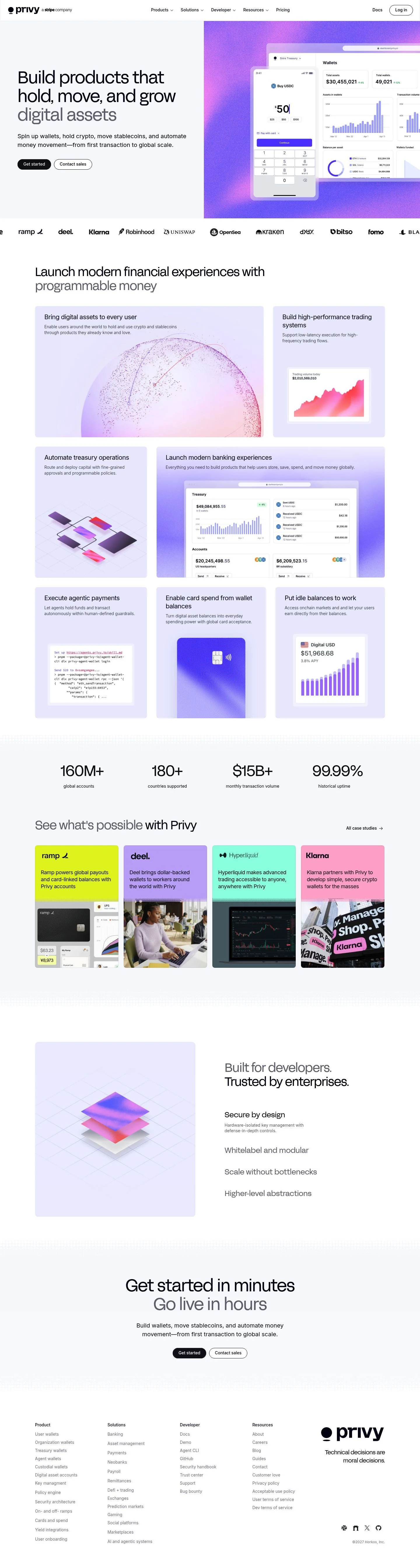
- Full page: https://cdn.designmunk.com/2026/09/09160037/privy-io-featured.webp
- Above the fold: https://cdn.designmunk.com/2026/09/09160037/privy-io-featured.webp
- On DesignMunk: https://designmunk.com/privy/

Study these for hierarchy, rhythm, spacing and density. Where an image and the written spec disagree, the spec wins: the tokens were read from the page's own CSS, the images are one rendering of it.

## Before you start

Ask the user what they are building, who it is for, and what brand assets they already have — name, colours, typefaces. Wait for their answers before writing anything. Everything below is then applied to their product, not to the reference.

## Design specification

# Privy: Black CTAs, Grey Subheads, Violet Mockups

## Overview

Privy's interface is infra-grade and sober: black text on white, restrained greys, and dense but legible copy blocks. Headline tracking is tight and sections breathe with large outer paddings. The audience is technical—product, engineering, and compliance—so typography carries hierarchy while color stays conservative. Use the system to project reliability first; illustrations and gradients add energy without changing core UI tone.

## Colors

- **primary (#000000):** Core text and CTAs. Use for headlines, primary buttons, and important labels.
- **secondary (#7c7c84):** De-emphasis. Apply to subheads, captions, helper text, and meta.
- **tertiary (#0000ee):** Actionable accents such as links or focused UI states. Use sparingly against white.
- **neutral (#ffffff):** Base canvas for pages and cards.
- **border (#e5e7eb):** Hairline dividers and input borders. Maintain 1px weight by default.
- **brand-nimbus-cloud (#c9c9cc):** Subtle, cool tint for empty states, skeletons, or muted backgrounds.
- **surface ({colors.neutral} → #ffffff):** Card and container backgrounds.
- **on-surface ({colors.primary} → #000000):** Default text on any surface.

## Typography

- Headlines (lg 58px, md 44px) use FFF Acid Grotesk Normal at weight 400 with tight negative letter-spacing. This is a custom/self-hosted face; agents should not assume access. Recommended substitutes with similar feel: Space Grotesk (Google), Plus Jakarta Sans (Google), or Manrope (Google). Maintain line heights from tokens (1.1–1.09) and keep tracking tight.
- Small headlines (sm 34px, xs 26px) fall back to system sans-serif; when building new screens prefer the same family as larger headlines or one of the substitutes above for consistency.
- Body (body-md 20px/1.5) uses Inter (Google) at weight 400. Inter is freely available and should be the default for paragraphs, lists, and long-form help text.
- Keep subheads and lead lines in secondary grey to separate them from the main headline without introducing new weights.

## Layout

Spacing scale is compact-to-generous: 12, 20, 32, 60, 80px. Use xl (80px) for section top/bottom padding on desktop, lg (60px) when sections stack densely. Apply md (32px) for grid gutters and card spacing; sm (20px) and xs (12px) for control spacing and inline gaps. A 12-column grid with 32px gutters fits the measured rhythm and supports the two-column hero with right-side illustration.

## Elevation & Depth

No shadows are used at any level. Separation is achieved with whitespace, 1px borders in #e5e7eb, and tonal contrast: #ffffff surfaces with #000000 type and #7c7c84 secondary labels. Emphasize hierarchy through scale and spacing rather than elevation.

## Shapes

Two radii set the language: 4px for interactive controls and tags (crisp, utilitarian), and 8px for cards and large containers (friendly but restrained). Links are un-rounded. Keep radii consistent across breakpoints; do not introduce circles or pill buttons unless explicitly specified.

## Components

Buttons and cards use fixed tokens across the site.

- Button Primary: 40px height, 8×16px padding, 4px radius, #000000 background with #ffffff text.
- Button Secondary: 40px height, 8×16px padding, 4px radius, text in #000000 on a transparent background.
- Button Link: text-only in #000000, 0px radius.
- Card: #ffffff surface, #000000 text, 8px radius, 16px padding, 1px border optional in #e5e7eb.

### Hero with Product Mockup
- Layout: two columns; left copy column max-width ~560px, right image panel. Section padding: 80px top/bottom.
- Typography: headline-lg 58px/1.1, secondary line in #7c7c84; body Inter 20px.
- CTAs: Primary "Get started", Secondary "Contact sales", placed as a row with 12–20px gap.

### Logo Wall
- Single-row brand marks on #ffffff with 32px vertical padding and 32px horizontal gaps. No shadows; optional bottom border #e5e7eb.

### Use-Case Cards Grid
- 2×3 (desktop) grid of cards using 8px radius and 16px inner padding. Title in headline-xs (26px), body in Inter 20px #7c7c84.

### Stat Strip
- Four equal columns with large numerals (headline-sm 34px #000000) and labels in Inter 20px #7c7c84. Dividers: 1px #e5e7eb between items.

### Case Studies Row
- Horizontal list of text-led links. Use headline-xs (26px) for titles; underline or color-shift to #0000ee on hover.

### Developer/Enterprise Band
- Two-column text layout with short feature blurbs. Use md spacing (32px) between items; optional top border #e5e7eb.

### Final CTA Banner
- Centered copy with headline-md (44px) and paired 40px buttons. Section padding: lg–xl depending on page depth.

## Do's and Don'ts

Do
- Use #000000 on #ffffff for all core text and CTAs.
- Keep body copy at Inter 20px/1.5 and subheads in #7c7c84 for de-emphasis.
- Maintain 40px button height and 4px radius across variants.
- Separate sections with whitespace and #e5e7eb dividers; keep shadows off.

Don't
- Introduce new accent colors or gradients into UI chrome (illustrations are fine).
- Loosen headline tracking; keep the negative letter-spacing from tokens.
- Round cards or controls beyond 8px and 4px respectively.
- Replace Inter with a serif or display face for body text.

## Agent Prompt Guide

Quick color reference
- Text: #000000
- Background: #ffffff
- Border: #e5e7eb
- Accent/Link: #0000ee

1) Build the hero
- Two columns on #ffffff. Left: headline "Build products that hold, move, and grow digital assets" set in FFF Acid Grotesk Normal 58px, 400, line-height 1.1, letter-spacing -0.03em, color #000000. Subhead in Inter 20px/1.5 color #7c7c84. Buttons: primary 40px tall, 8×16px, 4px radius, bg #000000 text #ffffff; secondary 40px tall, text #000000.

2) Create the use-case card grid
- 3 columns with 32px gutters. Each card: bg #ffffff, 1px border #e5e7eb, 8px radius, 16px padding. Title in FFF Acid Grotesk Normal 26px color #000000; body Inter 20px color #7c7c84; link color #0000ee on hover.

3) Add a stat strip
- 4 equal columns on #ffffff with 32px vertical padding. Numeral in FFF Acid Grotesk Normal 34px color #000000; label in Inter 20px color #7c7c84. Insert 1px vertical dividers in #e5e7eb between items.

4) Finish with a centered CTA band
- Headline in FFF Acid Grotesk Normal 44px/1.09 color #000000. Body Inter 20px color #7c7c84. Buttons side by side using the 40px/4px spec above. Section padding 80px top and bottom.

## Similar Brands

- Stripe: similarly sober black-on-white base; Privy is denser and uses violet illustration rather than colored UI components.
- Coinbase: clean fintech with strong numerals; Privy is more infra-focused and keeps link blue limited.
- Plaid: enterprise-grade typography and grids; Privy's headlines are tighter and larger at 58px.
- Circle: stablecoin infra with monochrome UI; Privy adds a bolder hero mockup treatment.
- Modern Treasury: operations-first content hierarchy; Privy runs larger display type and pairs it with a logo wall earlier in the page.

## Tokens

### CSS custom properties

```css
:root {
  /* Colors */
  --color-primary: #000000;
  --color-secondary: #7c7c84;
  --color-tertiary: #0000ee;
  --color-neutral: #ffffff;
  --color-border: #e5e7eb;
  --color-brand-nimbus-cloud: #c9c9cc;
  --color-surface: var(--color-neutral);
  --color-on-surface: var(--color-primary);

  /* Typography */
  --text-headline-lg-size: 58px;
  --text-headline-lg-weight: 400;
  --text-headline-lg-leading: 1.1;
  --text-headline-lg-tracking: -0.03em;
  --text-headline-md-size: 44px;
  --text-headline-md-weight: 400;
  --text-headline-md-leading: 1.09;
  --text-headline-md-tracking: -0.029em;
  --text-headline-sm-size: 34px;
  --text-headline-sm-weight: 400;
  --text-headline-sm-leading: 1.21;
  --text-headline-xs-size: 26px;
  --text-headline-xs-weight: 400;
  --text-headline-xs-leading: 1.19;
  --text-body-md-size: 20px;
  --text-body-md-weight: 400;
  --text-body-md-leading: 1.5;
  --font-fff-acid-grotesk-normal: "FFF Acid Grotesk Normal";
  --font-sans-serif: "sans-serif";
  --font-inter: "Inter";

  /* Rounded */
  --radius-sm: 4px;
  --radius-md: 8px;

  /* Spacing */
  --spacing-xs: 12px;
  --spacing-sm: 20px;
  --spacing-md: 32px;
  --spacing-lg: 60px;
  --spacing-xl: 80px;

  /* Components */
  --button-primary-background-color: var(--color-primary);
  --button-primary-text-color: var(--color-neutral);
  --button-primary-rounded: var(--radius-sm);
  --button-primary-padding: 8px 16px;
  --button-primary-height: 40px;
  --button-secondary-text-color: var(--color-primary);
  --button-secondary-rounded: var(--radius-sm);
  --button-secondary-padding: 8px 16px;
  --button-secondary-height: 40px;
  --button-link-text-color: var(--color-primary);
  --button-link-rounded: 0px;
  --card-background-color: var(--color-neutral);
  --card-text-color: var(--color-primary);
  --card-rounded: var(--radius-md);
  --card-padding: 16px;
}
```

### Tailwind theme

```css
@theme {
  --color-primary: #000000;
  --color-secondary: #7c7c84;
  --color-tertiary: #0000ee;
  --color-neutral: #ffffff;
  --color-border: #e5e7eb;
  --color-brand-nimbus-cloud: #c9c9cc;
  --color-surface: #ffffff;
  --color-on-surface: #000000;
  --font-headline-lg: "FFF Acid Grotesk Normal";
  --font-headline-md: "FFF Acid Grotesk Normal";
  --font-headline-sm: "sans-serif";
  --font-headline-xs: "sans-serif";
  --font-body-md: "Inter";
  --text-headline-lg: 58px;
  --text-headline-md: 44px;
  --text-headline-sm: 34px;
  --text-headline-xs: 26px;
  --text-body-md: 20px;
  --tracking-headline-lg: -0.03em;
  --tracking-headline-md: -0.029em;
  --font-weight-headline-lg: 400;
  --font-weight-headline-md: 400;
  --font-weight-headline-sm: 400;
  --font-weight-headline-xs: 400;
  --font-weight-body-md: 400;
  --radius-sm: 4px;
  --radius-md: 8px;
  --spacing-xs: 12px;
  --spacing-sm: 20px;
  --spacing-md: 32px;
  --spacing-lg: 60px;
  --spacing-xl: 80px;
}
```

### Design tokens (DTCG)

```json
{
    "$schema": "https://www.designtokens.org/schemas/2025.10/format.json",
    "color": {
        "$type": "color",
        "primary": {
            "$value": {
                "colorSpace": "srgb",
                "components": [
                    0,
                    0,
                    0
                ],
                "hex": "#000000"
            }
        },
        "secondary": {
            "$value": {
                "colorSpace": "srgb",
                "components": [
                    0.486,
                    0.486,
                    0.518
                ],
                "hex": "#7c7c84"
            }
        },
        "tertiary": {
            "$value": {
                "colorSpace": "srgb",
                "components": [
                    0,
                    0,
                    0.933
                ],
                "hex": "#0000ee"
            }
        },
        "neutral": {
            "$value": {
                "colorSpace": "srgb",
                "components": [
                    1,
                    1,
                    1
                ],
                "hex": "#ffffff"
            }
        },
        "border": {
            "$value": {
                "colorSpace": "srgb",
                "components": [
                    0.898,
                    0.906,
                    0.922
                ],
                "hex": "#e5e7eb"
            }
        },
        "brand-nimbus-cloud": {
            "$value": {
                "colorSpace": "srgb",
                "components": [
                    0.788,
                    0.788,
                    0.8
                ],
                "hex": "#c9c9cc"
            }
        },
        "surface": {
            "$value": {
                "colorSpace": "srgb",
                "components": [
                    1,
                    1,
                    1
                ],
                "hex": "#ffffff"
            }
        },
        "on-surface": {
            "$value": {
                "colorSpace": "srgb",
                "components": [
                    0,
                    0,
                    0
                ],
                "hex": "#000000"
            }
        }
    },
    "spacing": {
        "$type": "dimension",
        "xs": {
            "$value": {
                "value": 12,
                "unit": "px"
            }
        },
        "sm": {
            "$value": {
                "value": 20,
                "unit": "px"
            }
        },
        "md": {
            "$value": {
                "value": 32,
                "unit": "px"
            }
        },
        "lg": {
            "$value": {
                "value": 60,
                "unit": "px"
            }
        },
        "xl": {
            "$value": {
                "value": 80,
                "unit": "px"
            }
        }
    },
    "rounded": {
        "$type": "dimension",
        "sm": {
            "$value": {
                "value": 4,
                "unit": "px"
            }
        },
        "md": {
            "$value": {
                "value": 8,
                "unit": "px"
            }
        }
    },
    "typography": {
        "headline-lg": {
            "$type": "typography",
            "$value": {
                "fontFamily": "FFF Acid Grotesk Normal",
                "fontSize": {
                    "value": 58,
                    "unit": "px"
                },
                "fontWeight": 400,
                "letterSpacing": {
                    "value": -0.03,
                    "unit": "em"
                }
            }
        },
        "headline-md": {
            "$type": "typography",
            "$value": {
                "fontFamily": "FFF Acid Grotesk Normal",
                "fontSize": {
                    "value": 44,
                    "unit": "px"
                },
                "fontWeight": 400,
                "letterSpacing": {
                    "value": -0.029,
                    "unit": "em"
                }
            }
        },
        "headline-sm": {
            "$type": "typography",
            "$value": {
                "fontFamily": "sans-serif",
                "fontSize": {
                    "value": 34,
                    "unit": "px"
                },
                "fontWeight": 400
            }
        },
        "headline-xs": {
            "$type": "typography",
            "$value": {
                "fontFamily": "sans-serif",
                "fontSize": {
                    "value": 26,
                    "unit": "px"
                },
                "fontWeight": 400
            }
        },
        "body-md": {
            "$type": "typography",
            "$value": {
                "fontFamily": "Inter",
                "fontSize": {
                    "value": 20,
                    "unit": "px"
                },
                "fontWeight": 400
            }
        }
    }
}
```

## Rules

- **Fonts.** If the specification names a custom or self-hosted family, use one of the substitutes it names. Never reference a typeface you cannot actually load — it will fall back to a system font and undo the typography.
- **Colour.** Derive the palette from the user's brand. Use the token values as a guide to *relationships* — contrast, tint, how many accents carry the page — not as hex codes to paste.
- **Never reproduce** the wordmark, mascot, logo, brand name, illustrations, icon set, screenshots or any copy from the reference.
- **Never present the result as Privy**, or imply any connection to it.
- If something is unspecified, choose clarity and legibility over decoration.
---
version: alpha
name: Privy
description: Build products that hold, move, and grow digital assets.
colors:
  primary: "#000000"
  secondary: "#7c7c84"
  tertiary: "#0000ee"
  neutral: "#ffffff"
  border: "#e5e7eb"
  brand-nimbus-cloud: "#c9c9cc"
  surface: "{colors.neutral}"
  on-surface: "{colors.primary}"
typography:
  headline-lg:
    fontFamily: FFF Acid Grotesk Normal
    fontSize: 58px
    fontWeight: 400
    lineHeight: 1.1
    letterSpacing: -0.03em
  headline-md:
    fontFamily: FFF Acid Grotesk Normal
    fontSize: 44px
    fontWeight: 400
    lineHeight: 1.09
    letterSpacing: -0.029em
  headline-sm:
    fontFamily: sans-serif
    fontSize: 34px
    fontWeight: 400
    lineHeight: 1.21
  headline-xs:
    fontFamily: sans-serif
    fontSize: 26px
    fontWeight: 400
    lineHeight: 1.19
  body-md:
    fontFamily: Inter
    fontSize: 20px
    fontWeight: 400
    lineHeight: 1.5
rounded:
  sm: 4px
  md: 8px
spacing:
  xs: 12px
  sm: 20px
  md: 32px
  lg: 60px
  xl: 80px
components:
  button-primary:
    backgroundColor: "{colors.primary}"
    textColor: "{colors.neutral}"
    rounded: "{rounded.sm}"
    padding: 8px 16px
    height: 40px
  button-secondary:
    textColor: "{colors.primary}"
    rounded: "{rounded.sm}"
    padding: 8px 16px
    height: 40px
  button-link:
    textColor: "{colors.primary}"
    rounded: 0px
  card:
    backgroundColor: "{colors.neutral}"
    textColor: "{colors.primary}"
    rounded: "{rounded.md}"
    padding: 16px
---

# Privy: Black CTAs, Grey Subheads, Violet Mockups

## Overview

Privy's interface is infra-grade and sober: black text on white, restrained greys, and dense but legible copy blocks. Headline tracking is tight and sections breathe with large outer paddings. The audience is technical—product, engineering, and compliance—so typography carries hierarchy while color stays conservative. Use the system to project reliability first; illustrations and gradients add energy without changing core UI tone.

## Colors

- **primary (#000000):** Core text and CTAs. Use for headlines, primary buttons, and important labels.
- **secondary (#7c7c84):** De-emphasis. Apply to subheads, captions, helper text, and meta.
- **tertiary (#0000ee):** Actionable accents such as links or focused UI states. Use sparingly against white.
- **neutral (#ffffff):** Base canvas for pages and cards.
- **border (#e5e7eb):** Hairline dividers and input borders. Maintain 1px weight by default.
- **brand-nimbus-cloud (#c9c9cc):** Subtle, cool tint for empty states, skeletons, or muted backgrounds.
- **surface ({colors.neutral} → #ffffff):** Card and container backgrounds.
- **on-surface ({colors.primary} → #000000):** Default text on any surface.

## Typography

- Headlines (lg 58px, md 44px) use FFF Acid Grotesk Normal at weight 400 with tight negative letter-spacing. This is a custom/self-hosted face; agents should not assume access. Recommended substitutes with similar feel: Space Grotesk (Google), Plus Jakarta Sans (Google), or Manrope (Google). Maintain line heights from tokens (1.1–1.09) and keep tracking tight.
- Small headlines (sm 34px, xs 26px) fall back to system sans-serif; when building new screens prefer the same family as larger headlines or one of the substitutes above for consistency.
- Body (body-md 20px/1.5) uses Inter (Google) at weight 400. Inter is freely available and should be the default for paragraphs, lists, and long-form help text.
- Keep subheads and lead lines in secondary grey to separate them from the main headline without introducing new weights.

## Layout

Spacing scale is compact-to-generous: 12, 20, 32, 60, 80px. Use xl (80px) for section top/bottom padding on desktop, lg (60px) when sections stack densely. Apply md (32px) for grid gutters and card spacing; sm (20px) and xs (12px) for control spacing and inline gaps. A 12-column grid with 32px gutters fits the measured rhythm and supports the two-column hero with right-side illustration.

## Elevation & Depth

No shadows are used at any level. Separation is achieved with whitespace, 1px borders in #e5e7eb, and tonal contrast: #ffffff surfaces with #000000 type and #7c7c84 secondary labels. Emphasize hierarchy through scale and spacing rather than elevation.

## Shapes

Two radii set the language: 4px for interactive controls and tags (crisp, utilitarian), and 8px for cards and large containers (friendly but restrained). Links are un-rounded. Keep radii consistent across breakpoints; do not introduce circles or pill buttons unless explicitly specified.

## Components

Buttons and cards use fixed tokens across the site.

- Button Primary: 40px height, 8×16px padding, 4px radius, #000000 background with #ffffff text.
- Button Secondary: 40px height, 8×16px padding, 4px radius, text in #000000 on a transparent background.
- Button Link: text-only in #000000, 0px radius.
- Card: #ffffff surface, #000000 text, 8px radius, 16px padding, 1px border optional in #e5e7eb.

### Hero with Product Mockup
- Layout: two columns; left copy column max-width ~560px, right image panel. Section padding: 80px top/bottom.
- Typography: headline-lg 58px/1.1, secondary line in #7c7c84; body Inter 20px.
- CTAs: Primary "Get started", Secondary "Contact sales", placed as a row with 12–20px gap.

### Logo Wall
- Single-row brand marks on #ffffff with 32px vertical padding and 32px horizontal gaps. No shadows; optional bottom border #e5e7eb.

### Use-Case Cards Grid
- 2×3 (desktop) grid of cards using 8px radius and 16px inner padding. Title in headline-xs (26px), body in Inter 20px #7c7c84.

### Stat Strip
- Four equal columns with large numerals (headline-sm 34px #000000) and labels in Inter 20px #7c7c84. Dividers: 1px #e5e7eb between items.

### Case Studies Row
- Horizontal list of text-led links. Use headline-xs (26px) for titles; underline or color-shift to #0000ee on hover.

### Developer/Enterprise Band
- Two-column text layout with short feature blurbs. Use md spacing (32px) between items; optional top border #e5e7eb.

### Final CTA Banner
- Centered copy with headline-md (44px) and paired 40px buttons. Section padding: lg–xl depending on page depth.

## Do's and Don'ts

Do
- Use #000000 on #ffffff for all core text and CTAs.
- Keep body copy at Inter 20px/1.5 and subheads in #7c7c84 for de-emphasis.
- Maintain 40px button height and 4px radius across variants.
- Separate sections with whitespace and #e5e7eb dividers; keep shadows off.

Don't
- Introduce new accent colors or gradients into UI chrome (illustrations are fine).
- Loosen headline tracking; keep the negative letter-spacing from tokens.
- Round cards or controls beyond 8px and 4px respectively.
- Replace Inter with a serif or display face for body text.

## Agent Prompt Guide

Quick color reference
- Text: #000000
- Background: #ffffff
- Border: #e5e7eb
- Accent/Link: #0000ee

1) Build the hero
- Two columns on #ffffff. Left: headline "Build products that hold, move, and grow digital assets" set in FFF Acid Grotesk Normal 58px, 400, line-height 1.1, letter-spacing -0.03em, color #000000. Subhead in Inter 20px/1.5 color #7c7c84. Buttons: primary 40px tall, 8×16px, 4px radius, bg #000000 text #ffffff; secondary 40px tall, text #000000.

2) Create the use-case card grid
- 3 columns with 32px gutters. Each card: bg #ffffff, 1px border #e5e7eb, 8px radius, 16px padding. Title in FFF Acid Grotesk Normal 26px color #000000; body Inter 20px color #7c7c84; link color #0000ee on hover.

3) Add a stat strip
- 4 equal columns on #ffffff with 32px vertical padding. Numeral in FFF Acid Grotesk Normal 34px color #000000; label in Inter 20px color #7c7c84. Insert 1px vertical dividers in #e5e7eb between items.

4) Finish with a centered CTA band
- Headline in FFF Acid Grotesk Normal 44px/1.09 color #000000. Body Inter 20px color #7c7c84. Buttons side by side using the 40px/4px spec above. Section padding 80px top and bottom.

## Similar Brands

- Stripe: similarly sober black-on-white base; Privy is denser and uses violet illustration rather than colored UI components.
- Coinbase: clean fintech with strong numerals; Privy is more infra-focused and keeps link blue limited.
- Plaid: enterprise-grade typography and grids; Privy's headlines are tighter and larger at 58px.
- Circle: stablecoin infra with monochrome UI; Privy adds a bolder hero mockup treatment.
- Modern Treasury: operations-first content hierarchy; Privy runs larger display type and pairs it with a logo wall earlier in the page.
:root {
  /* Colors */
  --color-primary: #000000;
  --color-secondary: #7c7c84;
  --color-tertiary: #0000ee;
  --color-neutral: #ffffff;
  --color-border: #e5e7eb;
  --color-brand-nimbus-cloud: #c9c9cc;
  --color-surface: var(--color-neutral);
  --color-on-surface: var(--color-primary);

  /* Typography */
  --text-headline-lg-size: 58px;
  --text-headline-lg-weight: 400;
  --text-headline-lg-leading: 1.1;
  --text-headline-lg-tracking: -0.03em;
  --text-headline-md-size: 44px;
  --text-headline-md-weight: 400;
  --text-headline-md-leading: 1.09;
  --text-headline-md-tracking: -0.029em;
  --text-headline-sm-size: 34px;
  --text-headline-sm-weight: 400;
  --text-headline-sm-leading: 1.21;
  --text-headline-xs-size: 26px;
  --text-headline-xs-weight: 400;
  --text-headline-xs-leading: 1.19;
  --text-body-md-size: 20px;
  --text-body-md-weight: 400;
  --text-body-md-leading: 1.5;
  --font-fff-acid-grotesk-normal: "FFF Acid Grotesk Normal";
  --font-sans-serif: "sans-serif";
  --font-inter: "Inter";

  /* Rounded */
  --radius-sm: 4px;
  --radius-md: 8px;

  /* Spacing */
  --spacing-xs: 12px;
  --spacing-sm: 20px;
  --spacing-md: 32px;
  --spacing-lg: 60px;
  --spacing-xl: 80px;

  /* Components */
  --button-primary-background-color: var(--color-primary);
  --button-primary-text-color: var(--color-neutral);
  --button-primary-rounded: var(--radius-sm);
  --button-primary-padding: 8px 16px;
  --button-primary-height: 40px;
  --button-secondary-text-color: var(--color-primary);
  --button-secondary-rounded: var(--radius-sm);
  --button-secondary-padding: 8px 16px;
  --button-secondary-height: 40px;
  --button-link-text-color: var(--color-primary);
  --button-link-rounded: 0px;
  --card-background-color: var(--color-neutral);
  --card-text-color: var(--color-primary);
  --card-rounded: var(--radius-md);
  --card-padding: 16px;
}
{
  "$schema": "https://www.designtokens.org/schemas/2025.10/format.json",
  "$description": "Build products that hold, move, and grow digital assets.",
  "color": {
    "$type": "color",
    "primary": {
      "$value": {
        "colorSpace": "srgb",
        "components": [
          0,
          0,
          0
        ],
        "hex": "#000000"
      }
    },
    "secondary": {
      "$value": {
        "colorSpace": "srgb",
        "components": [
          0.486,
          0.486,
          0.518
        ],
        "hex": "#7c7c84"
      }
    },
    "tertiary": {
      "$value": {
        "colorSpace": "srgb",
        "components": [
          0,
          0,
          0.933
        ],
        "hex": "#0000ee"
      }
    },
    "neutral": {
      "$value": {
        "colorSpace": "srgb",
        "components": [
          1,
          1,
          1
        ],
        "hex": "#ffffff"
      }
    },
    "border": {
      "$value": {
        "colorSpace": "srgb",
        "components": [
          0.898,
          0.906,
          0.922
        ],
        "hex": "#e5e7eb"
      }
    },
    "brand-nimbus-cloud": {
      "$value": {
        "colorSpace": "srgb",
        "components": [
          0.788,
          0.788,
          0.8
        ],
        "hex": "#c9c9cc"
      }
    },
    "surface": {
      "$value": {
        "colorSpace": "srgb",
        "components": [
          1,
          1,
          1
        ],
        "hex": "#ffffff"
      }
    },
    "on-surface": {
      "$value": {
        "colorSpace": "srgb",
        "components": [
          0,
          0,
          0
        ],
        "hex": "#000000"
      }
    }
  },
  "spacing": {
    "$type": "dimension",
    "xs": {
      "$value": {
        "value": 12,
        "unit": "px"
      }
    },
    "sm": {
      "$value": {
        "value": 20,
        "unit": "px"
      }
    },
    "md": {
      "$value": {
        "value": 32,
        "unit": "px"
      }
    },
    "lg": {
      "$value": {
        "value": 60,
        "unit": "px"
      }
    },
    "xl": {
      "$value": {
        "value": 80,
        "unit": "px"
      }
    }
  },
  "rounded": {
    "$type": "dimension",
    "sm": {
      "$value": {
        "value": 4,
        "unit": "px"
      }
    },
    "md": {
      "$value": {
        "value": 8,
        "unit": "px"
      }
    }
  },
  "typography": {
    "headline-lg": {
      "$type": "typography",
      "$value": {
        "fontFamily": "FFF Acid Grotesk Normal",
        "fontSize": {
          "value": 58,
          "unit": "px"
        },
        "fontWeight": 400,
        "letterSpacing": {
          "value": -0.03,
          "unit": "em"
        }
      }
    },
    "headline-md": {
      "$type": "typography",
      "$value": {
        "fontFamily": "FFF Acid Grotesk Normal",
        "fontSize": {
          "value": 44,
          "unit": "px"
        },
        "fontWeight": 400,
        "letterSpacing": {
          "value": -0.029,
          "unit": "em"
        }
      }
    },
    "headline-sm": {
      "$type": "typography",
      "$value": {
        "fontFamily": "sans-serif",
        "fontSize": {
          "value": 34,
          "unit": "px"
        },
        "fontWeight": 400
      }
    },
    "headline-xs": {
      "$type": "typography",
      "$value": {
        "fontFamily": "sans-serif",
        "fontSize": {
          "value": 26,
          "unit": "px"
        },
        "fontWeight": 400
      }
    },
    "body-md": {
      "$type": "typography",
      "$value": {
        "fontFamily": "Inter",
        "fontSize": {
          "value": 20,
          "unit": "px"
        },
        "fontWeight": 400
      }
    }
  }
}
@theme {
--color-primary: #000000;
--color-secondary: #7c7c84;
--color-tertiary: #0000ee;
--color-neutral: #ffffff;
--color-border: #e5e7eb;
--color-brand-nimbus-cloud: #c9c9cc;
--color-surface: #ffffff;
--color-on-surface: #000000;
--font-headline-lg: "FFF Acid Grotesk Normal";
--font-headline-md: "FFF Acid Grotesk Normal";
--font-headline-sm: "sans-serif";
--font-headline-xs: "sans-serif";
--font-body-md: "Inter";
--text-headline-lg: 58px;
--text-headline-md: 44px;
--text-headline-sm: 34px;
--text-headline-xs: 26px;
--text-body-md: 20px;
--tracking-headline-lg: -0.03em;
--tracking-headline-md: -0.029em;
--font-weight-headline-lg: 400;
--font-weight-headline-md: 400;
--font-weight-headline-sm: 400;
--font-weight-headline-xs: 400;
--font-weight-body-md: 400;
--radius-sm: 4px;
--radius-md: 8px;
--spacing-xs: 12px;
--spacing-sm: 20px;
--spacing-md: 32px;
--spacing-lg: 60px;
--spacing-xl: 80px;
} # Design brief: the Privy design language
Below is a complete design specification measured from a real, published web page. Use it as a design language for the user's product. It is not a page to reproduce.
## Reference images
- Full page: https://cdn.designmunk.com/2026/09/09160037/privy-io-featured.webp
- Above the fold: https://cdn.designmunk.com/2026/09/09160037/privy-io-featured.webp
- On DesignMunk: https://designmunk.com/privy/
Study these for hierarchy, rhythm, spacing and density. Where an image and the written spec disagree, the spec wins: the tokens were read from the page's own CSS, the images are one rendering of it.
## Before you start
Ask the user what they are building, who it is for, and what brand assets they already have — name, colours, typefaces. Wait for their answers before writing anything. Everything below is then applied to their product, not to the reference.
## Design specification
# Privy: Black CTAs, Grey Subheads, Violet Mockups
## Overview
Privy's interface is infra-grade and sober: black text on white, restrained greys, and dense but legible copy blocks. Headline tracking is tight and sections breathe with large outer paddings. The audience is technical—product, engineering, and compliance—so typography carries hierarchy while color stays conservative. Use the system to project reliability first; illustrations and gradients add energy without changing core UI tone.
## Colors
- **primary (#000000):** Core text and CTAs. Use for headlines, primary buttons, and important labels.
- **secondary (#7c7c84):** De-emphasis. Apply to subheads, captions, helper text, and meta.
- **tertiary (#0000ee):** Actionable accents such as links or focused UI states. Use sparingly against white.
- **neutral (#ffffff):** Base canvas for pages and cards.
- **border (#e5e7eb):** Hairline dividers and input borders. Maintain 1px weight by default.
- **brand-nimbus-cloud (#c9c9cc):** Subtle, cool tint for empty states, skeletons, or muted backgrounds.
- **surface ({colors.neutral} → #ffffff):** Card and container backgrounds.
- **on-surface ({colors.primary} → #000000):** Default text on any surface.
## Typography
- Headlines (lg 58px, md 44px) use FFF Acid Grotesk Normal at weight 400 with tight negative letter-spacing. This is a custom/self-hosted face; agents should not assume access. Recommended substitutes with similar feel: Space Grotesk (Google), Plus Jakarta Sans (Google), or Manrope (Google). Maintain line heights from tokens (1.1–1.09) and keep tracking tight.
- Small headlines (sm 34px, xs 26px) fall back to system sans-serif; when building new screens prefer the same family as larger headlines or one of the substitutes above for consistency.
- Body (body-md 20px/1.5) uses Inter (Google) at weight 400. Inter is freely available and should be the default for paragraphs, lists, and long-form help text.
- Keep subheads and lead lines in secondary grey to separate them from the main headline without introducing new weights.
## Layout
Spacing scale is compact-to-generous: 12, 20, 32, 60, 80px. Use xl (80px) for section top/bottom padding on desktop, lg (60px) when sections stack densely. Apply md (32px) for grid gutters and card spacing; sm (20px) and xs (12px) for control spacing and inline gaps. A 12-column grid with 32px gutters fits the measured rhythm and supports the two-column hero with right-side illustration.
## Elevation & Depth
No shadows are used at any level. Separation is achieved with whitespace, 1px borders in #e5e7eb, and tonal contrast: #ffffff surfaces with #000000 type and #7c7c84 secondary labels. Emphasize hierarchy through scale and spacing rather than elevation.
## Shapes
Two radii set the language: 4px for interactive controls and tags (crisp, utilitarian), and 8px for cards and large containers (friendly but restrained). Links are un-rounded. Keep radii consistent across breakpoints; do not introduce circles or pill buttons unless explicitly specified.
## Components
Buttons and cards use fixed tokens across the site.
- Button Primary: 40px height, 8×16px padding, 4px radius, #000000 background with #ffffff text.
- Button Secondary: 40px height, 8×16px padding, 4px radius, text in #000000 on a transparent background.
- Button Link: text-only in #000000, 0px radius.
- Card: #ffffff surface, #000000 text, 8px radius, 16px padding, 1px border optional in #e5e7eb.
### Hero with Product Mockup
- Layout: two columns; left copy column max-width ~560px, right image panel. Section padding: 80px top/bottom.
- Typography: headline-lg 58px/1.1, secondary line in #7c7c84; body Inter 20px.
- CTAs: Primary "Get started", Secondary "Contact sales", placed as a row with 12–20px gap.
### Logo Wall
- Single-row brand marks on #ffffff with 32px vertical padding and 32px horizontal gaps. No shadows; optional bottom border #e5e7eb.
### Use-Case Cards Grid
- 2×3 (desktop) grid of cards using 8px radius and 16px inner padding. Title in headline-xs (26px), body in Inter 20px #7c7c84.
### Stat Strip
- Four equal columns with large numerals (headline-sm 34px #000000) and labels in Inter 20px #7c7c84. Dividers: 1px #e5e7eb between items.
### Case Studies Row
- Horizontal list of text-led links. Use headline-xs (26px) for titles; underline or color-shift to #0000ee on hover.
### Developer/Enterprise Band
- Two-column text layout with short feature blurbs. Use md spacing (32px) between items; optional top border #e5e7eb.
### Final CTA Banner
- Centered copy with headline-md (44px) and paired 40px buttons. Section padding: lg–xl depending on page depth.
## Do's and Don'ts
Do
- Use #000000 on #ffffff for all core text and CTAs.
- Keep body copy at Inter 20px/1.5 and subheads in #7c7c84 for de-emphasis.
- Maintain 40px button height and 4px radius across variants.
- Separate sections with whitespace and #e5e7eb dividers; keep shadows off.
Don't
- Introduce new accent colors or gradients into UI chrome (illustrations are fine).
- Loosen headline tracking; keep the negative letter-spacing from tokens.
- Round cards or controls beyond 8px and 4px respectively.
- Replace Inter with a serif or display face for body text.
## Agent Prompt Guide
Quick color reference
- Text: #000000
- Background: #ffffff
- Border: #e5e7eb
- Accent/Link: #0000ee
1) Build the hero
- Two columns on #ffffff. Left: headline "Build products that hold, move, and grow digital assets" set in FFF Acid Grotesk Normal 58px, 400, line-height 1.1, letter-spacing -0.03em, color #000000. Subhead in Inter 20px/1.5 color #7c7c84. Buttons: primary 40px tall, 8×16px, 4px radius, bg #000000 text #ffffff; secondary 40px tall, text #000000.
2) Create the use-case card grid
- 3 columns with 32px gutters. Each card: bg #ffffff, 1px border #e5e7eb, 8px radius, 16px padding. Title in FFF Acid Grotesk Normal 26px color #000000; body Inter 20px color #7c7c84; link color #0000ee on hover.
3) Add a stat strip
- 4 equal columns on #ffffff with 32px vertical padding. Numeral in FFF Acid Grotesk Normal 34px color #000000; label in Inter 20px color #7c7c84. Insert 1px vertical dividers in #e5e7eb between items.
4) Finish with a centered CTA band
- Headline in FFF Acid Grotesk Normal 44px/1.09 color #000000. Body Inter 20px color #7c7c84. Buttons side by side using the 40px/4px spec above. Section padding 80px top and bottom.
## Tokens
### CSS custom properties
```css
:root {
/* Colors */
--color-primary: #000000;
--color-secondary: #7c7c84;
--color-tertiary: #0000ee;
--color-neutral: #ffffff;
--color-border: #e5e7eb;
--color-brand-nimbus-cloud: #c9c9cc;
--color-surface: var(--color-neutral);
--color-on-surface: var(--color-primary);
/* Typography */
--text-headline-lg-size: 58px;
--text-headline-lg-weight: 400;
--text-headline-lg-leading: 1.1;
--text-headline-lg-tracking: -0.03em;
--text-headline-md-size: 44px;
--text-headline-md-weight: 400;
--text-headline-md-leading: 1.09;
--text-headline-md-tracking: -0.029em;
--text-headline-sm-size: 34px;
--text-headline-sm-weight: 400;
--text-headline-sm-leading: 1.21;
--text-headline-xs-size: 26px;
--text-headline-xs-weight: 400;
--text-headline-xs-leading: 1.19;
--text-body-md-size: 20px;
--text-body-md-weight: 400;
--text-body-md-leading: 1.5;
--font-fff-acid-grotesk-normal: "FFF Acid Grotesk Normal";
--font-sans-serif: "sans-serif";
--font-inter: "Inter";
/* Rounded */
--radius-sm: 4px;
--radius-md: 8px;
/* Spacing */
--spacing-xs: 12px;
--spacing-sm: 20px;
--spacing-md: 32px;
--spacing-lg: 60px;
--spacing-xl: 80px;
/* Components */
--button-primary-background-color: var(--color-primary);
--button-primary-text-color: var(--color-neutral);
--button-primary-rounded: var(--radius-sm);
--button-primary-padding: 8px 16px;
--button-primary-height: 40px;
--button-secondary-text-color: var(--color-primary);
--button-secondary-rounded: var(--radius-sm);
--button-secondary-padding: 8px 16px;
--button-secondary-height: 40px;
--button-link-text-color: var(--color-primary);
--button-link-rounded: 0px;
--card-background-color: var(--color-neutral);
--card-text-color: var(--color-primary);
--card-rounded: var(--radius-md);
--card-padding: 16px;
}
```
## Rules
- **Fonts.** If the specification names a custom or self-hosted family, use one of the substitutes it names. Never reference a typeface you cannot actually load — it will fall back to a system font and undo the typography.
- **Colour.** Derive the palette from the user's brand. Use the token values as a guide to *relationships* — contrast, tint, how many accents carry the page — not as hex codes to paste.
- **Never reproduce** the wordmark, mascot, logo, brand name, illustrations, icon set, screenshots or any copy from the reference.
- **Never present the result as Privy**, or imply any connection to it.
- If something is unspecified, choose clarity and legibility over decoration.