







Primitive
getprimitive.ai
Decision-making is the work—Primitive makes it durable, networked, enforced.
getprimitive.ai
AI Breakdown
Design export
# Design brief: the Primitive design language

Below is a complete design specification measured from a real, published web page. Use it as a design language for the user's product. It is not a page to reproduce.

## Reference images

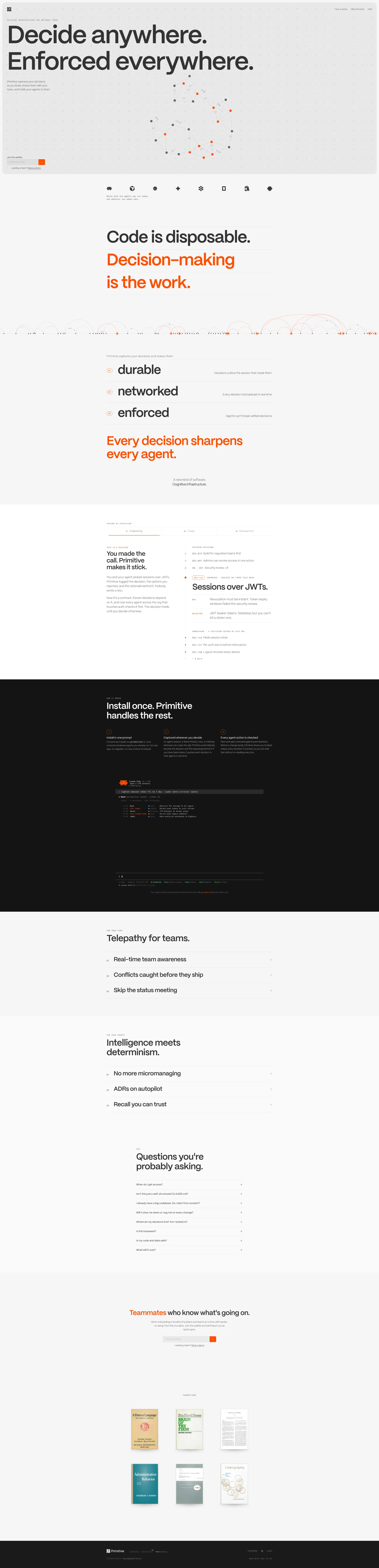
- Full page: https://cdn.designmunk.com/2026/09/04182514/primitive-1440x5949.webp
- Above the fold: https://cdn.designmunk.com/2026/09/04182514/primitive.webp
- On DesignMunk: https://designmunk.com/primitive/

Study these for hierarchy, rhythm, spacing and density. Where an image and the written spec disagree, the spec wins: the tokens were read from the page's own CSS, the images are one rendering of it.

## Before you start

Ask the user what they are building, who it is for, and what brand assets they already have — name, colours, typefaces. Wait for their answers before writing anything. Everything below is then applied to their product, not to the reference.

## Design specification

# Primitive: Monumental Headlines on a Dotted Grid

## Overview

Primitive is a developer-facing brand: serious, technical, and explicit. The UI should feel deterministic rather than expressive—monochrome first, with one vivid accent used sparingly for signals. Layouts are spacious but gridded; content is dense in meaning, not decoration. When in doubt, prefer fewer elements, stronger scale, and visible structure (dotted fields, 1px keylines).

## Colors

- **primary (#000000):** Ink for headlines, core text, and iconography.
- **secondary (#848484):** Muted copy, timestamps, helper labels, and inactive states.
- **tertiary (#ff4f00):** Signal orange for data points, enforced badges, and interactive highlights only.
- **neutral (#f5f5f5):** Paper-gray backgrounds and panels; default surface.
- **brand-silverback (#cbcbcb):** Grids, dotted fields, dividers, and subtle keylines.
- **surface (#f5f5f5):** Application background surface alias.
- **on-surface (#000000):** Default on-surface text and icon color alias.

## Typography

- Headline LG (Mori Bold, 157px, -0.025em, 1.06): Hero statements and marquee section intros. Extremely large; reserve for first-view and rare sectional anchors.
- Headline MD (Mori Bold, 89px, -0.01em, 1.2): Secondary hero lines and major section headers.
- Headline SM (Mori Regular, 50px, 1.2): Section titles and case headers.
- Headline XS (Mori Light, 28px, 1.21): Subheads and lead-ins.
- Body MD (Berkeley Mono, 16px, 0.06em): All running copy, captions, and UI labels; the tracking keeps the mono face readable at small sizes.
Font availability: Mori (Bold/Regular/Light) and Berkeley Mono are self-hosted/custom; an agent should not assume they can be loaded from Google. Practical substitutes with similar tone:
- For Mori: Inter, Plus Jakarta Sans, or Manrope (all widely available) for bold grotesk display and clean text.
- For Berkeley Mono: IBM Plex Mono, JetBrains Mono, or PT Mono for readable developer-grade monospace.
Keep negative letter-spacing only on display sizes; never track mono text tighter than 0em.

## Layout

Spacing uses an 8px base with deliberate jumps: 8, 16, 26, 48, 110. Use xl (110px) for hero insets and major section breathing room; lg (48px) for section padding; md (26px) for card gutters and vertical rhythm between subhead and body; sm/xs for controls. A simple 12-column grid pairs well with the dotted background; align major blocks to columns and let the dot field extend edge-to-edge within rounded containers.

## Elevation & Depth

Shadows are essentially keylines: sm adds a 1px rgba(0,0,0,0.1) outline; inner provides the same inset. Medium and larger shadows are none. Depth and hierarchy are built with tonal steps (neutral #f5f5f5 panels against white/neutral pages), 1px borders in brand-silverback, and whitespace. Reserve the orange accent for state and data, not elevation.

## Shapes

Two radii define the language: sm 4px for interactive controls (buttons, inputs) and md 8px for containers (cards, hero panels). Links are square (0px) to keep text minimal. Use radius as a semantic cue—larger radius means "group of content," smaller means "action."

## Components

Buttons and Card (tokened):
- Primary Button: 40px height, 8x16 padding, 4px radius; black fill (#000000) with paper text (#f5f5f5).
- Secondary Button: 40px height, 8x16 padding, 4px radius; text-only black with transparent background.
- Link Button: Text-only, 0px radius.
- Card: Neutral background (#f5f5f5), black text, 8px radius, 16px padding; add sm keyline if separation is needed.

### Dot-Grid Hero Panel
- Container: neutral surface with md 8px radius and sm keyline. Overlay a subtle dot grid using brand-silverback (#cbcbcb). Headline LG 157px, supporting line in Headline MD 89px.

### Decision Graph Visualization
- Sparse node scatter with small gray nodes (#848484) and signal nodes in tertiary (#ff4f00). Labels in Body MD. Use no outer shadow; rely on the grid and keylines.

### "This is a decision" Capsule
- Title in Headline XS 28px; body in Berkeley Mono 16px. Card container (8px radius, 16px padding) with a left accent rail using #cbcbcb; enforced state badges use #ff4f00.

### Live Decisions Feed
- Four-item list with category labels in secondary (#848484), decision titles in Mori Regular 50px or XS 28px depending on viewport, timestamps in secondary. 26px vertical rhythm, 1px dividers in #cbcbcb.

### Install Steps Rail
- Three steps, each: numeral badge (mono, secondary), step title in Headline XS 28px, description in Body MD. Use 48px spacing between steps and 16px internal padding.

### Discipline Switcher
- Inline segmented control for Engineering / Design / Management. Secondary text default, primary text when active. 4px radius pills, 1px #cbcbcb keyline on focus.

### Enforcement Badges
- Small mono chips indicating Enforced / checked N times. Text #000000 with a 4px circular marker in #ff4f00; no drop shadow.

### Foundations Library Tiles
- Simple list tiles: book title in Headline XS 28px, author/year in secondary. Card background neutral with 8px radius and 16px padding; sm keyline when grouped.

## Do's and Don'ts

- Do reserve #ff4f00 for live signals, enforcement states, and active nodes; don't use it for routine links or body text.
- Do keep one primary action per view; don't place multiple filled buttons side-by-side.
- Do use the dotted field and #cbcbcb keylines to separate regions; don't introduce soft drop shadows beyond the 1px keyline.
- Do set body copy in Berkeley Mono 16px with 0.06em tracking; don't tighten tracking on mono or it will blur at small sizes.
- Do cap display lines to two per hero; don't wrap the 157px headline beyond two lines.
- Do apply 4px radius to controls and 8px to content groups; don't mix radii within the same component.

## Agent Prompt Guide

Quick color reference
- Text: #000000
- Background: #f5f5f5
- Border/keyline: #cbcbcb
- Accent/signal: #ff4f00

1) Hero with dotted field and monumental headline
- Canvas #f5f5f5. Add a centered container with 8px radius and a 1px #cbcbcb keyline.
- Overlay a subtle dotted pattern using #cbcbcb.
- Set h1 in "Mori Bold" at 157px, line-height 1.06, letter-spacing -0.025em, color #000000.
- Set subhead in "Mori Bold" at 89px, line-height 1.2, letter-spacing -0.01em.
- Body intro in "Berkeley Mono" 16px, letter-spacing 0.06em.
- Primary button: 40px height, 8px 16px, 4px radius, background #000000, text #f5f5f5.

2) Decision card ("This is a decision")
- Card: background #f5f5f5, 8px radius, 16px padding, optional 1px #cbcbcb keyline.
- Title: "Mori Light" 28px, line-height 1.21.
- Body: "Berkeley Mono" 16px, letter-spacing 0.06em.
- Status chip: small circle in #ff4f00 before "Enforced".

3) Live decisions feed (4 items)
- Section heading in "Mori Regular" 50px.
- Each row: category label in #848484 (mono 16px), decision title in #000000, timestamp in #848484.
- Use 26px vertical spacing; 1px dividers in #cbcbcb between rows.

4) Install steps (1–3)
- Three columns or a vertical rail.
- Step number in mono 16px #848484; title in "Mori Light" 28px; description in mono 16px 0.06em.
- 48px gap between steps; buttons follow 40px/4px token specs.

5) Button set
- Primary: background #000000, text #f5f5f5, 40px height, 8px 16px, 4px radius.
- Secondary: text #000000, transparent background, 40px height, 8px 16px, 4px radius.
- Link: text #000000, 0px radius.

## Similar Brands

- Linear: restrained monochrome UI and oversized headings; Linear is sleeker with more motion, while Primitive leans on a visible dotted substrate.
- Vercel: black–white discipline and one-accent signaling; Vercel is darker and denser, Primitive stays on paper gray.
- Notion: minimal palette and keyline-driven depth; Notion uses serif accents and softer typography, Primitive is harder and more technical.
- Retool: developer-tool pragmatism and monospace usage; Retool has more color in data states, Primitive keeps orange as a strict signal.

## Tokens

### CSS custom properties

```css
:root {
  /* Colors */
  --color-primary: #000000;
  --color-secondary: #848484;
  --color-tertiary: #ff4f00;
  --color-neutral: #f5f5f5;
  --color-brand-silverback: #cbcbcb;
  --color-surface: var(--color-neutral);
  --color-on-surface: var(--color-primary);

  /* Typography */
  --text-headline-lg-size: 157px;
  --text-headline-lg-weight: 400;
  --text-headline-lg-leading: 1.06;
  --text-headline-lg-tracking: -0.025em;
  --text-headline-md-size: 89px;
  --text-headline-md-weight: 400;
  --text-headline-md-leading: 1.2;
  --text-headline-md-tracking: -0.01em;
  --text-headline-sm-size: 50px;
  --text-headline-sm-weight: 400;
  --text-headline-sm-leading: 1.2;
  --text-headline-xs-size: 28px;
  --text-headline-xs-weight: 400;
  --text-headline-xs-leading: 1.21;
  --text-body-md-size: 16px;
  --text-body-md-weight: 400;
  --text-body-md-tracking: 0.06em;
  --font-mori-bold: "Mori Bold";
  --font-mori-regular: "Mori Regular";
  --font-mori-light: "Mori Light";
  --font-berkeley-mono: "Berkeley Mono";

  /* Rounded */
  --radius-sm: 4px;
  --radius-md: 8px;

  /* Spacing */
  --spacing-xs: 8px;
  --spacing-sm: 16px;
  --spacing-md: 26px;
  --spacing-lg: 48px;
  --spacing-xl: 110px;

  /* Components */
  --button-primary-background-color: var(--color-primary);
  --button-primary-text-color: var(--color-neutral);
  --button-primary-rounded: var(--radius-sm);
  --button-primary-padding: 8px 16px;
  --button-primary-height: 40px;
  --button-secondary-text-color: var(--color-primary);
  --button-secondary-rounded: var(--radius-sm);
  --button-secondary-padding: 8px 16px;
  --button-secondary-height: 40px;
  --button-link-text-color: var(--color-primary);
  --button-link-rounded: 0px;
  --card-background-color: var(--color-neutral);
  --card-text-color: var(--color-primary);
  --card-rounded: var(--radius-md);
  --card-padding: 16px;
}
```

### Tailwind theme

```css
@theme {
  --color-primary: #000000;
  --color-secondary: #848484;
  --color-tertiary: #ff4f00;
  --color-neutral: #f5f5f5;
  --color-brand-silverback: #cbcbcb;
  --color-surface: #f5f5f5;
  --color-on-surface: #000000;
  --font-headline-lg: "Mori Bold";
  --font-headline-md: "Mori Bold";
  --font-headline-sm: "Mori Regular";
  --font-headline-xs: "Mori Light";
  --font-body-md: "Berkeley Mono";
  --text-headline-lg: 157px;
  --text-headline-md: 89px;
  --text-headline-sm: 50px;
  --text-headline-xs: 28px;
  --text-body-md: 16px;
  --tracking-headline-lg: -0.025em;
  --tracking-headline-md: -0.01em;
  --tracking-body-md: 0.06em;
  --font-weight-headline-lg: 400;
  --font-weight-headline-md: 400;
  --font-weight-headline-sm: 400;
  --font-weight-headline-xs: 400;
  --font-weight-body-md: 400;
  --radius-sm: 4px;
  --radius-md: 8px;
  --spacing-xs: 8px;
  --spacing-sm: 16px;
  --spacing-md: 26px;
  --spacing-lg: 48px;
  --spacing-xl: 110px;
}
```

### Design tokens (DTCG)

```json
{
    "$schema": "https://www.designtokens.org/schemas/2025.10/format.json",
    "color": {
        "$type": "color",
        "primary": {
            "$value": {
                "colorSpace": "srgb",
                "components": [
                    0,
                    0,
                    0
                ],
                "hex": "#000000"
            }
        },
        "secondary": {
            "$value": {
                "colorSpace": "srgb",
                "components": [
                    0.518,
                    0.518,
                    0.518
                ],
                "hex": "#848484"
            }
        },
        "tertiary": {
            "$value": {
                "colorSpace": "srgb",
                "components": [
                    1,
                    0.31,
                    0
                ],
                "hex": "#ff4f00"
            }
        },
        "neutral": {
            "$value": {
                "colorSpace": "srgb",
                "components": [
                    0.961,
                    0.961,
                    0.961
                ],
                "hex": "#f5f5f5"
            }
        },
        "brand-silverback": {
            "$value": {
                "colorSpace": "srgb",
                "components": [
                    0.796,
                    0.796,
                    0.796
                ],
                "hex": "#cbcbcb"
            }
        },
        "surface": {
            "$value": {
                "colorSpace": "srgb",
                "components": [
                    0.961,
                    0.961,
                    0.961
                ],
                "hex": "#f5f5f5"
            }
        },
        "on-surface": {
            "$value": {
                "colorSpace": "srgb",
                "components": [
                    0,
                    0,
                    0
                ],
                "hex": "#000000"
            }
        }
    },
    "spacing": {
        "$type": "dimension",
        "xs": {
            "$value": {
                "value": 8,
                "unit": "px"
            }
        },
        "sm": {
            "$value": {
                "value": 16,
                "unit": "px"
            }
        },
        "md": {
            "$value": {
                "value": 26,
                "unit": "px"
            }
        },
        "lg": {
            "$value": {
                "value": 48,
                "unit": "px"
            }
        },
        "xl": {
            "$value": {
                "value": 110,
                "unit": "px"
            }
        }
    },
    "rounded": {
        "$type": "dimension",
        "sm": {
            "$value": {
                "value": 4,
                "unit": "px"
            }
        },
        "md": {
            "$value": {
                "value": 8,
                "unit": "px"
            }
        }
    },
    "typography": {
        "headline-lg": {
            "$type": "typography",
            "$value": {
                "fontFamily": "Mori Bold",
                "fontSize": {
                    "value": 157,
                    "unit": "px"
                },
                "fontWeight": 400,
                "letterSpacing": {
                    "value": -0.025,
                    "unit": "em"
                }
            }
        },
        "headline-md": {
            "$type": "typography",
            "$value": {
                "fontFamily": "Mori Bold",
                "fontSize": {
                    "value": 89,
                    "unit": "px"
                },
                "fontWeight": 400,
                "letterSpacing": {
                    "value": -0.01,
                    "unit": "em"
                }
            }
        },
        "headline-sm": {
            "$type": "typography",
            "$value": {
                "fontFamily": "Mori Regular",
                "fontSize": {
                    "value": 50,
                    "unit": "px"
                },
                "fontWeight": 400
            }
        },
        "headline-xs": {
            "$type": "typography",
            "$value": {
                "fontFamily": "Mori Light",
                "fontSize": {
                    "value": 28,
                    "unit": "px"
                },
                "fontWeight": 400
            }
        },
        "body-md": {
            "$type": "typography",
            "$value": {
                "fontFamily": "Berkeley Mono",
                "fontSize": {
                    "value": 16,
                    "unit": "px"
                },
                "fontWeight": 400,
                "letterSpacing": {
                    "value": 0.06,
                    "unit": "em"
                }
            }
        }
    }
}
```

## Rules

- **Fonts.** If the specification names a custom or self-hosted family, use one of the substitutes it names. Never reference a typeface you cannot actually load — it will fall back to a system font and undo the typography.
- **Colour.** Derive the palette from the user's brand. Use the token values as a guide to *relationships* — contrast, tint, how many accents carry the page — not as hex codes to paste.
- **Never reproduce** the wordmark, mascot, logo, brand name, illustrations, icon set, screenshots or any copy from the reference.
- **Never present the result as Primitive**, or imply any connection to it.
- If something is unspecified, choose clarity and legibility over decoration.
---
version: alpha
name: Primitive
description: Decision-making is the work—Primitive makes it durable, networked, enforced.
colors:
  primary: "#000000"
  secondary: "#848484"
  tertiary: "#ff4f00"
  neutral: "#f5f5f5"
  brand-silverback: "#cbcbcb"
  surface: "{colors.neutral}"
  on-surface: "{colors.primary}"
typography:
  headline-lg:
    fontFamily: Mori Bold
    fontSize: 157px
    fontWeight: 400
    lineHeight: 1.06
    letterSpacing: -0.025em
  headline-md:
    fontFamily: Mori Bold
    fontSize: 89px
    fontWeight: 400
    lineHeight: 1.2
    letterSpacing: -0.01em
  headline-sm:
    fontFamily: Mori Regular
    fontSize: 50px
    fontWeight: 400
    lineHeight: 1.2
  headline-xs:
    fontFamily: Mori Light
    fontSize: 28px
    fontWeight: 400
    lineHeight: 1.21
  body-md:
    fontFamily: Berkeley Mono
    fontSize: 16px
    fontWeight: 400
    letterSpacing: 0.06em
rounded:
  sm: 4px
  md: 8px
spacing:
  xs: 8px
  sm: 16px
  md: 26px
  lg: 48px
  xl: 110px
components:
  button-primary:
    backgroundColor: "{colors.primary}"
    textColor: "{colors.neutral}"
    rounded: "{rounded.sm}"
    padding: 8px 16px
    height: 40px
  button-secondary:
    textColor: "{colors.primary}"
    rounded: "{rounded.sm}"
    padding: 8px 16px
    height: 40px
  button-link:
    textColor: "{colors.primary}"
    rounded: 0px
  card:
    backgroundColor: "{colors.neutral}"
    textColor: "{colors.primary}"
    rounded: "{rounded.md}"
    padding: 16px
---

# Primitive: Monumental Headlines on a Dotted Grid

## Overview

Primitive is a developer-facing brand: serious, technical, and explicit. The UI should feel deterministic rather than expressive—monochrome first, with one vivid accent used sparingly for signals. Layouts are spacious but gridded; content is dense in meaning, not decoration. When in doubt, prefer fewer elements, stronger scale, and visible structure (dotted fields, 1px keylines).

## Colors

- **primary (#000000):** Ink for headlines, core text, and iconography.
- **secondary (#848484):** Muted copy, timestamps, helper labels, and inactive states.
- **tertiary (#ff4f00):** Signal orange for data points, enforced badges, and interactive highlights only.
- **neutral (#f5f5f5):** Paper-gray backgrounds and panels; default surface.
- **brand-silverback (#cbcbcb):** Grids, dotted fields, dividers, and subtle keylines.
- **surface (#f5f5f5):** Application background surface alias.
- **on-surface (#000000):** Default on-surface text and icon color alias.

## Typography

- Headline LG (Mori Bold, 157px, -0.025em, 1.06): Hero statements and marquee section intros. Extremely large; reserve for first-view and rare sectional anchors.
- Headline MD (Mori Bold, 89px, -0.01em, 1.2): Secondary hero lines and major section headers.
- Headline SM (Mori Regular, 50px, 1.2): Section titles and case headers.
- Headline XS (Mori Light, 28px, 1.21): Subheads and lead-ins.
- Body MD (Berkeley Mono, 16px, 0.06em): All running copy, captions, and UI labels; the tracking keeps the mono face readable at small sizes.
Font availability: Mori (Bold/Regular/Light) and Berkeley Mono are self-hosted/custom; an agent should not assume they can be loaded from Google. Practical substitutes with similar tone:
- For Mori: Inter, Plus Jakarta Sans, or Manrope (all widely available) for bold grotesk display and clean text.
- For Berkeley Mono: IBM Plex Mono, JetBrains Mono, or PT Mono for readable developer-grade monospace.
Keep negative letter-spacing only on display sizes; never track mono text tighter than 0em.

## Layout

Spacing uses an 8px base with deliberate jumps: 8, 16, 26, 48, 110. Use xl (110px) for hero insets and major section breathing room; lg (48px) for section padding; md (26px) for card gutters and vertical rhythm between subhead and body; sm/xs for controls. A simple 12-column grid pairs well with the dotted background; align major blocks to columns and let the dot field extend edge-to-edge within rounded containers.

## Elevation & Depth

Shadows are essentially keylines: sm adds a 1px rgba(0,0,0,0.1) outline; inner provides the same inset. Medium and larger shadows are none. Depth and hierarchy are built with tonal steps (neutral #f5f5f5 panels against white/neutral pages), 1px borders in brand-silverback, and whitespace. Reserve the orange accent for state and data, not elevation.

## Shapes

Two radii define the language: sm 4px for interactive controls (buttons, inputs) and md 8px for containers (cards, hero panels). Links are square (0px) to keep text minimal. Use radius as a semantic cue—larger radius means "group of content," smaller means "action."

## Components

Buttons and Card (tokened):
- Primary Button: 40px height, 8x16 padding, 4px radius; black fill (#000000) with paper text (#f5f5f5).
- Secondary Button: 40px height, 8x16 padding, 4px radius; text-only black with transparent background.
- Link Button: Text-only, 0px radius.
- Card: Neutral background (#f5f5f5), black text, 8px radius, 16px padding; add sm keyline if separation is needed.

### Dot-Grid Hero Panel
- Container: neutral surface with md 8px radius and sm keyline. Overlay a subtle dot grid using brand-silverback (#cbcbcb). Headline LG 157px, supporting line in Headline MD 89px.

### Decision Graph Visualization
- Sparse node scatter with small gray nodes (#848484) and signal nodes in tertiary (#ff4f00). Labels in Body MD. Use no outer shadow; rely on the grid and keylines.

### "This is a decision" Capsule
- Title in Headline XS 28px; body in Berkeley Mono 16px. Card container (8px radius, 16px padding) with a left accent rail using #cbcbcb; enforced state badges use #ff4f00.

### Live Decisions Feed
- Four-item list with category labels in secondary (#848484), decision titles in Mori Regular 50px or XS 28px depending on viewport, timestamps in secondary. 26px vertical rhythm, 1px dividers in #cbcbcb.

### Install Steps Rail
- Three steps, each: numeral badge (mono, secondary), step title in Headline XS 28px, description in Body MD. Use 48px spacing between steps and 16px internal padding.

### Discipline Switcher
- Inline segmented control for Engineering / Design / Management. Secondary text default, primary text when active. 4px radius pills, 1px #cbcbcb keyline on focus.

### Enforcement Badges
- Small mono chips indicating Enforced / checked N times. Text #000000 with a 4px circular marker in #ff4f00; no drop shadow.

### Foundations Library Tiles
- Simple list tiles: book title in Headline XS 28px, author/year in secondary. Card background neutral with 8px radius and 16px padding; sm keyline when grouped.

## Do's and Don'ts

- Do reserve #ff4f00 for live signals, enforcement states, and active nodes; don't use it for routine links or body text.
- Do keep one primary action per view; don't place multiple filled buttons side-by-side.
- Do use the dotted field and #cbcbcb keylines to separate regions; don't introduce soft drop shadows beyond the 1px keyline.
- Do set body copy in Berkeley Mono 16px with 0.06em tracking; don't tighten tracking on mono or it will blur at small sizes.
- Do cap display lines to two per hero; don't wrap the 157px headline beyond two lines.
- Do apply 4px radius to controls and 8px to content groups; don't mix radii within the same component.

## Agent Prompt Guide

Quick color reference
- Text: #000000
- Background: #f5f5f5
- Border/keyline: #cbcbcb
- Accent/signal: #ff4f00

1) Hero with dotted field and monumental headline
- Canvas #f5f5f5. Add a centered container with 8px radius and a 1px #cbcbcb keyline.
- Overlay a subtle dotted pattern using #cbcbcb.
- Set h1 in "Mori Bold" at 157px, line-height 1.06, letter-spacing -0.025em, color #000000.
- Set subhead in "Mori Bold" at 89px, line-height 1.2, letter-spacing -0.01em.
- Body intro in "Berkeley Mono" 16px, letter-spacing 0.06em.
- Primary button: 40px height, 8px 16px, 4px radius, background #000000, text #f5f5f5.

2) Decision card ("This is a decision")
- Card: background #f5f5f5, 8px radius, 16px padding, optional 1px #cbcbcb keyline.
- Title: "Mori Light" 28px, line-height 1.21.
- Body: "Berkeley Mono" 16px, letter-spacing 0.06em.
- Status chip: small circle in #ff4f00 before "Enforced".

3) Live decisions feed (4 items)
- Section heading in "Mori Regular" 50px.
- Each row: category label in #848484 (mono 16px), decision title in #000000, timestamp in #848484.
- Use 26px vertical spacing; 1px dividers in #cbcbcb between rows.

4) Install steps (1–3)
- Three columns or a vertical rail.
- Step number in mono 16px #848484; title in "Mori Light" 28px; description in mono 16px 0.06em.
- 48px gap between steps; buttons follow 40px/4px token specs.

5) Button set
- Primary: background #000000, text #f5f5f5, 40px height, 8px 16px, 4px radius.
- Secondary: text #000000, transparent background, 40px height, 8px 16px, 4px radius.
- Link: text #000000, 0px radius.

## Similar Brands

- Linear: restrained monochrome UI and oversized headings; Linear is sleeker with more motion, while Primitive leans on a visible dotted substrate.
- Vercel: black–white discipline and one-accent signaling; Vercel is darker and denser, Primitive stays on paper gray.
- Notion: minimal palette and keyline-driven depth; Notion uses serif accents and softer typography, Primitive is harder and more technical.
- Retool: developer-tool pragmatism and monospace usage; Retool has more color in data states, Primitive keeps orange as a strict signal.
:root {
  /* Colors */
  --color-primary: #000000;
  --color-secondary: #848484;
  --color-tertiary: #ff4f00;
  --color-neutral: #f5f5f5;
  --color-brand-silverback: #cbcbcb;
  --color-surface: var(--color-neutral);
  --color-on-surface: var(--color-primary);

  /* Typography */
  --text-headline-lg-size: 157px;
  --text-headline-lg-weight: 400;
  --text-headline-lg-leading: 1.06;
  --text-headline-lg-tracking: -0.025em;
  --text-headline-md-size: 89px;
  --text-headline-md-weight: 400;
  --text-headline-md-leading: 1.2;
  --text-headline-md-tracking: -0.01em;
  --text-headline-sm-size: 50px;
  --text-headline-sm-weight: 400;
  --text-headline-sm-leading: 1.2;
  --text-headline-xs-size: 28px;
  --text-headline-xs-weight: 400;
  --text-headline-xs-leading: 1.21;
  --text-body-md-size: 16px;
  --text-body-md-weight: 400;
  --text-body-md-tracking: 0.06em;
  --font-mori-bold: "Mori Bold";
  --font-mori-regular: "Mori Regular";
  --font-mori-light: "Mori Light";
  --font-berkeley-mono: "Berkeley Mono";

  /* Rounded */
  --radius-sm: 4px;
  --radius-md: 8px;

  /* Spacing */
  --spacing-xs: 8px;
  --spacing-sm: 16px;
  --spacing-md: 26px;
  --spacing-lg: 48px;
  --spacing-xl: 110px;

  /* Components */
  --button-primary-background-color: var(--color-primary);
  --button-primary-text-color: var(--color-neutral);
  --button-primary-rounded: var(--radius-sm);
  --button-primary-padding: 8px 16px;
  --button-primary-height: 40px;
  --button-secondary-text-color: var(--color-primary);
  --button-secondary-rounded: var(--radius-sm);
  --button-secondary-padding: 8px 16px;
  --button-secondary-height: 40px;
  --button-link-text-color: var(--color-primary);
  --button-link-rounded: 0px;
  --card-background-color: var(--color-neutral);
  --card-text-color: var(--color-primary);
  --card-rounded: var(--radius-md);
  --card-padding: 16px;
}
{
  "$schema": "https://www.designtokens.org/schemas/2025.10/format.json",
  "$description": "Decision-making is the work—Primitive makes it durable, networked, enforced.",
  "color": {
    "$type": "color",
    "primary": {
      "$value": {
        "colorSpace": "srgb",
        "components": [
          0,
          0,
          0
        ],
        "hex": "#000000"
      }
    },
    "secondary": {
      "$value": {
        "colorSpace": "srgb",
        "components": [
          0.518,
          0.518,
          0.518
        ],
        "hex": "#848484"
      }
    },
    "tertiary": {
      "$value": {
        "colorSpace": "srgb",
        "components": [
          1,
          0.31,
          0
        ],
        "hex": "#ff4f00"
      }
    },
    "neutral": {
      "$value": {
        "colorSpace": "srgb",
        "components": [
          0.961,
          0.961,
          0.961
        ],
        "hex": "#f5f5f5"
      }
    },
    "brand-silverback": {
      "$value": {
        "colorSpace": "srgb",
        "components": [
          0.796,
          0.796,
          0.796
        ],
        "hex": "#cbcbcb"
      }
    },
    "surface": {
      "$value": {
        "colorSpace": "srgb",
        "components": [
          0.961,
          0.961,
          0.961
        ],
        "hex": "#f5f5f5"
      }
    },
    "on-surface": {
      "$value": {
        "colorSpace": "srgb",
        "components": [
          0,
          0,
          0
        ],
        "hex": "#000000"
      }
    }
  },
  "spacing": {
    "$type": "dimension",
    "xs": {
      "$value": {
        "value": 8,
        "unit": "px"
      }
    },
    "sm": {
      "$value": {
        "value": 16,
        "unit": "px"
      }
    },
    "md": {
      "$value": {
        "value": 26,
        "unit": "px"
      }
    },
    "lg": {
      "$value": {
        "value": 48,
        "unit": "px"
      }
    },
    "xl": {
      "$value": {
        "value": 110,
        "unit": "px"
      }
    }
  },
  "rounded": {
    "$type": "dimension",
    "sm": {
      "$value": {
        "value": 4,
        "unit": "px"
      }
    },
    "md": {
      "$value": {
        "value": 8,
        "unit": "px"
      }
    }
  },
  "typography": {
    "headline-lg": {
      "$type": "typography",
      "$value": {
        "fontFamily": "Mori Bold",
        "fontSize": {
          "value": 157,
          "unit": "px"
        },
        "fontWeight": 400,
        "letterSpacing": {
          "value": -0.025,
          "unit": "em"
        }
      }
    },
    "headline-md": {
      "$type": "typography",
      "$value": {
        "fontFamily": "Mori Bold",
        "fontSize": {
          "value": 89,
          "unit": "px"
        },
        "fontWeight": 400,
        "letterSpacing": {
          "value": -0.01,
          "unit": "em"
        }
      }
    },
    "headline-sm": {
      "$type": "typography",
      "$value": {
        "fontFamily": "Mori Regular",
        "fontSize": {
          "value": 50,
          "unit": "px"
        },
        "fontWeight": 400
      }
    },
    "headline-xs": {
      "$type": "typography",
      "$value": {
        "fontFamily": "Mori Light",
        "fontSize": {
          "value": 28,
          "unit": "px"
        },
        "fontWeight": 400
      }
    },
    "body-md": {
      "$type": "typography",
      "$value": {
        "fontFamily": "Berkeley Mono",
        "fontSize": {
          "value": 16,
          "unit": "px"
        },
        "fontWeight": 400,
        "letterSpacing": {
          "value": 0.06,
          "unit": "em"
        }
      }
    }
  }
}
@theme {
--color-primary: #000000;
--color-secondary: #848484;
--color-tertiary: #ff4f00;
--color-neutral: #f5f5f5;
--color-brand-silverback: #cbcbcb;
--color-surface: #f5f5f5;
--color-on-surface: #000000;
--font-headline-lg: "Mori Bold";
--font-headline-md: "Mori Bold";
--font-headline-sm: "Mori Regular";
--font-headline-xs: "Mori Light";
--font-body-md: "Berkeley Mono";
--text-headline-lg: 157px;
--text-headline-md: 89px;
--text-headline-sm: 50px;
--text-headline-xs: 28px;
--text-body-md: 16px;
--tracking-headline-lg: -0.025em;
--tracking-headline-md: -0.01em;
--tracking-body-md: 0.06em;
--font-weight-headline-lg: 400;
--font-weight-headline-md: 400;
--font-weight-headline-sm: 400;
--font-weight-headline-xs: 400;
--font-weight-body-md: 400;
--radius-sm: 4px;
--radius-md: 8px;
--spacing-xs: 8px;
--spacing-sm: 16px;
--spacing-md: 26px;
--spacing-lg: 48px;
--spacing-xl: 110px;
} # Design brief: the Primitive design language
Below is a complete design specification measured from a real, published web page. Use it as a design language for the user's product. It is not a page to reproduce.
## Reference images
- Full page: https://cdn.designmunk.com/2026/09/04182514/primitive-1440x5949.webp
- Above the fold: https://cdn.designmunk.com/2026/09/04182514/primitive.webp
- On DesignMunk: https://designmunk.com/primitive/
Study these for hierarchy, rhythm, spacing and density. Where an image and the written spec disagree, the spec wins: the tokens were read from the page's own CSS, the images are one rendering of it.
## Before you start
Ask the user what they are building, who it is for, and what brand assets they already have — name, colours, typefaces. Wait for their answers before writing anything. Everything below is then applied to their product, not to the reference.
## Design specification
# Primitive: Monumental Headlines on a Dotted Grid
## Overview
Primitive is a developer-facing brand: serious, technical, and explicit. The UI should feel deterministic rather than expressive—monochrome first, with one vivid accent used sparingly for signals. Layouts are spacious but gridded; content is dense in meaning, not decoration. When in doubt, prefer fewer elements, stronger scale, and visible structure (dotted fields, 1px keylines).
## Colors
- **primary (#000000):** Ink for headlines, core text, and iconography.
- **secondary (#848484):** Muted copy, timestamps, helper labels, and inactive states.
- **tertiary (#ff4f00):** Signal orange for data points, enforced badges, and interactive highlights only.
- **neutral (#f5f5f5):** Paper-gray backgrounds and panels; default surface.
- **brand-silverback (#cbcbcb):** Grids, dotted fields, dividers, and subtle keylines.
- **surface (#f5f5f5):** Application background surface alias.
- **on-surface (#000000):** Default on-surface text and icon color alias.
## Typography
- Headline LG (Mori Bold, 157px, -0.025em, 1.06): Hero statements and marquee section intros. Extremely large; reserve for first-view and rare sectional anchors.
- Headline MD (Mori Bold, 89px, -0.01em, 1.2): Secondary hero lines and major section headers.
- Headline SM (Mori Regular, 50px, 1.2): Section titles and case headers.
- Headline XS (Mori Light, 28px, 1.21): Subheads and lead-ins.
- Body MD (Berkeley Mono, 16px, 0.06em): All running copy, captions, and UI labels; the tracking keeps the mono face readable at small sizes.
Font availability: Mori (Bold/Regular/Light) and Berkeley Mono are self-hosted/custom; an agent should not assume they can be loaded from Google. Practical substitutes with similar tone:
- For Mori: Inter, Plus Jakarta Sans, or Manrope (all widely available) for bold grotesk display and clean text.
- For Berkeley Mono: IBM Plex Mono, JetBrains Mono, or PT Mono for readable developer-grade monospace.
Keep negative letter-spacing only on display sizes; never track mono text tighter than 0em.
## Layout
Spacing uses an 8px base with deliberate jumps: 8, 16, 26, 48, 110. Use xl (110px) for hero insets and major section breathing room; lg (48px) for section padding; md (26px) for card gutters and vertical rhythm between subhead and body; sm/xs for controls. A simple 12-column grid pairs well with the dotted background; align major blocks to columns and let the dot field extend edge-to-edge within rounded containers.
## Elevation & Depth
Shadows are essentially keylines: sm adds a 1px rgba(0,0,0,0.1) outline; inner provides the same inset. Medium and larger shadows are none. Depth and hierarchy are built with tonal steps (neutral #f5f5f5 panels against white/neutral pages), 1px borders in brand-silverback, and whitespace. Reserve the orange accent for state and data, not elevation.
## Shapes
Two radii define the language: sm 4px for interactive controls (buttons, inputs) and md 8px for containers (cards, hero panels). Links are square (0px) to keep text minimal. Use radius as a semantic cue—larger radius means "group of content," smaller means "action."
## Components
Buttons and Card (tokened):
- Primary Button: 40px height, 8x16 padding, 4px radius; black fill (#000000) with paper text (#f5f5f5).
- Secondary Button: 40px height, 8x16 padding, 4px radius; text-only black with transparent background.
- Link Button: Text-only, 0px radius.
- Card: Neutral background (#f5f5f5), black text, 8px radius, 16px padding; add sm keyline if separation is needed.
### Dot-Grid Hero Panel
- Container: neutral surface with md 8px radius and sm keyline. Overlay a subtle dot grid using brand-silverback (#cbcbcb). Headline LG 157px, supporting line in Headline MD 89px.
### Decision Graph Visualization
- Sparse node scatter with small gray nodes (#848484) and signal nodes in tertiary (#ff4f00). Labels in Body MD. Use no outer shadow; rely on the grid and keylines.
### "This is a decision" Capsule
- Title in Headline XS 28px; body in Berkeley Mono 16px. Card container (8px radius, 16px padding) with a left accent rail using #cbcbcb; enforced state badges use #ff4f00.
### Live Decisions Feed
- Four-item list with category labels in secondary (#848484), decision titles in Mori Regular 50px or XS 28px depending on viewport, timestamps in secondary. 26px vertical rhythm, 1px dividers in #cbcbcb.
### Install Steps Rail
- Three steps, each: numeral badge (mono, secondary), step title in Headline XS 28px, description in Body MD. Use 48px spacing between steps and 16px internal padding.
### Discipline Switcher
- Inline segmented control for Engineering / Design / Management. Secondary text default, primary text when active. 4px radius pills, 1px #cbcbcb keyline on focus.
### Enforcement Badges
- Small mono chips indicating Enforced / checked N times. Text #000000 with a 4px circular marker in #ff4f00; no drop shadow.
### Foundations Library Tiles
- Simple list tiles: book title in Headline XS 28px, author/year in secondary. Card background neutral with 8px radius and 16px padding; sm keyline when grouped.
## Do's and Don'ts
- Do reserve #ff4f00 for live signals, enforcement states, and active nodes; don't use it for routine links or body text.
- Do keep one primary action per view; don't place multiple filled buttons side-by-side.
- Do use the dotted field and #cbcbcb keylines to separate regions; don't introduce soft drop shadows beyond the 1px keyline.
- Do set body copy in Berkeley Mono 16px with 0.06em tracking; don't tighten tracking on mono or it will blur at small sizes.
- Do cap display lines to two per hero; don't wrap the 157px headline beyond two lines.
- Do apply 4px radius to controls and 8px to content groups; don't mix radii within the same component.
## Agent Prompt Guide
Quick color reference
- Text: #000000
- Background: #f5f5f5
- Border/keyline: #cbcbcb
- Accent/signal: #ff4f00
1) Hero with dotted field and monumental headline
- Canvas #f5f5f5. Add a centered container with 8px radius and a 1px #cbcbcb keyline.
- Overlay a subtle dotted pattern using #cbcbcb.
- Set h1 in "Mori Bold" at 157px, line-height 1.06, letter-spacing -0.025em, color #000000.
- Set subhead in "Mori Bold" at 89px, line-height 1.2, letter-spacing -0.01em.
- Body intro in "Berkeley Mono" 16px, letter-spacing 0.06em.
- Primary button: 40px height, 8px 16px, 4px radius, background #000000, text #f5f5f5.
2) Decision card ("This is a decision")
- Card: background #f5f5f5, 8px radius, 16px padding, optional 1px #cbcbcb keyline.
- Title: "Mori Light" 28px, line-height 1.21.
- Body: "Berkeley Mono" 16px, letter-spacing 0.06em.
- Status chip: small circle in #ff4f00 before "Enforced".
3) Live decisions feed (4 items)
- Section heading in "Mori Regular" 50px.
- Each row: category label in #848484 (mono 16px), decision title in #000000, timestamp in #848484.
- Use 26px vertical spacing; 1px dividers in #cbcbcb between rows.
4) Install steps (1–3)
- Three columns or a vertical rail.
- Step number in mono 16px #848484; title in "Mori Light" 28px; description in mono 16px 0.06em.
- 48px gap between steps; buttons follow 40px/4px token specs.
5) Button set
- Primary: background #000000, text #f5f5f5, 40px height, 8px 16px, 4px radius.
- Secondary: text #000000, transparent background, 40px height, 8px 16px, 4px radius.
- Link: text #000000, 0px radius.
## Tokens
### CSS custom properties
```css
:root {
/* Colors */
--color-primary: #000000;
--color-secondary: #848484;
--color-tertiary: #ff4f00;
--color-neutral: #f5f5f5;
--color-brand-silverback: #cbcbcb;
--color-surface: var(--color-neutral);
--color-on-surface: var(--color-primary);
/* Typography */
--text-headline-lg-size: 157px;
--text-headline-lg-weight: 400;
--text-headline-lg-leading: 1.06;
--text-headline-lg-tracking: -0.025em;
--text-headline-md-size: 89px;
--text-headline-md-weight: 400;
--text-headline-md-leading: 1.2;
--text-headline-md-tracking: -0.01em;
--text-headline-sm-size: 50px;
--text-headline-sm-weight: 400;
--text-headline-sm-leading: 1.2;
--text-headline-xs-size: 28px;
--text-headline-xs-weight: 400;
--text-headline-xs-leading: 1.21;
--text-body-md-size: 16px;
--text-body-md-weight: 400;
--text-body-md-tracking: 0.06em;
--font-mori-bold: "Mori Bold";
--font-mori-regular: "Mori Regular";
--font-mori-light: "Mori Light";
--font-berkeley-mono: "Berkeley Mono";
/* Rounded */
--radius-sm: 4px;
--radius-md: 8px;
/* Spacing */
--spacing-xs: 8px;
--spacing-sm: 16px;
--spacing-md: 26px;
--spacing-lg: 48px;
--spacing-xl: 110px;
/* Components */
--button-primary-background-color: var(--color-primary);
--button-primary-text-color: var(--color-neutral);
--button-primary-rounded: var(--radius-sm);
--button-primary-padding: 8px 16px;
--button-primary-height: 40px;
--button-secondary-text-color: var(--color-primary);
--button-secondary-rounded: var(--radius-sm);
--button-secondary-padding: 8px 16px;
--button-secondary-height: 40px;
--button-link-text-color: var(--color-primary);
--button-link-rounded: 0px;
--card-background-color: var(--color-neutral);
--card-text-color: var(--color-primary);
--card-rounded: var(--radius-md);
--card-padding: 16px;
}
```
## Rules
- **Fonts.** If the specification names a custom or self-hosted family, use one of the substitutes it names. Never reference a typeface you cannot actually load — it will fall back to a system font and undo the typography.
- **Colour.** Derive the palette from the user's brand. Use the token values as a guide to *relationships* — contrast, tint, how many accents carry the page — not as hex codes to paste.
- **Never reproduce** the wordmark, mascot, logo, brand name, illustrations, icon set, screenshots or any copy from the reference.
- **Never present the result as Primitive**, or imply any connection to it.
- If something is unspecified, choose clarity and legibility over decoration.



