polymer.co

AI Breakdown
Design export
# Design brief: the Polymer design language

Below is a complete design specification measured from a real, published web page. Use it as a design language for the user's product. It is not a page to reproduce.

## Reference images

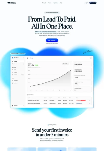
- Full page: https://cdn.designmunk.com/2026/09/07093150/polymer-co-featured.webp
- Above the fold: https://cdn.designmunk.com/2026/09/07093150/polymer-co-featured.webp
- On DesignMunk: https://designmunk.com/polymer/

Study these for hierarchy, rhythm, spacing and density. Where an image and the written spec disagree, the spec wins: the tokens were read from the page's own CSS, the images are one rendering of it.

## Before you start

Ask the user what they are building, who it is for, and what brand assets they already have — name, colours, typefaces. Wait for their answers before writing anything. Everything below is then applied to their product, not to the reference.

## Design specification

# Polymer: Monochrome layout anchored by pink CTAs

## Overview

Polymer's UI is utilitarian and direct: black type on white surfaces with a single pink accent for primary calls to action. Spacing is generous and centered, giving the content a calm, product-first feel. The audience is hiring teams who want speed and clarity, so density is medium with copy that's easy to scan and section leads that announce purpose quickly.

## Colors

- **primary (#000000):** Core text, icons, and strong emphasis.
- **secondary (#7c7c7c):** Secondary text, metadata, and subdued labels.
- **neutral (#ffffff):** Page background and card surfaces.
- **border (#e5e7eb):** Hairline dividers, card outlines, input strokes.
- **brand-explosive-grey (#c4c4c4):** Light UI accents and neutral illustrations when a step above border is needed.
- **surface ({colors.neutral}):** Alias of white for surfaces.
- **on-surface ({colors.primary}):** Alias of black for text/icons on white.

## Typography

All text styles use Suisse. Suisse is a proprietary, self-hosted family (font_sources type: custom), so agents should provide obtainable substitutes when Suisse is unavailable.
- Headline-lg (Suisse 48px/700, 1.3): Page H1 and major campaign lines.
- Headline-md (Suisse 36px/600, 1.3): Section openers and key value props.
- Headline-sm (Suisse 28px/600, 1.03): Feature blocks and card titles.
- Headline-xs (Suisse 21px/600, 1.19): Minor headings, footers, and labels with prominence.
- Body-md (Suisse 16px/400, 1.6): All body copy and captions.
Substitutes when Suisse isn't available: Inter (Google), IBM Plex Sans (Google), system-ui/Helvetica/Arial as final fallbacks. Keep weights parallel (400/600/700) and line-heights as specified above.

## Layout

Spacing scale is small but expressive: 8/16/24 for intra-component rhythm; 60/80 for vertical section spacing. Use md (24px) for gaps inside cards and between headings and body text. Use lg (60px) and xl (80px) as top/bottom section paddings on landing pages. Grids are simple: centered single column for narrative, three-up or two-up feature blocks with md gaps as needed. Content width stays readable; avoid cramming dense UI—let the product screenshot do the detail work.

## Elevation & Depth

The system is mostly flat. A single soft shadow (sm) is reserved for prominent media like product screenshots or elevated cards. Everywhere else, separation is handled with #e5e7eb borders, white space, and tonal hierarchy rather than stacked shadows.

## Shapes

Corners are subtly rounded: 4px for inputs and compact UI, 5px for buttons, and 8px for cards and media frames. Higher priority or larger containers use the 8px language; keep radii consistent—never mix extremes on the same surface.

## Components

Buttons
- Primary: background #fbd7ff, text #000000, 5px radius, 40px height, 7px × 20px padding. Use for "Sign up" and primary CTAs.
- Secondary: text #000000, 4px radius, 40px height; no fill by default. Use for secondary actions adjacent to primary.
- Link: text #000000, 0px radius. Inline and subtle actions.
Cards
- Background #ffffff, text #000000, 8px radius, 16px padding, optional #e5e7eb border or sm shadow for emphasis.

### Top navigation
- Left logo, right-aligned links. Use Body-md for items with 16px gaps. "Log in" may appear filled black (#000000) with white (#ffffff) text; "Sign up" uses Primary Button. Keep nav height comfortable around the 40px button spec and use border #e5e7eb for a subtle bottom rule if separation is needed.

### Hero
- H1 in Headline-lg (48px/700), centered, followed by Body-md copy. Primary Button (#fbd7ff, 40px, 5px radius) centered under copy. Background is white; optional decorative gradient can sit behind the product frame but should not affect text contrast.

### Product screenshot frame
- Large card container with 8px radius, sm shadow, and white surface. Use md (24px) outer margin to the surrounding section and center align. Avoid extra borders to keep the frame crisp.

### Feature trio
- Three vertically stacked segments (or a three-up grid on wide screens) each using Headline-sm (28px/600) and a short Body-md paragraph. End with a Link Button for "View..." actions. Use md gaps within each block and lg (60px) between blocks.

### Bulleted feature list
- Use Body-md with 16px vertical gaps. Headline-md (36px/600) introduces the list. Keep bullets dark (#000000) and avoid additional colors.

### Integrations grid
- Simple list or grid of logo + one-line description + link. Wrap each item in a Card with 8px radius and a #e5e7eb border when grouping is needed; use md gaps and lg section spacing.

### Footer columns
- Multi-column link list set in Body-md with 16px line height rhythm. Section headings use Headline-xs (21px/600). Use #e5e7eb dividers sparingly and keep link color #000000 with hover underline rather than new hues.

## Do's and Don'ts

- Do reserve #fbd7ff for the primary CTA and keep it 40px high with a 5px radius.
- Do keep text black (#000000) on white (#ffffff); use #7c7c7c only for metadata or de-emphasis.
- Do use 8px corners and the sm shadow for hero/product frames; otherwise rely on #e5e7eb borders and spacing.
- Do space sections with 60–80px and keep intra-component gaps at 16–24px.
- Don't introduce additional brand colors or heavier shadows.
- Don't mix radii within a component (e.g., 8px container with 4px child buttons looks inconsistent).

## Agent Prompt Guide

Quick color reference
- Text: #000000
- Background: #ffffff
- Border: #e5e7eb
- Accent (primary CTA): #fbd7ff

1) Build a centered hero
- Background #ffffff. H1 set to 48px/700, line-height 1.3, font-family: "Suisse", Inter, system-ui, Helvetica, Arial, sans-serif; color #000000. Body text 16px/400, line-height 1.6, color #7c7c7c. Primary button: height 40px, padding 7px 20px, radius 5px, background #fbd7ff, text #000000; centered under copy with 24px gap.

2) Product screenshot section
- Add a white card container (#ffffff) with 8px radius, sm shadow, and 24px inner padding. Center it below the hero with 60px top margin. Caption in Body-md under the frame with 16px top margin, color #7c7c7c.

3) Three-up feature row
- Use a grid of three cards (white, 8px radius, #e5e7eb border) with 24px gaps. Each card: title in 28px/600, body in 16px/400. Add a link styled as Button-link (text #000000) at the end of each card.

4) Integrations list
- Create a two-column list. Each item: logo left, copy right in 16px/400, and a trailing link. Use 16px vertical gaps, a light bottom border #e5e7eb on each item, and 60px section padding.

5) Footer
- White background, top border #e5e7eb. Section headings in 21px/600; links in 16px/400. Columns stack with 24px gaps on mobile and 60px top/bottom padding.

## Similar Brands

- Ashby: similar monochrome marketing with restrained accent; Ashby leans denser in product detail.
- Lever: black/white foundation with focused CTAs; uses blue accents where Polymer uses pink.
- Greenhouse: clean type and quiet cards; applies a stronger brand green and more illustration.
- Workable: comparable ATS narrative with larger illustration blocks and a bluer palette.
- Notion: not HR, but shares strict black/white typography and soft shadowed frames; diverges with block-based layouts.

## Tokens

### CSS custom properties

```css
:root {
  /* Colors */
  --color-primary: #000000;
  --color-secondary: #7c7c7c;
  --color-neutral: #ffffff;
  --color-border: #e5e7eb;
  --color-brand-explosive-grey: #c4c4c4;
  --color-surface: var(--color-neutral);
  --color-on-surface: var(--color-primary);

  /* Typography */
  --text-headline-lg-size: 48px;
  --text-headline-lg-weight: 700;
  --text-headline-lg-leading: 1.3;
  --text-headline-md-size: 36px;
  --text-headline-md-weight: 600;
  --text-headline-md-leading: 1.3;
  --text-headline-sm-size: 28px;
  --text-headline-sm-weight: 600;
  --text-headline-sm-leading: 1.03;
  --text-headline-xs-size: 21px;
  --text-headline-xs-weight: 600;
  --text-headline-xs-leading: 1.19;
  --text-body-md-size: 16px;
  --text-body-md-weight: 400;
  --text-body-md-leading: 1.6;
  --font-suisse: "Suisse";

  /* Rounded */
  --radius-sm: 4px;
  --radius-md: 5px;
  --radius-lg: 8px;

  /* Spacing */
  --spacing-xs: 8px;
  --spacing-sm: 16px;
  --spacing-md: 24px;
  --spacing-lg: 60px;
  --spacing-xl: 80px;

  /* Components */
  --button-primary-background-color: #fbd7ff;
  --button-primary-text-color: var(--color-primary);
  --button-primary-rounded: var(--radius-md);
  --button-primary-padding: 7px 20px;
  --button-primary-height: 40px;
  --button-secondary-text-color: var(--color-primary);
  --button-secondary-rounded: var(--radius-sm);
  --button-secondary-padding: 7px 20px;
  --button-secondary-height: 40px;
  --button-link-text-color: var(--color-primary);
  --button-link-rounded: 0px;
  --card-background-color: var(--color-neutral);
  --card-text-color: var(--color-primary);
  --card-rounded: var(--radius-lg);
  --card-padding: 16px;
}
```

### Tailwind theme

```css
@theme {
  --color-primary: #000000;
  --color-secondary: #7c7c7c;
  --color-neutral: #ffffff;
  --color-border: #e5e7eb;
  --color-brand-explosive-grey: #c4c4c4;
  --color-surface: #ffffff;
  --color-on-surface: #000000;
  --font-headline-lg: "Suisse";
  --font-headline-md: "Suisse";
  --font-headline-sm: "Suisse";
  --font-headline-xs: "Suisse";
  --font-body-md: "Suisse";
  --text-headline-lg: 48px;
  --text-headline-md: 36px;
  --text-headline-sm: 28px;
  --text-headline-xs: 21px;
  --text-body-md: 16px;
  --font-weight-headline-lg: 700;
  --font-weight-headline-md: 600;
  --font-weight-headline-sm: 600;
  --font-weight-headline-xs: 600;
  --font-weight-body-md: 400;
  --radius-sm: 4px;
  --radius-md: 5px;
  --radius-lg: 8px;
  --spacing-xs: 8px;
  --spacing-sm: 16px;
  --spacing-md: 24px;
  --spacing-lg: 60px;
  --spacing-xl: 80px;
}
```

### Design tokens (DTCG)

```json
{
    "$schema": "https://www.designtokens.org/schemas/2025.10/format.json",
    "color": {
        "$type": "color",
        "primary": {
            "$value": {
                "colorSpace": "srgb",
                "components": [
                    0,
                    0,
                    0
                ],
                "hex": "#000000"
            }
        },
        "secondary": {
            "$value": {
                "colorSpace": "srgb",
                "components": [
                    0.486,
                    0.486,
                    0.486
                ],
                "hex": "#7c7c7c"
            }
        },
        "neutral": {
            "$value": {
                "colorSpace": "srgb",
                "components": [
                    1,
                    1,
                    1
                ],
                "hex": "#ffffff"
            }
        },
        "border": {
            "$value": {
                "colorSpace": "srgb",
                "components": [
                    0.898,
                    0.906,
                    0.922
                ],
                "hex": "#e5e7eb"
            }
        },
        "brand-explosive-grey": {
            "$value": {
                "colorSpace": "srgb",
                "components": [
                    0.769,
                    0.769,
                    0.769
                ],
                "hex": "#c4c4c4"
            }
        },
        "surface": {
            "$value": {
                "colorSpace": "srgb",
                "components": [
                    1,
                    1,
                    1
                ],
                "hex": "#ffffff"
            }
        },
        "on-surface": {
            "$value": {
                "colorSpace": "srgb",
                "components": [
                    0,
                    0,
                    0
                ],
                "hex": "#000000"
            }
        }
    },
    "spacing": {
        "$type": "dimension",
        "xs": {
            "$value": {
                "value": 8,
                "unit": "px"
            }
        },
        "sm": {
            "$value": {
                "value": 16,
                "unit": "px"
            }
        },
        "md": {
            "$value": {
                "value": 24,
                "unit": "px"
            }
        },
        "lg": {
            "$value": {
                "value": 60,
                "unit": "px"
            }
        },
        "xl": {
            "$value": {
                "value": 80,
                "unit": "px"
            }
        }
    },
    "rounded": {
        "$type": "dimension",
        "sm": {
            "$value": {
                "value": 4,
                "unit": "px"
            }
        },
        "md": {
            "$value": {
                "value": 5,
                "unit": "px"
            }
        },
        "lg": {
            "$value": {
                "value": 8,
                "unit": "px"
            }
        }
    },
    "typography": {
        "headline-lg": {
            "$type": "typography",
            "$value": {
                "fontFamily": "Suisse",
                "fontSize": {
                    "value": 48,
                    "unit": "px"
                },
                "fontWeight": 700
            }
        },
        "headline-md": {
            "$type": "typography",
            "$value": {
                "fontFamily": "Suisse",
                "fontSize": {
                    "value": 36,
                    "unit": "px"
                },
                "fontWeight": 600
            }
        },
        "headline-sm": {
            "$type": "typography",
            "$value": {
                "fontFamily": "Suisse",
                "fontSize": {
                    "value": 28,
                    "unit": "px"
                },
                "fontWeight": 600
            }
        },
        "headline-xs": {
            "$type": "typography",
            "$value": {
                "fontFamily": "Suisse",
                "fontSize": {
                    "value": 21,
                    "unit": "px"
                },
                "fontWeight": 600
            }
        },
        "body-md": {
            "$type": "typography",
            "$value": {
                "fontFamily": "Suisse",
                "fontSize": {
                    "value": 16,
                    "unit": "px"
                },
                "fontWeight": 400
            }
        }
    }
}
```

## Rules

- **Fonts.** If the specification names a custom or self-hosted family, use one of the substitutes it names. Never reference a typeface you cannot actually load — it will fall back to a system font and undo the typography.
- **Colour.** Derive the palette from the user's brand. Use the token values as a guide to *relationships* — contrast, tint, how many accents carry the page — not as hex codes to paste.
- **Never reproduce** the wordmark, mascot, logo, brand name, illustrations, icon set, screenshots or any copy from the reference.
- **Never present the result as Polymer**, or imply any connection to it.
- If something is unspecified, choose clarity and legibility over decoration.
---
version: alpha
name: Polymer
description: Attract and hire great people with a powerful ATS and job board
colors:
  primary: "#000000"
  secondary: "#7c7c7c"
  neutral: "#ffffff"
  border: "#e5e7eb"
  brand-explosive-grey: "#c4c4c4"
  surface: "{colors.neutral}"
  on-surface: "{colors.primary}"
typography:
  headline-lg:
    fontFamily: Suisse
    fontSize: 48px
    fontWeight: 700
    lineHeight: 1.3
  headline-md:
    fontFamily: Suisse
    fontSize: 36px
    fontWeight: 600
    lineHeight: 1.3
  headline-sm:
    fontFamily: Suisse
    fontSize: 28px
    fontWeight: 600
    lineHeight: 1.03
  headline-xs:
    fontFamily: Suisse
    fontSize: 21px
    fontWeight: 600
    lineHeight: 1.19
  body-md:
    fontFamily: Suisse
    fontSize: 16px
    fontWeight: 400
    lineHeight: 1.6
rounded:
  sm: 4px
  md: 5px
  lg: 8px
spacing:
  xs: 8px
  sm: 16px
  md: 24px
  lg: 60px
  xl: 80px
components:
  button-primary:
    backgroundColor: "#fbd7ff"
    textColor: "{colors.primary}"
    rounded: "{rounded.md}"
    padding: 7px 20px
    height: 40px
  button-secondary:
    textColor: "{colors.primary}"
    rounded: "{rounded.sm}"
    padding: 7px 20px
    height: 40px
  button-link:
    textColor: "{colors.primary}"
    rounded: 0px
  card:
    backgroundColor: "{colors.neutral}"
    textColor: "{colors.primary}"
    rounded: "{rounded.lg}"
    padding: 16px
---

# Polymer: Monochrome layout anchored by pink CTAs

## Overview

Polymer's UI is utilitarian and direct: black type on white surfaces with a single pink accent for primary calls to action. Spacing is generous and centered, giving the content a calm, product-first feel. The audience is hiring teams who want speed and clarity, so density is medium with copy that's easy to scan and section leads that announce purpose quickly.

## Colors

- **primary (#000000):** Core text, icons, and strong emphasis.
- **secondary (#7c7c7c):** Secondary text, metadata, and subdued labels.
- **neutral (#ffffff):** Page background and card surfaces.
- **border (#e5e7eb):** Hairline dividers, card outlines, input strokes.
- **brand-explosive-grey (#c4c4c4):** Light UI accents and neutral illustrations when a step above border is needed.
- **surface ({colors.neutral}):** Alias of white for surfaces.
- **on-surface ({colors.primary}):** Alias of black for text/icons on white.

## Typography

All text styles use Suisse. Suisse is a proprietary, self-hosted family (font_sources type: custom), so agents should provide obtainable substitutes when Suisse is unavailable.
- Headline-lg (Suisse 48px/700, 1.3): Page H1 and major campaign lines.
- Headline-md (Suisse 36px/600, 1.3): Section openers and key value props.
- Headline-sm (Suisse 28px/600, 1.03): Feature blocks and card titles.
- Headline-xs (Suisse 21px/600, 1.19): Minor headings, footers, and labels with prominence.
- Body-md (Suisse 16px/400, 1.6): All body copy and captions.
Substitutes when Suisse isn't available: Inter (Google), IBM Plex Sans (Google), system-ui/Helvetica/Arial as final fallbacks. Keep weights parallel (400/600/700) and line-heights as specified above.

## Layout

Spacing scale is small but expressive: 8/16/24 for intra-component rhythm; 60/80 for vertical section spacing. Use md (24px) for gaps inside cards and between headings and body text. Use lg (60px) and xl (80px) as top/bottom section paddings on landing pages. Grids are simple: centered single column for narrative, three-up or two-up feature blocks with md gaps as needed. Content width stays readable; avoid cramming dense UI—let the product screenshot do the detail work.

## Elevation & Depth

The system is mostly flat. A single soft shadow (sm) is reserved for prominent media like product screenshots or elevated cards. Everywhere else, separation is handled with #e5e7eb borders, white space, and tonal hierarchy rather than stacked shadows.

## Shapes

Corners are subtly rounded: 4px for inputs and compact UI, 5px for buttons, and 8px for cards and media frames. Higher priority or larger containers use the 8px language; keep radii consistent—never mix extremes on the same surface.

## Components

Buttons
- Primary: background #fbd7ff, text #000000, 5px radius, 40px height, 7px × 20px padding. Use for "Sign up" and primary CTAs.
- Secondary: text #000000, 4px radius, 40px height; no fill by default. Use for secondary actions adjacent to primary.
- Link: text #000000, 0px radius. Inline and subtle actions.
Cards
- Background #ffffff, text #000000, 8px radius, 16px padding, optional #e5e7eb border or sm shadow for emphasis.

### Top navigation
- Left logo, right-aligned links. Use Body-md for items with 16px gaps. "Log in" may appear filled black (#000000) with white (#ffffff) text; "Sign up" uses Primary Button. Keep nav height comfortable around the 40px button spec and use border #e5e7eb for a subtle bottom rule if separation is needed.

### Hero
- H1 in Headline-lg (48px/700), centered, followed by Body-md copy. Primary Button (#fbd7ff, 40px, 5px radius) centered under copy. Background is white; optional decorative gradient can sit behind the product frame but should not affect text contrast.

### Product screenshot frame
- Large card container with 8px radius, sm shadow, and white surface. Use md (24px) outer margin to the surrounding section and center align. Avoid extra borders to keep the frame crisp.

### Feature trio
- Three vertically stacked segments (or a three-up grid on wide screens) each using Headline-sm (28px/600) and a short Body-md paragraph. End with a Link Button for "View..." actions. Use md gaps within each block and lg (60px) between blocks.

### Bulleted feature list
- Use Body-md with 16px vertical gaps. Headline-md (36px/600) introduces the list. Keep bullets dark (#000000) and avoid additional colors.

### Integrations grid
- Simple list or grid of logo + one-line description + link. Wrap each item in a Card with 8px radius and a #e5e7eb border when grouping is needed; use md gaps and lg section spacing.

### Footer columns
- Multi-column link list set in Body-md with 16px line height rhythm. Section headings use Headline-xs (21px/600). Use #e5e7eb dividers sparingly and keep link color #000000 with hover underline rather than new hues.

## Do's and Don'ts

- Do reserve #fbd7ff for the primary CTA and keep it 40px high with a 5px radius.
- Do keep text black (#000000) on white (#ffffff); use #7c7c7c only for metadata or de-emphasis.
- Do use 8px corners and the sm shadow for hero/product frames; otherwise rely on #e5e7eb borders and spacing.
- Do space sections with 60–80px and keep intra-component gaps at 16–24px.
- Don't introduce additional brand colors or heavier shadows.
- Don't mix radii within a component (e.g., 8px container with 4px child buttons looks inconsistent).

## Agent Prompt Guide

Quick color reference
- Text: #000000
- Background: #ffffff
- Border: #e5e7eb
- Accent (primary CTA): #fbd7ff

1) Build a centered hero
- Background #ffffff. H1 set to 48px/700, line-height 1.3, font-family: "Suisse", Inter, system-ui, Helvetica, Arial, sans-serif; color #000000. Body text 16px/400, line-height 1.6, color #7c7c7c. Primary button: height 40px, padding 7px 20px, radius 5px, background #fbd7ff, text #000000; centered under copy with 24px gap.

2) Product screenshot section
- Add a white card container (#ffffff) with 8px radius, sm shadow, and 24px inner padding. Center it below the hero with 60px top margin. Caption in Body-md under the frame with 16px top margin, color #7c7c7c.

3) Three-up feature row
- Use a grid of three cards (white, 8px radius, #e5e7eb border) with 24px gaps. Each card: title in 28px/600, body in 16px/400. Add a link styled as Button-link (text #000000) at the end of each card.

4) Integrations list
- Create a two-column list. Each item: logo left, copy right in 16px/400, and a trailing link. Use 16px vertical gaps, a light bottom border #e5e7eb on each item, and 60px section padding.

5) Footer
- White background, top border #e5e7eb. Section headings in 21px/600; links in 16px/400. Columns stack with 24px gaps on mobile and 60px top/bottom padding.

## Similar Brands

- Ashby: similar monochrome marketing with restrained accent; Ashby leans denser in product detail.
- Lever: black/white foundation with focused CTAs; uses blue accents where Polymer uses pink.
- Greenhouse: clean type and quiet cards; applies a stronger brand green and more illustration.
- Workable: comparable ATS narrative with larger illustration blocks and a bluer palette.
- Notion: not HR, but shares strict black/white typography and soft shadowed frames; diverges with block-based layouts.
:root {
  /* Colors */
  --color-primary: #000000;
  --color-secondary: #7c7c7c;
  --color-neutral: #ffffff;
  --color-border: #e5e7eb;
  --color-brand-explosive-grey: #c4c4c4;
  --color-surface: var(--color-neutral);
  --color-on-surface: var(--color-primary);

  /* Typography */
  --text-headline-lg-size: 48px;
  --text-headline-lg-weight: 700;
  --text-headline-lg-leading: 1.3;
  --text-headline-md-size: 36px;
  --text-headline-md-weight: 600;
  --text-headline-md-leading: 1.3;
  --text-headline-sm-size: 28px;
  --text-headline-sm-weight: 600;
  --text-headline-sm-leading: 1.03;
  --text-headline-xs-size: 21px;
  --text-headline-xs-weight: 600;
  --text-headline-xs-leading: 1.19;
  --text-body-md-size: 16px;
  --text-body-md-weight: 400;
  --text-body-md-leading: 1.6;
  --font-suisse: "Suisse";

  /* Rounded */
  --radius-sm: 4px;
  --radius-md: 5px;
  --radius-lg: 8px;

  /* Spacing */
  --spacing-xs: 8px;
  --spacing-sm: 16px;
  --spacing-md: 24px;
  --spacing-lg: 60px;
  --spacing-xl: 80px;

  /* Components */
  --button-primary-background-color: #fbd7ff;
  --button-primary-text-color: var(--color-primary);
  --button-primary-rounded: var(--radius-md);
  --button-primary-padding: 7px 20px;
  --button-primary-height: 40px;
  --button-secondary-text-color: var(--color-primary);
  --button-secondary-rounded: var(--radius-sm);
  --button-secondary-padding: 7px 20px;
  --button-secondary-height: 40px;
  --button-link-text-color: var(--color-primary);
  --button-link-rounded: 0px;
  --card-background-color: var(--color-neutral);
  --card-text-color: var(--color-primary);
  --card-rounded: var(--radius-lg);
  --card-padding: 16px;
}
{
  "$schema": "https://www.designtokens.org/schemas/2025.10/format.json",
  "$description": "Attract and hire great people with a powerful ATS and job board",
  "color": {
    "$type": "color",
    "primary": {
      "$value": {
        "colorSpace": "srgb",
        "components": [
          0,
          0,
          0
        ],
        "hex": "#000000"
      }
    },
    "secondary": {
      "$value": {
        "colorSpace": "srgb",
        "components": [
          0.486,
          0.486,
          0.486
        ],
        "hex": "#7c7c7c"
      }
    },
    "neutral": {
      "$value": {
        "colorSpace": "srgb",
        "components": [
          1,
          1,
          1
        ],
        "hex": "#ffffff"
      }
    },
    "border": {
      "$value": {
        "colorSpace": "srgb",
        "components": [
          0.898,
          0.906,
          0.922
        ],
        "hex": "#e5e7eb"
      }
    },
    "brand-explosive-grey": {
      "$value": {
        "colorSpace": "srgb",
        "components": [
          0.769,
          0.769,
          0.769
        ],
        "hex": "#c4c4c4"
      }
    },
    "surface": {
      "$value": {
        "colorSpace": "srgb",
        "components": [
          1,
          1,
          1
        ],
        "hex": "#ffffff"
      }
    },
    "on-surface": {
      "$value": {
        "colorSpace": "srgb",
        "components": [
          0,
          0,
          0
        ],
        "hex": "#000000"
      }
    }
  },
  "spacing": {
    "$type": "dimension",
    "xs": {
      "$value": {
        "value": 8,
        "unit": "px"
      }
    },
    "sm": {
      "$value": {
        "value": 16,
        "unit": "px"
      }
    },
    "md": {
      "$value": {
        "value": 24,
        "unit": "px"
      }
    },
    "lg": {
      "$value": {
        "value": 60,
        "unit": "px"
      }
    },
    "xl": {
      "$value": {
        "value": 80,
        "unit": "px"
      }
    }
  },
  "rounded": {
    "$type": "dimension",
    "sm": {
      "$value": {
        "value": 4,
        "unit": "px"
      }
    },
    "md": {
      "$value": {
        "value": 5,
        "unit": "px"
      }
    },
    "lg": {
      "$value": {
        "value": 8,
        "unit": "px"
      }
    }
  },
  "typography": {
    "headline-lg": {
      "$type": "typography",
      "$value": {
        "fontFamily": "Suisse",
        "fontSize": {
          "value": 48,
          "unit": "px"
        },
        "fontWeight": 700
      }
    },
    "headline-md": {
      "$type": "typography",
      "$value": {
        "fontFamily": "Suisse",
        "fontSize": {
          "value": 36,
          "unit": "px"
        },
        "fontWeight": 600
      }
    },
    "headline-sm": {
      "$type": "typography",
      "$value": {
        "fontFamily": "Suisse",
        "fontSize": {
          "value": 28,
          "unit": "px"
        },
        "fontWeight": 600
      }
    },
    "headline-xs": {
      "$type": "typography",
      "$value": {
        "fontFamily": "Suisse",
        "fontSize": {
          "value": 21,
          "unit": "px"
        },
        "fontWeight": 600
      }
    },
    "body-md": {
      "$type": "typography",
      "$value": {
        "fontFamily": "Suisse",
        "fontSize": {
          "value": 16,
          "unit": "px"
        },
        "fontWeight": 400
      }
    }
  }
}
@theme {
--color-primary: #000000;
--color-secondary: #7c7c7c;
--color-neutral: #ffffff;
--color-border: #e5e7eb;
--color-brand-explosive-grey: #c4c4c4;
--color-surface: #ffffff;
--color-on-surface: #000000;
--font-headline-lg: "Suisse";
--font-headline-md: "Suisse";
--font-headline-sm: "Suisse";
--font-headline-xs: "Suisse";
--font-body-md: "Suisse";
--text-headline-lg: 48px;
--text-headline-md: 36px;
--text-headline-sm: 28px;
--text-headline-xs: 21px;
--text-body-md: 16px;
--font-weight-headline-lg: 700;
--font-weight-headline-md: 600;
--font-weight-headline-sm: 600;
--font-weight-headline-xs: 600;
--font-weight-body-md: 400;
--radius-sm: 4px;
--radius-md: 5px;
--radius-lg: 8px;
--spacing-xs: 8px;
--spacing-sm: 16px;
--spacing-md: 24px;
--spacing-lg: 60px;
--spacing-xl: 80px;
} # Design brief: the Polymer design language
Below is a complete design specification measured from a real, published web page. Use it as a design language for the user's product. It is not a page to reproduce.
## Reference images
- Full page: https://cdn.designmunk.com/2026/09/07093150/polymer-co-featured.webp
- Above the fold: https://cdn.designmunk.com/2026/09/07093150/polymer-co-featured.webp
- On DesignMunk: https://designmunk.com/polymer/
Study these for hierarchy, rhythm, spacing and density. Where an image and the written spec disagree, the spec wins: the tokens were read from the page's own CSS, the images are one rendering of it.
## Before you start
Ask the user what they are building, who it is for, and what brand assets they already have — name, colours, typefaces. Wait for their answers before writing anything. Everything below is then applied to their product, not to the reference.
## Design specification
# Polymer: Monochrome layout anchored by pink CTAs
## Overview
Polymer's UI is utilitarian and direct: black type on white surfaces with a single pink accent for primary calls to action. Spacing is generous and centered, giving the content a calm, product-first feel. The audience is hiring teams who want speed and clarity, so density is medium with copy that's easy to scan and section leads that announce purpose quickly.
## Colors
- **primary (#000000):** Core text, icons, and strong emphasis.
- **secondary (#7c7c7c):** Secondary text, metadata, and subdued labels.
- **neutral (#ffffff):** Page background and card surfaces.
- **border (#e5e7eb):** Hairline dividers, card outlines, input strokes.
- **brand-explosive-grey (#c4c4c4):** Light UI accents and neutral illustrations when a step above border is needed.
- **surface ({colors.neutral}):** Alias of white for surfaces.
- **on-surface ({colors.primary}):** Alias of black for text/icons on white.
## Typography
All text styles use Suisse. Suisse is a proprietary, self-hosted family (font_sources type: custom), so agents should provide obtainable substitutes when Suisse is unavailable.
- Headline-lg (Suisse 48px/700, 1.3): Page H1 and major campaign lines.
- Headline-md (Suisse 36px/600, 1.3): Section openers and key value props.
- Headline-sm (Suisse 28px/600, 1.03): Feature blocks and card titles.
- Headline-xs (Suisse 21px/600, 1.19): Minor headings, footers, and labels with prominence.
- Body-md (Suisse 16px/400, 1.6): All body copy and captions.
Substitutes when Suisse isn't available: Inter (Google), IBM Plex Sans (Google), system-ui/Helvetica/Arial as final fallbacks. Keep weights parallel (400/600/700) and line-heights as specified above.
## Layout
Spacing scale is small but expressive: 8/16/24 for intra-component rhythm; 60/80 for vertical section spacing. Use md (24px) for gaps inside cards and between headings and body text. Use lg (60px) and xl (80px) as top/bottom section paddings on landing pages. Grids are simple: centered single column for narrative, three-up or two-up feature blocks with md gaps as needed. Content width stays readable; avoid cramming dense UI—let the product screenshot do the detail work.
## Elevation & Depth
The system is mostly flat. A single soft shadow (sm) is reserved for prominent media like product screenshots or elevated cards. Everywhere else, separation is handled with #e5e7eb borders, white space, and tonal hierarchy rather than stacked shadows.
## Shapes
Corners are subtly rounded: 4px for inputs and compact UI, 5px for buttons, and 8px for cards and media frames. Higher priority or larger containers use the 8px language; keep radii consistent—never mix extremes on the same surface.
## Components
Buttons
- Primary: background #fbd7ff, text #000000, 5px radius, 40px height, 7px × 20px padding. Use for "Sign up" and primary CTAs.
- Secondary: text #000000, 4px radius, 40px height; no fill by default. Use for secondary actions adjacent to primary.
- Link: text #000000, 0px radius. Inline and subtle actions.
Cards
- Background #ffffff, text #000000, 8px radius, 16px padding, optional #e5e7eb border or sm shadow for emphasis.
### Top navigation
- Left logo, right-aligned links. Use Body-md for items with 16px gaps. "Log in" may appear filled black (#000000) with white (#ffffff) text; "Sign up" uses Primary Button. Keep nav height comfortable around the 40px button spec and use border #e5e7eb for a subtle bottom rule if separation is needed.
### Hero
- H1 in Headline-lg (48px/700), centered, followed by Body-md copy. Primary Button (#fbd7ff, 40px, 5px radius) centered under copy. Background is white; optional decorative gradient can sit behind the product frame but should not affect text contrast.
### Product screenshot frame
- Large card container with 8px radius, sm shadow, and white surface. Use md (24px) outer margin to the surrounding section and center align. Avoid extra borders to keep the frame crisp.
### Feature trio
- Three vertically stacked segments (or a three-up grid on wide screens) each using Headline-sm (28px/600) and a short Body-md paragraph. End with a Link Button for "View..." actions. Use md gaps within each block and lg (60px) between blocks.
### Bulleted feature list
- Use Body-md with 16px vertical gaps. Headline-md (36px/600) introduces the list. Keep bullets dark (#000000) and avoid additional colors.
### Integrations grid
- Simple list or grid of logo + one-line description + link. Wrap each item in a Card with 8px radius and a #e5e7eb border when grouping is needed; use md gaps and lg section spacing.
### Footer columns
- Multi-column link list set in Body-md with 16px line height rhythm. Section headings use Headline-xs (21px/600). Use #e5e7eb dividers sparingly and keep link color #000000 with hover underline rather than new hues.
## Do's and Don'ts
- Do reserve #fbd7ff for the primary CTA and keep it 40px high with a 5px radius.
- Do keep text black (#000000) on white (#ffffff); use #7c7c7c only for metadata or de-emphasis.
- Do use 8px corners and the sm shadow for hero/product frames; otherwise rely on #e5e7eb borders and spacing.
- Do space sections with 60–80px and keep intra-component gaps at 16–24px.
- Don't introduce additional brand colors or heavier shadows.
- Don't mix radii within a component (e.g., 8px container with 4px child buttons looks inconsistent).
## Agent Prompt Guide
Quick color reference
- Text: #000000
- Background: #ffffff
- Border: #e5e7eb
- Accent (primary CTA): #fbd7ff
1) Build a centered hero
- Background #ffffff. H1 set to 48px/700, line-height 1.3, font-family: "Suisse", Inter, system-ui, Helvetica, Arial, sans-serif; color #000000. Body text 16px/400, line-height 1.6, color #7c7c7c. Primary button: height 40px, padding 7px 20px, radius 5px, background #fbd7ff, text #000000; centered under copy with 24px gap.
2) Product screenshot section
- Add a white card container (#ffffff) with 8px radius, sm shadow, and 24px inner padding. Center it below the hero with 60px top margin. Caption in Body-md under the frame with 16px top margin, color #7c7c7c.
3) Three-up feature row
- Use a grid of three cards (white, 8px radius, #e5e7eb border) with 24px gaps. Each card: title in 28px/600, body in 16px/400. Add a link styled as Button-link (text #000000) at the end of each card.
4) Integrations list
- Create a two-column list. Each item: logo left, copy right in 16px/400, and a trailing link. Use 16px vertical gaps, a light bottom border #e5e7eb on each item, and 60px section padding.
5) Footer
- White background, top border #e5e7eb. Section headings in 21px/600; links in 16px/400. Columns stack with 24px gaps on mobile and 60px top/bottom padding.
## Tokens
### CSS custom properties
```css
:root {
/* Colors */
--color-primary: #000000;
--color-secondary: #7c7c7c;
--color-neutral: #ffffff;
--color-border: #e5e7eb;
--color-brand-explosive-grey: #c4c4c4;
--color-surface: var(--color-neutral);
--color-on-surface: var(--color-primary);
/* Typography */
--text-headline-lg-size: 48px;
--text-headline-lg-weight: 700;
--text-headline-lg-leading: 1.3;
--text-headline-md-size: 36px;
--text-headline-md-weight: 600;
--text-headline-md-leading: 1.3;
--text-headline-sm-size: 28px;
--text-headline-sm-weight: 600;
--text-headline-sm-leading: 1.03;
--text-headline-xs-size: 21px;
--text-headline-xs-weight: 600;
--text-headline-xs-leading: 1.19;
--text-body-md-size: 16px;
--text-body-md-weight: 400;
--text-body-md-leading: 1.6;
--font-suisse: "Suisse";
/* Rounded */
--radius-sm: 4px;
--radius-md: 5px;
--radius-lg: 8px;
/* Spacing */
--spacing-xs: 8px;
--spacing-sm: 16px;
--spacing-md: 24px;
--spacing-lg: 60px;
--spacing-xl: 80px;
/* Components */
--button-primary-background-color: #fbd7ff;
--button-primary-text-color: var(--color-primary);
--button-primary-rounded: var(--radius-md);
--button-primary-padding: 7px 20px;
--button-primary-height: 40px;
--button-secondary-text-color: var(--color-primary);
--button-secondary-rounded: var(--radius-sm);
--button-secondary-padding: 7px 20px;
--button-secondary-height: 40px;
--button-link-text-color: var(--color-primary);
--button-link-rounded: 0px;
--card-background-color: var(--color-neutral);
--card-text-color: var(--color-primary);
--card-rounded: var(--radius-lg);
--card-padding: 16px;
}
```
## Rules
- **Fonts.** If the specification names a custom or self-hosted family, use one of the substitutes it names. Never reference a typeface you cannot actually load — it will fall back to a system font and undo the typography.
- **Colour.** Derive the palette from the user's brand. Use the token values as a guide to *relationships* — contrast, tint, how many accents carry the page — not as hex codes to paste.
- **Never reproduce** the wordmark, mascot, logo, brand name, illustrations, icon set, screenshots or any copy from the reference.
- **Never present the result as Polymer**, or imply any connection to it.
- If something is unspecified, choose clarity and legibility over decoration.