ploy.ai
AI Breakdown
Design export
# Design brief: the Ploy Careers design language

Below is a complete design specification measured from a real, published web page. Use it as a design language for the user's product. It is not a page to reproduce.

## Reference images

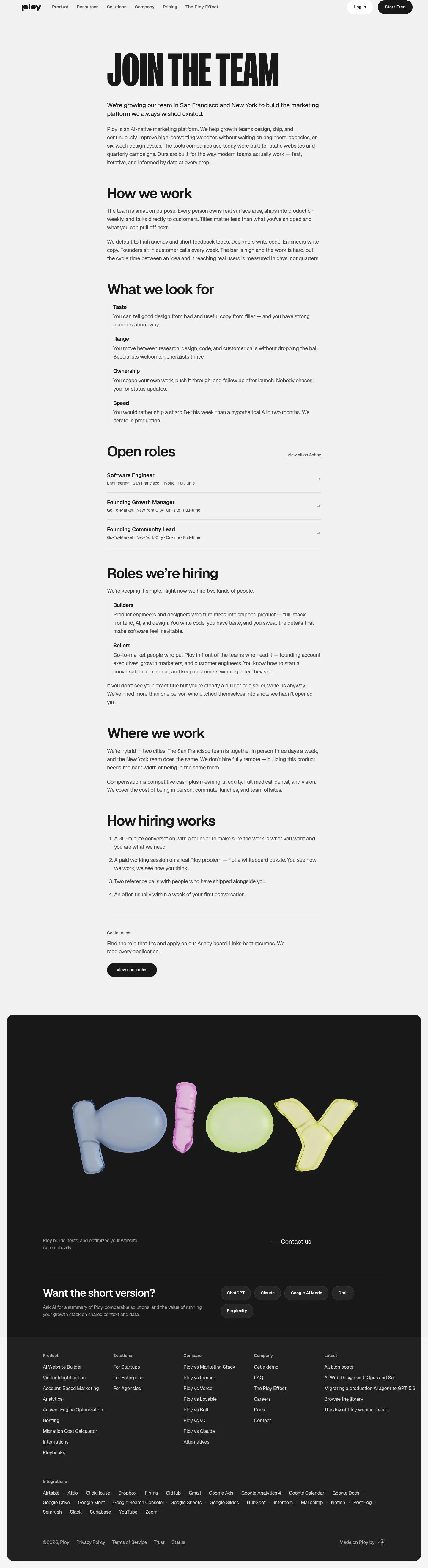
- Full page: https://cdn.designmunk.com/2026/09/12075107/ploy-ai-careers-featured.webp
- Above the fold: https://cdn.designmunk.com/2026/09/12075107/ploy-ai-careers-featured.webp
- On DesignMunk: https://designmunk.com/ploy-careers-page/

Study these for hierarchy, rhythm, spacing and density. Where an image and the written spec disagree, the spec wins: the tokens were read from the page's own CSS, the images are one rendering of it.

## Before you start

Ask the user what they are building, who it is for, and what brand assets they already have — name, colours, typefaces. Wait for their answers before writing anything. Everything below is then applied to their product, not to the reference.

## Design specification

# Ploy Careers: Giant Black Headline on Soft Gray

## Overview

A monochrome, type-led system aimed at experienced builders and sellers. The tone is confident and plain-spoken: fewer decorations, more content. Layouts are spacious with clear section breaks, but text is compact and efficient. When tokens don't cover a case, bias toward high contrast (#212121 on #f4f4f4), strong hierarchy from type, and minimal chrome.

## Colors

- **primary (#212121):** Ink for headlines, body text, and iconography.
- **secondary (#7c7c7c):** Muted copy, timestamps, and supportive notes.
- **tertiary (#000000):** Absolute black for emphasis states and the filled secondary button.
- **neutral (#f4f4f4):** Page canvas and card backgrounds.
- **brand-brushed-metal (#c8c8c8):** Hairline dividers, muted borders, and inputs.
- **surface ({colors.neutral}):** Alias to neutral for surfaces and section blocks.
- **on-surface ({colors.primary}):** Alias to primary for text on neutral surfaces.

## Typography

- Display: FK Screamer, 144px/1.2, 700, reserved for headline-lg moments (hero H1). Availability: custom/self-hosted; agents should not attempt to load it. Substitutes: Anton, Bebas Neue, or Oswald for a condensed, high-impact display.
- Interface: Geist (Google), used for headline-md (80px/600), headline-sm (45px/600), headline-xs (25px/600), and body-md (14px/400/1.43). Geist can be loaded directly from Google Fonts. If unavailable, use Inter or Manrope as functional substitutes.
- Pairing rule: one display family for a single hero line; Geist handles the rest to keep hierarchy predictable and scanning fast.

## Layout

Spacing scale is compact-to-generous: 12, 20, 32, 48, 128px. Use xl (128px) to separate top-level sections, lg (48px) for internal blocks, and md (32px) for stack gaps within a section. Headlines sit with 20–32px breathing room from the following paragraph. Content columns favor a readable width; when in doubt, keep paragraphs in a single column with md spacing between them.

## Elevation & Depth

All shadows are none. Hierarchy is established via typography, tone, and whitespace. Use #f4f4f4 blocks against white imagery only when needed; otherwise rely on ink (#212121) over the neutral canvas. Where separation is required, use 1px borders in #c8c8c8 rather than shadows.

## Shapes

Two radii define the language: sm at 8px for cards and content containers; full at 9999px for pills (buttons, tags). Use square edges for links and text-only elements.

## Components

Buttons
- Primary button: white background (#ffffff), text #212121, 48px height, 17x24px padding, full radius (9999px). Default for light surfaces.
- Secondary button: #212121 background with white text, same size and radius. Use for primary calls on pale backgrounds or to pair with the primary.
- Link button: text-only in #212121, no radius. Reserve for inline CTAs.

Card
- Neutral card: background #f4f4f4, text #212121, 8px radius, 16px padding. Use for callouts and grouped links.

### Careers Hero
- H1 uses headline-lg (FK Screamer 144/700) in #212121. Intro paragraph uses body-md (Geist 14/1.43). Spacing below the block: xl (128px). Optional CTAs: pair the secondary button (black fill) with the primary (white fill).

### How We Work
- Section heading: headline-sm (Geist 45/600) in #212121. Two short paragraphs in body-md with md (32px) vertical gaps. Section margin: lg–xl (48–128px) depending on page depth.

### Qualities List
- Title: headline-sm (45/600). Each quality label ("Taste", "Range", etc.) set in headline-xs (25/600) with its description in body-md beneath. Use md (32px) between items.

### Open Roles List
- Title: headline-sm. Role links styled as button-link in #212121. Provide md (32px) gaps and optional #c8c8c8 dividers at 1px for scan lines. Include a preceding "View all on Ashby" link.

### Roles We're Hiring Block
- Two bullets ("Builders", "Sellers") each with a headline-xs label and body-md description. Use md spacing and keep copy lines around 60–70ch.

### Where We Work
- Paragraph block with headline-sm and two body-md paragraphs. If presenting benefits as a list, use body-md with sm (20px) spacing.

### Hiring Steps
- Ordered list of four items. Step label or number may be bolded Geist 600; body set in body-md. Keep 20–32px between steps and add a #c8c8c8 hairline above the list if extra separation is needed.

### "Short Version" AI Links
- Card container (8px radius, #f4f4f4, 16px padding). Title in headline-sm; links are button-link in #212121 with compact sm (20px) spacing.

## Do's and Don'ts

- Do reserve FK Screamer 144/700 for the single page H1; don't use it for subheads or pull quotes.
- Do space major sections with 128px; don't stack sections tighter than 48px without a clear relationship.
- Do use 48px, full-radius pill buttons; don't alter the height or corner radius per instance.
- Do keep body copy in Geist 14/1.43; if density increases, increase spacing (md) rather than introducing new sizes.
- Don't simulate depth with shadows; use #c8c8c8 borders or extra whitespace instead.
- Don't mix pure black (#000000) for body text—reserve it for emphasis states or the filled secondary button.

## Agent Prompt Guide

Quick color reference
- Text/Icons: #212121
- Background/Surface: #f4f4f4
- Border/Dividers: #c8c8c8
- Accent (filled CTA): #000000

1) Careers hero
"Create a hero on a #f4f4f4 page. H1 'JOIN THE TEAM' in FK Screamer 144px, weight 700, color #212121, line-height 1.2. Intro paragraph in Geist 14px, 1.43 line-height, color #212121. Add two CTAs: Primary (white background, text #212121, height 48px, padding 17px 24px, radius 9999px) and Secondary (#212121 background, text #ffffff, same size). Add 128px spacing below the hero."

2) Section: How we work
"Add a section with 128px top and bottom padding. Heading in Geist 45px, weight 600, color #212121. Two paragraphs in Geist 14px/1.43 with 32px gap. Keep the section background #f4f4f4 and separate from the next section with 48px space."

3) Qualities list
"Insert a block titled 'What we look for' (Geist 45px/600, #212121). For each item ('Taste', 'Range', 'Ownership', 'Speed'), use a subhead in Geist 25px/600 and body in Geist 14px/1.43. Space items by 32px. No shadows; use a 1px #c8c8c8 divider if needed."

4) Open roles list
"Create a list under 'Open roles' (Geist 45px/600). Each role is a text link styled as button-link in #212121 with 32px vertical spacing. Optional 1px #c8c8c8 separators. Include a 'View all on Ashby' link above the list."

5) Hiring steps
"Add 'How hiring works' (Geist 45px/600). Create an ordered list of four steps. Step titles may be Geist 600 with body Geist 14px/1.43. Maintain 20–32px gaps, and place a 16px padded card in #f4f4f4 if grouping is desired (radius 8px)."

## Similar Brands

- Linear: Monochrome UI with disciplined type and pill actions; Ploy pushes a larger display headline and lighter gray canvas.
- Vercel: Greyscale, engineering-forward clarity; Ploy is warmer and more recruiting-oriented with FK Screamer as a statement.
- Notion: Quiet black-on-gray system and minimal chrome; Ploy runs bolder display type and denser body copy.
- Framer: High-contrast monochrome with expressive headings; Ploy is less glossy, more editorial in section structure.

## Tokens

### CSS custom properties

```css
:root {
  /* Colors */
  --color-primary: #212121;
  --color-secondary: #7c7c7c;
  --color-tertiary: #000000;
  --color-neutral: #f4f4f4;
  --color-brand-brushed-metal: #c8c8c8;
  --color-surface: var(--color-neutral);
  --color-on-surface: var(--color-primary);

  /* Typography */
  --text-headline-lg-size: 144px;
  --text-headline-lg-weight: 700;
  --text-headline-lg-leading: 1.2;
  --text-headline-md-size: 80px;
  --text-headline-md-weight: 600;
  --text-headline-md-leading: 1.2;
  --text-headline-md-tracking: -0.024em;
  --text-headline-sm-size: 45px;
  --text-headline-sm-weight: 600;
  --text-headline-sm-leading: 1.2;
  --text-headline-xs-size: 25px;
  --text-headline-xs-weight: 600;
  --text-headline-xs-leading: 1.2;
  --text-body-md-size: 14px;
  --text-body-md-weight: 400;
  --text-body-md-leading: 1.43;
  --font-fk-screamer: "FK Screamer";
  --font-geist: "Geist";

  /* Rounded */
  --radius-sm: 8px;
  --radius-full: 9999px;

  /* Spacing */
  --spacing-xs: 12px;
  --spacing-sm: 20px;
  --spacing-md: 32px;
  --spacing-lg: 48px;
  --spacing-xl: 128px;

  /* Components */
  --button-primary-background-color: #ffffff;
  --button-primary-text-color: var(--color-primary);
  --button-primary-rounded: var(--radius-full);
  --button-primary-padding: 17px 24px;
  --button-primary-height: 48px;
  --button-secondary-background-color: var(--color-primary);
  --button-secondary-text-color: #ffffff;
  --button-secondary-rounded: var(--radius-full);
  --button-secondary-padding: 17px 24px;
  --button-secondary-height: 48px;
  --button-link-text-color: var(--color-primary);
  --button-link-rounded: 0px;
  --card-background-color: var(--color-neutral);
  --card-text-color: var(--color-primary);
  --card-rounded: var(--radius-sm);
  --card-padding: 16px;
}
```

### Tailwind theme

```css
@theme {
  --color-primary: #212121;
  --color-secondary: #7c7c7c;
  --color-tertiary: #000000;
  --color-neutral: #f4f4f4;
  --color-brand-brushed-metal: #c8c8c8;
  --color-surface: #f4f4f4;
  --color-on-surface: #212121;
  --font-headline-lg: "FK Screamer";
  --font-headline-md: "Geist";
  --font-headline-sm: "Geist";
  --font-headline-xs: "Geist";
  --font-body-md: "Geist";
  --text-headline-lg: 144px;
  --text-headline-md: 80px;
  --text-headline-sm: 45px;
  --text-headline-xs: 25px;
  --text-body-md: 14px;
  --tracking-headline-md: -0.024em;
  --font-weight-headline-lg: 700;
  --font-weight-headline-md: 600;
  --font-weight-headline-sm: 600;
  --font-weight-headline-xs: 600;
  --font-weight-body-md: 400;
  --radius-sm: 8px;
  --radius-full: 9999px;
  --spacing-xs: 12px;
  --spacing-sm: 20px;
  --spacing-md: 32px;
  --spacing-lg: 48px;
  --spacing-xl: 128px;
}
```

### Design tokens (DTCG)

```json
{
    "$schema": "https://www.designtokens.org/schemas/2025.10/format.json",
    "color": {
        "$type": "color",
        "primary": {
            "$value": {
                "colorSpace": "srgb",
                "components": [
                    0.129,
                    0.129,
                    0.129
                ],
                "hex": "#212121"
            }
        },
        "secondary": {
            "$value": {
                "colorSpace": "srgb",
                "components": [
                    0.486,
                    0.486,
                    0.486
                ],
                "hex": "#7c7c7c"
            }
        },
        "tertiary": {
            "$value": {
                "colorSpace": "srgb",
                "components": [
                    0,
                    0,
                    0
                ],
                "hex": "#000000"
            }
        },
        "neutral": {
            "$value": {
                "colorSpace": "srgb",
                "components": [
                    0.957,
                    0.957,
                    0.957
                ],
                "hex": "#f4f4f4"
            }
        },
        "brand-brushed-metal": {
            "$value": {
                "colorSpace": "srgb",
                "components": [
                    0.784,
                    0.784,
                    0.784
                ],
                "hex": "#c8c8c8"
            }
        },
        "surface": {
            "$value": {
                "colorSpace": "srgb",
                "components": [
                    0.957,
                    0.957,
                    0.957
                ],
                "hex": "#f4f4f4"
            }
        },
        "on-surface": {
            "$value": {
                "colorSpace": "srgb",
                "components": [
                    0.129,
                    0.129,
                    0.129
                ],
                "hex": "#212121"
            }
        }
    },
    "spacing": {
        "$type": "dimension",
        "xs": {
            "$value": {
                "value": 12,
                "unit": "px"
            }
        },
        "sm": {
            "$value": {
                "value": 20,
                "unit": "px"
            }
        },
        "md": {
            "$value": {
                "value": 32,
                "unit": "px"
            }
        },
        "lg": {
            "$value": {
                "value": 48,
                "unit": "px"
            }
        },
        "xl": {
            "$value": {
                "value": 128,
                "unit": "px"
            }
        }
    },
    "rounded": {
        "$type": "dimension",
        "sm": {
            "$value": {
                "value": 8,
                "unit": "px"
            }
        },
        "full": {
            "$value": {
                "value": 9999,
                "unit": "px"
            }
        }
    },
    "typography": {
        "headline-lg": {
            "$type": "typography",
            "$value": {
                "fontFamily": "FK Screamer",
                "fontSize": {
                    "value": 144,
                    "unit": "px"
                },
                "fontWeight": 700
            }
        },
        "headline-md": {
            "$type": "typography",
            "$value": {
                "fontFamily": "Geist",
                "fontSize": {
                    "value": 80,
                    "unit": "px"
                },
                "fontWeight": 600,
                "letterSpacing": {
                    "value": -0.024,
                    "unit": "em"
                }
            }
        },
        "headline-sm": {
            "$type": "typography",
            "$value": {
                "fontFamily": "Geist",
                "fontSize": {
                    "value": 45,
                    "unit": "px"
                },
                "fontWeight": 600
            }
        },
        "headline-xs": {
            "$type": "typography",
            "$value": {
                "fontFamily": "Geist",
                "fontSize": {
                    "value": 25,
                    "unit": "px"
                },
                "fontWeight": 600
            }
        },
        "body-md": {
            "$type": "typography",
            "$value": {
                "fontFamily": "Geist",
                "fontSize": {
                    "value": 14,
                    "unit": "px"
                },
                "fontWeight": 400
            }
        }
    }
}
```

## Rules

- **Fonts.** If the specification names a custom or self-hosted family, use one of the substitutes it names. Never reference a typeface you cannot actually load — it will fall back to a system font and undo the typography.
- **Colour.** Derive the palette from the user's brand. Use the token values as a guide to *relationships* — contrast, tint, how many accents carry the page — not as hex codes to paste.
- **Never reproduce** the wordmark, mascot, logo, brand name, illustrations, icon set, screenshots or any copy from the reference.
- **Never present the result as Ploy Careers**, or imply any connection to it.
- If something is unspecified, choose clarity and legibility over decoration.
---
version: alpha
name: Ploy
description: Your website into your company's growth engine.
colors:
  primary: "#212121"
  secondary: "#7c7c7c"
  tertiary: "#000000"
  neutral: "#f4f4f4"
  brand-brushed-metal: "#c8c8c8"
  surface: "{colors.neutral}"
  on-surface: "{colors.primary}"
typography:
  headline-lg:
    fontFamily: FK Screamer
    fontSize: 144px
    fontWeight: 700
    lineHeight: 1.2
  headline-md:
    fontFamily: Geist
    fontSize: 80px
    fontWeight: 600
    lineHeight: 1.2
    letterSpacing: -0.024em
  headline-sm:
    fontFamily: Geist
    fontSize: 45px
    fontWeight: 600
    lineHeight: 1.2
  headline-xs:
    fontFamily: Geist
    fontSize: 25px
    fontWeight: 600
    lineHeight: 1.2
  body-md:
    fontFamily: Geist
    fontSize: 14px
    fontWeight: 400
    lineHeight: 1.43
rounded:
  sm: 8px
  full: 9999px
spacing:
  xs: 12px
  sm: 20px
  md: 32px
  lg: 48px
  xl: 128px
components:
  button-primary:
    backgroundColor: "#ffffff"
    textColor: "{colors.primary}"
    rounded: "{rounded.full}"
    padding: 17px 24px
    height: 48px
  button-secondary:
    backgroundColor: "{colors.primary}"
    textColor: "#ffffff"
    rounded: "{rounded.full}"
    padding: 17px 24px
    height: 48px
  button-link:
    textColor: "{colors.primary}"
    rounded: 0px
  card:
    backgroundColor: "{colors.neutral}"
    textColor: "{colors.primary}"
    rounded: "{rounded.sm}"
    padding: 16px
---

# Ploy Careers: Giant Black Headline on Soft Gray

## Overview

A monochrome, type-led system aimed at experienced builders and sellers. The tone is confident and plain-spoken: fewer decorations, more content. Layouts are spacious with clear section breaks, but text is compact and efficient. When tokens don't cover a case, bias toward high contrast (#212121 on #f4f4f4), strong hierarchy from type, and minimal chrome.

## Colors

- **primary (#212121):** Ink for headlines, body text, and iconography.
- **secondary (#7c7c7c):** Muted copy, timestamps, and supportive notes.
- **tertiary (#000000):** Absolute black for emphasis states and the filled secondary button.
- **neutral (#f4f4f4):** Page canvas and card backgrounds.
- **brand-brushed-metal (#c8c8c8):** Hairline dividers, muted borders, and inputs.
- **surface ({colors.neutral}):** Alias to neutral for surfaces and section blocks.
- **on-surface ({colors.primary}):** Alias to primary for text on neutral surfaces.

## Typography

- Display: FK Screamer, 144px/1.2, 700, reserved for headline-lg moments (hero H1). Availability: custom/self-hosted; agents should not attempt to load it. Substitutes: Anton, Bebas Neue, or Oswald for a condensed, high-impact display.
- Interface: Geist (Google), used for headline-md (80px/600), headline-sm (45px/600), headline-xs (25px/600), and body-md (14px/400/1.43). Geist can be loaded directly from Google Fonts. If unavailable, use Inter or Manrope as functional substitutes.
- Pairing rule: one display family for a single hero line; Geist handles the rest to keep hierarchy predictable and scanning fast.

## Layout

Spacing scale is compact-to-generous: 12, 20, 32, 48, 128px. Use xl (128px) to separate top-level sections, lg (48px) for internal blocks, and md (32px) for stack gaps within a section. Headlines sit with 20–32px breathing room from the following paragraph. Content columns favor a readable width; when in doubt, keep paragraphs in a single column with md spacing between them.

## Elevation & Depth

All shadows are none. Hierarchy is established via typography, tone, and whitespace. Use #f4f4f4 blocks against white imagery only when needed; otherwise rely on ink (#212121) over the neutral canvas. Where separation is required, use 1px borders in #c8c8c8 rather than shadows.

## Shapes

Two radii define the language: sm at 8px for cards and content containers; full at 9999px for pills (buttons, tags). Use square edges for links and text-only elements.

## Components

Buttons
- Primary button: white background (#ffffff), text #212121, 48px height, 17x24px padding, full radius (9999px). Default for light surfaces.
- Secondary button: #212121 background with white text, same size and radius. Use for primary calls on pale backgrounds or to pair with the primary.
- Link button: text-only in #212121, no radius. Reserve for inline CTAs.

Card
- Neutral card: background #f4f4f4, text #212121, 8px radius, 16px padding. Use for callouts and grouped links.

### Careers Hero
- H1 uses headline-lg (FK Screamer 144/700) in #212121. Intro paragraph uses body-md (Geist 14/1.43). Spacing below the block: xl (128px). Optional CTAs: pair the secondary button (black fill) with the primary (white fill).

### How We Work
- Section heading: headline-sm (Geist 45/600) in #212121. Two short paragraphs in body-md with md (32px) vertical gaps. Section margin: lg–xl (48–128px) depending on page depth.

### Qualities List
- Title: headline-sm (45/600). Each quality label ("Taste", "Range", etc.) set in headline-xs (25/600) with its description in body-md beneath. Use md (32px) between items.

### Open Roles List
- Title: headline-sm. Role links styled as button-link in #212121. Provide md (32px) gaps and optional #c8c8c8 dividers at 1px for scan lines. Include a preceding "View all on Ashby" link.

### Roles We're Hiring Block
- Two bullets ("Builders", "Sellers") each with a headline-xs label and body-md description. Use md spacing and keep copy lines around 60–70ch.

### Where We Work
- Paragraph block with headline-sm and two body-md paragraphs. If presenting benefits as a list, use body-md with sm (20px) spacing.

### Hiring Steps
- Ordered list of four items. Step label or number may be bolded Geist 600; body set in body-md. Keep 20–32px between steps and add a #c8c8c8 hairline above the list if extra separation is needed.

### "Short Version" AI Links
- Card container (8px radius, #f4f4f4, 16px padding). Title in headline-sm; links are button-link in #212121 with compact sm (20px) spacing.

## Do's and Don'ts

- Do reserve FK Screamer 144/700 for the single page H1; don't use it for subheads or pull quotes.
- Do space major sections with 128px; don't stack sections tighter than 48px without a clear relationship.
- Do use 48px, full-radius pill buttons; don't alter the height or corner radius per instance.
- Do keep body copy in Geist 14/1.43; if density increases, increase spacing (md) rather than introducing new sizes.
- Don't simulate depth with shadows; use #c8c8c8 borders or extra whitespace instead.
- Don't mix pure black (#000000) for body text—reserve it for emphasis states or the filled secondary button.

## Agent Prompt Guide

Quick color reference
- Text/Icons: #212121
- Background/Surface: #f4f4f4
- Border/Dividers: #c8c8c8
- Accent (filled CTA): #000000

1) Careers hero
"Create a hero on a #f4f4f4 page. H1 'JOIN THE TEAM' in FK Screamer 144px, weight 700, color #212121, line-height 1.2. Intro paragraph in Geist 14px, 1.43 line-height, color #212121. Add two CTAs: Primary (white background, text #212121, height 48px, padding 17px 24px, radius 9999px) and Secondary (#212121 background, text #ffffff, same size). Add 128px spacing below the hero."

2) Section: How we work
"Add a section with 128px top and bottom padding. Heading in Geist 45px, weight 600, color #212121. Two paragraphs in Geist 14px/1.43 with 32px gap. Keep the section background #f4f4f4 and separate from the next section with 48px space."

3) Qualities list
"Insert a block titled 'What we look for' (Geist 45px/600, #212121). For each item ('Taste', 'Range', 'Ownership', 'Speed'), use a subhead in Geist 25px/600 and body in Geist 14px/1.43. Space items by 32px. No shadows; use a 1px #c8c8c8 divider if needed."

4) Open roles list
"Create a list under 'Open roles' (Geist 45px/600). Each role is a text link styled as button-link in #212121 with 32px vertical spacing. Optional 1px #c8c8c8 separators. Include a 'View all on Ashby' link above the list."

5) Hiring steps
"Add 'How hiring works' (Geist 45px/600). Create an ordered list of four steps. Step titles may be Geist 600 with body Geist 14px/1.43. Maintain 20–32px gaps, and place a 16px padded card in #f4f4f4 if grouping is desired (radius 8px)."

## Similar Brands

- Linear: Monochrome UI with disciplined type and pill actions; Ploy pushes a larger display headline and lighter gray canvas.
- Vercel: Greyscale, engineering-forward clarity; Ploy is warmer and more recruiting-oriented with FK Screamer as a statement.
- Notion: Quiet black-on-gray system and minimal chrome; Ploy runs bolder display type and denser body copy.
- Framer: High-contrast monochrome with expressive headings; Ploy is less glossy, more editorial in section structure.
:root {
  /* Colors */
  --color-primary: #212121;
  --color-secondary: #7c7c7c;
  --color-tertiary: #000000;
  --color-neutral: #f4f4f4;
  --color-brand-brushed-metal: #c8c8c8;
  --color-surface: var(--color-neutral);
  --color-on-surface: var(--color-primary);

  /* Typography */
  --text-headline-lg-size: 144px;
  --text-headline-lg-weight: 700;
  --text-headline-lg-leading: 1.2;
  --text-headline-md-size: 80px;
  --text-headline-md-weight: 600;
  --text-headline-md-leading: 1.2;
  --text-headline-md-tracking: -0.024em;
  --text-headline-sm-size: 45px;
  --text-headline-sm-weight: 600;
  --text-headline-sm-leading: 1.2;
  --text-headline-xs-size: 25px;
  --text-headline-xs-weight: 600;
  --text-headline-xs-leading: 1.2;
  --text-body-md-size: 14px;
  --text-body-md-weight: 400;
  --text-body-md-leading: 1.43;
  --font-fk-screamer: "FK Screamer";
  --font-geist: "Geist";

  /* Rounded */
  --radius-sm: 8px;
  --radius-full: 9999px;

  /* Spacing */
  --spacing-xs: 12px;
  --spacing-sm: 20px;
  --spacing-md: 32px;
  --spacing-lg: 48px;
  --spacing-xl: 128px;

  /* Components */
  --button-primary-background-color: #ffffff;
  --button-primary-text-color: var(--color-primary);
  --button-primary-rounded: var(--radius-full);
  --button-primary-padding: 17px 24px;
  --button-primary-height: 48px;
  --button-secondary-background-color: var(--color-primary);
  --button-secondary-text-color: #ffffff;
  --button-secondary-rounded: var(--radius-full);
  --button-secondary-padding: 17px 24px;
  --button-secondary-height: 48px;
  --button-link-text-color: var(--color-primary);
  --button-link-rounded: 0px;
  --card-background-color: var(--color-neutral);
  --card-text-color: var(--color-primary);
  --card-rounded: var(--radius-sm);
  --card-padding: 16px;
}
{
  "$schema": "https://www.designtokens.org/schemas/2025.10/format.json",
  "$description": "Your website into your company's growth engine.",
  "color": {
    "$type": "color",
    "primary": {
      "$value": {
        "colorSpace": "srgb",
        "components": [
          0.129,
          0.129,
          0.129
        ],
        "hex": "#212121"
      }
    },
    "secondary": {
      "$value": {
        "colorSpace": "srgb",
        "components": [
          0.486,
          0.486,
          0.486
        ],
        "hex": "#7c7c7c"
      }
    },
    "tertiary": {
      "$value": {
        "colorSpace": "srgb",
        "components": [
          0,
          0,
          0
        ],
        "hex": "#000000"
      }
    },
    "neutral": {
      "$value": {
        "colorSpace": "srgb",
        "components": [
          0.957,
          0.957,
          0.957
        ],
        "hex": "#f4f4f4"
      }
    },
    "brand-brushed-metal": {
      "$value": {
        "colorSpace": "srgb",
        "components": [
          0.784,
          0.784,
          0.784
        ],
        "hex": "#c8c8c8"
      }
    },
    "surface": {
      "$value": {
        "colorSpace": "srgb",
        "components": [
          0.957,
          0.957,
          0.957
        ],
        "hex": "#f4f4f4"
      }
    },
    "on-surface": {
      "$value": {
        "colorSpace": "srgb",
        "components": [
          0.129,
          0.129,
          0.129
        ],
        "hex": "#212121"
      }
    }
  },
  "spacing": {
    "$type": "dimension",
    "xs": {
      "$value": {
        "value": 12,
        "unit": "px"
      }
    },
    "sm": {
      "$value": {
        "value": 20,
        "unit": "px"
      }
    },
    "md": {
      "$value": {
        "value": 32,
        "unit": "px"
      }
    },
    "lg": {
      "$value": {
        "value": 48,
        "unit": "px"
      }
    },
    "xl": {
      "$value": {
        "value": 128,
        "unit": "px"
      }
    }
  },
  "rounded": {
    "$type": "dimension",
    "sm": {
      "$value": {
        "value": 8,
        "unit": "px"
      }
    },
    "full": {
      "$value": {
        "value": 9999,
        "unit": "px"
      }
    }
  },
  "typography": {
    "headline-lg": {
      "$type": "typography",
      "$value": {
        "fontFamily": "FK Screamer",
        "fontSize": {
          "value": 144,
          "unit": "px"
        },
        "fontWeight": 700
      }
    },
    "headline-md": {
      "$type": "typography",
      "$value": {
        "fontFamily": "Geist",
        "fontSize": {
          "value": 80,
          "unit": "px"
        },
        "fontWeight": 600,
        "letterSpacing": {
          "value": -0.024,
          "unit": "em"
        }
      }
    },
    "headline-sm": {
      "$type": "typography",
      "$value": {
        "fontFamily": "Geist",
        "fontSize": {
          "value": 45,
          "unit": "px"
        },
        "fontWeight": 600
      }
    },
    "headline-xs": {
      "$type": "typography",
      "$value": {
        "fontFamily": "Geist",
        "fontSize": {
          "value": 25,
          "unit": "px"
        },
        "fontWeight": 600
      }
    },
    "body-md": {
      "$type": "typography",
      "$value": {
        "fontFamily": "Geist",
        "fontSize": {
          "value": 14,
          "unit": "px"
        },
        "fontWeight": 400
      }
    }
  }
}
@theme {
--color-primary: #212121;
--color-secondary: #7c7c7c;
--color-tertiary: #000000;
--color-neutral: #f4f4f4;
--color-brand-brushed-metal: #c8c8c8;
--color-surface: #f4f4f4;
--color-on-surface: #212121;
--font-headline-lg: "FK Screamer";
--font-headline-md: "Geist";
--font-headline-sm: "Geist";
--font-headline-xs: "Geist";
--font-body-md: "Geist";
--text-headline-lg: 144px;
--text-headline-md: 80px;
--text-headline-sm: 45px;
--text-headline-xs: 25px;
--text-body-md: 14px;
--tracking-headline-md: -0.024em;
--font-weight-headline-lg: 700;
--font-weight-headline-md: 600;
--font-weight-headline-sm: 600;
--font-weight-headline-xs: 600;
--font-weight-body-md: 400;
--radius-sm: 8px;
--radius-full: 9999px;
--spacing-xs: 12px;
--spacing-sm: 20px;
--spacing-md: 32px;
--spacing-lg: 48px;
--spacing-xl: 128px;
} # Design brief: the Ploy Careers design language
Below is a complete design specification measured from a real, published web page. Use it as a design language for the user's product. It is not a page to reproduce.
## Reference images
- Full page: https://cdn.designmunk.com/2026/09/12075107/ploy-ai-careers-featured.webp
- Above the fold: https://cdn.designmunk.com/2026/09/12075107/ploy-ai-careers-featured.webp
- On DesignMunk: https://designmunk.com/ploy-careers-page/
Study these for hierarchy, rhythm, spacing and density. Where an image and the written spec disagree, the spec wins: the tokens were read from the page's own CSS, the images are one rendering of it.
## Before you start
Ask the user what they are building, who it is for, and what brand assets they already have — name, colours, typefaces. Wait for their answers before writing anything. Everything below is then applied to their product, not to the reference.
## Design specification
# Ploy Careers: Giant Black Headline on Soft Gray
## Overview
A monochrome, type-led system aimed at experienced builders and sellers. The tone is confident and plain-spoken: fewer decorations, more content. Layouts are spacious with clear section breaks, but text is compact and efficient. When tokens don't cover a case, bias toward high contrast (#212121 on #f4f4f4), strong hierarchy from type, and minimal chrome.
## Colors
- **primary (#212121):** Ink for headlines, body text, and iconography.
- **secondary (#7c7c7c):** Muted copy, timestamps, and supportive notes.
- **tertiary (#000000):** Absolute black for emphasis states and the filled secondary button.
- **neutral (#f4f4f4):** Page canvas and card backgrounds.
- **brand-brushed-metal (#c8c8c8):** Hairline dividers, muted borders, and inputs.
- **surface ({colors.neutral}):** Alias to neutral for surfaces and section blocks.
- **on-surface ({colors.primary}):** Alias to primary for text on neutral surfaces.
## Typography
- Display: FK Screamer, 144px/1.2, 700, reserved for headline-lg moments (hero H1). Availability: custom/self-hosted; agents should not attempt to load it. Substitutes: Anton, Bebas Neue, or Oswald for a condensed, high-impact display.
- Interface: Geist (Google), used for headline-md (80px/600), headline-sm (45px/600), headline-xs (25px/600), and body-md (14px/400/1.43). Geist can be loaded directly from Google Fonts. If unavailable, use Inter or Manrope as functional substitutes.
- Pairing rule: one display family for a single hero line; Geist handles the rest to keep hierarchy predictable and scanning fast.
## Layout
Spacing scale is compact-to-generous: 12, 20, 32, 48, 128px. Use xl (128px) to separate top-level sections, lg (48px) for internal blocks, and md (32px) for stack gaps within a section. Headlines sit with 20–32px breathing room from the following paragraph. Content columns favor a readable width; when in doubt, keep paragraphs in a single column with md spacing between them.
## Elevation & Depth
All shadows are none. Hierarchy is established via typography, tone, and whitespace. Use #f4f4f4 blocks against white imagery only when needed; otherwise rely on ink (#212121) over the neutral canvas. Where separation is required, use 1px borders in #c8c8c8 rather than shadows.
## Shapes
Two radii define the language: sm at 8px for cards and content containers; full at 9999px for pills (buttons, tags). Use square edges for links and text-only elements.
## Components
Buttons
- Primary button: white background (#ffffff), text #212121, 48px height, 17x24px padding, full radius (9999px). Default for light surfaces.
- Secondary button: #212121 background with white text, same size and radius. Use for primary calls on pale backgrounds or to pair with the primary.
- Link button: text-only in #212121, no radius. Reserve for inline CTAs.
Card
- Neutral card: background #f4f4f4, text #212121, 8px radius, 16px padding. Use for callouts and grouped links.
### Careers Hero
- H1 uses headline-lg (FK Screamer 144/700) in #212121. Intro paragraph uses body-md (Geist 14/1.43). Spacing below the block: xl (128px). Optional CTAs: pair the secondary button (black fill) with the primary (white fill).
### How We Work
- Section heading: headline-sm (Geist 45/600) in #212121. Two short paragraphs in body-md with md (32px) vertical gaps. Section margin: lg–xl (48–128px) depending on page depth.
### Qualities List
- Title: headline-sm (45/600). Each quality label ("Taste", "Range", etc.) set in headline-xs (25/600) with its description in body-md beneath. Use md (32px) between items.
### Open Roles List
- Title: headline-sm. Role links styled as button-link in #212121. Provide md (32px) gaps and optional #c8c8c8 dividers at 1px for scan lines. Include a preceding "View all on Ashby" link.
### Roles We're Hiring Block
- Two bullets ("Builders", "Sellers") each with a headline-xs label and body-md description. Use md spacing and keep copy lines around 60–70ch.
### Where We Work
- Paragraph block with headline-sm and two body-md paragraphs. If presenting benefits as a list, use body-md with sm (20px) spacing.
### Hiring Steps
- Ordered list of four items. Step label or number may be bolded Geist 600; body set in body-md. Keep 20–32px between steps and add a #c8c8c8 hairline above the list if extra separation is needed.
### "Short Version" AI Links
- Card container (8px radius, #f4f4f4, 16px padding). Title in headline-sm; links are button-link in #212121 with compact sm (20px) spacing.
## Do's and Don'ts
- Do reserve FK Screamer 144/700 for the single page H1; don't use it for subheads or pull quotes.
- Do space major sections with 128px; don't stack sections tighter than 48px without a clear relationship.
- Do use 48px, full-radius pill buttons; don't alter the height or corner radius per instance.
- Do keep body copy in Geist 14/1.43; if density increases, increase spacing (md) rather than introducing new sizes.
- Don't simulate depth with shadows; use #c8c8c8 borders or extra whitespace instead.
- Don't mix pure black (#000000) for body text—reserve it for emphasis states or the filled secondary button.
## Agent Prompt Guide
Quick color reference
- Text/Icons: #212121
- Background/Surface: #f4f4f4
- Border/Dividers: #c8c8c8
- Accent (filled CTA): #000000
1) Careers hero
"Create a hero on a #f4f4f4 page. H1 'JOIN THE TEAM' in FK Screamer 144px, weight 700, color #212121, line-height 1.2. Intro paragraph in Geist 14px, 1.43 line-height, color #212121. Add two CTAs: Primary (white background, text #212121, height 48px, padding 17px 24px, radius 9999px) and Secondary (#212121 background, text #ffffff, same size). Add 128px spacing below the hero."
2) Section: How we work
"Add a section with 128px top and bottom padding. Heading in Geist 45px, weight 600, color #212121. Two paragraphs in Geist 14px/1.43 with 32px gap. Keep the section background #f4f4f4 and separate from the next section with 48px space."
3) Qualities list
"Insert a block titled 'What we look for' (Geist 45px/600, #212121). For each item ('Taste', 'Range', 'Ownership', 'Speed'), use a subhead in Geist 25px/600 and body in Geist 14px/1.43. Space items by 32px. No shadows; use a 1px #c8c8c8 divider if needed."
4) Open roles list
"Create a list under 'Open roles' (Geist 45px/600). Each role is a text link styled as button-link in #212121 with 32px vertical spacing. Optional 1px #c8c8c8 separators. Include a 'View all on Ashby' link above the list."
5) Hiring steps
"Add 'How hiring works' (Geist 45px/600). Create an ordered list of four steps. Step titles may be Geist 600 with body Geist 14px/1.43. Maintain 20–32px gaps, and place a 16px padded card in #f4f4f4 if grouping is desired (radius 8px)."
## Tokens
### CSS custom properties
```css
:root {
/* Colors */
--color-primary: #212121;
--color-secondary: #7c7c7c;
--color-tertiary: #000000;
--color-neutral: #f4f4f4;
--color-brand-brushed-metal: #c8c8c8;
--color-surface: var(--color-neutral);
--color-on-surface: var(--color-primary);
/* Typography */
--text-headline-lg-size: 144px;
--text-headline-lg-weight: 700;
--text-headline-lg-leading: 1.2;
--text-headline-md-size: 80px;
--text-headline-md-weight: 600;
--text-headline-md-leading: 1.2;
--text-headline-md-tracking: -0.024em;
--text-headline-sm-size: 45px;
--text-headline-sm-weight: 600;
--text-headline-sm-leading: 1.2;
--text-headline-xs-size: 25px;
--text-headline-xs-weight: 600;
--text-headline-xs-leading: 1.2;
--text-body-md-size: 14px;
--text-body-md-weight: 400;
--text-body-md-leading: 1.43;
--font-fk-screamer: "FK Screamer";
--font-geist: "Geist";
/* Rounded */
--radius-sm: 8px;
--radius-full: 9999px;
/* Spacing */
--spacing-xs: 12px;
--spacing-sm: 20px;
--spacing-md: 32px;
--spacing-lg: 48px;
--spacing-xl: 128px;
/* Components */
--button-primary-background-color: #ffffff;
--button-primary-text-color: var(--color-primary);
--button-primary-rounded: var(--radius-full);
--button-primary-padding: 17px 24px;
--button-primary-height: 48px;
--button-secondary-background-color: var(--color-primary);
--button-secondary-text-color: #ffffff;
--button-secondary-rounded: var(--radius-full);
--button-secondary-padding: 17px 24px;
--button-secondary-height: 48px;
--button-link-text-color: var(--color-primary);
--button-link-rounded: 0px;
--card-background-color: var(--color-neutral);
--card-text-color: var(--color-primary);
--card-rounded: var(--radius-sm);
--card-padding: 16px;
}
```
## Rules
- **Fonts.** If the specification names a custom or self-hosted family, use one of the substitutes it names. Never reference a typeface you cannot actually load — it will fall back to a system font and undo the typography.
- **Colour.** Derive the palette from the user's brand. Use the token values as a guide to *relationships* — contrast, tint, how many accents carry the page — not as hex codes to paste.
- **Never reproduce** the wordmark, mascot, logo, brand name, illustrations, icon set, screenshots or any copy from the reference.
- **Never present the result as Ploy Careers**, or imply any connection to it.
- If something is unspecified, choose clarity and legibility over decoration.