pepper.inc
AI Breakdown
Design export
# Design brief: the Pepper Blog design language

Below is a complete design specification measured from a real, published web page. Use it as a design language for the user's product. It is not a page to reproduce.

## Reference images

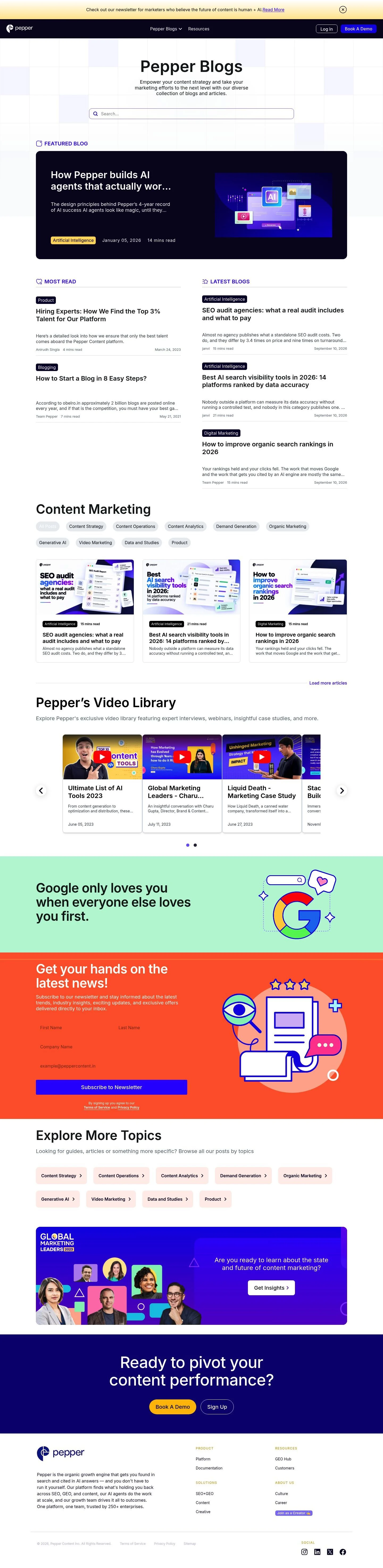
- Full page: https://cdn.designmunk.com/2026/09/10174754/pepper-inc-blog-featured.webp
- Above the fold: https://cdn.designmunk.com/2026/09/10174754/pepper-inc-blog-featured.webp
- On DesignMunk: https://designmunk.com/pepper-blog-page/

Study these for hierarchy, rhythm, spacing and density. Where an image and the written spec disagree, the spec wins: the tokens were read from the page's own CSS, the images are one rendering of it.

## Before you start

Ask the user what they are building, who it is for, and what brand assets they already have — name, colours, typefaces. Wait for their answers before writing anything. Everything below is then applied to their product, not to the reference.

## Design specification

# Pepper Blogs: Dark Feature Slab and Violet CTAs

## Overview

Pepper's blog uses a clear, product-forward voice with technical confidence. The mood is modern and focused: bright surface backgrounds, one strong dark section for emphasis, and high-contrast text. Spacing is tidy and modular, leaning dense over airy to prioritize scannability for a research-oriented audience of marketers and growth teams.

## Colors

- **primary (#171a1c):** Core ink for headings, body text, and icons on light surfaces.
- **secondary (#040434):** Deep navy for dark sections such as the featured-post slab and footer overlays.
- **tertiary (#1700e6):** Accent violet for interactive elements, section labels, and focus states.
- **neutral (#ffffff):** Primary surface for pages, cards, and inputs.
- **border (#e5e7eb):** Subtle divider lines, input outlines, card borders, and table rules.
- **surface ({colors.neutral}):** Alias to neutral; use as default page and card background.
- **on-surface ({colors.primary}):** Alias to primary; standard text color on light surfaces.

## Typography

- Inter (Google, free): the sole text family for headings and body. Load weights 400 and 600. Roles:
  - headline-lg: Inter 60px/1.1, 600 for the blog masthead.
  - headline-md: Inter 43px/1, 600 for major section intros.
  - headline-sm: Inter 31px/1.19, 600 for featured and card titles.
  - headline-xs: Inter 22px/1.68, 600 for subheads and list section headers.
  - body-md: Inter 16px/1.5, 400 for paragraphs, descriptions, and metadata.
  Recommended substitutes if Inter is unavailable: system-ui, "Segoe UI", Arial, Roboto.
- Noto Color Emoji (Google, free): emoji fallback for occasional icons and labels. If unavailable, fall back to Apple Color Emoji or Segoe UI Emoji.

## Layout

- Spacing scale is an 8px base: xs 8, sm 16, md 32, lg 40, xl 48.
- Use xs/sm for intra-component padding and gaps; md for card gutters and list spacing; lg/xl for section paddings and block rhythm.
- Lists and category grids work well as two columns on desktop with md (32px) gutters; collapse to a single column on mobile while preserving the 8px rhythm.
- Keep max-widths consistent across search, featured block, and lists to maintain alignment with the content container.

## Elevation & Depth

- Primary depth cues are color contrast (secondary vs neutral), 1px borders (#e5e7eb), and whitespace.
- Use measured_shadows.sm for subtle lift on hoverable cards and menus.
- measured_shadows.md is a brand glow accent; reserve for high-attention surfaces (announcements or key CTAs). lg/xl/inner are none—rely on tonal shifts instead of heavy shadows.

## Shapes

- One radius: rounded.sm at 8px. Apply to buttons, inputs, and cards for consistency.
- button-link is square (0px) to read as text-first and inline.
- Maintain 8px radii on dark slabs to keep them related to card geometry without appearing like separate modules.

## Components

Tokens define buttons and cards; apply them consistently, then extend into page patterns.

### Button — Primary
- Background #1700e6; text #ffffff; height 32px; padding 6px 16px; radius 8px.
- Use for primary actions like Book a Demo or Subscribe.

### Button — Secondary
- Text #ffffff; height 32px; padding 6px 16px; radius 8px. Place on dark surfaces (e.g., #040434) or pair with a 1px #e5e7eb stroke.

### Button — Link
- Text #171a1c; radius 0px. Inline actions and simple navigational links.

### Card
- Background #ffffff; text #171a1c; padding 16px; radius 8px; optional 1px border #e5e7eb; hover with sm shadow.

### Featured Blog Slab
- Full-width card using #040434 with 8px radius. Title set in Inter headline-sm (31px/600) or headline-md (43px/600) depending on space; body in 16px/1.5. Right-aligned image area; primary button in #1700e6.

### Global Search Bar
- Centered input under the masthead. 1px border #e5e7eb, radius 8px, internal padding sm (16px). Placeholder/body text in Inter 16px/1.5 #171a1c.

### Category Tile
- Clickable card linking to a category. #ffffff background, 1px #e5e7eb border, 8px radius, padding 16px. Title in Inter 22px/600; description in 16px/400. On hover: border or underline accent in #1700e6.

### Article List Item
- Compact card-row: title in 22px/600, metadata in 16px/400. Use md (32px) vertical spacing between items; optional divider #e5e7eb.

### Video Library Carousel/Grid
- Cards at 8px radius on #ffffff; title in 22px/600, date in 16px/400; hover lift with sm shadow.

### Newsletter CTA
- Light panel with 8px radius and md (32px) padding. Input styled like Global Search; primary button #1700e6. Keep copy in 22px/600 headline with 16px body.

### Footer
- Multi-column list with 16px link rows and 32px column gutters. Text in #171a1c on #ffffff or reversed when placed on #040434.

## Do's and Don'ts

- Do reserve #1700e6 for interactive states, labels, and key links; keep body copy in #171a1c.
- Do use 8/16/32px spacing multiples; avoid ad-hoc values that break alignment.
- Do use #040434 sparingly for emphasis sections so the page keeps one dominant light surface.
- Don't round corners beyond 8px or mix radii on adjacent elements.
- Don't place light text over #171a1c; use #040434 for dark panels and #ffffff text for proper contrast.
- Don't overuse the md glow; it is for announcements or highlight moments, not general hover states.

## Agent Prompt Guide

Quick color reference — Text: #171a1c; Background: #ffffff; Border: #e5e7eb; Accent: #1700e6; Dark section: #040434.

1) Build the blog masthead
- Container on #ffffff. Set H1 in Inter 60px/1.1 weight 600, color #171a1c. Add a supporting paragraph in Inter 16px/1.5 #171a1c. Place a centered search input with 1px border #e5e7eb, 8px radius, and sm (16px) internal padding.

2) Create the Featured Blog slab
- Full-width card with background #040434, 8px radius, padding md (32px). Title in Inter 43px/1 weight 600, color #ffffff; excerpt in Inter 16px/1.5 #ffffff at 80% opacity. Add a primary button: 32px height, 6px 16px, radius 8px, background #1700e6, text #ffffff.

3) Two-column article list
- On #ffffff, render two columns with md (32px) column gap. Each item: title Inter 22px/1.68 600 #171a1c; metadata Inter 16px/1.5 #171a1c at 70% opacity. Separate items with a 1px divider #e5e7eb.

4) Category tiles grid
- Grid of cards on #ffffff with md (32px) gaps. Each card: background #ffffff, 1px border #e5e7eb, radius 8px, padding 16px. Title Inter 22px/600 #171a1c; description Inter 16px/400 #171a1c. Hover: border color #1700e6.

5) Newsletter CTA panel
- Light panel on #ffffff with radius 8px, padding md (32px). Headline Inter 22px/600 #171a1c; body Inter 16px/1.5. Input matches masthead search; submit uses primary button spec (background #1700e6, text #ffffff, 32px height).

## Similar Brands

- HubSpot Blog — white surfaces, navy accents, card-based lists; HubSpot is warmer and uses orange for CTAs rather than violet.
- Ahrefs Blog — dense, research-forward layouts; relies more on outline buttons and orange highlights.
- Semrush Blog — large section labels and two-column lists; brand orange replaces Pepper's violet and uses heavier illustration.
- Webflow Blog — strong typographic hierarchy and generous white space; more experimental layouts versus Pepper's stricter grid.

## Tokens

### CSS custom properties

```css
:root {
  /* Colors */
  --color-primary: #171a1c;
  --color-secondary: #040434;
  --color-tertiary: #1700e6;
  --color-neutral: #ffffff;
  --color-border: #e5e7eb;
  --color-surface: var(--color-neutral);
  --color-on-surface: var(--color-primary);

  /* Typography */
  --text-headline-lg-size: 60px;
  --text-headline-lg-weight: 600;
  --text-headline-lg-leading: 1.1;
  --text-headline-md-size: 43px;
  --text-headline-md-weight: 600;
  --text-headline-md-leading: 1;
  --text-headline-sm-size: 31px;
  --text-headline-sm-weight: 600;
  --text-headline-sm-leading: 1.19;
  --text-headline-xs-size: 22px;
  --text-headline-xs-weight: 600;
  --text-headline-xs-leading: 1.68;
  --text-body-md-size: 16px;
  --text-body-md-weight: 400;
  --text-body-md-leading: 1.5;
  --font-inter: "Inter";

  /* Rounded */
  --radius-sm: 8px;

  /* Spacing */
  --spacing-xs: 8px;
  --spacing-sm: 16px;
  --spacing-md: 32px;
  --spacing-lg: 40px;
  --spacing-xl: 48px;

  /* Components */
  --button-primary-background-color: var(--color-tertiary);
  --button-primary-text-color: var(--color-neutral);
  --button-primary-rounded: var(--radius-sm);
  --button-primary-padding: 6px 16px;
  --button-primary-height: 32px;
  --button-secondary-text-color: var(--color-neutral);
  --button-secondary-rounded: var(--radius-sm);
  --button-secondary-padding: 6px 16px;
  --button-secondary-height: 32px;
  --button-link-text-color: var(--color-primary);
  --button-link-rounded: 0px;
  --card-background-color: var(--color-neutral);
  --card-text-color: var(--color-primary);
  --card-rounded: var(--radius-sm);
  --card-padding: 16px;
}
```

### Tailwind theme

```css
@theme {
  --color-primary: #171a1c;
  --color-secondary: #040434;
  --color-tertiary: #1700e6;
  --color-neutral: #ffffff;
  --color-border: #e5e7eb;
  --color-surface: #ffffff;
  --color-on-surface: #171a1c;
  --font-headline-lg: "Inter";
  --font-headline-md: "Inter";
  --font-headline-sm: "Inter";
  --font-headline-xs: "Inter";
  --font-body-md: "Inter";
  --text-headline-lg: 60px;
  --text-headline-md: 43px;
  --text-headline-sm: 31px;
  --text-headline-xs: 22px;
  --text-body-md: 16px;
  --font-weight-headline-lg: 600;
  --font-weight-headline-md: 600;
  --font-weight-headline-sm: 600;
  --font-weight-headline-xs: 600;
  --font-weight-body-md: 400;
  --radius-sm: 8px;
  --spacing-xs: 8px;
  --spacing-sm: 16px;
  --spacing-md: 32px;
  --spacing-lg: 40px;
  --spacing-xl: 48px;
}
```

### Design tokens (DTCG)

```json
{
    "$schema": "https://www.designtokens.org/schemas/2025.10/format.json",
    "color": {
        "$type": "color",
        "primary": {
            "$value": {
                "colorSpace": "srgb",
                "components": [
                    0.09,
                    0.102,
                    0.11
                ],
                "hex": "#171a1c"
            }
        },
        "secondary": {
            "$value": {
                "colorSpace": "srgb",
                "components": [
                    0.016,
                    0.016,
                    0.204
                ],
                "hex": "#040434"
            }
        },
        "tertiary": {
            "$value": {
                "colorSpace": "srgb",
                "components": [
                    0.09,
                    0,
                    0.902
                ],
                "hex": "#1700e6"
            }
        },
        "neutral": {
            "$value": {
                "colorSpace": "srgb",
                "components": [
                    1,
                    1,
                    1
                ],
                "hex": "#ffffff"
            }
        },
        "border": {
            "$value": {
                "colorSpace": "srgb",
                "components": [
                    0.898,
                    0.906,
                    0.922
                ],
                "hex": "#e5e7eb"
            }
        },
        "surface": {
            "$value": {
                "colorSpace": "srgb",
                "components": [
                    1,
                    1,
                    1
                ],
                "hex": "#ffffff"
            }
        },
        "on-surface": {
            "$value": {
                "colorSpace": "srgb",
                "components": [
                    0.09,
                    0.102,
                    0.11
                ],
                "hex": "#171a1c"
            }
        }
    },
    "spacing": {
        "$type": "dimension",
        "xs": {
            "$value": {
                "value": 8,
                "unit": "px"
            }
        },
        "sm": {
            "$value": {
                "value": 16,
                "unit": "px"
            }
        },
        "md": {
            "$value": {
                "value": 32,
                "unit": "px"
            }
        },
        "lg": {
            "$value": {
                "value": 40,
                "unit": "px"
            }
        },
        "xl": {
            "$value": {
                "value": 48,
                "unit": "px"
            }
        }
    },
    "rounded": {
        "$type": "dimension",
        "sm": {
            "$value": {
                "value": 8,
                "unit": "px"
            }
        }
    },
    "typography": {
        "headline-lg": {
            "$type": "typography",
            "$value": {
                "fontFamily": "Inter",
                "fontSize": {
                    "value": 60,
                    "unit": "px"
                },
                "fontWeight": 600
            }
        },
        "headline-md": {
            "$type": "typography",
            "$value": {
                "fontFamily": "Inter",
                "fontSize": {
                    "value": 43,
                    "unit": "px"
                },
                "fontWeight": 600
            }
        },
        "headline-sm": {
            "$type": "typography",
            "$value": {
                "fontFamily": "Inter",
                "fontSize": {
                    "value": 31,
                    "unit": "px"
                },
                "fontWeight": 600
            }
        },
        "headline-xs": {
            "$type": "typography",
            "$value": {
                "fontFamily": "Inter",
                "fontSize": {
                    "value": 22,
                    "unit": "px"
                },
                "fontWeight": 600
            }
        },
        "body-md": {
            "$type": "typography",
            "$value": {
                "fontFamily": "Inter",
                "fontSize": {
                    "value": 16,
                    "unit": "px"
                },
                "fontWeight": 400
            }
        }
    }
}
```

## Rules

- **Fonts.** If the specification names a custom or self-hosted family, use one of the substitutes it names. Never reference a typeface you cannot actually load — it will fall back to a system font and undo the typography.
- **Colour.** Derive the palette from the user's brand. Use the token values as a guide to *relationships* — contrast, tint, how many accents carry the page — not as hex codes to paste.
- **Never reproduce** the wordmark, mascot, logo, brand name, illustrations, icon set, screenshots or any copy from the reference.
- **Never present the result as Pepper Blog**, or imply any connection to it.
- If something is unspecified, choose clarity and legibility over decoration.
---
version: alpha
name: Pepper
description: Content-Led Growth Engine for the AI Age
colors:
  primary: "#171a1c"
  secondary: "#040434"
  tertiary: "#1700e6"
  neutral: "#ffffff"
  border: "#e5e7eb"
  surface: "{colors.neutral}"
  on-surface: "{colors.primary}"
typography:
  headline-lg:
    fontFamily: Inter
    fontSize: 60px
    fontWeight: 600
    lineHeight: 1.1
  headline-md:
    fontFamily: Inter
    fontSize: 43px
    fontWeight: 600
    lineHeight: 1
  headline-sm:
    fontFamily: Inter
    fontSize: 31px
    fontWeight: 600
    lineHeight: 1.19
  headline-xs:
    fontFamily: Inter
    fontSize: 22px
    fontWeight: 600
    lineHeight: 1.68
  body-md:
    fontFamily: Inter
    fontSize: 16px
    fontWeight: 400
    lineHeight: 1.5
rounded:
  sm: 8px
spacing:
  xs: 8px
  sm: 16px
  md: 32px
  lg: 40px
  xl: 48px
components:
  button-primary:
    backgroundColor: "{colors.tertiary}"
    textColor: "{colors.neutral}"
    rounded: "{rounded.sm}"
    padding: 6px 16px
    height: 32px
  button-secondary:
    textColor: "{colors.neutral}"
    rounded: "{rounded.sm}"
    padding: 6px 16px
    height: 32px
  button-link:
    textColor: "{colors.primary}"
    rounded: 0px
  card:
    backgroundColor: "{colors.neutral}"
    textColor: "{colors.primary}"
    rounded: "{rounded.sm}"
    padding: 16px
---

# Pepper Blogs: Dark Feature Slab and Violet CTAs

## Overview

Pepper's blog uses a clear, product-forward voice with technical confidence. The mood is modern and focused: bright surface backgrounds, one strong dark section for emphasis, and high-contrast text. Spacing is tidy and modular, leaning dense over airy to prioritize scannability for a research-oriented audience of marketers and growth teams.

## Colors

- **primary (#171a1c):** Core ink for headings, body text, and icons on light surfaces.
- **secondary (#040434):** Deep navy for dark sections such as the featured-post slab and footer overlays.
- **tertiary (#1700e6):** Accent violet for interactive elements, section labels, and focus states.
- **neutral (#ffffff):** Primary surface for pages, cards, and inputs.
- **border (#e5e7eb):** Subtle divider lines, input outlines, card borders, and table rules.
- **surface ({colors.neutral}):** Alias to neutral; use as default page and card background.
- **on-surface ({colors.primary}):** Alias to primary; standard text color on light surfaces.

## Typography

- Inter (Google, free): the sole text family for headings and body. Load weights 400 and 600. Roles:
  - headline-lg: Inter 60px/1.1, 600 for the blog masthead.
  - headline-md: Inter 43px/1, 600 for major section intros.
  - headline-sm: Inter 31px/1.19, 600 for featured and card titles.
  - headline-xs: Inter 22px/1.68, 600 for subheads and list section headers.
  - body-md: Inter 16px/1.5, 400 for paragraphs, descriptions, and metadata.
  Recommended substitutes if Inter is unavailable: system-ui, "Segoe UI", Arial, Roboto.
- Noto Color Emoji (Google, free): emoji fallback for occasional icons and labels. If unavailable, fall back to Apple Color Emoji or Segoe UI Emoji.

## Layout

- Spacing scale is an 8px base: xs 8, sm 16, md 32, lg 40, xl 48.
- Use xs/sm for intra-component padding and gaps; md for card gutters and list spacing; lg/xl for section paddings and block rhythm.
- Lists and category grids work well as two columns on desktop with md (32px) gutters; collapse to a single column on mobile while preserving the 8px rhythm.
- Keep max-widths consistent across search, featured block, and lists to maintain alignment with the content container.

## Elevation & Depth

- Primary depth cues are color contrast (secondary vs neutral), 1px borders (#e5e7eb), and whitespace.
- Use measured_shadows.sm for subtle lift on hoverable cards and menus.
- measured_shadows.md is a brand glow accent; reserve for high-attention surfaces (announcements or key CTAs). lg/xl/inner are none—rely on tonal shifts instead of heavy shadows.

## Shapes

- One radius: rounded.sm at 8px. Apply to buttons, inputs, and cards for consistency.
- button-link is square (0px) to read as text-first and inline.
- Maintain 8px radii on dark slabs to keep them related to card geometry without appearing like separate modules.

## Components

Tokens define buttons and cards; apply them consistently, then extend into page patterns.

### Button — Primary
- Background #1700e6; text #ffffff; height 32px; padding 6px 16px; radius 8px.
- Use for primary actions like Book a Demo or Subscribe.

### Button — Secondary
- Text #ffffff; height 32px; padding 6px 16px; radius 8px. Place on dark surfaces (e.g., #040434) or pair with a 1px #e5e7eb stroke.

### Button — Link
- Text #171a1c; radius 0px. Inline actions and simple navigational links.

### Card
- Background #ffffff; text #171a1c; padding 16px; radius 8px; optional 1px border #e5e7eb; hover with sm shadow.

### Featured Blog Slab
- Full-width card using #040434 with 8px radius. Title set in Inter headline-sm (31px/600) or headline-md (43px/600) depending on space; body in 16px/1.5. Right-aligned image area; primary button in #1700e6.

### Global Search Bar
- Centered input under the masthead. 1px border #e5e7eb, radius 8px, internal padding sm (16px). Placeholder/body text in Inter 16px/1.5 #171a1c.

### Category Tile
- Clickable card linking to a category. #ffffff background, 1px #e5e7eb border, 8px radius, padding 16px. Title in Inter 22px/600; description in 16px/400. On hover: border or underline accent in #1700e6.

### Article List Item
- Compact card-row: title in 22px/600, metadata in 16px/400. Use md (32px) vertical spacing between items; optional divider #e5e7eb.

### Video Library Carousel/Grid
- Cards at 8px radius on #ffffff; title in 22px/600, date in 16px/400; hover lift with sm shadow.

### Newsletter CTA
- Light panel with 8px radius and md (32px) padding. Input styled like Global Search; primary button #1700e6. Keep copy in 22px/600 headline with 16px body.

### Footer
- Multi-column list with 16px link rows and 32px column gutters. Text in #171a1c on #ffffff or reversed when placed on #040434.

## Do's and Don'ts

- Do reserve #1700e6 for interactive states, labels, and key links; keep body copy in #171a1c.
- Do use 8/16/32px spacing multiples; avoid ad-hoc values that break alignment.
- Do use #040434 sparingly for emphasis sections so the page keeps one dominant light surface.
- Don't round corners beyond 8px or mix radii on adjacent elements.
- Don't place light text over #171a1c; use #040434 for dark panels and #ffffff text for proper contrast.
- Don't overuse the md glow; it is for announcements or highlight moments, not general hover states.

## Agent Prompt Guide

Quick color reference — Text: #171a1c; Background: #ffffff; Border: #e5e7eb; Accent: #1700e6; Dark section: #040434.

1) Build the blog masthead
- Container on #ffffff. Set H1 in Inter 60px/1.1 weight 600, color #171a1c. Add a supporting paragraph in Inter 16px/1.5 #171a1c. Place a centered search input with 1px border #e5e7eb, 8px radius, and sm (16px) internal padding.

2) Create the Featured Blog slab
- Full-width card with background #040434, 8px radius, padding md (32px). Title in Inter 43px/1 weight 600, color #ffffff; excerpt in Inter 16px/1.5 #ffffff at 80% opacity. Add a primary button: 32px height, 6px 16px, radius 8px, background #1700e6, text #ffffff.

3) Two-column article list
- On #ffffff, render two columns with md (32px) column gap. Each item: title Inter 22px/1.68 600 #171a1c; metadata Inter 16px/1.5 #171a1c at 70% opacity. Separate items with a 1px divider #e5e7eb.

4) Category tiles grid
- Grid of cards on #ffffff with md (32px) gaps. Each card: background #ffffff, 1px border #e5e7eb, radius 8px, padding 16px. Title Inter 22px/600 #171a1c; description Inter 16px/400 #171a1c. Hover: border color #1700e6.

5) Newsletter CTA panel
- Light panel on #ffffff with radius 8px, padding md (32px). Headline Inter 22px/600 #171a1c; body Inter 16px/1.5. Input matches masthead search; submit uses primary button spec (background #1700e6, text #ffffff, 32px height).

## Similar Brands

- HubSpot Blog — white surfaces, navy accents, card-based lists; HubSpot is warmer and uses orange for CTAs rather than violet.
- Ahrefs Blog — dense, research-forward layouts; relies more on outline buttons and orange highlights.
- Semrush Blog — large section labels and two-column lists; brand orange replaces Pepper's violet and uses heavier illustration.
- Webflow Blog — strong typographic hierarchy and generous white space; more experimental layouts versus Pepper's stricter grid.
:root {
  /* Colors */
  --color-primary: #171a1c;
  --color-secondary: #040434;
  --color-tertiary: #1700e6;
  --color-neutral: #ffffff;
  --color-border: #e5e7eb;
  --color-surface: var(--color-neutral);
  --color-on-surface: var(--color-primary);

  /* Typography */
  --text-headline-lg-size: 60px;
  --text-headline-lg-weight: 600;
  --text-headline-lg-leading: 1.1;
  --text-headline-md-size: 43px;
  --text-headline-md-weight: 600;
  --text-headline-md-leading: 1;
  --text-headline-sm-size: 31px;
  --text-headline-sm-weight: 600;
  --text-headline-sm-leading: 1.19;
  --text-headline-xs-size: 22px;
  --text-headline-xs-weight: 600;
  --text-headline-xs-leading: 1.68;
  --text-body-md-size: 16px;
  --text-body-md-weight: 400;
  --text-body-md-leading: 1.5;
  --font-inter: "Inter";

  /* Rounded */
  --radius-sm: 8px;

  /* Spacing */
  --spacing-xs: 8px;
  --spacing-sm: 16px;
  --spacing-md: 32px;
  --spacing-lg: 40px;
  --spacing-xl: 48px;

  /* Components */
  --button-primary-background-color: var(--color-tertiary);
  --button-primary-text-color: var(--color-neutral);
  --button-primary-rounded: var(--radius-sm);
  --button-primary-padding: 6px 16px;
  --button-primary-height: 32px;
  --button-secondary-text-color: var(--color-neutral);
  --button-secondary-rounded: var(--radius-sm);
  --button-secondary-padding: 6px 16px;
  --button-secondary-height: 32px;
  --button-link-text-color: var(--color-primary);
  --button-link-rounded: 0px;
  --card-background-color: var(--color-neutral);
  --card-text-color: var(--color-primary);
  --card-rounded: var(--radius-sm);
  --card-padding: 16px;
}
{
  "$schema": "https://www.designtokens.org/schemas/2025.10/format.json",
  "$description": "Content-Led Growth Engine for the AI Age",
  "color": {
    "$type": "color",
    "primary": {
      "$value": {
        "colorSpace": "srgb",
        "components": [
          0.09,
          0.102,
          0.11
        ],
        "hex": "#171a1c"
      }
    },
    "secondary": {
      "$value": {
        "colorSpace": "srgb",
        "components": [
          0.016,
          0.016,
          0.204
        ],
        "hex": "#040434"
      }
    },
    "tertiary": {
      "$value": {
        "colorSpace": "srgb",
        "components": [
          0.09,
          0,
          0.902
        ],
        "hex": "#1700e6"
      }
    },
    "neutral": {
      "$value": {
        "colorSpace": "srgb",
        "components": [
          1,
          1,
          1
        ],
        "hex": "#ffffff"
      }
    },
    "border": {
      "$value": {
        "colorSpace": "srgb",
        "components": [
          0.898,
          0.906,
          0.922
        ],
        "hex": "#e5e7eb"
      }
    },
    "surface": {
      "$value": {
        "colorSpace": "srgb",
        "components": [
          1,
          1,
          1
        ],
        "hex": "#ffffff"
      }
    },
    "on-surface": {
      "$value": {
        "colorSpace": "srgb",
        "components": [
          0.09,
          0.102,
          0.11
        ],
        "hex": "#171a1c"
      }
    }
  },
  "spacing": {
    "$type": "dimension",
    "xs": {
      "$value": {
        "value": 8,
        "unit": "px"
      }
    },
    "sm": {
      "$value": {
        "value": 16,
        "unit": "px"
      }
    },
    "md": {
      "$value": {
        "value": 32,
        "unit": "px"
      }
    },
    "lg": {
      "$value": {
        "value": 40,
        "unit": "px"
      }
    },
    "xl": {
      "$value": {
        "value": 48,
        "unit": "px"
      }
    }
  },
  "rounded": {
    "$type": "dimension",
    "sm": {
      "$value": {
        "value": 8,
        "unit": "px"
      }
    }
  },
  "typography": {
    "headline-lg": {
      "$type": "typography",
      "$value": {
        "fontFamily": "Inter",
        "fontSize": {
          "value": 60,
          "unit": "px"
        },
        "fontWeight": 600
      }
    },
    "headline-md": {
      "$type": "typography",
      "$value": {
        "fontFamily": "Inter",
        "fontSize": {
          "value": 43,
          "unit": "px"
        },
        "fontWeight": 600
      }
    },
    "headline-sm": {
      "$type": "typography",
      "$value": {
        "fontFamily": "Inter",
        "fontSize": {
          "value": 31,
          "unit": "px"
        },
        "fontWeight": 600
      }
    },
    "headline-xs": {
      "$type": "typography",
      "$value": {
        "fontFamily": "Inter",
        "fontSize": {
          "value": 22,
          "unit": "px"
        },
        "fontWeight": 600
      }
    },
    "body-md": {
      "$type": "typography",
      "$value": {
        "fontFamily": "Inter",
        "fontSize": {
          "value": 16,
          "unit": "px"
        },
        "fontWeight": 400
      }
    }
  }
}
@theme {
--color-primary: #171a1c;
--color-secondary: #040434;
--color-tertiary: #1700e6;
--color-neutral: #ffffff;
--color-border: #e5e7eb;
--color-surface: #ffffff;
--color-on-surface: #171a1c;
--font-headline-lg: "Inter";
--font-headline-md: "Inter";
--font-headline-sm: "Inter";
--font-headline-xs: "Inter";
--font-body-md: "Inter";
--text-headline-lg: 60px;
--text-headline-md: 43px;
--text-headline-sm: 31px;
--text-headline-xs: 22px;
--text-body-md: 16px;
--font-weight-headline-lg: 600;
--font-weight-headline-md: 600;
--font-weight-headline-sm: 600;
--font-weight-headline-xs: 600;
--font-weight-body-md: 400;
--radius-sm: 8px;
--spacing-xs: 8px;
--spacing-sm: 16px;
--spacing-md: 32px;
--spacing-lg: 40px;
--spacing-xl: 48px;
} # Design brief: the Pepper Blog design language
Below is a complete design specification measured from a real, published web page. Use it as a design language for the user's product. It is not a page to reproduce.
## Reference images
- Full page: https://cdn.designmunk.com/2026/09/10174754/pepper-inc-blog-featured.webp
- Above the fold: https://cdn.designmunk.com/2026/09/10174754/pepper-inc-blog-featured.webp
- On DesignMunk: https://designmunk.com/pepper-blog-page/
Study these for hierarchy, rhythm, spacing and density. Where an image and the written spec disagree, the spec wins: the tokens were read from the page's own CSS, the images are one rendering of it.
## Before you start
Ask the user what they are building, who it is for, and what brand assets they already have — name, colours, typefaces. Wait for their answers before writing anything. Everything below is then applied to their product, not to the reference.
## Design specification
# Pepper Blogs: Dark Feature Slab and Violet CTAs
## Overview
Pepper's blog uses a clear, product-forward voice with technical confidence. The mood is modern and focused: bright surface backgrounds, one strong dark section for emphasis, and high-contrast text. Spacing is tidy and modular, leaning dense over airy to prioritize scannability for a research-oriented audience of marketers and growth teams.
## Colors
- **primary (#171a1c):** Core ink for headings, body text, and icons on light surfaces.
- **secondary (#040434):** Deep navy for dark sections such as the featured-post slab and footer overlays.
- **tertiary (#1700e6):** Accent violet for interactive elements, section labels, and focus states.
- **neutral (#ffffff):** Primary surface for pages, cards, and inputs.
- **border (#e5e7eb):** Subtle divider lines, input outlines, card borders, and table rules.
- **surface ({colors.neutral}):** Alias to neutral; use as default page and card background.
- **on-surface ({colors.primary}):** Alias to primary; standard text color on light surfaces.
## Typography
- Inter (Google, free): the sole text family for headings and body. Load weights 400 and 600. Roles:
- headline-lg: Inter 60px/1.1, 600 for the blog masthead.
- headline-md: Inter 43px/1, 600 for major section intros.
- headline-sm: Inter 31px/1.19, 600 for featured and card titles.
- headline-xs: Inter 22px/1.68, 600 for subheads and list section headers.
- body-md: Inter 16px/1.5, 400 for paragraphs, descriptions, and metadata.
Recommended substitutes if Inter is unavailable: system-ui, "Segoe UI", Arial, Roboto.
- Noto Color Emoji (Google, free): emoji fallback for occasional icons and labels. If unavailable, fall back to Apple Color Emoji or Segoe UI Emoji.
## Layout
- Spacing scale is an 8px base: xs 8, sm 16, md 32, lg 40, xl 48.
- Use xs/sm for intra-component padding and gaps; md for card gutters and list spacing; lg/xl for section paddings and block rhythm.
- Lists and category grids work well as two columns on desktop with md (32px) gutters; collapse to a single column on mobile while preserving the 8px rhythm.
- Keep max-widths consistent across search, featured block, and lists to maintain alignment with the content container.
## Elevation & Depth
- Primary depth cues are color contrast (secondary vs neutral), 1px borders (#e5e7eb), and whitespace.
- Use measured_shadows.sm for subtle lift on hoverable cards and menus.
- measured_shadows.md is a brand glow accent; reserve for high-attention surfaces (announcements or key CTAs). lg/xl/inner are none—rely on tonal shifts instead of heavy shadows.
## Shapes
- One radius: rounded.sm at 8px. Apply to buttons, inputs, and cards for consistency.
- button-link is square (0px) to read as text-first and inline.
- Maintain 8px radii on dark slabs to keep them related to card geometry without appearing like separate modules.
## Components
Tokens define buttons and cards; apply them consistently, then extend into page patterns.
### Button — Primary
- Background #1700e6; text #ffffff; height 32px; padding 6px 16px; radius 8px.
- Use for primary actions like Book a Demo or Subscribe.
### Button — Secondary
- Text #ffffff; height 32px; padding 6px 16px; radius 8px. Place on dark surfaces (e.g., #040434) or pair with a 1px #e5e7eb stroke.
### Button — Link
- Text #171a1c; radius 0px. Inline actions and simple navigational links.
### Card
- Background #ffffff; text #171a1c; padding 16px; radius 8px; optional 1px border #e5e7eb; hover with sm shadow.
### Featured Blog Slab
- Full-width card using #040434 with 8px radius. Title set in Inter headline-sm (31px/600) or headline-md (43px/600) depending on space; body in 16px/1.5. Right-aligned image area; primary button in #1700e6.
### Global Search Bar
- Centered input under the masthead. 1px border #e5e7eb, radius 8px, internal padding sm (16px). Placeholder/body text in Inter 16px/1.5 #171a1c.
### Category Tile
- Clickable card linking to a category. #ffffff background, 1px #e5e7eb border, 8px radius, padding 16px. Title in Inter 22px/600; description in 16px/400. On hover: border or underline accent in #1700e6.
### Article List Item
- Compact card-row: title in 22px/600, metadata in 16px/400. Use md (32px) vertical spacing between items; optional divider #e5e7eb.
### Video Library Carousel/Grid
- Cards at 8px radius on #ffffff; title in 22px/600, date in 16px/400; hover lift with sm shadow.
### Newsletter CTA
- Light panel with 8px radius and md (32px) padding. Input styled like Global Search; primary button #1700e6. Keep copy in 22px/600 headline with 16px body.
### Footer
- Multi-column list with 16px link rows and 32px column gutters. Text in #171a1c on #ffffff or reversed when placed on #040434.
## Do's and Don'ts
- Do reserve #1700e6 for interactive states, labels, and key links; keep body copy in #171a1c.
- Do use 8/16/32px spacing multiples; avoid ad-hoc values that break alignment.
- Do use #040434 sparingly for emphasis sections so the page keeps one dominant light surface.
- Don't round corners beyond 8px or mix radii on adjacent elements.
- Don't place light text over #171a1c; use #040434 for dark panels and #ffffff text for proper contrast.
- Don't overuse the md glow; it is for announcements or highlight moments, not general hover states.
## Agent Prompt Guide
Quick color reference — Text: #171a1c; Background: #ffffff; Border: #e5e7eb; Accent: #1700e6; Dark section: #040434.
1) Build the blog masthead
- Container on #ffffff. Set H1 in Inter 60px/1.1 weight 600, color #171a1c. Add a supporting paragraph in Inter 16px/1.5 #171a1c. Place a centered search input with 1px border #e5e7eb, 8px radius, and sm (16px) internal padding.
2) Create the Featured Blog slab
- Full-width card with background #040434, 8px radius, padding md (32px). Title in Inter 43px/1 weight 600, color #ffffff; excerpt in Inter 16px/1.5 #ffffff at 80% opacity. Add a primary button: 32px height, 6px 16px, radius 8px, background #1700e6, text #ffffff.
3) Two-column article list
- On #ffffff, render two columns with md (32px) column gap. Each item: title Inter 22px/1.68 600 #171a1c; metadata Inter 16px/1.5 #171a1c at 70% opacity. Separate items with a 1px divider #e5e7eb.
4) Category tiles grid
- Grid of cards on #ffffff with md (32px) gaps. Each card: background #ffffff, 1px border #e5e7eb, radius 8px, padding 16px. Title Inter 22px/600 #171a1c; description Inter 16px/400 #171a1c. Hover: border color #1700e6.
5) Newsletter CTA panel
- Light panel on #ffffff with radius 8px, padding md (32px). Headline Inter 22px/600 #171a1c; body Inter 16px/1.5. Input matches masthead search; submit uses primary button spec (background #1700e6, text #ffffff, 32px height).
## Tokens
### CSS custom properties
```css
:root {
/* Colors */
--color-primary: #171a1c;
--color-secondary: #040434;
--color-tertiary: #1700e6;
--color-neutral: #ffffff;
--color-border: #e5e7eb;
--color-surface: var(--color-neutral);
--color-on-surface: var(--color-primary);
/* Typography */
--text-headline-lg-size: 60px;
--text-headline-lg-weight: 600;
--text-headline-lg-leading: 1.1;
--text-headline-md-size: 43px;
--text-headline-md-weight: 600;
--text-headline-md-leading: 1;
--text-headline-sm-size: 31px;
--text-headline-sm-weight: 600;
--text-headline-sm-leading: 1.19;
--text-headline-xs-size: 22px;
--text-headline-xs-weight: 600;
--text-headline-xs-leading: 1.68;
--text-body-md-size: 16px;
--text-body-md-weight: 400;
--text-body-md-leading: 1.5;
--font-inter: "Inter";
/* Rounded */
--radius-sm: 8px;
/* Spacing */
--spacing-xs: 8px;
--spacing-sm: 16px;
--spacing-md: 32px;
--spacing-lg: 40px;
--spacing-xl: 48px;
/* Components */
--button-primary-background-color: var(--color-tertiary);
--button-primary-text-color: var(--color-neutral);
--button-primary-rounded: var(--radius-sm);
--button-primary-padding: 6px 16px;
--button-primary-height: 32px;
--button-secondary-text-color: var(--color-neutral);
--button-secondary-rounded: var(--radius-sm);
--button-secondary-padding: 6px 16px;
--button-secondary-height: 32px;
--button-link-text-color: var(--color-primary);
--button-link-rounded: 0px;
--card-background-color: var(--color-neutral);
--card-text-color: var(--color-primary);
--card-rounded: var(--radius-sm);
--card-padding: 16px;
}
```
## Rules
- **Fonts.** If the specification names a custom or self-hosted family, use one of the substitutes it names. Never reference a typeface you cannot actually load — it will fall back to a system font and undo the typography.
- **Colour.** Derive the palette from the user's brand. Use the token values as a guide to *relationships* — contrast, tint, how many accents carry the page — not as hex codes to paste.
- **Never reproduce** the wordmark, mascot, logo, brand name, illustrations, icon set, screenshots or any copy from the reference.
- **Never present the result as Pepper Blog**, or imply any connection to it.
- If something is unspecified, choose clarity and legibility over decoration.