Pause
joinpause.co
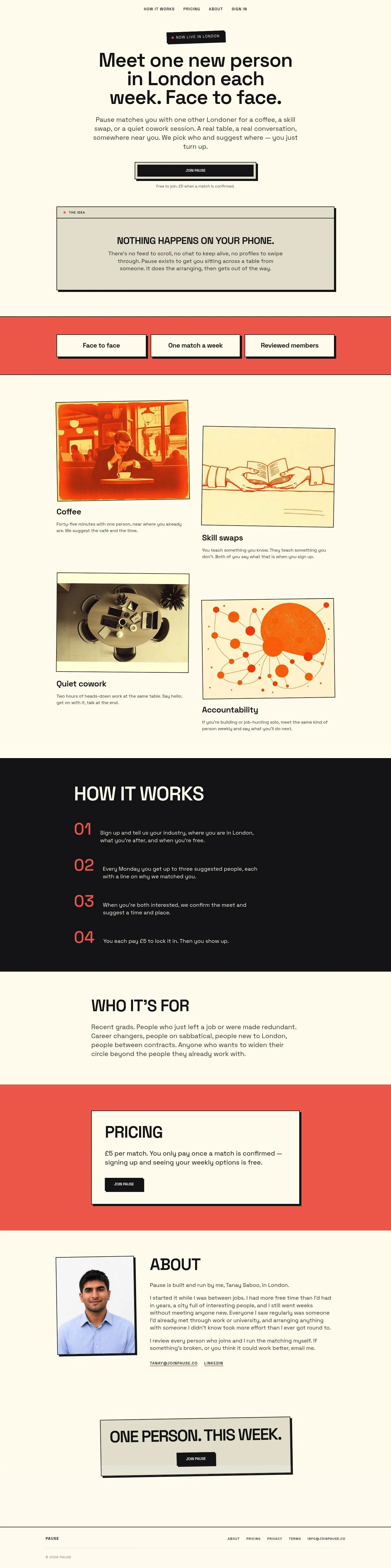
Meet one new Londoner each week—face-to-face, with no phone distractions.
joinpause.co
AI Breakdown
Design export
# Design brief: the Pause design language

Below is a complete design specification measured from a real, published web page. Use it as a design language for the user's product. It is not a page to reproduce.

## Reference images

- Full page: https://cdn.designmunk.com/2026/09/07084757/joinpause-co-featured.webp
- Above the fold: https://cdn.designmunk.com/2026/09/07084757/joinpause-co-featured.webp
- On DesignMunk: https://designmunk.com/pause/

Study these for hierarchy, rhythm, spacing and density. Where an image and the written spec disagree, the spec wins: the tokens were read from the page's own CSS, the images are one rendering of it.

## Before you start

Ask the user what they are building, who it is for, and what brand assets they already have — name, colours, typefaces. Wait for their answers before writing anything. Everything below is then applied to their product, not to the reference.

## Design specification

# Pause: Poster Cards and Offset Shadows on Warm Paper

## Overview

Pause speaks in plain, human language with a confident, poster-like layout. The interface should feel paper-warm, spacious, and distraction-free. One strong column, generous type sizes, and minimal chrome guide the user to a single action: join and meet someone offline. When unsure, choose clarity, contrast, and fewer elements over ornament.

## Colors

- **primary (#18181b):** Deep ink for headlines, core text, and the primary CTA background.
- **secondary (#f1543b):** Attention accents like announcement tags and status dots.
- **tertiary (#f26d5b):** Softer accent for supportive highlights or hover states.
- **neutral (#fdfcf0):** Paper-warm page background and card surfaces.
- **border (#e5e7eb):** Light dividers and subtle rules; never for text.
- **brand-hihada-brown (#752b22):** Occasional brand warmth for editorial touches.
- **surface (#fdfcf0):** Alias of neutral; default surface color.
- **on-surface (#18181b):** Alias of primary for text/icons on surfaces.

## Typography

- Space Grotesk is the sole family for headings and body. It is a free Google font and can be loaded directly. Use it at the following roles:
  - Headline-lg 72/1.19, 600, -0.025em for the main hero.
  - Headline-md 55/1.2, 600, -0.016em for major section leads.
  - Headline-sm 42/1.19, 600 and Headline-xs 32/1.19, 600 for subheads, feature titles, and step titles.
  - Body-md 24/1.5, 400 for all paragraphs and supporting copy.
- Substitutes when Space Grotesk isn't available: Inter (Google) for similar geometry and x-height; Manrope (Google) for a clean, modern grotesk feel.

## Layout

- Single central column with generous vertical rhythm. Use spacing lg (48px) to xl (96px) between sections, and md (32px) between a heading, paragraph, and CTA within a section.
- Small elements like labels or flags may use xs (12px) and sm (20px) paddings/margins for compact alignment.
- Cards and banners sit on the same paper surface (#fdfcf0); rely on spacing and type to separate sections rather than heavy containers.

## Elevation & Depth

- Depth is conveyed with a single, graphic shadow: rgb(24,24,27) 6px 6px 0 0 (sm). Use it on hero CTAs, callout cards, and key panels to produce a sticker/poster effect.
- Additional shadow sizes are none; hierarchy beyond that comes from type scale, contrast (primary on neutral), borders in #e5e7eb, and whitespace.

## Shapes

- Two radii define the language: sm 4px for buttons and compact controls; md 8px for larger cards and panels.
- Corners are modest to preserve the printed-poster vibe; avoid fully rounded pills unless a link-style button is used (0px).

## Components

- Buttons
  - Primary: background #18181b, text #fdfcf0, 44px height, 12px×24px padding, 4px radius. Optionally apply the 6px offset shadow for emphasis.
  - Secondary: text #18181b on surface, 44px height, 12px×24px padding, 4px radius; pair with a subtle divider or hover fill using tertiary.
  - Link: text #18181b, 0px radius; use for inline or lightweight calls.
- Card: surface #fdfcf0, text #18181b, 16px padding, 8px radius. Add the 6px offset shadow when the card should read as a feature panel.

Distinctive components on this page:

### Announcement Flag
- A compact label ("Now live in London") near the hero. Use secondary (#f1543b) as the accent mark and apply the 6px offset shadow to feel like a sticker.

### Hero Stack
- Headline-lg (72px) followed by Body-md (24px) and a Primary button (44px) with optional small caption text beneath. Vertical spacing: md (32px) between elements.

### Idea Panel
- A wide card with a small top label ("The idea") and a red dot in secondary. Card uses 8px radius, 16px padding, and the offset shadow.

### Interaction Modules
- Four subsections ("Coffee", "Skill swaps", "Quiet cowork", "Accountability"). Each uses Headline-xs (32px) for the title and Body-md for explanation, spaced by md (32px).

### Stepper List
- "How it works" with steps 01–04. Use Headline-xs (32px) for step titles and Body-md (24px) for details. Separate steps with border color #e5e7eb.

### Pricing Banner
- Concise copy and a repeat Join button. Keep the surface neutral and emphasize the CTA with an offset shadow.

### Founder Note
- Plain text block with Body-md copy and inline links styled as Button-link; keep spacing lg (48px) above and below.

### Footer Strip
- Minimal nav links on the neutral surface, separated with the border color for quiet structure.

## Do's and Don'ts

- Do keep backgrounds on #fdfcf0 and set all core text in #18181b for strong contrast.
- Do reserve #f1543b and #f26d5b for small, high-signal accents (flags, dots, hovers).
- Do use the 6px offset shadow consistently on primary CTAs and key cards; avoid stacking multiple shadow styles.
- Do size paragraphs at 24px/1.5; let headings carry hierarchy (72/55/42/32).
- Don't introduce new radii—use 4px for buttons and 8px for larger cards to stay on brand.
- Don't rely on heavy grey boxes; use #e5e7eb only for thin dividers or rules.

## Agent Prompt Guide

Quick color reference — Text: #18181b, Background: #fdfcf0, Border: #e5e7eb, Accents: #f1543b and #f26d5b.

1) Build the hero
- Set page background to #fdfcf0. Center a stack: h1 using Space Grotesk 72px/1.19 weight 600 letter-spacing -0.025em in #18181b; paragraph in 24px/1.5 #18181b; primary button 44px high with 12px 24px padding, 4px radius, background #18181b, text #fdfcf0, add shadow rgb(24,24,27) 6px 6px 0 0; place a small caption below with 24px text.

2) Create the "Idea Panel" card
- Container: background #fdfcf0, text #18181b, 16px padding, 8px radius, apply shadow rgb(24,24,27) 6px 6px 0 0. Add a thin top rule in #e5e7eb and a small circular dot in #f1543b next to a label set in Space Grotesk 24px.

3) Lay out the Interaction Modules
- Four blocks each with a title in Space Grotesk 32px/1.19, 600, and a paragraph in 24px/1.5. Space blocks by lg (48px). Use small accent bullets or icons in #f26d5b for variety.

4) Build the Stepper list
- Section heading in 55px/1.2, 600. Each step has a numeric label (01–04) and a title in 32px/1.19, 600 with supporting copy at 24px/1.5. Separate steps with a 1px divider in #e5e7eb and stack with md (32px) gaps.

5) Pricing + CTA band
- Short line in 24px, then a primary button using the same 44px spec and 6px offset shadow. Keep plenty of top/bottom space: xl (96px).

## Similar Brands

- Lunchclub — also matches professionals; Pause is simpler and phone-free with a print-like aesthetic instead of a dashboard.
- Meetup — organizes IRL connections; Pause focuses on curated one-to-one meets with a quieter, single-column design.
- Eventbrite — event utility feel; Pause keeps the UI editorial and typographic rather than transactional.
- Bumble (BFF) — social matching with bold color; Pause avoids swipe mechanics and uses restrained accents on warm paper.

## Tokens

### CSS custom properties

```css
:root {
  /* Colors */
  --color-primary: #18181b;
  --color-secondary: #f1543b;
  --color-tertiary: #f26d5b;
  --color-neutral: #fdfcf0;
  --color-border: #e5e7eb;
  --color-brand-hihada-brown: #752b22;
  --color-surface: var(--color-neutral);
  --color-on-surface: var(--color-primary);

  /* Typography */
  --text-headline-lg-size: 72px;
  --text-headline-lg-weight: 600;
  --text-headline-lg-leading: 1.19;
  --text-headline-lg-tracking: -0.025em;
  --text-headline-md-size: 55px;
  --text-headline-md-weight: 600;
  --text-headline-md-leading: 1.2;
  --text-headline-md-tracking: -0.016em;
  --text-headline-sm-size: 42px;
  --text-headline-sm-weight: 600;
  --text-headline-sm-leading: 1.19;
  --text-headline-xs-size: 32px;
  --text-headline-xs-weight: 600;
  --text-headline-xs-leading: 1.19;
  --text-body-md-size: 24px;
  --text-body-md-weight: 400;
  --text-body-md-leading: 1.5;
  --font-space-grotesk: "Space Grotesk";

  /* Rounded */
  --radius-sm: 4px;
  --radius-md: 8px;

  /* Spacing */
  --spacing-xs: 12px;
  --spacing-sm: 20px;
  --spacing-md: 32px;
  --spacing-lg: 48px;
  --spacing-xl: 96px;

  /* Components */
  --button-primary-background-color: var(--color-primary);
  --button-primary-text-color: var(--color-neutral);
  --button-primary-rounded: var(--radius-sm);
  --button-primary-padding: 12px 24px;
  --button-primary-height: 44px;
  --button-secondary-text-color: var(--color-primary);
  --button-secondary-rounded: var(--radius-sm);
  --button-secondary-padding: 12px 24px;
  --button-secondary-height: 44px;
  --button-link-text-color: var(--color-primary);
  --button-link-rounded: 0px;
  --card-background-color: var(--color-neutral);
  --card-text-color: var(--color-primary);
  --card-rounded: var(--radius-md);
  --card-padding: 16px;
}
```

### Tailwind theme

```css
@theme {
  --color-primary: #18181b;
  --color-secondary: #f1543b;
  --color-tertiary: #f26d5b;
  --color-neutral: #fdfcf0;
  --color-border: #e5e7eb;
  --color-brand-hihada-brown: #752b22;
  --color-surface: #fdfcf0;
  --color-on-surface: #18181b;
  --font-headline-lg: "Space Grotesk";
  --font-headline-md: "Space Grotesk";
  --font-headline-sm: "Space Grotesk";
  --font-headline-xs: "Space Grotesk";
  --font-body-md: "Space Grotesk";
  --text-headline-lg: 72px;
  --text-headline-md: 55px;
  --text-headline-sm: 42px;
  --text-headline-xs: 32px;
  --text-body-md: 24px;
  --tracking-headline-lg: -0.025em;
  --tracking-headline-md: -0.016em;
  --font-weight-headline-lg: 600;
  --font-weight-headline-md: 600;
  --font-weight-headline-sm: 600;
  --font-weight-headline-xs: 600;
  --font-weight-body-md: 400;
  --radius-sm: 4px;
  --radius-md: 8px;
  --spacing-xs: 12px;
  --spacing-sm: 20px;
  --spacing-md: 32px;
  --spacing-lg: 48px;
  --spacing-xl: 96px;
}
```

### Design tokens (DTCG)

```json
{
    "$schema": "https://www.designtokens.org/schemas/2025.10/format.json",
    "color": {
        "$type": "color",
        "primary": {
            "$value": {
                "colorSpace": "srgb",
                "components": [
                    0.094,
                    0.094,
                    0.106
                ],
                "hex": "#18181b"
            }
        },
        "secondary": {
            "$value": {
                "colorSpace": "srgb",
                "components": [
                    0.945,
                    0.329,
                    0.231
                ],
                "hex": "#f1543b"
            }
        },
        "tertiary": {
            "$value": {
                "colorSpace": "srgb",
                "components": [
                    0.949,
                    0.427,
                    0.357
                ],
                "hex": "#f26d5b"
            }
        },
        "neutral": {
            "$value": {
                "colorSpace": "srgb",
                "components": [
                    0.992,
                    0.988,
                    0.941
                ],
                "hex": "#fdfcf0"
            }
        },
        "border": {
            "$value": {
                "colorSpace": "srgb",
                "components": [
                    0.898,
                    0.906,
                    0.922
                ],
                "hex": "#e5e7eb"
            }
        },
        "brand-hihada-brown": {
            "$value": {
                "colorSpace": "srgb",
                "components": [
                    0.459,
                    0.169,
                    0.133
                ],
                "hex": "#752b22"
            }
        },
        "surface": {
            "$value": {
                "colorSpace": "srgb",
                "components": [
                    0.992,
                    0.988,
                    0.941
                ],
                "hex": "#fdfcf0"
            }
        },
        "on-surface": {
            "$value": {
                "colorSpace": "srgb",
                "components": [
                    0.094,
                    0.094,
                    0.106
                ],
                "hex": "#18181b"
            }
        }
    },
    "spacing": {
        "$type": "dimension",
        "xs": {
            "$value": {
                "value": 12,
                "unit": "px"
            }
        },
        "sm": {
            "$value": {
                "value": 20,
                "unit": "px"
            }
        },
        "md": {
            "$value": {
                "value": 32,
                "unit": "px"
            }
        },
        "lg": {
            "$value": {
                "value": 48,
                "unit": "px"
            }
        },
        "xl": {
            "$value": {
                "value": 96,
                "unit": "px"
            }
        }
    },
    "rounded": {
        "$type": "dimension",
        "sm": {
            "$value": {
                "value": 4,
                "unit": "px"
            }
        },
        "md": {
            "$value": {
                "value": 8,
                "unit": "px"
            }
        }
    },
    "typography": {
        "headline-lg": {
            "$type": "typography",
            "$value": {
                "fontFamily": "Space Grotesk",
                "fontSize": {
                    "value": 72,
                    "unit": "px"
                },
                "fontWeight": 600,
                "letterSpacing": {
                    "value": -0.025,
                    "unit": "em"
                }
            }
        },
        "headline-md": {
            "$type": "typography",
            "$value": {
                "fontFamily": "Space Grotesk",
                "fontSize": {
                    "value": 55,
                    "unit": "px"
                },
                "fontWeight": 600,
                "letterSpacing": {
                    "value": -0.016,
                    "unit": "em"
                }
            }
        },
        "headline-sm": {
            "$type": "typography",
            "$value": {
                "fontFamily": "Space Grotesk",
                "fontSize": {
                    "value": 42,
                    "unit": "px"
                },
                "fontWeight": 600
            }
        },
        "headline-xs": {
            "$type": "typography",
            "$value": {
                "fontFamily": "Space Grotesk",
                "fontSize": {
                    "value": 32,
                    "unit": "px"
                },
                "fontWeight": 600
            }
        },
        "body-md": {
            "$type": "typography",
            "$value": {
                "fontFamily": "Space Grotesk",
                "fontSize": {
                    "value": 24,
                    "unit": "px"
                },
                "fontWeight": 400
            }
        }
    }
}
```

## Rules

- **Fonts.** If the specification names a custom or self-hosted family, use one of the substitutes it names. Never reference a typeface you cannot actually load — it will fall back to a system font and undo the typography.
- **Colour.** Derive the palette from the user's brand. Use the token values as a guide to *relationships* — contrast, tint, how many accents carry the page — not as hex codes to paste.
- **Never reproduce** the wordmark, mascot, logo, brand name, illustrations, icon set, screenshots or any copy from the reference.
- **Never present the result as Pause**, or imply any connection to it.
- If something is unspecified, choose clarity and legibility over decoration.
---
version: alpha
name: Pause
description: Meet one new Londoner each week—face-to-face, with no phone distractions.
colors:
  primary: "#18181b"
  secondary: "#f1543b"
  tertiary: "#f26d5b"
  neutral: "#fdfcf0"
  border: "#e5e7eb"
  brand-hihada-brown: "#752b22"
  surface: "{colors.neutral}"
  on-surface: "{colors.primary}"
typography:
  headline-lg:
    fontFamily: Space Grotesk
    fontSize: 72px
    fontWeight: 600
    lineHeight: 1.19
    letterSpacing: -0.025em
  headline-md:
    fontFamily: Space Grotesk
    fontSize: 55px
    fontWeight: 600
    lineHeight: 1.2
    letterSpacing: -0.016em
  headline-sm:
    fontFamily: Space Grotesk
    fontSize: 42px
    fontWeight: 600
    lineHeight: 1.19
  headline-xs:
    fontFamily: Space Grotesk
    fontSize: 32px
    fontWeight: 600
    lineHeight: 1.19
  body-md:
    fontFamily: Space Grotesk
    fontSize: 24px
    fontWeight: 400
    lineHeight: 1.5
rounded:
  sm: 4px
  md: 8px
spacing:
  xs: 12px
  sm: 20px
  md: 32px
  lg: 48px
  xl: 96px
components:
  button-primary:
    backgroundColor: "{colors.primary}"
    textColor: "{colors.neutral}"
    rounded: "{rounded.sm}"
    padding: 12px 24px
    height: 44px
  button-secondary:
    textColor: "{colors.primary}"
    rounded: "{rounded.sm}"
    padding: 12px 24px
    height: 44px
  button-link:
    textColor: "{colors.primary}"
    rounded: 0px
  card:
    backgroundColor: "{colors.neutral}"
    textColor: "{colors.primary}"
    rounded: "{rounded.md}"
    padding: 16px
---

# Pause: Poster Cards and Offset Shadows on Warm Paper

## Overview

Pause speaks in plain, human language with a confident, poster-like layout. The interface should feel paper-warm, spacious, and distraction-free. One strong column, generous type sizes, and minimal chrome guide the user to a single action: join and meet someone offline. When unsure, choose clarity, contrast, and fewer elements over ornament.

## Colors

- **primary (#18181b):** Deep ink for headlines, core text, and the primary CTA background.
- **secondary (#f1543b):** Attention accents like announcement tags and status dots.
- **tertiary (#f26d5b):** Softer accent for supportive highlights or hover states.
- **neutral (#fdfcf0):** Paper-warm page background and card surfaces.
- **border (#e5e7eb):** Light dividers and subtle rules; never for text.
- **brand-hihada-brown (#752b22):** Occasional brand warmth for editorial touches.
- **surface (#fdfcf0):** Alias of neutral; default surface color.
- **on-surface (#18181b):** Alias of primary for text/icons on surfaces.

## Typography

- Space Grotesk is the sole family for headings and body. It is a free Google font and can be loaded directly. Use it at the following roles:
  - Headline-lg 72/1.19, 600, -0.025em for the main hero.
  - Headline-md 55/1.2, 600, -0.016em for major section leads.
  - Headline-sm 42/1.19, 600 and Headline-xs 32/1.19, 600 for subheads, feature titles, and step titles.
  - Body-md 24/1.5, 400 for all paragraphs and supporting copy.
- Substitutes when Space Grotesk isn't available: Inter (Google) for similar geometry and x-height; Manrope (Google) for a clean, modern grotesk feel.

## Layout

- Single central column with generous vertical rhythm. Use spacing lg (48px) to xl (96px) between sections, and md (32px) between a heading, paragraph, and CTA within a section.
- Small elements like labels or flags may use xs (12px) and sm (20px) paddings/margins for compact alignment.
- Cards and banners sit on the same paper surface (#fdfcf0); rely on spacing and type to separate sections rather than heavy containers.

## Elevation & Depth

- Depth is conveyed with a single, graphic shadow: rgb(24,24,27) 6px 6px 0 0 (sm). Use it on hero CTAs, callout cards, and key panels to produce a sticker/poster effect.
- Additional shadow sizes are none; hierarchy beyond that comes from type scale, contrast (primary on neutral), borders in #e5e7eb, and whitespace.

## Shapes

- Two radii define the language: sm 4px for buttons and compact controls; md 8px for larger cards and panels.
- Corners are modest to preserve the printed-poster vibe; avoid fully rounded pills unless a link-style button is used (0px).

## Components

- Buttons
  - Primary: background #18181b, text #fdfcf0, 44px height, 12px×24px padding, 4px radius. Optionally apply the 6px offset shadow for emphasis.
  - Secondary: text #18181b on surface, 44px height, 12px×24px padding, 4px radius; pair with a subtle divider or hover fill using tertiary.
  - Link: text #18181b, 0px radius; use for inline or lightweight calls.
- Card: surface #fdfcf0, text #18181b, 16px padding, 8px radius. Add the 6px offset shadow when the card should read as a feature panel.

Distinctive components on this page:

### Announcement Flag
- A compact label ("Now live in London") near the hero. Use secondary (#f1543b) as the accent mark and apply the 6px offset shadow to feel like a sticker.

### Hero Stack
- Headline-lg (72px) followed by Body-md (24px) and a Primary button (44px) with optional small caption text beneath. Vertical spacing: md (32px) between elements.

### Idea Panel
- A wide card with a small top label ("The idea") and a red dot in secondary. Card uses 8px radius, 16px padding, and the offset shadow.

### Interaction Modules
- Four subsections ("Coffee", "Skill swaps", "Quiet cowork", "Accountability"). Each uses Headline-xs (32px) for the title and Body-md for explanation, spaced by md (32px).

### Stepper List
- "How it works" with steps 01–04. Use Headline-xs (32px) for step titles and Body-md (24px) for details. Separate steps with border color #e5e7eb.

### Pricing Banner
- Concise copy and a repeat Join button. Keep the surface neutral and emphasize the CTA with an offset shadow.

### Founder Note
- Plain text block with Body-md copy and inline links styled as Button-link; keep spacing lg (48px) above and below.

### Footer Strip
- Minimal nav links on the neutral surface, separated with the border color for quiet structure.

## Do's and Don'ts

- Do keep backgrounds on #fdfcf0 and set all core text in #18181b for strong contrast.
- Do reserve #f1543b and #f26d5b for small, high-signal accents (flags, dots, hovers).
- Do use the 6px offset shadow consistently on primary CTAs and key cards; avoid stacking multiple shadow styles.
- Do size paragraphs at 24px/1.5; let headings carry hierarchy (72/55/42/32).
- Don't introduce new radii—use 4px for buttons and 8px for larger cards to stay on brand.
- Don't rely on heavy grey boxes; use #e5e7eb only for thin dividers or rules.

## Agent Prompt Guide

Quick color reference — Text: #18181b, Background: #fdfcf0, Border: #e5e7eb, Accents: #f1543b and #f26d5b.

1) Build the hero
- Set page background to #fdfcf0. Center a stack: h1 using Space Grotesk 72px/1.19 weight 600 letter-spacing -0.025em in #18181b; paragraph in 24px/1.5 #18181b; primary button 44px high with 12px 24px padding, 4px radius, background #18181b, text #fdfcf0, add shadow rgb(24,24,27) 6px 6px 0 0; place a small caption below with 24px text.

2) Create the "Idea Panel" card
- Container: background #fdfcf0, text #18181b, 16px padding, 8px radius, apply shadow rgb(24,24,27) 6px 6px 0 0. Add a thin top rule in #e5e7eb and a small circular dot in #f1543b next to a label set in Space Grotesk 24px.

3) Lay out the Interaction Modules
- Four blocks each with a title in Space Grotesk 32px/1.19, 600, and a paragraph in 24px/1.5. Space blocks by lg (48px). Use small accent bullets or icons in #f26d5b for variety.

4) Build the Stepper list
- Section heading in 55px/1.2, 600. Each step has a numeric label (01–04) and a title in 32px/1.19, 600 with supporting copy at 24px/1.5. Separate steps with a 1px divider in #e5e7eb and stack with md (32px) gaps.

5) Pricing + CTA band
- Short line in 24px, then a primary button using the same 44px spec and 6px offset shadow. Keep plenty of top/bottom space: xl (96px).

## Similar Brands

- Lunchclub — also matches professionals; Pause is simpler and phone-free with a print-like aesthetic instead of a dashboard.
- Meetup — organizes IRL connections; Pause focuses on curated one-to-one meets with a quieter, single-column design.
- Eventbrite — event utility feel; Pause keeps the UI editorial and typographic rather than transactional.
- Bumble (BFF) — social matching with bold color; Pause avoids swipe mechanics and uses restrained accents on warm paper.
:root {
  /* Colors */
  --color-primary: #18181b;
  --color-secondary: #f1543b;
  --color-tertiary: #f26d5b;
  --color-neutral: #fdfcf0;
  --color-border: #e5e7eb;
  --color-brand-hihada-brown: #752b22;
  --color-surface: var(--color-neutral);
  --color-on-surface: var(--color-primary);

  /* Typography */
  --text-headline-lg-size: 72px;
  --text-headline-lg-weight: 600;
  --text-headline-lg-leading: 1.19;
  --text-headline-lg-tracking: -0.025em;
  --text-headline-md-size: 55px;
  --text-headline-md-weight: 600;
  --text-headline-md-leading: 1.2;
  --text-headline-md-tracking: -0.016em;
  --text-headline-sm-size: 42px;
  --text-headline-sm-weight: 600;
  --text-headline-sm-leading: 1.19;
  --text-headline-xs-size: 32px;
  --text-headline-xs-weight: 600;
  --text-headline-xs-leading: 1.19;
  --text-body-md-size: 24px;
  --text-body-md-weight: 400;
  --text-body-md-leading: 1.5;
  --font-space-grotesk: "Space Grotesk";

  /* Rounded */
  --radius-sm: 4px;
  --radius-md: 8px;

  /* Spacing */
  --spacing-xs: 12px;
  --spacing-sm: 20px;
  --spacing-md: 32px;
  --spacing-lg: 48px;
  --spacing-xl: 96px;

  /* Components */
  --button-primary-background-color: var(--color-primary);
  --button-primary-text-color: var(--color-neutral);
  --button-primary-rounded: var(--radius-sm);
  --button-primary-padding: 12px 24px;
  --button-primary-height: 44px;
  --button-secondary-text-color: var(--color-primary);
  --button-secondary-rounded: var(--radius-sm);
  --button-secondary-padding: 12px 24px;
  --button-secondary-height: 44px;
  --button-link-text-color: var(--color-primary);
  --button-link-rounded: 0px;
  --card-background-color: var(--color-neutral);
  --card-text-color: var(--color-primary);
  --card-rounded: var(--radius-md);
  --card-padding: 16px;
}
{
  "$schema": "https://www.designtokens.org/schemas/2025.10/format.json",
  "$description": "Meet one new Londoner each week—face-to-face, with no phone distractions.",
  "color": {
    "$type": "color",
    "primary": {
      "$value": {
        "colorSpace": "srgb",
        "components": [
          0.094,
          0.094,
          0.106
        ],
        "hex": "#18181b"
      }
    },
    "secondary": {
      "$value": {
        "colorSpace": "srgb",
        "components": [
          0.945,
          0.329,
          0.231
        ],
        "hex": "#f1543b"
      }
    },
    "tertiary": {
      "$value": {
        "colorSpace": "srgb",
        "components": [
          0.949,
          0.427,
          0.357
        ],
        "hex": "#f26d5b"
      }
    },
    "neutral": {
      "$value": {
        "colorSpace": "srgb",
        "components": [
          0.992,
          0.988,
          0.941
        ],
        "hex": "#fdfcf0"
      }
    },
    "border": {
      "$value": {
        "colorSpace": "srgb",
        "components": [
          0.898,
          0.906,
          0.922
        ],
        "hex": "#e5e7eb"
      }
    },
    "brand-hihada-brown": {
      "$value": {
        "colorSpace": "srgb",
        "components": [
          0.459,
          0.169,
          0.133
        ],
        "hex": "#752b22"
      }
    },
    "surface": {
      "$value": {
        "colorSpace": "srgb",
        "components": [
          0.992,
          0.988,
          0.941
        ],
        "hex": "#fdfcf0"
      }
    },
    "on-surface": {
      "$value": {
        "colorSpace": "srgb",
        "components": [
          0.094,
          0.094,
          0.106
        ],
        "hex": "#18181b"
      }
    }
  },
  "spacing": {
    "$type": "dimension",
    "xs": {
      "$value": {
        "value": 12,
        "unit": "px"
      }
    },
    "sm": {
      "$value": {
        "value": 20,
        "unit": "px"
      }
    },
    "md": {
      "$value": {
        "value": 32,
        "unit": "px"
      }
    },
    "lg": {
      "$value": {
        "value": 48,
        "unit": "px"
      }
    },
    "xl": {
      "$value": {
        "value": 96,
        "unit": "px"
      }
    }
  },
  "rounded": {
    "$type": "dimension",
    "sm": {
      "$value": {
        "value": 4,
        "unit": "px"
      }
    },
    "md": {
      "$value": {
        "value": 8,
        "unit": "px"
      }
    }
  },
  "typography": {
    "headline-lg": {
      "$type": "typography",
      "$value": {
        "fontFamily": "Space Grotesk",
        "fontSize": {
          "value": 72,
          "unit": "px"
        },
        "fontWeight": 600,
        "letterSpacing": {
          "value": -0.025,
          "unit": "em"
        }
      }
    },
    "headline-md": {
      "$type": "typography",
      "$value": {
        "fontFamily": "Space Grotesk",
        "fontSize": {
          "value": 55,
          "unit": "px"
        },
        "fontWeight": 600,
        "letterSpacing": {
          "value": -0.016,
          "unit": "em"
        }
      }
    },
    "headline-sm": {
      "$type": "typography",
      "$value": {
        "fontFamily": "Space Grotesk",
        "fontSize": {
          "value": 42,
          "unit": "px"
        },
        "fontWeight": 600
      }
    },
    "headline-xs": {
      "$type": "typography",
      "$value": {
        "fontFamily": "Space Grotesk",
        "fontSize": {
          "value": 32,
          "unit": "px"
        },
        "fontWeight": 600
      }
    },
    "body-md": {
      "$type": "typography",
      "$value": {
        "fontFamily": "Space Grotesk",
        "fontSize": {
          "value": 24,
          "unit": "px"
        },
        "fontWeight": 400
      }
    }
  }
}
@theme {
--color-primary: #18181b;
--color-secondary: #f1543b;
--color-tertiary: #f26d5b;
--color-neutral: #fdfcf0;
--color-border: #e5e7eb;
--color-brand-hihada-brown: #752b22;
--color-surface: #fdfcf0;
--color-on-surface: #18181b;
--font-headline-lg: "Space Grotesk";
--font-headline-md: "Space Grotesk";
--font-headline-sm: "Space Grotesk";
--font-headline-xs: "Space Grotesk";
--font-body-md: "Space Grotesk";
--text-headline-lg: 72px;
--text-headline-md: 55px;
--text-headline-sm: 42px;
--text-headline-xs: 32px;
--text-body-md: 24px;
--tracking-headline-lg: -0.025em;
--tracking-headline-md: -0.016em;
--font-weight-headline-lg: 600;
--font-weight-headline-md: 600;
--font-weight-headline-sm: 600;
--font-weight-headline-xs: 600;
--font-weight-body-md: 400;
--radius-sm: 4px;
--radius-md: 8px;
--spacing-xs: 12px;
--spacing-sm: 20px;
--spacing-md: 32px;
--spacing-lg: 48px;
--spacing-xl: 96px;
} # Design brief: the Pause design language
Below is a complete design specification measured from a real, published web page. Use it as a design language for the user's product. It is not a page to reproduce.
## Reference images
- Full page: https://cdn.designmunk.com/2026/09/07084757/joinpause-co-featured.webp
- Above the fold: https://cdn.designmunk.com/2026/09/07084757/joinpause-co-featured.webp
- On DesignMunk: https://designmunk.com/pause/
Study these for hierarchy, rhythm, spacing and density. Where an image and the written spec disagree, the spec wins: the tokens were read from the page's own CSS, the images are one rendering of it.
## Before you start
Ask the user what they are building, who it is for, and what brand assets they already have — name, colours, typefaces. Wait for their answers before writing anything. Everything below is then applied to their product, not to the reference.
## Design specification
# Pause: Poster Cards and Offset Shadows on Warm Paper
## Overview
Pause speaks in plain, human language with a confident, poster-like layout. The interface should feel paper-warm, spacious, and distraction-free. One strong column, generous type sizes, and minimal chrome guide the user to a single action: join and meet someone offline. When unsure, choose clarity, contrast, and fewer elements over ornament.
## Colors
- **primary (#18181b):** Deep ink for headlines, core text, and the primary CTA background.
- **secondary (#f1543b):** Attention accents like announcement tags and status dots.
- **tertiary (#f26d5b):** Softer accent for supportive highlights or hover states.
- **neutral (#fdfcf0):** Paper-warm page background and card surfaces.
- **border (#e5e7eb):** Light dividers and subtle rules; never for text.
- **brand-hihada-brown (#752b22):** Occasional brand warmth for editorial touches.
- **surface (#fdfcf0):** Alias of neutral; default surface color.
- **on-surface (#18181b):** Alias of primary for text/icons on surfaces.
## Typography
- Space Grotesk is the sole family for headings and body. It is a free Google font and can be loaded directly. Use it at the following roles:
- Headline-lg 72/1.19, 600, -0.025em for the main hero.
- Headline-md 55/1.2, 600, -0.016em for major section leads.
- Headline-sm 42/1.19, 600 and Headline-xs 32/1.19, 600 for subheads, feature titles, and step titles.
- Body-md 24/1.5, 400 for all paragraphs and supporting copy.
- Substitutes when Space Grotesk isn't available: Inter (Google) for similar geometry and x-height; Manrope (Google) for a clean, modern grotesk feel.
## Layout
- Single central column with generous vertical rhythm. Use spacing lg (48px) to xl (96px) between sections, and md (32px) between a heading, paragraph, and CTA within a section.
- Small elements like labels or flags may use xs (12px) and sm (20px) paddings/margins for compact alignment.
- Cards and banners sit on the same paper surface (#fdfcf0); rely on spacing and type to separate sections rather than heavy containers.
## Elevation & Depth
- Depth is conveyed with a single, graphic shadow: rgb(24,24,27) 6px 6px 0 0 (sm). Use it on hero CTAs, callout cards, and key panels to produce a sticker/poster effect.
- Additional shadow sizes are none; hierarchy beyond that comes from type scale, contrast (primary on neutral), borders in #e5e7eb, and whitespace.
## Shapes
- Two radii define the language: sm 4px for buttons and compact controls; md 8px for larger cards and panels.
- Corners are modest to preserve the printed-poster vibe; avoid fully rounded pills unless a link-style button is used (0px).
## Components
- Buttons
- Primary: background #18181b, text #fdfcf0, 44px height, 12px×24px padding, 4px radius. Optionally apply the 6px offset shadow for emphasis.
- Secondary: text #18181b on surface, 44px height, 12px×24px padding, 4px radius; pair with a subtle divider or hover fill using tertiary.
- Link: text #18181b, 0px radius; use for inline or lightweight calls.
- Card: surface #fdfcf0, text #18181b, 16px padding, 8px radius. Add the 6px offset shadow when the card should read as a feature panel.
Distinctive components on this page:
### Announcement Flag
- A compact label ("Now live in London") near the hero. Use secondary (#f1543b) as the accent mark and apply the 6px offset shadow to feel like a sticker.
### Hero Stack
- Headline-lg (72px) followed by Body-md (24px) and a Primary button (44px) with optional small caption text beneath. Vertical spacing: md (32px) between elements.
### Idea Panel
- A wide card with a small top label ("The idea") and a red dot in secondary. Card uses 8px radius, 16px padding, and the offset shadow.
### Interaction Modules
- Four subsections ("Coffee", "Skill swaps", "Quiet cowork", "Accountability"). Each uses Headline-xs (32px) for the title and Body-md for explanation, spaced by md (32px).
### Stepper List
- "How it works" with steps 01–04. Use Headline-xs (32px) for step titles and Body-md (24px) for details. Separate steps with border color #e5e7eb.
### Pricing Banner
- Concise copy and a repeat Join button. Keep the surface neutral and emphasize the CTA with an offset shadow.
### Founder Note
- Plain text block with Body-md copy and inline links styled as Button-link; keep spacing lg (48px) above and below.
### Footer Strip
- Minimal nav links on the neutral surface, separated with the border color for quiet structure.
## Do's and Don'ts
- Do keep backgrounds on #fdfcf0 and set all core text in #18181b for strong contrast.
- Do reserve #f1543b and #f26d5b for small, high-signal accents (flags, dots, hovers).
- Do use the 6px offset shadow consistently on primary CTAs and key cards; avoid stacking multiple shadow styles.
- Do size paragraphs at 24px/1.5; let headings carry hierarchy (72/55/42/32).
- Don't introduce new radii—use 4px for buttons and 8px for larger cards to stay on brand.
- Don't rely on heavy grey boxes; use #e5e7eb only for thin dividers or rules.
## Agent Prompt Guide
Quick color reference — Text: #18181b, Background: #fdfcf0, Border: #e5e7eb, Accents: #f1543b and #f26d5b.
1) Build the hero
- Set page background to #fdfcf0. Center a stack: h1 using Space Grotesk 72px/1.19 weight 600 letter-spacing -0.025em in #18181b; paragraph in 24px/1.5 #18181b; primary button 44px high with 12px 24px padding, 4px radius, background #18181b, text #fdfcf0, add shadow rgb(24,24,27) 6px 6px 0 0; place a small caption below with 24px text.
2) Create the "Idea Panel" card
- Container: background #fdfcf0, text #18181b, 16px padding, 8px radius, apply shadow rgb(24,24,27) 6px 6px 0 0. Add a thin top rule in #e5e7eb and a small circular dot in #f1543b next to a label set in Space Grotesk 24px.
3) Lay out the Interaction Modules
- Four blocks each with a title in Space Grotesk 32px/1.19, 600, and a paragraph in 24px/1.5. Space blocks by lg (48px). Use small accent bullets or icons in #f26d5b for variety.
4) Build the Stepper list
- Section heading in 55px/1.2, 600. Each step has a numeric label (01–04) and a title in 32px/1.19, 600 with supporting copy at 24px/1.5. Separate steps with a 1px divider in #e5e7eb and stack with md (32px) gaps.
5) Pricing + CTA band
- Short line in 24px, then a primary button using the same 44px spec and 6px offset shadow. Keep plenty of top/bottom space: xl (96px).
## Tokens
### CSS custom properties
```css
:root {
/* Colors */
--color-primary: #18181b;
--color-secondary: #f1543b;
--color-tertiary: #f26d5b;
--color-neutral: #fdfcf0;
--color-border: #e5e7eb;
--color-brand-hihada-brown: #752b22;
--color-surface: var(--color-neutral);
--color-on-surface: var(--color-primary);
/* Typography */
--text-headline-lg-size: 72px;
--text-headline-lg-weight: 600;
--text-headline-lg-leading: 1.19;
--text-headline-lg-tracking: -0.025em;
--text-headline-md-size: 55px;
--text-headline-md-weight: 600;
--text-headline-md-leading: 1.2;
--text-headline-md-tracking: -0.016em;
--text-headline-sm-size: 42px;
--text-headline-sm-weight: 600;
--text-headline-sm-leading: 1.19;
--text-headline-xs-size: 32px;
--text-headline-xs-weight: 600;
--text-headline-xs-leading: 1.19;
--text-body-md-size: 24px;
--text-body-md-weight: 400;
--text-body-md-leading: 1.5;
--font-space-grotesk: "Space Grotesk";
/* Rounded */
--radius-sm: 4px;
--radius-md: 8px;
/* Spacing */
--spacing-xs: 12px;
--spacing-sm: 20px;
--spacing-md: 32px;
--spacing-lg: 48px;
--spacing-xl: 96px;
/* Components */
--button-primary-background-color: var(--color-primary);
--button-primary-text-color: var(--color-neutral);
--button-primary-rounded: var(--radius-sm);
--button-primary-padding: 12px 24px;
--button-primary-height: 44px;
--button-secondary-text-color: var(--color-primary);
--button-secondary-rounded: var(--radius-sm);
--button-secondary-padding: 12px 24px;
--button-secondary-height: 44px;
--button-link-text-color: var(--color-primary);
--button-link-rounded: 0px;
--card-background-color: var(--color-neutral);
--card-text-color: var(--color-primary);
--card-rounded: var(--radius-md);
--card-padding: 16px;
}
```
## Rules
- **Fonts.** If the specification names a custom or self-hosted family, use one of the substitutes it names. Never reference a typeface you cannot actually load — it will fall back to a system font and undo the typography.
- **Colour.** Derive the palette from the user's brand. Use the token values as a guide to *relationships* — contrast, tint, how many accents carry the page — not as hex codes to paste.
- **Never reproduce** the wordmark, mascot, logo, brand name, illustrations, icon set, screenshots or any copy from the reference.
- **Never present the result as Pause**, or imply any connection to it.
- If something is unspecified, choose clarity and legibility over decoration.