



useparallel.com
AI Breakdown
Design export
# Design brief: the Parallel design language

Below is a complete design specification measured from a real, published web page. Use it as a design language for the user's product. It is not a page to reproduce.

## Reference images

- Full page: https://cdn.designmunk.com/2026/09/04175303/useparallel-com-featured.webp
- Above the fold: https://cdn.designmunk.com/2026/09/04175303/useparallel-com-featured.webp
- On DesignMunk: https://designmunk.com/parallel/

Study these for hierarchy, rhythm, spacing and density. Where an image and the written spec disagree, the spec wins: the tokens were read from the page's own CSS, the images are one rendering of it.

## Before you start

Ask the user what they are building, who it is for, and what brand assets they already have — name, colours, typefaces. Wait for their answers before writing anything. Everything below is then applied to their product, not to the reference.

## Design specification

# Parallel: Big Serif Headlines and a Pill Job Search

## Overview

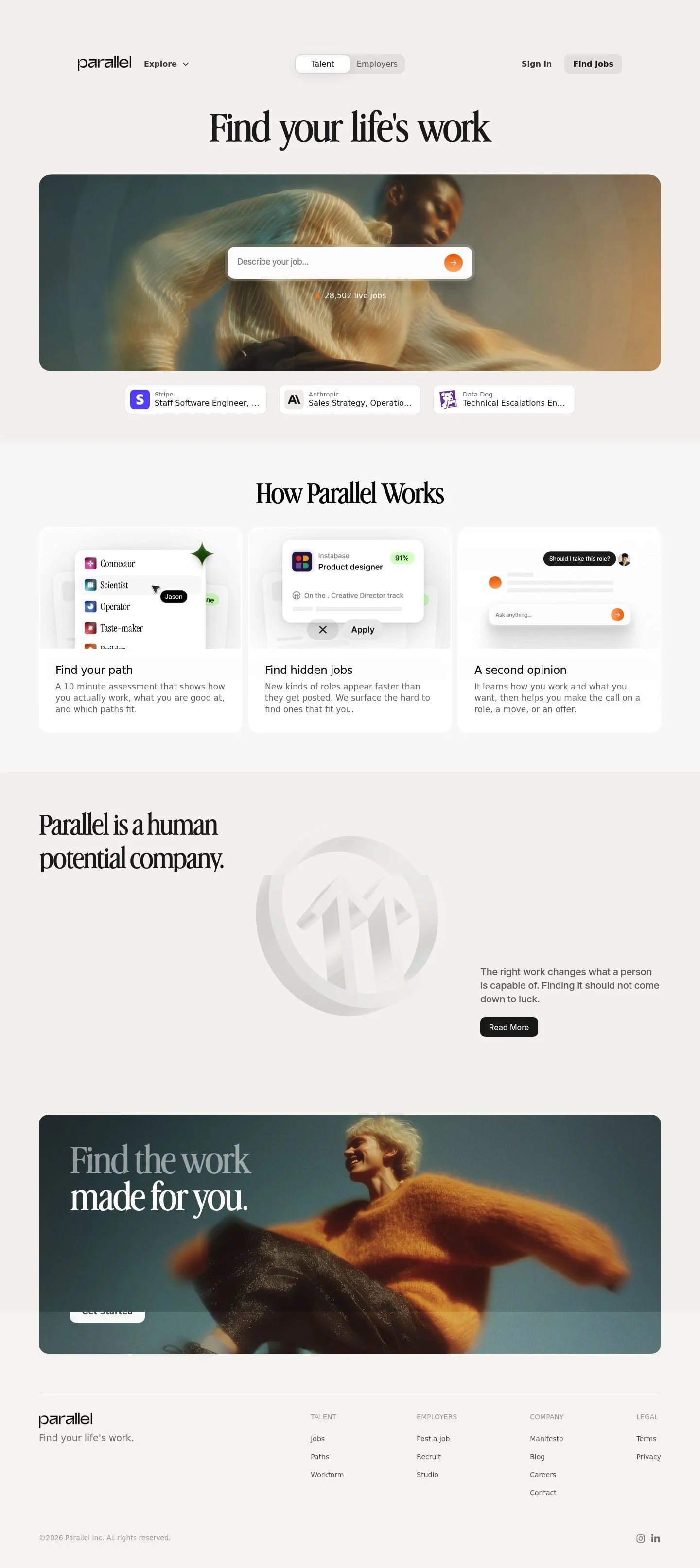
Parallel's UI aims for calm clarity: editorial headlines, restrained color, and soft paper-tinted surfaces. Audience is job seekers and employers; tone is confident, not flashy. Layout is spacious with tall pill controls and card clusters that scan quickly. When tokens don't cover a case, prefer the neutral surface, strong typographic hierarchy, and a single warm accent to guide actions.

## Colors

- **primary (#232323):** Deep ink for headlines and core text.
- **secondary (#f18f41):** Warm highlight for secondary accents and micro-badges.
- **tertiary (#ef6e07):** Signal orange for primary actions and focus states.
- **neutral (#fbfaf9):** Paper-white base for pages and cards.
- **brand-ancient-planks (#7c3c0c):** Aged umber for rare, high-contrast decorative marks.
- **brand-armor-wash (#040404):** Near-black reserved for overlays or dense iconography.
- **surface ({colors.neutral}):** Default container and page background.
- **on-surface ({colors.primary}):** Default text on the surface color.

## Typography

- Headlines (lg/md/sm): Advercase Demo at 68/47/33px, weight 400 with tight letter-spacing for a classic, editorial voice. This font is custom/self-hosted and not broadly available. Substitutes with similar contrast and presence: Playfair Display, Cormorant Garamond, or Libre Baskerville (all Google).
- Headline-xs: ui-sans-serif at 23px for compact subheads and section labels.
- Body: ui-sans-serif at 16px/1.5 for readable paragraphs and UI strings. ui-sans-serif maps to system UI stacks (e.g., San Francisco, Segoe UI, Roboto), so it is safe to use without loading. If a web font is needed, Inter or Source Sans 3 are suitable substitutes.
- Emoji: Noto Color Emoji (Google) provides consistent emoji rendering when used in chips or reactions.

## Layout

Spacing uses a short scale—6, 14, 24, 40, 60. Treat 24px as the base rhythm for gutters and card padding; 40–60px handle section padding and hero breathing room. Use 14px for compact gaps within components and 6px for micro-spacing between labels and icons. Grids tend to be 3-up feature cards collapsing to 2-up/1-up; keep gutters at 24px and align pill controls to the same vertical rhythm.

## Elevation & Depth

Depth is minimal. Only a very light sm shadow (rgba black at 4%) is used on interactive cards or the search input to lift them subtly from the paper surface. Most separation is achieved by whitespace, the paper-neutral background, and 1px hairlines in primary when needed. Avoid heavy shadows; medium and larger elevations are explicitly none.

## Shapes

Corners come in two voices: sm at 8px for cards and chips; full at 9999px for pill buttons, search fields, and segmented controls. Use full radius for any primary action or input to keep the tall-pill signature. Keep media and large containers at 8px to stay consistent.

## Components

- Button — Primary: #ef6e07 background, #000 text, 60px tall, pill radius, 12px x 19px padding. Use for primary CTAs like "Find Jobs" or "Get Started".
- Button — Secondary: #ffffff background, #000 text, 60px tall, pill radius. Use on neutral surfaces when a secondary action sits beside the primary.
- Button — Link: #232323 text, no radius. Use for inline navigational links like "Read More".
- Card: #fbfaf9 background, #232323 text, 8px radius, 16px padding, light sm shadow only when interactive.

Distinctive page components

### Global Navigation
- Left logo plus "Explore" dropdown; right-aligned audience switcher (Talent/Employers), Sign in, and a Find Jobs primary pill. Nav elements align to the 60px control height.

### Audience Switcher (Talent/Employers)
- Two pill options using secondary/neutral styling; text in #232323. Use full radius and 14px internal gaps.

### Hero Search Bar
- Centered headline paired with a wide, 60px-tall input. Submit affordance is a circular button using #ef6e07; placeholder text in #232323 at reduced opacity; include a small "Live jobs" label beneath.

### Job Chips Carousel
- Horizontal row of small cards showing company avatar and role title. Use Card styles with 8px radius and md (24px) gaps; apply sm shadow for hover/focus.

### "How Parallel Works" Steps
- Three cards in a row, each with a concise title and 1–2 lines of body copy. Use 33px Advercase for the section header and ui-sans-serif 16px for descriptions; 24px gutters.

### Mission Block
- Serif subhead ("Parallel is a human potential company.") with a short paragraph and a "Read More" link styled as Button—Link. Keep max-width to a comfortable reading measure.

### Closing CTA Banner
- Short serif line ("Find the work made for you.") and a primary pill button. Spacing xl (60px) top/bottom, centered layout.

### Footer
- Four link columns (Talent, Employers, Company, Legal) on the neutral surface. Use 16px body text, 24px vertical rhythm, and low-contrast dividers only if needed.

## Do's and Don'ts

- Do reserve #ef6e07 for primary actions, the search submit, and key status dots; overuse dilutes the guidance.
- Do match control heights at 60px so nav pills, the search field, and CTAs read as one system.
- Do keep cards at 8px radius and use the sm shadow sparingly—only on interactive elements.
- Don't introduce additional accent colors; use #f18f41 for softer highlights and keep text in #232323.
- Don't place long text on orange backgrounds; maintain contrast by using the neutral surface with on-surface text.
- Don't mix square and pill buttons in the same cluster; actions should share the full radius style.

## Agent Prompt Guide

Quick color reference
- Text: #232323
- Background: #fbfaf9
- Border: #232323
- Accent/Primary action: #ef6e07

1) Build the hero header and search
- Page background #fbfaf9. Center a headline in Advercase Demo 68px, weight 400, letter-spacing -0.03em, color #232323.
- Under it, a 60px-tall search input: 9999px radius, background #ffffff, 24px horizontal padding. Right-attached submit button is a 60px circle in #ef6e07 with a white icon. Place a small "Live jobs" label below in ui-sans-serif 16px, #232323.

2) Create the Audience Switcher
- Horizontal segmented control with two options (Talent, Employers). Each option: 60px height, 9999px radius, 12px x 19px padding, background #ffffff for the inactive, #ef6e07 only for the emphasized action when needed. Labels in ui-sans-serif 16px, #232323. Spacing between pills: 14px.

3) Design the "How It Works" grid
- Section header in Advercase Demo 47px, weight 400, color #232323, spacing below 24px.
- Three cards side-by-side: each card background #fbfaf9, 8px radius, 16px internal padding, optional sm shadow. Titles in Advercase 33px; body in ui-sans-serif 16px/1.5. Gutter between cards: 24px; section padding top/bottom: 60px.

4) Build job chips carousel
- Horizontal scroll area with 24px gap. Each chip uses Card styles (8px radius, #fbfaf9), contains a 32px square logo, title in ui-sans-serif 16px #232323, and subtle meta text beneath. Hover adds the sm shadow.

5) Compose the closing CTA banner
- Centered serif line in Advercase Demo 33px and a primary Button: #ef6e07 background, #000 text, height 60px, 9999px radius, 12px x 19px padding. Section padding 60px.

## Similar Brands

- Indeed: similarly neutral surfaces and clear search-first hero; Parallel uses a warmer single accent and an editorial serif for more brand character.
- LinkedIn Jobs: prioritizes function over style; Parallel is softer with pill controls and a stronger headline voice.
- Wellfound (AngelList Talent): shares the startup/job focus; Parallel is calmer, with fewer accents and taller pills.
- Greenhouse: ATS-first patterns and dense tables; Parallel favors consumer-grade cards and a single-CTA hero.

## Tokens

### CSS custom properties

```css
:root {
  /* Colors */
  --color-primary: #232323;
  --color-secondary: #f18f41;
  --color-tertiary: #ef6e07;
  --color-neutral: #fbfaf9;
  --color-brand-ancient-planks: #7c3c0c;
  --color-brand-armor-wash: #040404;
  --color-surface: var(--color-neutral);
  --color-on-surface: var(--color-primary);

  /* Typography */
  --text-headline-lg-size: 68px;
  --text-headline-lg-weight: 400;
  --text-headline-lg-leading: 1.14;
  --text-headline-lg-tracking: -0.03em;
  --text-headline-md-size: 47px;
  --text-headline-md-weight: 400;
  --text-headline-md-leading: 1.23;
  --text-headline-md-tracking: -0.02em;
  --text-headline-sm-size: 33px;
  --text-headline-sm-weight: 400;
  --text-headline-sm-leading: 1.6;
  --text-headline-sm-tracking: -0.029em;
  --text-headline-xs-size: 23px;
  --text-headline-xs-weight: 400;
  --text-headline-xs-leading: 1.22;
  --text-body-md-size: 16px;
  --text-body-md-weight: 400;
  --text-body-md-leading: 1.5;
  --font-advercase-demo: "Advercase Demo";
  --font-ui-sans-serif: "ui-sans-serif";

  /* Rounded */
  --radius-sm: 8px;
  --radius-full: 9999px;

  /* Spacing */
  --spacing-xs: 6px;
  --spacing-sm: 14px;
  --spacing-md: 24px;
  --spacing-lg: 40px;
  --spacing-xl: 60px;

  /* Components */
  --button-primary-background-color: var(--color-tertiary);
  --button-primary-text-color: #000000;
  --button-primary-rounded: var(--radius-full);
  --button-primary-padding: 12px 19px;
  --button-primary-height: 60px;
  --button-secondary-background-color: #ffffff;
  --button-secondary-text-color: #000000;
  --button-secondary-rounded: var(--radius-full);
  --button-secondary-padding: 12px 19px;
  --button-secondary-height: 60px;
  --button-link-text-color: var(--color-primary);
  --button-link-rounded: 0px;
  --card-background-color: var(--color-neutral);
  --card-text-color: var(--color-primary);
  --card-rounded: var(--radius-sm);
  --card-padding: 16px;
}
```

### Tailwind theme

```css
@theme {
  --color-primary: #232323;
  --color-secondary: #f18f41;
  --color-tertiary: #ef6e07;
  --color-neutral: #fbfaf9;
  --color-brand-ancient-planks: #7c3c0c;
  --color-brand-armor-wash: #040404;
  --color-surface: #fbfaf9;
  --color-on-surface: #232323;
  --font-headline-lg: "Advercase Demo";
  --font-headline-md: "Advercase Demo";
  --font-headline-sm: "Advercase Demo";
  --font-headline-xs: "ui-sans-serif";
  --font-body-md: "ui-sans-serif";
  --text-headline-lg: 68px;
  --text-headline-md: 47px;
  --text-headline-sm: 33px;
  --text-headline-xs: 23px;
  --text-body-md: 16px;
  --tracking-headline-lg: -0.03em;
  --tracking-headline-md: -0.02em;
  --tracking-headline-sm: -0.029em;
  --font-weight-headline-lg: 400;
  --font-weight-headline-md: 400;
  --font-weight-headline-sm: 400;
  --font-weight-headline-xs: 400;
  --font-weight-body-md: 400;
  --radius-sm: 8px;
  --radius-full: 9999px;
  --spacing-xs: 6px;
  --spacing-sm: 14px;
  --spacing-md: 24px;
  --spacing-lg: 40px;
  --spacing-xl: 60px;
}
```

### Design tokens (DTCG)

```json
{
    "$schema": "https://www.designtokens.org/schemas/2025.10/format.json",
    "color": {
        "$type": "color",
        "primary": {
            "$value": {
                "colorSpace": "srgb",
                "components": [
                    0.137,
                    0.137,
                    0.137
                ],
                "hex": "#232323"
            }
        },
        "secondary": {
            "$value": {
                "colorSpace": "srgb",
                "components": [
                    0.945,
                    0.561,
                    0.255
                ],
                "hex": "#f18f41"
            }
        },
        "tertiary": {
            "$value": {
                "colorSpace": "srgb",
                "components": [
                    0.937,
                    0.431,
                    0.027
                ],
                "hex": "#ef6e07"
            }
        },
        "neutral": {
            "$value": {
                "colorSpace": "srgb",
                "components": [
                    0.984,
                    0.98,
                    0.976
                ],
                "hex": "#fbfaf9"
            }
        },
        "brand-ancient-planks": {
            "$value": {
                "colorSpace": "srgb",
                "components": [
                    0.486,
                    0.235,
                    0.047
                ],
                "hex": "#7c3c0c"
            }
        },
        "brand-armor-wash": {
            "$value": {
                "colorSpace": "srgb",
                "components": [
                    0.016,
                    0.016,
                    0.016
                ],
                "hex": "#040404"
            }
        },
        "surface": {
            "$value": {
                "colorSpace": "srgb",
                "components": [
                    0.984,
                    0.98,
                    0.976
                ],
                "hex": "#fbfaf9"
            }
        },
        "on-surface": {
            "$value": {
                "colorSpace": "srgb",
                "components": [
                    0.137,
                    0.137,
                    0.137
                ],
                "hex": "#232323"
            }
        }
    },
    "spacing": {
        "$type": "dimension",
        "xs": {
            "$value": {
                "value": 6,
                "unit": "px"
            }
        },
        "sm": {
            "$value": {
                "value": 14,
                "unit": "px"
            }
        },
        "md": {
            "$value": {
                "value": 24,
                "unit": "px"
            }
        },
        "lg": {
            "$value": {
                "value": 40,
                "unit": "px"
            }
        },
        "xl": {
            "$value": {
                "value": 60,
                "unit": "px"
            }
        }
    },
    "rounded": {
        "$type": "dimension",
        "sm": {
            "$value": {
                "value": 8,
                "unit": "px"
            }
        },
        "full": {
            "$value": {
                "value": 9999,
                "unit": "px"
            }
        }
    },
    "typography": {
        "headline-lg": {
            "$type": "typography",
            "$value": {
                "fontFamily": "Advercase Demo",
                "fontSize": {
                    "value": 68,
                    "unit": "px"
                },
                "fontWeight": 400,
                "letterSpacing": {
                    "value": -0.03,
                    "unit": "em"
                }
            }
        },
        "headline-md": {
            "$type": "typography",
            "$value": {
                "fontFamily": "Advercase Demo",
                "fontSize": {
                    "value": 47,
                    "unit": "px"
                },
                "fontWeight": 400,
                "letterSpacing": {
                    "value": -0.02,
                    "unit": "em"
                }
            }
        },
        "headline-sm": {
            "$type": "typography",
            "$value": {
                "fontFamily": "Advercase Demo",
                "fontSize": {
                    "value": 33,
                    "unit": "px"
                },
                "fontWeight": 400,
                "letterSpacing": {
                    "value": -0.029,
                    "unit": "em"
                }
            }
        },
        "headline-xs": {
            "$type": "typography",
            "$value": {
                "fontFamily": "ui-sans-serif",
                "fontSize": {
                    "value": 23,
                    "unit": "px"
                },
                "fontWeight": 400
            }
        },
        "body-md": {
            "$type": "typography",
            "$value": {
                "fontFamily": "ui-sans-serif",
                "fontSize": {
                    "value": 16,
                    "unit": "px"
                },
                "fontWeight": 400
            }
        }
    }
}
```

## Rules

- **Fonts.** If the specification names a custom or self-hosted family, use one of the substitutes it names. Never reference a typeface you cannot actually load — it will fall back to a system font and undo the typography.
- **Colour.** Derive the palette from the user's brand. Use the token values as a guide to *relationships* — contrast, tint, how many accents carry the page — not as hex codes to paste.
- **Never reproduce** the wordmark, mascot, logo, brand name, illustrations, icon set, screenshots or any copy from the reference.
- **Never present the result as Parallel**, or imply any connection to it.
- If something is unspecified, choose clarity and legibility over decoration.
---
version: alpha
name: Parallel
description: Find the work made for you.
colors:
  primary: "#232323"
  secondary: "#f18f41"
  tertiary: "#ef6e07"
  neutral: "#fbfaf9"
  brand-ancient-planks: "#7c3c0c"
  brand-armor-wash: "#040404"
  surface: "{colors.neutral}"
  on-surface: "{colors.primary}"
typography:
  headline-lg:
    fontFamily: Advercase Demo
    fontSize: 68px
    fontWeight: 400
    lineHeight: 1.14
    letterSpacing: -0.03em
  headline-md:
    fontFamily: Advercase Demo
    fontSize: 47px
    fontWeight: 400
    lineHeight: 1.23
    letterSpacing: -0.02em
  headline-sm:
    fontFamily: Advercase Demo
    fontSize: 33px
    fontWeight: 400
    lineHeight: 1.6
    letterSpacing: -0.029em
  headline-xs:
    fontFamily: ui-sans-serif
    fontSize: 23px
    fontWeight: 400
    lineHeight: 1.22
  body-md:
    fontFamily: ui-sans-serif
    fontSize: 16px
    fontWeight: 400
    lineHeight: 1.5
rounded:
  sm: 8px
  full: 9999px
spacing:
  xs: 6px
  sm: 14px
  md: 24px
  lg: 40px
  xl: 60px
components:
  button-primary:
    backgroundColor: "{colors.tertiary}"
    textColor: "#000000"
    rounded: "{rounded.full}"
    padding: 12px 19px
    height: 60px
  button-secondary:
    backgroundColor: "#ffffff"
    textColor: "#000000"
    rounded: "{rounded.full}"
    padding: 12px 19px
    height: 60px
  button-link:
    textColor: "{colors.primary}"
    rounded: 0px
  card:
    backgroundColor: "{colors.neutral}"
    textColor: "{colors.primary}"
    rounded: "{rounded.sm}"
    padding: 16px
---

# Parallel: Big Serif Headlines and a Pill Job Search

## Overview

Parallel's UI aims for calm clarity: editorial headlines, restrained color, and soft paper-tinted surfaces. Audience is job seekers and employers; tone is confident, not flashy. Layout is spacious with tall pill controls and card clusters that scan quickly. When tokens don't cover a case, prefer the neutral surface, strong typographic hierarchy, and a single warm accent to guide actions.

## Colors

- **primary (#232323):** Deep ink for headlines and core text.
- **secondary (#f18f41):** Warm highlight for secondary accents and micro-badges.
- **tertiary (#ef6e07):** Signal orange for primary actions and focus states.
- **neutral (#fbfaf9):** Paper-white base for pages and cards.
- **brand-ancient-planks (#7c3c0c):** Aged umber for rare, high-contrast decorative marks.
- **brand-armor-wash (#040404):** Near-black reserved for overlays or dense iconography.
- **surface ({colors.neutral}):** Default container and page background.
- **on-surface ({colors.primary}):** Default text on the surface color.

## Typography

- Headlines (lg/md/sm): Advercase Demo at 68/47/33px, weight 400 with tight letter-spacing for a classic, editorial voice. This font is custom/self-hosted and not broadly available. Substitutes with similar contrast and presence: Playfair Display, Cormorant Garamond, or Libre Baskerville (all Google).
- Headline-xs: ui-sans-serif at 23px for compact subheads and section labels.
- Body: ui-sans-serif at 16px/1.5 for readable paragraphs and UI strings. ui-sans-serif maps to system UI stacks (e.g., San Francisco, Segoe UI, Roboto), so it is safe to use without loading. If a web font is needed, Inter or Source Sans 3 are suitable substitutes.
- Emoji: Noto Color Emoji (Google) provides consistent emoji rendering when used in chips or reactions.

## Layout

Spacing uses a short scale—6, 14, 24, 40, 60. Treat 24px as the base rhythm for gutters and card padding; 40–60px handle section padding and hero breathing room. Use 14px for compact gaps within components and 6px for micro-spacing between labels and icons. Grids tend to be 3-up feature cards collapsing to 2-up/1-up; keep gutters at 24px and align pill controls to the same vertical rhythm.

## Elevation & Depth

Depth is minimal. Only a very light sm shadow (rgba black at 4%) is used on interactive cards or the search input to lift them subtly from the paper surface. Most separation is achieved by whitespace, the paper-neutral background, and 1px hairlines in primary when needed. Avoid heavy shadows; medium and larger elevations are explicitly none.

## Shapes

Corners come in two voices: sm at 8px for cards and chips; full at 9999px for pill buttons, search fields, and segmented controls. Use full radius for any primary action or input to keep the tall-pill signature. Keep media and large containers at 8px to stay consistent.

## Components

- Button — Primary: #ef6e07 background, #000 text, 60px tall, pill radius, 12px x 19px padding. Use for primary CTAs like "Find Jobs" or "Get Started".
- Button — Secondary: #ffffff background, #000 text, 60px tall, pill radius. Use on neutral surfaces when a secondary action sits beside the primary.
- Button — Link: #232323 text, no radius. Use for inline navigational links like "Read More".
- Card: #fbfaf9 background, #232323 text, 8px radius, 16px padding, light sm shadow only when interactive.

Distinctive page components

### Global Navigation
- Left logo plus "Explore" dropdown; right-aligned audience switcher (Talent/Employers), Sign in, and a Find Jobs primary pill. Nav elements align to the 60px control height.

### Audience Switcher (Talent/Employers)
- Two pill options using secondary/neutral styling; text in #232323. Use full radius and 14px internal gaps.

### Hero Search Bar
- Centered headline paired with a wide, 60px-tall input. Submit affordance is a circular button using #ef6e07; placeholder text in #232323 at reduced opacity; include a small "Live jobs" label beneath.

### Job Chips Carousel
- Horizontal row of small cards showing company avatar and role title. Use Card styles with 8px radius and md (24px) gaps; apply sm shadow for hover/focus.

### "How Parallel Works" Steps
- Three cards in a row, each with a concise title and 1–2 lines of body copy. Use 33px Advercase for the section header and ui-sans-serif 16px for descriptions; 24px gutters.

### Mission Block
- Serif subhead ("Parallel is a human potential company.") with a short paragraph and a "Read More" link styled as Button—Link. Keep max-width to a comfortable reading measure.

### Closing CTA Banner
- Short serif line ("Find the work made for you.") and a primary pill button. Spacing xl (60px) top/bottom, centered layout.

### Footer
- Four link columns (Talent, Employers, Company, Legal) on the neutral surface. Use 16px body text, 24px vertical rhythm, and low-contrast dividers only if needed.

## Do's and Don'ts

- Do reserve #ef6e07 for primary actions, the search submit, and key status dots; overuse dilutes the guidance.
- Do match control heights at 60px so nav pills, the search field, and CTAs read as one system.
- Do keep cards at 8px radius and use the sm shadow sparingly—only on interactive elements.
- Don't introduce additional accent colors; use #f18f41 for softer highlights and keep text in #232323.
- Don't place long text on orange backgrounds; maintain contrast by using the neutral surface with on-surface text.
- Don't mix square and pill buttons in the same cluster; actions should share the full radius style.

## Agent Prompt Guide

Quick color reference
- Text: #232323
- Background: #fbfaf9
- Border: #232323
- Accent/Primary action: #ef6e07

1) Build the hero header and search
- Page background #fbfaf9. Center a headline in Advercase Demo 68px, weight 400, letter-spacing -0.03em, color #232323.
- Under it, a 60px-tall search input: 9999px radius, background #ffffff, 24px horizontal padding. Right-attached submit button is a 60px circle in #ef6e07 with a white icon. Place a small "Live jobs" label below in ui-sans-serif 16px, #232323.

2) Create the Audience Switcher
- Horizontal segmented control with two options (Talent, Employers). Each option: 60px height, 9999px radius, 12px x 19px padding, background #ffffff for the inactive, #ef6e07 only for the emphasized action when needed. Labels in ui-sans-serif 16px, #232323. Spacing between pills: 14px.

3) Design the "How It Works" grid
- Section header in Advercase Demo 47px, weight 400, color #232323, spacing below 24px.
- Three cards side-by-side: each card background #fbfaf9, 8px radius, 16px internal padding, optional sm shadow. Titles in Advercase 33px; body in ui-sans-serif 16px/1.5. Gutter between cards: 24px; section padding top/bottom: 60px.

4) Build job chips carousel
- Horizontal scroll area with 24px gap. Each chip uses Card styles (8px radius, #fbfaf9), contains a 32px square logo, title in ui-sans-serif 16px #232323, and subtle meta text beneath. Hover adds the sm shadow.

5) Compose the closing CTA banner
- Centered serif line in Advercase Demo 33px and a primary Button: #ef6e07 background, #000 text, height 60px, 9999px radius, 12px x 19px padding. Section padding 60px.

## Similar Brands

- Indeed: similarly neutral surfaces and clear search-first hero; Parallel uses a warmer single accent and an editorial serif for more brand character.
- LinkedIn Jobs: prioritizes function over style; Parallel is softer with pill controls and a stronger headline voice.
- Wellfound (AngelList Talent): shares the startup/job focus; Parallel is calmer, with fewer accents and taller pills.
- Greenhouse: ATS-first patterns and dense tables; Parallel favors consumer-grade cards and a single-CTA hero.
:root {
  /* Colors */
  --color-primary: #232323;
  --color-secondary: #f18f41;
  --color-tertiary: #ef6e07;
  --color-neutral: #fbfaf9;
  --color-brand-ancient-planks: #7c3c0c;
  --color-brand-armor-wash: #040404;
  --color-surface: var(--color-neutral);
  --color-on-surface: var(--color-primary);

  /* Typography */
  --text-headline-lg-size: 68px;
  --text-headline-lg-weight: 400;
  --text-headline-lg-leading: 1.14;
  --text-headline-lg-tracking: -0.03em;
  --text-headline-md-size: 47px;
  --text-headline-md-weight: 400;
  --text-headline-md-leading: 1.23;
  --text-headline-md-tracking: -0.02em;
  --text-headline-sm-size: 33px;
  --text-headline-sm-weight: 400;
  --text-headline-sm-leading: 1.6;
  --text-headline-sm-tracking: -0.029em;
  --text-headline-xs-size: 23px;
  --text-headline-xs-weight: 400;
  --text-headline-xs-leading: 1.22;
  --text-body-md-size: 16px;
  --text-body-md-weight: 400;
  --text-body-md-leading: 1.5;
  --font-advercase-demo: "Advercase Demo";
  --font-ui-sans-serif: "ui-sans-serif";

  /* Rounded */
  --radius-sm: 8px;
  --radius-full: 9999px;

  /* Spacing */
  --spacing-xs: 6px;
  --spacing-sm: 14px;
  --spacing-md: 24px;
  --spacing-lg: 40px;
  --spacing-xl: 60px;

  /* Components */
  --button-primary-background-color: var(--color-tertiary);
  --button-primary-text-color: #000000;
  --button-primary-rounded: var(--radius-full);
  --button-primary-padding: 12px 19px;
  --button-primary-height: 60px;
  --button-secondary-background-color: #ffffff;
  --button-secondary-text-color: #000000;
  --button-secondary-rounded: var(--radius-full);
  --button-secondary-padding: 12px 19px;
  --button-secondary-height: 60px;
  --button-link-text-color: var(--color-primary);
  --button-link-rounded: 0px;
  --card-background-color: var(--color-neutral);
  --card-text-color: var(--color-primary);
  --card-rounded: var(--radius-sm);
  --card-padding: 16px;
}
{
  "$schema": "https://www.designtokens.org/schemas/2025.10/format.json",
  "$description": "Find the work made for you.",
  "color": {
    "$type": "color",
    "primary": {
      "$value": {
        "colorSpace": "srgb",
        "components": [
          0.137,
          0.137,
          0.137
        ],
        "hex": "#232323"
      }
    },
    "secondary": {
      "$value": {
        "colorSpace": "srgb",
        "components": [
          0.945,
          0.561,
          0.255
        ],
        "hex": "#f18f41"
      }
    },
    "tertiary": {
      "$value": {
        "colorSpace": "srgb",
        "components": [
          0.937,
          0.431,
          0.027
        ],
        "hex": "#ef6e07"
      }
    },
    "neutral": {
      "$value": {
        "colorSpace": "srgb",
        "components": [
          0.984,
          0.98,
          0.976
        ],
        "hex": "#fbfaf9"
      }
    },
    "brand-ancient-planks": {
      "$value": {
        "colorSpace": "srgb",
        "components": [
          0.486,
          0.235,
          0.047
        ],
        "hex": "#7c3c0c"
      }
    },
    "brand-armor-wash": {
      "$value": {
        "colorSpace": "srgb",
        "components": [
          0.016,
          0.016,
          0.016
        ],
        "hex": "#040404"
      }
    },
    "surface": {
      "$value": {
        "colorSpace": "srgb",
        "components": [
          0.984,
          0.98,
          0.976
        ],
        "hex": "#fbfaf9"
      }
    },
    "on-surface": {
      "$value": {
        "colorSpace": "srgb",
        "components": [
          0.137,
          0.137,
          0.137
        ],
        "hex": "#232323"
      }
    }
  },
  "spacing": {
    "$type": "dimension",
    "xs": {
      "$value": {
        "value": 6,
        "unit": "px"
      }
    },
    "sm": {
      "$value": {
        "value": 14,
        "unit": "px"
      }
    },
    "md": {
      "$value": {
        "value": 24,
        "unit": "px"
      }
    },
    "lg": {
      "$value": {
        "value": 40,
        "unit": "px"
      }
    },
    "xl": {
      "$value": {
        "value": 60,
        "unit": "px"
      }
    }
  },
  "rounded": {
    "$type": "dimension",
    "sm": {
      "$value": {
        "value": 8,
        "unit": "px"
      }
    },
    "full": {
      "$value": {
        "value": 9999,
        "unit": "px"
      }
    }
  },
  "typography": {
    "headline-lg": {
      "$type": "typography",
      "$value": {
        "fontFamily": "Advercase Demo",
        "fontSize": {
          "value": 68,
          "unit": "px"
        },
        "fontWeight": 400,
        "letterSpacing": {
          "value": -0.03,
          "unit": "em"
        }
      }
    },
    "headline-md": {
      "$type": "typography",
      "$value": {
        "fontFamily": "Advercase Demo",
        "fontSize": {
          "value": 47,
          "unit": "px"
        },
        "fontWeight": 400,
        "letterSpacing": {
          "value": -0.02,
          "unit": "em"
        }
      }
    },
    "headline-sm": {
      "$type": "typography",
      "$value": {
        "fontFamily": "Advercase Demo",
        "fontSize": {
          "value": 33,
          "unit": "px"
        },
        "fontWeight": 400,
        "letterSpacing": {
          "value": -0.029,
          "unit": "em"
        }
      }
    },
    "headline-xs": {
      "$type": "typography",
      "$value": {
        "fontFamily": "ui-sans-serif",
        "fontSize": {
          "value": 23,
          "unit": "px"
        },
        "fontWeight": 400
      }
    },
    "body-md": {
      "$type": "typography",
      "$value": {
        "fontFamily": "ui-sans-serif",
        "fontSize": {
          "value": 16,
          "unit": "px"
        },
        "fontWeight": 400
      }
    }
  }
}
@theme {
--color-primary: #232323;
--color-secondary: #f18f41;
--color-tertiary: #ef6e07;
--color-neutral: #fbfaf9;
--color-brand-ancient-planks: #7c3c0c;
--color-brand-armor-wash: #040404;
--color-surface: #fbfaf9;
--color-on-surface: #232323;
--font-headline-lg: "Advercase Demo";
--font-headline-md: "Advercase Demo";
--font-headline-sm: "Advercase Demo";
--font-headline-xs: "ui-sans-serif";
--font-body-md: "ui-sans-serif";
--text-headline-lg: 68px;
--text-headline-md: 47px;
--text-headline-sm: 33px;
--text-headline-xs: 23px;
--text-body-md: 16px;
--tracking-headline-lg: -0.03em;
--tracking-headline-md: -0.02em;
--tracking-headline-sm: -0.029em;
--font-weight-headline-lg: 400;
--font-weight-headline-md: 400;
--font-weight-headline-sm: 400;
--font-weight-headline-xs: 400;
--font-weight-body-md: 400;
--radius-sm: 8px;
--radius-full: 9999px;
--spacing-xs: 6px;
--spacing-sm: 14px;
--spacing-md: 24px;
--spacing-lg: 40px;
--spacing-xl: 60px;
} # Design brief: the Parallel design language
Below is a complete design specification measured from a real, published web page. Use it as a design language for the user's product. It is not a page to reproduce.
## Reference images
- Full page: https://cdn.designmunk.com/2026/09/04175303/useparallel-com-featured.webp
- Above the fold: https://cdn.designmunk.com/2026/09/04175303/useparallel-com-featured.webp
- On DesignMunk: https://designmunk.com/parallel/
Study these for hierarchy, rhythm, spacing and density. Where an image and the written spec disagree, the spec wins: the tokens were read from the page's own CSS, the images are one rendering of it.
## Before you start
Ask the user what they are building, who it is for, and what brand assets they already have — name, colours, typefaces. Wait for their answers before writing anything. Everything below is then applied to their product, not to the reference.
## Design specification
# Parallel: Big Serif Headlines and a Pill Job Search
## Overview
Parallel's UI aims for calm clarity: editorial headlines, restrained color, and soft paper-tinted surfaces. Audience is job seekers and employers; tone is confident, not flashy. Layout is spacious with tall pill controls and card clusters that scan quickly. When tokens don't cover a case, prefer the neutral surface, strong typographic hierarchy, and a single warm accent to guide actions.
## Colors
- **primary (#232323):** Deep ink for headlines and core text.
- **secondary (#f18f41):** Warm highlight for secondary accents and micro-badges.
- **tertiary (#ef6e07):** Signal orange for primary actions and focus states.
- **neutral (#fbfaf9):** Paper-white base for pages and cards.
- **brand-ancient-planks (#7c3c0c):** Aged umber for rare, high-contrast decorative marks.
- **brand-armor-wash (#040404):** Near-black reserved for overlays or dense iconography.
- **surface ({colors.neutral}):** Default container and page background.
- **on-surface ({colors.primary}):** Default text on the surface color.
## Typography
- Headlines (lg/md/sm): Advercase Demo at 68/47/33px, weight 400 with tight letter-spacing for a classic, editorial voice. This font is custom/self-hosted and not broadly available. Substitutes with similar contrast and presence: Playfair Display, Cormorant Garamond, or Libre Baskerville (all Google).
- Headline-xs: ui-sans-serif at 23px for compact subheads and section labels.
- Body: ui-sans-serif at 16px/1.5 for readable paragraphs and UI strings. ui-sans-serif maps to system UI stacks (e.g., San Francisco, Segoe UI, Roboto), so it is safe to use without loading. If a web font is needed, Inter or Source Sans 3 are suitable substitutes.
- Emoji: Noto Color Emoji (Google) provides consistent emoji rendering when used in chips or reactions.
## Layout
Spacing uses a short scale—6, 14, 24, 40, 60. Treat 24px as the base rhythm for gutters and card padding; 40–60px handle section padding and hero breathing room. Use 14px for compact gaps within components and 6px for micro-spacing between labels and icons. Grids tend to be 3-up feature cards collapsing to 2-up/1-up; keep gutters at 24px and align pill controls to the same vertical rhythm.
## Elevation & Depth
Depth is minimal. Only a very light sm shadow (rgba black at 4%) is used on interactive cards or the search input to lift them subtly from the paper surface. Most separation is achieved by whitespace, the paper-neutral background, and 1px hairlines in primary when needed. Avoid heavy shadows; medium and larger elevations are explicitly none.
## Shapes
Corners come in two voices: sm at 8px for cards and chips; full at 9999px for pill buttons, search fields, and segmented controls. Use full radius for any primary action or input to keep the tall-pill signature. Keep media and large containers at 8px to stay consistent.
## Components
- Button — Primary: #ef6e07 background, #000 text, 60px tall, pill radius, 12px x 19px padding. Use for primary CTAs like "Find Jobs" or "Get Started".
- Button — Secondary: #ffffff background, #000 text, 60px tall, pill radius. Use on neutral surfaces when a secondary action sits beside the primary.
- Button — Link: #232323 text, no radius. Use for inline navigational links like "Read More".
- Card: #fbfaf9 background, #232323 text, 8px radius, 16px padding, light sm shadow only when interactive.
Distinctive page components
### Global Navigation
- Left logo plus "Explore" dropdown; right-aligned audience switcher (Talent/Employers), Sign in, and a Find Jobs primary pill. Nav elements align to the 60px control height.
### Audience Switcher (Talent/Employers)
- Two pill options using secondary/neutral styling; text in #232323. Use full radius and 14px internal gaps.
### Hero Search Bar
- Centered headline paired with a wide, 60px-tall input. Submit affordance is a circular button using #ef6e07; placeholder text in #232323 at reduced opacity; include a small "Live jobs" label beneath.
### Job Chips Carousel
- Horizontal row of small cards showing company avatar and role title. Use Card styles with 8px radius and md (24px) gaps; apply sm shadow for hover/focus.
### "How Parallel Works" Steps
- Three cards in a row, each with a concise title and 1–2 lines of body copy. Use 33px Advercase for the section header and ui-sans-serif 16px for descriptions; 24px gutters.
### Mission Block
- Serif subhead ("Parallel is a human potential company.") with a short paragraph and a "Read More" link styled as Button—Link. Keep max-width to a comfortable reading measure.
### Closing CTA Banner
- Short serif line ("Find the work made for you.") and a primary pill button. Spacing xl (60px) top/bottom, centered layout.
### Footer
- Four link columns (Talent, Employers, Company, Legal) on the neutral surface. Use 16px body text, 24px vertical rhythm, and low-contrast dividers only if needed.
## Do's and Don'ts
- Do reserve #ef6e07 for primary actions, the search submit, and key status dots; overuse dilutes the guidance.
- Do match control heights at 60px so nav pills, the search field, and CTAs read as one system.
- Do keep cards at 8px radius and use the sm shadow sparingly—only on interactive elements.
- Don't introduce additional accent colors; use #f18f41 for softer highlights and keep text in #232323.
- Don't place long text on orange backgrounds; maintain contrast by using the neutral surface with on-surface text.
- Don't mix square and pill buttons in the same cluster; actions should share the full radius style.
## Agent Prompt Guide
Quick color reference
- Text: #232323
- Background: #fbfaf9
- Border: #232323
- Accent/Primary action: #ef6e07
1) Build the hero header and search
- Page background #fbfaf9. Center a headline in Advercase Demo 68px, weight 400, letter-spacing -0.03em, color #232323.
- Under it, a 60px-tall search input: 9999px radius, background #ffffff, 24px horizontal padding. Right-attached submit button is a 60px circle in #ef6e07 with a white icon. Place a small "Live jobs" label below in ui-sans-serif 16px, #232323.
2) Create the Audience Switcher
- Horizontal segmented control with two options (Talent, Employers). Each option: 60px height, 9999px radius, 12px x 19px padding, background #ffffff for the inactive, #ef6e07 only for the emphasized action when needed. Labels in ui-sans-serif 16px, #232323. Spacing between pills: 14px.
3) Design the "How It Works" grid
- Section header in Advercase Demo 47px, weight 400, color #232323, spacing below 24px.
- Three cards side-by-side: each card background #fbfaf9, 8px radius, 16px internal padding, optional sm shadow. Titles in Advercase 33px; body in ui-sans-serif 16px/1.5. Gutter between cards: 24px; section padding top/bottom: 60px.
4) Build job chips carousel
- Horizontal scroll area with 24px gap. Each chip uses Card styles (8px radius, #fbfaf9), contains a 32px square logo, title in ui-sans-serif 16px #232323, and subtle meta text beneath. Hover adds the sm shadow.
5) Compose the closing CTA banner
- Centered serif line in Advercase Demo 33px and a primary Button: #ef6e07 background, #000 text, height 60px, 9999px radius, 12px x 19px padding. Section padding 60px.
## Tokens
### CSS custom properties
```css
:root {
/* Colors */
--color-primary: #232323;
--color-secondary: #f18f41;
--color-tertiary: #ef6e07;
--color-neutral: #fbfaf9;
--color-brand-ancient-planks: #7c3c0c;
--color-brand-armor-wash: #040404;
--color-surface: var(--color-neutral);
--color-on-surface: var(--color-primary);
/* Typography */
--text-headline-lg-size: 68px;
--text-headline-lg-weight: 400;
--text-headline-lg-leading: 1.14;
--text-headline-lg-tracking: -0.03em;
--text-headline-md-size: 47px;
--text-headline-md-weight: 400;
--text-headline-md-leading: 1.23;
--text-headline-md-tracking: -0.02em;
--text-headline-sm-size: 33px;
--text-headline-sm-weight: 400;
--text-headline-sm-leading: 1.6;
--text-headline-sm-tracking: -0.029em;
--text-headline-xs-size: 23px;
--text-headline-xs-weight: 400;
--text-headline-xs-leading: 1.22;
--text-body-md-size: 16px;
--text-body-md-weight: 400;
--text-body-md-leading: 1.5;
--font-advercase-demo: "Advercase Demo";
--font-ui-sans-serif: "ui-sans-serif";
/* Rounded */
--radius-sm: 8px;
--radius-full: 9999px;
/* Spacing */
--spacing-xs: 6px;
--spacing-sm: 14px;
--spacing-md: 24px;
--spacing-lg: 40px;
--spacing-xl: 60px;
/* Components */
--button-primary-background-color: var(--color-tertiary);
--button-primary-text-color: #000000;
--button-primary-rounded: var(--radius-full);
--button-primary-padding: 12px 19px;
--button-primary-height: 60px;
--button-secondary-background-color: #ffffff;
--button-secondary-text-color: #000000;
--button-secondary-rounded: var(--radius-full);
--button-secondary-padding: 12px 19px;
--button-secondary-height: 60px;
--button-link-text-color: var(--color-primary);
--button-link-rounded: 0px;
--card-background-color: var(--color-neutral);
--card-text-color: var(--color-primary);
--card-rounded: var(--radius-sm);
--card-padding: 16px;
}
```
## Rules
- **Fonts.** If the specification names a custom or self-hosted family, use one of the substitutes it names. Never reference a typeface you cannot actually load — it will fall back to a system font and undo the typography.
- **Colour.** Derive the palette from the user's brand. Use the token values as a guide to *relationships* — contrast, tint, how many accents carry the page — not as hex codes to paste.
- **Never reproduce** the wordmark, mascot, logo, brand name, illustrations, icon set, screenshots or any copy from the reference.
- **Never present the result as Parallel**, or imply any connection to it.
- If something is unspecified, choose clarity and legibility over decoration.