panxo.com

AI Breakdown
Design export
# Design brief: the Panxo design language

Below is a complete design specification measured from a real, published web page. Use it as a design language for the user's product. It is not a page to reproduce.

## Reference images

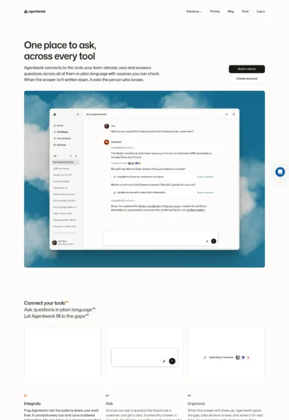
- Full page: https://cdn.designmunk.com/2026/09/30105220/panxo-com-featured.webp
- Above the fold: https://cdn.designmunk.com/2026/09/30105220/panxo-com-featured-1440x900.webp
- On DesignMunk: https://designmunk.com/panxo/

Study these for hierarchy, rhythm, spacing and density. Where an image and the written spec disagree, the spec wins: the tokens were read from the page's own CSS, the images are one rendering of it.

## Before you start

Ask the user what they are building, who it is for, and what brand assets they already have — name, colours, typefaces. Wait for their answers before writing anything. Everything below is then applied to their product, not to the reference.

## Design specification

# Panxo: Product-led hero and repeating 12px cards

## Overview

Product-forward, analytical, and calm. The interface relies on neutral surfaces with a single blue accent to keep focus on data and actions. Spacing is generous at section starts and contracts inside dense, data-heavy bands. Tone should feel enterprise-ready but approachable — concise copy, predictable modules, and minimal ornament.

## Page Structure

- Top announcement bar: full-width strip with a single line of small text and inline link buttons.
- Global header: compact nav with product menus left, solution links centered, and auth + primary CTA right; light surface with thin dividers.
- Hero: two-column layout — oversized headline at left and short lead at right; stacked CTA pair; a wide product demo panel sits below with rounded corners and a floating callout.
- Social proof/KPI row: a heading followed by a row of metric tiles in cards; compact, evenly spaced.
- AI Audiences explainer: text-forward band with a lead, CTA, and small stat chips; airy.
- Detection to Demand: product explainer with short paragraphs, a 4-field spec strip, and a secondary CTA; medium density.
- The Gap (problem grid): multi-column row of issues with short headings and copy blocks; includes a compact search UI sample.
- Premium Demand (ad showcase): a row of advertiser cards with logos, short copy, primary CTA, and a small "Why this ad?" link.
- For Search: side-by-side product comparison strip and three large numeric badges.
- Marketplace directory: directory heading, filters, and a vertically stacked list of publisher profile cards.
- Insights/blog: a row of article teasers in cards with metadata and links.
- Final CTA band: centered headline, two CTAs; then an extensive footer in multi-column layout.

## Colors

- Primary (#1c1a17): Primary ink for headlines, body text, and icons.
- Secondary (#7c7c7c): Muted text for metadata, captions, and secondary labels.
- Tertiary (#0000ee): Accent and interactive color for links and actions.
- Neutral (#fafafa): Site background and section surfaces.
- brand-brainstem-grey (#b4b4b4): Subtle borders, dividers, and quiet UI chrome.
- surface ({colors.neutral} → #fafafa): Default page surface token for containers.
- on-surface ({colors.primary} → #1c1a17): Foreground ink used on light surfaces.

## Typography

- Headline-lg (sans-serif, 40px, 700, 1.2): Display headline for heroes and section intros. Uses the system sans stack defined by the environment.
- Headline-md (Mona Sans, 31px, 500, 1.55, -0.013em): Primary section headings and key statements. Mona Sans is self-hosted/custom; substitutes: Manrope (Google), Outfit (Google), Public Sans (Google).
- Headline-sm (Mona Sans, 24px, 500, 2, -0.067em): Subheads inside cards and dense sections. If Mona Sans unavailable, use Manrope/Outfit/Public Sans.
- Headline-xs (Mona Sans, 18px, 500, 1.6, -0.053em): Labels, metric headings, and UI titles.
- Body-md (Inter, Google, 14px, 400, 1.43, -0.01em): Paragraphs, list items, and UI help text. Inter is freely available via Google Fonts and should be the default body family across the site.

## Layout

- Spacing scale is compact-to-generous: 6, 14, 24, 40, 88. Use xl (88px) for section top/bottom padding in hero or major transitions; lg (40px) for standard section rhythm; md (24px) for card padding and intra-section gaps; sm/xs for UI controls.
- Content sits in a centered column with roomy side gutters; cards and tiles align to this spine. Rows of cards use consistent md (24px) gaps and wrap as needed without forcing a fixed column count.
- Headlines and CTA pairs create the vertical rhythm: headline → short lead → CTAs → supporting media or cards, with increasing spacing below heavier elements.

## Elevation & Depth

- Shadows are minimal. Only the sm shadow is used: rgba multi-cast for subtle lift on floating cards and the hero demo panel. All larger shadow tiers are none; hierarchy is primarily established through whitespace, tone (neutral vs white), and thin borders in brand-brainstem-grey.

## Shapes

- Radius language is clear and semantic: cards at 12px (sm) for structure; secondary controls at 20px (md) for friendliness; primary CTAs at 48px (lg) for unmistakable, pill-shaped actions. Large media frames mirror card radii for consistency.

## Components

- Buttons
  - Primary: background #1c1a17, text #0000ee, 48px radius, 34px height, 7px 12px padding. Use for the main action in a section, typically paired with a secondary.
  - Secondary: text #1c1a17 on neutral surface, 20px radius, 34px height, 7px 12px padding. Use as the quiet alternative.
  - Link: text #1c1a17, radius 0; relies on typography and the #0000ee accent for affordance.
- Card: white background, 12px radius, 24px internal padding, subtle sm shadow when elevated; use for metrics, list items, teasers, and UI demos.

### Global Header
Compact top nav on #fafafa with thin dividers (#b4b4b4). Left-aligned product menus, centered solution links, and right-aligned auth + a primary pill CTA (34px tall). Keep link color #0000ee for hover/active.

### Hero Demo Panel
A wide media frame with 12px corners placed under the hero copy. Contains a row of compact chips (md radius) and a floating annotation card using the sm shadow for lift. Maintain md (24px) internal spacing and lg (40px) separation from the CTAs above.

### Capability Tabs
A horizontal row of four chips ("Identification, Classification, Segmentation, Monetization") behaving like segmented controls. Use md (20px) radii, md (24px) gaps, and #1c1a17 text; active/hover may adopt #0000ee accents.

### KPI Metric Tiles
A row of small cards (12px radius, 24px padding) each with a short label (headline-xs) and a large value. Use secondary gray (#7c7c7c) for labels and primary ink for values; equal widths on desktop, stack on mobile.

### Problem Grid
A multi-column band listing issues with short headings (headline-sm) and body (Inter 14px). Use md gaps between items and avoid imagery; clarity over decoration.

### Advertiser Showcase Cards
Three brand ads in a horizontal row. Each uses a logo/initial block, a brief two-line pitch, and a small primary CTA. Cards are white with 12px radius and md padding; include a quiet "Why this ad?" link using #0000ee.

### For Search Comparison Strip
Side-by-side UI mockup with three large performance badges below (e.g., 5x, $15+, 96%). Badges can be 12px cards or stroked pills; keep values in headline-sm with secondary captions.

### Marketplace Directory List Item
A dense card with favicon/initial, domain, company, flag, category, and three right-aligned stats. Use a 12px card with md (24px) internal grid and thin separators in #b4b4b4 for sub-rows.

### Final CTA Band
Centered headline (headline-md), brief body, and a primary + secondary CTA pair. Use xl vertical padding and keep buttons horizontally paired with md gap.

## Do's and Don'ts

- Do reserve #0000ee for links and key actions; keep most text in #1c1a17 and secondary copy in #7c7c7c.
- Do use 12px cards with 24px padding for metrics, ads, and directory items to maintain visual rhythm.
- Do keep primary CTAs at 34px height with a 48px radius; pair them with a quieter secondary when two actions appear.
- Don't introduce heavy shadows; use the sm shadow sparingly and rely on whitespace and borders instead.
- Don't stack more than one dense grid in a single band; separate complex content with lg/xl vertical spacing.
- Don't add new accent colors; the system assumes a single blue accent for interaction.

## Agent Prompt Guide

Quick color reference — Text: #1c1a17; Background: #fafafa (cards: #ffffff); Border: #b4b4b4; Accent: #0000ee.

1) Hero with Demo Panel
- Container: background #fafafa; top/bottom padding 88px; center max-width.
- H1: 40px/1.2, 700, system-ui or Manrope (as Mona Sans substitute), color #1c1a17.
- Lead: Inter 14px/1.43, color #7c7c7c, max-width ~60ch.
- Buttons: primary — bg #1c1a17, text #0000ee, radius 48px, height 34px, padding 7px 12px; secondary — text #1c1a17, radius 20px.
- Demo panel: white card, radius 12px, padding 24px, sm shadow.

2) KPI Metric Row
- Layout: a row of equal-width 12px cards with 24px padding and 24px gaps.
- Label: headline-xs (18px/1.6, 500) in #7c7c7c.
- Value: headline-sm (24px/2, 500) in #1c1a17; optional accent for units in #0000ee.

3) Problem Grid Section
- Section padding 40px top/bottom; background #fafafa.
- Each item: title 24px/2, 500 (Manrope or system), body Inter 14px/1.43.
- Use thin dividers or 24px gaps; links in #0000ee only.

4) Final CTA Band
- Background #fafafa; padding 88px.
- Title: 31px/1.55, 500; body Inter 14px/1.43 centered.
- Buttons: primary pill (as above) then secondary with 20px radius; 24px gap between.

## Similar Brands

- The Trade Desk: similarly restrained, data-first layout with neutral surfaces; Panxo is lighter on corporate chrome and uses a simpler card rhythm.
- Segment (Twilio): modular cards and generous spacing; Panxo runs a narrower palette and more compact body type.
- Snowflake: enterprise clarity with white cards and blue accents; Panxo is less illustrative and leans on product demos and badges.
- Clearbit: crisp metrics and directory-like listings; Panxo's directory is denser and more utilitarian.

## Tokens

### CSS custom properties

```css
:root {
  /* Colors */
  --color-primary: #1c1a17;
  --color-secondary: #7c7c7c;
  --color-tertiary: #0000ee;
  --color-neutral: #fafafa;
  --color-brand-brainstem-grey: #b4b4b4;
  --color-surface: var(--color-neutral);
  --color-on-surface: var(--color-primary);

  /* Typography */
  --text-headline-lg-size: 40px;
  --text-headline-lg-weight: 700;
  --text-headline-lg-leading: 1.2;
  --text-headline-md-size: 31px;
  --text-headline-md-weight: 500;
  --text-headline-md-leading: 1.55;
  --text-headline-md-tracking: -0.013em;
  --text-headline-sm-size: 24px;
  --text-headline-sm-weight: 500;
  --text-headline-sm-leading: 2;
  --text-headline-sm-tracking: -0.067em;
  --text-headline-xs-size: 18px;
  --text-headline-xs-weight: 500;
  --text-headline-xs-leading: 1.6;
  --text-headline-xs-tracking: -0.053em;
  --text-body-md-size: 14px;
  --text-body-md-weight: 400;
  --text-body-md-leading: 1.43;
  --text-body-md-tracking: -0.01em;
  --font-sans-serif: "sans-serif";
  --font-mona-sans: "Mona Sans";
  --font-inter: "Inter";

  /* Rounded */
  --radius-sm: 12px;
  --radius-md: 20px;
  --radius-lg: 48px;

  /* Spacing */
  --spacing-xs: 6px;
  --spacing-sm: 14px;
  --spacing-md: 24px;
  --spacing-lg: 40px;
  --spacing-xl: 88px;

  /* Components */
  --button-primary-background-color: var(--color-primary);
  --button-primary-text-color: var(--color-tertiary);
  --button-primary-rounded: var(--radius-lg);
  --button-primary-padding: 7px 12px;
  --button-primary-height: 34px;
  --button-secondary-text-color: var(--color-primary);
  --button-secondary-rounded: var(--radius-md);
  --button-secondary-padding: 7px 12px;
  --button-secondary-height: 34px;
  --button-link-text-color: var(--color-primary);
  --button-link-rounded: 0px;
  --card-background-color: #ffffff;
  --card-text-color: var(--color-tertiary);
  --card-rounded: var(--radius-sm);
  --card-padding: 24px;
}
```

### Tailwind theme

```css
@theme {
  --color-primary: #1c1a17;
  --color-secondary: #7c7c7c;
  --color-tertiary: #0000ee;
  --color-neutral: #fafafa;
  --color-brand-brainstem-grey: #b4b4b4;
  --color-surface: #fafafa;
  --color-on-surface: #1c1a17;
  --font-headline-lg: "sans-serif";
  --font-headline-md: "Mona Sans";
  --font-headline-sm: "Mona Sans";
  --font-headline-xs: "Mona Sans";
  --font-body-md: "Inter";
  --text-headline-lg: 40px;
  --text-headline-md: 31px;
  --text-headline-sm: 24px;
  --text-headline-xs: 18px;
  --text-body-md: 14px;
  --tracking-headline-md: -0.013em;
  --tracking-headline-sm: -0.067em;
  --tracking-headline-xs: -0.053em;
  --tracking-body-md: -0.01em;
  --font-weight-headline-lg: 700;
  --font-weight-headline-md: 500;
  --font-weight-headline-sm: 500;
  --font-weight-headline-xs: 500;
  --font-weight-body-md: 400;
  --radius-sm: 12px;
  --radius-md: 20px;
  --radius-lg: 48px;
  --spacing-xs: 6px;
  --spacing-sm: 14px;
  --spacing-md: 24px;
  --spacing-lg: 40px;
  --spacing-xl: 88px;
}
```

### Design tokens (DTCG)

```json
{
    "$schema": "https://www.designtokens.org/schemas/2025.10/format.json",
    "color": {
        "$type": "color",
        "primary": {
            "$value": {
                "colorSpace": "srgb",
                "components": [
                    0.11,
                    0.102,
                    0.09
                ],
                "hex": "#1c1a17"
            }
        },
        "secondary": {
            "$value": {
                "colorSpace": "srgb",
                "components": [
                    0.486,
                    0.486,
                    0.486
                ],
                "hex": "#7c7c7c"
            }
        },
        "tertiary": {
            "$value": {
                "colorSpace": "srgb",
                "components": [
                    0,
                    0,
                    0.933
                ],
                "hex": "#0000ee"
            }
        },
        "neutral": {
            "$value": {
                "colorSpace": "srgb",
                "components": [
                    0.98,
                    0.98,
                    0.98
                ],
                "hex": "#fafafa"
            }
        },
        "brand-brainstem-grey": {
            "$value": {
                "colorSpace": "srgb",
                "components": [
                    0.706,
                    0.706,
                    0.706
                ],
                "hex": "#b4b4b4"
            }
        },
        "surface": {
            "$value": {
                "colorSpace": "srgb",
                "components": [
                    0.98,
                    0.98,
                    0.98
                ],
                "hex": "#fafafa"
            }
        },
        "on-surface": {
            "$value": {
                "colorSpace": "srgb",
                "components": [
                    0.11,
                    0.102,
                    0.09
                ],
                "hex": "#1c1a17"
            }
        }
    },
    "spacing": {
        "$type": "dimension",
        "xs": {
            "$value": {
                "value": 6,
                "unit": "px"
            }
        },
        "sm": {
            "$value": {
                "value": 14,
                "unit": "px"
            }
        },
        "md": {
            "$value": {
                "value": 24,
                "unit": "px"
            }
        },
        "lg": {
            "$value": {
                "value": 40,
                "unit": "px"
            }
        },
        "xl": {
            "$value": {
                "value": 88,
                "unit": "px"
            }
        }
    },
    "rounded": {
        "$type": "dimension",
        "sm": {
            "$value": {
                "value": 12,
                "unit": "px"
            }
        },
        "md": {
            "$value": {
                "value": 20,
                "unit": "px"
            }
        },
        "lg": {
            "$value": {
                "value": 48,
                "unit": "px"
            }
        }
    },
    "typography": {
        "headline-lg": {
            "$type": "typography",
            "$value": {
                "fontFamily": "sans-serif",
                "fontSize": {
                    "value": 40,
                    "unit": "px"
                },
                "fontWeight": 700
            }
        },
        "headline-md": {
            "$type": "typography",
            "$value": {
                "fontFamily": "Mona Sans",
                "fontSize": {
                    "value": 31,
                    "unit": "px"
                },
                "fontWeight": 500,
                "letterSpacing": {
                    "value": -0.013,
                    "unit": "em"
                }
            }
        },
        "headline-sm": {
            "$type": "typography",
            "$value": {
                "fontFamily": "Mona Sans",
                "fontSize": {
                    "value": 24,
                    "unit": "px"
                },
                "fontWeight": 500,
                "letterSpacing": {
                    "value": -0.067,
                    "unit": "em"
                }
            }
        },
        "headline-xs": {
            "$type": "typography",
            "$value": {
                "fontFamily": "Mona Sans",
                "fontSize": {
                    "value": 18,
                    "unit": "px"
                },
                "fontWeight": 500,
                "letterSpacing": {
                    "value": -0.053,
                    "unit": "em"
                }
            }
        },
        "body-md": {
            "$type": "typography",
            "$value": {
                "fontFamily": "Inter",
                "fontSize": {
                    "value": 14,
                    "unit": "px"
                },
                "fontWeight": 400,
                "letterSpacing": {
                    "value": -0.01,
                    "unit": "em"
                }
            }
        }
    }
}
```

## Rules

- **Fonts.** If the specification names a custom or self-hosted family, use one of the substitutes it names. Never reference a typeface you cannot actually load — it will fall back to a system font and undo the typography.
- **Colour.** Derive the palette from the user's brand. Use the token values as a guide to *relationships* — contrast, tint, how many accents carry the page — not as hex codes to paste.
- **Never reproduce** the wordmark, mascot, logo, brand name, illustrations, icon set, screenshots or any copy from the reference.
- **Never present the result as Panxo**, or imply any connection to it.
- If something is unspecified, choose clarity and legibility over decoration.
---
version: alpha
name: Panxo
description: Detect. Segment. Activate. Premium AI audience monetization.
colors:
  primary: "#1c1a17"
  secondary: "#7c7c7c"
  tertiary: "#0000ee"
  neutral: "#fafafa"
  brand-brainstem-grey: "#b4b4b4"
  surface: "{colors.neutral}"
  on-surface: "{colors.primary}"
typography:
  headline-lg:
    fontFamily: sans-serif
    fontSize: 40px
    fontWeight: 700
    lineHeight: 1.2
  headline-md:
    fontFamily: Mona Sans
    fontSize: 31px
    fontWeight: 500
    lineHeight: 1.55
    letterSpacing: -0.013em
  headline-sm:
    fontFamily: Mona Sans
    fontSize: 24px
    fontWeight: 500
    lineHeight: 2
    letterSpacing: -0.067em
  headline-xs:
    fontFamily: Mona Sans
    fontSize: 18px
    fontWeight: 500
    lineHeight: 1.6
    letterSpacing: -0.053em
  body-md:
    fontFamily: Inter
    fontSize: 14px
    fontWeight: 400
    lineHeight: 1.43
    letterSpacing: -0.01em
rounded:
  sm: 12px
  md: 20px
  lg: 48px
spacing:
  xs: 6px
  sm: 14px
  md: 24px
  lg: 40px
  xl: 88px
components:
  button-primary:
    backgroundColor: "{colors.primary}"
    textColor: "{colors.tertiary}"
    rounded: "{rounded.lg}"
    padding: 7px 12px
    height: 34px
  button-secondary:
    textColor: "{colors.primary}"
    rounded: "{rounded.md}"
    padding: 7px 12px
    height: 34px
  button-link:
    textColor: "{colors.primary}"
    rounded: 0px
  card:
    backgroundColor: "#ffffff"
    textColor: "{colors.tertiary}"
    rounded: "{rounded.sm}"
    padding: 24px
---

# Panxo: Product-led hero and repeating 12px cards

## Overview

Product-forward, analytical, and calm. The interface relies on neutral surfaces with a single blue accent to keep focus on data and actions. Spacing is generous at section starts and contracts inside dense, data-heavy bands. Tone should feel enterprise-ready but approachable — concise copy, predictable modules, and minimal ornament.

## Page Structure

- Top announcement bar: full-width strip with a single line of small text and inline link buttons.
- Global header: compact nav with product menus left, solution links centered, and auth + primary CTA right; light surface with thin dividers.
- Hero: two-column layout — oversized headline at left and short lead at right; stacked CTA pair; a wide product demo panel sits below with rounded corners and a floating callout.
- Social proof/KPI row: a heading followed by a row of metric tiles in cards; compact, evenly spaced.
- AI Audiences explainer: text-forward band with a lead, CTA, and small stat chips; airy.
- Detection to Demand: product explainer with short paragraphs, a 4-field spec strip, and a secondary CTA; medium density.
- The Gap (problem grid): multi-column row of issues with short headings and copy blocks; includes a compact search UI sample.
- Premium Demand (ad showcase): a row of advertiser cards with logos, short copy, primary CTA, and a small "Why this ad?" link.
- For Search: side-by-side product comparison strip and three large numeric badges.
- Marketplace directory: directory heading, filters, and a vertically stacked list of publisher profile cards.
- Insights/blog: a row of article teasers in cards with metadata and links.
- Final CTA band: centered headline, two CTAs; then an extensive footer in multi-column layout.

## Colors

- Primary (#1c1a17): Primary ink for headlines, body text, and icons.
- Secondary (#7c7c7c): Muted text for metadata, captions, and secondary labels.
- Tertiary (#0000ee): Accent and interactive color for links and actions.
- Neutral (#fafafa): Site background and section surfaces.
- brand-brainstem-grey (#b4b4b4): Subtle borders, dividers, and quiet UI chrome.
- surface ({colors.neutral} → #fafafa): Default page surface token for containers.
- on-surface ({colors.primary} → #1c1a17): Foreground ink used on light surfaces.

## Typography

- Headline-lg (sans-serif, 40px, 700, 1.2): Display headline for heroes and section intros. Uses the system sans stack defined by the environment.
- Headline-md (Mona Sans, 31px, 500, 1.55, -0.013em): Primary section headings and key statements. Mona Sans is self-hosted/custom; substitutes: Manrope (Google), Outfit (Google), Public Sans (Google).
- Headline-sm (Mona Sans, 24px, 500, 2, -0.067em): Subheads inside cards and dense sections. If Mona Sans unavailable, use Manrope/Outfit/Public Sans.
- Headline-xs (Mona Sans, 18px, 500, 1.6, -0.053em): Labels, metric headings, and UI titles.
- Body-md (Inter, Google, 14px, 400, 1.43, -0.01em): Paragraphs, list items, and UI help text. Inter is freely available via Google Fonts and should be the default body family across the site.

## Layout

- Spacing scale is compact-to-generous: 6, 14, 24, 40, 88. Use xl (88px) for section top/bottom padding in hero or major transitions; lg (40px) for standard section rhythm; md (24px) for card padding and intra-section gaps; sm/xs for UI controls.
- Content sits in a centered column with roomy side gutters; cards and tiles align to this spine. Rows of cards use consistent md (24px) gaps and wrap as needed without forcing a fixed column count.
- Headlines and CTA pairs create the vertical rhythm: headline → short lead → CTAs → supporting media or cards, with increasing spacing below heavier elements.

## Elevation & Depth

- Shadows are minimal. Only the sm shadow is used: rgba multi-cast for subtle lift on floating cards and the hero demo panel. All larger shadow tiers are none; hierarchy is primarily established through whitespace, tone (neutral vs white), and thin borders in brand-brainstem-grey.

## Shapes

- Radius language is clear and semantic: cards at 12px (sm) for structure; secondary controls at 20px (md) for friendliness; primary CTAs at 48px (lg) for unmistakable, pill-shaped actions. Large media frames mirror card radii for consistency.

## Components

- Buttons
  - Primary: background #1c1a17, text #0000ee, 48px radius, 34px height, 7px 12px padding. Use for the main action in a section, typically paired with a secondary.
  - Secondary: text #1c1a17 on neutral surface, 20px radius, 34px height, 7px 12px padding. Use as the quiet alternative.
  - Link: text #1c1a17, radius 0; relies on typography and the #0000ee accent for affordance.
- Card: white background, 12px radius, 24px internal padding, subtle sm shadow when elevated; use for metrics, list items, teasers, and UI demos.

### Global Header
Compact top nav on #fafafa with thin dividers (#b4b4b4). Left-aligned product menus, centered solution links, and right-aligned auth + a primary pill CTA (34px tall). Keep link color #0000ee for hover/active.

### Hero Demo Panel
A wide media frame with 12px corners placed under the hero copy. Contains a row of compact chips (md radius) and a floating annotation card using the sm shadow for lift. Maintain md (24px) internal spacing and lg (40px) separation from the CTAs above.

### Capability Tabs
A horizontal row of four chips ("Identification, Classification, Segmentation, Monetization") behaving like segmented controls. Use md (20px) radii, md (24px) gaps, and #1c1a17 text; active/hover may adopt #0000ee accents.

### KPI Metric Tiles
A row of small cards (12px radius, 24px padding) each with a short label (headline-xs) and a large value. Use secondary gray (#7c7c7c) for labels and primary ink for values; equal widths on desktop, stack on mobile.

### Problem Grid
A multi-column band listing issues with short headings (headline-sm) and body (Inter 14px). Use md gaps between items and avoid imagery; clarity over decoration.

### Advertiser Showcase Cards
Three brand ads in a horizontal row. Each uses a logo/initial block, a brief two-line pitch, and a small primary CTA. Cards are white with 12px radius and md padding; include a quiet "Why this ad?" link using #0000ee.

### For Search Comparison Strip
Side-by-side UI mockup with three large performance badges below (e.g., 5x, $15+, 96%). Badges can be 12px cards or stroked pills; keep values in headline-sm with secondary captions.

### Marketplace Directory List Item
A dense card with favicon/initial, domain, company, flag, category, and three right-aligned stats. Use a 12px card with md (24px) internal grid and thin separators in #b4b4b4 for sub-rows.

### Final CTA Band
Centered headline (headline-md), brief body, and a primary + secondary CTA pair. Use xl vertical padding and keep buttons horizontally paired with md gap.

## Do's and Don'ts

- Do reserve #0000ee for links and key actions; keep most text in #1c1a17 and secondary copy in #7c7c7c.
- Do use 12px cards with 24px padding for metrics, ads, and directory items to maintain visual rhythm.
- Do keep primary CTAs at 34px height with a 48px radius; pair them with a quieter secondary when two actions appear.
- Don't introduce heavy shadows; use the sm shadow sparingly and rely on whitespace and borders instead.
- Don't stack more than one dense grid in a single band; separate complex content with lg/xl vertical spacing.
- Don't add new accent colors; the system assumes a single blue accent for interaction.

## Agent Prompt Guide

Quick color reference — Text: #1c1a17; Background: #fafafa (cards: #ffffff); Border: #b4b4b4; Accent: #0000ee.

1) Hero with Demo Panel
- Container: background #fafafa; top/bottom padding 88px; center max-width.
- H1: 40px/1.2, 700, system-ui or Manrope (as Mona Sans substitute), color #1c1a17.
- Lead: Inter 14px/1.43, color #7c7c7c, max-width ~60ch.
- Buttons: primary — bg #1c1a17, text #0000ee, radius 48px, height 34px, padding 7px 12px; secondary — text #1c1a17, radius 20px.
- Demo panel: white card, radius 12px, padding 24px, sm shadow.

2) KPI Metric Row
- Layout: a row of equal-width 12px cards with 24px padding and 24px gaps.
- Label: headline-xs (18px/1.6, 500) in #7c7c7c.
- Value: headline-sm (24px/2, 500) in #1c1a17; optional accent for units in #0000ee.

3) Problem Grid Section
- Section padding 40px top/bottom; background #fafafa.
- Each item: title 24px/2, 500 (Manrope or system), body Inter 14px/1.43.
- Use thin dividers or 24px gaps; links in #0000ee only.

4) Final CTA Band
- Background #fafafa; padding 88px.
- Title: 31px/1.55, 500; body Inter 14px/1.43 centered.
- Buttons: primary pill (as above) then secondary with 20px radius; 24px gap between.

## Similar Brands

- The Trade Desk: similarly restrained, data-first layout with neutral surfaces; Panxo is lighter on corporate chrome and uses a simpler card rhythm.
- Segment (Twilio): modular cards and generous spacing; Panxo runs a narrower palette and more compact body type.
- Snowflake: enterprise clarity with white cards and blue accents; Panxo is less illustrative and leans on product demos and badges.
- Clearbit: crisp metrics and directory-like listings; Panxo's directory is denser and more utilitarian.
:root {
  /* Colors */
  --color-primary: #1c1a17;
  --color-secondary: #7c7c7c;
  --color-tertiary: #0000ee;
  --color-neutral: #fafafa;
  --color-brand-brainstem-grey: #b4b4b4;
  --color-surface: var(--color-neutral);
  --color-on-surface: var(--color-primary);

  /* Typography */
  --text-headline-lg-size: 40px;
  --text-headline-lg-weight: 700;
  --text-headline-lg-leading: 1.2;
  --text-headline-md-size: 31px;
  --text-headline-md-weight: 500;
  --text-headline-md-leading: 1.55;
  --text-headline-md-tracking: -0.013em;
  --text-headline-sm-size: 24px;
  --text-headline-sm-weight: 500;
  --text-headline-sm-leading: 2;
  --text-headline-sm-tracking: -0.067em;
  --text-headline-xs-size: 18px;
  --text-headline-xs-weight: 500;
  --text-headline-xs-leading: 1.6;
  --text-headline-xs-tracking: -0.053em;
  --text-body-md-size: 14px;
  --text-body-md-weight: 400;
  --text-body-md-leading: 1.43;
  --text-body-md-tracking: -0.01em;
  --font-sans-serif: "sans-serif";
  --font-mona-sans: "Mona Sans";
  --font-inter: "Inter";

  /* Rounded */
  --radius-sm: 12px;
  --radius-md: 20px;
  --radius-lg: 48px;

  /* Spacing */
  --spacing-xs: 6px;
  --spacing-sm: 14px;
  --spacing-md: 24px;
  --spacing-lg: 40px;
  --spacing-xl: 88px;

  /* Components */
  --button-primary-background-color: var(--color-primary);
  --button-primary-text-color: var(--color-tertiary);
  --button-primary-rounded: var(--radius-lg);
  --button-primary-padding: 7px 12px;
  --button-primary-height: 34px;
  --button-secondary-text-color: var(--color-primary);
  --button-secondary-rounded: var(--radius-md);
  --button-secondary-padding: 7px 12px;
  --button-secondary-height: 34px;
  --button-link-text-color: var(--color-primary);
  --button-link-rounded: 0px;
  --card-background-color: #ffffff;
  --card-text-color: var(--color-tertiary);
  --card-rounded: var(--radius-sm);
  --card-padding: 24px;
}
{
  "$schema": "https://www.designtokens.org/schemas/2025.10/format.json",
  "$description": "Detect. Segment. Activate. Premium AI audience monetization.",
  "color": {
    "$type": "color",
    "primary": {
      "$value": {
        "colorSpace": "srgb",
        "components": [
          0.11,
          0.102,
          0.09
        ],
        "hex": "#1c1a17"
      }
    },
    "secondary": {
      "$value": {
        "colorSpace": "srgb",
        "components": [
          0.486,
          0.486,
          0.486
        ],
        "hex": "#7c7c7c"
      }
    },
    "tertiary": {
      "$value": {
        "colorSpace": "srgb",
        "components": [
          0,
          0,
          0.933
        ],
        "hex": "#0000ee"
      }
    },
    "neutral": {
      "$value": {
        "colorSpace": "srgb",
        "components": [
          0.98,
          0.98,
          0.98
        ],
        "hex": "#fafafa"
      }
    },
    "brand-brainstem-grey": {
      "$value": {
        "colorSpace": "srgb",
        "components": [
          0.706,
          0.706,
          0.706
        ],
        "hex": "#b4b4b4"
      }
    },
    "surface": {
      "$value": {
        "colorSpace": "srgb",
        "components": [
          0.98,
          0.98,
          0.98
        ],
        "hex": "#fafafa"
      }
    },
    "on-surface": {
      "$value": {
        "colorSpace": "srgb",
        "components": [
          0.11,
          0.102,
          0.09
        ],
        "hex": "#1c1a17"
      }
    }
  },
  "spacing": {
    "$type": "dimension",
    "xs": {
      "$value": {
        "value": 6,
        "unit": "px"
      }
    },
    "sm": {
      "$value": {
        "value": 14,
        "unit": "px"
      }
    },
    "md": {
      "$value": {
        "value": 24,
        "unit": "px"
      }
    },
    "lg": {
      "$value": {
        "value": 40,
        "unit": "px"
      }
    },
    "xl": {
      "$value": {
        "value": 88,
        "unit": "px"
      }
    }
  },
  "rounded": {
    "$type": "dimension",
    "sm": {
      "$value": {
        "value": 12,
        "unit": "px"
      }
    },
    "md": {
      "$value": {
        "value": 20,
        "unit": "px"
      }
    },
    "lg": {
      "$value": {
        "value": 48,
        "unit": "px"
      }
    }
  },
  "typography": {
    "headline-lg": {
      "$type": "typography",
      "$value": {
        "fontFamily": "sans-serif",
        "fontSize": {
          "value": 40,
          "unit": "px"
        },
        "fontWeight": 700
      }
    },
    "headline-md": {
      "$type": "typography",
      "$value": {
        "fontFamily": "Mona Sans",
        "fontSize": {
          "value": 31,
          "unit": "px"
        },
        "fontWeight": 500,
        "letterSpacing": {
          "value": -0.013,
          "unit": "em"
        }
      }
    },
    "headline-sm": {
      "$type": "typography",
      "$value": {
        "fontFamily": "Mona Sans",
        "fontSize": {
          "value": 24,
          "unit": "px"
        },
        "fontWeight": 500,
        "letterSpacing": {
          "value": -0.067,
          "unit": "em"
        }
      }
    },
    "headline-xs": {
      "$type": "typography",
      "$value": {
        "fontFamily": "Mona Sans",
        "fontSize": {
          "value": 18,
          "unit": "px"
        },
        "fontWeight": 500,
        "letterSpacing": {
          "value": -0.053,
          "unit": "em"
        }
      }
    },
    "body-md": {
      "$type": "typography",
      "$value": {
        "fontFamily": "Inter",
        "fontSize": {
          "value": 14,
          "unit": "px"
        },
        "fontWeight": 400,
        "letterSpacing": {
          "value": -0.01,
          "unit": "em"
        }
      }
    }
  }
}
@theme {
--color-primary: #1c1a17;
--color-secondary: #7c7c7c;
--color-tertiary: #0000ee;
--color-neutral: #fafafa;
--color-brand-brainstem-grey: #b4b4b4;
--color-surface: #fafafa;
--color-on-surface: #1c1a17;
--font-headline-lg: "sans-serif";
--font-headline-md: "Mona Sans";
--font-headline-sm: "Mona Sans";
--font-headline-xs: "Mona Sans";
--font-body-md: "Inter";
--text-headline-lg: 40px;
--text-headline-md: 31px;
--text-headline-sm: 24px;
--text-headline-xs: 18px;
--text-body-md: 14px;
--tracking-headline-md: -0.013em;
--tracking-headline-sm: -0.067em;
--tracking-headline-xs: -0.053em;
--tracking-body-md: -0.01em;
--font-weight-headline-lg: 700;
--font-weight-headline-md: 500;
--font-weight-headline-sm: 500;
--font-weight-headline-xs: 500;
--font-weight-body-md: 400;
--radius-sm: 12px;
--radius-md: 20px;
--radius-lg: 48px;
--spacing-xs: 6px;
--spacing-sm: 14px;
--spacing-md: 24px;
--spacing-lg: 40px;
--spacing-xl: 88px;
} # Design brief: the Panxo design language
Below is a complete design specification measured from a real, published web page. Use it as a design language for the user's product. It is not a page to reproduce.
## Reference images
- Full page: https://cdn.designmunk.com/2026/09/30105220/panxo-com-featured.webp
- Above the fold: https://cdn.designmunk.com/2026/09/30105220/panxo-com-featured-1440x900.webp
- On DesignMunk: https://designmunk.com/panxo/
Study these for hierarchy, rhythm, spacing and density. Where an image and the written spec disagree, the spec wins: the tokens were read from the page's own CSS, the images are one rendering of it.
## Before you start
Ask the user what they are building, who it is for, and what brand assets they already have — name, colours, typefaces. Wait for their answers before writing anything. Everything below is then applied to their product, not to the reference.
## Design specification
# Panxo: Product-led hero and repeating 12px cards
## Overview
Product-forward, analytical, and calm. The interface relies on neutral surfaces with a single blue accent to keep focus on data and actions. Spacing is generous at section starts and contracts inside dense, data-heavy bands. Tone should feel enterprise-ready but approachable — concise copy, predictable modules, and minimal ornament.
## Page Structure
- Top announcement bar: full-width strip with a single line of small text and inline link buttons.
- Global header: compact nav with product menus left, solution links centered, and auth + primary CTA right; light surface with thin dividers.
- Hero: two-column layout — oversized headline at left and short lead at right; stacked CTA pair; a wide product demo panel sits below with rounded corners and a floating callout.
- Social proof/KPI row: a heading followed by a row of metric tiles in cards; compact, evenly spaced.
- AI Audiences explainer: text-forward band with a lead, CTA, and small stat chips; airy.
- Detection to Demand: product explainer with short paragraphs, a 4-field spec strip, and a secondary CTA; medium density.
- The Gap (problem grid): multi-column row of issues with short headings and copy blocks; includes a compact search UI sample.
- Premium Demand (ad showcase): a row of advertiser cards with logos, short copy, primary CTA, and a small "Why this ad?" link.
- For Search: side-by-side product comparison strip and three large numeric badges.
- Marketplace directory: directory heading, filters, and a vertically stacked list of publisher profile cards.
- Insights/blog: a row of article teasers in cards with metadata and links.
- Final CTA band: centered headline, two CTAs; then an extensive footer in multi-column layout.
## Colors
- Primary (#1c1a17): Primary ink for headlines, body text, and icons.
- Secondary (#7c7c7c): Muted text for metadata, captions, and secondary labels.
- Tertiary (#0000ee): Accent and interactive color for links and actions.
- Neutral (#fafafa): Site background and section surfaces.
- brand-brainstem-grey (#b4b4b4): Subtle borders, dividers, and quiet UI chrome.
- surface ({colors.neutral} → #fafafa): Default page surface token for containers.
- on-surface ({colors.primary} → #1c1a17): Foreground ink used on light surfaces.
## Typography
- Headline-lg (sans-serif, 40px, 700, 1.2): Display headline for heroes and section intros. Uses the system sans stack defined by the environment.
- Headline-md (Mona Sans, 31px, 500, 1.55, -0.013em): Primary section headings and key statements. Mona Sans is self-hosted/custom; substitutes: Manrope (Google), Outfit (Google), Public Sans (Google).
- Headline-sm (Mona Sans, 24px, 500, 2, -0.067em): Subheads inside cards and dense sections. If Mona Sans unavailable, use Manrope/Outfit/Public Sans.
- Headline-xs (Mona Sans, 18px, 500, 1.6, -0.053em): Labels, metric headings, and UI titles.
- Body-md (Inter, Google, 14px, 400, 1.43, -0.01em): Paragraphs, list items, and UI help text. Inter is freely available via Google Fonts and should be the default body family across the site.
## Layout
- Spacing scale is compact-to-generous: 6, 14, 24, 40, 88. Use xl (88px) for section top/bottom padding in hero or major transitions; lg (40px) for standard section rhythm; md (24px) for card padding and intra-section gaps; sm/xs for UI controls.
- Content sits in a centered column with roomy side gutters; cards and tiles align to this spine. Rows of cards use consistent md (24px) gaps and wrap as needed without forcing a fixed column count.
- Headlines and CTA pairs create the vertical rhythm: headline → short lead → CTAs → supporting media or cards, with increasing spacing below heavier elements.
## Elevation & Depth
- Shadows are minimal. Only the sm shadow is used: rgba multi-cast for subtle lift on floating cards and the hero demo panel. All larger shadow tiers are none; hierarchy is primarily established through whitespace, tone (neutral vs white), and thin borders in brand-brainstem-grey.
## Shapes
- Radius language is clear and semantic: cards at 12px (sm) for structure; secondary controls at 20px (md) for friendliness; primary CTAs at 48px (lg) for unmistakable, pill-shaped actions. Large media frames mirror card radii for consistency.
## Components
- Buttons
- Primary: background #1c1a17, text #0000ee, 48px radius, 34px height, 7px 12px padding. Use for the main action in a section, typically paired with a secondary.
- Secondary: text #1c1a17 on neutral surface, 20px radius, 34px height, 7px 12px padding. Use as the quiet alternative.
- Link: text #1c1a17, radius 0; relies on typography and the #0000ee accent for affordance.
- Card: white background, 12px radius, 24px internal padding, subtle sm shadow when elevated; use for metrics, list items, teasers, and UI demos.
### Global Header
Compact top nav on #fafafa with thin dividers (#b4b4b4). Left-aligned product menus, centered solution links, and right-aligned auth + a primary pill CTA (34px tall). Keep link color #0000ee for hover/active.
### Hero Demo Panel
A wide media frame with 12px corners placed under the hero copy. Contains a row of compact chips (md radius) and a floating annotation card using the sm shadow for lift. Maintain md (24px) internal spacing and lg (40px) separation from the CTAs above.
### Capability Tabs
A horizontal row of four chips ("Identification, Classification, Segmentation, Monetization") behaving like segmented controls. Use md (20px) radii, md (24px) gaps, and #1c1a17 text; active/hover may adopt #0000ee accents.
### KPI Metric Tiles
A row of small cards (12px radius, 24px padding) each with a short label (headline-xs) and a large value. Use secondary gray (#7c7c7c) for labels and primary ink for values; equal widths on desktop, stack on mobile.
### Problem Grid
A multi-column band listing issues with short headings (headline-sm) and body (Inter 14px). Use md gaps between items and avoid imagery; clarity over decoration.
### Advertiser Showcase Cards
Three brand ads in a horizontal row. Each uses a logo/initial block, a brief two-line pitch, and a small primary CTA. Cards are white with 12px radius and md padding; include a quiet "Why this ad?" link using #0000ee.
### For Search Comparison Strip
Side-by-side UI mockup with three large performance badges below (e.g., 5x, $15+, 96%). Badges can be 12px cards or stroked pills; keep values in headline-sm with secondary captions.
### Marketplace Directory List Item
A dense card with favicon/initial, domain, company, flag, category, and three right-aligned stats. Use a 12px card with md (24px) internal grid and thin separators in #b4b4b4 for sub-rows.
### Final CTA Band
Centered headline (headline-md), brief body, and a primary + secondary CTA pair. Use xl vertical padding and keep buttons horizontally paired with md gap.
## Do's and Don'ts
- Do reserve #0000ee for links and key actions; keep most text in #1c1a17 and secondary copy in #7c7c7c.
- Do use 12px cards with 24px padding for metrics, ads, and directory items to maintain visual rhythm.
- Do keep primary CTAs at 34px height with a 48px radius; pair them with a quieter secondary when two actions appear.
- Don't introduce heavy shadows; use the sm shadow sparingly and rely on whitespace and borders instead.
- Don't stack more than one dense grid in a single band; separate complex content with lg/xl vertical spacing.
- Don't add new accent colors; the system assumes a single blue accent for interaction.
## Agent Prompt Guide
Quick color reference — Text: #1c1a17; Background: #fafafa (cards: #ffffff); Border: #b4b4b4; Accent: #0000ee.
1) Hero with Demo Panel
- Container: background #fafafa; top/bottom padding 88px; center max-width.
- H1: 40px/1.2, 700, system-ui or Manrope (as Mona Sans substitute), color #1c1a17.
- Lead: Inter 14px/1.43, color #7c7c7c, max-width ~60ch.
- Buttons: primary — bg #1c1a17, text #0000ee, radius 48px, height 34px, padding 7px 12px; secondary — text #1c1a17, radius 20px.
- Demo panel: white card, radius 12px, padding 24px, sm shadow.
2) KPI Metric Row
- Layout: a row of equal-width 12px cards with 24px padding and 24px gaps.
- Label: headline-xs (18px/1.6, 500) in #7c7c7c.
- Value: headline-sm (24px/2, 500) in #1c1a17; optional accent for units in #0000ee.
3) Problem Grid Section
- Section padding 40px top/bottom; background #fafafa.
- Each item: title 24px/2, 500 (Manrope or system), body Inter 14px/1.43.
- Use thin dividers or 24px gaps; links in #0000ee only.
4) Final CTA Band
- Background #fafafa; padding 88px.
- Title: 31px/1.55, 500; body Inter 14px/1.43 centered.
- Buttons: primary pill (as above) then secondary with 20px radius; 24px gap between.
## Tokens
### CSS custom properties
```css
:root {
/* Colors */
--color-primary: #1c1a17;
--color-secondary: #7c7c7c;
--color-tertiary: #0000ee;
--color-neutral: #fafafa;
--color-brand-brainstem-grey: #b4b4b4;
--color-surface: var(--color-neutral);
--color-on-surface: var(--color-primary);
/* Typography */
--text-headline-lg-size: 40px;
--text-headline-lg-weight: 700;
--text-headline-lg-leading: 1.2;
--text-headline-md-size: 31px;
--text-headline-md-weight: 500;
--text-headline-md-leading: 1.55;
--text-headline-md-tracking: -0.013em;
--text-headline-sm-size: 24px;
--text-headline-sm-weight: 500;
--text-headline-sm-leading: 2;
--text-headline-sm-tracking: -0.067em;
--text-headline-xs-size: 18px;
--text-headline-xs-weight: 500;
--text-headline-xs-leading: 1.6;
--text-headline-xs-tracking: -0.053em;
--text-body-md-size: 14px;
--text-body-md-weight: 400;
--text-body-md-leading: 1.43;
--text-body-md-tracking: -0.01em;
--font-sans-serif: "sans-serif";
--font-mona-sans: "Mona Sans";
--font-inter: "Inter";
/* Rounded */
--radius-sm: 12px;
--radius-md: 20px;
--radius-lg: 48px;
/* Spacing */
--spacing-xs: 6px;
--spacing-sm: 14px;
--spacing-md: 24px;
--spacing-lg: 40px;
--spacing-xl: 88px;
/* Components */
--button-primary-background-color: var(--color-primary);
--button-primary-text-color: var(--color-tertiary);
--button-primary-rounded: var(--radius-lg);
--button-primary-padding: 7px 12px;
--button-primary-height: 34px;
--button-secondary-text-color: var(--color-primary);
--button-secondary-rounded: var(--radius-md);
--button-secondary-padding: 7px 12px;
--button-secondary-height: 34px;
--button-link-text-color: var(--color-primary);
--button-link-rounded: 0px;
--card-background-color: #ffffff;
--card-text-color: var(--color-tertiary);
--card-rounded: var(--radius-sm);
--card-padding: 24px;
}
```
## Rules
- **Fonts.** If the specification names a custom or self-hosted family, use one of the substitutes it names. Never reference a typeface you cannot actually load — it will fall back to a system font and undo the typography.
- **Colour.** Derive the palette from the user's brand. Use the token values as a guide to *relationships* — contrast, tint, how many accents carry the page — not as hex codes to paste.
- **Never reproduce** the wordmark, mascot, logo, brand name, illustrations, icon set, screenshots or any copy from the reference.
- **Never present the result as Panxo**, or imply any connection to it.
- If something is unspecified, choose clarity and legibility over decoration.