



Pallyy
pallyy.com
Plan, approve, schedule, and publish on one simple social calendar.
pallyy.com
AI Breakdown
Design export
# Design brief: the Pallyy design language

Below is a complete design specification measured from a real, published web page. Use it as a design language for the user's product. It is not a page to reproduce.

## Reference images

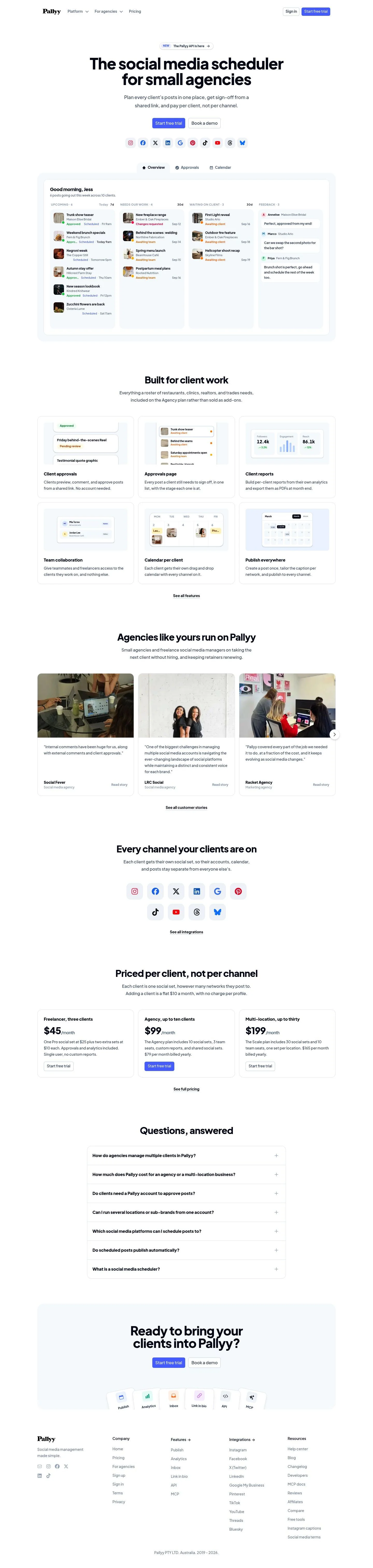
- Full page: https://cdn.designmunk.com/2026/09/10061124/pallyy-com-featured.webp
- Above the fold: https://cdn.designmunk.com/2026/09/10061124/pallyy-com-featured.webp
- On DesignMunk: https://designmunk.com/pallyy/

Study these for hierarchy, rhythm, spacing and density. Where an image and the written spec disagree, the spec wins: the tokens were read from the page's own CSS, the images are one rendering of it.

## Before you start

Ask the user what they are building, who it is for, and what brand assets they already have — name, colours, typefaces. Wait for their answers before writing anything. Everything below is then applied to their product, not to the reference.

## Design specification

# Pallyy: 60px Jakarta Sans and a Two-Button Hero

## Overview

Pallyy's UI is calm, direct and agency-friendly: large headlines, compact paragraphs, and a single accent blue. The page reads spacious but not wasteful, relying on small radii and light borders instead of heavy panels. Content aims to feel organized—workflow first, pricing clear, and actions consistent. When tokens don't cover a case, favor clarity, center alignment in the hero, and a single primary action in blue.

## Colors

- **primary (#5576ff):** Blue accent for primary actions, focused borders, and links.
- **secondary (#040404):** Ink for headlines, navigation, and most body text.
- **neutral (#ffffff):** Paper white backgrounds and cards.
- **surface (#ffffff):** Section surfaces and large preview panels.
- **on-surface (#5576ff):** Interactive text on white surfaces; use for link states and emphasis copy.

## Typography

All typography uses Plus Jakarta Sans. It's a Google font and can be loaded directly.
- Headline levels use Plus Jakarta Sans at 60/44/33/24px with heavy weights (800 for lg–sm, 600 for xs). Use lg for the homepage H1, md for section leads, sm for card titles, and xs for UI subheads.
- Body uses Plus Jakarta Sans at 18px/1.56 with weight 600 for compact, assertive copy blocks.
Substitutes if Plus Jakarta Sans is unavailable: Inter, Manrope, or Poppins—each geometric, high x-height sans families that hold similar tracking and weight ranges.

## Layout

Spacing runs on five steps: 6, 14, 24, 48, and 80px. Use xl (80px) for section top/bottom padding, lg (48px) for large vertical gaps between feature blocks, and md (24px) for card gutters and grid gaps. Apply sm (14px) to button paddings and inline clusters, and xs (6px) to icon chips and compact stacks. Grids present as centered, fluid columns with generous outer whitespace; cards align in 2–3 columns on desktop, moving to a single column on mobile.

## Elevation & Depth

Depth is minimal. One small shadow is available for subtle lift on key previews: rgba(0,0,0,0.1) 0 1px 3px. Larger shadows are none. Separation relies on white surfaces, thin inset borders (the measured inner inset), and blue accents for focus and active states. Prefer tonal and border contrast over drop shadows for hierarchy.

## Shapes

Two radii shape the system: 6px for buttons and pills, 12px for cards and large containers. Small radius signals click targets; the larger radius marks grouped content like previews, pricing cards, and quotes. Keep corners square when a link should read as text-level, not a button.

## Components

Buttons and card components are defined by tokens and should be used as-is for consistency.
- Button — Primary: #5576ff background, #ffffff text, 40px height, 8px 12px padding, 6px radius. Use for main CTAs.
- Button — Secondary: #e4405f background with matching text, 0px radius, 40px height, 8px 12px padding. Use sparingly for contrasting promotions or special routes.
- Button — Link: Text-only, #5576ff, 0px radius. Use inside paragraphs and tertiary placements.
- Card: #ffffff background, text colored by on-surface (blue emphasis), 12px radius, 0px 8px padding. Use md (24px) internal spacing for content blocks inside the card.

### Hero with double CTA
- Headline: headline-lg (60px/800, tight tracking). Centered over body-md copy.
- Actions: Primary then a quiet secondary, spaced using sm (14px). Social network pills follow with xs (6px) gaps.

### Network icon strip
- Row of supported networks as pill buttons. Height aligns with 40px actions; use 6px radius and xs (6px) inset padding, sm (14px) gaps.

### Feature tabs bar
- "Overview / Approvals / Calendar" displayed as tabs within a rounded 12px container. Use on-surface blue for active text and inner inset border for definition.

### Dashboard preview panel
- Large card at 12px radius with the small shadow. Internal columns separated by md (24px) gaps; headings at headline-xs (24px/600), item text at body-md.

### Pricing cards
- Three cards in a responsive grid. Use headline-sm (33px/800) for price, body-md for features, primary button at full width, md (24px) spacing.

### Customer story quotes
- Quote as body-md, client line in headline-xs. Cards at 12px radius with md (24px) padding and sm (14px) gaps between elements.

### FAQ accordion
- Question labels set in headline-xs (24px/600). Answers in body-md. Dividers use the inner inset border; sections spaced by md (24px).

## Do's and Don'ts

- Do set primary actions in #5576ff and keep them visually identical across sections.
- Do use 6px radius for small controls and 12px for cards and large previews.
- Do keep section padding generous (80px) and internal gaps consistent (24px) for readable blocks.
- Don't introduce heavy shadows; prefer borders and white space to separate content.
- Don't mix new accent colors; the system runs on one blue accent with black text and white surfaces.
- Don't overuse secondary buttons; reserve them for special pathways so the primary stands out.

## Agent Prompt Guide

Quick color reference:
- Text: #040404
- Background: #ffffff
- Border: #5576ff (focus/active)
- Accent: #5576ff

1) Build the hero
- Container with 80px top/bottom padding (#ffffff).
- H1: Plus Jakarta Sans, 60px, weight 800, line-height 1, letter-spacing -0.025em, color #040404.
- Lead: Plus Jakarta Sans, 18px, weight 600, line-height 1.56, color #040404, max-width 60–70ch.
- Primary button: 40px height, 8px 12px, 6px radius, background #5576ff, text #ffffff.
- Secondary link button: text #5576ff, radius 0, placed sm (14px) to the right of primary.

2) Network icon strip under the hero
- Row layout with sm (14px) gaps.
- Each chip: 6px radius, xs (6px) internal padding; text/icons #040404 on #ffffff with a 1px border using #5576ff for focus state.

3) Dashboard preview card
- Card container: 12px radius, background #ffffff, apply small shadow rgba(0,0,0,0.1) 0 1px 3px.
- Header: Plus Jakarta Sans 24px/600.
- Columns: 4 equal columns with md (24px) gaps; body items set in 18px/600.

4) Pricing grid
- Three cards in a responsive grid with md (24px) column gaps and lg (48px) row gaps.
- Price: Plus Jakarta Sans 33px/800.
- CTA in each card: primary button spec (40px height, 8px 12px, 6px radius, #5576ff on #ffffff text).

## Similar Brands

- Buffer — Similar single-blue accent and calendar-first storytelling; Buffer leans lighter on weight and more rounded shapes.
- Later — Blue-forward scheduling tool; uses softer pastels and more illustration than Pallyy's functional previews.
- Hootsuite — Enterprise-leaning with darker themes; Pallyy is cleaner and lighter with clearer per-client pricing.
- Sprout Social — Professional sans and restrained color; Sprout is denser and more data-heavy, while Pallyy foregrounds approvals and workflow.
- Loomly — Comparable CTA treatment and pricing clarity; Loomly's palette is broader where Pallyy sticks to one accent.

## Tokens

### CSS custom properties

```css
:root {
  /* Colors */
  --color-primary: #5576ff;
  --color-secondary: #040404;
  --color-neutral: #ffffff;
  --color-surface: var(--color-neutral);
  --color-on-surface: var(--color-primary);

  /* Typography */
  --text-headline-lg-size: 60px;
  --text-headline-lg-weight: 800;
  --text-headline-lg-leading: 1;
  --text-headline-lg-tracking: -0.025em;
  --text-headline-md-size: 44px;
  --text-headline-md-weight: 800;
  --text-headline-md-leading: 1.2;
  --text-headline-md-tracking: -0.02em;
  --text-headline-sm-size: 33px;
  --text-headline-sm-weight: 800;
  --text-headline-sm-leading: 1.21;
  --text-headline-xs-size: 24px;
  --text-headline-xs-weight: 600;
  --text-headline-xs-leading: 1.21;
  --text-body-md-size: 18px;
  --text-body-md-weight: 600;
  --text-body-md-leading: 1.56;
  --text-body-md-tracking: -0.025em;
  --font-plus-jakarta-sans: "Plus Jakarta Sans";

  /* Rounded */
  --radius-sm: 6px;
  --radius-md: 12px;

  /* Spacing */
  --spacing-xs: 6px;
  --spacing-sm: 14px;
  --spacing-md: 24px;
  --spacing-lg: 48px;
  --spacing-xl: 80px;

  /* Components */
  --button-primary-background-color: var(--color-primary);
  --button-primary-text-color: var(--color-neutral);
  --button-primary-rounded: var(--radius-sm);
  --button-primary-padding: 8px 12px;
  --button-primary-height: 40px;
  --button-secondary-background-color: #e4405f;
  --button-secondary-text-color: #e4405f;
  --button-secondary-rounded: 0px;
  --button-secondary-padding: 8px 12px;
  --button-secondary-height: 40px;
  --button-link-text-color: var(--color-primary);
  --button-link-rounded: 0px;
  --card-background-color: var(--color-neutral);
  --card-text-color: var(--color-primary);
  --card-rounded: var(--radius-md);
  --card-padding: 0px 8px;
}
```

### Tailwind theme

```css
@theme {
  --color-primary: #5576ff;
  --color-secondary: #040404;
  --color-neutral: #ffffff;
  --color-surface: #ffffff;
  --color-on-surface: #5576ff;
  --font-headline-lg: "Plus Jakarta Sans";
  --font-headline-md: "Plus Jakarta Sans";
  --font-headline-sm: "Plus Jakarta Sans";
  --font-headline-xs: "Plus Jakarta Sans";
  --font-body-md: "Plus Jakarta Sans";
  --text-headline-lg: 60px;
  --text-headline-md: 44px;
  --text-headline-sm: 33px;
  --text-headline-xs: 24px;
  --text-body-md: 18px;
  --tracking-headline-lg: -0.025em;
  --tracking-headline-md: -0.02em;
  --tracking-body-md: -0.025em;
  --font-weight-headline-lg: 800;
  --font-weight-headline-md: 800;
  --font-weight-headline-sm: 800;
  --font-weight-headline-xs: 600;
  --font-weight-body-md: 600;
  --radius-sm: 6px;
  --radius-md: 12px;
  --spacing-xs: 6px;
  --spacing-sm: 14px;
  --spacing-md: 24px;
  --spacing-lg: 48px;
  --spacing-xl: 80px;
}
```

### Design tokens (DTCG)

```json
{
    "$schema": "https://www.designtokens.org/schemas/2025.10/format.json",
    "color": {
        "$type": "color",
        "primary": {
            "$value": {
                "colorSpace": "srgb",
                "components": [
                    0.333,
                    0.463,
                    1
                ],
                "hex": "#5576ff"
            }
        },
        "secondary": {
            "$value": {
                "colorSpace": "srgb",
                "components": [
                    0.016,
                    0.016,
                    0.016
                ],
                "hex": "#040404"
            }
        },
        "neutral": {
            "$value": {
                "colorSpace": "srgb",
                "components": [
                    1,
                    1,
                    1
                ],
                "hex": "#ffffff"
            }
        },
        "surface": {
            "$value": {
                "colorSpace": "srgb",
                "components": [
                    1,
                    1,
                    1
                ],
                "hex": "#ffffff"
            }
        },
        "on-surface": {
            "$value": {
                "colorSpace": "srgb",
                "components": [
                    0.333,
                    0.463,
                    1
                ],
                "hex": "#5576ff"
            }
        }
    },
    "spacing": {
        "$type": "dimension",
        "xs": {
            "$value": {
                "value": 6,
                "unit": "px"
            }
        },
        "sm": {
            "$value": {
                "value": 14,
                "unit": "px"
            }
        },
        "md": {
            "$value": {
                "value": 24,
                "unit": "px"
            }
        },
        "lg": {
            "$value": {
                "value": 48,
                "unit": "px"
            }
        },
        "xl": {
            "$value": {
                "value": 80,
                "unit": "px"
            }
        }
    },
    "rounded": {
        "$type": "dimension",
        "sm": {
            "$value": {
                "value": 6,
                "unit": "px"
            }
        },
        "md": {
            "$value": {
                "value": 12,
                "unit": "px"
            }
        }
    },
    "typography": {
        "headline-lg": {
            "$type": "typography",
            "$value": {
                "fontFamily": "Plus Jakarta Sans",
                "fontSize": {
                    "value": 60,
                    "unit": "px"
                },
                "fontWeight": 800,
                "letterSpacing": {
                    "value": -0.025,
                    "unit": "em"
                }
            }
        },
        "headline-md": {
            "$type": "typography",
            "$value": {
                "fontFamily": "Plus Jakarta Sans",
                "fontSize": {
                    "value": 44,
                    "unit": "px"
                },
                "fontWeight": 800,
                "letterSpacing": {
                    "value": -0.02,
                    "unit": "em"
                }
            }
        },
        "headline-sm": {
            "$type": "typography",
            "$value": {
                "fontFamily": "Plus Jakarta Sans",
                "fontSize": {
                    "value": 33,
                    "unit": "px"
                },
                "fontWeight": 800
            }
        },
        "headline-xs": {
            "$type": "typography",
            "$value": {
                "fontFamily": "Plus Jakarta Sans",
                "fontSize": {
                    "value": 24,
                    "unit": "px"
                },
                "fontWeight": 600
            }
        },
        "body-md": {
            "$type": "typography",
            "$value": {
                "fontFamily": "Plus Jakarta Sans",
                "fontSize": {
                    "value": 18,
                    "unit": "px"
                },
                "fontWeight": 600,
                "letterSpacing": {
                    "value": -0.025,
                    "unit": "em"
                }
            }
        }
    }
}
```

## Rules

- **Fonts.** If the specification names a custom or self-hosted family, use one of the substitutes it names. Never reference a typeface you cannot actually load — it will fall back to a system font and undo the typography.
- **Colour.** Derive the palette from the user's brand. Use the token values as a guide to *relationships* — contrast, tint, how many accents carry the page — not as hex codes to paste.
- **Never reproduce** the wordmark, mascot, logo, brand name, illustrations, icon set, screenshots or any copy from the reference.
- **Never present the result as Pallyy**, or imply any connection to it.
- If something is unspecified, choose clarity and legibility over decoration.
---
version: alpha
name: Pallyy
description: Plan, approve, schedule, and publish on one simple social calendar.
colors:
  primary: "#5576ff"
  secondary: "#040404"
  neutral: "#ffffff"
  surface: "{colors.neutral}"
  on-surface: "{colors.primary}"
typography:
  headline-lg:
    fontFamily: Plus Jakarta Sans
    fontSize: 60px
    fontWeight: 800
    lineHeight: 1
    letterSpacing: -0.025em
  headline-md:
    fontFamily: Plus Jakarta Sans
    fontSize: 44px
    fontWeight: 800
    lineHeight: 1.2
    letterSpacing: -0.02em
  headline-sm:
    fontFamily: Plus Jakarta Sans
    fontSize: 33px
    fontWeight: 800
    lineHeight: 1.21
  headline-xs:
    fontFamily: Plus Jakarta Sans
    fontSize: 24px
    fontWeight: 600
    lineHeight: 1.21
  body-md:
    fontFamily: Plus Jakarta Sans
    fontSize: 18px
    fontWeight: 600
    lineHeight: 1.56
    letterSpacing: -0.025em
rounded:
  sm: 6px
  md: 12px
spacing:
  xs: 6px
  sm: 14px
  md: 24px
  lg: 48px
  xl: 80px
components:
  button-primary:
    backgroundColor: "{colors.primary}"
    textColor: "{colors.neutral}"
    rounded: "{rounded.sm}"
    padding: 8px 12px
    height: 40px
  button-secondary:
    backgroundColor: "#e4405f"
    textColor: "#e4405f"
    rounded: 0px
    padding: 8px 12px
    height: 40px
  button-link:
    textColor: "{colors.primary}"
    rounded: 0px
  card:
    backgroundColor: "{colors.neutral}"
    textColor: "{colors.primary}"
    rounded: "{rounded.md}"
    padding: 0px 8px
---

# Pallyy: 60px Jakarta Sans and a Two-Button Hero

## Overview

Pallyy's UI is calm, direct and agency-friendly: large headlines, compact paragraphs, and a single accent blue. The page reads spacious but not wasteful, relying on small radii and light borders instead of heavy panels. Content aims to feel organized—workflow first, pricing clear, and actions consistent. When tokens don't cover a case, favor clarity, center alignment in the hero, and a single primary action in blue.

## Colors

- **primary (#5576ff):** Blue accent for primary actions, focused borders, and links.
- **secondary (#040404):** Ink for headlines, navigation, and most body text.
- **neutral (#ffffff):** Paper white backgrounds and cards.
- **surface (#ffffff):** Section surfaces and large preview panels.
- **on-surface (#5576ff):** Interactive text on white surfaces; use for link states and emphasis copy.

## Typography

All typography uses Plus Jakarta Sans. It's a Google font and can be loaded directly.
- Headline levels use Plus Jakarta Sans at 60/44/33/24px with heavy weights (800 for lg–sm, 600 for xs). Use lg for the homepage H1, md for section leads, sm for card titles, and xs for UI subheads.
- Body uses Plus Jakarta Sans at 18px/1.56 with weight 600 for compact, assertive copy blocks.
Substitutes if Plus Jakarta Sans is unavailable: Inter, Manrope, or Poppins—each geometric, high x-height sans families that hold similar tracking and weight ranges.

## Layout

Spacing runs on five steps: 6, 14, 24, 48, and 80px. Use xl (80px) for section top/bottom padding, lg (48px) for large vertical gaps between feature blocks, and md (24px) for card gutters and grid gaps. Apply sm (14px) to button paddings and inline clusters, and xs (6px) to icon chips and compact stacks. Grids present as centered, fluid columns with generous outer whitespace; cards align in 2–3 columns on desktop, moving to a single column on mobile.

## Elevation & Depth

Depth is minimal. One small shadow is available for subtle lift on key previews: rgba(0,0,0,0.1) 0 1px 3px. Larger shadows are none. Separation relies on white surfaces, thin inset borders (the measured inner inset), and blue accents for focus and active states. Prefer tonal and border contrast over drop shadows for hierarchy.

## Shapes

Two radii shape the system: 6px for buttons and pills, 12px for cards and large containers. Small radius signals click targets; the larger radius marks grouped content like previews, pricing cards, and quotes. Keep corners square when a link should read as text-level, not a button.

## Components

Buttons and card components are defined by tokens and should be used as-is for consistency.
- Button — Primary: #5576ff background, #ffffff text, 40px height, 8px 12px padding, 6px radius. Use for main CTAs.
- Button — Secondary: #e4405f background with matching text, 0px radius, 40px height, 8px 12px padding. Use sparingly for contrasting promotions or special routes.
- Button — Link: Text-only, #5576ff, 0px radius. Use inside paragraphs and tertiary placements.
- Card: #ffffff background, text colored by on-surface (blue emphasis), 12px radius, 0px 8px padding. Use md (24px) internal spacing for content blocks inside the card.

### Hero with double CTA
- Headline: headline-lg (60px/800, tight tracking). Centered over body-md copy.
- Actions: Primary then a quiet secondary, spaced using sm (14px). Social network pills follow with xs (6px) gaps.

### Network icon strip
- Row of supported networks as pill buttons. Height aligns with 40px actions; use 6px radius and xs (6px) inset padding, sm (14px) gaps.

### Feature tabs bar
- "Overview / Approvals / Calendar" displayed as tabs within a rounded 12px container. Use on-surface blue for active text and inner inset border for definition.

### Dashboard preview panel
- Large card at 12px radius with the small shadow. Internal columns separated by md (24px) gaps; headings at headline-xs (24px/600), item text at body-md.

### Pricing cards
- Three cards in a responsive grid. Use headline-sm (33px/800) for price, body-md for features, primary button at full width, md (24px) spacing.

### Customer story quotes
- Quote as body-md, client line in headline-xs. Cards at 12px radius with md (24px) padding and sm (14px) gaps between elements.

### FAQ accordion
- Question labels set in headline-xs (24px/600). Answers in body-md. Dividers use the inner inset border; sections spaced by md (24px).

## Do's and Don'ts

- Do set primary actions in #5576ff and keep them visually identical across sections.
- Do use 6px radius for small controls and 12px for cards and large previews.
- Do keep section padding generous (80px) and internal gaps consistent (24px) for readable blocks.
- Don't introduce heavy shadows; prefer borders and white space to separate content.
- Don't mix new accent colors; the system runs on one blue accent with black text and white surfaces.
- Don't overuse secondary buttons; reserve them for special pathways so the primary stands out.

## Agent Prompt Guide

Quick color reference:
- Text: #040404
- Background: #ffffff
- Border: #5576ff (focus/active)
- Accent: #5576ff

1) Build the hero
- Container with 80px top/bottom padding (#ffffff).
- H1: Plus Jakarta Sans, 60px, weight 800, line-height 1, letter-spacing -0.025em, color #040404.
- Lead: Plus Jakarta Sans, 18px, weight 600, line-height 1.56, color #040404, max-width 60–70ch.
- Primary button: 40px height, 8px 12px, 6px radius, background #5576ff, text #ffffff.
- Secondary link button: text #5576ff, radius 0, placed sm (14px) to the right of primary.

2) Network icon strip under the hero
- Row layout with sm (14px) gaps.
- Each chip: 6px radius, xs (6px) internal padding; text/icons #040404 on #ffffff with a 1px border using #5576ff for focus state.

3) Dashboard preview card
- Card container: 12px radius, background #ffffff, apply small shadow rgba(0,0,0,0.1) 0 1px 3px.
- Header: Plus Jakarta Sans 24px/600.
- Columns: 4 equal columns with md (24px) gaps; body items set in 18px/600.

4) Pricing grid
- Three cards in a responsive grid with md (24px) column gaps and lg (48px) row gaps.
- Price: Plus Jakarta Sans 33px/800.
- CTA in each card: primary button spec (40px height, 8px 12px, 6px radius, #5576ff on #ffffff text).

## Similar Brands

- Buffer — Similar single-blue accent and calendar-first storytelling; Buffer leans lighter on weight and more rounded shapes.
- Later — Blue-forward scheduling tool; uses softer pastels and more illustration than Pallyy's functional previews.
- Hootsuite — Enterprise-leaning with darker themes; Pallyy is cleaner and lighter with clearer per-client pricing.
- Sprout Social — Professional sans and restrained color; Sprout is denser and more data-heavy, while Pallyy foregrounds approvals and workflow.
- Loomly — Comparable CTA treatment and pricing clarity; Loomly's palette is broader where Pallyy sticks to one accent.
:root {
  /* Colors */
  --color-primary: #5576ff;
  --color-secondary: #040404;
  --color-neutral: #ffffff;
  --color-surface: var(--color-neutral);
  --color-on-surface: var(--color-primary);

  /* Typography */
  --text-headline-lg-size: 60px;
  --text-headline-lg-weight: 800;
  --text-headline-lg-leading: 1;
  --text-headline-lg-tracking: -0.025em;
  --text-headline-md-size: 44px;
  --text-headline-md-weight: 800;
  --text-headline-md-leading: 1.2;
  --text-headline-md-tracking: -0.02em;
  --text-headline-sm-size: 33px;
  --text-headline-sm-weight: 800;
  --text-headline-sm-leading: 1.21;
  --text-headline-xs-size: 24px;
  --text-headline-xs-weight: 600;
  --text-headline-xs-leading: 1.21;
  --text-body-md-size: 18px;
  --text-body-md-weight: 600;
  --text-body-md-leading: 1.56;
  --text-body-md-tracking: -0.025em;
  --font-plus-jakarta-sans: "Plus Jakarta Sans";

  /* Rounded */
  --radius-sm: 6px;
  --radius-md: 12px;

  /* Spacing */
  --spacing-xs: 6px;
  --spacing-sm: 14px;
  --spacing-md: 24px;
  --spacing-lg: 48px;
  --spacing-xl: 80px;

  /* Components */
  --button-primary-background-color: var(--color-primary);
  --button-primary-text-color: var(--color-neutral);
  --button-primary-rounded: var(--radius-sm);
  --button-primary-padding: 8px 12px;
  --button-primary-height: 40px;
  --button-secondary-background-color: #e4405f;
  --button-secondary-text-color: #e4405f;
  --button-secondary-rounded: 0px;
  --button-secondary-padding: 8px 12px;
  --button-secondary-height: 40px;
  --button-link-text-color: var(--color-primary);
  --button-link-rounded: 0px;
  --card-background-color: var(--color-neutral);
  --card-text-color: var(--color-primary);
  --card-rounded: var(--radius-md);
  --card-padding: 0px 8px;
}
{
  "$schema": "https://www.designtokens.org/schemas/2025.10/format.json",
  "$description": "Plan, approve, schedule, and publish on one simple social calendar.",
  "color": {
    "$type": "color",
    "primary": {
      "$value": {
        "colorSpace": "srgb",
        "components": [
          0.333,
          0.463,
          1
        ],
        "hex": "#5576ff"
      }
    },
    "secondary": {
      "$value": {
        "colorSpace": "srgb",
        "components": [
          0.016,
          0.016,
          0.016
        ],
        "hex": "#040404"
      }
    },
    "neutral": {
      "$value": {
        "colorSpace": "srgb",
        "components": [
          1,
          1,
          1
        ],
        "hex": "#ffffff"
      }
    },
    "surface": {
      "$value": {
        "colorSpace": "srgb",
        "components": [
          1,
          1,
          1
        ],
        "hex": "#ffffff"
      }
    },
    "on-surface": {
      "$value": {
        "colorSpace": "srgb",
        "components": [
          0.333,
          0.463,
          1
        ],
        "hex": "#5576ff"
      }
    }
  },
  "spacing": {
    "$type": "dimension",
    "xs": {
      "$value": {
        "value": 6,
        "unit": "px"
      }
    },
    "sm": {
      "$value": {
        "value": 14,
        "unit": "px"
      }
    },
    "md": {
      "$value": {
        "value": 24,
        "unit": "px"
      }
    },
    "lg": {
      "$value": {
        "value": 48,
        "unit": "px"
      }
    },
    "xl": {
      "$value": {
        "value": 80,
        "unit": "px"
      }
    }
  },
  "rounded": {
    "$type": "dimension",
    "sm": {
      "$value": {
        "value": 6,
        "unit": "px"
      }
    },
    "md": {
      "$value": {
        "value": 12,
        "unit": "px"
      }
    }
  },
  "typography": {
    "headline-lg": {
      "$type": "typography",
      "$value": {
        "fontFamily": "Plus Jakarta Sans",
        "fontSize": {
          "value": 60,
          "unit": "px"
        },
        "fontWeight": 800,
        "letterSpacing": {
          "value": -0.025,
          "unit": "em"
        }
      }
    },
    "headline-md": {
      "$type": "typography",
      "$value": {
        "fontFamily": "Plus Jakarta Sans",
        "fontSize": {
          "value": 44,
          "unit": "px"
        },
        "fontWeight": 800,
        "letterSpacing": {
          "value": -0.02,
          "unit": "em"
        }
      }
    },
    "headline-sm": {
      "$type": "typography",
      "$value": {
        "fontFamily": "Plus Jakarta Sans",
        "fontSize": {
          "value": 33,
          "unit": "px"
        },
        "fontWeight": 800
      }
    },
    "headline-xs": {
      "$type": "typography",
      "$value": {
        "fontFamily": "Plus Jakarta Sans",
        "fontSize": {
          "value": 24,
          "unit": "px"
        },
        "fontWeight": 600
      }
    },
    "body-md": {
      "$type": "typography",
      "$value": {
        "fontFamily": "Plus Jakarta Sans",
        "fontSize": {
          "value": 18,
          "unit": "px"
        },
        "fontWeight": 600,
        "letterSpacing": {
          "value": -0.025,
          "unit": "em"
        }
      }
    }
  }
}
@theme {
--color-primary: #5576ff;
--color-secondary: #040404;
--color-neutral: #ffffff;
--color-surface: #ffffff;
--color-on-surface: #5576ff;
--font-headline-lg: "Plus Jakarta Sans";
--font-headline-md: "Plus Jakarta Sans";
--font-headline-sm: "Plus Jakarta Sans";
--font-headline-xs: "Plus Jakarta Sans";
--font-body-md: "Plus Jakarta Sans";
--text-headline-lg: 60px;
--text-headline-md: 44px;
--text-headline-sm: 33px;
--text-headline-xs: 24px;
--text-body-md: 18px;
--tracking-headline-lg: -0.025em;
--tracking-headline-md: -0.02em;
--tracking-body-md: -0.025em;
--font-weight-headline-lg: 800;
--font-weight-headline-md: 800;
--font-weight-headline-sm: 800;
--font-weight-headline-xs: 600;
--font-weight-body-md: 600;
--radius-sm: 6px;
--radius-md: 12px;
--spacing-xs: 6px;
--spacing-sm: 14px;
--spacing-md: 24px;
--spacing-lg: 48px;
--spacing-xl: 80px;
} # Design brief: the Pallyy design language
Below is a complete design specification measured from a real, published web page. Use it as a design language for the user's product. It is not a page to reproduce.
## Reference images
- Full page: https://cdn.designmunk.com/2026/09/10061124/pallyy-com-featured.webp
- Above the fold: https://cdn.designmunk.com/2026/09/10061124/pallyy-com-featured.webp
- On DesignMunk: https://designmunk.com/pallyy/
Study these for hierarchy, rhythm, spacing and density. Where an image and the written spec disagree, the spec wins: the tokens were read from the page's own CSS, the images are one rendering of it.
## Before you start
Ask the user what they are building, who it is for, and what brand assets they already have — name, colours, typefaces. Wait for their answers before writing anything. Everything below is then applied to their product, not to the reference.
## Design specification
# Pallyy: 60px Jakarta Sans and a Two-Button Hero
## Overview
Pallyy's UI is calm, direct and agency-friendly: large headlines, compact paragraphs, and a single accent blue. The page reads spacious but not wasteful, relying on small radii and light borders instead of heavy panels. Content aims to feel organized—workflow first, pricing clear, and actions consistent. When tokens don't cover a case, favor clarity, center alignment in the hero, and a single primary action in blue.
## Colors
- **primary (#5576ff):** Blue accent for primary actions, focused borders, and links.
- **secondary (#040404):** Ink for headlines, navigation, and most body text.
- **neutral (#ffffff):** Paper white backgrounds and cards.
- **surface (#ffffff):** Section surfaces and large preview panels.
- **on-surface (#5576ff):** Interactive text on white surfaces; use for link states and emphasis copy.
## Typography
All typography uses Plus Jakarta Sans. It's a Google font and can be loaded directly.
- Headline levels use Plus Jakarta Sans at 60/44/33/24px with heavy weights (800 for lg–sm, 600 for xs). Use lg for the homepage H1, md for section leads, sm for card titles, and xs for UI subheads.
- Body uses Plus Jakarta Sans at 18px/1.56 with weight 600 for compact, assertive copy blocks.
Substitutes if Plus Jakarta Sans is unavailable: Inter, Manrope, or Poppins—each geometric, high x-height sans families that hold similar tracking and weight ranges.
## Layout
Spacing runs on five steps: 6, 14, 24, 48, and 80px. Use xl (80px) for section top/bottom padding, lg (48px) for large vertical gaps between feature blocks, and md (24px) for card gutters and grid gaps. Apply sm (14px) to button paddings and inline clusters, and xs (6px) to icon chips and compact stacks. Grids present as centered, fluid columns with generous outer whitespace; cards align in 2–3 columns on desktop, moving to a single column on mobile.
## Elevation & Depth
Depth is minimal. One small shadow is available for subtle lift on key previews: rgba(0,0,0,0.1) 0 1px 3px. Larger shadows are none. Separation relies on white surfaces, thin inset borders (the measured inner inset), and blue accents for focus and active states. Prefer tonal and border contrast over drop shadows for hierarchy.
## Shapes
Two radii shape the system: 6px for buttons and pills, 12px for cards and large containers. Small radius signals click targets; the larger radius marks grouped content like previews, pricing cards, and quotes. Keep corners square when a link should read as text-level, not a button.
## Components
Buttons and card components are defined by tokens and should be used as-is for consistency.
- Button — Primary: #5576ff background, #ffffff text, 40px height, 8px 12px padding, 6px radius. Use for main CTAs.
- Button — Secondary: #e4405f background with matching text, 0px radius, 40px height, 8px 12px padding. Use sparingly for contrasting promotions or special routes.
- Button — Link: Text-only, #5576ff, 0px radius. Use inside paragraphs and tertiary placements.
- Card: #ffffff background, text colored by on-surface (blue emphasis), 12px radius, 0px 8px padding. Use md (24px) internal spacing for content blocks inside the card.
### Hero with double CTA
- Headline: headline-lg (60px/800, tight tracking). Centered over body-md copy.
- Actions: Primary then a quiet secondary, spaced using sm (14px). Social network pills follow with xs (6px) gaps.
### Network icon strip
- Row of supported networks as pill buttons. Height aligns with 40px actions; use 6px radius and xs (6px) inset padding, sm (14px) gaps.
### Feature tabs bar
- "Overview / Approvals / Calendar" displayed as tabs within a rounded 12px container. Use on-surface blue for active text and inner inset border for definition.
### Dashboard preview panel
- Large card at 12px radius with the small shadow. Internal columns separated by md (24px) gaps; headings at headline-xs (24px/600), item text at body-md.
### Pricing cards
- Three cards in a responsive grid. Use headline-sm (33px/800) for price, body-md for features, primary button at full width, md (24px) spacing.
### Customer story quotes
- Quote as body-md, client line in headline-xs. Cards at 12px radius with md (24px) padding and sm (14px) gaps between elements.
### FAQ accordion
- Question labels set in headline-xs (24px/600). Answers in body-md. Dividers use the inner inset border; sections spaced by md (24px).
## Do's and Don'ts
- Do set primary actions in #5576ff and keep them visually identical across sections.
- Do use 6px radius for small controls and 12px for cards and large previews.
- Do keep section padding generous (80px) and internal gaps consistent (24px) for readable blocks.
- Don't introduce heavy shadows; prefer borders and white space to separate content.
- Don't mix new accent colors; the system runs on one blue accent with black text and white surfaces.
- Don't overuse secondary buttons; reserve them for special pathways so the primary stands out.
## Agent Prompt Guide
Quick color reference:
- Text: #040404
- Background: #ffffff
- Border: #5576ff (focus/active)
- Accent: #5576ff
1) Build the hero
- Container with 80px top/bottom padding (#ffffff).
- H1: Plus Jakarta Sans, 60px, weight 800, line-height 1, letter-spacing -0.025em, color #040404.
- Lead: Plus Jakarta Sans, 18px, weight 600, line-height 1.56, color #040404, max-width 60–70ch.
- Primary button: 40px height, 8px 12px, 6px radius, background #5576ff, text #ffffff.
- Secondary link button: text #5576ff, radius 0, placed sm (14px) to the right of primary.
2) Network icon strip under the hero
- Row layout with sm (14px) gaps.
- Each chip: 6px radius, xs (6px) internal padding; text/icons #040404 on #ffffff with a 1px border using #5576ff for focus state.
3) Dashboard preview card
- Card container: 12px radius, background #ffffff, apply small shadow rgba(0,0,0,0.1) 0 1px 3px.
- Header: Plus Jakarta Sans 24px/600.
- Columns: 4 equal columns with md (24px) gaps; body items set in 18px/600.
4) Pricing grid
- Three cards in a responsive grid with md (24px) column gaps and lg (48px) row gaps.
- Price: Plus Jakarta Sans 33px/800.
- CTA in each card: primary button spec (40px height, 8px 12px, 6px radius, #5576ff on #ffffff text).
## Tokens
### CSS custom properties
```css
:root {
/* Colors */
--color-primary: #5576ff;
--color-secondary: #040404;
--color-neutral: #ffffff;
--color-surface: var(--color-neutral);
--color-on-surface: var(--color-primary);
/* Typography */
--text-headline-lg-size: 60px;
--text-headline-lg-weight: 800;
--text-headline-lg-leading: 1;
--text-headline-lg-tracking: -0.025em;
--text-headline-md-size: 44px;
--text-headline-md-weight: 800;
--text-headline-md-leading: 1.2;
--text-headline-md-tracking: -0.02em;
--text-headline-sm-size: 33px;
--text-headline-sm-weight: 800;
--text-headline-sm-leading: 1.21;
--text-headline-xs-size: 24px;
--text-headline-xs-weight: 600;
--text-headline-xs-leading: 1.21;
--text-body-md-size: 18px;
--text-body-md-weight: 600;
--text-body-md-leading: 1.56;
--text-body-md-tracking: -0.025em;
--font-plus-jakarta-sans: "Plus Jakarta Sans";
/* Rounded */
--radius-sm: 6px;
--radius-md: 12px;
/* Spacing */
--spacing-xs: 6px;
--spacing-sm: 14px;
--spacing-md: 24px;
--spacing-lg: 48px;
--spacing-xl: 80px;
/* Components */
--button-primary-background-color: var(--color-primary);
--button-primary-text-color: var(--color-neutral);
--button-primary-rounded: var(--radius-sm);
--button-primary-padding: 8px 12px;
--button-primary-height: 40px;
--button-secondary-background-color: #e4405f;
--button-secondary-text-color: #e4405f;
--button-secondary-rounded: 0px;
--button-secondary-padding: 8px 12px;
--button-secondary-height: 40px;
--button-link-text-color: var(--color-primary);
--button-link-rounded: 0px;
--card-background-color: var(--color-neutral);
--card-text-color: var(--color-primary);
--card-rounded: var(--radius-md);
--card-padding: 0px 8px;
}
```
## Rules
- **Fonts.** If the specification names a custom or self-hosted family, use one of the substitutes it names. Never reference a typeface you cannot actually load — it will fall back to a system font and undo the typography.
- **Colour.** Derive the palette from the user's brand. Use the token values as a guide to *relationships* — contrast, tint, how many accents carry the page — not as hex codes to paste.
- **Never reproduce** the wordmark, mascot, logo, brand name, illustrations, icon set, screenshots or any copy from the reference.
- **Never present the result as Pallyy**, or imply any connection to it.
- If something is unspecified, choose clarity and legibility over decoration.