







PAI
pai.company
Turn customer data into a predictive intelligence engine for launches.
pai.company
AI Breakdown
Design export
# Design brief: the PAI design language

Below is a complete design specification measured from a real, published web page. Use it as a design language for the user's product. It is not a page to reproduce.

## Reference images

- Full page: https://cdn.designmunk.com/2026/09/04164938/pai-company-featured.webp
- Above the fold: https://cdn.designmunk.com/2026/09/04164938/pai-company-featured.webp
- On DesignMunk: https://designmunk.com/pai/

Study these for hierarchy, rhythm, spacing and density. Where an image and the written spec disagree, the spec wins: the tokens were read from the page's own CSS, the images are one rendering of it.

## Before you start

Ask the user what they are building, who it is for, and what brand assets they already have — name, colours, typefaces. Wait for their answers before writing anything. Everything below is then applied to their product, not to the reference.

## Design specification

# PAI: Instrument Serif Headlines and Beige Data Cards

## Overview

PAI's interface is editorial and minimal: black text on white with a single warm accent. Headlines feel premium and serious, while body copy remains compact for dense explanations. Spacing is generous but not airy, supporting long-form claims, stats, and step-by-step demos. Use this system for confident, research-led storytelling rather than playful marketing.

## Colors

- **primary (#111111):** Ink black for headlines, body text, and icons.
- **neutral (#ffffff):** Paper-white background for pages and most sections.
- **surface (#ffffff):** Same as neutral; use for containers that should read as flat and clean.
- **on-surface (#111111):** Text and icon color when placed on surface/neutral backgrounds.

## Typography

- Instrument Serif (Google Fonts, free): Used for headline-lg 88px, headline-md 58px, and headline-sm 38px. It provides the editorial voice for hero lines and section titles. Substitutes: PT Serif, Literata, Spectral.
- Inter (Google Fonts, free): Used for headline-xs 25px. Employ for compact subheads, stat labels, eyebrow lines, and navigation where a sans contrast is useful. Substitutes: Source Sans 3, IBM Plex Sans, Work Sans.
- Instrument Sans (Google Fonts, free): Used for body-md 16.8px; primary choice for paragraphs, captions, and UI copy. Substitutes: DM Sans, Manrope, Public Sans.
Use regular weights (400) by default; increase weight only for emphasis, not as a primary hierarchy tool.

## Layout

The spacing scale is tight-to-generous: 6, 14, 28, 40, 64. Build rhythm with 28px gutters, 40px vertical spacing inside sections, and 64px top/bottom section padding. A responsive two-column hero (text and visual) suits the system; stack to a single column on small screens with 28px gaps. Keep line lengths short for serif headings and ~60–70ch for body-md.

## Elevation & Depth

Depth is minimal. Only a soft small shadow is measured: rgba(17, 17, 17, 0.12) 0px 6px 20px. Apply it sparingly to floating visuals or chips. Most hierarchy comes from the beige card background (#f3eee8), typography scale, and whitespace rather than outlines or heavy shadows.

## Shapes

Two radii define the language: sm at 16px for cards and containers, and full at 9999px for pills (CTAs, tags, small badges). Use full radius on all primary and secondary buttons; keep content cards at 16px to feel sturdy and editorial.

## Components

Buttons and cards are core to this system.
- Button — Primary: background #111111, text #ffffff, rounded 9999px, 14px × 28px padding, fixed height 51px. Use for main CTAs like "Book a demo".
- Button — Secondary: text #111111, rounded 9999px, 14px × 28px padding, height 51px. Background remains transparent on white; add a subtle 1px #111111 border only when extra edge is needed.
- Button — Link: text #111111, no radius, used inline (e.g., "See a case study").
- Card: background #f3eee8, text #111111, rounded 16px, padding 64px top/bottom and 40px sides.

Distinctive page components:
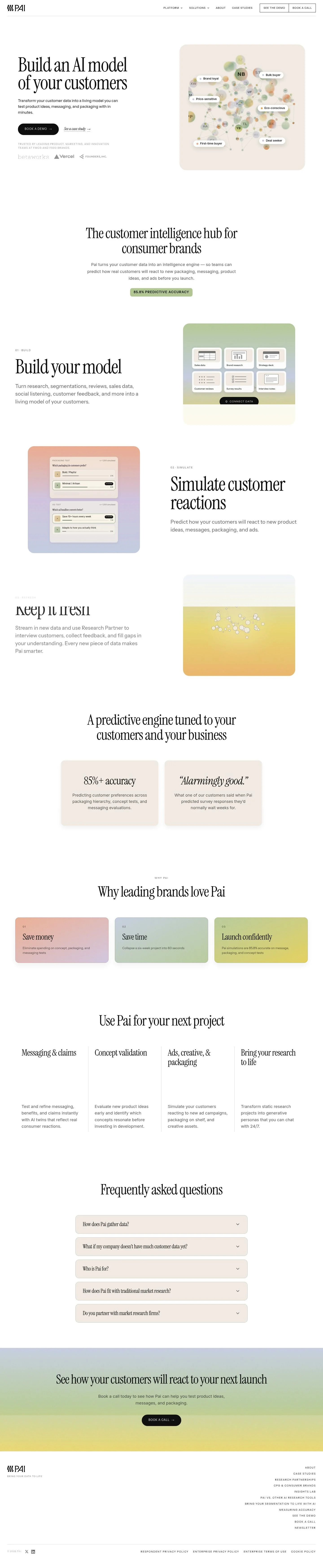
### Hero Header
Two-line Instrument Serif headline (headline-lg 88px, -0.025em tracking) left-aligned, paired with a primary pill CTA and a link-style secondary action.
### Persona Network Illustration
A media block placed inside a 16px-radius frame. Use the card background (#f3eee8) and the sm shadow to lift it from the page; overlay small full-radius labels.
### Step Header (01 · Build / 02 · Simulate / 03 · Refresh)
Number prefix set in Inter headline-xs 25px, section titles in Instrument Serif headline-sm 38px. Maintain 28px gaps between label, title, and body.
### A/B Simulation Card
Surface background (#ffffff) with optional beige sub-card panels. Include "n = 1,200 simulated" in Inter headline-xs 25px, option labels A/B with pill "Winner" tag, and result percentages in body-md 16.8px.
### Accuracy Stat Badge
Compact callout using Inter headline-xs 25px for "85.8% predictive accuracy" and an optional full-radius chip for the metric.
### Pull-Quote
Short testimonial like "Alarmingly good." typeset in Instrument Serif headline-md 58px with generous white space.
### FAQ Accordion
Each item uses headline-xs 25px for the question and body-md 16.8px for the answer; 28px vertical spacing between items, 16px radius on the container if grouped.
### Footer Resource Grid
Multi-column link list in body-md with restrained spacing (14–28px) and no shadows; use link buttons for CTAs such as newsletter sign-ups.

## Do's and Don'ts

- Do set primary headlines in Instrument Serif (88/58/38) and keep body copy in Instrument Sans 16.8 for readability.
- Do reserve #f3eee8 cards for simulations, diagrams, or highlighted content; keep most sections on #ffffff.
- Do use full-radius 9999px pills for CTAs and small labels to maintain the brand's rounded signature.
- Do space sections with 64px padding and 28–40px internal gaps for consistent rhythm.
- Don't introduce additional accent colors or heavy gradients; the palette is monochrome with one beige surface.
- Don't apply medium/large shadows; only the small, soft shadow is part of this system.

## Agent Prompt Guide

Quick color reference
- Text: #111111
- Background: #ffffff
- Border: #111111
- Accent surface: #f3eee8

1) Build the hero
- Canvas #ffffff. Left column: Instrument Serif headline-lg 88px, line-height 1.2, letter-spacing -0.025em, color #111111. Under it, body-md 16.8px Instrument Sans. Primary button: 51px height, 14px × 28px padding, rounded 9999px, background #111111, text #ffffff. Add a link-style secondary action in #111111.

2) Three-step section (Build / Simulate / Refresh)
- Section padding 64px top/bottom. For each step: eyebrow in Inter headline-xs 25px, title in Instrument Serif headline-sm 38px, body in Instrument Sans 16.8px. Use 28px gaps between elements and 40px between steps. Optional step media sits in a #f3eee8 card with 16px radius.

3) A/B simulation card
- Outer container: #ffffff surface, 28px internal padding, optional 16px radius. Header line "n = 1,200 simulated" in Inter 25px. Two options A and B with pill "Winner" badges (rounded 9999px). Percentages in Instrument Sans 16.8px. Use rgba(17,17,17,0.12) shadow only if the card needs lift.

4) FAQ accordion
- Each item: question set in Inter headline-xs 25px (#111111), answer in Instrument Sans 16.8px. 14px padding for triggers, 28px between items, optional group container with 16px radius and no shadow.

## Similar Brands

- Anthropic — similarly minimal and serif-led; Anthropic leans heavier on sand gradients and denser research copy.
- Ramp — black-and-white editorial look with pill buttons; Ramp introduces a green accent and more motion.
- Mercury — monochrome finance brand with serif headlines and crisp UI; uses stronger color accents than PAI.
- Vercel — stark black/white system and pill CTAs; entirely sans-serif, giving it a more technical tone than PAI's editorial voice.

## Tokens

### CSS custom properties

```css
:root {
  /* Colors */
  --color-primary: #111111;
  --color-neutral: #ffffff;
  --color-surface: var(--color-neutral);
  --color-on-surface: var(--color-primary);

  /* Typography */
  --text-headline-lg-size: 88px;
  --text-headline-lg-weight: 400;
  --text-headline-lg-leading: 1.2;
  --text-headline-lg-tracking: -0.025em;
  --text-headline-md-size: 58px;
  --text-headline-md-weight: 400;
  --text-headline-md-leading: 1.44;
  --text-headline-md-tracking: -0.038em;
  --text-headline-sm-size: 38px;
  --text-headline-sm-weight: 400;
  --text-headline-sm-leading: 1.41;
  --text-headline-sm-tracking: -0.025em;
  --text-headline-xs-size: 25px;
  --text-headline-xs-weight: 400;
  --text-headline-xs-leading: 1.2;
  --text-body-md-size: 16.8px;
  --text-body-md-weight: 400;
  --text-body-md-leading: 1.55;
  --text-body-md-tracking: 0.01em;
  --font-instrument-serif: "Instrument Serif";
  --font-inter: "Inter";
  --font-instrument-sans: "Instrument Sans";

  /* Rounded */
  --radius-sm: 16px;
  --radius-full: 9999px;

  /* Spacing */
  --spacing-xs: 6px;
  --spacing-sm: 14px;
  --spacing-md: 28px;
  --spacing-lg: 40px;
  --spacing-xl: 64px;

  /* Components */
  --button-primary-background-color: var(--color-primary);
  --button-primary-text-color: var(--color-neutral);
  --button-primary-rounded: var(--radius-full);
  --button-primary-padding: 14px 28px;
  --button-primary-height: 51px;
  --button-secondary-text-color: var(--color-primary);
  --button-secondary-rounded: var(--radius-full);
  --button-secondary-padding: 14px 28px;
  --button-secondary-height: 51px;
  --button-link-text-color: var(--color-primary);
  --button-link-rounded: 0px;
  --card-background-color: #f3eee8;
  --card-text-color: var(--color-primary);
  --card-rounded: var(--radius-sm);
  --card-padding: 64px 40px;
}
```

### Tailwind theme

```css
@theme {
  --color-primary: #111111;
  --color-neutral: #ffffff;
  --color-surface: #ffffff;
  --color-on-surface: #111111;
  --font-headline-lg: "Instrument Serif";
  --font-headline-md: "Instrument Serif";
  --font-headline-sm: "Instrument Serif";
  --font-headline-xs: "Inter";
  --font-body-md: "Instrument Sans";
  --text-headline-lg: 88px;
  --text-headline-md: 58px;
  --text-headline-sm: 38px;
  --text-headline-xs: 25px;
  --text-body-md: 16.8px;
  --tracking-headline-lg: -0.025em;
  --tracking-headline-md: -0.038em;
  --tracking-headline-sm: -0.025em;
  --tracking-body-md: 0.01em;
  --font-weight-headline-lg: 400;
  --font-weight-headline-md: 400;
  --font-weight-headline-sm: 400;
  --font-weight-headline-xs: 400;
  --font-weight-body-md: 400;
  --radius-sm: 16px;
  --radius-full: 9999px;
  --spacing-xs: 6px;
  --spacing-sm: 14px;
  --spacing-md: 28px;
  --spacing-lg: 40px;
  --spacing-xl: 64px;
}
```

### Design tokens (DTCG)

```json
{
    "$schema": "https://www.designtokens.org/schemas/2025.10/format.json",
    "color": {
        "$type": "color",
        "primary": {
            "$value": {
                "colorSpace": "srgb",
                "components": [
                    0.067,
                    0.067,
                    0.067
                ],
                "hex": "#111111"
            }
        },
        "neutral": {
            "$value": {
                "colorSpace": "srgb",
                "components": [
                    1,
                    1,
                    1
                ],
                "hex": "#ffffff"
            }
        },
        "surface": {
            "$value": {
                "colorSpace": "srgb",
                "components": [
                    1,
                    1,
                    1
                ],
                "hex": "#ffffff"
            }
        },
        "on-surface": {
            "$value": {
                "colorSpace": "srgb",
                "components": [
                    0.067,
                    0.067,
                    0.067
                ],
                "hex": "#111111"
            }
        }
    },
    "spacing": {
        "$type": "dimension",
        "xs": {
            "$value": {
                "value": 6,
                "unit": "px"
            }
        },
        "sm": {
            "$value": {
                "value": 14,
                "unit": "px"
            }
        },
        "md": {
            "$value": {
                "value": 28,
                "unit": "px"
            }
        },
        "lg": {
            "$value": {
                "value": 40,
                "unit": "px"
            }
        },
        "xl": {
            "$value": {
                "value": 64,
                "unit": "px"
            }
        }
    },
    "rounded": {
        "$type": "dimension",
        "sm": {
            "$value": {
                "value": 16,
                "unit": "px"
            }
        },
        "full": {
            "$value": {
                "value": 9999,
                "unit": "px"
            }
        }
    },
    "typography": {
        "headline-lg": {
            "$type": "typography",
            "$value": {
                "fontFamily": "Instrument Serif",
                "fontSize": {
                    "value": 88,
                    "unit": "px"
                },
                "fontWeight": 400,
                "letterSpacing": {
                    "value": -0.025,
                    "unit": "em"
                }
            }
        },
        "headline-md": {
            "$type": "typography",
            "$value": {
                "fontFamily": "Instrument Serif",
                "fontSize": {
                    "value": 58,
                    "unit": "px"
                },
                "fontWeight": 400,
                "letterSpacing": {
                    "value": -0.038,
                    "unit": "em"
                }
            }
        },
        "headline-sm": {
            "$type": "typography",
            "$value": {
                "fontFamily": "Instrument Serif",
                "fontSize": {
                    "value": 38,
                    "unit": "px"
                },
                "fontWeight": 400,
                "letterSpacing": {
                    "value": -0.025,
                    "unit": "em"
                }
            }
        },
        "headline-xs": {
            "$type": "typography",
            "$value": {
                "fontFamily": "Inter",
                "fontSize": {
                    "value": 25,
                    "unit": "px"
                },
                "fontWeight": 400
            }
        },
        "body-md": {
            "$type": "typography",
            "$value": {
                "fontFamily": "Instrument Sans",
                "fontSize": {
                    "value": 16.8,
                    "unit": "px"
                },
                "fontWeight": 400,
                "letterSpacing": {
                    "value": 0.01,
                    "unit": "em"
                }
            }
        }
    }
}
```

## Rules

- **Fonts.** If the specification names a custom or self-hosted family, use one of the substitutes it names. Never reference a typeface you cannot actually load — it will fall back to a system font and undo the typography.
- **Colour.** Derive the palette from the user's brand. Use the token values as a guide to *relationships* — contrast, tint, how many accents carry the page — not as hex codes to paste.
- **Never reproduce** the wordmark, mascot, logo, brand name, illustrations, icon set, screenshots or any copy from the reference.
- **Never present the result as PAI**, or imply any connection to it.
- If something is unspecified, choose clarity and legibility over decoration.
---
version: alpha
name: PAI
description: Turn customer data into a predictive intelligence engine for launches.
colors:
  primary: "#111111"
  neutral: "#ffffff"
  surface: "{colors.neutral}"
  on-surface: "{colors.primary}"
typography:
  headline-lg:
    fontFamily: Instrument Serif
    fontSize: 88px
    fontWeight: 400
    lineHeight: 1.2
    letterSpacing: -0.025em
  headline-md:
    fontFamily: Instrument Serif
    fontSize: 58px
    fontWeight: 400
    lineHeight: 1.44
    letterSpacing: -0.038em
  headline-sm:
    fontFamily: Instrument Serif
    fontSize: 38px
    fontWeight: 400
    lineHeight: 1.41
    letterSpacing: -0.025em
  headline-xs:
    fontFamily: Inter
    fontSize: 25px
    fontWeight: 400
    lineHeight: 1.2
  body-md:
    fontFamily: Instrument Sans
    fontSize: 16.8px
    fontWeight: 400
    lineHeight: 1.55
    letterSpacing: 0.01em
rounded:
  sm: 16px
  full: 9999px
spacing:
  xs: 6px
  sm: 14px
  md: 28px
  lg: 40px
  xl: 64px
components:
  button-primary:
    backgroundColor: "{colors.primary}"
    textColor: "{colors.neutral}"
    rounded: "{rounded.full}"
    padding: 14px 28px
    height: 51px
  button-secondary:
    textColor: "{colors.primary}"
    rounded: "{rounded.full}"
    padding: 14px 28px
    height: 51px
  button-link:
    textColor: "{colors.primary}"
    rounded: 0px
  card:
    backgroundColor: "#f3eee8"
    textColor: "{colors.primary}"
    rounded: "{rounded.sm}"
    padding: 64px 40px
---

# PAI: Instrument Serif Headlines and Beige Data Cards

## Overview

PAI's interface is editorial and minimal: black text on white with a single warm accent. Headlines feel premium and serious, while body copy remains compact for dense explanations. Spacing is generous but not airy, supporting long-form claims, stats, and step-by-step demos. Use this system for confident, research-led storytelling rather than playful marketing.

## Colors

- **primary (#111111):** Ink black for headlines, body text, and icons.
- **neutral (#ffffff):** Paper-white background for pages and most sections.
- **surface (#ffffff):** Same as neutral; use for containers that should read as flat and clean.
- **on-surface (#111111):** Text and icon color when placed on surface/neutral backgrounds.

## Typography

- Instrument Serif (Google Fonts, free): Used for headline-lg 88px, headline-md 58px, and headline-sm 38px. It provides the editorial voice for hero lines and section titles. Substitutes: PT Serif, Literata, Spectral.
- Inter (Google Fonts, free): Used for headline-xs 25px. Employ for compact subheads, stat labels, eyebrow lines, and navigation where a sans contrast is useful. Substitutes: Source Sans 3, IBM Plex Sans, Work Sans.
- Instrument Sans (Google Fonts, free): Used for body-md 16.8px; primary choice for paragraphs, captions, and UI copy. Substitutes: DM Sans, Manrope, Public Sans.
Use regular weights (400) by default; increase weight only for emphasis, not as a primary hierarchy tool.

## Layout

The spacing scale is tight-to-generous: 6, 14, 28, 40, 64. Build rhythm with 28px gutters, 40px vertical spacing inside sections, and 64px top/bottom section padding. A responsive two-column hero (text and visual) suits the system; stack to a single column on small screens with 28px gaps. Keep line lengths short for serif headings and ~60–70ch for body-md.

## Elevation & Depth

Depth is minimal. Only a soft small shadow is measured: rgba(17, 17, 17, 0.12) 0px 6px 20px. Apply it sparingly to floating visuals or chips. Most hierarchy comes from the beige card background (#f3eee8), typography scale, and whitespace rather than outlines or heavy shadows.

## Shapes

Two radii define the language: sm at 16px for cards and containers, and full at 9999px for pills (CTAs, tags, small badges). Use full radius on all primary and secondary buttons; keep content cards at 16px to feel sturdy and editorial.

## Components

Buttons and cards are core to this system.
- Button — Primary: background #111111, text #ffffff, rounded 9999px, 14px × 28px padding, fixed height 51px. Use for main CTAs like "Book a demo".
- Button — Secondary: text #111111, rounded 9999px, 14px × 28px padding, height 51px. Background remains transparent on white; add a subtle 1px #111111 border only when extra edge is needed.
- Button — Link: text #111111, no radius, used inline (e.g., "See a case study").
- Card: background #f3eee8, text #111111, rounded 16px, padding 64px top/bottom and 40px sides.

Distinctive page components:
### Hero Header
Two-line Instrument Serif headline (headline-lg 88px, -0.025em tracking) left-aligned, paired with a primary pill CTA and a link-style secondary action.
### Persona Network Illustration
A media block placed inside a 16px-radius frame. Use the card background (#f3eee8) and the sm shadow to lift it from the page; overlay small full-radius labels.
### Step Header (01 · Build / 02 · Simulate / 03 · Refresh)
Number prefix set in Inter headline-xs 25px, section titles in Instrument Serif headline-sm 38px. Maintain 28px gaps between label, title, and body.
### A/B Simulation Card
Surface background (#ffffff) with optional beige sub-card panels. Include "n = 1,200 simulated" in Inter headline-xs 25px, option labels A/B with pill "Winner" tag, and result percentages in body-md 16.8px.
### Accuracy Stat Badge
Compact callout using Inter headline-xs 25px for "85.8% predictive accuracy" and an optional full-radius chip for the metric.
### Pull-Quote
Short testimonial like "Alarmingly good." typeset in Instrument Serif headline-md 58px with generous white space.
### FAQ Accordion
Each item uses headline-xs 25px for the question and body-md 16.8px for the answer; 28px vertical spacing between items, 16px radius on the container if grouped.
### Footer Resource Grid
Multi-column link list in body-md with restrained spacing (14–28px) and no shadows; use link buttons for CTAs such as newsletter sign-ups.

## Do's and Don'ts

- Do set primary headlines in Instrument Serif (88/58/38) and keep body copy in Instrument Sans 16.8 for readability.
- Do reserve #f3eee8 cards for simulations, diagrams, or highlighted content; keep most sections on #ffffff.
- Do use full-radius 9999px pills for CTAs and small labels to maintain the brand's rounded signature.
- Do space sections with 64px padding and 28–40px internal gaps for consistent rhythm.
- Don't introduce additional accent colors or heavy gradients; the palette is monochrome with one beige surface.
- Don't apply medium/large shadows; only the small, soft shadow is part of this system.

## Agent Prompt Guide

Quick color reference
- Text: #111111
- Background: #ffffff
- Border: #111111
- Accent surface: #f3eee8

1) Build the hero
- Canvas #ffffff. Left column: Instrument Serif headline-lg 88px, line-height 1.2, letter-spacing -0.025em, color #111111. Under it, body-md 16.8px Instrument Sans. Primary button: 51px height, 14px × 28px padding, rounded 9999px, background #111111, text #ffffff. Add a link-style secondary action in #111111.

2) Three-step section (Build / Simulate / Refresh)
- Section padding 64px top/bottom. For each step: eyebrow in Inter headline-xs 25px, title in Instrument Serif headline-sm 38px, body in Instrument Sans 16.8px. Use 28px gaps between elements and 40px between steps. Optional step media sits in a #f3eee8 card with 16px radius.

3) A/B simulation card
- Outer container: #ffffff surface, 28px internal padding, optional 16px radius. Header line "n = 1,200 simulated" in Inter 25px. Two options A and B with pill "Winner" badges (rounded 9999px). Percentages in Instrument Sans 16.8px. Use rgba(17,17,17,0.12) shadow only if the card needs lift.

4) FAQ accordion
- Each item: question set in Inter headline-xs 25px (#111111), answer in Instrument Sans 16.8px. 14px padding for triggers, 28px between items, optional group container with 16px radius and no shadow.

## Similar Brands

- Anthropic — similarly minimal and serif-led; Anthropic leans heavier on sand gradients and denser research copy.
- Ramp — black-and-white editorial look with pill buttons; Ramp introduces a green accent and more motion.
- Mercury — monochrome finance brand with serif headlines and crisp UI; uses stronger color accents than PAI.
- Vercel — stark black/white system and pill CTAs; entirely sans-serif, giving it a more technical tone than PAI's editorial voice.
:root {
  /* Colors */
  --color-primary: #111111;
  --color-neutral: #ffffff;
  --color-surface: var(--color-neutral);
  --color-on-surface: var(--color-primary);

  /* Typography */
  --text-headline-lg-size: 88px;
  --text-headline-lg-weight: 400;
  --text-headline-lg-leading: 1.2;
  --text-headline-lg-tracking: -0.025em;
  --text-headline-md-size: 58px;
  --text-headline-md-weight: 400;
  --text-headline-md-leading: 1.44;
  --text-headline-md-tracking: -0.038em;
  --text-headline-sm-size: 38px;
  --text-headline-sm-weight: 400;
  --text-headline-sm-leading: 1.41;
  --text-headline-sm-tracking: -0.025em;
  --text-headline-xs-size: 25px;
  --text-headline-xs-weight: 400;
  --text-headline-xs-leading: 1.2;
  --text-body-md-size: 16.8px;
  --text-body-md-weight: 400;
  --text-body-md-leading: 1.55;
  --text-body-md-tracking: 0.01em;
  --font-instrument-serif: "Instrument Serif";
  --font-inter: "Inter";
  --font-instrument-sans: "Instrument Sans";

  /* Rounded */
  --radius-sm: 16px;
  --radius-full: 9999px;

  /* Spacing */
  --spacing-xs: 6px;
  --spacing-sm: 14px;
  --spacing-md: 28px;
  --spacing-lg: 40px;
  --spacing-xl: 64px;

  /* Components */
  --button-primary-background-color: var(--color-primary);
  --button-primary-text-color: var(--color-neutral);
  --button-primary-rounded: var(--radius-full);
  --button-primary-padding: 14px 28px;
  --button-primary-height: 51px;
  --button-secondary-text-color: var(--color-primary);
  --button-secondary-rounded: var(--radius-full);
  --button-secondary-padding: 14px 28px;
  --button-secondary-height: 51px;
  --button-link-text-color: var(--color-primary);
  --button-link-rounded: 0px;
  --card-background-color: #f3eee8;
  --card-text-color: var(--color-primary);
  --card-rounded: var(--radius-sm);
  --card-padding: 64px 40px;
}
{
  "$schema": "https://www.designtokens.org/schemas/2025.10/format.json",
  "$description": "Turn customer data into a predictive intelligence engine for launches.",
  "color": {
    "$type": "color",
    "primary": {
      "$value": {
        "colorSpace": "srgb",
        "components": [
          0.067,
          0.067,
          0.067
        ],
        "hex": "#111111"
      }
    },
    "neutral": {
      "$value": {
        "colorSpace": "srgb",
        "components": [
          1,
          1,
          1
        ],
        "hex": "#ffffff"
      }
    },
    "surface": {
      "$value": {
        "colorSpace": "srgb",
        "components": [
          1,
          1,
          1
        ],
        "hex": "#ffffff"
      }
    },
    "on-surface": {
      "$value": {
        "colorSpace": "srgb",
        "components": [
          0.067,
          0.067,
          0.067
        ],
        "hex": "#111111"
      }
    }
  },
  "spacing": {
    "$type": "dimension",
    "xs": {
      "$value": {
        "value": 6,
        "unit": "px"
      }
    },
    "sm": {
      "$value": {
        "value": 14,
        "unit": "px"
      }
    },
    "md": {
      "$value": {
        "value": 28,
        "unit": "px"
      }
    },
    "lg": {
      "$value": {
        "value": 40,
        "unit": "px"
      }
    },
    "xl": {
      "$value": {
        "value": 64,
        "unit": "px"
      }
    }
  },
  "rounded": {
    "$type": "dimension",
    "sm": {
      "$value": {
        "value": 16,
        "unit": "px"
      }
    },
    "full": {
      "$value": {
        "value": 9999,
        "unit": "px"
      }
    }
  },
  "typography": {
    "headline-lg": {
      "$type": "typography",
      "$value": {
        "fontFamily": "Instrument Serif",
        "fontSize": {
          "value": 88,
          "unit": "px"
        },
        "fontWeight": 400,
        "letterSpacing": {
          "value": -0.025,
          "unit": "em"
        }
      }
    },
    "headline-md": {
      "$type": "typography",
      "$value": {
        "fontFamily": "Instrument Serif",
        "fontSize": {
          "value": 58,
          "unit": "px"
        },
        "fontWeight": 400,
        "letterSpacing": {
          "value": -0.038,
          "unit": "em"
        }
      }
    },
    "headline-sm": {
      "$type": "typography",
      "$value": {
        "fontFamily": "Instrument Serif",
        "fontSize": {
          "value": 38,
          "unit": "px"
        },
        "fontWeight": 400,
        "letterSpacing": {
          "value": -0.025,
          "unit": "em"
        }
      }
    },
    "headline-xs": {
      "$type": "typography",
      "$value": {
        "fontFamily": "Inter",
        "fontSize": {
          "value": 25,
          "unit": "px"
        },
        "fontWeight": 400
      }
    },
    "body-md": {
      "$type": "typography",
      "$value": {
        "fontFamily": "Instrument Sans",
        "fontSize": {
          "value": 16.8,
          "unit": "px"
        },
        "fontWeight": 400,
        "letterSpacing": {
          "value": 0.01,
          "unit": "em"
        }
      }
    }
  }
}
@theme {
--color-primary: #111111;
--color-neutral: #ffffff;
--color-surface: #ffffff;
--color-on-surface: #111111;
--font-headline-lg: "Instrument Serif";
--font-headline-md: "Instrument Serif";
--font-headline-sm: "Instrument Serif";
--font-headline-xs: "Inter";
--font-body-md: "Instrument Sans";
--text-headline-lg: 88px;
--text-headline-md: 58px;
--text-headline-sm: 38px;
--text-headline-xs: 25px;
--text-body-md: 16.8px;
--tracking-headline-lg: -0.025em;
--tracking-headline-md: -0.038em;
--tracking-headline-sm: -0.025em;
--tracking-body-md: 0.01em;
--font-weight-headline-lg: 400;
--font-weight-headline-md: 400;
--font-weight-headline-sm: 400;
--font-weight-headline-xs: 400;
--font-weight-body-md: 400;
--radius-sm: 16px;
--radius-full: 9999px;
--spacing-xs: 6px;
--spacing-sm: 14px;
--spacing-md: 28px;
--spacing-lg: 40px;
--spacing-xl: 64px;
} # Design brief: the PAI design language
Below is a complete design specification measured from a real, published web page. Use it as a design language for the user's product. It is not a page to reproduce.
## Reference images
- Full page: https://cdn.designmunk.com/2026/09/04164938/pai-company-featured.webp
- Above the fold: https://cdn.designmunk.com/2026/09/04164938/pai-company-featured.webp
- On DesignMunk: https://designmunk.com/pai/
Study these for hierarchy, rhythm, spacing and density. Where an image and the written spec disagree, the spec wins: the tokens were read from the page's own CSS, the images are one rendering of it.
## Before you start
Ask the user what they are building, who it is for, and what brand assets they already have — name, colours, typefaces. Wait for their answers before writing anything. Everything below is then applied to their product, not to the reference.
## Design specification
# PAI: Instrument Serif Headlines and Beige Data Cards
## Overview
PAI's interface is editorial and minimal: black text on white with a single warm accent. Headlines feel premium and serious, while body copy remains compact for dense explanations. Spacing is generous but not airy, supporting long-form claims, stats, and step-by-step demos. Use this system for confident, research-led storytelling rather than playful marketing.
## Colors
- **primary (#111111):** Ink black for headlines, body text, and icons.
- **neutral (#ffffff):** Paper-white background for pages and most sections.
- **surface (#ffffff):** Same as neutral; use for containers that should read as flat and clean.
- **on-surface (#111111):** Text and icon color when placed on surface/neutral backgrounds.
## Typography
- Instrument Serif (Google Fonts, free): Used for headline-lg 88px, headline-md 58px, and headline-sm 38px. It provides the editorial voice for hero lines and section titles. Substitutes: PT Serif, Literata, Spectral.
- Inter (Google Fonts, free): Used for headline-xs 25px. Employ for compact subheads, stat labels, eyebrow lines, and navigation where a sans contrast is useful. Substitutes: Source Sans 3, IBM Plex Sans, Work Sans.
- Instrument Sans (Google Fonts, free): Used for body-md 16.8px; primary choice for paragraphs, captions, and UI copy. Substitutes: DM Sans, Manrope, Public Sans.
Use regular weights (400) by default; increase weight only for emphasis, not as a primary hierarchy tool.
## Layout
The spacing scale is tight-to-generous: 6, 14, 28, 40, 64. Build rhythm with 28px gutters, 40px vertical spacing inside sections, and 64px top/bottom section padding. A responsive two-column hero (text and visual) suits the system; stack to a single column on small screens with 28px gaps. Keep line lengths short for serif headings and ~60–70ch for body-md.
## Elevation & Depth
Depth is minimal. Only a soft small shadow is measured: rgba(17, 17, 17, 0.12) 0px 6px 20px. Apply it sparingly to floating visuals or chips. Most hierarchy comes from the beige card background (#f3eee8), typography scale, and whitespace rather than outlines or heavy shadows.
## Shapes
Two radii define the language: sm at 16px for cards and containers, and full at 9999px for pills (CTAs, tags, small badges). Use full radius on all primary and secondary buttons; keep content cards at 16px to feel sturdy and editorial.
## Components
Buttons and cards are core to this system.
- Button — Primary: background #111111, text #ffffff, rounded 9999px, 14px × 28px padding, fixed height 51px. Use for main CTAs like "Book a demo".
- Button — Secondary: text #111111, rounded 9999px, 14px × 28px padding, height 51px. Background remains transparent on white; add a subtle 1px #111111 border only when extra edge is needed.
- Button — Link: text #111111, no radius, used inline (e.g., "See a case study").
- Card: background #f3eee8, text #111111, rounded 16px, padding 64px top/bottom and 40px sides.
Distinctive page components:
### Hero Header
Two-line Instrument Serif headline (headline-lg 88px, -0.025em tracking) left-aligned, paired with a primary pill CTA and a link-style secondary action.
### Persona Network Illustration
A media block placed inside a 16px-radius frame. Use the card background (#f3eee8) and the sm shadow to lift it from the page; overlay small full-radius labels.
### Step Header (01 · Build / 02 · Simulate / 03 · Refresh)
Number prefix set in Inter headline-xs 25px, section titles in Instrument Serif headline-sm 38px. Maintain 28px gaps between label, title, and body.
### A/B Simulation Card
Surface background (#ffffff) with optional beige sub-card panels. Include "n = 1,200 simulated" in Inter headline-xs 25px, option labels A/B with pill "Winner" tag, and result percentages in body-md 16.8px.
### Accuracy Stat Badge
Compact callout using Inter headline-xs 25px for "85.8% predictive accuracy" and an optional full-radius chip for the metric.
### Pull-Quote
Short testimonial like "Alarmingly good." typeset in Instrument Serif headline-md 58px with generous white space.
### FAQ Accordion
Each item uses headline-xs 25px for the question and body-md 16.8px for the answer; 28px vertical spacing between items, 16px radius on the container if grouped.
### Footer Resource Grid
Multi-column link list in body-md with restrained spacing (14–28px) and no shadows; use link buttons for CTAs such as newsletter sign-ups.
## Do's and Don'ts
- Do set primary headlines in Instrument Serif (88/58/38) and keep body copy in Instrument Sans 16.8 for readability.
- Do reserve #f3eee8 cards for simulations, diagrams, or highlighted content; keep most sections on #ffffff.
- Do use full-radius 9999px pills for CTAs and small labels to maintain the brand's rounded signature.
- Do space sections with 64px padding and 28–40px internal gaps for consistent rhythm.
- Don't introduce additional accent colors or heavy gradients; the palette is monochrome with one beige surface.
- Don't apply medium/large shadows; only the small, soft shadow is part of this system.
## Agent Prompt Guide
Quick color reference
- Text: #111111
- Background: #ffffff
- Border: #111111
- Accent surface: #f3eee8
1) Build the hero
- Canvas #ffffff. Left column: Instrument Serif headline-lg 88px, line-height 1.2, letter-spacing -0.025em, color #111111. Under it, body-md 16.8px Instrument Sans. Primary button: 51px height, 14px × 28px padding, rounded 9999px, background #111111, text #ffffff. Add a link-style secondary action in #111111.
2) Three-step section (Build / Simulate / Refresh)
- Section padding 64px top/bottom. For each step: eyebrow in Inter headline-xs 25px, title in Instrument Serif headline-sm 38px, body in Instrument Sans 16.8px. Use 28px gaps between elements and 40px between steps. Optional step media sits in a #f3eee8 card with 16px radius.
3) A/B simulation card
- Outer container: #ffffff surface, 28px internal padding, optional 16px radius. Header line "n = 1,200 simulated" in Inter 25px. Two options A and B with pill "Winner" badges (rounded 9999px). Percentages in Instrument Sans 16.8px. Use rgba(17,17,17,0.12) shadow only if the card needs lift.
4) FAQ accordion
- Each item: question set in Inter headline-xs 25px (#111111), answer in Instrument Sans 16.8px. 14px padding for triggers, 28px between items, optional group container with 16px radius and no shadow.
## Tokens
### CSS custom properties
```css
:root {
/* Colors */
--color-primary: #111111;
--color-neutral: #ffffff;
--color-surface: var(--color-neutral);
--color-on-surface: var(--color-primary);
/* Typography */
--text-headline-lg-size: 88px;
--text-headline-lg-weight: 400;
--text-headline-lg-leading: 1.2;
--text-headline-lg-tracking: -0.025em;
--text-headline-md-size: 58px;
--text-headline-md-weight: 400;
--text-headline-md-leading: 1.44;
--text-headline-md-tracking: -0.038em;
--text-headline-sm-size: 38px;
--text-headline-sm-weight: 400;
--text-headline-sm-leading: 1.41;
--text-headline-sm-tracking: -0.025em;
--text-headline-xs-size: 25px;
--text-headline-xs-weight: 400;
--text-headline-xs-leading: 1.2;
--text-body-md-size: 16.8px;
--text-body-md-weight: 400;
--text-body-md-leading: 1.55;
--text-body-md-tracking: 0.01em;
--font-instrument-serif: "Instrument Serif";
--font-inter: "Inter";
--font-instrument-sans: "Instrument Sans";
/* Rounded */
--radius-sm: 16px;
--radius-full: 9999px;
/* Spacing */
--spacing-xs: 6px;
--spacing-sm: 14px;
--spacing-md: 28px;
--spacing-lg: 40px;
--spacing-xl: 64px;
/* Components */
--button-primary-background-color: var(--color-primary);
--button-primary-text-color: var(--color-neutral);
--button-primary-rounded: var(--radius-full);
--button-primary-padding: 14px 28px;
--button-primary-height: 51px;
--button-secondary-text-color: var(--color-primary);
--button-secondary-rounded: var(--radius-full);
--button-secondary-padding: 14px 28px;
--button-secondary-height: 51px;
--button-link-text-color: var(--color-primary);
--button-link-rounded: 0px;
--card-background-color: #f3eee8;
--card-text-color: var(--color-primary);
--card-rounded: var(--radius-sm);
--card-padding: 64px 40px;
}
```
## Rules
- **Fonts.** If the specification names a custom or self-hosted family, use one of the substitutes it names. Never reference a typeface you cannot actually load — it will fall back to a system font and undo the typography.
- **Colour.** Derive the palette from the user's brand. Use the token values as a guide to *relationships* — contrast, tint, how many accents carry the page — not as hex codes to paste.
- **Never reproduce** the wordmark, mascot, logo, brand name, illustrations, icon set, screenshots or any copy from the reference.
- **Never present the result as PAI**, or imply any connection to it.
- If something is unspecified, choose clarity and legibility over decoration.



