
Oxygen Builder
oxygenbuilder.com
Unleash your design power with Oxygen for WordPress and WooCommerce
oxygenbuilder.com

AI Breakdown
Design export
# Design brief: the Oxygen Builder design language

Below is a complete design specification measured from a real, published web page. Use it as a design language for the user's product. It is not a page to reproduce.

## Reference images

- Full page: https://cdn.designmunk.com/2026/08/19173059/oxygenbuilder-com-featured-1440x7405.webp
- Above the fold: https://cdn.designmunk.com/2026/08/19173059/oxygenbuilder-com-featured.webp
- On DesignMunk: https://designmunk.com/oxygen-builder/

Study these for hierarchy, rhythm, spacing and density. Where an image and the written spec disagree, the spec wins: the tokens were read from the page's own CSS, the images are one rendering of it.

## Before you start

Ask the user what they are building, who it is for, and what brand assets they already have — name, colours, typefaces. Wait for their answers before writing anything. Everything below is then applied to their product, not to the reference.

## Design specification

# Oxygen: Dark Builder UI with Lilac Agent Headlines

## Overview

Oxygen presents a developer-first brand: confident, fast, and no-bloat. The interface is dark by default with high-contrast text and a single saturated accent for actions. Spacing is generous at section level, while components stay compact to feel efficient. The overall feel is serious, performance-oriented, and minimally decorative—built for control and speed.

## Colors

- **primary (#ffffff):** Primary text and iconography on dark surfaces; use for body copy and high-priority labels.
- **secondary (#9591ce):** Lilac supporting color for sub-heads, meta labels, chips, and low-emphasis links.
- **tertiary (#5137c3):** Action accent for primary CTAs, highlights, toggles, and focus states.
- **neutral (#000000):** Page canvas and modal backdrops; the core dark mode background.
- **brand-h-i-s-black (#191f2f):** Subtle borders, rules, and dividers on dark backgrounds.
- **surface (#000000):** Default surface token (aliases neutral) for sections and app bars.
- **on-surface (#ffffff):** Text and icon color on surfaces (aliases primary).

## Typography

Inter drives all headlines and body text at consistent, readable sizes. Headline levels: 48px/1.21 (weight 500, -0.038em) for hero, 36px/1.4 (500, -0.04em) for major sections, 28px/1.21 (500) for feature cards; body runs 16px/1.4 (400). Headline-xs uses the platform's system-ui stack at 21px/1.19 for compact labels and minor headings.
- Inter: freely available from Google Fonts (load weights 400–500 used here). Suitable substitutes if needed: Roboto (Google) or the system-ui stack.
- system-ui: uses the OS UI font (no webfont needed). If a consistent webfont is required, use Inter or Roboto.

## Layout

Spacing follows a tight-to-wide scale: 6px (micro gaps), 14px (inline chips and controls), 24px (component padding and block gaps), 64px (section spacing), 136px (hero and major band padding). Compose sections as stacked bands on a fluid grid; keep vertical rhythm in 24px multiples where possible. Headlines pair with 24px body blocks; CTAs sit in a 24px group with consistent gutters. Long pages stay scannable by alternating full-bleed sections with contained cards.

## Elevation & Depth

Depth is minimal. A single composite shadow (sm) provides lift for floating elements like dialogs or overlaid screenshots; medium and larger shadows are not used. Most hierarchy comes from tonal shifts (cards at #0a0a0a on #000000), crisp borders in #191f2f, and whitespace. The inner inset shadow is suitable for sticky footers or bottom overlays to visually anchor them on dark backgrounds.

## Shapes

The system prefers rounded geometry: 24px (md) for primary buttons and prominent pills, 18px (sm) for cards and chat panels. Link buttons are square (0px) to read as text-like affordances. Choose one radius per cluster to avoid visual noise; reserve 24px for CTAs and interactive chips that need emphasis.

## Components

Buttons and cards are the primary building blocks.
- Button — Primary: #5137c3 background, #e1e4fe text, 24px radius, 12px 20px padding, 50px height. Use for the main action per view.
- Button — Secondary: Text-only on dark, 24px radius, 12px 20px padding, 50px height. Pair with Primary as a quieter option.
- Button — Link: Text color #ffffff, 0px radius. Use inline with copy for low-friction navigation.
- Card: #0a0a0a background, #f5f5f5 text, 18px radius, 18px 20px 20px padding. Use for grouped content on dark pages.

### AI Agent Hero Panel
Two-column hero: left column uses headline-lg (48px) and body-md (16px); right column shows a chat/card stack on #0a0a0a with 18px radius and sm shadow. Primary and secondary buttons sit as a 24px-gapped group.

### Works-With Strip
A muted row of tool names separated by interpuncts. Text uses secondary #9591ce on #000000 with 14px spacing between items and 24px section padding.

### CLI Install Chip
A compact rounded container showcasing the command "npm create oxygen-wp." Use #0a0a0a background, #ffffff text, 24px radius, and 12px 20px padding; place near CTAs.

### Feature Tiles Grid
Cards present Design, Interactions, Variables, Components, and Dynamic Data. Each tile: headline-sm (28px), body-md (16px), 18px radius card with 24px internal spacing and a link-style CTA.

### Data Model Builder Section
Conversation + checklist describing post types/fields. Use a two-column layout with a right card at #0a0a0a (18px radius) and 64px vertical section spacing.

### Proof & Guarantees Block
Four points (refund, license, support, client use) in a responsive grid. Headlines at 21px system-ui, body at 16px, 24px gaps, and link buttons for learn-more patterns.

### Footer Mega-Menu
Multi-column list with 16px body text and 6px item spacing. Use #191f2f for subtle dividers and 64px top padding to separate from the last section.

## Do's and Don'ts

- Do keep backgrounds at #000000 with #ffffff text for core readability; use #0a0a0a for cards and panels.
- Do reserve #5137c3 for primary actions and interactive highlights; use #9591ce for supportive labels and metadata.
- Do use the provided spacing scale (24px, 64px, 136px) to structure sections; avoid ad-hoc values.
- Don't mix radii within a component cluster; use 24px for CTAs and 18px for cards.
- Don't introduce additional shadows; sm is sufficient, with borders (#191f2f) for structure.
- Don't add extra type families; stick to Inter and system-ui (Roboto only as a fallback).

## Agent Prompt Guide

Quick reference — text: #ffffff, background: #000000, border: #191f2f, accent: #5137c3.

1) Build a dark hero with agent panel
- Page background #000000. Container max-width your default.
- H1: Inter, 48px, weight 500, line-height 1.21, letter-spacing -0.038em, color #ffffff.
- Body: Inter, 16px/1.4, color #ffffff at 80%.
- Primary button: 50px height, 12px 20px, radius 24px, background #5137c3, text #e1e4fe.
- Secondary button: text #ffffff, radius 24px, 12px 20px.
- Right column: card #0a0a0a, text #f5f5f5, radius 18px, apply sm shadow.

2) Create a 2xN feature tiles grid
- Section padding: 64px top/bottom.
- Each tile: card #0a0a0a, radius 18px, padding 24px, border 1px #191f2f.
- Title: Inter 28px/1.21, weight 500, color #ffffff.
- Copy: Inter 16px/1.4, color #ffffff at 80%.
- Link button: text #ffffff, radius 0px.

3) Add a CLI install chip near CTAs
- Background #0a0a0a, text #ffffff, 24px radius, padding 12px 20px, inline with 14px gaps.
- Prepend a small icon if needed; border 1px #191f2f.

4) Build the guarantees block
- Four items in responsive grid with 24px gaps.
- Heading: system-ui 21px/1.19, weight 500, color #ffffff.
- Body: Inter 16px/1.4, color #ffffff at 80%.
- Optional learn-more links as link buttons (radius 0px).

5) Footer mega-menu
- Top border #191f2f. Section padding 64px top.
- Lists: Inter 16px/1.4, item spacing 6px, link color #ffffff; hover underline only.

## Similar Brands

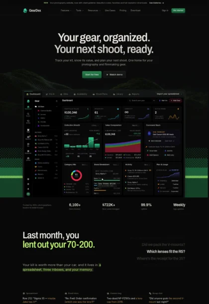
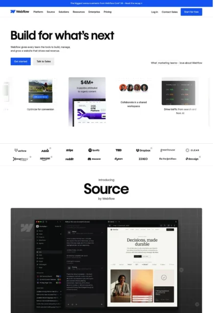
- Webflow: similarly polished marketing for a builder; Oxygen is darker with a single accent and more developer-leaning content.
- Framer: shares large type and product-first sections; Oxygen uses a stricter dark palette and fewer motion flourishes.
- Vercel: dark mode, purple accent, and developer signals; Oxygen is more marketing-site than docs-driven.
- GitHub Copilot: conversational UI examples; Oxygen applies chat patterns to website building rather than code completion.
- Cursor: developer-centric and dark; Oxygen introduces stronger marketing blocks and WordPress-specific integrations.

## Tokens

### CSS custom properties

```css
:root {
  /* Colors */
  --color-primary: #ffffff;
  --color-secondary: #9591ce;
  --color-tertiary: #5137c3;
  --color-neutral: #000000;
  --color-brand-h-i-s-black: #191f2f;
  --color-surface: var(--color-neutral);
  --color-on-surface: var(--color-primary);

  /* Typography */
  --text-headline-lg-size: 48px;
  --text-headline-lg-weight: 500;
  --text-headline-lg-leading: 1.21;
  --text-headline-lg-tracking: -0.038em;
  --text-headline-md-size: 36px;
  --text-headline-md-weight: 500;
  --text-headline-md-leading: 1.4;
  --text-headline-md-tracking: -0.04em;
  --text-headline-sm-size: 28px;
  --text-headline-sm-weight: 500;
  --text-headline-sm-leading: 1.21;
  --text-headline-xs-size: 21px;
  --text-headline-xs-weight: 500;
  --text-headline-xs-leading: 1.19;
  --text-body-md-size: 16px;
  --text-body-md-weight: 400;
  --text-body-md-leading: 1.4;
  --font-inter: "Inter";
  --font-system-ui: "system-ui";

  /* Rounded */
  --radius-sm: 18px;
  --radius-md: 24px;

  /* Spacing */
  --spacing-xs: 6px;
  --spacing-sm: 14px;
  --spacing-md: 24px;
  --spacing-lg: 64px;
  --spacing-xl: 136px;

  /* Components */
  --button-primary-background-color: var(--color-tertiary);
  --button-primary-text-color: #e1e4fe;
  --button-primary-rounded: var(--radius-md);
  --button-primary-padding: 12px 20px;
  --button-primary-height: 50px;
  --button-secondary-text-color: var(--color-primary);
  --button-secondary-rounded: var(--radius-md);
  --button-secondary-padding: 12px 20px;
  --button-secondary-height: 50px;
  --button-link-text-color: var(--color-primary);
  --button-link-rounded: 0px;
  --card-background-color: #0a0a0a;
  --card-text-color: #f5f5f5;
  --card-rounded: var(--radius-sm);
  --card-padding: 18px 20px 20px;
}
```

### Tailwind theme

```css
@theme {
  --color-primary: #ffffff;
  --color-secondary: #9591ce;
  --color-tertiary: #5137c3;
  --color-neutral: #000000;
  --color-brand-h-i-s-black: #191f2f;
  --color-surface: #000000;
  --color-on-surface: #ffffff;
  --font-headline-lg: "Inter";
  --font-headline-md: "Inter";
  --font-headline-sm: "Inter";
  --font-headline-xs: "system-ui";
  --font-body-md: "Inter";
  --text-headline-lg: 48px;
  --text-headline-md: 36px;
  --text-headline-sm: 28px;
  --text-headline-xs: 21px;
  --text-body-md: 16px;
  --tracking-headline-lg: -0.038em;
  --tracking-headline-md: -0.04em;
  --font-weight-headline-lg: 500;
  --font-weight-headline-md: 500;
  --font-weight-headline-sm: 500;
  --font-weight-headline-xs: 500;
  --font-weight-body-md: 400;
  --radius-sm: 18px;
  --radius-md: 24px;
  --spacing-xs: 6px;
  --spacing-sm: 14px;
  --spacing-md: 24px;
  --spacing-lg: 64px;
  --spacing-xl: 136px;
}
```

### Design tokens (DTCG)

```json
{
    "$schema": "https://www.designtokens.org/schemas/2025.10/format.json",
    "color": {
        "$type": "color",
        "primary": {
            "$value": {
                "colorSpace": "srgb",
                "components": [
                    1,
                    1,
                    1
                ],
                "hex": "#ffffff"
            }
        },
        "secondary": {
            "$value": {
                "colorSpace": "srgb",
                "components": [
                    0.584,
                    0.569,
                    0.808
                ],
                "hex": "#9591ce"
            }
        },
        "tertiary": {
            "$value": {
                "colorSpace": "srgb",
                "components": [
                    0.318,
                    0.216,
                    0.765
                ],
                "hex": "#5137c3"
            }
        },
        "neutral": {
            "$value": {
                "colorSpace": "srgb",
                "components": [
                    0,
                    0,
                    0
                ],
                "hex": "#000000"
            }
        },
        "brand-h-i-s-black": {
            "$value": {
                "colorSpace": "srgb",
                "components": [
                    0.098,
                    0.122,
                    0.184
                ],
                "hex": "#191f2f"
            }
        },
        "surface": {
            "$value": {
                "colorSpace": "srgb",
                "components": [
                    0,
                    0,
                    0
                ],
                "hex": "#000000"
            }
        },
        "on-surface": {
            "$value": {
                "colorSpace": "srgb",
                "components": [
                    1,
                    1,
                    1
                ],
                "hex": "#ffffff"
            }
        }
    },
    "spacing": {
        "$type": "dimension",
        "xs": {
            "$value": {
                "value": 6,
                "unit": "px"
            }
        },
        "sm": {
            "$value": {
                "value": 14,
                "unit": "px"
            }
        },
        "md": {
            "$value": {
                "value": 24,
                "unit": "px"
            }
        },
        "lg": {
            "$value": {
                "value": 64,
                "unit": "px"
            }
        },
        "xl": {
            "$value": {
                "value": 136,
                "unit": "px"
            }
        }
    },
    "rounded": {
        "$type": "dimension",
        "sm": {
            "$value": {
                "value": 18,
                "unit": "px"
            }
        },
        "md": {
            "$value": {
                "value": 24,
                "unit": "px"
            }
        }
    },
    "typography": {
        "headline-lg": {
            "$type": "typography",
            "$value": {
                "fontFamily": "Inter",
                "fontSize": {
                    "value": 48,
                    "unit": "px"
                },
                "fontWeight": 500,
                "letterSpacing": {
                    "value": -0.038,
                    "unit": "em"
                }
            }
        },
        "headline-md": {
            "$type": "typography",
            "$value": {
                "fontFamily": "Inter",
                "fontSize": {
                    "value": 36,
                    "unit": "px"
                },
                "fontWeight": 500,
                "letterSpacing": {
                    "value": -0.04,
                    "unit": "em"
                }
            }
        },
        "headline-sm": {
            "$type": "typography",
            "$value": {
                "fontFamily": "Inter",
                "fontSize": {
                    "value": 28,
                    "unit": "px"
                },
                "fontWeight": 500
            }
        },
        "headline-xs": {
            "$type": "typography",
            "$value": {
                "fontFamily": "system-ui",
                "fontSize": {
                    "value": 21,
                    "unit": "px"
                },
                "fontWeight": 500
            }
        },
        "body-md": {
            "$type": "typography",
            "$value": {
                "fontFamily": "Inter",
                "fontSize": {
                    "value": 16,
                    "unit": "px"
                },
                "fontWeight": 400
            }
        }
    }
}
```

## Rules

- **Fonts.** If the specification names a custom or self-hosted family, use one of the substitutes it names. Never reference a typeface you cannot actually load — it will fall back to a system font and undo the typography.
- **Colour.** Derive the palette from the user's brand. Use the token values as a guide to *relationships* — contrast, tint, how many accents carry the page — not as hex codes to paste.
- **Never reproduce** the wordmark, mascot, logo, brand name, illustrations, icon set, screenshots or any copy from the reference.
- **Never present the result as Oxygen Builder**, or imply any connection to it.
- If something is unspecified, choose clarity and legibility over decoration.
---
version: alpha
name: Oxygen
description: Unleash your design power with Oxygen for WordPress and WooCommerce
colors:
  primary: "#ffffff"
  secondary: "#9591ce"
  tertiary: "#5137c3"
  neutral: "#000000"
  brand-h-i-s-black: "#191f2f"
  surface: "{colors.neutral}"
  on-surface: "{colors.primary}"
typography:
  headline-lg:
    fontFamily: Inter
    fontSize: 48px
    fontWeight: 500
    lineHeight: 1.21
    letterSpacing: -0.038em
  headline-md:
    fontFamily: Inter
    fontSize: 36px
    fontWeight: 500
    lineHeight: 1.4
    letterSpacing: -0.04em
  headline-sm:
    fontFamily: Inter
    fontSize: 28px
    fontWeight: 500
    lineHeight: 1.21
  headline-xs:
    fontFamily: system-ui
    fontSize: 21px
    fontWeight: 500
    lineHeight: 1.19
  body-md:
    fontFamily: Inter
    fontSize: 16px
    fontWeight: 400
    lineHeight: 1.4
rounded:
  sm: 18px
  md: 24px
spacing:
  xs: 6px
  sm: 14px
  md: 24px
  lg: 64px
  xl: 136px
components:
  button-primary:
    backgroundColor: "{colors.tertiary}"
    textColor: "#e1e4fe"
    rounded: "{rounded.md}"
    padding: 12px 20px
    height: 50px
  button-secondary:
    textColor: "{colors.primary}"
    rounded: "{rounded.md}"
    padding: 12px 20px
    height: 50px
  button-link:
    textColor: "{colors.primary}"
    rounded: 0px
  card:
    backgroundColor: "#0a0a0a"
    textColor: "#f5f5f5"
    rounded: "{rounded.sm}"
    padding: 18px 20px 20px
---

# Oxygen: Dark Builder UI with Lilac Agent Headlines

## Overview

Oxygen presents a developer-first brand: confident, fast, and no-bloat. The interface is dark by default with high-contrast text and a single saturated accent for actions. Spacing is generous at section level, while components stay compact to feel efficient. The overall feel is serious, performance-oriented, and minimally decorative—built for control and speed.

## Colors

- **primary (#ffffff):** Primary text and iconography on dark surfaces; use for body copy and high-priority labels.
- **secondary (#9591ce):** Lilac supporting color for sub-heads, meta labels, chips, and low-emphasis links.
- **tertiary (#5137c3):** Action accent for primary CTAs, highlights, toggles, and focus states.
- **neutral (#000000):** Page canvas and modal backdrops; the core dark mode background.
- **brand-h-i-s-black (#191f2f):** Subtle borders, rules, and dividers on dark backgrounds.
- **surface (#000000):** Default surface token (aliases neutral) for sections and app bars.
- **on-surface (#ffffff):** Text and icon color on surfaces (aliases primary).

## Typography

Inter drives all headlines and body text at consistent, readable sizes. Headline levels: 48px/1.21 (weight 500, -0.038em) for hero, 36px/1.4 (500, -0.04em) for major sections, 28px/1.21 (500) for feature cards; body runs 16px/1.4 (400). Headline-xs uses the platform's system-ui stack at 21px/1.19 for compact labels and minor headings.
- Inter: freely available from Google Fonts (load weights 400–500 used here). Suitable substitutes if needed: Roboto (Google) or the system-ui stack.
- system-ui: uses the OS UI font (no webfont needed). If a consistent webfont is required, use Inter or Roboto.

## Layout

Spacing follows a tight-to-wide scale: 6px (micro gaps), 14px (inline chips and controls), 24px (component padding and block gaps), 64px (section spacing), 136px (hero and major band padding). Compose sections as stacked bands on a fluid grid; keep vertical rhythm in 24px multiples where possible. Headlines pair with 24px body blocks; CTAs sit in a 24px group with consistent gutters. Long pages stay scannable by alternating full-bleed sections with contained cards.

## Elevation & Depth

Depth is minimal. A single composite shadow (sm) provides lift for floating elements like dialogs or overlaid screenshots; medium and larger shadows are not used. Most hierarchy comes from tonal shifts (cards at #0a0a0a on #000000), crisp borders in #191f2f, and whitespace. The inner inset shadow is suitable for sticky footers or bottom overlays to visually anchor them on dark backgrounds.

## Shapes

The system prefers rounded geometry: 24px (md) for primary buttons and prominent pills, 18px (sm) for cards and chat panels. Link buttons are square (0px) to read as text-like affordances. Choose one radius per cluster to avoid visual noise; reserve 24px for CTAs and interactive chips that need emphasis.

## Components

Buttons and cards are the primary building blocks.
- Button — Primary: #5137c3 background, #e1e4fe text, 24px radius, 12px 20px padding, 50px height. Use for the main action per view.
- Button — Secondary: Text-only on dark, 24px radius, 12px 20px padding, 50px height. Pair with Primary as a quieter option.
- Button — Link: Text color #ffffff, 0px radius. Use inline with copy for low-friction navigation.
- Card: #0a0a0a background, #f5f5f5 text, 18px radius, 18px 20px 20px padding. Use for grouped content on dark pages.

### AI Agent Hero Panel
Two-column hero: left column uses headline-lg (48px) and body-md (16px); right column shows a chat/card stack on #0a0a0a with 18px radius and sm shadow. Primary and secondary buttons sit as a 24px-gapped group.

### Works-With Strip
A muted row of tool names separated by interpuncts. Text uses secondary #9591ce on #000000 with 14px spacing between items and 24px section padding.

### CLI Install Chip
A compact rounded container showcasing the command "npm create oxygen-wp." Use #0a0a0a background, #ffffff text, 24px radius, and 12px 20px padding; place near CTAs.

### Feature Tiles Grid
Cards present Design, Interactions, Variables, Components, and Dynamic Data. Each tile: headline-sm (28px), body-md (16px), 18px radius card with 24px internal spacing and a link-style CTA.

### Data Model Builder Section
Conversation + checklist describing post types/fields. Use a two-column layout with a right card at #0a0a0a (18px radius) and 64px vertical section spacing.

### Proof & Guarantees Block
Four points (refund, license, support, client use) in a responsive grid. Headlines at 21px system-ui, body at 16px, 24px gaps, and link buttons for learn-more patterns.

### Footer Mega-Menu
Multi-column list with 16px body text and 6px item spacing. Use #191f2f for subtle dividers and 64px top padding to separate from the last section.

## Do's and Don'ts

- Do keep backgrounds at #000000 with #ffffff text for core readability; use #0a0a0a for cards and panels.
- Do reserve #5137c3 for primary actions and interactive highlights; use #9591ce for supportive labels and metadata.
- Do use the provided spacing scale (24px, 64px, 136px) to structure sections; avoid ad-hoc values.
- Don't mix radii within a component cluster; use 24px for CTAs and 18px for cards.
- Don't introduce additional shadows; sm is sufficient, with borders (#191f2f) for structure.
- Don't add extra type families; stick to Inter and system-ui (Roboto only as a fallback).

## Agent Prompt Guide

Quick reference — text: #ffffff, background: #000000, border: #191f2f, accent: #5137c3.

1) Build a dark hero with agent panel
- Page background #000000. Container max-width your default.
- H1: Inter, 48px, weight 500, line-height 1.21, letter-spacing -0.038em, color #ffffff.
- Body: Inter, 16px/1.4, color #ffffff at 80%.
- Primary button: 50px height, 12px 20px, radius 24px, background #5137c3, text #e1e4fe.
- Secondary button: text #ffffff, radius 24px, 12px 20px.
- Right column: card #0a0a0a, text #f5f5f5, radius 18px, apply sm shadow.

2) Create a 2xN feature tiles grid
- Section padding: 64px top/bottom.
- Each tile: card #0a0a0a, radius 18px, padding 24px, border 1px #191f2f.
- Title: Inter 28px/1.21, weight 500, color #ffffff.
- Copy: Inter 16px/1.4, color #ffffff at 80%.
- Link button: text #ffffff, radius 0px.

3) Add a CLI install chip near CTAs
- Background #0a0a0a, text #ffffff, 24px radius, padding 12px 20px, inline with 14px gaps.
- Prepend a small icon if needed; border 1px #191f2f.

4) Build the guarantees block
- Four items in responsive grid with 24px gaps.
- Heading: system-ui 21px/1.19, weight 500, color #ffffff.
- Body: Inter 16px/1.4, color #ffffff at 80%.
- Optional learn-more links as link buttons (radius 0px).

5) Footer mega-menu
- Top border #191f2f. Section padding 64px top.
- Lists: Inter 16px/1.4, item spacing 6px, link color #ffffff; hover underline only.

## Similar Brands

- Webflow: similarly polished marketing for a builder; Oxygen is darker with a single accent and more developer-leaning content.
- Framer: shares large type and product-first sections; Oxygen uses a stricter dark palette and fewer motion flourishes.
- Vercel: dark mode, purple accent, and developer signals; Oxygen is more marketing-site than docs-driven.
- GitHub Copilot: conversational UI examples; Oxygen applies chat patterns to website building rather than code completion.
- Cursor: developer-centric and dark; Oxygen introduces stronger marketing blocks and WordPress-specific integrations.
:root {
  /* Colors */
  --color-primary: #ffffff;
  --color-secondary: #9591ce;
  --color-tertiary: #5137c3;
  --color-neutral: #000000;
  --color-brand-h-i-s-black: #191f2f;
  --color-surface: var(--color-neutral);
  --color-on-surface: var(--color-primary);

  /* Typography */
  --text-headline-lg-size: 48px;
  --text-headline-lg-weight: 500;
  --text-headline-lg-leading: 1.21;
  --text-headline-lg-tracking: -0.038em;
  --text-headline-md-size: 36px;
  --text-headline-md-weight: 500;
  --text-headline-md-leading: 1.4;
  --text-headline-md-tracking: -0.04em;
  --text-headline-sm-size: 28px;
  --text-headline-sm-weight: 500;
  --text-headline-sm-leading: 1.21;
  --text-headline-xs-size: 21px;
  --text-headline-xs-weight: 500;
  --text-headline-xs-leading: 1.19;
  --text-body-md-size: 16px;
  --text-body-md-weight: 400;
  --text-body-md-leading: 1.4;
  --font-inter: "Inter";
  --font-system-ui: "system-ui";

  /* Rounded */
  --radius-sm: 18px;
  --radius-md: 24px;

  /* Spacing */
  --spacing-xs: 6px;
  --spacing-sm: 14px;
  --spacing-md: 24px;
  --spacing-lg: 64px;
  --spacing-xl: 136px;

  /* Components */
  --button-primary-background-color: var(--color-tertiary);
  --button-primary-text-color: #e1e4fe;
  --button-primary-rounded: var(--radius-md);
  --button-primary-padding: 12px 20px;
  --button-primary-height: 50px;
  --button-secondary-text-color: var(--color-primary);
  --button-secondary-rounded: var(--radius-md);
  --button-secondary-padding: 12px 20px;
  --button-secondary-height: 50px;
  --button-link-text-color: var(--color-primary);
  --button-link-rounded: 0px;
  --card-background-color: #0a0a0a;
  --card-text-color: #f5f5f5;
  --card-rounded: var(--radius-sm);
  --card-padding: 18px 20px 20px;
}
{
  "$schema": "https://www.designtokens.org/schemas/2025.10/format.json",
  "$description": "Unleash your design power with Oxygen for WordPress and WooCommerce",
  "color": {
    "$type": "color",
    "primary": {
      "$value": {
        "colorSpace": "srgb",
        "components": [
          1,
          1,
          1
        ],
        "hex": "#ffffff"
      }
    },
    "secondary": {
      "$value": {
        "colorSpace": "srgb",
        "components": [
          0.584,
          0.569,
          0.808
        ],
        "hex": "#9591ce"
      }
    },
    "tertiary": {
      "$value": {
        "colorSpace": "srgb",
        "components": [
          0.318,
          0.216,
          0.765
        ],
        "hex": "#5137c3"
      }
    },
    "neutral": {
      "$value": {
        "colorSpace": "srgb",
        "components": [
          0,
          0,
          0
        ],
        "hex": "#000000"
      }
    },
    "brand-h-i-s-black": {
      "$value": {
        "colorSpace": "srgb",
        "components": [
          0.098,
          0.122,
          0.184
        ],
        "hex": "#191f2f"
      }
    },
    "surface": {
      "$value": {
        "colorSpace": "srgb",
        "components": [
          0,
          0,
          0
        ],
        "hex": "#000000"
      }
    },
    "on-surface": {
      "$value": {
        "colorSpace": "srgb",
        "components": [
          1,
          1,
          1
        ],
        "hex": "#ffffff"
      }
    }
  },
  "spacing": {
    "$type": "dimension",
    "xs": {
      "$value": {
        "value": 6,
        "unit": "px"
      }
    },
    "sm": {
      "$value": {
        "value": 14,
        "unit": "px"
      }
    },
    "md": {
      "$value": {
        "value": 24,
        "unit": "px"
      }
    },
    "lg": {
      "$value": {
        "value": 64,
        "unit": "px"
      }
    },
    "xl": {
      "$value": {
        "value": 136,
        "unit": "px"
      }
    }
  },
  "rounded": {
    "$type": "dimension",
    "sm": {
      "$value": {
        "value": 18,
        "unit": "px"
      }
    },
    "md": {
      "$value": {
        "value": 24,
        "unit": "px"
      }
    }
  },
  "typography": {
    "headline-lg": {
      "$type": "typography",
      "$value": {
        "fontFamily": "Inter",
        "fontSize": {
          "value": 48,
          "unit": "px"
        },
        "fontWeight": 500,
        "letterSpacing": {
          "value": -0.038,
          "unit": "em"
        }
      }
    },
    "headline-md": {
      "$type": "typography",
      "$value": {
        "fontFamily": "Inter",
        "fontSize": {
          "value": 36,
          "unit": "px"
        },
        "fontWeight": 500,
        "letterSpacing": {
          "value": -0.04,
          "unit": "em"
        }
      }
    },
    "headline-sm": {
      "$type": "typography",
      "$value": {
        "fontFamily": "Inter",
        "fontSize": {
          "value": 28,
          "unit": "px"
        },
        "fontWeight": 500
      }
    },
    "headline-xs": {
      "$type": "typography",
      "$value": {
        "fontFamily": "system-ui",
        "fontSize": {
          "value": 21,
          "unit": "px"
        },
        "fontWeight": 500
      }
    },
    "body-md": {
      "$type": "typography",
      "$value": {
        "fontFamily": "Inter",
        "fontSize": {
          "value": 16,
          "unit": "px"
        },
        "fontWeight": 400
      }
    }
  }
}
@theme {
--color-primary: #ffffff;
--color-secondary: #9591ce;
--color-tertiary: #5137c3;
--color-neutral: #000000;
--color-brand-h-i-s-black: #191f2f;
--color-surface: #000000;
--color-on-surface: #ffffff;
--font-headline-lg: "Inter";
--font-headline-md: "Inter";
--font-headline-sm: "Inter";
--font-headline-xs: "system-ui";
--font-body-md: "Inter";
--text-headline-lg: 48px;
--text-headline-md: 36px;
--text-headline-sm: 28px;
--text-headline-xs: 21px;
--text-body-md: 16px;
--tracking-headline-lg: -0.038em;
--tracking-headline-md: -0.04em;
--font-weight-headline-lg: 500;
--font-weight-headline-md: 500;
--font-weight-headline-sm: 500;
--font-weight-headline-xs: 500;
--font-weight-body-md: 400;
--radius-sm: 18px;
--radius-md: 24px;
--spacing-xs: 6px;
--spacing-sm: 14px;
--spacing-md: 24px;
--spacing-lg: 64px;
--spacing-xl: 136px;
} # Design brief: the Oxygen Builder design language
Below is a complete design specification measured from a real, published web page. Use it as a design language for the user's product. It is not a page to reproduce.
## Reference images
- Full page: https://cdn.designmunk.com/2026/08/19173059/oxygenbuilder-com-featured-1440x7405.webp
- Above the fold: https://cdn.designmunk.com/2026/08/19173059/oxygenbuilder-com-featured.webp
- On DesignMunk: https://designmunk.com/oxygen-builder/
Study these for hierarchy, rhythm, spacing and density. Where an image and the written spec disagree, the spec wins: the tokens were read from the page's own CSS, the images are one rendering of it.
## Before you start
Ask the user what they are building, who it is for, and what brand assets they already have — name, colours, typefaces. Wait for their answers before writing anything. Everything below is then applied to their product, not to the reference.
## Design specification
# Oxygen: Dark Builder UI with Lilac Agent Headlines
## Overview
Oxygen presents a developer-first brand: confident, fast, and no-bloat. The interface is dark by default with high-contrast text and a single saturated accent for actions. Spacing is generous at section level, while components stay compact to feel efficient. The overall feel is serious, performance-oriented, and minimally decorative—built for control and speed.
## Colors
- **primary (#ffffff):** Primary text and iconography on dark surfaces; use for body copy and high-priority labels.
- **secondary (#9591ce):** Lilac supporting color for sub-heads, meta labels, chips, and low-emphasis links.
- **tertiary (#5137c3):** Action accent for primary CTAs, highlights, toggles, and focus states.
- **neutral (#000000):** Page canvas and modal backdrops; the core dark mode background.
- **brand-h-i-s-black (#191f2f):** Subtle borders, rules, and dividers on dark backgrounds.
- **surface (#000000):** Default surface token (aliases neutral) for sections and app bars.
- **on-surface (#ffffff):** Text and icon color on surfaces (aliases primary).
## Typography
Inter drives all headlines and body text at consistent, readable sizes. Headline levels: 48px/1.21 (weight 500, -0.038em) for hero, 36px/1.4 (500, -0.04em) for major sections, 28px/1.21 (500) for feature cards; body runs 16px/1.4 (400). Headline-xs uses the platform's system-ui stack at 21px/1.19 for compact labels and minor headings.
- Inter: freely available from Google Fonts (load weights 400–500 used here). Suitable substitutes if needed: Roboto (Google) or the system-ui stack.
- system-ui: uses the OS UI font (no webfont needed). If a consistent webfont is required, use Inter or Roboto.
## Layout
Spacing follows a tight-to-wide scale: 6px (micro gaps), 14px (inline chips and controls), 24px (component padding and block gaps), 64px (section spacing), 136px (hero and major band padding). Compose sections as stacked bands on a fluid grid; keep vertical rhythm in 24px multiples where possible. Headlines pair with 24px body blocks; CTAs sit in a 24px group with consistent gutters. Long pages stay scannable by alternating full-bleed sections with contained cards.
## Elevation & Depth
Depth is minimal. A single composite shadow (sm) provides lift for floating elements like dialogs or overlaid screenshots; medium and larger shadows are not used. Most hierarchy comes from tonal shifts (cards at #0a0a0a on #000000), crisp borders in #191f2f, and whitespace. The inner inset shadow is suitable for sticky footers or bottom overlays to visually anchor them on dark backgrounds.
## Shapes
The system prefers rounded geometry: 24px (md) for primary buttons and prominent pills, 18px (sm) for cards and chat panels. Link buttons are square (0px) to read as text-like affordances. Choose one radius per cluster to avoid visual noise; reserve 24px for CTAs and interactive chips that need emphasis.
## Components
Buttons and cards are the primary building blocks.
- Button — Primary: #5137c3 background, #e1e4fe text, 24px radius, 12px 20px padding, 50px height. Use for the main action per view.
- Button — Secondary: Text-only on dark, 24px radius, 12px 20px padding, 50px height. Pair with Primary as a quieter option.
- Button — Link: Text color #ffffff, 0px radius. Use inline with copy for low-friction navigation.
- Card: #0a0a0a background, #f5f5f5 text, 18px radius, 18px 20px 20px padding. Use for grouped content on dark pages.
### AI Agent Hero Panel
Two-column hero: left column uses headline-lg (48px) and body-md (16px); right column shows a chat/card stack on #0a0a0a with 18px radius and sm shadow. Primary and secondary buttons sit as a 24px-gapped group.
### Works-With Strip
A muted row of tool names separated by interpuncts. Text uses secondary #9591ce on #000000 with 14px spacing between items and 24px section padding.
### CLI Install Chip
A compact rounded container showcasing the command "npm create oxygen-wp." Use #0a0a0a background, #ffffff text, 24px radius, and 12px 20px padding; place near CTAs.
### Feature Tiles Grid
Cards present Design, Interactions, Variables, Components, and Dynamic Data. Each tile: headline-sm (28px), body-md (16px), 18px radius card with 24px internal spacing and a link-style CTA.
### Data Model Builder Section
Conversation + checklist describing post types/fields. Use a two-column layout with a right card at #0a0a0a (18px radius) and 64px vertical section spacing.
### Proof & Guarantees Block
Four points (refund, license, support, client use) in a responsive grid. Headlines at 21px system-ui, body at 16px, 24px gaps, and link buttons for learn-more patterns.
### Footer Mega-Menu
Multi-column list with 16px body text and 6px item spacing. Use #191f2f for subtle dividers and 64px top padding to separate from the last section.
## Do's and Don'ts
- Do keep backgrounds at #000000 with #ffffff text for core readability; use #0a0a0a for cards and panels.
- Do reserve #5137c3 for primary actions and interactive highlights; use #9591ce for supportive labels and metadata.
- Do use the provided spacing scale (24px, 64px, 136px) to structure sections; avoid ad-hoc values.
- Don't mix radii within a component cluster; use 24px for CTAs and 18px for cards.
- Don't introduce additional shadows; sm is sufficient, with borders (#191f2f) for structure.
- Don't add extra type families; stick to Inter and system-ui (Roboto only as a fallback).
## Agent Prompt Guide
Quick reference — text: #ffffff, background: #000000, border: #191f2f, accent: #5137c3.
1) Build a dark hero with agent panel
- Page background #000000. Container max-width your default.
- H1: Inter, 48px, weight 500, line-height 1.21, letter-spacing -0.038em, color #ffffff.
- Body: Inter, 16px/1.4, color #ffffff at 80%.
- Primary button: 50px height, 12px 20px, radius 24px, background #5137c3, text #e1e4fe.
- Secondary button: text #ffffff, radius 24px, 12px 20px.
- Right column: card #0a0a0a, text #f5f5f5, radius 18px, apply sm shadow.
2) Create a 2xN feature tiles grid
- Section padding: 64px top/bottom.
- Each tile: card #0a0a0a, radius 18px, padding 24px, border 1px #191f2f.
- Title: Inter 28px/1.21, weight 500, color #ffffff.
- Copy: Inter 16px/1.4, color #ffffff at 80%.
- Link button: text #ffffff, radius 0px.
3) Add a CLI install chip near CTAs
- Background #0a0a0a, text #ffffff, 24px radius, padding 12px 20px, inline with 14px gaps.
- Prepend a small icon if needed; border 1px #191f2f.
4) Build the guarantees block
- Four items in responsive grid with 24px gaps.
- Heading: system-ui 21px/1.19, weight 500, color #ffffff.
- Body: Inter 16px/1.4, color #ffffff at 80%.
- Optional learn-more links as link buttons (radius 0px).
5) Footer mega-menu
- Top border #191f2f. Section padding 64px top.
- Lists: Inter 16px/1.4, item spacing 6px, link color #ffffff; hover underline only.
## Tokens
### CSS custom properties
```css
:root {
/* Colors */
--color-primary: #ffffff;
--color-secondary: #9591ce;
--color-tertiary: #5137c3;
--color-neutral: #000000;
--color-brand-h-i-s-black: #191f2f;
--color-surface: var(--color-neutral);
--color-on-surface: var(--color-primary);
/* Typography */
--text-headline-lg-size: 48px;
--text-headline-lg-weight: 500;
--text-headline-lg-leading: 1.21;
--text-headline-lg-tracking: -0.038em;
--text-headline-md-size: 36px;
--text-headline-md-weight: 500;
--text-headline-md-leading: 1.4;
--text-headline-md-tracking: -0.04em;
--text-headline-sm-size: 28px;
--text-headline-sm-weight: 500;
--text-headline-sm-leading: 1.21;
--text-headline-xs-size: 21px;
--text-headline-xs-weight: 500;
--text-headline-xs-leading: 1.19;
--text-body-md-size: 16px;
--text-body-md-weight: 400;
--text-body-md-leading: 1.4;
--font-inter: "Inter";
--font-system-ui: "system-ui";
/* Rounded */
--radius-sm: 18px;
--radius-md: 24px;
/* Spacing */
--spacing-xs: 6px;
--spacing-sm: 14px;
--spacing-md: 24px;
--spacing-lg: 64px;
--spacing-xl: 136px;
/* Components */
--button-primary-background-color: var(--color-tertiary);
--button-primary-text-color: #e1e4fe;
--button-primary-rounded: var(--radius-md);
--button-primary-padding: 12px 20px;
--button-primary-height: 50px;
--button-secondary-text-color: var(--color-primary);
--button-secondary-rounded: var(--radius-md);
--button-secondary-padding: 12px 20px;
--button-secondary-height: 50px;
--button-link-text-color: var(--color-primary);
--button-link-rounded: 0px;
--card-background-color: #0a0a0a;
--card-text-color: #f5f5f5;
--card-rounded: var(--radius-sm);
--card-padding: 18px 20px 20px;
}
```
## Rules
- **Fonts.** If the specification names a custom or self-hosted family, use one of the substitutes it names. Never reference a typeface you cannot actually load — it will fall back to a system font and undo the typography.
- **Colour.** Derive the palette from the user's brand. Use the token values as a guide to *relationships* — contrast, tint, how many accents carry the page — not as hex codes to paste.
- **Never reproduce** the wordmark, mascot, logo, brand name, illustrations, icon set, screenshots or any copy from the reference.
- **Never present the result as Oxygen Builder**, or imply any connection to it.
- If something is unspecified, choose clarity and legibility over decoration.