



near.com
AI Breakdown
Design export
# Design brief: the Near design language

Below is a complete design specification measured from a real, published web page. Use it as a design language for the user's product. It is not a page to reproduce.

## Reference images

- Full page: https://cdn.designmunk.com/2026/09/13093922/near-com-featured-1.webp
- Above the fold: https://cdn.designmunk.com/2026/09/13093922/near-com-featured-1-1440x900.webp
- On DesignMunk: https://designmunk.com/near/

Study these for hierarchy, rhythm, spacing and density. Where an image and the written spec disagree, the spec wins: the tokens were read from the page's own CSS, the images are one rendering of it.

## Before you start

Ask the user what they are building, who it is for, and what brand assets they already have — name, colours, typefaces. Wait for their answers before writing anything. Everything below is then applied to their product, not to the reference.

## Design specification

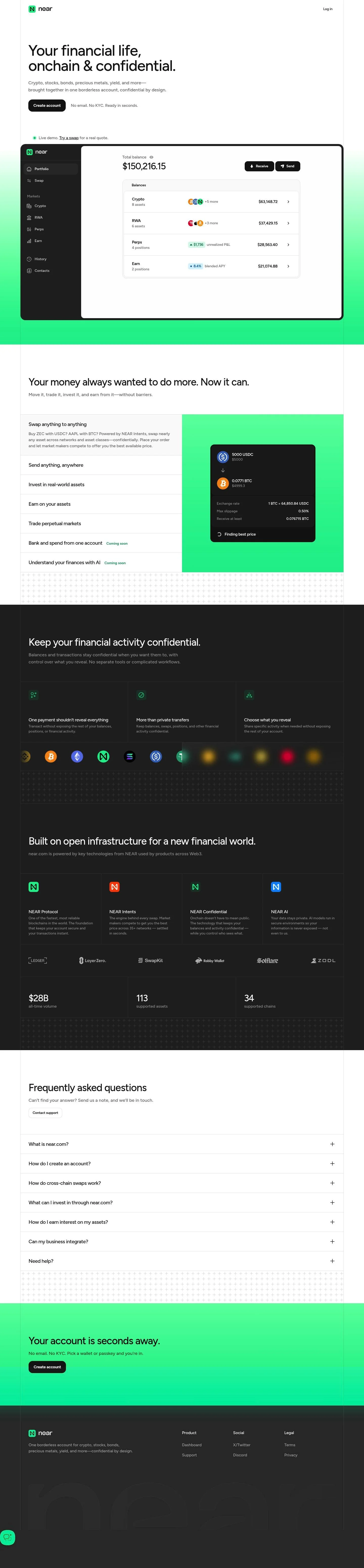
# Near: Big Figtree Headline with Framed App Preview

## Overview

A confident, minimal fintech surface that favors clarity and speed. Tone is serious but approachable, using a single sans family and decisive black CTAs. Layout is spacious with wide white margins, punctuated by a large product preview. When tokens don't specify, prefer airy spacing and text-first components with restrained color accents (green/blue).

## Page Structure

- Header: narrow top bar; logo at far left, a single Log in link at far right; generous white margins.
- Hero: oversized single-column headline with tight tracking, short supporting copy, and a primary black CTA; a compact secondary line of micro-benefits sits below; small inline demo link.
- App preview: large, rounded white/very-light card framed with an inset border; left vertical app nav, right main panel with Total balance heading, big number, action pills, and a list of balances.
- Capabilities overview: section headline and a row(s) of text-first feature blurbs (swap, send, invest, earn, trade, bank/AI coming soon); one inline swap ticket example follows.
- Swap ticket example: compact module showing two assets, amounts, exchange rate, slippage, and "finding best price" status.
- Confidentiality explainer: headline with three compact text blocks describing privacy controls.
- Built on open infrastructure: four linked tiles describing platform technologies, followed by a compact stats strip.
- FAQ: accordion list of common questions with brief answers and a support link.
- Closing CTA: short headline, one-line reassurance, and a repeated primary CTA.
- Footer: three slim columns — Product, Social, Legal — in a low-contrast, minimal layout.

## Colors

- Primary (#171717): Deep ink for headlines, body text, and high-contrast icons.
- Secondary (#04ea93): Neon mint accent for brand cues, links, and success states.
- Tertiary (#3b82f6): Signal blue accent for secondary emphasis and interactive affordances.
- Neutral (#ffffff): Paper white canvas for the page background.
- Border (#e5e5e5): Divider gray for hairlines, card insets, and section separators.
- Brand-gnarls-green (#04754c): Forest green for selective brand moments and deeper accenting.
- Surface (#ffffff): Canvas white for surface backgrounds and cards that sit on the page.
- On-surface (#171717): On-canvas ink for text and icons placed on surfaces.

## Typography

- Figtree (Google, available): single sans family used for all levels. Headline-lg 60/1 at 500 with -0.025em tracking for the hero; Headline-md 44/1.2 and Headline-sm 33/1.21 for key section titles and big numerals; Headline-xs 24/1 for subheads; Body-md 18/1.56 at 500 for paragraphs and supporting text. Suitable substitutes when Figtree is unavailable: Inter, Manrope, or Outfit (all freely available on Google Fonts) with similar x-height and weight range.

## Layout

The spacing scale sets rhythm: xs 8, sm 16 for tight element gaps; md 28 for intra-section padding; lg 64 for section spacing; xl 128 for hero and major breaks. Composition favors single-column reading with wide gutters and occasional two-area layouts (text column + product preview). Cards and modules use internal padding based on sm–md, with outer margins stepping up to lg–xl for major sections.

## Elevation & Depth

Depth is mostly achieved without heavy shadows. Cards rely on a very light #fafafa surface plus a subtle inset 1px border (inner) and, when needed, a gentle sm shadow for lift. Emphasis comes from tonal contrast, whitespace, and consistent borders rather than layered drop shadows.

## Shapes

Two radii define hierarchy: md 16px for primary buttons and large surfaces (cards, preview frame), and sm 4px for secondary buttons, chips, and utility elements. Zero-radius links remain text-only. The larger radius signals primary importance and approachability; the smaller radius reads as precise and utilitarian.

## Components

- Buttons
  - Primary: 48px height, 16px radius, 16×20 padding, background #171717, text #ffffff. Use for the main CTA in each section.
  - Secondary: 48px height, 4px radius, 16×20 padding, text #171717 on transparent or light surfaces; add a #e5e5e5 outline when needed.
  - Link: text-only, no radius, #171717.
- Card
  - Background #fafafa, text #171717, 16px radius, padding 0 4 4, with an inset border using the inner token; apply sm shadow sparingly.

### App Preview Frame
- Large 16px-rounded card (#fafafa) with an inset #e5e5e5 border. Left column hosts a compact vertical nav; right pane shows a 24px subhead ("Total balance"), a 33px figure, and a list of rows. Action pills ("Receive", "Send") render as small primary buttons.

### Balance Row
- Each row is a horizontal item with label (Headline-xs 24 or Body-md 18 depending on density), small metadata to the left, and the amount right-aligned. Use sm (16px) gaps and border dividers between rows.

### Swap Ticket Example
- Two stacked input panels with token/asset selectors, amounts, and a rate line. Use 16px card radius, md internal spacing, and Border #e5e5e5 dividers. Status line ("Finding best price") in Secondary #04ea93.

### Feature Blurbs
- Compact text modules: subhead in Headline-xs 24, one short Body-md 18 line beneath. Arrange in a responsive row of cards or text blocks with lg spacing between items.

### Confidentiality Trio
- Three minimal text blocks under a section headline. No imagery; rely on spacing and bold subheads. Optional subtle left rule in Border #e5e5e5 to separate items.

### Tech Tiles & Stats Strip
- Four linked tiles with short copy; treat as cards with 16px radius and sm padding. Follow with a single-line stats strip using Headline-sm 33 for numbers and Body-md 18 for labels.

### FAQ Accordion
- List of questions styled in Headline-xs 24. Each item has a top/bottom 16px padding and a #e5e5e5 divider. Answers in Body-md 18; expand/collapse chevron sits right.

## Do's and Don'ts

- Do use the 16px radius for any primary action or large surface; reserve 4px for utilities and secondary controls.
- Do keep the palette mostly monochrome; use #04ea93 and #3b82f6 sparingly for emphasis or status, not as backgrounds.
- Do space sections generously with lg (64px) or xl (128px) to match the airy hero.
- Don't introduce heavy drop shadows; rely on the inset border and light sm shadow only when lift is necessary.
- Don't mix additional fonts; if Figtree is unavailable, substitute one of the listed families consistently across all levels.
- Don't crowd micro-copy under CTAs; give at least md (28px) separation to avoid competition.

## Agent Prompt Guide

Quick color reference — Text: #171717; Background: #ffffff; Border: #e5e5e5; Accent: #04ea93 (secondary), optional #3b82f6 (tertiary).

1) Build a left-aligned hero
- Container on #ffffff with xl (128px) top/bottom padding.
- Headline: Figtree 60px/1, weight 500, letter-spacing -0.025em, color #171717.
- Body: Figtree 18px/1.56, weight 500, color #171717, max 60–70ch.
- Primary CTA: 48px height, 16px radius, padding 16px 20px, bg #171717, text #ffffff; place md (28px) below body.
- Add a small inline link in #171717 below with sm (16px) spacing.

2) Create the framed app preview
- Card: 16px radius, background #fafafa, inset 1px border in #e5e5e5; apply sm shadow rgba(0,0,0,0.1) 0 4px 7px if lift is needed.
- Header row: subhead "Total balance" in Figtree 24/1 at 500; large amount in Figtree 33/1.21 at 500.
- Actions: two primary buttons (48px, 16px radius) aligned right.
- Content: a vertical list of rows separated by #e5e5e5 dividers and sm (16px) gaps.

3) Lay out a features row
- Section title: Figtree 44/1.2 at 500.
- Below, create a row of text modules; each uses Figtree 24/1 for the subhead and 18/1.56 for copy.
- Use lg (64px) vertical spacing around the section and sm–md inner gaps between items; keep background #ffffff.

4) Build the swap ticket example
- 16px-rounded card on #fafafa with md (28px) padding.
- Two stacked amount inputs with token selectors; divider in #e5e5e5 between them.
- Metadata lines (rate, slippage, min received) in Figtree 18/1.56; status text in #04ea93.

5) FAQ accordion
- Each item: question in Figtree 24/1 at 500; answer in 18/1.56.
- Top/bottom padding 16px, divider #e5e5e5 between items; chevron/right affordance in #171717.

## Similar Brands

- Coinbase: similarly sparse white layouts and strong black CTAs; Coinbase leans heavier on blue accent and imagery.
- Robinhood: text-first sections with green accents; Robinhood's typography runs lighter and uses more illustration.
- Revolut: monochrome core with bright accents; Revolut relies more on gradients and photography.
- Uniswap: minimal web3 aesthetic with restrained color; Uniswap's accent skews pink/purple and uses more motion.
- Stripe: rigorous typographic scale and crisp cards; Stripe's blue system and denser documentation patterns are more technical.

## Tokens

### CSS custom properties

```css
:root {
  /* Colors */
  --color-primary: #171717;
  --color-secondary: #04ea93;
  --color-tertiary: #3b82f6;
  --color-neutral: #ffffff;
  --color-border: #e5e5e5;
  --color-brand-gnarls-green: #04754c;
  --color-surface: var(--color-neutral);
  --color-on-surface: var(--color-primary);

  /* Typography */
  --text-headline-lg-size: 60px;
  --text-headline-lg-weight: 500;
  --text-headline-lg-leading: 1;
  --text-headline-lg-tracking: -0.025em;
  --text-headline-md-size: 44px;
  --text-headline-md-weight: 500;
  --text-headline-md-leading: 1.2;
  --text-headline-md-tracking: -0.023em;
  --text-headline-sm-size: 33px;
  --text-headline-sm-weight: 500;
  --text-headline-sm-leading: 1.21;
  --text-headline-xs-size: 24px;
  --text-headline-xs-weight: 500;
  --text-headline-xs-leading: 1;
  --text-headline-xs-tracking: -0.017em;
  --text-body-md-size: 18px;
  --text-body-md-weight: 500;
  --text-body-md-leading: 1.56;
  --font-figtree: "Figtree";

  /* Rounded */
  --radius-sm: 4px;
  --radius-md: 16px;

  /* Spacing */
  --spacing-xs: 8px;
  --spacing-sm: 16px;
  --spacing-md: 28px;
  --spacing-lg: 64px;
  --spacing-xl: 128px;

  /* Components */
  --button-primary-background-color: var(--color-primary);
  --button-primary-text-color: var(--color-neutral);
  --button-primary-rounded: var(--radius-md);
  --button-primary-padding: 16px 20px;
  --button-primary-height: 48px;
  --button-secondary-text-color: var(--color-primary);
  --button-secondary-rounded: var(--radius-sm);
  --button-secondary-padding: 16px 20px;
  --button-secondary-height: 48px;
  --button-link-text-color: var(--color-primary);
  --button-link-rounded: 0px;
  --card-background-color: #fafafa;
  --card-text-color: var(--color-primary);
  --card-rounded: var(--radius-md);
}
```

### Tailwind theme

```css
@theme {
  --color-primary: #171717;
  --color-secondary: #04ea93;
  --color-tertiary: #3b82f6;
  --color-neutral: #ffffff;
  --color-border: #e5e5e5;
  --color-brand-gnarls-green: #04754c;
  --color-surface: #ffffff;
  --color-on-surface: #171717;
  --font-headline-lg: "Figtree";
  --font-headline-md: "Figtree";
  --font-headline-sm: "Figtree";
  --font-headline-xs: "Figtree";
  --font-body-md: "Figtree";
  --text-headline-lg: 60px;
  --text-headline-md: 44px;
  --text-headline-sm: 33px;
  --text-headline-xs: 24px;
  --text-body-md: 18px;
  --tracking-headline-lg: -0.025em;
  --tracking-headline-md: -0.023em;
  --tracking-headline-xs: -0.017em;
  --font-weight-headline-lg: 500;
  --font-weight-headline-md: 500;
  --font-weight-headline-sm: 500;
  --font-weight-headline-xs: 500;
  --font-weight-body-md: 500;
  --radius-sm: 4px;
  --radius-md: 16px;
  --spacing-xs: 8px;
  --spacing-sm: 16px;
  --spacing-md: 28px;
  --spacing-lg: 64px;
  --spacing-xl: 128px;
}
```

### Design tokens (DTCG)

```json
{
    "$schema": "https://www.designtokens.org/schemas/2025.10/format.json",
    "color": {
        "$type": "color",
        "primary": {
            "$value": {
                "colorSpace": "srgb",
                "components": [
                    0.09,
                    0.09,
                    0.09
                ],
                "hex": "#171717"
            }
        },
        "secondary": {
            "$value": {
                "colorSpace": "srgb",
                "components": [
                    0.016,
                    0.918,
                    0.576
                ],
                "hex": "#04ea93"
            }
        },
        "tertiary": {
            "$value": {
                "colorSpace": "srgb",
                "components": [
                    0.231,
                    0.51,
                    0.965
                ],
                "hex": "#3b82f6"
            }
        },
        "neutral": {
            "$value": {
                "colorSpace": "srgb",
                "components": [
                    1,
                    1,
                    1
                ],
                "hex": "#ffffff"
            }
        },
        "border": {
            "$value": {
                "colorSpace": "srgb",
                "components": [
                    0.898,
                    0.898,
                    0.898
                ],
                "hex": "#e5e5e5"
            }
        },
        "brand-gnarls-green": {
            "$value": {
                "colorSpace": "srgb",
                "components": [
                    0.016,
                    0.459,
                    0.298
                ],
                "hex": "#04754c"
            }
        },
        "surface": {
            "$value": {
                "colorSpace": "srgb",
                "components": [
                    1,
                    1,
                    1
                ],
                "hex": "#ffffff"
            }
        },
        "on-surface": {
            "$value": {
                "colorSpace": "srgb",
                "components": [
                    0.09,
                    0.09,
                    0.09
                ],
                "hex": "#171717"
            }
        }
    },
    "spacing": {
        "$type": "dimension",
        "xs": {
            "$value": {
                "value": 8,
                "unit": "px"
            }
        },
        "sm": {
            "$value": {
                "value": 16,
                "unit": "px"
            }
        },
        "md": {
            "$value": {
                "value": 28,
                "unit": "px"
            }
        },
        "lg": {
            "$value": {
                "value": 64,
                "unit": "px"
            }
        },
        "xl": {
            "$value": {
                "value": 128,
                "unit": "px"
            }
        }
    },
    "rounded": {
        "$type": "dimension",
        "sm": {
            "$value": {
                "value": 4,
                "unit": "px"
            }
        },
        "md": {
            "$value": {
                "value": 16,
                "unit": "px"
            }
        }
    },
    "typography": {
        "headline-lg": {
            "$type": "typography",
            "$value": {
                "fontFamily": "Figtree",
                "fontSize": {
                    "value": 60,
                    "unit": "px"
                },
                "fontWeight": 500,
                "letterSpacing": {
                    "value": -0.025,
                    "unit": "em"
                }
            }
        },
        "headline-md": {
            "$type": "typography",
            "$value": {
                "fontFamily": "Figtree",
                "fontSize": {
                    "value": 44,
                    "unit": "px"
                },
                "fontWeight": 500,
                "letterSpacing": {
                    "value": -0.023,
                    "unit": "em"
                }
            }
        },
        "headline-sm": {
            "$type": "typography",
            "$value": {
                "fontFamily": "Figtree",
                "fontSize": {
                    "value": 33,
                    "unit": "px"
                },
                "fontWeight": 500
            }
        },
        "headline-xs": {
            "$type": "typography",
            "$value": {
                "fontFamily": "Figtree",
                "fontSize": {
                    "value": 24,
                    "unit": "px"
                },
                "fontWeight": 500,
                "letterSpacing": {
                    "value": -0.017,
                    "unit": "em"
                }
            }
        },
        "body-md": {
            "$type": "typography",
            "$value": {
                "fontFamily": "Figtree",
                "fontSize": {
                    "value": 18,
                    "unit": "px"
                },
                "fontWeight": 500
            }
        }
    }
}
```

## Rules

- **Fonts.** If the specification names a custom or self-hosted family, use one of the substitutes it names. Never reference a typeface you cannot actually load — it will fall back to a system font and undo the typography.
- **Colour.** Derive the palette from the user's brand. Use the token values as a guide to *relationships* — contrast, tint, how many accents carry the page — not as hex codes to paste.
- **Never reproduce** the wordmark, mascot, logo, brand name, illustrations, icon set, screenshots or any copy from the reference.
- **Never present the result as Near**, or imply any connection to it.
- If something is unspecified, choose clarity and legibility over decoration.
---
version: alpha
name: Near
description: One account. No borders. Your financial life, onchain.
colors:
  primary: "#171717"
  secondary: "#04ea93"
  tertiary: "#3b82f6"
  neutral: "#ffffff"
  border: "#e5e5e5"
  brand-gnarls-green: "#04754c"
  surface: "{colors.neutral}"
  on-surface: "{colors.primary}"
typography:
  headline-lg:
    fontFamily: Figtree
    fontSize: 60px
    fontWeight: 500
    lineHeight: 1
    letterSpacing: -0.025em
  headline-md:
    fontFamily: Figtree
    fontSize: 44px
    fontWeight: 500
    lineHeight: 1.2
    letterSpacing: -0.023em
  headline-sm:
    fontFamily: Figtree
    fontSize: 33px
    fontWeight: 500
    lineHeight: 1.21
  headline-xs:
    fontFamily: Figtree
    fontSize: 24px
    fontWeight: 500
    lineHeight: 1
    letterSpacing: -0.017em
  body-md:
    fontFamily: Figtree
    fontSize: 18px
    fontWeight: 500
    lineHeight: 1.56
rounded:
  sm: 4px
  md: 16px
spacing:
  xs: 8px
  sm: 16px
  md: 28px
  lg: 64px
  xl: 128px
components:
  button-primary:
    backgroundColor: "{colors.primary}"
    textColor: "{colors.neutral}"
    rounded: "{rounded.md}"
    padding: 16px 20px
    height: 48px
  button-secondary:
    textColor: "{colors.primary}"
    rounded: "{rounded.sm}"
    padding: 16px 20px
    height: 48px
  button-link:
    textColor: "{colors.primary}"
    rounded: 0px
  card:
    backgroundColor: "#fafafa"
    textColor: "{colors.primary}"
    rounded: "{rounded.md}"
---

# Near: Big Figtree Headline with Framed App Preview

## Overview

A confident, minimal fintech surface that favors clarity and speed. Tone is serious but approachable, using a single sans family and decisive black CTAs. Layout is spacious with wide white margins, punctuated by a large product preview. When tokens don't specify, prefer airy spacing and text-first components with restrained color accents (green/blue).

## Page Structure

- Header: narrow top bar; logo at far left, a single Log in link at far right; generous white margins.
- Hero: oversized single-column headline with tight tracking, short supporting copy, and a primary black CTA; a compact secondary line of micro-benefits sits below; small inline demo link.
- App preview: large, rounded white/very-light card framed with an inset border; left vertical app nav, right main panel with Total balance heading, big number, action pills, and a list of balances.
- Capabilities overview: section headline and a row(s) of text-first feature blurbs (swap, send, invest, earn, trade, bank/AI coming soon); one inline swap ticket example follows.
- Swap ticket example: compact module showing two assets, amounts, exchange rate, slippage, and "finding best price" status.
- Confidentiality explainer: headline with three compact text blocks describing privacy controls.
- Built on open infrastructure: four linked tiles describing platform technologies, followed by a compact stats strip.
- FAQ: accordion list of common questions with brief answers and a support link.
- Closing CTA: short headline, one-line reassurance, and a repeated primary CTA.
- Footer: three slim columns — Product, Social, Legal — in a low-contrast, minimal layout.

## Colors

- Primary (#171717): Deep ink for headlines, body text, and high-contrast icons.
- Secondary (#04ea93): Neon mint accent for brand cues, links, and success states.
- Tertiary (#3b82f6): Signal blue accent for secondary emphasis and interactive affordances.
- Neutral (#ffffff): Paper white canvas for the page background.
- Border (#e5e5e5): Divider gray for hairlines, card insets, and section separators.
- Brand-gnarls-green (#04754c): Forest green for selective brand moments and deeper accenting.
- Surface (#ffffff): Canvas white for surface backgrounds and cards that sit on the page.
- On-surface (#171717): On-canvas ink for text and icons placed on surfaces.

## Typography

- Figtree (Google, available): single sans family used for all levels. Headline-lg 60/1 at 500 with -0.025em tracking for the hero; Headline-md 44/1.2 and Headline-sm 33/1.21 for key section titles and big numerals; Headline-xs 24/1 for subheads; Body-md 18/1.56 at 500 for paragraphs and supporting text. Suitable substitutes when Figtree is unavailable: Inter, Manrope, or Outfit (all freely available on Google Fonts) with similar x-height and weight range.

## Layout

The spacing scale sets rhythm: xs 8, sm 16 for tight element gaps; md 28 for intra-section padding; lg 64 for section spacing; xl 128 for hero and major breaks. Composition favors single-column reading with wide gutters and occasional two-area layouts (text column + product preview). Cards and modules use internal padding based on sm–md, with outer margins stepping up to lg–xl for major sections.

## Elevation & Depth

Depth is mostly achieved without heavy shadows. Cards rely on a very light #fafafa surface plus a subtle inset 1px border (inner) and, when needed, a gentle sm shadow for lift. Emphasis comes from tonal contrast, whitespace, and consistent borders rather than layered drop shadows.

## Shapes

Two radii define hierarchy: md 16px for primary buttons and large surfaces (cards, preview frame), and sm 4px for secondary buttons, chips, and utility elements. Zero-radius links remain text-only. The larger radius signals primary importance and approachability; the smaller radius reads as precise and utilitarian.

## Components

- Buttons
  - Primary: 48px height, 16px radius, 16×20 padding, background #171717, text #ffffff. Use for the main CTA in each section.
  - Secondary: 48px height, 4px radius, 16×20 padding, text #171717 on transparent or light surfaces; add a #e5e5e5 outline when needed.
  - Link: text-only, no radius, #171717.
- Card
  - Background #fafafa, text #171717, 16px radius, padding 0 4 4, with an inset border using the inner token; apply sm shadow sparingly.

### App Preview Frame
- Large 16px-rounded card (#fafafa) with an inset #e5e5e5 border. Left column hosts a compact vertical nav; right pane shows a 24px subhead ("Total balance"), a 33px figure, and a list of rows. Action pills ("Receive", "Send") render as small primary buttons.

### Balance Row
- Each row is a horizontal item with label (Headline-xs 24 or Body-md 18 depending on density), small metadata to the left, and the amount right-aligned. Use sm (16px) gaps and border dividers between rows.

### Swap Ticket Example
- Two stacked input panels with token/asset selectors, amounts, and a rate line. Use 16px card radius, md internal spacing, and Border #e5e5e5 dividers. Status line ("Finding best price") in Secondary #04ea93.

### Feature Blurbs
- Compact text modules: subhead in Headline-xs 24, one short Body-md 18 line beneath. Arrange in a responsive row of cards or text blocks with lg spacing between items.

### Confidentiality Trio
- Three minimal text blocks under a section headline. No imagery; rely on spacing and bold subheads. Optional subtle left rule in Border #e5e5e5 to separate items.

### Tech Tiles & Stats Strip
- Four linked tiles with short copy; treat as cards with 16px radius and sm padding. Follow with a single-line stats strip using Headline-sm 33 for numbers and Body-md 18 for labels.

### FAQ Accordion
- List of questions styled in Headline-xs 24. Each item has a top/bottom 16px padding and a #e5e5e5 divider. Answers in Body-md 18; expand/collapse chevron sits right.

## Do's and Don'ts

- Do use the 16px radius for any primary action or large surface; reserve 4px for utilities and secondary controls.
- Do keep the palette mostly monochrome; use #04ea93 and #3b82f6 sparingly for emphasis or status, not as backgrounds.
- Do space sections generously with lg (64px) or xl (128px) to match the airy hero.
- Don't introduce heavy drop shadows; rely on the inset border and light sm shadow only when lift is necessary.
- Don't mix additional fonts; if Figtree is unavailable, substitute one of the listed families consistently across all levels.
- Don't crowd micro-copy under CTAs; give at least md (28px) separation to avoid competition.

## Agent Prompt Guide

Quick color reference — Text: #171717; Background: #ffffff; Border: #e5e5e5; Accent: #04ea93 (secondary), optional #3b82f6 (tertiary).

1) Build a left-aligned hero
- Container on #ffffff with xl (128px) top/bottom padding.
- Headline: Figtree 60px/1, weight 500, letter-spacing -0.025em, color #171717.
- Body: Figtree 18px/1.56, weight 500, color #171717, max 60–70ch.
- Primary CTA: 48px height, 16px radius, padding 16px 20px, bg #171717, text #ffffff; place md (28px) below body.
- Add a small inline link in #171717 below with sm (16px) spacing.

2) Create the framed app preview
- Card: 16px radius, background #fafafa, inset 1px border in #e5e5e5; apply sm shadow rgba(0,0,0,0.1) 0 4px 7px if lift is needed.
- Header row: subhead "Total balance" in Figtree 24/1 at 500; large amount in Figtree 33/1.21 at 500.
- Actions: two primary buttons (48px, 16px radius) aligned right.
- Content: a vertical list of rows separated by #e5e5e5 dividers and sm (16px) gaps.

3) Lay out a features row
- Section title: Figtree 44/1.2 at 500.
- Below, create a row of text modules; each uses Figtree 24/1 for the subhead and 18/1.56 for copy.
- Use lg (64px) vertical spacing around the section and sm–md inner gaps between items; keep background #ffffff.

4) Build the swap ticket example
- 16px-rounded card on #fafafa with md (28px) padding.
- Two stacked amount inputs with token selectors; divider in #e5e5e5 between them.
- Metadata lines (rate, slippage, min received) in Figtree 18/1.56; status text in #04ea93.

5) FAQ accordion
- Each item: question in Figtree 24/1 at 500; answer in 18/1.56.
- Top/bottom padding 16px, divider #e5e5e5 between items; chevron/right affordance in #171717.

## Similar Brands

- Coinbase: similarly sparse white layouts and strong black CTAs; Coinbase leans heavier on blue accent and imagery.
- Robinhood: text-first sections with green accents; Robinhood's typography runs lighter and uses more illustration.
- Revolut: monochrome core with bright accents; Revolut relies more on gradients and photography.
- Uniswap: minimal web3 aesthetic with restrained color; Uniswap's accent skews pink/purple and uses more motion.
- Stripe: rigorous typographic scale and crisp cards; Stripe's blue system and denser documentation patterns are more technical.
:root {
  /* Colors */
  --color-primary: #171717;
  --color-secondary: #04ea93;
  --color-tertiary: #3b82f6;
  --color-neutral: #ffffff;
  --color-border: #e5e5e5;
  --color-brand-gnarls-green: #04754c;
  --color-surface: var(--color-neutral);
  --color-on-surface: var(--color-primary);

  /* Typography */
  --text-headline-lg-size: 60px;
  --text-headline-lg-weight: 500;
  --text-headline-lg-leading: 1;
  --text-headline-lg-tracking: -0.025em;
  --text-headline-md-size: 44px;
  --text-headline-md-weight: 500;
  --text-headline-md-leading: 1.2;
  --text-headline-md-tracking: -0.023em;
  --text-headline-sm-size: 33px;
  --text-headline-sm-weight: 500;
  --text-headline-sm-leading: 1.21;
  --text-headline-xs-size: 24px;
  --text-headline-xs-weight: 500;
  --text-headline-xs-leading: 1;
  --text-headline-xs-tracking: -0.017em;
  --text-body-md-size: 18px;
  --text-body-md-weight: 500;
  --text-body-md-leading: 1.56;
  --font-figtree: "Figtree";

  /* Rounded */
  --radius-sm: 4px;
  --radius-md: 16px;

  /* Spacing */
  --spacing-xs: 8px;
  --spacing-sm: 16px;
  --spacing-md: 28px;
  --spacing-lg: 64px;
  --spacing-xl: 128px;

  /* Components */
  --button-primary-background-color: var(--color-primary);
  --button-primary-text-color: var(--color-neutral);
  --button-primary-rounded: var(--radius-md);
  --button-primary-padding: 16px 20px;
  --button-primary-height: 48px;
  --button-secondary-text-color: var(--color-primary);
  --button-secondary-rounded: var(--radius-sm);
  --button-secondary-padding: 16px 20px;
  --button-secondary-height: 48px;
  --button-link-text-color: var(--color-primary);
  --button-link-rounded: 0px;
  --card-background-color: #fafafa;
  --card-text-color: var(--color-primary);
  --card-rounded: var(--radius-md);
}
{
  "$schema": "https://www.designtokens.org/schemas/2025.10/format.json",
  "$description": "One account. No borders. Your financial life, onchain.",
  "color": {
    "$type": "color",
    "primary": {
      "$value": {
        "colorSpace": "srgb",
        "components": [
          0.09,
          0.09,
          0.09
        ],
        "hex": "#171717"
      }
    },
    "secondary": {
      "$value": {
        "colorSpace": "srgb",
        "components": [
          0.016,
          0.918,
          0.576
        ],
        "hex": "#04ea93"
      }
    },
    "tertiary": {
      "$value": {
        "colorSpace": "srgb",
        "components": [
          0.231,
          0.51,
          0.965
        ],
        "hex": "#3b82f6"
      }
    },
    "neutral": {
      "$value": {
        "colorSpace": "srgb",
        "components": [
          1,
          1,
          1
        ],
        "hex": "#ffffff"
      }
    },
    "border": {
      "$value": {
        "colorSpace": "srgb",
        "components": [
          0.898,
          0.898,
          0.898
        ],
        "hex": "#e5e5e5"
      }
    },
    "brand-gnarls-green": {
      "$value": {
        "colorSpace": "srgb",
        "components": [
          0.016,
          0.459,
          0.298
        ],
        "hex": "#04754c"
      }
    },
    "surface": {
      "$value": {
        "colorSpace": "srgb",
        "components": [
          1,
          1,
          1
        ],
        "hex": "#ffffff"
      }
    },
    "on-surface": {
      "$value": {
        "colorSpace": "srgb",
        "components": [
          0.09,
          0.09,
          0.09
        ],
        "hex": "#171717"
      }
    }
  },
  "spacing": {
    "$type": "dimension",
    "xs": {
      "$value": {
        "value": 8,
        "unit": "px"
      }
    },
    "sm": {
      "$value": {
        "value": 16,
        "unit": "px"
      }
    },
    "md": {
      "$value": {
        "value": 28,
        "unit": "px"
      }
    },
    "lg": {
      "$value": {
        "value": 64,
        "unit": "px"
      }
    },
    "xl": {
      "$value": {
        "value": 128,
        "unit": "px"
      }
    }
  },
  "rounded": {
    "$type": "dimension",
    "sm": {
      "$value": {
        "value": 4,
        "unit": "px"
      }
    },
    "md": {
      "$value": {
        "value": 16,
        "unit": "px"
      }
    }
  },
  "typography": {
    "headline-lg": {
      "$type": "typography",
      "$value": {
        "fontFamily": "Figtree",
        "fontSize": {
          "value": 60,
          "unit": "px"
        },
        "fontWeight": 500,
        "letterSpacing": {
          "value": -0.025,
          "unit": "em"
        }
      }
    },
    "headline-md": {
      "$type": "typography",
      "$value": {
        "fontFamily": "Figtree",
        "fontSize": {
          "value": 44,
          "unit": "px"
        },
        "fontWeight": 500,
        "letterSpacing": {
          "value": -0.023,
          "unit": "em"
        }
      }
    },
    "headline-sm": {
      "$type": "typography",
      "$value": {
        "fontFamily": "Figtree",
        "fontSize": {
          "value": 33,
          "unit": "px"
        },
        "fontWeight": 500
      }
    },
    "headline-xs": {
      "$type": "typography",
      "$value": {
        "fontFamily": "Figtree",
        "fontSize": {
          "value": 24,
          "unit": "px"
        },
        "fontWeight": 500,
        "letterSpacing": {
          "value": -0.017,
          "unit": "em"
        }
      }
    },
    "body-md": {
      "$type": "typography",
      "$value": {
        "fontFamily": "Figtree",
        "fontSize": {
          "value": 18,
          "unit": "px"
        },
        "fontWeight": 500
      }
    }
  }
}
@theme {
--color-primary: #171717;
--color-secondary: #04ea93;
--color-tertiary: #3b82f6;
--color-neutral: #ffffff;
--color-border: #e5e5e5;
--color-brand-gnarls-green: #04754c;
--color-surface: #ffffff;
--color-on-surface: #171717;
--font-headline-lg: "Figtree";
--font-headline-md: "Figtree";
--font-headline-sm: "Figtree";
--font-headline-xs: "Figtree";
--font-body-md: "Figtree";
--text-headline-lg: 60px;
--text-headline-md: 44px;
--text-headline-sm: 33px;
--text-headline-xs: 24px;
--text-body-md: 18px;
--tracking-headline-lg: -0.025em;
--tracking-headline-md: -0.023em;
--tracking-headline-xs: -0.017em;
--font-weight-headline-lg: 500;
--font-weight-headline-md: 500;
--font-weight-headline-sm: 500;
--font-weight-headline-xs: 500;
--font-weight-body-md: 500;
--radius-sm: 4px;
--radius-md: 16px;
--spacing-xs: 8px;
--spacing-sm: 16px;
--spacing-md: 28px;
--spacing-lg: 64px;
--spacing-xl: 128px;
} # Design brief: the Near design language
Below is a complete design specification measured from a real, published web page. Use it as a design language for the user's product. It is not a page to reproduce.
## Reference images
- Full page: https://cdn.designmunk.com/2026/09/13093922/near-com-featured-1.webp
- Above the fold: https://cdn.designmunk.com/2026/09/13093922/near-com-featured-1-1440x900.webp
- On DesignMunk: https://designmunk.com/near/
Study these for hierarchy, rhythm, spacing and density. Where an image and the written spec disagree, the spec wins: the tokens were read from the page's own CSS, the images are one rendering of it.
## Before you start
Ask the user what they are building, who it is for, and what brand assets they already have — name, colours, typefaces. Wait for their answers before writing anything. Everything below is then applied to their product, not to the reference.
## Design specification
# Near: Big Figtree Headline with Framed App Preview
## Overview
A confident, minimal fintech surface that favors clarity and speed. Tone is serious but approachable, using a single sans family and decisive black CTAs. Layout is spacious with wide white margins, punctuated by a large product preview. When tokens don't specify, prefer airy spacing and text-first components with restrained color accents (green/blue).
## Page Structure
- Header: narrow top bar; logo at far left, a single Log in link at far right; generous white margins.
- Hero: oversized single-column headline with tight tracking, short supporting copy, and a primary black CTA; a compact secondary line of micro-benefits sits below; small inline demo link.
- App preview: large, rounded white/very-light card framed with an inset border; left vertical app nav, right main panel with Total balance heading, big number, action pills, and a list of balances.
- Capabilities overview: section headline and a row(s) of text-first feature blurbs (swap, send, invest, earn, trade, bank/AI coming soon); one inline swap ticket example follows.
- Swap ticket example: compact module showing two assets, amounts, exchange rate, slippage, and "finding best price" status.
- Confidentiality explainer: headline with three compact text blocks describing privacy controls.
- Built on open infrastructure: four linked tiles describing platform technologies, followed by a compact stats strip.
- FAQ: accordion list of common questions with brief answers and a support link.
- Closing CTA: short headline, one-line reassurance, and a repeated primary CTA.
- Footer: three slim columns — Product, Social, Legal — in a low-contrast, minimal layout.
## Colors
- Primary (#171717): Deep ink for headlines, body text, and high-contrast icons.
- Secondary (#04ea93): Neon mint accent for brand cues, links, and success states.
- Tertiary (#3b82f6): Signal blue accent for secondary emphasis and interactive affordances.
- Neutral (#ffffff): Paper white canvas for the page background.
- Border (#e5e5e5): Divider gray for hairlines, card insets, and section separators.
- Brand-gnarls-green (#04754c): Forest green for selective brand moments and deeper accenting.
- Surface (#ffffff): Canvas white for surface backgrounds and cards that sit on the page.
- On-surface (#171717): On-canvas ink for text and icons placed on surfaces.
## Typography
- Figtree (Google, available): single sans family used for all levels. Headline-lg 60/1 at 500 with -0.025em tracking for the hero; Headline-md 44/1.2 and Headline-sm 33/1.21 for key section titles and big numerals; Headline-xs 24/1 for subheads; Body-md 18/1.56 at 500 for paragraphs and supporting text. Suitable substitutes when Figtree is unavailable: Inter, Manrope, or Outfit (all freely available on Google Fonts) with similar x-height and weight range.
## Layout
The spacing scale sets rhythm: xs 8, sm 16 for tight element gaps; md 28 for intra-section padding; lg 64 for section spacing; xl 128 for hero and major breaks. Composition favors single-column reading with wide gutters and occasional two-area layouts (text column + product preview). Cards and modules use internal padding based on sm–md, with outer margins stepping up to lg–xl for major sections.
## Elevation & Depth
Depth is mostly achieved without heavy shadows. Cards rely on a very light #fafafa surface plus a subtle inset 1px border (inner) and, when needed, a gentle sm shadow for lift. Emphasis comes from tonal contrast, whitespace, and consistent borders rather than layered drop shadows.
## Shapes
Two radii define hierarchy: md 16px for primary buttons and large surfaces (cards, preview frame), and sm 4px for secondary buttons, chips, and utility elements. Zero-radius links remain text-only. The larger radius signals primary importance and approachability; the smaller radius reads as precise and utilitarian.
## Components
- Buttons
- Primary: 48px height, 16px radius, 16×20 padding, background #171717, text #ffffff. Use for the main CTA in each section.
- Secondary: 48px height, 4px radius, 16×20 padding, text #171717 on transparent or light surfaces; add a #e5e5e5 outline when needed.
- Link: text-only, no radius, #171717.
- Card
- Background #fafafa, text #171717, 16px radius, padding 0 4 4, with an inset border using the inner token; apply sm shadow sparingly.
### App Preview Frame
- Large 16px-rounded card (#fafafa) with an inset #e5e5e5 border. Left column hosts a compact vertical nav; right pane shows a 24px subhead ("Total balance"), a 33px figure, and a list of rows. Action pills ("Receive", "Send") render as small primary buttons.
### Balance Row
- Each row is a horizontal item with label (Headline-xs 24 or Body-md 18 depending on density), small metadata to the left, and the amount right-aligned. Use sm (16px) gaps and border dividers between rows.
### Swap Ticket Example
- Two stacked input panels with token/asset selectors, amounts, and a rate line. Use 16px card radius, md internal spacing, and Border #e5e5e5 dividers. Status line ("Finding best price") in Secondary #04ea93.
### Feature Blurbs
- Compact text modules: subhead in Headline-xs 24, one short Body-md 18 line beneath. Arrange in a responsive row of cards or text blocks with lg spacing between items.
### Confidentiality Trio
- Three minimal text blocks under a section headline. No imagery; rely on spacing and bold subheads. Optional subtle left rule in Border #e5e5e5 to separate items.
### Tech Tiles & Stats Strip
- Four linked tiles with short copy; treat as cards with 16px radius and sm padding. Follow with a single-line stats strip using Headline-sm 33 for numbers and Body-md 18 for labels.
### FAQ Accordion
- List of questions styled in Headline-xs 24. Each item has a top/bottom 16px padding and a #e5e5e5 divider. Answers in Body-md 18; expand/collapse chevron sits right.
## Do's and Don'ts
- Do use the 16px radius for any primary action or large surface; reserve 4px for utilities and secondary controls.
- Do keep the palette mostly monochrome; use #04ea93 and #3b82f6 sparingly for emphasis or status, not as backgrounds.
- Do space sections generously with lg (64px) or xl (128px) to match the airy hero.
- Don't introduce heavy drop shadows; rely on the inset border and light sm shadow only when lift is necessary.
- Don't mix additional fonts; if Figtree is unavailable, substitute one of the listed families consistently across all levels.
- Don't crowd micro-copy under CTAs; give at least md (28px) separation to avoid competition.
## Agent Prompt Guide
Quick color reference — Text: #171717; Background: #ffffff; Border: #e5e5e5; Accent: #04ea93 (secondary), optional #3b82f6 (tertiary).
1) Build a left-aligned hero
- Container on #ffffff with xl (128px) top/bottom padding.
- Headline: Figtree 60px/1, weight 500, letter-spacing -0.025em, color #171717.
- Body: Figtree 18px/1.56, weight 500, color #171717, max 60–70ch.
- Primary CTA: 48px height, 16px radius, padding 16px 20px, bg #171717, text #ffffff; place md (28px) below body.
- Add a small inline link in #171717 below with sm (16px) spacing.
2) Create the framed app preview
- Card: 16px radius, background #fafafa, inset 1px border in #e5e5e5; apply sm shadow rgba(0,0,0,0.1) 0 4px 7px if lift is needed.
- Header row: subhead "Total balance" in Figtree 24/1 at 500; large amount in Figtree 33/1.21 at 500.
- Actions: two primary buttons (48px, 16px radius) aligned right.
- Content: a vertical list of rows separated by #e5e5e5 dividers and sm (16px) gaps.
3) Lay out a features row
- Section title: Figtree 44/1.2 at 500.
- Below, create a row of text modules; each uses Figtree 24/1 for the subhead and 18/1.56 for copy.
- Use lg (64px) vertical spacing around the section and sm–md inner gaps between items; keep background #ffffff.
4) Build the swap ticket example
- 16px-rounded card on #fafafa with md (28px) padding.
- Two stacked amount inputs with token selectors; divider in #e5e5e5 between them.
- Metadata lines (rate, slippage, min received) in Figtree 18/1.56; status text in #04ea93.
5) FAQ accordion
- Each item: question in Figtree 24/1 at 500; answer in 18/1.56.
- Top/bottom padding 16px, divider #e5e5e5 between items; chevron/right affordance in #171717.
## Tokens
### CSS custom properties
```css
:root {
/* Colors */
--color-primary: #171717;
--color-secondary: #04ea93;
--color-tertiary: #3b82f6;
--color-neutral: #ffffff;
--color-border: #e5e5e5;
--color-brand-gnarls-green: #04754c;
--color-surface: var(--color-neutral);
--color-on-surface: var(--color-primary);
/* Typography */
--text-headline-lg-size: 60px;
--text-headline-lg-weight: 500;
--text-headline-lg-leading: 1;
--text-headline-lg-tracking: -0.025em;
--text-headline-md-size: 44px;
--text-headline-md-weight: 500;
--text-headline-md-leading: 1.2;
--text-headline-md-tracking: -0.023em;
--text-headline-sm-size: 33px;
--text-headline-sm-weight: 500;
--text-headline-sm-leading: 1.21;
--text-headline-xs-size: 24px;
--text-headline-xs-weight: 500;
--text-headline-xs-leading: 1;
--text-headline-xs-tracking: -0.017em;
--text-body-md-size: 18px;
--text-body-md-weight: 500;
--text-body-md-leading: 1.56;
--font-figtree: "Figtree";
/* Rounded */
--radius-sm: 4px;
--radius-md: 16px;
/* Spacing */
--spacing-xs: 8px;
--spacing-sm: 16px;
--spacing-md: 28px;
--spacing-lg: 64px;
--spacing-xl: 128px;
/* Components */
--button-primary-background-color: var(--color-primary);
--button-primary-text-color: var(--color-neutral);
--button-primary-rounded: var(--radius-md);
--button-primary-padding: 16px 20px;
--button-primary-height: 48px;
--button-secondary-text-color: var(--color-primary);
--button-secondary-rounded: var(--radius-sm);
--button-secondary-padding: 16px 20px;
--button-secondary-height: 48px;
--button-link-text-color: var(--color-primary);
--button-link-rounded: 0px;
--card-background-color: #fafafa;
--card-text-color: var(--color-primary);
--card-rounded: var(--radius-md);
}
```
## Rules
- **Fonts.** If the specification names a custom or self-hosted family, use one of the substitutes it names. Never reference a typeface you cannot actually load — it will fall back to a system font and undo the typography.
- **Colour.** Derive the palette from the user's brand. Use the token values as a guide to *relationships* — contrast, tint, how many accents carry the page — not as hex codes to paste.
- **Never reproduce** the wordmark, mascot, logo, brand name, illustrations, icon set, screenshots or any copy from the reference.
- **Never present the result as Near**, or imply any connection to it.
- If something is unspecified, choose clarity and legibility over decoration.