







Modulify
modulify.ai
Turn a prompt into a real website or web app—edit, refine, publish.
modulify.ai
AI Breakdown
Design export
# Design brief: the Modulify design language

Below is a complete design specification measured from a real, published web page. Use it as a design language for the user's product. It is not a page to reproduce.

## Reference images

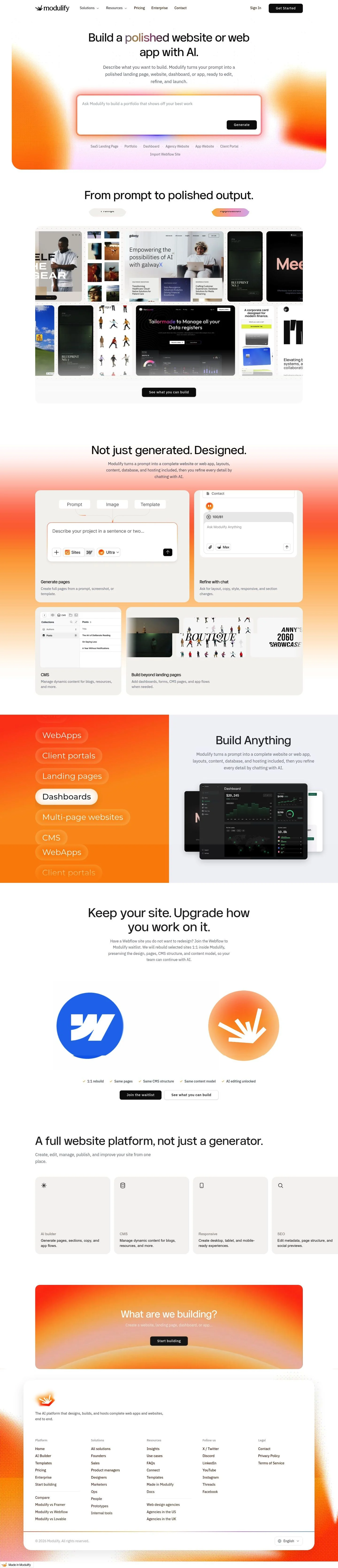
- Full page: https://cdn.designmunk.com/2026/09/09161939/modulify-ai-featured.webp
- Above the fold: https://cdn.designmunk.com/2026/09/09161939/modulify-ai-featured.webp
- On DesignMunk: https://designmunk.com/modulify/

Study these for hierarchy, rhythm, spacing and density. Where an image and the written spec disagree, the spec wins: the tokens were read from the page's own CSS, the images are one rendering of it.

## Before you start

Ask the user what they are building, who it is for, and what brand assets they already have — name, colours, typefaces. Wait for their answers before writing anything. Everything below is then applied to their product, not to the reference.

## Design specification

# Modulify: Gradient-glow Hero Framing a Prompt Console

## Overview

A type-driven, product-forward system built on high contrast (#131316 on white) with warm accent gradients for moments of emphasis. The tone is confident and technical but not cold—airy sections, minimal chrome, and sparing decoration. Audience spans founders to enterprise buyers; the feeling should be decisive and efficient, never playful. When in doubt, choose clarity, whitespace, and one strong accent over multiple decorative flourishes.

## Page Structure

- Global navigation: compact top bar; logo left, solution/resources clusters, pricing and enterprise links; auth links on the right with a high-contrast primary CTA.
- Hero: oversized single-line headline and short supporting copy centered; a large prompt input centered with a dark "Generate" button; soft sunset gradient panel behind.
- Use-case chips: a thin row of small rounded tags beneath the input, acting as quick-start presets.
- Template reel: headline with two small labels, followed by a wide horizontal gallery of template thumbnails in a bordered card.
- Feature overview: headline plus stacked copy and a row of concise feature blurbs; low-decoration, text-led.
- "Build Anything" statement: short reinforcing copy block, airy spacing.
- Webflow transfer callout: copy and a short checklist with two CTAs; presented as a contained card on white.
- Platform capabilities: a dense list of features presented in simple rows; minimal iconography.
- Closing CTA: short prompt to start building.
- Footer: multi-column site map with product, solutions, resources, compare links, socials, and legal; compact copyright and language switcher.

## Colors

- Primary (#131316): Core ink for headlines, body text, and critical icons.
- Secondary (#fb8811): Warm accent for subtle highlights; used sparingly beside gradients.
- Neutral (#ffffff): Primary surface and card backgrounds.
- brand-fire-opal (#fb3f04): Hot accent used in hero and chips; anchors the warm gradient.
- brand-double-dragon (#faa443): Lighter warm accent complementing fire-opal in gradients and highlights.
- Surface ({colors.neutral}): Canonical light background across the site.
- On-surface ({colors.primary}): Default text color when placed on surface backgrounds.

## Typography

- Neutralsans Medium: Headline family for headline-lg (48px/1.3, -0.01em), headline-md (38px/1.52), headline-sm (30px/1.2, -0.006em). Source type: custom/self-hosted; not Google-hosted. Recommended substitutes: Inter (Google), Manrope (Google), or Plus Jakarta Sans (Google) in Medium/SemiBold weights.
- Times New Roman: Headline-xs at 24px/1.21 for occasional emphasis or editorial subheads; widely available as a system serif.
- IBM Plex Sans: Body-md at 18.9px/1.63 for paragraphs and UI text. Source type: Google; can be loaded directly. Use weights 400–600 for emphasis while keeping headlines in Neutralsans or its substitutes.

## Layout

- Spacing scale uses 8px increments: xs 8, sm 16, md 24, lg 40, xl 80. Sections generally breathe at lg–xl on desktop, md on mobile.
- Content aligns to a centered single column with full-bleed moments (hero gradient, template reel container). Keep hero and major CTAs with xl top/bottom paddings.
- Inline gaps: sm for tight UI groupings (chips, input/button), md for card internals, lg for section content stacks.
- Grid usage is light; prefer stacked blocks and single rows of cards/reels over complex multi-column grids.

## Elevation & Depth

- Shadows are minimal: a 1px hairline shadow for subtle separation and no md/lg/xl depths. Depth is conveyed via strong ink on white, thin borders, and whitespace.
- The notable effect is an inner white glow for key interactive surfaces (prompt input) to suggest focus without heavy drop shadows.
- Reserve glow/gradient treatments for hero-level components to avoid visual noise elsewhere.

## Shapes

- Rounded sm = 8px for buttons, inputs, and chips—functional curvature without pill styling.
- Rounded md = 14px for cards, large input containers, and media frames—used to signal module boundaries and prominence.
- Keep radii consistent within a component; do not mix sm and md on the same element.

## Components

- Buttons
  - Primary: #0d0d0d background, #ffffff text, 39px height, 12px 30px padding, 8px radius. Use for key CTAs like Get Started and Generate.
  - Secondary: #fe3200 background, #131316 text, 39px height, 12px 30px padding, 8px radius. Use sparingly for supporting actions on light backgrounds.
  - Link: #131316 text, no radius; inline placement only.
- Card: White background, #131316 text, 14px radius, 16px padding. Use for reels, checklists, or grouped content.

### Hero Prompt Console
- Centered container on a warm gradient field blending #fb3f04 and #faa443. Large input with md (14px) radius and inner glow; primary "Generate" button docks to the right.

### Use-Case Chip Row
- A single line of compact chips beneath the input; 8px radius, sm horizontal spacing. Acts as presets; keep labels short.

### Template Reel
- Wide card with 14px radius containing a horizontally scrollable row of template thumbnails. Thin border or hairline shadow allowed; xl spacing above and below.

### Feature Blurb List
- Stacked text items under a section headline. Each item uses headline-sm for the title and body-md for detail. No icons required.

### Webflow Transfer Callout
- Two-part card: short pitch plus a checklist of 4–5 bullets, ending with primary and link CTAs. 14px radius, md padding, lg outer spacing.

### Platform Capabilities List
- Dense, multi-row list of short features. Use body-md with bold leads if needed; avoid heavy visuals.

### Mega-footer
- Multi-column link groups with short section headings in headline-xs and body-md links. Low-contrast dividers; generous vertical rhythm.

## Do's and Don'ts

- Do keep primary text in #131316 on #ffffff for maximum readability; reserve warm accents for emphasis and gradients.
- Do use 8px radii for interactive controls and 14px for containers; mixing within one component weakens hierarchy.
- Do keep sections airy with lg–xl vertical spacing; the design depends on whitespace, not heavy shadow.
- Don't overuse gradients or inner glows; restrict them to hero-level components and key demos.
- Don't replace IBM Plex Sans for body unless necessary; if headlines swap to Inter/Manrope, keep body unchanged for stability.
- Don't introduce new shadow depths; depth is conveyed via contrast, borders, and spacing.

## Agent Prompt Guide

Quick color reference
- Text: #131316
- Background: #ffffff
- Border: #131316
- Accent: #fb3f04 (use with #faa443 for gradients)

1) Build the hero with prompt console
- Container: background #ffffff with a full-width gradient panel blending #fb3f04 → #faa443.
- Headline: font-family 'Neutralsans Medium', Inter, system-ui; size 48px, line-height 1.3, letter-spacing -0.01em; color #131316; center aligned; spacing below lg (40px).
- Supporting copy: IBM Plex Sans 18.9px/1.63, color #131316 at 80% opacity.
- Prompt input: white background, 14px radius, inner white glow; height ~56–64px; padding md (24px). Dock a primary button at right: background #0d0d0d, text #ffffff, height 39px, padding 12px 30px, radius 8px.
- Preset chips row: small 8px-radius pills with sm (16px) gaps beneath the input.

2) Build the template reel section
- Section padding: xl (80px) top and bottom.
- Heading: headline-md (38px/1.52), #131316; short labels beneath using body-md.
- Reel: place a 14px-radius white card; inside, a horizontal row of equal-width thumbnails with sm (16px) gaps; enable overflow-x scroll.

3) Build the feature blurbs block
- Use a centered container, lg vertical spacing between items.
- Each item: title in headline-sm (30px/1.2, -0.006em), description in IBM Plex Sans 18.9px/1.63. No icons; rely on type.

4) Build the Webflow transfer callout
- White card, 14px radius, md (24px) padding, lg (40px) outer margins.
- Left: short paragraph (IBM Plex Sans 18.9px/1.63); Right: checklist with 4–5 bullets in body-md.
- Actions: primary button (#0d0d0d on #ffffff, 8px radius, 39px height) plus link button (#131316).

5) Build the mega-footer
- Multi-column list of links under short headings. Headings use headline-xs (24px/1.21, Times New Roman), links in IBM Plex Sans 18.9px/1.63. Keep dividers subtle; background #ffffff, text #131316.

## Similar Brands

- Framer: Similar white canvas with bold headlines and product-as-demo hero; Framer leans heavier on motion and brighter accent saturation.
- Webflow: Type-first with strong structure; Webflow uses darker themes more often and denser, icon-led feature lists.
- Lovable: Also prompt-centric with warm gradients; Lovable's components skew more playful and pill-shaped.
- Vercel: High-contrast, minimal shadows; Vercel is developer-leaning with darker palettes and more technical code visuals.

## Tokens

### CSS custom properties

```css
:root {
  /* Colors */
  --color-primary: #131316;
  --color-secondary: #fb8811;
  --color-neutral: #ffffff;
  --color-brand-fire-opal: #fb3f04;
  --color-brand-double-dragon: #faa443;
  --color-surface: var(--color-neutral);
  --color-on-surface: var(--color-primary);

  /* Typography */
  --text-headline-lg-size: 48px;
  --text-headline-lg-weight: 500;
  --text-headline-lg-leading: 1.3;
  --text-headline-lg-tracking: -0.01em;
  --text-headline-md-size: 38px;
  --text-headline-md-weight: 500;
  --text-headline-md-leading: 1.52;
  --text-headline-sm-size: 30px;
  --text-headline-sm-weight: 500;
  --text-headline-sm-leading: 1.2;
  --text-headline-sm-tracking: -0.006em;
  --text-headline-xs-size: 24px;
  --text-headline-xs-weight: 500;
  --text-headline-xs-leading: 1.21;
  --text-body-md-size: 18.9px;
  --text-body-md-weight: 400;
  --text-body-md-leading: 1.63;
  --font-neutralsans-medium: "Neutralsans Medium";
  --font-times-new-roman: "Times New Roman";
  --font-ibm-plex-sans: "IBM Plex Sans";

  /* Rounded */
  --radius-sm: 8px;
  --radius-md: 14px;

  /* Spacing */
  --spacing-xs: 8px;
  --spacing-sm: 16px;
  --spacing-md: 24px;
  --spacing-lg: 40px;
  --spacing-xl: 80px;

  /* Components */
  --button-primary-background-color: #0d0d0d;
  --button-primary-text-color: var(--color-neutral);
  --button-primary-rounded: var(--radius-sm);
  --button-primary-padding: 12px 30px;
  --button-primary-height: 39px;
  --button-secondary-background-color: #fe3200;
  --button-secondary-text-color: var(--color-primary);
  --button-secondary-rounded: var(--radius-sm);
  --button-secondary-padding: 12px 30px;
  --button-secondary-height: 39px;
  --button-link-text-color: var(--color-primary);
  --button-link-rounded: 0px;
  --card-background-color: var(--color-neutral);
  --card-text-color: var(--color-primary);
  --card-rounded: var(--radius-md);
  --card-padding: 16px;
}
```

### Tailwind theme

```css
@theme {
  --color-primary: #131316;
  --color-secondary: #fb8811;
  --color-neutral: #ffffff;
  --color-brand-fire-opal: #fb3f04;
  --color-brand-double-dragon: #faa443;
  --color-surface: #ffffff;
  --color-on-surface: #131316;
  --font-headline-lg: "Neutralsans Medium";
  --font-headline-md: "Neutralsans Medium";
  --font-headline-sm: "Neutralsans Medium";
  --font-headline-xs: "Times New Roman";
  --font-body-md: "IBM Plex Sans";
  --text-headline-lg: 48px;
  --text-headline-md: 38px;
  --text-headline-sm: 30px;
  --text-headline-xs: 24px;
  --text-body-md: 18.9px;
  --tracking-headline-lg: -0.01em;
  --tracking-headline-sm: -0.006em;
  --font-weight-headline-lg: 500;
  --font-weight-headline-md: 500;
  --font-weight-headline-sm: 500;
  --font-weight-headline-xs: 500;
  --font-weight-body-md: 400;
  --radius-sm: 8px;
  --radius-md: 14px;
  --spacing-xs: 8px;
  --spacing-sm: 16px;
  --spacing-md: 24px;
  --spacing-lg: 40px;
  --spacing-xl: 80px;
}
```

### Design tokens (DTCG)

```json
{
    "$schema": "https://www.designtokens.org/schemas/2025.10/format.json",
    "color": {
        "$type": "color",
        "primary": {
            "$value": {
                "colorSpace": "srgb",
                "components": [
                    0.075,
                    0.075,
                    0.086
                ],
                "hex": "#131316"
            }
        },
        "secondary": {
            "$value": {
                "colorSpace": "srgb",
                "components": [
                    0.984,
                    0.533,
                    0.067
                ],
                "hex": "#fb8811"
            }
        },
        "neutral": {
            "$value": {
                "colorSpace": "srgb",
                "components": [
                    1,
                    1,
                    1
                ],
                "hex": "#ffffff"
            }
        },
        "brand-fire-opal": {
            "$value": {
                "colorSpace": "srgb",
                "components": [
                    0.984,
                    0.247,
                    0.016
                ],
                "hex": "#fb3f04"
            }
        },
        "brand-double-dragon": {
            "$value": {
                "colorSpace": "srgb",
                "components": [
                    0.98,
                    0.643,
                    0.263
                ],
                "hex": "#faa443"
            }
        },
        "surface": {
            "$value": {
                "colorSpace": "srgb",
                "components": [
                    1,
                    1,
                    1
                ],
                "hex": "#ffffff"
            }
        },
        "on-surface": {
            "$value": {
                "colorSpace": "srgb",
                "components": [
                    0.075,
                    0.075,
                    0.086
                ],
                "hex": "#131316"
            }
        }
    },
    "spacing": {
        "$type": "dimension",
        "xs": {
            "$value": {
                "value": 8,
                "unit": "px"
            }
        },
        "sm": {
            "$value": {
                "value": 16,
                "unit": "px"
            }
        },
        "md": {
            "$value": {
                "value": 24,
                "unit": "px"
            }
        },
        "lg": {
            "$value": {
                "value": 40,
                "unit": "px"
            }
        },
        "xl": {
            "$value": {
                "value": 80,
                "unit": "px"
            }
        }
    },
    "rounded": {
        "$type": "dimension",
        "sm": {
            "$value": {
                "value": 8,
                "unit": "px"
            }
        },
        "md": {
            "$value": {
                "value": 14,
                "unit": "px"
            }
        }
    },
    "typography": {
        "headline-lg": {
            "$type": "typography",
            "$value": {
                "fontFamily": "Neutralsans Medium",
                "fontSize": {
                    "value": 48,
                    "unit": "px"
                },
                "fontWeight": 500,
                "letterSpacing": {
                    "value": -0.01,
                    "unit": "em"
                }
            }
        },
        "headline-md": {
            "$type": "typography",
            "$value": {
                "fontFamily": "Neutralsans Medium",
                "fontSize": {
                    "value": 38,
                    "unit": "px"
                },
                "fontWeight": 500
            }
        },
        "headline-sm": {
            "$type": "typography",
            "$value": {
                "fontFamily": "Neutralsans Medium",
                "fontSize": {
                    "value": 30,
                    "unit": "px"
                },
                "fontWeight": 500,
                "letterSpacing": {
                    "value": -0.006,
                    "unit": "em"
                }
            }
        },
        "headline-xs": {
            "$type": "typography",
            "$value": {
                "fontFamily": "Times New Roman",
                "fontSize": {
                    "value": 24,
                    "unit": "px"
                },
                "fontWeight": 500
            }
        },
        "body-md": {
            "$type": "typography",
            "$value": {
                "fontFamily": "IBM Plex Sans",
                "fontSize": {
                    "value": 18.9,
                    "unit": "px"
                },
                "fontWeight": 400
            }
        }
    }
}
```

## Rules

- **Fonts.** If the specification names a custom or self-hosted family, use one of the substitutes it names. Never reference a typeface you cannot actually load — it will fall back to a system font and undo the typography.
- **Colour.** Derive the palette from the user's brand. Use the token values as a guide to *relationships* — contrast, tint, how many accents carry the page — not as hex codes to paste.
- **Never reproduce** the wordmark, mascot, logo, brand name, illustrations, icon set, screenshots or any copy from the reference.
- **Never present the result as Modulify**, or imply any connection to it.
- If something is unspecified, choose clarity and legibility over decoration.
---
version: alpha
name: Modulify
description: Turn a prompt into a real website or web app—edit, refine, publish.
colors:
  primary: "#131316"
  secondary: "#fb8811"
  neutral: "#ffffff"
  brand-fire-opal: "#fb3f04"
  brand-double-dragon: "#faa443"
  surface: "{colors.neutral}"
  on-surface: "{colors.primary}"
typography:
  headline-lg:
    fontFamily: Neutralsans Medium
    fontSize: 48px
    fontWeight: 500
    lineHeight: 1.3
    letterSpacing: -0.01em
  headline-md:
    fontFamily: Neutralsans Medium
    fontSize: 38px
    fontWeight: 500
    lineHeight: 1.52
  headline-sm:
    fontFamily: Neutralsans Medium
    fontSize: 30px
    fontWeight: 500
    lineHeight: 1.2
    letterSpacing: -0.006em
  headline-xs:
    fontFamily: Times New Roman
    fontSize: 24px
    fontWeight: 500
    lineHeight: 1.21
  body-md:
    fontFamily: IBM Plex Sans
    fontSize: 18.9px
    fontWeight: 400
    lineHeight: 1.63
rounded:
  sm: 8px
  md: 14px
spacing:
  xs: 8px
  sm: 16px
  md: 24px
  lg: 40px
  xl: 80px
components:
  button-primary:
    backgroundColor: "#0d0d0d"
    textColor: "{colors.neutral}"
    rounded: "{rounded.sm}"
    padding: 12px 30px
    height: 39px
  button-secondary:
    backgroundColor: "#fe3200"
    textColor: "{colors.primary}"
    rounded: "{rounded.sm}"
    padding: 12px 30px
    height: 39px
  button-link:
    textColor: "{colors.primary}"
    rounded: 0px
  card:
    backgroundColor: "{colors.neutral}"
    textColor: "{colors.primary}"
    rounded: "{rounded.md}"
    padding: 16px
---

# Modulify: Gradient-glow Hero Framing a Prompt Console

## Overview

A type-driven, product-forward system built on high contrast (#131316 on white) with warm accent gradients for moments of emphasis. The tone is confident and technical but not cold—airy sections, minimal chrome, and sparing decoration. Audience spans founders to enterprise buyers; the feeling should be decisive and efficient, never playful. When in doubt, choose clarity, whitespace, and one strong accent over multiple decorative flourishes.

## Page Structure

- Global navigation: compact top bar; logo left, solution/resources clusters, pricing and enterprise links; auth links on the right with a high-contrast primary CTA.
- Hero: oversized single-line headline and short supporting copy centered; a large prompt input centered with a dark "Generate" button; soft sunset gradient panel behind.
- Use-case chips: a thin row of small rounded tags beneath the input, acting as quick-start presets.
- Template reel: headline with two small labels, followed by a wide horizontal gallery of template thumbnails in a bordered card.
- Feature overview: headline plus stacked copy and a row of concise feature blurbs; low-decoration, text-led.
- "Build Anything" statement: short reinforcing copy block, airy spacing.
- Webflow transfer callout: copy and a short checklist with two CTAs; presented as a contained card on white.
- Platform capabilities: a dense list of features presented in simple rows; minimal iconography.
- Closing CTA: short prompt to start building.
- Footer: multi-column site map with product, solutions, resources, compare links, socials, and legal; compact copyright and language switcher.

## Colors

- Primary (#131316): Core ink for headlines, body text, and critical icons.
- Secondary (#fb8811): Warm accent for subtle highlights; used sparingly beside gradients.
- Neutral (#ffffff): Primary surface and card backgrounds.
- brand-fire-opal (#fb3f04): Hot accent used in hero and chips; anchors the warm gradient.
- brand-double-dragon (#faa443): Lighter warm accent complementing fire-opal in gradients and highlights.
- Surface ({colors.neutral}): Canonical light background across the site.
- On-surface ({colors.primary}): Default text color when placed on surface backgrounds.

## Typography

- Neutralsans Medium: Headline family for headline-lg (48px/1.3, -0.01em), headline-md (38px/1.52), headline-sm (30px/1.2, -0.006em). Source type: custom/self-hosted; not Google-hosted. Recommended substitutes: Inter (Google), Manrope (Google), or Plus Jakarta Sans (Google) in Medium/SemiBold weights.
- Times New Roman: Headline-xs at 24px/1.21 for occasional emphasis or editorial subheads; widely available as a system serif.
- IBM Plex Sans: Body-md at 18.9px/1.63 for paragraphs and UI text. Source type: Google; can be loaded directly. Use weights 400–600 for emphasis while keeping headlines in Neutralsans or its substitutes.

## Layout

- Spacing scale uses 8px increments: xs 8, sm 16, md 24, lg 40, xl 80. Sections generally breathe at lg–xl on desktop, md on mobile.
- Content aligns to a centered single column with full-bleed moments (hero gradient, template reel container). Keep hero and major CTAs with xl top/bottom paddings.
- Inline gaps: sm for tight UI groupings (chips, input/button), md for card internals, lg for section content stacks.
- Grid usage is light; prefer stacked blocks and single rows of cards/reels over complex multi-column grids.

## Elevation & Depth

- Shadows are minimal: a 1px hairline shadow for subtle separation and no md/lg/xl depths. Depth is conveyed via strong ink on white, thin borders, and whitespace.
- The notable effect is an inner white glow for key interactive surfaces (prompt input) to suggest focus without heavy drop shadows.
- Reserve glow/gradient treatments for hero-level components to avoid visual noise elsewhere.

## Shapes

- Rounded sm = 8px for buttons, inputs, and chips—functional curvature without pill styling.
- Rounded md = 14px for cards, large input containers, and media frames—used to signal module boundaries and prominence.
- Keep radii consistent within a component; do not mix sm and md on the same element.

## Components

- Buttons
  - Primary: #0d0d0d background, #ffffff text, 39px height, 12px 30px padding, 8px radius. Use for key CTAs like Get Started and Generate.
  - Secondary: #fe3200 background, #131316 text, 39px height, 12px 30px padding, 8px radius. Use sparingly for supporting actions on light backgrounds.
  - Link: #131316 text, no radius; inline placement only.
- Card: White background, #131316 text, 14px radius, 16px padding. Use for reels, checklists, or grouped content.

### Hero Prompt Console
- Centered container on a warm gradient field blending #fb3f04 and #faa443. Large input with md (14px) radius and inner glow; primary "Generate" button docks to the right.

### Use-Case Chip Row
- A single line of compact chips beneath the input; 8px radius, sm horizontal spacing. Acts as presets; keep labels short.

### Template Reel
- Wide card with 14px radius containing a horizontally scrollable row of template thumbnails. Thin border or hairline shadow allowed; xl spacing above and below.

### Feature Blurb List
- Stacked text items under a section headline. Each item uses headline-sm for the title and body-md for detail. No icons required.

### Webflow Transfer Callout
- Two-part card: short pitch plus a checklist of 4–5 bullets, ending with primary and link CTAs. 14px radius, md padding, lg outer spacing.

### Platform Capabilities List
- Dense, multi-row list of short features. Use body-md with bold leads if needed; avoid heavy visuals.

### Mega-footer
- Multi-column link groups with short section headings in headline-xs and body-md links. Low-contrast dividers; generous vertical rhythm.

## Do's and Don'ts

- Do keep primary text in #131316 on #ffffff for maximum readability; reserve warm accents for emphasis and gradients.
- Do use 8px radii for interactive controls and 14px for containers; mixing within one component weakens hierarchy.
- Do keep sections airy with lg–xl vertical spacing; the design depends on whitespace, not heavy shadow.
- Don't overuse gradients or inner glows; restrict them to hero-level components and key demos.
- Don't replace IBM Plex Sans for body unless necessary; if headlines swap to Inter/Manrope, keep body unchanged for stability.
- Don't introduce new shadow depths; depth is conveyed via contrast, borders, and spacing.

## Agent Prompt Guide

Quick color reference
- Text: #131316
- Background: #ffffff
- Border: #131316
- Accent: #fb3f04 (use with #faa443 for gradients)

1) Build the hero with prompt console
- Container: background #ffffff with a full-width gradient panel blending #fb3f04 → #faa443.
- Headline: font-family 'Neutralsans Medium', Inter, system-ui; size 48px, line-height 1.3, letter-spacing -0.01em; color #131316; center aligned; spacing below lg (40px).
- Supporting copy: IBM Plex Sans 18.9px/1.63, color #131316 at 80% opacity.
- Prompt input: white background, 14px radius, inner white glow; height ~56–64px; padding md (24px). Dock a primary button at right: background #0d0d0d, text #ffffff, height 39px, padding 12px 30px, radius 8px.
- Preset chips row: small 8px-radius pills with sm (16px) gaps beneath the input.

2) Build the template reel section
- Section padding: xl (80px) top and bottom.
- Heading: headline-md (38px/1.52), #131316; short labels beneath using body-md.
- Reel: place a 14px-radius white card; inside, a horizontal row of equal-width thumbnails with sm (16px) gaps; enable overflow-x scroll.

3) Build the feature blurbs block
- Use a centered container, lg vertical spacing between items.
- Each item: title in headline-sm (30px/1.2, -0.006em), description in IBM Plex Sans 18.9px/1.63. No icons; rely on type.

4) Build the Webflow transfer callout
- White card, 14px radius, md (24px) padding, lg (40px) outer margins.
- Left: short paragraph (IBM Plex Sans 18.9px/1.63); Right: checklist with 4–5 bullets in body-md.
- Actions: primary button (#0d0d0d on #ffffff, 8px radius, 39px height) plus link button (#131316).

5) Build the mega-footer
- Multi-column list of links under short headings. Headings use headline-xs (24px/1.21, Times New Roman), links in IBM Plex Sans 18.9px/1.63. Keep dividers subtle; background #ffffff, text #131316.

## Similar Brands

- Framer: Similar white canvas with bold headlines and product-as-demo hero; Framer leans heavier on motion and brighter accent saturation.
- Webflow: Type-first with strong structure; Webflow uses darker themes more often and denser, icon-led feature lists.
- Lovable: Also prompt-centric with warm gradients; Lovable's components skew more playful and pill-shaped.
- Vercel: High-contrast, minimal shadows; Vercel is developer-leaning with darker palettes and more technical code visuals.
:root {
  /* Colors */
  --color-primary: #131316;
  --color-secondary: #fb8811;
  --color-neutral: #ffffff;
  --color-brand-fire-opal: #fb3f04;
  --color-brand-double-dragon: #faa443;
  --color-surface: var(--color-neutral);
  --color-on-surface: var(--color-primary);

  /* Typography */
  --text-headline-lg-size: 48px;
  --text-headline-lg-weight: 500;
  --text-headline-lg-leading: 1.3;
  --text-headline-lg-tracking: -0.01em;
  --text-headline-md-size: 38px;
  --text-headline-md-weight: 500;
  --text-headline-md-leading: 1.52;
  --text-headline-sm-size: 30px;
  --text-headline-sm-weight: 500;
  --text-headline-sm-leading: 1.2;
  --text-headline-sm-tracking: -0.006em;
  --text-headline-xs-size: 24px;
  --text-headline-xs-weight: 500;
  --text-headline-xs-leading: 1.21;
  --text-body-md-size: 18.9px;
  --text-body-md-weight: 400;
  --text-body-md-leading: 1.63;
  --font-neutralsans-medium: "Neutralsans Medium";
  --font-times-new-roman: "Times New Roman";
  --font-ibm-plex-sans: "IBM Plex Sans";

  /* Rounded */
  --radius-sm: 8px;
  --radius-md: 14px;

  /* Spacing */
  --spacing-xs: 8px;
  --spacing-sm: 16px;
  --spacing-md: 24px;
  --spacing-lg: 40px;
  --spacing-xl: 80px;

  /* Components */
  --button-primary-background-color: #0d0d0d;
  --button-primary-text-color: var(--color-neutral);
  --button-primary-rounded: var(--radius-sm);
  --button-primary-padding: 12px 30px;
  --button-primary-height: 39px;
  --button-secondary-background-color: #fe3200;
  --button-secondary-text-color: var(--color-primary);
  --button-secondary-rounded: var(--radius-sm);
  --button-secondary-padding: 12px 30px;
  --button-secondary-height: 39px;
  --button-link-text-color: var(--color-primary);
  --button-link-rounded: 0px;
  --card-background-color: var(--color-neutral);
  --card-text-color: var(--color-primary);
  --card-rounded: var(--radius-md);
  --card-padding: 16px;
}
{
  "$schema": "https://www.designtokens.org/schemas/2025.10/format.json",
  "$description": "Turn a prompt into a real website or web app—edit, refine, publish.",
  "color": {
    "$type": "color",
    "primary": {
      "$value": {
        "colorSpace": "srgb",
        "components": [
          0.075,
          0.075,
          0.086
        ],
        "hex": "#131316"
      }
    },
    "secondary": {
      "$value": {
        "colorSpace": "srgb",
        "components": [
          0.984,
          0.533,
          0.067
        ],
        "hex": "#fb8811"
      }
    },
    "neutral": {
      "$value": {
        "colorSpace": "srgb",
        "components": [
          1,
          1,
          1
        ],
        "hex": "#ffffff"
      }
    },
    "brand-fire-opal": {
      "$value": {
        "colorSpace": "srgb",
        "components": [
          0.984,
          0.247,
          0.016
        ],
        "hex": "#fb3f04"
      }
    },
    "brand-double-dragon": {
      "$value": {
        "colorSpace": "srgb",
        "components": [
          0.98,
          0.643,
          0.263
        ],
        "hex": "#faa443"
      }
    },
    "surface": {
      "$value": {
        "colorSpace": "srgb",
        "components": [
          1,
          1,
          1
        ],
        "hex": "#ffffff"
      }
    },
    "on-surface": {
      "$value": {
        "colorSpace": "srgb",
        "components": [
          0.075,
          0.075,
          0.086
        ],
        "hex": "#131316"
      }
    }
  },
  "spacing": {
    "$type": "dimension",
    "xs": {
      "$value": {
        "value": 8,
        "unit": "px"
      }
    },
    "sm": {
      "$value": {
        "value": 16,
        "unit": "px"
      }
    },
    "md": {
      "$value": {
        "value": 24,
        "unit": "px"
      }
    },
    "lg": {
      "$value": {
        "value": 40,
        "unit": "px"
      }
    },
    "xl": {
      "$value": {
        "value": 80,
        "unit": "px"
      }
    }
  },
  "rounded": {
    "$type": "dimension",
    "sm": {
      "$value": {
        "value": 8,
        "unit": "px"
      }
    },
    "md": {
      "$value": {
        "value": 14,
        "unit": "px"
      }
    }
  },
  "typography": {
    "headline-lg": {
      "$type": "typography",
      "$value": {
        "fontFamily": "Neutralsans Medium",
        "fontSize": {
          "value": 48,
          "unit": "px"
        },
        "fontWeight": 500,
        "letterSpacing": {
          "value": -0.01,
          "unit": "em"
        }
      }
    },
    "headline-md": {
      "$type": "typography",
      "$value": {
        "fontFamily": "Neutralsans Medium",
        "fontSize": {
          "value": 38,
          "unit": "px"
        },
        "fontWeight": 500
      }
    },
    "headline-sm": {
      "$type": "typography",
      "$value": {
        "fontFamily": "Neutralsans Medium",
        "fontSize": {
          "value": 30,
          "unit": "px"
        },
        "fontWeight": 500,
        "letterSpacing": {
          "value": -0.006,
          "unit": "em"
        }
      }
    },
    "headline-xs": {
      "$type": "typography",
      "$value": {
        "fontFamily": "Times New Roman",
        "fontSize": {
          "value": 24,
          "unit": "px"
        },
        "fontWeight": 500
      }
    },
    "body-md": {
      "$type": "typography",
      "$value": {
        "fontFamily": "IBM Plex Sans",
        "fontSize": {
          "value": 18.9,
          "unit": "px"
        },
        "fontWeight": 400
      }
    }
  }
}
@theme {
--color-primary: #131316;
--color-secondary: #fb8811;
--color-neutral: #ffffff;
--color-brand-fire-opal: #fb3f04;
--color-brand-double-dragon: #faa443;
--color-surface: #ffffff;
--color-on-surface: #131316;
--font-headline-lg: "Neutralsans Medium";
--font-headline-md: "Neutralsans Medium";
--font-headline-sm: "Neutralsans Medium";
--font-headline-xs: "Times New Roman";
--font-body-md: "IBM Plex Sans";
--text-headline-lg: 48px;
--text-headline-md: 38px;
--text-headline-sm: 30px;
--text-headline-xs: 24px;
--text-body-md: 18.9px;
--tracking-headline-lg: -0.01em;
--tracking-headline-sm: -0.006em;
--font-weight-headline-lg: 500;
--font-weight-headline-md: 500;
--font-weight-headline-sm: 500;
--font-weight-headline-xs: 500;
--font-weight-body-md: 400;
--radius-sm: 8px;
--radius-md: 14px;
--spacing-xs: 8px;
--spacing-sm: 16px;
--spacing-md: 24px;
--spacing-lg: 40px;
--spacing-xl: 80px;
} # Design brief: the Modulify design language
Below is a complete design specification measured from a real, published web page. Use it as a design language for the user's product. It is not a page to reproduce.
## Reference images
- Full page: https://cdn.designmunk.com/2026/09/09161939/modulify-ai-featured.webp
- Above the fold: https://cdn.designmunk.com/2026/09/09161939/modulify-ai-featured.webp
- On DesignMunk: https://designmunk.com/modulify/
Study these for hierarchy, rhythm, spacing and density. Where an image and the written spec disagree, the spec wins: the tokens were read from the page's own CSS, the images are one rendering of it.
## Before you start
Ask the user what they are building, who it is for, and what brand assets they already have — name, colours, typefaces. Wait for their answers before writing anything. Everything below is then applied to their product, not to the reference.
## Design specification
# Modulify: Gradient-glow Hero Framing a Prompt Console
## Overview
A type-driven, product-forward system built on high contrast (#131316 on white) with warm accent gradients for moments of emphasis. The tone is confident and technical but not cold—airy sections, minimal chrome, and sparing decoration. Audience spans founders to enterprise buyers; the feeling should be decisive and efficient, never playful. When in doubt, choose clarity, whitespace, and one strong accent over multiple decorative flourishes.
## Page Structure
- Global navigation: compact top bar; logo left, solution/resources clusters, pricing and enterprise links; auth links on the right with a high-contrast primary CTA.
- Hero: oversized single-line headline and short supporting copy centered; a large prompt input centered with a dark "Generate" button; soft sunset gradient panel behind.
- Use-case chips: a thin row of small rounded tags beneath the input, acting as quick-start presets.
- Template reel: headline with two small labels, followed by a wide horizontal gallery of template thumbnails in a bordered card.
- Feature overview: headline plus stacked copy and a row of concise feature blurbs; low-decoration, text-led.
- "Build Anything" statement: short reinforcing copy block, airy spacing.
- Webflow transfer callout: copy and a short checklist with two CTAs; presented as a contained card on white.
- Platform capabilities: a dense list of features presented in simple rows; minimal iconography.
- Closing CTA: short prompt to start building.
- Footer: multi-column site map with product, solutions, resources, compare links, socials, and legal; compact copyright and language switcher.
## Colors
- Primary (#131316): Core ink for headlines, body text, and critical icons.
- Secondary (#fb8811): Warm accent for subtle highlights; used sparingly beside gradients.
- Neutral (#ffffff): Primary surface and card backgrounds.
- brand-fire-opal (#fb3f04): Hot accent used in hero and chips; anchors the warm gradient.
- brand-double-dragon (#faa443): Lighter warm accent complementing fire-opal in gradients and highlights.
- Surface ({colors.neutral}): Canonical light background across the site.
- On-surface ({colors.primary}): Default text color when placed on surface backgrounds.
## Typography
- Neutralsans Medium: Headline family for headline-lg (48px/1.3, -0.01em), headline-md (38px/1.52), headline-sm (30px/1.2, -0.006em). Source type: custom/self-hosted; not Google-hosted. Recommended substitutes: Inter (Google), Manrope (Google), or Plus Jakarta Sans (Google) in Medium/SemiBold weights.
- Times New Roman: Headline-xs at 24px/1.21 for occasional emphasis or editorial subheads; widely available as a system serif.
- IBM Plex Sans: Body-md at 18.9px/1.63 for paragraphs and UI text. Source type: Google; can be loaded directly. Use weights 400–600 for emphasis while keeping headlines in Neutralsans or its substitutes.
## Layout
- Spacing scale uses 8px increments: xs 8, sm 16, md 24, lg 40, xl 80. Sections generally breathe at lg–xl on desktop, md on mobile.
- Content aligns to a centered single column with full-bleed moments (hero gradient, template reel container). Keep hero and major CTAs with xl top/bottom paddings.
- Inline gaps: sm for tight UI groupings (chips, input/button), md for card internals, lg for section content stacks.
- Grid usage is light; prefer stacked blocks and single rows of cards/reels over complex multi-column grids.
## Elevation & Depth
- Shadows are minimal: a 1px hairline shadow for subtle separation and no md/lg/xl depths. Depth is conveyed via strong ink on white, thin borders, and whitespace.
- The notable effect is an inner white glow for key interactive surfaces (prompt input) to suggest focus without heavy drop shadows.
- Reserve glow/gradient treatments for hero-level components to avoid visual noise elsewhere.
## Shapes
- Rounded sm = 8px for buttons, inputs, and chips—functional curvature without pill styling.
- Rounded md = 14px for cards, large input containers, and media frames—used to signal module boundaries and prominence.
- Keep radii consistent within a component; do not mix sm and md on the same element.
## Components
- Buttons
- Primary: #0d0d0d background, #ffffff text, 39px height, 12px 30px padding, 8px radius. Use for key CTAs like Get Started and Generate.
- Secondary: #fe3200 background, #131316 text, 39px height, 12px 30px padding, 8px radius. Use sparingly for supporting actions on light backgrounds.
- Link: #131316 text, no radius; inline placement only.
- Card: White background, #131316 text, 14px radius, 16px padding. Use for reels, checklists, or grouped content.
### Hero Prompt Console
- Centered container on a warm gradient field blending #fb3f04 and #faa443. Large input with md (14px) radius and inner glow; primary "Generate" button docks to the right.
### Use-Case Chip Row
- A single line of compact chips beneath the input; 8px radius, sm horizontal spacing. Acts as presets; keep labels short.
### Template Reel
- Wide card with 14px radius containing a horizontally scrollable row of template thumbnails. Thin border or hairline shadow allowed; xl spacing above and below.
### Feature Blurb List
- Stacked text items under a section headline. Each item uses headline-sm for the title and body-md for detail. No icons required.
### Webflow Transfer Callout
- Two-part card: short pitch plus a checklist of 4–5 bullets, ending with primary and link CTAs. 14px radius, md padding, lg outer spacing.
### Platform Capabilities List
- Dense, multi-row list of short features. Use body-md with bold leads if needed; avoid heavy visuals.
### Mega-footer
- Multi-column link groups with short section headings in headline-xs and body-md links. Low-contrast dividers; generous vertical rhythm.
## Do's and Don'ts
- Do keep primary text in #131316 on #ffffff for maximum readability; reserve warm accents for emphasis and gradients.
- Do use 8px radii for interactive controls and 14px for containers; mixing within one component weakens hierarchy.
- Do keep sections airy with lg–xl vertical spacing; the design depends on whitespace, not heavy shadow.
- Don't overuse gradients or inner glows; restrict them to hero-level components and key demos.
- Don't replace IBM Plex Sans for body unless necessary; if headlines swap to Inter/Manrope, keep body unchanged for stability.
- Don't introduce new shadow depths; depth is conveyed via contrast, borders, and spacing.
## Agent Prompt Guide
Quick color reference
- Text: #131316
- Background: #ffffff
- Border: #131316
- Accent: #fb3f04 (use with #faa443 for gradients)
1) Build the hero with prompt console
- Container: background #ffffff with a full-width gradient panel blending #fb3f04 → #faa443.
- Headline: font-family 'Neutralsans Medium', Inter, system-ui; size 48px, line-height 1.3, letter-spacing -0.01em; color #131316; center aligned; spacing below lg (40px).
- Supporting copy: IBM Plex Sans 18.9px/1.63, color #131316 at 80% opacity.
- Prompt input: white background, 14px radius, inner white glow; height ~56–64px; padding md (24px). Dock a primary button at right: background #0d0d0d, text #ffffff, height 39px, padding 12px 30px, radius 8px.
- Preset chips row: small 8px-radius pills with sm (16px) gaps beneath the input.
2) Build the template reel section
- Section padding: xl (80px) top and bottom.
- Heading: headline-md (38px/1.52), #131316; short labels beneath using body-md.
- Reel: place a 14px-radius white card; inside, a horizontal row of equal-width thumbnails with sm (16px) gaps; enable overflow-x scroll.
3) Build the feature blurbs block
- Use a centered container, lg vertical spacing between items.
- Each item: title in headline-sm (30px/1.2, -0.006em), description in IBM Plex Sans 18.9px/1.63. No icons; rely on type.
4) Build the Webflow transfer callout
- White card, 14px radius, md (24px) padding, lg (40px) outer margins.
- Left: short paragraph (IBM Plex Sans 18.9px/1.63); Right: checklist with 4–5 bullets in body-md.
- Actions: primary button (#0d0d0d on #ffffff, 8px radius, 39px height) plus link button (#131316).
5) Build the mega-footer
- Multi-column list of links under short headings. Headings use headline-xs (24px/1.21, Times New Roman), links in IBM Plex Sans 18.9px/1.63. Keep dividers subtle; background #ffffff, text #131316.
## Tokens
### CSS custom properties
```css
:root {
/* Colors */
--color-primary: #131316;
--color-secondary: #fb8811;
--color-neutral: #ffffff;
--color-brand-fire-opal: #fb3f04;
--color-brand-double-dragon: #faa443;
--color-surface: var(--color-neutral);
--color-on-surface: var(--color-primary);
/* Typography */
--text-headline-lg-size: 48px;
--text-headline-lg-weight: 500;
--text-headline-lg-leading: 1.3;
--text-headline-lg-tracking: -0.01em;
--text-headline-md-size: 38px;
--text-headline-md-weight: 500;
--text-headline-md-leading: 1.52;
--text-headline-sm-size: 30px;
--text-headline-sm-weight: 500;
--text-headline-sm-leading: 1.2;
--text-headline-sm-tracking: -0.006em;
--text-headline-xs-size: 24px;
--text-headline-xs-weight: 500;
--text-headline-xs-leading: 1.21;
--text-body-md-size: 18.9px;
--text-body-md-weight: 400;
--text-body-md-leading: 1.63;
--font-neutralsans-medium: "Neutralsans Medium";
--font-times-new-roman: "Times New Roman";
--font-ibm-plex-sans: "IBM Plex Sans";
/* Rounded */
--radius-sm: 8px;
--radius-md: 14px;
/* Spacing */
--spacing-xs: 8px;
--spacing-sm: 16px;
--spacing-md: 24px;
--spacing-lg: 40px;
--spacing-xl: 80px;
/* Components */
--button-primary-background-color: #0d0d0d;
--button-primary-text-color: var(--color-neutral);
--button-primary-rounded: var(--radius-sm);
--button-primary-padding: 12px 30px;
--button-primary-height: 39px;
--button-secondary-background-color: #fe3200;
--button-secondary-text-color: var(--color-primary);
--button-secondary-rounded: var(--radius-sm);
--button-secondary-padding: 12px 30px;
--button-secondary-height: 39px;
--button-link-text-color: var(--color-primary);
--button-link-rounded: 0px;
--card-background-color: var(--color-neutral);
--card-text-color: var(--color-primary);
--card-rounded: var(--radius-md);
--card-padding: 16px;
}
```
## Rules
- **Fonts.** If the specification names a custom or self-hosted family, use one of the substitutes it names. Never reference a typeface you cannot actually load — it will fall back to a system font and undo the typography.
- **Colour.** Derive the palette from the user's brand. Use the token values as a guide to *relationships* — contrast, tint, how many accents carry the page — not as hex codes to paste.
- **Never reproduce** the wordmark, mascot, logo, brand name, illustrations, icon set, screenshots or any copy from the reference.
- **Never present the result as Modulify**, or imply any connection to it.
- If something is unspecified, choose clarity and legibility over decoration.



