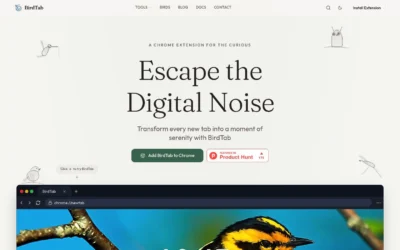





missiveapp.com

AI Breakdown
Design export
# Design brief: the Missive design language

Below is a complete design specification measured from a real, published web page. Use it as a design language for the user's product. It is not a page to reproduce.

## Reference images

- Full page: https://cdn.designmunk.com/2026/09/02093507/missiveapp-com-featured.webp
- Above the fold: https://cdn.designmunk.com/2026/09/02093507/missiveapp-com-featured.webp
- On DesignMunk: https://designmunk.com/missive/

Study these for hierarchy, rhythm, spacing and density. Where an image and the written spec disagree, the spec wins: the tokens were read from the page's own CSS, the images are one rendering of it.

## Before you start

Ask the user what they are building, who it is for, and what brand assets they already have — name, colours, typefaces. Wait for their answers before writing anything. Everything below is then applied to their product, not to the reference.

## Design specification

# Missive: Focused Serif Headlines and a Single Blue CTA

## Overview

Missive's UI aims for calm confidence: minimal color, high legibility, and generous spacing. It serves teams evaluating a collaborative inbox, so clarity and predictable hierarchy matter more than spectacle. The page should feel professional and approachable—spacious, light, and focused on the primary action.

## Colors

- **primary (#333333):** Core text and headlines; highest contrast on white.
- **secondary (#848487):** Secondary copy, meta labels, and subdued UI text.
- **tertiary (#2266ed):** Primary accent for CTAs, interactive highlights, and key links.
- **neutral (#ffffff):** Page background and card surfaces.
- **border (#e5e7eb):** Subtle dividers, card borders, and section separators.
- **brand-armor-wash (#040404):** Rarely used dark wash for media frames or overlays.
- **surface ({colors.neutral}):** Default surface color for cards and modules.
- **on-surface ({colors.primary}):** Default text color when placed on surfaces.

## Typography

- Headline Large — Tiempos Headline, 40px/1.3, weight 400. This is a self-hosted serif; agents should prefer obtainable substitutes when Tiempos isn't available: try Lora, Source Serif 4, or Georgia for a similar modern serif tone.
- Headline Medium — Inter, 34px/1.06, weight 400. Freely available from Google Fonts and safe to load.
- Headline Small/XS — Arial, 28px and 24px at 1.21. System-safe; if Arial is unavailable, use Helvetica, UI system sans (system-ui), or Inter.
- Body — Inter, 20px/1.4, weight 400. Use for all paragraphs, navigation, and UI labels. Favor Inter for consistency across components and captions.

## Layout

The spacing scale is 8px-based: xs 8, sm 16, md 32, lg 80, xl 196. Use md (32px) as the default vertical rhythm between related blocks; scale up to lg (80px) for section padding and to xl (196px) for top/bottom hero breathing room. Content reads best in a centered, single-column flow with media blocks spanning the same width. When using grids, a simple two-column layout with md gutters matches the examples on the page.

## Elevation & Depth

Depth is restrained. Cards and mockups sit on white with light borders (#e5e7eb) and occasional soft shadows: sm for tiny UI elements, md for dialogs or device frames, and lg for large hero media. No inner or extra-large shadows are used; hierarchy is conveyed primarily by whitespace, type scale, and borders.

## Shapes

Corners are consistently small and modern: rounded.sm at 8px. Apply 8px to buttons, cards, and media frames. Link-style buttons remain square (0px) to read as text-first actions.

## Components

Buttons
- Primary Button: 54px tall, 16px×24px padding, 8px radius. Background #2266ED with white text. Default for main CTAs like "Try for free."
- Secondary Button: 54px tall, 16px×24px padding, 8px radius. Background #f5f6f6 with #34363a text for low-emphasis actions like "Watch demo."
- Link Button: Text-only, #333333, 0px radius.

Cards
- White background, #333333 text, 16px padding, 8px radius. Use borders #e5e7eb and md shadow when elevation is needed.

### Top Navigation
Compact bar with Inter 20px links. Primary CTAs at the right ("Try for free") use the blue accent (#2266ED). Spacing sm (16px) horizontally; underline-free links with clear hover states.

### Hero with Dual CTAs
Headline in Tiempos Headline 40px/1.3, body Inter 20px. Two-button row: primary blue and secondary gray, both 54px tall with 8px radii. Section padding lg–xl to keep the intro airy.

### Product UI Mockup Window
Large media card on white with md or lg shadow for gentle lift. Outer frame uses border #e5e7eb and 8px corners to echo cards.

### Social Proof Band
Short section highlighting "6000+ companies rely on Missive." Set heading in Inter 34px and supporting text in Inter 20px. Use top/bottom borders #e5e7eb and md spacing.

### Feature Rows
Alternating blocks that pair a headline with descriptive copy. Headings in Inter 34px or Arial 28px depending on level; body in Inter 20px. Maintain md (32px) spacing between elements and lg (80px) between rows.

### Feature Tabs (Automations / Context / Customize)
Three-tab interface. Active tab uses #2266ED for the indicator and text; panels are white cards with 16px padding, 8px radius, and optional md shadow.

### Testimonial Cards with Video
Quote-first cards with customer details. Use card spec (white, 16px padding, 8px radius) and Inter 20px body; headings in Arial 28px for emphasis. Media thumbnails can adopt sm shadow.

### Footer Mega Menu
Multi-column list with Inter 20px links, grouped by headings. Light separators with #e5e7eb and generous md–lg vertical spacing.

## Do's and Don'ts

- Do reserve #2266ED for primary actions and key highlights; avoid using it for long text blocks.
- Do keep vertical rhythm on the 8/16/32/80 scale; default to 32px between related elements.
- Do set the main H1 in Tiempos Headline 40px (or Lora/Source Serif 4 if Tiempos isn't available).
- Don't mix corner radii; buttons, cards, and media should all use 8px.
- Don't add heavy shadows; prefer borders #e5e7eb and whitespace for separation.
- Don't introduce additional grays; use #333333 for primary text and #848487 for secondary.

## Agent Prompt Guide

Quick color reference
- Text: #333333
- Background: #FFFFFF
- Border: #E5E7EB
- Accent: #2266ED

1) Build a hero with dual CTAs
- Container: centered on #FFFFFF with top/bottom padding 196px.
- H1: Tiempos Headline (fallback: Lora), 40px, line-height 1.3, color #333333.
- Subhead: Inter 20px/1.4, color #848487, max-width comfortable.
- Buttons: Primary — 54px height, 16px×24px, radius 8px, bg #2266ED, text #FFFFFF. Secondary — same size, bg #F5F6F6, text #34363A.

2) Create a social-proof strip
- Section on #FFFFFF with 32px vertical padding and top/bottom borders #E5E7EB.
- Heading: Inter 34px/1.06, color #333333.
- Supporting text: Inter 20px, color #848487.

3) Feature tabs (3 items)
- Tab labels: Inter 20px; active label color #2266ED with a 2px underline in #2266ED.
- Panel: white card, 16px padding, radius 8px, shadow rgba(0,0,0,0.1) 0 0 32px 0.

4) Testimonial card
- Card: #FFFFFF, 16px padding, radius 8px, border #E5E7EB.
- Quote: Arial 28px/1.21, color #333333.
- Body/details: Inter 20px, color #848487. Include a small play overlay if using video, with sm shadow rgba(45,62,80,0.06) 0 -3px 8px 0.

5) App mockup block
- Frame a screenshot inside a card: bg #FFFFFF, radius 8px, shadow lg (rgb(228,230,233) 0 1px 1px 0, rgba(0,0,0,0.05) 0 48px 56px -8px), outer margin 32px.

## Similar Brands

- Front: Similar single-accent blue, calm typography, and collaboration-first messaging; Front leans denser with more enterprise UI chrome.
- Help Scout: Friendly sans-serif system with soft blues and white cards; more rounded and illustrative than Missive's restrained, serif-led voice.
- Superhuman: Minimal palette and disciplined spacing; darker theme and speed-oriented copy diverge from Missive's collaborative framing.
- Slack: White-card sections and soft grays; uses a multi-color accent language where Missive stays with a single signal blue.

## Tokens

### CSS custom properties

```css
:root {
  /* Colors */
  --color-primary: #333333;
  --color-secondary: #848487;
  --color-tertiary: #2266ed;
  --color-neutral: #ffffff;
  --color-border: #e5e7eb;
  --color-brand-armor-wash: #040404;
  --color-surface: var(--color-neutral);
  --color-on-surface: var(--color-primary);

  /* Typography */
  --text-headline-lg-size: 40px;
  --text-headline-lg-weight: 400;
  --text-headline-lg-leading: 1.3;
  --text-headline-md-size: 34px;
  --text-headline-md-weight: 400;
  --text-headline-md-leading: 1.06;
  --text-headline-sm-size: 28px;
  --text-headline-sm-weight: 400;
  --text-headline-sm-leading: 1.21;
  --text-headline-xs-size: 24px;
  --text-headline-xs-weight: 400;
  --text-headline-xs-leading: 1.21;
  --text-body-md-size: 20px;
  --text-body-md-weight: 400;
  --text-body-md-leading: 1.4;
  --font-tiempos-headline: "Tiempos Headline";
  --font-inter: "Inter";
  --font-arial: "Arial";

  /* Rounded */
  --radius-sm: 8px;

  /* Spacing */
  --spacing-xs: 8px;
  --spacing-sm: 16px;
  --spacing-md: 32px;
  --spacing-lg: 80px;
  --spacing-xl: 196px;

  /* Components */
  --button-primary-background-color: var(--color-tertiary);
  --button-primary-text-color: var(--color-neutral);
  --button-primary-rounded: var(--radius-sm);
  --button-primary-padding: 16px 24px;
  --button-primary-height: 54px;
  --button-secondary-background-color: #f5f6f6;
  --button-secondary-text-color: #34363a;
  --button-secondary-rounded: var(--radius-sm);
  --button-secondary-padding: 16px 24px;
  --button-secondary-height: 54px;
  --button-link-text-color: var(--color-primary);
  --button-link-rounded: 0px;
  --card-background-color: var(--color-neutral);
  --card-text-color: var(--color-primary);
  --card-rounded: var(--radius-sm);
  --card-padding: 16px;
}
```

### Tailwind theme

```css
@theme {
  --color-primary: #333333;
  --color-secondary: #848487;
  --color-tertiary: #2266ed;
  --color-neutral: #ffffff;
  --color-border: #e5e7eb;
  --color-brand-armor-wash: #040404;
  --color-surface: #ffffff;
  --color-on-surface: #333333;
  --font-headline-lg: "Tiempos Headline";
  --font-headline-md: "Inter";
  --font-headline-sm: "Arial";
  --font-headline-xs: "Arial";
  --font-body-md: "Inter";
  --text-headline-lg: 40px;
  --text-headline-md: 34px;
  --text-headline-sm: 28px;
  --text-headline-xs: 24px;
  --text-body-md: 20px;
  --font-weight-headline-lg: 400;
  --font-weight-headline-md: 400;
  --font-weight-headline-sm: 400;
  --font-weight-headline-xs: 400;
  --font-weight-body-md: 400;
  --radius-sm: 8px;
  --spacing-xs: 8px;
  --spacing-sm: 16px;
  --spacing-md: 32px;
  --spacing-lg: 80px;
  --spacing-xl: 196px;
}
```

### Design tokens (DTCG)

```json
{
    "$schema": "https://www.designtokens.org/schemas/2025.10/format.json",
    "color": {
        "$type": "color",
        "primary": {
            "$value": {
                "colorSpace": "srgb",
                "components": [
                    0.2,
                    0.2,
                    0.2
                ],
                "hex": "#333333"
            }
        },
        "secondary": {
            "$value": {
                "colorSpace": "srgb",
                "components": [
                    0.518,
                    0.518,
                    0.529
                ],
                "hex": "#848487"
            }
        },
        "tertiary": {
            "$value": {
                "colorSpace": "srgb",
                "components": [
                    0.133,
                    0.4,
                    0.929
                ],
                "hex": "#2266ed"
            }
        },
        "neutral": {
            "$value": {
                "colorSpace": "srgb",
                "components": [
                    1,
                    1,
                    1
                ],
                "hex": "#ffffff"
            }
        },
        "border": {
            "$value": {
                "colorSpace": "srgb",
                "components": [
                    0.898,
                    0.906,
                    0.922
                ],
                "hex": "#e5e7eb"
            }
        },
        "brand-armor-wash": {
            "$value": {
                "colorSpace": "srgb",
                "components": [
                    0.016,
                    0.016,
                    0.016
                ],
                "hex": "#040404"
            }
        },
        "surface": {
            "$value": {
                "colorSpace": "srgb",
                "components": [
                    1,
                    1,
                    1
                ],
                "hex": "#ffffff"
            }
        },
        "on-surface": {
            "$value": {
                "colorSpace": "srgb",
                "components": [
                    0.2,
                    0.2,
                    0.2
                ],
                "hex": "#333333"
            }
        }
    },
    "spacing": {
        "$type": "dimension",
        "xs": {
            "$value": {
                "value": 8,
                "unit": "px"
            }
        },
        "sm": {
            "$value": {
                "value": 16,
                "unit": "px"
            }
        },
        "md": {
            "$value": {
                "value": 32,
                "unit": "px"
            }
        },
        "lg": {
            "$value": {
                "value": 80,
                "unit": "px"
            }
        },
        "xl": {
            "$value": {
                "value": 196,
                "unit": "px"
            }
        }
    },
    "rounded": {
        "$type": "dimension",
        "sm": {
            "$value": {
                "value": 8,
                "unit": "px"
            }
        }
    },
    "typography": {
        "headline-lg": {
            "$type": "typography",
            "$value": {
                "fontFamily": "Tiempos Headline",
                "fontSize": {
                    "value": 40,
                    "unit": "px"
                },
                "fontWeight": 400
            }
        },
        "headline-md": {
            "$type": "typography",
            "$value": {
                "fontFamily": "Inter",
                "fontSize": {
                    "value": 34,
                    "unit": "px"
                },
                "fontWeight": 400
            }
        },
        "headline-sm": {
            "$type": "typography",
            "$value": {
                "fontFamily": "Arial",
                "fontSize": {
                    "value": 28,
                    "unit": "px"
                },
                "fontWeight": 400
            }
        },
        "headline-xs": {
            "$type": "typography",
            "$value": {
                "fontFamily": "Arial",
                "fontSize": {
                    "value": 24,
                    "unit": "px"
                },
                "fontWeight": 400
            }
        },
        "body-md": {
            "$type": "typography",
            "$value": {
                "fontFamily": "Inter",
                "fontSize": {
                    "value": 20,
                    "unit": "px"
                },
                "fontWeight": 400
            }
        }
    }
}
```

## Rules

- **Fonts.** If the specification names a custom or self-hosted family, use one of the substitutes it names. Never reference a typeface you cannot actually load — it will fall back to a system font and undo the typography.
- **Colour.** Derive the palette from the user's brand. Use the token values as a guide to *relationships* — contrast, tint, how many accents carry the page — not as hex codes to paste.
- **Never reproduce** the wordmark, mascot, logo, brand name, illustrations, icon set, screenshots or any copy from the reference.
- **Never present the result as Missive**, or imply any connection to it.
- If something is unspecified, choose clarity and legibility over decoration.
---
version: alpha
name: Missive
description: Inbox collaboration for teams that run on email
colors:
  primary: "#333333"
  secondary: "#848487"
  tertiary: "#2266ed"
  neutral: "#ffffff"
  border: "#e5e7eb"
  brand-armor-wash: "#040404"
  surface: "{colors.neutral}"
  on-surface: "{colors.primary}"
typography:
  headline-lg:
    fontFamily: Tiempos Headline
    fontSize: 40px
    fontWeight: 400
    lineHeight: 1.3
  headline-md:
    fontFamily: Inter
    fontSize: 34px
    fontWeight: 400
    lineHeight: 1.06
  headline-sm:
    fontFamily: Arial
    fontSize: 28px
    fontWeight: 400
    lineHeight: 1.21
  headline-xs:
    fontFamily: Arial
    fontSize: 24px
    fontWeight: 400
    lineHeight: 1.21
  body-md:
    fontFamily: Inter
    fontSize: 20px
    fontWeight: 400
    lineHeight: 1.4
rounded:
  sm: 8px
spacing:
  xs: 8px
  sm: 16px
  md: 32px
  lg: 80px
  xl: 196px
components:
  button-primary:
    backgroundColor: "{colors.tertiary}"
    textColor: "{colors.neutral}"
    rounded: "{rounded.sm}"
    padding: 16px 24px
    height: 54px
  button-secondary:
    backgroundColor: "#f5f6f6"
    textColor: "#34363a"
    rounded: "{rounded.sm}"
    padding: 16px 24px
    height: 54px
  button-link:
    textColor: "{colors.primary}"
    rounded: 0px
  card:
    backgroundColor: "{colors.neutral}"
    textColor: "{colors.primary}"
    rounded: "{rounded.sm}"
    padding: 16px
---

# Missive: Focused Serif Headlines and a Single Blue CTA

## Overview

Missive's UI aims for calm confidence: minimal color, high legibility, and generous spacing. It serves teams evaluating a collaborative inbox, so clarity and predictable hierarchy matter more than spectacle. The page should feel professional and approachable—spacious, light, and focused on the primary action.

## Colors

- **primary (#333333):** Core text and headlines; highest contrast on white.
- **secondary (#848487):** Secondary copy, meta labels, and subdued UI text.
- **tertiary (#2266ed):** Primary accent for CTAs, interactive highlights, and key links.
- **neutral (#ffffff):** Page background and card surfaces.
- **border (#e5e7eb):** Subtle dividers, card borders, and section separators.
- **brand-armor-wash (#040404):** Rarely used dark wash for media frames or overlays.
- **surface ({colors.neutral}):** Default surface color for cards and modules.
- **on-surface ({colors.primary}):** Default text color when placed on surfaces.

## Typography

- Headline Large — Tiempos Headline, 40px/1.3, weight 400. This is a self-hosted serif; agents should prefer obtainable substitutes when Tiempos isn't available: try Lora, Source Serif 4, or Georgia for a similar modern serif tone.
- Headline Medium — Inter, 34px/1.06, weight 400. Freely available from Google Fonts and safe to load.
- Headline Small/XS — Arial, 28px and 24px at 1.21. System-safe; if Arial is unavailable, use Helvetica, UI system sans (system-ui), or Inter.
- Body — Inter, 20px/1.4, weight 400. Use for all paragraphs, navigation, and UI labels. Favor Inter for consistency across components and captions.

## Layout

The spacing scale is 8px-based: xs 8, sm 16, md 32, lg 80, xl 196. Use md (32px) as the default vertical rhythm between related blocks; scale up to lg (80px) for section padding and to xl (196px) for top/bottom hero breathing room. Content reads best in a centered, single-column flow with media blocks spanning the same width. When using grids, a simple two-column layout with md gutters matches the examples on the page.

## Elevation & Depth

Depth is restrained. Cards and mockups sit on white with light borders (#e5e7eb) and occasional soft shadows: sm for tiny UI elements, md for dialogs or device frames, and lg for large hero media. No inner or extra-large shadows are used; hierarchy is conveyed primarily by whitespace, type scale, and borders.

## Shapes

Corners are consistently small and modern: rounded.sm at 8px. Apply 8px to buttons, cards, and media frames. Link-style buttons remain square (0px) to read as text-first actions.

## Components

Buttons
- Primary Button: 54px tall, 16px×24px padding, 8px radius. Background #2266ED with white text. Default for main CTAs like "Try for free."
- Secondary Button: 54px tall, 16px×24px padding, 8px radius. Background #f5f6f6 with #34363a text for low-emphasis actions like "Watch demo."
- Link Button: Text-only, #333333, 0px radius.

Cards
- White background, #333333 text, 16px padding, 8px radius. Use borders #e5e7eb and md shadow when elevation is needed.

### Top Navigation
Compact bar with Inter 20px links. Primary CTAs at the right ("Try for free") use the blue accent (#2266ED). Spacing sm (16px) horizontally; underline-free links with clear hover states.

### Hero with Dual CTAs
Headline in Tiempos Headline 40px/1.3, body Inter 20px. Two-button row: primary blue and secondary gray, both 54px tall with 8px radii. Section padding lg–xl to keep the intro airy.

### Product UI Mockup Window
Large media card on white with md or lg shadow for gentle lift. Outer frame uses border #e5e7eb and 8px corners to echo cards.

### Social Proof Band
Short section highlighting "6000+ companies rely on Missive." Set heading in Inter 34px and supporting text in Inter 20px. Use top/bottom borders #e5e7eb and md spacing.

### Feature Rows
Alternating blocks that pair a headline with descriptive copy. Headings in Inter 34px or Arial 28px depending on level; body in Inter 20px. Maintain md (32px) spacing between elements and lg (80px) between rows.

### Feature Tabs (Automations / Context / Customize)
Three-tab interface. Active tab uses #2266ED for the indicator and text; panels are white cards with 16px padding, 8px radius, and optional md shadow.

### Testimonial Cards with Video
Quote-first cards with customer details. Use card spec (white, 16px padding, 8px radius) and Inter 20px body; headings in Arial 28px for emphasis. Media thumbnails can adopt sm shadow.

### Footer Mega Menu
Multi-column list with Inter 20px links, grouped by headings. Light separators with #e5e7eb and generous md–lg vertical spacing.

## Do's and Don'ts

- Do reserve #2266ED for primary actions and key highlights; avoid using it for long text blocks.
- Do keep vertical rhythm on the 8/16/32/80 scale; default to 32px between related elements.
- Do set the main H1 in Tiempos Headline 40px (or Lora/Source Serif 4 if Tiempos isn't available).
- Don't mix corner radii; buttons, cards, and media should all use 8px.
- Don't add heavy shadows; prefer borders #e5e7eb and whitespace for separation.
- Don't introduce additional grays; use #333333 for primary text and #848487 for secondary.

## Agent Prompt Guide

Quick color reference
- Text: #333333
- Background: #FFFFFF
- Border: #E5E7EB
- Accent: #2266ED

1) Build a hero with dual CTAs
- Container: centered on #FFFFFF with top/bottom padding 196px.
- H1: Tiempos Headline (fallback: Lora), 40px, line-height 1.3, color #333333.
- Subhead: Inter 20px/1.4, color #848487, max-width comfortable.
- Buttons: Primary — 54px height, 16px×24px, radius 8px, bg #2266ED, text #FFFFFF. Secondary — same size, bg #F5F6F6, text #34363A.

2) Create a social-proof strip
- Section on #FFFFFF with 32px vertical padding and top/bottom borders #E5E7EB.
- Heading: Inter 34px/1.06, color #333333.
- Supporting text: Inter 20px, color #848487.

3) Feature tabs (3 items)
- Tab labels: Inter 20px; active label color #2266ED with a 2px underline in #2266ED.
- Panel: white card, 16px padding, radius 8px, shadow rgba(0,0,0,0.1) 0 0 32px 0.

4) Testimonial card
- Card: #FFFFFF, 16px padding, radius 8px, border #E5E7EB.
- Quote: Arial 28px/1.21, color #333333.
- Body/details: Inter 20px, color #848487. Include a small play overlay if using video, with sm shadow rgba(45,62,80,0.06) 0 -3px 8px 0.

5) App mockup block
- Frame a screenshot inside a card: bg #FFFFFF, radius 8px, shadow lg (rgb(228,230,233) 0 1px 1px 0, rgba(0,0,0,0.05) 0 48px 56px -8px), outer margin 32px.

## Similar Brands

- Front: Similar single-accent blue, calm typography, and collaboration-first messaging; Front leans denser with more enterprise UI chrome.
- Help Scout: Friendly sans-serif system with soft blues and white cards; more rounded and illustrative than Missive's restrained, serif-led voice.
- Superhuman: Minimal palette and disciplined spacing; darker theme and speed-oriented copy diverge from Missive's collaborative framing.
- Slack: White-card sections and soft grays; uses a multi-color accent language where Missive stays with a single signal blue.
:root {
  /* Colors */
  --color-primary: #333333;
  --color-secondary: #848487;
  --color-tertiary: #2266ed;
  --color-neutral: #ffffff;
  --color-border: #e5e7eb;
  --color-brand-armor-wash: #040404;
  --color-surface: var(--color-neutral);
  --color-on-surface: var(--color-primary);

  /* Typography */
  --text-headline-lg-size: 40px;
  --text-headline-lg-weight: 400;
  --text-headline-lg-leading: 1.3;
  --text-headline-md-size: 34px;
  --text-headline-md-weight: 400;
  --text-headline-md-leading: 1.06;
  --text-headline-sm-size: 28px;
  --text-headline-sm-weight: 400;
  --text-headline-sm-leading: 1.21;
  --text-headline-xs-size: 24px;
  --text-headline-xs-weight: 400;
  --text-headline-xs-leading: 1.21;
  --text-body-md-size: 20px;
  --text-body-md-weight: 400;
  --text-body-md-leading: 1.4;
  --font-tiempos-headline: "Tiempos Headline";
  --font-inter: "Inter";
  --font-arial: "Arial";

  /* Rounded */
  --radius-sm: 8px;

  /* Spacing */
  --spacing-xs: 8px;
  --spacing-sm: 16px;
  --spacing-md: 32px;
  --spacing-lg: 80px;
  --spacing-xl: 196px;

  /* Components */
  --button-primary-background-color: var(--color-tertiary);
  --button-primary-text-color: var(--color-neutral);
  --button-primary-rounded: var(--radius-sm);
  --button-primary-padding: 16px 24px;
  --button-primary-height: 54px;
  --button-secondary-background-color: #f5f6f6;
  --button-secondary-text-color: #34363a;
  --button-secondary-rounded: var(--radius-sm);
  --button-secondary-padding: 16px 24px;
  --button-secondary-height: 54px;
  --button-link-text-color: var(--color-primary);
  --button-link-rounded: 0px;
  --card-background-color: var(--color-neutral);
  --card-text-color: var(--color-primary);
  --card-rounded: var(--radius-sm);
  --card-padding: 16px;
}
{
  "$schema": "https://www.designtokens.org/schemas/2025.10/format.json",
  "$description": "Inbox collaboration for teams that run on email",
  "color": {
    "$type": "color",
    "primary": {
      "$value": {
        "colorSpace": "srgb",
        "components": [
          0.2,
          0.2,
          0.2
        ],
        "hex": "#333333"
      }
    },
    "secondary": {
      "$value": {
        "colorSpace": "srgb",
        "components": [
          0.518,
          0.518,
          0.529
        ],
        "hex": "#848487"
      }
    },
    "tertiary": {
      "$value": {
        "colorSpace": "srgb",
        "components": [
          0.133,
          0.4,
          0.929
        ],
        "hex": "#2266ed"
      }
    },
    "neutral": {
      "$value": {
        "colorSpace": "srgb",
        "components": [
          1,
          1,
          1
        ],
        "hex": "#ffffff"
      }
    },
    "border": {
      "$value": {
        "colorSpace": "srgb",
        "components": [
          0.898,
          0.906,
          0.922
        ],
        "hex": "#e5e7eb"
      }
    },
    "brand-armor-wash": {
      "$value": {
        "colorSpace": "srgb",
        "components": [
          0.016,
          0.016,
          0.016
        ],
        "hex": "#040404"
      }
    },
    "surface": {
      "$value": {
        "colorSpace": "srgb",
        "components": [
          1,
          1,
          1
        ],
        "hex": "#ffffff"
      }
    },
    "on-surface": {
      "$value": {
        "colorSpace": "srgb",
        "components": [
          0.2,
          0.2,
          0.2
        ],
        "hex": "#333333"
      }
    }
  },
  "spacing": {
    "$type": "dimension",
    "xs": {
      "$value": {
        "value": 8,
        "unit": "px"
      }
    },
    "sm": {
      "$value": {
        "value": 16,
        "unit": "px"
      }
    },
    "md": {
      "$value": {
        "value": 32,
        "unit": "px"
      }
    },
    "lg": {
      "$value": {
        "value": 80,
        "unit": "px"
      }
    },
    "xl": {
      "$value": {
        "value": 196,
        "unit": "px"
      }
    }
  },
  "rounded": {
    "$type": "dimension",
    "sm": {
      "$value": {
        "value": 8,
        "unit": "px"
      }
    }
  },
  "typography": {
    "headline-lg": {
      "$type": "typography",
      "$value": {
        "fontFamily": "Tiempos Headline",
        "fontSize": {
          "value": 40,
          "unit": "px"
        },
        "fontWeight": 400
      }
    },
    "headline-md": {
      "$type": "typography",
      "$value": {
        "fontFamily": "Inter",
        "fontSize": {
          "value": 34,
          "unit": "px"
        },
        "fontWeight": 400
      }
    },
    "headline-sm": {
      "$type": "typography",
      "$value": {
        "fontFamily": "Arial",
        "fontSize": {
          "value": 28,
          "unit": "px"
        },
        "fontWeight": 400
      }
    },
    "headline-xs": {
      "$type": "typography",
      "$value": {
        "fontFamily": "Arial",
        "fontSize": {
          "value": 24,
          "unit": "px"
        },
        "fontWeight": 400
      }
    },
    "body-md": {
      "$type": "typography",
      "$value": {
        "fontFamily": "Inter",
        "fontSize": {
          "value": 20,
          "unit": "px"
        },
        "fontWeight": 400
      }
    }
  }
}
@theme {
--color-primary: #333333;
--color-secondary: #848487;
--color-tertiary: #2266ed;
--color-neutral: #ffffff;
--color-border: #e5e7eb;
--color-brand-armor-wash: #040404;
--color-surface: #ffffff;
--color-on-surface: #333333;
--font-headline-lg: "Tiempos Headline";
--font-headline-md: "Inter";
--font-headline-sm: "Arial";
--font-headline-xs: "Arial";
--font-body-md: "Inter";
--text-headline-lg: 40px;
--text-headline-md: 34px;
--text-headline-sm: 28px;
--text-headline-xs: 24px;
--text-body-md: 20px;
--font-weight-headline-lg: 400;
--font-weight-headline-md: 400;
--font-weight-headline-sm: 400;
--font-weight-headline-xs: 400;
--font-weight-body-md: 400;
--radius-sm: 8px;
--spacing-xs: 8px;
--spacing-sm: 16px;
--spacing-md: 32px;
--spacing-lg: 80px;
--spacing-xl: 196px;
} # Design brief: the Missive design language
Below is a complete design specification measured from a real, published web page. Use it as a design language for the user's product. It is not a page to reproduce.
## Reference images
- Full page: https://cdn.designmunk.com/2026/09/02093507/missiveapp-com-featured.webp
- Above the fold: https://cdn.designmunk.com/2026/09/02093507/missiveapp-com-featured.webp
- On DesignMunk: https://designmunk.com/missive/
Study these for hierarchy, rhythm, spacing and density. Where an image and the written spec disagree, the spec wins: the tokens were read from the page's own CSS, the images are one rendering of it.
## Before you start
Ask the user what they are building, who it is for, and what brand assets they already have — name, colours, typefaces. Wait for their answers before writing anything. Everything below is then applied to their product, not to the reference.
## Design specification
# Missive: Focused Serif Headlines and a Single Blue CTA
## Overview
Missive's UI aims for calm confidence: minimal color, high legibility, and generous spacing. It serves teams evaluating a collaborative inbox, so clarity and predictable hierarchy matter more than spectacle. The page should feel professional and approachable—spacious, light, and focused on the primary action.
## Colors
- **primary (#333333):** Core text and headlines; highest contrast on white.
- **secondary (#848487):** Secondary copy, meta labels, and subdued UI text.
- **tertiary (#2266ed):** Primary accent for CTAs, interactive highlights, and key links.
- **neutral (#ffffff):** Page background and card surfaces.
- **border (#e5e7eb):** Subtle dividers, card borders, and section separators.
- **brand-armor-wash (#040404):** Rarely used dark wash for media frames or overlays.
- **surface ({colors.neutral}):** Default surface color for cards and modules.
- **on-surface ({colors.primary}):** Default text color when placed on surfaces.
## Typography
- Headline Large — Tiempos Headline, 40px/1.3, weight 400. This is a self-hosted serif; agents should prefer obtainable substitutes when Tiempos isn't available: try Lora, Source Serif 4, or Georgia for a similar modern serif tone.
- Headline Medium — Inter, 34px/1.06, weight 400. Freely available from Google Fonts and safe to load.
- Headline Small/XS — Arial, 28px and 24px at 1.21. System-safe; if Arial is unavailable, use Helvetica, UI system sans (system-ui), or Inter.
- Body — Inter, 20px/1.4, weight 400. Use for all paragraphs, navigation, and UI labels. Favor Inter for consistency across components and captions.
## Layout
The spacing scale is 8px-based: xs 8, sm 16, md 32, lg 80, xl 196. Use md (32px) as the default vertical rhythm between related blocks; scale up to lg (80px) for section padding and to xl (196px) for top/bottom hero breathing room. Content reads best in a centered, single-column flow with media blocks spanning the same width. When using grids, a simple two-column layout with md gutters matches the examples on the page.
## Elevation & Depth
Depth is restrained. Cards and mockups sit on white with light borders (#e5e7eb) and occasional soft shadows: sm for tiny UI elements, md for dialogs or device frames, and lg for large hero media. No inner or extra-large shadows are used; hierarchy is conveyed primarily by whitespace, type scale, and borders.
## Shapes
Corners are consistently small and modern: rounded.sm at 8px. Apply 8px to buttons, cards, and media frames. Link-style buttons remain square (0px) to read as text-first actions.
## Components
Buttons
- Primary Button: 54px tall, 16px×24px padding, 8px radius. Background #2266ED with white text. Default for main CTAs like "Try for free."
- Secondary Button: 54px tall, 16px×24px padding, 8px radius. Background #f5f6f6 with #34363a text for low-emphasis actions like "Watch demo."
- Link Button: Text-only, #333333, 0px radius.
Cards
- White background, #333333 text, 16px padding, 8px radius. Use borders #e5e7eb and md shadow when elevation is needed.
### Top Navigation
Compact bar with Inter 20px links. Primary CTAs at the right ("Try for free") use the blue accent (#2266ED). Spacing sm (16px) horizontally; underline-free links with clear hover states.
### Hero with Dual CTAs
Headline in Tiempos Headline 40px/1.3, body Inter 20px. Two-button row: primary blue and secondary gray, both 54px tall with 8px radii. Section padding lg–xl to keep the intro airy.
### Product UI Mockup Window
Large media card on white with md or lg shadow for gentle lift. Outer frame uses border #e5e7eb and 8px corners to echo cards.
### Social Proof Band
Short section highlighting "6000+ companies rely on Missive." Set heading in Inter 34px and supporting text in Inter 20px. Use top/bottom borders #e5e7eb and md spacing.
### Feature Rows
Alternating blocks that pair a headline with descriptive copy. Headings in Inter 34px or Arial 28px depending on level; body in Inter 20px. Maintain md (32px) spacing between elements and lg (80px) between rows.
### Feature Tabs (Automations / Context / Customize)
Three-tab interface. Active tab uses #2266ED for the indicator and text; panels are white cards with 16px padding, 8px radius, and optional md shadow.
### Testimonial Cards with Video
Quote-first cards with customer details. Use card spec (white, 16px padding, 8px radius) and Inter 20px body; headings in Arial 28px for emphasis. Media thumbnails can adopt sm shadow.
### Footer Mega Menu
Multi-column list with Inter 20px links, grouped by headings. Light separators with #e5e7eb and generous md–lg vertical spacing.
## Do's and Don'ts
- Do reserve #2266ED for primary actions and key highlights; avoid using it for long text blocks.
- Do keep vertical rhythm on the 8/16/32/80 scale; default to 32px between related elements.
- Do set the main H1 in Tiempos Headline 40px (or Lora/Source Serif 4 if Tiempos isn't available).
- Don't mix corner radii; buttons, cards, and media should all use 8px.
- Don't add heavy shadows; prefer borders #e5e7eb and whitespace for separation.
- Don't introduce additional grays; use #333333 for primary text and #848487 for secondary.
## Agent Prompt Guide
Quick color reference
- Text: #333333
- Background: #FFFFFF
- Border: #E5E7EB
- Accent: #2266ED
1) Build a hero with dual CTAs
- Container: centered on #FFFFFF with top/bottom padding 196px.
- H1: Tiempos Headline (fallback: Lora), 40px, line-height 1.3, color #333333.
- Subhead: Inter 20px/1.4, color #848487, max-width comfortable.
- Buttons: Primary — 54px height, 16px×24px, radius 8px, bg #2266ED, text #FFFFFF. Secondary — same size, bg #F5F6F6, text #34363A.
2) Create a social-proof strip
- Section on #FFFFFF with 32px vertical padding and top/bottom borders #E5E7EB.
- Heading: Inter 34px/1.06, color #333333.
- Supporting text: Inter 20px, color #848487.
3) Feature tabs (3 items)
- Tab labels: Inter 20px; active label color #2266ED with a 2px underline in #2266ED.
- Panel: white card, 16px padding, radius 8px, shadow rgba(0,0,0,0.1) 0 0 32px 0.
4) Testimonial card
- Card: #FFFFFF, 16px padding, radius 8px, border #E5E7EB.
- Quote: Arial 28px/1.21, color #333333.
- Body/details: Inter 20px, color #848487. Include a small play overlay if using video, with sm shadow rgba(45,62,80,0.06) 0 -3px 8px 0.
5) App mockup block
- Frame a screenshot inside a card: bg #FFFFFF, radius 8px, shadow lg (rgb(228,230,233) 0 1px 1px 0, rgba(0,0,0,0.05) 0 48px 56px -8px), outer margin 32px.
## Tokens
### CSS custom properties
```css
:root {
/* Colors */
--color-primary: #333333;
--color-secondary: #848487;
--color-tertiary: #2266ed;
--color-neutral: #ffffff;
--color-border: #e5e7eb;
--color-brand-armor-wash: #040404;
--color-surface: var(--color-neutral);
--color-on-surface: var(--color-primary);
/* Typography */
--text-headline-lg-size: 40px;
--text-headline-lg-weight: 400;
--text-headline-lg-leading: 1.3;
--text-headline-md-size: 34px;
--text-headline-md-weight: 400;
--text-headline-md-leading: 1.06;
--text-headline-sm-size: 28px;
--text-headline-sm-weight: 400;
--text-headline-sm-leading: 1.21;
--text-headline-xs-size: 24px;
--text-headline-xs-weight: 400;
--text-headline-xs-leading: 1.21;
--text-body-md-size: 20px;
--text-body-md-weight: 400;
--text-body-md-leading: 1.4;
--font-tiempos-headline: "Tiempos Headline";
--font-inter: "Inter";
--font-arial: "Arial";
/* Rounded */
--radius-sm: 8px;
/* Spacing */
--spacing-xs: 8px;
--spacing-sm: 16px;
--spacing-md: 32px;
--spacing-lg: 80px;
--spacing-xl: 196px;
/* Components */
--button-primary-background-color: var(--color-tertiary);
--button-primary-text-color: var(--color-neutral);
--button-primary-rounded: var(--radius-sm);
--button-primary-padding: 16px 24px;
--button-primary-height: 54px;
--button-secondary-background-color: #f5f6f6;
--button-secondary-text-color: #34363a;
--button-secondary-rounded: var(--radius-sm);
--button-secondary-padding: 16px 24px;
--button-secondary-height: 54px;
--button-link-text-color: var(--color-primary);
--button-link-rounded: 0px;
--card-background-color: var(--color-neutral);
--card-text-color: var(--color-primary);
--card-rounded: var(--radius-sm);
--card-padding: 16px;
}
```
## Rules
- **Fonts.** If the specification names a custom or self-hosted family, use one of the substitutes it names. Never reference a typeface you cannot actually load — it will fall back to a system font and undo the typography.
- **Colour.** Derive the palette from the user's brand. Use the token values as a guide to *relationships* — contrast, tint, how many accents carry the page — not as hex codes to paste.
- **Never reproduce** the wordmark, mascot, logo, brand name, illustrations, icon set, screenshots or any copy from the reference.
- **Never present the result as Missive**, or imply any connection to it.
- If something is unspecified, choose clarity and legibility over decoration.