







maillayer.com
AI Breakdown
Design export
# Design brief: the MailLayer design language

Below is a complete design specification measured from a real, published web page. Use it as a design language for the user's product. It is not a page to reproduce.

## Reference images

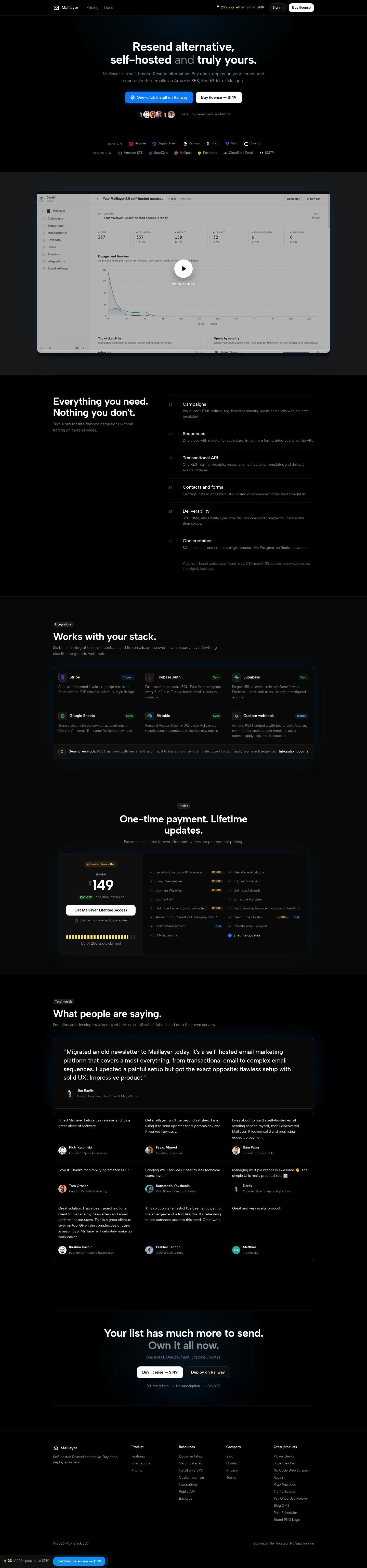
- Full page: https://cdn.designmunk.com/2026/09/07091430/maillayer-com-featured.webp
- Above the fold: https://cdn.designmunk.com/2026/09/07091430/maillayer-com-featured.webp
- On DesignMunk: https://designmunk.com/maillayer/

Study these for hierarchy, rhythm, spacing and density. Where an image and the written spec disagree, the spec wins: the tokens were read from the page's own CSS, the images are one rendering of it.

## Before you start

Ask the user what they are building, who it is for, and what brand assets they already have — name, colours, typefaces. Wait for their answers before writing anything. Everything below is then applied to their product, not to the reference.

## Design specification

# MailLayer: Dark Developer Landing With Lifetime Deal Spotlight

## Overview

MailLayer targets developers and technical founders choosing to self-host. The interface is dark, confident, and utilitarian, favoring dense information blocks over ornament. Spacing is compact-to-moderate with clear vertical rhythm, and accents are used sparingly to call out actions, counts, and prices. When no token applies, default to high-contrast dark mode: black surfaces, soft-grey text, and yellow for emphasis.

## Colors

- **primary (#999999):** Default body copy on dark surfaces and subdued UI text.
- **secondary (#747474):** Secondary labels, helper text, and muted metadata beneath headings.
- **tertiary (#ffcb6b):** Highlights for prices, counts, badges, and step numbers.
- **neutral (#000000):** Page background, card fills, and modal backdrops.
- **border (#ffffff):** Text on dark fills and hairline dividers; use at 1px for separators.
- **brand-brainstem-grey (#b5b5b5):** Logo rows and muted iconography in trust sections.
- **brand-american-silver (#cecece):** Higher-contrast logos or accent labels over black.
- **surface (#000000):** Primary surface color for sections and cards.
- **on-surface (#999999):** Default text color on surface when no override is specified.

## Typography

- Albert Sans is the sole family across headings and body. It is freely available via Google Fonts and can be loaded directly. Use it for all text elements.
- Headline levels: lg 48px/1.06/700 (-0.03em) for hero titles; md 37px/1.19/700 for section leads; sm 29px/1.21/500 and xs 22px/1.18/500 for feature headings and card titles.
- Body: 17px/1.6/400 (-0.004em) for paragraphs and lists. Keep long blocks to 60–75ch on desktop for readability in dark mode.
- System fallbacks if Google Fonts is unavailable: Inter, Manrope, or Segoe UI/Helvetica Neue as last-resort sans-serif stand-ins with similar x-height and spacing.

## Layout

- Spacing scale: xs 6px for micro gaps; sm 16px as the base step; md 24px for intra-section gaps; lg 40px for section padding; xl 72px for major hero/top-bottom spacing.
- Structure favors stacked sections with a centered content column. Use sm–md gaps within components and lg–xl padding between sections.
- Trust logo rows and feature lists use tighter md spacing to keep density appropriate for developer audiences.
- Keep line lengths moderate; align actions and captions to a single content column to maintain rhythm on the dark canvas.

## Elevation & Depth

- Depth is subtle. Use measured shadows sparingly: sm for small lifts on controls, md (rgba(0, 144, 255, 0.7) 0 0 10 0) or lg (rgba(0, 144, 255, 0.6) 0 0 24px -6px) to halo key media like the demo or a featured CTA on black.
- Where shadows are "none", separate layers with 1px borders in #ffffff and tonal contrast between #000000 surfaces and #999999 copy.
- Avoid heavy blur or stacked shadows; the hierarchy is conveyed primarily by whitespace, size, and color shifts.

## Shapes

- Radius language is consistent: rounded.sm = 12px for buttons, cards, inputs, and pills.
- Use square corners only for text links and inline elements (button-link has 0px). Roundness signals interactivity and focus in an otherwise rectilinear grid.

## Components

- Buttons
  - Primary: background #121212 with #ffffff text, 46px height, 12px radius, 15px 20px padding. Use for the main on-site action (e.g., Buy license).
  - Secondary: background #ffffff with #000000 text, same size specs. Use when the contrasting light pill is the clearer choice on a dark surface.
  - Link: text-only in #999999, 0px radius; reserve for tertiary actions.
- Card: #000000 background with #ffffff text, 12px radius, 1px padding; use for framed media or pricing blocks.

### Hero banner
- Headline uses headline-lg (48px/700, -0.03em). Subcopy set in body-md (17px/1.6). Two buttons side-by-side: Secondary (#ffffff) and Primary (#121212), both 46px tall with 12px radius. Vertical spacing: xl (72px) top/bottom; md (24px) between text and CTAs.

### Logo trust strips
- Two rows: "Runs on" and "Sends via". Labels in secondary #747474; logos tinted to #b5b5b5 or #cecece. Row gap md (24px); icon gaps sm (16px). Optional 1px #ffffff divider above the strip.

### Feature index (01–06)
- Six items aligned to the content column. Step numbers in tertiary #ffcb6b, headings in headline-xs (22px/500), body in 17px. Use md (24px) item gaps and lg (40px) section padding.

### Demo player frame
- Card container with 12px radius and 1px padding. Apply md shadow (rgba(0, 144, 255, 0.7) 0 0 10 0) to lift the media on black. Center a circular play control; caption text in primary #999999.

### Integrations grid
- A stacked list or 2-column grid of cards. Each item: integration name in headline-sm (29px/500), a small status label (Trigger/Sync) in secondary #747474, body in 17px. Gaps md (24px); section padding lg (40px).

### Pricing spotlight
- One-time license block with headline-md (37px/700) and price emphasized with tertiary #ffcb6b. Include a progress/meter row and a Primary or Secondary button (46px height). Outer padding lg (40px).

### Testimonial stack
- Quote text in 17px with increased line length; author row in #cecece and avatar strip beneath. Item gaps md (24px); section spacing lg (40px).

## Do's and Don'ts

- Do use #ffcb6b only for counts, highlights, and prices; keep it scarce so it reads as a signal.
- Do keep buttons at 46px height with 12px radius for consistency across hero, pricing, and footers.
- Do render vendor and partner logos in desaturated greys (#b5b5b5 or #cecece) on black.
- Don't mix additional brand colors; if emphasis is required, use the provided shadows or the tertiary yellow.
- Don't increase body size beyond 17px within dense sections; favor spacing (md–lg) to create air instead.
- Don't stack more than two shadows; prefer borders (#ffffff at 1px) for separation on dark surfaces.

## Agent Prompt Guide

Quick references
- Text: #999999 on #000000
- Background: #000000 (surface)
- Border: #ffffff at 1px
- Accent: #ffcb6b (tertiary)

1) Build the hero
- Background #000000. Center a headline in Albert Sans 48px/1.06/700, letter-spacing -0.03em, color #ffffff. Add a 17px/1.6 paragraph in #999999. Place two buttons: Secondary (#ffffff bg, #000000 text) and Primary (#121212 bg, #ffffff text), both 46px tall, 12px radius, 15px 20px padding. Use 72px top/bottom padding and 24px spacing between elements.

2) Trust logo strip
- Add a row labeled in Albert Sans 17px/1.6, color #747474. Place monochrome logos tinted #b5b5b5 with 16px gaps. Use 24px vertical spacing and an optional 1px #ffffff divider.

3) Feature index (01–06)
- Create six items. Number each in #ffcb6b. Headings in Albert Sans 22px/1.18/500; descriptions in 17px/1.6 #999999. Use 24px item gaps and 40px section padding.

4) Pricing card
- Card background #000000 with 12px radius and 1px #ffffff border. Title in 37px/1.19/700; show the sale price emphasized in #ffcb6b. Add a Primary button (#121212 bg, #ffffff text), 46px tall. Apply 40px inner padding and 24px element spacing.

5) Demo media block
- Wrap the screenshot/video in a card (12px radius, 1px padding). Apply md shadow: rgba(0, 144, 255, 0.7) 0 0 10 0. Caption in 17px #999999. Align to the main content column.

## Similar Brands

- Resend — similar dark, developer-centric marketing with restrained color; Maillayer diverges by emphasizing one-time licensing and self-hosting from the first screen.
- Postmark — uses focused typography and product-led storytelling; Maillayer is darker, with fewer brand colors and more infrastructure logos.
- Railway — shares the dark palette and glowing highlights; Maillayer applies that glow more sparingly and centers lifetime purchase over usage pricing.
- Fly.io — developer-forward copy and dense sections; Maillayer is more sales-direct with a visible scarcity meter and one-time pricing.
- DigitalOcean — familiar trust-logo rhythms; Maillayer keeps accents to a single yellow and tighter component radii (12px).

## Tokens

### CSS custom properties

```css
:root {
  /* Colors */
  --color-primary: #999999;
  --color-secondary: #747474;
  --color-tertiary: #ffcb6b;
  --color-neutral: #000000;
  --color-border: #ffffff;
  --color-brand-brainstem-grey: #b5b5b5;
  --color-brand-american-silver: #cecece;
  --color-surface: var(--color-neutral);
  --color-on-surface: var(--color-primary);

  /* Typography */
  --text-headline-lg-size: 48px;
  --text-headline-lg-weight: 700;
  --text-headline-lg-leading: 1.06;
  --text-headline-lg-tracking: -0.03em;
  --text-headline-md-size: 37px;
  --text-headline-md-weight: 700;
  --text-headline-md-leading: 1.19;
  --text-headline-md-tracking: -0.027em;
  --text-headline-sm-size: 29px;
  --text-headline-sm-weight: 500;
  --text-headline-sm-leading: 1.21;
  --text-headline-sm-tracking: -0.009em;
  --text-headline-xs-size: 22px;
  --text-headline-xs-weight: 500;
  --text-headline-xs-leading: 1.18;
  --text-body-md-size: 17px;
  --text-body-md-weight: 400;
  --text-body-md-leading: 1.6;
  --text-body-md-tracking: -0.004em;
  --font-albert-sans: "Albert Sans";

  /* Rounded */
  --radius-sm: 12px;

  /* Spacing */
  --spacing-xs: 6px;
  --spacing-sm: 16px;
  --spacing-md: 24px;
  --spacing-lg: 40px;
  --spacing-xl: 72px;

  /* Components */
  --button-primary-background-color: #121212;
  --button-primary-text-color: var(--color-border);
  --button-primary-rounded: var(--radius-sm);
  --button-primary-padding: 15px 20px;
  --button-primary-height: 46px;
  --button-secondary-background-color: var(--color-border);
  --button-secondary-text-color: var(--color-neutral);
  --button-secondary-rounded: var(--radius-sm);
  --button-secondary-padding: 15px 20px;
  --button-secondary-height: 46px;
  --button-link-text-color: var(--color-primary);
  --button-link-rounded: 0px;
  --card-background-color: var(--color-neutral);
  --card-text-color: var(--color-border);
  --card-rounded: var(--radius-sm);
  --card-padding: 1px;
}
```

### Tailwind theme

```css
@theme {
  --color-primary: #999999;
  --color-secondary: #747474;
  --color-tertiary: #ffcb6b;
  --color-neutral: #000000;
  --color-border: #ffffff;
  --color-brand-brainstem-grey: #b5b5b5;
  --color-brand-american-silver: #cecece;
  --color-surface: #000000;
  --color-on-surface: #999999;
  --font-headline-lg: "Albert Sans";
  --font-headline-md: "Albert Sans";
  --font-headline-sm: "Albert Sans";
  --font-headline-xs: "Albert Sans";
  --font-body-md: "Albert Sans";
  --text-headline-lg: 48px;
  --text-headline-md: 37px;
  --text-headline-sm: 29px;
  --text-headline-xs: 22px;
  --text-body-md: 17px;
  --tracking-headline-lg: -0.03em;
  --tracking-headline-md: -0.027em;
  --tracking-headline-sm: -0.009em;
  --tracking-body-md: -0.004em;
  --font-weight-headline-lg: 700;
  --font-weight-headline-md: 700;
  --font-weight-headline-sm: 500;
  --font-weight-headline-xs: 500;
  --font-weight-body-md: 400;
  --radius-sm: 12px;
  --spacing-xs: 6px;
  --spacing-sm: 16px;
  --spacing-md: 24px;
  --spacing-lg: 40px;
  --spacing-xl: 72px;
}
```

### Design tokens (DTCG)

```json
{
    "$schema": "https://www.designtokens.org/schemas/2025.10/format.json",
    "color": {
        "$type": "color",
        "primary": {
            "$value": {
                "colorSpace": "srgb",
                "components": [
                    0.6,
                    0.6,
                    0.6
                ],
                "hex": "#999999"
            }
        },
        "secondary": {
            "$value": {
                "colorSpace": "srgb",
                "components": [
                    0.455,
                    0.455,
                    0.455
                ],
                "hex": "#747474"
            }
        },
        "tertiary": {
            "$value": {
                "colorSpace": "srgb",
                "components": [
                    1,
                    0.796,
                    0.42
                ],
                "hex": "#ffcb6b"
            }
        },
        "neutral": {
            "$value": {
                "colorSpace": "srgb",
                "components": [
                    0,
                    0,
                    0
                ],
                "hex": "#000000"
            }
        },
        "border": {
            "$value": {
                "colorSpace": "srgb",
                "components": [
                    1,
                    1,
                    1
                ],
                "hex": "#ffffff"
            }
        },
        "brand-brainstem-grey": {
            "$value": {
                "colorSpace": "srgb",
                "components": [
                    0.71,
                    0.71,
                    0.71
                ],
                "hex": "#b5b5b5"
            }
        },
        "brand-american-silver": {
            "$value": {
                "colorSpace": "srgb",
                "components": [
                    0.808,
                    0.808,
                    0.808
                ],
                "hex": "#cecece"
            }
        },
        "surface": {
            "$value": {
                "colorSpace": "srgb",
                "components": [
                    0,
                    0,
                    0
                ],
                "hex": "#000000"
            }
        },
        "on-surface": {
            "$value": {
                "colorSpace": "srgb",
                "components": [
                    0.6,
                    0.6,
                    0.6
                ],
                "hex": "#999999"
            }
        }
    },
    "spacing": {
        "$type": "dimension",
        "xs": {
            "$value": {
                "value": 6,
                "unit": "px"
            }
        },
        "sm": {
            "$value": {
                "value": 16,
                "unit": "px"
            }
        },
        "md": {
            "$value": {
                "value": 24,
                "unit": "px"
            }
        },
        "lg": {
            "$value": {
                "value": 40,
                "unit": "px"
            }
        },
        "xl": {
            "$value": {
                "value": 72,
                "unit": "px"
            }
        }
    },
    "rounded": {
        "$type": "dimension",
        "sm": {
            "$value": {
                "value": 12,
                "unit": "px"
            }
        }
    },
    "typography": {
        "headline-lg": {
            "$type": "typography",
            "$value": {
                "fontFamily": "Albert Sans",
                "fontSize": {
                    "value": 48,
                    "unit": "px"
                },
                "fontWeight": 700,
                "letterSpacing": {
                    "value": -0.03,
                    "unit": "em"
                }
            }
        },
        "headline-md": {
            "$type": "typography",
            "$value": {
                "fontFamily": "Albert Sans",
                "fontSize": {
                    "value": 37,
                    "unit": "px"
                },
                "fontWeight": 700,
                "letterSpacing": {
                    "value": -0.027,
                    "unit": "em"
                }
            }
        },
        "headline-sm": {
            "$type": "typography",
            "$value": {
                "fontFamily": "Albert Sans",
                "fontSize": {
                    "value": 29,
                    "unit": "px"
                },
                "fontWeight": 500,
                "letterSpacing": {
                    "value": -0.009,
                    "unit": "em"
                }
            }
        },
        "headline-xs": {
            "$type": "typography",
            "$value": {
                "fontFamily": "Albert Sans",
                "fontSize": {
                    "value": 22,
                    "unit": "px"
                },
                "fontWeight": 500
            }
        },
        "body-md": {
            "$type": "typography",
            "$value": {
                "fontFamily": "Albert Sans",
                "fontSize": {
                    "value": 17,
                    "unit": "px"
                },
                "fontWeight": 400,
                "letterSpacing": {
                    "value": -0.004,
                    "unit": "em"
                }
            }
        }
    }
}
```

## Rules

- **Fonts.** If the specification names a custom or self-hosted family, use one of the substitutes it names. Never reference a typeface you cannot actually load — it will fall back to a system font and undo the typography.
- **Colour.** Derive the palette from the user's brand. Use the token values as a guide to *relationships* — contrast, tint, how many accents carry the page — not as hex codes to paste.
- **Never reproduce** the wordmark, mascot, logo, brand name, illustrations, icon set, screenshots or any copy from the reference.
- **Never present the result as MailLayer**, or imply any connection to it.
- If something is unspecified, choose clarity and legibility over decoration.
---
version: alpha
name: MailLayer
description: Everything you need. Nothing you don't.
colors:
  primary: "#999999"
  secondary: "#747474"
  tertiary: "#ffcb6b"
  neutral: "#000000"
  border: "#ffffff"
  brand-brainstem-grey: "#b5b5b5"
  brand-american-silver: "#cecece"
  surface: "{colors.neutral}"
  on-surface: "{colors.primary}"
typography:
  headline-lg:
    fontFamily: Albert Sans
    fontSize: 48px
    fontWeight: 700
    lineHeight: 1.06
    letterSpacing: -0.03em
  headline-md:
    fontFamily: Albert Sans
    fontSize: 37px
    fontWeight: 700
    lineHeight: 1.19
    letterSpacing: -0.027em
  headline-sm:
    fontFamily: Albert Sans
    fontSize: 29px
    fontWeight: 500
    lineHeight: 1.21
    letterSpacing: -0.009em
  headline-xs:
    fontFamily: Albert Sans
    fontSize: 22px
    fontWeight: 500
    lineHeight: 1.18
  body-md:
    fontFamily: Albert Sans
    fontSize: 17px
    fontWeight: 400
    lineHeight: 1.6
    letterSpacing: -0.004em
rounded:
  sm: 12px
spacing:
  xs: 6px
  sm: 16px
  md: 24px
  lg: 40px
  xl: 72px
components:
  button-primary:
    backgroundColor: "#121212"
    textColor: "{colors.border}"
    rounded: "{rounded.sm}"
    padding: 15px 20px
    height: 46px
  button-secondary:
    backgroundColor: "{colors.border}"
    textColor: "{colors.neutral}"
    rounded: "{rounded.sm}"
    padding: 15px 20px
    height: 46px
  button-link:
    textColor: "{colors.primary}"
    rounded: 0px
  card:
    backgroundColor: "{colors.neutral}"
    textColor: "{colors.border}"
    rounded: "{rounded.sm}"
    padding: 1px
---

# MailLayer: Dark Developer Landing With Lifetime Deal Spotlight

## Overview

MailLayer targets developers and technical founders choosing to self-host. The interface is dark, confident, and utilitarian, favoring dense information blocks over ornament. Spacing is compact-to-moderate with clear vertical rhythm, and accents are used sparingly to call out actions, counts, and prices. When no token applies, default to high-contrast dark mode: black surfaces, soft-grey text, and yellow for emphasis.

## Colors

- **primary (#999999):** Default body copy on dark surfaces and subdued UI text.
- **secondary (#747474):** Secondary labels, helper text, and muted metadata beneath headings.
- **tertiary (#ffcb6b):** Highlights for prices, counts, badges, and step numbers.
- **neutral (#000000):** Page background, card fills, and modal backdrops.
- **border (#ffffff):** Text on dark fills and hairline dividers; use at 1px for separators.
- **brand-brainstem-grey (#b5b5b5):** Logo rows and muted iconography in trust sections.
- **brand-american-silver (#cecece):** Higher-contrast logos or accent labels over black.
- **surface (#000000):** Primary surface color for sections and cards.
- **on-surface (#999999):** Default text color on surface when no override is specified.

## Typography

- Albert Sans is the sole family across headings and body. It is freely available via Google Fonts and can be loaded directly. Use it for all text elements.
- Headline levels: lg 48px/1.06/700 (-0.03em) for hero titles; md 37px/1.19/700 for section leads; sm 29px/1.21/500 and xs 22px/1.18/500 for feature headings and card titles.
- Body: 17px/1.6/400 (-0.004em) for paragraphs and lists. Keep long blocks to 60–75ch on desktop for readability in dark mode.
- System fallbacks if Google Fonts is unavailable: Inter, Manrope, or Segoe UI/Helvetica Neue as last-resort sans-serif stand-ins with similar x-height and spacing.

## Layout

- Spacing scale: xs 6px for micro gaps; sm 16px as the base step; md 24px for intra-section gaps; lg 40px for section padding; xl 72px for major hero/top-bottom spacing.
- Structure favors stacked sections with a centered content column. Use sm–md gaps within components and lg–xl padding between sections.
- Trust logo rows and feature lists use tighter md spacing to keep density appropriate for developer audiences.
- Keep line lengths moderate; align actions and captions to a single content column to maintain rhythm on the dark canvas.

## Elevation & Depth

- Depth is subtle. Use measured shadows sparingly: sm for small lifts on controls, md (rgba(0, 144, 255, 0.7) 0 0 10 0) or lg (rgba(0, 144, 255, 0.6) 0 0 24px -6px) to halo key media like the demo or a featured CTA on black.
- Where shadows are "none", separate layers with 1px borders in #ffffff and tonal contrast between #000000 surfaces and #999999 copy.
- Avoid heavy blur or stacked shadows; the hierarchy is conveyed primarily by whitespace, size, and color shifts.

## Shapes

- Radius language is consistent: rounded.sm = 12px for buttons, cards, inputs, and pills.
- Use square corners only for text links and inline elements (button-link has 0px). Roundness signals interactivity and focus in an otherwise rectilinear grid.

## Components

- Buttons
  - Primary: background #121212 with #ffffff text, 46px height, 12px radius, 15px 20px padding. Use for the main on-site action (e.g., Buy license).
  - Secondary: background #ffffff with #000000 text, same size specs. Use when the contrasting light pill is the clearer choice on a dark surface.
  - Link: text-only in #999999, 0px radius; reserve for tertiary actions.
- Card: #000000 background with #ffffff text, 12px radius, 1px padding; use for framed media or pricing blocks.

### Hero banner
- Headline uses headline-lg (48px/700, -0.03em). Subcopy set in body-md (17px/1.6). Two buttons side-by-side: Secondary (#ffffff) and Primary (#121212), both 46px tall with 12px radius. Vertical spacing: xl (72px) top/bottom; md (24px) between text and CTAs.

### Logo trust strips
- Two rows: "Runs on" and "Sends via". Labels in secondary #747474; logos tinted to #b5b5b5 or #cecece. Row gap md (24px); icon gaps sm (16px). Optional 1px #ffffff divider above the strip.

### Feature index (01–06)
- Six items aligned to the content column. Step numbers in tertiary #ffcb6b, headings in headline-xs (22px/500), body in 17px. Use md (24px) item gaps and lg (40px) section padding.

### Demo player frame
- Card container with 12px radius and 1px padding. Apply md shadow (rgba(0, 144, 255, 0.7) 0 0 10 0) to lift the media on black. Center a circular play control; caption text in primary #999999.

### Integrations grid
- A stacked list or 2-column grid of cards. Each item: integration name in headline-sm (29px/500), a small status label (Trigger/Sync) in secondary #747474, body in 17px. Gaps md (24px); section padding lg (40px).

### Pricing spotlight
- One-time license block with headline-md (37px/700) and price emphasized with tertiary #ffcb6b. Include a progress/meter row and a Primary or Secondary button (46px height). Outer padding lg (40px).

### Testimonial stack
- Quote text in 17px with increased line length; author row in #cecece and avatar strip beneath. Item gaps md (24px); section spacing lg (40px).

## Do's and Don'ts

- Do use #ffcb6b only for counts, highlights, and prices; keep it scarce so it reads as a signal.
- Do keep buttons at 46px height with 12px radius for consistency across hero, pricing, and footers.
- Do render vendor and partner logos in desaturated greys (#b5b5b5 or #cecece) on black.
- Don't mix additional brand colors; if emphasis is required, use the provided shadows or the tertiary yellow.
- Don't increase body size beyond 17px within dense sections; favor spacing (md–lg) to create air instead.
- Don't stack more than two shadows; prefer borders (#ffffff at 1px) for separation on dark surfaces.

## Agent Prompt Guide

Quick references
- Text: #999999 on #000000
- Background: #000000 (surface)
- Border: #ffffff at 1px
- Accent: #ffcb6b (tertiary)

1) Build the hero
- Background #000000. Center a headline in Albert Sans 48px/1.06/700, letter-spacing -0.03em, color #ffffff. Add a 17px/1.6 paragraph in #999999. Place two buttons: Secondary (#ffffff bg, #000000 text) and Primary (#121212 bg, #ffffff text), both 46px tall, 12px radius, 15px 20px padding. Use 72px top/bottom padding and 24px spacing between elements.

2) Trust logo strip
- Add a row labeled in Albert Sans 17px/1.6, color #747474. Place monochrome logos tinted #b5b5b5 with 16px gaps. Use 24px vertical spacing and an optional 1px #ffffff divider.

3) Feature index (01–06)
- Create six items. Number each in #ffcb6b. Headings in Albert Sans 22px/1.18/500; descriptions in 17px/1.6 #999999. Use 24px item gaps and 40px section padding.

4) Pricing card
- Card background #000000 with 12px radius and 1px #ffffff border. Title in 37px/1.19/700; show the sale price emphasized in #ffcb6b. Add a Primary button (#121212 bg, #ffffff text), 46px tall. Apply 40px inner padding and 24px element spacing.

5) Demo media block
- Wrap the screenshot/video in a card (12px radius, 1px padding). Apply md shadow: rgba(0, 144, 255, 0.7) 0 0 10 0. Caption in 17px #999999. Align to the main content column.

## Similar Brands

- Resend — similar dark, developer-centric marketing with restrained color; Maillayer diverges by emphasizing one-time licensing and self-hosting from the first screen.
- Postmark — uses focused typography and product-led storytelling; Maillayer is darker, with fewer brand colors and more infrastructure logos.
- Railway — shares the dark palette and glowing highlights; Maillayer applies that glow more sparingly and centers lifetime purchase over usage pricing.
- Fly.io — developer-forward copy and dense sections; Maillayer is more sales-direct with a visible scarcity meter and one-time pricing.
- DigitalOcean — familiar trust-logo rhythms; Maillayer keeps accents to a single yellow and tighter component radii (12px).
:root {
  /* Colors */
  --color-primary: #999999;
  --color-secondary: #747474;
  --color-tertiary: #ffcb6b;
  --color-neutral: #000000;
  --color-border: #ffffff;
  --color-brand-brainstem-grey: #b5b5b5;
  --color-brand-american-silver: #cecece;
  --color-surface: var(--color-neutral);
  --color-on-surface: var(--color-primary);

  /* Typography */
  --text-headline-lg-size: 48px;
  --text-headline-lg-weight: 700;
  --text-headline-lg-leading: 1.06;
  --text-headline-lg-tracking: -0.03em;
  --text-headline-md-size: 37px;
  --text-headline-md-weight: 700;
  --text-headline-md-leading: 1.19;
  --text-headline-md-tracking: -0.027em;
  --text-headline-sm-size: 29px;
  --text-headline-sm-weight: 500;
  --text-headline-sm-leading: 1.21;
  --text-headline-sm-tracking: -0.009em;
  --text-headline-xs-size: 22px;
  --text-headline-xs-weight: 500;
  --text-headline-xs-leading: 1.18;
  --text-body-md-size: 17px;
  --text-body-md-weight: 400;
  --text-body-md-leading: 1.6;
  --text-body-md-tracking: -0.004em;
  --font-albert-sans: "Albert Sans";

  /* Rounded */
  --radius-sm: 12px;

  /* Spacing */
  --spacing-xs: 6px;
  --spacing-sm: 16px;
  --spacing-md: 24px;
  --spacing-lg: 40px;
  --spacing-xl: 72px;

  /* Components */
  --button-primary-background-color: #121212;
  --button-primary-text-color: var(--color-border);
  --button-primary-rounded: var(--radius-sm);
  --button-primary-padding: 15px 20px;
  --button-primary-height: 46px;
  --button-secondary-background-color: var(--color-border);
  --button-secondary-text-color: var(--color-neutral);
  --button-secondary-rounded: var(--radius-sm);
  --button-secondary-padding: 15px 20px;
  --button-secondary-height: 46px;
  --button-link-text-color: var(--color-primary);
  --button-link-rounded: 0px;
  --card-background-color: var(--color-neutral);
  --card-text-color: var(--color-border);
  --card-rounded: var(--radius-sm);
  --card-padding: 1px;
}
{
  "$schema": "https://www.designtokens.org/schemas/2025.10/format.json",
  "$description": "Everything you need. Nothing you don't.",
  "color": {
    "$type": "color",
    "primary": {
      "$value": {
        "colorSpace": "srgb",
        "components": [
          0.6,
          0.6,
          0.6
        ],
        "hex": "#999999"
      }
    },
    "secondary": {
      "$value": {
        "colorSpace": "srgb",
        "components": [
          0.455,
          0.455,
          0.455
        ],
        "hex": "#747474"
      }
    },
    "tertiary": {
      "$value": {
        "colorSpace": "srgb",
        "components": [
          1,
          0.796,
          0.42
        ],
        "hex": "#ffcb6b"
      }
    },
    "neutral": {
      "$value": {
        "colorSpace": "srgb",
        "components": [
          0,
          0,
          0
        ],
        "hex": "#000000"
      }
    },
    "border": {
      "$value": {
        "colorSpace": "srgb",
        "components": [
          1,
          1,
          1
        ],
        "hex": "#ffffff"
      }
    },
    "brand-brainstem-grey": {
      "$value": {
        "colorSpace": "srgb",
        "components": [
          0.71,
          0.71,
          0.71
        ],
        "hex": "#b5b5b5"
      }
    },
    "brand-american-silver": {
      "$value": {
        "colorSpace": "srgb",
        "components": [
          0.808,
          0.808,
          0.808
        ],
        "hex": "#cecece"
      }
    },
    "surface": {
      "$value": {
        "colorSpace": "srgb",
        "components": [
          0,
          0,
          0
        ],
        "hex": "#000000"
      }
    },
    "on-surface": {
      "$value": {
        "colorSpace": "srgb",
        "components": [
          0.6,
          0.6,
          0.6
        ],
        "hex": "#999999"
      }
    }
  },
  "spacing": {
    "$type": "dimension",
    "xs": {
      "$value": {
        "value": 6,
        "unit": "px"
      }
    },
    "sm": {
      "$value": {
        "value": 16,
        "unit": "px"
      }
    },
    "md": {
      "$value": {
        "value": 24,
        "unit": "px"
      }
    },
    "lg": {
      "$value": {
        "value": 40,
        "unit": "px"
      }
    },
    "xl": {
      "$value": {
        "value": 72,
        "unit": "px"
      }
    }
  },
  "rounded": {
    "$type": "dimension",
    "sm": {
      "$value": {
        "value": 12,
        "unit": "px"
      }
    }
  },
  "typography": {
    "headline-lg": {
      "$type": "typography",
      "$value": {
        "fontFamily": "Albert Sans",
        "fontSize": {
          "value": 48,
          "unit": "px"
        },
        "fontWeight": 700,
        "letterSpacing": {
          "value": -0.03,
          "unit": "em"
        }
      }
    },
    "headline-md": {
      "$type": "typography",
      "$value": {
        "fontFamily": "Albert Sans",
        "fontSize": {
          "value": 37,
          "unit": "px"
        },
        "fontWeight": 700,
        "letterSpacing": {
          "value": -0.027,
          "unit": "em"
        }
      }
    },
    "headline-sm": {
      "$type": "typography",
      "$value": {
        "fontFamily": "Albert Sans",
        "fontSize": {
          "value": 29,
          "unit": "px"
        },
        "fontWeight": 500,
        "letterSpacing": {
          "value": -0.009,
          "unit": "em"
        }
      }
    },
    "headline-xs": {
      "$type": "typography",
      "$value": {
        "fontFamily": "Albert Sans",
        "fontSize": {
          "value": 22,
          "unit": "px"
        },
        "fontWeight": 500
      }
    },
    "body-md": {
      "$type": "typography",
      "$value": {
        "fontFamily": "Albert Sans",
        "fontSize": {
          "value": 17,
          "unit": "px"
        },
        "fontWeight": 400,
        "letterSpacing": {
          "value": -0.004,
          "unit": "em"
        }
      }
    }
  }
}
@theme {
--color-primary: #999999;
--color-secondary: #747474;
--color-tertiary: #ffcb6b;
--color-neutral: #000000;
--color-border: #ffffff;
--color-brand-brainstem-grey: #b5b5b5;
--color-brand-american-silver: #cecece;
--color-surface: #000000;
--color-on-surface: #999999;
--font-headline-lg: "Albert Sans";
--font-headline-md: "Albert Sans";
--font-headline-sm: "Albert Sans";
--font-headline-xs: "Albert Sans";
--font-body-md: "Albert Sans";
--text-headline-lg: 48px;
--text-headline-md: 37px;
--text-headline-sm: 29px;
--text-headline-xs: 22px;
--text-body-md: 17px;
--tracking-headline-lg: -0.03em;
--tracking-headline-md: -0.027em;
--tracking-headline-sm: -0.009em;
--tracking-body-md: -0.004em;
--font-weight-headline-lg: 700;
--font-weight-headline-md: 700;
--font-weight-headline-sm: 500;
--font-weight-headline-xs: 500;
--font-weight-body-md: 400;
--radius-sm: 12px;
--spacing-xs: 6px;
--spacing-sm: 16px;
--spacing-md: 24px;
--spacing-lg: 40px;
--spacing-xl: 72px;
} # Design brief: the MailLayer design language
Below is a complete design specification measured from a real, published web page. Use it as a design language for the user's product. It is not a page to reproduce.
## Reference images
- Full page: https://cdn.designmunk.com/2026/09/07091430/maillayer-com-featured.webp
- Above the fold: https://cdn.designmunk.com/2026/09/07091430/maillayer-com-featured.webp
- On DesignMunk: https://designmunk.com/maillayer/
Study these for hierarchy, rhythm, spacing and density. Where an image and the written spec disagree, the spec wins: the tokens were read from the page's own CSS, the images are one rendering of it.
## Before you start
Ask the user what they are building, who it is for, and what brand assets they already have — name, colours, typefaces. Wait for their answers before writing anything. Everything below is then applied to their product, not to the reference.
## Design specification
# MailLayer: Dark Developer Landing With Lifetime Deal Spotlight
## Overview
MailLayer targets developers and technical founders choosing to self-host. The interface is dark, confident, and utilitarian, favoring dense information blocks over ornament. Spacing is compact-to-moderate with clear vertical rhythm, and accents are used sparingly to call out actions, counts, and prices. When no token applies, default to high-contrast dark mode: black surfaces, soft-grey text, and yellow for emphasis.
## Colors
- **primary (#999999):** Default body copy on dark surfaces and subdued UI text.
- **secondary (#747474):** Secondary labels, helper text, and muted metadata beneath headings.
- **tertiary (#ffcb6b):** Highlights for prices, counts, badges, and step numbers.
- **neutral (#000000):** Page background, card fills, and modal backdrops.
- **border (#ffffff):** Text on dark fills and hairline dividers; use at 1px for separators.
- **brand-brainstem-grey (#b5b5b5):** Logo rows and muted iconography in trust sections.
- **brand-american-silver (#cecece):** Higher-contrast logos or accent labels over black.
- **surface (#000000):** Primary surface color for sections and cards.
- **on-surface (#999999):** Default text color on surface when no override is specified.
## Typography
- Albert Sans is the sole family across headings and body. It is freely available via Google Fonts and can be loaded directly. Use it for all text elements.
- Headline levels: lg 48px/1.06/700 (-0.03em) for hero titles; md 37px/1.19/700 for section leads; sm 29px/1.21/500 and xs 22px/1.18/500 for feature headings and card titles.
- Body: 17px/1.6/400 (-0.004em) for paragraphs and lists. Keep long blocks to 60–75ch on desktop for readability in dark mode.
- System fallbacks if Google Fonts is unavailable: Inter, Manrope, or Segoe UI/Helvetica Neue as last-resort sans-serif stand-ins with similar x-height and spacing.
## Layout
- Spacing scale: xs 6px for micro gaps; sm 16px as the base step; md 24px for intra-section gaps; lg 40px for section padding; xl 72px for major hero/top-bottom spacing.
- Structure favors stacked sections with a centered content column. Use sm–md gaps within components and lg–xl padding between sections.
- Trust logo rows and feature lists use tighter md spacing to keep density appropriate for developer audiences.
- Keep line lengths moderate; align actions and captions to a single content column to maintain rhythm on the dark canvas.
## Elevation & Depth
- Depth is subtle. Use measured shadows sparingly: sm for small lifts on controls, md (rgba(0, 144, 255, 0.7) 0 0 10 0) or lg (rgba(0, 144, 255, 0.6) 0 0 24px -6px) to halo key media like the demo or a featured CTA on black.
- Where shadows are "none", separate layers with 1px borders in #ffffff and tonal contrast between #000000 surfaces and #999999 copy.
- Avoid heavy blur or stacked shadows; the hierarchy is conveyed primarily by whitespace, size, and color shifts.
## Shapes
- Radius language is consistent: rounded.sm = 12px for buttons, cards, inputs, and pills.
- Use square corners only for text links and inline elements (button-link has 0px). Roundness signals interactivity and focus in an otherwise rectilinear grid.
## Components
- Buttons
- Primary: background #121212 with #ffffff text, 46px height, 12px radius, 15px 20px padding. Use for the main on-site action (e.g., Buy license).
- Secondary: background #ffffff with #000000 text, same size specs. Use when the contrasting light pill is the clearer choice on a dark surface.
- Link: text-only in #999999, 0px radius; reserve for tertiary actions.
- Card: #000000 background with #ffffff text, 12px radius, 1px padding; use for framed media or pricing blocks.
### Hero banner
- Headline uses headline-lg (48px/700, -0.03em). Subcopy set in body-md (17px/1.6). Two buttons side-by-side: Secondary (#ffffff) and Primary (#121212), both 46px tall with 12px radius. Vertical spacing: xl (72px) top/bottom; md (24px) between text and CTAs.
### Logo trust strips
- Two rows: "Runs on" and "Sends via". Labels in secondary #747474; logos tinted to #b5b5b5 or #cecece. Row gap md (24px); icon gaps sm (16px). Optional 1px #ffffff divider above the strip.
### Feature index (01–06)
- Six items aligned to the content column. Step numbers in tertiary #ffcb6b, headings in headline-xs (22px/500), body in 17px. Use md (24px) item gaps and lg (40px) section padding.
### Demo player frame
- Card container with 12px radius and 1px padding. Apply md shadow (rgba(0, 144, 255, 0.7) 0 0 10 0) to lift the media on black. Center a circular play control; caption text in primary #999999.
### Integrations grid
- A stacked list or 2-column grid of cards. Each item: integration name in headline-sm (29px/500), a small status label (Trigger/Sync) in secondary #747474, body in 17px. Gaps md (24px); section padding lg (40px).
### Pricing spotlight
- One-time license block with headline-md (37px/700) and price emphasized with tertiary #ffcb6b. Include a progress/meter row and a Primary or Secondary button (46px height). Outer padding lg (40px).
### Testimonial stack
- Quote text in 17px with increased line length; author row in #cecece and avatar strip beneath. Item gaps md (24px); section spacing lg (40px).
## Do's and Don'ts
- Do use #ffcb6b only for counts, highlights, and prices; keep it scarce so it reads as a signal.
- Do keep buttons at 46px height with 12px radius for consistency across hero, pricing, and footers.
- Do render vendor and partner logos in desaturated greys (#b5b5b5 or #cecece) on black.
- Don't mix additional brand colors; if emphasis is required, use the provided shadows or the tertiary yellow.
- Don't increase body size beyond 17px within dense sections; favor spacing (md–lg) to create air instead.
- Don't stack more than two shadows; prefer borders (#ffffff at 1px) for separation on dark surfaces.
## Agent Prompt Guide
Quick references
- Text: #999999 on #000000
- Background: #000000 (surface)
- Border: #ffffff at 1px
- Accent: #ffcb6b (tertiary)
1) Build the hero
- Background #000000. Center a headline in Albert Sans 48px/1.06/700, letter-spacing -0.03em, color #ffffff. Add a 17px/1.6 paragraph in #999999. Place two buttons: Secondary (#ffffff bg, #000000 text) and Primary (#121212 bg, #ffffff text), both 46px tall, 12px radius, 15px 20px padding. Use 72px top/bottom padding and 24px spacing between elements.
2) Trust logo strip
- Add a row labeled in Albert Sans 17px/1.6, color #747474. Place monochrome logos tinted #b5b5b5 with 16px gaps. Use 24px vertical spacing and an optional 1px #ffffff divider.
3) Feature index (01–06)
- Create six items. Number each in #ffcb6b. Headings in Albert Sans 22px/1.18/500; descriptions in 17px/1.6 #999999. Use 24px item gaps and 40px section padding.
4) Pricing card
- Card background #000000 with 12px radius and 1px #ffffff border. Title in 37px/1.19/700; show the sale price emphasized in #ffcb6b. Add a Primary button (#121212 bg, #ffffff text), 46px tall. Apply 40px inner padding and 24px element spacing.
5) Demo media block
- Wrap the screenshot/video in a card (12px radius, 1px padding). Apply md shadow: rgba(0, 144, 255, 0.7) 0 0 10 0. Caption in 17px #999999. Align to the main content column.
## Tokens
### CSS custom properties
```css
:root {
/* Colors */
--color-primary: #999999;
--color-secondary: #747474;
--color-tertiary: #ffcb6b;
--color-neutral: #000000;
--color-border: #ffffff;
--color-brand-brainstem-grey: #b5b5b5;
--color-brand-american-silver: #cecece;
--color-surface: var(--color-neutral);
--color-on-surface: var(--color-primary);
/* Typography */
--text-headline-lg-size: 48px;
--text-headline-lg-weight: 700;
--text-headline-lg-leading: 1.06;
--text-headline-lg-tracking: -0.03em;
--text-headline-md-size: 37px;
--text-headline-md-weight: 700;
--text-headline-md-leading: 1.19;
--text-headline-md-tracking: -0.027em;
--text-headline-sm-size: 29px;
--text-headline-sm-weight: 500;
--text-headline-sm-leading: 1.21;
--text-headline-sm-tracking: -0.009em;
--text-headline-xs-size: 22px;
--text-headline-xs-weight: 500;
--text-headline-xs-leading: 1.18;
--text-body-md-size: 17px;
--text-body-md-weight: 400;
--text-body-md-leading: 1.6;
--text-body-md-tracking: -0.004em;
--font-albert-sans: "Albert Sans";
/* Rounded */
--radius-sm: 12px;
/* Spacing */
--spacing-xs: 6px;
--spacing-sm: 16px;
--spacing-md: 24px;
--spacing-lg: 40px;
--spacing-xl: 72px;
/* Components */
--button-primary-background-color: #121212;
--button-primary-text-color: var(--color-border);
--button-primary-rounded: var(--radius-sm);
--button-primary-padding: 15px 20px;
--button-primary-height: 46px;
--button-secondary-background-color: var(--color-border);
--button-secondary-text-color: var(--color-neutral);
--button-secondary-rounded: var(--radius-sm);
--button-secondary-padding: 15px 20px;
--button-secondary-height: 46px;
--button-link-text-color: var(--color-primary);
--button-link-rounded: 0px;
--card-background-color: var(--color-neutral);
--card-text-color: var(--color-border);
--card-rounded: var(--radius-sm);
--card-padding: 1px;
}
```
## Rules
- **Fonts.** If the specification names a custom or self-hosted family, use one of the substitutes it names. Never reference a typeface you cannot actually load — it will fall back to a system font and undo the typography.
- **Colour.** Derive the palette from the user's brand. Use the token values as a guide to *relationships* — contrast, tint, how many accents carry the page — not as hex codes to paste.
- **Never reproduce** the wordmark, mascot, logo, brand name, illustrations, icon set, screenshots or any copy from the reference.
- **Never present the result as MailLayer**, or imply any connection to it.
- If something is unspecified, choose clarity and legibility over decoration.



