






mahjonglogbook.com
AI Breakdown
Design export
# Design brief: the Mahjong Logbook design language

Below is a complete design specification measured from a real, published web page. Use it as a design language for the user's product. It is not a page to reproduce.

## Reference images

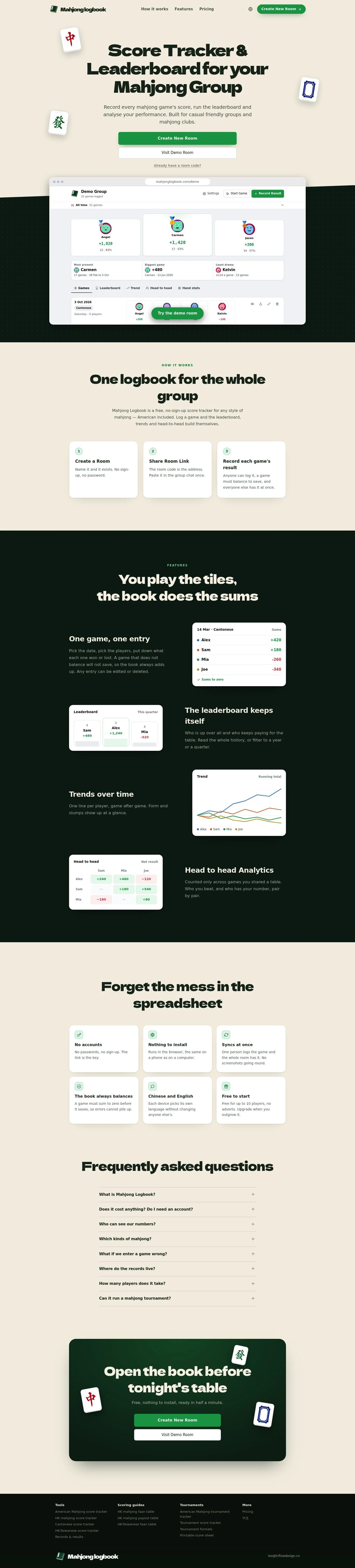
- Full page: https://cdn.designmunk.com/2026/10/03064520/mahjonglogbook-com-en-featured.webp
- Above the fold: https://cdn.designmunk.com/2026/10/03064520/mahjonglogbook-com-en-featured-1440x900.webp
- On DesignMunk: https://designmunk.com/mahjong-logbook/

Study these for hierarchy, rhythm, spacing and density. Where an image and the written spec disagree, the spec wins: the tokens were read from the page's own CSS, the images are one rendering of it.

## Before you start

Ask the user what they are building, who it is for, and what brand assets they already have — name, colours, typefaces. Wait for their answers before writing anything. Everything below is then applied to their product, not to the reference.

## Design specification

# Mahjong Logbook: Playful Display Headlines and Jade CTAs

## Overview

Friendly, game-night energy with a clear, no-login workflow. Tone is playful but precise: bold display headlines, roomy body copy, and data shown on simple, bright cards. Layout is centered, with generous vertical spacing and a soft beige surface that keeps green accents authoritative. When tokens don't specify, default to light backgrounds, dark text, and one strong green CTA per section.

## Page Structure

- Global nav: compact single row; brand at left, inline text links centered/left-aligned, language switch and a green CTA button at the far right.
- Hero: oversized display headline centered over short body text; two side-by-side CTAs (solid green then white-outline style); small helper link below. Mahjong tiles float as decorative elements around the masthead.
- Overlapping demo: a wide browser-style product mockup card sits just below the hero, overlapping the fold with soft elevation.
- How it works: section heading plus a linear list of three steps; each step has a numeral, short title, and sentence of copy, laid out as a row on wide screens and stacked on small.
- Feature stack: repeated blocks, each with a heading, body, and a framed mini-UI sample (entry form, leaderboard, trend chart, head-to-head table). Stacked vertically with comfortable spacing.
- Benefit list: a compact grid of short text-only blurbs (no accounts, nothing to install, syncs at once, etc.).
- FAQ: accordion list with concise questions and paragraph answers.
- Closing CTA band: short headline, one-line reassurance, and the two CTAs repeated.
- Footer: multi-column link lists (Tools, Scoring guides, Tournaments, More) and a contact email, on the neutral surface.

## Colors

- Primary (#1d2b20): Deep ink for headlines, paragraphs, and icons.
- Secondary (#7c9c88): Muted sage for supportive accents and subtle UI text.
- Tertiary (#12a150): Jade action color for primary CTAs, positive states, and key highlights.
- Neutral (#f4efe4): Rice-paper page background and section surfaces.
- brand-bay-salt (#d2cdbc): Pale border/underline tone and subtle dividers on the neutral backdrop.
- surface (#f4efe4): Default canvas behind cards and components.
- on-surface (#1d2b20): Text and icon color when placed on the surface.

## Typography

- Dela Gothic One: display family for major headlines. Used at 64px (headline-lg, 1.16 line height, -0.055em) and 48px (headline-md, 1.41, -0.031em). Freely available on Google Fonts.
- System UI (-apple-system): used for smaller headings (36px, 27px) and body (20px, 1.5 line height, -0.02em). Prefer the platform default for a native feel. Good cross-platform substitutes when system UI is unavailable: Roboto (Google Fonts) for Latin and Noto Sans TC (Google Fonts) for Traditional Chinese text.
- Pairing guidance: keep display headlines in Dela Gothic One; all paragraphs, buttons, captions, and UI labels in system UI/Roboto/Noto Sans TC to maintain clarity beside the chunky display style.

## Layout

- Spacing scale favors roomy vertical rhythm: base steps at 6/14/22/34px and a large sectional gap at 160px for hero and major bands.
- Sections stack on a single central column; cards sit on white against the neutral page surface for contrast.
- Use md (22px) and lg (34px) gaps between related elements; reserve xl (160px) for section top/bottom padding and oversized hero breathing room.
- Content width stays moderate to keep the 20px body readable; data samples live inside cards to constrain line length.

## Elevation & Depth

- Soft, long-cast shadows signal depth without harsh edges. Use sm on small floating decor (mahjong tiles), md on inline cards, and lg/xl for major overlays or the hero demo card.
- Borders are minimal; when needed, use #d2cdbc for hairlines on the neutral background.
- Hierarchy primarily comes from contrast (white cards on beige surface), size, and spacing before heavier shadows.

## Shapes

- Two radii: 7px (sm) for buttons, inputs, and small panels; 18px (md) for cards and large surfaces.
- Rounded corners signal interactivity and friendliness; keep consistency—do not mix in other radii.
- CTAs remain rectangular with softened corners, not pills; reserve 18px for large content cards only.

## Components

- Buttons
  - Primary: background #12a150, text #ffffff, 7px radius, 8px 13px padding, fixed height 52px.
  - Secondary: background #ffffff, text #1d2b20, 7px radius, 8px 13px padding, 52px height.
  - Link: text #1d2b20, no radius; use for subtle inline actions.
- Card: white (#ffffff) with text #1d2b20, 18px radius, padding 26px 24px 28px; apply sm–md shadow depending on prominence.

### Top Navigation Bar
- Single row on the neutral surface (#f4efe4); logo at left, text links, language toggle, and a primary CTA (#12a150) at right. Use body text (20px) and keep link color #1d2b20.

### Hero with Floating Tiles
- Centered headline in Dela Gothic One at 64px; short body at 20px underneath. Two adjacent buttons (primary then secondary). Decorative tile images float with sm shadow; section padding uses xl (160px) top/bottom.

### Browser Mockup Card
- A wide card (white) overlapping the hero's bottom edge with lg shadow; 18px radius. Acts as a live-UI preview area.

### How-It-Works Steps
- Three step items with numeric markers, each a compact text block using body copy. Use md (22px) gaps between lines and lg (34px) between steps; stack on small screens.

### Feature Demo Blocks
- Repeated pattern: small heading, paragraph, and a mini card showing data (entry form, leaderboard, trend, head-to-head). Cards use 18px radius, sm–md shadow; positive values may use #12a150.

### Benefits Grid
- Six short text blurbs grouped as a simple grid/list; no icons. Headings in system UI headline-xs (27px), body at 20px, with md spacing.

### FAQ Accordion
- Question rows on neutral surface with #d2cdbc dividers; expanded panels are white cards with 7px corners and md shadow.

### Footer Columns
- Neutral background; section headings in headline-xs and link lists in body style. Use md–lg spacing and keep links #1d2b20.

## Do's and Don'ts

- Do reserve #12a150 for the primary action and positive data; one solid green CTA per section is enough.
- Do keep major headlines in Dela Gothic One and all UI/body copy in a system UI/Roboto/Noto Sans TC mix.
- Do place data samples inside white 18px cards to maintain readable contrast on #f4efe4.
- Don't add new corner radii; stick to 7px for controls and 18px for content surfaces.
- Don't overuse shadows; prefer sm for decor and md for cards, leaving lg/xl for hero-level elements.
- Don't introduce additional accent colors; the palette centers on deep ink, rice-paper, and jade.

## Agent Prompt Guide

Quick color reference: text #1d2b20 / background #f4efe4 / border #d2cdbc / accent #12a150.

1) Build a centered hero with dual CTAs
- Background #f4efe4. H1 in Dela Gothic One, 64px, line-height 1.16, letter-spacing -0.055em, color #1d2b20; centered.
- Paragraph below in system UI or Roboto 20px/1.5, color #1d2b20.
- Place two buttons side by side: Primary (#12a150 bg, #ffffff text, height 52px, padding 8px 13px, radius 7px) then Secondary (#ffffff bg, #1d2b20 text, height 52px, radius 7px).
- Add 160px top and bottom padding; keep max-width to a readable column and add a white 18px-radius card overlapping the bottom with a lg shadow.

2) Create a three-step "How it works" row
- Section heading in Dela Gothic One 48px/1.41, letter-spacing -0.031em, color #1d2b20.
- Use three step items; each has a small numeric badge, a title in system UI 27–36px, and body at 20px.
- Space items with 34px gaps; stack vertically on small screens. Surface remains #f4efe4; text #1d2b20.

3) Feature block with mini card sample
- Subheading in Dela Gothic One 48px or system UI 36px depending on hierarchy; body at 20px.
- Under the text, render a white card (bg #ffffff, text #1d2b20, radius 18px, padding 26px 24px 28px, sm–md shadow). Use #12a150 for positive totals or CTA chips inside the card.
- Separate consecutive blocks with 34px; add 160px before/after the entire feature section if it's primary.

4) FAQ accordion
- Each question row: #f4efe4 background, text #1d2b20, 22px vertical padding, bottom border #d2cdbc.
- Expanded answer: white panel with 7px radius and md shadow; body text 20px/1.5.
- Maintain one accent color only (#12a150) for active states or chevrons.

## Similar Brands

- Duolingo: playful green accent and friendly curves; this page is quieter, using beige and softer shadows instead of neon gradients.
- Chess.com: game stats and leaderboards; Mahjong Logbook is lighter, with bigger display headlines and more white card framing.
- Strava: performance tracking and trend visuals; this site swaps Strava's orange speed for jade and denser cards.
- Notion: card-based clarity and neutral surfaces; Mahjong Logbook adds a bolder display headline and themed decor (tiles).

## Tokens

### CSS custom properties

```css
:root {
  /* Colors */
  --color-primary: #1d2b20;
  --color-secondary: #7c9c88;
  --color-tertiary: #12a150;
  --color-neutral: #f4efe4;
  --color-brand-bay-salt: #d2cdbc;
  --color-surface: var(--color-neutral);
  --color-on-surface: var(--color-primary);

  /* Typography */
  --text-headline-lg-size: 64px;
  --text-headline-lg-weight: 400;
  --text-headline-lg-leading: 1.16;
  --text-headline-lg-tracking: -0.055em;
  --text-headline-md-size: 48px;
  --text-headline-md-weight: 400;
  --text-headline-md-leading: 1.41;
  --text-headline-md-tracking: -0.031em;
  --text-headline-sm-size: 36px;
  --text-headline-sm-weight: 400;
  --text-headline-sm-leading: 1.19;
  --text-headline-xs-size: 27px;
  --text-headline-xs-weight: 400;
  --text-headline-xs-leading: 1.19;
  --text-body-md-size: 20px;
  --text-body-md-weight: 400;
  --text-body-md-leading: 1.5;
  --text-body-md-tracking: -0.02em;
  --font-dela-gothic-one: "Dela Gothic One";
  --font-apple-system: "-apple-system";

  /* Rounded */
  --radius-sm: 7px;
  --radius-md: 18px;

  /* Spacing */
  --spacing-xs: 6px;
  --spacing-sm: 14px;
  --spacing-md: 22px;
  --spacing-lg: 34px;
  --spacing-xl: 160px;

  /* Components */
  --button-primary-background-color: var(--color-tertiary);
  --button-primary-text-color: #ffffff;
  --button-primary-rounded: var(--radius-sm);
  --button-primary-padding: 8px 13px;
  --button-primary-height: 52px;
  --button-secondary-background-color: #ffffff;
  --button-secondary-text-color: var(--color-primary);
  --button-secondary-rounded: var(--radius-sm);
  --button-secondary-padding: 8px 13px;
  --button-secondary-height: 52px;
  --button-link-text-color: var(--color-primary);
  --button-link-rounded: 0px;
  --card-background-color: #ffffff;
  --card-text-color: var(--color-primary);
  --card-rounded: var(--radius-md);
  --card-padding: 26px 24px 28px;
}
```

### Tailwind theme

```css
@theme {
  --color-primary: #1d2b20;
  --color-secondary: #7c9c88;
  --color-tertiary: #12a150;
  --color-neutral: #f4efe4;
  --color-brand-bay-salt: #d2cdbc;
  --color-surface: #f4efe4;
  --color-on-surface: #1d2b20;
  --font-headline-lg: "Dela Gothic One";
  --font-headline-md: "Dela Gothic One";
  --font-headline-sm: "-apple-system";
  --font-headline-xs: "-apple-system";
  --font-body-md: "-apple-system";
  --text-headline-lg: 64px;
  --text-headline-md: 48px;
  --text-headline-sm: 36px;
  --text-headline-xs: 27px;
  --text-body-md: 20px;
  --tracking-headline-lg: -0.055em;
  --tracking-headline-md: -0.031em;
  --tracking-body-md: -0.02em;
  --font-weight-headline-lg: 400;
  --font-weight-headline-md: 400;
  --font-weight-headline-sm: 400;
  --font-weight-headline-xs: 400;
  --font-weight-body-md: 400;
  --radius-sm: 7px;
  --radius-md: 18px;
  --spacing-xs: 6px;
  --spacing-sm: 14px;
  --spacing-md: 22px;
  --spacing-lg: 34px;
  --spacing-xl: 160px;
}
```

### Design tokens (DTCG)

```json
{
    "$schema": "https://www.designtokens.org/schemas/2025.10/format.json",
    "color": {
        "$type": "color",
        "primary": {
            "$value": {
                "colorSpace": "srgb",
                "components": [
                    0.114,
                    0.169,
                    0.125
                ],
                "hex": "#1d2b20"
            }
        },
        "secondary": {
            "$value": {
                "colorSpace": "srgb",
                "components": [
                    0.486,
                    0.612,
                    0.533
                ],
                "hex": "#7c9c88"
            }
        },
        "tertiary": {
            "$value": {
                "colorSpace": "srgb",
                "components": [
                    0.071,
                    0.631,
                    0.314
                ],
                "hex": "#12a150"
            }
        },
        "neutral": {
            "$value": {
                "colorSpace": "srgb",
                "components": [
                    0.957,
                    0.937,
                    0.894
                ],
                "hex": "#f4efe4"
            }
        },
        "brand-bay-salt": {
            "$value": {
                "colorSpace": "srgb",
                "components": [
                    0.824,
                    0.804,
                    0.737
                ],
                "hex": "#d2cdbc"
            }
        },
        "surface": {
            "$value": {
                "colorSpace": "srgb",
                "components": [
                    0.957,
                    0.937,
                    0.894
                ],
                "hex": "#f4efe4"
            }
        },
        "on-surface": {
            "$value": {
                "colorSpace": "srgb",
                "components": [
                    0.114,
                    0.169,
                    0.125
                ],
                "hex": "#1d2b20"
            }
        }
    },
    "spacing": {
        "$type": "dimension",
        "xs": {
            "$value": {
                "value": 6,
                "unit": "px"
            }
        },
        "sm": {
            "$value": {
                "value": 14,
                "unit": "px"
            }
        },
        "md": {
            "$value": {
                "value": 22,
                "unit": "px"
            }
        },
        "lg": {
            "$value": {
                "value": 34,
                "unit": "px"
            }
        },
        "xl": {
            "$value": {
                "value": 160,
                "unit": "px"
            }
        }
    },
    "rounded": {
        "$type": "dimension",
        "sm": {
            "$value": {
                "value": 7,
                "unit": "px"
            }
        },
        "md": {
            "$value": {
                "value": 18,
                "unit": "px"
            }
        }
    },
    "typography": {
        "headline-lg": {
            "$type": "typography",
            "$value": {
                "fontFamily": "Dela Gothic One",
                "fontSize": {
                    "value": 64,
                    "unit": "px"
                },
                "fontWeight": 400,
                "letterSpacing": {
                    "value": -0.055,
                    "unit": "em"
                }
            }
        },
        "headline-md": {
            "$type": "typography",
            "$value": {
                "fontFamily": "Dela Gothic One",
                "fontSize": {
                    "value": 48,
                    "unit": "px"
                },
                "fontWeight": 400,
                "letterSpacing": {
                    "value": -0.031,
                    "unit": "em"
                }
            }
        },
        "headline-sm": {
            "$type": "typography",
            "$value": {
                "fontFamily": "-apple-system",
                "fontSize": {
                    "value": 36,
                    "unit": "px"
                },
                "fontWeight": 400
            }
        },
        "headline-xs": {
            "$type": "typography",
            "$value": {
                "fontFamily": "-apple-system",
                "fontSize": {
                    "value": 27,
                    "unit": "px"
                },
                "fontWeight": 400
            }
        },
        "body-md": {
            "$type": "typography",
            "$value": {
                "fontFamily": "-apple-system",
                "fontSize": {
                    "value": 20,
                    "unit": "px"
                },
                "fontWeight": 400,
                "letterSpacing": {
                    "value": -0.02,
                    "unit": "em"
                }
            }
        }
    }
}
```

## Rules

- **Fonts.** If the specification names a custom or self-hosted family, use one of the substitutes it names. Never reference a typeface you cannot actually load — it will fall back to a system font and undo the typography.
- **Colour.** Derive the palette from the user's brand. Use the token values as a guide to *relationships* — contrast, tint, how many accents carry the page — not as hex codes to paste.
- **Never reproduce** the wordmark, mascot, logo, brand name, illustrations, icon set, screenshots or any copy from the reference.
- **Never present the result as Mahjong Logbook**, or imply any connection to it.
- If something is unspecified, choose clarity and legibility over decoration.
---
version: alpha
name: Mahjong Logbook
description: 免費麻雀記數簿:一鍵記分數、排行榜走勢自動更新
colors:
  primary: "#1d2b20"
  secondary: "#7c9c88"
  tertiary: "#12a150"
  neutral: "#f4efe4"
  brand-bay-salt: "#d2cdbc"
  surface: "{colors.neutral}"
  on-surface: "{colors.primary}"
typography:
  headline-lg:
    fontFamily: Dela Gothic One
    fontSize: 64px
    fontWeight: 400
    lineHeight: 1.16
    letterSpacing: -0.055em
  headline-md:
    fontFamily: Dela Gothic One
    fontSize: 48px
    fontWeight: 400
    lineHeight: 1.41
    letterSpacing: -0.031em
  headline-sm:
    fontFamily: -apple-system
    fontSize: 36px
    fontWeight: 400
    lineHeight: 1.19
  headline-xs:
    fontFamily: -apple-system
    fontSize: 27px
    fontWeight: 400
    lineHeight: 1.19
  body-md:
    fontFamily: -apple-system
    fontSize: 20px
    fontWeight: 400
    lineHeight: 1.5
    letterSpacing: -0.02em
rounded:
  sm: 7px
  md: 18px
spacing:
  xs: 6px
  sm: 14px
  md: 22px
  lg: 34px
  xl: 160px
components:
  button-primary:
    backgroundColor: "{colors.tertiary}"
    textColor: "#ffffff"
    rounded: "{rounded.sm}"
    padding: 8px 13px
    height: 52px
  button-secondary:
    backgroundColor: "#ffffff"
    textColor: "{colors.primary}"
    rounded: "{rounded.sm}"
    padding: 8px 13px
    height: 52px
  button-link:
    textColor: "{colors.primary}"
    rounded: 0px
  card:
    backgroundColor: "#ffffff"
    textColor: "{colors.primary}"
    rounded: "{rounded.md}"
    padding: 26px 24px 28px
---

# Mahjong Logbook: Playful Display Headlines and Jade CTAs

## Overview

Friendly, game-night energy with a clear, no-login workflow. Tone is playful but precise: bold display headlines, roomy body copy, and data shown on simple, bright cards. Layout is centered, with generous vertical spacing and a soft beige surface that keeps green accents authoritative. When tokens don't specify, default to light backgrounds, dark text, and one strong green CTA per section.

## Page Structure

- Global nav: compact single row; brand at left, inline text links centered/left-aligned, language switch and a green CTA button at the far right.
- Hero: oversized display headline centered over short body text; two side-by-side CTAs (solid green then white-outline style); small helper link below. Mahjong tiles float as decorative elements around the masthead.
- Overlapping demo: a wide browser-style product mockup card sits just below the hero, overlapping the fold with soft elevation.
- How it works: section heading plus a linear list of three steps; each step has a numeral, short title, and sentence of copy, laid out as a row on wide screens and stacked on small.
- Feature stack: repeated blocks, each with a heading, body, and a framed mini-UI sample (entry form, leaderboard, trend chart, head-to-head table). Stacked vertically with comfortable spacing.
- Benefit list: a compact grid of short text-only blurbs (no accounts, nothing to install, syncs at once, etc.).
- FAQ: accordion list with concise questions and paragraph answers.
- Closing CTA band: short headline, one-line reassurance, and the two CTAs repeated.
- Footer: multi-column link lists (Tools, Scoring guides, Tournaments, More) and a contact email, on the neutral surface.

## Colors

- Primary (#1d2b20): Deep ink for headlines, paragraphs, and icons.
- Secondary (#7c9c88): Muted sage for supportive accents and subtle UI text.
- Tertiary (#12a150): Jade action color for primary CTAs, positive states, and key highlights.
- Neutral (#f4efe4): Rice-paper page background and section surfaces.
- brand-bay-salt (#d2cdbc): Pale border/underline tone and subtle dividers on the neutral backdrop.
- surface (#f4efe4): Default canvas behind cards and components.
- on-surface (#1d2b20): Text and icon color when placed on the surface.

## Typography

- Dela Gothic One: display family for major headlines. Used at 64px (headline-lg, 1.16 line height, -0.055em) and 48px (headline-md, 1.41, -0.031em). Freely available on Google Fonts.
- System UI (-apple-system): used for smaller headings (36px, 27px) and body (20px, 1.5 line height, -0.02em). Prefer the platform default for a native feel. Good cross-platform substitutes when system UI is unavailable: Roboto (Google Fonts) for Latin and Noto Sans TC (Google Fonts) for Traditional Chinese text.
- Pairing guidance: keep display headlines in Dela Gothic One; all paragraphs, buttons, captions, and UI labels in system UI/Roboto/Noto Sans TC to maintain clarity beside the chunky display style.

## Layout

- Spacing scale favors roomy vertical rhythm: base steps at 6/14/22/34px and a large sectional gap at 160px for hero and major bands.
- Sections stack on a single central column; cards sit on white against the neutral page surface for contrast.
- Use md (22px) and lg (34px) gaps between related elements; reserve xl (160px) for section top/bottom padding and oversized hero breathing room.
- Content width stays moderate to keep the 20px body readable; data samples live inside cards to constrain line length.

## Elevation & Depth

- Soft, long-cast shadows signal depth without harsh edges. Use sm on small floating decor (mahjong tiles), md on inline cards, and lg/xl for major overlays or the hero demo card.
- Borders are minimal; when needed, use #d2cdbc for hairlines on the neutral background.
- Hierarchy primarily comes from contrast (white cards on beige surface), size, and spacing before heavier shadows.

## Shapes

- Two radii: 7px (sm) for buttons, inputs, and small panels; 18px (md) for cards and large surfaces.
- Rounded corners signal interactivity and friendliness; keep consistency—do not mix in other radii.
- CTAs remain rectangular with softened corners, not pills; reserve 18px for large content cards only.

## Components

- Buttons
  - Primary: background #12a150, text #ffffff, 7px radius, 8px 13px padding, fixed height 52px.
  - Secondary: background #ffffff, text #1d2b20, 7px radius, 8px 13px padding, 52px height.
  - Link: text #1d2b20, no radius; use for subtle inline actions.
- Card: white (#ffffff) with text #1d2b20, 18px radius, padding 26px 24px 28px; apply sm–md shadow depending on prominence.

### Top Navigation Bar
- Single row on the neutral surface (#f4efe4); logo at left, text links, language toggle, and a primary CTA (#12a150) at right. Use body text (20px) and keep link color #1d2b20.

### Hero with Floating Tiles
- Centered headline in Dela Gothic One at 64px; short body at 20px underneath. Two adjacent buttons (primary then secondary). Decorative tile images float with sm shadow; section padding uses xl (160px) top/bottom.

### Browser Mockup Card
- A wide card (white) overlapping the hero's bottom edge with lg shadow; 18px radius. Acts as a live-UI preview area.

### How-It-Works Steps
- Three step items with numeric markers, each a compact text block using body copy. Use md (22px) gaps between lines and lg (34px) between steps; stack on small screens.

### Feature Demo Blocks
- Repeated pattern: small heading, paragraph, and a mini card showing data (entry form, leaderboard, trend, head-to-head). Cards use 18px radius, sm–md shadow; positive values may use #12a150.

### Benefits Grid
- Six short text blurbs grouped as a simple grid/list; no icons. Headings in system UI headline-xs (27px), body at 20px, with md spacing.

### FAQ Accordion
- Question rows on neutral surface with #d2cdbc dividers; expanded panels are white cards with 7px corners and md shadow.

### Footer Columns
- Neutral background; section headings in headline-xs and link lists in body style. Use md–lg spacing and keep links #1d2b20.

## Do's and Don'ts

- Do reserve #12a150 for the primary action and positive data; one solid green CTA per section is enough.
- Do keep major headlines in Dela Gothic One and all UI/body copy in a system UI/Roboto/Noto Sans TC mix.
- Do place data samples inside white 18px cards to maintain readable contrast on #f4efe4.
- Don't add new corner radii; stick to 7px for controls and 18px for content surfaces.
- Don't overuse shadows; prefer sm for decor and md for cards, leaving lg/xl for hero-level elements.
- Don't introduce additional accent colors; the palette centers on deep ink, rice-paper, and jade.

## Agent Prompt Guide

Quick color reference: text #1d2b20 / background #f4efe4 / border #d2cdbc / accent #12a150.

1) Build a centered hero with dual CTAs
- Background #f4efe4. H1 in Dela Gothic One, 64px, line-height 1.16, letter-spacing -0.055em, color #1d2b20; centered.
- Paragraph below in system UI or Roboto 20px/1.5, color #1d2b20.
- Place two buttons side by side: Primary (#12a150 bg, #ffffff text, height 52px, padding 8px 13px, radius 7px) then Secondary (#ffffff bg, #1d2b20 text, height 52px, radius 7px).
- Add 160px top and bottom padding; keep max-width to a readable column and add a white 18px-radius card overlapping the bottom with a lg shadow.

2) Create a three-step "How it works" row
- Section heading in Dela Gothic One 48px/1.41, letter-spacing -0.031em, color #1d2b20.
- Use three step items; each has a small numeric badge, a title in system UI 27–36px, and body at 20px.
- Space items with 34px gaps; stack vertically on small screens. Surface remains #f4efe4; text #1d2b20.

3) Feature block with mini card sample
- Subheading in Dela Gothic One 48px or system UI 36px depending on hierarchy; body at 20px.
- Under the text, render a white card (bg #ffffff, text #1d2b20, radius 18px, padding 26px 24px 28px, sm–md shadow). Use #12a150 for positive totals or CTA chips inside the card.
- Separate consecutive blocks with 34px; add 160px before/after the entire feature section if it's primary.

4) FAQ accordion
- Each question row: #f4efe4 background, text #1d2b20, 22px vertical padding, bottom border #d2cdbc.
- Expanded answer: white panel with 7px radius and md shadow; body text 20px/1.5.
- Maintain one accent color only (#12a150) for active states or chevrons.

## Similar Brands

- Duolingo: playful green accent and friendly curves; this page is quieter, using beige and softer shadows instead of neon gradients.
- Chess.com: game stats and leaderboards; Mahjong Logbook is lighter, with bigger display headlines and more white card framing.
- Strava: performance tracking and trend visuals; this site swaps Strava's orange speed for jade and denser cards.
- Notion: card-based clarity and neutral surfaces; Mahjong Logbook adds a bolder display headline and themed decor (tiles).
:root {
  /* Colors */
  --color-primary: #1d2b20;
  --color-secondary: #7c9c88;
  --color-tertiary: #12a150;
  --color-neutral: #f4efe4;
  --color-brand-bay-salt: #d2cdbc;
  --color-surface: var(--color-neutral);
  --color-on-surface: var(--color-primary);

  /* Typography */
  --text-headline-lg-size: 64px;
  --text-headline-lg-weight: 400;
  --text-headline-lg-leading: 1.16;
  --text-headline-lg-tracking: -0.055em;
  --text-headline-md-size: 48px;
  --text-headline-md-weight: 400;
  --text-headline-md-leading: 1.41;
  --text-headline-md-tracking: -0.031em;
  --text-headline-sm-size: 36px;
  --text-headline-sm-weight: 400;
  --text-headline-sm-leading: 1.19;
  --text-headline-xs-size: 27px;
  --text-headline-xs-weight: 400;
  --text-headline-xs-leading: 1.19;
  --text-body-md-size: 20px;
  --text-body-md-weight: 400;
  --text-body-md-leading: 1.5;
  --text-body-md-tracking: -0.02em;
  --font-dela-gothic-one: "Dela Gothic One";
  --font-apple-system: "-apple-system";

  /* Rounded */
  --radius-sm: 7px;
  --radius-md: 18px;

  /* Spacing */
  --spacing-xs: 6px;
  --spacing-sm: 14px;
  --spacing-md: 22px;
  --spacing-lg: 34px;
  --spacing-xl: 160px;

  /* Components */
  --button-primary-background-color: var(--color-tertiary);
  --button-primary-text-color: #ffffff;
  --button-primary-rounded: var(--radius-sm);
  --button-primary-padding: 8px 13px;
  --button-primary-height: 52px;
  --button-secondary-background-color: #ffffff;
  --button-secondary-text-color: var(--color-primary);
  --button-secondary-rounded: var(--radius-sm);
  --button-secondary-padding: 8px 13px;
  --button-secondary-height: 52px;
  --button-link-text-color: var(--color-primary);
  --button-link-rounded: 0px;
  --card-background-color: #ffffff;
  --card-text-color: var(--color-primary);
  --card-rounded: var(--radius-md);
  --card-padding: 26px 24px 28px;
}
{
  "$schema": "https://www.designtokens.org/schemas/2025.10/format.json",
  "$description": "免費麻雀記數簿:一鍵記分數、排行榜走勢自動更新",
  "color": {
    "$type": "color",
    "primary": {
      "$value": {
        "colorSpace": "srgb",
        "components": [
          0.114,
          0.169,
          0.125
        ],
        "hex": "#1d2b20"
      }
    },
    "secondary": {
      "$value": {
        "colorSpace": "srgb",
        "components": [
          0.486,
          0.612,
          0.533
        ],
        "hex": "#7c9c88"
      }
    },
    "tertiary": {
      "$value": {
        "colorSpace": "srgb",
        "components": [
          0.071,
          0.631,
          0.314
        ],
        "hex": "#12a150"
      }
    },
    "neutral": {
      "$value": {
        "colorSpace": "srgb",
        "components": [
          0.957,
          0.937,
          0.894
        ],
        "hex": "#f4efe4"
      }
    },
    "brand-bay-salt": {
      "$value": {
        "colorSpace": "srgb",
        "components": [
          0.824,
          0.804,
          0.737
        ],
        "hex": "#d2cdbc"
      }
    },
    "surface": {
      "$value": {
        "colorSpace": "srgb",
        "components": [
          0.957,
          0.937,
          0.894
        ],
        "hex": "#f4efe4"
      }
    },
    "on-surface": {
      "$value": {
        "colorSpace": "srgb",
        "components": [
          0.114,
          0.169,
          0.125
        ],
        "hex": "#1d2b20"
      }
    }
  },
  "spacing": {
    "$type": "dimension",
    "xs": {
      "$value": {
        "value": 6,
        "unit": "px"
      }
    },
    "sm": {
      "$value": {
        "value": 14,
        "unit": "px"
      }
    },
    "md": {
      "$value": {
        "value": 22,
        "unit": "px"
      }
    },
    "lg": {
      "$value": {
        "value": 34,
        "unit": "px"
      }
    },
    "xl": {
      "$value": {
        "value": 160,
        "unit": "px"
      }
    }
  },
  "rounded": {
    "$type": "dimension",
    "sm": {
      "$value": {
        "value": 7,
        "unit": "px"
      }
    },
    "md": {
      "$value": {
        "value": 18,
        "unit": "px"
      }
    }
  },
  "typography": {
    "headline-lg": {
      "$type": "typography",
      "$value": {
        "fontFamily": "Dela Gothic One",
        "fontSize": {
          "value": 64,
          "unit": "px"
        },
        "fontWeight": 400,
        "letterSpacing": {
          "value": -0.055,
          "unit": "em"
        }
      }
    },
    "headline-md": {
      "$type": "typography",
      "$value": {
        "fontFamily": "Dela Gothic One",
        "fontSize": {
          "value": 48,
          "unit": "px"
        },
        "fontWeight": 400,
        "letterSpacing": {
          "value": -0.031,
          "unit": "em"
        }
      }
    },
    "headline-sm": {
      "$type": "typography",
      "$value": {
        "fontFamily": "-apple-system",
        "fontSize": {
          "value": 36,
          "unit": "px"
        },
        "fontWeight": 400
      }
    },
    "headline-xs": {
      "$type": "typography",
      "$value": {
        "fontFamily": "-apple-system",
        "fontSize": {
          "value": 27,
          "unit": "px"
        },
        "fontWeight": 400
      }
    },
    "body-md": {
      "$type": "typography",
      "$value": {
        "fontFamily": "-apple-system",
        "fontSize": {
          "value": 20,
          "unit": "px"
        },
        "fontWeight": 400,
        "letterSpacing": {
          "value": -0.02,
          "unit": "em"
        }
      }
    }
  }
}
@theme {
--color-primary: #1d2b20;
--color-secondary: #7c9c88;
--color-tertiary: #12a150;
--color-neutral: #f4efe4;
--color-brand-bay-salt: #d2cdbc;
--color-surface: #f4efe4;
--color-on-surface: #1d2b20;
--font-headline-lg: "Dela Gothic One";
--font-headline-md: "Dela Gothic One";
--font-headline-sm: "-apple-system";
--font-headline-xs: "-apple-system";
--font-body-md: "-apple-system";
--text-headline-lg: 64px;
--text-headline-md: 48px;
--text-headline-sm: 36px;
--text-headline-xs: 27px;
--text-body-md: 20px;
--tracking-headline-lg: -0.055em;
--tracking-headline-md: -0.031em;
--tracking-body-md: -0.02em;
--font-weight-headline-lg: 400;
--font-weight-headline-md: 400;
--font-weight-headline-sm: 400;
--font-weight-headline-xs: 400;
--font-weight-body-md: 400;
--radius-sm: 7px;
--radius-md: 18px;
--spacing-xs: 6px;
--spacing-sm: 14px;
--spacing-md: 22px;
--spacing-lg: 34px;
--spacing-xl: 160px;
} # Design brief: the Mahjong Logbook design language
Below is a complete design specification measured from a real, published web page. Use it as a design language for the user's product. It is not a page to reproduce.
## Reference images
- Full page: https://cdn.designmunk.com/2026/10/03064520/mahjonglogbook-com-en-featured.webp
- Above the fold: https://cdn.designmunk.com/2026/10/03064520/mahjonglogbook-com-en-featured-1440x900.webp
- On DesignMunk: https://designmunk.com/mahjong-logbook/
Study these for hierarchy, rhythm, spacing and density. Where an image and the written spec disagree, the spec wins: the tokens were read from the page's own CSS, the images are one rendering of it.
## Before you start
Ask the user what they are building, who it is for, and what brand assets they already have — name, colours, typefaces. Wait for their answers before writing anything. Everything below is then applied to their product, not to the reference.
## Design specification
# Mahjong Logbook: Playful Display Headlines and Jade CTAs
## Overview
Friendly, game-night energy with a clear, no-login workflow. Tone is playful but precise: bold display headlines, roomy body copy, and data shown on simple, bright cards. Layout is centered, with generous vertical spacing and a soft beige surface that keeps green accents authoritative. When tokens don't specify, default to light backgrounds, dark text, and one strong green CTA per section.
## Page Structure
- Global nav: compact single row; brand at left, inline text links centered/left-aligned, language switch and a green CTA button at the far right.
- Hero: oversized display headline centered over short body text; two side-by-side CTAs (solid green then white-outline style); small helper link below. Mahjong tiles float as decorative elements around the masthead.
- Overlapping demo: a wide browser-style product mockup card sits just below the hero, overlapping the fold with soft elevation.
- How it works: section heading plus a linear list of three steps; each step has a numeral, short title, and sentence of copy, laid out as a row on wide screens and stacked on small.
- Feature stack: repeated blocks, each with a heading, body, and a framed mini-UI sample (entry form, leaderboard, trend chart, head-to-head table). Stacked vertically with comfortable spacing.
- Benefit list: a compact grid of short text-only blurbs (no accounts, nothing to install, syncs at once, etc.).
- FAQ: accordion list with concise questions and paragraph answers.
- Closing CTA band: short headline, one-line reassurance, and the two CTAs repeated.
- Footer: multi-column link lists (Tools, Scoring guides, Tournaments, More) and a contact email, on the neutral surface.
## Colors
- Primary (#1d2b20): Deep ink for headlines, paragraphs, and icons.
- Secondary (#7c9c88): Muted sage for supportive accents and subtle UI text.
- Tertiary (#12a150): Jade action color for primary CTAs, positive states, and key highlights.
- Neutral (#f4efe4): Rice-paper page background and section surfaces.
- brand-bay-salt (#d2cdbc): Pale border/underline tone and subtle dividers on the neutral backdrop.
- surface (#f4efe4): Default canvas behind cards and components.
- on-surface (#1d2b20): Text and icon color when placed on the surface.
## Typography
- Dela Gothic One: display family for major headlines. Used at 64px (headline-lg, 1.16 line height, -0.055em) and 48px (headline-md, 1.41, -0.031em). Freely available on Google Fonts.
- System UI (-apple-system): used for smaller headings (36px, 27px) and body (20px, 1.5 line height, -0.02em). Prefer the platform default for a native feel. Good cross-platform substitutes when system UI is unavailable: Roboto (Google Fonts) for Latin and Noto Sans TC (Google Fonts) for Traditional Chinese text.
- Pairing guidance: keep display headlines in Dela Gothic One; all paragraphs, buttons, captions, and UI labels in system UI/Roboto/Noto Sans TC to maintain clarity beside the chunky display style.
## Layout
- Spacing scale favors roomy vertical rhythm: base steps at 6/14/22/34px and a large sectional gap at 160px for hero and major bands.
- Sections stack on a single central column; cards sit on white against the neutral page surface for contrast.
- Use md (22px) and lg (34px) gaps between related elements; reserve xl (160px) for section top/bottom padding and oversized hero breathing room.
- Content width stays moderate to keep the 20px body readable; data samples live inside cards to constrain line length.
## Elevation & Depth
- Soft, long-cast shadows signal depth without harsh edges. Use sm on small floating decor (mahjong tiles), md on inline cards, and lg/xl for major overlays or the hero demo card.
- Borders are minimal; when needed, use #d2cdbc for hairlines on the neutral background.
- Hierarchy primarily comes from contrast (white cards on beige surface), size, and spacing before heavier shadows.
## Shapes
- Two radii: 7px (sm) for buttons, inputs, and small panels; 18px (md) for cards and large surfaces.
- Rounded corners signal interactivity and friendliness; keep consistency—do not mix in other radii.
- CTAs remain rectangular with softened corners, not pills; reserve 18px for large content cards only.
## Components
- Buttons
- Primary: background #12a150, text #ffffff, 7px radius, 8px 13px padding, fixed height 52px.
- Secondary: background #ffffff, text #1d2b20, 7px radius, 8px 13px padding, 52px height.
- Link: text #1d2b20, no radius; use for subtle inline actions.
- Card: white (#ffffff) with text #1d2b20, 18px radius, padding 26px 24px 28px; apply sm–md shadow depending on prominence.
### Top Navigation Bar
- Single row on the neutral surface (#f4efe4); logo at left, text links, language toggle, and a primary CTA (#12a150) at right. Use body text (20px) and keep link color #1d2b20.
### Hero with Floating Tiles
- Centered headline in Dela Gothic One at 64px; short body at 20px underneath. Two adjacent buttons (primary then secondary). Decorative tile images float with sm shadow; section padding uses xl (160px) top/bottom.
### Browser Mockup Card
- A wide card (white) overlapping the hero's bottom edge with lg shadow; 18px radius. Acts as a live-UI preview area.
### How-It-Works Steps
- Three step items with numeric markers, each a compact text block using body copy. Use md (22px) gaps between lines and lg (34px) between steps; stack on small screens.
### Feature Demo Blocks
- Repeated pattern: small heading, paragraph, and a mini card showing data (entry form, leaderboard, trend, head-to-head). Cards use 18px radius, sm–md shadow; positive values may use #12a150.
### Benefits Grid
- Six short text blurbs grouped as a simple grid/list; no icons. Headings in system UI headline-xs (27px), body at 20px, with md spacing.
### FAQ Accordion
- Question rows on neutral surface with #d2cdbc dividers; expanded panels are white cards with 7px corners and md shadow.
### Footer Columns
- Neutral background; section headings in headline-xs and link lists in body style. Use md–lg spacing and keep links #1d2b20.
## Do's and Don'ts
- Do reserve #12a150 for the primary action and positive data; one solid green CTA per section is enough.
- Do keep major headlines in Dela Gothic One and all UI/body copy in a system UI/Roboto/Noto Sans TC mix.
- Do place data samples inside white 18px cards to maintain readable contrast on #f4efe4.
- Don't add new corner radii; stick to 7px for controls and 18px for content surfaces.
- Don't overuse shadows; prefer sm for decor and md for cards, leaving lg/xl for hero-level elements.
- Don't introduce additional accent colors; the palette centers on deep ink, rice-paper, and jade.
## Agent Prompt Guide
Quick color reference: text #1d2b20 / background #f4efe4 / border #d2cdbc / accent #12a150.
1) Build a centered hero with dual CTAs
- Background #f4efe4. H1 in Dela Gothic One, 64px, line-height 1.16, letter-spacing -0.055em, color #1d2b20; centered.
- Paragraph below in system UI or Roboto 20px/1.5, color #1d2b20.
- Place two buttons side by side: Primary (#12a150 bg, #ffffff text, height 52px, padding 8px 13px, radius 7px) then Secondary (#ffffff bg, #1d2b20 text, height 52px, radius 7px).
- Add 160px top and bottom padding; keep max-width to a readable column and add a white 18px-radius card overlapping the bottom with a lg shadow.
2) Create a three-step "How it works" row
- Section heading in Dela Gothic One 48px/1.41, letter-spacing -0.031em, color #1d2b20.
- Use three step items; each has a small numeric badge, a title in system UI 27–36px, and body at 20px.
- Space items with 34px gaps; stack vertically on small screens. Surface remains #f4efe4; text #1d2b20.
3) Feature block with mini card sample
- Subheading in Dela Gothic One 48px or system UI 36px depending on hierarchy; body at 20px.
- Under the text, render a white card (bg #ffffff, text #1d2b20, radius 18px, padding 26px 24px 28px, sm–md shadow). Use #12a150 for positive totals or CTA chips inside the card.
- Separate consecutive blocks with 34px; add 160px before/after the entire feature section if it's primary.
4) FAQ accordion
- Each question row: #f4efe4 background, text #1d2b20, 22px vertical padding, bottom border #d2cdbc.
- Expanded answer: white panel with 7px radius and md shadow; body text 20px/1.5.
- Maintain one accent color only (#12a150) for active states or chevrons.
## Tokens
### CSS custom properties
```css
:root {
/* Colors */
--color-primary: #1d2b20;
--color-secondary: #7c9c88;
--color-tertiary: #12a150;
--color-neutral: #f4efe4;
--color-brand-bay-salt: #d2cdbc;
--color-surface: var(--color-neutral);
--color-on-surface: var(--color-primary);
/* Typography */
--text-headline-lg-size: 64px;
--text-headline-lg-weight: 400;
--text-headline-lg-leading: 1.16;
--text-headline-lg-tracking: -0.055em;
--text-headline-md-size: 48px;
--text-headline-md-weight: 400;
--text-headline-md-leading: 1.41;
--text-headline-md-tracking: -0.031em;
--text-headline-sm-size: 36px;
--text-headline-sm-weight: 400;
--text-headline-sm-leading: 1.19;
--text-headline-xs-size: 27px;
--text-headline-xs-weight: 400;
--text-headline-xs-leading: 1.19;
--text-body-md-size: 20px;
--text-body-md-weight: 400;
--text-body-md-leading: 1.5;
--text-body-md-tracking: -0.02em;
--font-dela-gothic-one: "Dela Gothic One";
--font-apple-system: "-apple-system";
/* Rounded */
--radius-sm: 7px;
--radius-md: 18px;
/* Spacing */
--spacing-xs: 6px;
--spacing-sm: 14px;
--spacing-md: 22px;
--spacing-lg: 34px;
--spacing-xl: 160px;
/* Components */
--button-primary-background-color: var(--color-tertiary);
--button-primary-text-color: #ffffff;
--button-primary-rounded: var(--radius-sm);
--button-primary-padding: 8px 13px;
--button-primary-height: 52px;
--button-secondary-background-color: #ffffff;
--button-secondary-text-color: var(--color-primary);
--button-secondary-rounded: var(--radius-sm);
--button-secondary-padding: 8px 13px;
--button-secondary-height: 52px;
--button-link-text-color: var(--color-primary);
--button-link-rounded: 0px;
--card-background-color: #ffffff;
--card-text-color: var(--color-primary);
--card-rounded: var(--radius-md);
--card-padding: 26px 24px 28px;
}
```
## Rules
- **Fonts.** If the specification names a custom or self-hosted family, use one of the substitutes it names. Never reference a typeface you cannot actually load — it will fall back to a system font and undo the typography.
- **Colour.** Derive the palette from the user's brand. Use the token values as a guide to *relationships* — contrast, tint, how many accents carry the page — not as hex codes to paste.
- **Never reproduce** the wordmark, mascot, logo, brand name, illustrations, icon set, screenshots or any copy from the reference.
- **Never present the result as Mahjong Logbook**, or imply any connection to it.
- If something is unspecified, choose clarity and legibility over decoration.