Letsjive
letsjive.io
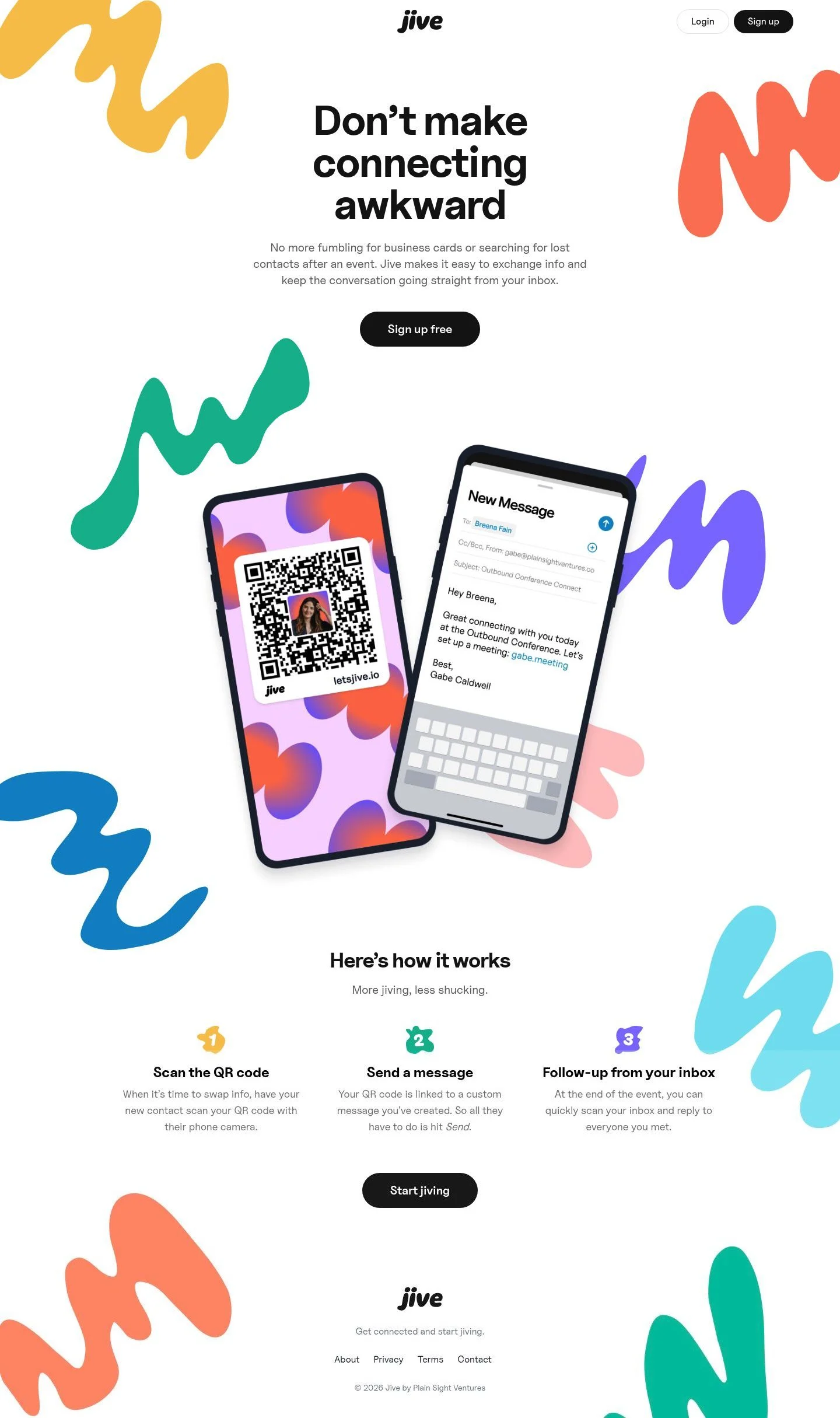
Don’t make connecting awkward—Jive makes it easy to connect and follow up.
letsjive.io
AI Breakdown
Design export
# Design brief: the Letsjive design language

Below is a complete design specification measured from a real, published web page. Use it as a design language for the user's product. It is not a page to reproduce.

## Reference images

- Full page: https://cdn.designmunk.com/2026/09/07092548/letsjive-io-featured.webp
- Above the fold: https://cdn.designmunk.com/2026/09/07092548/letsjive-io-featured.webp
- On DesignMunk: https://designmunk.com/letsjive/

Study these for hierarchy, rhythm, spacing and density. Where an image and the written spec disagree, the spec wins: the tokens were read from the page's own CSS, the images are one rendering of it.

## Before you start

Ask the user what they are building, who it is for, and what brand assets they already have — name, colours, typefaces. Wait for their answers before writing anything. Everything below is then applied to their product, not to the reference.

## Design specification

# Letsjive: One Pill CTA From Nav To Footer

## Overview

A crisp, minimal interface aimed at fast sign-ups during or after events. The tone is direct and friendly, not corporate. Layouts are spacious with large headline type and tight hierarchy. Color is mostly monochrome with two bright brand accents used in illustration and highlights. When tokens don't dictate a case, bias toward black text on white, ample whitespace, and pill-shaped CTAs.

## Colors

- **primary (#000000):** Core ink for headlines, body text, and icons.
- **secondary (#1c1c1c):** Dark UI elements such as filled CTAs and dark chips.
- **tertiary (#111827):** Deep slate for subdued headings, metadata, or dark mode-leaning UI bits.
- **neutral (#ffffff):** Page and card surfaces.
- **border (#e5e7eb):** Subtle dividers, card outlines, and input strokes.
- **brand-january-blue (#0ba2b8):** Bright accent for links, highlights, or illustrative touches.
- **brand-copper-river (#f8a271):** Warm accent used sparingly in illustration or hover states.
- **surface ({colors.neutral}):** Default canvas; mirrors neutral.
- **on-surface ({colors.primary}):** Default text on surface; mirrors primary.

## Typography

All text styles use Uncut Sans at multiple weights: headlines from 600–800 and body at 400, with sizes 72/52/38/28/20px. Uncut Sans is provided as a custom, self-hosted family; if it isn't available to your build, substitute a geometric, high-x-height sans such as Inter (Google), Manrope (Google), or Roboto (Google). Use headline-lg for hero statements (72px, 800, line-height 1, -0.025em tracking). Body-md is the default paragraph style at 20px/1.4 for readable blocks under dense headings. Keep sentence case; avoid all caps in body copy.

## Layout

Spacing follows a roomy scale: 8, 24, 48, 64, 132px. Use xl (132px) for section top/bottom padding, lg (64px) for hero inner gaps and step-section gutters, md (48px) for grid gaps, sm (24px) for component padding and stack spacing, xs (8px) for micro gaps. A 12-column grid with generous margins suits the light content load; center the hero and steps for focus. Keep lines around 60–72 characters at body-md.

## Elevation & Depth

Depth is minimal. Only a small shadow is measured (sm) for light lifts on images or mockups; medium and larger shadows are none. Emphasize hierarchy with bold type, whitespace, and the border color #e5e7eb for separation. Reserve shadows for modals, floating device mockups, and hover states that require affordance.

## Shapes

Two radii define shape language: 8px for cards and structured surfaces; 9999px for pill buttons, chips, and inputs where applicable. Pills signal interactivity (primary actions and header chips). Keep imagery corners square unless it's a card wrapper (8px).

## Components

Buttons and cards are the foundation:
- Button—Primary: white background, #181818 text, 42px height, 8px×24px padding, full radius (9999px).
- Button—Secondary: #181818 background, white text, same size and radius; used for main CTAs on light backgrounds.
- Button—Link: text-only, #000000, no radius; pair with subtle underline on hover.
- Card: white background, black text, 8px radius, 16px padding; add border #e5e7eb or sm shadow when separation is needed.

Distinctive components on this page:

### Header Bar
- Right-aligned "Login" (light) and "Sign up" (filled) chips.
- Spacing: sm (24px) vertically; keep links at body-md 20px.

### Hero Section
- Headline uses headline-lg (72px/800, -0.025em) centered.
- Supporting copy at body-md (20px/1.4) limited to ~70ch.
- Primary CTA uses button-secondary (black pill) centered beneath copy with md (48px) gap.

### Three-Step Explainer
- Section title uses headline-md (52px/800).
- Three items ("Scan the QR code", "Send a message", "Follow-up...") arranged in a responsive 1→3 column grid with md (48px) gaps and sm (24px) internal spacing.
- Each item headline uses headline-sm (38px/700); descriptions body-md.

### Device Mockup Pair
- Two overlapping phone images angled slightly; apply sm shadow only.
- Maintain lg (64px) spacing from surrounding content to avoid crowding the hero CTA.

### QR Code Card
- Uses card styles (white, 8px radius, 16px padding) when rendered as an in-page demo.
- Optional border #e5e7eb for definition on white.

### Confirmation Modal
- Title at headline-xs (28px/600); body at body-md.
- Container: card styles with sm shadow; actions use primary/secondary buttons.

### Alert Dialog
- Title at headline-xs; single "OK" action in a centered black pill.
- Keep content width narrow with sm–md padding.

### Footer Links Row
- Inline list: About, Privacy, Terms, Contact.
- Use border #e5e7eb as a top rule and xl (132px) section spacing above.

## Do's and Don'ts

- Do keep CTAs consistent: 42px height, full-radius, and either white-on-black or black-on-white only.
- Do reserve brand accents (#0ba2b8, #f8a271) for links, badges, or illustrations—avoid using them for primary text.
- Do use xl (132px) vertical spacing for major sections; anything tighter makes the hero feel cramped.
- Don't introduce heavy shadows; beyond the sm preset, use borders or whitespace for separation.
- Don't mix additional fonts; if Uncut Sans isn't available, switch everything to Inter or Roboto for uniformity.
- Don't add extra button sizes; scale via layout spacing, not component height changes.

## Agent Prompt Guide

Color quick reference — Text: #000000; Background: #ffffff; Border: #e5e7eb; Accent: #0ba2b8.

1) Build the hero
- Canvas #ffffff. Center a headline in "Uncut Sans" 72px, weight 800, line-height 1, letter-spacing -0.025em; if unavailable, use Inter or Roboto.
- Add supporting copy at 20px, weight 400, line-height 1.4, max-width ~70ch.
- Place a primary CTA using a 42px-tall pill button: background #181818, text #ffffff, padding 8px 24px, border-radius 9999px. Keep 48px gap between text and button.

2) Three-step explainer grid
- Section header: "Uncut Sans" 52px/800, line-height 1.19.
- Create a responsive grid (1 column mobile → 3 columns desktop) with 48px gaps and 24px internal spacing.
- Item headings 38px/700; body 20px/1.4. Use #000000 for text, #ffffff cards with 8px radius and optional 1px border #e5e7eb.

3) Sticky header with actions
- Top bar on #ffffff, 24px vertical padding.
- Left: wordmark; Right: two actions — "Login" (white pill, 1px border #e5e7eb, text #000000) and "Sign up" (filled pill #181818 with #ffffff text). Buttons: 42px height, 8px 24px padding, 9999px radius.

4) Modal dialog
- Overlay page and center a card: background #ffffff, 8px radius, 16px padding, small shadow (rgba(0,0,0,0.1) 0 1px 3px, rgba(0,0,0,0.1) 0 1px 2px -1px).
- Title 28px/600, body 20px/1.4. Actions: primary (white button with #181818 text) and secondary (black button with white text), both 42px tall, 9999px radius.

5) Footer links row
- Add a 1px top border #e5e7eb, 132px top spacing from prior section, and 24px internal padding.
- Render links at 20px body style; color #000000 by default, accent hover #0ba2b8.

## Similar Brands

- Linktree — Minimal black-on-white with bright accents; Linktree leans heavier on color blocks, while Letsjive keeps accents mostly in illustration.
- Calendly — Big friendly type and a simple three-step flow; Calendly uses more blue in core UI, Letsjive reserves accent for highlights.
- HiHello — Digital business cards with QR emphasis; HiHello employs more card chrome, where Letsjive stays flatter with subtle borders.
- Popl — Networking tools with bold CTAs; Popl uses gradients and heavier marketing visuals, Letsjive opts for cleaner whitespace.

## Tokens

### CSS custom properties

```css
:root {
  /* Colors */
  --color-primary: #000000;
  --color-secondary: #1c1c1c;
  --color-tertiary: #111827;
  --color-neutral: #ffffff;
  --color-border: #e5e7eb;
  --color-brand-january-blue: #0ba2b8;
  --color-brand-copper-river: #f8a271;
  --color-surface: var(--color-neutral);
  --color-on-surface: var(--color-primary);

  /* Typography */
  --text-headline-lg-size: 72px;
  --text-headline-lg-weight: 800;
  --text-headline-lg-leading: 1;
  --text-headline-lg-tracking: -0.025em;
  --text-headline-md-size: 52px;
  --text-headline-md-weight: 800;
  --text-headline-md-leading: 1.19;
  --text-headline-md-tracking: -0.017em;
  --text-headline-sm-size: 38px;
  --text-headline-sm-weight: 700;
  --text-headline-sm-leading: 1.21;
  --text-headline-xs-size: 28px;
  --text-headline-xs-weight: 600;
  --text-headline-xs-leading: 1.21;
  --text-body-md-size: 20px;
  --text-body-md-weight: 400;
  --text-body-md-leading: 1.4;
  --font-uncut-sans: "Uncut Sans";

  /* Rounded */
  --radius-sm: 8px;
  --radius-full: 9999px;

  /* Spacing */
  --spacing-xs: 8px;
  --spacing-sm: 24px;
  --spacing-md: 48px;
  --spacing-lg: 64px;
  --spacing-xl: 132px;

  /* Components */
  --button-primary-background-color: var(--color-neutral);
  --button-primary-text-color: #181818;
  --button-primary-rounded: var(--radius-full);
  --button-primary-padding: 8px 24px;
  --button-primary-height: 42px;
  --button-secondary-background-color: #181818;
  --button-secondary-text-color: var(--color-neutral);
  --button-secondary-rounded: var(--radius-full);
  --button-secondary-padding: 8px 24px;
  --button-secondary-height: 42px;
  --button-link-text-color: var(--color-primary);
  --button-link-rounded: 0px;
  --card-background-color: var(--color-neutral);
  --card-text-color: var(--color-primary);
  --card-rounded: var(--radius-sm);
  --card-padding: 16px;
}
```

### Tailwind theme

```css
@theme {
  --color-primary: #000000;
  --color-secondary: #1c1c1c;
  --color-tertiary: #111827;
  --color-neutral: #ffffff;
  --color-border: #e5e7eb;
  --color-brand-january-blue: #0ba2b8;
  --color-brand-copper-river: #f8a271;
  --color-surface: #ffffff;
  --color-on-surface: #000000;
  --font-headline-lg: "Uncut Sans";
  --font-headline-md: "Uncut Sans";
  --font-headline-sm: "Uncut Sans";
  --font-headline-xs: "Uncut Sans";
  --font-body-md: "Uncut Sans";
  --text-headline-lg: 72px;
  --text-headline-md: 52px;
  --text-headline-sm: 38px;
  --text-headline-xs: 28px;
  --text-body-md: 20px;
  --tracking-headline-lg: -0.025em;
  --tracking-headline-md: -0.017em;
  --font-weight-headline-lg: 800;
  --font-weight-headline-md: 800;
  --font-weight-headline-sm: 700;
  --font-weight-headline-xs: 600;
  --font-weight-body-md: 400;
  --radius-sm: 8px;
  --radius-full: 9999px;
  --spacing-xs: 8px;
  --spacing-sm: 24px;
  --spacing-md: 48px;
  --spacing-lg: 64px;
  --spacing-xl: 132px;
}
```

### Design tokens (DTCG)

```json
{
    "$schema": "https://www.designtokens.org/schemas/2025.10/format.json",
    "color": {
        "$type": "color",
        "primary": {
            "$value": {
                "colorSpace": "srgb",
                "components": [
                    0,
                    0,
                    0
                ],
                "hex": "#000000"
            }
        },
        "secondary": {
            "$value": {
                "colorSpace": "srgb",
                "components": [
                    0.11,
                    0.11,
                    0.11
                ],
                "hex": "#1c1c1c"
            }
        },
        "tertiary": {
            "$value": {
                "colorSpace": "srgb",
                "components": [
                    0.067,
                    0.094,
                    0.153
                ],
                "hex": "#111827"
            }
        },
        "neutral": {
            "$value": {
                "colorSpace": "srgb",
                "components": [
                    1,
                    1,
                    1
                ],
                "hex": "#ffffff"
            }
        },
        "border": {
            "$value": {
                "colorSpace": "srgb",
                "components": [
                    0.898,
                    0.906,
                    0.922
                ],
                "hex": "#e5e7eb"
            }
        },
        "brand-january-blue": {
            "$value": {
                "colorSpace": "srgb",
                "components": [
                    0.043,
                    0.635,
                    0.722
                ],
                "hex": "#0ba2b8"
            }
        },
        "brand-copper-river": {
            "$value": {
                "colorSpace": "srgb",
                "components": [
                    0.973,
                    0.635,
                    0.443
                ],
                "hex": "#f8a271"
            }
        },
        "surface": {
            "$value": {
                "colorSpace": "srgb",
                "components": [
                    1,
                    1,
                    1
                ],
                "hex": "#ffffff"
            }
        },
        "on-surface": {
            "$value": {
                "colorSpace": "srgb",
                "components": [
                    0,
                    0,
                    0
                ],
                "hex": "#000000"
            }
        }
    },
    "spacing": {
        "$type": "dimension",
        "xs": {
            "$value": {
                "value": 8,
                "unit": "px"
            }
        },
        "sm": {
            "$value": {
                "value": 24,
                "unit": "px"
            }
        },
        "md": {
            "$value": {
                "value": 48,
                "unit": "px"
            }
        },
        "lg": {
            "$value": {
                "value": 64,
                "unit": "px"
            }
        },
        "xl": {
            "$value": {
                "value": 132,
                "unit": "px"
            }
        }
    },
    "rounded": {
        "$type": "dimension",
        "sm": {
            "$value": {
                "value": 8,
                "unit": "px"
            }
        },
        "full": {
            "$value": {
                "value": 9999,
                "unit": "px"
            }
        }
    },
    "typography": {
        "headline-lg": {
            "$type": "typography",
            "$value": {
                "fontFamily": "Uncut Sans",
                "fontSize": {
                    "value": 72,
                    "unit": "px"
                },
                "fontWeight": 800,
                "letterSpacing": {
                    "value": -0.025,
                    "unit": "em"
                }
            }
        },
        "headline-md": {
            "$type": "typography",
            "$value": {
                "fontFamily": "Uncut Sans",
                "fontSize": {
                    "value": 52,
                    "unit": "px"
                },
                "fontWeight": 800,
                "letterSpacing": {
                    "value": -0.017,
                    "unit": "em"
                }
            }
        },
        "headline-sm": {
            "$type": "typography",
            "$value": {
                "fontFamily": "Uncut Sans",
                "fontSize": {
                    "value": 38,
                    "unit": "px"
                },
                "fontWeight": 700
            }
        },
        "headline-xs": {
            "$type": "typography",
            "$value": {
                "fontFamily": "Uncut Sans",
                "fontSize": {
                    "value": 28,
                    "unit": "px"
                },
                "fontWeight": 600
            }
        },
        "body-md": {
            "$type": "typography",
            "$value": {
                "fontFamily": "Uncut Sans",
                "fontSize": {
                    "value": 20,
                    "unit": "px"
                },
                "fontWeight": 400
            }
        }
    }
}
```

## Rules

- **Fonts.** If the specification names a custom or self-hosted family, use one of the substitutes it names. Never reference a typeface you cannot actually load — it will fall back to a system font and undo the typography.
- **Colour.** Derive the palette from the user's brand. Use the token values as a guide to *relationships* — contrast, tint, how many accents carry the page — not as hex codes to paste.
- **Never reproduce** the wordmark, mascot, logo, brand name, illustrations, icon set, screenshots or any copy from the reference.
- **Never present the result as Letsjive**, or imply any connection to it.
- If something is unspecified, choose clarity and legibility over decoration.
---
version: alpha
name: Letsjive
description: Don’t make connecting awkward—Jive makes it easy to connect and follow up.
colors:
  primary: "#000000"
  secondary: "#1c1c1c"
  tertiary: "#111827"
  neutral: "#ffffff"
  border: "#e5e7eb"
  brand-january-blue: "#0ba2b8"
  brand-copper-river: "#f8a271"
  surface: "{colors.neutral}"
  on-surface: "{colors.primary}"
typography:
  headline-lg:
    fontFamily: Uncut Sans
    fontSize: 72px
    fontWeight: 800
    lineHeight: 1
    letterSpacing: -0.025em
  headline-md:
    fontFamily: Uncut Sans
    fontSize: 52px
    fontWeight: 800
    lineHeight: 1.19
    letterSpacing: -0.017em
  headline-sm:
    fontFamily: Uncut Sans
    fontSize: 38px
    fontWeight: 700
    lineHeight: 1.21
  headline-xs:
    fontFamily: Uncut Sans
    fontSize: 28px
    fontWeight: 600
    lineHeight: 1.21
  body-md:
    fontFamily: Uncut Sans
    fontSize: 20px
    fontWeight: 400
    lineHeight: 1.4
rounded:
  sm: 8px
  full: 9999px
spacing:
  xs: 8px
  sm: 24px
  md: 48px
  lg: 64px
  xl: 132px
components:
  button-primary:
    backgroundColor: "{colors.neutral}"
    textColor: "#181818"
    rounded: "{rounded.full}"
    padding: 8px 24px
    height: 42px
  button-secondary:
    backgroundColor: "#181818"
    textColor: "{colors.neutral}"
    rounded: "{rounded.full}"
    padding: 8px 24px
    height: 42px
  button-link:
    textColor: "{colors.primary}"
    rounded: 0px
  card:
    backgroundColor: "{colors.neutral}"
    textColor: "{colors.primary}"
    rounded: "{rounded.sm}"
    padding: 16px
---

# Letsjive: One Pill CTA From Nav To Footer

## Overview

A crisp, minimal interface aimed at fast sign-ups during or after events. The tone is direct and friendly, not corporate. Layouts are spacious with large headline type and tight hierarchy. Color is mostly monochrome with two bright brand accents used in illustration and highlights. When tokens don't dictate a case, bias toward black text on white, ample whitespace, and pill-shaped CTAs.

## Colors

- **primary (#000000):** Core ink for headlines, body text, and icons.
- **secondary (#1c1c1c):** Dark UI elements such as filled CTAs and dark chips.
- **tertiary (#111827):** Deep slate for subdued headings, metadata, or dark mode-leaning UI bits.
- **neutral (#ffffff):** Page and card surfaces.
- **border (#e5e7eb):** Subtle dividers, card outlines, and input strokes.
- **brand-january-blue (#0ba2b8):** Bright accent for links, highlights, or illustrative touches.
- **brand-copper-river (#f8a271):** Warm accent used sparingly in illustration or hover states.
- **surface ({colors.neutral}):** Default canvas; mirrors neutral.
- **on-surface ({colors.primary}):** Default text on surface; mirrors primary.

## Typography

All text styles use Uncut Sans at multiple weights: headlines from 600–800 and body at 400, with sizes 72/52/38/28/20px. Uncut Sans is provided as a custom, self-hosted family; if it isn't available to your build, substitute a geometric, high-x-height sans such as Inter (Google), Manrope (Google), or Roboto (Google). Use headline-lg for hero statements (72px, 800, line-height 1, -0.025em tracking). Body-md is the default paragraph style at 20px/1.4 for readable blocks under dense headings. Keep sentence case; avoid all caps in body copy.

## Layout

Spacing follows a roomy scale: 8, 24, 48, 64, 132px. Use xl (132px) for section top/bottom padding, lg (64px) for hero inner gaps and step-section gutters, md (48px) for grid gaps, sm (24px) for component padding and stack spacing, xs (8px) for micro gaps. A 12-column grid with generous margins suits the light content load; center the hero and steps for focus. Keep lines around 60–72 characters at body-md.

## Elevation & Depth

Depth is minimal. Only a small shadow is measured (sm) for light lifts on images or mockups; medium and larger shadows are none. Emphasize hierarchy with bold type, whitespace, and the border color #e5e7eb for separation. Reserve shadows for modals, floating device mockups, and hover states that require affordance.

## Shapes

Two radii define shape language: 8px for cards and structured surfaces; 9999px for pill buttons, chips, and inputs where applicable. Pills signal interactivity (primary actions and header chips). Keep imagery corners square unless it's a card wrapper (8px).

## Components

Buttons and cards are the foundation:
- Button—Primary: white background, #181818 text, 42px height, 8px×24px padding, full radius (9999px).
- Button—Secondary: #181818 background, white text, same size and radius; used for main CTAs on light backgrounds.
- Button—Link: text-only, #000000, no radius; pair with subtle underline on hover.
- Card: white background, black text, 8px radius, 16px padding; add border #e5e7eb or sm shadow when separation is needed.

Distinctive components on this page:

### Header Bar
- Right-aligned "Login" (light) and "Sign up" (filled) chips.
- Spacing: sm (24px) vertically; keep links at body-md 20px.

### Hero Section
- Headline uses headline-lg (72px/800, -0.025em) centered.
- Supporting copy at body-md (20px/1.4) limited to ~70ch.
- Primary CTA uses button-secondary (black pill) centered beneath copy with md (48px) gap.

### Three-Step Explainer
- Section title uses headline-md (52px/800).
- Three items ("Scan the QR code", "Send a message", "Follow-up...") arranged in a responsive 1→3 column grid with md (48px) gaps and sm (24px) internal spacing.
- Each item headline uses headline-sm (38px/700); descriptions body-md.

### Device Mockup Pair
- Two overlapping phone images angled slightly; apply sm shadow only.
- Maintain lg (64px) spacing from surrounding content to avoid crowding the hero CTA.

### QR Code Card
- Uses card styles (white, 8px radius, 16px padding) when rendered as an in-page demo.
- Optional border #e5e7eb for definition on white.

### Confirmation Modal
- Title at headline-xs (28px/600); body at body-md.
- Container: card styles with sm shadow; actions use primary/secondary buttons.

### Alert Dialog
- Title at headline-xs; single "OK" action in a centered black pill.
- Keep content width narrow with sm–md padding.

### Footer Links Row
- Inline list: About, Privacy, Terms, Contact.
- Use border #e5e7eb as a top rule and xl (132px) section spacing above.

## Do's and Don'ts

- Do keep CTAs consistent: 42px height, full-radius, and either white-on-black or black-on-white only.
- Do reserve brand accents (#0ba2b8, #f8a271) for links, badges, or illustrations—avoid using them for primary text.
- Do use xl (132px) vertical spacing for major sections; anything tighter makes the hero feel cramped.
- Don't introduce heavy shadows; beyond the sm preset, use borders or whitespace for separation.
- Don't mix additional fonts; if Uncut Sans isn't available, switch everything to Inter or Roboto for uniformity.
- Don't add extra button sizes; scale via layout spacing, not component height changes.

## Agent Prompt Guide

Color quick reference — Text: #000000; Background: #ffffff; Border: #e5e7eb; Accent: #0ba2b8.

1) Build the hero
- Canvas #ffffff. Center a headline in "Uncut Sans" 72px, weight 800, line-height 1, letter-spacing -0.025em; if unavailable, use Inter or Roboto.
- Add supporting copy at 20px, weight 400, line-height 1.4, max-width ~70ch.
- Place a primary CTA using a 42px-tall pill button: background #181818, text #ffffff, padding 8px 24px, border-radius 9999px. Keep 48px gap between text and button.

2) Three-step explainer grid
- Section header: "Uncut Sans" 52px/800, line-height 1.19.
- Create a responsive grid (1 column mobile → 3 columns desktop) with 48px gaps and 24px internal spacing.
- Item headings 38px/700; body 20px/1.4. Use #000000 for text, #ffffff cards with 8px radius and optional 1px border #e5e7eb.

3) Sticky header with actions
- Top bar on #ffffff, 24px vertical padding.
- Left: wordmark; Right: two actions — "Login" (white pill, 1px border #e5e7eb, text #000000) and "Sign up" (filled pill #181818 with #ffffff text). Buttons: 42px height, 8px 24px padding, 9999px radius.

4) Modal dialog
- Overlay page and center a card: background #ffffff, 8px radius, 16px padding, small shadow (rgba(0,0,0,0.1) 0 1px 3px, rgba(0,0,0,0.1) 0 1px 2px -1px).
- Title 28px/600, body 20px/1.4. Actions: primary (white button with #181818 text) and secondary (black button with white text), both 42px tall, 9999px radius.

5) Footer links row
- Add a 1px top border #e5e7eb, 132px top spacing from prior section, and 24px internal padding.
- Render links at 20px body style; color #000000 by default, accent hover #0ba2b8.

## Similar Brands

- Linktree — Minimal black-on-white with bright accents; Linktree leans heavier on color blocks, while Letsjive keeps accents mostly in illustration.
- Calendly — Big friendly type and a simple three-step flow; Calendly uses more blue in core UI, Letsjive reserves accent for highlights.
- HiHello — Digital business cards with QR emphasis; HiHello employs more card chrome, where Letsjive stays flatter with subtle borders.
- Popl — Networking tools with bold CTAs; Popl uses gradients and heavier marketing visuals, Letsjive opts for cleaner whitespace.
:root {
  /* Colors */
  --color-primary: #000000;
  --color-secondary: #1c1c1c;
  --color-tertiary: #111827;
  --color-neutral: #ffffff;
  --color-border: #e5e7eb;
  --color-brand-january-blue: #0ba2b8;
  --color-brand-copper-river: #f8a271;
  --color-surface: var(--color-neutral);
  --color-on-surface: var(--color-primary);

  /* Typography */
  --text-headline-lg-size: 72px;
  --text-headline-lg-weight: 800;
  --text-headline-lg-leading: 1;
  --text-headline-lg-tracking: -0.025em;
  --text-headline-md-size: 52px;
  --text-headline-md-weight: 800;
  --text-headline-md-leading: 1.19;
  --text-headline-md-tracking: -0.017em;
  --text-headline-sm-size: 38px;
  --text-headline-sm-weight: 700;
  --text-headline-sm-leading: 1.21;
  --text-headline-xs-size: 28px;
  --text-headline-xs-weight: 600;
  --text-headline-xs-leading: 1.21;
  --text-body-md-size: 20px;
  --text-body-md-weight: 400;
  --text-body-md-leading: 1.4;
  --font-uncut-sans: "Uncut Sans";

  /* Rounded */
  --radius-sm: 8px;
  --radius-full: 9999px;

  /* Spacing */
  --spacing-xs: 8px;
  --spacing-sm: 24px;
  --spacing-md: 48px;
  --spacing-lg: 64px;
  --spacing-xl: 132px;

  /* Components */
  --button-primary-background-color: var(--color-neutral);
  --button-primary-text-color: #181818;
  --button-primary-rounded: var(--radius-full);
  --button-primary-padding: 8px 24px;
  --button-primary-height: 42px;
  --button-secondary-background-color: #181818;
  --button-secondary-text-color: var(--color-neutral);
  --button-secondary-rounded: var(--radius-full);
  --button-secondary-padding: 8px 24px;
  --button-secondary-height: 42px;
  --button-link-text-color: var(--color-primary);
  --button-link-rounded: 0px;
  --card-background-color: var(--color-neutral);
  --card-text-color: var(--color-primary);
  --card-rounded: var(--radius-sm);
  --card-padding: 16px;
}
{
  "$schema": "https://www.designtokens.org/schemas/2025.10/format.json",
  "$description": "Don’t make connecting awkward—Jive makes it easy to connect and follow up.",
  "color": {
    "$type": "color",
    "primary": {
      "$value": {
        "colorSpace": "srgb",
        "components": [
          0,
          0,
          0
        ],
        "hex": "#000000"
      }
    },
    "secondary": {
      "$value": {
        "colorSpace": "srgb",
        "components": [
          0.11,
          0.11,
          0.11
        ],
        "hex": "#1c1c1c"
      }
    },
    "tertiary": {
      "$value": {
        "colorSpace": "srgb",
        "components": [
          0.067,
          0.094,
          0.153
        ],
        "hex": "#111827"
      }
    },
    "neutral": {
      "$value": {
        "colorSpace": "srgb",
        "components": [
          1,
          1,
          1
        ],
        "hex": "#ffffff"
      }
    },
    "border": {
      "$value": {
        "colorSpace": "srgb",
        "components": [
          0.898,
          0.906,
          0.922
        ],
        "hex": "#e5e7eb"
      }
    },
    "brand-january-blue": {
      "$value": {
        "colorSpace": "srgb",
        "components": [
          0.043,
          0.635,
          0.722
        ],
        "hex": "#0ba2b8"
      }
    },
    "brand-copper-river": {
      "$value": {
        "colorSpace": "srgb",
        "components": [
          0.973,
          0.635,
          0.443
        ],
        "hex": "#f8a271"
      }
    },
    "surface": {
      "$value": {
        "colorSpace": "srgb",
        "components": [
          1,
          1,
          1
        ],
        "hex": "#ffffff"
      }
    },
    "on-surface": {
      "$value": {
        "colorSpace": "srgb",
        "components": [
          0,
          0,
          0
        ],
        "hex": "#000000"
      }
    }
  },
  "spacing": {
    "$type": "dimension",
    "xs": {
      "$value": {
        "value": 8,
        "unit": "px"
      }
    },
    "sm": {
      "$value": {
        "value": 24,
        "unit": "px"
      }
    },
    "md": {
      "$value": {
        "value": 48,
        "unit": "px"
      }
    },
    "lg": {
      "$value": {
        "value": 64,
        "unit": "px"
      }
    },
    "xl": {
      "$value": {
        "value": 132,
        "unit": "px"
      }
    }
  },
  "rounded": {
    "$type": "dimension",
    "sm": {
      "$value": {
        "value": 8,
        "unit": "px"
      }
    },
    "full": {
      "$value": {
        "value": 9999,
        "unit": "px"
      }
    }
  },
  "typography": {
    "headline-lg": {
      "$type": "typography",
      "$value": {
        "fontFamily": "Uncut Sans",
        "fontSize": {
          "value": 72,
          "unit": "px"
        },
        "fontWeight": 800,
        "letterSpacing": {
          "value": -0.025,
          "unit": "em"
        }
      }
    },
    "headline-md": {
      "$type": "typography",
      "$value": {
        "fontFamily": "Uncut Sans",
        "fontSize": {
          "value": 52,
          "unit": "px"
        },
        "fontWeight": 800,
        "letterSpacing": {
          "value": -0.017,
          "unit": "em"
        }
      }
    },
    "headline-sm": {
      "$type": "typography",
      "$value": {
        "fontFamily": "Uncut Sans",
        "fontSize": {
          "value": 38,
          "unit": "px"
        },
        "fontWeight": 700
      }
    },
    "headline-xs": {
      "$type": "typography",
      "$value": {
        "fontFamily": "Uncut Sans",
        "fontSize": {
          "value": 28,
          "unit": "px"
        },
        "fontWeight": 600
      }
    },
    "body-md": {
      "$type": "typography",
      "$value": {
        "fontFamily": "Uncut Sans",
        "fontSize": {
          "value": 20,
          "unit": "px"
        },
        "fontWeight": 400
      }
    }
  }
}
@theme {
--color-primary: #000000;
--color-secondary: #1c1c1c;
--color-tertiary: #111827;
--color-neutral: #ffffff;
--color-border: #e5e7eb;
--color-brand-january-blue: #0ba2b8;
--color-brand-copper-river: #f8a271;
--color-surface: #ffffff;
--color-on-surface: #000000;
--font-headline-lg: "Uncut Sans";
--font-headline-md: "Uncut Sans";
--font-headline-sm: "Uncut Sans";
--font-headline-xs: "Uncut Sans";
--font-body-md: "Uncut Sans";
--text-headline-lg: 72px;
--text-headline-md: 52px;
--text-headline-sm: 38px;
--text-headline-xs: 28px;
--text-body-md: 20px;
--tracking-headline-lg: -0.025em;
--tracking-headline-md: -0.017em;
--font-weight-headline-lg: 800;
--font-weight-headline-md: 800;
--font-weight-headline-sm: 700;
--font-weight-headline-xs: 600;
--font-weight-body-md: 400;
--radius-sm: 8px;
--radius-full: 9999px;
--spacing-xs: 8px;
--spacing-sm: 24px;
--spacing-md: 48px;
--spacing-lg: 64px;
--spacing-xl: 132px;
} # Design brief: the Letsjive design language
Below is a complete design specification measured from a real, published web page. Use it as a design language for the user's product. It is not a page to reproduce.
## Reference images
- Full page: https://cdn.designmunk.com/2026/09/07092548/letsjive-io-featured.webp
- Above the fold: https://cdn.designmunk.com/2026/09/07092548/letsjive-io-featured.webp
- On DesignMunk: https://designmunk.com/letsjive/
Study these for hierarchy, rhythm, spacing and density. Where an image and the written spec disagree, the spec wins: the tokens were read from the page's own CSS, the images are one rendering of it.
## Before you start
Ask the user what they are building, who it is for, and what brand assets they already have — name, colours, typefaces. Wait for their answers before writing anything. Everything below is then applied to their product, not to the reference.
## Design specification
# Letsjive: One Pill CTA From Nav To Footer
## Overview
A crisp, minimal interface aimed at fast sign-ups during or after events. The tone is direct and friendly, not corporate. Layouts are spacious with large headline type and tight hierarchy. Color is mostly monochrome with two bright brand accents used in illustration and highlights. When tokens don't dictate a case, bias toward black text on white, ample whitespace, and pill-shaped CTAs.
## Colors
- **primary (#000000):** Core ink for headlines, body text, and icons.
- **secondary (#1c1c1c):** Dark UI elements such as filled CTAs and dark chips.
- **tertiary (#111827):** Deep slate for subdued headings, metadata, or dark mode-leaning UI bits.
- **neutral (#ffffff):** Page and card surfaces.
- **border (#e5e7eb):** Subtle dividers, card outlines, and input strokes.
- **brand-january-blue (#0ba2b8):** Bright accent for links, highlights, or illustrative touches.
- **brand-copper-river (#f8a271):** Warm accent used sparingly in illustration or hover states.
- **surface ({colors.neutral}):** Default canvas; mirrors neutral.
- **on-surface ({colors.primary}):** Default text on surface; mirrors primary.
## Typography
All text styles use Uncut Sans at multiple weights: headlines from 600–800 and body at 400, with sizes 72/52/38/28/20px. Uncut Sans is provided as a custom, self-hosted family; if it isn't available to your build, substitute a geometric, high-x-height sans such as Inter (Google), Manrope (Google), or Roboto (Google). Use headline-lg for hero statements (72px, 800, line-height 1, -0.025em tracking). Body-md is the default paragraph style at 20px/1.4 for readable blocks under dense headings. Keep sentence case; avoid all caps in body copy.
## Layout
Spacing follows a roomy scale: 8, 24, 48, 64, 132px. Use xl (132px) for section top/bottom padding, lg (64px) for hero inner gaps and step-section gutters, md (48px) for grid gaps, sm (24px) for component padding and stack spacing, xs (8px) for micro gaps. A 12-column grid with generous margins suits the light content load; center the hero and steps for focus. Keep lines around 60–72 characters at body-md.
## Elevation & Depth
Depth is minimal. Only a small shadow is measured (sm) for light lifts on images or mockups; medium and larger shadows are none. Emphasize hierarchy with bold type, whitespace, and the border color #e5e7eb for separation. Reserve shadows for modals, floating device mockups, and hover states that require affordance.
## Shapes
Two radii define shape language: 8px for cards and structured surfaces; 9999px for pill buttons, chips, and inputs where applicable. Pills signal interactivity (primary actions and header chips). Keep imagery corners square unless it's a card wrapper (8px).
## Components
Buttons and cards are the foundation:
- Button—Primary: white background, #181818 text, 42px height, 8px×24px padding, full radius (9999px).
- Button—Secondary: #181818 background, white text, same size and radius; used for main CTAs on light backgrounds.
- Button—Link: text-only, #000000, no radius; pair with subtle underline on hover.
- Card: white background, black text, 8px radius, 16px padding; add border #e5e7eb or sm shadow when separation is needed.
Distinctive components on this page:
### Header Bar
- Right-aligned "Login" (light) and "Sign up" (filled) chips.
- Spacing: sm (24px) vertically; keep links at body-md 20px.
### Hero Section
- Headline uses headline-lg (72px/800, -0.025em) centered.
- Supporting copy at body-md (20px/1.4) limited to ~70ch.
- Primary CTA uses button-secondary (black pill) centered beneath copy with md (48px) gap.
### Three-Step Explainer
- Section title uses headline-md (52px/800).
- Three items ("Scan the QR code", "Send a message", "Follow-up...") arranged in a responsive 1→3 column grid with md (48px) gaps and sm (24px) internal spacing.
- Each item headline uses headline-sm (38px/700); descriptions body-md.
### Device Mockup Pair
- Two overlapping phone images angled slightly; apply sm shadow only.
- Maintain lg (64px) spacing from surrounding content to avoid crowding the hero CTA.
### QR Code Card
- Uses card styles (white, 8px radius, 16px padding) when rendered as an in-page demo.
- Optional border #e5e7eb for definition on white.
### Confirmation Modal
- Title at headline-xs (28px/600); body at body-md.
- Container: card styles with sm shadow; actions use primary/secondary buttons.
### Alert Dialog
- Title at headline-xs; single "OK" action in a centered black pill.
- Keep content width narrow with sm–md padding.
### Footer Links Row
- Inline list: About, Privacy, Terms, Contact.
- Use border #e5e7eb as a top rule and xl (132px) section spacing above.
## Do's and Don'ts
- Do keep CTAs consistent: 42px height, full-radius, and either white-on-black or black-on-white only.
- Do reserve brand accents (#0ba2b8, #f8a271) for links, badges, or illustrations—avoid using them for primary text.
- Do use xl (132px) vertical spacing for major sections; anything tighter makes the hero feel cramped.
- Don't introduce heavy shadows; beyond the sm preset, use borders or whitespace for separation.
- Don't mix additional fonts; if Uncut Sans isn't available, switch everything to Inter or Roboto for uniformity.
- Don't add extra button sizes; scale via layout spacing, not component height changes.
## Agent Prompt Guide
Color quick reference — Text: #000000; Background: #ffffff; Border: #e5e7eb; Accent: #0ba2b8.
1) Build the hero
- Canvas #ffffff. Center a headline in "Uncut Sans" 72px, weight 800, line-height 1, letter-spacing -0.025em; if unavailable, use Inter or Roboto.
- Add supporting copy at 20px, weight 400, line-height 1.4, max-width ~70ch.
- Place a primary CTA using a 42px-tall pill button: background #181818, text #ffffff, padding 8px 24px, border-radius 9999px. Keep 48px gap between text and button.
2) Three-step explainer grid
- Section header: "Uncut Sans" 52px/800, line-height 1.19.
- Create a responsive grid (1 column mobile → 3 columns desktop) with 48px gaps and 24px internal spacing.
- Item headings 38px/700; body 20px/1.4. Use #000000 for text, #ffffff cards with 8px radius and optional 1px border #e5e7eb.
3) Sticky header with actions
- Top bar on #ffffff, 24px vertical padding.
- Left: wordmark; Right: two actions — "Login" (white pill, 1px border #e5e7eb, text #000000) and "Sign up" (filled pill #181818 with #ffffff text). Buttons: 42px height, 8px 24px padding, 9999px radius.
4) Modal dialog
- Overlay page and center a card: background #ffffff, 8px radius, 16px padding, small shadow (rgba(0,0,0,0.1) 0 1px 3px, rgba(0,0,0,0.1) 0 1px 2px -1px).
- Title 28px/600, body 20px/1.4. Actions: primary (white button with #181818 text) and secondary (black button with white text), both 42px tall, 9999px radius.
5) Footer links row
- Add a 1px top border #e5e7eb, 132px top spacing from prior section, and 24px internal padding.
- Render links at 20px body style; color #000000 by default, accent hover #0ba2b8.
## Tokens
### CSS custom properties
```css
:root {
/* Colors */
--color-primary: #000000;
--color-secondary: #1c1c1c;
--color-tertiary: #111827;
--color-neutral: #ffffff;
--color-border: #e5e7eb;
--color-brand-january-blue: #0ba2b8;
--color-brand-copper-river: #f8a271;
--color-surface: var(--color-neutral);
--color-on-surface: var(--color-primary);
/* Typography */
--text-headline-lg-size: 72px;
--text-headline-lg-weight: 800;
--text-headline-lg-leading: 1;
--text-headline-lg-tracking: -0.025em;
--text-headline-md-size: 52px;
--text-headline-md-weight: 800;
--text-headline-md-leading: 1.19;
--text-headline-md-tracking: -0.017em;
--text-headline-sm-size: 38px;
--text-headline-sm-weight: 700;
--text-headline-sm-leading: 1.21;
--text-headline-xs-size: 28px;
--text-headline-xs-weight: 600;
--text-headline-xs-leading: 1.21;
--text-body-md-size: 20px;
--text-body-md-weight: 400;
--text-body-md-leading: 1.4;
--font-uncut-sans: "Uncut Sans";
/* Rounded */
--radius-sm: 8px;
--radius-full: 9999px;
/* Spacing */
--spacing-xs: 8px;
--spacing-sm: 24px;
--spacing-md: 48px;
--spacing-lg: 64px;
--spacing-xl: 132px;
/* Components */
--button-primary-background-color: var(--color-neutral);
--button-primary-text-color: #181818;
--button-primary-rounded: var(--radius-full);
--button-primary-padding: 8px 24px;
--button-primary-height: 42px;
--button-secondary-background-color: #181818;
--button-secondary-text-color: var(--color-neutral);
--button-secondary-rounded: var(--radius-full);
--button-secondary-padding: 8px 24px;
--button-secondary-height: 42px;
--button-link-text-color: var(--color-primary);
--button-link-rounded: 0px;
--card-background-color: var(--color-neutral);
--card-text-color: var(--color-primary);
--card-rounded: var(--radius-sm);
--card-padding: 16px;
}
```
## Rules
- **Fonts.** If the specification names a custom or self-hosted family, use one of the substitutes it names. Never reference a typeface you cannot actually load — it will fall back to a system font and undo the typography.
- **Colour.** Derive the palette from the user's brand. Use the token values as a guide to *relationships* — contrast, tint, how many accents carry the page — not as hex codes to paste.
- **Never reproduce** the wordmark, mascot, logo, brand name, illustrations, icon set, screenshots or any copy from the reference.
- **Never present the result as Letsjive**, or imply any connection to it.
- If something is unspecified, choose clarity and legibility over decoration.