kota.io
AI Breakdown
Design export
# Design brief: the Kota Blog design language

Below is a complete design specification measured from a real, published web page. Use it as a design language for the user's product. It is not a page to reproduce.

## Reference images

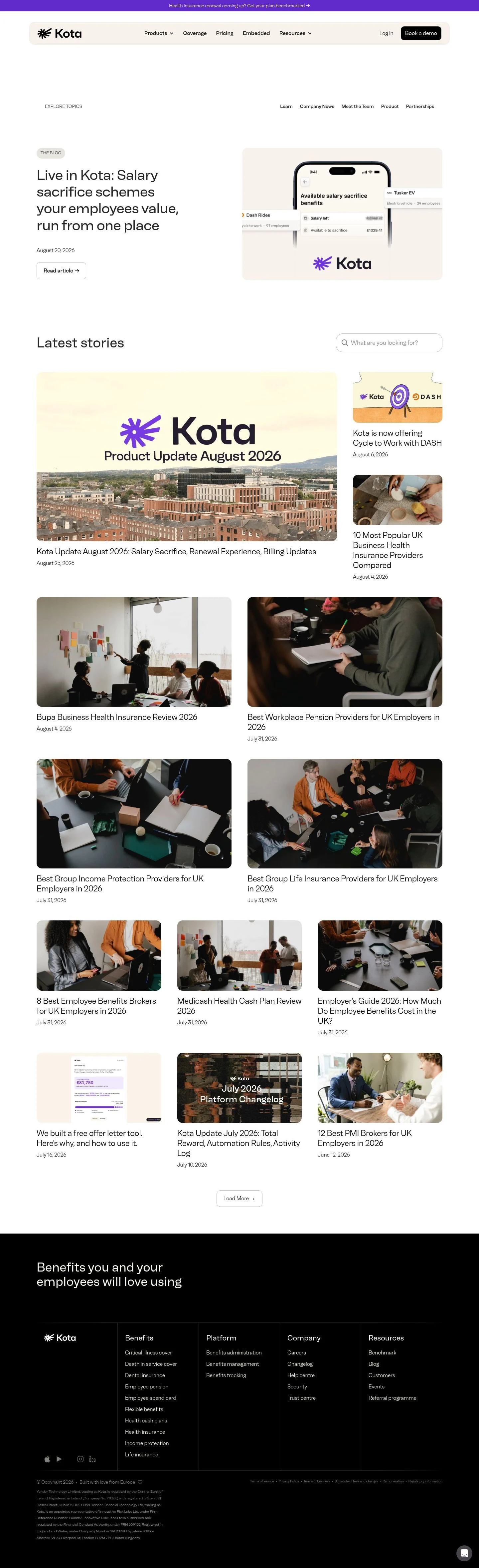
- Full page: https://cdn.designmunk.com/2026/09/10170812/kota-io-blog-featured.webp
- Above the fold: https://cdn.designmunk.com/2026/09/10170812/kota-io-blog-featured.webp
- On DesignMunk: https://designmunk.com/kota-blog-page/

Study these for hierarchy, rhythm, spacing and density. Where an image and the written spec disagree, the spec wins: the tokens were read from the page's own CSS, the images are one rendering of it.

## Before you start

Ask the user what they are building, who it is for, and what brand assets they already have — name, colours, typefaces. Wait for their answers before writing anything. Everything below is then applied to their product, not to the reference.

## Design specification

# Kota: Monochrome Blog Punctuated by Aconite Purple

## Overview

Kota's UI speaks to HR and finance teams: calm, trustworthy, and operational. The page is predominantly monochrome with a single purple accent, plenty of white space, and soft radii. The tone should feel professional and lightly editorial, prioritising legibility over decoration. When in doubt, keep layouts spacious and actions discreet except for the primary conversion button.

## Colors

- **primary (#333333):** Core text on light backgrounds; default for paragraphs and headings.
- **secondary (#040404):** Near-black for brand marks or emphatic text on light surfaces.
- **tertiary (#e7fe77):** High-energy highlight for callouts or data tags; use sparingly.
- **neutral (#ffffff):** Base surface for pages, cards, and inputs.
- **border (#e5e7eb):** Subtle dividers, input strokes, and card outlines.
- **brand-aconite-purple (#754cdc):** Accent for links on hover, announcement bars, and small UI highlights.
- **brand-lavender-cream (#bca4ec):** Supporting tint for illustrations or empty states.
- **surface ({colors.neutral} -> #ffffff):** Default container backgrounds.
- **on-surface ({colors.primary} -> #333333):** Text on any light surface.

## Typography

All text styles use Neue faktum V2 in light-to-regular weights. This family is custom/self-hosted; agents should not attempt to load it directly. Suitable substitutes: Inter (Google), Manrope (Google), or General Sans (Fontshare). Maintain sizes and line heights exactly.
- Headline-lg (44px/1.15, 400): Primary H1 on feature and landing panels.
- Headline-md (42px/1.15, 400): Section leads (e.g., page intros).
- Headline-sm (24px/1.25, 300): Card titles, list items, and subheads.
- Headline-xs (18px/1.22, 300): Eyebrows, small section titles, utility headings.
- Body-md (16px/1.5, 300): Paragraphs, nav items, metadata, buttons.

## Layout

Spacing follows a simple vertical rhythm: 10, 20, 32, 60, 80px. Use 60–80px blocks to separate page sections; 20–32px for in-section grouping; 10px for tight element spacing. A responsive two-column split suits heroes (text left, media right). Grids for cards should keep generous gutters and 24–32px internal padding, aligning to the spacing tokens.

## Elevation & Depth

Depth is minimal. Cards and inputs are primarily separated by the border token (#e5e7eb) and whitespace. Use the measured sm shadow (rgba(172,171,171,0.3) 0 -1px 10px 0) sparingly for sticky headers or floating elements; md shadow (rgba(0,0,0,0.3) 0 32px 68px 0) is reserved for overlays/modals. Larger shadow tiers are disabled.

## Shapes

Corners are soft and consistent: sm 8px and md 10px. Apply 10px to primary actions and prominent inputs for friendliness; 8px to cards and secondary controls. Avoid introducing new radii; consistency is the signal of brand polish.

## Components

Buttons
- Primary: Background #000000, text #ffffff, 10px radius, 50px height, 8x12px padding — default CTA (e.g., "Book a demo").
- Secondary: Text #000000, 8px radius, 50px height, 8x12px padding — outline/ghost or text-only treatments.
- Link: Text #333333, 0px radius — inline actions.

Card
- Background #ffffff, text #333333, 8px radius, 16px padding. Add a #e5e7eb border if separation is needed.

### Announcement Bar
- Background #754cdc, text #ffffff. Use 10–20px vertical padding and center the message. Dismiss or arrow link can be button-link style.

### Global Header
- Surface #ffffff with sm shadow for subtle separation. Navigation items in body-md. Right-aligned primary button uses the button-primary spec (50px height, 10px radius).

### Topic Filters
- Inline links using button-link styling. Space with 20px gaps; active state can pick up #754cdc.

### Featured Blog Hero
- Left column: headline-lg (44px) in #333333, date in body-md. Action uses button-secondary. Right column hosts media in a card container (8px radius).

### Search Field
- Container #ffffff with 1px #e5e7eb border, 10px radius, height ~50px; placeholder in #333333 at reduced opacity.

### Article Card
- Image or illustration top, title in headline-sm (24px), metadata in body-md. Card spec per token; use #e5e7eb divider if stacking.

### Load More CTA
- Centered secondary or primary button depending on emphasis; keep 50px height and grid spacing of 60–80px above/below.

### Footer
- Multi-column list with a #e5e7eb top border. Section labels in headline-xs (18px); links in body-md; generous 60–80px vertical padding.

## Do's and Don'ts

Do
- Use #333333 for all primary text on #ffffff surfaces.
- Reserve #754cdc for highlights, announcement bars, or active filter states.
- Keep primary buttons at 50px height with a 10px radius; they should be the darkest element on light pages.
- Separate blocks with 60–80px spacing; group items with 20–32px.

Don't
- Introduce new radii or heavy shadows; depth comes from borders and whitespace.
- Swap in saturated colors for links or badges; stick to the defined purple and occasional Electric Lime highlight.
- Use dense copy in narrow columns; the system assumes airy line lengths and 16px body text.

## Agent Prompt Guide

Quick palette reference
- Text: #333333
- Background: #ffffff
- Border: #e5e7eb
- Accent: #754cdc

1) Build a sticky header with demo CTA
- Container: 100% width, background #ffffff, sm shadow rgba(172,171,171,0.3) 0 -1px 10px 0.
- Type: Inter (substitute for Neue faktum V2), body-md sizing 16px/1.5, color #333333.
- Nav links: spacing 20px.
- Primary button: 50px height, 10px radius, background #000000, text #ffffff, padding 8px 12px.

2) Compose the blog hero split
- Grid: two columns; left 1fr text, right 1fr media, gap 32px.
- H1: Inter 44px/1.15, weight 400, letter-spacing -0.02em, color #333333.
- Meta/date: 16px/1.5, #333333 at 70% opacity.
- Action: secondary button (text #000000) below copy with 20px top margin.
- Media card: background #ffffff, radius 8px, optional #e5e7eb border.

3) Add topic filters and search
- Filters: inline button-link style, color #333333; active/hover color #754cdc; 20px gaps.
- Search input: 50px height, 10px radius, 1px border #e5e7eb, background #ffffff, placeholder #333333 at 60%.

4) Lay out article cards grid
- Grid: 3 columns desktop, gap 32px; stack to 1 column on mobile.
- Card: background #ffffff, radius 8px, padding 16px, optional 1px border #e5e7eb.
- Title: Inter 24px/1.25, weight 300, color #333333.
- Metadata: 16px/1.5, color #333333 at 70%.

5) Build the footer
- Top border: 1px #e5e7eb.
- Section headings: 18px/1.22, weight 300, color #333333.
- Links: 16px/1.5, color #333333; hover #754cdc.
- Spacing: 60–80px vertical padding, 32px column gaps.

## Similar Brands

- Gusto: similarly calm HR/benefits storytelling with soft radii; Gusto uses warmer greens where Kota keeps accents to purple and occasional neon.
- Rippling: monochrome UI with a strong header CTA; Rippling leans heavier on blacks and denser typography than Kota's lighter weights.
- Ben (getben.co): contemporary HR benefits site with playful color pops; Ben's palette is brighter overall, while Kota stays restrained and editorial.
- HiBob: clear HR content hierarchy and airy grids; HiBob's headings are bolder and more colorful compared to Kota's light-weight grotesk.

## Tokens

### CSS custom properties

```css
:root {
  /* Colors */
  --color-primary: #333333;
  --color-secondary: #040404;
  --color-tertiary: #e7fe77;
  --color-neutral: #ffffff;
  --color-border: #e5e7eb;
  --color-brand-aconite-purple: #754cdc;
  --color-brand-lavender-cream: #bca4ec;
  --color-surface: var(--color-neutral);
  --color-on-surface: var(--color-primary);

  /* Typography */
  --text-headline-lg-size: 44px;
  --text-headline-lg-weight: 400;
  --text-headline-lg-leading: 1.15;
  --text-headline-lg-tracking: -0.02em;
  --text-headline-md-size: 42px;
  --text-headline-md-weight: 400;
  --text-headline-md-leading: 1.15;
  --text-headline-sm-size: 24px;
  --text-headline-sm-weight: 300;
  --text-headline-sm-leading: 1.25;
  --text-headline-xs-size: 18px;
  --text-headline-xs-weight: 300;
  --text-headline-xs-leading: 1.22;
  --text-body-md-size: 16px;
  --text-body-md-weight: 300;
  --text-body-md-leading: 1.5;
  --font-neue-faktum-v2: "Neue faktum V2";

  /* Rounded */
  --radius-sm: 8px;
  --radius-md: 10px;

  /* Spacing */
  --spacing-xs: 10px;
  --spacing-sm: 20px;
  --spacing-md: 32px;
  --spacing-lg: 60px;
  --spacing-xl: 80px;

  /* Components */
  --button-primary-background-color: #000000;
  --button-primary-text-color: var(--color-neutral);
  --button-primary-rounded: var(--radius-md);
  --button-primary-padding: 8px 12px;
  --button-primary-height: 50px;
  --button-secondary-text-color: #000000;
  --button-secondary-rounded: var(--radius-sm);
  --button-secondary-padding: 8px 12px;
  --button-secondary-height: 50px;
  --button-link-text-color: var(--color-primary);
  --button-link-rounded: 0px;
  --card-background-color: var(--color-neutral);
  --card-text-color: var(--color-primary);
  --card-rounded: var(--radius-sm);
  --card-padding: 16px;
}
```

### Tailwind theme

```css
@theme {
  --color-primary: #333333;
  --color-secondary: #040404;
  --color-tertiary: #e7fe77;
  --color-neutral: #ffffff;
  --color-border: #e5e7eb;
  --color-brand-aconite-purple: #754cdc;
  --color-brand-lavender-cream: #bca4ec;
  --color-surface: #ffffff;
  --color-on-surface: #333333;
  --font-headline-lg: "Neue faktum V2";
  --font-headline-md: "Neue faktum V2";
  --font-headline-sm: "Neue faktum V2";
  --font-headline-xs: "Neue faktum V2";
  --font-body-md: "Neue faktum V2";
  --text-headline-lg: 44px;
  --text-headline-md: 42px;
  --text-headline-sm: 24px;
  --text-headline-xs: 18px;
  --text-body-md: 16px;
  --tracking-headline-lg: -0.02em;
  --font-weight-headline-lg: 400;
  --font-weight-headline-md: 400;
  --font-weight-headline-sm: 300;
  --font-weight-headline-xs: 300;
  --font-weight-body-md: 300;
  --radius-sm: 8px;
  --radius-md: 10px;
  --spacing-xs: 10px;
  --spacing-sm: 20px;
  --spacing-md: 32px;
  --spacing-lg: 60px;
  --spacing-xl: 80px;
}
```

### Design tokens (DTCG)

```json
{
    "$schema": "https://www.designtokens.org/schemas/2025.10/format.json",
    "color": {
        "$type": "color",
        "primary": {
            "$value": {
                "colorSpace": "srgb",
                "components": [
                    0.2,
                    0.2,
                    0.2
                ],
                "hex": "#333333"
            }
        },
        "secondary": {
            "$value": {
                "colorSpace": "srgb",
                "components": [
                    0.016,
                    0.016,
                    0.016
                ],
                "hex": "#040404"
            }
        },
        "tertiary": {
            "$value": {
                "colorSpace": "srgb",
                "components": [
                    0.906,
                    0.996,
                    0.467
                ],
                "hex": "#e7fe77"
            }
        },
        "neutral": {
            "$value": {
                "colorSpace": "srgb",
                "components": [
                    1,
                    1,
                    1
                ],
                "hex": "#ffffff"
            }
        },
        "border": {
            "$value": {
                "colorSpace": "srgb",
                "components": [
                    0.898,
                    0.906,
                    0.922
                ],
                "hex": "#e5e7eb"
            }
        },
        "brand-aconite-purple": {
            "$value": {
                "colorSpace": "srgb",
                "components": [
                    0.459,
                    0.298,
                    0.863
                ],
                "hex": "#754cdc"
            }
        },
        "brand-lavender-cream": {
            "$value": {
                "colorSpace": "srgb",
                "components": [
                    0.737,
                    0.643,
                    0.925
                ],
                "hex": "#bca4ec"
            }
        },
        "surface": {
            "$value": {
                "colorSpace": "srgb",
                "components": [
                    1,
                    1,
                    1
                ],
                "hex": "#ffffff"
            }
        },
        "on-surface": {
            "$value": {
                "colorSpace": "srgb",
                "components": [
                    0.2,
                    0.2,
                    0.2
                ],
                "hex": "#333333"
            }
        }
    },
    "spacing": {
        "$type": "dimension",
        "xs": {
            "$value": {
                "value": 10,
                "unit": "px"
            }
        },
        "sm": {
            "$value": {
                "value": 20,
                "unit": "px"
            }
        },
        "md": {
            "$value": {
                "value": 32,
                "unit": "px"
            }
        },
        "lg": {
            "$value": {
                "value": 60,
                "unit": "px"
            }
        },
        "xl": {
            "$value": {
                "value": 80,
                "unit": "px"
            }
        }
    },
    "rounded": {
        "$type": "dimension",
        "sm": {
            "$value": {
                "value": 8,
                "unit": "px"
            }
        },
        "md": {
            "$value": {
                "value": 10,
                "unit": "px"
            }
        }
    },
    "typography": {
        "headline-lg": {
            "$type": "typography",
            "$value": {
                "fontFamily": "Neue faktum V2",
                "fontSize": {
                    "value": 44,
                    "unit": "px"
                },
                "fontWeight": 400,
                "letterSpacing": {
                    "value": -0.02,
                    "unit": "em"
                }
            }
        },
        "headline-md": {
            "$type": "typography",
            "$value": {
                "fontFamily": "Neue faktum V2",
                "fontSize": {
                    "value": 42,
                    "unit": "px"
                },
                "fontWeight": 400
            }
        },
        "headline-sm": {
            "$type": "typography",
            "$value": {
                "fontFamily": "Neue faktum V2",
                "fontSize": {
                    "value": 24,
                    "unit": "px"
                },
                "fontWeight": 300
            }
        },
        "headline-xs": {
            "$type": "typography",
            "$value": {
                "fontFamily": "Neue faktum V2",
                "fontSize": {
                    "value": 18,
                    "unit": "px"
                },
                "fontWeight": 300
            }
        },
        "body-md": {
            "$type": "typography",
            "$value": {
                "fontFamily": "Neue faktum V2",
                "fontSize": {
                    "value": 16,
                    "unit": "px"
                },
                "fontWeight": 300
            }
        }
    }
}
```

## Rules

- **Fonts.** If the specification names a custom or self-hosted family, use one of the substitutes it names. Never reference a typeface you cannot actually load — it will fall back to a system font and undo the typography.
- **Colour.** Derive the palette from the user's brand. Use the token values as a guide to *relationships* — contrast, tint, how many accents carry the page — not as hex codes to paste.
- **Never reproduce** the wordmark, mascot, logo, brand name, illustrations, icon set, screenshots or any copy from the reference.
- **Never present the result as Kota Blog**, or imply any connection to it.
- If something is unspecified, choose clarity and legibility over decoration.
---
version: alpha
name: Kota
description: The platform that runs employee benefits on autopilot.
colors:
  primary: "#333333"
  secondary: "#040404"
  tertiary: "#e7fe77"
  neutral: "#ffffff"
  border: "#e5e7eb"
  brand-aconite-purple: "#754cdc"
  brand-lavender-cream: "#bca4ec"
  surface: "{colors.neutral}"
  on-surface: "{colors.primary}"
typography:
  headline-lg:
    fontFamily: Neue faktum V2
    fontSize: 44px
    fontWeight: 400
    lineHeight: 1.15
    letterSpacing: -0.02em
  headline-md:
    fontFamily: Neue faktum V2
    fontSize: 42px
    fontWeight: 400
    lineHeight: 1.15
  headline-sm:
    fontFamily: Neue faktum V2
    fontSize: 24px
    fontWeight: 300
    lineHeight: 1.25
  headline-xs:
    fontFamily: Neue faktum V2
    fontSize: 18px
    fontWeight: 300
    lineHeight: 1.22
  body-md:
    fontFamily: Neue faktum V2
    fontSize: 16px
    fontWeight: 300
    lineHeight: 1.5
rounded:
  sm: 8px
  md: 10px
spacing:
  xs: 10px
  sm: 20px
  md: 32px
  lg: 60px
  xl: 80px
components:
  button-primary:
    backgroundColor: "#000000"
    textColor: "{colors.neutral}"
    rounded: "{rounded.md}"
    padding: 8px 12px
    height: 50px
  button-secondary:
    textColor: "#000000"
    rounded: "{rounded.sm}"
    padding: 8px 12px
    height: 50px
  button-link:
    textColor: "{colors.primary}"
    rounded: 0px
  card:
    backgroundColor: "{colors.neutral}"
    textColor: "{colors.primary}"
    rounded: "{rounded.sm}"
    padding: 16px
---

# Kota: Monochrome Blog Punctuated by Aconite Purple

## Overview

Kota's UI speaks to HR and finance teams: calm, trustworthy, and operational. The page is predominantly monochrome with a single purple accent, plenty of white space, and soft radii. The tone should feel professional and lightly editorial, prioritising legibility over decoration. When in doubt, keep layouts spacious and actions discreet except for the primary conversion button.

## Colors

- **primary (#333333):** Core text on light backgrounds; default for paragraphs and headings.
- **secondary (#040404):** Near-black for brand marks or emphatic text on light surfaces.
- **tertiary (#e7fe77):** High-energy highlight for callouts or data tags; use sparingly.
- **neutral (#ffffff):** Base surface for pages, cards, and inputs.
- **border (#e5e7eb):** Subtle dividers, input strokes, and card outlines.
- **brand-aconite-purple (#754cdc):** Accent for links on hover, announcement bars, and small UI highlights.
- **brand-lavender-cream (#bca4ec):** Supporting tint for illustrations or empty states.
- **surface ({colors.neutral} -> #ffffff):** Default container backgrounds.
- **on-surface ({colors.primary} -> #333333):** Text on any light surface.

## Typography

All text styles use Neue faktum V2 in light-to-regular weights. This family is custom/self-hosted; agents should not attempt to load it directly. Suitable substitutes: Inter (Google), Manrope (Google), or General Sans (Fontshare). Maintain sizes and line heights exactly.
- Headline-lg (44px/1.15, 400): Primary H1 on feature and landing panels.
- Headline-md (42px/1.15, 400): Section leads (e.g., page intros).
- Headline-sm (24px/1.25, 300): Card titles, list items, and subheads.
- Headline-xs (18px/1.22, 300): Eyebrows, small section titles, utility headings.
- Body-md (16px/1.5, 300): Paragraphs, nav items, metadata, buttons.

## Layout

Spacing follows a simple vertical rhythm: 10, 20, 32, 60, 80px. Use 60–80px blocks to separate page sections; 20–32px for in-section grouping; 10px for tight element spacing. A responsive two-column split suits heroes (text left, media right). Grids for cards should keep generous gutters and 24–32px internal padding, aligning to the spacing tokens.

## Elevation & Depth

Depth is minimal. Cards and inputs are primarily separated by the border token (#e5e7eb) and whitespace. Use the measured sm shadow (rgba(172,171,171,0.3) 0 -1px 10px 0) sparingly for sticky headers or floating elements; md shadow (rgba(0,0,0,0.3) 0 32px 68px 0) is reserved for overlays/modals. Larger shadow tiers are disabled.

## Shapes

Corners are soft and consistent: sm 8px and md 10px. Apply 10px to primary actions and prominent inputs for friendliness; 8px to cards and secondary controls. Avoid introducing new radii; consistency is the signal of brand polish.

## Components

Buttons
- Primary: Background #000000, text #ffffff, 10px radius, 50px height, 8x12px padding — default CTA (e.g., "Book a demo").
- Secondary: Text #000000, 8px radius, 50px height, 8x12px padding — outline/ghost or text-only treatments.
- Link: Text #333333, 0px radius — inline actions.

Card
- Background #ffffff, text #333333, 8px radius, 16px padding. Add a #e5e7eb border if separation is needed.

### Announcement Bar
- Background #754cdc, text #ffffff. Use 10–20px vertical padding and center the message. Dismiss or arrow link can be button-link style.

### Global Header
- Surface #ffffff with sm shadow for subtle separation. Navigation items in body-md. Right-aligned primary button uses the button-primary spec (50px height, 10px radius).

### Topic Filters
- Inline links using button-link styling. Space with 20px gaps; active state can pick up #754cdc.

### Featured Blog Hero
- Left column: headline-lg (44px) in #333333, date in body-md. Action uses button-secondary. Right column hosts media in a card container (8px radius).

### Search Field
- Container #ffffff with 1px #e5e7eb border, 10px radius, height ~50px; placeholder in #333333 at reduced opacity.

### Article Card
- Image or illustration top, title in headline-sm (24px), metadata in body-md. Card spec per token; use #e5e7eb divider if stacking.

### Load More CTA
- Centered secondary or primary button depending on emphasis; keep 50px height and grid spacing of 60–80px above/below.

### Footer
- Multi-column list with a #e5e7eb top border. Section labels in headline-xs (18px); links in body-md; generous 60–80px vertical padding.

## Do's and Don'ts

Do
- Use #333333 for all primary text on #ffffff surfaces.
- Reserve #754cdc for highlights, announcement bars, or active filter states.
- Keep primary buttons at 50px height with a 10px radius; they should be the darkest element on light pages.
- Separate blocks with 60–80px spacing; group items with 20–32px.

Don't
- Introduce new radii or heavy shadows; depth comes from borders and whitespace.
- Swap in saturated colors for links or badges; stick to the defined purple and occasional Electric Lime highlight.
- Use dense copy in narrow columns; the system assumes airy line lengths and 16px body text.

## Agent Prompt Guide

Quick palette reference
- Text: #333333
- Background: #ffffff
- Border: #e5e7eb
- Accent: #754cdc

1) Build a sticky header with demo CTA
- Container: 100% width, background #ffffff, sm shadow rgba(172,171,171,0.3) 0 -1px 10px 0.
- Type: Inter (substitute for Neue faktum V2), body-md sizing 16px/1.5, color #333333.
- Nav links: spacing 20px.
- Primary button: 50px height, 10px radius, background #000000, text #ffffff, padding 8px 12px.

2) Compose the blog hero split
- Grid: two columns; left 1fr text, right 1fr media, gap 32px.
- H1: Inter 44px/1.15, weight 400, letter-spacing -0.02em, color #333333.
- Meta/date: 16px/1.5, #333333 at 70% opacity.
- Action: secondary button (text #000000) below copy with 20px top margin.
- Media card: background #ffffff, radius 8px, optional #e5e7eb border.

3) Add topic filters and search
- Filters: inline button-link style, color #333333; active/hover color #754cdc; 20px gaps.
- Search input: 50px height, 10px radius, 1px border #e5e7eb, background #ffffff, placeholder #333333 at 60%.

4) Lay out article cards grid
- Grid: 3 columns desktop, gap 32px; stack to 1 column on mobile.
- Card: background #ffffff, radius 8px, padding 16px, optional 1px border #e5e7eb.
- Title: Inter 24px/1.25, weight 300, color #333333.
- Metadata: 16px/1.5, color #333333 at 70%.

5) Build the footer
- Top border: 1px #e5e7eb.
- Section headings: 18px/1.22, weight 300, color #333333.
- Links: 16px/1.5, color #333333; hover #754cdc.
- Spacing: 60–80px vertical padding, 32px column gaps.

## Similar Brands

- Gusto: similarly calm HR/benefits storytelling with soft radii; Gusto uses warmer greens where Kota keeps accents to purple and occasional neon.
- Rippling: monochrome UI with a strong header CTA; Rippling leans heavier on blacks and denser typography than Kota's lighter weights.
- Ben (getben.co): contemporary HR benefits site with playful color pops; Ben's palette is brighter overall, while Kota stays restrained and editorial.
- HiBob: clear HR content hierarchy and airy grids; HiBob's headings are bolder and more colorful compared to Kota's light-weight grotesk.
:root {
  /* Colors */
  --color-primary: #333333;
  --color-secondary: #040404;
  --color-tertiary: #e7fe77;
  --color-neutral: #ffffff;
  --color-border: #e5e7eb;
  --color-brand-aconite-purple: #754cdc;
  --color-brand-lavender-cream: #bca4ec;
  --color-surface: var(--color-neutral);
  --color-on-surface: var(--color-primary);

  /* Typography */
  --text-headline-lg-size: 44px;
  --text-headline-lg-weight: 400;
  --text-headline-lg-leading: 1.15;
  --text-headline-lg-tracking: -0.02em;
  --text-headline-md-size: 42px;
  --text-headline-md-weight: 400;
  --text-headline-md-leading: 1.15;
  --text-headline-sm-size: 24px;
  --text-headline-sm-weight: 300;
  --text-headline-sm-leading: 1.25;
  --text-headline-xs-size: 18px;
  --text-headline-xs-weight: 300;
  --text-headline-xs-leading: 1.22;
  --text-body-md-size: 16px;
  --text-body-md-weight: 300;
  --text-body-md-leading: 1.5;
  --font-neue-faktum-v2: "Neue faktum V2";

  /* Rounded */
  --radius-sm: 8px;
  --radius-md: 10px;

  /* Spacing */
  --spacing-xs: 10px;
  --spacing-sm: 20px;
  --spacing-md: 32px;
  --spacing-lg: 60px;
  --spacing-xl: 80px;

  /* Components */
  --button-primary-background-color: #000000;
  --button-primary-text-color: var(--color-neutral);
  --button-primary-rounded: var(--radius-md);
  --button-primary-padding: 8px 12px;
  --button-primary-height: 50px;
  --button-secondary-text-color: #000000;
  --button-secondary-rounded: var(--radius-sm);
  --button-secondary-padding: 8px 12px;
  --button-secondary-height: 50px;
  --button-link-text-color: var(--color-primary);
  --button-link-rounded: 0px;
  --card-background-color: var(--color-neutral);
  --card-text-color: var(--color-primary);
  --card-rounded: var(--radius-sm);
  --card-padding: 16px;
}
{
  "$schema": "https://www.designtokens.org/schemas/2025.10/format.json",
  "$description": "The platform that runs employee benefits on autopilot.",
  "color": {
    "$type": "color",
    "primary": {
      "$value": {
        "colorSpace": "srgb",
        "components": [
          0.2,
          0.2,
          0.2
        ],
        "hex": "#333333"
      }
    },
    "secondary": {
      "$value": {
        "colorSpace": "srgb",
        "components": [
          0.016,
          0.016,
          0.016
        ],
        "hex": "#040404"
      }
    },
    "tertiary": {
      "$value": {
        "colorSpace": "srgb",
        "components": [
          0.906,
          0.996,
          0.467
        ],
        "hex": "#e7fe77"
      }
    },
    "neutral": {
      "$value": {
        "colorSpace": "srgb",
        "components": [
          1,
          1,
          1
        ],
        "hex": "#ffffff"
      }
    },
    "border": {
      "$value": {
        "colorSpace": "srgb",
        "components": [
          0.898,
          0.906,
          0.922
        ],
        "hex": "#e5e7eb"
      }
    },
    "brand-aconite-purple": {
      "$value": {
        "colorSpace": "srgb",
        "components": [
          0.459,
          0.298,
          0.863
        ],
        "hex": "#754cdc"
      }
    },
    "brand-lavender-cream": {
      "$value": {
        "colorSpace": "srgb",
        "components": [
          0.737,
          0.643,
          0.925
        ],
        "hex": "#bca4ec"
      }
    },
    "surface": {
      "$value": {
        "colorSpace": "srgb",
        "components": [
          1,
          1,
          1
        ],
        "hex": "#ffffff"
      }
    },
    "on-surface": {
      "$value": {
        "colorSpace": "srgb",
        "components": [
          0.2,
          0.2,
          0.2
        ],
        "hex": "#333333"
      }
    }
  },
  "spacing": {
    "$type": "dimension",
    "xs": {
      "$value": {
        "value": 10,
        "unit": "px"
      }
    },
    "sm": {
      "$value": {
        "value": 20,
        "unit": "px"
      }
    },
    "md": {
      "$value": {
        "value": 32,
        "unit": "px"
      }
    },
    "lg": {
      "$value": {
        "value": 60,
        "unit": "px"
      }
    },
    "xl": {
      "$value": {
        "value": 80,
        "unit": "px"
      }
    }
  },
  "rounded": {
    "$type": "dimension",
    "sm": {
      "$value": {
        "value": 8,
        "unit": "px"
      }
    },
    "md": {
      "$value": {
        "value": 10,
        "unit": "px"
      }
    }
  },
  "typography": {
    "headline-lg": {
      "$type": "typography",
      "$value": {
        "fontFamily": "Neue faktum V2",
        "fontSize": {
          "value": 44,
          "unit": "px"
        },
        "fontWeight": 400,
        "letterSpacing": {
          "value": -0.02,
          "unit": "em"
        }
      }
    },
    "headline-md": {
      "$type": "typography",
      "$value": {
        "fontFamily": "Neue faktum V2",
        "fontSize": {
          "value": 42,
          "unit": "px"
        },
        "fontWeight": 400
      }
    },
    "headline-sm": {
      "$type": "typography",
      "$value": {
        "fontFamily": "Neue faktum V2",
        "fontSize": {
          "value": 24,
          "unit": "px"
        },
        "fontWeight": 300
      }
    },
    "headline-xs": {
      "$type": "typography",
      "$value": {
        "fontFamily": "Neue faktum V2",
        "fontSize": {
          "value": 18,
          "unit": "px"
        },
        "fontWeight": 300
      }
    },
    "body-md": {
      "$type": "typography",
      "$value": {
        "fontFamily": "Neue faktum V2",
        "fontSize": {
          "value": 16,
          "unit": "px"
        },
        "fontWeight": 300
      }
    }
  }
}
@theme {
--color-primary: #333333;
--color-secondary: #040404;
--color-tertiary: #e7fe77;
--color-neutral: #ffffff;
--color-border: #e5e7eb;
--color-brand-aconite-purple: #754cdc;
--color-brand-lavender-cream: #bca4ec;
--color-surface: #ffffff;
--color-on-surface: #333333;
--font-headline-lg: "Neue faktum V2";
--font-headline-md: "Neue faktum V2";
--font-headline-sm: "Neue faktum V2";
--font-headline-xs: "Neue faktum V2";
--font-body-md: "Neue faktum V2";
--text-headline-lg: 44px;
--text-headline-md: 42px;
--text-headline-sm: 24px;
--text-headline-xs: 18px;
--text-body-md: 16px;
--tracking-headline-lg: -0.02em;
--font-weight-headline-lg: 400;
--font-weight-headline-md: 400;
--font-weight-headline-sm: 300;
--font-weight-headline-xs: 300;
--font-weight-body-md: 300;
--radius-sm: 8px;
--radius-md: 10px;
--spacing-xs: 10px;
--spacing-sm: 20px;
--spacing-md: 32px;
--spacing-lg: 60px;
--spacing-xl: 80px;
} # Design brief: the Kota Blog design language
Below is a complete design specification measured from a real, published web page. Use it as a design language for the user's product. It is not a page to reproduce.
## Reference images
- Full page: https://cdn.designmunk.com/2026/09/10170812/kota-io-blog-featured.webp
- Above the fold: https://cdn.designmunk.com/2026/09/10170812/kota-io-blog-featured.webp
- On DesignMunk: https://designmunk.com/kota-blog-page/
Study these for hierarchy, rhythm, spacing and density. Where an image and the written spec disagree, the spec wins: the tokens were read from the page's own CSS, the images are one rendering of it.
## Before you start
Ask the user what they are building, who it is for, and what brand assets they already have — name, colours, typefaces. Wait for their answers before writing anything. Everything below is then applied to their product, not to the reference.
## Design specification
# Kota: Monochrome Blog Punctuated by Aconite Purple
## Overview
Kota's UI speaks to HR and finance teams: calm, trustworthy, and operational. The page is predominantly monochrome with a single purple accent, plenty of white space, and soft radii. The tone should feel professional and lightly editorial, prioritising legibility over decoration. When in doubt, keep layouts spacious and actions discreet except for the primary conversion button.
## Colors
- **primary (#333333):** Core text on light backgrounds; default for paragraphs and headings.
- **secondary (#040404):** Near-black for brand marks or emphatic text on light surfaces.
- **tertiary (#e7fe77):** High-energy highlight for callouts or data tags; use sparingly.
- **neutral (#ffffff):** Base surface for pages, cards, and inputs.
- **border (#e5e7eb):** Subtle dividers, input strokes, and card outlines.
- **brand-aconite-purple (#754cdc):** Accent for links on hover, announcement bars, and small UI highlights.
- **brand-lavender-cream (#bca4ec):** Supporting tint for illustrations or empty states.
- **surface ({colors.neutral} -> #ffffff):** Default container backgrounds.
- **on-surface ({colors.primary} -> #333333):** Text on any light surface.
## Typography
All text styles use Neue faktum V2 in light-to-regular weights. This family is custom/self-hosted; agents should not attempt to load it directly. Suitable substitutes: Inter (Google), Manrope (Google), or General Sans (Fontshare). Maintain sizes and line heights exactly.
- Headline-lg (44px/1.15, 400): Primary H1 on feature and landing panels.
- Headline-md (42px/1.15, 400): Section leads (e.g., page intros).
- Headline-sm (24px/1.25, 300): Card titles, list items, and subheads.
- Headline-xs (18px/1.22, 300): Eyebrows, small section titles, utility headings.
- Body-md (16px/1.5, 300): Paragraphs, nav items, metadata, buttons.
## Layout
Spacing follows a simple vertical rhythm: 10, 20, 32, 60, 80px. Use 60–80px blocks to separate page sections; 20–32px for in-section grouping; 10px for tight element spacing. A responsive two-column split suits heroes (text left, media right). Grids for cards should keep generous gutters and 24–32px internal padding, aligning to the spacing tokens.
## Elevation & Depth
Depth is minimal. Cards and inputs are primarily separated by the border token (#e5e7eb) and whitespace. Use the measured sm shadow (rgba(172,171,171,0.3) 0 -1px 10px 0) sparingly for sticky headers or floating elements; md shadow (rgba(0,0,0,0.3) 0 32px 68px 0) is reserved for overlays/modals. Larger shadow tiers are disabled.
## Shapes
Corners are soft and consistent: sm 8px and md 10px. Apply 10px to primary actions and prominent inputs for friendliness; 8px to cards and secondary controls. Avoid introducing new radii; consistency is the signal of brand polish.
## Components
Buttons
- Primary: Background #000000, text #ffffff, 10px radius, 50px height, 8x12px padding — default CTA (e.g., "Book a demo").
- Secondary: Text #000000, 8px radius, 50px height, 8x12px padding — outline/ghost or text-only treatments.
- Link: Text #333333, 0px radius — inline actions.
Card
- Background #ffffff, text #333333, 8px radius, 16px padding. Add a #e5e7eb border if separation is needed.
### Announcement Bar
- Background #754cdc, text #ffffff. Use 10–20px vertical padding and center the message. Dismiss or arrow link can be button-link style.
### Global Header
- Surface #ffffff with sm shadow for subtle separation. Navigation items in body-md. Right-aligned primary button uses the button-primary spec (50px height, 10px radius).
### Topic Filters
- Inline links using button-link styling. Space with 20px gaps; active state can pick up #754cdc.
### Featured Blog Hero
- Left column: headline-lg (44px) in #333333, date in body-md. Action uses button-secondary. Right column hosts media in a card container (8px radius).
### Search Field
- Container #ffffff with 1px #e5e7eb border, 10px radius, height ~50px; placeholder in #333333 at reduced opacity.
### Article Card
- Image or illustration top, title in headline-sm (24px), metadata in body-md. Card spec per token; use #e5e7eb divider if stacking.
### Load More CTA
- Centered secondary or primary button depending on emphasis; keep 50px height and grid spacing of 60–80px above/below.
### Footer
- Multi-column list with a #e5e7eb top border. Section labels in headline-xs (18px); links in body-md; generous 60–80px vertical padding.
## Do's and Don'ts
Do
- Use #333333 for all primary text on #ffffff surfaces.
- Reserve #754cdc for highlights, announcement bars, or active filter states.
- Keep primary buttons at 50px height with a 10px radius; they should be the darkest element on light pages.
- Separate blocks with 60–80px spacing; group items with 20–32px.
Don't
- Introduce new radii or heavy shadows; depth comes from borders and whitespace.
- Swap in saturated colors for links or badges; stick to the defined purple and occasional Electric Lime highlight.
- Use dense copy in narrow columns; the system assumes airy line lengths and 16px body text.
## Agent Prompt Guide
Quick palette reference
- Text: #333333
- Background: #ffffff
- Border: #e5e7eb
- Accent: #754cdc
1) Build a sticky header with demo CTA
- Container: 100% width, background #ffffff, sm shadow rgba(172,171,171,0.3) 0 -1px 10px 0.
- Type: Inter (substitute for Neue faktum V2), body-md sizing 16px/1.5, color #333333.
- Nav links: spacing 20px.
- Primary button: 50px height, 10px radius, background #000000, text #ffffff, padding 8px 12px.
2) Compose the blog hero split
- Grid: two columns; left 1fr text, right 1fr media, gap 32px.
- H1: Inter 44px/1.15, weight 400, letter-spacing -0.02em, color #333333.
- Meta/date: 16px/1.5, #333333 at 70% opacity.
- Action: secondary button (text #000000) below copy with 20px top margin.
- Media card: background #ffffff, radius 8px, optional #e5e7eb border.
3) Add topic filters and search
- Filters: inline button-link style, color #333333; active/hover color #754cdc; 20px gaps.
- Search input: 50px height, 10px radius, 1px border #e5e7eb, background #ffffff, placeholder #333333 at 60%.
4) Lay out article cards grid
- Grid: 3 columns desktop, gap 32px; stack to 1 column on mobile.
- Card: background #ffffff, radius 8px, padding 16px, optional 1px border #e5e7eb.
- Title: Inter 24px/1.25, weight 300, color #333333.
- Metadata: 16px/1.5, color #333333 at 70%.
5) Build the footer
- Top border: 1px #e5e7eb.
- Section headings: 18px/1.22, weight 300, color #333333.
- Links: 16px/1.5, color #333333; hover #754cdc.
- Spacing: 60–80px vertical padding, 32px column gaps.
## Tokens
### CSS custom properties
```css
:root {
/* Colors */
--color-primary: #333333;
--color-secondary: #040404;
--color-tertiary: #e7fe77;
--color-neutral: #ffffff;
--color-border: #e5e7eb;
--color-brand-aconite-purple: #754cdc;
--color-brand-lavender-cream: #bca4ec;
--color-surface: var(--color-neutral);
--color-on-surface: var(--color-primary);
/* Typography */
--text-headline-lg-size: 44px;
--text-headline-lg-weight: 400;
--text-headline-lg-leading: 1.15;
--text-headline-lg-tracking: -0.02em;
--text-headline-md-size: 42px;
--text-headline-md-weight: 400;
--text-headline-md-leading: 1.15;
--text-headline-sm-size: 24px;
--text-headline-sm-weight: 300;
--text-headline-sm-leading: 1.25;
--text-headline-xs-size: 18px;
--text-headline-xs-weight: 300;
--text-headline-xs-leading: 1.22;
--text-body-md-size: 16px;
--text-body-md-weight: 300;
--text-body-md-leading: 1.5;
--font-neue-faktum-v2: "Neue faktum V2";
/* Rounded */
--radius-sm: 8px;
--radius-md: 10px;
/* Spacing */
--spacing-xs: 10px;
--spacing-sm: 20px;
--spacing-md: 32px;
--spacing-lg: 60px;
--spacing-xl: 80px;
/* Components */
--button-primary-background-color: #000000;
--button-primary-text-color: var(--color-neutral);
--button-primary-rounded: var(--radius-md);
--button-primary-padding: 8px 12px;
--button-primary-height: 50px;
--button-secondary-text-color: #000000;
--button-secondary-rounded: var(--radius-sm);
--button-secondary-padding: 8px 12px;
--button-secondary-height: 50px;
--button-link-text-color: var(--color-primary);
--button-link-rounded: 0px;
--card-background-color: var(--color-neutral);
--card-text-color: var(--color-primary);
--card-rounded: var(--radius-sm);
--card-padding: 16px;
}
```
## Rules
- **Fonts.** If the specification names a custom or self-hosted family, use one of the substitutes it names. Never reference a typeface you cannot actually load — it will fall back to a system font and undo the typography.
- **Colour.** Derive the palette from the user's brand. Use the token values as a guide to *relationships* — contrast, tint, how many accents carry the page — not as hex codes to paste.
- **Never reproduce** the wordmark, mascot, logo, brand name, illustrations, icon set, screenshots or any copy from the reference.
- **Never present the result as Kota Blog**, or imply any connection to it.
- If something is unspecified, choose clarity and legibility over decoration.