







kagaz.app
AI Breakdown
Design export
# Design brief: the Kagaz design language

Below is a complete design specification measured from a real, published web page. Use it as a design language for the user's product. It is not a page to reproduce.

## Reference images

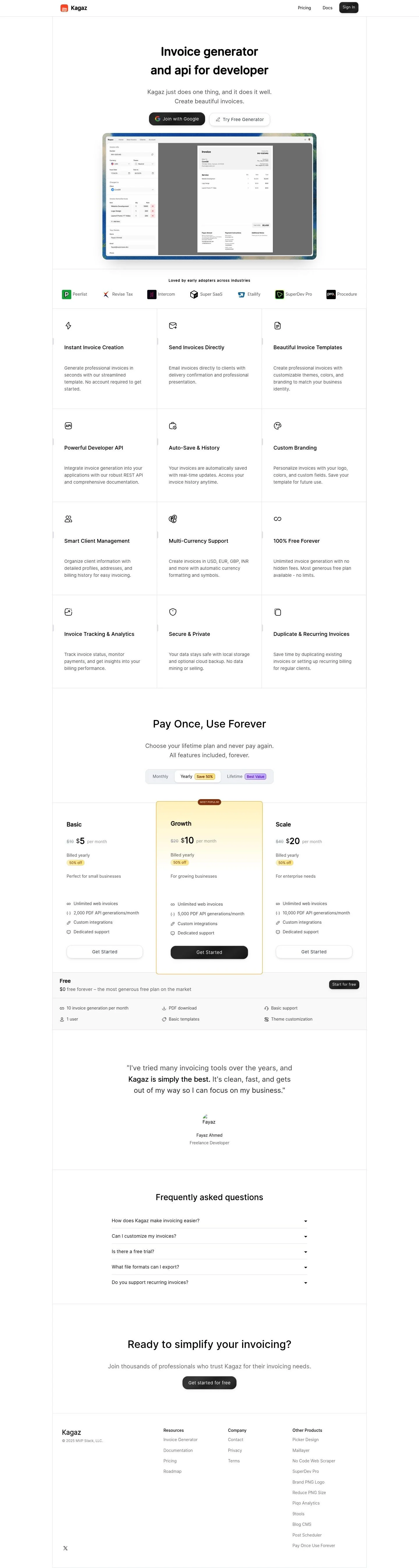
- Full page: https://cdn.designmunk.com/2026/09/07093417/kagaz-app-featured.webp
- Above the fold: https://cdn.designmunk.com/2026/09/07093417/kagaz-app-featured.webp
- On DesignMunk: https://designmunk.com/kagaz/

Study these for hierarchy, rhythm, spacing and density. Where an image and the written spec disagree, the spec wins: the tokens were read from the page's own CSS, the images are one rendering of it.

## Before you start

Ask the user what they are building, who it is for, and what brand assets they already have — name, colours, typefaces. Wait for their answers before writing anything. Everything below is then applied to their product, not to the reference.

## Design specification

# Kagaz: Two-Pill Hero and Framed Invoice Demo

## Overview

Kagaz is a focused invoicing tool for freelancers, small teams, and developers. The interface is calm, text-first, and centered, with a single column that reduces choice overload. Tone is pragmatic and straightforward; color is restrained so the CTAs and pricing highlights stand out. Spacing trends generous and even, prioritizing scanability over flash.

## Colors

- Primary (#666666): Default body text and subdued UI labels.
- Secondary (#f66237): Accent actions and highlights sparingly; pairs well with black CTAs.
- Tertiary (#000000): High-emphasis text (headlines, key prices) and the primary button background.
- Neutral (#ffffff): Page background and most cards.
- Border (#f59e0b): Emphatic borders, tags, or switches; use lightly to avoid competing with Secondary.
- Brand-coral-correlation (#fcac8c): Soft supporting accent for badges or subtle fills.
- Surface ({colors.neutral} → #ffffff): Card surfaces and hero containers.
- On-surface ({colors.primary} → #666666): Default text color on white surfaces.

## Typography

- OpenRunde-Medium (headlines): Custom/self-hosted; not available via Google Fonts. Use for headings at 40px, 34px, 28px, and 24px with weights 600/500 as specified. Substitutes when Open Runde is unavailable: Manrope (Google), DM Sans (Google), or Nunito (Google) for a rounded, friendly sans.
- OpenRunde-Regular (body): Custom/self-hosted; not Google-loadable. Use for body at 20px/1.6 line-height. Substitute with Manrope Regular, DM Sans Regular, or Nunito Regular when the custom family can't be served.
- Scale intent: headline-lg (40px) for hero H1; headline-md (34px) for section leads; headline-sm (28px) for card titles; headline-xs (24px) for FAQ questions; body-md (20px) for all supporting copy.

## Layout

Spacing scale is compact-to-generous: 6, 16, 24, 40, 80px. Use xl (80px) for vertical section padding, lg (40px) between major blocks within a section, and md (24px) for card padding and grid gutters. The page reads as a centered single column with components that can break into 2–3 columns at wider widths. Maintain consistent max-widths so the framed screenshot and pricing grid align with the hero text.

## Elevation & Depth

Shadows are subtle to medium: sm for small controls, md for larger components like the screenshot frame, and lg for modal or spotlighted elements. xl is none — avoid heavy blur for a flat, friendly feel. When elevation isn't appropriate, use the Border token (#f59e0b) for thin emphasis lines or rely on whitespace. The inner shadow can be used to add a soft inset ring on inputs or framed previews.

## Shapes

Radii are soft but utilitarian. Use lg (18px) for primary CTAs and hero pills, md (16px) for secondary buttons and larger input fields, and sm (8px) for cards and images. Square corners (0px) are reserved for link buttons and dividers to preserve hierarchy.

## Components

- Button Primary: 45px tall with 12px×20px padding, background #1a1a1a, white text, rounded 18px. Use for the main action (e.g., Join with Google / Get started).
- Button Secondary: 45px tall, white background, #374151 text, rounded 16px, 12px×20px padding. Use for alternative actions (e.g., Try Free Generator).
- Button Link: Text-only action with #666666 and 0px radius; reserve for low-emphasis links.
- Card: White background, #000000 text, 24px padding, 8px radius; add sm or md shadow as needed.

### Header Bar
Minimal top navigation with logo left and Pricing/Docs/Sign In right. Background #ffffff, text #666666; link hover can pick up #000000. Spacing: md (24px) vertical padding; Sign In may use primary button style for prominence.

### Hero Block
headline-lg (40px/600) title and body-md (20px/1.6) lead, centered. Two CTAs inline: Primary (lg radius 18px) then Secondary (md radius 16px). Vertical rhythm: lg (40px) from title to lead; md (24px) to CTAs.

### Framed Invoice Demo
A screenshot card using md shadow and sm radius (8px). Center it below CTAs with lg–xl spacing (40–80px). Keep max-width aligned to the hero text container.

### Logo Strip
"Loved by early adopters" row of logos in a card with sm radius and sm–md padding (16–24px). Use on-surface text (#666666) and low-contrast dividers.

### Features Grid
3-up or 2-up responsive grid. Each feature uses headline-sm (28px) for the title and body-md for copy inside a white card (8px radius, 24px padding). Optional accents: small icons or a top border in #f59e0b.

### Pricing (Lifetime Plans)
Cards for Basic/Growth/Scale/Free: 8px radius, 24px padding, md shadow for the highlighted plan. Prices can use #000000 for emphasis; badges or "Most Popular" can use #f66237 with #ffffff text. CTAs use the 45px primary button.

### Testimonial Quote
Single card with sm shadow, 24px padding, and 8px radius. Quote in body-md, bold key phrase, attribution beneath using on-surface color.

### FAQ Accordion
Each question in headline-xs (24px/500) with a thin divider; answers in body-md (20px). Use spacing md (24px) between items.

### Footer
Multi-column links on white surface; body-md for labels, low-contrast #666666 text. Column gutters at md (24px), vertical section padding xl (80px).

## Do's and Don'ts

- Do use #666666 for default body text and reserve #000000 for headlines and critical prices.
- Do keep CTAs 45px tall with 18px or 16px radius per variant; pair a black primary with a white secondary.
- Do space sections with 80px top/bottom and maintain 24px card padding for consistency.
- Don't introduce new accent colors; use #f66237 for highlights and #f59e0b for borders/badges only.
- Don't overuse heavy shadows; stay at sm or md, with lg reserved for modals or spotlight elements.
- Don't drop body text below 20px; readability is part of the brand's promise of simplicity.

## Agent Prompt Guide

Quick color reference — Text: #666666 (body), #000000 (emphasis); Background: #ffffff; Border: #f59e0b; Accent: #f66237; Soft accent: #fcac8c.

1) Build a centered hero
- Container: max-width 960px, margin auto, padding-top/bottom 80px (#ffffff).
- H1: 40px/600 in 'OpenRunde-Medium', fallback 'Manrope', color #000000.
- Lead: 20px/1.6 in 'OpenRunde-Regular', fallback 'Manrope', color #666666, margin-top 40px.
- CTAs: Primary button 45px tall, 12×20px, radius 18px, bg #1a1a1a, text #ffffff. Secondary button 45px, 12×20px, radius 16px, bg #ffffff, text #374151, 24px gap.

2) Features grid card
- Grid: 3 columns with 24px gutters; stack to 1 column on mobile.
- Card: bg #ffffff, text #000000, padding 24px, radius 8px, shadow sm.
- Title: 28px/500 in 'OpenRunde-Medium'; Body: 20px in 'OpenRunde-Regular' color #666666.
- Optional top border: 2px solid #f59e0b; small icon accent #f66237.

3) Pricing card (highlighted)
- Card: bg #ffffff, padding 24px, radius 8px, shadow md.
- Plan name: 24px/500; Price: emphasize with #000000.
- Badge: text #ffffff on #f66237 with 8px radius.
- CTA: 45px primary button (bg #1a1a1a, text #ffffff).

4) Framed screenshot section
- Wrapper: margin-top 80px; center.
- Frame: card 8px radius, shadow md, bg #ffffff; optional 1px border #f59e0b.

5) FAQ list
- Item title: 24px/500, color #000000; answer: 20px, color #666666.
- Divider between items: 1px solid rgba(0,0,0,0.06) or use #f59e0b sparingly for emphasis.
- Section padding: 80px top/bottom.

## Similar Brands

- Stripe Billing: Similar focus on developer credibility with restrained color; Stripe is denser and more technical in typography and motion.
- Paddle: Clean pricing and simple cards; uses more blues and stronger illustration than Kagaz's grayscale + orange.
- Wave Invoicing: Friendly, minimal invoicing pages; bolder illustrations and a cooler palette than Kagaz's warm accents.
- Zoho Invoice: Feature-rich with card grids; more complex navigation and heavier iconography compared to Kagaz's light single-column flow.

## Tokens

### CSS custom properties

```css
:root {
  /* Colors */
  --color-primary: #666666;
  --color-secondary: #f66237;
  --color-tertiary: #000000;
  --color-neutral: #ffffff;
  --color-border: #f59e0b;
  --color-brand-coral-correlation: #fcac8c;
  --color-surface: var(--color-neutral);
  --color-on-surface: var(--color-primary);

  /* Typography */
  --text-headline-lg-size: 40px;
  --text-headline-lg-weight: 600;
  --text-headline-lg-leading: 1.6;
  --text-headline-md-size: 34px;
  --text-headline-md-weight: 500;
  --text-headline-md-leading: 1.69;
  --text-headline-sm-size: 28px;
  --text-headline-sm-weight: 500;
  --text-headline-sm-leading: 1.07;
  --text-headline-xs-size: 24px;
  --text-headline-xs-weight: 500;
  --text-headline-xs-leading: 1.21;
  --text-body-md-size: 20px;
  --text-body-md-weight: 400;
  --text-body-md-leading: 1.6;
  --font-openrunde-medium: "OpenRunde-Medium";
  --font-openrunde-regular: "OpenRunde-Regular";

  /* Rounded */
  --radius-sm: 8px;
  --radius-md: 16px;
  --radius-lg: 18px;

  /* Spacing */
  --spacing-xs: 6px;
  --spacing-sm: 16px;
  --spacing-md: 24px;
  --spacing-lg: 40px;
  --spacing-xl: 80px;

  /* Components */
  --button-primary-background-color: #1a1a1a;
  --button-primary-text-color: var(--color-neutral);
  --button-primary-rounded: var(--radius-lg);
  --button-primary-padding: 12px 20px;
  --button-primary-height: 45px;
  --button-secondary-background-color: var(--color-neutral);
  --button-secondary-text-color: #374151;
  --button-secondary-rounded: var(--radius-md);
  --button-secondary-padding: 12px 20px;
  --button-secondary-height: 45px;
  --button-link-text-color: var(--color-primary);
  --button-link-rounded: 0px;
  --card-background-color: var(--color-neutral);
  --card-text-color: var(--color-tertiary);
  --card-rounded: var(--radius-sm);
  --card-padding: 24px;
}
```

### Tailwind theme

```css
@theme {
  --color-primary: #666666;
  --color-secondary: #f66237;
  --color-tertiary: #000000;
  --color-neutral: #ffffff;
  --color-border: #f59e0b;
  --color-brand-coral-correlation: #fcac8c;
  --color-surface: #ffffff;
  --color-on-surface: #666666;
  --font-headline-lg: "OpenRunde-Medium";
  --font-headline-md: "OpenRunde-Medium";
  --font-headline-sm: "OpenRunde-Medium";
  --font-headline-xs: "OpenRunde-Regular";
  --font-body-md: "OpenRunde-Regular";
  --text-headline-lg: 40px;
  --text-headline-md: 34px;
  --text-headline-sm: 28px;
  --text-headline-xs: 24px;
  --text-body-md: 20px;
  --font-weight-headline-lg: 600;
  --font-weight-headline-md: 500;
  --font-weight-headline-sm: 500;
  --font-weight-headline-xs: 500;
  --font-weight-body-md: 400;
  --radius-sm: 8px;
  --radius-md: 16px;
  --radius-lg: 18px;
  --spacing-xs: 6px;
  --spacing-sm: 16px;
  --spacing-md: 24px;
  --spacing-lg: 40px;
  --spacing-xl: 80px;
}
```

### Design tokens (DTCG)

```json
{
    "$schema": "https://www.designtokens.org/schemas/2025.10/format.json",
    "color": {
        "$type": "color",
        "primary": {
            "$value": {
                "colorSpace": "srgb",
                "components": [
                    0.4,
                    0.4,
                    0.4
                ],
                "hex": "#666666"
            }
        },
        "secondary": {
            "$value": {
                "colorSpace": "srgb",
                "components": [
                    0.965,
                    0.384,
                    0.216
                ],
                "hex": "#f66237"
            }
        },
        "tertiary": {
            "$value": {
                "colorSpace": "srgb",
                "components": [
                    0,
                    0,
                    0
                ],
                "hex": "#000000"
            }
        },
        "neutral": {
            "$value": {
                "colorSpace": "srgb",
                "components": [
                    1,
                    1,
                    1
                ],
                "hex": "#ffffff"
            }
        },
        "border": {
            "$value": {
                "colorSpace": "srgb",
                "components": [
                    0.961,
                    0.62,
                    0.043
                ],
                "hex": "#f59e0b"
            }
        },
        "brand-coral-correlation": {
            "$value": {
                "colorSpace": "srgb",
                "components": [
                    0.988,
                    0.675,
                    0.549
                ],
                "hex": "#fcac8c"
            }
        },
        "surface": {
            "$value": {
                "colorSpace": "srgb",
                "components": [
                    1,
                    1,
                    1
                ],
                "hex": "#ffffff"
            }
        },
        "on-surface": {
            "$value": {
                "colorSpace": "srgb",
                "components": [
                    0.4,
                    0.4,
                    0.4
                ],
                "hex": "#666666"
            }
        }
    },
    "spacing": {
        "$type": "dimension",
        "xs": {
            "$value": {
                "value": 6,
                "unit": "px"
            }
        },
        "sm": {
            "$value": {
                "value": 16,
                "unit": "px"
            }
        },
        "md": {
            "$value": {
                "value": 24,
                "unit": "px"
            }
        },
        "lg": {
            "$value": {
                "value": 40,
                "unit": "px"
            }
        },
        "xl": {
            "$value": {
                "value": 80,
                "unit": "px"
            }
        }
    },
    "rounded": {
        "$type": "dimension",
        "sm": {
            "$value": {
                "value": 8,
                "unit": "px"
            }
        },
        "md": {
            "$value": {
                "value": 16,
                "unit": "px"
            }
        },
        "lg": {
            "$value": {
                "value": 18,
                "unit": "px"
            }
        }
    },
    "typography": {
        "headline-lg": {
            "$type": "typography",
            "$value": {
                "fontFamily": "OpenRunde-Medium",
                "fontSize": {
                    "value": 40,
                    "unit": "px"
                },
                "fontWeight": 600
            }
        },
        "headline-md": {
            "$type": "typography",
            "$value": {
                "fontFamily": "OpenRunde-Medium",
                "fontSize": {
                    "value": 34,
                    "unit": "px"
                },
                "fontWeight": 500
            }
        },
        "headline-sm": {
            "$type": "typography",
            "$value": {
                "fontFamily": "OpenRunde-Medium",
                "fontSize": {
                    "value": 28,
                    "unit": "px"
                },
                "fontWeight": 500
            }
        },
        "headline-xs": {
            "$type": "typography",
            "$value": {
                "fontFamily": "OpenRunde-Regular",
                "fontSize": {
                    "value": 24,
                    "unit": "px"
                },
                "fontWeight": 500
            }
        },
        "body-md": {
            "$type": "typography",
            "$value": {
                "fontFamily": "OpenRunde-Regular",
                "fontSize": {
                    "value": 20,
                    "unit": "px"
                },
                "fontWeight": 400
            }
        }
    }
}
```

## Rules

- **Fonts.** If the specification names a custom or self-hosted family, use one of the substitutes it names. Never reference a typeface you cannot actually load — it will fall back to a system font and undo the typography.
- **Colour.** Derive the palette from the user's brand. Use the token values as a guide to *relationships* — contrast, tint, how many accents carry the page — not as hex codes to paste.
- **Never reproduce** the wordmark, mascot, logo, brand name, illustrations, icon set, screenshots or any copy from the reference.
- **Never present the result as Kagaz**, or imply any connection to it.
- If something is unspecified, choose clarity and legibility over decoration.
---
version: alpha
name: Kagaz
description: Invoice generator and API that creates beautiful invoices fast.
colors:
  primary: "#666666"
  secondary: "#f66237"
  tertiary: "#000000"
  neutral: "#ffffff"
  border: "#f59e0b"
  brand-coral-correlation: "#fcac8c"
  surface: "{colors.neutral}"
  on-surface: "{colors.primary}"
typography:
  headline-lg:
    fontFamily: OpenRunde-Medium
    fontSize: 40px
    fontWeight: 600
    lineHeight: 1.6
  headline-md:
    fontFamily: OpenRunde-Medium
    fontSize: 34px
    fontWeight: 500
    lineHeight: 1.69
  headline-sm:
    fontFamily: OpenRunde-Medium
    fontSize: 28px
    fontWeight: 500
    lineHeight: 1.07
  headline-xs:
    fontFamily: OpenRunde-Regular
    fontSize: 24px
    fontWeight: 500
    lineHeight: 1.21
  body-md:
    fontFamily: OpenRunde-Regular
    fontSize: 20px
    fontWeight: 400
    lineHeight: 1.6
rounded:
  sm: 8px
  md: 16px
  lg: 18px
spacing:
  xs: 6px
  sm: 16px
  md: 24px
  lg: 40px
  xl: 80px
components:
  button-primary:
    backgroundColor: "#1a1a1a"
    textColor: "{colors.neutral}"
    rounded: "{rounded.lg}"
    padding: 12px 20px
    height: 45px
  button-secondary:
    backgroundColor: "{colors.neutral}"
    textColor: "#374151"
    rounded: "{rounded.md}"
    padding: 12px 20px
    height: 45px
  button-link:
    textColor: "{colors.primary}"
    rounded: 0px
  card:
    backgroundColor: "{colors.neutral}"
    textColor: "{colors.tertiary}"
    rounded: "{rounded.sm}"
    padding: 24px
---

# Kagaz: Two-Pill Hero and Framed Invoice Demo

## Overview

Kagaz is a focused invoicing tool for freelancers, small teams, and developers. The interface is calm, text-first, and centered, with a single column that reduces choice overload. Tone is pragmatic and straightforward; color is restrained so the CTAs and pricing highlights stand out. Spacing trends generous and even, prioritizing scanability over flash.

## Colors

- Primary (#666666): Default body text and subdued UI labels.
- Secondary (#f66237): Accent actions and highlights sparingly; pairs well with black CTAs.
- Tertiary (#000000): High-emphasis text (headlines, key prices) and the primary button background.
- Neutral (#ffffff): Page background and most cards.
- Border (#f59e0b): Emphatic borders, tags, or switches; use lightly to avoid competing with Secondary.
- Brand-coral-correlation (#fcac8c): Soft supporting accent for badges or subtle fills.
- Surface ({colors.neutral} → #ffffff): Card surfaces and hero containers.
- On-surface ({colors.primary} → #666666): Default text color on white surfaces.

## Typography

- OpenRunde-Medium (headlines): Custom/self-hosted; not available via Google Fonts. Use for headings at 40px, 34px, 28px, and 24px with weights 600/500 as specified. Substitutes when Open Runde is unavailable: Manrope (Google), DM Sans (Google), or Nunito (Google) for a rounded, friendly sans.
- OpenRunde-Regular (body): Custom/self-hosted; not Google-loadable. Use for body at 20px/1.6 line-height. Substitute with Manrope Regular, DM Sans Regular, or Nunito Regular when the custom family can't be served.
- Scale intent: headline-lg (40px) for hero H1; headline-md (34px) for section leads; headline-sm (28px) for card titles; headline-xs (24px) for FAQ questions; body-md (20px) for all supporting copy.

## Layout

Spacing scale is compact-to-generous: 6, 16, 24, 40, 80px. Use xl (80px) for vertical section padding, lg (40px) between major blocks within a section, and md (24px) for card padding and grid gutters. The page reads as a centered single column with components that can break into 2–3 columns at wider widths. Maintain consistent max-widths so the framed screenshot and pricing grid align with the hero text.

## Elevation & Depth

Shadows are subtle to medium: sm for small controls, md for larger components like the screenshot frame, and lg for modal or spotlighted elements. xl is none — avoid heavy blur for a flat, friendly feel. When elevation isn't appropriate, use the Border token (#f59e0b) for thin emphasis lines or rely on whitespace. The inner shadow can be used to add a soft inset ring on inputs or framed previews.

## Shapes

Radii are soft but utilitarian. Use lg (18px) for primary CTAs and hero pills, md (16px) for secondary buttons and larger input fields, and sm (8px) for cards and images. Square corners (0px) are reserved for link buttons and dividers to preserve hierarchy.

## Components

- Button Primary: 45px tall with 12px×20px padding, background #1a1a1a, white text, rounded 18px. Use for the main action (e.g., Join with Google / Get started).
- Button Secondary: 45px tall, white background, #374151 text, rounded 16px, 12px×20px padding. Use for alternative actions (e.g., Try Free Generator).
- Button Link: Text-only action with #666666 and 0px radius; reserve for low-emphasis links.
- Card: White background, #000000 text, 24px padding, 8px radius; add sm or md shadow as needed.

### Header Bar
Minimal top navigation with logo left and Pricing/Docs/Sign In right. Background #ffffff, text #666666; link hover can pick up #000000. Spacing: md (24px) vertical padding; Sign In may use primary button style for prominence.

### Hero Block
headline-lg (40px/600) title and body-md (20px/1.6) lead, centered. Two CTAs inline: Primary (lg radius 18px) then Secondary (md radius 16px). Vertical rhythm: lg (40px) from title to lead; md (24px) to CTAs.

### Framed Invoice Demo
A screenshot card using md shadow and sm radius (8px). Center it below CTAs with lg–xl spacing (40–80px). Keep max-width aligned to the hero text container.

### Logo Strip
"Loved by early adopters" row of logos in a card with sm radius and sm–md padding (16–24px). Use on-surface text (#666666) and low-contrast dividers.

### Features Grid
3-up or 2-up responsive grid. Each feature uses headline-sm (28px) for the title and body-md for copy inside a white card (8px radius, 24px padding). Optional accents: small icons or a top border in #f59e0b.

### Pricing (Lifetime Plans)
Cards for Basic/Growth/Scale/Free: 8px radius, 24px padding, md shadow for the highlighted plan. Prices can use #000000 for emphasis; badges or "Most Popular" can use #f66237 with #ffffff text. CTAs use the 45px primary button.

### Testimonial Quote
Single card with sm shadow, 24px padding, and 8px radius. Quote in body-md, bold key phrase, attribution beneath using on-surface color.

### FAQ Accordion
Each question in headline-xs (24px/500) with a thin divider; answers in body-md (20px). Use spacing md (24px) between items.

### Footer
Multi-column links on white surface; body-md for labels, low-contrast #666666 text. Column gutters at md (24px), vertical section padding xl (80px).

## Do's and Don'ts

- Do use #666666 for default body text and reserve #000000 for headlines and critical prices.
- Do keep CTAs 45px tall with 18px or 16px radius per variant; pair a black primary with a white secondary.
- Do space sections with 80px top/bottom and maintain 24px card padding for consistency.
- Don't introduce new accent colors; use #f66237 for highlights and #f59e0b for borders/badges only.
- Don't overuse heavy shadows; stay at sm or md, with lg reserved for modals or spotlight elements.
- Don't drop body text below 20px; readability is part of the brand's promise of simplicity.

## Agent Prompt Guide

Quick color reference — Text: #666666 (body), #000000 (emphasis); Background: #ffffff; Border: #f59e0b; Accent: #f66237; Soft accent: #fcac8c.

1) Build a centered hero
- Container: max-width 960px, margin auto, padding-top/bottom 80px (#ffffff).
- H1: 40px/600 in 'OpenRunde-Medium', fallback 'Manrope', color #000000.
- Lead: 20px/1.6 in 'OpenRunde-Regular', fallback 'Manrope', color #666666, margin-top 40px.
- CTAs: Primary button 45px tall, 12×20px, radius 18px, bg #1a1a1a, text #ffffff. Secondary button 45px, 12×20px, radius 16px, bg #ffffff, text #374151, 24px gap.

2) Features grid card
- Grid: 3 columns with 24px gutters; stack to 1 column on mobile.
- Card: bg #ffffff, text #000000, padding 24px, radius 8px, shadow sm.
- Title: 28px/500 in 'OpenRunde-Medium'; Body: 20px in 'OpenRunde-Regular' color #666666.
- Optional top border: 2px solid #f59e0b; small icon accent #f66237.

3) Pricing card (highlighted)
- Card: bg #ffffff, padding 24px, radius 8px, shadow md.
- Plan name: 24px/500; Price: emphasize with #000000.
- Badge: text #ffffff on #f66237 with 8px radius.
- CTA: 45px primary button (bg #1a1a1a, text #ffffff).

4) Framed screenshot section
- Wrapper: margin-top 80px; center.
- Frame: card 8px radius, shadow md, bg #ffffff; optional 1px border #f59e0b.

5) FAQ list
- Item title: 24px/500, color #000000; answer: 20px, color #666666.
- Divider between items: 1px solid rgba(0,0,0,0.06) or use #f59e0b sparingly for emphasis.
- Section padding: 80px top/bottom.

## Similar Brands

- Stripe Billing: Similar focus on developer credibility with restrained color; Stripe is denser and more technical in typography and motion.
- Paddle: Clean pricing and simple cards; uses more blues and stronger illustration than Kagaz's grayscale + orange.
- Wave Invoicing: Friendly, minimal invoicing pages; bolder illustrations and a cooler palette than Kagaz's warm accents.
- Zoho Invoice: Feature-rich with card grids; more complex navigation and heavier iconography compared to Kagaz's light single-column flow.
:root {
  /* Colors */
  --color-primary: #666666;
  --color-secondary: #f66237;
  --color-tertiary: #000000;
  --color-neutral: #ffffff;
  --color-border: #f59e0b;
  --color-brand-coral-correlation: #fcac8c;
  --color-surface: var(--color-neutral);
  --color-on-surface: var(--color-primary);

  /* Typography */
  --text-headline-lg-size: 40px;
  --text-headline-lg-weight: 600;
  --text-headline-lg-leading: 1.6;
  --text-headline-md-size: 34px;
  --text-headline-md-weight: 500;
  --text-headline-md-leading: 1.69;
  --text-headline-sm-size: 28px;
  --text-headline-sm-weight: 500;
  --text-headline-sm-leading: 1.07;
  --text-headline-xs-size: 24px;
  --text-headline-xs-weight: 500;
  --text-headline-xs-leading: 1.21;
  --text-body-md-size: 20px;
  --text-body-md-weight: 400;
  --text-body-md-leading: 1.6;
  --font-openrunde-medium: "OpenRunde-Medium";
  --font-openrunde-regular: "OpenRunde-Regular";

  /* Rounded */
  --radius-sm: 8px;
  --radius-md: 16px;
  --radius-lg: 18px;

  /* Spacing */
  --spacing-xs: 6px;
  --spacing-sm: 16px;
  --spacing-md: 24px;
  --spacing-lg: 40px;
  --spacing-xl: 80px;

  /* Components */
  --button-primary-background-color: #1a1a1a;
  --button-primary-text-color: var(--color-neutral);
  --button-primary-rounded: var(--radius-lg);
  --button-primary-padding: 12px 20px;
  --button-primary-height: 45px;
  --button-secondary-background-color: var(--color-neutral);
  --button-secondary-text-color: #374151;
  --button-secondary-rounded: var(--radius-md);
  --button-secondary-padding: 12px 20px;
  --button-secondary-height: 45px;
  --button-link-text-color: var(--color-primary);
  --button-link-rounded: 0px;
  --card-background-color: var(--color-neutral);
  --card-text-color: var(--color-tertiary);
  --card-rounded: var(--radius-sm);
  --card-padding: 24px;
}
{
  "$schema": "https://www.designtokens.org/schemas/2025.10/format.json",
  "$description": "Invoice generator and API that creates beautiful invoices fast.",
  "color": {
    "$type": "color",
    "primary": {
      "$value": {
        "colorSpace": "srgb",
        "components": [
          0.4,
          0.4,
          0.4
        ],
        "hex": "#666666"
      }
    },
    "secondary": {
      "$value": {
        "colorSpace": "srgb",
        "components": [
          0.965,
          0.384,
          0.216
        ],
        "hex": "#f66237"
      }
    },
    "tertiary": {
      "$value": {
        "colorSpace": "srgb",
        "components": [
          0,
          0,
          0
        ],
        "hex": "#000000"
      }
    },
    "neutral": {
      "$value": {
        "colorSpace": "srgb",
        "components": [
          1,
          1,
          1
        ],
        "hex": "#ffffff"
      }
    },
    "border": {
      "$value": {
        "colorSpace": "srgb",
        "components": [
          0.961,
          0.62,
          0.043
        ],
        "hex": "#f59e0b"
      }
    },
    "brand-coral-correlation": {
      "$value": {
        "colorSpace": "srgb",
        "components": [
          0.988,
          0.675,
          0.549
        ],
        "hex": "#fcac8c"
      }
    },
    "surface": {
      "$value": {
        "colorSpace": "srgb",
        "components": [
          1,
          1,
          1
        ],
        "hex": "#ffffff"
      }
    },
    "on-surface": {
      "$value": {
        "colorSpace": "srgb",
        "components": [
          0.4,
          0.4,
          0.4
        ],
        "hex": "#666666"
      }
    }
  },
  "spacing": {
    "$type": "dimension",
    "xs": {
      "$value": {
        "value": 6,
        "unit": "px"
      }
    },
    "sm": {
      "$value": {
        "value": 16,
        "unit": "px"
      }
    },
    "md": {
      "$value": {
        "value": 24,
        "unit": "px"
      }
    },
    "lg": {
      "$value": {
        "value": 40,
        "unit": "px"
      }
    },
    "xl": {
      "$value": {
        "value": 80,
        "unit": "px"
      }
    }
  },
  "rounded": {
    "$type": "dimension",
    "sm": {
      "$value": {
        "value": 8,
        "unit": "px"
      }
    },
    "md": {
      "$value": {
        "value": 16,
        "unit": "px"
      }
    },
    "lg": {
      "$value": {
        "value": 18,
        "unit": "px"
      }
    }
  },
  "typography": {
    "headline-lg": {
      "$type": "typography",
      "$value": {
        "fontFamily": "OpenRunde-Medium",
        "fontSize": {
          "value": 40,
          "unit": "px"
        },
        "fontWeight": 600
      }
    },
    "headline-md": {
      "$type": "typography",
      "$value": {
        "fontFamily": "OpenRunde-Medium",
        "fontSize": {
          "value": 34,
          "unit": "px"
        },
        "fontWeight": 500
      }
    },
    "headline-sm": {
      "$type": "typography",
      "$value": {
        "fontFamily": "OpenRunde-Medium",
        "fontSize": {
          "value": 28,
          "unit": "px"
        },
        "fontWeight": 500
      }
    },
    "headline-xs": {
      "$type": "typography",
      "$value": {
        "fontFamily": "OpenRunde-Regular",
        "fontSize": {
          "value": 24,
          "unit": "px"
        },
        "fontWeight": 500
      }
    },
    "body-md": {
      "$type": "typography",
      "$value": {
        "fontFamily": "OpenRunde-Regular",
        "fontSize": {
          "value": 20,
          "unit": "px"
        },
        "fontWeight": 400
      }
    }
  }
}
@theme {
--color-primary: #666666;
--color-secondary: #f66237;
--color-tertiary: #000000;
--color-neutral: #ffffff;
--color-border: #f59e0b;
--color-brand-coral-correlation: #fcac8c;
--color-surface: #ffffff;
--color-on-surface: #666666;
--font-headline-lg: "OpenRunde-Medium";
--font-headline-md: "OpenRunde-Medium";
--font-headline-sm: "OpenRunde-Medium";
--font-headline-xs: "OpenRunde-Regular";
--font-body-md: "OpenRunde-Regular";
--text-headline-lg: 40px;
--text-headline-md: 34px;
--text-headline-sm: 28px;
--text-headline-xs: 24px;
--text-body-md: 20px;
--font-weight-headline-lg: 600;
--font-weight-headline-md: 500;
--font-weight-headline-sm: 500;
--font-weight-headline-xs: 500;
--font-weight-body-md: 400;
--radius-sm: 8px;
--radius-md: 16px;
--radius-lg: 18px;
--spacing-xs: 6px;
--spacing-sm: 16px;
--spacing-md: 24px;
--spacing-lg: 40px;
--spacing-xl: 80px;
} # Design brief: the Kagaz design language
Below is a complete design specification measured from a real, published web page. Use it as a design language for the user's product. It is not a page to reproduce.
## Reference images
- Full page: https://cdn.designmunk.com/2026/09/07093417/kagaz-app-featured.webp
- Above the fold: https://cdn.designmunk.com/2026/09/07093417/kagaz-app-featured.webp
- On DesignMunk: https://designmunk.com/kagaz/
Study these for hierarchy, rhythm, spacing and density. Where an image and the written spec disagree, the spec wins: the tokens were read from the page's own CSS, the images are one rendering of it.
## Before you start
Ask the user what they are building, who it is for, and what brand assets they already have — name, colours, typefaces. Wait for their answers before writing anything. Everything below is then applied to their product, not to the reference.
## Design specification
# Kagaz: Two-Pill Hero and Framed Invoice Demo
## Overview
Kagaz is a focused invoicing tool for freelancers, small teams, and developers. The interface is calm, text-first, and centered, with a single column that reduces choice overload. Tone is pragmatic and straightforward; color is restrained so the CTAs and pricing highlights stand out. Spacing trends generous and even, prioritizing scanability over flash.
## Colors
- Primary (#666666): Default body text and subdued UI labels.
- Secondary (#f66237): Accent actions and highlights sparingly; pairs well with black CTAs.
- Tertiary (#000000): High-emphasis text (headlines, key prices) and the primary button background.
- Neutral (#ffffff): Page background and most cards.
- Border (#f59e0b): Emphatic borders, tags, or switches; use lightly to avoid competing with Secondary.
- Brand-coral-correlation (#fcac8c): Soft supporting accent for badges or subtle fills.
- Surface ({colors.neutral} → #ffffff): Card surfaces and hero containers.
- On-surface ({colors.primary} → #666666): Default text color on white surfaces.
## Typography
- OpenRunde-Medium (headlines): Custom/self-hosted; not available via Google Fonts. Use for headings at 40px, 34px, 28px, and 24px with weights 600/500 as specified. Substitutes when Open Runde is unavailable: Manrope (Google), DM Sans (Google), or Nunito (Google) for a rounded, friendly sans.
- OpenRunde-Regular (body): Custom/self-hosted; not Google-loadable. Use for body at 20px/1.6 line-height. Substitute with Manrope Regular, DM Sans Regular, or Nunito Regular when the custom family can't be served.
- Scale intent: headline-lg (40px) for hero H1; headline-md (34px) for section leads; headline-sm (28px) for card titles; headline-xs (24px) for FAQ questions; body-md (20px) for all supporting copy.
## Layout
Spacing scale is compact-to-generous: 6, 16, 24, 40, 80px. Use xl (80px) for vertical section padding, lg (40px) between major blocks within a section, and md (24px) for card padding and grid gutters. The page reads as a centered single column with components that can break into 2–3 columns at wider widths. Maintain consistent max-widths so the framed screenshot and pricing grid align with the hero text.
## Elevation & Depth
Shadows are subtle to medium: sm for small controls, md for larger components like the screenshot frame, and lg for modal or spotlighted elements. xl is none — avoid heavy blur for a flat, friendly feel. When elevation isn't appropriate, use the Border token (#f59e0b) for thin emphasis lines or rely on whitespace. The inner shadow can be used to add a soft inset ring on inputs or framed previews.
## Shapes
Radii are soft but utilitarian. Use lg (18px) for primary CTAs and hero pills, md (16px) for secondary buttons and larger input fields, and sm (8px) for cards and images. Square corners (0px) are reserved for link buttons and dividers to preserve hierarchy.
## Components
- Button Primary: 45px tall with 12px×20px padding, background #1a1a1a, white text, rounded 18px. Use for the main action (e.g., Join with Google / Get started).
- Button Secondary: 45px tall, white background, #374151 text, rounded 16px, 12px×20px padding. Use for alternative actions (e.g., Try Free Generator).
- Button Link: Text-only action with #666666 and 0px radius; reserve for low-emphasis links.
- Card: White background, #000000 text, 24px padding, 8px radius; add sm or md shadow as needed.
### Header Bar
Minimal top navigation with logo left and Pricing/Docs/Sign In right. Background #ffffff, text #666666; link hover can pick up #000000. Spacing: md (24px) vertical padding; Sign In may use primary button style for prominence.
### Hero Block
headline-lg (40px/600) title and body-md (20px/1.6) lead, centered. Two CTAs inline: Primary (lg radius 18px) then Secondary (md radius 16px). Vertical rhythm: lg (40px) from title to lead; md (24px) to CTAs.
### Framed Invoice Demo
A screenshot card using md shadow and sm radius (8px). Center it below CTAs with lg–xl spacing (40–80px). Keep max-width aligned to the hero text container.
### Logo Strip
"Loved by early adopters" row of logos in a card with sm radius and sm–md padding (16–24px). Use on-surface text (#666666) and low-contrast dividers.
### Features Grid
3-up or 2-up responsive grid. Each feature uses headline-sm (28px) for the title and body-md for copy inside a white card (8px radius, 24px padding). Optional accents: small icons or a top border in #f59e0b.
### Pricing (Lifetime Plans)
Cards for Basic/Growth/Scale/Free: 8px radius, 24px padding, md shadow for the highlighted plan. Prices can use #000000 for emphasis; badges or "Most Popular" can use #f66237 with #ffffff text. CTAs use the 45px primary button.
### Testimonial Quote
Single card with sm shadow, 24px padding, and 8px radius. Quote in body-md, bold key phrase, attribution beneath using on-surface color.
### FAQ Accordion
Each question in headline-xs (24px/500) with a thin divider; answers in body-md (20px). Use spacing md (24px) between items.
### Footer
Multi-column links on white surface; body-md for labels, low-contrast #666666 text. Column gutters at md (24px), vertical section padding xl (80px).
## Do's and Don'ts
- Do use #666666 for default body text and reserve #000000 for headlines and critical prices.
- Do keep CTAs 45px tall with 18px or 16px radius per variant; pair a black primary with a white secondary.
- Do space sections with 80px top/bottom and maintain 24px card padding for consistency.
- Don't introduce new accent colors; use #f66237 for highlights and #f59e0b for borders/badges only.
- Don't overuse heavy shadows; stay at sm or md, with lg reserved for modals or spotlight elements.
- Don't drop body text below 20px; readability is part of the brand's promise of simplicity.
## Agent Prompt Guide
Quick color reference — Text: #666666 (body), #000000 (emphasis); Background: #ffffff; Border: #f59e0b; Accent: #f66237; Soft accent: #fcac8c.
1) Build a centered hero
- Container: max-width 960px, margin auto, padding-top/bottom 80px (#ffffff).
- H1: 40px/600 in 'OpenRunde-Medium', fallback 'Manrope', color #000000.
- Lead: 20px/1.6 in 'OpenRunde-Regular', fallback 'Manrope', color #666666, margin-top 40px.
- CTAs: Primary button 45px tall, 12×20px, radius 18px, bg #1a1a1a, text #ffffff. Secondary button 45px, 12×20px, radius 16px, bg #ffffff, text #374151, 24px gap.
2) Features grid card
- Grid: 3 columns with 24px gutters; stack to 1 column on mobile.
- Card: bg #ffffff, text #000000, padding 24px, radius 8px, shadow sm.
- Title: 28px/500 in 'OpenRunde-Medium'; Body: 20px in 'OpenRunde-Regular' color #666666.
- Optional top border: 2px solid #f59e0b; small icon accent #f66237.
3) Pricing card (highlighted)
- Card: bg #ffffff, padding 24px, radius 8px, shadow md.
- Plan name: 24px/500; Price: emphasize with #000000.
- Badge: text #ffffff on #f66237 with 8px radius.
- CTA: 45px primary button (bg #1a1a1a, text #ffffff).
4) Framed screenshot section
- Wrapper: margin-top 80px; center.
- Frame: card 8px radius, shadow md, bg #ffffff; optional 1px border #f59e0b.
5) FAQ list
- Item title: 24px/500, color #000000; answer: 20px, color #666666.
- Divider between items: 1px solid rgba(0,0,0,0.06) or use #f59e0b sparingly for emphasis.
- Section padding: 80px top/bottom.
## Tokens
### CSS custom properties
```css
:root {
/* Colors */
--color-primary: #666666;
--color-secondary: #f66237;
--color-tertiary: #000000;
--color-neutral: #ffffff;
--color-border: #f59e0b;
--color-brand-coral-correlation: #fcac8c;
--color-surface: var(--color-neutral);
--color-on-surface: var(--color-primary);
/* Typography */
--text-headline-lg-size: 40px;
--text-headline-lg-weight: 600;
--text-headline-lg-leading: 1.6;
--text-headline-md-size: 34px;
--text-headline-md-weight: 500;
--text-headline-md-leading: 1.69;
--text-headline-sm-size: 28px;
--text-headline-sm-weight: 500;
--text-headline-sm-leading: 1.07;
--text-headline-xs-size: 24px;
--text-headline-xs-weight: 500;
--text-headline-xs-leading: 1.21;
--text-body-md-size: 20px;
--text-body-md-weight: 400;
--text-body-md-leading: 1.6;
--font-openrunde-medium: "OpenRunde-Medium";
--font-openrunde-regular: "OpenRunde-Regular";
/* Rounded */
--radius-sm: 8px;
--radius-md: 16px;
--radius-lg: 18px;
/* Spacing */
--spacing-xs: 6px;
--spacing-sm: 16px;
--spacing-md: 24px;
--spacing-lg: 40px;
--spacing-xl: 80px;
/* Components */
--button-primary-background-color: #1a1a1a;
--button-primary-text-color: var(--color-neutral);
--button-primary-rounded: var(--radius-lg);
--button-primary-padding: 12px 20px;
--button-primary-height: 45px;
--button-secondary-background-color: var(--color-neutral);
--button-secondary-text-color: #374151;
--button-secondary-rounded: var(--radius-md);
--button-secondary-padding: 12px 20px;
--button-secondary-height: 45px;
--button-link-text-color: var(--color-primary);
--button-link-rounded: 0px;
--card-background-color: var(--color-neutral);
--card-text-color: var(--color-tertiary);
--card-rounded: var(--radius-sm);
--card-padding: 24px;
}
```
## Rules
- **Fonts.** If the specification names a custom or self-hosted family, use one of the substitutes it names. Never reference a typeface you cannot actually load — it will fall back to a system font and undo the typography.
- **Colour.** Derive the palette from the user's brand. Use the token values as a guide to *relationships* — contrast, tint, how many accents carry the page — not as hex codes to paste.
- **Never reproduce** the wordmark, mascot, logo, brand name, illustrations, icon set, screenshots or any copy from the reference.
- **Never present the result as Kagaz**, or imply any connection to it.
- If something is unspecified, choose clarity and legibility over decoration.



