Joymore
joymore.com
AI back office for real estate brokerages—automated compliance, zero agent work.
joymore.com
AI Breakdown
Design export
# Design brief: the Joymore design language

Below is a complete design specification measured from a real, published web page. Use it as a design language for the user's product. It is not a page to reproduce.

## Reference images

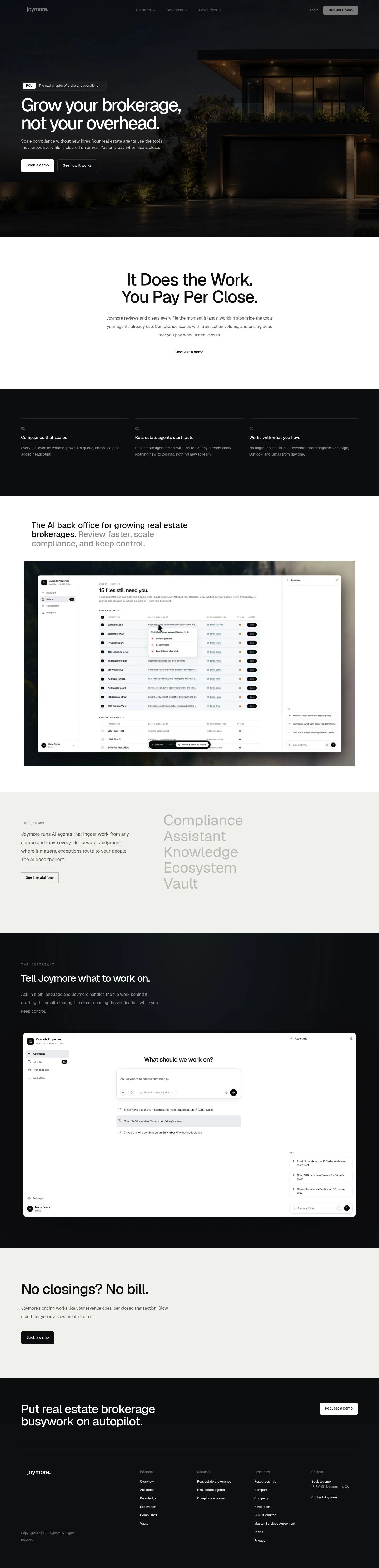
- Full page: https://cdn.designmunk.com/2026/09/07085611/joymore-com-featured.webp
- Above the fold: https://cdn.designmunk.com/2026/09/07085611/joymore-com-featured.webp
- On DesignMunk: https://designmunk.com/joymore/

Study these for hierarchy, rhythm, spacing and density. Where an image and the written spec disagree, the spec wins: the tokens were read from the page's own CSS, the images are one rendering of it.

## Before you start

Ask the user what they are building, who it is for, and what brand assets they already have — name, colours, typefaces. Wait for their answers before writing anything. Everything below is then applied to their product, not to the reference.

## Design specification

# Joymore: Monochrome Real-Estate SaaS With Per-Close Promise

## Overview

Joymore's UI is professional, monochrome, and editorial. It targets brokerage leaders and compliance teams, so tone leans serious and efficient, not playful. Surfaces are predominantly white with black type; dark imagery and the Twilight Slate tone create premium contrast. Layouts breathe with large vertical rhythm and concise copy blocks that scan quickly.

## Colors

- **primary (#000000):** Core text and icons on light surfaces; use for headings, body, and links.
- **secondary (#8c8c8c):** Muted labels, helper text, timestamps, and numeral markers like 01–03.
- **neutral (#ffffff):** Primary canvas and the default for filled CTAs; also the text color when placed on dark grounds.
- **border (#e5e7eb):** Hairline dividers, card strokes, and section boundaries; 1px by default.
- **brand-twilight-zone (#1c1c14):** Dark panels, photo overlays, and night-mode hero treatments that need high drama.
- **surface ({colors.neutral}):** Alias for the base page background.
- **on-surface ({colors.primary}):** Alias for text on light surfaces; pair with surface.

## Typography

All type uses Geist. It is freely available via Google Fonts and can be loaded directly. Suitable substitutes when Geist isn't available: Inter, Plus Jakarta Sans, or IBM Plex Sans.
- Headline-lg (Geist 72px/500, LH 1, -0.058em): Hero statements and marquee pricing promises.
- Headline-md (Geist 49px/500, LH 1.33, -0.039em): Section intros like "The platform" or "The assistant."
- Headline-sm (Geist 34px/500, LH 1.21): Subsections and punchy benefits.
- Headline-xs (Geist 23px/500, LH 1.22): Feature titles and card headings.
- Body-md (Geist 16px/400, LH 1.5): Paragraphs, navigation items, and footers. Keep body copy brief and high-contrast.

## Layout

Spacing is modular: 6, 14, 24, 40, and 128px. Use md (24px) as the base gap, lg (40px) for block separation, and xl (128px) for hero/promo top and bottom padding. Grid may be 12 columns with generous gutters; center content and keep line lengths moderate for legibility. Stack sections with clear white space to avoid visual noise on the monochrome palette.

## Elevation & Depth

Depth is primarily conveyed through whitespace, typographic scale, and tonal shifts. Borders in #e5e7eb separate regions; use sparingly to avoid visual clutter. Shadows are mostly off; the only measured one is sm: color(srgb 0.046594 0.0584211 0.0702261 / 0.14) 0px 28px 80px 0px — reserve it for overlays or hero-area cards over photography.

## Shapes

The system is rectilinear with subtle rounding. Small elements (buttons) use 6px; containers (cards) use 8px. Avoid exaggerated radii; consistency in 6px/8px signals discipline and a premium tone.

## Components

Buttons
- Primary: background #ffffff, text #000000, 6px radius, 14px×20px padding, 49px height. Use for conversion CTAs like "Request a demo" and "Book a demo."
- Secondary: text-only style, #000000, 6px radius footprint; pair with the primary and keep it visibly subordinate.
- Link: inline textual action with no radius; use inside paragraphs or lists.

Card
- Background #ffffff, text #000000, 8px radius, 16px padding. Optional 1px #e5e7eb border; apply sm shadow only over imagery.

### Top Navigation Bar
- Left-aligned wordmark; right-aligned menu. Keep links in Body-md. Include a primary button at 49px height.

### POV Pill
- A small pre-headline tag. Use #ffffff background, #000000 text, 6px radius, and md (24px) gap below.

### Hero Block
- Dark photo or Twilight Slate overlay. Headline-lg, Body-md lead-in, primary and secondary actions side by side with md gaps and xl vertical padding.

### 01–03 Feature List
- Three columns on desktop. Numerals in Secondary (#8c8c8c), titles in Headline-xs, copy in Body-md. Gaps at lg (40px).

### Platform Modules Row
- Inline list of module links (Compliance, Assistant, Knowledge, Ecosystem, Vault). Style each as Link button; increase hit area with md padding.

### Pricing Promise Banner
- Large centered Headline-md/-lg line ("No closings? No bill.") with xl vertical padding and a single primary CTA.

### Footer Columns
- Multi-column link list in Body-md with a top border in #e5e7eb and lg spacing. Reserve brand claims and addresses here.

## Do's and Don'ts

- Do keep headings at weight 500 and use the provided negative letter-spacing for lg/md headlines.
- Do use #ffffff text when placing copy on Twilight Slate or photography; otherwise default to #000000 on white.
- Do space sections generously (lg 40px–xl 128px) to maintain the premium feel.
- Don't introduce new radii; stick to 6px for controls and 8px for containers.
- Don't rely on heavy shadows; prefer borders (#e5e7eb) and tonal separation.
- Don't promote secondary actions over the primary; keep secondary as a text link beside the white CTA.

## Agent Prompt Guide

Quick color reference
- Text (light surface): #000000
- Background: #ffffff
- Border: #e5e7eb
- Accent/Dark ground: #1c1c14

1) Hero over dark image
- Use a full-width section with background overlay #1c1c14 and vertical padding 128px.
- Heading: Geist 72px, weight 500, line-height 1, letter-spacing -0.058em, color #ffffff.
- Paragraph: Geist 16px/400/1.5, color #ffffff at 90% if available, otherwise #ffffff.
- Primary CTA: background #ffffff, text #000000, height 49px, padding 14px 20px, radius 6px.
- Secondary link: text #ffffff, no background, placed 24px to the right.

2) Three-column features 01–03
- Container max-width center, gap 40px.
- Each item: numeral label in #8c8c8c, title Geist 23px/500/1.22, body Geist 16px/400/1.5, text #000000.
- Use md (24px) spacing between title and body.

3) Platform cards over white
- Grid of 3–5 cards. Card: background #ffffff, text #000000, padding 16px, radius 8px, optional border 1px #e5e7eb.
- If card sits on imagery, apply shadow: color(srgb 0.046594 0.0584211 0.0702261 / 0.14) 0px 28px 80px 0px.
- Headings Geist 23px/500; body Geist 16px/400.

4) Pricing promise band
- White background, centered content, padding 128px.
- Headline: Geist 49px, weight 500, line-height 1.33, letter-spacing -0.039em, color #000000.
- One primary CTA below with top margin 24px using the primary button spec.

5) Footer with columns
- Top border 1px #e5e7eb; background #ffffff; text #000000.
- Use a 4-column layout with column gaps 40px and vertical padding 40px.
- Links in Geist 16px/400; section titles in Geist 23px/500.

## Similar Brands

- Vercel — Shares the Geist-driven, black-and-white minimalism; Vercel leans darker and more developer-oriented.
- Linear — Similar crisp monochrome and disciplined spacing; Linear uses more motion and violet accents.
- Mercury — Editorial black-and-white with luxurious restraint; Mercury introduces metallic accents and more photographic variety.
- Notion — Clean typography and sparse UI; Notion is friendlier with more illustration and neutral tints.

## Tokens

### CSS custom properties

```css
:root {
  /* Colors */
  --color-primary: #000000;
  --color-secondary: #8c8c8c;
  --color-neutral: #ffffff;
  --color-border: #e5e7eb;
  --color-brand-twilight-zone: #1c1c14;
  --color-surface: var(--color-neutral);
  --color-on-surface: var(--color-primary);

  /* Typography */
  --text-headline-lg-size: 72px;
  --text-headline-lg-weight: 500;
  --text-headline-lg-leading: 1;
  --text-headline-lg-tracking: -0.058em;
  --text-headline-md-size: 49px;
  --text-headline-md-weight: 500;
  --text-headline-md-leading: 1.33;
  --text-headline-md-tracking: -0.039em;
  --text-headline-sm-size: 34px;
  --text-headline-sm-weight: 500;
  --text-headline-sm-leading: 1.21;
  --text-headline-xs-size: 23px;
  --text-headline-xs-weight: 500;
  --text-headline-xs-leading: 1.22;
  --text-body-md-size: 16px;
  --text-body-md-weight: 400;
  --text-body-md-leading: 1.5;
  --font-geist: "Geist";

  /* Rounded */
  --radius-sm: 6px;
  --radius-md: 8px;

  /* Spacing */
  --spacing-xs: 6px;
  --spacing-sm: 14px;
  --spacing-md: 24px;
  --spacing-lg: 40px;
  --spacing-xl: 128px;

  /* Components */
  --button-primary-background-color: var(--color-neutral);
  --button-primary-text-color: var(--color-primary);
  --button-primary-rounded: var(--radius-sm);
  --button-primary-padding: 14px 20px;
  --button-primary-height: 49px;
  --button-secondary-text-color: var(--color-primary);
  --button-secondary-rounded: var(--radius-sm);
  --button-secondary-padding: 14px 20px;
  --button-secondary-height: 49px;
  --button-link-text-color: var(--color-primary);
  --button-link-rounded: 0px;
  --card-background-color: var(--color-neutral);
  --card-text-color: var(--color-primary);
  --card-rounded: var(--radius-md);
  --card-padding: 16px;
}
```

### Tailwind theme

```css
@theme {
  --color-primary: #000000;
  --color-secondary: #8c8c8c;
  --color-neutral: #ffffff;
  --color-border: #e5e7eb;
  --color-brand-twilight-zone: #1c1c14;
  --color-surface: #ffffff;
  --color-on-surface: #000000;
  --font-headline-lg: "Geist";
  --font-headline-md: "Geist";
  --font-headline-sm: "Geist";
  --font-headline-xs: "Geist";
  --font-body-md: "Geist";
  --text-headline-lg: 72px;
  --text-headline-md: 49px;
  --text-headline-sm: 34px;
  --text-headline-xs: 23px;
  --text-body-md: 16px;
  --tracking-headline-lg: -0.058em;
  --tracking-headline-md: -0.039em;
  --font-weight-headline-lg: 500;
  --font-weight-headline-md: 500;
  --font-weight-headline-sm: 500;
  --font-weight-headline-xs: 500;
  --font-weight-body-md: 400;
  --radius-sm: 6px;
  --radius-md: 8px;
  --spacing-xs: 6px;
  --spacing-sm: 14px;
  --spacing-md: 24px;
  --spacing-lg: 40px;
  --spacing-xl: 128px;
}
```

### Design tokens (DTCG)

```json
{
    "$schema": "https://www.designtokens.org/schemas/2025.10/format.json",
    "color": {
        "$type": "color",
        "primary": {
            "$value": {
                "colorSpace": "srgb",
                "components": [
                    0,
                    0,
                    0
                ],
                "hex": "#000000"
            }
        },
        "secondary": {
            "$value": {
                "colorSpace": "srgb",
                "components": [
                    0.549,
                    0.549,
                    0.549
                ],
                "hex": "#8c8c8c"
            }
        },
        "neutral": {
            "$value": {
                "colorSpace": "srgb",
                "components": [
                    1,
                    1,
                    1
                ],
                "hex": "#ffffff"
            }
        },
        "border": {
            "$value": {
                "colorSpace": "srgb",
                "components": [
                    0.898,
                    0.906,
                    0.922
                ],
                "hex": "#e5e7eb"
            }
        },
        "brand-twilight-zone": {
            "$value": {
                "colorSpace": "srgb",
                "components": [
                    0.11,
                    0.11,
                    0.078
                ],
                "hex": "#1c1c14"
            }
        },
        "surface": {
            "$value": {
                "colorSpace": "srgb",
                "components": [
                    1,
                    1,
                    1
                ],
                "hex": "#ffffff"
            }
        },
        "on-surface": {
            "$value": {
                "colorSpace": "srgb",
                "components": [
                    0,
                    0,
                    0
                ],
                "hex": "#000000"
            }
        }
    },
    "spacing": {
        "$type": "dimension",
        "xs": {
            "$value": {
                "value": 6,
                "unit": "px"
            }
        },
        "sm": {
            "$value": {
                "value": 14,
                "unit": "px"
            }
        },
        "md": {
            "$value": {
                "value": 24,
                "unit": "px"
            }
        },
        "lg": {
            "$value": {
                "value": 40,
                "unit": "px"
            }
        },
        "xl": {
            "$value": {
                "value": 128,
                "unit": "px"
            }
        }
    },
    "rounded": {
        "$type": "dimension",
        "sm": {
            "$value": {
                "value": 6,
                "unit": "px"
            }
        },
        "md": {
            "$value": {
                "value": 8,
                "unit": "px"
            }
        }
    },
    "typography": {
        "headline-lg": {
            "$type": "typography",
            "$value": {
                "fontFamily": "Geist",
                "fontSize": {
                    "value": 72,
                    "unit": "px"
                },
                "fontWeight": 500,
                "letterSpacing": {
                    "value": -0.058,
                    "unit": "em"
                }
            }
        },
        "headline-md": {
            "$type": "typography",
            "$value": {
                "fontFamily": "Geist",
                "fontSize": {
                    "value": 49,
                    "unit": "px"
                },
                "fontWeight": 500,
                "letterSpacing": {
                    "value": -0.039,
                    "unit": "em"
                }
            }
        },
        "headline-sm": {
            "$type": "typography",
            "$value": {
                "fontFamily": "Geist",
                "fontSize": {
                    "value": 34,
                    "unit": "px"
                },
                "fontWeight": 500
            }
        },
        "headline-xs": {
            "$type": "typography",
            "$value": {
                "fontFamily": "Geist",
                "fontSize": {
                    "value": 23,
                    "unit": "px"
                },
                "fontWeight": 500
            }
        },
        "body-md": {
            "$type": "typography",
            "$value": {
                "fontFamily": "Geist",
                "fontSize": {
                    "value": 16,
                    "unit": "px"
                },
                "fontWeight": 400
            }
        }
    }
}
```

## Rules

- **Fonts.** If the specification names a custom or self-hosted family, use one of the substitutes it names. Never reference a typeface you cannot actually load — it will fall back to a system font and undo the typography.
- **Colour.** Derive the palette from the user's brand. Use the token values as a guide to *relationships* — contrast, tint, how many accents carry the page — not as hex codes to paste.
- **Never reproduce** the wordmark, mascot, logo, brand name, illustrations, icon set, screenshots or any copy from the reference.
- **Never present the result as Joymore**, or imply any connection to it.
- If something is unspecified, choose clarity and legibility over decoration.
---
version: alpha
name: Joymore
description: AI back office for real estate brokerages—automated compliance, zero agent work.
colors:
  primary: "#000000"
  secondary: "#8c8c8c"
  neutral: "#ffffff"
  border: "#e5e7eb"
  brand-twilight-zone: "#1c1c14"
  surface: "{colors.neutral}"
  on-surface: "{colors.primary}"
typography:
  headline-lg:
    fontFamily: Geist
    fontSize: 72px
    fontWeight: 500
    lineHeight: 1
    letterSpacing: -0.058em
  headline-md:
    fontFamily: Geist
    fontSize: 49px
    fontWeight: 500
    lineHeight: 1.33
    letterSpacing: -0.039em
  headline-sm:
    fontFamily: Geist
    fontSize: 34px
    fontWeight: 500
    lineHeight: 1.21
  headline-xs:
    fontFamily: Geist
    fontSize: 23px
    fontWeight: 500
    lineHeight: 1.22
  body-md:
    fontFamily: Geist
    fontSize: 16px
    fontWeight: 400
    lineHeight: 1.5
rounded:
  sm: 6px
  md: 8px
spacing:
  xs: 6px
  sm: 14px
  md: 24px
  lg: 40px
  xl: 128px
components:
  button-primary:
    backgroundColor: "{colors.neutral}"
    textColor: "{colors.primary}"
    rounded: "{rounded.sm}"
    padding: 14px 20px
    height: 49px
  button-secondary:
    textColor: "{colors.primary}"
    rounded: "{rounded.sm}"
    padding: 14px 20px
    height: 49px
  button-link:
    textColor: "{colors.primary}"
    rounded: 0px
  card:
    backgroundColor: "{colors.neutral}"
    textColor: "{colors.primary}"
    rounded: "{rounded.md}"
    padding: 16px
---

# Joymore: Monochrome Real-Estate SaaS With Per-Close Promise

## Overview

Joymore's UI is professional, monochrome, and editorial. It targets brokerage leaders and compliance teams, so tone leans serious and efficient, not playful. Surfaces are predominantly white with black type; dark imagery and the Twilight Slate tone create premium contrast. Layouts breathe with large vertical rhythm and concise copy blocks that scan quickly.

## Colors

- **primary (#000000):** Core text and icons on light surfaces; use for headings, body, and links.
- **secondary (#8c8c8c):** Muted labels, helper text, timestamps, and numeral markers like 01–03.
- **neutral (#ffffff):** Primary canvas and the default for filled CTAs; also the text color when placed on dark grounds.
- **border (#e5e7eb):** Hairline dividers, card strokes, and section boundaries; 1px by default.
- **brand-twilight-zone (#1c1c14):** Dark panels, photo overlays, and night-mode hero treatments that need high drama.
- **surface ({colors.neutral}):** Alias for the base page background.
- **on-surface ({colors.primary}):** Alias for text on light surfaces; pair with surface.

## Typography

All type uses Geist. It is freely available via Google Fonts and can be loaded directly. Suitable substitutes when Geist isn't available: Inter, Plus Jakarta Sans, or IBM Plex Sans.
- Headline-lg (Geist 72px/500, LH 1, -0.058em): Hero statements and marquee pricing promises.
- Headline-md (Geist 49px/500, LH 1.33, -0.039em): Section intros like "The platform" or "The assistant."
- Headline-sm (Geist 34px/500, LH 1.21): Subsections and punchy benefits.
- Headline-xs (Geist 23px/500, LH 1.22): Feature titles and card headings.
- Body-md (Geist 16px/400, LH 1.5): Paragraphs, navigation items, and footers. Keep body copy brief and high-contrast.

## Layout

Spacing is modular: 6, 14, 24, 40, and 128px. Use md (24px) as the base gap, lg (40px) for block separation, and xl (128px) for hero/promo top and bottom padding. Grid may be 12 columns with generous gutters; center content and keep line lengths moderate for legibility. Stack sections with clear white space to avoid visual noise on the monochrome palette.

## Elevation & Depth

Depth is primarily conveyed through whitespace, typographic scale, and tonal shifts. Borders in #e5e7eb separate regions; use sparingly to avoid visual clutter. Shadows are mostly off; the only measured one is sm: color(srgb 0.046594 0.0584211 0.0702261 / 0.14) 0px 28px 80px 0px — reserve it for overlays or hero-area cards over photography.

## Shapes

The system is rectilinear with subtle rounding. Small elements (buttons) use 6px; containers (cards) use 8px. Avoid exaggerated radii; consistency in 6px/8px signals discipline and a premium tone.

## Components

Buttons
- Primary: background #ffffff, text #000000, 6px radius, 14px×20px padding, 49px height. Use for conversion CTAs like "Request a demo" and "Book a demo."
- Secondary: text-only style, #000000, 6px radius footprint; pair with the primary and keep it visibly subordinate.
- Link: inline textual action with no radius; use inside paragraphs or lists.

Card
- Background #ffffff, text #000000, 8px radius, 16px padding. Optional 1px #e5e7eb border; apply sm shadow only over imagery.

### Top Navigation Bar
- Left-aligned wordmark; right-aligned menu. Keep links in Body-md. Include a primary button at 49px height.

### POV Pill
- A small pre-headline tag. Use #ffffff background, #000000 text, 6px radius, and md (24px) gap below.

### Hero Block
- Dark photo or Twilight Slate overlay. Headline-lg, Body-md lead-in, primary and secondary actions side by side with md gaps and xl vertical padding.

### 01–03 Feature List
- Three columns on desktop. Numerals in Secondary (#8c8c8c), titles in Headline-xs, copy in Body-md. Gaps at lg (40px).

### Platform Modules Row
- Inline list of module links (Compliance, Assistant, Knowledge, Ecosystem, Vault). Style each as Link button; increase hit area with md padding.

### Pricing Promise Banner
- Large centered Headline-md/-lg line ("No closings? No bill.") with xl vertical padding and a single primary CTA.

### Footer Columns
- Multi-column link list in Body-md with a top border in #e5e7eb and lg spacing. Reserve brand claims and addresses here.

## Do's and Don'ts

- Do keep headings at weight 500 and use the provided negative letter-spacing for lg/md headlines.
- Do use #ffffff text when placing copy on Twilight Slate or photography; otherwise default to #000000 on white.
- Do space sections generously (lg 40px–xl 128px) to maintain the premium feel.
- Don't introduce new radii; stick to 6px for controls and 8px for containers.
- Don't rely on heavy shadows; prefer borders (#e5e7eb) and tonal separation.
- Don't promote secondary actions over the primary; keep secondary as a text link beside the white CTA.

## Agent Prompt Guide

Quick color reference
- Text (light surface): #000000
- Background: #ffffff
- Border: #e5e7eb
- Accent/Dark ground: #1c1c14

1) Hero over dark image
- Use a full-width section with background overlay #1c1c14 and vertical padding 128px.
- Heading: Geist 72px, weight 500, line-height 1, letter-spacing -0.058em, color #ffffff.
- Paragraph: Geist 16px/400/1.5, color #ffffff at 90% if available, otherwise #ffffff.
- Primary CTA: background #ffffff, text #000000, height 49px, padding 14px 20px, radius 6px.
- Secondary link: text #ffffff, no background, placed 24px to the right.

2) Three-column features 01–03
- Container max-width center, gap 40px.
- Each item: numeral label in #8c8c8c, title Geist 23px/500/1.22, body Geist 16px/400/1.5, text #000000.
- Use md (24px) spacing between title and body.

3) Platform cards over white
- Grid of 3–5 cards. Card: background #ffffff, text #000000, padding 16px, radius 8px, optional border 1px #e5e7eb.
- If card sits on imagery, apply shadow: color(srgb 0.046594 0.0584211 0.0702261 / 0.14) 0px 28px 80px 0px.
- Headings Geist 23px/500; body Geist 16px/400.

4) Pricing promise band
- White background, centered content, padding 128px.
- Headline: Geist 49px, weight 500, line-height 1.33, letter-spacing -0.039em, color #000000.
- One primary CTA below with top margin 24px using the primary button spec.

5) Footer with columns
- Top border 1px #e5e7eb; background #ffffff; text #000000.
- Use a 4-column layout with column gaps 40px and vertical padding 40px.
- Links in Geist 16px/400; section titles in Geist 23px/500.

## Similar Brands

- Vercel — Shares the Geist-driven, black-and-white minimalism; Vercel leans darker and more developer-oriented.
- Linear — Similar crisp monochrome and disciplined spacing; Linear uses more motion and violet accents.
- Mercury — Editorial black-and-white with luxurious restraint; Mercury introduces metallic accents and more photographic variety.
- Notion — Clean typography and sparse UI; Notion is friendlier with more illustration and neutral tints.
:root {
  /* Colors */
  --color-primary: #000000;
  --color-secondary: #8c8c8c;
  --color-neutral: #ffffff;
  --color-border: #e5e7eb;
  --color-brand-twilight-zone: #1c1c14;
  --color-surface: var(--color-neutral);
  --color-on-surface: var(--color-primary);

  /* Typography */
  --text-headline-lg-size: 72px;
  --text-headline-lg-weight: 500;
  --text-headline-lg-leading: 1;
  --text-headline-lg-tracking: -0.058em;
  --text-headline-md-size: 49px;
  --text-headline-md-weight: 500;
  --text-headline-md-leading: 1.33;
  --text-headline-md-tracking: -0.039em;
  --text-headline-sm-size: 34px;
  --text-headline-sm-weight: 500;
  --text-headline-sm-leading: 1.21;
  --text-headline-xs-size: 23px;
  --text-headline-xs-weight: 500;
  --text-headline-xs-leading: 1.22;
  --text-body-md-size: 16px;
  --text-body-md-weight: 400;
  --text-body-md-leading: 1.5;
  --font-geist: "Geist";

  /* Rounded */
  --radius-sm: 6px;
  --radius-md: 8px;

  /* Spacing */
  --spacing-xs: 6px;
  --spacing-sm: 14px;
  --spacing-md: 24px;
  --spacing-lg: 40px;
  --spacing-xl: 128px;

  /* Components */
  --button-primary-background-color: var(--color-neutral);
  --button-primary-text-color: var(--color-primary);
  --button-primary-rounded: var(--radius-sm);
  --button-primary-padding: 14px 20px;
  --button-primary-height: 49px;
  --button-secondary-text-color: var(--color-primary);
  --button-secondary-rounded: var(--radius-sm);
  --button-secondary-padding: 14px 20px;
  --button-secondary-height: 49px;
  --button-link-text-color: var(--color-primary);
  --button-link-rounded: 0px;
  --card-background-color: var(--color-neutral);
  --card-text-color: var(--color-primary);
  --card-rounded: var(--radius-md);
  --card-padding: 16px;
}
{
  "$schema": "https://www.designtokens.org/schemas/2025.10/format.json",
  "$description": "AI back office for real estate brokerages—automated compliance, zero agent work.",
  "color": {
    "$type": "color",
    "primary": {
      "$value": {
        "colorSpace": "srgb",
        "components": [
          0,
          0,
          0
        ],
        "hex": "#000000"
      }
    },
    "secondary": {
      "$value": {
        "colorSpace": "srgb",
        "components": [
          0.549,
          0.549,
          0.549
        ],
        "hex": "#8c8c8c"
      }
    },
    "neutral": {
      "$value": {
        "colorSpace": "srgb",
        "components": [
          1,
          1,
          1
        ],
        "hex": "#ffffff"
      }
    },
    "border": {
      "$value": {
        "colorSpace": "srgb",
        "components": [
          0.898,
          0.906,
          0.922
        ],
        "hex": "#e5e7eb"
      }
    },
    "brand-twilight-zone": {
      "$value": {
        "colorSpace": "srgb",
        "components": [
          0.11,
          0.11,
          0.078
        ],
        "hex": "#1c1c14"
      }
    },
    "surface": {
      "$value": {
        "colorSpace": "srgb",
        "components": [
          1,
          1,
          1
        ],
        "hex": "#ffffff"
      }
    },
    "on-surface": {
      "$value": {
        "colorSpace": "srgb",
        "components": [
          0,
          0,
          0
        ],
        "hex": "#000000"
      }
    }
  },
  "spacing": {
    "$type": "dimension",
    "xs": {
      "$value": {
        "value": 6,
        "unit": "px"
      }
    },
    "sm": {
      "$value": {
        "value": 14,
        "unit": "px"
      }
    },
    "md": {
      "$value": {
        "value": 24,
        "unit": "px"
      }
    },
    "lg": {
      "$value": {
        "value": 40,
        "unit": "px"
      }
    },
    "xl": {
      "$value": {
        "value": 128,
        "unit": "px"
      }
    }
  },
  "rounded": {
    "$type": "dimension",
    "sm": {
      "$value": {
        "value": 6,
        "unit": "px"
      }
    },
    "md": {
      "$value": {
        "value": 8,
        "unit": "px"
      }
    }
  },
  "typography": {
    "headline-lg": {
      "$type": "typography",
      "$value": {
        "fontFamily": "Geist",
        "fontSize": {
          "value": 72,
          "unit": "px"
        },
        "fontWeight": 500,
        "letterSpacing": {
          "value": -0.058,
          "unit": "em"
        }
      }
    },
    "headline-md": {
      "$type": "typography",
      "$value": {
        "fontFamily": "Geist",
        "fontSize": {
          "value": 49,
          "unit": "px"
        },
        "fontWeight": 500,
        "letterSpacing": {
          "value": -0.039,
          "unit": "em"
        }
      }
    },
    "headline-sm": {
      "$type": "typography",
      "$value": {
        "fontFamily": "Geist",
        "fontSize": {
          "value": 34,
          "unit": "px"
        },
        "fontWeight": 500
      }
    },
    "headline-xs": {
      "$type": "typography",
      "$value": {
        "fontFamily": "Geist",
        "fontSize": {
          "value": 23,
          "unit": "px"
        },
        "fontWeight": 500
      }
    },
    "body-md": {
      "$type": "typography",
      "$value": {
        "fontFamily": "Geist",
        "fontSize": {
          "value": 16,
          "unit": "px"
        },
        "fontWeight": 400
      }
    }
  }
}
@theme {
--color-primary: #000000;
--color-secondary: #8c8c8c;
--color-neutral: #ffffff;
--color-border: #e5e7eb;
--color-brand-twilight-zone: #1c1c14;
--color-surface: #ffffff;
--color-on-surface: #000000;
--font-headline-lg: "Geist";
--font-headline-md: "Geist";
--font-headline-sm: "Geist";
--font-headline-xs: "Geist";
--font-body-md: "Geist";
--text-headline-lg: 72px;
--text-headline-md: 49px;
--text-headline-sm: 34px;
--text-headline-xs: 23px;
--text-body-md: 16px;
--tracking-headline-lg: -0.058em;
--tracking-headline-md: -0.039em;
--font-weight-headline-lg: 500;
--font-weight-headline-md: 500;
--font-weight-headline-sm: 500;
--font-weight-headline-xs: 500;
--font-weight-body-md: 400;
--radius-sm: 6px;
--radius-md: 8px;
--spacing-xs: 6px;
--spacing-sm: 14px;
--spacing-md: 24px;
--spacing-lg: 40px;
--spacing-xl: 128px;
} # Design brief: the Joymore design language
Below is a complete design specification measured from a real, published web page. Use it as a design language for the user's product. It is not a page to reproduce.
## Reference images
- Full page: https://cdn.designmunk.com/2026/09/07085611/joymore-com-featured.webp
- Above the fold: https://cdn.designmunk.com/2026/09/07085611/joymore-com-featured.webp
- On DesignMunk: https://designmunk.com/joymore/
Study these for hierarchy, rhythm, spacing and density. Where an image and the written spec disagree, the spec wins: the tokens were read from the page's own CSS, the images are one rendering of it.
## Before you start
Ask the user what they are building, who it is for, and what brand assets they already have — name, colours, typefaces. Wait for their answers before writing anything. Everything below is then applied to their product, not to the reference.
## Design specification
# Joymore: Monochrome Real-Estate SaaS With Per-Close Promise
## Overview
Joymore's UI is professional, monochrome, and editorial. It targets brokerage leaders and compliance teams, so tone leans serious and efficient, not playful. Surfaces are predominantly white with black type; dark imagery and the Twilight Slate tone create premium contrast. Layouts breathe with large vertical rhythm and concise copy blocks that scan quickly.
## Colors
- **primary (#000000):** Core text and icons on light surfaces; use for headings, body, and links.
- **secondary (#8c8c8c):** Muted labels, helper text, timestamps, and numeral markers like 01–03.
- **neutral (#ffffff):** Primary canvas and the default for filled CTAs; also the text color when placed on dark grounds.
- **border (#e5e7eb):** Hairline dividers, card strokes, and section boundaries; 1px by default.
- **brand-twilight-zone (#1c1c14):** Dark panels, photo overlays, and night-mode hero treatments that need high drama.
- **surface ({colors.neutral}):** Alias for the base page background.
- **on-surface ({colors.primary}):** Alias for text on light surfaces; pair with surface.
## Typography
All type uses Geist. It is freely available via Google Fonts and can be loaded directly. Suitable substitutes when Geist isn't available: Inter, Plus Jakarta Sans, or IBM Plex Sans.
- Headline-lg (Geist 72px/500, LH 1, -0.058em): Hero statements and marquee pricing promises.
- Headline-md (Geist 49px/500, LH 1.33, -0.039em): Section intros like "The platform" or "The assistant."
- Headline-sm (Geist 34px/500, LH 1.21): Subsections and punchy benefits.
- Headline-xs (Geist 23px/500, LH 1.22): Feature titles and card headings.
- Body-md (Geist 16px/400, LH 1.5): Paragraphs, navigation items, and footers. Keep body copy brief and high-contrast.
## Layout
Spacing is modular: 6, 14, 24, 40, and 128px. Use md (24px) as the base gap, lg (40px) for block separation, and xl (128px) for hero/promo top and bottom padding. Grid may be 12 columns with generous gutters; center content and keep line lengths moderate for legibility. Stack sections with clear white space to avoid visual noise on the monochrome palette.
## Elevation & Depth
Depth is primarily conveyed through whitespace, typographic scale, and tonal shifts. Borders in #e5e7eb separate regions; use sparingly to avoid visual clutter. Shadows are mostly off; the only measured one is sm: color(srgb 0.046594 0.0584211 0.0702261 / 0.14) 0px 28px 80px 0px — reserve it for overlays or hero-area cards over photography.
## Shapes
The system is rectilinear with subtle rounding. Small elements (buttons) use 6px; containers (cards) use 8px. Avoid exaggerated radii; consistency in 6px/8px signals discipline and a premium tone.
## Components
Buttons
- Primary: background #ffffff, text #000000, 6px radius, 14px×20px padding, 49px height. Use for conversion CTAs like "Request a demo" and "Book a demo."
- Secondary: text-only style, #000000, 6px radius footprint; pair with the primary and keep it visibly subordinate.
- Link: inline textual action with no radius; use inside paragraphs or lists.
Card
- Background #ffffff, text #000000, 8px radius, 16px padding. Optional 1px #e5e7eb border; apply sm shadow only over imagery.
### Top Navigation Bar
- Left-aligned wordmark; right-aligned menu. Keep links in Body-md. Include a primary button at 49px height.
### POV Pill
- A small pre-headline tag. Use #ffffff background, #000000 text, 6px radius, and md (24px) gap below.
### Hero Block
- Dark photo or Twilight Slate overlay. Headline-lg, Body-md lead-in, primary and secondary actions side by side with md gaps and xl vertical padding.
### 01–03 Feature List
- Three columns on desktop. Numerals in Secondary (#8c8c8c), titles in Headline-xs, copy in Body-md. Gaps at lg (40px).
### Platform Modules Row
- Inline list of module links (Compliance, Assistant, Knowledge, Ecosystem, Vault). Style each as Link button; increase hit area with md padding.
### Pricing Promise Banner
- Large centered Headline-md/-lg line ("No closings? No bill.") with xl vertical padding and a single primary CTA.
### Footer Columns
- Multi-column link list in Body-md with a top border in #e5e7eb and lg spacing. Reserve brand claims and addresses here.
## Do's and Don'ts
- Do keep headings at weight 500 and use the provided negative letter-spacing for lg/md headlines.
- Do use #ffffff text when placing copy on Twilight Slate or photography; otherwise default to #000000 on white.
- Do space sections generously (lg 40px–xl 128px) to maintain the premium feel.
- Don't introduce new radii; stick to 6px for controls and 8px for containers.
- Don't rely on heavy shadows; prefer borders (#e5e7eb) and tonal separation.
- Don't promote secondary actions over the primary; keep secondary as a text link beside the white CTA.
## Agent Prompt Guide
Quick color reference
- Text (light surface): #000000
- Background: #ffffff
- Border: #e5e7eb
- Accent/Dark ground: #1c1c14
1) Hero over dark image
- Use a full-width section with background overlay #1c1c14 and vertical padding 128px.
- Heading: Geist 72px, weight 500, line-height 1, letter-spacing -0.058em, color #ffffff.
- Paragraph: Geist 16px/400/1.5, color #ffffff at 90% if available, otherwise #ffffff.
- Primary CTA: background #ffffff, text #000000, height 49px, padding 14px 20px, radius 6px.
- Secondary link: text #ffffff, no background, placed 24px to the right.
2) Three-column features 01–03
- Container max-width center, gap 40px.
- Each item: numeral label in #8c8c8c, title Geist 23px/500/1.22, body Geist 16px/400/1.5, text #000000.
- Use md (24px) spacing between title and body.
3) Platform cards over white
- Grid of 3–5 cards. Card: background #ffffff, text #000000, padding 16px, radius 8px, optional border 1px #e5e7eb.
- If card sits on imagery, apply shadow: color(srgb 0.046594 0.0584211 0.0702261 / 0.14) 0px 28px 80px 0px.
- Headings Geist 23px/500; body Geist 16px/400.
4) Pricing promise band
- White background, centered content, padding 128px.
- Headline: Geist 49px, weight 500, line-height 1.33, letter-spacing -0.039em, color #000000.
- One primary CTA below with top margin 24px using the primary button spec.
5) Footer with columns
- Top border 1px #e5e7eb; background #ffffff; text #000000.
- Use a 4-column layout with column gaps 40px and vertical padding 40px.
- Links in Geist 16px/400; section titles in Geist 23px/500.
## Tokens
### CSS custom properties
```css
:root {
/* Colors */
--color-primary: #000000;
--color-secondary: #8c8c8c;
--color-neutral: #ffffff;
--color-border: #e5e7eb;
--color-brand-twilight-zone: #1c1c14;
--color-surface: var(--color-neutral);
--color-on-surface: var(--color-primary);
/* Typography */
--text-headline-lg-size: 72px;
--text-headline-lg-weight: 500;
--text-headline-lg-leading: 1;
--text-headline-lg-tracking: -0.058em;
--text-headline-md-size: 49px;
--text-headline-md-weight: 500;
--text-headline-md-leading: 1.33;
--text-headline-md-tracking: -0.039em;
--text-headline-sm-size: 34px;
--text-headline-sm-weight: 500;
--text-headline-sm-leading: 1.21;
--text-headline-xs-size: 23px;
--text-headline-xs-weight: 500;
--text-headline-xs-leading: 1.22;
--text-body-md-size: 16px;
--text-body-md-weight: 400;
--text-body-md-leading: 1.5;
--font-geist: "Geist";
/* Rounded */
--radius-sm: 6px;
--radius-md: 8px;
/* Spacing */
--spacing-xs: 6px;
--spacing-sm: 14px;
--spacing-md: 24px;
--spacing-lg: 40px;
--spacing-xl: 128px;
/* Components */
--button-primary-background-color: var(--color-neutral);
--button-primary-text-color: var(--color-primary);
--button-primary-rounded: var(--radius-sm);
--button-primary-padding: 14px 20px;
--button-primary-height: 49px;
--button-secondary-text-color: var(--color-primary);
--button-secondary-rounded: var(--radius-sm);
--button-secondary-padding: 14px 20px;
--button-secondary-height: 49px;
--button-link-text-color: var(--color-primary);
--button-link-rounded: 0px;
--card-background-color: var(--color-neutral);
--card-text-color: var(--color-primary);
--card-rounded: var(--radius-md);
--card-padding: 16px;
}
```
## Rules
- **Fonts.** If the specification names a custom or self-hosted family, use one of the substitutes it names. Never reference a typeface you cannot actually load — it will fall back to a system font and undo the typography.
- **Colour.** Derive the palette from the user's brand. Use the token values as a guide to *relationships* — contrast, tint, how many accents carry the page — not as hex codes to paste.
- **Never reproduce** the wordmark, mascot, logo, brand name, illustrations, icon set, screenshots or any copy from the reference.
- **Never present the result as Joymore**, or imply any connection to it.
- If something is unspecified, choose clarity and legibility over decoration.