inspire360.com
AI Breakdown
Design export
# Design brief: the Inspire 360 design language

Below is a complete design specification measured from a real, published web page. Use it as a design language for the user's product. It is not a page to reproduce.

## Reference images

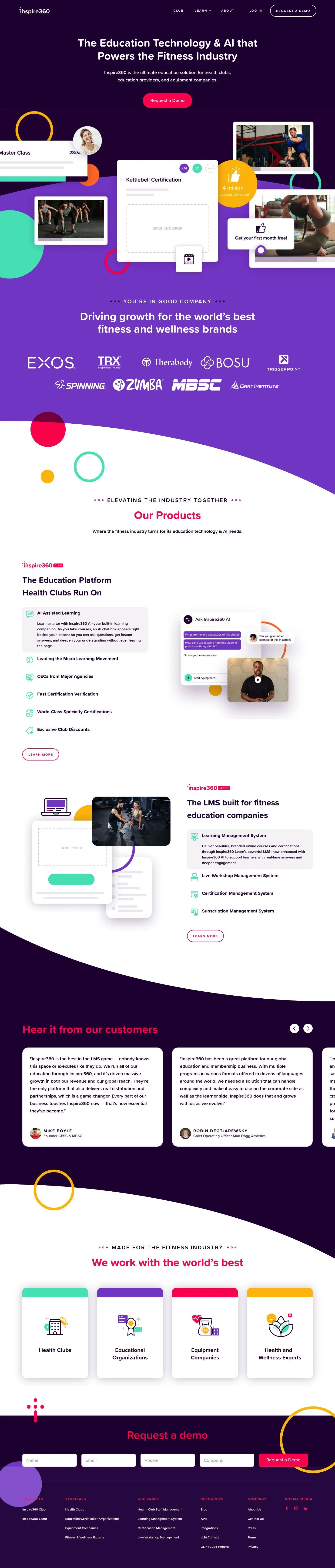
- Full page: https://cdn.designmunk.com/2026/09/02092642/inspire360-com-featured.webp
- Above the fold: https://cdn.designmunk.com/2026/09/02092642/inspire360-com-featured.webp
- On DesignMunk: https://designmunk.com/inspire-360/

Study these for hierarchy, rhythm, spacing and density. Where an image and the written spec disagree, the spec wins: the tokens were read from the page's own CSS, the images are one rendering of it.

## Before you start

Ask the user what they are building, who it is for, and what brand assets they already have — name, colours, typefaces. Wait for their answers before writing anything. Everything below is then applied to their product, not to the reference.

## Design specification

# Inspire360: Dark-Purple LMS with Neon Pill CTAs

## Overview

A dark-mode, high-contrast system built for a fitness-focused LMS. The brand voice is energetic but professional: rounded type, playful rings, and vivid magenta accents over a deep purple surface. Density is medium—compact headlines and 20px body copy keep content efficient while spacious vertical rhythm (up to 80px) prevents crowding. Use this when communicating momentum, modern tech, and confidence in product capability.

## Colors

- **primary (#ffffff):** Primary text on dark surfaces, card backgrounds, and iconography.
- **secondary (#fc7aac):** Soft accent for hovers, secondary chips, and decorative shapes; pairs with tertiary for gradients.
- **tertiary (#ff025d):** Primary action color for CTAs and key highlights; always on white text.
- **neutral (#29023f):** Core surface color for the dark theme; use for page backgrounds and large sections.
- **border (#000000):** Rarely used stroke on light elements; avoid on dark surfaces.
- **brand-exotic-liras (#d60a5f):** Deeper magenta used for emphasis states or overlays where tertiary is too bright.
- **brand-dawn-of-the-fairies (#790646):** Dark mulberry accent for contrast blocks, chips, or hover darken effects.
- **surface (#29023f):** Alias of neutral; primary background.
- **on-surface (#ffffff):** Alias of primary; use for text and icons on surface.

## Typography

Proxima Soft is the sole family across headings and body, giving the UI a rounded, approachable tone. It is self-hosted (type: custom) and may not be directly loadable by agents; use high-quality, freely available substitutes with similar warmth: Nunito (Google), Rubik (Google), or Quicksand (Google).
- Headline-lg (48px/1.17, 700): Hero headlines and marquee claims.
- Headline-md (39px/1.38, 700): Section headers such as "Our Products".
- Headline-sm (31px/1.74, 700): Card or tile headings and testimonial intro lines where longer copy wraps.
- Headline-xs (25px/1.2, 700): Subsection titles and callout labels.
- Body-md (20px/1.6, 600): Paragraphs, nav items, and button labels for strong legibility on dark backgrounds.

## Layout

Spacing follows an 8px base with steps at 8/16/32/48/80. Use 80px for major section separations, 48px for hero internals and feature blocks, and 32px within cards. Grids lean 12-column on large screens with generous negative space at the edges; stack to a single column on mobile while preserving the spacing scale. Decorative circles and screenshots float within these bounds but should still respect the 16–32px gutters around cards and media.

## Elevation & Depth

Hierarchy is achieved primarily through color and contrast: white cards on a deep-purple surface. Shadows are subtle—use sm (0 0 14 rgba(0,0,0,0.1)) for small floating elements and md (0 2 39 rgba(41,2,63,0.23)) for featured cards and media. Large or inner shadows are avoided; keep depth clean and minimal.

## Shapes

Two radii define the language: 24px for cards and modules, and 9999px for pills and circular badges. Use the pill radius for CTAs, chips, and counters; reserve 24px for content containers to signal "clickable but serious." Sharp corners are limited to links and dividers.

## Components

Buttons
- Primary: Background tertiary (#ff025d), text primary (#ffffff), pill radius 9999px, 17px x 32px padding, 64px height. Use for the main action (Request a Demo).
- Secondary: Text tertiary (#ff025d), pill radius 9999px, 17px x 32px padding, 64px height. Place adjacent to the primary when a non-destructive alternative is needed.
- Link: Text primary (#ffffff), no radius; use inline.

Card
- Background primary (#ffffff), text neutral (#29023f), 24px radius, 32px padding. Ideal for feature descriptions, metrics, and media frames.

### Hero header
- Surface: #29023f with on-surface text #ffffff.
- Headline: headline-lg 48px/700; subhead body-md 20px/600.
- CTA: button-primary centered below copy.

### Product feature grid
- 24px cards in a 2–3 column grid, 32px internal padding, headlines at headline-sm, body-md for descriptions, optional icons in secondary (#fc7aac).

### KPI badge
- Pill or circular badge using tertiary (#ff025d) or brand-exotic-liras (#d60a5f), white text, small sm shadow.

### Testimonial carousel
- White 24px card over surface, md shadow for lift, headline-xs for author name, body-md for quote. Navigation dots or arrows in secondary.

### Industry tiles
- Four clickable tiles (24px radius) with neutral-on-primary inversion on hover (text #ffffff on tertiary background).

### Sticky header navigation
- Surface background with on-surface links, right-aligned CTA following button-primary.

### Footer demo form
- White card container with 32px padding; inputs full-width with 24px corners; submit uses button-primary.

## Do's and Don'ts

- Do use tertiary (#ff025d) for the single primary action; reserve secondary (#fc7aac) for supporting accents and hovers.
- Do keep containers at 24px radius and CTAs at full (9999px) to preserve the brand's rounded language.
- Do space sections in 48–80px increments and cards in 16–32px to maintain rhythm.
- Don't introduce new grays or borders on dark surfaces; rely on contrast and subtle shadows instead.
- Don't mix outlined and filled styles for the same CTA in a single viewport; choose one to reduce decision friction.
- Don't reduce body text below 20px on dark backgrounds; legibility suffers.

## Agent Prompt Guide

Quick color reference
- Text: #ffffff (on-surface)
- Background: #29023f (surface)
- Border: #000000 (border, use sparingly)
- Accent: #ff025d (tertiary), alt-accent #fc7aac (secondary)

1) Build a hero section
"Create a dark hero on #29023f with a centered 48px/1.17, weight 700 headline in Proxima Soft (or Nunito as a substitute), white text (#ffffff). Add a 20px/1.6 subhead below. Place a primary CTA button 64px tall, 17px x 32px padding, pill radius 9999px, background #ff025d, label in #ffffff."

2) Product feature cards grid
"Render a 3-column grid of cards. Each card: background #ffffff, text #29023f, 24px corner radius, 32px internal padding, shadow rgba(41,2,63,0.23) 0 2px 39px. Title 31px/700 (headline-sm), body 20px/600. Use small icons in #fc7aac."

3) Testimonial carousel slide
"On #29023f, center a 24px-radius white card 720px wide with md shadow rgba(41,2,63,0.23) 0 2px 39px. Quote set in 20px/1.6, author line in 25px/700. Navigation dots in #fc7aac, active in #ff025d."

4) KPI badge
"Create a circular badge with 9999px radius, background #ff025d, white text (#ffffff) for the metric, optional icon in #ffffff. Apply sm shadow rgba(0,0,0,0.1) 0 0 14px."

5) Footer demo form
"Place a white (#ffffff) card with 24px radius and 32px padding on a #29023f background. Inputs have 24px radius; submit button uses the primary style (64px tall, 17px x 32px, pill radius 9999px, background #ff025d, text #ffffff)."

## Similar Brands

- Mindbody: Also fitness SaaS with rounded UI; tends lighter, while Inspire360 commits to dark mode with bolder magenta accents.
- Trainerize: Uses friendly shapes and pills; Inspire360 is darker and leans more on high-contrast white cards.
- Teachable: Education-commerce platform with clean cards; Inspire360 adds stronger color drama and thicker CTAs.
- ClassPass for Business: Bright accents and friendly typography; Inspire360's 24px cards and deep purple surface are more distinctive and product-first.

## Tokens

### CSS custom properties

```css
:root {
  /* Colors */
  --color-primary: #ffffff;
  --color-secondary: #fc7aac;
  --color-tertiary: #ff025d;
  --color-neutral: #29023f;
  --color-border: #000000;
  --color-brand-exotic-liras: #d60a5f;
  --color-brand-dawn-of-the-fairies: #790646;
  --color-surface: var(--color-neutral);
  --color-on-surface: var(--color-primary);

  /* Typography */
  --text-headline-lg-size: 48px;
  --text-headline-lg-weight: 700;
  --text-headline-lg-leading: 1.17;
  --text-headline-md-size: 39px;
  --text-headline-md-weight: 700;
  --text-headline-md-leading: 1.38;
  --text-headline-sm-size: 31px;
  --text-headline-sm-weight: 700;
  --text-headline-sm-leading: 1.74;
  --text-headline-xs-size: 25px;
  --text-headline-xs-weight: 700;
  --text-headline-xs-leading: 1.2;
  --text-body-md-size: 20px;
  --text-body-md-weight: 600;
  --text-body-md-leading: 1.6;
  --font-proxima-soft: "Proxima Soft";

  /* Rounded */
  --radius-sm: 24px;
  --radius-full: 9999px;

  /* Spacing */
  --spacing-xs: 8px;
  --spacing-sm: 16px;
  --spacing-md: 32px;
  --spacing-lg: 48px;
  --spacing-xl: 80px;

  /* Components */
  --button-primary-background-color: var(--color-tertiary);
  --button-primary-text-color: var(--color-primary);
  --button-primary-rounded: var(--radius-full);
  --button-primary-padding: 17px 32px;
  --button-primary-height: 64px;
  --button-secondary-text-color: var(--color-tertiary);
  --button-secondary-rounded: var(--radius-full);
  --button-secondary-padding: 17px 32px;
  --button-secondary-height: 64px;
  --button-link-text-color: var(--color-primary);
  --button-link-rounded: 0px;
  --card-background-color: var(--color-primary);
  --card-text-color: var(--color-neutral);
  --card-rounded: var(--radius-sm);
  --card-padding: 32px;
}
```

### Tailwind theme

```css
@theme {
  --color-primary: #ffffff;
  --color-secondary: #fc7aac;
  --color-tertiary: #ff025d;
  --color-neutral: #29023f;
  --color-border: #000000;
  --color-brand-exotic-liras: #d60a5f;
  --color-brand-dawn-of-the-fairies: #790646;
  --color-surface: #29023f;
  --color-on-surface: #ffffff;
  --font-headline-lg: "Proxima Soft";
  --font-headline-md: "Proxima Soft";
  --font-headline-sm: "Proxima Soft";
  --font-headline-xs: "Proxima Soft";
  --font-body-md: "Proxima Soft";
  --text-headline-lg: 48px;
  --text-headline-md: 39px;
  --text-headline-sm: 31px;
  --text-headline-xs: 25px;
  --text-body-md: 20px;
  --font-weight-headline-lg: 700;
  --font-weight-headline-md: 700;
  --font-weight-headline-sm: 700;
  --font-weight-headline-xs: 700;
  --font-weight-body-md: 600;
  --radius-sm: 24px;
  --radius-full: 9999px;
  --spacing-xs: 8px;
  --spacing-sm: 16px;
  --spacing-md: 32px;
  --spacing-lg: 48px;
  --spacing-xl: 80px;
}
```

### Design tokens (DTCG)

```json
{
    "$schema": "https://www.designtokens.org/schemas/2025.10/format.json",
    "color": {
        "$type": "color",
        "primary": {
            "$value": {
                "colorSpace": "srgb",
                "components": [
                    1,
                    1,
                    1
                ],
                "hex": "#ffffff"
            }
        },
        "secondary": {
            "$value": {
                "colorSpace": "srgb",
                "components": [
                    0.988,
                    0.478,
                    0.675
                ],
                "hex": "#fc7aac"
            }
        },
        "tertiary": {
            "$value": {
                "colorSpace": "srgb",
                "components": [
                    1,
                    0.008,
                    0.365
                ],
                "hex": "#ff025d"
            }
        },
        "neutral": {
            "$value": {
                "colorSpace": "srgb",
                "components": [
                    0.161,
                    0.008,
                    0.247
                ],
                "hex": "#29023f"
            }
        },
        "border": {
            "$value": {
                "colorSpace": "srgb",
                "components": [
                    0,
                    0,
                    0
                ],
                "hex": "#000000"
            }
        },
        "brand-exotic-liras": {
            "$value": {
                "colorSpace": "srgb",
                "components": [
                    0.839,
                    0.039,
                    0.373
                ],
                "hex": "#d60a5f"
            }
        },
        "brand-dawn-of-the-fairies": {
            "$value": {
                "colorSpace": "srgb",
                "components": [
                    0.475,
                    0.024,
                    0.275
                ],
                "hex": "#790646"
            }
        },
        "surface": {
            "$value": {
                "colorSpace": "srgb",
                "components": [
                    0.161,
                    0.008,
                    0.247
                ],
                "hex": "#29023f"
            }
        },
        "on-surface": {
            "$value": {
                "colorSpace": "srgb",
                "components": [
                    1,
                    1,
                    1
                ],
                "hex": "#ffffff"
            }
        }
    },
    "spacing": {
        "$type": "dimension",
        "xs": {
            "$value": {
                "value": 8,
                "unit": "px"
            }
        },
        "sm": {
            "$value": {
                "value": 16,
                "unit": "px"
            }
        },
        "md": {
            "$value": {
                "value": 32,
                "unit": "px"
            }
        },
        "lg": {
            "$value": {
                "value": 48,
                "unit": "px"
            }
        },
        "xl": {
            "$value": {
                "value": 80,
                "unit": "px"
            }
        }
    },
    "rounded": {
        "$type": "dimension",
        "sm": {
            "$value": {
                "value": 24,
                "unit": "px"
            }
        },
        "full": {
            "$value": {
                "value": 9999,
                "unit": "px"
            }
        }
    },
    "typography": {
        "headline-lg": {
            "$type": "typography",
            "$value": {
                "fontFamily": "Proxima Soft",
                "fontSize": {
                    "value": 48,
                    "unit": "px"
                },
                "fontWeight": 700
            }
        },
        "headline-md": {
            "$type": "typography",
            "$value": {
                "fontFamily": "Proxima Soft",
                "fontSize": {
                    "value": 39,
                    "unit": "px"
                },
                "fontWeight": 700
            }
        },
        "headline-sm": {
            "$type": "typography",
            "$value": {
                "fontFamily": "Proxima Soft",
                "fontSize": {
                    "value": 31,
                    "unit": "px"
                },
                "fontWeight": 700
            }
        },
        "headline-xs": {
            "$type": "typography",
            "$value": {
                "fontFamily": "Proxima Soft",
                "fontSize": {
                    "value": 25,
                    "unit": "px"
                },
                "fontWeight": 700
            }
        },
        "body-md": {
            "$type": "typography",
            "$value": {
                "fontFamily": "Proxima Soft",
                "fontSize": {
                    "value": 20,
                    "unit": "px"
                },
                "fontWeight": 600
            }
        }
    }
}
```

## Rules

- **Fonts.** If the specification names a custom or self-hosted family, use one of the substitutes it names. Never reference a typeface you cannot actually load — it will fall back to a system font and undo the typography.
- **Colour.** Derive the palette from the user's brand. Use the token values as a guide to *relationships* — contrast, tint, how many accents carry the page — not as hex codes to paste.
- **Never reproduce** the wordmark, mascot, logo, brand name, illustrations, icon set, screenshots or any copy from the reference.
- **Never present the result as Inspire 360**, or imply any connection to it.
- If something is unspecified, choose clarity and legibility over decoration.
---
version: alpha
name: Inspire 360
description: Elevating the industry together
colors:
  primary: "#ffffff"
  secondary: "#fc7aac"
  tertiary: "#ff025d"
  neutral: "#29023f"
  border: "#000000"
  brand-exotic-liras: "#d60a5f"
  brand-dawn-of-the-fairies: "#790646"
  surface: "{colors.neutral}"
  on-surface: "{colors.primary}"
typography:
  headline-lg:
    fontFamily: Proxima Soft
    fontSize: 48px
    fontWeight: 700
    lineHeight: 1.17
  headline-md:
    fontFamily: Proxima Soft
    fontSize: 39px
    fontWeight: 700
    lineHeight: 1.38
  headline-sm:
    fontFamily: Proxima Soft
    fontSize: 31px
    fontWeight: 700
    lineHeight: 1.74
  headline-xs:
    fontFamily: Proxima Soft
    fontSize: 25px
    fontWeight: 700
    lineHeight: 1.2
  body-md:
    fontFamily: Proxima Soft
    fontSize: 20px
    fontWeight: 600
    lineHeight: 1.6
rounded:
  sm: 24px
  full: 9999px
spacing:
  xs: 8px
  sm: 16px
  md: 32px
  lg: 48px
  xl: 80px
components:
  button-primary:
    backgroundColor: "{colors.tertiary}"
    textColor: "{colors.primary}"
    rounded: "{rounded.full}"
    padding: 17px 32px
    height: 64px
  button-secondary:
    textColor: "{colors.tertiary}"
    rounded: "{rounded.full}"
    padding: 17px 32px
    height: 64px
  button-link:
    textColor: "{colors.primary}"
    rounded: 0px
  card:
    backgroundColor: "{colors.primary}"
    textColor: "{colors.neutral}"
    rounded: "{rounded.sm}"
    padding: 32px
---

# Inspire360: Dark-Purple LMS with Neon Pill CTAs

## Overview

A dark-mode, high-contrast system built for a fitness-focused LMS. The brand voice is energetic but professional: rounded type, playful rings, and vivid magenta accents over a deep purple surface. Density is medium—compact headlines and 20px body copy keep content efficient while spacious vertical rhythm (up to 80px) prevents crowding. Use this when communicating momentum, modern tech, and confidence in product capability.

## Colors

- **primary (#ffffff):** Primary text on dark surfaces, card backgrounds, and iconography.
- **secondary (#fc7aac):** Soft accent for hovers, secondary chips, and decorative shapes; pairs with tertiary for gradients.
- **tertiary (#ff025d):** Primary action color for CTAs and key highlights; always on white text.
- **neutral (#29023f):** Core surface color for the dark theme; use for page backgrounds and large sections.
- **border (#000000):** Rarely used stroke on light elements; avoid on dark surfaces.
- **brand-exotic-liras (#d60a5f):** Deeper magenta used for emphasis states or overlays where tertiary is too bright.
- **brand-dawn-of-the-fairies (#790646):** Dark mulberry accent for contrast blocks, chips, or hover darken effects.
- **surface (#29023f):** Alias of neutral; primary background.
- **on-surface (#ffffff):** Alias of primary; use for text and icons on surface.

## Typography

Proxima Soft is the sole family across headings and body, giving the UI a rounded, approachable tone. It is self-hosted (type: custom) and may not be directly loadable by agents; use high-quality, freely available substitutes with similar warmth: Nunito (Google), Rubik (Google), or Quicksand (Google).
- Headline-lg (48px/1.17, 700): Hero headlines and marquee claims.
- Headline-md (39px/1.38, 700): Section headers such as "Our Products".
- Headline-sm (31px/1.74, 700): Card or tile headings and testimonial intro lines where longer copy wraps.
- Headline-xs (25px/1.2, 700): Subsection titles and callout labels.
- Body-md (20px/1.6, 600): Paragraphs, nav items, and button labels for strong legibility on dark backgrounds.

## Layout

Spacing follows an 8px base with steps at 8/16/32/48/80. Use 80px for major section separations, 48px for hero internals and feature blocks, and 32px within cards. Grids lean 12-column on large screens with generous negative space at the edges; stack to a single column on mobile while preserving the spacing scale. Decorative circles and screenshots float within these bounds but should still respect the 16–32px gutters around cards and media.

## Elevation & Depth

Hierarchy is achieved primarily through color and contrast: white cards on a deep-purple surface. Shadows are subtle—use sm (0 0 14 rgba(0,0,0,0.1)) for small floating elements and md (0 2 39 rgba(41,2,63,0.23)) for featured cards and media. Large or inner shadows are avoided; keep depth clean and minimal.

## Shapes

Two radii define the language: 24px for cards and modules, and 9999px for pills and circular badges. Use the pill radius for CTAs, chips, and counters; reserve 24px for content containers to signal "clickable but serious." Sharp corners are limited to links and dividers.

## Components

Buttons
- Primary: Background tertiary (#ff025d), text primary (#ffffff), pill radius 9999px, 17px x 32px padding, 64px height. Use for the main action (Request a Demo).
- Secondary: Text tertiary (#ff025d), pill radius 9999px, 17px x 32px padding, 64px height. Place adjacent to the primary when a non-destructive alternative is needed.
- Link: Text primary (#ffffff), no radius; use inline.

Card
- Background primary (#ffffff), text neutral (#29023f), 24px radius, 32px padding. Ideal for feature descriptions, metrics, and media frames.

### Hero header
- Surface: #29023f with on-surface text #ffffff.
- Headline: headline-lg 48px/700; subhead body-md 20px/600.
- CTA: button-primary centered below copy.

### Product feature grid
- 24px cards in a 2–3 column grid, 32px internal padding, headlines at headline-sm, body-md for descriptions, optional icons in secondary (#fc7aac).

### KPI badge
- Pill or circular badge using tertiary (#ff025d) or brand-exotic-liras (#d60a5f), white text, small sm shadow.

### Testimonial carousel
- White 24px card over surface, md shadow for lift, headline-xs for author name, body-md for quote. Navigation dots or arrows in secondary.

### Industry tiles
- Four clickable tiles (24px radius) with neutral-on-primary inversion on hover (text #ffffff on tertiary background).

### Sticky header navigation
- Surface background with on-surface links, right-aligned CTA following button-primary.

### Footer demo form
- White card container with 32px padding; inputs full-width with 24px corners; submit uses button-primary.

## Do's and Don'ts

- Do use tertiary (#ff025d) for the single primary action; reserve secondary (#fc7aac) for supporting accents and hovers.
- Do keep containers at 24px radius and CTAs at full (9999px) to preserve the brand's rounded language.
- Do space sections in 48–80px increments and cards in 16–32px to maintain rhythm.
- Don't introduce new grays or borders on dark surfaces; rely on contrast and subtle shadows instead.
- Don't mix outlined and filled styles for the same CTA in a single viewport; choose one to reduce decision friction.
- Don't reduce body text below 20px on dark backgrounds; legibility suffers.

## Agent Prompt Guide

Quick color reference
- Text: #ffffff (on-surface)
- Background: #29023f (surface)
- Border: #000000 (border, use sparingly)
- Accent: #ff025d (tertiary), alt-accent #fc7aac (secondary)

1) Build a hero section
"Create a dark hero on #29023f with a centered 48px/1.17, weight 700 headline in Proxima Soft (or Nunito as a substitute), white text (#ffffff). Add a 20px/1.6 subhead below. Place a primary CTA button 64px tall, 17px x 32px padding, pill radius 9999px, background #ff025d, label in #ffffff."

2) Product feature cards grid
"Render a 3-column grid of cards. Each card: background #ffffff, text #29023f, 24px corner radius, 32px internal padding, shadow rgba(41,2,63,0.23) 0 2px 39px. Title 31px/700 (headline-sm), body 20px/600. Use small icons in #fc7aac."

3) Testimonial carousel slide
"On #29023f, center a 24px-radius white card 720px wide with md shadow rgba(41,2,63,0.23) 0 2px 39px. Quote set in 20px/1.6, author line in 25px/700. Navigation dots in #fc7aac, active in #ff025d."

4) KPI badge
"Create a circular badge with 9999px radius, background #ff025d, white text (#ffffff) for the metric, optional icon in #ffffff. Apply sm shadow rgba(0,0,0,0.1) 0 0 14px."

5) Footer demo form
"Place a white (#ffffff) card with 24px radius and 32px padding on a #29023f background. Inputs have 24px radius; submit button uses the primary style (64px tall, 17px x 32px, pill radius 9999px, background #ff025d, text #ffffff)."

## Similar Brands

- Mindbody: Also fitness SaaS with rounded UI; tends lighter, while Inspire360 commits to dark mode with bolder magenta accents.
- Trainerize: Uses friendly shapes and pills; Inspire360 is darker and leans more on high-contrast white cards.
- Teachable: Education-commerce platform with clean cards; Inspire360 adds stronger color drama and thicker CTAs.
- ClassPass for Business: Bright accents and friendly typography; Inspire360's 24px cards and deep purple surface are more distinctive and product-first.
:root {
  /* Colors */
  --color-primary: #ffffff;
  --color-secondary: #fc7aac;
  --color-tertiary: #ff025d;
  --color-neutral: #29023f;
  --color-border: #000000;
  --color-brand-exotic-liras: #d60a5f;
  --color-brand-dawn-of-the-fairies: #790646;
  --color-surface: var(--color-neutral);
  --color-on-surface: var(--color-primary);

  /* Typography */
  --text-headline-lg-size: 48px;
  --text-headline-lg-weight: 700;
  --text-headline-lg-leading: 1.17;
  --text-headline-md-size: 39px;
  --text-headline-md-weight: 700;
  --text-headline-md-leading: 1.38;
  --text-headline-sm-size: 31px;
  --text-headline-sm-weight: 700;
  --text-headline-sm-leading: 1.74;
  --text-headline-xs-size: 25px;
  --text-headline-xs-weight: 700;
  --text-headline-xs-leading: 1.2;
  --text-body-md-size: 20px;
  --text-body-md-weight: 600;
  --text-body-md-leading: 1.6;
  --font-proxima-soft: "Proxima Soft";

  /* Rounded */
  --radius-sm: 24px;
  --radius-full: 9999px;

  /* Spacing */
  --spacing-xs: 8px;
  --spacing-sm: 16px;
  --spacing-md: 32px;
  --spacing-lg: 48px;
  --spacing-xl: 80px;

  /* Components */
  --button-primary-background-color: var(--color-tertiary);
  --button-primary-text-color: var(--color-primary);
  --button-primary-rounded: var(--radius-full);
  --button-primary-padding: 17px 32px;
  --button-primary-height: 64px;
  --button-secondary-text-color: var(--color-tertiary);
  --button-secondary-rounded: var(--radius-full);
  --button-secondary-padding: 17px 32px;
  --button-secondary-height: 64px;
  --button-link-text-color: var(--color-primary);
  --button-link-rounded: 0px;
  --card-background-color: var(--color-primary);
  --card-text-color: var(--color-neutral);
  --card-rounded: var(--radius-sm);
  --card-padding: 32px;
}
{
  "$schema": "https://www.designtokens.org/schemas/2025.10/format.json",
  "$description": "Elevating the industry together",
  "color": {
    "$type": "color",
    "primary": {
      "$value": {
        "colorSpace": "srgb",
        "components": [
          1,
          1,
          1
        ],
        "hex": "#ffffff"
      }
    },
    "secondary": {
      "$value": {
        "colorSpace": "srgb",
        "components": [
          0.988,
          0.478,
          0.675
        ],
        "hex": "#fc7aac"
      }
    },
    "tertiary": {
      "$value": {
        "colorSpace": "srgb",
        "components": [
          1,
          0.008,
          0.365
        ],
        "hex": "#ff025d"
      }
    },
    "neutral": {
      "$value": {
        "colorSpace": "srgb",
        "components": [
          0.161,
          0.008,
          0.247
        ],
        "hex": "#29023f"
      }
    },
    "border": {
      "$value": {
        "colorSpace": "srgb",
        "components": [
          0,
          0,
          0
        ],
        "hex": "#000000"
      }
    },
    "brand-exotic-liras": {
      "$value": {
        "colorSpace": "srgb",
        "components": [
          0.839,
          0.039,
          0.373
        ],
        "hex": "#d60a5f"
      }
    },
    "brand-dawn-of-the-fairies": {
      "$value": {
        "colorSpace": "srgb",
        "components": [
          0.475,
          0.024,
          0.275
        ],
        "hex": "#790646"
      }
    },
    "surface": {
      "$value": {
        "colorSpace": "srgb",
        "components": [
          0.161,
          0.008,
          0.247
        ],
        "hex": "#29023f"
      }
    },
    "on-surface": {
      "$value": {
        "colorSpace": "srgb",
        "components": [
          1,
          1,
          1
        ],
        "hex": "#ffffff"
      }
    }
  },
  "spacing": {
    "$type": "dimension",
    "xs": {
      "$value": {
        "value": 8,
        "unit": "px"
      }
    },
    "sm": {
      "$value": {
        "value": 16,
        "unit": "px"
      }
    },
    "md": {
      "$value": {
        "value": 32,
        "unit": "px"
      }
    },
    "lg": {
      "$value": {
        "value": 48,
        "unit": "px"
      }
    },
    "xl": {
      "$value": {
        "value": 80,
        "unit": "px"
      }
    }
  },
  "rounded": {
    "$type": "dimension",
    "sm": {
      "$value": {
        "value": 24,
        "unit": "px"
      }
    },
    "full": {
      "$value": {
        "value": 9999,
        "unit": "px"
      }
    }
  },
  "typography": {
    "headline-lg": {
      "$type": "typography",
      "$value": {
        "fontFamily": "Proxima Soft",
        "fontSize": {
          "value": 48,
          "unit": "px"
        },
        "fontWeight": 700
      }
    },
    "headline-md": {
      "$type": "typography",
      "$value": {
        "fontFamily": "Proxima Soft",
        "fontSize": {
          "value": 39,
          "unit": "px"
        },
        "fontWeight": 700
      }
    },
    "headline-sm": {
      "$type": "typography",
      "$value": {
        "fontFamily": "Proxima Soft",
        "fontSize": {
          "value": 31,
          "unit": "px"
        },
        "fontWeight": 700
      }
    },
    "headline-xs": {
      "$type": "typography",
      "$value": {
        "fontFamily": "Proxima Soft",
        "fontSize": {
          "value": 25,
          "unit": "px"
        },
        "fontWeight": 700
      }
    },
    "body-md": {
      "$type": "typography",
      "$value": {
        "fontFamily": "Proxima Soft",
        "fontSize": {
          "value": 20,
          "unit": "px"
        },
        "fontWeight": 600
      }
    }
  }
}
@theme {
--color-primary: #ffffff;
--color-secondary: #fc7aac;
--color-tertiary: #ff025d;
--color-neutral: #29023f;
--color-border: #000000;
--color-brand-exotic-liras: #d60a5f;
--color-brand-dawn-of-the-fairies: #790646;
--color-surface: #29023f;
--color-on-surface: #ffffff;
--font-headline-lg: "Proxima Soft";
--font-headline-md: "Proxima Soft";
--font-headline-sm: "Proxima Soft";
--font-headline-xs: "Proxima Soft";
--font-body-md: "Proxima Soft";
--text-headline-lg: 48px;
--text-headline-md: 39px;
--text-headline-sm: 31px;
--text-headline-xs: 25px;
--text-body-md: 20px;
--font-weight-headline-lg: 700;
--font-weight-headline-md: 700;
--font-weight-headline-sm: 700;
--font-weight-headline-xs: 700;
--font-weight-body-md: 600;
--radius-sm: 24px;
--radius-full: 9999px;
--spacing-xs: 8px;
--spacing-sm: 16px;
--spacing-md: 32px;
--spacing-lg: 48px;
--spacing-xl: 80px;
} # Design brief: the Inspire 360 design language
Below is a complete design specification measured from a real, published web page. Use it as a design language for the user's product. It is not a page to reproduce.
## Reference images
- Full page: https://cdn.designmunk.com/2026/09/02092642/inspire360-com-featured.webp
- Above the fold: https://cdn.designmunk.com/2026/09/02092642/inspire360-com-featured.webp
- On DesignMunk: https://designmunk.com/inspire-360/
Study these for hierarchy, rhythm, spacing and density. Where an image and the written spec disagree, the spec wins: the tokens were read from the page's own CSS, the images are one rendering of it.
## Before you start
Ask the user what they are building, who it is for, and what brand assets they already have — name, colours, typefaces. Wait for their answers before writing anything. Everything below is then applied to their product, not to the reference.
## Design specification
# Inspire360: Dark-Purple LMS with Neon Pill CTAs
## Overview
A dark-mode, high-contrast system built for a fitness-focused LMS. The brand voice is energetic but professional: rounded type, playful rings, and vivid magenta accents over a deep purple surface. Density is medium—compact headlines and 20px body copy keep content efficient while spacious vertical rhythm (up to 80px) prevents crowding. Use this when communicating momentum, modern tech, and confidence in product capability.
## Colors
- **primary (#ffffff):** Primary text on dark surfaces, card backgrounds, and iconography.
- **secondary (#fc7aac):** Soft accent for hovers, secondary chips, and decorative shapes; pairs with tertiary for gradients.
- **tertiary (#ff025d):** Primary action color for CTAs and key highlights; always on white text.
- **neutral (#29023f):** Core surface color for the dark theme; use for page backgrounds and large sections.
- **border (#000000):** Rarely used stroke on light elements; avoid on dark surfaces.
- **brand-exotic-liras (#d60a5f):** Deeper magenta used for emphasis states or overlays where tertiary is too bright.
- **brand-dawn-of-the-fairies (#790646):** Dark mulberry accent for contrast blocks, chips, or hover darken effects.
- **surface (#29023f):** Alias of neutral; primary background.
- **on-surface (#ffffff):** Alias of primary; use for text and icons on surface.
## Typography
Proxima Soft is the sole family across headings and body, giving the UI a rounded, approachable tone. It is self-hosted (type: custom) and may not be directly loadable by agents; use high-quality, freely available substitutes with similar warmth: Nunito (Google), Rubik (Google), or Quicksand (Google).
- Headline-lg (48px/1.17, 700): Hero headlines and marquee claims.
- Headline-md (39px/1.38, 700): Section headers such as "Our Products".
- Headline-sm (31px/1.74, 700): Card or tile headings and testimonial intro lines where longer copy wraps.
- Headline-xs (25px/1.2, 700): Subsection titles and callout labels.
- Body-md (20px/1.6, 600): Paragraphs, nav items, and button labels for strong legibility on dark backgrounds.
## Layout
Spacing follows an 8px base with steps at 8/16/32/48/80. Use 80px for major section separations, 48px for hero internals and feature blocks, and 32px within cards. Grids lean 12-column on large screens with generous negative space at the edges; stack to a single column on mobile while preserving the spacing scale. Decorative circles and screenshots float within these bounds but should still respect the 16–32px gutters around cards and media.
## Elevation & Depth
Hierarchy is achieved primarily through color and contrast: white cards on a deep-purple surface. Shadows are subtle—use sm (0 0 14 rgba(0,0,0,0.1)) for small floating elements and md (0 2 39 rgba(41,2,63,0.23)) for featured cards and media. Large or inner shadows are avoided; keep depth clean and minimal.
## Shapes
Two radii define the language: 24px for cards and modules, and 9999px for pills and circular badges. Use the pill radius for CTAs, chips, and counters; reserve 24px for content containers to signal "clickable but serious." Sharp corners are limited to links and dividers.
## Components
Buttons
- Primary: Background tertiary (#ff025d), text primary (#ffffff), pill radius 9999px, 17px x 32px padding, 64px height. Use for the main action (Request a Demo).
- Secondary: Text tertiary (#ff025d), pill radius 9999px, 17px x 32px padding, 64px height. Place adjacent to the primary when a non-destructive alternative is needed.
- Link: Text primary (#ffffff), no radius; use inline.
Card
- Background primary (#ffffff), text neutral (#29023f), 24px radius, 32px padding. Ideal for feature descriptions, metrics, and media frames.
### Hero header
- Surface: #29023f with on-surface text #ffffff.
- Headline: headline-lg 48px/700; subhead body-md 20px/600.
- CTA: button-primary centered below copy.
### Product feature grid
- 24px cards in a 2–3 column grid, 32px internal padding, headlines at headline-sm, body-md for descriptions, optional icons in secondary (#fc7aac).
### KPI badge
- Pill or circular badge using tertiary (#ff025d) or brand-exotic-liras (#d60a5f), white text, small sm shadow.
### Testimonial carousel
- White 24px card over surface, md shadow for lift, headline-xs for author name, body-md for quote. Navigation dots or arrows in secondary.
### Industry tiles
- Four clickable tiles (24px radius) with neutral-on-primary inversion on hover (text #ffffff on tertiary background).
### Sticky header navigation
- Surface background with on-surface links, right-aligned CTA following button-primary.
### Footer demo form
- White card container with 32px padding; inputs full-width with 24px corners; submit uses button-primary.
## Do's and Don'ts
- Do use tertiary (#ff025d) for the single primary action; reserve secondary (#fc7aac) for supporting accents and hovers.
- Do keep containers at 24px radius and CTAs at full (9999px) to preserve the brand's rounded language.
- Do space sections in 48–80px increments and cards in 16–32px to maintain rhythm.
- Don't introduce new grays or borders on dark surfaces; rely on contrast and subtle shadows instead.
- Don't mix outlined and filled styles for the same CTA in a single viewport; choose one to reduce decision friction.
- Don't reduce body text below 20px on dark backgrounds; legibility suffers.
## Agent Prompt Guide
Quick color reference
- Text: #ffffff (on-surface)
- Background: #29023f (surface)
- Border: #000000 (border, use sparingly)
- Accent: #ff025d (tertiary), alt-accent #fc7aac (secondary)
1) Build a hero section
"Create a dark hero on #29023f with a centered 48px/1.17, weight 700 headline in Proxima Soft (or Nunito as a substitute), white text (#ffffff). Add a 20px/1.6 subhead below. Place a primary CTA button 64px tall, 17px x 32px padding, pill radius 9999px, background #ff025d, label in #ffffff."
2) Product feature cards grid
"Render a 3-column grid of cards. Each card: background #ffffff, text #29023f, 24px corner radius, 32px internal padding, shadow rgba(41,2,63,0.23) 0 2px 39px. Title 31px/700 (headline-sm), body 20px/600. Use small icons in #fc7aac."
3) Testimonial carousel slide
"On #29023f, center a 24px-radius white card 720px wide with md shadow rgba(41,2,63,0.23) 0 2px 39px. Quote set in 20px/1.6, author line in 25px/700. Navigation dots in #fc7aac, active in #ff025d."
4) KPI badge
"Create a circular badge with 9999px radius, background #ff025d, white text (#ffffff) for the metric, optional icon in #ffffff. Apply sm shadow rgba(0,0,0,0.1) 0 0 14px."
5) Footer demo form
"Place a white (#ffffff) card with 24px radius and 32px padding on a #29023f background. Inputs have 24px radius; submit button uses the primary style (64px tall, 17px x 32px, pill radius 9999px, background #ff025d, text #ffffff)."
## Tokens
### CSS custom properties
```css
:root {
/* Colors */
--color-primary: #ffffff;
--color-secondary: #fc7aac;
--color-tertiary: #ff025d;
--color-neutral: #29023f;
--color-border: #000000;
--color-brand-exotic-liras: #d60a5f;
--color-brand-dawn-of-the-fairies: #790646;
--color-surface: var(--color-neutral);
--color-on-surface: var(--color-primary);
/* Typography */
--text-headline-lg-size: 48px;
--text-headline-lg-weight: 700;
--text-headline-lg-leading: 1.17;
--text-headline-md-size: 39px;
--text-headline-md-weight: 700;
--text-headline-md-leading: 1.38;
--text-headline-sm-size: 31px;
--text-headline-sm-weight: 700;
--text-headline-sm-leading: 1.74;
--text-headline-xs-size: 25px;
--text-headline-xs-weight: 700;
--text-headline-xs-leading: 1.2;
--text-body-md-size: 20px;
--text-body-md-weight: 600;
--text-body-md-leading: 1.6;
--font-proxima-soft: "Proxima Soft";
/* Rounded */
--radius-sm: 24px;
--radius-full: 9999px;
/* Spacing */
--spacing-xs: 8px;
--spacing-sm: 16px;
--spacing-md: 32px;
--spacing-lg: 48px;
--spacing-xl: 80px;
/* Components */
--button-primary-background-color: var(--color-tertiary);
--button-primary-text-color: var(--color-primary);
--button-primary-rounded: var(--radius-full);
--button-primary-padding: 17px 32px;
--button-primary-height: 64px;
--button-secondary-text-color: var(--color-tertiary);
--button-secondary-rounded: var(--radius-full);
--button-secondary-padding: 17px 32px;
--button-secondary-height: 64px;
--button-link-text-color: var(--color-primary);
--button-link-rounded: 0px;
--card-background-color: var(--color-primary);
--card-text-color: var(--color-neutral);
--card-rounded: var(--radius-sm);
--card-padding: 32px;
}
```
## Rules
- **Fonts.** If the specification names a custom or self-hosted family, use one of the substitutes it names. Never reference a typeface you cannot actually load — it will fall back to a system font and undo the typography.
- **Colour.** Derive the palette from the user's brand. Use the token values as a guide to *relationships* — contrast, tint, how many accents carry the page — not as hex codes to paste.
- **Never reproduce** the wordmark, mascot, logo, brand name, illustrations, icon set, screenshots or any copy from the reference.
- **Never present the result as Inspire 360**, or imply any connection to it.
- If something is unspecified, choose clarity and legibility over decoration.