In Tandem
intandem.com
We believe in putting families first—building peace of mind.
intandem.com
AI Breakdown
Design export
# Design brief: the In Tandem design language

Below is a complete design specification measured from a real, published web page. Use it as a design language for the user's product. It is not a page to reproduce.

## Reference images

- Full page: https://cdn.designmunk.com/2026/09/30103924/intandem-com-featured.webp
- Above the fold: https://cdn.designmunk.com/2026/09/30103924/intandem-com-featured-1440x900.webp
- On DesignMunk: https://designmunk.com/in-tandem/

Study these for hierarchy, rhythm, spacing and density. Where an image and the written spec disagree, the spec wins: the tokens were read from the page's own CSS, the images are one rendering of it.

## Before you start

Ask the user what they are building, who it is for, and what brand assets they already have — name, colours, typefaces. Wait for their answers before writing anything. Everything below is then applied to their product, not to the reference.

## Design specification

# In Tandem: Editorial Serif Headlines on Warm Linen

## Overview

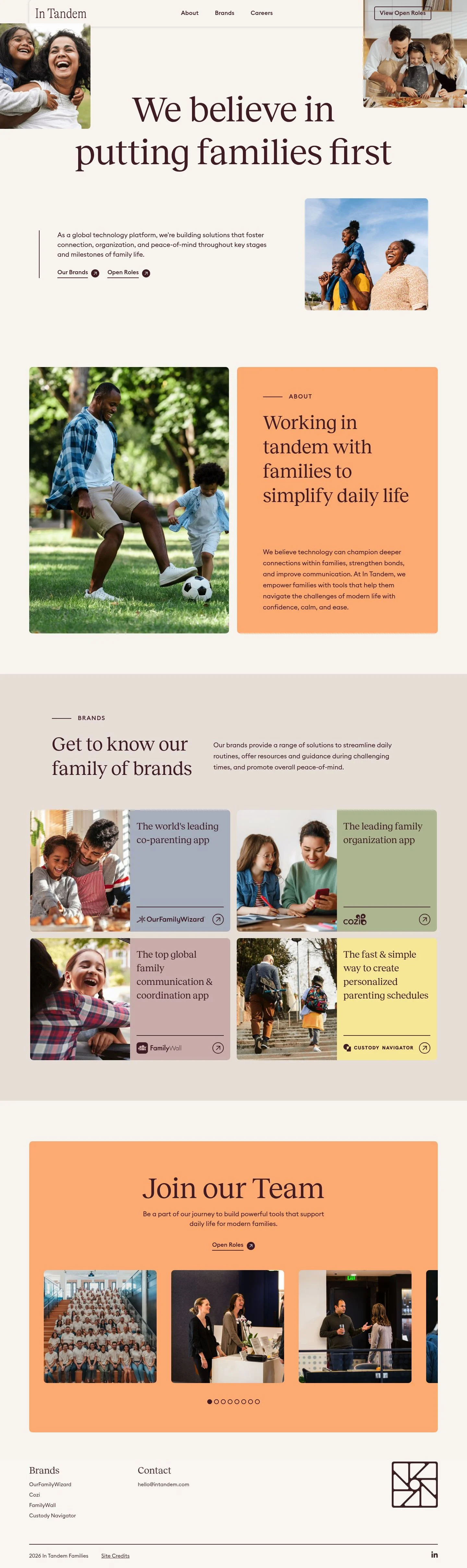
A calm, editorial system for a family-focused technology brand. Tone is warm and trustworthy rather than playful. Spacing is generous and sections are airy; typography carries hierarchy with a large serif for display and a geometric sans for body and labels. Imagery is candid, set as rounded tiles that sit at edges rather than dominating the flow.

## Page Structure

- Global Header: slim top bar on a neutral surface with wordmark left and three inline links (About, Brands, Careers); a prominent "View Open Roles" link sits at the far right.
- Corner Photography: small rounded photo tiles anchored near the top-left and top-right edges, creating bookends for the hero without crowding it.
- Hero: oversized two-line serif headline centered in a wide column with generous top/bottom padding.
- Lead Copy & CTAs: left-aligned paragraph inside a vertical rule; two inline text-link CTAs ("Our Brands", "Open Roles") beneath; a portrait image tile sits to the right.
- About: section kicker label above a mid-size headline and paragraph; presented in a two-column layout that pairs copy with an adjacent colored card or image tile.
- Brands: section kicker and headline followed by a row of brand links; each is a text-first link styled consistently.
- Careers: compact band with a headline and a single CTA link to open roles.
- Footer: stacked lists with a Brands list and a Contact block (email), followed by credits and year.

## Colors

- Primary (#512731): Deep plum ink for headlines, body text, and interactive text.
- Secondary (#f7eaa5): Soft accent for highlighted panels and callout cards.
- Neutral (#f9f6f2): Warm linen background for the page canvas and cards.
- brand-gothic-amethyst (#a48c94): Dusty mauve accent for subtle tints or secondary typography moments.
- surface (#f9f6f2): Default surface color; matches Neutral for a seamless canvas.
- on-surface (#512731): Standard text color on the neutral surface; mirrors Primary.

## Typography

- Reckless — custom (self-hosted). Display serif for headlines: 110px (headline-lg), 72px (headline-md), 47px (headline-sm) at 400 weight. Not freely hosted; substitutes: Playfair Display, Cormorant Garamond, or Libre Baskerville for editorial contrast.
- Euclid Square — custom (self-hosted). Geometric/grotesk sans for body and small headings: 20px body (body-md) and 31px letterspaced kicker (headline-xs, 0.065em). Not freely hosted; substitutes: DM Sans, Poppins, or Inter.
- Roles: Use Reckless for primary page headings and pull quotes; use Euclid Square/stand-in for navigation, overlines (headline-xs), CTAs, and body copy for readability.

## Layout

- Spacing scale favors air: xs 8px, sm 20px for tight UI, md 46px for intra-section gaps, lg 80px and xl 100px for section padding.
- Grid behaves as single wide column with contextual side media on large screens; shifts to stacked flow on smaller viewports.
- Use lg/xl paddings to frame the hero and major sections; reserve md gaps for copy-to-CTA and copy-to-image spacing.

## Elevation & Depth

- Shadows are subtle: sm (0,0,11, 12% black) and md (0,0,10, 15% black) are available and used sparingly on image tiles or floating controls. Larger tiers are intentionally none.
- Hierarchy relies on type scale, color contrast (plum on linen), and whitespace. Where separation is needed, use borders or background shifts rather than heavy shadows.

## Shapes

- Radii are gentle and consistent: 5px for buttons and small controls, 8px for cards and imagery.
- Rounded corners signal approachable content without feeling juvenile; avoid circles or exaggerated rounding.

## Components

- Buttons
  - Primary: text color #512731, 42px height, 9px 15px padding, 5px radius. Used on light backgrounds; relies on text color rather than a filled background.
  - Secondary: same specs as primary; deploy as a peer action.
  - Link: unrounded text link using the primary color; pairs with an arrow icon where needed.
- Card: linen background (#f9f6f2), plum text (#512731), 8px radius, 16px padding. Use for content groupings and image tiles.

### Navigation Bar
- Neutral surface with wordmark left and inline links (Euclid Square/20px). Spacing: 20px between links; 80px bottom offset to the hero. Optional subtle sm shadow for separation.

### Corner Photo Tiles
- Image cards with 8px radius, optional sm shadow. Positioned at the top-left and top-right margins of the hero to frame the headline.

### Hero Display Block
- Headline in Reckless 110px/1.2, plum (#512731). Two lines with comfortable 80–100px vertical padding. No subhead to preserve focus; imagery handled by corner tiles.

### Lead Copy Callout
- Left-aligned paragraph set in Euclid Square 20px/1.5. A 1px plum rule runs vertically at the left; 20px inset between rule and text. Below, two link buttons (Our Brands, Open Roles) with 20px gap.

### Section Kicker Label
- Overline tag above section headlines using headline-xs: Euclid Square 31px, 0.065em letterspacing, 400 weight; case-transform to uppercase for a label feel.

### Brand Link Row
- A horizontal list of brand links styled as button-link: plum text, optional arrow icon. 20px inline gap; wraps on small screens.

### Careers CTA Banner
- Compact block with headline (Reckless 47px) and a single link CTA. Use secondary background (#f7eaa5) sparingly to increase prominence; 8px radius and 46px internal gap.

## Do's and Don'ts

- Do keep all body and link text in #512731 on the #f9f6f2 surface for maximum readability.
- Do reserve #f7eaa5 for highlight panels or a single CTA band; overuse dilutes emphasis.
- Do use 5px radius on buttons and 8px on cards/images; mixing them within a component breaks consistency.
- Don't introduce heavy drop shadows; stick to sm/md only where needed.
- Don't center long paragraphs; left-align body copy to match the lead callout style.
- Don't add new accent colors; if a tint is required, use brand-gothic-amethyst (#a48c94).

## Agent Prompt Guide

Quick color reference — Text: #512731, Background: #f9f6f2, Border/Rule: #512731 at 1px, Accent panel: #f7eaa5.

1) Hero with corner photos
- Canvas: background #f9f6f2 with 100px top/bottom padding.
- H1: font-family: 'Reckless', 'Playfair Display', 'Cormorant Garamond', serif; size 110px; line-height 1.2; color #512731; max-width ~12–14ch; margin-bottom 80px.
- Place two image tiles (8px radius, sm shadow) at top-left and top-right of the hero area.

2) Lead copy callout with right image
- Create a two-column layout (content left, image right) with 46px column gap.
- Left block: 1px left border in #512731; padding-left 20px; body text in 'Euclid Square', 'DM Sans', 'Poppins', 'Inter', sans-serif at 20px/1.5; color #512731.
- Add two link-style CTAs below (gap 20px), using #512731 text and 0px radius.
- Right image: 8px radius, md shadow.

3) Section with kicker label
- Overline: 'Euclid Square'/31px/400 with 0.065em letter-spacing; uppercase; color #512731; margin-bottom 20px.
- H2: 'Reckless'/72px/400; color #512731; margin-bottom 20px.
- Body: 'Euclid Square'/20px.
- Section padding: 80px top and bottom.

4) Brands link row
- Heading as above, then a horizontal list of four links.
- Links: 'Euclid Square'/20px; color #512731; underline on hover; 20px inline gap; 5px focus ring radius if needed; no background.

5) Careers CTA banner
- Container: background #f7eaa5; 8px radius; padding 46px; text color #512731.
- Heading: 'Reckless'/47px; CTA: link-style in #512731 with 20px left icon gap.

## Similar Brands

- Care.com — Warm palette and human photography with simple sans/serif hierarchy; Care pushes brighter greens where In Tandem stays muted.
- Headspace — Gentle color fields and large type for calm; Headspace leans rounder and more playful, while In Tandem is more editorial.
- Airbnb.org — Editorial serif headlines and spacious layouts; Airbnb.org uses stronger contrast blocks versus In Tandem's lighter linen surface.
- Cozi — One of the linked brands; brighter, app-centric UI compared with In Tandem's umbrella-brand restraint.

## Tokens

### CSS custom properties

```css
:root {
  /* Colors */
  --color-primary: #512731;
  --color-secondary: #f7eaa5;
  --color-neutral: #f9f6f2;
  --color-brand-gothic-amethyst: #a48c94;
  --color-surface: var(--color-neutral);
  --color-on-surface: var(--color-primary);

  /* Typography */
  --text-headline-lg-size: 110px;
  --text-headline-lg-weight: 400;
  --text-headline-lg-leading: 1.2;
  --text-headline-md-size: 72px;
  --text-headline-md-weight: 400;
  --text-headline-md-leading: 1.5;
  --text-headline-sm-size: 47px;
  --text-headline-sm-weight: 400;
  --text-headline-sm-leading: 1.6;
  --text-headline-xs-size: 31px;
  --text-headline-xs-weight: 400;
  --text-headline-xs-leading: 1.19;
  --text-headline-xs-tracking: 0.065em;
  --text-body-md-size: 20px;
  --text-body-md-weight: 400;
  --text-body-md-leading: 1.5;
  --font-reckless: "Reckless";
  --font-euclid-square: "Euclid Square";

  /* Rounded */
  --radius-sm: 5px;
  --radius-md: 8px;

  /* Spacing */
  --spacing-xs: 8px;
  --spacing-sm: 20px;
  --spacing-md: 46px;
  --spacing-lg: 80px;
  --spacing-xl: 100px;

  /* Components */
  --button-primary-text-color: var(--color-primary);
  --button-primary-rounded: var(--radius-sm);
  --button-primary-padding: 9px 15px;
  --button-primary-height: 42px;
  --button-secondary-text-color: var(--color-primary);
  --button-secondary-rounded: var(--radius-sm);
  --button-secondary-padding: 9px 15px;
  --button-secondary-height: 42px;
  --button-link-text-color: var(--color-primary);
  --button-link-rounded: 0px;
  --card-background-color: var(--color-neutral);
  --card-text-color: var(--color-primary);
  --card-rounded: var(--radius-md);
  --card-padding: 16px;
}
```

### Tailwind theme

```css
@theme {
  --color-primary: #512731;
  --color-secondary: #f7eaa5;
  --color-neutral: #f9f6f2;
  --color-brand-gothic-amethyst: #a48c94;
  --color-surface: #f9f6f2;
  --color-on-surface: #512731;
  --font-headline-lg: "Reckless";
  --font-headline-md: "Reckless";
  --font-headline-sm: "Reckless";
  --font-headline-xs: "Euclid Square";
  --font-body-md: "Euclid Square";
  --text-headline-lg: 110px;
  --text-headline-md: 72px;
  --text-headline-sm: 47px;
  --text-headline-xs: 31px;
  --text-body-md: 20px;
  --tracking-headline-xs: 0.065em;
  --font-weight-headline-lg: 400;
  --font-weight-headline-md: 400;
  --font-weight-headline-sm: 400;
  --font-weight-headline-xs: 400;
  --font-weight-body-md: 400;
  --radius-sm: 5px;
  --radius-md: 8px;
  --spacing-xs: 8px;
  --spacing-sm: 20px;
  --spacing-md: 46px;
  --spacing-lg: 80px;
  --spacing-xl: 100px;
}
```

### Design tokens (DTCG)

```json
{
    "$schema": "https://www.designtokens.org/schemas/2025.10/format.json",
    "color": {
        "$type": "color",
        "primary": {
            "$value": {
                "colorSpace": "srgb",
                "components": [
                    0.318,
                    0.153,
                    0.192
                ],
                "hex": "#512731"
            }
        },
        "secondary": {
            "$value": {
                "colorSpace": "srgb",
                "components": [
                    0.969,
                    0.918,
                    0.647
                ],
                "hex": "#f7eaa5"
            }
        },
        "neutral": {
            "$value": {
                "colorSpace": "srgb",
                "components": [
                    0.976,
                    0.965,
                    0.949
                ],
                "hex": "#f9f6f2"
            }
        },
        "brand-gothic-amethyst": {
            "$value": {
                "colorSpace": "srgb",
                "components": [
                    0.643,
                    0.549,
                    0.58
                ],
                "hex": "#a48c94"
            }
        },
        "surface": {
            "$value": {
                "colorSpace": "srgb",
                "components": [
                    0.976,
                    0.965,
                    0.949
                ],
                "hex": "#f9f6f2"
            }
        },
        "on-surface": {
            "$value": {
                "colorSpace": "srgb",
                "components": [
                    0.318,
                    0.153,
                    0.192
                ],
                "hex": "#512731"
            }
        }
    },
    "spacing": {
        "$type": "dimension",
        "xs": {
            "$value": {
                "value": 8,
                "unit": "px"
            }
        },
        "sm": {
            "$value": {
                "value": 20,
                "unit": "px"
            }
        },
        "md": {
            "$value": {
                "value": 46,
                "unit": "px"
            }
        },
        "lg": {
            "$value": {
                "value": 80,
                "unit": "px"
            }
        },
        "xl": {
            "$value": {
                "value": 100,
                "unit": "px"
            }
        }
    },
    "rounded": {
        "$type": "dimension",
        "sm": {
            "$value": {
                "value": 5,
                "unit": "px"
            }
        },
        "md": {
            "$value": {
                "value": 8,
                "unit": "px"
            }
        }
    },
    "typography": {
        "headline-lg": {
            "$type": "typography",
            "$value": {
                "fontFamily": "Reckless",
                "fontSize": {
                    "value": 110,
                    "unit": "px"
                },
                "fontWeight": 400
            }
        },
        "headline-md": {
            "$type": "typography",
            "$value": {
                "fontFamily": "Reckless",
                "fontSize": {
                    "value": 72,
                    "unit": "px"
                },
                "fontWeight": 400
            }
        },
        "headline-sm": {
            "$type": "typography",
            "$value": {
                "fontFamily": "Reckless",
                "fontSize": {
                    "value": 47,
                    "unit": "px"
                },
                "fontWeight": 400
            }
        },
        "headline-xs": {
            "$type": "typography",
            "$value": {
                "fontFamily": "Euclid Square",
                "fontSize": {
                    "value": 31,
                    "unit": "px"
                },
                "fontWeight": 400,
                "letterSpacing": {
                    "value": 0.065,
                    "unit": "em"
                }
            }
        },
        "body-md": {
            "$type": "typography",
            "$value": {
                "fontFamily": "Euclid Square",
                "fontSize": {
                    "value": 20,
                    "unit": "px"
                },
                "fontWeight": 400
            }
        }
    }
}
```

## Rules

- **Fonts.** If the specification names a custom or self-hosted family, use one of the substitutes it names. Never reference a typeface you cannot actually load — it will fall back to a system font and undo the typography.
- **Colour.** Derive the palette from the user's brand. Use the token values as a guide to *relationships* — contrast, tint, how many accents carry the page — not as hex codes to paste.
- **Never reproduce** the wordmark, mascot, logo, brand name, illustrations, icon set, screenshots or any copy from the reference.
- **Never present the result as In Tandem**, or imply any connection to it.
- If something is unspecified, choose clarity and legibility over decoration.
---
version: alpha
name: In Tandem
description: We believe in putting families first—building peace of mind.
colors:
  primary: "#512731"
  secondary: "#f7eaa5"
  neutral: "#f9f6f2"
  brand-gothic-amethyst: "#a48c94"
  surface: "{colors.neutral}"
  on-surface: "{colors.primary}"
typography:
  headline-lg:
    fontFamily: Reckless
    fontSize: 110px
    fontWeight: 400
    lineHeight: 1.2
  headline-md:
    fontFamily: Reckless
    fontSize: 72px
    fontWeight: 400
    lineHeight: 1.5
  headline-sm:
    fontFamily: Reckless
    fontSize: 47px
    fontWeight: 400
    lineHeight: 1.6
  headline-xs:
    fontFamily: Euclid Square
    fontSize: 31px
    fontWeight: 400
    lineHeight: 1.19
    letterSpacing: 0.065em
  body-md:
    fontFamily: Euclid Square
    fontSize: 20px
    fontWeight: 400
    lineHeight: 1.5
rounded:
  sm: 5px
  md: 8px
spacing:
  xs: 8px
  sm: 20px
  md: 46px
  lg: 80px
  xl: 100px
components:
  button-primary:
    textColor: "{colors.primary}"
    rounded: "{rounded.sm}"
    padding: 9px 15px
    height: 42px
  button-secondary:
    textColor: "{colors.primary}"
    rounded: "{rounded.sm}"
    padding: 9px 15px
    height: 42px
  button-link:
    textColor: "{colors.primary}"
    rounded: 0px
  card:
    backgroundColor: "{colors.neutral}"
    textColor: "{colors.primary}"
    rounded: "{rounded.md}"
    padding: 16px
---

# In Tandem: Editorial Serif Headlines on Warm Linen

## Overview

A calm, editorial system for a family-focused technology brand. Tone is warm and trustworthy rather than playful. Spacing is generous and sections are airy; typography carries hierarchy with a large serif for display and a geometric sans for body and labels. Imagery is candid, set as rounded tiles that sit at edges rather than dominating the flow.

## Page Structure

- Global Header: slim top bar on a neutral surface with wordmark left and three inline links (About, Brands, Careers); a prominent "View Open Roles" link sits at the far right.
- Corner Photography: small rounded photo tiles anchored near the top-left and top-right edges, creating bookends for the hero without crowding it.
- Hero: oversized two-line serif headline centered in a wide column with generous top/bottom padding.
- Lead Copy & CTAs: left-aligned paragraph inside a vertical rule; two inline text-link CTAs ("Our Brands", "Open Roles") beneath; a portrait image tile sits to the right.
- About: section kicker label above a mid-size headline and paragraph; presented in a two-column layout that pairs copy with an adjacent colored card or image tile.
- Brands: section kicker and headline followed by a row of brand links; each is a text-first link styled consistently.
- Careers: compact band with a headline and a single CTA link to open roles.
- Footer: stacked lists with a Brands list and a Contact block (email), followed by credits and year.

## Colors

- Primary (#512731): Deep plum ink for headlines, body text, and interactive text.
- Secondary (#f7eaa5): Soft accent for highlighted panels and callout cards.
- Neutral (#f9f6f2): Warm linen background for the page canvas and cards.
- brand-gothic-amethyst (#a48c94): Dusty mauve accent for subtle tints or secondary typography moments.
- surface (#f9f6f2): Default surface color; matches Neutral for a seamless canvas.
- on-surface (#512731): Standard text color on the neutral surface; mirrors Primary.

## Typography

- Reckless — custom (self-hosted). Display serif for headlines: 110px (headline-lg), 72px (headline-md), 47px (headline-sm) at 400 weight. Not freely hosted; substitutes: Playfair Display, Cormorant Garamond, or Libre Baskerville for editorial contrast.
- Euclid Square — custom (self-hosted). Geometric/grotesk sans for body and small headings: 20px body (body-md) and 31px letterspaced kicker (headline-xs, 0.065em). Not freely hosted; substitutes: DM Sans, Poppins, or Inter.
- Roles: Use Reckless for primary page headings and pull quotes; use Euclid Square/stand-in for navigation, overlines (headline-xs), CTAs, and body copy for readability.

## Layout

- Spacing scale favors air: xs 8px, sm 20px for tight UI, md 46px for intra-section gaps, lg 80px and xl 100px for section padding.
- Grid behaves as single wide column with contextual side media on large screens; shifts to stacked flow on smaller viewports.
- Use lg/xl paddings to frame the hero and major sections; reserve md gaps for copy-to-CTA and copy-to-image spacing.

## Elevation & Depth

- Shadows are subtle: sm (0,0,11, 12% black) and md (0,0,10, 15% black) are available and used sparingly on image tiles or floating controls. Larger tiers are intentionally none.
- Hierarchy relies on type scale, color contrast (plum on linen), and whitespace. Where separation is needed, use borders or background shifts rather than heavy shadows.

## Shapes

- Radii are gentle and consistent: 5px for buttons and small controls, 8px for cards and imagery.
- Rounded corners signal approachable content without feeling juvenile; avoid circles or exaggerated rounding.

## Components

- Buttons
  - Primary: text color #512731, 42px height, 9px 15px padding, 5px radius. Used on light backgrounds; relies on text color rather than a filled background.
  - Secondary: same specs as primary; deploy as a peer action.
  - Link: unrounded text link using the primary color; pairs with an arrow icon where needed.
- Card: linen background (#f9f6f2), plum text (#512731), 8px radius, 16px padding. Use for content groupings and image tiles.

### Navigation Bar
- Neutral surface with wordmark left and inline links (Euclid Square/20px). Spacing: 20px between links; 80px bottom offset to the hero. Optional subtle sm shadow for separation.

### Corner Photo Tiles
- Image cards with 8px radius, optional sm shadow. Positioned at the top-left and top-right margins of the hero to frame the headline.

### Hero Display Block
- Headline in Reckless 110px/1.2, plum (#512731). Two lines with comfortable 80–100px vertical padding. No subhead to preserve focus; imagery handled by corner tiles.

### Lead Copy Callout
- Left-aligned paragraph set in Euclid Square 20px/1.5. A 1px plum rule runs vertically at the left; 20px inset between rule and text. Below, two link buttons (Our Brands, Open Roles) with 20px gap.

### Section Kicker Label
- Overline tag above section headlines using headline-xs: Euclid Square 31px, 0.065em letterspacing, 400 weight; case-transform to uppercase for a label feel.

### Brand Link Row
- A horizontal list of brand links styled as button-link: plum text, optional arrow icon. 20px inline gap; wraps on small screens.

### Careers CTA Banner
- Compact block with headline (Reckless 47px) and a single link CTA. Use secondary background (#f7eaa5) sparingly to increase prominence; 8px radius and 46px internal gap.

## Do's and Don'ts

- Do keep all body and link text in #512731 on the #f9f6f2 surface for maximum readability.
- Do reserve #f7eaa5 for highlight panels or a single CTA band; overuse dilutes emphasis.
- Do use 5px radius on buttons and 8px on cards/images; mixing them within a component breaks consistency.
- Don't introduce heavy drop shadows; stick to sm/md only where needed.
- Don't center long paragraphs; left-align body copy to match the lead callout style.
- Don't add new accent colors; if a tint is required, use brand-gothic-amethyst (#a48c94).

## Agent Prompt Guide

Quick color reference — Text: #512731, Background: #f9f6f2, Border/Rule: #512731 at 1px, Accent panel: #f7eaa5.

1) Hero with corner photos
- Canvas: background #f9f6f2 with 100px top/bottom padding.
- H1: font-family: 'Reckless', 'Playfair Display', 'Cormorant Garamond', serif; size 110px; line-height 1.2; color #512731; max-width ~12–14ch; margin-bottom 80px.
- Place two image tiles (8px radius, sm shadow) at top-left and top-right of the hero area.

2) Lead copy callout with right image
- Create a two-column layout (content left, image right) with 46px column gap.
- Left block: 1px left border in #512731; padding-left 20px; body text in 'Euclid Square', 'DM Sans', 'Poppins', 'Inter', sans-serif at 20px/1.5; color #512731.
- Add two link-style CTAs below (gap 20px), using #512731 text and 0px radius.
- Right image: 8px radius, md shadow.

3) Section with kicker label
- Overline: 'Euclid Square'/31px/400 with 0.065em letter-spacing; uppercase; color #512731; margin-bottom 20px.
- H2: 'Reckless'/72px/400; color #512731; margin-bottom 20px.
- Body: 'Euclid Square'/20px.
- Section padding: 80px top and bottom.

4) Brands link row
- Heading as above, then a horizontal list of four links.
- Links: 'Euclid Square'/20px; color #512731; underline on hover; 20px inline gap; 5px focus ring radius if needed; no background.

5) Careers CTA banner
- Container: background #f7eaa5; 8px radius; padding 46px; text color #512731.
- Heading: 'Reckless'/47px; CTA: link-style in #512731 with 20px left icon gap.

## Similar Brands

- Care.com — Warm palette and human photography with simple sans/serif hierarchy; Care pushes brighter greens where In Tandem stays muted.
- Headspace — Gentle color fields and large type for calm; Headspace leans rounder and more playful, while In Tandem is more editorial.
- Airbnb.org — Editorial serif headlines and spacious layouts; Airbnb.org uses stronger contrast blocks versus In Tandem's lighter linen surface.
- Cozi — One of the linked brands; brighter, app-centric UI compared with In Tandem's umbrella-brand restraint.
:root {
  /* Colors */
  --color-primary: #512731;
  --color-secondary: #f7eaa5;
  --color-neutral: #f9f6f2;
  --color-brand-gothic-amethyst: #a48c94;
  --color-surface: var(--color-neutral);
  --color-on-surface: var(--color-primary);

  /* Typography */
  --text-headline-lg-size: 110px;
  --text-headline-lg-weight: 400;
  --text-headline-lg-leading: 1.2;
  --text-headline-md-size: 72px;
  --text-headline-md-weight: 400;
  --text-headline-md-leading: 1.5;
  --text-headline-sm-size: 47px;
  --text-headline-sm-weight: 400;
  --text-headline-sm-leading: 1.6;
  --text-headline-xs-size: 31px;
  --text-headline-xs-weight: 400;
  --text-headline-xs-leading: 1.19;
  --text-headline-xs-tracking: 0.065em;
  --text-body-md-size: 20px;
  --text-body-md-weight: 400;
  --text-body-md-leading: 1.5;
  --font-reckless: "Reckless";
  --font-euclid-square: "Euclid Square";

  /* Rounded */
  --radius-sm: 5px;
  --radius-md: 8px;

  /* Spacing */
  --spacing-xs: 8px;
  --spacing-sm: 20px;
  --spacing-md: 46px;
  --spacing-lg: 80px;
  --spacing-xl: 100px;

  /* Components */
  --button-primary-text-color: var(--color-primary);
  --button-primary-rounded: var(--radius-sm);
  --button-primary-padding: 9px 15px;
  --button-primary-height: 42px;
  --button-secondary-text-color: var(--color-primary);
  --button-secondary-rounded: var(--radius-sm);
  --button-secondary-padding: 9px 15px;
  --button-secondary-height: 42px;
  --button-link-text-color: var(--color-primary);
  --button-link-rounded: 0px;
  --card-background-color: var(--color-neutral);
  --card-text-color: var(--color-primary);
  --card-rounded: var(--radius-md);
  --card-padding: 16px;
}
{
  "$schema": "https://www.designtokens.org/schemas/2025.10/format.json",
  "$description": "We believe in putting families first—building peace of mind.",
  "color": {
    "$type": "color",
    "primary": {
      "$value": {
        "colorSpace": "srgb",
        "components": [
          0.318,
          0.153,
          0.192
        ],
        "hex": "#512731"
      }
    },
    "secondary": {
      "$value": {
        "colorSpace": "srgb",
        "components": [
          0.969,
          0.918,
          0.647
        ],
        "hex": "#f7eaa5"
      }
    },
    "neutral": {
      "$value": {
        "colorSpace": "srgb",
        "components": [
          0.976,
          0.965,
          0.949
        ],
        "hex": "#f9f6f2"
      }
    },
    "brand-gothic-amethyst": {
      "$value": {
        "colorSpace": "srgb",
        "components": [
          0.643,
          0.549,
          0.58
        ],
        "hex": "#a48c94"
      }
    },
    "surface": {
      "$value": {
        "colorSpace": "srgb",
        "components": [
          0.976,
          0.965,
          0.949
        ],
        "hex": "#f9f6f2"
      }
    },
    "on-surface": {
      "$value": {
        "colorSpace": "srgb",
        "components": [
          0.318,
          0.153,
          0.192
        ],
        "hex": "#512731"
      }
    }
  },
  "spacing": {
    "$type": "dimension",
    "xs": {
      "$value": {
        "value": 8,
        "unit": "px"
      }
    },
    "sm": {
      "$value": {
        "value": 20,
        "unit": "px"
      }
    },
    "md": {
      "$value": {
        "value": 46,
        "unit": "px"
      }
    },
    "lg": {
      "$value": {
        "value": 80,
        "unit": "px"
      }
    },
    "xl": {
      "$value": {
        "value": 100,
        "unit": "px"
      }
    }
  },
  "rounded": {
    "$type": "dimension",
    "sm": {
      "$value": {
        "value": 5,
        "unit": "px"
      }
    },
    "md": {
      "$value": {
        "value": 8,
        "unit": "px"
      }
    }
  },
  "typography": {
    "headline-lg": {
      "$type": "typography",
      "$value": {
        "fontFamily": "Reckless",
        "fontSize": {
          "value": 110,
          "unit": "px"
        },
        "fontWeight": 400
      }
    },
    "headline-md": {
      "$type": "typography",
      "$value": {
        "fontFamily": "Reckless",
        "fontSize": {
          "value": 72,
          "unit": "px"
        },
        "fontWeight": 400
      }
    },
    "headline-sm": {
      "$type": "typography",
      "$value": {
        "fontFamily": "Reckless",
        "fontSize": {
          "value": 47,
          "unit": "px"
        },
        "fontWeight": 400
      }
    },
    "headline-xs": {
      "$type": "typography",
      "$value": {
        "fontFamily": "Euclid Square",
        "fontSize": {
          "value": 31,
          "unit": "px"
        },
        "fontWeight": 400,
        "letterSpacing": {
          "value": 0.065,
          "unit": "em"
        }
      }
    },
    "body-md": {
      "$type": "typography",
      "$value": {
        "fontFamily": "Euclid Square",
        "fontSize": {
          "value": 20,
          "unit": "px"
        },
        "fontWeight": 400
      }
    }
  }
}
@theme {
--color-primary: #512731;
--color-secondary: #f7eaa5;
--color-neutral: #f9f6f2;
--color-brand-gothic-amethyst: #a48c94;
--color-surface: #f9f6f2;
--color-on-surface: #512731;
--font-headline-lg: "Reckless";
--font-headline-md: "Reckless";
--font-headline-sm: "Reckless";
--font-headline-xs: "Euclid Square";
--font-body-md: "Euclid Square";
--text-headline-lg: 110px;
--text-headline-md: 72px;
--text-headline-sm: 47px;
--text-headline-xs: 31px;
--text-body-md: 20px;
--tracking-headline-xs: 0.065em;
--font-weight-headline-lg: 400;
--font-weight-headline-md: 400;
--font-weight-headline-sm: 400;
--font-weight-headline-xs: 400;
--font-weight-body-md: 400;
--radius-sm: 5px;
--radius-md: 8px;
--spacing-xs: 8px;
--spacing-sm: 20px;
--spacing-md: 46px;
--spacing-lg: 80px;
--spacing-xl: 100px;
} # Design brief: the In Tandem design language
Below is a complete design specification measured from a real, published web page. Use it as a design language for the user's product. It is not a page to reproduce.
## Reference images
- Full page: https://cdn.designmunk.com/2026/09/30103924/intandem-com-featured.webp
- Above the fold: https://cdn.designmunk.com/2026/09/30103924/intandem-com-featured-1440x900.webp
- On DesignMunk: https://designmunk.com/in-tandem/
Study these for hierarchy, rhythm, spacing and density. Where an image and the written spec disagree, the spec wins: the tokens were read from the page's own CSS, the images are one rendering of it.
## Before you start
Ask the user what they are building, who it is for, and what brand assets they already have — name, colours, typefaces. Wait for their answers before writing anything. Everything below is then applied to their product, not to the reference.
## Design specification
# In Tandem: Editorial Serif Headlines on Warm Linen
## Overview
A calm, editorial system for a family-focused technology brand. Tone is warm and trustworthy rather than playful. Spacing is generous and sections are airy; typography carries hierarchy with a large serif for display and a geometric sans for body and labels. Imagery is candid, set as rounded tiles that sit at edges rather than dominating the flow.
## Page Structure
- Global Header: slim top bar on a neutral surface with wordmark left and three inline links (About, Brands, Careers); a prominent "View Open Roles" link sits at the far right.
- Corner Photography: small rounded photo tiles anchored near the top-left and top-right edges, creating bookends for the hero without crowding it.
- Hero: oversized two-line serif headline centered in a wide column with generous top/bottom padding.
- Lead Copy & CTAs: left-aligned paragraph inside a vertical rule; two inline text-link CTAs ("Our Brands", "Open Roles") beneath; a portrait image tile sits to the right.
- About: section kicker label above a mid-size headline and paragraph; presented in a two-column layout that pairs copy with an adjacent colored card or image tile.
- Brands: section kicker and headline followed by a row of brand links; each is a text-first link styled consistently.
- Careers: compact band with a headline and a single CTA link to open roles.
- Footer: stacked lists with a Brands list and a Contact block (email), followed by credits and year.
## Colors
- Primary (#512731): Deep plum ink for headlines, body text, and interactive text.
- Secondary (#f7eaa5): Soft accent for highlighted panels and callout cards.
- Neutral (#f9f6f2): Warm linen background for the page canvas and cards.
- brand-gothic-amethyst (#a48c94): Dusty mauve accent for subtle tints or secondary typography moments.
- surface (#f9f6f2): Default surface color; matches Neutral for a seamless canvas.
- on-surface (#512731): Standard text color on the neutral surface; mirrors Primary.
## Typography
- Reckless — custom (self-hosted). Display serif for headlines: 110px (headline-lg), 72px (headline-md), 47px (headline-sm) at 400 weight. Not freely hosted; substitutes: Playfair Display, Cormorant Garamond, or Libre Baskerville for editorial contrast.
- Euclid Square — custom (self-hosted). Geometric/grotesk sans for body and small headings: 20px body (body-md) and 31px letterspaced kicker (headline-xs, 0.065em). Not freely hosted; substitutes: DM Sans, Poppins, or Inter.
- Roles: Use Reckless for primary page headings and pull quotes; use Euclid Square/stand-in for navigation, overlines (headline-xs), CTAs, and body copy for readability.
## Layout
- Spacing scale favors air: xs 8px, sm 20px for tight UI, md 46px for intra-section gaps, lg 80px and xl 100px for section padding.
- Grid behaves as single wide column with contextual side media on large screens; shifts to stacked flow on smaller viewports.
- Use lg/xl paddings to frame the hero and major sections; reserve md gaps for copy-to-CTA and copy-to-image spacing.
## Elevation & Depth
- Shadows are subtle: sm (0,0,11, 12% black) and md (0,0,10, 15% black) are available and used sparingly on image tiles or floating controls. Larger tiers are intentionally none.
- Hierarchy relies on type scale, color contrast (plum on linen), and whitespace. Where separation is needed, use borders or background shifts rather than heavy shadows.
## Shapes
- Radii are gentle and consistent: 5px for buttons and small controls, 8px for cards and imagery.
- Rounded corners signal approachable content without feeling juvenile; avoid circles or exaggerated rounding.
## Components
- Buttons
- Primary: text color #512731, 42px height, 9px 15px padding, 5px radius. Used on light backgrounds; relies on text color rather than a filled background.
- Secondary: same specs as primary; deploy as a peer action.
- Link: unrounded text link using the primary color; pairs with an arrow icon where needed.
- Card: linen background (#f9f6f2), plum text (#512731), 8px radius, 16px padding. Use for content groupings and image tiles.
### Navigation Bar
- Neutral surface with wordmark left and inline links (Euclid Square/20px). Spacing: 20px between links; 80px bottom offset to the hero. Optional subtle sm shadow for separation.
### Corner Photo Tiles
- Image cards with 8px radius, optional sm shadow. Positioned at the top-left and top-right margins of the hero to frame the headline.
### Hero Display Block
- Headline in Reckless 110px/1.2, plum (#512731). Two lines with comfortable 80–100px vertical padding. No subhead to preserve focus; imagery handled by corner tiles.
### Lead Copy Callout
- Left-aligned paragraph set in Euclid Square 20px/1.5. A 1px plum rule runs vertically at the left; 20px inset between rule and text. Below, two link buttons (Our Brands, Open Roles) with 20px gap.
### Section Kicker Label
- Overline tag above section headlines using headline-xs: Euclid Square 31px, 0.065em letterspacing, 400 weight; case-transform to uppercase for a label feel.
### Brand Link Row
- A horizontal list of brand links styled as button-link: plum text, optional arrow icon. 20px inline gap; wraps on small screens.
### Careers CTA Banner
- Compact block with headline (Reckless 47px) and a single link CTA. Use secondary background (#f7eaa5) sparingly to increase prominence; 8px radius and 46px internal gap.
## Do's and Don'ts
- Do keep all body and link text in #512731 on the #f9f6f2 surface for maximum readability.
- Do reserve #f7eaa5 for highlight panels or a single CTA band; overuse dilutes emphasis.
- Do use 5px radius on buttons and 8px on cards/images; mixing them within a component breaks consistency.
- Don't introduce heavy drop shadows; stick to sm/md only where needed.
- Don't center long paragraphs; left-align body copy to match the lead callout style.
- Don't add new accent colors; if a tint is required, use brand-gothic-amethyst (#a48c94).
## Agent Prompt Guide
Quick color reference — Text: #512731, Background: #f9f6f2, Border/Rule: #512731 at 1px, Accent panel: #f7eaa5.
1) Hero with corner photos
- Canvas: background #f9f6f2 with 100px top/bottom padding.
- H1: font-family: 'Reckless', 'Playfair Display', 'Cormorant Garamond', serif; size 110px; line-height 1.2; color #512731; max-width ~12–14ch; margin-bottom 80px.
- Place two image tiles (8px radius, sm shadow) at top-left and top-right of the hero area.
2) Lead copy callout with right image
- Create a two-column layout (content left, image right) with 46px column gap.
- Left block: 1px left border in #512731; padding-left 20px; body text in 'Euclid Square', 'DM Sans', 'Poppins', 'Inter', sans-serif at 20px/1.5; color #512731.
- Add two link-style CTAs below (gap 20px), using #512731 text and 0px radius.
- Right image: 8px radius, md shadow.
3) Section with kicker label
- Overline: 'Euclid Square'/31px/400 with 0.065em letter-spacing; uppercase; color #512731; margin-bottom 20px.
- H2: 'Reckless'/72px/400; color #512731; margin-bottom 20px.
- Body: 'Euclid Square'/20px.
- Section padding: 80px top and bottom.
4) Brands link row
- Heading as above, then a horizontal list of four links.
- Links: 'Euclid Square'/20px; color #512731; underline on hover; 20px inline gap; 5px focus ring radius if needed; no background.
5) Careers CTA banner
- Container: background #f7eaa5; 8px radius; padding 46px; text color #512731.
- Heading: 'Reckless'/47px; CTA: link-style in #512731 with 20px left icon gap.
## Tokens
### CSS custom properties
```css
:root {
/* Colors */
--color-primary: #512731;
--color-secondary: #f7eaa5;
--color-neutral: #f9f6f2;
--color-brand-gothic-amethyst: #a48c94;
--color-surface: var(--color-neutral);
--color-on-surface: var(--color-primary);
/* Typography */
--text-headline-lg-size: 110px;
--text-headline-lg-weight: 400;
--text-headline-lg-leading: 1.2;
--text-headline-md-size: 72px;
--text-headline-md-weight: 400;
--text-headline-md-leading: 1.5;
--text-headline-sm-size: 47px;
--text-headline-sm-weight: 400;
--text-headline-sm-leading: 1.6;
--text-headline-xs-size: 31px;
--text-headline-xs-weight: 400;
--text-headline-xs-leading: 1.19;
--text-headline-xs-tracking: 0.065em;
--text-body-md-size: 20px;
--text-body-md-weight: 400;
--text-body-md-leading: 1.5;
--font-reckless: "Reckless";
--font-euclid-square: "Euclid Square";
/* Rounded */
--radius-sm: 5px;
--radius-md: 8px;
/* Spacing */
--spacing-xs: 8px;
--spacing-sm: 20px;
--spacing-md: 46px;
--spacing-lg: 80px;
--spacing-xl: 100px;
/* Components */
--button-primary-text-color: var(--color-primary);
--button-primary-rounded: var(--radius-sm);
--button-primary-padding: 9px 15px;
--button-primary-height: 42px;
--button-secondary-text-color: var(--color-primary);
--button-secondary-rounded: var(--radius-sm);
--button-secondary-padding: 9px 15px;
--button-secondary-height: 42px;
--button-link-text-color: var(--color-primary);
--button-link-rounded: 0px;
--card-background-color: var(--color-neutral);
--card-text-color: var(--color-primary);
--card-rounded: var(--radius-md);
--card-padding: 16px;
}
```
## Rules
- **Fonts.** If the specification names a custom or self-hosted family, use one of the substitutes it names. Never reference a typeface you cannot actually load — it will fall back to a system font and undo the typography.
- **Colour.** Derive the palette from the user's brand. Use the token values as a guide to *relationships* — contrast, tint, how many accents carry the page — not as hex codes to paste.
- **Never reproduce** the wordmark, mascot, logo, brand name, illustrations, icon set, screenshots or any copy from the reference.
- **Never present the result as In Tandem**, or imply any connection to it.
- If something is unspecified, choose clarity and legibility over decoration.