
General Intelligence Careers
generalintelligencecompany.com
AI that runs businesses autonomously—tools that help businesses run themselves.
generalintelligencecompany.com
AI Breakdown
Design export
# Design brief: the General Intelligence Careers design language

Below is a complete design specification measured from a real, published web page. Use it as a design language for the user's product. It is not a page to reproduce.

## Reference images

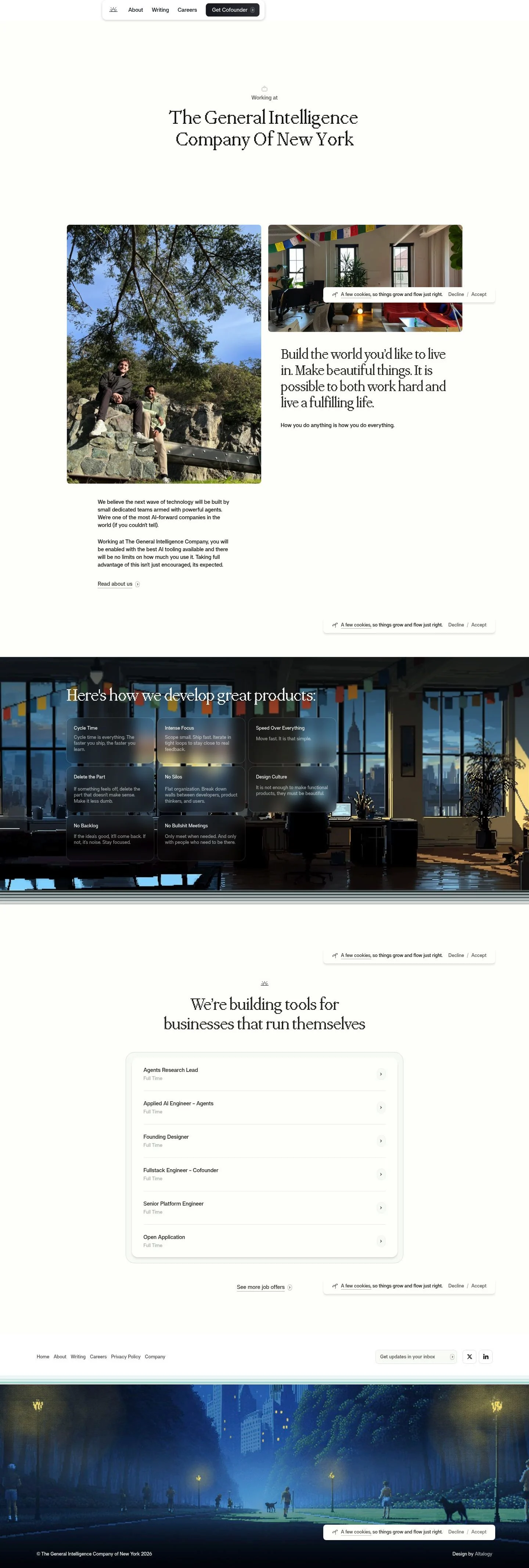
- Full page: https://cdn.designmunk.com/2026/09/12075540/generalintelligencecompany-com-careers-featured.webp
- Above the fold: https://cdn.designmunk.com/2026/09/12075540/generalintelligencecompany-com-careers-featured.webp
- On DesignMunk: https://designmunk.com/general-intelligence-careers-page/

Study these for hierarchy, rhythm, spacing and density. Where an image and the written spec disagree, the spec wins: the tokens were read from the page's own CSS, the images are one rendering of it.

## Before you start

Ask the user what they are building, who it is for, and what brand assets they already have — name, colours, typefaces. Wait for their answers before writing anything. Everything below is then applied to their product, not to the reference.

## Design specification

# General Intelligence: Editorial Serif Careers Page With Floating Dock

## Overview

Editorial, minimal, and calm. Black text on a white surface with spare accents; copy does the heavy lifting while UI stays out of the way. Spacing is generous and modular, producing a steady scroll rhythm across text blocks, tiles, and lists. The tone is serious but optimistic—workmanlike language paired with magazine-style type.

## Colors

- Primary (#171717): Core text and icons for maximum legibility on white.
- Secondary (#7c847c): Muted accent for subtle labels and meta content.
- Tertiary (#a0d7d1): Light mint accent reserved for gentle highlights or tags.
- Neutral (#ffffff): Page surface and cards.
- Border (#e5e7eb): Hairline dividers, card outlines, and input strokes.
- Brand-lacquered-liquorice (#383838): Alternative ink for subdued text or hovered states.
- Surface ({colors.neutral}): Default background for sections and cards.
- On-surface ({colors.primary}): Default text color on white.

## Typography

Display headlines use Ppmondwest at 54px and 39px for large and medium sizes with tight tracking; these set the brand's editorial voice. Smaller headlines and body copy use Af at 28px, 21px, and 15px for readable content and UI. Both families are custom/self-hosted and not openly available; agents should not attempt to fetch them directly.
- Ppmondwest (custom, unavailable): Use for headline-lg and headline-md. Suggested substitutes: Fraunces (Google Fonts), Playfair Display (Google Fonts), or Cormorant Garamond (Google Fonts) at similar sizes and line-heights.
- Af (custom, unavailable): Use for headline-sm/xs and body text. Suggested substitutes: Inter (Google Fonts), IBM Plex Sans (Google Fonts), or Work Sans (Google Fonts) at the specified sizes and weights.

## Layout

A spacious vertical rhythm keyed to 8/16/28/40/80px steps. Use 80px for section breaks, 40px for major intra-section gaps, and 28px for headline-to-body spacing. Grids are typically two columns for content blocks and galleries, switching to a single column on smaller viewports. Keep wide margins to preserve the quiet, editorial feel.

## Elevation & Depth

Depth is mostly flat. A subtle shadow (rgba(0,0,0,0.15) 0 2px 6px) appears on floating utility elements like the nav and consent toast. Elsewhere, hierarchy is created through whitespace, crisp borders (#e5e7eb), and tonal shifts between #171717 and #383838 rather than pronounced shadows.

## Shapes

Two radii articulate hierarchy: md (8px) for primary interactive surfaces (primary button, cards, floating bars) and sm (4px) for secondary buttons or small chips. Links remain square (0px) to read as text-first actions.

## Components

Buttons and card styles:
- Button Primary: 40px tall, 8px radius, background #1f1f29 with white text, padding 8px 12px 8px 16px.
- Button Secondary: 40px tall, 4px radius, text-only in #171717 with the same padding; sits on white.
- Button Link: Unadorned text action with square corners.
- Card: White background, #171717 text, 8px radius, 16px padding, thin borders when needed.

Distinctive components on this page:

### Floating Utility Nav
A compact, left-aligned dock with navigation links and a prominent "Get Cofounder" primary button. White surface (#ffffff), slight sm shadow, 8px radius. Internal gaps follow 16px.

### Hero Masthead
Centered stack with a small kicker ("Working at") above the h1. H1 uses headline-lg (54px/1.1, tight tracking), color #171717, generous top/bottom margins at 80px.

### Split Gallery + Manifesto
Two-column section: a left photo card and a right column combining an image over a manifesto set in headline-md (39px) followed by body-md copy. Gutters at 40px; images inherit 8px radius.

### Principles Grid
A sequence of compact tiles each with a short title (headline-xs 21px) and one-sentence body (15px). Use 28px vertical spacing within tiles and 40px between tiles; borders optional (#e5e7eb) to keep the look light.

### Job Listing Stack
List of roles with a title and employment type badge ("Full Time"). 28px vertical rhythm, 8px radius on any container, and a concluding link to the external job board.

### Cookie Consent Toast
Small floating bar over content with body-md text and two actions ("Decline" / "Accept"). White surface, sm shadow, 8px radius, and primary text color #171717.

### Footer Utility Panel
Compact footer with a stacked link list, social icons, an email capture line, and credits. Borders (#e5e7eb) separate clusters; 16–28px spacing keeps density controlled.

## Do's and Don'ts

- Do set headlines at the specified sizes (54px, 39px) with tight negative tracking for the editorial feel.
- Do prefer borders (#e5e7eb) and whitespace to create hierarchy; reserve shadows for floating elements only.
- Do use md (8px) radius for primary surfaces and sm (4px) for secondary actions; keep text links square.
- Don't introduce saturated brand colors for core UI; keep accents subtle (secondary #7c847c, tertiary #a0d7d1) and rare.
- Don't crowd sections—maintain 80px breaks and 40px gutters for the calm, magazine-like rhythm.
- Don't mix additional fonts; if custom faces aren't available, swap to the listed Google substitutes consistently.

## Agent Prompt Guide

Quick color reference
- Text: #171717
- Background: #ffffff
- Border: #e5e7eb
- Accent (Primary action): #1f1f29

Prompts
1) Build a centered hero masthead
"Create a full-width hero on white (#ffffff) with 80px top/bottom padding. Kicker in Inter 15px/1.4, #7c847c. H1 set in Fraunces (substitute for Ppmondwest) at 54px, weight 400, line-height 1.1, letter-spacing -0.02em, color #171717, centered. Constrain text to 720px max-width and center it. Use 28px space from kicker to h1."

2) Floating utility nav with primary CTA
"Add a floating nav dock at the top-left: white card (#ffffff), 8px radius, shadow rgba(0,0,0,0.15) 0 2px 6px, 12px horizontal padding, 8px vertical, 16px gaps between links. Links in Inter 15px, #171717. Add a primary button 40px tall with 8px radius, background #1f1f29, text #ffffff, padding 8px 12px 8px 16px."

3) Split gallery + manifesto section
"Create a two-column grid on white with a 40px gutter and 80px vertical spacing. Left: an image card with 8px radius. Right: an image (8px radius) above a manifesto headline in Fraunces 39px/1.13, letter-spacing -0.025em, #171717, followed by a paragraph in Inter 15px/1.4. Maintain 28px spacing between text blocks."

4) Principles grid
"Render a list of 8 principle tiles in a single column with 28px internal spacing and 40px between tiles. Each tile: title in Inter 21px/1.19, body in Inter 15px/1.4, color #171717; optional bottom border #e5e7eb. Cards stay flat; no shadow."

5) Jobs list with external link
"Add a jobs section on white with 80px top padding. For each role, show title (Inter 21px) and 'Full Time' label in #383838. Use 28px vertical spacing between roles and a thin divider #e5e7eb. End with a link button-style text to 'See more job offers' using Inter 15px and square corners."

## Similar Brands

- Anthropic: Editorial serif headlines and monochrome restraint; Anthropic skews more academic and uses warmer tints.
- Notion: Black-and-white minimalism with careful spacing; Notion leans on sans-serifs and iconography more heavily.
- Substack: Editorial typography and generous whitespace; Substack introduces more orange brand color and denser lists.
- Basecamp/37signals: Opinionated copy with minimal UI; they rely more on hand-drawn cues and brighter accents than this site.

## Tokens

### CSS custom properties

```css
:root {
  /* Colors */
  --color-primary: #171717;
  --color-secondary: #7c847c;
  --color-tertiary: #a0d7d1;
  --color-neutral: #ffffff;
  --color-border: #e5e7eb;
  --color-brand-lacquered-liquorice: #383838;
  --color-surface: var(--color-neutral);
  --color-on-surface: var(--color-primary);

  /* Typography */
  --text-headline-lg-size: 54px;
  --text-headline-lg-weight: 400;
  --text-headline-lg-leading: 1.1;
  --text-headline-lg-tracking: -0.02em;
  --text-headline-md-size: 39px;
  --text-headline-md-weight: 400;
  --text-headline-md-leading: 1.13;
  --text-headline-md-tracking: -0.025em;
  --text-headline-sm-size: 28px;
  --text-headline-sm-weight: 400;
  --text-headline-sm-leading: 1.21;
  --text-headline-sm-tracking: -0.005em;
  --text-headline-xs-size: 21px;
  --text-headline-xs-weight: 400;
  --text-headline-xs-leading: 1.19;
  --text-body-md-size: 15px;
  --text-body-md-weight: 400;
  --text-body-md-leading: 1.4;
  --text-body-md-tracking: -0.01em;
  --font-ppmondwest: "ppmondwest";
  --font-af: "af";

  /* Rounded */
  --radius-sm: 4px;
  --radius-md: 8px;

  /* Spacing */
  --spacing-xs: 8px;
  --spacing-sm: 16px;
  --spacing-md: 28px;
  --spacing-lg: 40px;
  --spacing-xl: 80px;

  /* Components */
  --button-primary-background-color: #1f1f29;
  --button-primary-text-color: var(--color-neutral);
  --button-primary-rounded: var(--radius-md);
  --button-primary-padding: 8px 12px 8px 16px;
  --button-primary-height: 40px;
  --button-secondary-text-color: var(--color-primary);
  --button-secondary-rounded: var(--radius-sm);
  --button-secondary-padding: 8px 12px 8px 16px;
  --button-secondary-height: 40px;
  --button-link-text-color: var(--color-primary);
  --button-link-rounded: 0px;
  --card-background-color: var(--color-neutral);
  --card-text-color: var(--color-primary);
  --card-rounded: var(--radius-md);
  --card-padding: 16px;
}
```

### Tailwind theme

```css
@theme {
  --color-primary: #171717;
  --color-secondary: #7c847c;
  --color-tertiary: #a0d7d1;
  --color-neutral: #ffffff;
  --color-border: #e5e7eb;
  --color-brand-lacquered-liquorice: #383838;
  --color-surface: #ffffff;
  --color-on-surface: #171717;
  --font-headline-lg: "ppmondwest";
  --font-headline-md: "ppmondwest";
  --font-headline-sm: "af";
  --font-headline-xs: "af";
  --font-body-md: "af";
  --text-headline-lg: 54px;
  --text-headline-md: 39px;
  --text-headline-sm: 28px;
  --text-headline-xs: 21px;
  --text-body-md: 15px;
  --tracking-headline-lg: -0.02em;
  --tracking-headline-md: -0.025em;
  --tracking-headline-sm: -0.005em;
  --tracking-body-md: -0.01em;
  --font-weight-headline-lg: 400;
  --font-weight-headline-md: 400;
  --font-weight-headline-sm: 400;
  --font-weight-headline-xs: 400;
  --font-weight-body-md: 400;
  --radius-sm: 4px;
  --radius-md: 8px;
  --spacing-xs: 8px;
  --spacing-sm: 16px;
  --spacing-md: 28px;
  --spacing-lg: 40px;
  --spacing-xl: 80px;
}
```

### Design tokens (DTCG)

```json
{
    "$schema": "https://www.designtokens.org/schemas/2025.10/format.json",
    "color": {
        "$type": "color",
        "primary": {
            "$value": {
                "colorSpace": "srgb",
                "components": [
                    0.09,
                    0.09,
                    0.09
                ],
                "hex": "#171717"
            }
        },
        "secondary": {
            "$value": {
                "colorSpace": "srgb",
                "components": [
                    0.486,
                    0.518,
                    0.486
                ],
                "hex": "#7c847c"
            }
        },
        "tertiary": {
            "$value": {
                "colorSpace": "srgb",
                "components": [
                    0.627,
                    0.843,
                    0.82
                ],
                "hex": "#a0d7d1"
            }
        },
        "neutral": {
            "$value": {
                "colorSpace": "srgb",
                "components": [
                    1,
                    1,
                    1
                ],
                "hex": "#ffffff"
            }
        },
        "border": {
            "$value": {
                "colorSpace": "srgb",
                "components": [
                    0.898,
                    0.906,
                    0.922
                ],
                "hex": "#e5e7eb"
            }
        },
        "brand-lacquered-liquorice": {
            "$value": {
                "colorSpace": "srgb",
                "components": [
                    0.22,
                    0.22,
                    0.22
                ],
                "hex": "#383838"
            }
        },
        "surface": {
            "$value": {
                "colorSpace": "srgb",
                "components": [
                    1,
                    1,
                    1
                ],
                "hex": "#ffffff"
            }
        },
        "on-surface": {
            "$value": {
                "colorSpace": "srgb",
                "components": [
                    0.09,
                    0.09,
                    0.09
                ],
                "hex": "#171717"
            }
        }
    },
    "spacing": {
        "$type": "dimension",
        "xs": {
            "$value": {
                "value": 8,
                "unit": "px"
            }
        },
        "sm": {
            "$value": {
                "value": 16,
                "unit": "px"
            }
        },
        "md": {
            "$value": {
                "value": 28,
                "unit": "px"
            }
        },
        "lg": {
            "$value": {
                "value": 40,
                "unit": "px"
            }
        },
        "xl": {
            "$value": {
                "value": 80,
                "unit": "px"
            }
        }
    },
    "rounded": {
        "$type": "dimension",
        "sm": {
            "$value": {
                "value": 4,
                "unit": "px"
            }
        },
        "md": {
            "$value": {
                "value": 8,
                "unit": "px"
            }
        }
    },
    "typography": {
        "headline-lg": {
            "$type": "typography",
            "$value": {
                "fontFamily": "ppmondwest",
                "fontSize": {
                    "value": 54,
                    "unit": "px"
                },
                "fontWeight": 400,
                "letterSpacing": {
                    "value": -0.02,
                    "unit": "em"
                }
            }
        },
        "headline-md": {
            "$type": "typography",
            "$value": {
                "fontFamily": "ppmondwest",
                "fontSize": {
                    "value": 39,
                    "unit": "px"
                },
                "fontWeight": 400,
                "letterSpacing": {
                    "value": -0.025,
                    "unit": "em"
                }
            }
        },
        "headline-sm": {
            "$type": "typography",
            "$value": {
                "fontFamily": "af",
                "fontSize": {
                    "value": 28,
                    "unit": "px"
                },
                "fontWeight": 400,
                "letterSpacing": {
                    "value": -0.005,
                    "unit": "em"
                }
            }
        },
        "headline-xs": {
            "$type": "typography",
            "$value": {
                "fontFamily": "af",
                "fontSize": {
                    "value": 21,
                    "unit": "px"
                },
                "fontWeight": 400
            }
        },
        "body-md": {
            "$type": "typography",
            "$value": {
                "fontFamily": "af",
                "fontSize": {
                    "value": 15,
                    "unit": "px"
                },
                "fontWeight": 400,
                "letterSpacing": {
                    "value": -0.01,
                    "unit": "em"
                }
            }
        }
    }
}
```

## Rules

- **Fonts.** If the specification names a custom or self-hosted family, use one of the substitutes it names. Never reference a typeface you cannot actually load — it will fall back to a system font and undo the typography.
- **Colour.** Derive the palette from the user's brand. Use the token values as a guide to *relationships* — contrast, tint, how many accents carry the page — not as hex codes to paste.
- **Never reproduce** the wordmark, mascot, logo, brand name, illustrations, icon set, screenshots or any copy from the reference.
- **Never present the result as General Intelligence Careers**, or imply any connection to it.
- If something is unspecified, choose clarity and legibility over decoration.
---
version: alpha
name: General Intelligence
description: AI that runs businesses autonomously—tools that help businesses run themselves.
colors:
  primary: "#171717"
  secondary: "#7c847c"
  tertiary: "#a0d7d1"
  neutral: "#ffffff"
  border: "#e5e7eb"
  brand-lacquered-liquorice: "#383838"
  surface: "{colors.neutral}"
  on-surface: "{colors.primary}"
typography:
  headline-lg:
    fontFamily: ppmondwest
    fontSize: 54px
    fontWeight: 400
    lineHeight: 1.1
    letterSpacing: -0.02em
  headline-md:
    fontFamily: ppmondwest
    fontSize: 39px
    fontWeight: 400
    lineHeight: 1.13
    letterSpacing: -0.025em
  headline-sm:
    fontFamily: af
    fontSize: 28px
    fontWeight: 400
    lineHeight: 1.21
    letterSpacing: -0.005em
  headline-xs:
    fontFamily: af
    fontSize: 21px
    fontWeight: 400
    lineHeight: 1.19
  body-md:
    fontFamily: af
    fontSize: 15px
    fontWeight: 400
    lineHeight: 1.4
    letterSpacing: -0.01em
rounded:
  sm: 4px
  md: 8px
spacing:
  xs: 8px
  sm: 16px
  md: 28px
  lg: 40px
  xl: 80px
components:
  button-primary:
    backgroundColor: "#1f1f29"
    textColor: "{colors.neutral}"
    rounded: "{rounded.md}"
    padding: 8px 12px 8px 16px
    height: 40px
  button-secondary:
    textColor: "{colors.primary}"
    rounded: "{rounded.sm}"
    padding: 8px 12px 8px 16px
    height: 40px
  button-link:
    textColor: "{colors.primary}"
    rounded: 0px
  card:
    backgroundColor: "{colors.neutral}"
    textColor: "{colors.primary}"
    rounded: "{rounded.md}"
    padding: 16px
---

# General Intelligence: Editorial Serif Careers Page With Floating Dock

## Overview

Editorial, minimal, and calm. Black text on a white surface with spare accents; copy does the heavy lifting while UI stays out of the way. Spacing is generous and modular, producing a steady scroll rhythm across text blocks, tiles, and lists. The tone is serious but optimistic—workmanlike language paired with magazine-style type.

## Colors

- Primary (#171717): Core text and icons for maximum legibility on white.
- Secondary (#7c847c): Muted accent for subtle labels and meta content.
- Tertiary (#a0d7d1): Light mint accent reserved for gentle highlights or tags.
- Neutral (#ffffff): Page surface and cards.
- Border (#e5e7eb): Hairline dividers, card outlines, and input strokes.
- Brand-lacquered-liquorice (#383838): Alternative ink for subdued text or hovered states.
- Surface ({colors.neutral}): Default background for sections and cards.
- On-surface ({colors.primary}): Default text color on white.

## Typography

Display headlines use Ppmondwest at 54px and 39px for large and medium sizes with tight tracking; these set the brand's editorial voice. Smaller headlines and body copy use Af at 28px, 21px, and 15px for readable content and UI. Both families are custom/self-hosted and not openly available; agents should not attempt to fetch them directly.
- Ppmondwest (custom, unavailable): Use for headline-lg and headline-md. Suggested substitutes: Fraunces (Google Fonts), Playfair Display (Google Fonts), or Cormorant Garamond (Google Fonts) at similar sizes and line-heights.
- Af (custom, unavailable): Use for headline-sm/xs and body text. Suggested substitutes: Inter (Google Fonts), IBM Plex Sans (Google Fonts), or Work Sans (Google Fonts) at the specified sizes and weights.

## Layout

A spacious vertical rhythm keyed to 8/16/28/40/80px steps. Use 80px for section breaks, 40px for major intra-section gaps, and 28px for headline-to-body spacing. Grids are typically two columns for content blocks and galleries, switching to a single column on smaller viewports. Keep wide margins to preserve the quiet, editorial feel.

## Elevation & Depth

Depth is mostly flat. A subtle shadow (rgba(0,0,0,0.15) 0 2px 6px) appears on floating utility elements like the nav and consent toast. Elsewhere, hierarchy is created through whitespace, crisp borders (#e5e7eb), and tonal shifts between #171717 and #383838 rather than pronounced shadows.

## Shapes

Two radii articulate hierarchy: md (8px) for primary interactive surfaces (primary button, cards, floating bars) and sm (4px) for secondary buttons or small chips. Links remain square (0px) to read as text-first actions.

## Components

Buttons and card styles:
- Button Primary: 40px tall, 8px radius, background #1f1f29 with white text, padding 8px 12px 8px 16px.
- Button Secondary: 40px tall, 4px radius, text-only in #171717 with the same padding; sits on white.
- Button Link: Unadorned text action with square corners.
- Card: White background, #171717 text, 8px radius, 16px padding, thin borders when needed.

Distinctive components on this page:

### Floating Utility Nav
A compact, left-aligned dock with navigation links and a prominent "Get Cofounder" primary button. White surface (#ffffff), slight sm shadow, 8px radius. Internal gaps follow 16px.

### Hero Masthead
Centered stack with a small kicker ("Working at") above the h1. H1 uses headline-lg (54px/1.1, tight tracking), color #171717, generous top/bottom margins at 80px.

### Split Gallery + Manifesto
Two-column section: a left photo card and a right column combining an image over a manifesto set in headline-md (39px) followed by body-md copy. Gutters at 40px; images inherit 8px radius.

### Principles Grid
A sequence of compact tiles each with a short title (headline-xs 21px) and one-sentence body (15px). Use 28px vertical spacing within tiles and 40px between tiles; borders optional (#e5e7eb) to keep the look light.

### Job Listing Stack
List of roles with a title and employment type badge ("Full Time"). 28px vertical rhythm, 8px radius on any container, and a concluding link to the external job board.

### Cookie Consent Toast
Small floating bar over content with body-md text and two actions ("Decline" / "Accept"). White surface, sm shadow, 8px radius, and primary text color #171717.

### Footer Utility Panel
Compact footer with a stacked link list, social icons, an email capture line, and credits. Borders (#e5e7eb) separate clusters; 16–28px spacing keeps density controlled.

## Do's and Don'ts

- Do set headlines at the specified sizes (54px, 39px) with tight negative tracking for the editorial feel.
- Do prefer borders (#e5e7eb) and whitespace to create hierarchy; reserve shadows for floating elements only.
- Do use md (8px) radius for primary surfaces and sm (4px) for secondary actions; keep text links square.
- Don't introduce saturated brand colors for core UI; keep accents subtle (secondary #7c847c, tertiary #a0d7d1) and rare.
- Don't crowd sections—maintain 80px breaks and 40px gutters for the calm, magazine-like rhythm.
- Don't mix additional fonts; if custom faces aren't available, swap to the listed Google substitutes consistently.

## Agent Prompt Guide

Quick color reference
- Text: #171717
- Background: #ffffff
- Border: #e5e7eb
- Accent (Primary action): #1f1f29

Prompts
1) Build a centered hero masthead
"Create a full-width hero on white (#ffffff) with 80px top/bottom padding. Kicker in Inter 15px/1.4, #7c847c. H1 set in Fraunces (substitute for Ppmondwest) at 54px, weight 400, line-height 1.1, letter-spacing -0.02em, color #171717, centered. Constrain text to 720px max-width and center it. Use 28px space from kicker to h1."

2) Floating utility nav with primary CTA
"Add a floating nav dock at the top-left: white card (#ffffff), 8px radius, shadow rgba(0,0,0,0.15) 0 2px 6px, 12px horizontal padding, 8px vertical, 16px gaps between links. Links in Inter 15px, #171717. Add a primary button 40px tall with 8px radius, background #1f1f29, text #ffffff, padding 8px 12px 8px 16px."

3) Split gallery + manifesto section
"Create a two-column grid on white with a 40px gutter and 80px vertical spacing. Left: an image card with 8px radius. Right: an image (8px radius) above a manifesto headline in Fraunces 39px/1.13, letter-spacing -0.025em, #171717, followed by a paragraph in Inter 15px/1.4. Maintain 28px spacing between text blocks."

4) Principles grid
"Render a list of 8 principle tiles in a single column with 28px internal spacing and 40px between tiles. Each tile: title in Inter 21px/1.19, body in Inter 15px/1.4, color #171717; optional bottom border #e5e7eb. Cards stay flat; no shadow."

5) Jobs list with external link
"Add a jobs section on white with 80px top padding. For each role, show title (Inter 21px) and 'Full Time' label in #383838. Use 28px vertical spacing between roles and a thin divider #e5e7eb. End with a link button-style text to 'See more job offers' using Inter 15px and square corners."

## Similar Brands

- Anthropic: Editorial serif headlines and monochrome restraint; Anthropic skews more academic and uses warmer tints.
- Notion: Black-and-white minimalism with careful spacing; Notion leans on sans-serifs and iconography more heavily.
- Substack: Editorial typography and generous whitespace; Substack introduces more orange brand color and denser lists.
- Basecamp/37signals: Opinionated copy with minimal UI; they rely more on hand-drawn cues and brighter accents than this site.
:root {
  /* Colors */
  --color-primary: #171717;
  --color-secondary: #7c847c;
  --color-tertiary: #a0d7d1;
  --color-neutral: #ffffff;
  --color-border: #e5e7eb;
  --color-brand-lacquered-liquorice: #383838;
  --color-surface: var(--color-neutral);
  --color-on-surface: var(--color-primary);

  /* Typography */
  --text-headline-lg-size: 54px;
  --text-headline-lg-weight: 400;
  --text-headline-lg-leading: 1.1;
  --text-headline-lg-tracking: -0.02em;
  --text-headline-md-size: 39px;
  --text-headline-md-weight: 400;
  --text-headline-md-leading: 1.13;
  --text-headline-md-tracking: -0.025em;
  --text-headline-sm-size: 28px;
  --text-headline-sm-weight: 400;
  --text-headline-sm-leading: 1.21;
  --text-headline-sm-tracking: -0.005em;
  --text-headline-xs-size: 21px;
  --text-headline-xs-weight: 400;
  --text-headline-xs-leading: 1.19;
  --text-body-md-size: 15px;
  --text-body-md-weight: 400;
  --text-body-md-leading: 1.4;
  --text-body-md-tracking: -0.01em;
  --font-ppmondwest: "ppmondwest";
  --font-af: "af";

  /* Rounded */
  --radius-sm: 4px;
  --radius-md: 8px;

  /* Spacing */
  --spacing-xs: 8px;
  --spacing-sm: 16px;
  --spacing-md: 28px;
  --spacing-lg: 40px;
  --spacing-xl: 80px;

  /* Components */
  --button-primary-background-color: #1f1f29;
  --button-primary-text-color: var(--color-neutral);
  --button-primary-rounded: var(--radius-md);
  --button-primary-padding: 8px 12px 8px 16px;
  --button-primary-height: 40px;
  --button-secondary-text-color: var(--color-primary);
  --button-secondary-rounded: var(--radius-sm);
  --button-secondary-padding: 8px 12px 8px 16px;
  --button-secondary-height: 40px;
  --button-link-text-color: var(--color-primary);
  --button-link-rounded: 0px;
  --card-background-color: var(--color-neutral);
  --card-text-color: var(--color-primary);
  --card-rounded: var(--radius-md);
  --card-padding: 16px;
}
{
  "$schema": "https://www.designtokens.org/schemas/2025.10/format.json",
  "$description": "AI that runs businesses autonomously—tools that help businesses run themselves.",
  "color": {
    "$type": "color",
    "primary": {
      "$value": {
        "colorSpace": "srgb",
        "components": [
          0.09,
          0.09,
          0.09
        ],
        "hex": "#171717"
      }
    },
    "secondary": {
      "$value": {
        "colorSpace": "srgb",
        "components": [
          0.486,
          0.518,
          0.486
        ],
        "hex": "#7c847c"
      }
    },
    "tertiary": {
      "$value": {
        "colorSpace": "srgb",
        "components": [
          0.627,
          0.843,
          0.82
        ],
        "hex": "#a0d7d1"
      }
    },
    "neutral": {
      "$value": {
        "colorSpace": "srgb",
        "components": [
          1,
          1,
          1
        ],
        "hex": "#ffffff"
      }
    },
    "border": {
      "$value": {
        "colorSpace": "srgb",
        "components": [
          0.898,
          0.906,
          0.922
        ],
        "hex": "#e5e7eb"
      }
    },
    "brand-lacquered-liquorice": {
      "$value": {
        "colorSpace": "srgb",
        "components": [
          0.22,
          0.22,
          0.22
        ],
        "hex": "#383838"
      }
    },
    "surface": {
      "$value": {
        "colorSpace": "srgb",
        "components": [
          1,
          1,
          1
        ],
        "hex": "#ffffff"
      }
    },
    "on-surface": {
      "$value": {
        "colorSpace": "srgb",
        "components": [
          0.09,
          0.09,
          0.09
        ],
        "hex": "#171717"
      }
    }
  },
  "spacing": {
    "$type": "dimension",
    "xs": {
      "$value": {
        "value": 8,
        "unit": "px"
      }
    },
    "sm": {
      "$value": {
        "value": 16,
        "unit": "px"
      }
    },
    "md": {
      "$value": {
        "value": 28,
        "unit": "px"
      }
    },
    "lg": {
      "$value": {
        "value": 40,
        "unit": "px"
      }
    },
    "xl": {
      "$value": {
        "value": 80,
        "unit": "px"
      }
    }
  },
  "rounded": {
    "$type": "dimension",
    "sm": {
      "$value": {
        "value": 4,
        "unit": "px"
      }
    },
    "md": {
      "$value": {
        "value": 8,
        "unit": "px"
      }
    }
  },
  "typography": {
    "headline-lg": {
      "$type": "typography",
      "$value": {
        "fontFamily": "ppmondwest",
        "fontSize": {
          "value": 54,
          "unit": "px"
        },
        "fontWeight": 400,
        "letterSpacing": {
          "value": -0.02,
          "unit": "em"
        }
      }
    },
    "headline-md": {
      "$type": "typography",
      "$value": {
        "fontFamily": "ppmondwest",
        "fontSize": {
          "value": 39,
          "unit": "px"
        },
        "fontWeight": 400,
        "letterSpacing": {
          "value": -0.025,
          "unit": "em"
        }
      }
    },
    "headline-sm": {
      "$type": "typography",
      "$value": {
        "fontFamily": "af",
        "fontSize": {
          "value": 28,
          "unit": "px"
        },
        "fontWeight": 400,
        "letterSpacing": {
          "value": -0.005,
          "unit": "em"
        }
      }
    },
    "headline-xs": {
      "$type": "typography",
      "$value": {
        "fontFamily": "af",
        "fontSize": {
          "value": 21,
          "unit": "px"
        },
        "fontWeight": 400
      }
    },
    "body-md": {
      "$type": "typography",
      "$value": {
        "fontFamily": "af",
        "fontSize": {
          "value": 15,
          "unit": "px"
        },
        "fontWeight": 400,
        "letterSpacing": {
          "value": -0.01,
          "unit": "em"
        }
      }
    }
  }
}
@theme {
--color-primary: #171717;
--color-secondary: #7c847c;
--color-tertiary: #a0d7d1;
--color-neutral: #ffffff;
--color-border: #e5e7eb;
--color-brand-lacquered-liquorice: #383838;
--color-surface: #ffffff;
--color-on-surface: #171717;
--font-headline-lg: "ppmondwest";
--font-headline-md: "ppmondwest";
--font-headline-sm: "af";
--font-headline-xs: "af";
--font-body-md: "af";
--text-headline-lg: 54px;
--text-headline-md: 39px;
--text-headline-sm: 28px;
--text-headline-xs: 21px;
--text-body-md: 15px;
--tracking-headline-lg: -0.02em;
--tracking-headline-md: -0.025em;
--tracking-headline-sm: -0.005em;
--tracking-body-md: -0.01em;
--font-weight-headline-lg: 400;
--font-weight-headline-md: 400;
--font-weight-headline-sm: 400;
--font-weight-headline-xs: 400;
--font-weight-body-md: 400;
--radius-sm: 4px;
--radius-md: 8px;
--spacing-xs: 8px;
--spacing-sm: 16px;
--spacing-md: 28px;
--spacing-lg: 40px;
--spacing-xl: 80px;
} # Design brief: the General Intelligence Careers design language
Below is a complete design specification measured from a real, published web page. Use it as a design language for the user's product. It is not a page to reproduce.
## Reference images
- Full page: https://cdn.designmunk.com/2026/09/12075540/generalintelligencecompany-com-careers-featured.webp
- Above the fold: https://cdn.designmunk.com/2026/09/12075540/generalintelligencecompany-com-careers-featured.webp
- On DesignMunk: https://designmunk.com/general-intelligence-careers-page/
Study these for hierarchy, rhythm, spacing and density. Where an image and the written spec disagree, the spec wins: the tokens were read from the page's own CSS, the images are one rendering of it.
## Before you start
Ask the user what they are building, who it is for, and what brand assets they already have — name, colours, typefaces. Wait for their answers before writing anything. Everything below is then applied to their product, not to the reference.
## Design specification
# General Intelligence: Editorial Serif Careers Page With Floating Dock
## Overview
Editorial, minimal, and calm. Black text on a white surface with spare accents; copy does the heavy lifting while UI stays out of the way. Spacing is generous and modular, producing a steady scroll rhythm across text blocks, tiles, and lists. The tone is serious but optimistic—workmanlike language paired with magazine-style type.
## Colors
- Primary (#171717): Core text and icons for maximum legibility on white.
- Secondary (#7c847c): Muted accent for subtle labels and meta content.
- Tertiary (#a0d7d1): Light mint accent reserved for gentle highlights or tags.
- Neutral (#ffffff): Page surface and cards.
- Border (#e5e7eb): Hairline dividers, card outlines, and input strokes.
- Brand-lacquered-liquorice (#383838): Alternative ink for subdued text or hovered states.
- Surface ({colors.neutral}): Default background for sections and cards.
- On-surface ({colors.primary}): Default text color on white.
## Typography
Display headlines use Ppmondwest at 54px and 39px for large and medium sizes with tight tracking; these set the brand's editorial voice. Smaller headlines and body copy use Af at 28px, 21px, and 15px for readable content and UI. Both families are custom/self-hosted and not openly available; agents should not attempt to fetch them directly.
- Ppmondwest (custom, unavailable): Use for headline-lg and headline-md. Suggested substitutes: Fraunces (Google Fonts), Playfair Display (Google Fonts), or Cormorant Garamond (Google Fonts) at similar sizes and line-heights.
- Af (custom, unavailable): Use for headline-sm/xs and body text. Suggested substitutes: Inter (Google Fonts), IBM Plex Sans (Google Fonts), or Work Sans (Google Fonts) at the specified sizes and weights.
## Layout
A spacious vertical rhythm keyed to 8/16/28/40/80px steps. Use 80px for section breaks, 40px for major intra-section gaps, and 28px for headline-to-body spacing. Grids are typically two columns for content blocks and galleries, switching to a single column on smaller viewports. Keep wide margins to preserve the quiet, editorial feel.
## Elevation & Depth
Depth is mostly flat. A subtle shadow (rgba(0,0,0,0.15) 0 2px 6px) appears on floating utility elements like the nav and consent toast. Elsewhere, hierarchy is created through whitespace, crisp borders (#e5e7eb), and tonal shifts between #171717 and #383838 rather than pronounced shadows.
## Shapes
Two radii articulate hierarchy: md (8px) for primary interactive surfaces (primary button, cards, floating bars) and sm (4px) for secondary buttons or small chips. Links remain square (0px) to read as text-first actions.
## Components
Buttons and card styles:
- Button Primary: 40px tall, 8px radius, background #1f1f29 with white text, padding 8px 12px 8px 16px.
- Button Secondary: 40px tall, 4px radius, text-only in #171717 with the same padding; sits on white.
- Button Link: Unadorned text action with square corners.
- Card: White background, #171717 text, 8px radius, 16px padding, thin borders when needed.
Distinctive components on this page:
### Floating Utility Nav
A compact, left-aligned dock with navigation links and a prominent "Get Cofounder" primary button. White surface (#ffffff), slight sm shadow, 8px radius. Internal gaps follow 16px.
### Hero Masthead
Centered stack with a small kicker ("Working at") above the h1. H1 uses headline-lg (54px/1.1, tight tracking), color #171717, generous top/bottom margins at 80px.
### Split Gallery + Manifesto
Two-column section: a left photo card and a right column combining an image over a manifesto set in headline-md (39px) followed by body-md copy. Gutters at 40px; images inherit 8px radius.
### Principles Grid
A sequence of compact tiles each with a short title (headline-xs 21px) and one-sentence body (15px). Use 28px vertical spacing within tiles and 40px between tiles; borders optional (#e5e7eb) to keep the look light.
### Job Listing Stack
List of roles with a title and employment type badge ("Full Time"). 28px vertical rhythm, 8px radius on any container, and a concluding link to the external job board.
### Cookie Consent Toast
Small floating bar over content with body-md text and two actions ("Decline" / "Accept"). White surface, sm shadow, 8px radius, and primary text color #171717.
### Footer Utility Panel
Compact footer with a stacked link list, social icons, an email capture line, and credits. Borders (#e5e7eb) separate clusters; 16–28px spacing keeps density controlled.
## Do's and Don'ts
- Do set headlines at the specified sizes (54px, 39px) with tight negative tracking for the editorial feel.
- Do prefer borders (#e5e7eb) and whitespace to create hierarchy; reserve shadows for floating elements only.
- Do use md (8px) radius for primary surfaces and sm (4px) for secondary actions; keep text links square.
- Don't introduce saturated brand colors for core UI; keep accents subtle (secondary #7c847c, tertiary #a0d7d1) and rare.
- Don't crowd sections—maintain 80px breaks and 40px gutters for the calm, magazine-like rhythm.
- Don't mix additional fonts; if custom faces aren't available, swap to the listed Google substitutes consistently.
## Agent Prompt Guide
Quick color reference
- Text: #171717
- Background: #ffffff
- Border: #e5e7eb
- Accent (Primary action): #1f1f29
Prompts
1) Build a centered hero masthead
"Create a full-width hero on white (#ffffff) with 80px top/bottom padding. Kicker in Inter 15px/1.4, #7c847c. H1 set in Fraunces (substitute for Ppmondwest) at 54px, weight 400, line-height 1.1, letter-spacing -0.02em, color #171717, centered. Constrain text to 720px max-width and center it. Use 28px space from kicker to h1."
2) Floating utility nav with primary CTA
"Add a floating nav dock at the top-left: white card (#ffffff), 8px radius, shadow rgba(0,0,0,0.15) 0 2px 6px, 12px horizontal padding, 8px vertical, 16px gaps between links. Links in Inter 15px, #171717. Add a primary button 40px tall with 8px radius, background #1f1f29, text #ffffff, padding 8px 12px 8px 16px."
3) Split gallery + manifesto section
"Create a two-column grid on white with a 40px gutter and 80px vertical spacing. Left: an image card with 8px radius. Right: an image (8px radius) above a manifesto headline in Fraunces 39px/1.13, letter-spacing -0.025em, #171717, followed by a paragraph in Inter 15px/1.4. Maintain 28px spacing between text blocks."
4) Principles grid
"Render a list of 8 principle tiles in a single column with 28px internal spacing and 40px between tiles. Each tile: title in Inter 21px/1.19, body in Inter 15px/1.4, color #171717; optional bottom border #e5e7eb. Cards stay flat; no shadow."
5) Jobs list with external link
"Add a jobs section on white with 80px top padding. For each role, show title (Inter 21px) and 'Full Time' label in #383838. Use 28px vertical spacing between roles and a thin divider #e5e7eb. End with a link button-style text to 'See more job offers' using Inter 15px and square corners."
## Tokens
### CSS custom properties
```css
:root {
/* Colors */
--color-primary: #171717;
--color-secondary: #7c847c;
--color-tertiary: #a0d7d1;
--color-neutral: #ffffff;
--color-border: #e5e7eb;
--color-brand-lacquered-liquorice: #383838;
--color-surface: var(--color-neutral);
--color-on-surface: var(--color-primary);
/* Typography */
--text-headline-lg-size: 54px;
--text-headline-lg-weight: 400;
--text-headline-lg-leading: 1.1;
--text-headline-lg-tracking: -0.02em;
--text-headline-md-size: 39px;
--text-headline-md-weight: 400;
--text-headline-md-leading: 1.13;
--text-headline-md-tracking: -0.025em;
--text-headline-sm-size: 28px;
--text-headline-sm-weight: 400;
--text-headline-sm-leading: 1.21;
--text-headline-sm-tracking: -0.005em;
--text-headline-xs-size: 21px;
--text-headline-xs-weight: 400;
--text-headline-xs-leading: 1.19;
--text-body-md-size: 15px;
--text-body-md-weight: 400;
--text-body-md-leading: 1.4;
--text-body-md-tracking: -0.01em;
--font-ppmondwest: "ppmondwest";
--font-af: "af";
/* Rounded */
--radius-sm: 4px;
--radius-md: 8px;
/* Spacing */
--spacing-xs: 8px;
--spacing-sm: 16px;
--spacing-md: 28px;
--spacing-lg: 40px;
--spacing-xl: 80px;
/* Components */
--button-primary-background-color: #1f1f29;
--button-primary-text-color: var(--color-neutral);
--button-primary-rounded: var(--radius-md);
--button-primary-padding: 8px 12px 8px 16px;
--button-primary-height: 40px;
--button-secondary-text-color: var(--color-primary);
--button-secondary-rounded: var(--radius-sm);
--button-secondary-padding: 8px 12px 8px 16px;
--button-secondary-height: 40px;
--button-link-text-color: var(--color-primary);
--button-link-rounded: 0px;
--card-background-color: var(--color-neutral);
--card-text-color: var(--color-primary);
--card-rounded: var(--radius-md);
--card-padding: 16px;
}
```
## Rules
- **Fonts.** If the specification names a custom or self-hosted family, use one of the substitutes it names. Never reference a typeface you cannot actually load — it will fall back to a system font and undo the typography.
- **Colour.** Derive the palette from the user's brand. Use the token values as a guide to *relationships* — contrast, tint, how many accents carry the page — not as hex codes to paste.
- **Never reproduce** the wordmark, mascot, logo, brand name, illustrations, icon set, screenshots or any copy from the reference.
- **Never present the result as General Intelligence Careers**, or imply any connection to it.
- If something is unspecified, choose clarity and legibility over decoration.