Furey
fureyfs.com
Supercharged processes for accounting, finance, and payroll that scale.
fureyfs.com
AI Breakdown
Design export
# Design brief: the Furey design language

Below is a complete design specification measured from a real, published web page. Use it as a design language for the user's product. It is not a page to reproduce.

## Reference images

- Full page: https://cdn.designmunk.com/2026/09/30100617/fureyfs-com-featured.webp
- Above the fold: https://cdn.designmunk.com/2026/09/30100617/fureyfs-com-featured-1440x900.webp
- On DesignMunk: https://designmunk.com/furey/

Study these for hierarchy, rhythm, spacing and density. Where an image and the written spec disagree, the spec wins: the tokens were read from the page's own CSS, the images are one rendering of it.

## Before you start

Ask the user what they are building, who it is for, and what brand assets they already have — name, colours, typefaces. Wait for their answers before writing anything. Everything below is then applied to their product, not to the reference.

## Design specification

# Furey: Oversized Helvetica Headlines with Peach Mission Pills

## Overview

Furey presents a confident, professional brand for startup finance services. The interface aims for clarity over spectacle: deep navy type on white, structured typography, and quiet accent color. Spacing is generous and measured, producing an airy but serious feel. Interactions should read dependable, with subtle motion and restrained use of the bright accent.

## Page Structure

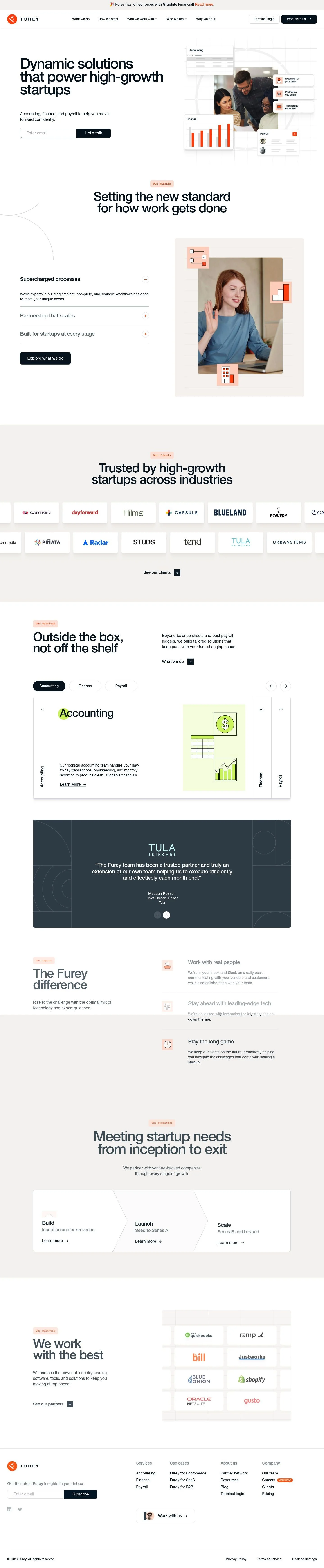
- Sitewide announcement bar: single-line notice with inline link; spans full width above the header.
- Global header: left logo, centered multi-item navigation with dropdown groups, right-aligned CTAs (text link and filled button); compact row with ample horizontal breathing room.
- Hero: two-column layout; left column carries an oversized display headline, short descriptive body, and an email capture with a fixed-height button; right column shows a collage of small UI-style cards arranged over a faint grid.
- Mission lead: centered section label in a small soft peach pill above a large headline; abundant white space.
- Services preface: two short supporting subheads, then a primary CTA link.
- Clients proof: heading followed by a grid/row of client logos and a link to view more.
- Services detail: three sequential items (Accounting, Finance, Payroll), each with numeral, heading, descriptive paragraph, and a link; presented as a vertical stack or row of cards depending on viewport.
- Testimonials: multiple long-form quotes with names, titles, and company; stacked vertically.
- Impact/Expertise: three feature points with short copy, then a stage-based trio of links (Build, Launch, Scale).
- Partners: heading and a logo rail, followed by a link to view all.
- Newsletter: single-field signup with confirmation/error states.
- Footer: multi-column link groups, a prominent "Work with us" link, legal links, and cookie controls.

## Colors

- Primary (#011624): Deep ink for headlines and core text.
- Secondary (#4f5c65): Slate utility tone for filled buttons and secondary UI elements.
- Tertiary (#ff530d): Signal orange for highlights, icons, and interactive links that require attention.
- Neutral (#ffffff): Base surface for the light mode canvas and cards.
- Border (#e5e7eb): Light dividers, input outlines, and subtle container boundaries.
- Brand-china-silk (#e2d2cb): Soft peach used for small section labels and gentle emphasis backgrounds.
- Surface ({colors.neutral}): Default background for pages and components.
- On-surface ({colors.primary}): Default text color when placed on light surfaces.

## Typography

- Helvetica Medium (headlines lg/md/sm): Proprietary/self-hosted. Use for bold-leaning display at 500 weight with tight letter-spacing. If unavailable, substitute Inter (Google), IBM Plex Sans (Google), or Source Sans 3 (Google) with equivalent sizes and tracking.
- Helvetica Regular (headline-xs, body-md): Proprietary/self-hosted. Employed for paragraphs and small headings at a comfortable 24px body with 1.5 line height. Substitutes: Inter, IBM Plex Sans, or Source Sans 3 regular weights.
- Ibmplexmono (not prominently used): Proprietary/self-hosted mono. If a code or stat style is needed, substitute IBM Plex Mono (Google), JetBrains Mono (Google), or Roboto Mono (Google).

## Layout

- Spacing scale uses 8/20/30/42/64px steps, encouraging roomy vertical rhythm and wide gutters.
- Sections alternate between single-column centered blocks and two-column text/media compositions.
- Cards and feature tiles use internal padding of 16px and sit within generous section padding (lg–xl).
- Grid choices should prefer ample negative space around headlines and between stacked sections; avoid crowding adjacent modules.

## Elevation & Depth

- Shadows are minimal; a light multi-layer sm shadow lifts small cards in the hero and testimonial elements.
- Most separation relies on borders (#e5e7eb), contrast between primary text and white surfaces, and whitespace.
- Accent backgrounds (brand-china-silk) provide soft emphasis without heavy elevation.

## Shapes

- Two radii signal hierarchy: sm 8px for cards and small tiles, and md 10.7px for interactive controls such as buttons and inputs.
- Radii are square-leaning, keeping the tone professional; avoid fully rounded or pill shapes unless dictated by content tags.

## Components

- Buttons
  - Primary: 64px tall, background #485765, text #ffffff, radius 10.7px, padding 21px 32px.
  - Secondary: Same construction as primary; use placement and copy to differentiate intent.
  - Link button: Text-only using #ff530d, radius 0px.
- Card: White background, text #011624, radius 8px, 16px padding; may use sm shadow.

### Announcement Bar
- Full-width strip above navigation with concise copy and a single inline link. Background remains white; rely on text contrast and emoji/inline icon for visibility.

### Global Navigation
- Single row with left logo, center nav groups, and right utilities. Include a text link and one filled 64px button. Keep link color #011624, active/CTA as filled slate.

### Hero Email Capture
- Left-aligned form below the headline: a single email input beside a 64px button. Input may use border #e5e7eb and radius 10.7px; maintain 20–30px gap between field and button.

### Feature Collage
- Right of the hero: a cluster of 8px-radius white cards (Accounting, Finance chart, Payroll tile) offset over a faint grid. Apply sm shadow to each tile and subtle spacing (sm–md) between them.

### Mission Heading with Pill Label
- Small tag using brand-china-silk as background above a center-aligned headline-md. Maintain xl spacing above and lg below.

### Services Triptych
- Three items (Accounting, Finance, Payroll). Each includes a numeral, short heading, paragraph, and a link-style CTA in #ff530d. Use card padding 16px and 8px radius when carded.

### Testimonials Stack
- Quote text set in body-md with ample line length, followed by name, title, and company. Optionally wrap each quote in a white card with sm shadow and border separators.

### Partners Logo Rail
- A horizontal logo strip under a heading and link. Maintain border separators or generous spacing to avoid crowding.

### Cookie Banner
- Bottom-anchored compact bar with copy and two actions. Buttons use 10.7px radius; default to slate fill and a neutral text link variant.

## Do's and Don'ts

- Do reserve #ff530d for links, icons, and small highlights to keep it special.
- Do use 85/62/45/33px headline steps exactly; avoid intermediate sizes that dilute hierarchy.
- Do apply 10.7px radius to buttons and inputs; use 8px for cards and tiles.
- Don't introduce heavy shadows; prefer borders (#e5e7eb) and whitespace for separation.
- Don't style secondary CTAs as outlines with new colors; stay within slate fill or link-only.
- Don't crowd the hero collage; maintain clear gaps so each mini-card reads independently.

## Agent Prompt Guide

Quick color reference — Text: #011624; Background: #ffffff; Border: #e5e7eb; Accent: #ff530d; Utility button fill: #4f5c65; Peach label: #e2d2cb.

1) Build the hero
- Two columns: left 55%, right 45% on desktop.
- Left: headline using Helvetica Medium 85px, -0.04em letter-spacing, line-height 1.2, color #011624; supporting body in Helvetica Regular 24px/1.5.
- Email form: input with 10.7px radius, 1px border #e5e7eb; button 64px tall, background #4f5c65, text #ffffff, radius 10.7px, padding 21px 32px.
- Right: place three 8px-radius white cards with sm shadow over a light grid; 20–30px gaps.

2) Mission lead with pill label
- Centered block with a small pill above the headline: background #e2d2cb, text #011624, 8px radius, 8–20px horizontal padding.
- Headline uses Helvetica Medium 62px, -0.036em tracking; xl (64px) spacing above and lg (42px) below.

3) Services triptych
- Row of three cards (stack on mobile). Each card: background #ffffff, border 1px #e5e7eb, radius 8px, padding 16px.
- Headline Helvetica Medium 45px; body Helvetica Regular 24px/1.5; "Learn more" as a link in #ff530d with no underline.

4) Testimonials stack
- Each quote in a white card with sm shadow, 8px radius, 30px internal padding.
- Quote body in Helvetica Regular 24px/1.5; author line in #4f5c65; maintain 42px gaps between items.

## Similar Brands

- Pilot: Similar restrained palette and large sans headlines; Pilot leans more towards blue accents and denser, product-forward sections.
- Bench: Friendly bookkeeping brand with big type; Bench uses brighter greens and more illustration, where Furey stays corporate and monochrome.
- Kruze Consulting: Comparable services narrative and logo walls; Kruze uses more photographic texture and tighter grids.
- Graphite Financial: Parallel professional tone and typography; Graphite pushes bolder accent blocks, while Furey favors white space and soft labels.

## Tokens

### CSS custom properties

```css
:root {
  /* Colors */
  --color-primary: #011624;
  --color-secondary: #4f5c65;
  --color-tertiary: #ff530d;
  --color-neutral: #ffffff;
  --color-border: #e5e7eb;
  --color-brand-china-silk: #e2d2cb;
  --color-surface: var(--color-neutral);
  --color-on-surface: var(--color-primary);

  /* Typography */
  --text-headline-lg-size: 85px;
  --text-headline-lg-weight: 500;
  --text-headline-lg-leading: 1.2;
  --text-headline-lg-tracking: -0.04em;
  --text-headline-md-size: 62px;
  --text-headline-md-weight: 500;
  --text-headline-md-leading: 1.08;
  --text-headline-md-tracking: -0.036em;
  --text-headline-sm-size: 45px;
  --text-headline-sm-weight: 500;
  --text-headline-sm-leading: 1.28;
  --text-headline-sm-tracking: -0.043em;
  --text-headline-xs-size: 33px;
  --text-headline-xs-weight: 500;
  --text-headline-xs-leading: 1.21;
  --text-body-md-size: 24px;
  --text-body-md-weight: 400;
  --text-body-md-leading: 1.5;
  --text-body-md-tracking: -0.01em;
  --font-helvetica-medium: "Helvetica Medium";
  --font-helvetica-regular: "Helvetica Regular";

  /* Rounded */
  --radius-sm: 8px;
  --radius-md: 10.7px;

  /* Spacing */
  --spacing-xs: 8px;
  --spacing-sm: 20px;
  --spacing-md: 30px;
  --spacing-lg: 42px;
  --spacing-xl: 64px;

  /* Components */
  --button-primary-background-color: #485765;
  --button-primary-text-color: var(--color-neutral);
  --button-primary-rounded: var(--radius-md);
  --button-primary-padding: 21px 32px;
  --button-primary-height: 64px;
  --button-secondary-background-color: #485765;
  --button-secondary-text-color: var(--color-neutral);
  --button-secondary-rounded: var(--radius-md);
  --button-secondary-padding: 21px 32px;
  --button-secondary-height: 64px;
  --button-link-text-color: var(--color-tertiary);
  --button-link-rounded: 0px;
  --card-background-color: var(--color-neutral);
  --card-text-color: var(--color-primary);
  --card-rounded: var(--radius-sm);
  --card-padding: 16px;
}
```

### Tailwind theme

```css
@theme {
  --color-primary: #011624;
  --color-secondary: #4f5c65;
  --color-tertiary: #ff530d;
  --color-neutral: #ffffff;
  --color-border: #e5e7eb;
  --color-brand-china-silk: #e2d2cb;
  --color-surface: #ffffff;
  --color-on-surface: #011624;
  --font-headline-lg: "Helvetica Medium";
  --font-headline-md: "Helvetica Medium";
  --font-headline-sm: "Helvetica Medium";
  --font-headline-xs: "Helvetica Regular";
  --font-body-md: "Helvetica Regular";
  --text-headline-lg: 85px;
  --text-headline-md: 62px;
  --text-headline-sm: 45px;
  --text-headline-xs: 33px;
  --text-body-md: 24px;
  --tracking-headline-lg: -0.04em;
  --tracking-headline-md: -0.036em;
  --tracking-headline-sm: -0.043em;
  --tracking-body-md: -0.01em;
  --font-weight-headline-lg: 500;
  --font-weight-headline-md: 500;
  --font-weight-headline-sm: 500;
  --font-weight-headline-xs: 500;
  --font-weight-body-md: 400;
  --radius-sm: 8px;
  --radius-md: 10.7px;
  --spacing-xs: 8px;
  --spacing-sm: 20px;
  --spacing-md: 30px;
  --spacing-lg: 42px;
  --spacing-xl: 64px;
}
```

### Design tokens (DTCG)

```json
{
    "$schema": "https://www.designtokens.org/schemas/2025.10/format.json",
    "color": {
        "$type": "color",
        "primary": {
            "$value": {
                "colorSpace": "srgb",
                "components": [
                    0.004,
                    0.086,
                    0.141
                ],
                "hex": "#011624"
            }
        },
        "secondary": {
            "$value": {
                "colorSpace": "srgb",
                "components": [
                    0.31,
                    0.361,
                    0.396
                ],
                "hex": "#4f5c65"
            }
        },
        "tertiary": {
            "$value": {
                "colorSpace": "srgb",
                "components": [
                    1,
                    0.325,
                    0.051
                ],
                "hex": "#ff530d"
            }
        },
        "neutral": {
            "$value": {
                "colorSpace": "srgb",
                "components": [
                    1,
                    1,
                    1
                ],
                "hex": "#ffffff"
            }
        },
        "border": {
            "$value": {
                "colorSpace": "srgb",
                "components": [
                    0.898,
                    0.906,
                    0.922
                ],
                "hex": "#e5e7eb"
            }
        },
        "brand-china-silk": {
            "$value": {
                "colorSpace": "srgb",
                "components": [
                    0.886,
                    0.824,
                    0.796
                ],
                "hex": "#e2d2cb"
            }
        },
        "surface": {
            "$value": {
                "colorSpace": "srgb",
                "components": [
                    1,
                    1,
                    1
                ],
                "hex": "#ffffff"
            }
        },
        "on-surface": {
            "$value": {
                "colorSpace": "srgb",
                "components": [
                    0.004,
                    0.086,
                    0.141
                ],
                "hex": "#011624"
            }
        }
    },
    "spacing": {
        "$type": "dimension",
        "xs": {
            "$value": {
                "value": 8,
                "unit": "px"
            }
        },
        "sm": {
            "$value": {
                "value": 20,
                "unit": "px"
            }
        },
        "md": {
            "$value": {
                "value": 30,
                "unit": "px"
            }
        },
        "lg": {
            "$value": {
                "value": 42,
                "unit": "px"
            }
        },
        "xl": {
            "$value": {
                "value": 64,
                "unit": "px"
            }
        }
    },
    "rounded": {
        "$type": "dimension",
        "sm": {
            "$value": {
                "value": 8,
                "unit": "px"
            }
        },
        "md": {
            "$value": {
                "value": 10.7,
                "unit": "px"
            }
        }
    },
    "typography": {
        "headline-lg": {
            "$type": "typography",
            "$value": {
                "fontFamily": "Helvetica Medium",
                "fontSize": {
                    "value": 85,
                    "unit": "px"
                },
                "fontWeight": 500,
                "letterSpacing": {
                    "value": -0.04,
                    "unit": "em"
                }
            }
        },
        "headline-md": {
            "$type": "typography",
            "$value": {
                "fontFamily": "Helvetica Medium",
                "fontSize": {
                    "value": 62,
                    "unit": "px"
                },
                "fontWeight": 500,
                "letterSpacing": {
                    "value": -0.036,
                    "unit": "em"
                }
            }
        },
        "headline-sm": {
            "$type": "typography",
            "$value": {
                "fontFamily": "Helvetica Medium",
                "fontSize": {
                    "value": 45,
                    "unit": "px"
                },
                "fontWeight": 500,
                "letterSpacing": {
                    "value": -0.043,
                    "unit": "em"
                }
            }
        },
        "headline-xs": {
            "$type": "typography",
            "$value": {
                "fontFamily": "Helvetica Regular",
                "fontSize": {
                    "value": 33,
                    "unit": "px"
                },
                "fontWeight": 500
            }
        },
        "body-md": {
            "$type": "typography",
            "$value": {
                "fontFamily": "Helvetica Regular",
                "fontSize": {
                    "value": 24,
                    "unit": "px"
                },
                "fontWeight": 400,
                "letterSpacing": {
                    "value": -0.01,
                    "unit": "em"
                }
            }
        }
    }
}
```

## Rules

- **Fonts.** If the specification names a custom or self-hosted family, use one of the substitutes it names. Never reference a typeface you cannot actually load — it will fall back to a system font and undo the typography.
- **Colour.** Derive the palette from the user's brand. Use the token values as a guide to *relationships* — contrast, tint, how many accents carry the page — not as hex codes to paste.
- **Never reproduce** the wordmark, mascot, logo, brand name, illustrations, icon set, screenshots or any copy from the reference.
- **Never present the result as Furey**, or imply any connection to it.
- If something is unspecified, choose clarity and legibility over decoration.
---
version: alpha
name: Furey
description: Supercharged processes for accounting, finance, and payroll that scale.
colors:
  primary: "#011624"
  secondary: "#4f5c65"
  tertiary: "#ff530d"
  neutral: "#ffffff"
  border: "#e5e7eb"
  brand-china-silk: "#e2d2cb"
  surface: "{colors.neutral}"
  on-surface: "{colors.primary}"
typography:
  headline-lg:
    fontFamily: Helvetica Medium
    fontSize: 85px
    fontWeight: 500
    lineHeight: 1.2
    letterSpacing: -0.04em
  headline-md:
    fontFamily: Helvetica Medium
    fontSize: 62px
    fontWeight: 500
    lineHeight: 1.08
    letterSpacing: -0.036em
  headline-sm:
    fontFamily: Helvetica Medium
    fontSize: 45px
    fontWeight: 500
    lineHeight: 1.28
    letterSpacing: -0.043em
  headline-xs:
    fontFamily: Helvetica Regular
    fontSize: 33px
    fontWeight: 500
    lineHeight: 1.21
  body-md:
    fontFamily: Helvetica Regular
    fontSize: 24px
    fontWeight: 400
    lineHeight: 1.5
    letterSpacing: -0.01em
rounded:
  sm: 8px
  md: 10.7px
spacing:
  xs: 8px
  sm: 20px
  md: 30px
  lg: 42px
  xl: 64px
components:
  button-primary:
    backgroundColor: "#485765"
    textColor: "{colors.neutral}"
    rounded: "{rounded.md}"
    padding: 21px 32px
    height: 64px
  button-secondary:
    backgroundColor: "#485765"
    textColor: "{colors.neutral}"
    rounded: "{rounded.md}"
    padding: 21px 32px
    height: 64px
  button-link:
    textColor: "{colors.tertiary}"
    rounded: 0px
  card:
    backgroundColor: "{colors.neutral}"
    textColor: "{colors.primary}"
    rounded: "{rounded.sm}"
    padding: 16px
---

# Furey: Oversized Helvetica Headlines with Peach Mission Pills

## Overview

Furey presents a confident, professional brand for startup finance services. The interface aims for clarity over spectacle: deep navy type on white, structured typography, and quiet accent color. Spacing is generous and measured, producing an airy but serious feel. Interactions should read dependable, with subtle motion and restrained use of the bright accent.

## Page Structure

- Sitewide announcement bar: single-line notice with inline link; spans full width above the header.
- Global header: left logo, centered multi-item navigation with dropdown groups, right-aligned CTAs (text link and filled button); compact row with ample horizontal breathing room.
- Hero: two-column layout; left column carries an oversized display headline, short descriptive body, and an email capture with a fixed-height button; right column shows a collage of small UI-style cards arranged over a faint grid.
- Mission lead: centered section label in a small soft peach pill above a large headline; abundant white space.
- Services preface: two short supporting subheads, then a primary CTA link.
- Clients proof: heading followed by a grid/row of client logos and a link to view more.
- Services detail: three sequential items (Accounting, Finance, Payroll), each with numeral, heading, descriptive paragraph, and a link; presented as a vertical stack or row of cards depending on viewport.
- Testimonials: multiple long-form quotes with names, titles, and company; stacked vertically.
- Impact/Expertise: three feature points with short copy, then a stage-based trio of links (Build, Launch, Scale).
- Partners: heading and a logo rail, followed by a link to view all.
- Newsletter: single-field signup with confirmation/error states.
- Footer: multi-column link groups, a prominent "Work with us" link, legal links, and cookie controls.

## Colors

- Primary (#011624): Deep ink for headlines and core text.
- Secondary (#4f5c65): Slate utility tone for filled buttons and secondary UI elements.
- Tertiary (#ff530d): Signal orange for highlights, icons, and interactive links that require attention.
- Neutral (#ffffff): Base surface for the light mode canvas and cards.
- Border (#e5e7eb): Light dividers, input outlines, and subtle container boundaries.
- Brand-china-silk (#e2d2cb): Soft peach used for small section labels and gentle emphasis backgrounds.
- Surface ({colors.neutral}): Default background for pages and components.
- On-surface ({colors.primary}): Default text color when placed on light surfaces.

## Typography

- Helvetica Medium (headlines lg/md/sm): Proprietary/self-hosted. Use for bold-leaning display at 500 weight with tight letter-spacing. If unavailable, substitute Inter (Google), IBM Plex Sans (Google), or Source Sans 3 (Google) with equivalent sizes and tracking.
- Helvetica Regular (headline-xs, body-md): Proprietary/self-hosted. Employed for paragraphs and small headings at a comfortable 24px body with 1.5 line height. Substitutes: Inter, IBM Plex Sans, or Source Sans 3 regular weights.
- Ibmplexmono (not prominently used): Proprietary/self-hosted mono. If a code or stat style is needed, substitute IBM Plex Mono (Google), JetBrains Mono (Google), or Roboto Mono (Google).

## Layout

- Spacing scale uses 8/20/30/42/64px steps, encouraging roomy vertical rhythm and wide gutters.
- Sections alternate between single-column centered blocks and two-column text/media compositions.
- Cards and feature tiles use internal padding of 16px and sit within generous section padding (lg–xl).
- Grid choices should prefer ample negative space around headlines and between stacked sections; avoid crowding adjacent modules.

## Elevation & Depth

- Shadows are minimal; a light multi-layer sm shadow lifts small cards in the hero and testimonial elements.
- Most separation relies on borders (#e5e7eb), contrast between primary text and white surfaces, and whitespace.
- Accent backgrounds (brand-china-silk) provide soft emphasis without heavy elevation.

## Shapes

- Two radii signal hierarchy: sm 8px for cards and small tiles, and md 10.7px for interactive controls such as buttons and inputs.
- Radii are square-leaning, keeping the tone professional; avoid fully rounded or pill shapes unless dictated by content tags.

## Components

- Buttons
  - Primary: 64px tall, background #485765, text #ffffff, radius 10.7px, padding 21px 32px.
  - Secondary: Same construction as primary; use placement and copy to differentiate intent.
  - Link button: Text-only using #ff530d, radius 0px.
- Card: White background, text #011624, radius 8px, 16px padding; may use sm shadow.

### Announcement Bar
- Full-width strip above navigation with concise copy and a single inline link. Background remains white; rely on text contrast and emoji/inline icon for visibility.

### Global Navigation
- Single row with left logo, center nav groups, and right utilities. Include a text link and one filled 64px button. Keep link color #011624, active/CTA as filled slate.

### Hero Email Capture
- Left-aligned form below the headline: a single email input beside a 64px button. Input may use border #e5e7eb and radius 10.7px; maintain 20–30px gap between field and button.

### Feature Collage
- Right of the hero: a cluster of 8px-radius white cards (Accounting, Finance chart, Payroll tile) offset over a faint grid. Apply sm shadow to each tile and subtle spacing (sm–md) between them.

### Mission Heading with Pill Label
- Small tag using brand-china-silk as background above a center-aligned headline-md. Maintain xl spacing above and lg below.

### Services Triptych
- Three items (Accounting, Finance, Payroll). Each includes a numeral, short heading, paragraph, and a link-style CTA in #ff530d. Use card padding 16px and 8px radius when carded.

### Testimonials Stack
- Quote text set in body-md with ample line length, followed by name, title, and company. Optionally wrap each quote in a white card with sm shadow and border separators.

### Partners Logo Rail
- A horizontal logo strip under a heading and link. Maintain border separators or generous spacing to avoid crowding.

### Cookie Banner
- Bottom-anchored compact bar with copy and two actions. Buttons use 10.7px radius; default to slate fill and a neutral text link variant.

## Do's and Don'ts

- Do reserve #ff530d for links, icons, and small highlights to keep it special.
- Do use 85/62/45/33px headline steps exactly; avoid intermediate sizes that dilute hierarchy.
- Do apply 10.7px radius to buttons and inputs; use 8px for cards and tiles.
- Don't introduce heavy shadows; prefer borders (#e5e7eb) and whitespace for separation.
- Don't style secondary CTAs as outlines with new colors; stay within slate fill or link-only.
- Don't crowd the hero collage; maintain clear gaps so each mini-card reads independently.

## Agent Prompt Guide

Quick color reference — Text: #011624; Background: #ffffff; Border: #e5e7eb; Accent: #ff530d; Utility button fill: #4f5c65; Peach label: #e2d2cb.

1) Build the hero
- Two columns: left 55%, right 45% on desktop.
- Left: headline using Helvetica Medium 85px, -0.04em letter-spacing, line-height 1.2, color #011624; supporting body in Helvetica Regular 24px/1.5.
- Email form: input with 10.7px radius, 1px border #e5e7eb; button 64px tall, background #4f5c65, text #ffffff, radius 10.7px, padding 21px 32px.
- Right: place three 8px-radius white cards with sm shadow over a light grid; 20–30px gaps.

2) Mission lead with pill label
- Centered block with a small pill above the headline: background #e2d2cb, text #011624, 8px radius, 8–20px horizontal padding.
- Headline uses Helvetica Medium 62px, -0.036em tracking; xl (64px) spacing above and lg (42px) below.

3) Services triptych
- Row of three cards (stack on mobile). Each card: background #ffffff, border 1px #e5e7eb, radius 8px, padding 16px.
- Headline Helvetica Medium 45px; body Helvetica Regular 24px/1.5; "Learn more" as a link in #ff530d with no underline.

4) Testimonials stack
- Each quote in a white card with sm shadow, 8px radius, 30px internal padding.
- Quote body in Helvetica Regular 24px/1.5; author line in #4f5c65; maintain 42px gaps between items.

## Similar Brands

- Pilot: Similar restrained palette and large sans headlines; Pilot leans more towards blue accents and denser, product-forward sections.
- Bench: Friendly bookkeeping brand with big type; Bench uses brighter greens and more illustration, where Furey stays corporate and monochrome.
- Kruze Consulting: Comparable services narrative and logo walls; Kruze uses more photographic texture and tighter grids.
- Graphite Financial: Parallel professional tone and typography; Graphite pushes bolder accent blocks, while Furey favors white space and soft labels.
:root {
  /* Colors */
  --color-primary: #011624;
  --color-secondary: #4f5c65;
  --color-tertiary: #ff530d;
  --color-neutral: #ffffff;
  --color-border: #e5e7eb;
  --color-brand-china-silk: #e2d2cb;
  --color-surface: var(--color-neutral);
  --color-on-surface: var(--color-primary);

  /* Typography */
  --text-headline-lg-size: 85px;
  --text-headline-lg-weight: 500;
  --text-headline-lg-leading: 1.2;
  --text-headline-lg-tracking: -0.04em;
  --text-headline-md-size: 62px;
  --text-headline-md-weight: 500;
  --text-headline-md-leading: 1.08;
  --text-headline-md-tracking: -0.036em;
  --text-headline-sm-size: 45px;
  --text-headline-sm-weight: 500;
  --text-headline-sm-leading: 1.28;
  --text-headline-sm-tracking: -0.043em;
  --text-headline-xs-size: 33px;
  --text-headline-xs-weight: 500;
  --text-headline-xs-leading: 1.21;
  --text-body-md-size: 24px;
  --text-body-md-weight: 400;
  --text-body-md-leading: 1.5;
  --text-body-md-tracking: -0.01em;
  --font-helvetica-medium: "Helvetica Medium";
  --font-helvetica-regular: "Helvetica Regular";

  /* Rounded */
  --radius-sm: 8px;
  --radius-md: 10.7px;

  /* Spacing */
  --spacing-xs: 8px;
  --spacing-sm: 20px;
  --spacing-md: 30px;
  --spacing-lg: 42px;
  --spacing-xl: 64px;

  /* Components */
  --button-primary-background-color: #485765;
  --button-primary-text-color: var(--color-neutral);
  --button-primary-rounded: var(--radius-md);
  --button-primary-padding: 21px 32px;
  --button-primary-height: 64px;
  --button-secondary-background-color: #485765;
  --button-secondary-text-color: var(--color-neutral);
  --button-secondary-rounded: var(--radius-md);
  --button-secondary-padding: 21px 32px;
  --button-secondary-height: 64px;
  --button-link-text-color: var(--color-tertiary);
  --button-link-rounded: 0px;
  --card-background-color: var(--color-neutral);
  --card-text-color: var(--color-primary);
  --card-rounded: var(--radius-sm);
  --card-padding: 16px;
}
{
  "$schema": "https://www.designtokens.org/schemas/2025.10/format.json",
  "$description": "Supercharged processes for accounting, finance, and payroll that scale.",
  "color": {
    "$type": "color",
    "primary": {
      "$value": {
        "colorSpace": "srgb",
        "components": [
          0.004,
          0.086,
          0.141
        ],
        "hex": "#011624"
      }
    },
    "secondary": {
      "$value": {
        "colorSpace": "srgb",
        "components": [
          0.31,
          0.361,
          0.396
        ],
        "hex": "#4f5c65"
      }
    },
    "tertiary": {
      "$value": {
        "colorSpace": "srgb",
        "components": [
          1,
          0.325,
          0.051
        ],
        "hex": "#ff530d"
      }
    },
    "neutral": {
      "$value": {
        "colorSpace": "srgb",
        "components": [
          1,
          1,
          1
        ],
        "hex": "#ffffff"
      }
    },
    "border": {
      "$value": {
        "colorSpace": "srgb",
        "components": [
          0.898,
          0.906,
          0.922
        ],
        "hex": "#e5e7eb"
      }
    },
    "brand-china-silk": {
      "$value": {
        "colorSpace": "srgb",
        "components": [
          0.886,
          0.824,
          0.796
        ],
        "hex": "#e2d2cb"
      }
    },
    "surface": {
      "$value": {
        "colorSpace": "srgb",
        "components": [
          1,
          1,
          1
        ],
        "hex": "#ffffff"
      }
    },
    "on-surface": {
      "$value": {
        "colorSpace": "srgb",
        "components": [
          0.004,
          0.086,
          0.141
        ],
        "hex": "#011624"
      }
    }
  },
  "spacing": {
    "$type": "dimension",
    "xs": {
      "$value": {
        "value": 8,
        "unit": "px"
      }
    },
    "sm": {
      "$value": {
        "value": 20,
        "unit": "px"
      }
    },
    "md": {
      "$value": {
        "value": 30,
        "unit": "px"
      }
    },
    "lg": {
      "$value": {
        "value": 42,
        "unit": "px"
      }
    },
    "xl": {
      "$value": {
        "value": 64,
        "unit": "px"
      }
    }
  },
  "rounded": {
    "$type": "dimension",
    "sm": {
      "$value": {
        "value": 8,
        "unit": "px"
      }
    },
    "md": {
      "$value": {
        "value": 10.7,
        "unit": "px"
      }
    }
  },
  "typography": {
    "headline-lg": {
      "$type": "typography",
      "$value": {
        "fontFamily": "Helvetica Medium",
        "fontSize": {
          "value": 85,
          "unit": "px"
        },
        "fontWeight": 500,
        "letterSpacing": {
          "value": -0.04,
          "unit": "em"
        }
      }
    },
    "headline-md": {
      "$type": "typography",
      "$value": {
        "fontFamily": "Helvetica Medium",
        "fontSize": {
          "value": 62,
          "unit": "px"
        },
        "fontWeight": 500,
        "letterSpacing": {
          "value": -0.036,
          "unit": "em"
        }
      }
    },
    "headline-sm": {
      "$type": "typography",
      "$value": {
        "fontFamily": "Helvetica Medium",
        "fontSize": {
          "value": 45,
          "unit": "px"
        },
        "fontWeight": 500,
        "letterSpacing": {
          "value": -0.043,
          "unit": "em"
        }
      }
    },
    "headline-xs": {
      "$type": "typography",
      "$value": {
        "fontFamily": "Helvetica Regular",
        "fontSize": {
          "value": 33,
          "unit": "px"
        },
        "fontWeight": 500
      }
    },
    "body-md": {
      "$type": "typography",
      "$value": {
        "fontFamily": "Helvetica Regular",
        "fontSize": {
          "value": 24,
          "unit": "px"
        },
        "fontWeight": 400,
        "letterSpacing": {
          "value": -0.01,
          "unit": "em"
        }
      }
    }
  }
}
@theme {
--color-primary: #011624;
--color-secondary: #4f5c65;
--color-tertiary: #ff530d;
--color-neutral: #ffffff;
--color-border: #e5e7eb;
--color-brand-china-silk: #e2d2cb;
--color-surface: #ffffff;
--color-on-surface: #011624;
--font-headline-lg: "Helvetica Medium";
--font-headline-md: "Helvetica Medium";
--font-headline-sm: "Helvetica Medium";
--font-headline-xs: "Helvetica Regular";
--font-body-md: "Helvetica Regular";
--text-headline-lg: 85px;
--text-headline-md: 62px;
--text-headline-sm: 45px;
--text-headline-xs: 33px;
--text-body-md: 24px;
--tracking-headline-lg: -0.04em;
--tracking-headline-md: -0.036em;
--tracking-headline-sm: -0.043em;
--tracking-body-md: -0.01em;
--font-weight-headline-lg: 500;
--font-weight-headline-md: 500;
--font-weight-headline-sm: 500;
--font-weight-headline-xs: 500;
--font-weight-body-md: 400;
--radius-sm: 8px;
--radius-md: 10.7px;
--spacing-xs: 8px;
--spacing-sm: 20px;
--spacing-md: 30px;
--spacing-lg: 42px;
--spacing-xl: 64px;
} # Design brief: the Furey design language
Below is a complete design specification measured from a real, published web page. Use it as a design language for the user's product. It is not a page to reproduce.
## Reference images
- Full page: https://cdn.designmunk.com/2026/09/30100617/fureyfs-com-featured.webp
- Above the fold: https://cdn.designmunk.com/2026/09/30100617/fureyfs-com-featured-1440x900.webp
- On DesignMunk: https://designmunk.com/furey/
Study these for hierarchy, rhythm, spacing and density. Where an image and the written spec disagree, the spec wins: the tokens were read from the page's own CSS, the images are one rendering of it.
## Before you start
Ask the user what they are building, who it is for, and what brand assets they already have — name, colours, typefaces. Wait for their answers before writing anything. Everything below is then applied to their product, not to the reference.
## Design specification
# Furey: Oversized Helvetica Headlines with Peach Mission Pills
## Overview
Furey presents a confident, professional brand for startup finance services. The interface aims for clarity over spectacle: deep navy type on white, structured typography, and quiet accent color. Spacing is generous and measured, producing an airy but serious feel. Interactions should read dependable, with subtle motion and restrained use of the bright accent.
## Page Structure
- Sitewide announcement bar: single-line notice with inline link; spans full width above the header.
- Global header: left logo, centered multi-item navigation with dropdown groups, right-aligned CTAs (text link and filled button); compact row with ample horizontal breathing room.
- Hero: two-column layout; left column carries an oversized display headline, short descriptive body, and an email capture with a fixed-height button; right column shows a collage of small UI-style cards arranged over a faint grid.
- Mission lead: centered section label in a small soft peach pill above a large headline; abundant white space.
- Services preface: two short supporting subheads, then a primary CTA link.
- Clients proof: heading followed by a grid/row of client logos and a link to view more.
- Services detail: three sequential items (Accounting, Finance, Payroll), each with numeral, heading, descriptive paragraph, and a link; presented as a vertical stack or row of cards depending on viewport.
- Testimonials: multiple long-form quotes with names, titles, and company; stacked vertically.
- Impact/Expertise: three feature points with short copy, then a stage-based trio of links (Build, Launch, Scale).
- Partners: heading and a logo rail, followed by a link to view all.
- Newsletter: single-field signup with confirmation/error states.
- Footer: multi-column link groups, a prominent "Work with us" link, legal links, and cookie controls.
## Colors
- Primary (#011624): Deep ink for headlines and core text.
- Secondary (#4f5c65): Slate utility tone for filled buttons and secondary UI elements.
- Tertiary (#ff530d): Signal orange for highlights, icons, and interactive links that require attention.
- Neutral (#ffffff): Base surface for the light mode canvas and cards.
- Border (#e5e7eb): Light dividers, input outlines, and subtle container boundaries.
- Brand-china-silk (#e2d2cb): Soft peach used for small section labels and gentle emphasis backgrounds.
- Surface ({colors.neutral}): Default background for pages and components.
- On-surface ({colors.primary}): Default text color when placed on light surfaces.
## Typography
- Helvetica Medium (headlines lg/md/sm): Proprietary/self-hosted. Use for bold-leaning display at 500 weight with tight letter-spacing. If unavailable, substitute Inter (Google), IBM Plex Sans (Google), or Source Sans 3 (Google) with equivalent sizes and tracking.
- Helvetica Regular (headline-xs, body-md): Proprietary/self-hosted. Employed for paragraphs and small headings at a comfortable 24px body with 1.5 line height. Substitutes: Inter, IBM Plex Sans, or Source Sans 3 regular weights.
- Ibmplexmono (not prominently used): Proprietary/self-hosted mono. If a code or stat style is needed, substitute IBM Plex Mono (Google), JetBrains Mono (Google), or Roboto Mono (Google).
## Layout
- Spacing scale uses 8/20/30/42/64px steps, encouraging roomy vertical rhythm and wide gutters.
- Sections alternate between single-column centered blocks and two-column text/media compositions.
- Cards and feature tiles use internal padding of 16px and sit within generous section padding (lg–xl).
- Grid choices should prefer ample negative space around headlines and between stacked sections; avoid crowding adjacent modules.
## Elevation & Depth
- Shadows are minimal; a light multi-layer sm shadow lifts small cards in the hero and testimonial elements.
- Most separation relies on borders (#e5e7eb), contrast between primary text and white surfaces, and whitespace.
- Accent backgrounds (brand-china-silk) provide soft emphasis without heavy elevation.
## Shapes
- Two radii signal hierarchy: sm 8px for cards and small tiles, and md 10.7px for interactive controls such as buttons and inputs.
- Radii are square-leaning, keeping the tone professional; avoid fully rounded or pill shapes unless dictated by content tags.
## Components
- Buttons
- Primary: 64px tall, background #485765, text #ffffff, radius 10.7px, padding 21px 32px.
- Secondary: Same construction as primary; use placement and copy to differentiate intent.
- Link button: Text-only using #ff530d, radius 0px.
- Card: White background, text #011624, radius 8px, 16px padding; may use sm shadow.
### Announcement Bar
- Full-width strip above navigation with concise copy and a single inline link. Background remains white; rely on text contrast and emoji/inline icon for visibility.
### Global Navigation
- Single row with left logo, center nav groups, and right utilities. Include a text link and one filled 64px button. Keep link color #011624, active/CTA as filled slate.
### Hero Email Capture
- Left-aligned form below the headline: a single email input beside a 64px button. Input may use border #e5e7eb and radius 10.7px; maintain 20–30px gap between field and button.
### Feature Collage
- Right of the hero: a cluster of 8px-radius white cards (Accounting, Finance chart, Payroll tile) offset over a faint grid. Apply sm shadow to each tile and subtle spacing (sm–md) between them.
### Mission Heading with Pill Label
- Small tag using brand-china-silk as background above a center-aligned headline-md. Maintain xl spacing above and lg below.
### Services Triptych
- Three items (Accounting, Finance, Payroll). Each includes a numeral, short heading, paragraph, and a link-style CTA in #ff530d. Use card padding 16px and 8px radius when carded.
### Testimonials Stack
- Quote text set in body-md with ample line length, followed by name, title, and company. Optionally wrap each quote in a white card with sm shadow and border separators.
### Partners Logo Rail
- A horizontal logo strip under a heading and link. Maintain border separators or generous spacing to avoid crowding.
### Cookie Banner
- Bottom-anchored compact bar with copy and two actions. Buttons use 10.7px radius; default to slate fill and a neutral text link variant.
## Do's and Don'ts
- Do reserve #ff530d for links, icons, and small highlights to keep it special.
- Do use 85/62/45/33px headline steps exactly; avoid intermediate sizes that dilute hierarchy.
- Do apply 10.7px radius to buttons and inputs; use 8px for cards and tiles.
- Don't introduce heavy shadows; prefer borders (#e5e7eb) and whitespace for separation.
- Don't style secondary CTAs as outlines with new colors; stay within slate fill or link-only.
- Don't crowd the hero collage; maintain clear gaps so each mini-card reads independently.
## Agent Prompt Guide
Quick color reference — Text: #011624; Background: #ffffff; Border: #e5e7eb; Accent: #ff530d; Utility button fill: #4f5c65; Peach label: #e2d2cb.
1) Build the hero
- Two columns: left 55%, right 45% on desktop.
- Left: headline using Helvetica Medium 85px, -0.04em letter-spacing, line-height 1.2, color #011624; supporting body in Helvetica Regular 24px/1.5.
- Email form: input with 10.7px radius, 1px border #e5e7eb; button 64px tall, background #4f5c65, text #ffffff, radius 10.7px, padding 21px 32px.
- Right: place three 8px-radius white cards with sm shadow over a light grid; 20–30px gaps.
2) Mission lead with pill label
- Centered block with a small pill above the headline: background #e2d2cb, text #011624, 8px radius, 8–20px horizontal padding.
- Headline uses Helvetica Medium 62px, -0.036em tracking; xl (64px) spacing above and lg (42px) below.
3) Services triptych
- Row of three cards (stack on mobile). Each card: background #ffffff, border 1px #e5e7eb, radius 8px, padding 16px.
- Headline Helvetica Medium 45px; body Helvetica Regular 24px/1.5; "Learn more" as a link in #ff530d with no underline.
4) Testimonials stack
- Each quote in a white card with sm shadow, 8px radius, 30px internal padding.
- Quote body in Helvetica Regular 24px/1.5; author line in #4f5c65; maintain 42px gaps between items.
## Tokens
### CSS custom properties
```css
:root {
/* Colors */
--color-primary: #011624;
--color-secondary: #4f5c65;
--color-tertiary: #ff530d;
--color-neutral: #ffffff;
--color-border: #e5e7eb;
--color-brand-china-silk: #e2d2cb;
--color-surface: var(--color-neutral);
--color-on-surface: var(--color-primary);
/* Typography */
--text-headline-lg-size: 85px;
--text-headline-lg-weight: 500;
--text-headline-lg-leading: 1.2;
--text-headline-lg-tracking: -0.04em;
--text-headline-md-size: 62px;
--text-headline-md-weight: 500;
--text-headline-md-leading: 1.08;
--text-headline-md-tracking: -0.036em;
--text-headline-sm-size: 45px;
--text-headline-sm-weight: 500;
--text-headline-sm-leading: 1.28;
--text-headline-sm-tracking: -0.043em;
--text-headline-xs-size: 33px;
--text-headline-xs-weight: 500;
--text-headline-xs-leading: 1.21;
--text-body-md-size: 24px;
--text-body-md-weight: 400;
--text-body-md-leading: 1.5;
--text-body-md-tracking: -0.01em;
--font-helvetica-medium: "Helvetica Medium";
--font-helvetica-regular: "Helvetica Regular";
/* Rounded */
--radius-sm: 8px;
--radius-md: 10.7px;
/* Spacing */
--spacing-xs: 8px;
--spacing-sm: 20px;
--spacing-md: 30px;
--spacing-lg: 42px;
--spacing-xl: 64px;
/* Components */
--button-primary-background-color: #485765;
--button-primary-text-color: var(--color-neutral);
--button-primary-rounded: var(--radius-md);
--button-primary-padding: 21px 32px;
--button-primary-height: 64px;
--button-secondary-background-color: #485765;
--button-secondary-text-color: var(--color-neutral);
--button-secondary-rounded: var(--radius-md);
--button-secondary-padding: 21px 32px;
--button-secondary-height: 64px;
--button-link-text-color: var(--color-tertiary);
--button-link-rounded: 0px;
--card-background-color: var(--color-neutral);
--card-text-color: var(--color-primary);
--card-rounded: var(--radius-sm);
--card-padding: 16px;
}
```
## Rules
- **Fonts.** If the specification names a custom or self-hosted family, use one of the substitutes it names. Never reference a typeface you cannot actually load — it will fall back to a system font and undo the typography.
- **Colour.** Derive the palette from the user's brand. Use the token values as a guide to *relationships* — contrast, tint, how many accents carry the page — not as hex codes to paste.
- **Never reproduce** the wordmark, mascot, logo, brand name, illustrations, icon set, screenshots or any copy from the reference.
- **Never present the result as Furey**, or imply any connection to it.
- If something is unspecified, choose clarity and legibility over decoration.