







Freshworks
freshworks.com
Turn operational complexity into coordinated action with AI-powered workflows.
freshworks.com
AI Breakdown
Design export
# Design brief: the Freshworks design language

Below is a complete design specification measured from a real, published web page. Use it as a design language for the user's product. It is not a page to reproduce.

## Reference images

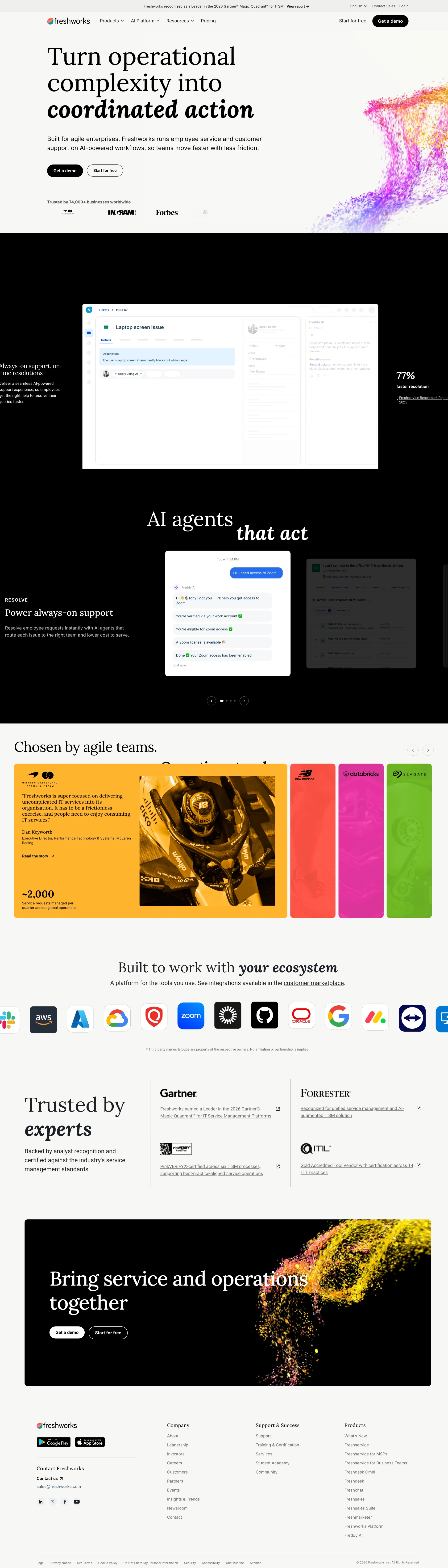
- Full page: https://cdn.designmunk.com/2026/09/14152635/freshworks-1440x5035.webp
- Above the fold: https://cdn.designmunk.com/2026/09/14152635/freshworks-1440x900.webp
- On DesignMunk: https://designmunk.com/freshworks/

Study these for hierarchy, rhythm, spacing and density. Where an image and the written spec disagree, the spec wins: the tokens were read from the page's own CSS, the images are one rendering of it.

## Before you start

Ask the user what they are building, who it is for, and what brand assets they already have — name, colours, typefaces. Wait for their answers before writing anything. Everything below is then applied to their product, not to the reference.

## Design specification

# Freshworks: Lora Headlines, Black CTAs, Color-dust Hero

## Overview

Enterprise-first, calm and confident. The interface is predominantly black text on white surfaces with selective bursts of color in illustrations and accents. Tone is serious but approachable: serif display headlines paired with utilitarian sans for speed and clarity. Spacing is generous and content-dense sections are buffered by airy bands to maintain scanability.

## Page Structure

- Notification bar: slim top strip with a single-line announcement and link; full-width, low height.
- Global header: left-aligned logo, centered product menus, right-aligned CTAs; primary black button and a secondary text link; sticky behavior.
- Hero: two-column split; oversized serif headline and short paragraph left; two pill CTAs in a row beneath; abstract color-dust illustration occupies the right column.
- Trust logos: compact row of monochrome brand marks under a small heading; low height, wide gutters.
- Platform summary: heading plus short sublines; lightweight list of capabilities presented inline.
- Feature metrics grid: a sequence of cards/rows each with a medium headline, short copy, and one highlighted metric with footnote; arranged as stacked items or a simple multi-up on wide screens.
- AI capability cluster: labeled tabs or section nav followed by a 2×2-style feature grid; each item includes bullets and a single performance stat.
- Feature carousel: "AI agents that act" slider with four slides; text block and supporting media, with slide counter/pager.
- Interaction carousel: second four-slide carousel using the same pattern.
- Customer proof: alternating or grid layout of stat-led testimonials; each item pairs a KPI, short quote, and a "Read the story" link.
- Integrations band: marketplace link with a compact logo wall and a legal disclaimer line beneath.
- Analyst recognition: dense list of external validations with inline links; no heavy graphics.
- CTA band: concise heading with dual CTAs centered or left-aligned.
- Outcomes grid: four KPIs with short supporting quotes; card layout on desktop, stacked on mobile.
- Secondary integrations + CTA: repeat of the integrations pattern for another product line followed by CTAs.
- Footer: multi-column mega-footer with company, support, products, and legal; small-print copyright at the end.

## Colors

- Primary (#000000): Core ink for all headlines, body copy, and primary iconography.
- Secondary (#6c6c6a): Muted graphite for secondary text and subdued UI labels.
- Tertiary (#ffb42d): Bright accent reserved for highlights and data points when a warm cue is needed.
- Neutral (#ffffff): Base surface for pages, cards, and containers.
- Border (#e5e7eb): Dividers, card outlines, and section separators; prefer 1px usage.
- Brand-sea-nettle (#f47933): Warm orange accent used sparingly in illustrations or data highlights.
- Brand-aquarium-diver (#0895ac): Deep teal accent for links, small UI highlights, or metric emphasis.
- Brand-death-of-a-star (#df67d2): Vivid magenta accent, primarily decorative or for emphasis in charts/illustrations.
- Surface ({colors.neutral}): Alias of Neutral; default background of cards and sections.
- On-surface ({colors.primary}): Alias of Primary; default text color on light backgrounds.

## Typography

- Lora (Google, free): Display serif for headline-lg at 96px/1.1 and headline-sm at 39px/1.21 with slight negative tracking. Use for the hero and key section leads. Suitable substitutes if unavailable: Spectral, Cormorant Garamond, Georgia.
- Inter (Google, free): Sans for headline-md at 61px/1.2 and for prominent numeric metrics. Substitutes: IBM Plex Sans, Source Sans 3, system-ui/SF Pro Text.
- Roboto (Google, free): Body and utility type at 16px/1.5 and headline-xs at 25px/1.2 for subheads and UI labels. Substitutes: Noto Sans, Open Sans, Arial.
- Role guidance: Keep one family per level—Lora for big statements, Inter for mid-tier intros and numbers, Roboto everywhere else to keep long-form and UI readable.

## Layout

- Spacing scale is asymmetric for pace: xs 10, sm 32, md 48, lg 90, xl 136. Use xl for hero paddings, lg for section paddings, md for intra-section blocks, and sm for card internals.
- Compose sections in one or two columns on desktop and collapse to a single column on mobile. Prefer wide gutters and generous white space around dense components (carousels, logo walls) to prevent crowding.
- Cards use 16px internal padding by token; stack with md (48px) gaps. Section dividers rely on border color rather than tinted backgrounds.
- Keep CTAs aligned to text columns; maintain consistent row spacing between headline, body, and buttons using sm (32px) steps.

## Elevation & Depth

- The system is largely flat. Primary separation uses 1px borders in #e5e7eb and roomy white space.
- Shadows are minimal; the only measured shadow is a subtle upward cast (sm) for floating or sticky elements. Avoid decorative depth—use tonal contrast and spacing for hierarchy.

## Shapes

- Buttons are rounded-md (24px) for a pill profile; always 48px tall for touch targets.
- Cards and media frames are rounded-sm (8px) for quiet structure.
- Use the 24px radius to signal interactivity (buttons, chips), and the 8px radius for containers and content surfaces.

## Components

- Buttons
  - Primary: 48px height, 10px × 24px padding, 24px radius, text color #ffffff on #000000 background.
  - Secondary: 48px height, 10px × 24px padding, 24px radius, white background with #000000 text; add a 1px #e5e7eb border if separation is needed.
  - Link: Text-only action in #1d2026 with no radius; use for inline or tertiary CTAs.
- Card
  - Background #ffffff, text #000000, 8px radius, 16px internal padding. Add a 1px #e5e7eb border when stacked.

### Announcement Bar
- Full-width strip above the header with one-line copy and a link. Use Roboto 16px, secondary color #6c6c6a for text, link in #0895ac. Vertical padding xs (10px), 1px bottom border.

### Global Header with CTAs
- Left logo, center navigation groups, right-aligned actions. Include a secondary "Start for free" and a primary "Get a demo" (48px, 24px radius). Background #ffffff with a bottom border #e5e7eb.

### Hero Split with Color-dust Illustration
- Two columns: left text block (Lora 96px headline, Roboto 16px paragraph, sm spacing), right decorative illustration. CTA row uses Primary and Secondary buttons side by side with sm (32px) gap.

### Trust Logos Row
- Compact band beneath the hero. Small heading in Roboto 16px and a horizontal row of monochrome logos spaced evenly; container uses top/bottom md (48px) padding and a subtle #e5e7eb divider.

### Metric Feature Card
- For "Always-on support" style items: Lora 39px heading, Roboto 16px body, a single metric set in Inter 61px. Card background #ffffff, 8px radius, 16px padding, optional left accent rule in #0895ac or #df67d2.

### Feature Carousel
- Four slides with left text and right media. Container uses white background, 1px #e5e7eb border, and md (48px) internal gaps. Include a compact pager ("Slide 1 of 4") in Roboto 16px and next/prev as link buttons.

### Testimonial Stat Card
- Grid of customer stories: KPI lockup (Inter 61px), short quote in Roboto 16px, attribution in secondary color #6c6c6a, and a button-link "Read the story." Card uses 8px radius and 16px padding; grid gap md (48px).

### Integrations Strip with Disclaimer
- Simple heading and a row/wall of partner logos. Use a compact Roboto 16px disclaimer line below. Contained within section paddings lg (90px) with 1px top border.

## Do's and Don'ts

- Do reserve Lora for major headlines; keep Inter for mid-tier headings and numeric metrics, and Roboto for body and UI text.
- Do keep CTAs at 48px height with 24px radius; place Primary first and Secondary adjacent with a sm (32px) gap.
- Do separate dense blocks with #e5e7eb borders and lg (90px) section padding instead of heavy shadows or tinted panels.
- Don't flood the layout with multiple accent colors at once; pick one accent (#0895ac, #df67d2, or #f47933) per block.
- Don't round cards to 24px—containers stay at 8px to contrast with pill buttons.
- Don't center long paragraphs or stack more than one carousel back-to-back on smaller screens; collapse to simple stacks.

## Agent Prompt Guide

Quick colors — Text: #000000; Background: #ffffff; Border: #e5e7eb; Accent: #0895ac (optional alternates: #df67d2 or #f47933).

1) Build the hero split
- Container: white background, xl (136px) top/bottom padding, 2 columns (text/media).
- Headline: Lora, 96px, weight 400, line-height 1.1, color #000000.
- Paragraph: Roboto, 16px/1.5, color #6c6c6a, max-width 60ch, md (48px) gap below headline.
- CTAs: Primary button 48px tall, 24px radius, #000000 background, #ffffff text; Secondary button 48px, 24px radius, #ffffff background, #000000 text with 1px #e5e7eb border; sm (32px) gap between.
- Right column: reserve for illustration; keep gutters md (48px).

2) Trust logos row
- Section padding md (48px) top and bottom; top border #e5e7eb.
- Heading: Roboto 16px, color #6c6c6a.
- Logo strip: row of images with equal widths and sm (32px) gaps; keep logos monochrome on white.

3) Two-by-two feature grid with metrics
- Grid: 2 columns on desktop, 1 on mobile; md (48px) gaps.
- Each card: 8px radius, 16px padding, 1px #e5e7eb border, white background.
- Heading: Lora 39px/1.21, color #000000.
- Bullet list/body: Roboto 16px/1.5, color #6c6c6a.
- Metric: Inter 61px/1.2, color #0895ac.

4) Carousel slide
- Wrapper: white background, 1px #e5e7eb border, md (48px) internal padding, two columns (text/media).
- Title: Lora 39px; body: Roboto 16px.
- Pager: Roboto 16px, color #6c6c6a; nav buttons use Link style (#1d2026 text).
- Buttons (optional): Primary/Secondary as specified; keep slide height comfortable with md (48px) vertical gaps.

## Similar Brands

- Zendesk: similarly pared-back black-on-white UI with stat-led storytelling; Zendesk leans more turquoise and rounded illustrations.
- Intercom: clean serif–sans pairing and big conversational CTAs; Intercom uses more gradients and dark sections.
- Atlassian (Jira Service Management): enterprise grid, proof-driven sections; Atlassian relies on blue accents and denser navigation.
- ServiceNow: conservative enterprise palette, testimonial-heavy mid-page; more tinted panels and fewer serif headlines.

## Tokens

### CSS custom properties

```css
:root {
  /* Colors */
  --color-primary: #000000;
  --color-secondary: #6c6c6a;
  --color-tertiary: #ffb42d;
  --color-neutral: #ffffff;
  --color-border: #e5e7eb;
  --color-brand-sea-nettle: #f47933;
  --color-brand-aquarium-diver: #0895ac;
  --color-brand-death-of-a-star: #df67d2;
  --color-surface: var(--color-neutral);
  --color-on-surface: var(--color-primary);

  /* Typography */
  --text-headline-lg-size: 96px;
  --text-headline-lg-weight: 400;
  --text-headline-lg-leading: 1.1;
  --text-headline-md-size: 61px;
  --text-headline-md-weight: 400;
  --text-headline-md-leading: 1.2;
  --text-headline-sm-size: 39px;
  --text-headline-sm-weight: 400;
  --text-headline-sm-leading: 1.21;
  --text-headline-sm-tracking: -0.012em;
  --text-headline-xs-size: 25px;
  --text-headline-xs-weight: 400;
  --text-headline-xs-leading: 1.2;
  --text-body-md-size: 16px;
  --text-body-md-weight: 400;
  --text-body-md-leading: 1.5;
  --font-lora: "Lora";
  --font-inter: "Inter";
  --font-roboto: "Roboto";

  /* Rounded */
  --radius-sm: 8px;
  --radius-md: 24px;

  /* Spacing */
  --spacing-xs: 10px;
  --spacing-sm: 32px;
  --spacing-md: 48px;
  --spacing-lg: 90px;
  --spacing-xl: 136px;

  /* Components */
  --button-primary-text-color: var(--color-neutral);
  --button-primary-rounded: var(--radius-md);
  --button-primary-padding: 10px 24px;
  --button-primary-height: 48px;
  --button-secondary-background-color: var(--color-neutral);
  --button-secondary-text-color: var(--color-primary);
  --button-secondary-rounded: var(--radius-md);
  --button-secondary-padding: 10px 24px;
  --button-secondary-height: 48px;
  --button-link-text-color: #1d2026;
  --button-link-rounded: 0px;
  --card-background-color: var(--color-neutral);
  --card-text-color: var(--color-primary);
  --card-rounded: var(--radius-sm);
  --card-padding: 16px;
}
```

### Tailwind theme

```css
@theme {
  --color-primary: #000000;
  --color-secondary: #6c6c6a;
  --color-tertiary: #ffb42d;
  --color-neutral: #ffffff;
  --color-border: #e5e7eb;
  --color-brand-sea-nettle: #f47933;
  --color-brand-aquarium-diver: #0895ac;
  --color-brand-death-of-a-star: #df67d2;
  --color-surface: #ffffff;
  --color-on-surface: #000000;
  --font-headline-lg: "Lora";
  --font-headline-md: "Inter";
  --font-headline-sm: "Lora";
  --font-headline-xs: "Roboto";
  --font-body-md: "Roboto";
  --text-headline-lg: 96px;
  --text-headline-md: 61px;
  --text-headline-sm: 39px;
  --text-headline-xs: 25px;
  --text-body-md: 16px;
  --tracking-headline-sm: -0.012em;
  --font-weight-headline-lg: 400;
  --font-weight-headline-md: 400;
  --font-weight-headline-sm: 400;
  --font-weight-headline-xs: 400;
  --font-weight-body-md: 400;
  --radius-sm: 8px;
  --radius-md: 24px;
  --spacing-xs: 10px;
  --spacing-sm: 32px;
  --spacing-md: 48px;
  --spacing-lg: 90px;
  --spacing-xl: 136px;
}
```

### Design tokens (DTCG)

```json
{
    "$schema": "https://www.designtokens.org/schemas/2025.10/format.json",
    "color": {
        "$type": "color",
        "primary": {
            "$value": {
                "colorSpace": "srgb",
                "components": [
                    0,
                    0,
                    0
                ],
                "hex": "#000000"
            }
        },
        "secondary": {
            "$value": {
                "colorSpace": "srgb",
                "components": [
                    0.424,
                    0.424,
                    0.416
                ],
                "hex": "#6c6c6a"
            }
        },
        "tertiary": {
            "$value": {
                "colorSpace": "srgb",
                "components": [
                    1,
                    0.706,
                    0.176
                ],
                "hex": "#ffb42d"
            }
        },
        "neutral": {
            "$value": {
                "colorSpace": "srgb",
                "components": [
                    1,
                    1,
                    1
                ],
                "hex": "#ffffff"
            }
        },
        "border": {
            "$value": {
                "colorSpace": "srgb",
                "components": [
                    0.898,
                    0.906,
                    0.922
                ],
                "hex": "#e5e7eb"
            }
        },
        "brand-sea-nettle": {
            "$value": {
                "colorSpace": "srgb",
                "components": [
                    0.957,
                    0.475,
                    0.2
                ],
                "hex": "#f47933"
            }
        },
        "brand-aquarium-diver": {
            "$value": {
                "colorSpace": "srgb",
                "components": [
                    0.031,
                    0.584,
                    0.675
                ],
                "hex": "#0895ac"
            }
        },
        "brand-death-of-a-star": {
            "$value": {
                "colorSpace": "srgb",
                "components": [
                    0.875,
                    0.404,
                    0.824
                ],
                "hex": "#df67d2"
            }
        },
        "surface": {
            "$value": {
                "colorSpace": "srgb",
                "components": [
                    1,
                    1,
                    1
                ],
                "hex": "#ffffff"
            }
        },
        "on-surface": {
            "$value": {
                "colorSpace": "srgb",
                "components": [
                    0,
                    0,
                    0
                ],
                "hex": "#000000"
            }
        }
    },
    "spacing": {
        "$type": "dimension",
        "xs": {
            "$value": {
                "value": 10,
                "unit": "px"
            }
        },
        "sm": {
            "$value": {
                "value": 32,
                "unit": "px"
            }
        },
        "md": {
            "$value": {
                "value": 48,
                "unit": "px"
            }
        },
        "lg": {
            "$value": {
                "value": 90,
                "unit": "px"
            }
        },
        "xl": {
            "$value": {
                "value": 136,
                "unit": "px"
            }
        }
    },
    "rounded": {
        "$type": "dimension",
        "sm": {
            "$value": {
                "value": 8,
                "unit": "px"
            }
        },
        "md": {
            "$value": {
                "value": 24,
                "unit": "px"
            }
        }
    },
    "typography": {
        "headline-lg": {
            "$type": "typography",
            "$value": {
                "fontFamily": "Lora",
                "fontSize": {
                    "value": 96,
                    "unit": "px"
                },
                "fontWeight": 400
            }
        },
        "headline-md": {
            "$type": "typography",
            "$value": {
                "fontFamily": "Inter",
                "fontSize": {
                    "value": 61,
                    "unit": "px"
                },
                "fontWeight": 400
            }
        },
        "headline-sm": {
            "$type": "typography",
            "$value": {
                "fontFamily": "Lora",
                "fontSize": {
                    "value": 39,
                    "unit": "px"
                },
                "fontWeight": 400,
                "letterSpacing": {
                    "value": -0.012,
                    "unit": "em"
                }
            }
        },
        "headline-xs": {
            "$type": "typography",
            "$value": {
                "fontFamily": "Roboto",
                "fontSize": {
                    "value": 25,
                    "unit": "px"
                },
                "fontWeight": 400
            }
        },
        "body-md": {
            "$type": "typography",
            "$value": {
                "fontFamily": "Roboto",
                "fontSize": {
                    "value": 16,
                    "unit": "px"
                },
                "fontWeight": 400
            }
        }
    }
}
```

## Rules

- **Fonts.** If the specification names a custom or self-hosted family, use one of the substitutes it names. Never reference a typeface you cannot actually load — it will fall back to a system font and undo the typography.
- **Colour.** Derive the palette from the user's brand. Use the token values as a guide to *relationships* — contrast, tint, how many accents carry the page — not as hex codes to paste.
- **Never reproduce** the wordmark, mascot, logo, brand name, illustrations, icon set, screenshots or any copy from the reference.
- **Never present the result as Freshworks**, or imply any connection to it.
- If something is unspecified, choose clarity and legibility over decoration.
---
version: alpha
name: Freshworks
description: Turn operational complexity into coordinated action with AI-powered workflows.
colors:
  primary: "#000000"
  secondary: "#6c6c6a"
  tertiary: "#ffb42d"
  neutral: "#ffffff"
  border: "#e5e7eb"
  brand-sea-nettle: "#f47933"
  brand-aquarium-diver: "#0895ac"
  brand-death-of-a-star: "#df67d2"
  surface: "{colors.neutral}"
  on-surface: "{colors.primary}"
typography:
  headline-lg:
    fontFamily: Lora
    fontSize: 96px
    fontWeight: 400
    lineHeight: 1.1
  headline-md:
    fontFamily: Inter
    fontSize: 61px
    fontWeight: 400
    lineHeight: 1.2
  headline-sm:
    fontFamily: Lora
    fontSize: 39px
    fontWeight: 400
    lineHeight: 1.21
    letterSpacing: -0.012em
  headline-xs:
    fontFamily: Roboto
    fontSize: 25px
    fontWeight: 400
    lineHeight: 1.2
  body-md:
    fontFamily: Roboto
    fontSize: 16px
    fontWeight: 400
    lineHeight: 1.5
rounded:
  sm: 8px
  md: 24px
spacing:
  xs: 10px
  sm: 32px
  md: 48px
  lg: 90px
  xl: 136px
components:
  button-primary:
    textColor: "{colors.neutral}"
    rounded: "{rounded.md}"
    padding: 10px 24px
    height: 48px
  button-secondary:
    backgroundColor: "{colors.neutral}"
    textColor: "{colors.primary}"
    rounded: "{rounded.md}"
    padding: 10px 24px
    height: 48px
  button-link:
    textColor: "#1d2026"
    rounded: 0px
  card:
    backgroundColor: "{colors.neutral}"
    textColor: "{colors.primary}"
    rounded: "{rounded.sm}"
    padding: 16px
---

# Freshworks: Lora Headlines, Black CTAs, Color-dust Hero

## Overview

Enterprise-first, calm and confident. The interface is predominantly black text on white surfaces with selective bursts of color in illustrations and accents. Tone is serious but approachable: serif display headlines paired with utilitarian sans for speed and clarity. Spacing is generous and content-dense sections are buffered by airy bands to maintain scanability.

## Page Structure

- Notification bar: slim top strip with a single-line announcement and link; full-width, low height.
- Global header: left-aligned logo, centered product menus, right-aligned CTAs; primary black button and a secondary text link; sticky behavior.
- Hero: two-column split; oversized serif headline and short paragraph left; two pill CTAs in a row beneath; abstract color-dust illustration occupies the right column.
- Trust logos: compact row of monochrome brand marks under a small heading; low height, wide gutters.
- Platform summary: heading plus short sublines; lightweight list of capabilities presented inline.
- Feature metrics grid: a sequence of cards/rows each with a medium headline, short copy, and one highlighted metric with footnote; arranged as stacked items or a simple multi-up on wide screens.
- AI capability cluster: labeled tabs or section nav followed by a 2×2-style feature grid; each item includes bullets and a single performance stat.
- Feature carousel: "AI agents that act" slider with four slides; text block and supporting media, with slide counter/pager.
- Interaction carousel: second four-slide carousel using the same pattern.
- Customer proof: alternating or grid layout of stat-led testimonials; each item pairs a KPI, short quote, and a "Read the story" link.
- Integrations band: marketplace link with a compact logo wall and a legal disclaimer line beneath.
- Analyst recognition: dense list of external validations with inline links; no heavy graphics.
- CTA band: concise heading with dual CTAs centered or left-aligned.
- Outcomes grid: four KPIs with short supporting quotes; card layout on desktop, stacked on mobile.
- Secondary integrations + CTA: repeat of the integrations pattern for another product line followed by CTAs.
- Footer: multi-column mega-footer with company, support, products, and legal; small-print copyright at the end.

## Colors

- Primary (#000000): Core ink for all headlines, body copy, and primary iconography.
- Secondary (#6c6c6a): Muted graphite for secondary text and subdued UI labels.
- Tertiary (#ffb42d): Bright accent reserved for highlights and data points when a warm cue is needed.
- Neutral (#ffffff): Base surface for pages, cards, and containers.
- Border (#e5e7eb): Dividers, card outlines, and section separators; prefer 1px usage.
- Brand-sea-nettle (#f47933): Warm orange accent used sparingly in illustrations or data highlights.
- Brand-aquarium-diver (#0895ac): Deep teal accent for links, small UI highlights, or metric emphasis.
- Brand-death-of-a-star (#df67d2): Vivid magenta accent, primarily decorative or for emphasis in charts/illustrations.
- Surface ({colors.neutral}): Alias of Neutral; default background of cards and sections.
- On-surface ({colors.primary}): Alias of Primary; default text color on light backgrounds.

## Typography

- Lora (Google, free): Display serif for headline-lg at 96px/1.1 and headline-sm at 39px/1.21 with slight negative tracking. Use for the hero and key section leads. Suitable substitutes if unavailable: Spectral, Cormorant Garamond, Georgia.
- Inter (Google, free): Sans for headline-md at 61px/1.2 and for prominent numeric metrics. Substitutes: IBM Plex Sans, Source Sans 3, system-ui/SF Pro Text.
- Roboto (Google, free): Body and utility type at 16px/1.5 and headline-xs at 25px/1.2 for subheads and UI labels. Substitutes: Noto Sans, Open Sans, Arial.
- Role guidance: Keep one family per level—Lora for big statements, Inter for mid-tier intros and numbers, Roboto everywhere else to keep long-form and UI readable.

## Layout

- Spacing scale is asymmetric for pace: xs 10, sm 32, md 48, lg 90, xl 136. Use xl for hero paddings, lg for section paddings, md for intra-section blocks, and sm for card internals.
- Compose sections in one or two columns on desktop and collapse to a single column on mobile. Prefer wide gutters and generous white space around dense components (carousels, logo walls) to prevent crowding.
- Cards use 16px internal padding by token; stack with md (48px) gaps. Section dividers rely on border color rather than tinted backgrounds.
- Keep CTAs aligned to text columns; maintain consistent row spacing between headline, body, and buttons using sm (32px) steps.

## Elevation & Depth

- The system is largely flat. Primary separation uses 1px borders in #e5e7eb and roomy white space.
- Shadows are minimal; the only measured shadow is a subtle upward cast (sm) for floating or sticky elements. Avoid decorative depth—use tonal contrast and spacing for hierarchy.

## Shapes

- Buttons are rounded-md (24px) for a pill profile; always 48px tall for touch targets.
- Cards and media frames are rounded-sm (8px) for quiet structure.
- Use the 24px radius to signal interactivity (buttons, chips), and the 8px radius for containers and content surfaces.

## Components

- Buttons
  - Primary: 48px height, 10px × 24px padding, 24px radius, text color #ffffff on #000000 background.
  - Secondary: 48px height, 10px × 24px padding, 24px radius, white background with #000000 text; add a 1px #e5e7eb border if separation is needed.
  - Link: Text-only action in #1d2026 with no radius; use for inline or tertiary CTAs.
- Card
  - Background #ffffff, text #000000, 8px radius, 16px internal padding. Add a 1px #e5e7eb border when stacked.

### Announcement Bar
- Full-width strip above the header with one-line copy and a link. Use Roboto 16px, secondary color #6c6c6a for text, link in #0895ac. Vertical padding xs (10px), 1px bottom border.

### Global Header with CTAs
- Left logo, center navigation groups, right-aligned actions. Include a secondary "Start for free" and a primary "Get a demo" (48px, 24px radius). Background #ffffff with a bottom border #e5e7eb.

### Hero Split with Color-dust Illustration
- Two columns: left text block (Lora 96px headline, Roboto 16px paragraph, sm spacing), right decorative illustration. CTA row uses Primary and Secondary buttons side by side with sm (32px) gap.

### Trust Logos Row
- Compact band beneath the hero. Small heading in Roboto 16px and a horizontal row of monochrome logos spaced evenly; container uses top/bottom md (48px) padding and a subtle #e5e7eb divider.

### Metric Feature Card
- For "Always-on support" style items: Lora 39px heading, Roboto 16px body, a single metric set in Inter 61px. Card background #ffffff, 8px radius, 16px padding, optional left accent rule in #0895ac or #df67d2.

### Feature Carousel
- Four slides with left text and right media. Container uses white background, 1px #e5e7eb border, and md (48px) internal gaps. Include a compact pager ("Slide 1 of 4") in Roboto 16px and next/prev as link buttons.

### Testimonial Stat Card
- Grid of customer stories: KPI lockup (Inter 61px), short quote in Roboto 16px, attribution in secondary color #6c6c6a, and a button-link "Read the story." Card uses 8px radius and 16px padding; grid gap md (48px).

### Integrations Strip with Disclaimer
- Simple heading and a row/wall of partner logos. Use a compact Roboto 16px disclaimer line below. Contained within section paddings lg (90px) with 1px top border.

## Do's and Don'ts

- Do reserve Lora for major headlines; keep Inter for mid-tier headings and numeric metrics, and Roboto for body and UI text.
- Do keep CTAs at 48px height with 24px radius; place Primary first and Secondary adjacent with a sm (32px) gap.
- Do separate dense blocks with #e5e7eb borders and lg (90px) section padding instead of heavy shadows or tinted panels.
- Don't flood the layout with multiple accent colors at once; pick one accent (#0895ac, #df67d2, or #f47933) per block.
- Don't round cards to 24px—containers stay at 8px to contrast with pill buttons.
- Don't center long paragraphs or stack more than one carousel back-to-back on smaller screens; collapse to simple stacks.

## Agent Prompt Guide

Quick colors — Text: #000000; Background: #ffffff; Border: #e5e7eb; Accent: #0895ac (optional alternates: #df67d2 or #f47933).

1) Build the hero split
- Container: white background, xl (136px) top/bottom padding, 2 columns (text/media).
- Headline: Lora, 96px, weight 400, line-height 1.1, color #000000.
- Paragraph: Roboto, 16px/1.5, color #6c6c6a, max-width 60ch, md (48px) gap below headline.
- CTAs: Primary button 48px tall, 24px radius, #000000 background, #ffffff text; Secondary button 48px, 24px radius, #ffffff background, #000000 text with 1px #e5e7eb border; sm (32px) gap between.
- Right column: reserve for illustration; keep gutters md (48px).

2) Trust logos row
- Section padding md (48px) top and bottom; top border #e5e7eb.
- Heading: Roboto 16px, color #6c6c6a.
- Logo strip: row of images with equal widths and sm (32px) gaps; keep logos monochrome on white.

3) Two-by-two feature grid with metrics
- Grid: 2 columns on desktop, 1 on mobile; md (48px) gaps.
- Each card: 8px radius, 16px padding, 1px #e5e7eb border, white background.
- Heading: Lora 39px/1.21, color #000000.
- Bullet list/body: Roboto 16px/1.5, color #6c6c6a.
- Metric: Inter 61px/1.2, color #0895ac.

4) Carousel slide
- Wrapper: white background, 1px #e5e7eb border, md (48px) internal padding, two columns (text/media).
- Title: Lora 39px; body: Roboto 16px.
- Pager: Roboto 16px, color #6c6c6a; nav buttons use Link style (#1d2026 text).
- Buttons (optional): Primary/Secondary as specified; keep slide height comfortable with md (48px) vertical gaps.

## Similar Brands

- Zendesk: similarly pared-back black-on-white UI with stat-led storytelling; Zendesk leans more turquoise and rounded illustrations.
- Intercom: clean serif–sans pairing and big conversational CTAs; Intercom uses more gradients and dark sections.
- Atlassian (Jira Service Management): enterprise grid, proof-driven sections; Atlassian relies on blue accents and denser navigation.
- ServiceNow: conservative enterprise palette, testimonial-heavy mid-page; more tinted panels and fewer serif headlines.
:root {
  /* Colors */
  --color-primary: #000000;
  --color-secondary: #6c6c6a;
  --color-tertiary: #ffb42d;
  --color-neutral: #ffffff;
  --color-border: #e5e7eb;
  --color-brand-sea-nettle: #f47933;
  --color-brand-aquarium-diver: #0895ac;
  --color-brand-death-of-a-star: #df67d2;
  --color-surface: var(--color-neutral);
  --color-on-surface: var(--color-primary);

  /* Typography */
  --text-headline-lg-size: 96px;
  --text-headline-lg-weight: 400;
  --text-headline-lg-leading: 1.1;
  --text-headline-md-size: 61px;
  --text-headline-md-weight: 400;
  --text-headline-md-leading: 1.2;
  --text-headline-sm-size: 39px;
  --text-headline-sm-weight: 400;
  --text-headline-sm-leading: 1.21;
  --text-headline-sm-tracking: -0.012em;
  --text-headline-xs-size: 25px;
  --text-headline-xs-weight: 400;
  --text-headline-xs-leading: 1.2;
  --text-body-md-size: 16px;
  --text-body-md-weight: 400;
  --text-body-md-leading: 1.5;
  --font-lora: "Lora";
  --font-inter: "Inter";
  --font-roboto: "Roboto";

  /* Rounded */
  --radius-sm: 8px;
  --radius-md: 24px;

  /* Spacing */
  --spacing-xs: 10px;
  --spacing-sm: 32px;
  --spacing-md: 48px;
  --spacing-lg: 90px;
  --spacing-xl: 136px;

  /* Components */
  --button-primary-text-color: var(--color-neutral);
  --button-primary-rounded: var(--radius-md);
  --button-primary-padding: 10px 24px;
  --button-primary-height: 48px;
  --button-secondary-background-color: var(--color-neutral);
  --button-secondary-text-color: var(--color-primary);
  --button-secondary-rounded: var(--radius-md);
  --button-secondary-padding: 10px 24px;
  --button-secondary-height: 48px;
  --button-link-text-color: #1d2026;
  --button-link-rounded: 0px;
  --card-background-color: var(--color-neutral);
  --card-text-color: var(--color-primary);
  --card-rounded: var(--radius-sm);
  --card-padding: 16px;
}
{
  "$schema": "https://www.designtokens.org/schemas/2025.10/format.json",
  "$description": "Turn operational complexity into coordinated action with AI-powered workflows.",
  "color": {
    "$type": "color",
    "primary": {
      "$value": {
        "colorSpace": "srgb",
        "components": [
          0,
          0,
          0
        ],
        "hex": "#000000"
      }
    },
    "secondary": {
      "$value": {
        "colorSpace": "srgb",
        "components": [
          0.424,
          0.424,
          0.416
        ],
        "hex": "#6c6c6a"
      }
    },
    "tertiary": {
      "$value": {
        "colorSpace": "srgb",
        "components": [
          1,
          0.706,
          0.176
        ],
        "hex": "#ffb42d"
      }
    },
    "neutral": {
      "$value": {
        "colorSpace": "srgb",
        "components": [
          1,
          1,
          1
        ],
        "hex": "#ffffff"
      }
    },
    "border": {
      "$value": {
        "colorSpace": "srgb",
        "components": [
          0.898,
          0.906,
          0.922
        ],
        "hex": "#e5e7eb"
      }
    },
    "brand-sea-nettle": {
      "$value": {
        "colorSpace": "srgb",
        "components": [
          0.957,
          0.475,
          0.2
        ],
        "hex": "#f47933"
      }
    },
    "brand-aquarium-diver": {
      "$value": {
        "colorSpace": "srgb",
        "components": [
          0.031,
          0.584,
          0.675
        ],
        "hex": "#0895ac"
      }
    },
    "brand-death-of-a-star": {
      "$value": {
        "colorSpace": "srgb",
        "components": [
          0.875,
          0.404,
          0.824
        ],
        "hex": "#df67d2"
      }
    },
    "surface": {
      "$value": {
        "colorSpace": "srgb",
        "components": [
          1,
          1,
          1
        ],
        "hex": "#ffffff"
      }
    },
    "on-surface": {
      "$value": {
        "colorSpace": "srgb",
        "components": [
          0,
          0,
          0
        ],
        "hex": "#000000"
      }
    }
  },
  "spacing": {
    "$type": "dimension",
    "xs": {
      "$value": {
        "value": 10,
        "unit": "px"
      }
    },
    "sm": {
      "$value": {
        "value": 32,
        "unit": "px"
      }
    },
    "md": {
      "$value": {
        "value": 48,
        "unit": "px"
      }
    },
    "lg": {
      "$value": {
        "value": 90,
        "unit": "px"
      }
    },
    "xl": {
      "$value": {
        "value": 136,
        "unit": "px"
      }
    }
  },
  "rounded": {
    "$type": "dimension",
    "sm": {
      "$value": {
        "value": 8,
        "unit": "px"
      }
    },
    "md": {
      "$value": {
        "value": 24,
        "unit": "px"
      }
    }
  },
  "typography": {
    "headline-lg": {
      "$type": "typography",
      "$value": {
        "fontFamily": "Lora",
        "fontSize": {
          "value": 96,
          "unit": "px"
        },
        "fontWeight": 400
      }
    },
    "headline-md": {
      "$type": "typography",
      "$value": {
        "fontFamily": "Inter",
        "fontSize": {
          "value": 61,
          "unit": "px"
        },
        "fontWeight": 400
      }
    },
    "headline-sm": {
      "$type": "typography",
      "$value": {
        "fontFamily": "Lora",
        "fontSize": {
          "value": 39,
          "unit": "px"
        },
        "fontWeight": 400,
        "letterSpacing": {
          "value": -0.012,
          "unit": "em"
        }
      }
    },
    "headline-xs": {
      "$type": "typography",
      "$value": {
        "fontFamily": "Roboto",
        "fontSize": {
          "value": 25,
          "unit": "px"
        },
        "fontWeight": 400
      }
    },
    "body-md": {
      "$type": "typography",
      "$value": {
        "fontFamily": "Roboto",
        "fontSize": {
          "value": 16,
          "unit": "px"
        },
        "fontWeight": 400
      }
    }
  }
}
@theme {
--color-primary: #000000;
--color-secondary: #6c6c6a;
--color-tertiary: #ffb42d;
--color-neutral: #ffffff;
--color-border: #e5e7eb;
--color-brand-sea-nettle: #f47933;
--color-brand-aquarium-diver: #0895ac;
--color-brand-death-of-a-star: #df67d2;
--color-surface: #ffffff;
--color-on-surface: #000000;
--font-headline-lg: "Lora";
--font-headline-md: "Inter";
--font-headline-sm: "Lora";
--font-headline-xs: "Roboto";
--font-body-md: "Roboto";
--text-headline-lg: 96px;
--text-headline-md: 61px;
--text-headline-sm: 39px;
--text-headline-xs: 25px;
--text-body-md: 16px;
--tracking-headline-sm: -0.012em;
--font-weight-headline-lg: 400;
--font-weight-headline-md: 400;
--font-weight-headline-sm: 400;
--font-weight-headline-xs: 400;
--font-weight-body-md: 400;
--radius-sm: 8px;
--radius-md: 24px;
--spacing-xs: 10px;
--spacing-sm: 32px;
--spacing-md: 48px;
--spacing-lg: 90px;
--spacing-xl: 136px;
} # Design brief: the Freshworks design language
Below is a complete design specification measured from a real, published web page. Use it as a design language for the user's product. It is not a page to reproduce.
## Reference images
- Full page: https://cdn.designmunk.com/2026/09/14152635/freshworks-1440x5035.webp
- Above the fold: https://cdn.designmunk.com/2026/09/14152635/freshworks-1440x900.webp
- On DesignMunk: https://designmunk.com/freshworks/
Study these for hierarchy, rhythm, spacing and density. Where an image and the written spec disagree, the spec wins: the tokens were read from the page's own CSS, the images are one rendering of it.
## Before you start
Ask the user what they are building, who it is for, and what brand assets they already have — name, colours, typefaces. Wait for their answers before writing anything. Everything below is then applied to their product, not to the reference.
## Design specification
# Freshworks: Lora Headlines, Black CTAs, Color-dust Hero
## Overview
Enterprise-first, calm and confident. The interface is predominantly black text on white surfaces with selective bursts of color in illustrations and accents. Tone is serious but approachable: serif display headlines paired with utilitarian sans for speed and clarity. Spacing is generous and content-dense sections are buffered by airy bands to maintain scanability.
## Page Structure
- Notification bar: slim top strip with a single-line announcement and link; full-width, low height.
- Global header: left-aligned logo, centered product menus, right-aligned CTAs; primary black button and a secondary text link; sticky behavior.
- Hero: two-column split; oversized serif headline and short paragraph left; two pill CTAs in a row beneath; abstract color-dust illustration occupies the right column.
- Trust logos: compact row of monochrome brand marks under a small heading; low height, wide gutters.
- Platform summary: heading plus short sublines; lightweight list of capabilities presented inline.
- Feature metrics grid: a sequence of cards/rows each with a medium headline, short copy, and one highlighted metric with footnote; arranged as stacked items or a simple multi-up on wide screens.
- AI capability cluster: labeled tabs or section nav followed by a 2×2-style feature grid; each item includes bullets and a single performance stat.
- Feature carousel: "AI agents that act" slider with four slides; text block and supporting media, with slide counter/pager.
- Interaction carousel: second four-slide carousel using the same pattern.
- Customer proof: alternating or grid layout of stat-led testimonials; each item pairs a KPI, short quote, and a "Read the story" link.
- Integrations band: marketplace link with a compact logo wall and a legal disclaimer line beneath.
- Analyst recognition: dense list of external validations with inline links; no heavy graphics.
- CTA band: concise heading with dual CTAs centered or left-aligned.
- Outcomes grid: four KPIs with short supporting quotes; card layout on desktop, stacked on mobile.
- Secondary integrations + CTA: repeat of the integrations pattern for another product line followed by CTAs.
- Footer: multi-column mega-footer with company, support, products, and legal; small-print copyright at the end.
## Colors
- Primary (#000000): Core ink for all headlines, body copy, and primary iconography.
- Secondary (#6c6c6a): Muted graphite for secondary text and subdued UI labels.
- Tertiary (#ffb42d): Bright accent reserved for highlights and data points when a warm cue is needed.
- Neutral (#ffffff): Base surface for pages, cards, and containers.
- Border (#e5e7eb): Dividers, card outlines, and section separators; prefer 1px usage.
- Brand-sea-nettle (#f47933): Warm orange accent used sparingly in illustrations or data highlights.
- Brand-aquarium-diver (#0895ac): Deep teal accent for links, small UI highlights, or metric emphasis.
- Brand-death-of-a-star (#df67d2): Vivid magenta accent, primarily decorative or for emphasis in charts/illustrations.
- Surface ({colors.neutral}): Alias of Neutral; default background of cards and sections.
- On-surface ({colors.primary}): Alias of Primary; default text color on light backgrounds.
## Typography
- Lora (Google, free): Display serif for headline-lg at 96px/1.1 and headline-sm at 39px/1.21 with slight negative tracking. Use for the hero and key section leads. Suitable substitutes if unavailable: Spectral, Cormorant Garamond, Georgia.
- Inter (Google, free): Sans for headline-md at 61px/1.2 and for prominent numeric metrics. Substitutes: IBM Plex Sans, Source Sans 3, system-ui/SF Pro Text.
- Roboto (Google, free): Body and utility type at 16px/1.5 and headline-xs at 25px/1.2 for subheads and UI labels. Substitutes: Noto Sans, Open Sans, Arial.
- Role guidance: Keep one family per level—Lora for big statements, Inter for mid-tier intros and numbers, Roboto everywhere else to keep long-form and UI readable.
## Layout
- Spacing scale is asymmetric for pace: xs 10, sm 32, md 48, lg 90, xl 136. Use xl for hero paddings, lg for section paddings, md for intra-section blocks, and sm for card internals.
- Compose sections in one or two columns on desktop and collapse to a single column on mobile. Prefer wide gutters and generous white space around dense components (carousels, logo walls) to prevent crowding.
- Cards use 16px internal padding by token; stack with md (48px) gaps. Section dividers rely on border color rather than tinted backgrounds.
- Keep CTAs aligned to text columns; maintain consistent row spacing between headline, body, and buttons using sm (32px) steps.
## Elevation & Depth
- The system is largely flat. Primary separation uses 1px borders in #e5e7eb and roomy white space.
- Shadows are minimal; the only measured shadow is a subtle upward cast (sm) for floating or sticky elements. Avoid decorative depth—use tonal contrast and spacing for hierarchy.
## Shapes
- Buttons are rounded-md (24px) for a pill profile; always 48px tall for touch targets.
- Cards and media frames are rounded-sm (8px) for quiet structure.
- Use the 24px radius to signal interactivity (buttons, chips), and the 8px radius for containers and content surfaces.
## Components
- Buttons
- Primary: 48px height, 10px × 24px padding, 24px radius, text color #ffffff on #000000 background.
- Secondary: 48px height, 10px × 24px padding, 24px radius, white background with #000000 text; add a 1px #e5e7eb border if separation is needed.
- Link: Text-only action in #1d2026 with no radius; use for inline or tertiary CTAs.
- Card
- Background #ffffff, text #000000, 8px radius, 16px internal padding. Add a 1px #e5e7eb border when stacked.
### Announcement Bar
- Full-width strip above the header with one-line copy and a link. Use Roboto 16px, secondary color #6c6c6a for text, link in #0895ac. Vertical padding xs (10px), 1px bottom border.
### Global Header with CTAs
- Left logo, center navigation groups, right-aligned actions. Include a secondary "Start for free" and a primary "Get a demo" (48px, 24px radius). Background #ffffff with a bottom border #e5e7eb.
### Hero Split with Color-dust Illustration
- Two columns: left text block (Lora 96px headline, Roboto 16px paragraph, sm spacing), right decorative illustration. CTA row uses Primary and Secondary buttons side by side with sm (32px) gap.
### Trust Logos Row
- Compact band beneath the hero. Small heading in Roboto 16px and a horizontal row of monochrome logos spaced evenly; container uses top/bottom md (48px) padding and a subtle #e5e7eb divider.
### Metric Feature Card
- For "Always-on support" style items: Lora 39px heading, Roboto 16px body, a single metric set in Inter 61px. Card background #ffffff, 8px radius, 16px padding, optional left accent rule in #0895ac or #df67d2.
### Feature Carousel
- Four slides with left text and right media. Container uses white background, 1px #e5e7eb border, and md (48px) internal gaps. Include a compact pager ("Slide 1 of 4") in Roboto 16px and next/prev as link buttons.
### Testimonial Stat Card
- Grid of customer stories: KPI lockup (Inter 61px), short quote in Roboto 16px, attribution in secondary color #6c6c6a, and a button-link "Read the story." Card uses 8px radius and 16px padding; grid gap md (48px).
### Integrations Strip with Disclaimer
- Simple heading and a row/wall of partner logos. Use a compact Roboto 16px disclaimer line below. Contained within section paddings lg (90px) with 1px top border.
## Do's and Don'ts
- Do reserve Lora for major headlines; keep Inter for mid-tier headings and numeric metrics, and Roboto for body and UI text.
- Do keep CTAs at 48px height with 24px radius; place Primary first and Secondary adjacent with a sm (32px) gap.
- Do separate dense blocks with #e5e7eb borders and lg (90px) section padding instead of heavy shadows or tinted panels.
- Don't flood the layout with multiple accent colors at once; pick one accent (#0895ac, #df67d2, or #f47933) per block.
- Don't round cards to 24px—containers stay at 8px to contrast with pill buttons.
- Don't center long paragraphs or stack more than one carousel back-to-back on smaller screens; collapse to simple stacks.
## Agent Prompt Guide
Quick colors — Text: #000000; Background: #ffffff; Border: #e5e7eb; Accent: #0895ac (optional alternates: #df67d2 or #f47933).
1) Build the hero split
- Container: white background, xl (136px) top/bottom padding, 2 columns (text/media).
- Headline: Lora, 96px, weight 400, line-height 1.1, color #000000.
- Paragraph: Roboto, 16px/1.5, color #6c6c6a, max-width 60ch, md (48px) gap below headline.
- CTAs: Primary button 48px tall, 24px radius, #000000 background, #ffffff text; Secondary button 48px, 24px radius, #ffffff background, #000000 text with 1px #e5e7eb border; sm (32px) gap between.
- Right column: reserve for illustration; keep gutters md (48px).
2) Trust logos row
- Section padding md (48px) top and bottom; top border #e5e7eb.
- Heading: Roboto 16px, color #6c6c6a.
- Logo strip: row of images with equal widths and sm (32px) gaps; keep logos monochrome on white.
3) Two-by-two feature grid with metrics
- Grid: 2 columns on desktop, 1 on mobile; md (48px) gaps.
- Each card: 8px radius, 16px padding, 1px #e5e7eb border, white background.
- Heading: Lora 39px/1.21, color #000000.
- Bullet list/body: Roboto 16px/1.5, color #6c6c6a.
- Metric: Inter 61px/1.2, color #0895ac.
4) Carousel slide
- Wrapper: white background, 1px #e5e7eb border, md (48px) internal padding, two columns (text/media).
- Title: Lora 39px; body: Roboto 16px.
- Pager: Roboto 16px, color #6c6c6a; nav buttons use Link style (#1d2026 text).
- Buttons (optional): Primary/Secondary as specified; keep slide height comfortable with md (48px) vertical gaps.
## Tokens
### CSS custom properties
```css
:root {
/* Colors */
--color-primary: #000000;
--color-secondary: #6c6c6a;
--color-tertiary: #ffb42d;
--color-neutral: #ffffff;
--color-border: #e5e7eb;
--color-brand-sea-nettle: #f47933;
--color-brand-aquarium-diver: #0895ac;
--color-brand-death-of-a-star: #df67d2;
--color-surface: var(--color-neutral);
--color-on-surface: var(--color-primary);
/* Typography */
--text-headline-lg-size: 96px;
--text-headline-lg-weight: 400;
--text-headline-lg-leading: 1.1;
--text-headline-md-size: 61px;
--text-headline-md-weight: 400;
--text-headline-md-leading: 1.2;
--text-headline-sm-size: 39px;
--text-headline-sm-weight: 400;
--text-headline-sm-leading: 1.21;
--text-headline-sm-tracking: -0.012em;
--text-headline-xs-size: 25px;
--text-headline-xs-weight: 400;
--text-headline-xs-leading: 1.2;
--text-body-md-size: 16px;
--text-body-md-weight: 400;
--text-body-md-leading: 1.5;
--font-lora: "Lora";
--font-inter: "Inter";
--font-roboto: "Roboto";
/* Rounded */
--radius-sm: 8px;
--radius-md: 24px;
/* Spacing */
--spacing-xs: 10px;
--spacing-sm: 32px;
--spacing-md: 48px;
--spacing-lg: 90px;
--spacing-xl: 136px;
/* Components */
--button-primary-text-color: var(--color-neutral);
--button-primary-rounded: var(--radius-md);
--button-primary-padding: 10px 24px;
--button-primary-height: 48px;
--button-secondary-background-color: var(--color-neutral);
--button-secondary-text-color: var(--color-primary);
--button-secondary-rounded: var(--radius-md);
--button-secondary-padding: 10px 24px;
--button-secondary-height: 48px;
--button-link-text-color: #1d2026;
--button-link-rounded: 0px;
--card-background-color: var(--color-neutral);
--card-text-color: var(--color-primary);
--card-rounded: var(--radius-sm);
--card-padding: 16px;
}
```
## Rules
- **Fonts.** If the specification names a custom or self-hosted family, use one of the substitutes it names. Never reference a typeface you cannot actually load — it will fall back to a system font and undo the typography.
- **Colour.** Derive the palette from the user's brand. Use the token values as a guide to *relationships* — contrast, tint, how many accents carry the page — not as hex codes to paste.
- **Never reproduce** the wordmark, mascot, logo, brand name, illustrations, icon set, screenshots or any copy from the reference.
- **Never present the result as Freshworks**, or imply any connection to it.
- If something is unspecified, choose clarity and legibility over decoration.



