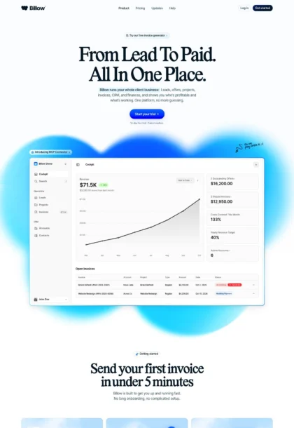
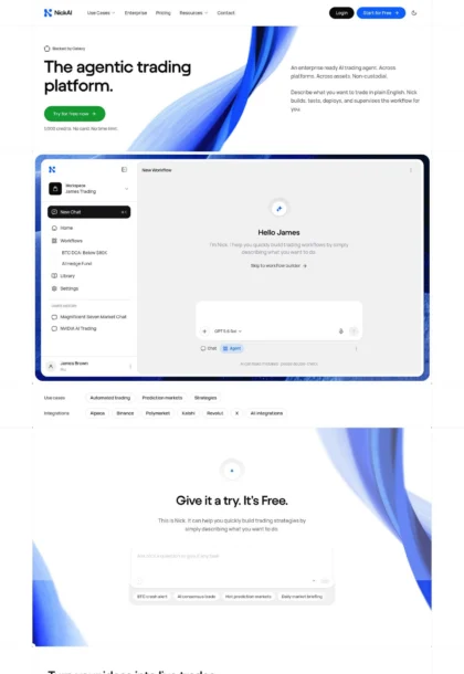
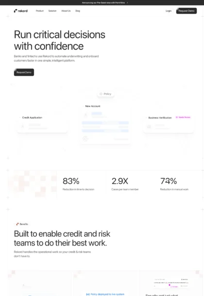
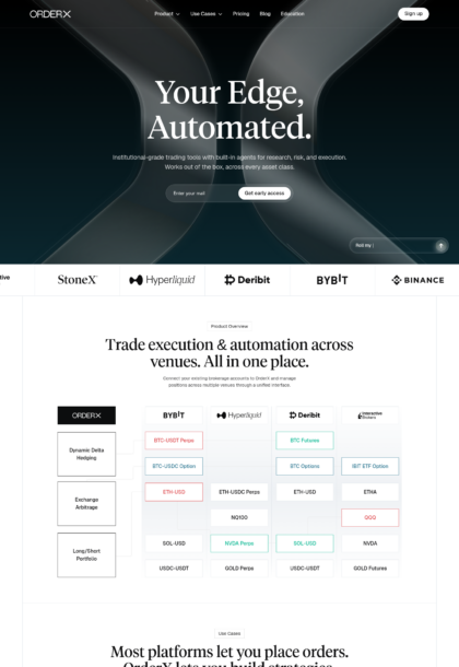
finera.com

AI Breakdown
Design export
# Design brief: the Finera design language

Below is a complete design specification measured from a real, published web page. Use it as a design language for the user's product. It is not a page to reproduce.

## Reference images

- Full page: https://cdn.designmunk.com/2026/09/04180142/finera-com-featured.webp
- Above the fold: https://cdn.designmunk.com/2026/09/04180142/finera-com-featured.webp
- On DesignMunk: https://designmunk.com/finera/

Study these for hierarchy, rhythm, spacing and density. Where an image and the written spec disagree, the spec wins: the tokens were read from the page's own CSS, the images are one rendering of it.

## Before you start

Ask the user what they are building, who it is for, and what brand assets they already have — name, colours, typefaces. Wait for their answers before writing anything. Everything below is then applied to their product, not to the reference.

## Design specification

# Finera: Elegant Serif Headlines on a Night-Glass Hero

## Overview

Finera's UI communicates premium, secure, and global. The tone is confident and minimal: dark, cinematic hero up top; bright, low-contrast content areas below. Spacing is generous and consistent, with white cards organizing complex offerings into approachable blocks. Use one strong accent and keep everything else quiet and monochrome.

## Colors

- Primary (#555555): Utility text grey for paragraphs, inputs, and default icons.
- Secondary (#84848c): Muted supportive grey for meta, captions, and disabled states.
- Tertiary (#5443e0): The accent indigo for links, active states, and subtle highlights.
- Neutral (#ffffff): Primary surface for cards and content sections.
- brand-absence-of-light (#15151d): Deep night backdrop for hero bands and dark footers.
- brand-glacier-grey (#bcbcbd): Light border and divider grey; use for hairlines and subtle outlines.
- brand-north-sea-blue (#333c4c): Cool slate for subdued text on dark or for chips; sparing use.
- surface (#ffffff): Alias of neutral; default page and card background.
- on-surface (#555555): Default text on light surfaces; pairs with surface.

## Typography

All typography uses Edgar Deiner per tokens for headlines and body. It is a custom, self-hosted face and not guaranteed for agents to load. Recommended, obtainable substitutes with similar serif character and display performance: Fraunces (Google), Playfair Display (Google), Source Serif 4 (Adobe/Google).
- Headline LG (64px/1, 700, -0.047em): Hero headlines; dramatic, tight tracking.
- Headline MD (50px/1.1, 600, -0.04em): Section kickers and marquee statements.
- Headline SM (32px/1.15, 500, -0.021em): Card titles and sub-hero headers.
- Headline XS (18px/1.22, 500): Small section labels and overlines.
- Body MD (16px/1.69, 400, -0.015em): Running copy, lists, link text. Keep color #555555 on light, #ffffff when placed on #15151d.
Use tight negative tracking on display sizes as specified; do not add extra letterspacing.

## Layout

Spacing scale is 8/16/28/54/80px (xs–xl). Build vertical rhythm with lg (54px) between major sections and md (28px) inside cards. Cards typically run in a 12-column grid, 3–4 across on desktop with 28px gutters and xs/sm internal gaps. Hero is full-width with a centered stack; content bands alternate white surface and dark stage bands.

## Elevation & Depth

Hierarchy relies on controlled shadows and tone shifts. Use sm (rgba(0,0,0,0.12) 0 0 10 0) for cards on white; md (0 8px 40px -4px, 16%) for featured tiles. The lg preset adds a warm highlight and should be reserved for hero props or promotional cards. xl is none by design. The inner inset shadow (rgb(20,23,31) 0 -90px 60px 12px inset) builds the dark hero "stage." When shadows are minimized, use borders in #bcbcbd and whitespace to separate content.

## Shapes

Corners are friendly and premium rather than cute. Cards and panels use 24px radius (rounded.sm). Buttons and chips use full pills (9999px). Avoid squared corners unless rendering a pure link or plain divider. Consistency of the 24px language across tiles, modals, and inputs is key to the brand feel.

## Components

Buttons and cards are foundational.
- Button Primary: 46px tall pill; background #14171f, text #f5f6f9, 12px×20px padding. Use on dark or light surfaces; ensure ≥16px side padding in tight layouts.
- Button Secondary: 46px tall pill; background #f5f6f9, text #13171f. Use as a calm alternative or for secondary CTAs next to the primary.
- Button Link: Text-only with #555555 and no radius; reserve for inline actions.
- Card: White (#ffffff) surface, text #353b4c, 24px radius, 28px internal padding; sm or md shadow depending on prominence.

Distinctive page components:

### Announcement Modal
A temporary, high-contrast card announcing events ("WE'RE EXHIBITING!"). Use card styling with 24px radius, md shadow, body text #555555 on #ffffff, and a primary or secondary pill action.

### Mega Navigation
Top bar with multi-column dropdowns for Products, Boosters, Company, Resources, Partners. Background #15151d, text #ffffff; hover or active accents may use #5443e0. Buttons like "Contact Us" render as white secondary pills.

### Hero Device Showcase
Centered stack: Headline LG (64px) and body on a #15151d stage with the inset shadow. Place a single primary action pill (46px height). Device or glossy 3D artwork sits below text; avoid clutter and keep vertical spacing at lg (54px).

### Payment Methods Strip
A low-contrast credibility band labeled "Connected with." Background remains dark; logos sit on subdued tones with sm shadow or none. Maintain xs–sm spacing and low-opacity treatments; no extra colors beyond greys and #5443e0 if needed for focus.

### Product Feature Cards Grid
"Built to Simplify" section uses 3–4 cards across. Each card: 24px radius, 28px padding, title at 32px Headline SM, body at 16px. Use sm shadow; lift to md on hover.

### Business Boosters List
A repeatable card pattern for Fraud & Risk, Smart Routing, etc., each with a small headline and a "Learn More" link. Keep link in #5443e0, body in #555555, and spacing md between items.

### Onboarding Steps
Numbered three-step band ("Start Accepting Payments," etc.). Use a white background, 24px cards or plain blocks with bold numerals; maintain lg spacing and sm shadow if carded.

### Insights Rail
Blog teasers: thumbnail or icon optional; titles at 18–32px per importance, meta in #84848c. Cards use 24px corners, sm shadow, and 28px padding.

### Footer Matrix
Dark footer on #15151d with multi-column links. Headings at 18px, body links in #bcbcbd or #ffffff at reduced opacity; keep generous lg spacing and no heavy shadow.

## Do's and Don'ts

- Do keep accent usage to #5443e0 for links, actives, and sparse highlights.
- Do use 24px radius on all cards and surfaced modules; reserve 9999px only for pills and chips.
- Do apply the inner inset shadow for dark hero bands; elsewhere rely on sm/md elevation and whitespace.
- Don't introduce bright gradients behind body text; on dark stages, switch text to #ffffff for legibility.
- Don't stack more than two button styles side by side; pair primary with secondary only.
- Don't add new greys; use #555555 for body, #84848c for meta, and #bcbcbd for borders.

## Agent Prompt Guide

Quick color reference:
- Text: #555555
- Background: #ffffff
- Border: #bcbcbd
- Accent: #5443e0
- Dark stage: #15151d

1) Build a centered hero with dark stage
- Section background: #15151d with inset shadow rgb(20,23,31) 0 -90px 60px 12px inset.
- H1: "The Art of Payments." font-family: "Edgar Deiner", Fraunces, serif; size 64px; weight 700; line-height 1; letter-spacing -0.047em; color #ffffff.
- Lead: font-family "Edgar Deiner" 16px/1.69; color #ffffff at 88% opacity.
- Primary CTA: pill 46px tall; bg #14171f; text #f5f6f9; padding 12px 20px; radius 9999px.

2) Create a 3-column feature card grid
- Section background: #ffffff.
- Grid: 12 columns, 28px gutters; three 1fr cards.
- Card: bg #ffffff; radius 24px; padding 28px; shadow rgba(0,0,0,0.12) 0 0 10 0.
- Card title: font "Edgar Deiner" 32px/1.15 500; letter-spacing -0.021em; color #555555.
- Body: 16px/1.69; color #555555.
- Link: color #5443e0; no underline.

3) Build the "Business Boosters" list
- Background: #ffffff.
- Each item: 24px radius card; padding 28px; border 1px solid #bcbcbd or sm shadow.
- Heading: 32px or 18px per importance, "Edgar Deiner" 500.
- Body: 16px/1.69 #555555. "Learn More" link in #5443e0.

4) Design a dark footer matrix
- Background: #15151d.
- Section title: font "Edgar Deiner" 18px/1.22 500; color #ffffff.
- Links: 16px/1.69; color #bcbcbd; hover color #ffffff.
- Spacing: lg (54px) top/bottom; columns with sm (16px) internal gaps; no shadows.

5) Assemble a 3-step onboarding band
- Background: #ffffff.
- Three cards: radius 24px; padding 28px; sm shadow; icons optional.
- Step title: 32px/1.15 500; body 16px/1.69; colors #555555.
- Maintain lg (54px) vertical spacing between band and neighbors.

## Similar Brands

- Stripe: Similar restraint and disciplined spacing; Stripe stays fully sans and more blue-forward, while Finera adds a serif headline and darker hero staging.
- Checkout.com: Shares monochrome palettes and minimal cards; Checkout leans cooler and flatter with fewer shadows.
- Adyen: Enterprise clarity with subdued accents; Adyen is greener and sans-only, Finera is more editorial with serif display.
- Rapyd: High-contrast fintech visuals; Rapyd uses heavier illustration and bolder color, Finera opts for a single indigo accent and softer depth.
- Payoneer: Card-heavy content organization; Payoneer employs brighter brand color blocks, while Finera relies on white cards and a dark hero.

## Tokens

### CSS custom properties

```css
:root {
  /* Colors */
  --color-primary: #555555;
  --color-secondary: #84848c;
  --color-tertiary: #5443e0;
  --color-neutral: #ffffff;
  --color-brand-absence-of-light: #15151d;
  --color-brand-glacier-grey: #bcbcbd;
  --color-brand-north-sea-blue: #333c4c;
  --color-surface: var(--color-neutral);
  --color-on-surface: var(--color-primary);

  /* Typography */
  --text-headline-lg-size: 64px;
  --text-headline-lg-weight: 700;
  --text-headline-lg-leading: 1;
  --text-headline-lg-tracking: -0.047em;
  --text-headline-md-size: 50px;
  --text-headline-md-weight: 600;
  --text-headline-md-leading: 1.1;
  --text-headline-md-tracking: -0.04em;
  --text-headline-sm-size: 32px;
  --text-headline-sm-weight: 500;
  --text-headline-sm-leading: 1.15;
  --text-headline-sm-tracking: -0.021em;
  --text-headline-xs-size: 18px;
  --text-headline-xs-weight: 500;
  --text-headline-xs-leading: 1.22;
  --text-body-md-size: 16px;
  --text-body-md-weight: 400;
  --text-body-md-leading: 1.69;
  --text-body-md-tracking: -0.015em;
  --font-edgar-deiner: "Edgar Deiner";

  /* Rounded */
  --radius-sm: 24px;
  --radius-full: 9999px;

  /* Spacing */
  --spacing-xs: 8px;
  --spacing-sm: 16px;
  --spacing-md: 28px;
  --spacing-lg: 54px;
  --spacing-xl: 80px;

  /* Components */
  --button-primary-background-color: #14171f;
  --button-primary-text-color: #f5f6f9;
  --button-primary-rounded: var(--radius-full);
  --button-primary-padding: 12px 20px;
  --button-primary-height: 46px;
  --button-secondary-background-color: #f5f6f9;
  --button-secondary-text-color: #13171f;
  --button-secondary-rounded: var(--radius-full);
  --button-secondary-padding: 12px 20px;
  --button-secondary-height: 46px;
  --button-link-text-color: var(--color-primary);
  --button-link-rounded: 0px;
  --card-background-color: var(--color-neutral);
  --card-text-color: #353b4c;
  --card-rounded: var(--radius-sm);
  --card-padding: 28px;
}
```

### Tailwind theme

```css
@theme {
  --color-primary: #555555;
  --color-secondary: #84848c;
  --color-tertiary: #5443e0;
  --color-neutral: #ffffff;
  --color-brand-absence-of-light: #15151d;
  --color-brand-glacier-grey: #bcbcbd;
  --color-brand-north-sea-blue: #333c4c;
  --color-surface: #ffffff;
  --color-on-surface: #555555;
  --font-headline-lg: "Edgar Deiner";
  --font-headline-md: "Edgar Deiner";
  --font-headline-sm: "Edgar Deiner";
  --font-headline-xs: "Edgar Deiner";
  --font-body-md: "Edgar Deiner";
  --text-headline-lg: 64px;
  --text-headline-md: 50px;
  --text-headline-sm: 32px;
  --text-headline-xs: 18px;
  --text-body-md: 16px;
  --tracking-headline-lg: -0.047em;
  --tracking-headline-md: -0.04em;
  --tracking-headline-sm: -0.021em;
  --tracking-body-md: -0.015em;
  --font-weight-headline-lg: 700;
  --font-weight-headline-md: 600;
  --font-weight-headline-sm: 500;
  --font-weight-headline-xs: 500;
  --font-weight-body-md: 400;
  --radius-sm: 24px;
  --radius-full: 9999px;
  --spacing-xs: 8px;
  --spacing-sm: 16px;
  --spacing-md: 28px;
  --spacing-lg: 54px;
  --spacing-xl: 80px;
}
```

### Design tokens (DTCG)

```json
{
    "$schema": "https://www.designtokens.org/schemas/2025.10/format.json",
    "color": {
        "$type": "color",
        "primary": {
            "$value": {
                "colorSpace": "srgb",
                "components": [
                    0.333,
                    0.333,
                    0.333
                ],
                "hex": "#555555"
            }
        },
        "secondary": {
            "$value": {
                "colorSpace": "srgb",
                "components": [
                    0.518,
                    0.518,
                    0.549
                ],
                "hex": "#84848c"
            }
        },
        "tertiary": {
            "$value": {
                "colorSpace": "srgb",
                "components": [
                    0.329,
                    0.263,
                    0.878
                ],
                "hex": "#5443e0"
            }
        },
        "neutral": {
            "$value": {
                "colorSpace": "srgb",
                "components": [
                    1,
                    1,
                    1
                ],
                "hex": "#ffffff"
            }
        },
        "brand-absence-of-light": {
            "$value": {
                "colorSpace": "srgb",
                "components": [
                    0.082,
                    0.082,
                    0.114
                ],
                "hex": "#15151d"
            }
        },
        "brand-glacier-grey": {
            "$value": {
                "colorSpace": "srgb",
                "components": [
                    0.737,
                    0.737,
                    0.741
                ],
                "hex": "#bcbcbd"
            }
        },
        "brand-north-sea-blue": {
            "$value": {
                "colorSpace": "srgb",
                "components": [
                    0.2,
                    0.235,
                    0.298
                ],
                "hex": "#333c4c"
            }
        },
        "surface": {
            "$value": {
                "colorSpace": "srgb",
                "components": [
                    1,
                    1,
                    1
                ],
                "hex": "#ffffff"
            }
        },
        "on-surface": {
            "$value": {
                "colorSpace": "srgb",
                "components": [
                    0.333,
                    0.333,
                    0.333
                ],
                "hex": "#555555"
            }
        }
    },
    "spacing": {
        "$type": "dimension",
        "xs": {
            "$value": {
                "value": 8,
                "unit": "px"
            }
        },
        "sm": {
            "$value": {
                "value": 16,
                "unit": "px"
            }
        },
        "md": {
            "$value": {
                "value": 28,
                "unit": "px"
            }
        },
        "lg": {
            "$value": {
                "value": 54,
                "unit": "px"
            }
        },
        "xl": {
            "$value": {
                "value": 80,
                "unit": "px"
            }
        }
    },
    "rounded": {
        "$type": "dimension",
        "sm": {
            "$value": {
                "value": 24,
                "unit": "px"
            }
        },
        "full": {
            "$value": {
                "value": 9999,
                "unit": "px"
            }
        }
    },
    "typography": {
        "headline-lg": {
            "$type": "typography",
            "$value": {
                "fontFamily": "Edgar Deiner",
                "fontSize": {
                    "value": 64,
                    "unit": "px"
                },
                "fontWeight": 700,
                "letterSpacing": {
                    "value": -0.047,
                    "unit": "em"
                }
            }
        },
        "headline-md": {
            "$type": "typography",
            "$value": {
                "fontFamily": "Edgar Deiner",
                "fontSize": {
                    "value": 50,
                    "unit": "px"
                },
                "fontWeight": 600,
                "letterSpacing": {
                    "value": -0.04,
                    "unit": "em"
                }
            }
        },
        "headline-sm": {
            "$type": "typography",
            "$value": {
                "fontFamily": "Edgar Deiner",
                "fontSize": {
                    "value": 32,
                    "unit": "px"
                },
                "fontWeight": 500,
                "letterSpacing": {
                    "value": -0.021,
                    "unit": "em"
                }
            }
        },
        "headline-xs": {
            "$type": "typography",
            "$value": {
                "fontFamily": "Edgar Deiner",
                "fontSize": {
                    "value": 18,
                    "unit": "px"
                },
                "fontWeight": 500
            }
        },
        "body-md": {
            "$type": "typography",
            "$value": {
                "fontFamily": "Edgar Deiner",
                "fontSize": {
                    "value": 16,
                    "unit": "px"
                },
                "fontWeight": 400,
                "letterSpacing": {
                    "value": -0.015,
                    "unit": "em"
                }
            }
        }
    }
}
```

## Rules

- **Fonts.** If the specification names a custom or self-hosted family, use one of the substitutes it names. Never reference a typeface you cannot actually load — it will fall back to a system font and undo the typography.
- **Colour.** Derive the palette from the user's brand. Use the token values as a guide to *relationships* — contrast, tint, how many accents carry the page — not as hex codes to paste.
- **Never reproduce** the wordmark, mascot, logo, brand name, illustrations, icon set, screenshots or any copy from the reference.
- **Never present the result as Finera**, or imply any connection to it.
- If something is unspecified, choose clarity and legibility over decoration.
---
version: alpha
name: Finera
description: The Art of Payments.
colors:
  primary: "#555555"
  secondary: "#84848c"
  tertiary: "#5443e0"
  neutral: "#ffffff"
  brand-absence-of-light: "#15151d"
  brand-glacier-grey: "#bcbcbd"
  brand-north-sea-blue: "#333c4c"
  surface: "{colors.neutral}"
  on-surface: "{colors.primary}"
typography:
  headline-lg:
    fontFamily: Edgar Deiner
    fontSize: 64px
    fontWeight: 700
    lineHeight: 1
    letterSpacing: -0.047em
  headline-md:
    fontFamily: Edgar Deiner
    fontSize: 50px
    fontWeight: 600
    lineHeight: 1.1
    letterSpacing: -0.04em
  headline-sm:
    fontFamily: Edgar Deiner
    fontSize: 32px
    fontWeight: 500
    lineHeight: 1.15
    letterSpacing: -0.021em
  headline-xs:
    fontFamily: Edgar Deiner
    fontSize: 18px
    fontWeight: 500
    lineHeight: 1.22
  body-md:
    fontFamily: Edgar Deiner
    fontSize: 16px
    fontWeight: 400
    lineHeight: 1.69
    letterSpacing: -0.015em
rounded:
  sm: 24px
  full: 9999px
spacing:
  xs: 8px
  sm: 16px
  md: 28px
  lg: 54px
  xl: 80px
components:
  button-primary:
    backgroundColor: "#14171f"
    textColor: "#f5f6f9"
    rounded: "{rounded.full}"
    padding: 12px 20px
    height: 46px
  button-secondary:
    backgroundColor: "#f5f6f9"
    textColor: "#13171f"
    rounded: "{rounded.full}"
    padding: 12px 20px
    height: 46px
  button-link:
    textColor: "{colors.primary}"
    rounded: 0px
  card:
    backgroundColor: "{colors.neutral}"
    textColor: "#353b4c"
    rounded: "{rounded.sm}"
    padding: 28px
---

# Finera: Elegant Serif Headlines on a Night-Glass Hero

## Overview

Finera's UI communicates premium, secure, and global. The tone is confident and minimal: dark, cinematic hero up top; bright, low-contrast content areas below. Spacing is generous and consistent, with white cards organizing complex offerings into approachable blocks. Use one strong accent and keep everything else quiet and monochrome.

## Colors

- Primary (#555555): Utility text grey for paragraphs, inputs, and default icons.
- Secondary (#84848c): Muted supportive grey for meta, captions, and disabled states.
- Tertiary (#5443e0): The accent indigo for links, active states, and subtle highlights.
- Neutral (#ffffff): Primary surface for cards and content sections.
- brand-absence-of-light (#15151d): Deep night backdrop for hero bands and dark footers.
- brand-glacier-grey (#bcbcbd): Light border and divider grey; use for hairlines and subtle outlines.
- brand-north-sea-blue (#333c4c): Cool slate for subdued text on dark or for chips; sparing use.
- surface (#ffffff): Alias of neutral; default page and card background.
- on-surface (#555555): Default text on light surfaces; pairs with surface.

## Typography

All typography uses Edgar Deiner per tokens for headlines and body. It is a custom, self-hosted face and not guaranteed for agents to load. Recommended, obtainable substitutes with similar serif character and display performance: Fraunces (Google), Playfair Display (Google), Source Serif 4 (Adobe/Google).
- Headline LG (64px/1, 700, -0.047em): Hero headlines; dramatic, tight tracking.
- Headline MD (50px/1.1, 600, -0.04em): Section kickers and marquee statements.
- Headline SM (32px/1.15, 500, -0.021em): Card titles and sub-hero headers.
- Headline XS (18px/1.22, 500): Small section labels and overlines.
- Body MD (16px/1.69, 400, -0.015em): Running copy, lists, link text. Keep color #555555 on light, #ffffff when placed on #15151d.
Use tight negative tracking on display sizes as specified; do not add extra letterspacing.

## Layout

Spacing scale is 8/16/28/54/80px (xs–xl). Build vertical rhythm with lg (54px) between major sections and md (28px) inside cards. Cards typically run in a 12-column grid, 3–4 across on desktop with 28px gutters and xs/sm internal gaps. Hero is full-width with a centered stack; content bands alternate white surface and dark stage bands.

## Elevation & Depth

Hierarchy relies on controlled shadows and tone shifts. Use sm (rgba(0,0,0,0.12) 0 0 10 0) for cards on white; md (0 8px 40px -4px, 16%) for featured tiles. The lg preset adds a warm highlight and should be reserved for hero props or promotional cards. xl is none by design. The inner inset shadow (rgb(20,23,31) 0 -90px 60px 12px inset) builds the dark hero "stage." When shadows are minimized, use borders in #bcbcbd and whitespace to separate content.

## Shapes

Corners are friendly and premium rather than cute. Cards and panels use 24px radius (rounded.sm). Buttons and chips use full pills (9999px). Avoid squared corners unless rendering a pure link or plain divider. Consistency of the 24px language across tiles, modals, and inputs is key to the brand feel.

## Components

Buttons and cards are foundational.
- Button Primary: 46px tall pill; background #14171f, text #f5f6f9, 12px×20px padding. Use on dark or light surfaces; ensure ≥16px side padding in tight layouts.
- Button Secondary: 46px tall pill; background #f5f6f9, text #13171f. Use as a calm alternative or for secondary CTAs next to the primary.
- Button Link: Text-only with #555555 and no radius; reserve for inline actions.
- Card: White (#ffffff) surface, text #353b4c, 24px radius, 28px internal padding; sm or md shadow depending on prominence.

Distinctive page components:

### Announcement Modal
A temporary, high-contrast card announcing events ("WE'RE EXHIBITING!"). Use card styling with 24px radius, md shadow, body text #555555 on #ffffff, and a primary or secondary pill action.

### Mega Navigation
Top bar with multi-column dropdowns for Products, Boosters, Company, Resources, Partners. Background #15151d, text #ffffff; hover or active accents may use #5443e0. Buttons like "Contact Us" render as white secondary pills.

### Hero Device Showcase
Centered stack: Headline LG (64px) and body on a #15151d stage with the inset shadow. Place a single primary action pill (46px height). Device or glossy 3D artwork sits below text; avoid clutter and keep vertical spacing at lg (54px).

### Payment Methods Strip
A low-contrast credibility band labeled "Connected with." Background remains dark; logos sit on subdued tones with sm shadow or none. Maintain xs–sm spacing and low-opacity treatments; no extra colors beyond greys and #5443e0 if needed for focus.

### Product Feature Cards Grid
"Built to Simplify" section uses 3–4 cards across. Each card: 24px radius, 28px padding, title at 32px Headline SM, body at 16px. Use sm shadow; lift to md on hover.

### Business Boosters List
A repeatable card pattern for Fraud & Risk, Smart Routing, etc., each with a small headline and a "Learn More" link. Keep link in #5443e0, body in #555555, and spacing md between items.

### Onboarding Steps
Numbered three-step band ("Start Accepting Payments," etc.). Use a white background, 24px cards or plain blocks with bold numerals; maintain lg spacing and sm shadow if carded.

### Insights Rail
Blog teasers: thumbnail or icon optional; titles at 18–32px per importance, meta in #84848c. Cards use 24px corners, sm shadow, and 28px padding.

### Footer Matrix
Dark footer on #15151d with multi-column links. Headings at 18px, body links in #bcbcbd or #ffffff at reduced opacity; keep generous lg spacing and no heavy shadow.

## Do's and Don'ts

- Do keep accent usage to #5443e0 for links, actives, and sparse highlights.
- Do use 24px radius on all cards and surfaced modules; reserve 9999px only for pills and chips.
- Do apply the inner inset shadow for dark hero bands; elsewhere rely on sm/md elevation and whitespace.
- Don't introduce bright gradients behind body text; on dark stages, switch text to #ffffff for legibility.
- Don't stack more than two button styles side by side; pair primary with secondary only.
- Don't add new greys; use #555555 for body, #84848c for meta, and #bcbcbd for borders.

## Agent Prompt Guide

Quick color reference:
- Text: #555555
- Background: #ffffff
- Border: #bcbcbd
- Accent: #5443e0
- Dark stage: #15151d

1) Build a centered hero with dark stage
- Section background: #15151d with inset shadow rgb(20,23,31) 0 -90px 60px 12px inset.
- H1: "The Art of Payments." font-family: "Edgar Deiner", Fraunces, serif; size 64px; weight 700; line-height 1; letter-spacing -0.047em; color #ffffff.
- Lead: font-family "Edgar Deiner" 16px/1.69; color #ffffff at 88% opacity.
- Primary CTA: pill 46px tall; bg #14171f; text #f5f6f9; padding 12px 20px; radius 9999px.

2) Create a 3-column feature card grid
- Section background: #ffffff.
- Grid: 12 columns, 28px gutters; three 1fr cards.
- Card: bg #ffffff; radius 24px; padding 28px; shadow rgba(0,0,0,0.12) 0 0 10 0.
- Card title: font "Edgar Deiner" 32px/1.15 500; letter-spacing -0.021em; color #555555.
- Body: 16px/1.69; color #555555.
- Link: color #5443e0; no underline.

3) Build the "Business Boosters" list
- Background: #ffffff.
- Each item: 24px radius card; padding 28px; border 1px solid #bcbcbd or sm shadow.
- Heading: 32px or 18px per importance, "Edgar Deiner" 500.
- Body: 16px/1.69 #555555. "Learn More" link in #5443e0.

4) Design a dark footer matrix
- Background: #15151d.
- Section title: font "Edgar Deiner" 18px/1.22 500; color #ffffff.
- Links: 16px/1.69; color #bcbcbd; hover color #ffffff.
- Spacing: lg (54px) top/bottom; columns with sm (16px) internal gaps; no shadows.

5) Assemble a 3-step onboarding band
- Background: #ffffff.
- Three cards: radius 24px; padding 28px; sm shadow; icons optional.
- Step title: 32px/1.15 500; body 16px/1.69; colors #555555.
- Maintain lg (54px) vertical spacing between band and neighbors.

## Similar Brands

- Stripe: Similar restraint and disciplined spacing; Stripe stays fully sans and more blue-forward, while Finera adds a serif headline and darker hero staging.
- Checkout.com: Shares monochrome palettes and minimal cards; Checkout leans cooler and flatter with fewer shadows.
- Adyen: Enterprise clarity with subdued accents; Adyen is greener and sans-only, Finera is more editorial with serif display.
- Rapyd: High-contrast fintech visuals; Rapyd uses heavier illustration and bolder color, Finera opts for a single indigo accent and softer depth.
- Payoneer: Card-heavy content organization; Payoneer employs brighter brand color blocks, while Finera relies on white cards and a dark hero.
:root {
  /* Colors */
  --color-primary: #555555;
  --color-secondary: #84848c;
  --color-tertiary: #5443e0;
  --color-neutral: #ffffff;
  --color-brand-absence-of-light: #15151d;
  --color-brand-glacier-grey: #bcbcbd;
  --color-brand-north-sea-blue: #333c4c;
  --color-surface: var(--color-neutral);
  --color-on-surface: var(--color-primary);

  /* Typography */
  --text-headline-lg-size: 64px;
  --text-headline-lg-weight: 700;
  --text-headline-lg-leading: 1;
  --text-headline-lg-tracking: -0.047em;
  --text-headline-md-size: 50px;
  --text-headline-md-weight: 600;
  --text-headline-md-leading: 1.1;
  --text-headline-md-tracking: -0.04em;
  --text-headline-sm-size: 32px;
  --text-headline-sm-weight: 500;
  --text-headline-sm-leading: 1.15;
  --text-headline-sm-tracking: -0.021em;
  --text-headline-xs-size: 18px;
  --text-headline-xs-weight: 500;
  --text-headline-xs-leading: 1.22;
  --text-body-md-size: 16px;
  --text-body-md-weight: 400;
  --text-body-md-leading: 1.69;
  --text-body-md-tracking: -0.015em;
  --font-edgar-deiner: "Edgar Deiner";

  /* Rounded */
  --radius-sm: 24px;
  --radius-full: 9999px;

  /* Spacing */
  --spacing-xs: 8px;
  --spacing-sm: 16px;
  --spacing-md: 28px;
  --spacing-lg: 54px;
  --spacing-xl: 80px;

  /* Components */
  --button-primary-background-color: #14171f;
  --button-primary-text-color: #f5f6f9;
  --button-primary-rounded: var(--radius-full);
  --button-primary-padding: 12px 20px;
  --button-primary-height: 46px;
  --button-secondary-background-color: #f5f6f9;
  --button-secondary-text-color: #13171f;
  --button-secondary-rounded: var(--radius-full);
  --button-secondary-padding: 12px 20px;
  --button-secondary-height: 46px;
  --button-link-text-color: var(--color-primary);
  --button-link-rounded: 0px;
  --card-background-color: var(--color-neutral);
  --card-text-color: #353b4c;
  --card-rounded: var(--radius-sm);
  --card-padding: 28px;
}
{
  "$schema": "https://www.designtokens.org/schemas/2025.10/format.json",
  "$description": "The Art of Payments.",
  "color": {
    "$type": "color",
    "primary": {
      "$value": {
        "colorSpace": "srgb",
        "components": [
          0.333,
          0.333,
          0.333
        ],
        "hex": "#555555"
      }
    },
    "secondary": {
      "$value": {
        "colorSpace": "srgb",
        "components": [
          0.518,
          0.518,
          0.549
        ],
        "hex": "#84848c"
      }
    },
    "tertiary": {
      "$value": {
        "colorSpace": "srgb",
        "components": [
          0.329,
          0.263,
          0.878
        ],
        "hex": "#5443e0"
      }
    },
    "neutral": {
      "$value": {
        "colorSpace": "srgb",
        "components": [
          1,
          1,
          1
        ],
        "hex": "#ffffff"
      }
    },
    "brand-absence-of-light": {
      "$value": {
        "colorSpace": "srgb",
        "components": [
          0.082,
          0.082,
          0.114
        ],
        "hex": "#15151d"
      }
    },
    "brand-glacier-grey": {
      "$value": {
        "colorSpace": "srgb",
        "components": [
          0.737,
          0.737,
          0.741
        ],
        "hex": "#bcbcbd"
      }
    },
    "brand-north-sea-blue": {
      "$value": {
        "colorSpace": "srgb",
        "components": [
          0.2,
          0.235,
          0.298
        ],
        "hex": "#333c4c"
      }
    },
    "surface": {
      "$value": {
        "colorSpace": "srgb",
        "components": [
          1,
          1,
          1
        ],
        "hex": "#ffffff"
      }
    },
    "on-surface": {
      "$value": {
        "colorSpace": "srgb",
        "components": [
          0.333,
          0.333,
          0.333
        ],
        "hex": "#555555"
      }
    }
  },
  "spacing": {
    "$type": "dimension",
    "xs": {
      "$value": {
        "value": 8,
        "unit": "px"
      }
    },
    "sm": {
      "$value": {
        "value": 16,
        "unit": "px"
      }
    },
    "md": {
      "$value": {
        "value": 28,
        "unit": "px"
      }
    },
    "lg": {
      "$value": {
        "value": 54,
        "unit": "px"
      }
    },
    "xl": {
      "$value": {
        "value": 80,
        "unit": "px"
      }
    }
  },
  "rounded": {
    "$type": "dimension",
    "sm": {
      "$value": {
        "value": 24,
        "unit": "px"
      }
    },
    "full": {
      "$value": {
        "value": 9999,
        "unit": "px"
      }
    }
  },
  "typography": {
    "headline-lg": {
      "$type": "typography",
      "$value": {
        "fontFamily": "Edgar Deiner",
        "fontSize": {
          "value": 64,
          "unit": "px"
        },
        "fontWeight": 700,
        "letterSpacing": {
          "value": -0.047,
          "unit": "em"
        }
      }
    },
    "headline-md": {
      "$type": "typography",
      "$value": {
        "fontFamily": "Edgar Deiner",
        "fontSize": {
          "value": 50,
          "unit": "px"
        },
        "fontWeight": 600,
        "letterSpacing": {
          "value": -0.04,
          "unit": "em"
        }
      }
    },
    "headline-sm": {
      "$type": "typography",
      "$value": {
        "fontFamily": "Edgar Deiner",
        "fontSize": {
          "value": 32,
          "unit": "px"
        },
        "fontWeight": 500,
        "letterSpacing": {
          "value": -0.021,
          "unit": "em"
        }
      }
    },
    "headline-xs": {
      "$type": "typography",
      "$value": {
        "fontFamily": "Edgar Deiner",
        "fontSize": {
          "value": 18,
          "unit": "px"
        },
        "fontWeight": 500
      }
    },
    "body-md": {
      "$type": "typography",
      "$value": {
        "fontFamily": "Edgar Deiner",
        "fontSize": {
          "value": 16,
          "unit": "px"
        },
        "fontWeight": 400,
        "letterSpacing": {
          "value": -0.015,
          "unit": "em"
        }
      }
    }
  }
}
@theme {
--color-primary: #555555;
--color-secondary: #84848c;
--color-tertiary: #5443e0;
--color-neutral: #ffffff;
--color-brand-absence-of-light: #15151d;
--color-brand-glacier-grey: #bcbcbd;
--color-brand-north-sea-blue: #333c4c;
--color-surface: #ffffff;
--color-on-surface: #555555;
--font-headline-lg: "Edgar Deiner";
--font-headline-md: "Edgar Deiner";
--font-headline-sm: "Edgar Deiner";
--font-headline-xs: "Edgar Deiner";
--font-body-md: "Edgar Deiner";
--text-headline-lg: 64px;
--text-headline-md: 50px;
--text-headline-sm: 32px;
--text-headline-xs: 18px;
--text-body-md: 16px;
--tracking-headline-lg: -0.047em;
--tracking-headline-md: -0.04em;
--tracking-headline-sm: -0.021em;
--tracking-body-md: -0.015em;
--font-weight-headline-lg: 700;
--font-weight-headline-md: 600;
--font-weight-headline-sm: 500;
--font-weight-headline-xs: 500;
--font-weight-body-md: 400;
--radius-sm: 24px;
--radius-full: 9999px;
--spacing-xs: 8px;
--spacing-sm: 16px;
--spacing-md: 28px;
--spacing-lg: 54px;
--spacing-xl: 80px;
} # Design brief: the Finera design language
Below is a complete design specification measured from a real, published web page. Use it as a design language for the user's product. It is not a page to reproduce.
## Reference images
- Full page: https://cdn.designmunk.com/2026/09/04180142/finera-com-featured.webp
- Above the fold: https://cdn.designmunk.com/2026/09/04180142/finera-com-featured.webp
- On DesignMunk: https://designmunk.com/finera/
Study these for hierarchy, rhythm, spacing and density. Where an image and the written spec disagree, the spec wins: the tokens were read from the page's own CSS, the images are one rendering of it.
## Before you start
Ask the user what they are building, who it is for, and what brand assets they already have — name, colours, typefaces. Wait for their answers before writing anything. Everything below is then applied to their product, not to the reference.
## Design specification
# Finera: Elegant Serif Headlines on a Night-Glass Hero
## Overview
Finera's UI communicates premium, secure, and global. The tone is confident and minimal: dark, cinematic hero up top; bright, low-contrast content areas below. Spacing is generous and consistent, with white cards organizing complex offerings into approachable blocks. Use one strong accent and keep everything else quiet and monochrome.
## Colors
- Primary (#555555): Utility text grey for paragraphs, inputs, and default icons.
- Secondary (#84848c): Muted supportive grey for meta, captions, and disabled states.
- Tertiary (#5443e0): The accent indigo for links, active states, and subtle highlights.
- Neutral (#ffffff): Primary surface for cards and content sections.
- brand-absence-of-light (#15151d): Deep night backdrop for hero bands and dark footers.
- brand-glacier-grey (#bcbcbd): Light border and divider grey; use for hairlines and subtle outlines.
- brand-north-sea-blue (#333c4c): Cool slate for subdued text on dark or for chips; sparing use.
- surface (#ffffff): Alias of neutral; default page and card background.
- on-surface (#555555): Default text on light surfaces; pairs with surface.
## Typography
All typography uses Edgar Deiner per tokens for headlines and body. It is a custom, self-hosted face and not guaranteed for agents to load. Recommended, obtainable substitutes with similar serif character and display performance: Fraunces (Google), Playfair Display (Google), Source Serif 4 (Adobe/Google).
- Headline LG (64px/1, 700, -0.047em): Hero headlines; dramatic, tight tracking.
- Headline MD (50px/1.1, 600, -0.04em): Section kickers and marquee statements.
- Headline SM (32px/1.15, 500, -0.021em): Card titles and sub-hero headers.
- Headline XS (18px/1.22, 500): Small section labels and overlines.
- Body MD (16px/1.69, 400, -0.015em): Running copy, lists, link text. Keep color #555555 on light, #ffffff when placed on #15151d.
Use tight negative tracking on display sizes as specified; do not add extra letterspacing.
## Layout
Spacing scale is 8/16/28/54/80px (xs–xl). Build vertical rhythm with lg (54px) between major sections and md (28px) inside cards. Cards typically run in a 12-column grid, 3–4 across on desktop with 28px gutters and xs/sm internal gaps. Hero is full-width with a centered stack; content bands alternate white surface and dark stage bands.
## Elevation & Depth
Hierarchy relies on controlled shadows and tone shifts. Use sm (rgba(0,0,0,0.12) 0 0 10 0) for cards on white; md (0 8px 40px -4px, 16%) for featured tiles. The lg preset adds a warm highlight and should be reserved for hero props or promotional cards. xl is none by design. The inner inset shadow (rgb(20,23,31) 0 -90px 60px 12px inset) builds the dark hero "stage." When shadows are minimized, use borders in #bcbcbd and whitespace to separate content.
## Shapes
Corners are friendly and premium rather than cute. Cards and panels use 24px radius (rounded.sm). Buttons and chips use full pills (9999px). Avoid squared corners unless rendering a pure link or plain divider. Consistency of the 24px language across tiles, modals, and inputs is key to the brand feel.
## Components
Buttons and cards are foundational.
- Button Primary: 46px tall pill; background #14171f, text #f5f6f9, 12px×20px padding. Use on dark or light surfaces; ensure ≥16px side padding in tight layouts.
- Button Secondary: 46px tall pill; background #f5f6f9, text #13171f. Use as a calm alternative or for secondary CTAs next to the primary.
- Button Link: Text-only with #555555 and no radius; reserve for inline actions.
- Card: White (#ffffff) surface, text #353b4c, 24px radius, 28px internal padding; sm or md shadow depending on prominence.
Distinctive page components:
### Announcement Modal
A temporary, high-contrast card announcing events ("WE'RE EXHIBITING!"). Use card styling with 24px radius, md shadow, body text #555555 on #ffffff, and a primary or secondary pill action.
### Mega Navigation
Top bar with multi-column dropdowns for Products, Boosters, Company, Resources, Partners. Background #15151d, text #ffffff; hover or active accents may use #5443e0. Buttons like "Contact Us" render as white secondary pills.
### Hero Device Showcase
Centered stack: Headline LG (64px) and body on a #15151d stage with the inset shadow. Place a single primary action pill (46px height). Device or glossy 3D artwork sits below text; avoid clutter and keep vertical spacing at lg (54px).
### Payment Methods Strip
A low-contrast credibility band labeled "Connected with." Background remains dark; logos sit on subdued tones with sm shadow or none. Maintain xs–sm spacing and low-opacity treatments; no extra colors beyond greys and #5443e0 if needed for focus.
### Product Feature Cards Grid
"Built to Simplify" section uses 3–4 cards across. Each card: 24px radius, 28px padding, title at 32px Headline SM, body at 16px. Use sm shadow; lift to md on hover.
### Business Boosters List
A repeatable card pattern for Fraud & Risk, Smart Routing, etc., each with a small headline and a "Learn More" link. Keep link in #5443e0, body in #555555, and spacing md between items.
### Onboarding Steps
Numbered three-step band ("Start Accepting Payments," etc.). Use a white background, 24px cards or plain blocks with bold numerals; maintain lg spacing and sm shadow if carded.
### Insights Rail
Blog teasers: thumbnail or icon optional; titles at 18–32px per importance, meta in #84848c. Cards use 24px corners, sm shadow, and 28px padding.
### Footer Matrix
Dark footer on #15151d with multi-column links. Headings at 18px, body links in #bcbcbd or #ffffff at reduced opacity; keep generous lg spacing and no heavy shadow.
## Do's and Don'ts
- Do keep accent usage to #5443e0 for links, actives, and sparse highlights.
- Do use 24px radius on all cards and surfaced modules; reserve 9999px only for pills and chips.
- Do apply the inner inset shadow for dark hero bands; elsewhere rely on sm/md elevation and whitespace.
- Don't introduce bright gradients behind body text; on dark stages, switch text to #ffffff for legibility.
- Don't stack more than two button styles side by side; pair primary with secondary only.
- Don't add new greys; use #555555 for body, #84848c for meta, and #bcbcbd for borders.
## Agent Prompt Guide
Quick color reference:
- Text: #555555
- Background: #ffffff
- Border: #bcbcbd
- Accent: #5443e0
- Dark stage: #15151d
1) Build a centered hero with dark stage
- Section background: #15151d with inset shadow rgb(20,23,31) 0 -90px 60px 12px inset.
- H1: "The Art of Payments." font-family: "Edgar Deiner", Fraunces, serif; size 64px; weight 700; line-height 1; letter-spacing -0.047em; color #ffffff.
- Lead: font-family "Edgar Deiner" 16px/1.69; color #ffffff at 88% opacity.
- Primary CTA: pill 46px tall; bg #14171f; text #f5f6f9; padding 12px 20px; radius 9999px.
2) Create a 3-column feature card grid
- Section background: #ffffff.
- Grid: 12 columns, 28px gutters; three 1fr cards.
- Card: bg #ffffff; radius 24px; padding 28px; shadow rgba(0,0,0,0.12) 0 0 10 0.
- Card title: font "Edgar Deiner" 32px/1.15 500; letter-spacing -0.021em; color #555555.
- Body: 16px/1.69; color #555555.
- Link: color #5443e0; no underline.
3) Build the "Business Boosters" list
- Background: #ffffff.
- Each item: 24px radius card; padding 28px; border 1px solid #bcbcbd or sm shadow.
- Heading: 32px or 18px per importance, "Edgar Deiner" 500.
- Body: 16px/1.69 #555555. "Learn More" link in #5443e0.
4) Design a dark footer matrix
- Background: #15151d.
- Section title: font "Edgar Deiner" 18px/1.22 500; color #ffffff.
- Links: 16px/1.69; color #bcbcbd; hover color #ffffff.
- Spacing: lg (54px) top/bottom; columns with sm (16px) internal gaps; no shadows.
5) Assemble a 3-step onboarding band
- Background: #ffffff.
- Three cards: radius 24px; padding 28px; sm shadow; icons optional.
- Step title: 32px/1.15 500; body 16px/1.69; colors #555555.
- Maintain lg (54px) vertical spacing between band and neighbors.
## Tokens
### CSS custom properties
```css
:root {
/* Colors */
--color-primary: #555555;
--color-secondary: #84848c;
--color-tertiary: #5443e0;
--color-neutral: #ffffff;
--color-brand-absence-of-light: #15151d;
--color-brand-glacier-grey: #bcbcbd;
--color-brand-north-sea-blue: #333c4c;
--color-surface: var(--color-neutral);
--color-on-surface: var(--color-primary);
/* Typography */
--text-headline-lg-size: 64px;
--text-headline-lg-weight: 700;
--text-headline-lg-leading: 1;
--text-headline-lg-tracking: -0.047em;
--text-headline-md-size: 50px;
--text-headline-md-weight: 600;
--text-headline-md-leading: 1.1;
--text-headline-md-tracking: -0.04em;
--text-headline-sm-size: 32px;
--text-headline-sm-weight: 500;
--text-headline-sm-leading: 1.15;
--text-headline-sm-tracking: -0.021em;
--text-headline-xs-size: 18px;
--text-headline-xs-weight: 500;
--text-headline-xs-leading: 1.22;
--text-body-md-size: 16px;
--text-body-md-weight: 400;
--text-body-md-leading: 1.69;
--text-body-md-tracking: -0.015em;
--font-edgar-deiner: "Edgar Deiner";
/* Rounded */
--radius-sm: 24px;
--radius-full: 9999px;
/* Spacing */
--spacing-xs: 8px;
--spacing-sm: 16px;
--spacing-md: 28px;
--spacing-lg: 54px;
--spacing-xl: 80px;
/* Components */
--button-primary-background-color: #14171f;
--button-primary-text-color: #f5f6f9;
--button-primary-rounded: var(--radius-full);
--button-primary-padding: 12px 20px;
--button-primary-height: 46px;
--button-secondary-background-color: #f5f6f9;
--button-secondary-text-color: #13171f;
--button-secondary-rounded: var(--radius-full);
--button-secondary-padding: 12px 20px;
--button-secondary-height: 46px;
--button-link-text-color: var(--color-primary);
--button-link-rounded: 0px;
--card-background-color: var(--color-neutral);
--card-text-color: #353b4c;
--card-rounded: var(--radius-sm);
--card-padding: 28px;
}
```
## Rules
- **Fonts.** If the specification names a custom or self-hosted family, use one of the substitutes it names. Never reference a typeface you cannot actually load — it will fall back to a system font and undo the typography.
- **Colour.** Derive the palette from the user's brand. Use the token values as a guide to *relationships* — contrast, tint, how many accents carry the page — not as hex codes to paste.
- **Never reproduce** the wordmark, mascot, logo, brand name, illustrations, icon set, screenshots or any copy from the reference.
- **Never present the result as Finera**, or imply any connection to it.
- If something is unspecified, choose clarity and legibility over decoration.